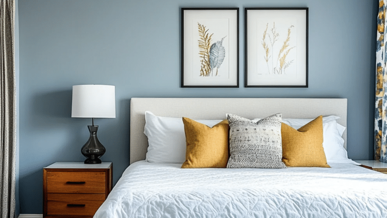
If you’ve been searching for a blue that feels calm but not dull, Debonair Sherwin-Williams (SW 9139) might be the one for you.
I’ve seen how tricky it can be to find a shade that works in every light; some look too bright, others too dark. Debonair strikes the perfect middle ground with its mix of soft blue and gray, making it easy to live with every day.
If you’re updating your bedroom, freshening up your kitchen, or giving your exterior a new look, this color adapts beautifully.
In this post, I’ll walk you through what makes SW Debonair special, its undertones, lighting effects, best pairings, and how you can use it to transform your space.
What Color is Debonair Sherwin-Williams (SW 9139)?
Debonair SW 9139 by Sherwin-Williams is a medium blue paint color softened with gentle gray undertones.
It falls right between bold navy and pale pastel blues, giving it a balanced and versatile look. This muted tone adds calmness without feeling dull or heavy.
Because of its neutral base, it fits beautifully in both interior and exterior spaces, from living rooms and bedrooms to entryways and siding.
The color feels grounded yet fresh, offering a classic blue-gray mix that works in classic, modern, or coastal homes alike.
RGB, HEX, and LRV Values:
- RGB: 150 / 168 / 179
- HEX: #96A8B3
- LRV: 45
LRV (Light Reflectance Value) measures how much light a color reflects. With a mid-range LRV of 45, Debonair balances light and depth; it won’t darken a space but still brings cozy definition to walls.
Undertones of Debonair SW 9139 Explained

Debonair SW 9139 stands out for its balanced mix of blue and gray, creating a tone that feels calm yet grounded. This harmony gives it flexibility across lighting conditions and interior styles.
The blue keeps it lively, while the gray adds a touch of softness, making it easy to pair with warm or cool elements in your space.
Because of this balance, Debonair doesn’t lean too cold or too vivid; it holds a steady middle ground that feels natural and inviting.
If you use it in a sunlit room or a dim hallway, the undertones help it stay consistent and relaxing. The color’s base is a medium blue softened by gray, reducing sharpness and keeping the tone mature and versatile.
The gray layer ensures the color never feels too bright or cold, maintaining a steady, neutral appeal.
It pairs best with gray-based neutrals like Site White, Alabaster, or Drift of Mist, and balances beautifully with warm finishes like brass, beige, or light oak.
Lighting and Directional Tips for SW Debonair
Lighting changes Debonair’s appearance dramatically, shifting it from airy blue in bright daylight to moody gray-blue in low evening light.
Natural vs. Artificial Light
In natural daylight, Debonair appears lighter and more open, with its blue tone standing out softly against neutral decor. When viewed under artificial light, the color gains richness and depth.
Warm light bulbs tend to pull forward the blue, adding comfort and warmth to a space. In contrast, cool or daylight bulbs bring out the gray base, giving the walls a smoother, more refined tone.
Testing the color under both conditions helps you understand how it will look throughout the day.
North vs. South-Facing Rooms
Debonair behaves differently depending on where your room faces.
In north-facing rooms, the cooler light enhances its gray undertones, creating a calm, subdued atmosphere.
In south-facing rooms, bright light makes it appear lighter and warmer, emphasizing the soft blue side.
East-facing rooms show more blue in the morning, while west-facing rooms take on a richer hue as the sun sets.
Best Light Bulbs for True Color
To get the most accurate version of Debonair, focus on your lighting type. Daylight LED bulbs keep the tone crisp and balanced, especially in modern interiors.
Warm white bulbs add comfort, deepening the blue while keeping rooms inviting. Always test the paint on a sample board or small wall section under your actual lighting setup to see how it changes during the day before painting the entire space.
How to Use SW Debonair in Your Home
SW Debonair is flexible and balanced, fitting beautifully into bedrooms, bathrooms, kitchens, or even exteriors with its calm gray-blue tone.
1. Bedroom: Promotes Rest and Calm
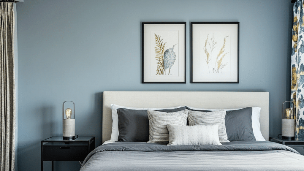
Debonair creates a peaceful, restful feeling in bedrooms. Its muted blue-gray tone helps reduce visual noise, making the space more relaxing and inviting. Pair it with soft whites or natural wood furniture for a cozy atmosphere.
For bedding and textiles, go with light beige, ivory, or pale gray. This combination helps you wind down after long days and wake up to a calm, gentle environment.
2. Living Room: Stylish with Neutrals and Gold Accents
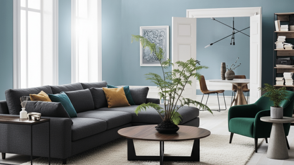
In living areas, Debonair adds quiet confidence. It balances well with white trim, beige furniture, and brushed gold details. The gray undertone keeps it from feeling too bright, making the room feel grounded and cozy.
Add soft lighting or metallic fixtures for warmth, or mix in textured fabrics for depth. This color works well for both open spaces and smaller living rooms that need a refined touch.
3. Bathroom: Spa-Like and Fresh
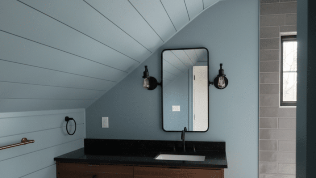
Debonair is ideal for creating a soft, refreshing bathroom atmosphere. The muted blue shade feels soothing and clean, perfect for spaces where you want calm energy.
Pair it with crisp white tiles or light stone countertops to keep the space bright and airy. Natural textures like woven baskets or warm wood accents add balance and prevent the space from feeling cold.
4. Kitchen: Beautiful Contrast
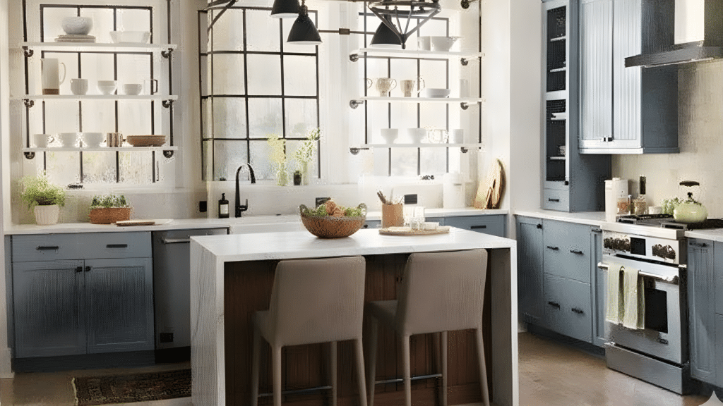
In kitchens, Debonair pairs perfectly with white or cream cabinets, adding modern contrast without overpowering the space. The soft blue-gray tone brings a sense of freshness and sophistication.
Add brass or matte black hardware for warmth and definition. Whether on walls or an island base, this shade complements wood floors, marble, or quartz counters beautifully.
5. Exterior: Refined Peace in Daylight
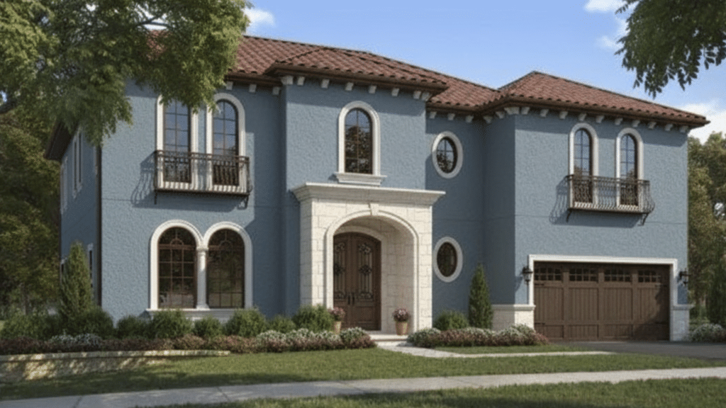
Debonair shines outdoors, where natural light enhances its balanced tone. It reads as a polished blue-gray that complements brick, stone, or wood accents.
Use white or soft gray trim to highlight architectural lines. The color holds up well across seasons, offering year-round elegance without looking too dark or faded.
Best Trim and Ceiling Colors: Pair with Alabaster, Site White, or Pure White for a clean, crisp contrast that enhances Debonair’s depth.
Recommended Finishes:
- Matte: Bedrooms for softness
- Satin: Living areas for light reflection
- Semi-gloss: Trim and cabinetry for durability and definition
Coordinating Colors for Debonair
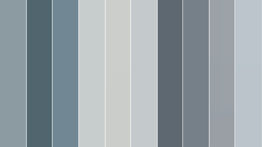
Debonair SW 9139 pairs beautifully with soft neutrals and contrasting blues. Sherwin-Williams offers several shades that highlight its calm balance of blue and gray.
| Color | Undertone | LRV | Mood | Best Use |
|---|---|---|---|---|
| Debonair SW 9139 | Muted gray-blue | 45 | Calm & versatile | Interiors/Exteriors |
| Waterloo SW 9141 | Deep navy-blue | 35 | Bold & moody | Accent walls |
| Bracing Blue SW 6242 | Crisp cool blue | 52 | Light & airy | Small rooms |
| Misty Blue SW 6232 | Soft gray-blue | 44 | Cozy & vintage | Bedrooms |
| Reflection SW 7661 | Cool gray with a blue tint | 66 | Bright & refreshing | Ceilings and trims |
| North Star SW 6246 | Pale silvery blue | 62 | Soft & peaceful | Hallways and bathrooms |
| Granite Peak SW 6250 | Charcoal blue-gray | 14 | Sophisticated & deep | Cabinets and exteriors |
| Storm Cloud SW 6249 | Medium blue-gray | 23 | Strong & grounded | Accent or feature walls |
| Let It Rain SW 9152 | Muted stormy blue | 36 | Calm & balanced | Living rooms or dining areas |
| Upward SW 6239 | Gentle sky blue | 57 | Airy & casual | Kitchens or nurseries |
These shades offer a range of moods, from bright and airy to rich and dramatic, allowing Debonair to adapt seamlessly in both warm and cool settings.
Debonair Sherwin-Williams vs. Blues from Other Brands
Debonair vs. Benjamin Moore

Debonair’s nearest Benjamin Moore equivalents are Van Courtland Blue and Newburyport Blue. Van Courtland Blue has a green-gray undertone, giving it a cozier, warmer vibe, while Newburyport feels slightly darker and more traditional.
In comparison, Debonair remains softer and more neutral, blending gray and blue in a calmer way. It fits both modern and classic interiors, where you want color presence without heavy saturation or strong temperature shifts.
Debonair vs. Behr

Comparable Behr shades include English Channel and Light French Gray Blue. Behr’s blues typically appear bolder, leaning toward true navy or vivid sky tones. Debonair, on the other hand, reads more refined and balanced.
Its subtle gray influence prevents it from feeling overpowering while maintaining enough pigment for depth. This makes Debonair an easier choice for everyday walls, especially when you prefer a paint color that adapts smoothly to changing light.
Debonair vs. Valspar

Valspar’s Blue Twilight and Coastal Dusk share a similar family but differ in brightness. Blue Twilight leans cooler and lighter, while Coastal Dusk feels more coastal and airy.
Debonair falls right in the middle, with a steadier gray undertone that gives it better versatility for modern interiors. It feels grounded yet stylish, working equally well in rooms with natural light or shaded spaces.
| Brand | Color | Undertone | LRV | Best Use |
|---|---|---|---|---|
| Sherwin-Williams | Debonair SW 9139 | Gray-blue | 45 | Interiors/Exteriors |
| Benjamin Moore | Van Courtland Blue HC-145 | Green-gray-blue | 43 | Cozy interiors |
| Behr | English Channel PPU14-19 | Navy-blue | 38 | Accent walls |
| Valspar | Blue Twilight 4009-6 | Cool medium blue | 50 | Airy modern rooms |
Design Styles that Suit Debonair Sherwin-Williams
Debonair’s balanced gray-blue tone adapts easily to different design styles, adding calmness and depth without overpowering your space.
- Coastal: Pair with whites, natural fibers, and woven textures for a breezy, seaside-inspired look that feels light and relaxed.
- Modern Farmhouse: Combine with black fixtures, warm oak furniture, and soft neutrals to create a grounded yet inviting style.
- Transitional: Match with creamy whites, subtle metallic accents, and layered fabrics for a smooth mix of traditional and modern elements.
- Minimalist: Use Debonair on clean walls with matte finishes, neutral décor, and simple forms to maintain balance and openness.
Where to Buy Sherwin-Williams Debonair (SW 9139)
You can easily find Debonair SW 9139 in Sherwin-Williams stores or online through trusted retail and delivery options.
Sherwin-Williams Stores: Visit any Sherwin-Williams Paint Store to view color swatches, request samples, or order gallons directly.
Official Website: Order from the Sherwin-Williams website, where you can preview the color, estimate paint quantity, and schedule pickup or delivery.
Local Retailers: Some local paint suppliers and hardware stores carry Sherwin-Williams products; check availability by searching Debonair SW 9139.
Sample Options: Purchase Color-to-Go paint samples or peel-and-stick sheets to test the color on your walls before buying full-sized cans.
Professional Assistance: Ask Sherwin-Williams associates for finish advice and matching suggestions for trims, ceilings, and coordinating colors.
Conclusion
If you’re searching for a paint color that feels calm, versatile, and easy to style, Debonair Sherwin-Williams (SW 9139) fits perfectly.
Its balanced blend of blue and gray gives you flexibility across styles, if you’re decorating a cozy bedroom, refreshing a living room, or painting an exterior. The color’s medium tone works well in all lighting, staying steady and relaxing throughout the day.
Pair it with crisp whites or warm neutrals, and it instantly brings harmony to your space. If you’ve been unsure which blue to choose, this one offers the best of both worlds, subtle but full of depth.
Would you try SW Debonair in your home? Share your thoughts or questions in the comments below.

