
Best Paint Finish for Bathroom Spaces That Last Longer

Bathrooms are tricky spaces when it comes to paint. I’ve spent years helping clients pick finishes that last, and I still remember staring at a tiny powder room swatch in the morning light, wondering if semi-gloss would look too harsh. The right paint finish doesn’t just protect walls from moisture; it shapes how a room feels at 7 am versus 7 pm, especially when light shifts across tile, mirrors, and fixtures. If you’re wondering which sheen is best for your walls, trim, or shower area, I’ll break down the pros, cons, and practical tips for selecting the best paint finish for bathroom spaces, including mildew-resistant, washable, and waterproof options. Why Does Paint Finish Matter More in Bathrooms? Paint sheen refers to the level of shine a paint has once it dries, and it plays a bigger role than appearance alone. It directly impacts durability, cleanability, and how well a surface handles moisture. Flat finishes are great at hiding dents and uneven patches, but they tend to absorb moisture and are difficult to wipe clean. Higher-sheen options like satin, semi-gloss, and gloss reflect more light, resist scrubbing, and hold up better in humid conditions, though they can highlight wall imperfections more easily. If you want a deeper look at how each level of sheen performs across different rooms, paint sheen comparisons by room type cover the full range. In bathrooms, this choice becomes especially important because constant steam, condensation, and frequent cleaning put extra stress on walls and ceilings. A poor finish can lead to streaking, peeling, or mildew buildup in corners and near wet zones like sinks and showers. That’s why testing samples in real bathroom lighting matters, sheen can shift noticeably from morning softness to evening glare in humid conditions and under artificial light. Factors That Affect the Right Bathroom Paint Finish Before choosing a finish, look at how the bathroom is used. A powder room without a shower has very different paint needs than a busy family bathroom. The main things to check are: Moisture level: Bathrooms with showers need stronger moisture resistance. Ventilation: Poor airflow makes paint work harder because humidity stays trapped. Surface condition: Glossy finishes can show bumps, patches, and roller marks. Cleaning needs: Busy bathrooms need paint that can handle wiping and scrubbing. Lighting: Bright lights and natural light can make shiny finishes look harsher. Paint location: Walls, ceilings, trim, doors, and cabinets each need a different finish. Once you review these factors, the right finish becomes clearer. You can confidently match sheen to moisture, cleaning, lighting, and the exact surface being painted. Best Paint Finish for Bathroom: Top Recommendations Choosing the right paint sheen is about balancing appearance, moisture resistance, cleanability, and the presence of wall imperfections. I often tell my clients that the wrong finish can make a bathroom look cheap or require a repaint sooner than expected. 1. Gloss & High-Gloss Gloss and high-gloss paints are highly reflective finishes that create a polished, almost glass-like surface. They’re the shiniest options available and have a smooth, sleek appearance. The high sheen makes surfaces extremely resistant towater, soap splashes, and humidity, which is why these paints are most often used for trim, doors, cabinets, or small accent walls near sinks and tubs. Best Use Areas: Cabinetry and trim, Bathroom doors, Small accent walls near moisture-prone areas 2. Semi-Gloss Semi-gloss is a medium-high sheen that balances reflection with subtlety. It’s one of the most popular choices for bathrooms because it combines durability with elegance. Semi-gloss can handle direct water contact, steam, and regular cleaning without peeling or staining. It’s particularly useful around showers, sinks, and backsplashes. For a closer look at how it holds up against satin on interior walls, the difference between satin and semi-gloss is worth reading before you commit to either. Best Use Areas: Shower and bathtub walls, Sink splash zones, Family bathrooms or powder rooms with heavy use 3. Satin Satin has a soft, velvety sheen that reflects light gently. It’s less shiny than semi-gloss, offering a warm, sophisticated look. Satin is moisture-resistant and washable enough for moderate-use walls while hiding minor imperfections better than glossier paints. It strikes a balance between cleanability and soft visual style, which is why it’s often the right call for mid-size or powder bathrooms. If you’re still deciding whether satin fits your specific space, whether satin finish suits your room covers the tradeoffs in more detail. Best Use Areas: Main walls in powder rooms or medium-use bathrooms, Areas not exposed to constant splashing, Low-traffic family bathrooms 4. Matte / Flat Matte or flat paint has little to no sheen, creating a soft, contemporary finish. It’s excellent at hiding imperfections and creating a cozy, modern appearance. Matte finishes absorb moisture and are generally less washable, but in low-humidity powder rooms or small bathrooms with good ventilation, they provide a clean, minimalistic look. The flat versus satin comparison is useful if you’re weighing these two for a powder room or ceiling. Best Use Areas: Powder rooms, Ceilings in bathrooms, Accent walls away from direct water exposure How to Choose the Best Paint Finish for a Bathroom Bathrooms face varying moisture and traffic levels, so choosing the right paint finish ensures durability, easy cleaning, and long-lasting beauty. Identify Moisture Zones: Map high-, moderate-, and low-moisture areas to select finishes that resist water and mildew. Consider Traffic & Cleaning Frequency: Use semi-gloss for heavy use, satin for occasional contact, ensuring surfaces remain cleanable. Assess Wall Imperfections: Flatter sheens hide bumps; glossier sheens emphasize imperfections; test swatches in both morning and evening light. Choose the Right Paint Formula: Select mildew-resistant, waterproof, or scrubbable formulas to match your bathroom’s moisture and cleaning needs. What to Look for Beyond the Finish Beyond the paint finish, the formula you choose matters just as much in a bathroom. Look for mold- and mildew-resistant paint, especially one with antimicrobial additives, because bathrooms hold steam and damp air longer than most rooms. Paint and primer combinations can also improve adhesion, but very humid rooms or damaged walls may still require a separate primer for better grip. VOC levels are another key point. Low-VOC paints are better for enclosed bathrooms because they emit fewer strong odors and are easier to use in small spaces with limited airflow. If you want to understand exactly what VOC content means and how it affects indoor air quality, what VOC in paint actually means explains it clearly. Water-based latex paint is usually the best choice for bathroom walls since it dries faster, cleans up easily, and resists yellowing. Oil-based paint is durable but produces stronger fumes, has a longer drying time, and is less common in modern bathroom projects. Comparing Popular Paint Brands for Bathroom Use Picking the right brand and formulation matters as much as choosing finish and sheen. Some paints are specifically engineered to resist moisture, mildew, and repeated cleaning, which is vital in bathrooms where humidity and condensation are constant. Below are clear, product‑focused pointers to help you choose paint brands that perform well in high‑moisture rooms. Brand & Product Moisture Resistance Mildew Protection Durability Price Benjamin Moore Aura Bath & Spa Excellent Very High Very High Premium Sherwin‑Williams Emerald Interior Excellent Very High Very High Premium Behr Premium Plus Kitchen & Bath Good Good Good Value PPG Diamond Interior Very Good Very Good Very High Mid‑Range Zinsser Perma‑White Excellent Excellent High Budget-Friendly When choosing paint for a bathroom, brand formulation and finish selection go hand in hand. Investing a bit more in a paint designed for humidity pays off with longer life, reduced mildew concerns, and fewer repaints. Pair your chosen brand with the appropriate sheen (semi‑gloss or satin for most walls and high‑moisture zones), and ensure proper surface prep and ventilation for the best results. Common Mistakes When Choosing Bathroom Paint Finish Choosing the wrong paint finish often leads to faster wear, higher maintenance, and unwanted visual issues in bathrooms. A few common errors show up repeatedly during bathroom projects: Using flat paint in high-moisture areas: Flat or matte finishes may look smooth at first, but they absorb moisture easily. In bathrooms with frequent showers, this often leads to stains, peeling, and mildew buildup around corners and ceilings. Choosing gloss for all walls: High-gloss paint is durable, but using it across entire bathroom walls can make imperfections more visible. Uneven patches, roller marks, and surface flaws become more noticeable under bright lighting. Ignoring ventilation conditions: Paint finish performance depends heavily on airflow. Bathrooms with poor ventilation trap humidity, which can damage even mid-sheen paints over time and reduce overall durability. Skipping sample testing in real lighting: Sheen changes appearance under different lighting conditions. A finish that looks balanced in store lighting may appear too shiny or too dull once applied in a bathroom with shifts between natural and artificial light. Overlooking surface preparation: Even the best paint finish will not perform well on poorly prepared walls. Dust, uneven patches, or leftover moisture can affect adhesion and lead to early wear or patchy results. Frequently Asked Questions Can I use the same finish for walls and trim in a bathroom? While it’s possible, semi-gloss or high-gloss is usually the better call for trim because it cleans easily and holds up to direct contact. Satin or semi-gloss works better for walls. Different finishes protect surfaces according to their function and moisture exposure. How does natural light affect the choice of bathroom paint sheen? Natural light changes throughout the day, highlighting imperfections or glare. A satin or soft semi-gloss balances reflection, ensuring walls look smooth in both morning and evening light. Are there eco-friendly or low-VOC options for bathroom paints? Yes, many premium paints, including mildew-resistant formulas, are low-VOC or zero-VOC, reducing odors and toxins while still performing well in humid, high-use bathrooms. Does color choice impact mildew growth in bathrooms? Indirectly, yes. Darker colors show streaks and water marks more clearly, while lighter shades reflect light and make streaks less noticeable. Sheen and ventilation are more important for mildew prevention than color alone. Conclusion Picking bathroom paint is really about choosing what can handle real life, not just what looks good on a color card. I’d choose satin for most walls because it gives you a clean look, better washability, and solid moisture resistance. You can use semi-gloss where water, steam, and daily wiping are major concerns, such as trim, doors, cabinets, and splash zones. Matte or flat finishes should be used in low-moisture areas unless the formula is designed for bathrooms. The best paint finish for bathroom spaces also depends on airflow, surface condition, and how often you clean. When you match the finish to the room, your paint lasts longer and looks better. Try these tips, then share your results or questions in the comments.
Benjamin Moore Cloud White Review & Room Guide

Color Name Cloud White OC-130 (also 967, CC-40) Brand Benjamin Moore LRV 85.05 — light, high-reflecting white Undertones Soft yellow, cream, subtle taupe Best For Warm-toned rooms with wood, brass, beige, or greige finishes; walls, trim, cabinets, ceilings Avoid In Rooms with cool gray floors, icy tile, blue-toned countertops, or very bright white trim Ever walked into a room and felt a white paint suddenly look yellow, dull, or too warm? I know how frustrating that can be when you expect a clean finish but get something totally different. That’s where plan-a-garden Cloud White review choices often go wrong when lighting is ignored. You may be trying to pick the right white for walls, cabinets, or trim, but end up second-guessing everything. I break down how cloud white benjamin moore behaves in real rooms, what its undertones really do, and where it works best or fails. You will learn how light, finishes, and surroundings change everything, so you can choose with confidence.c What Cloud White Benjamin Moore Actually Looks Like on a Wall Benjamin Moore Cloud WhiteOC-130 is not a flat, clean white. It sits between crisp white and creamy off-white, with soft yellow, cream, and subtle taupe undertones that shift depending on your room’s lighting, bulbs, and finishes. In a warm, well-lit room with wood floors and neutral furnishings, it reads as a fresh, settled white that feels bright without being stark. Pull in cool gray tile or blue-toned countertops, and that warmth reads as dingy. That gap between how Cloud White looks on a chip and how it lands on your walls is the most important thing to understand before you buy. If you’re considering Cloud White for walls, trim, cabinets, or ceilings, this review walks through exactly how it behaves — in every light condition, in every room type, and against every finish category where it succeeds or fails. Cloud White Undertones: What They Are and When They Show Up The undertone in Cloud White is a soft yellow with secondary notes of cream and taupe. It is not a heavy cream color, and it does not read as buttery or golden in most conditions. What keeps it from going strongly yellow is a neutral base that quiets the warmth down to something that feels balanced rather than saturated. That yellow shows up in three specific situations: strong south or west-facing sunlight, warm incandescent or soft-white bulbs, and proximity to cool finishes. When Cloud White sits beside a stark white appliance, cool gray floors, or bright white trim with blue undertones, the contrast pulls the yellow forward and makes Cloud White look creamier than it actually is. If the surrounding finishes are warm, that same yellow reads as a quiet, pleasant warmth. This is the undertone behavior most paint reviews skip over: the color you see depends as much on what’s next to it as on the paint itself. Before committing to Cloud White in any room, hold a large sample against your flooring, trim, and any fixed countertop or tile. That context test tells you more in five minutes than any chip will. Pro Tip: If you’re using Cloud White on both walls and trim, keep them in the same color and vary only the sheen. Pairing Cloud White walls with a different white trim almost always pulls the yellow undertone forward in a way that reads unintentional. How Cloud White Behaves in Different Light Conditions Light is what separates a color that works in a room from one that doesn’t. Cloud White’s warm base reacts differently across room orientations, times of day, and bulb types. Here is exactly what to expect in each condition. North-Facing Rooms: Cool northern light softens Cloud White, keeping it balanced and slightly warm. It works well in bedrooms and offices, but may show subtle yellow undertones with cool gray decor. South-Facing Rooms: Strong sunlight warms it significantly, making it look creamier and more lived-in. It may feel too warm if you want a crisp white. East-Facing Rooms: Morning light keeps it clean and fresh, while evenings turn it warmer. It suits kitchens and breakfast areas well. West-Facing Rooms: Afternoon light pushes warmth, sometimes making it look slightly yellow by evening—test under real lighting first. Artificial Lighting: Warm bulbs (2700K) increase yellow tones, while 3000K keeps the balance. Daylight bulbs (5000K+) can flatten warmth and make it look dull. Where Cloud White Works Best and Where It Doesn’t Cloud White is a genuinely versatile color, but it earns that reputation only in the right conditions. Here is the honest breakdown by surface and room type. Surface How It Works Sheen Key Watch-Out Walls Warm, soft, feels bright without clinical sharpness Eggshell or matte Test against fixed flooring and trim before committing Trim Works when walls are also warm-toned, clashes with icy wall colors Satin or semi-gloss Don’t pair with a cool-white wall color; it reads yellow by contrast Cabinets Soft, warm kitchen or bath finish with good durability in the right product line Satin or cabinet-grade Avoid cool gray countertops or blue-toned tile Ceilings Softer alternative to stark white; keeps warm rooms cohesive Flat Best paired with warm wall colors; may look heavy with cool palettes Doors and Trim Together Seamless when matched to trim throughout Satin or semi-gloss Match to trim rather than walls for a clean read Changing sheen shifts how Cloud White reads without changing the color itself. A flat finish makes it look softer and slightly more muted; a semi-gloss brings out more brightness and can make the warm undertone more visible under direct light. If you’re unsure whether the shade feels too creamy in your space, try stepping down one sheen level before reconsidering the color entirely. If you’re unsure which finish to reach for, how sheen affects color on different surfaces is worth understanding before you commit. How Does Benjamin Moore Cloud White Read in Real Rooms? Cloud White is not a flat or pure white. It has a warm base that can look soft, creamy, or slightly muted depending on the room. Its LRV also plays a big role because it reflects plenty of light without feeling cold. Understanding these details helps you decide if Cloud White will look fresh, cozy, too creamy, or too warm in your space. 1. Living Room Benjamin Moore Cloud White has warm undertones with a gentle mix of cream, beige, and soft taupe. It does not look like an icy, blue-white paint color or a sharp gallery white. Instead, it gives rooms a softer, warmer, and more comfortable feel while still keeping the space bright. These undertones are why Cloud White often works well in traditional, transitional, farmhouse, and warm neutral homes. It feels clean, but it still has enough warmth to stop a room from looking cold. 2. South-Facing Room / Sunroom Cloud White can look more yellow or creamy in warm sunlight, especially in south-facing or west-facing rooms where the light gets stronger later in the day. Yellow-toned bulbs can also bring out its creamy side and make the color feel warmer than expected. It usually should not look strongly yellow on its own, but it may lean that way beside cool gray floors, stark white trim, or blue-based finishes. Testing it near your fixed finishes is the safest way to judge it. 3. Kitchen or Bathroom Cloud White can look dingy when it is placed beside very cool whites, icy tile, blue-gray flooring, or cold countertops. Its warmth may look muted, dull, or slightly dirty when the surrounding finishes are too cool or too sharp. This does not mean Cloud White is a bad color. It simply needs the right setting. It usually looks cleaner with warm wood, beige, greige, brass, soft taupe, and muted earthy colors. The rest of the room should support its warm base. 4. All Rooms / General Light LRV means Light Reflectance Value, which tells you how much light a paint color reflects. Cloud White has an LRV around 85, so it reflects a strong amount of light and can help many rooms feel brighter. That said, it is not a cold or sterile white. Its warm undertones soften the brightness, making it feel more relaxed. This is why Cloud White can look cozy rather than crisp, even though it is still a light, reflective white paint color. 5. Bedrooms or Low-Light Spaces Cloud White can work in dark rooms, but it will not brighten rooms with very little natural light. In low-light spaces, it may look softer, warmer, and creamier instead of clean and crisp. This can feel cozy in bedrooms, laundry rooms, hallways, or small rooms without much sunlight. Good artificial lighting matters here because bulbs can change how warm the paint appears. Test Cloud White with the same lighting you use every day before choosing it for a dark room. 6. Sunlit Areas / Open Spaces Cloud White is usually not too white for sunny rooms. In bright south-facing or west-facing spaces, it often looks warm, bright, and welcoming. Strong afternoon light can make it appear creamier, especially near warm wood floors, beige fabrics, or soft neutral finishes. If you want a very crisp white, this warmth may feel too creamy. If you want a gentle white that feels calm and lived-in, sunny rooms can make Cloud White look beautiful. Sampling is still important before painting a full room. 7. Overall Takeaway Cloud White is warm, soft, and bright enough for many homes. Its undertones can look creamy, beige, or slightly taupe depending on the light, bulbs, and nearby finishes. It works best with warm or balanced materials, not very cool gray or blue-based finishes. Before using it on walls, trim, cabinets, or ceilings, test it in your own room during the day and at night. This helps you see whether it feels clean, cozy, too creamy, or too warm. Coordinating Colors for Cloud White Cloud White works best when the palette around it supports its warm base. The pairing choices below all share a warm or balanced undertone, nothing with a clear blue or cool gray base. Trim and ceiling white: If you use Cloud White on walls, keep the trim in Cloud White at a higher sheen. Switching to a different white almost always creates an unintended yellow contrast. If you want a white with more brightness on the trim, Benjamin Moore Simply White OC-117 is the closest step up in brightness while staying warm. Warm neutral walls to pair with Cloud White trim: Manchester Tan HC-81, Pale Oak OC-20 all share Cloud White’s warm undertone base. They read as greige or warm beige beside it rather than fighting it. Accent and furniture colors: Muted sage green, warm taupe, soft terracotta, and earthy rust all sit well against Cloud White. Brushed brass, unlacquered brass, and warm bronze hardware suit it better than polished chrome or brushed nickel, which tend to read cold against the warm base. Dark accent paints: Benjamin Moore Wrought Iron 2124-10 and Black Beauty 2128-10 give strong contrast without fighting Cloud White’s warmth. Onyx 2133-10 also works. Test these with your specific lighting; they can read slightly softer or harsher depending on the sheen and bulb type you use. For rooms where the flooring drives the decision, the wall color with wood floors works through this pairing logic. Benjamin Moore Cloud White vs. White Dove OC-17 This is the comparison I hear most often, and the reason people stay stuck between them is that they look nearly identical on a chip. On a wall, the difference is real. The gray component in White Dove’s muted undertone keeps it from reading as cream in most conditions, which is what gives it a softer, quieter quality than Cloud White. It sits at an LRV of approximately 85.38, making it slightly darker — a difference that is largely invisible on a chip but slightly more noticeable on four full walls. Cloud White has a more forward warmth. The yellow in Cloud White is not grayed down the way White Dove’s is, which means it shows as cream a little more readily in warm light or beside cool finishes. In direct comparison, Cloud White reads just a touch more yellow; White Dove reads just a touch more muted and neutral. The practical decision: choose Cloud White when you want a warm white with a clear, present warmth that feels cozy. Choose White Dove when you want a white that stays softer and more forgiving across a wider range of light conditions and finishes. Both need to be sampled in your actual room; the chip difference is subtle enough that your specific lighting will decide the outcome. Cloud White vs. Other Whites Worth Comparing Cloud White becomes easier to understand when compared with a few key whites that people often consider for similar interior styles. These three comparisons show how warmth, brightness, and undertones shift in real room settings, helping you decide which white fits your space best. 1. Cloud White vs Sherwin-Williams Alabaster SW 7008 Alabaster is a soft, warm white with a muted, creamy appearance that feels calm and subtle in most interiors. It leans more toward a blend and is less defined, which can make it feel softer overall. Cloud White, on the other hand, appears slightly brighter and more structured, with a clearer mix of cream, beige, and soft taupe undertones. Both are warm, but Cloud White offers a bit more contrast and clarity across changing natural and artificial lighting conditions. 2. Cloud White vs Benjamin Moore Swiss Coffee OC-45 Swiss Coffee is noticeably creamier and more beige-forward than Cloud White, giving it a softer, more relaxed appearance. It can feel warmer but also slightly heavier in certain lighting conditions. Cloud White reads cleaner and more balanced, offering warmth without becoming overly creamy. This makes it a better choice when you want a fresh warm white that still feels bright and usable across walls, trim, and cabinetry without looking too muted or dull. 3. Cloud White vs Benjamin Moore Simply White OC-117 Simply White is a brighter, crisper white that leans closer to a clean, modern aesthetic with less visible warmth. It feels sharper and more reflective, especially in well-lit spaces. Cloud White, in contrast, is softer and more grounded, with visible warm undertones that include cream, beige, and subtle taupe. This gives it a more traditional and cozy feel. Simply White suits clean, minimal spaces, while Cloud White suits warm, natural, and layered interiors better. Where To Buy Benjamin Moore Cloud White You can buy Benjamin Moore Cloud White through Benjamin Moore retailers, local paint stores, and online sample providers. Peel-and-stick samples are helpful for early testing because you can move them around the room and check the color in different lighting before buying paint. Buy From Benjamin Moore Retailers: Start with an authorized Benjamin Moore retailer for the most reliable match. They can mix the correct color, explain product lines, and help you choose the right finish. Try Local Paint Stores: Many local paint stores carry Benjamin Moore or can help you order it. Provide the exact color name and number to avoid confusion with similar white paint colors. Official Website: Order from the Benjamin Moore Cloud White, where you can preview the color, estimate paint quantity, and schedule pickup or delivery. Choose The Right Product Line: Benjamin Moore offers different paint lines for different needs. Choose based on the surface you are painting, such as walls, trim, cabinets, bathrooms, or high-traffic spaces. Pick The Right Finish: The finish can change how Cloud White looks. Flat or matte works well for ceilings, eggshell suits walls, and satin or semi-gloss is better for trim, doors, and cabinets. Buy A Sample First: A sample helps you see how Cloud White reacts to your room’s light, flooring, counters, and existing trim. Test it in the morning, afternoon, evening, and at night. Do Not Trust Screen Color Alone: Cloud White can look different on phones, laptops, store images, and printed cards. Real lighting and nearby finishes matter much more than a digital preview. Frequently Asked Questions Can I ask another paint brand (like Sherwin-Williams or Behr) to color-match Cloud White? It is highly recommended that you don’t. White paint colors are incredibly sensitive because they use very little tint. Every brand has a proprietary “base white” formula with its own unique undertones. When you try to cross-mix Cloud White into a different brand’s base, the formula often breaks down, resulting in an accidental muddy green or sickly pink undertone. To get the true color, stick to actual Benjamin Moore paint. How does Cloud White look next to popular quartz countertops like Calacatta Gold vs. Carrara Marble? It pairs beautifully with Calacatta Gold quartz because the warm, soft gold or brass-toned veining perfectly complements the paint’s soft cream base. However, you should avoid pairing it with classic Carrara Marble or cool, blue-veined quartz. The icy, gray-blue background of those stones will immediately clash with Cloud White, making your walls look slightly yellowed or dingy. Is Cloud White a safe choice for staging a home to sell? Yes, but only if your home leans warm. Cloud White creates an incredibly inviting, cozy, and “lived-in” luxury vibe that buyers love. However, if your home is being staged with ultra-modern, stark gray furniture or chrome accents, Cloud White will look out of place. For a completely foolproof, safer staging white that handles all furniture types, White Dove or Sherwin-Williams Alabaster are slightly safer bets. Does Cloud White work for a modern “Japandi” or minimalist design style? Absolutely. While many modern minimalist spaces default to cold, clinical gallery whites, the Japandi style (a blend of Japanese and Scandinavian design) relies heavily on warmth, raw white oak, canvas textiles, and earthy elements. Cloud White serves as the perfect backdrop for this look because it softens the straight lines of minimalist architecture without making the space feel sterile. Will Cloud White yellow over time as it ages on the wall? Modern high-quality latex formulas from Benjamin Moore do not yellow or oxidize over time the way old oil-based paints used to. If your walls look yellow three years from now, it isn’t the paint changing color—it is likely due to UV exposure fading your flooring and fabrics, which shifts how the light bounces around the room and alters your visual perception of the wall. Final Thoughts Cloud White Benjamin Moore is not just another white paint; it is a warm, shifting color that reacts strongly to light, finishes, and surrounding materials. I’ve shown you how it can feel soft and inviting in some rooms while turning too creamy in others. You now understand its undertones, lighting behavior, and where it fits best in real homes. This matters because the wrong white can change the entire mood of a space and lead to costly repainting. When you think about plan-a-garden Cloud White decisions for your home palette, you start making smarter, more confident choices. Try a sample in your space, observe it at different times of day, and see how it truly behaves before you commit.
Woodlawn Blue Benjamin Moore HC-147 Paint Color Review

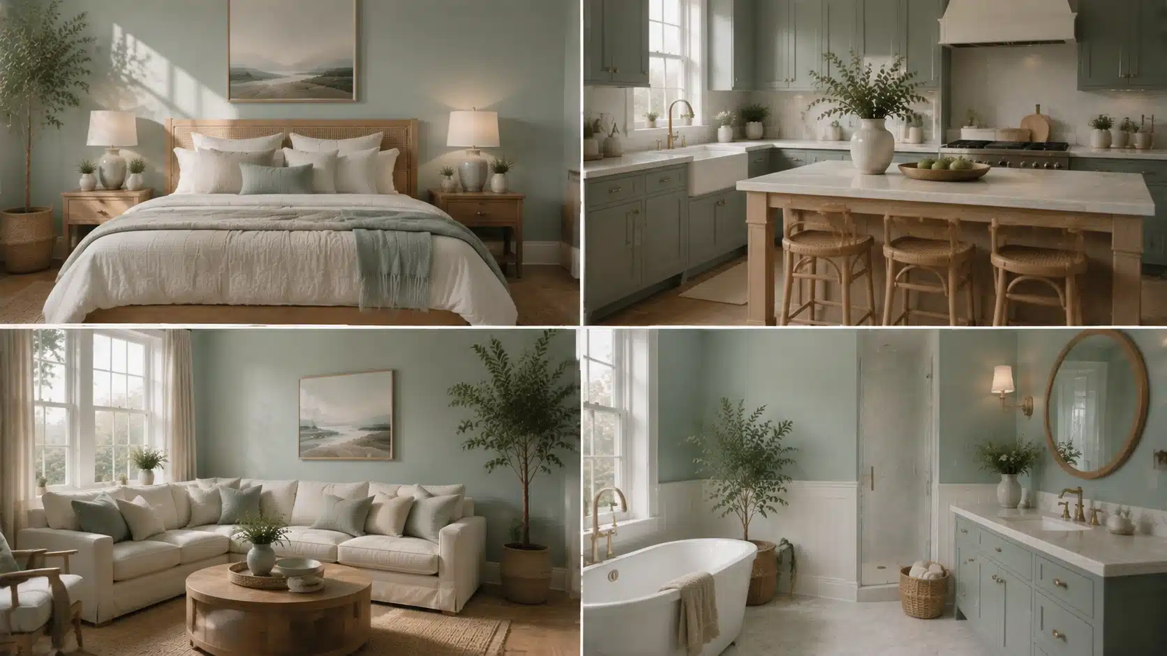
Color Name Woodlawn Blue HC-147 Brand Benjamin Moore Collection Historical Colors LRV 60.65 — medium-light Undertones Blue-green with a gray cast Best For Bedrooms, bathrooms, laundry rooms, porch ceilings, south- or east-facing rooms Avoid In Very dim rooms, spaces with cool gray floors, rooms where you want a true clear blue Ever stare at a paint chip and wonder why it looks different once it’s on your walls? Choosing Woodlawn Blue Benjamin Moore HC-147 can feel tricky when lighting, flooring, and finishes all shift its blue-green balance in unexpected ways. I know it gets frustrating when a calm color suddenly turns gray or green once painted. I’ll help you understand how this shade behaves in real rooms, what affects its undertones, and how to test it properly before committing. By the end, you’ll know where it works best, where it falls flat, and how to choose trim and lighting that keep it consistent across your space. What Woodlawn Blue Benjamin Moore Actually Looks Like on a Wall Woodlawn Blue HC-147 is a soft blue-green from Benjamin Moore’s Historical Colors collection with an LRV of 60.65 and a gray cast that keeps it from reading as bright or saturated. That gray influence is what gives it its restrained, almost collected quality; it never shouts blue, but it’s clearly there. The green undertone runs underneath the blue base, and depending on your light, it can push forward or quietly step back. What that means in a real room is that Woodlawn Blue reads differently at 8am than it does at 8pm, and it reads differently beside warm wood than it does against cool gray tile. That’s the tension at the heart of this color. It’s versatile, but it isn’t effortless. It needs the right light and the right surroundings to stay in its blue-green lane rather than tipping toward green-gray or dull. The rest of this review explains exactly when it works and when it doesn’t. How Woodlawn Blue Looks in Different Lighting Room direction is the single biggest variable with Woodlawn Blue. Test it in the actual moments when you use the space — not just at noon. North-facing rooms: The blue-gray side becomes dominant. The color can look flat and cool without strong natural light to bring it forward. I would sample carefully here before committing to four walls. South-facing rooms: The best-case scenario. Steady daylight keeps the blue-green balance intact and the color feels airy rather than muted. It may look a touch lighter than the chip at peak brightness. East-facing rooms: Morning light makes Woodlawn Blue feel fresh and clean. By afternoon it softens considerably, which works well for a bedroom or nursery that you want to feel gentle by evening. West-facing rooms: Muted during morning hours, then warmer and slightly greener as afternoon sun strengthens. The evening shift can be dramatic — sample it specifically at 6pm if this is a dining or living room. Artificial light: Warm incandescent or yellow LED bulbs pull the green undertone forward. Cooler daylight-spectrum LEDs keep the color closer to its blue-gray base. Always check the sample under your actual bulbs at night before painting. Real-Life Reviews of Woodlawn Blue Benjamin Moore Most Woodlawn Blue owners online notice that it actually feels like color, even though it’s muted. They say it doesn’t fade into the walls like a bland neutral, yet it doesn’t feel overwhelming either; it just fits. One Reddit user talked about it being “very soft and serene, but still plenty of color” in their bedroom, which is exactly the kind of nuance that paint chips don’t show. Because it’s not screaming “blue!”, it gives a room depth without clashing with furniture or décor. Many people who have used it in plenty of natural light say it stays calm without washing out. It reads as a thoughtful, not a loud shade. Whether it was a nursery wall or a grown‑up bedroom, Best Rooms to Use Woodlawn Blue Woodlawn Blue works best where the light and fixed finishes support its blue-green-gray base. Each room below outlines the best pairings and the conditions that cause problems. Bedroom In a bedroom, Woodlawn Blue creates a restful backdrop without disappearing into the wall. Its muted tone works well when you want color that feels calm at night and soft in the morning. Pair it with warm white trim, pale linen bedding, light oak furniture, or soft beige accents. If you’re weighing several bedroom colors for a cozy feel, Woodlawn Blue sits in the quieter end of that range, more settled than vivid. In darker rooms, sample it first, as the shade may lean more toward gray than blue when natural light is limited. Bathroom Woodlawn Blue can make a bathroom feel clean and gentle without turning cold. It works well with white tile, marble-style counters, chrome, brushed nickel, or warm brass. Check it beside your tile before deciding, bathroom surfaces reflect color quickly, and yellow, green, or strong gray undertones in the tile can shift how the wall color reads. Laundry Room A laundry room is a practical place for Woodlawn Blue because the color adds softness to a utilitarian space. It looks fresh with white cabinets, wood shelves, woven baskets, and simple beige or gray flooring. Since laundry rooms often have limited daylight, test it under your actual bulbs. That check will tell you whether the shade holds its blue-green balance or reads flat during daily use. Kitchen or Cabinets On kitchen walls, Woodlawn Blue brings a light, calm feel around white or warm neutral finishes. On cabinets, shadows fall differently on doors and corners, so the color can look deeper and more saturated than it does on a flat wall. Pair it with white counters, brass hardware, simple tile, and warm wood floors. For cabinetry, paint a vertical test board and view it beside the handles and counters before committing. Dining Room In a dining room, Woodlawn Blue feels relaxed and easy to gather around. It suits spaces with wood dining tables, cream chairs, linen curtains, black accents, and warm white trim. Because dining rooms are often used after dark, lamp light matters as much as daylight here. Check the sample during dinner hours before choosing; the goal is soft and inviting, not cool and washed out. Nursery Woodlawn Blue is a lovely nursery color when you want something peaceful but not too pale. It works with white furniture, natural wood, soft rugs, and pale green accents. The color grows well with the room, so it doesn’t feel limited to a baby stage. Keep the palette simple, particularly curtains and rugs, larger fabric pieces can shift how blue or green the walls appear through the day. Porch Ceiling For a porch ceiling, Woodlawn Blue gives a soft sky-like effect without reading too bright. This is the same blue-green family used in traditional haint-blue porch ceilings, though Woodlawn Blue reads as quieter and more gray-blue than the brighter haint shades. Outdoor light usually makes it appear cleaner and lighter than it does inside, so sample it outside specifically. It pairs well with white trim, stone, natural wood, and surrounding greenery. Because ceilings reflect light differently than walls, the color may look more airy overhead than the same sample appears in the room below. Best Trim Colors to Pair with Woodlawn Blue Trim changes how Woodlawn Blue reads on the wall. A softer white holds the color in its calmer range; a cleaner white brings the blue-green tone into sharper focus. Use this table to match the trim to the mood you’re after, then sample both together before painting. Trim Color Why It Works Benjamin Moore White Dove OC-17 A soft warm white that keeps Woodlawn Blue calm and gentle. The right call when your room has warm floors, wood furniture, or creamy fabrics. Benjamin Moore Chantilly Lace OC-65 A clean, bright white that sharpens the edge of the blue-green. Works well in rooms with white tile, modern finishes, or cooler surfaces. Benjamin Moore Simply White OC-117 A fresh white with slight warmth. Keeps the room bright without making Woodlawn Blue look too cold or too gray. Benjamin Moore Cloud White OC-130 A creamy white that softens the blue-green tone. Best when you want a warm, relaxed look rather than high contrast. Whites shift significantly once they sit beside blue-green paint, real flooring, and natural light, sample before painting, not after. Colors That Go with Woodlawn Blue Woodlawn Blue pairs best with colors and materials that support its soft blue-green-gray base rather than pulling it toward green or cold. Build the palette in layers: light colors for brightness, grounded accents for warmth, natural textures to keep the room from feeling flat. Soft whites: On ceilings, doors, and larger furniture pieces, they keep the room feeling open and help Woodlawn Blue stay light without looking stark. Warm neutrals: Beige, sandy tones, taupe, and soft greige soften the cooler side of the color and make the room feel more settled. Natural wood: Light oak, white oak, and maple add organic warmth through flooring, furniture, shelves, or woven pieces. This is the pairing that keeps Woodlawn Blue from reading too cool. Brass: In lighting, cabinet pulls, mirror frames, and small decor, brass adds warmth without overpowering the wall color. Black accents: Picture frames, curtain rods, hardware, or chairs in black give the soft wall color more definition without competing with it. Navy: Works well on pillows, art, rugs, or one statement furniture piece. It gives Woodlawn Blue a richer partner than bright blue would. Muted greens: Soft sage and gray-green shades link back to Woodlawn Blue’s green undertone. Keep them muted so the palette stays calm rather than becoming overly botanical. Linen textures: Linen curtains, cotton bedding, woven shades, and textured rugs make the color feel lived-in. These pieces prevent the room from looking overly styled. Test larger pieces beside the wall color first, particularly rugs, curtains, and wood furniture — these are the elements most likely to shift how the undertone reads. Woodlawn Blue vs. Palladian Blue Woodlawn Blue and Palladian Blue HC-144 are the two colors that come up on the same shortlist most often, and at first glance they look nearly identical. The LRV gap is negligible (60.65 vs. 60.4). The real difference is in the undertone: Woodlawn Blue reads more blue-gray, while Palladian Blue tilts toward green-blue. In practical terms, Woodlawn Blue tends to feel quieter and slightly more muted; Palladian Blue reads a touch fresher and airier. Feature Woodlawn Blue HC-147 Palladian Blue HC-144 LRV 60.65 60.4 General feel Muted, calm, slightly blue-gray Airy, soft, slightly green-blue Main risk Can look dull or gray in weak light Can look minty in bright or warm light Best for Bedrooms, baths, laundry rooms, porches Bedrooms, baths, coastal rooms, open spaces Choose Woodlawn Blue if you want a quieter, more grounded shade. Choose Palladian Blue if you want something with a slightly fresher, brighter lift. Because they are so close, the only reliable way to choose is to sample them side by side in your actual room under your actual light. Closest Matches in Other Paint Brands These are the most comparable colors from other brands, useful for comparison shopping, but not as direct substitutes. Every brand uses different pigment bases, so what reads as a match on screen may behave differently on your wall. Sample any candidate beside Woodlawn Blue before buying. Brand Color How It Compares Sherwin-Williams Rainwashed SW 6211 Light blue-green with a calm, airy feel. May show more green than Woodlawn Blue in some rooms. Sherwin-Williams Copen Blue SW 0068 Muted blue-green with similar softness, but slightly different depth and character. Behr Nature’s Reflection N430-2 A soft blue-green option in the same family, though not a direct match in every light condition. Farrow and Ball Light Blue No. 22 A silvery blue with a calm feel. Reads more layered and muted than Woodlawn Blue. Judge these options on your wall in your light — not on a screen or a store chip. When Not to Use Woodlawn Blue Woodlawn Blue needs light to show its character. In very dim rooms, it loses the blue-green balance and can read flat, shadowy, or gray rather than the serene shade people choose it for. That’s the clearest case for skipping it. It also needs care beside cool gray flooring, blue-gray tile, or stark white surfaces. Those finishes can push the whole room toward cold. Strong yellow bulbs are the other risk: warm artificial light tends to activate the green undertone more than most people expect, which can make the room feel greener than the chip suggested. If your goal is a clear, true blue with no green movement, Woodlawn Blue will likely disappoint. For a crisper coastal blue without the blue-green shift, consider Yarmouth Blue HC-155 or a saturated coastal shade instead. Sample first in all cases. How to Sample Woodlawn Blue the Right Way A small chip will not tell you enough about how Woodlawn Blue behaves in your home. This shade shifts with light, direction, and surrounding finishes in ways that only become clear at poster scale or larger. Use a large sample: A peel-and-stick sample or a painted board at least 12×12 inches shows the undertone far better than a chip. Larger is better. Test on more than one wall: A wall near the window and a shaded interior wall can show meaningfully different versions of the same color. Check throughout the day: Morning, afternoon, evening, and lamp light. The evening check under artificial bulbs is the one people most often skip and most often regret skipping. Compare it beside fixed finishes: Hold the sample against trim, flooring, tile, counters, and any large fabric pieces already in the room. These are the elements it has to live with. Sample it beside Palladian Blue: If you’re undecided between the two, put them on the same wall in the same light. The difference becomes clear in person in a way that side-by-side photos rarely capture. Leave it up for two full days: One afternoon is not enough. You need to see it across the full range of light your room actually receives. These are the questions I hear most often from people who already have the chip on their wall — and who want to make sure the full room goes right. Frequently Asked Questions What undertones does Woodlawn Blue have? Woodlawn Blue HC-147 has a blue base with a green undertone and a gray cast. The green side is stronger than most people expect from the chip, and it becomes more visible in warm light or beside yellow-toned bulbs. The gray cast is what gives the color its muted, historic quality. Does Woodlawn Blue look green in some lighting? Yes. In warm artificial light or west-facing rooms with strong afternoon sun, the green undertone can push forward enough that the color reads more green-blue than blue-green. This is the primary surprise for first-time users. Testing under your actual bulbs at night is non-negotiable before painting. Is Woodlawn Blue the same as Palladian Blue? No. They are close in LRV (60.65 vs. 60.4), but Woodlawn Blue reads more blue-gray while Palladian Blue leans green-blue. Woodlawn Blue is quieter and more muted; Palladian Blue is slightly airier. Sample both side by side in your room before choosing. What trim color goes best with Woodlawn Blue? White Dove OC-17 is the most reliable match — warm enough to hold the color in its calmer range without competing. Chantilly Lace OC-65 works if you want a sharper, cleaner contrast. Simply White OC-117 splits the difference and keeps the room bright without turning cold. Is Woodlawn Blue a good choice for a north-facing room? With caution. North-facing rooms make the blue-gray side dominant, and the color can look flat or cool without strong daylight to support it. If your north-facing room has large windows or white surfaces that bounce available light, sample it first on both the well-lit and shaded walls before deciding. What finish is best for Woodlawn Blue? Matte or eggshell for bedrooms and low-traffic areas — it hides wall imperfections and gives the color a softer, more relaxed appearance. Satin for bathrooms, kitchens, and laundry rooms — easier to clean and reflects slightly more light, which helps in spaces that run dim. Does Woodlawn Blue work on exterior walls? Yes, with the right primer and finish. All exterior paints fade with UV exposure over time, so a high-quality exterior formula and a proper primer extend the color’s life, particularly on walls with direct southern or western sun exposure. Final Thoughts Paint color decisions often come down to how a shade actually behaves once it’s on your walls rather than how it looks on a chip. Woodlawn Blue Benjamin Moore HC-147 stands out because it shifts between blue, green, and gray depending on light, which makes testing in your own space essential. I find it works best when you match it with the right trim, lighting, and surrounding materials so it stays balanced throughout the day. You should review your current rooms, test samples carefully, and choose combinations that keep the color steady in different conditions. Try a few samples besides your existing finishes and share how they respond in your lighting setup.
Sherwin-Williams White Duck SW 7010: The Complete Guide
Color Name White Duck SW 7010 Brand Sherwin-Williams LRV 74, medium-light; reflects well without washing out Undertones Creamy beige with a soft greige pull; occasionally a faint pink in certain lighting Best For South- and west-facing rooms, exteriors, kitchens with warm wood, open-plan spaces Avoid In North-facing rooms with no warm lighting, spaces with cool gray floors or blue-gray tile Picking a white paint color sounds simple until you’re staring at 47 swatches that all look identical in the store. White Duck Sherwin Williams is one of those colors that genuinely surprises people; it reads differently depending on your light, your flooring, and your existing décor. It’s warm without being yellow, neutral without being cold, and versatile enough for both interiors and exteriors. If you’ve been going back and forth between creamy whites and greige neutrals, this color might be sitting right in your sweet spot. I’ll keep things practical here, with undertones, lighting, pairings, exterior use, and the Shoji White comparison covered clearly. What Sherwin-Williams White Duck SW 7010 Actually Looks Like on Your Walls Sherwin-Williams White Duck SW 7010 is a warm off-white that sits between a true white and a light greige, creamy without reading yellow, neutral without going cold. If you’ve been going back and forth between soft creams and warm neutrals, this color lands right in that overlap. At an LRV of 74, it reflects a solid amount of light while keeping enough depth to look intentional rather than washed out. A step warmer than Natural Choice SW 7011 and noticeably softer than a bright white, it sits in a genuinely useful middle range. I’ve placed White Duck in everything from sunny open-plan kitchens to dimmer east-facing bedrooms, and the results depend almost entirely on what surrounds it: your light, your trim, and your flooring matter here more than they do with most whites. White Duck Undertones and Lighting Effects Lighting strongly affects how Sherwin-Williams White Duck looks in a real home. This warm off-white has creamy beige and soft greige undertones, so it can shift between warm white, light beige, and muted greige depending on the room. Because White Duck is not a crisp white, it should be tested beside flooring, trim, cabinets, counters, and exterior materials before painting a full space. Check the sample in the morning, afternoon, evening, and at night so you can see how much warmth or depth appears throughout the day. In Natural Light Natural light can make White Duck look lighter, warmer, creamier, or more muted based on the direction of the room. In bright spaces, it often looks soft and clean. In shaded spaces, its beige and greige tones may become more noticeable. North-facing rooms: The light is usually cooler and softer. White Duck may look more muted, greige, or slightly beige in these rooms. It can still feel calm and cozy, but it works best with warm lighting, natural wood, soft white trim, and warm decor to keep the space from feeling dull. South-facing rooms: South-facing rooms get warmer daylight for much of the day. This light can make White Duck feel brighter, creamier, and more welcoming. It is one of the easier lighting conditions for this color because the natural warmth makes the paint look soft rather than flat. East-facing rooms: East-facing rooms get bright morning light, which can make White Duck look fresh and softly warm early in the day. As the light fades, the color may look more beige or greige. Warm bulbs can help keep the room feeling balanced later. West-facing rooms: West-facing rooms get stronger afternoon and evening light. During this time, White Duck can look warmer, creamier, and a little richer. This makes it a good choice for living rooms, bedrooms, dining rooms, and spaces where a cozy evening feel matters. In Artificial Light Artificial lighting can significantly change White Duck after sunset. Warm white bulbs can bring out more of its creamy beige side, making the room feel softer and cozier. Cool LED or daylight bulbs can make White Duck look flatter, grayer, or less warm. If you want the color to stay balanced, soft white bulbs are usually the safest choice. Layered lighting also helps White Duck look better. Use ceiling lights, table lamps, floor lamps, or wall sconces together so the color feels even across the room. This keeps White Duck looking soft, warm, and comfortable during the day and at night. Pro Tip: Before sampling on a wall, tape the chip next to your flooring, your trim, and the largest fixed surface in the room. White Duck’s undertones shift based on what surrounds it more than almost any other color in this range. The chip alone will not tell you what you need to know. Shoji White vs White Duck: Which One Do You Actually Need? These two come up together constantly, and with good reason — they’re close. But they’re not interchangeable, and getting this wrong means a repaint. Feature White Duck SW 7010 Shoji White SW 7042 LRV 74 74 Undertones Creamy beige with soft greige Warm cream with greige depth; occasional faint pink Overall Feel Slightly cleaner, more balanced Warmer, cozier, slightly richer Best For Exteriors, open-plan walls, cabinets Cozy interiors, bedrooms, spaces that need warmth Watch Out For Can look beige beside cool finishes Can look too warm or muted in low light The honest answer: if you want a soft off-white that reads a bit cleaner and works as well outside as it does inside, White Duck is the call. If you want more cozy warmth and you’re staying interior, Shoji White often suits a wider range of fixed finishes. Test both on the actual wall before committing, the difference between them is exactly subtle enough to read clearly only once they’re up. Choosing the Right Finish for White Duck Finish changes how White Duck reads on the wall, a higher sheen intensifies the undertones, while matte and flat finishes keep it soft and even. How paint sheens behave in different lighting conditions matters more with a warm off-white like White Duck than with most mid-tone colors, because sheen directly amplifies whether you see cream or greige on the wall. The right choice depends on the room’s traffic, moisture level, and how much shine you want. Finish Best For Why It Works Flat / Matte Bedrooms, ceilings, low-traffic walls Softest look; hides imperfections well; keeps White Duck from looking shiny Eggshell Living rooms, hallways, family rooms Balanced softness with light washability; most common choice for main walls Satin Kitchens, bathrooms, trim, doors Washable and durable; handles moisture without compromising the warm tone Semi-Gloss Cabinets, doors, exterior trim Hardest finish for high-contact surfaces; clean contrast at edges One note on trim: White Duck is generally not my recommendation as an interior trim color. At LRV 74, it’s deep enough that it won’t create meaningful contrast against most wall colors. Use it on the walls and bring the trim up, Pure White (SW 7005) or Extra White (SW 7006) create the clean separation that lets White Duck read as the warm wall it’s meant to be. Where White Duck Works Best, Room by Room White Duck is flexible, but it performs differently depending on the room’s light, fixed finishes, and how much warmth the space already carries. Here’s where it does its best work and what to pair it with in each space. Living Room White Duck creates a relaxed, livable backdrop in a living room. It works particularly well with linen sofas, wood coffee tables, black frames, woven rugs, and warm white curtains. Because it reads light without looking stark, it doesn’t compete with furniture — it recedes and lets the room breathe. In open-plan spaces, this color moves well through living, dining, and entry zones without getting tired. Bedroom In a bedroom, White Duck is quiet in the best way. It pairs naturally with white bedding, beige or taupe throws, wood nightstands, and muted green accents. Warm enough to feel cozy at 10pm under soft lighting, clean enough to feel fresh at 7am when the morning light comes in. For bedrooms, flat or matte finish is the call — it keeps the color soft and absorbs rather than reflects the overhead light. Kitchen White Duck on kitchen cabinets works well when the surrounding finishes are warm — brass hardware, wood floors, stone countertops, and warm white backsplashes all support it. The color brings softness without making the kitchen feel dim. Where it runs into trouble is beside icy quartz, blue-gray tile, or very cool white cabinet pairings; those cooler surfaces pull out the beige side of White Duck in a way that reads less warm, more muddy. Bathroom Bathrooms with warm stone, cream tile, beige floors, brushed brass, or wood vanities are where White Duck looks most at home. In bathrooms with cool gray tile or blue-toned marble, expect the beige undertones to become more pronounced- not necessarily a problem, but worth testing with a real sample before committing. Good layered lighting is more important in bathrooms than in any other room for this color; a single overhead bulb will not give you an accurate read. Hallways and Open Layouts White Duck is genuinely good for hallways and open-plan spaces because it stays consistent across different light exposures without getting dramatic. It threads through entries, stairways, dining rooms, and living areas without changing color. That said, open layouts with a mix of warm and cool fixed finishes need a careful sample test; what looks balanced in the south-facing living room can read more beige in the north-facing hallway off the same paint can. Sherwin-Williams White Duck on the Exterior Choosing a Sherwin-Williams White Duck exterior finish gives your home a soft white look that reads warm without the harshness of a bright white in direct sun. Its creamy beige and greige undertones help it sit naturally beside brick, stone, and wood; the color feels like it belongs rather than being applied on top. For modern farmhouse, craftsman, colonial, and transitional homes, this is a reliable exterior choice. Exterior Area Best Use Why It Works Siding Whole-house body color Soft white look that holds in direct sun without glare Painted Brick Full brick or accent surfaces Warms up the brick texture without flattening it Stucco Main exterior body Softens rough texture; creates a warm, finished look Trim and Fascia Subtle contrast with deeper body colors Works when you want trim that reads soft rather than bright white Garage Doors Matching or blended with siding Reduces the visual weight of large garage doors from the street Shutters Paired with dark accents Warm base for black, bronze, navy, or sage shutters The critical exterior testing note: sample White Duck on more than one side of the house. In direct sunlight, it reads as a clean, soft white. In shade, the north-facing wall, the covered porch, the areas under the roofline, the greige and beige pull forward. Both reads can work beautifully, but you want to see them before painting the whole house. For the strongest exterior contrast, pair it with a near-black like Greenblack for contrast on shutters, doors, and trim, the warm white and deep near-black combination is hard to get wrong. What People Discuss About Benjamin Moore White Dove Reddit user was overwhelmed by the paint selection process and worried that most creamy whites would look too yellow or dirty, or clash with orange-toned wood flooring. After trying different options, they chose Sherwin-Williams Creamy and were pleasantly surprised by how balanced and versatile it looked. Another Reddit user joined the discussion and specifically recommended Sherwin-Williams White Duck, noting that it is one of the brand’s strongest white paint colors and a reliable choice when searching for a warm off-white that works with a variety of finishes and lighting conditions. The conversation highlights how White Duck is often suggested by homeowners seeking a soft, warm white that avoids the harshness of bright whites yet remains flexible enough for different spaces. Coordinating Colors That Work With White Duck White Duck’s warm off-white base pairs best with colors that add warmth, depth, or contrast without pushing toward yellow or cool gray. Since it sits at LRV 74, it can hold its own against both light neutrals and deeper accent colors without disappearing. If you’re still deciding between White Duck and other options in this range, the broader comparison of warm white paint colors lays out how the whole family behaves side by side. Coordinating Color Code LRV Best Use With White Duck Accessible Beige SW 7036 58 Adjoining rooms; soft whole-home palette Natural Linen SW 9109 66 Layered neutral palette for bedrooms and living rooms Urbane Bronze SW 7048 8 Doors, shutters, accent walls, exterior accents Dried Thyme SW 6186 21 Cabinets, shutters, accent walls Tony Taupe SW 7038 37 Accent walls, adjoining rooms, exterior trim Use Accessible Beige or Natural Linen when you want a layered, soft neutral palette that moves between rooms without contrast. Reach for Urbane Bronze, Dried Thyme, or Tony Taupe when you need depth and contrast that White Duck’s warmth can anchor without being overwhelmed. When NOT to Use White Duck White Duck is versatile, but it has limits. These are the situations where it consistently underperforms, and where a different color would serve you better. Rooms with predominantly cool gray flooring will pull out the muted, beige side of White Duck, and the walls can end up looking dull rather than warm. Spaces with blue-gray tile, cool quartz countertops, or silver-toned fixtures have the same problem: the cool finishes win, and White Duck looks like it can’t decide what it wants to be. Very bright white trim– particularly cool whites like Chantilly Lace (BM OC-65), can make White Duck look darker or creamier than intended, especially in rooms where the trim is a dominant visual element. That’s not always a bad thing, but it’s rarely what people expect when they choose White Duck for its soft white quality. Basements and rooms with no natural light are a risk. White Duck’s warmth is an asset in light-starved spaces, but without the right artificial lighting setup, soft white bulbs, and layered sources, it can read more beige and flat than you’d want. If the artificial lighting can’t be improved, consider a lighter option like Alabaster (SW 7008) at LRV 82. Finally, if you’re expecting a true crisp white, White Duck will not deliver that. At LRV 74 with a creamy greige base, it is a deeper, warmer off-white by design. Going in with that expectation prevents the most common source of disappointment with this color. Mistakes to Avoid With White Duck SW 7010 Testing White Duck paint without proper sampling can lead to unexpected color shifts on your walls, exteriors, and trim. Relying on digital screens: Monitor settings and photo editing distort the color, causing a soft white to look beige in person. Pairing with warm trim: Matching it with Alabaster blends the tones together, creating a flat look instead of crisp separation. Testing one exterior spot: Different lighting conditions cause north-facing walls to look greige while south-facing walls look much brighter. Always test your paint swatches in multiple locations and different lighting environments to ensure you love the final results. How to Sample White Duck the Right Way A careful sample process is the difference between getting White Duck right and repainting a room three months later. Here’s what I recommend before buying the gallons. Buy the actual sample pot, not a peel-and-stick chip. Samplize and similar services are useful, but nothing replaces painting two large swatches, at least 12 by 12 inches, directly on different walls in the same room. Check those swatches at 7 am, noon, 5 pm, and again at 9 pm under your actual lighting. That sequence tells you more about how White Duck will behave in your space than any chip or digital swatch can. Place the swatches next to your real furniture, rugs, flooring, and cabinets, not on an empty wall in a stripped room. The color reads entirely differently when it’s surrounded by the fixed finishes it’ll actually live with. Check it against your trim color specifically; that relationship determines whether the undertones read as intentional warmth or as a muddy, indecisive beige. Let the paint dry completely before judging it; wet White Duck reads darker and warmer than the final dried result. Frequently Asked Questions About Sherwin-Williams White Duck Can you use White Duck on ceilings? Yes. Using it on ceilings creates a cohesive, wrap-around feel in large spaces. Pair it with Matte or Flat finish to soften the room’s corners, prevent glare from artificial lights, and mask minor drywall imperfections without making the ceiling feel too low or heavy. Does it look yellow in low-light basements? Instead of shifting yellow, White Duck leans flat and muddy in dark basements. Without natural sunlight, its greige undertones take over, turning the color a shadow-like beige. You will need strong, layered 3000K lighting to keep it looking like a fresh, warm off-white. How does White Duck handle wood rot or exterior grime? Its medium-light depth hides dust, pollen, and minor outdoor scuffs much better than a bright, crisp white. While it will not mask severe wood rot, the subtle greige baseline helps your exterior siding look cleaner for longer between seasonal power washings. Will it clash with trendy black steel windows? Not at all. It provides a stunning, high-contrast backdrop for modern black window frames. The inherent warmth of the paint softens the industrial look of the black steel, creating a balanced, contemporary facade that feels inviting rather than stark or clinical. Does White Duck work well in nursery spaces? It is an excellent choice for a calming nursery backdrop. The neutral base grows easily with your child, shifting effortlessly from soft pastel decor to vibrant toddler bedding without requiring a repaint. It stays peaceful under dim nightlight conditions. Can it be used for color-drenching a room? Color-drenching walls, trim, and doors in White Duck works beautifully if you vary the sheens. Apply Satin to the trim and Satin or Semi-Gloss to doors while keeping walls Eggshell. This maintains monochromatic harmony while preventing the architectural details from completely disappearing. Final Thoughts White Duck proves that a soft white can feel warm, clean, and practical when it complements the surrounding space. I like how it gives you a gentle off-white look without the sharp feel of a bright white. You just need to watch its creamy beige and greige undertones, especially near trim, flooring, lighting, brick, stone, and roof colors. The room-by-room notes, finish tips, exterior ideas, and sampling steps all point to one thing: test first. That small step helps you avoid costly mistakes and choose with more confidence. If White Duck Sherwin Williams paint is on your list, try a real sample and share how it looks in your home, or check a related paint color review next.
Benjamin Moore Gray Owl OC-52: Full Paint Review

Benjamin Moore Gray Owl is a light gray paint color with a cool, crisp feel that shifts with lighting and surrounding finishes. It is often labeled as Gray Owl OC-52 or 2137-60, both of which refer to the same shade. I came across this color while comparing neutral paints for different rooms, and I noticed how easily it changes tone from space to space. I find it works best for me when tested on walls instead of relying on screens or chips. My focus here is to help you understand how it behaves in real rooms, from bright spaces to low-light corners. Small changes in trim, flooring, and light can make it look different, so sample testing before final paint choice matters Understanding Benjamin Moore Gray Owl Before choosing Benjamin Moore Gray Owl, check the key color details in one place. This quick table helps you confirm the right shade, compare samples, and understand the main paint information before buying. Detail Gray Owl Information Color Name Gray Owl Brand Benjamin Moore Color Codes OC-52 And 2137-60 LRV 64.51 Hex Value #D3D4CC Official Description A use-anywhere light gray with a cool, crisp cast Collections Off White Collection And Color Preview® Also Known As Gray Owl OC-52 / Gray Owl 2137-60 Buying Options Store locator, samples, paint, color chips, and digital dollop With an LRV of 64.51, Gray Owl sits in the light gray range. It is not white, but it can help a room feel brighter than deeper gray paint colors. Are Gray Owl OC-52 And 2137-60 The Same Color? Quick Answer: Yes, Gray Owl OC-52 and Gray Owl 2137-60 are the same Benjamin Moore paint color. They are not two separate shades, even though the two codes may appear on different Benjamin Moore pages, retailer listings, sample pages, or paint store systems. The difference comes from how Benjamin Moore organizes its color collections. Gray Owl OC-52 is listed with the Off White Collection, while Gray Owl 2137-60 is listed with the Color Preview Collection. Because the same color appears in more than one collection, shoppers may see either code while looking for samples, checking product pages, or asking a local retailer to mix the paint. Before buying, confirm the color name, color code, product line, and sheen. This matters most when ordering tinted paint, buying a sample, or choosing among wall, trim, cabinet, or bathroom paint. A quick check before checkout helps make sure you get Benjamin Moore Gray Owl, not a similar-looking gray. What Undertones Does Benjamin Moore Gray Owl Have? Benjamin Moore Gray Owl has soft blue-green undertones. This brief table shows how it may shift in different room conditions. Room Condition How Gray Owl May Look Cool Rooms Can lean slightly blue or feel crisper Warmer Rooms Can feel softer with a subtle green side Mixed Lighting Can shift throughout the day White Trim Often looks clean and fresh Beige Or Warm Finishes Needs testing to avoid undertone clashes Gray Owl is still a light gray, but lighting and nearby finishes can change how its undertones appear. Test a sample before buying full paint. Room Performance Of Benjamin Moore Gray Owl Benjamin Moore Gray Owl can work in different rooms, but it will not look exactly the same in every room. Lighting, trim, flooring, tile, cabinets, and sheen can all change how this light gray appears once it is on the wall. In bright spaces, Gray Owl may look clean and fresh. In darker rooms, it can feel cooler or slightly flat. Warm wood, white trim, gray tile, and artificial lighting can also pull out different sides of the color. These five room notes can help you decide where to sample it first and what to check before buying full paint. 1. Living Room Gray Owl can create a clean, soft gray backdrop in a living room without making the space feel too dark. It works well with white trim, warm wood floors, neutral sofas, black accents, and natural textures. If the room gets good daylight, Gray Owl can feel fresh and balanced. If the living room has limited natural light, it may look cooler or flatter. Warm lamps, wood furniture, and textured rugs can help soften the look. Quick Tip: Test Gray Owl behind the sofa and near the main window because these areas often show the biggest color shift. 2. Bedroom Gray Owl can feel calm and restful in a bedroom, especially with soft bedding, white or off-white trim, wood furniture, and muted accents. It gives the room a light gray base without feeling too heavy. In bedrooms with cool bulbs or north-facing light, Gray Owl may show more of its blue side. For a softer look, pair it with warm white bedding, beige linen, natural wood, or woven textures. Quick Tip: Check the sample at night with your bedside lamps on. Bedroom paint often looks different in evening lighting. 3. Kitchen Gray Owl can work well in kitchens with white cabinets, quartz counters, stainless steel appliances, chrome fixtures, and navy or charcoal accents. It can make the walls feel clean without competing with cabinets or countertops. Be careful if your kitchen has cream cabinets, beige backsplash tile, warm granite, or yellow-toned flooring. These finishes can make Gray Owl look cooler or slightly off. Quick Tip: Hold the sample beside your countertop and backsplash, not just on an empty wall. 4. Bathroom Gray Owl can look fresh in bathrooms with white tile, marble-style finishes, chrome, nickel, or clean white vanities. Its cool cast often works well because many bathroom finishes already feel crisp and light. If the bathroom has cool gray tile, Gray Owl may lean bluer. If it has beige tile or warm stone, the undertone may feel less balanced. Use a bathroom-friendly paint product for humid spaces. Quick Tip: Test Gray Owl beside the vanity, shower tile, and floor tile before buying full paint. 5. Hallway Gray Owl can brighten a hallway more than deeper gray colors, but hallways can be tricky because they often have limited natural light. In a narrow or shadowed hallway, it may look cooler, darker, or flatter than expected. If you use it in a hallway, add warm lighting and compare it with your trim color. Since hallways connect rooms, Gray Owl should also work with nearby wall colors, flooring, and doors. Quick Tip: Test it on both ends of the hallway. One side may look cooler than the other Benjamin Moore Gray Owl Paint Product Options Choosing the right Benjamin Moore Gray Owl product depends on where the paint will be applied, surface durability needs, finish preference for different rooms and surfaces, and overall usage requirements. Use Area Product Best Sheen Notes Walls Aura® waterborne Interior Paint / Regal® Select / ben® Interior Paint Matte or Eggshell Works well for bedrooms, living rooms, hallways, dining rooms, and open spaces with a soft, balanced finish. Bathrooms Aura® Bath & Spa Matte Designed for humid spaces like bathrooms, spas, and laundry rooms with added moisture resistance. Cabinets, Doors, Trim ADVANCE® Interior Paint Satin or Semi-Gloss (trim/doors), Satin or High Gloss (cabinets) Best for high-contact surfaces when properly cleaned, sanded, and primed before painting. Ceilings Benjamin Moore Ceiling Paint Flat Creates a smooth, low-sheen ceiling finish that keeps overhead surfaces subtle and clean. Matching product type and sheen to the space ensures better durability, appearance, and long-term performance of Gray Owl across walls, bathrooms, cabinets, and ceilings in any home. Overall, results matter. Official Benjamin Moore Coordinating Colors For Gray Owl Benjamin Moore lists several coordinating colors for Gray Owl. Use these bullet points as a quick starting point when planning trim, ceilings, accent walls, cabinets, or colors in nearby rooms. Super White (OC-152): Use this when you want a crisp white pairing with Gray Owl. It can work well for trim, ceilings, doors, and clean contrast. White Heron (OC-57): Choose this for a softer white option. It can feel less sharp than a bright white while still keeping the palette light. Silver Satin (OC-26): Use this for a soft, quiet neutral pairing. It works well when you want a lighter palette around Gray Owl. Taos Taupe (2111-40): Choose this when you want to add warmth beside Gray Owl’s cooler cast. It can help balance the palette. Hale Navy (HC-154): Use this for a classic dark blue accent. It can work for doors, cabinets, accent walls, or decor. Kendall Charcoal (HC-166): Choose this for a deep gray contrast. It pairs well with a stronger, more grounded look. Before choosing a final palette, test the coordinating colors beside your flooring, cabinets, counters, tile, and lighting. Gray Owl can shift slightly depending on the room. Similar Benjamin Moore Colors To Gray Owl Benjamin Moore Gray Owl is a popular light gray that many people choose for its soft, balanced look, but it can appear very different depending on the surrounding colors and lighting conditions. Comparing it with similar shades helps you see how subtle changes in undertone, depth, and brightness can completely shift the mood of a room. Some grays may feel cooler, others warmer, and some may stay more neutral throughout the day. Because of these variations, even small differences in paint selection can noticeably affect how walls look in real spaces, making side-by-side testing of close alternatives an important step before finalizing your room’s overall design and paint choice. 1. Vapor Trails (1556) Vapor Trails is a soft, light neutral that closely matches Benjamin Moore Gray Owl in brightness and overall tone. It offers a similar airy gray look but can appear slightly more muted depending on lighting conditions. In bright rooms, it stays clean, while in dim light, it feels softer and more blended with its surroundings. Works best in living rooms, bedrooms, and open-plan spaces 2. Moonshine (2140-60) Moonshine is a light, clean gray that feels more neutral compared to Gray Owl. It avoids strong blue-green undertones, so it looks more consistent across different lighting. In bright areas, it appears soft and smooth, while in lower light, it maintains a calm, balanced gray presence without feeling too heavy or dark. Works best in modern interiors and open living spaces 3. Alaskan Husky (1479) Alaskan Husky is a fresh light gray that can shift slightly depending on lighting and surrounding finishes. It feels crisp and airy in natural daylight, while artificial lighting can soften its appearance. Compared to Gray Owl, it has a bit more variation, making it important to test in multiple areas before final selection. Works best in bedrooms, hallways, and everyday living areas 4. Oystershell (864) Oystershell is a soft muted neutral that feels more relaxed and less crisp than Gray Owl. It leans slightly warm in some lighting and stays subtle in most spaces. It does not show strong undertones, making it an easy, forgiving choice for rooms where you want a gentle background color. Works best in calm, low-contrast interior spaces 5. Stonington Gray (HC-170) Stonington Gray is a cleaner, more structured gray than Gray Owl. It holds its tone better across different lighting conditions and feels more defined on walls. While Gray Owl has softer blue-green undertones, this shade appears more neutral and steady, especially in bright or evenly lit rooms. Works best in contemporary spaces with white trim 6. Wickham Gray (HC-171) Wickham Gray has stronger blue-green undertones than Gray Owl, giving it a cooler and slightly more noticeable color presence. It can look brighter in daylight and more pronounced in shaded rooms. Compared to Gray Owl, it feels more distinct and cooler, especially in north-facing or low-warmth lighting environments. Works best in bathrooms, bedrooms, and cool-toned interiors Benjamin Moore Gray Owl Sample Options Before buying full paint, test Benjamin Moore Gray Owl in your own space so you can see how it reacts to your lighting, trim, flooring, cabinets, and other fixed finishes. Start With A Color Chip: Pick up a Gray Owl color chip first for a quick look at the shade before buying a sample. Buy A Paint Sample: Order or buy a real paint sample before purchasing full paint. This gives you a better idea of how Gray Owl looks in your room. Test Near Trim: Place the sample beside your trim color because white, cream, or off-white trim can change how Gray Owl appears. Check Flooring and Tile: Test the sample near flooring, tile, counters, and cabinets since these fixed finishes can affect the undertone. Review Different Lighting: Look at Gray Owl in the morning, afternoon, evening, and artificial light before making a final choice. Compare Similar Colors: Check Gray Owl OC-52 / 2137-60 beside one or two similar Benjamin Moore colors if you are unsure. Confirm The Sheen: Choose the final sheen before ordering paint because matte, eggshell, satin, and semi-gloss can make the same color look slightly different. Avoid Screen-Only Decisions: A sample is more reliable than a screen image because Gray Owl can shift depending on lighting and surrounding finishes. Where To Buy Benjamin Moore Gray Owl Paint And Samples Benjamin Moore Gray Owl can be checked and purchased through official Benjamin Moore options and authorized retailers. Use the table below to decide which buying route makes the most sense before ordering full paint. Buying Option Best For Benjamin Moore Website Checking Gray Owl OC-52 or 2137-60 on the official color pages Find A Store Tool Locating a nearby Benjamin Moore retailer Buy Samples And Paint Ordering paint or samples directly through available Benjamin Moore buying options Free Color Chips Getting a first look at Gray Owl before buying a sample Local Retailers Buying Gray Owl samples, paint, and related Benjamin Moore products in person Digital Dollop Saving a digital color reference for planning, but not final color approval Screen colors and printed colors may differ from actual paint. For the safest result, test a Gray Owl sample in your own room before buying full paint. Common Mistakes To Avoid When Buying Benjamin Moore Gray Owl Gray Owl is a light gray that can shift in real rooms, so it is worth checking a few details before buying full paint. Choosing From A Screen Only: Digital colors may not match actual paint, so use a chip or sample. Skipping A Paint Sample: A real sample shows how Gray Owl looks in your lighting. Ignoring The Two Codes: Gray Owl may appear as OC-52 or 2137-60, but both refer to the same color. Testing One Wall Only: Check it near trim, flooring, cabinets, tile, and windows. Forgetting The Undertones: Gray Owl has soft blue-green undertones that can shift from room to room. Choosing The Wrong Sheen: Matte, eggshell, satin, and semi-gloss can change how the color reflects light. Buying Too Quickly: Compare samples first, then choose the final product and sheen. Frequently Asked Questions Can Benjamin Moore Gray Owl Be Used For A Whole House? Yes, Gray Owl can be used as a whole-house color if the lighting and fixed finishes work with its cool gray look. Test it in several rooms first, as it may shift slightly from room to room. Is Benjamin Moore Gray Owl Good For Small Rooms? Gray Owl can work in small rooms because it is a light gray. It may help the space feel open, but the final look depends on lighting, trim, flooring, and the paint sheen. Can Gray Owl Be Used On Exteriors? Gray Owl can be considered for exterior projects, but exterior light can make paint look much lighter. Always test a large outdoor sample before using it on siding, trim, doors, or shutters. Does Gray Owl Work In Rental Properties? Gray Owl can be a good rental paint color if you want a clean, neutral backdrop. It feels more current than many beige tones, but it still needs testing with flooring, cabinets, and existing trim. Is Gray Owl A Good Paint Color For Resale? Gray Owl can support resale because it is a soft neutral gray that many buyers may find easy to work with. It is best used in spaces where it looks clean, bright, and not too cool. How Long Does Benjamin Moore Paint Take To Dry? Dry time depends on the Benjamin Moore product, room temperature, humidity, and ventilation. Check the specific product label before recoating or moving furniture back against freshly painted walls. Is Gray Owl Easy To Clean? Cleanability depends more on the paint product and sheen than the color itself. Eggshell, satin, and semi-gloss finishes are usually easier to wipe than flat finishes, especially in busy areas. Can Gray Owl Work With Wood Floors? Yes, Gray Owl can work with wood floors, but the wood tone matters. Warm or orange-toned floors may make the color feel different, so place a sample beside the flooring before buying paint. Conclusion Gray Owl is easier to choose when you know what to check before buying. I would start with the official color details, then test a real sample in your own room. Benjamin Moore Gray Owl has two color codes, several buying options, and a light gray look that can shift with lighting, sheen, trim, flooring, and nearby finishes. You also have coordinating colors and similar Benjamin Moore shades to compare before making the final call. This matters because paint can look very different once it moves from a screen to your wall. If you are thinking about using Gray Owl, try a sample first, check it at different times of day, and read related blogs for more paint color ideas.
Pale Oak Benjamin Moore OC-20: Full Paint Review

Color Name Pale Oak OC-20 (also known as Athena 858) Brand Benjamin Moore Collection Off-White Collection LRV 68.64 — light, reflects well without reading as white Undertones Warm gray-greige with a taupe base; can shift pink or lavender in cool or mixed light Best For Whole-home walls, bedrooms, living rooms, open layouts, hallways, south- and west-facing rooms Avoid In Dark rooms with little natural light; rooms with cherry, mahogany, or reddish wood floors; spaces with cool LED-only lighting Ever paint a room and feel the color shift the moment the sun goes down? Choosing a wall color is frustrating when it looks perfect in the store but different at home, especially with Pale Oak OC-20. I know how confusing that can feel when lighting keeps changing the tone. Here, I break down how this soft greige behaves in real rooms, from natural light to evening lamps. You will see where it works best, where it fails, and how to avoid undertone surprises so your space feels consistent and calm. I focus on practical lighting tips so you can test them before committing. What Pale Oak Benjamin Moore Actually Looks Like in a Real Room Pale Oak OC-20 is a greige, that mix of gray and beige that reads neither cold nor heavy. Most of the time, on a well-lit wall, pale oak by Benjamin Moore looks like a soft, warm neutral that falls somewhere between an off-white and a classic taupe. That description is accurate, but incomplete. Here’s the part that catches people off guard: Pale Oak has pink and lavender undertones that show up in certain light. It doesn’t look rosy in the way peach paint does. But in a north-facing room at midday, or under cool LED bulbs after dark, you can see a definite purple-pink cast that surprises people who only sampled it in a sunny spot. That’s not a flaw. It’s the color’s character. But it’s the reason I tell every client to test Pale Oak on multiple walls in different light before committing to a gallon. Pro Tip: Test Pale Oak on at least two walls, one that gets direct light and one that doesn’t. Check it at 7 am, at noon, at 5 pm, and after 8 pm with your artificial lighting on. If you see lavender after dark, swap your bulbs for warm white (2700K) before deciding against the color. Understanding Pale Oak’s Undertones The official description calls Pale Oak a warm gray-greige. That’s technically true, but it leaves out what makes this color interesting and occasionally tricky. Pale Oak sits in the yellow-to-yellow-red hue family on the color wheel. Colors in that neighborhood are known to shift purple in imbalanced or cool light. In a room with balanced, neutral light, Pale Oak looks like a calm warm gray-beige. Add a cool-spectrum light source, an overcast north-facing window, a daylight LED bulb, or even a gray tile floor, and the lavender-pink side appears. This is low chroma, which means the color has very little saturation. Low-chroma colors are chameleons. The room around them has as much influence on their appearance as the pigment itself. A cream sofa can make Pale Oak read warm and golden. A bright white cabinet can make the same wall look distinctly gray-pink. Understanding this before you paint a room saves a lot of regret. If you’re still working out how to choose paint colors that hold up against your fixed elements, that process applies here as much as anywhere. The practical takeaway: Pale Oak is not for anyone who dislikes even subtle pink or purple tones. If that’s a hard no, look at Edgecomb Gray HC-173 (warmer, more beige) or Classic Gray OC-23 (cooler, closer to off-white) instead. But if a soft, complex neutral that shifts through the day sounds appealing rather than alarming, Pale Oak earns its reputation. How Pale Oak Looks in Natural Light Natural light can make Pale Oak look warmer, cooler, brighter, or more muted depending on where your windows face. In bright rooms, it often feels soft and open. In cooler rooms, it may show more of its gray side. North-facing rooms: The light is usually cooler and softer. Pale Oak may look slightly grayer here and less warm than it does in sunny spaces. It can still feel calm and gentle, but it may need support from warm whites, natural wood tones, and soft lighting to keep the room from feeling flat. South-facing rooms: South-facing rooms get warmer daylight for much of the day. This light can bring out the beige or greige side of Pale Oak, making it feel brighter, softer, and warmer. This is one of the easiest lighting conditions for this color because the warmth helps balance its gray undertone. East-facing rooms: East-facing rooms get bright morning light, which can make Pale Oak look fresh and slightly warm early in the day. As the light fades later, the color may look more muted and gray. Warm bulbs can help keep the room from feeling too cool at night. West-facing rooms: West-facing rooms get stronger afternoon and evening light. During this time, Pale Oak can appear warmer and a little creamier. It often feels cozy and soft in the evening, which makes it a good fit for living rooms, dining rooms, and bedrooms. How Pale Oak Looks in Artificial Light Artificial lighting is where Pale Oak surprises people most often. Warm incandescent bulbs (2700K) bring out the soft beige side and keep the room feeling settled after dark. Soft white bulbs (3000K) are also a safe choice. The problem starts with daylight or cool white LED bulbs (4000K and above). Under those, Pale Oak’s lavender-pink undertone surfaces clearly. It doesn’t look bad on its own, but if you were expecting a classic greige, the shift reads as an error rather than a feature. Layering your light sources helps more than any single bulb swap. Combining overhead ceiling fixtures with table lamps, floor lamps, or wall sconces gives the color multiple light angles to interact with, which tends to smooth out any single undertone from dominating. If the room looks off after dark, start with the bulbs before repainting. Choosing the Right Finish for Pale Oak OC-20 Finish affects both how Pale Oak looks and how the surface performs over time. Flat and matte finishes absorb light, keeping the color soft and slightly deeper. Glossier finishes reflect light and make the color appear fractionally brighter. The practical guidance is straightforward. Finish Best For Why It Works Matte Bedrooms, low-traffic walls Absorbs light, keeps color soft and calm Eggshell Living rooms, hallways, family rooms Slight sheen, easy to clean, most popular for walls Satin Trim, doors, bathrooms, kitchens More washable, reflects enough light to look crisp Semi-gloss Cabinets, doors, trim details Durable, easy to wipe, holds up in high-contact spots Eggshell is the most common choice for Pale Oak walls. It gives the color a subtle depth without the washout that comes with flat finishes in well-lit rooms. Use satin or semi-gloss on any trim, door, or cabinet that gets regular contact; the finish difference between wall and trim also helps define the two surfaces, which matters for contrast against a near-neutral like Pale Oak. If you’re deciding between those two sheens, the satin vs. semi-gloss, exactly when each makes sense for trim and doors. Pale Oak in Different Rooms Pale Oak adapts well across most room types, but it performs differently depending on what else is in the space. Here’s how it actually behaves room by room. Living Room Pale Oak works well as a main wall color in living rooms, particularly open-plan layouts where you need a neutral that stays calm across different light exposures throughout the day. Pair it with Chantilly Lace trim, natural wood floors, and linen furniture. The color needs contrast to avoid looking washed out; introduce it through darker accents like Wrought Iron 2124-10 on a built-in or deep wood furniture. Without enough contrast, the room can feel like one flat field of beige. Bedroom Bedrooms are where Pale Oak earns most of its reputation. The soft, low-saturation quality that can make it tricky in high-traffic living spaces becomes an asset in a room built for rest. Matte or eggshell finish keeps it genuinely calm. White Dove OC-17 on the trim blends softly rather than cutting harshly. Keep bedding and fabrics in cream, warm white, or muted linen tones; bright whites can pull the lavender undertone forward. If you’re still comparing options, there’s a full palette of cozy bedroom paint colors worth checking before you decide. Kitchen Pale Oak works as a kitchen wall color, especially paired with white or natural wood cabinets. White cabinets can pull the cooler, grayer side of OC-20 forward, which looks refined, while cream cabinets amplify the pink-beige side. Test your specific cabinet finish against a Pale Oak sample before committing. Brass and nickel hardware read well against it either way. Use a satin or eggshell finish for ease of cleaning. If you’re designing the wider kitchen layout, minimalist kitchen design pairs naturally with a neutral like Pale Oak as its wall color. Bathroom In bathrooms with bright tile and reflective surfaces, Pale Oak softens the clinical quality that white-on-white schemes can have. Its warm gray-greige base creates a spa-like calm without requiring any warm-toned tile to get there. Satin or moisture-resistant finish is the right call for humidity. One caution: bathrooms with cool, recessed lighting and white tile together can bring out the lavender undertone fairly strongly. Test it under your actual bathroom lighting before rolling it out on all four walls. Exterior Pale Oak on an exterior reads lighter than it does indoors; direct sun bleaches the depth out of it. It works best for homes that want a warm, soft-white exterior rather than a true white. Pair it with deep charcoal or black window trim (Wrought Iron 2124-10 is a strong choice), and the contrast holds the facade together. It reads well against stone and brick too. For modern farmhouse and transitional exteriors, this is a genuinely useful color — softer than a true white, more refined than a heavy beige. Paint a large sample board (at least 12×12 inches) and look at it at multiple times of day before committing to the full exterior. Coordinating Colors for Pale Oak OC-20 Pale Oak pairs best with colors that either provide clean contrast or share its warm gray register without competing with it. When building a cohesive pale oak color palette, these four combinations are thoroughly tested formulas, each serving a distinct purpose: Color Pairing Character LRV Best Use Chantilly Lace OC-65 Clean contrast, crisp edge 90.04 Trim, ceilings, cabinets Gray Cardigan 1600 Cool, grounded contrast 34.74 Accent walls, doors, built-ins Dinner Party AF-300 Rich, warm depth 8.43 Dining room accent wall Wrought Iron 2124-10 Dramatic contrast, high impact 8.17 Doors, trim, exterior accents Chantilly Lace and Wrought Iron give you the clearest version of Pale Oak’s range, soft and airy at the top, bold and grounded at the bottom. Dinner Party is worth knowing if you’re working in a dining room or study where a moody accent wall alongside Pale Oak walls would give the space some real character. How Pale Oak Compares to Similar Colors The comparison questions about Pale Oak come up constantly, mostly because it reads so similarly to several other popular neutrals on a paint chip but behaves quite differently on the wall. Here are the three comparisons that matter most. Pale Oak vs. Balboa Mist 1549 Pale Oak (LRV 68.64) is lighter and a touch warmer. Balboa Mist 1549 (LRV 65.53) leans grayer and cooler; it has less of the pink-taupe quality and reads more cleanly as a classic gray-greige. If the lavender undertone in Pale Oak is a concern, Balboa Mist is worth sampling alongside it. It’s also a stronger choice for rooms where you want a color that reads definitively “gray” rather than “neutral greige.” The Moonshine BM another off-white in the same family if you want a third option to compare in that lighter neutral range. Pale Oak vs. Classic Gray OC-23 Classic Gray OC-23 is lighter (LRV around 73) and leans closer to off-white. It has a warm gray quality but far less of the taupe-pink complexity that makes Pale Oak interesting in some rooms and challenging in others. Choose Classic Gray if you want something cleaner and less inconsistent. Choose Pale Oak if you want more depth and are willing to manage the undertone. Pale Oak vs. Edgecomb Gray HC-173 Edgecomb Gray HC-173 is warmer and more distinctly beige than Pale Oak. It has less of the gray quality and leans toward a warm taupe without the lavender shift. If you want a beige-greige that stays consistent across light conditions and doesn’t surprise you after dark, Edgecomb Gray is more predictable. Pale Oak is more versatile across different décor styles but less stable in color behavior. When Not to Use Pale Oak Being specific about where a color fails is more useful than listing where it works well, because the failures are what cost people time and money. Skip Pale Oak in rooms with very little natural light and only cool-toned artificial lighting. Under those conditions, the lavender-pink undertone dominates, and the color looks neither gray nor beige, just slightly off. North-facing basements and interior bathrooms with recessed daylight LEDs are the most common problem scenarios. Also avoid Pale Oak on walls adjacent to cherry, mahogany, or reddish oak floors. Those warm red-brown tones conflict with the taupe undertone and amplify the pinkish quality to an unflattering degree. Pale Oak paired with those woods tends to look unintentional rather than warm. One more: rooms with predominantly yellow or yellow-beige finishes — think warm travertine tile or honey-toned hardwood throughout- can make Pale Oak read pink by contrast. Test carefully in those environments before painting all four walls. Tips for Using Pale Oak Successfully Always test on at least two walls — one sun-exposed, one not — before buying more than a sample. Check the sample at different times of day and under your actual artificial lighting, not just in daylight. Pair with warm whites (White Dove or Chantilly Lace) for trim; avoid cool-toned whites. Use warm (2700K) or soft white (3000K) bulbs — cool LEDs surface the lavender undertone. Add contrast through dark accents, wood tones, or pattern; without it, the room can look flat. Use Samplize peel-and-stick samples if you want to test multiple walls without painting directly on them. Avoid judging the color from photos on screens — screens shift undertones significantly. Where to Buy Benjamin Moore Pale Oak OC-20 Pale Oak OC-20 is available at any authorized Benjamin Moore retailer and directly through the official Benjamin Moore website. The color is offered in both interior and exterior formulas across multiple product lines. Use Benjamin Moore’s Find a Store tool on their website to locate the nearest authorized dealer. Order a physical sample or a Samplize peel-and-stick sample before buying a full gallon. Pale Oak is a color that earns its testing time. Frequently Asked Questions Does Pale Oak look purple or pink on the wall? It can. Pale Oak has taupe-pink undertones that shift toward lavender in cool or north-facing light. In balanced or warm light, it reads as a calm gray-greige. The purple cast surprises people who only sampled it in a sunny room. Always test under your actual lighting conditions, especially after dark. What is the best trim color for Pale Oak? Chantilly Lace OC-65 for crisp contrast, or White Dove OC-17 for a softer, more blended look. Avoid cool-toned whites and stark whites — they can make Pale Oak look dingy or amplify its pink undertone. Is Pale Oak too beige or too gray? Neither, in most lighting. It sits squarely between the two, which is exactly its appeal. South-facing rooms pull it beige; north-facing rooms pull it gray. The lavender undertone occasionally shows up under cool artificial light. Testing in your specific room tells you which side dominates. Can Pale Oak be used for whole-house paint? Yes, and it’s one of the most common uses. Its neutrality makes it easy to carry through connected rooms. The one risk with whole-house application is that rooms with different light exposures will show the color differently — some owners find that variation pleasing, others find it inconsistent. What is a good Sherwin-Williams equivalent to Pale Oak? Limewash SW 7520 is frequently cited as the closest match — similar warm greige base, slight taupe quality. Egret White SW 7022 is another option, sitting at a comparable LRV. Neither is an exact duplicate; always sample both in your space rather than substituting by spec alone. When should I not use Pale Oak? Avoid it in rooms with no natural light and cool artificial lighting, rooms with cherry or mahogany wood floors, and spaces where you need a truly bright white or a definitive gray. It’s a greige, not a neutral utility player — it has an undertone that shows up in the wrong conditions. Does Pale Oak work with gray furniture? Warm gray furniture pairs well. Cool gray furniture with blue or green undertones can clash, pulling the lavender quality in the wall forward. If your furniture reads blue-gray, test Pale Oak carefully — Balboa Mist or Classic Gray may be a better match for that combination. Final thoughts Paint color choices often feel simple until light changes how they behave in real spaces. You see how this soft greige can lean warm, cool, or even slightly lavender depending on lighting conditions. You also understand where it performs well, like balanced living rooms, and where it struggles, such as dark or cool-lit rooms. I also highlight how pairing furniture, flooring, and bulbs shapes the final look more than the paint itself. Pale Oak OC-20 works best when you test it under real lighting before deciding on full-room coverage. I encourage you to try samples in your space and share what changes you notice across different times of day.
Benjamin Moore White Dove OC-17: Complete Paint Review
Color Name White Dove (OC-17 / PM-19) Brand Benjamin Moore LRV 83.16 — high, reads as a true white in bright rooms Undertones Soft yellow-gray, reads warmer in low light and cooler in strong north-facing light Best For Walls, trim, cabinets, ceilings, south- and east-facing rooms Avoid In North-facing rooms with cool gray or blue tones, next to bright white trim Benjamin Moore White Dove is the kind of white people search for when they want a soft, clean paint color that doesn’t feel cold or too creamy. It has a warm, calm look that works well in many homes, which is why I understand you’re looking at it more closely before choosing a sample. I’ve seen how tricky white paint can be because it shifts a lot with lighting, trim, flooring, and nearby colors. A shade that looks perfect online may feel different on the wall. You’ll see how the color behaves, where it works best, what undertones to expect, and what to check before using it in your space, so the final choice feels more confident. What Benjamin Moore White Dove Actually Looks Like in a Real Room White Dove OC-17 reads as a clean, soft white in a well-lit room. Put it in a north-facing space with cool gray furniture, and that yellow-gray undertone surfaces in a way that reads flat rather than fresh. That shift is the most important thing to understand before you order a sample. It is not a flaw in the color. It is the color telling you something specific about your room. White Dove sits in Benjamin Moore’s Off-White Collection under the code OC-17, also listed as PM-19. Its LRV of 83.16 puts it firmly in white territory, not cream. In bright rooms, it reflects light cleanly and holds its softness without reading yellow. In lower light, it shows more warmth, which is exactly what most people are looking for when they choose it for living rooms and kitchens. It has been one of Benjamin Moore’s most consistent performers precisely because that range is useful. White Dove Undertones: Yellow-Gray, Not Yellow The undertone of White Dove is a muted yellow-gray. This is different from a straightforwardly creamy white like Alabaster, which pulls clearly warm. White Dove’s gray component keeps it from reading as butter or cream in most conditions. The yellow is present but grayed out, which is why it can feel neutral one moment and slightly warm the next, depending on where you are in the room and what time of day it is. What causes problems is pairing it with colors that have a strong cool bias. Cool slate floors, blue-gray cabinetry, or stark white trim will make the yellow in White Dove visible in a way it wouldn’t be otherwise. Understanding how undertones interact with decor before committing saves you a repaint. The undertone interaction matters more than the swatch on its own. Pro Tip: Paint a large sample board (at least 12×12 inches) and move it to different walls in the room. The undertone shifts more than you’d expect between a north wall at 7 am and a south wall at noon. That undertone behavior directly affects how White Dove reads under different lighting conditions, which is the next thing worth mapping out carefully. How White Dove Looks in Different Room Directions White Dove changes noticeably with natural light. Room direction affects whether it looks bright, muted, warm, or creamy, so testing samples at different times matters before painting. Room Direction How White Dove Looks Best Tip North-Facing Rooms Looks softer and more muted, sometimes closer to greige than white. Cool gray or slate tones can make the yellow undertone more noticeable. Test carefully, especially with cool flooring or furniture. A warmer white like Alabaster SW 7008 may work better. South-Facing Rooms Looks clean, bright, and balanced. Warm natural light keeps the yellow-gray undertone from feeling too strong. Best direction for White Dove, especially in open kitchens, living rooms, trim, and cabinets. East-Facing Rooms Feels warm and inviting in morning light, then becomes calmer and more neutral later in the day. Works well in bedrooms because the color shifts gently with daylight. West-Facing Rooms Afternoon sun adds warmth and may push White Dove toward cream, especially near yellow-toned wood or stone. Test samples around 3 PM and 5 PM, not just in the morning light. White Dove works best when its undertones match the room’s light and materials. Always compare it beside flooring, furniture, and trim before deciding on the final paint choice. Choosing the Right Finish for White Dove The finish changes both how the color looks and how the surface performs. Flatter finishes read softer. Glossier finishes reflect more light, which makes the color appear marginally brighter and slightly more saturated. If you are deciding between Satin and Semi-Gloss for trim or cabinets, the difference between satin and semi-gloss comes down to sheen level and how much traffic the surface gets. Finish Best For Why It Works Matte Bedrooms, low-traffic walls Softest look, minimal sheen, hides imperfections Eggshell Living rooms, hallways, family rooms Balanced softness with enough durability for regular cleaning Satin Trim, doors, bathrooms, kitchens Washable, reflects light gently, holds up in higher-humidity spaces Semi-Gloss Cabinets, doors, trim Most durable option, easy to clean, slight brightening effect One rule worth following: never use Flat or Matte finish in bathrooms. Without the right sheen, moisture marks accumulate and the surface cannot be wiped down effectively. Satin or Semi-Gloss are the correct choices for any space with humidity. White Dove vs Alabaster: Which One Is Right for Your Room? These two colors come up together constantly. They are not the same white, and the difference is meaningful depending on your room’s light. Feature White Dove OC-17 (Benjamin Moore) Alabaster SW 7008 (Sherwin-Williams) LRV 83.16 82 Undertones Soft yellow-gray, balanced Warm, clearly creamy Look Muted warmth, reads closer to true white Cozy warmth, reads off-white Best For Trim, walls, cabinets, classic and contemporary spaces Walls, cabinets, farmhouse, and traditional spaces Potential Risk Can read flat or muted in cool north-facing light May read as overly creamy in very bright rooms Choose White Dove when you want something that reads as a true white in bright conditions but has enough warmth to avoid feeling clinical. Choose Alabaster when you want a consciously cozy, warmer result: farmhouse kitchens, traditional living rooms, spaces with rich wood tones. Both are reliable. The right choice comes down to your room’s light, not the color’s popularity. What Users Discuss About Benjamin Moore White Dove A Reddit user posted about White Dove looking “soo grey and flat” in their home and asked if anyone else experienced the same. They said it wasn’t giving the warm, creamy feel they expected and looked inconsistent in different rooms. Commenters suggested that underlying grey furniture, stone walls, and cool lighting were pulling out grey undertones. People recommended adding contrast by painting ceilings and trim a purer white, which can help White Dove pop more, or switching to warmer whites like Swiss Coffee or Medici Ivory. Others discussed how lighting, bulb warmth, and surrounding colors affect how White Dove appears and advised testing in various conditions before deciding on a repaint. Where White Dove Works Best: Room by Room 1. Living Room In living rooms with good natural light, White Dove reads open and fresh without the sharpness of a true white like Chantilly Lace. It provides a backdrop that lets furniture and textiles do the work. Pair it with wood floors, linen curtains, and neutral sofas for a calm palette. For rooms that need more definition, add navy, charcoal, olive, or black in accents. Those darker tones stop the white from feeling flat without fighting it. 2. Kitchen Cabinets White Dove is a strong cabinet color because it reads clean without the sharpness that makes some kitchens feel cold. Satin or Semi-Gloss finishes are the right call here: easier to clean and durable enough for a busy kitchen. It pairs well with brass hardware, matte black fixtures, and brushed nickel. If you are working toward a minimalist kitchen design, White Dove cabinets keep the palette restrained without going stark. Test it beside your backsplash first. If your tile is a very cool white or blue-gray, White Dove will read noticeably warmer against it, which may or may not be what you want. 3. Bedroom In bedrooms, White Dove creates a calm backdrop that feels warm rather than sterile. Its softness works with warm lamps, natural textures, and layered bedding. If you are choosing between warm whites and deeper tones, the best bedroom colors for coziness tend to be those that hold warmth without going heavy, which is exactly where White Dove lands. Pair it with dusty pink, sage green, warm gray, or muted blue. Avoid stark white bedding or bright white trim alongside it: that contrast tends to make White Dove look yellow or slightly dingy rather than intentionally warm. 4. Bathroom White Dove reflects light well in bathrooms and keeps small spaces from feeling harsh. Use Semi-Gloss on walls for moisture resistance and a surface that can actually be wiped down. High-Gloss on trim gives a crisp finish. It pairs nicely with marble, warm wood vanities, brass mirrors, and soft gray stone. Check your tile before committing: cool white subway tile will make White Dove appear warmer by contrast. 5. Exterior Outdoors, White Dove reads clean in sunlight without the glare of a true white. It works particularly well on trim against greige, navy, deep green, charcoal, or warm beige siding. As a full exterior color, it gives a home a soft, classic look. Note that outdoor light is stronger than indoor light, so the color will read lighter than your interior samples. In harsh sun or weather, it can also show dirt and wear sooner than darker colors. Colors That Work With White Dove White Dove pairs best with colors that either support its warmth, provide gentle contrast, or add depth without making the palette feel sharp or competing. Coordinating Color Color Code LRV Best Use Classic Gray OC-23 73.67 Walls, bedrooms, hallways Balboa Mist OC-27 65.53 Living rooms, open-plan spaces, bedrooms Revere Pewter HC-172 55.05 Walls, cabinets, built-ins Hale Navy HC-154 8.36 Accent walls, doors, cabinets Kendall Charcoal HC-166 14.61 Built-ins, trim, doors Test these pairings with White Dove in both natural and artificial light before committing. Soft neutrals keep the palette calm, darker shades add structure, and earthy tones reinforce the warmth without fighting it. When You Should Not Use White Dove White Dove is not the right answer for every space. Being specific about where it fails will save you a repaint. North-facing or low-light rooms: The gray undertone takes over, and the color reads flat or slightly dirty. A warmer white like Alabaster SW 7008 holds up better here. Rooms where you want a crisp, true white: White Dove is an off-white. For sharp, minimalist spaces, Chantilly Lace OC-65 is the more appropriate choice. Rooms dominated by cool gray or blue tones: The yellow undertone will quietly conflict with cool slate floors, gray stone, or blue-gray cabinetry, making the whole palette look slightly off. Spaces where existing trim is already bright white: The contrast will make White Dove walls look yellowed rather than intentionally warm. Repainting the trim is necessary to make it work. Bathrooms painted in Flat or Matte finish: Poor ventilation plus the wrong finish means moisture damage and no way to clean the surface properly. Satin or Semi-Gloss are the correct choices for any high-humidity room. Tight budgets: Benjamin Moore is premium-priced. If you want to understand the full cost before committing, it helps to know how much painting a house costs before you factor in premium paint at the higher end of that range. How to Sample White Dove Before You Commit Testing properly is the difference between a confident decision and an expensive mistake. Peel-and-stick samples: Place on different walls at different heights. View them at 7 am, noon, and 7 pm to see the full range of the color’s behavior. Painted sample boards: A 12×12-inch board you can move around the room gives a more accurate read than a fixed swatch, particularly next to cabinetry or flooring. Test at least two spots: One in the room’s brightest area and one in the darkest corner. The gap between those readings tells you how much the color will shift. Use the actual finish: Matte and Semi-Gloss read as noticeably different colors. Test in the sheen you plan to use, not just what’s on the sample card. Step back six feet: Undertones are more visible from a distance than up close. Read the sample from across the room, not just from arm’s length. Sampling White Dove this way takes about a week but avoids the cost and frustration of repainting a room that wasn’t tested correctly. A Note on “SW White Dove” A large number of searches use the phrase “SW White Dove,” expecting to find a Sherwin-Williams product. Sherwin-Williams does not make a paint called White Dove. The color belongs entirely to Benjamin Moore (OC-17). If you are working within the Sherwin-Williams range and want something similar, the closest options are Alabaster SW 7008 for a warmer version, Extra White SW 7006 for a brighter and crisper match, or Shoji White SW 7042 for something slightly more muted. None of these are exact dupes. White Dove’s specific undertone balance is particular to its Benjamin Moore formulation. Frequently Asked Questions About Benjamin Moore White Dove These are the questions I hear most often from people who already have the chip on their wall and still aren’t sure what they’re looking at. Is Benjamin Moore White Dove warm or cool? White Dove is warm. Its yellow-gray undertone places it on the warm side of the white spectrum, though it is far more balanced than a clearly creamy white like Alabaster. In strong cool light it can read neutral, but it never reads cool. Does White Dove look yellow on walls? It can, in specific conditions: strong afternoon light, warm incandescent bulbs, or placement next to bright white trim. In balanced natural light it reads as soft white, not yellow. Sampling at different times of day in your specific room tells you whether yellow is going to be a problem for your space. What is the LRV of Benjamin Moore White Dove? White Dove has an LRV of 83.16 according to Benjamin Moore’s official specs. That places it firmly in white territory, lighter than most off-whites, which is why it reads as a true white in bright rooms rather than cream. Is White Dove good for trim? Yes. White Dove works particularly well on trim in rooms where the walls are a warm neutral or a deeper color. Its softness prevents trim from looking harsh or stark. Pair it with walls in Balboa Mist OC-27 or Classic Gray OC-23 for a tonal approach that reads calm and cohesive. What colors go with Benjamin Moore White Dove? Hale Navy HC-154, Kendall Charcoal HC-166, Classic Gray OC-23, Balboa Mist OC-27, and Revere Pewter HC-172 are all reliable pairings. Warm neutrals and deep contrast colors work best. Cool grays and blue-toned palettes tend to conflict with its yellow undertone. How does White Dove compare to Chantilly Lace? Chantilly Lace OC-65 is a crisp, near-true white with no meaningful undertone. White Dove is warmer and softer with an LRV about five points lower. Use Chantilly Lace for sharp, contemporary spaces that need brightness without warmth. Use White Dove when you want softness alongside that brightness. Can White Dove be used on kitchen cabinets? Yes, and it performs well there. Its softness keeps kitchens from feeling clinical. Use Satin or Semi-Gloss for durability and cleanability. Test beside your countertop and backsplash before committing, since very cool tile can make the cabinet color read warmer than expected. Final Thoughts White Dove is more than just a soft white; it’s a color that adapts to your space and lighting. I’ve shared how its undertones, LRV, and finishes affect walls, trim, cabinets, and exteriors. You’ve also seen how to sample it the right way, explore complementary colors, and understand when it may not be the best choice. By paying attention to lighting, pairing it thoughtfully, and testing properly, you can make sure your rooms feel balanced, warm, and inviting. I’ve found that seeing it in your own space changes everything. Try these tips yourself, and let me know in the comments how White Dove works in your home.
Greek Villa vs Alabaster: Which White Is Best?

Picking between Greek Villa and Alabaster should feel like a simple decision. It rarely is. Both are warm Sherwin-Williams whites, both read soft and livable on the chip, and both end up on shortlists for nearly every room where the goal is “not too stark, not too creamy.” But once they hit the wall, they behave quite differently. Understanding the Greek Villa vs Alabaster distinction comes down to one key detail: their undertones are not the same, even though they look close on paper. I have watched clients choose Greek Villa expecting a quiet neutral and get a noticeably warm, creamy room instead. I have also seen Alabaster in rooms where it looked perfect, and in rooms where it read muddy next to the trim. The difference between those outcomes was almost never the paint. It was the light, the floors, and the fixed finishes around it. That is what this article will actually help you sort out. Greek Villa vs Alabaster: Side by Side Before getting into how each one behaves in a room, here is a direct comparison of the technical specs. These numbers are the starting point, not the decision. Feature Greek Villa SW 7551 Alabaster SW 7008 Color family Warm white Warm white LRV 84 82 Undertones Yellow-beige Yellow-beige with a gray base On-wall character Bright, creamy, warmer Softer, more muted, more stable Light stability Shifts noticeably in warm or evening light Holds closer to its chip color across conditions Main risk Reads creamy or yellow-warm under incandescent bulbs Can look dull or flat beside cool or bright whites Works well on Walls, trim, cabinets, exteriors Walls, trim, cabinets, ceilings, whole-house use The two-point LRV gap matters less than the undertone difference. Benjamin Moore Greek Villa runs warmer and shifts more. Alabaster is steadier. That distinction drives almost every room-use recommendation below. The Undertone Difference That Actually Matters This is the part most articles get wrong by calling both colors “warm white with beige undertones” and leaving it there. They are not the same. Greek Villa has yellow-beige undertones. That warmth is visible, and it intensifies as light changes. In a south-facing room in the afternoon, or under warm incandescent bulbs in the evening, Greek Villa can look noticeably creamy. If you were hoping for something that reads closer to white, that shift can feel like a surprise. Alabaster also has yellow-beige warmth, but there is a gray component in its base. That gray is its stabilizer. It keeps Alabaster from drifting too far into cream territory, which is why it holds its character across a wider range of light conditions. In a bright room, it still reads as white. In a dim room, it warms up without turning yellow. That behavior is why so many designers reach for Alabaster as a whole-house neutral: it is predictable in a way that Greek Villa is not. The Alabaster full color goes deeper into how that gray base performs across real rooms. The practical difference is this. Greek Villa gives you more visible warmth. Alabaster gives you warmth that stays controlled. Which one you want depends entirely on what your room already has going on around it. How Each Color Responds to Light Lighting is not just a variable. For these two whites, it is the deciding factor. Test both in your room before committing to either one. Light Condition Greek Villa Alabaster Better Pick North-facing rooms Holds brightness well in cool, indirect light Can read slightly muted or soft Greek Villa South-facing rooms May look creamy or yellow-warm by afternoon Stays balanced, does not shift much Alabaster East-facing rooms Bright and warm in morning light, cooler by afternoon Calm and soft throughout the day Greek Villa for brightness, Alabaster for softness West-facing rooms Turns creamier as afternoon sun hits it May lean warmer or beige in late light Test both carefully Warm incandescent bulbs Pushes into noticeable cream territory at night Warms up but stays controlled Alabaster Cool LED or daylight bulbs Reads cleaner, more white Holds its soft character without going gray Both can work Never judge either color from a single wall or a single time of day. Paint a large sample board, prop it upright against the wall, and check it in morning light, afternoon light, and with your actual room lamps on. The cool white vs daylight bulb how bulb color temperature interacts with warm whites like these two. Which One Is Brighter and Which One Is Warmer? Greek Villa is brighter. Its LRV of 84 means it reflects more light, which helps darker rooms feel more open. If the room needs lift, Greek Villa is the more direct tool for that job. Alabaster is warmer in a different sense. Its warmth is quieter, more settled. It does not push the room toward cream the way Greek Villa can. That is actually why many people describe Alabaster as feeling “cozy” rather than “warm.” The gray component in its base keeps the warmth from dominating. So the simple version is: choose Greek Villa when the room needs brightness, and choose Alabaster when the room needs softness without visual shift. If you want a white that is lighter and more energetic, Greek Villa. If you want a white that behaves the same in every corner of the house from 7am to 9pm, Alabaster. How Fixed Finishes Change Both Colors The biggest mistake I see is choosing a white paint without looking at what stays in the room. Floors, tile, counters, and trim are not neutral. They pull undertones out of the wall color, sometimes dramatically. Warm wood floors tend to support both colors. Greek Villa reads richer alongside pale or natural oak. Alabaster pairs well with medium and darker-stained wood because its gray component keeps it from fighting the floor. The wall color and wood floor exactly how warm whites interact with different stain tones. Gray or cool floors create contrast against either color’s warm undertones. That contrast makes both look creamier than they do in isolation. If your floors are cool-toned and you want a white that does not read beige, test Alabaster first. Its gray base gives it more resilience against cool surroundings. Cool marble with blue or white movement will pull the warmth out of both colors and make their undertones visible. Test samples directly against the stone before choosing. Warm bulbs at night are the most common source of surprise. A room that looked clean and balanced at noon can look like a different color by 8pm under incandescent light. This is especially true for Greek Villa. If your room has warm bulbs and warm floors together, Alabaster is the safer pick. Greek Villa vs Alabaster by Room Greek Villa and Alabaster can both work throughout the home, but each one performs better in certain spaces. The right choice depends on light, finishes, and the mood you want. 1. Living Room Greek Villa works well in living rooms that feel heavy, shaded, or north-facing. The extra brightness lifts the room without pushing it toward a stark or cold white. It pairs well with natural linen, pale wood, and black or iron accents. Alabaster is the better choice when the living room already has good light and you want the walls to sit quietly behind furniture, rugs, and artwork. It will not compete. Rooms with warm wood floors, layered textiles, and earthy neutrals consistently look settled with Alabaster on the walls. 2. Kitchen Kitchens are high-contrast environments. Cabinets, counters, backsplash, and hardware all sit close together, which means undertones become visible faster here than in any other room. Greek Villa works well in kitchens with wood shelving, black or matte hardware, and natural stone counters. It reads clean and bright without going sterile. Alabaster is better when the kitchen has cream-colored tile, brass hardware, warm countertops, or traditional shaker cabinets. Its softer warmth keeps the room from feeling too bright or clinical. 3. Bedroom Bedrooms need to work in morning light and under evening lamps. That dual requirement is where Alabaster often outperforms Greek Villa. Its more stable undertone means it reads soft and livable at night without looking like a different color than it did in the morning. Greek Villa is still a good bedroom choice in low-light rooms, particularly small or shaded spaces that need more brightness. But in a bedroom with warm bulbs and warm bedding, it can feel unexpectedly creamy by evening. If comfort and stability are the goal, Alabaster is the more reliable pick. 4. Bathroom Bathrooms amplify undertones faster than almost any other room because tile, mirrors, and vanity finishes all react to the wall color. Greek Villa performs well with warm tile, wood vanities, and lighter stone where a brighter, cleaner white is needed. Alabaster holds better beside cream or beige tile, warm stone, and natural wood accents. Both need to be tested against cool marble before committing. The gray movement in white marble can make either white read distinctly beige or cream depending on the stone’s exact undertone. 5. Trim and Doors Using either color on trim and walls together (in different sheens) can work well. Greek Villa creates a warm-white edge that reads clean beside beige, greige, and soft taupe wall colors. Alabaster on trim gives a creamier, gentler border and blends naturally with warm wall colors and wood floors. One thing to check before choosing: if your trim will be next to a brighter white on ceilings or adjacent rooms, Alabaster can sometimes look flat or slightly yellow by comparison. Test the trim color beside whatever white is on the ceiling before committing. 6. Exterior Exterior daylight is stronger and more variable than interior light. Both colors will look lighter on an exterior than they do inside, and undertones will be more visible on a large facade. Greek Villa on an exterior reads as a warm, lightly creamy white. It pairs well with black window frames, tan or warm stone, brick, and wood accents. Alabaster gives a softer, slightly more muted exterior white that suits homes with warm roofing, traditional trim, or cream-toned stonework. If you are working with cool siding colors or a very bright white roofline, test Alabaster carefully before using it as the main body color. Coordinating Colors for Greek Villa Greek Villa’s yellow-beige warmth pairs best with colors that support rather than fight that warmth. These are coordinates that consistently work well in real rooms: Accessible Beige SW 7036 for an adjacent room or lower wall where more color depth is needed Natural Linen SW 9109 for a warm transition between rooms without adding saturation Black Magic SW 6991 for trim, doors, or accents where strong contrast is needed Antique White SW 6119 for ceiling use when the walls are Greek Villa and you want the warmest possible whole-room feel Avoid pairing Greek Villa with very cool or gray-based whites on trim and ceilings. The contrast will make the wall color read yellower than it actually is. Coordinating Colors for Alabaster Alabaster’s gray-stabilized warmth makes it one of the most flexible whole-house whites available. It coordinates well with a wide range of neutrals. The Alabaster coordinating colors the full palette with room-by-room examples. Agreeable Gray SW 7029 for adjacent spaces or lower walls, the most common Alabaster pairing Repose Gray SW 7015 for a slightly cooler adjacent gray that still works with Alabaster’s undertone Intellectual Gray SW 7045 for accent walls or furniture in rooms where Alabaster is the primary wall color Eider White SW 7014 for a slightly cooler ceiling option when Alabaster is on the walls Alabaster also works well beside its close relatives. Among the cooler warm whites, Shoji White vs Alabaster how a grayer warm white sits beside it in real rooms. When NOT to Use Greek Villa Greek Villa is not the right choice in every “warm white” situation. Skip it when: The room has warm floors, warm bulbs, and warm wood furniture together. All that warmth will pull Greek Villa toward a yellow-cream that feels dated rather than cozy. You are painting beside a stark or cool white on ceilings. The contrast will make Greek Villa look yellower than it should. The room is south-facing with strong afternoon sun. Greek Villa will feel noticeably creamy in that light, which can make the room feel smaller and warmer than intended. The design direction is modern or minimal. Greek Villa’s visible warmth reads more traditional or Mediterranean. It works against clean-lined, cool-neutral interiors. When NOT to Use Alabaster Alabaster is close to a universal neutral, but there are conditions where it underperforms: The room has very cool floors (gray tile, blue-gray stone) and cool-toned furniture. Alabaster’s warmth will look muddy against that coolness rather than warm and intentional. You need true brightness. A shaded room with poor natural light needs more lift than Alabaster provides. Greek Villa or an even higher-LRV white would serve better. The trim and adjacent rooms use a bright or pure white. Alabaster will read as beige or cream beside those whites rather than as a warm white in its own right. Greek Villa vs Dover White and Dover White Dover White SW 6385 is the third option that comes up most often alongside these two. Here is how all three compare: Point Greek Villa SW 7551 Alabaster SW 7008 Dover White SW 6385 Overall look Bright warm white, slightly creamy Soft warm white, stable across light Creamy white with a clear yellow lean Undertones Yellow-beige Yellow-beige with gray base Yellow, more saturated Light behavior Shifts noticeably in warm light Holds steady across most conditions Turns distinctly yellow in warm light Best for Rooms needing brightness and lift Whole-house use, cozy rooms, cabinets Rooms with golden wood and traditional decor Main risk Looks creamy in warm or bright light Looks flat beside cool or bright whites Looks yellow beside cool finishes Dover White is the one to choose when you genuinely want a creamier white and the room supports it. Greek Villa and Alabaster are safer if you want warmth without a strong yellow cast. How to Test Greek Villa and Alabaster the Right Way These are the questions I hear most from people who already have the chip on the wall and are still not sure. The testing process is the answer to almost all of them. Use large boards, not small chips. A chip is too small to show how the color reads across four walls with your light hitting it at an angle. Stand them upright. A sample lying flat on a table catches light differently than a vertical wall. Always prop the board upright. Check at three times of day. Morning, afternoon, and evening with your room lamps on. For Greek Villa especially, the evening check is the one that surprises people. Move the board to different walls. The north wall of a room and the south wall can read as different colors with the same paint. Check both. Test the sheen you plan to use. Matte and eggshell absorb light. Satin reflects it. The same color in two sheens can feel different in the same room. Pro Tip: If you are torn between the two after testing, look at your trim. If your trim is a brighter or cooler white, Alabaster may look beige beside it. Greek Villa will hold up better in that situation. If your trim is warm or cream-toned, either color works. Frequently Asked Questions Does Greek Villa work better with warm or cool furniture pieces? Greek Villa usually works better with warm or natural furniture pieces. Think pale oak, rattan, linen, tan leather, beige upholstery, or black accents. Cool gray furniture can still work, but it may make Greek Villa’s creamy side more noticeable. Test it near your largest furniture pieces before painting. Can Alabaster make a small room feel too closed in? Alabaster can make a small room feel calm, but it may not always make it feel larger. If the room has weak light or dark flooring, it can feel a little soft instead of open. Use good lighting, lighter fabrics, and simple decor if you want Alabaster to feel less heavy. What ceiling color works best with Greek Villa walls? Greek Villa walls usually look best with a ceiling white that is warm, not icy or blue-based. A very bright ceiling white can make Greek Villa look creamier by contrast. For a softer look, use Greek Villa on both walls and ceiling, then change the sheen for trim. What ceiling color works best with Alabaster walls? Alabaster walls pair well with a soft white ceiling that does not feel too sharp. A cooler ceiling can make Alabaster look beige or slightly flat. If you want a seamless look, Alabaster can also go on the ceiling, especially in bedrooms, hallways, and calm living spaces. Is Greek Villa a good choice for open-concept spaces? Greek Villa can work in open-concept spaces if the flooring, trim, and lighting stay fairly consistent. It may shift more between bright and shaded zones, so large sample boards are important. If one area gets strong warm light, check that it does not turn too creamy there. Is Alabaster too creamy for a modern home interior? Alabaster is not too creamy for a modern home if the rest of the design has warm, simple finishes. It works well with wood, black accents, soft grays, and natural textures. It may feel less modern beside bright white trim, cool gray floors, or very sleek blue-toned materials. Should Greek Villa or Alabaster be used in rental homes? Alabaster is often the easier rental choice because it feels soft, neutral, and steady across different rooms. Greek Villa can also work if the rental needs brightness, but it may show more warmth under certain bulbs. For rentals, pick the shade that works with the existing floors and trim. Final Take Greek Villa and Alabaster may look close at first, but they create different results once they are on your walls. Greek Villa gives you more brightness and lift, so it works well in rooms that feel shaded or small. Alabaster feels softer and steadier, which makes it a strong choice for cozy rooms, cabinets, and whole-house use. I would not choose either color from a chip alone because lighting and fixed finishes can change everything. Test both beside your trim, floors, counters, and lamps before making the final call. If you have used either shade, share what it looked like in your home.
Benjamin Moore Stonington Gray HC-170: Paint Color Review
Stonington Gray can look calm, blue, or even stormy depending on the light in your room, and that often catches people off guard. Stonington Gray HC-170 is a cool gray with blue-green undertones and a medium depth that reacts strongly to its surroundings. You might think you’ve picked a safe neutral, but lighting, trim, and nearby finishes can quickly shift how it reads on your walls. I’ll help you understand how this color behaves so you know what to expect before painting. You and I will break down its undertones, lighting effects, and best uses so you can decide if it truly fits your space. Stonington Gray at a Glance Color Name Benjamin Moore Stonington Gray HC-170 Brand Benjamin Moore LRV 59, medium depth, not light and airy Undertones Blue-green (blue more noticeable than green) Best For Walls, cabinets, bathrooms, exteriors, in spaces with average to bright natural light Avoid In Rooms with yellow trim, cream tile, orange-toned floors, or minimal natural light Stonington Gray sits in the medium range. It will reflect a decent amount of light, but it will never disappear into the background. In rooms with strong natural light, it reads as a clean, composed gray. In darker rooms, it can feel heavier and cooler than the chip suggested. Stonington Gray Undertones: What the Blue-Green Actually Does The undertone in Stonington Gray is primarily blue, with a secondary green note that tends to show up in south-facing rooms and under warm afternoon light. Most of the time, the blue is the one you’ll notice. The green is subtle enough that many people never see it at all. What matters practically is this: that blue undertone is context-dependent. It stays quiet beside clean, cool whites. It becomes obvious beside creamy whites, warm beige tile, or orange-toned wood floors. If your existing finishes run warm, the undertone will read as blue because the warm surroundings amplify the contrast. This is the reason Stonington Gray can look exactly right in one room and strangely blue in the next. Besides Revere Pewter HC-172, the difference is stark. Revere Pewter reads warm and slightly green-beige. Stonington Gray reads noticeably cooler. If you’re comparing the two on a chip and thinking they look close, put them on a wall beside your trim and floors. The gap will show. Pro Tip: Before buying gallons, order a peel-and-stick sample from Samplize and move it around your room at different times of day. Test it beside your trim, your flooring, and the wall opposite your main window. One hour of testing prevents a costly mistake. How Light Changes Stonington Gray Light does more work on Stonington Gray than on most grays, because the undertone is responsive rather than neutral. The same color at 8 am can look markedly different at 4 pm, and markedly different again under your overhead lights at 9 pm. This is not unusual for cool grays, but it’s more pronounced here than in something closer to a true neutral. Light Direction How Stonington Gray Reads How to Balance It North-facing Cooler, bluer, sometimes close to stormy Warm bulbs, wood accents, soft white trim South-facing Softer, sometimes shows more green in the undertone Crisp white trim, navy accents East-facing Cleaner and fresher in the morning, flatter by evening Test at multiple times before committing West-facing Picks up warmth in the afternoon; reads softer Charcoal, navy, or warm wood to ground it Artificial light matters just as much. Cool LED bulbs will push the blue undertone further. Warm white bulbs (around 2700K) bring the gray back into balance. If a room relies on overhead lighting in the evenings, test Stonington Gray under both bulb types before painting. North-facing rooms are the riskiest application. I’ve seen Stonington Gray look genuinely beautiful in bright south-facing rooms and genuinely bleak in north-facing ones with no artificial warm light to compensate. The same can of paint. That’s how sensitive this color is to its environment. Colors That Pair Well With Stonington Gray When designing around Benjamin Moore Stonington Gray HC-170, selecting the right palette is crucial because its cool, context-dependent blue-green undertone reacts strongly to neighboring tones. To build cohesive Stonington gray color combinations, blue accents and clean white boundaries offer the most reliable ways to lean into or balance its shifting personality. White Trim Pairings The wrong white will turn Stonington Gray noticeably blue. Creamy whites with yellow undertones, like Antique White or some versions of Linen White, are the main culprits. The cool-blue undertone in Stonington Gray reacts against yellow-warm whites, and the contrast reads as “is that wall actually blue?” Chantilly Lace OC-65 gives the sharpest, cleanest contrast and is the safest choice for anyone who wants Stonington Gray to read as a true gray rather than a blue-gray. Oxford White CC-30 keeps the palette crisp without being as stark as Chantilly Lace. White Dove OC-17 works in rooms where the light is bright enough to carry the softness; it gives a warmer trim look without crossing into creamy territory. Simply White OC-117 can work, but sample it carefully beside your specific walls and lighting before committing. Blue Accent Colors Stonington Gray’s undertone already leans blue-green, so deeper blues create contrast rather than competition. Pale blues placed beside it tend to flatten the whole palette; the room starts to feel like a single wash of cool rather than a composed design. Hale Navy HC-154 is the most versatile accent; it works on front doors, kitchen islands, built-in cabinetry, and vanities. The contrast with Stonington Gray is strong without feeling harsh. Van Deusen Blue HC-156 is a slightly softer navy that works well on office built-ins and dining room accents. Boothbay Gray HC-165 creates a quieter blue palette, better suited to bedrooms and bathrooms where calm is the priority over contrast. Cheating Heart 1617 is a deep blue-black that works as a front door color or for a single dramatic accent wall. If you also want a deep, nearly-black wall color for interior spaces, the Sherwin-Williams Greenblack is a comparable dark option worth considering alongside it. Warm Materials as Counterbalance Wood is the easiest way to stop Stonington Gray from feeling clinical. White oak flooring, natural wood shelving, linen textiles, and woven baskets all add warmth without clashing with the cool undertone. You’re not trying to make the color warm; you’re giving the room enough warmth elsewhere that the gray feels intentional rather than cold. If you’re weighing whether to go warm or cool overall on your neutral palette, the Sherwin-Williams Natural Choice shows what a warm off-white approach looks like as a contrast. Best Rooms for Stonington Gray 1. Living Rooms Living rooms with average or better natural light are where Stonington Gray tends to earn its reputation. The color reads composed, clean, and calm without sliding into beige. White trim keeps it defined; warm wood floors and linen sofas keep it from feeling cold. In open-plan spaces, check how Stonington Gray reads beside adjacent wall colors. On a long wall facing a room with warm finishes, the blue undertone can become more noticeable than expected. Test the color on at least two walls, not just the sample board. 2. Bedrooms Stonington Gray suits bedrooms where the goal is quiet and composed rather than cozy and warm. Soft white bedding, muted navy or blue-gray textiles, and warm wood nightstands are the combination I’d lean on. The color has enough depth to feel present on the walls without overwhelming the room. North-facing bedrooms are the one application where I’d pause. Warm bulbs help, and wood furniture helps, but if the room already feels dim and cool, Stonington Gray can accentuate that rather than soften it. In that situation, Wickham Gray HC-171 is worth sampling alongside it, it’s a hair lighter, and the cooler feel is slightly less pronounced. 3. Bathrooms and Laundry Rooms Bathrooms are one of the stronger fits for Stonington Gray, particularly when the finishes run white and cool. White subway tile, marble-look quartz, chrome fixtures, and polished nickel hardware all work with the undertone rather than against it. The color reads crisp without feeling harsh in a tiled space. In laundry rooms, Stonington Gray combines well with white cabinets, black hooks or hardware, patterned floor tile, and light wood shelving. The cool-clean combination suits a utilitarian space without making it feel like a basement. Cream tile and beige flooring are the cautions here. Both warm finishes can make the blue undertone show more than expected. If your bathroom has travertine tile or warm stone, sample carefully, the contrast can make Stonington Gray read much bluer on the wall than the chip suggested. 4. Kitchens and Cabinets On kitchen walls, Stonington Gray works when the surrounding finishes support its cool undertone: white cabinets, white quartz or marble-look counters, chrome or matte black hardware, and navy accents. On cabinets, it gives more presence than white while keeping the kitchen from feeling heavy. A Stonington Gray island against white perimeter cabinets is one of the more reliable applications of this color — the contrast creates a focal point, and the cool undertone reads as intentional rather than accidental beside clean whites. The surfaces to watch carefully: cream backsplash tile, warm beige flooring, orange-toned wood floors, and yellow-beige granite. Any of these can pull the undertone visibly toward blue. For cabinets specifically, use a cabinet-grade paint rather than standard wall paint; the finish needs to handle regular cleaning and wear without showing scuffs. 5. Exteriors Stonington Gray has built a genuine following as an exterior color, and it earns it — but outdoor light tends to make it look lighter and cooler than it does inside. The sunny-side-of-the-house reading and the shaded reading can feel like two different colors on the same exterior. Good exterior combinations include: Stonington Gray siding, Chantilly Lace trim, and a Cheating Heart door Stonington Gray siding, White Dove trim, and Hale Navy shutters Stonington Gray painted brick, Oxford White trim, and a Soot front door Stonington Gray siding with Wrought Iron accents and black windows Stonington Gray with warm cedar, natural stone, or a brick path as an organic counterweight to the cool siding Before choosing it for an exterior, test on each side of the house, the north and south faces often read quite differently from each other. Test it beside the roof, driveway material, and any brick or stone detail. A cool gray on a warm stone foundation can look disconnected rather than style. Stonington Gray vs. Similar Benjamin Moore Colors Stonington Gray is often compared with other Benjamin Moore grays because the differences are subtle on a chip and significant on a wall. Here is where each comparison actually matters. Color How It Differs from Stonington Gray Choose It When Gray Owl OC-52 Lighter (LRV 65) with a green undertone; reads warmer than Stonington The room needs a paler, less directionally cool gray Wickham Gray HC-171 Slightly lighter with a similar cool feel; less pronounced in low light The room has less natural light and needs Stonington softened slightly Coventry Gray HC-169 Darker (LRV 46) and distinctly cooler; more dramatic More contrast and depth are needed, especially on cabinets or accent walls Revere Pewter HC-172 Warmer, with a beige-green undertone; clearly greige by comparison A warm neutral or greige fits the room better than a cool gray Classic Gray OC-23 Much lighter and warmer; a whisper of gray rather than a committed one A very pale gray is needed, and the room already runs cool Silver Chain 1472 Similar cool family; slightly different undertone character A comparable cool gray with a slightly different undertone signature is preferred The Stonington Gray vs Gray Owl comparison deserves a note: they look close on a chip, but they pull in opposite directions once they’re on a wall. Gray Owl leans green-warm. Stonington Gray leans blue-cool. In mixed lighting, Gray Owl tends to read as a fresh neutral, while Stonington Gray tends to read as more assertively gray. Neither is better, they suit different rooms. If you’re comparing the two and can’t decide, the undertone tells you everything: warm finishes in the room favor Gray Owl, and cool finishes favor Stonington Gray. For blue-gray color comparisons beyond Benjamin Moore, the Sherwin-Williams Debonair review covers a comparable blue-gray that behaves similarly to Stonington Gray in north-facing rooms. Paint Finish and Fixed Finishes Guide Finish affects how the undertone reads. A high-sheen finish amplifies undertones; a matte finish quiets them. That said, practical durability usually decides the finish in most rooms. Walls: Matte or eggshell. Eggshell gives enough durability for cleaning without amplifying the blue undertone. Bathrooms and laundry rooms: Eggshell or satin for moisture resistance. Trim, doors, cabinets: Satin or semi-gloss. These surfaces take wear and need to be wipeable. Exteriors: Low-luster or satin, depending on the Benjamin Moore product specified. Test the sheen choice on the actual surface, high sheen on a rough exterior wall can make undertones more visible than expected. The fixed finishes checklist for Stonington Gray: white oak floors, marble-look quartz, white tile, cool stone, and black windows all work with the undertone. Red oak floors, beige carpet, warm brick, cream granite, travertine, and orange-toned wood are the ones to sample against carefully first. The warmer finishes already fixed in a space, the more the blue undertone will push forward. Common Mistakes When Choosing Stonington Gray Expecting it to be a warm or neutral greige, it reads cool and blue in most conditions Pairing it with creamy white trim without testing first Using it in a dark or north-facing room and assuming warm bulbs will fully compensate Choosing it for the exterior and not testing it on both the sunny and shaded sides of the house Testing only one wall, or testing it at only one time of day Picking blue accents that are too similar in depth, pale blue beside Stonington Gray, tends to flatten the palette Judging it only from online photos, which vary dramatically by camera settings and screen calibration How to Sample Stonington Gray Before You Commit Place a large sample (at least 8 inches by 10 inches) beside the existing trim Move the sample to the wall beside the flooring Check it near counters, tile, and any large fixed furniture pieces View it in morning light, afternoon light, evening, and under both cool and warm artificial light Test it on more than one wall,1 the wall facing the window and the wall that the light falls on can read differently For exteriors, test on each elevation of the house Compare it directly beside Gray Owl, Wickham Gray, and Revere Pewter before making a final call Frequently Asked Questions Does Stonington Gray work well in small, windowless hallways? It can feel heavy and cool without light. Instead, use it in open areas and choose a lighter shade like Wickham Gray for dark hallways. Can I use brass or gold hardware with this paint color? Yes. Warm brass and gold fixtures beautifully contrast the cool blue undertones, preventing a utilitarian space from feeling overly clinical or cold. Will this paint show scuffs easily in high-traffic areas? An eggshell finish offers durability for walls. However, always use a specialized cabinet-grade paint for high-touch surfaces like doors and kitchen cabinets. What color ceiling should I pair with Stonington Gray? A clean, flat white ceiling like Chantilly Lace maintains a crisp boundary and ensures the cool gray walls don’t appear muddy or dark. How does it look paired alongside a true black accent? Excellent. True black or matte black accents ground the cool tones, creating a highly sophisticated, modern look with crisp, tailored visual contrast. Does it complement modern concrete or industrial finishes? Yes. It pairs seamlessly with cool concrete and industrial elements, though you should add warm wood or textiles to prevent it from feeling clinical. Is Stonington Gray a good choice for coastal decor styles? Absolutely. Its strong blue undertone acts as a sophisticated, stormy neutral that perfectly complements coastal palettes, crisp white trims, and natural jute textures. Should I use a tinted primer before applying this color? A standard white primer works best. Tinted primers are unnecessary because this medium-depth hue achieves excellent coverage and true color accuracy in two coats. Final Verdict Stonington Gray behaves like a shifting neutral that changes with light, surfaces, and surrounding finishes, so it requires careful testing before use. I’ve explained how its blue-green undertone responds differently in each room, how lighting can push it cooler or softer, and which trims and materials keep it balanced. You’ve also seen where it works best, from bright living spaces to bathrooms and exteriors. Stonington Gray fits beautifully when its cool nature is supported rather than fought. I’ve learned that sampling it in real conditions saves mistakes, and you should always do the same. Try testing it in your own space and see how it reacts before committing to paint.
Can You Paint Vinyl Windows: A Comprehensive Guide

Difficulty 3 out of 5, Prep work is where most people go wrong Time One full weekend (prep + 2 coats + cure time) Cost (DIY) $50–$150 per window for materials Tools Needed 220-grit sandpaper, small angled brush, painter’s tape, bonding primer, vinyl-safe acrylic latex paint, soft cloth, drop cloth Skill Required Intermediate or basic painting experience helps Paint can change the whole mood of a home, even when the change is small. But can you paint vinyl windows without creating a peeling mess later? That answer depends on the paint, prep, color, and condition of the frame. I’ve seen many homeowners fall for a deep black frame before checking how much heat vinyl can hold. That one choice can decide whether the finish lasts or the frame bends. Vinyl needs more care than wood because it is smooth, flexible, and sensitive to heat. Ahead, you’ll see when painting makes sense, when to avoid it, what paint and primer to choose, how to handle dark colors, and whether DIY, a pro, or replacement is the better call. Can You Paint Vinyl Windows? Yes, you can paint vinyl windows, but it is a different project than painting wood trim or metal frames. Vinyl is smooth, non-porous, and slightly flexible, which means paint has no natural surface texture to grip. That does not make it impossible. It means the bonding primer and paint choice carry more weight than they would on any other material. The project works when the frames are still in solid condition, with no cracks, no warping, and no failed seals. Paint changes the visual character of the window. It does not fix a frame that has already started to fail. If the window sticks, leaks air, or has fogged glass between the panes, those problems need to be addressed before anyone opens a can of paint. When the windows are sound, painting vinyl frames is a reasonable way to update the look without the cost of full replacement. Many homeowners repaint white frames to a softer charcoal or warm black to match updated exterior siding, and the result can look clean and intentional when the prep is done right. The key phrase is “when the prep is done right.” Will Painting Vinyl Windows Void the Warranty? Yes, painting vinyl windows can void the warranty, but it depends on the brand, the window’s age, and the warranty terms. Many warranties are tied to the original factory surface, so once you paint over it, the manufacturer may limit coverage for frame damage, finish failure, or heat-related issues. Before painting, check your paperwork or search for the exact window model on the manufacturer’s website. I would not rely on general advice here because each brand sets its own rules. If the windows are newer, contact the company before you buy paint. If you still decide to paint, keep a record of the paint, primer, color name, and product label. That gives you proof of what was used. It may not save the full warranty, but it can help if questions come up later. When You Should and Shouldn’t Paint Vinyl Windows Before you buy paint, take a close look at the window itself. Vinyl frames can be painted when they are still solid and working well, but paint should not be used to hide damage, leaks, or weak material. This quick check helps you decide if painting is worth it. Use the table below to see where your windows fit. You Should Paint Vinyl Windows If You Shouldn’t Paint Vinyl Windows If The frames are faded, stained, or outdated, but still firm and smooth. The frames are cracked, warped, loose, or clearly damaged. The windows open, close, lock, and seal the way they should. The windows stick, leak, or have failed seals. You want a lower-cost color update without replacing working windows. You are trying to cover a problem that needs to be repaired first. The surface can be cleaned and lightly prepared before painting. The vinyl feels brittle, chalky, flaky, or weak to the touch. You are using exterior paint made for vinyl, PVC, or plastic surfaces. You only have regular wall paint, not paint approved for vinyl. Your color choice is safe for vinyl and not much darker than the original frame. You want a very dark color that is not listed as vinyl-safe. The window warranty allows painting, or the warranty no longer matters to you. The warranty is still active, and the manufacturer does not allow painting. If most of your window’s condition falls on the left side, painting can be a good way to refresh the look. If it falls on the right side, I would pause before picking a color. A repair, replacement, or professional opinion may save you from a finish that fails too soon. Note: Painting vinyl windows is not risky when the frame is solid and the right paint is used. Problems usually start when paint is used to hide damage, the color creates too much heat, or the surface is rushed. Treat painting as a finish update, not a repair. That mindset helps you avoid peeling, sticking, and regret later Best Paint and Primer for Vinyl Windows The paint and primer you choose matter more on vinyl than on many other surfaces. Vinyl is smooth, flexible, and exposed to heat, light, and moisture, so the product needs to bond well without stiffening or stressing the frame. I always tell people to read the label before falling in love with a color. A good result starts with two choices: the coating that adds color and the base layer that helps it hold. Paint for Vinyl Windows The best paint for vinyl windows is an exterior acrylic latex paint made for vinyl, PVC, or plastic surfaces. It should be flexible enough to move with the frame as temperatures shift. Satin or semi-gloss is usually the better finish because it looks cleaner and is easier to wipe down than flat paint. Before you choose a color, consider how the window will handle sunlight and heat during the day. Choose a vinyl-safe color range: Some paint brands list approved vinyl colors, which matters if you want a shade darker than the original frame. Think about the finish in real light: Satin feels softer and more forgiving, while semi-gloss can make frames look sharper but may show brush marks more easily. Primer for Vinyl Windows Primer is useful when the paint brand asks for it or when the frame feels very slick after cleaning. A bonding primer for vinyl, PVC, or other plastics provides a better base for the topcoat. It should support the paint system rather than act as a separate quick fix. Use primer only when it solves a real bonding need, not just because it feels safer. Pick a bonding primer for slick surfaces: The label should mention vinyl, PVC, plastic, or glossy exterior surfaces, not just wood or drywall. Keep primer coats thin and even: A heavy primer layer can create buildup around edges, making the final paint look bulky. How to Paint Vinyl Windows the Right Way This project shows how a plain vinyl window can shift the overall feel of a room with careful prep, bonding primer, and thin coats of paint. The process is simple, but the small details decide whether the finish looks clean or rushed. Before starting, gather everything you need so the paint process stays smooth from prep to final touch. Materials needed: 220-grit sandpaper or sanding disc Wet rag Small cleaning brush Bonding primer for shiny surfaces Vinyl-safe paint Small angled brush Painter’s tape Electrical tape for interior window grids Drop cloth or floor protection Clean cloth for wiping dust Once the materials are ready, move through the process in this order. Step 1: Prep the Vinyl Surface First Start by looking closely at the vinyl frame and deciding which areas need light sanding. In this project, only a few sections were sanded with 220-grit sandpaper to test the difference, while the rest were left smooth. The goal is not to scratch the frame deeply. You only want to dull the shine a little. After sanding, wipe the frame with a wet rag and use a small brush to clean dust from the corners. A clean surface helps the next layer sit evenly. Step 2: Apply a Bonding Primer for Shiny Surfaces Vinyl is glossy, so a regular primer is not the best choice. Use a bonding primer made for hard-to-coat or shiny surfaces. In this project, two bonding primers were tested by me on different parts of the frame. Both helped the paint hold better than bare vinyl would. Apply the primer in a thin, even coat and work it into the narrow frame edges. Let it dry as directed on the label. This base layer gives the paint something stronger to grip. Step 3: Paint the Frame in Thin Coats Once the primer is dry, apply the paint with a small brush and steady pressure. A soft black shade was used here instead of a harsh jet black, which gave the window a cleaner, more finished look. The first coat may still show a little white underneath, especially around corners and narrow lines. That is normal. Do not overload the brush to cover everything at once. Let the first coat dry, then add a second coat for an even color. Step 4: Cover the White Grids Inside the Glass If your window has white grids between the glass, paint will not reach them because they sit inside the pane. A simple way to make them match the black frame is to use black electrical tape on the glass surface. Place the tape in a straight line over each grid so it looks neat from both a distance and up close. Take your time here because crooked tape will stand out. This small detail helps the whole window look more complete. Step 5: Check the Finish Before Calling It Done After two coats, step back and look at the frame from different angles. Check whether the color looks even, whether any white areas remain, and whether the edges look clean. In this project, sanding did not make a major visible difference, but the bonding primer mattered. The finished vinyl frame looked uniform and no longer had that plastic look. Before moving on, open and close the window gently to make sure no painted edge feels stuck. Watch the video for a step-by-step tutorial: Can You Paint Vinyl Windows Black? Yes, and black-framed windows look clean against the right exterior. The issue is heat. Black paint absorbs more solar energy than lighter shades, and vinyl is sensitive to sustained high temperatures. On a south- or west-facing wall in summer, a standard black paint on white vinyl frames can cause the frame to expand beyond its engineered range, which leads to warping, sticking sashes, or stress on the sealed glass unit. The safer path is to use paint specifically listed as vinyl-safe in the manufacturer’s dark or black range, and to check the LRV before committing. An LRV at or above 55 carries less heat risk than deeper blacks at LRV 20 or below. A soft charcoal or dark gray at LRV 30–40 often gives the visual effect of a near-black frame without the same heat load. If the windows face south or west and receive strong afternoon sun for most of the year, either choose a lighter dark shade or hire a professional who can spray a factory-quality vinyl coat. A pro will also mask the glass more cleanly than most first-time brush jobs on large windows. For how dark trim colors interact with your overall exterior, the same principles that apply to black-framed window exteriors apply here, the frame reads as part of the full elevation, not on its own. Best Weather for Painting Vinyl Windows Weather can affect how well paint adheres to vinyl. A dry, mild, calm day gives the paint enough time to level, bond, and dry without dust, heat, or moisture getting in the way. I would always check the forecast before setting up. Use this table to pick the right painting conditions: Weather Condition Best Choice Why It Matters Temperature Mild weather within the paint label’s range Paint bonds better when the surface is not too hot or too cold. Surface feel Cool or slightly warm to the touch Hot vinyl can cause paint to dry too quickly and leave a rough finish. Rain Avoid painting before or during rain Moisture can weaken the finish before the paint has time to set. Humidity Low to moderate humidity Heavy moisture in the air can slow drying and affect the final surface. Wind Calm or light breeze Strong wind can blow dust, pollen, or debris into wet paint. Sun exposure Shade, morning, or late afternoon Direct, harsh sun can cause the paint to dry unevenly. The safest time is usually a mild morning or late afternoon when the frame is dry and not hot. You do not need perfect weather, but you do need steady conditions long enough for the paint to set clean Common Mistakes to Avoid When Painting Vinyl Windows Most mistakes happen when the project starts to feel too simple. Vinyl windows look easy to paint, but small shortcuts can show up later as rough edges, stuck parts, or a finish that wears faster than expected. The goal is not to overthink the job. It is to slow down at the points that matter most. Watch for these common mistakes before you start painting. Painting without testing window movement: Open, close, lock, and unlock each window before painting. If something already sticks, paint can make that tight spot worse. Letting paint build up around edges: Thick paint near corners, grooves, and sash lines can dry bulky and make the frame look uneven. Forgetting to protect nearby surfaces: Glass, siding, trim, screens, and hardware can catch small splatters, especially when using a roller or sprayer. Removing tape at the wrong time: Pulling tape too late can lift dried paint, while pulling it too soon can smear wet edges. Skipping a small test area: A hidden test spot helps you check grip, color, and finish before covering the full frame. Closing the window too soon: Fresh paint needs time to settle. Closing the sash early can mark the finish or seal two painted edges together. A clean result comes from the small habits that do not seem exciting while you work. Test the window, protect the edges, keep coats controlled, and give the finish time before using the window normally. Note: Painted vinyl windows can last several years when the surface is prepared well and the right product is used. Sun exposure, weather, paint quality, and color choice all affect the finish. Watch for peeling, bubbling, fading, chalking, or rough texture, as these signs usually mean the paint is starting to fail. Should You Paint Vinyl Windows Yourself, Hire a Pro, or Replace Them? Once you know the windows can be painted, the next question is who should handle the job, or whether painting is even the best route. This choice depends on the window’s condition, height, color, finish goals, and how much risk you are willing to take on. Use this table to compare the three main options: Option Best For What You Gain What to Watch For DIY Ground-floor windows in good condition, lighter color update Lower material cost, flexible timing Requires patience with prep and thin coats; edge finish takes practice Hire a pro Upper-floor windows, very dark colors, large homes, spray finish Cleaner edges, better masking, spray application for uniform coverage Costs more; still need to confirm they use vinyl-rated paint Replace the windows Leaking, cracked, sticking, or failed-seal windows Better function, new warranty, longer-term solution Higher upfront cost and more planning than a paint project A painted frame is best when the window already works well and only needs a visual update. If the job feels too risky, a pro can make sense. If the window itself is failing, replacement is usually the cleaner long-term choice How to Maintain Painted Vinyl Windows Once the paint cures, the goal is not to fuss over it every weekend. Good care is quiet and steady. Gentle cleaning, early touch-ups, and reduced water exposure will help painted vinyl frames stay neat in heat, rain, and dust. Keep the finish in better shape with simple habits. Wash a few times a year gently: Use mild soap, water, and a soft cloth to remove dust, pollen, and grime before they sit on the painted surface for too long. Avoid harsh cleaning products: Skip bleach-heavy cleaners, strong solvents, and abrasive scrubbers, as they can dull the finish or weaken the paint layer. Touch up small chips early: Fix tiny marks before moisture or dirt gets under the paint edge and turns a small spot into a larger peeling area. Reduce constant water exposure: Adjust sprinklers, clear blocked weep holes, and wipe standing water so the frame is not sitting wet more than it needs to. Check seals and caulk seasonally: Look around the frame once or twice a year for gaps, cracking, or loose caulk so moisture problems do not spread into the painted area. Frequently Asked Questions What is the best paint for vinyl windows? Exterior acrylic latex paint formulated for vinyl, PVC, or plastic surfaces. Satin or semi-gloss finishes hold up better than flat in exterior conditions and are easier to clean. Confirm the label specifically names vinyl compatibility before buying. Do you need to prime vinyl windows before painting? Yes. A bonding primer rated for slick or non-porous surfaces is necessary for paint to adhere to vinyl. Standard drywall or wood primers are not the right product and can soften PVC. The bonding primer is the most important step in the process. How long does paint last on vinyl windows? Typically 5 to 7 years when prep is done correctly and a vinyl-rated paint is used. Sun-exposed frames, very dark colors, and high-humidity climates can shorten that timeline. Poor prep is the most common reason paint fails in under two years. Will painting vinyl windows void the warranty? Usually yes. Most manufacturers tie warranty coverage to the original factory finish. Check your paperwork before painting. If the windows are still under warranty, contact the manufacturer to confirm what is permitted before buying supplies. Can you paint white vinyl windows black? Yes, but it requires a vinyl-safe paint in a color with an LRV at or above 55 to reduce heat risk. On south- or west-facing walls with heavy sun exposure, even vinyl-safe dark paints carry more risk than lighter shades. A soft charcoal around LRV 35–45 is often the better call. How do you prep vinyl windows for painting? Clean the frame with a damp cloth, lightly scuff with 220-grit sandpaper to dull the shine, wipe away all dust, then apply a bonding primer rated for slick or non-porous surfaces. Let the primer dry fully before any paint goes on. Can painted vinyl windows affect resale value? A clean, neutral finish on solid frames generally does not hurt resale. An uneven, peeling, or overly dark finish can raise concerns about upkeep during a buyer walkthrough. The quality of the application matters more than the fact that the windows were painted. When choosing exterior frame colors to complement exterior paint and roof combinations, cohesion with the overall exterior palette tends to read better to buyers than a frame color that stands alone. How do you remove paint from vinyl windows? Start with gentle scraping and warm soapy water. For more stubborn areas, use a vinyl-safe paint remover and test it on a hidden section first. Avoid aggressive sanding or harsh solvent strippers, which can permanently scar or warp the frame surface. Wrapping up Can you paint vinyl windows and still get a finish you feel good about? Yes, when the frames are sound, the paint is vinyl-safe, and the color suits the surface. I’d treat this as a careful color update, not a quick cover-up. Look at the window in morning and evening light, think about how the frame color works with your trim, and be honest about the window’s condition. If it leaks, sticks, or has a failed seal, paint will not fix the real problem. For more practical home color ideas, read our other blogs on exterior trim colors, modern window frame colors, and choosing paint shades that fit your home and daily light in every season without guesswork or stress.
Sherwin Williams Natural Linen SW9109: Color Guide

Detail Value Color Name Natural Linen Code SW 9109 Brand Sherwin-Williams LRV 66 HEX #DFD3C3 Color Family Warm yellow/beige neutral Color Temperature Warm Undertones Warm beige, greige, soft cream, possible peach-pink shift When people choose a warm neutral, the worry is almost always the same: will it look too yellow, too peachy, too beige, or too bland once it is on the wall? I have had that exact conversation more times than I can count. People bring in a chip that looks soft and airy in the store, paint a room over the weekend, and call me Monday morning wondering why it looks nothing like they expected. Sherwin Williams Natural Linen is that kind of color. It sits between beige, cream, and soft greige, which is exactly why it is popular for whole-home palettes, bedrooms, living rooms, kitchens, and exteriors. It looks calm and neutral on a chip. On the wall, it has enough warmth and undertone movement to behave differently depending on the light in your room. This review covers undertones, lighting shifts, finishes, room use, proper testing, and which colors pair well with it. What is Sherwin-Williams Natural Linen SW 9109? Sherwin Williams Natural Linen SW 9109 is a light warm neutral from Sherwin-Williams’ yellow paint color family. Sherwin-Williams describes it as a light, warm neutral with a subtle breezy feel and a greige undertone. It sits between beige, cream, and soft greige, which makes it useful when white feels too stark but a deeper beige feels too heavy. With an LRV of 66, Natural Linen sits in a light-to-medium range. It reflects enough light to keep rooms feeling open, but it still gives walls warmth and body. It is neither crisp white nor heavy beige. That middle position is what makes it useful across room types and design styles. Natural Linen looks easy on paper, but the undertones decide whether it feels soft, warm, peachy, or slightly dull in your room. What Undertones Does SW 9109 Have? Sherwin-Williams Natural Linen has warm beige and greige undertones, with a soft cream base. In some lighting, it can also show a slight peach or pink warmth that catches people off guard. Lighting plays a major role in how Natural Linen reads. Its warmth is the reason people are drawn to it, but that same warmth can shift depending on whether the room has cool light, warm flooring, or certain bulb temperatures. Natural Light Natural Linen reacts strongly to the direction of sunlight. In brighter rooms, it can feel airy and soft. In cooler rooms, the greige side becomes more noticeable, and the color settles into something more muted and neutral. North-Facing Rooms: Natural Linen can look more muted and slightly greige in north-facing rooms. Use warm bulbs and lighter trim to keep it from feeling flat. South-Facing Rooms: South-facing light brings out Natural Linen’s warm beige and cream side. Be careful with orange or golden wood floors; make the color look peachier. East-Facing Rooms: Morning light makes Natural Linen feel soft and fresh. Later in the day, it settles into a calmer beige-greige. West-Facing Rooms: Afternoon light makes Natural Linen look warmer and richer. If you dislike peach or golden undertones, test it late in the day. Artificial Light Warm bulbs in the 2700K to 3000K range make Natural Linen feel cozy and warm, bringing out the beige quality. Cool bulbs at 4000K or above can pull the greige side forward and make it look less warm and more neutral gray-beige. Strong yellow bulbs may push the color too far toward creamy or peachy, so test with your actual bulbs before deciding. If your lighting is the variable you are unsure about, comparing cool white and daylight bulbs first will save you a repaint later. Once the undertones are clear, the next step is choosing the right finish so the color performs well on the surface. What Paint Finish Should You Use for Natural Linen? Finish affects how much light reflects from the wall. Natural Linen in matte will look softer and more muted. In satin, it may look slightly cleaner and warmer. Choosing the right sheen based on the surface and room type makes a real difference in the final result. Flat / Matte: Best for ceilings and low-traffic walls. It gives Natural Linen its softest look but is not ideal for busy rooms where cleaning the walls regularly is part of daily life. Eggshell: Best for living rooms, bedrooms, dining rooms, and most walls. It keeps the color balanced, easy to clean, and true to its warm beige quality without adding noticeable sheen. Satin: Best for kitchens, bathrooms, hallways, and laundry rooms. It adds durability and a little more light reflection, which helps Natural Linen stay bright in rooms with more moisture or traffic. Semi-Gloss: Best for trim, doors, and cabinets. It gives a sharper definition and a harder surface, but is too reflective for most walls. High Gloss: Best for small accents only. It can make Natural Linen look deeper and shinier than most rooms need. My usual recommendation is eggshell for most walls, satin for busy rooms, and semi-gloss for trim or cabinets. A quick read on how paint sheens work makes the matte versus satin call much easier. How Does Sherwin Williams Natural Linen Look in Different Rooms? Natural Linen can work in many rooms, but the room’s lighting and fixed finishes determine whether it feels warm and soft or too creamy. Here is what to expect in the most common spaces. 1. Living Rooms Natural Linen works well in living rooms with light wood furniture, woven textures, cream upholstery, linen curtains, and warm ambient lighting. It adds enough warmth to make the space feel settled without making it heavy. It suits transitional, modern farmhouse, coastal, traditional, and soft organic spaces particularly well. Pair it with a warm white trim, and the combination reads clean, grounded, and intentional. 2. Bedrooms In bedrooms, Natural Linen creates a restful, warm backdrop. It pairs well with white or soft linen bedding, warm wood nightstands, natural fabrics, and soft lamps that create a gentle glow. Avoid pairing it with icy gray bedding or cool blue-white trim because the warmth of the walls can look uneven or disconnected against those cooler elements. 3. Kitchens On kitchen walls, Natural Linen works well beside warm wood cabinets, cream cabinets, light stone, butcher block countertops, and brass hardware. It brings a soft warmth to the kitchen without competing with the materials around it. If the kitchen has cool white quartz, gray tile, or chrome-heavy finishes, test Natural Linen carefully first because the warmth in the color can clash visually with a very cool room. 4. Cabinets Natural Linen can work on cabinets when you want a soft beige-cream look instead of white. It suits warm countertops, natural stone surfaces, wood floors, and aged brass hardware well. If the counters are cool white or light gray, they may look too beige or show a slight peach on the cabinet surface, which tends to look unintentional rather than warm. 5. Bathrooms Natural Linen can look warm and soft in bathrooms that have cream tile, warm stone, wood vanities, brass or bronze fixtures, or sandy neutral tile. In bathrooms with blue-gray tile, stark white porcelain, or cool LED overhead lighting, it can look slightly off. The greige side can become more visible in a cool, small bathroom, and the result may feel less soft than the chip suggested. 6. Exteriors Natural Linen can work well outdoors because natural daylight makes it read lighter and more neutral than it does indoors. It suits stucco, siding, porches, brick, and homes with wood and stone accents. Test it in both full sun and full shade before committing. Shaded exterior walls may show more beige-greige depth, while direct sunlight may make it look lighter and creamier than expected. After room use, the next step is testing it correctly because Natural Linen can shift more than people expect from a single swatch. What Homeowners Say About Sherwin Williams Natural Linen On Reddit, Natural Linen came up in a discussion about choosing a paint color for a darker room with wood flooring and very little natural light. That kind of setting is useful because it shows why people often consider Natural Linen when plain white feels too stark but deeper beige feels risky. The general takeaway from the conversation is that Natural Linen is seen as a warm, easy neutral with enough depth to keep a room from feeling flat. It was suggested as a light cream with an orange-warm base, which lines up with how this color can read in real homes. It is not a cold white, nor a heavy tan. It sits in that softer middle space where a room can feel lighter while still keeping warmth. The thread also reflects a common homeowner concern: paint has to work with the floor, furniture, lighting, and room use. Natural Linen was mentioned because it could brighten the space while still working with warm wood floors. That makes it a practical option for living rooms, basements, bedrooms, and casual spaces where comfort matters. The review opinion is simple: Natural Linen is best for rooms that need warmth, softness, and a neutral base that feels more lived-in than white. Still, it should be sampled first, especially in rooms with low light or strong warm flooring. How to Test Natural Linen Before Painting Here is the common mistake: someone sees Natural Linen looking soft and airy in an online photo, paints a room, and wonders why it looks peachy, dull, or more beige than expected. The photo was taken in different light with different materials. The solution is straightforward and costs very little. Step 1: Get the Right Sample: Order a Sherwin-Williams peel-and-stick sample or paint sample for Natural Linen SW 9109. Do not use a small chip or a digital swatch. The liquid sample applied to the wall or a board is the only format that shows the true color accurately. Step 2: Test Two Coats: Apply two coats to a large foam board or wall patch. One coat is not enough to accurately judge the depth and tone. Step 3: Use More Than One Wall: Place the sample on a wall that receives direct light and one that does not. Natural Linen can look noticeably different between these two positions in the same room. Step 4: Check It at Four Points in the Day: Check the sample in the morning, at midday, in the late afternoon, and at night under your usual lighting. That full range tells you more than any single snapshot. Step 5: Hold It Against Fixed Finishes: Hold the sample next to your trim, flooring, tile, countertops, cabinets, and fabrics. The color lives in the room alongside all those materials, not in isolation on the wall. Step 6: Check Your Bulbs: If the color looks flat or slightly peachy under artificial light, swap in a warm 2700K bulb before deciding the color is wrong. The bulb change often resolves the problem. Step 7: Wait 48 Hours Before Deciding: Paint cures differently than it looks wet. Give the sample 48 hours before making a final call. Testing is especially important with Natural Linen because its soft warmth can shift toward beige, cream, or peach depending on the room and the light. Similar Colors to Sherwin Williams Natural Linen SW 9109 If you are shortlisting warm neutrals, comparing Natural Linen with nearby colors before committing helps you decide whether you need something lighter, grayer, warmer, or deeper. Browsing the most popular greige and beige colors side by side is also helpful when your shortlist is still wide. This is also where the accessible beige vs natural linen comparison comes up most often. Color Code Brand LRV Tone Key Difference vs Natural Linen Accessible Beige SW 7036 Sherwin-Williams 58 Warm greige Darker, grayer, and more grounded than Natural Linen Kilim Beige SW 6106 Sherwin-Williams 57 Warm beige Deeper and more traditional beige, warmer leaning Natural Choice SW 7011 Sherwin-Williams 73 Warm off-white Lighter and cleaner, less beige depth than Natural Linen Benjamin Moore Muslin OC-12 OC-12 Benjamin Moore 66.54 Soft warm neutral Softer and creamier cross-brand alternative In the accessible beige vs natural linen comparison, Natural Linen is the better choice if you want a lighter, softer, warmer neutral with a relaxed feel. Accessible Beige is the better choice if you want more gray balance, stronger depth, and a more grounded result on the wall. If the lighter end of that table appeals to you, Natural Choice SW 7011 behaves like a cleaner, brighter cousin of Natural Linen and deserves a sample of its own. Sherwin Williams Natural Linen Coordinating Colors Natural Linen is easiest to pair when the surrounding colors feel calm and connected rather than sharp or overly bright. Since it already has warmth, beige softness, and a greige undertone, the best pairings either add gentle contrast or deepen the palette without fighting the base color. Divine White SW 6105: A warm off-white that works beautifully for trim, ceilings, and doors. It gives a soft, warm transition rather than a sharp contrast. Antler Velvet SW 911: A deeper warm neutral that adds depth and richness in adjoining rooms, built-ins, or accent surfaces without leaving the warm color family. Gris Morado SW 9156: A muted purple-gray that gives Natural Linen a cooler, more unexpected contrast without clashing. It works well as an accent in connected spaces. Pure White SW 7005: A cleaner white option for trim if Divine White feels too warm for your space or trim style. Urbane Bronze SW 7048: A deeper warm-dark accent for doors, hardware finishes, exterior details, or contrast built-ins. The safest approach is to let Natural Linen stay as the main soft neutral, then use whites for structure, deeper neutrals for depth, and muted accents only where the room needs contrast. If neither trim white above feels right, testing a few warm white paint colors against your sample usually settles the question. Who Should Avoid Sherwin Williams Natural Linen? Natural Linen is a soft warm neutral, but it is not the safest choice for every home. It works best when the room already has warmth in the flooring, lighting, furniture, or fixed finishes. In cooler spaces, it can look more peachy, beige, or muted than expected. Situation Why It Can Be a Problem Cool gray tile The warm beige base can clash with blue-gray or icy gray tile. Stark white trim Cool white trim can make Natural Linen look creamier, warmer, or slightly peachy. Chrome-heavy finishes Chrome, cool nickel, and blue-gray stone can make the color feel disconnected. Very dark north-facing rooms Low, cool light can make Natural Linen look muted beige-greige instead of soft and warm. Crisp modern white interiors Natural Linen is not a clean white. It has warmth, body, and beige depth. Strong orange flooring Golden oak or orange-toned wood can pull out the peach or tan side of the color. Natural Linen is worth testing in homes with warm wood, natural textures, soft whites, and earthy finishes. It is less reliable in rooms built around cool gray, blue-white, or high-contrast modern materials. If your floors are the sticking point, the pairing rules for wall color with hardwood floors make the undertone call much easier. Decor Styles That Work Best With Sherwin Williams Natural Linen Natural Linen works well across several decor styles because it is warm without feeling too heavy. Its beige-greige base, with a possible soft peach or earthy orange shift, helps it sit comfortably beside wood, stone, linen, warm metals, and muted accent colors. Modern Farmhouse & Rustic: Natural Linen works well with wood beams, worn finishes, black metal accents, and textured fabrics. It gives the room warmth without making the walls feel dark or overly beige. Coastal & Transitional: This color suits coastal and transitional spaces when paired with light wood, soft white trim, muted blues, sage greens, and sandy neutrals. It keeps the room light while adding more warmth than a plain white. Minimalist & Organic Modern: Natural Linen is a good choice when cool gray feels too cold. It adds quiet warmth to clean-lined rooms with natural wood, stone, woven textures, and simple furniture. Traditional & Classic: In traditional homes, Natural Linen works with crown molding, warm wood furniture, antique brass, layered fabrics, and soft white trim. It gives the space a settled look without feeling too formal. Cottage & Casual Interiors: Natural Linen also fits relaxed interiors with slipcovered furniture, warm lamps, vintage pieces, and natural fiber rugs. It keeps the palette soft and easy to live with. The main thing to watch is the room’s undertone balance. Natural Linen looks best when the surrounding finishes are warm, muted, or natural. If the room is filled with cool gray tile, blue-white trim, or chrome finishes, test it carefully before choosing it. Is Sherwin Williams Natural Linen Still Worth Choosing? Yes. Natural Linen is worth choosing if you want a warm neutral that feels soft, light, and more relaxed than a classic beige. It works well in homes with light wood flooring, warm textures, soft white trim, and natural materials throughout. It is not the best choice if the home has very cool gray finishes, stark white trim with a blue base, or artificial lighting that pulls out peachy warmth. In those conditions, a cooler neutral or a lighter off-white tends to perform more reliably. Natural Linen is best treated as a warm neutral with movement, not a simple background beige. Test it in your own light and beside your actual materials before choosing. Frequently Asked Questions Is Natural Linen a good paint color for resale? Yes, Natural Linen can be a good resale color if the home has warm finishes and good natural light. It feels softer than white but still neutral enough for most buyers. Avoid it in homes with lots of cool gray tile or blue-white trim. Can Natural Linen work with gray furniture? Natural Linen can work with gray furniture if the gray has a warm or taupe base. It may look less balanced beside cold blue-gray upholstery. Add warm wood, cream textiles, brass, or woven textures to help the wall color and furniture feel connected. Should I use Natural Linen on the ceiling? Natural Linen is usually better on walls than on ceilings. On a ceiling, it can make the room feel warmer and slightly lower. If you want a soft look, use a warm white ceiling color instead so the walls still have gentle contrast. Does Natural Linen work with black accents? Yes, black accents can work well with Natural Linen when used in small doses. Think black window frames, picture frames, curtain rods, or light fixtures. Too much black can feel harsh, so balance it with wood, linen, warm metal, and soft whites. What flooring looks best with Natural Linen? Natural Linen looks best with light oak, white oak, warm wood, limestone, travertine, and other natural materials. These finishes support its warm neutral base. Very cool gray floors can make it look more beige or slightly peachy than expected. How many coats of Natural Linen do you need? Two coats give Natural Linen full, even coverage on most primed or previously painted walls. One coat often looks patchy and lighter than the true color. Over dark or bold existing colors, plan for a primer coat first, then two finish coats. Final Thoughts Choosing a warm neutral is not only about liking the swatch. Natural Linen changes with light, flooring, trim, and finish in ways that are hard to predict from a chip or an online photo. Sherwin Williams Natural Linen is a strong choice when you want a soft, warm neutral that feels easy to live with, but it needs the right setting to look the way people expect it to. Give it warm materials, good lighting, and a clean trim color, and it delivers. Place it in a cool, low-light room with chrome finishes and stark white trim, and it can feel off without you being able to explain exactly why. Test it properly before you commit. Sample it on two walls, check it across the full day, and hold it beside your fixed finishes. That single step saves more paint regrets than anything else. Drop a comment with your room direction, flooring color, and whether you are using Natural Linen on walls, cabinets, or exterior siding. I will share my honest take.
Eider White Sherwin-Williams 7014: A Complete Paint Review
Color Name Eider White SW 7014 Brand Sherwin-Williams LRV 73, light, off-white range Undertones Gray base; violet-pink shift in cool or north-facing light Best For South- and west-facing rooms, bedrooms, and living rooms with warm wood or beige finishes Avoid In North-facing rooms with cool flooring, dark rooms under poor artificial lighting, bathrooms with cool-white tile Eider White SW 7014 is not the soft, safe off-white it appears to be on the chip. In a north-facing room with gray flooring, it reads as a pale lavender-gray. In a south-facing space with warm wood, it looks exactly like what you wanted: a quiet, grounded white that doesn’t fight the room. The difference is enough to make or break the project, which is why this color rewards people who test it and trips up everyone who doesn’t. Here is what Eider White Sherwin-Williams actually looks like room by room, what lighting does to it, when it works, and the one situation where you should walk away from it. Eider White Undertones: What Makes This Color Complicated Light is one of the biggest reasons Eider White can look different from room to room. In natural light, it may read soft white, pale gray, or slightly greige. Under artificial light, the bulbs can pull out undertones that were less noticeable during the day. Natural Light Natural light has the greatest impact on how Eider White reads, so test it on multiple walls before buying paint. North-facing natural light: Gets cooler, muted light throughout the day. Eider White may look grayer and less white here. Violet or pink undertones can show more clearly, especially near cool gray floors or tile. Low daylight may make the color feel flat or shadowed, so warm wood, beige decor, warm bulbs, and layered lighting can help balance it. South-facing natural light: Gets warmer, brighter light for much of the day. Eider White usually looks softer and more balanced here. The gray undertone feels less strong, and the color can read as a gentle white rather than a pale gray. This is often one of the best settings for Eider White if you want a light look without a stark white finish. East-facing natural light: Gets bright morning light and softer afternoon light. Eider White may look fresher and lighter early in the day, especially with direct morning sun. Later, it can look more muted or gray as shadows increase. Check the sample in both the morning and evening before deciding. West-facing natural light: Looks cooler earlier and warmer later in the day. Eider White may look grayer in the morning, then warmer or slightly greige in afternoon light. Evening sun can soften the gray undertone. It works well with wood, brass, beige, taupe, and linen, but test it on shaded and sunlit walls first. Tip: Test Eider White on at least two walls before buying paint. A wall with direct light may look soft and bright, while a shaded wall in the same room can look cooler or more gray. Artificial Light Artificial light can change how Eider White looks after sunset. Warm bulbs may make it feel softer, but they can also bring out pink or beige hints. Cool LED bulbs can make the gray undertone more pronounced, which may make the color look sharper or colder. If the room has poor lighting, Eider White may look dull, flat, or shadowed instead of bright and relaxed. Artificial Light Type How Eider White May Look Warm white bulbs Softer, warmer, possibly slightly pink-beige Cool white bulbs Grayer, cooler, sharper Daylight bulbs Brighter but may expose undertones Low lighting Duller, flatter, more shadowed Layered lighting More balanced and natural The best way to judge Eider White is to test it at night with the bulbs you actually use. This matters most in bathrooms, kitchens, hallways, and laundry rooms because those spaces often rely more on artificial light than natural daylight. Is Eider White Warm or Cool? This question comes up constantly and the honest answer is: it depends on the room. Technically, Eider White’s RGB values (226/222/216) and its violet-gray undertone put it slightly on the cool side of neutral. But it behaves as a warm color in warm environments and a cool color in cool ones. That makes it different from a reliably warm off-white like Sherwin-Williams Creamy SW 7012, which holds its warmth regardless of light direction. Eider White is more reactive. It borrows from its surroundings. That quality is useful in a well-considered room and difficult in one that hasn’t been thought through. Best Finishes for Eider White The finish you choose affects how Eider White looks and performs. Higher-sheen finishes reflect more light, so the color can look brighter and sharper. Lower-sheen finishes absorb more light, giving Eider White a softer and more muted look. Flat or matte finishes work best for ceilings, adult bedrooms, and low-traffic rooms because they bring out Eider White its softest look and help hide minor wall flaws. Eggshell is the most practical choice for most walls, including living rooms, bedrooms, dining rooms, and hallways, since it has a slight sheen and keeps the undertones soft. Satin works better in kitchens, bathrooms, laundry rooms, mudrooms, and high-use areas because it is easier to wipe clean and can make Eider White look slightly brighter. Semi-gloss is best for trim, doors, cabinets, and built-ins, but it may make gray or violet-pink undertones more noticeable. Choose the finish based on the room’s use. Walls, ceilings, trim, cabinets, and high-traffic spaces all need different levels of durability and cleanability. How Eider White Looks Room by Room Eider White can work in many rooms, but it is not a one-size-fits-all white. Because it has a gray undertone, the color reacts strongly to surrounding fixed finishes. Flooring, trim, tile, countertops, cabinets, rugs, and large furniture pieces can all change how Eider White reads. 1. Living Rooms Eider White works well as a soft neutral wall color in living rooms, especially when bright white feels too sharp. It gives the walls a calm, quiet look without making the room feel plain. Because it has more depth than a crisp white, it can help a living room feel softer and more finished. This color pairs well with beige, taupe, warm gray, muted blue, black, brown, leather, rattan, and natural wood. If your living room has warm wood floors or beige upholstery, Eider White can feel balanced and easy to live with. If the room has cool gray flooring or many silver-toned finishes, the paint may look grayer. In open-concept spaces, test Eider White near trim, flooring, and nearby kitchen finishes. A color that looks soft in the sitting area may look cooler beside a backsplash, countertop, or cabinet color. 2. Bedrooms Eider White can create a calm, restful bedroom feel because it is soft without being too creamy. It works well when you want a light wall color that still has a little depth. In bedrooms, it can make the space feel relaxed, especially when paired with linen bedding, warm wood furniture, soft whites, muted blues, and layered neutrals. Dark bedrooms are the exception. If the room has one small window and most light comes from overhead, the gray-violet combination can make the space feel heavier than intended. In darker bedrooms, Repose Gray SW 7015 gives you a more intentional gray-leaning look rather than an accidental one. 3. Kitchens Eider White can work on kitchen walls, but kitchens need extra testing because they have so many fixed finishes. Counters, backsplash tile, cabinets, flooring, appliances, and hardware can all affect the undertone. This shade pairs well with white, greige, gray, blue, and wood cabinetry when the finishes are balanced. It can look soft and fresh beside warm wood cabinets or muted painted cabinets. It can also work with black or brass hardware for more contrast. The risk comes from cool white quartz, pink-beige tile, blue-gray stone, or very creamy cabinets. Those surfaces may pull out the gray, violet, or pink side of Eider White. Before painting kitchen walls, place the sample beside your counters and backsplash during the day and at night. 4. Bathrooms Bathrooms can be tricky because many rely more on artificial light than natural daylight. Eider White may look soft and clean in a bright bathroom with balanced lighting, but it can turn gray, violet, or slightly pink under poor bulbs. This is especially important if your bathroom has white tile, marble-look counters, gray flooring, or cool metal finishes. Those materials can make Eider White look cooler than expected. On the other hand, warm wood vanities, soft beige tile, and warmer lighting can help the color feel calmer. Test Eider White beside the vanity, tile, mirror, and light fixture. Do not judge it only during the day. Check it at night too, since that is when bathroom lighting can change the paint the most. 5. Cabinets and Built-Ins Eider White can work for cabinets and built-ins, but it is not the safest choice if you want a crisp white for cabinets. Its gray undertone becomes more noticeable on cabinetry because cabinets sit right next to counters, backsplash materials, hardware, and wall colors. On built-ins, Eider White can look soft and subtle, especially in living rooms, offices, bedrooms, or mudrooms. It works best when the surrounding palette includes warm wood, soft stone, muted walls, or brushed brass and black accents. For kitchen cabinets, be more cautious. If your counters are bright white, cool gray, or pink-beige, Eider White may look slightly dingy or undertone-heavy. Use a large painted sample board and move it around the room before committing. 6. Exterior Sherwin-Williams lists Eider White for exterior use, and it can be a good choice if you want a softer white than a bright, crisp one. Outdoors, Eider White often looks lighter because it gets more natural light than an interior room. It can work for siding, trim, painted brick, shutters, or exterior accents, depending on the home’s materials. It pairs well with warm stone, muted brick, black accents, soft gray details, natural wood doors, and darker roof colors. Tip: Paint a large sample on more than one side of the house before choosing it, because shaded areas may look grayer while sunny areas may look much brighter. That is why it may look like a soft white in one space, a pale gray in another, or a slightly greige white in warmer light. Before using it throughout the room, test it alongside the materials already in the space. Comparison With Similar Sherwin-Williams Colors If you are looking at Eider White, you may also be comparing it with other soft whites from Sherwin-Williams. Many look close on a small chip, but undertones, LRV, and lighting can make them feel very different on a full wall. Color Compared With Eider White LRV How It Differs SW Incredible White SW 7028 74 Warmer and more beige-influenced than Eider White. Eider White reads cooler, grayer, and may show violet or pink in some lighting. Snowbound SW 7004 83 Cleaner, brighter, and lighter. Eider White is grayer, softer, and more muted. Pure White SW 7005 84 Brighter, cleaner, and more neutral. Eider White has more gray depth and softness. Alabaster SW 7008 82 Warmer and creamier. Eider White feels cooler and grayer. Origami White SW 7636 76 Slightly warmer and less gray. Eider White can feel cooler and more shadowed. Crushed Ice SW 7647 66 More of a light gray-greige. Eider White is lighter and closer to off-white. Use this table as a starting point, then sample the closest two or three colors in your own room. Small chips can look similar, but larger samples will show which undertone works better with your light, trim, and flooring. Best Colors to Pair With Eider White Eider White pairs best with colors that respect its gray undertone. Since it can lean cool, the best coordinating colors either connect with that gray base or add enough warmth to keep the room from feeling flat. Sherwin-Williams lists Snowbound, Morris Room Grey, and Aqua-Sphere as official coordinating colors for Eider White. You can also pair it with deeper grays, muted blues, warm neutrals, and dark accents. Morris Room Grey SW 0037: A deeper gray that works well for accent walls, built-ins, doors, or furniture. It gives Eider White more depth and contrast. Aqua-Sphere SW 7613: A muted blue-green that works well in bedrooms, bathrooms, laundry rooms, or accent areas. It connects nicely with Eider White’s cooler side. Mindful Gray SW 7016: A soft gray that can work in nearby rooms, cabinetry, or neutral palettes. It keeps the look calm and connected. Dorian Gray SW 7017: A deeper gray option for doors, accent walls, built-ins, or exterior details. It creates more contrast than Mindful Gray. Urbane Bronze SW 7048: A dark warm neutral that works well on exterior accents, doors, furniture, or dramatic trim. It adds depth without feeling too cold. Riverway SW 6222: A blue-gray accent color that pairs well with Eider White in bedrooms, offices, bathrooms, or built-ins. Black Fox SW 7020: A deep warm neutral that works for doors, accents, cabinets, and exterior details. It gives Eider White a stronger, more grounded look. Warm woods, beige textures, woven accents, and natural materials also help soften Eider White’s gray undertone. They are especially useful if the room already has cool lighting or gray flooring. Decor Styles and Flooring: Eider White Goes Best With Eider White works best when the room has enough warmth, texture, or contrast. Since it has a gray undertone, it can feel flat if everything around it is also cool gray. The right accents help the color feel softer, warmer, and more finished. Best Decor Styles for Eider White Eider White works across several decor styles because it is quiet and flexible. It fits best in spaces that use layered neutrals, warm materials, and subtle contrast. Transitional: Creates a soft neutral backdrop for mixed warm and cool finishes. Modern farmhouse: Works with wood, black accents, soft white trim, and simple textures. Coastal: Pairs well with blue, gray, linen, rattan, and light wood. Minimal: Adds softness without bringing in a strong wall color. Traditional: Works with warm wood, classic trim, muted accents, and layered fabrics. Organic modern: Fits stone, wood, woven textures, and calm neutral palettes. The key is to keep the room from feeling too cold. Even a few warm accents, like wood furniture, woven shades, brass lighting, or beige textiles, can make Eider White feel more balanced. Flooring That Works With Eider White Flooring is one of the biggest reasons Eider White can look gray, pink, or slightly muddy. Since floors cover so much visual space, they can change how the paint reads more than small decor pieces do. Flooring that usually works well with Eider White includes: Natural oak: Adds warmth and keeps the gray undertone balanced. Warm medium wood: Helps Eider White feel softer and less cool. Walnut: Adds depth and contrast without clashing. Light beige tile: Works if it does not have a strong pink undertone. Warm gray tile: Can connect with the gray undertone while still feeling soft. Neutral carpet: Keeps the room calm and easy to style. Soft greige flooring: Works when the greige leans balanced, not too purple or pink. Before painting, place your sample right against the flooring, not just high on the wall. That gives you a more accurate idea of how Eider White will look once the whole room comes together. Where to Buy Eider White Sherwin-Williams A simple way to test it is to order a Sherwin-Williams color chip, peel-and-stick sample, or paint sample, then place it on at least two different walls. Check it in the morning, afternoon, evening, and under artificial light. Note: Wet paint can look different from dry paint, so let the sample dry fully before judging the color. You can buy Eider White SW 7014 through the official Sherwin-Williams Eider White page or at a nearby Sherwin-Williams store. The color page lets you view the paint details and shop interior or exterior paint options. You can also use theSherwin-Williams store locatorto find a nearby location by ZIP code, postal code, or current location. For help choosing the right paint line, finish, or amount of paint, contact Sherwin-Williams through their official contact page or call customer support at 1-800-474-3794. Product availability can vary by store, so check online or call your local Sherwin-Williams before planning the full project. Frequently Asked Questions Does Eider White make a room look bigger? Eider White can help a room feel more open because it is a light, soft white. It works best when the room has decent daylight, simple furniture, and enough contrast so the walls do not feel flat. What ceiling color works with Eider White walls? A clean white ceiling usually works best with Eider White walls. Pure White, Extra White, or High Reflective White can create a brighter ceiling line, while Snowbound gives a softer, less sharp look. Can Eider White work with black hardware? Yes, black hardware works well with Eider White because it adds contrast against the soft gray-white base. Use it on cabinets, doors, lighting, or furniture when you want the room to feel more defined. Is Eider White a good resale color? Eider White can be a good resale color if it suits the home’s lighting and finishes. It feels neutral, soft, and easy to decorate around, but sampling matters because undertones can show differently in each room. Final Verdict Eider White is the kind of white that needs a little context to make sense. It is soft, muted, and flexible, but its depth of gray means your lighting and finishes matter. If you want a gentle white that does not feel stark, Eider White SW 7014 can be a strong choice for bedrooms, living rooms, balanced kitchens, bright bathrooms, and muted exterior palettes. I would be more careful with it in dark rooms or spaces with cool finishes, since it may look gray or slightly flat. Before buying, sample Eider White Sherwin Williams beside SW Incredible White, Snowbound, and Pure White, then share which one looked best in your space. Have you tried Eider White in your home? Share how it looked under your lighting so other readers can compare.