


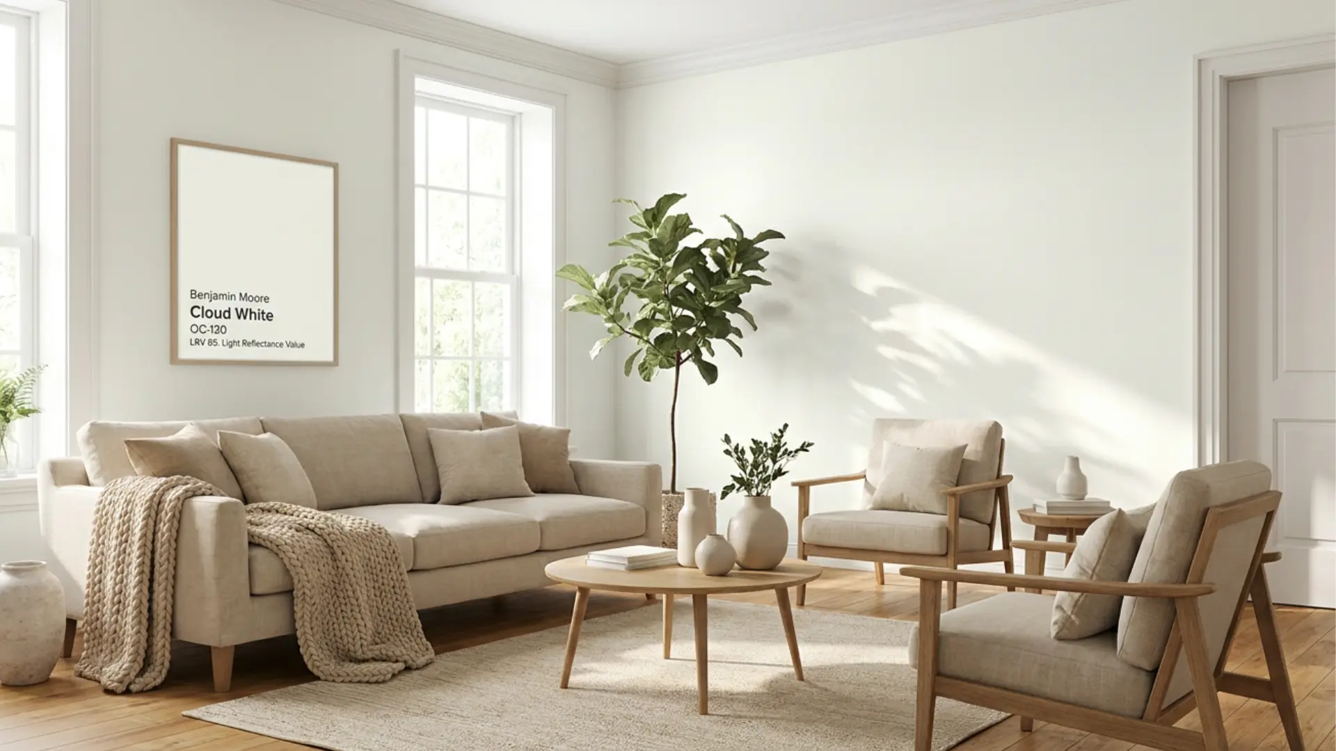
| Color Name | Cloud White OC-130 (also 967, CC-40) |
| Brand | Benjamin Moore |
| LRV | 85.05 — light, high-reflecting white |
| Undertones | Soft yellow, cream, subtle taupe |
| Best For | Warm-toned rooms with wood, brass, beige, or greige finishes; walls, trim, cabinets, ceilings |
| Avoid In | Rooms with cool gray floors, icy tile, blue-toned countertops, or very bright white trim |
Ever walked into a room and felt a white paint suddenly look yellow, dull, or too warm? I know how frustrating that can be when you expect a clean finish but get something totally different.
That’s where plan-a-garden Cloud White review choices often go wrong when lighting is ignored. You may be trying to pick the right white for walls, cabinets, or trim, but end up second-guessing everything.
I break down how cloud white benjamin moore behaves in real rooms, what its undertones really do, and where it works best or fails. You will learn how light, finishes, and surroundings change everything, so you can choose with confidence.c
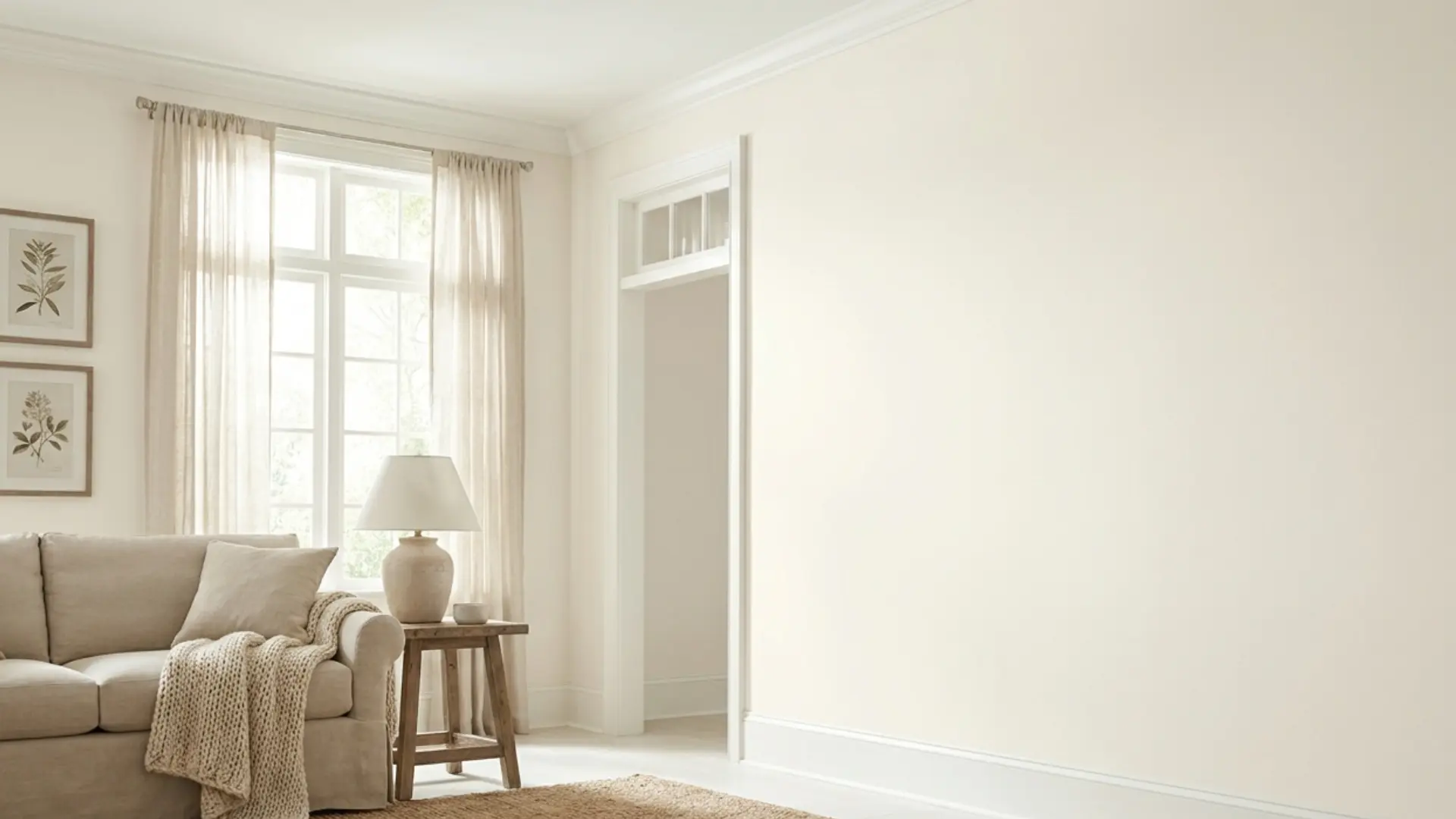
What Cloud White Benjamin Moore Actually Looks Like on a Wall
Benjamin Moore Cloud WhiteOC-130 is not a flat, clean white. It sits between crisp white and creamy off-white, with soft yellow, cream, and subtle taupe undertones that shift depending on your room’s lighting, bulbs, and finishes.
In a warm, well-lit room with wood floors and neutral furnishings, it reads as a fresh, settled white that feels bright without being stark.
Pull in cool gray tile or blue-toned countertops, and that warmth reads as dingy. That gap between how Cloud White looks on a chip and how it lands on your walls is the most important thing to understand before you buy.
If you’re considering Cloud White for walls, trim, cabinets, or ceilings, this review walks through exactly how it behaves — in every light condition, in every room type, and against every finish category where it succeeds or fails.
Cloud White Undertones: What They Are and When They Show Up
The undertone in Cloud White is a soft yellow with secondary notes of cream and taupe. It is not a heavy cream color, and it does not read as buttery or golden in most conditions. What keeps it from going strongly yellow is a neutral base that quiets the warmth down to something that feels balanced rather than saturated.
That yellow shows up in three specific situations: strong south or west-facing sunlight, warm incandescent or soft-white bulbs, and proximity to cool finishes.
When Cloud White sits beside a stark white appliance, cool gray floors, or bright white trim with blue undertones, the contrast pulls the yellow forward and makes Cloud White look creamier than it actually is. If the surrounding finishes are warm, that same yellow reads as a quiet, pleasant warmth.
This is the undertone behavior most paint reviews skip over: the color you see depends as much on what’s next to it as on the paint itself. Before committing to Cloud White in any room, hold a large sample against your flooring, trim, and any fixed countertop or tile. That context test tells you more in five minutes than any chip will.
| Pro Tip: If you’re using Cloud White on both walls and trim, keep them in the same color and vary only the sheen. Pairing Cloud White walls with a different white trim almost always pulls the yellow undertone forward in a way that reads unintentional. |
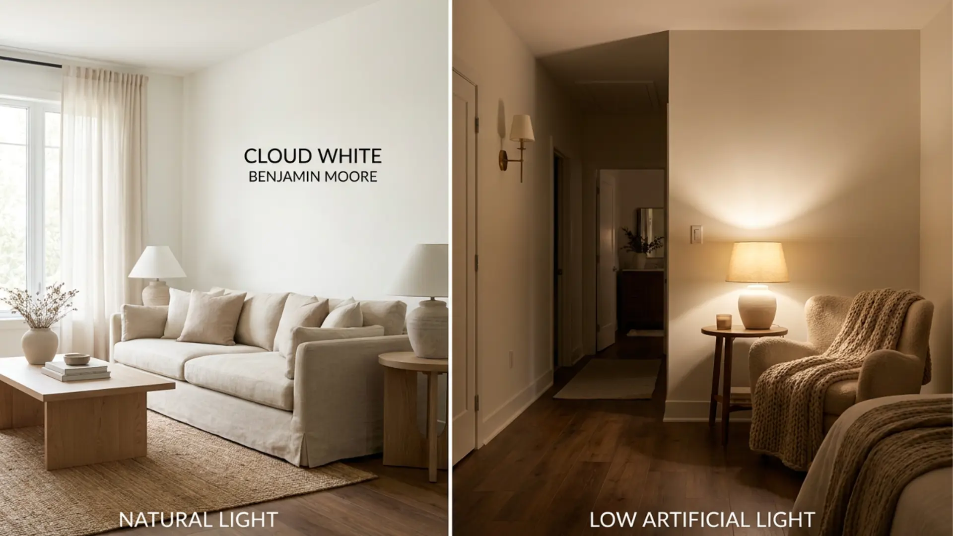
How Cloud White Behaves in Different Light Conditions
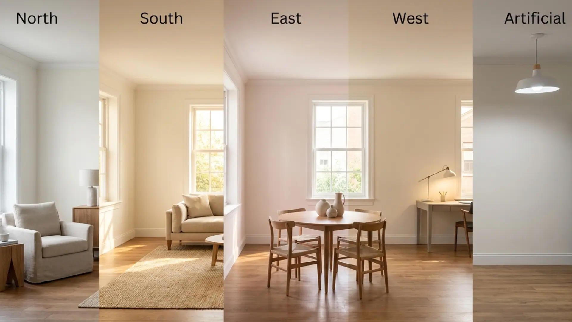
Light is what separates a color that works in a room from one that doesn’t. Cloud White’s warm base reacts differently across room orientations, times of day, and bulb types. Here is exactly what to expect in each condition.
- North-Facing Rooms: Cool northern light softens Cloud White, keeping it balanced and slightly warm. It works well in bedrooms and offices, but may show subtle yellow undertones with cool gray decor.
- South-Facing Rooms: Strong sunlight warms it significantly, making it look creamier and more lived-in. It may feel too warm if you want a crisp white.
- East-Facing Rooms: Morning light keeps it clean and fresh, while evenings turn it warmer. It suits kitchens and breakfast areas well.
- West-Facing Rooms: Afternoon light pushes warmth, sometimes making it look slightly yellow by evening—test under real lighting first.
- Artificial Lighting: Warm bulbs (2700K) increase yellow tones, while 3000K keeps the balance. Daylight bulbs (5000K+) can flatten warmth and make it look dull.
Where Cloud White Works Best and Where It Doesn’t
Cloud White is a genuinely versatile color, but it earns that reputation only in the right conditions. Here is the honest breakdown by surface and room type.
| Surface | How It Works | Sheen | Key Watch-Out |
| Walls | Warm, soft, feels bright without clinical sharpness | Eggshell or matte | Test against fixed flooring and trim before committing |
| Trim | Works when walls are also warm-toned, clashes with icy wall colors | Satin or semi-gloss | Don’t pair with a cool-white wall color; it reads yellow by contrast |
| Cabinets | Soft, warm kitchen or bath finish with good durability in the right product line | Satin or cabinet-grade | Avoid cool gray countertops or blue-toned tile |
| Ceilings | Softer alternative to stark white; keeps warm rooms cohesive | Flat | Best paired with warm wall colors; may look heavy with cool palettes |
| Doors and Trim Together | Seamless when matched to trim throughout | Satin or semi-gloss | Match to trim rather than walls for a clean read |
Changing sheen shifts how Cloud White reads without changing the color itself. A flat finish makes it look softer and slightly more muted; a semi-gloss brings out more brightness and can make the warm undertone more visible under direct light.
If you’re unsure whether the shade feels too creamy in your space, try stepping down one sheen level before reconsidering the color entirely. If you’re unsure which finish to reach for, how sheen affects color on different surfaces is worth understanding before you commit.
How Does Benjamin Moore Cloud White Read in Real Rooms?
Cloud White is not a flat or pure white. It has a warm base that can look soft, creamy, or slightly muted depending on the room.
Its LRV also plays a big role because it reflects plenty of light without feeling cold. Understanding these details helps you decide if Cloud White will look fresh, cozy, too creamy, or too warm in your space.
1. Living Room
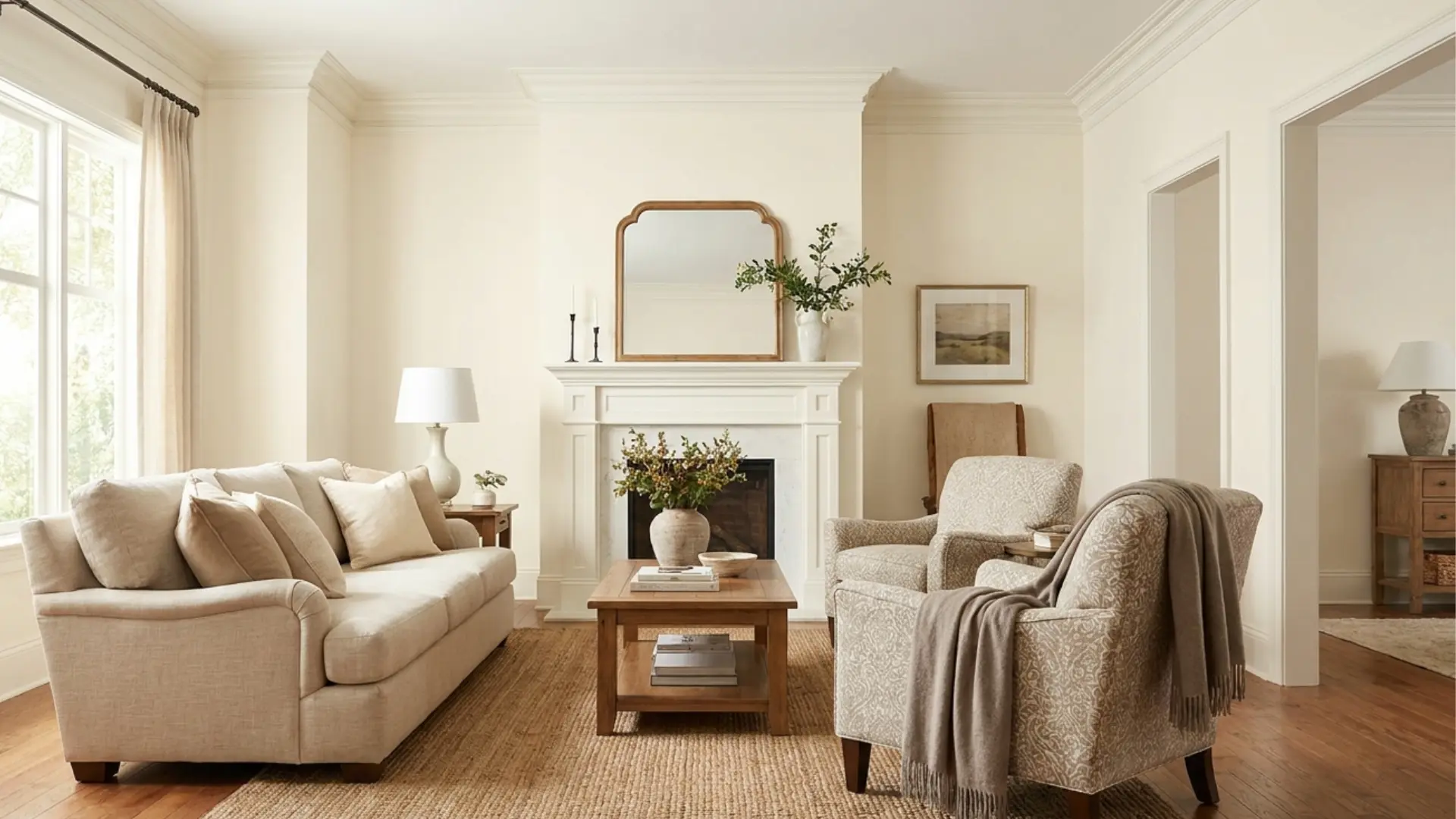
Benjamin Moore Cloud White has warm undertones with a gentle mix of cream, beige, and soft taupe. It does not look like an icy, blue-white paint color or a sharp gallery white.
Instead, it gives rooms a softer, warmer, and more comfortable feel while still keeping the space bright.
These undertones are why Cloud White often works well in traditional, transitional, farmhouse, and warm neutral homes. It feels clean, but it still has enough warmth to stop a room from looking cold.
2. South-Facing Room / Sunroom
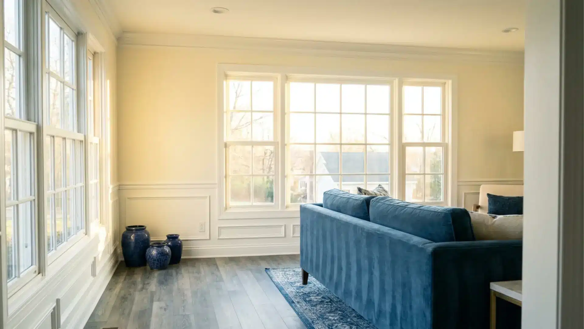
Cloud White can look more yellow or creamy in warm sunlight, especially in south-facing or west-facing rooms where the light gets stronger later in the day.
Yellow-toned bulbs can also bring out its creamy side and make the color feel warmer than expected.
It usually should not look strongly yellow on its own, but it may lean that way beside cool gray floors, stark white trim, or blue-based finishes. Testing it near your fixed finishes is the safest way to judge it.
3. Kitchen or Bathroom
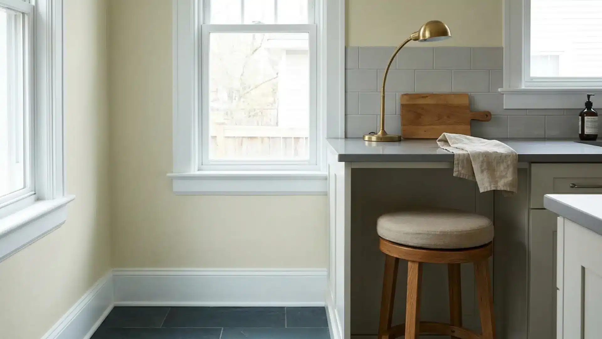
Cloud White can look dingy when it is placed beside very cool whites, icy tile, blue-gray flooring, or cold countertops.
Its warmth may look muted, dull, or slightly dirty when the surrounding finishes are too cool or too sharp. This does not mean Cloud White is a bad color.
It simply needs the right setting. It usually looks cleaner with warm wood, beige, greige, brass, soft taupe, and muted earthy colors. The rest of the room should support its warm base.
4. All Rooms / General Light
LRV means Light Reflectance Value, which tells you how much light a paint color reflects. Cloud White has an LRV around 85, so it reflects a strong amount of light and can help many rooms feel brighter.
That said, it is not a cold or sterile white. Its warm undertones soften the brightness, making it feel more relaxed.
This is why Cloud White can look cozy rather than crisp, even though it is still a light, reflective white paint color.
5. Bedrooms or Low-Light Spaces
Cloud White can work in dark rooms, but it will not brighten rooms with very little natural light.
In low-light spaces, it may look softer, warmer, and creamier instead of clean and crisp. This can feel cozy in bedrooms, laundry rooms, hallways, or small rooms without much sunlight.
Good artificial lighting matters here because bulbs can change how warm the paint appears. Test Cloud White with the same lighting you use every day before choosing it for a dark room.
6. Sunlit Areas / Open Spaces

Cloud White is usually not too white for sunny rooms. In bright south-facing or west-facing spaces, it often looks warm, bright, and welcoming.
Strong afternoon light can make it appear creamier, especially near warm wood floors, beige fabrics, or soft neutral finishes.
If you want a very crisp white, this warmth may feel too creamy. If you want a gentle white that feels calm and lived-in, sunny rooms can make Cloud White look beautiful. Sampling is still important before painting a full room.
7. Overall Takeaway

Cloud White is warm, soft, and bright enough for many homes. Its undertones can look creamy, beige, or slightly taupe depending on the light, bulbs, and nearby finishes.
It works best with warm or balanced materials, not very cool gray or blue-based finishes. Before using it on walls, trim, cabinets, or ceilings, test it in your own room during the day and at night. This helps you see whether it feels clean, cozy, too creamy, or too warm.
Coordinating Colors for Cloud White
Cloud White works best when the palette around it supports its warm base. The pairing choices below all share a warm or balanced undertone, nothing with a clear blue or cool gray base.
- Trim and ceiling white: If you use Cloud White on walls, keep the trim in Cloud White at a higher sheen. Switching to a different white almost always creates an unintended yellow contrast. If you want a white with more brightness on the trim, Benjamin Moore Simply White OC-117 is the closest step up in brightness while staying warm.
- Warm neutral walls to pair with Cloud White trim: Manchester Tan HC-81, Pale Oak OC-20 all share Cloud White’s warm undertone base. They read as greige or warm beige beside it rather than fighting it.
- Accent and furniture colors: Muted sage green, warm taupe, soft terracotta, and earthy rust all sit well against Cloud White. Brushed brass, unlacquered brass, and warm bronze hardware suit it better than polished chrome or brushed nickel, which tend to read cold against the warm base.
- Dark accent paints: Benjamin Moore Wrought Iron 2124-10 and Black Beauty 2128-10 give strong contrast without fighting Cloud White’s warmth. Onyx 2133-10 also works. Test these with your specific lighting; they can read slightly softer or harsher depending on the sheen and bulb type you use.
For rooms where the flooring drives the decision, the wall color with wood floors works through this pairing logic.
Benjamin Moore Cloud White vs. White Dove OC-17
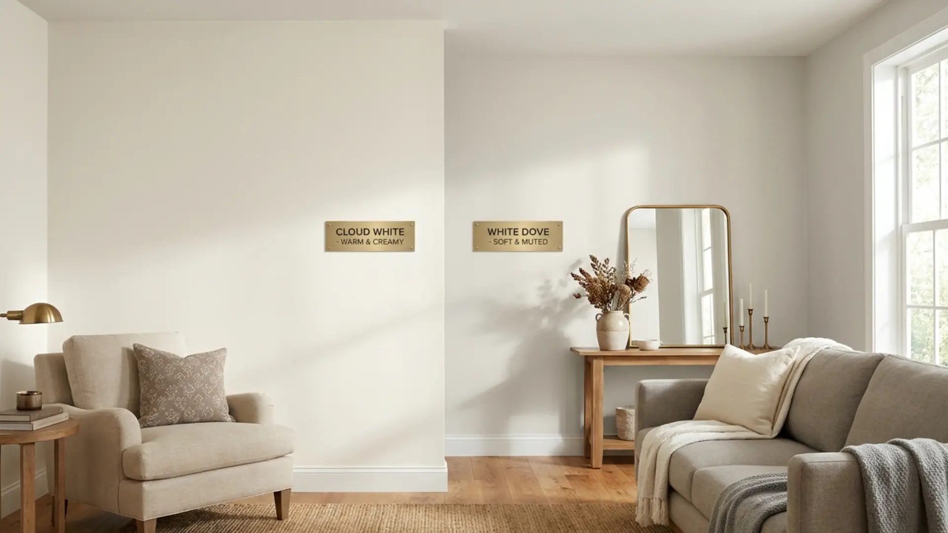
This is the comparison I hear most often, and the reason people stay stuck between them is that they look nearly identical on a chip. On a wall, the difference is real.
The gray component in White Dove’s muted undertone keeps it from reading as cream in most conditions, which is what gives it a softer, quieter quality than Cloud White. It sits at an LRV of approximately 85.38, making it slightly darker — a difference that is largely invisible on a chip but slightly more noticeable on four full walls.
Cloud White has a more forward warmth. The yellow in Cloud White is not grayed down the way White Dove’s is, which means it shows as cream a little more readily in warm light or beside cool finishes. In direct comparison, Cloud White reads just a touch more yellow; White Dove reads just a touch more muted and neutral.
The practical decision: choose Cloud White when you want a warm white with a clear, present warmth that feels cozy. Choose White Dove when you want a white that stays softer and more forgiving across a wider range of light conditions and finishes.
Both need to be sampled in your actual room; the chip difference is subtle enough that your specific lighting will decide the outcome.
Cloud White vs. Other Whites Worth Comparing
Cloud White becomes easier to understand when compared with a few key whites that people often consider for similar interior styles. These three comparisons show how warmth, brightness, and undertones shift in real room settings, helping you decide which white fits your space best.
1. Cloud White vs Sherwin-Williams Alabaster SW 7008

Alabaster is a soft, warm white with a muted, creamy appearance that feels calm and subtle in most interiors. It leans more toward a blend and is less defined, which can make it feel softer overall.
Cloud White, on the other hand, appears slightly brighter and more structured, with a clearer mix of cream, beige, and soft taupe undertones. Both are warm, but Cloud White offers a bit more contrast and clarity across changing natural and artificial lighting conditions.
2. Cloud White vs Benjamin Moore Swiss Coffee OC-45

Swiss Coffee is noticeably creamier and more beige-forward than Cloud White, giving it a softer, more relaxed appearance. It can feel warmer but also slightly heavier in certain lighting conditions.
Cloud White reads cleaner and more balanced, offering warmth without becoming overly creamy. This makes it a better choice when you want a fresh warm white that still feels bright and usable across walls, trim, and cabinetry without looking too muted or dull.
3. Cloud White vs Benjamin Moore Simply White OC-117
Simply White is a brighter, crisper white that leans closer to a clean, modern aesthetic with less visible warmth. It feels sharper and more reflective, especially in well-lit spaces.
Cloud White, in contrast, is softer and more grounded, with visible warm undertones that include cream, beige, and subtle taupe. This gives it a more traditional and cozy feel. Simply White suits clean, minimal spaces, while Cloud White suits warm, natural, and layered interiors better.
Where To Buy Benjamin Moore Cloud White
You can buy Benjamin Moore Cloud White through Benjamin Moore retailers, local paint stores, and online sample providers.
Peel-and-stick samples are helpful for early testing because you can move them around the room and check the color in different lighting before buying paint.
- Buy From Benjamin Moore Retailers: Start with an authorized Benjamin Moore retailer for the most reliable match. They can mix the correct color, explain product lines, and help you choose the right finish.
- Try Local Paint Stores: Many local paint stores carry Benjamin Moore or can help you order it. Provide the exact color name and number to avoid confusion with similar white paint colors.
- Official Website: Order from the Benjamin Moore Cloud White, where you can preview the color, estimate paint quantity, and schedule pickup or delivery.
- Choose The Right Product Line: Benjamin Moore offers different paint lines for different needs. Choose based on the surface you are painting, such as walls, trim, cabinets, bathrooms, or high-traffic spaces.
- Pick The Right Finish: The finish can change how Cloud White looks. Flat or matte works well for ceilings, eggshell suits walls, and satin or semi-gloss is better for trim, doors, and cabinets.
- Buy A Sample First: A sample helps you see how Cloud White reacts to your room’s light, flooring, counters, and existing trim. Test it in the morning, afternoon, evening, and at night.
- Do Not Trust Screen Color Alone: Cloud White can look different on phones, laptops, store images, and printed cards. Real lighting and nearby finishes matter much more than a digital preview.
Frequently Asked Questions
Can I ask another paint brand (like Sherwin-Williams or Behr) to color-match Cloud White?
It is highly recommended that you don’t. White paint colors are incredibly sensitive because they use very little tint. Every brand has a proprietary “base white” formula with its own unique undertones. When you try to cross-mix Cloud White into a different brand’s base, the formula often breaks down, resulting in an accidental muddy green or sickly pink undertone. To get the true color, stick to actual Benjamin Moore paint.
How does Cloud White look next to popular quartz countertops like Calacatta Gold vs. Carrara Marble?
It pairs beautifully with Calacatta Gold quartz because the warm, soft gold or brass-toned veining perfectly complements the paint’s soft cream base. However, you should avoid pairing it with classic Carrara Marble or cool, blue-veined quartz. The icy, gray-blue background of those stones will immediately clash with Cloud White, making your walls look slightly yellowed or dingy.
Is Cloud White a safe choice for staging a home to sell?
Yes, but only if your home leans warm. Cloud White creates an incredibly inviting, cozy, and “lived-in” luxury vibe that buyers love. However, if your home is being staged with ultra-modern, stark gray furniture or chrome accents, Cloud White will look out of place. For a completely foolproof, safer staging white that handles all furniture types, White Dove or Sherwin-Williams Alabaster are slightly safer bets.
Does Cloud White work for a modern “Japandi” or minimalist design style?
Absolutely. While many modern minimalist spaces default to cold, clinical gallery whites, the Japandi style (a blend of Japanese and Scandinavian design) relies heavily on warmth, raw white oak, canvas textiles, and earthy elements. Cloud White serves as the perfect backdrop for this look because it softens the straight lines of minimalist architecture without making the space feel sterile.
Will Cloud White yellow over time as it ages on the wall?
Modern high-quality latex formulas from Benjamin Moore do not yellow or oxidize over time the way old oil-based paints used to. If your walls look yellow three years from now, it isn’t the paint changing color—it is likely due to UV exposure fading your flooring and fabrics, which shifts how the light bounces around the room and alters your visual perception of the wall.
Final Thoughts
Cloud White Benjamin Moore is not just another white paint; it is a warm, shifting color that reacts strongly to light, finishes, and surrounding materials.
I’ve shown you how it can feel soft and inviting in some rooms while turning too creamy in others.
You now understand its undertones, lighting behavior, and where it fits best in real homes. This matters because the wrong white can change the entire mood of a space and lead to costly repainting.
When you think about plan-a-garden Cloud White decisions for your home palette, you start making smarter, more confident choices.
Try a sample in your space, observe it at different times of day, and see how it truly behaves before you commit.


