


| Color Name | White Dove (OC-17 / PM-19) |
| Brand | Benjamin Moore |
| LRV | 83.16 — high, reads as a true white in bright rooms |
| Undertones | Soft yellow-gray, reads warmer in low light and cooler in strong north-facing light |
| Best For | Walls, trim, cabinets, ceilings, south- and east-facing rooms |
| Avoid In | North-facing rooms with cool gray or blue tones, next to bright white trim |
Benjamin Moore White Dove is the kind of white people search for when they want a soft, clean paint color that doesn’t feel cold or too creamy. It has a warm, calm look that works well in many homes, which is why I understand you’re looking at it more closely before choosing a sample.
I’ve seen how tricky white paint can be because it shifts a lot with lighting, trim, flooring, and nearby colors. A shade that looks perfect online may feel different on the wall.
You’ll see how the color behaves, where it works best, what undertones to expect, and what to check before using it in your space, so the final choice feels more confident.
What Benjamin Moore White Dove Actually Looks Like in a Real Room
White Dove OC-17 reads as a clean, soft white in a well-lit room. Put it in a north-facing space with cool gray furniture, and that yellow-gray undertone surfaces in a way that reads flat rather than fresh.
That shift is the most important thing to understand before you order a sample. It is not a flaw in the color. It is the color telling you something specific about your room.
White Dove sits in Benjamin Moore’s Off-White Collection under the code OC-17, also listed as PM-19. Its LRV of 83.16 puts it firmly in white territory, not cream. In bright rooms, it reflects light cleanly and holds its softness without reading yellow.
In lower light, it shows more warmth, which is exactly what most people are looking for when they choose it for living rooms and kitchens. It has been one of Benjamin Moore’s most consistent performers precisely because that range is useful.
White Dove Undertones: Yellow-Gray, Not Yellow

The undertone of White Dove is a muted yellow-gray. This is different from a straightforwardly creamy white like Alabaster, which pulls clearly warm. White Dove’s gray component keeps it from reading as butter or cream in most conditions.
The yellow is present but grayed out, which is why it can feel neutral one moment and slightly warm the next, depending on where you are in the room and what time of day it is.
What causes problems is pairing it with colors that have a strong cool bias. Cool slate floors, blue-gray cabinetry, or stark white trim will make the yellow in White Dove visible in a way it wouldn’t be otherwise.
Understanding how undertones interact with decor before committing saves you a repaint. The undertone interaction matters more than the swatch on its own.
| Pro Tip: Paint a large sample board (at least 12×12 inches) and move it to different walls in the room. The undertone shifts more than you’d expect between a north wall at 7 am and a south wall at noon. |
That undertone behavior directly affects how White Dove reads under different lighting conditions, which is the next thing worth mapping out carefully.
How White Dove Looks in Different Room Directions
White Dove changes noticeably with natural light. Room direction affects whether it looks bright, muted, warm, or creamy, so testing samples at different times matters before painting.
| Room Direction | How White Dove Looks | Best Tip |
|---|---|---|
| North-Facing Rooms | Looks softer and more muted, sometimes closer to greige than white. Cool gray or slate tones can make the yellow undertone more noticeable. | Test carefully, especially with cool flooring or furniture. A warmer white like Alabaster SW 7008 may work better. |
| South-Facing Rooms | Looks clean, bright, and balanced. Warm natural light keeps the yellow-gray undertone from feeling too strong. | Best direction for White Dove, especially in open kitchens, living rooms, trim, and cabinets. |
| East-Facing Rooms | Feels warm and inviting in morning light, then becomes calmer and more neutral later in the day. | Works well in bedrooms because the color shifts gently with daylight. |
| West-Facing Rooms | Afternoon sun adds warmth and may push White Dove toward cream, especially near yellow-toned wood or stone. | Test samples around 3 PM and 5 PM, not just in the morning light. |
White Dove works best when its undertones match the room’s light and materials. Always compare it beside flooring, furniture, and trim before deciding on the final paint choice.
Choosing the Right Finish for White Dove
The finish changes both how the color looks and how the surface performs. Flatter finishes read softer. Glossier finishes reflect more light, which makes the color appear marginally brighter and slightly more saturated.
If you are deciding between Satin and Semi-Gloss for trim or cabinets, the difference between satin and semi-gloss comes down to sheen level and how much traffic the surface gets.
| Finish | Best For | Why It Works |
|---|---|---|
| Matte | Bedrooms, low-traffic walls | Softest look, minimal sheen, hides imperfections |
| Eggshell | Living rooms, hallways, family rooms | Balanced softness with enough durability for regular cleaning |
| Satin | Trim, doors, bathrooms, kitchens | Washable, reflects light gently, holds up in higher-humidity spaces |
| Semi-Gloss | Cabinets, doors, trim | Most durable option, easy to clean, slight brightening effect |
One rule worth following: never use Flat or Matte finish in bathrooms. Without the right sheen, moisture marks accumulate and the surface cannot be wiped down effectively. Satin or Semi-Gloss are the correct choices for any space with humidity.
White Dove vs Alabaster: Which One Is Right for Your Room?
These two colors come up together constantly. They are not the same white, and the difference is meaningful depending on your room’s light.
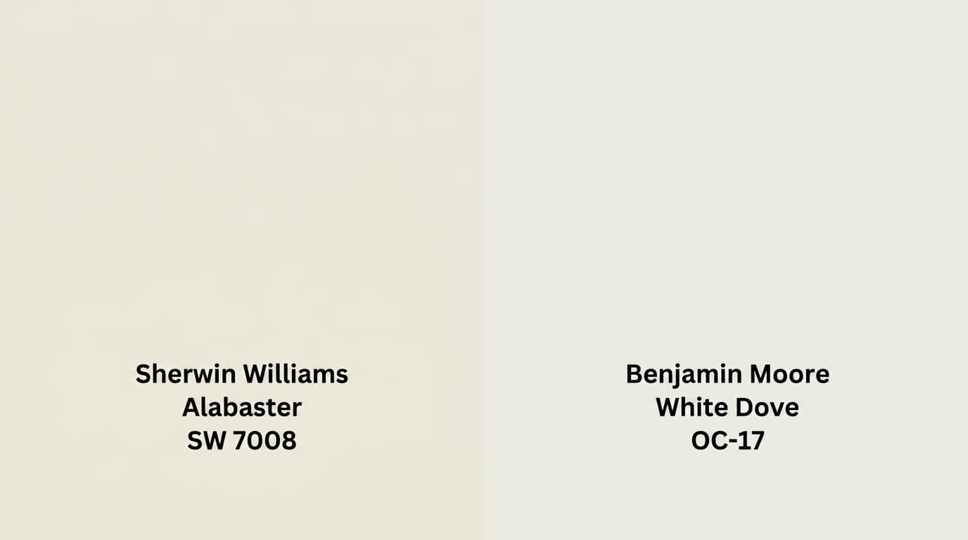
| Feature | White Dove OC-17 (Benjamin Moore) | Alabaster SW 7008 (Sherwin-Williams) |
|---|---|---|
| LRV | 83.16 | 82 |
| Undertones | Soft yellow-gray, balanced | Warm, clearly creamy |
| Look | Muted warmth, reads closer to true white | Cozy warmth, reads off-white |
| Best For | Trim, walls, cabinets, classic and contemporary spaces | Walls, cabinets, farmhouse, and traditional spaces |
| Potential Risk | Can read flat or muted in cool north-facing light | May read as overly creamy in very bright rooms |
Choose White Dove when you want something that reads as a true white in bright conditions but has enough warmth to avoid feeling clinical.
Choose Alabaster when you want a consciously cozy, warmer result: farmhouse kitchens, traditional living rooms, spaces with rich wood tones. Both are reliable. The right choice comes down to your room’s light, not the color’s popularity.
What Users Discuss About Benjamin Moore White Dove
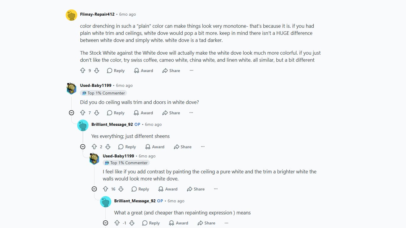
A Reddit user posted about White Dove looking “soo grey and flat” in their home and asked if anyone else experienced the same. They said it wasn’t giving the warm, creamy feel they expected and looked inconsistent in different rooms.
Commenters suggested that underlying grey furniture, stone walls, and cool lighting were pulling out grey undertones. People recommended adding contrast by painting ceilings and trim a purer white, which can help White Dove pop more, or switching to warmer whites like Swiss Coffee or Medici Ivory.
Others discussed how lighting, bulb warmth, and surrounding colors affect how White Dove appears and advised testing in various conditions before deciding on a repaint.
Where White Dove Works Best: Room by Room
1. Living Room
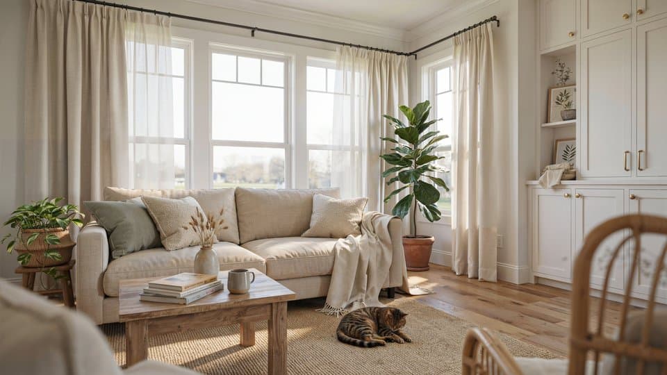
In living rooms with good natural light, White Dove reads open and fresh without the sharpness of a true white like Chantilly Lace. It provides a backdrop that lets furniture and textiles do the work.
Pair it with wood floors, linen curtains, and neutral sofas for a calm palette. For rooms that need more definition, add navy, charcoal, olive, or black in accents. Those darker tones stop the white from feeling flat without fighting it.
2. Kitchen Cabinets
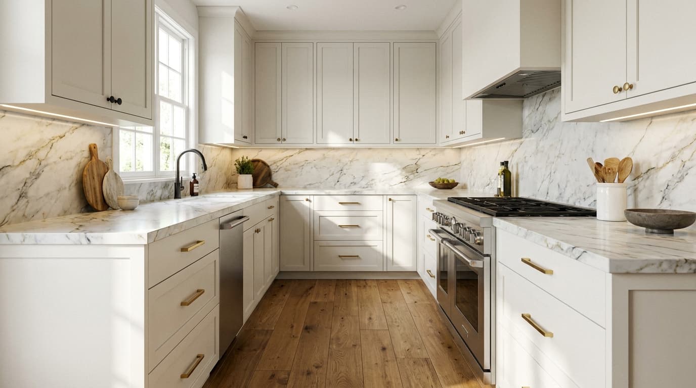
White Dove is a strong cabinet color because it reads clean without the sharpness that makes some kitchens feel cold. Satin or Semi-Gloss finishes are the right call here: easier to clean and durable enough for a busy kitchen. It pairs well with brass hardware, matte black fixtures, and brushed nickel.
If you are working toward a minimalist kitchen design, White Dove cabinets keep the palette restrained without going stark. Test it beside your backsplash first. If your tile is a very cool white or blue-gray, White Dove will read noticeably warmer against it, which may or may not be what you want.
3. Bedroom
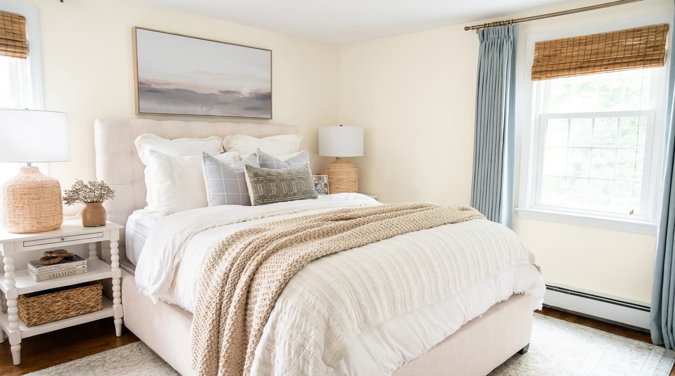
In bedrooms, White Dove creates a calm backdrop that feels warm rather than sterile. Its softness works with warm lamps, natural textures, and layered bedding.
If you are choosing between warm whites and deeper tones, the best bedroom colors for coziness tend to be those that hold warmth without going heavy, which is exactly where White Dove lands.
Pair it with dusty pink, sage green, warm gray, or muted blue. Avoid stark white bedding or bright white trim alongside it: that contrast tends to make White Dove look yellow or slightly dingy rather than intentionally warm.
4. Bathroom
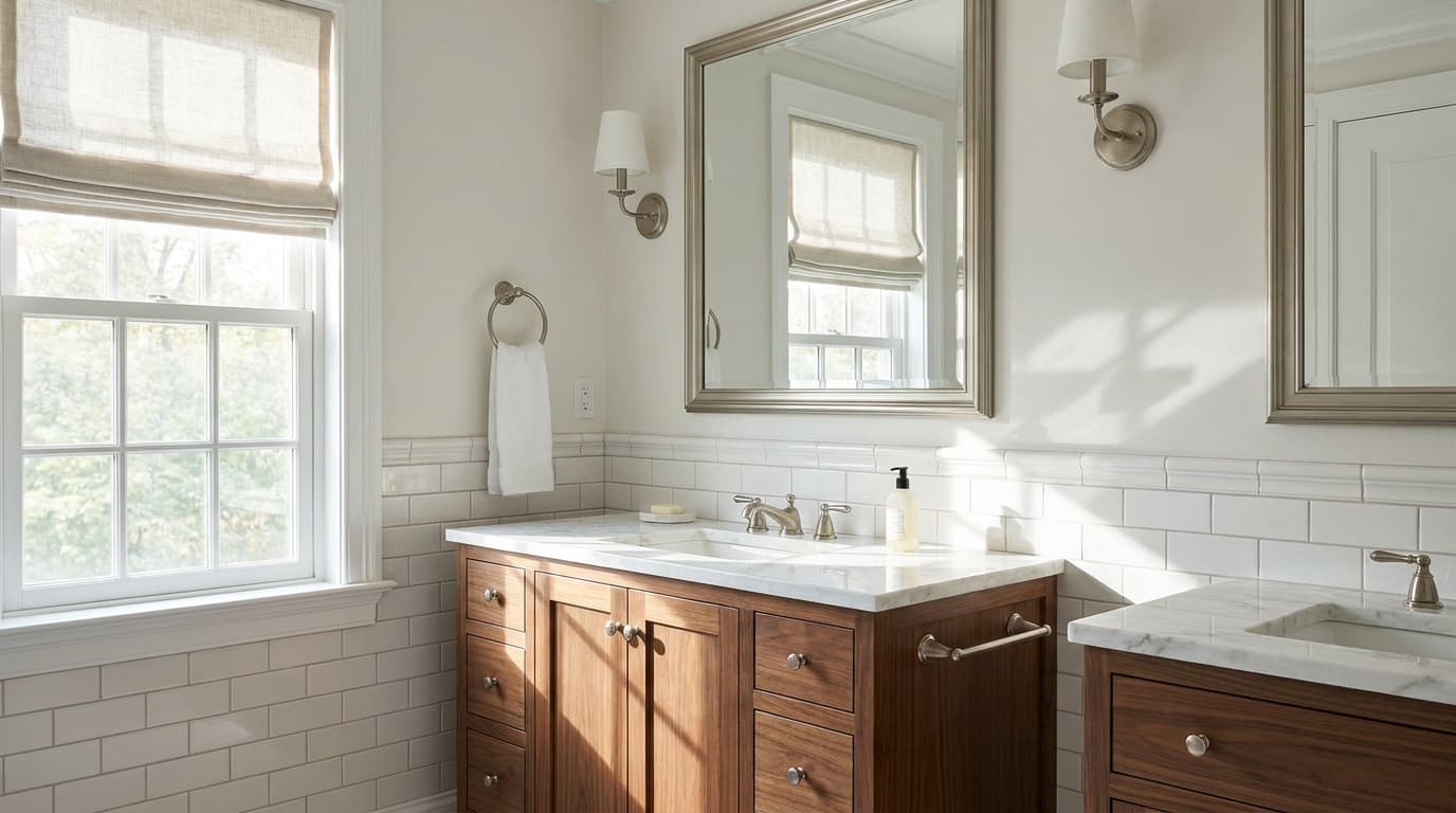
White Dove reflects light well in bathrooms and keeps small spaces from feeling harsh. Use Semi-Gloss on walls for moisture resistance and a surface that can actually be wiped down.
High-Gloss on trim gives a crisp finish. It pairs nicely with marble, warm wood vanities, brass mirrors, and soft gray stone. Check your tile before committing: cool white subway tile will make White Dove appear warmer by contrast.
5. Exterior
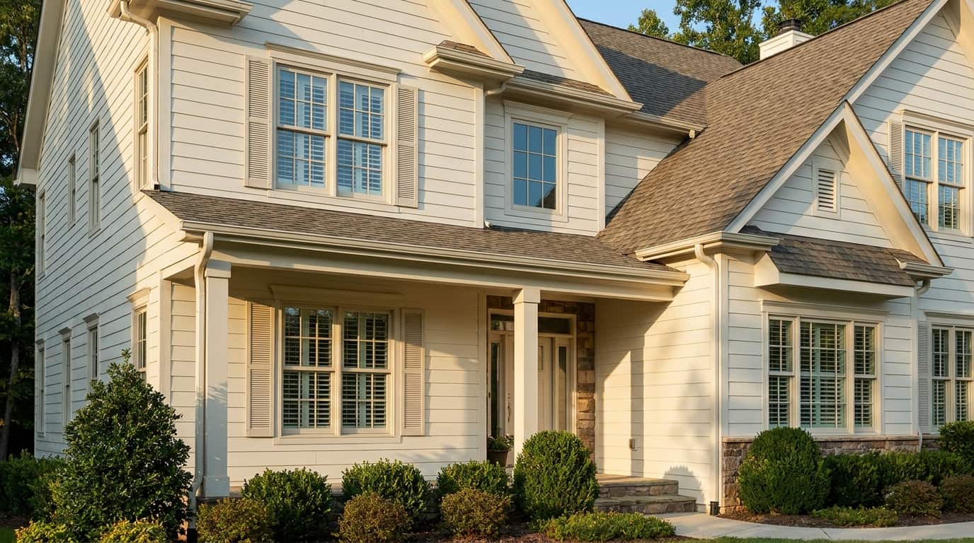
Outdoors, White Dove reads clean in sunlight without the glare of a true white. It works particularly well on trim against greige, navy, deep green, charcoal, or warm beige siding.
As a full exterior color, it gives a home a soft, classic look. Note that outdoor light is stronger than indoor light, so the color will read lighter than your interior samples. In harsh sun or weather, it can also show dirt and wear sooner than darker colors.
Colors That Work With White Dove
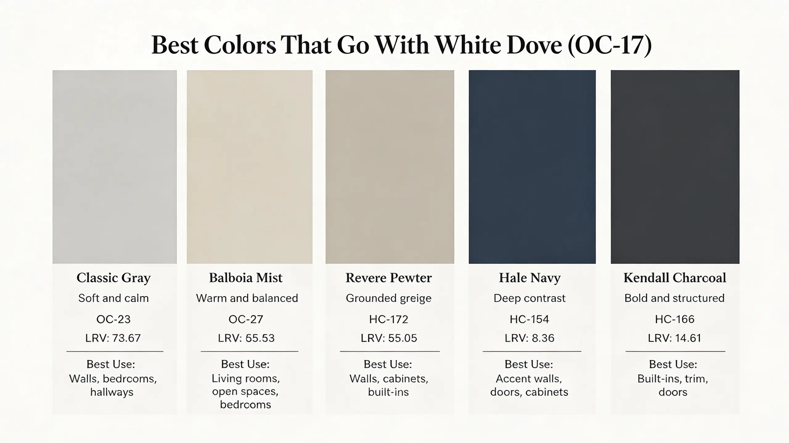
White Dove pairs best with colors that either support its warmth, provide gentle contrast, or add depth without making the palette feel sharp or competing.
| Coordinating Color | Color Code | LRV | Best Use |
|---|---|---|---|
| Classic Gray | OC-23 | 73.67 | Walls, bedrooms, hallways |
| Balboa Mist | OC-27 | 65.53 | Living rooms, open-plan spaces, bedrooms |
| Revere Pewter | HC-172 | 55.05 | Walls, cabinets, built-ins |
| Hale Navy | HC-154 | 8.36 | Accent walls, doors, cabinets |
| Kendall Charcoal | HC-166 | 14.61 | Built-ins, trim, doors |
Test these pairings with White Dove in both natural and artificial light before committing. Soft neutrals keep the palette calm, darker shades add structure, and earthy tones reinforce the warmth without fighting it.
When You Should Not Use White Dove
White Dove is not the right answer for every space. Being specific about where it fails will save you a repaint.
- North-facing or low-light rooms: The gray undertone takes over, and the color reads flat or slightly dirty. A warmer white like Alabaster SW 7008 holds up better here.
- Rooms where you want a crisp, true white: White Dove is an off-white. For sharp, minimalist spaces, Chantilly Lace OC-65 is the more appropriate choice.
- Rooms dominated by cool gray or blue tones: The yellow undertone will quietly conflict with cool slate floors, gray stone, or blue-gray cabinetry, making the whole palette look slightly off.
- Spaces where existing trim is already bright white: The contrast will make White Dove walls look yellowed rather than intentionally warm. Repainting the trim is necessary to make it work.
- Bathrooms painted in Flat or Matte finish: Poor ventilation plus the wrong finish means moisture damage and no way to clean the surface properly. Satin or Semi-Gloss are the correct choices for any high-humidity room.
- Tight budgets: Benjamin Moore is premium-priced. If you want to understand the full cost before committing, it helps to know how much painting a house costs before you factor in premium paint at the higher end of that range.
How to Sample White Dove Before You Commit
Testing properly is the difference between a confident decision and an expensive mistake.
- Peel-and-stick samples: Place on different walls at different heights. View them at 7 am, noon, and 7 pm to see the full range of the color’s behavior.
- Painted sample boards: A 12×12-inch board you can move around the room gives a more accurate read than a fixed swatch, particularly next to cabinetry or flooring.
- Test at least two spots: One in the room’s brightest area and one in the darkest corner. The gap between those readings tells you how much the color will shift.
- Use the actual finish: Matte and Semi-Gloss read as noticeably different colors. Test in the sheen you plan to use, not just what’s on the sample card.
- Step back six feet: Undertones are more visible from a distance than up close. Read the sample from across the room, not just from arm’s length.
Sampling White Dove this way takes about a week but avoids the cost and frustration of repainting a room that wasn’t tested correctly.
A Note on “SW White Dove”
A large number of searches use the phrase “SW White Dove,” expecting to find a Sherwin-Williams product. Sherwin-Williams does not make a paint called White Dove.
The color belongs entirely to Benjamin Moore (OC-17). If you are working within the Sherwin-Williams range and want something similar, the closest options are Alabaster SW 7008 for a warmer version, Extra White SW 7006 for a brighter and crisper match, or Shoji White SW 7042 for something slightly more muted. None of these are exact dupes.
White Dove’s specific undertone balance is particular to its Benjamin Moore formulation.
Frequently Asked Questions About Benjamin Moore White Dove
These are the questions I hear most often from people who already have the chip on their wall and still aren’t sure what they’re looking at.
Is Benjamin Moore White Dove warm or cool?
White Dove is warm. Its yellow-gray undertone places it on the warm side of the white spectrum, though it is far more balanced than a clearly creamy white like Alabaster. In strong cool light it can read neutral, but it never reads cool.
Does White Dove look yellow on walls?
It can, in specific conditions: strong afternoon light, warm incandescent bulbs, or placement next to bright white trim. In balanced natural light it reads as soft white, not yellow. Sampling at different times of day in your specific room tells you whether yellow is going to be a problem for your space.
What is the LRV of Benjamin Moore White Dove?
White Dove has an LRV of 83.16 according to Benjamin Moore’s official specs. That places it firmly in white territory, lighter than most off-whites, which is why it reads as a true white in bright rooms rather than cream.
Is White Dove good for trim?
Yes. White Dove works particularly well on trim in rooms where the walls are a warm neutral or a deeper color. Its softness prevents trim from looking harsh or stark. Pair it with walls in Balboa Mist OC-27 or Classic Gray OC-23 for a tonal approach that reads calm and cohesive.
What colors go with Benjamin Moore White Dove?
Hale Navy HC-154, Kendall Charcoal HC-166, Classic Gray OC-23, Balboa Mist OC-27, and Revere Pewter HC-172 are all reliable pairings. Warm neutrals and deep contrast colors work best. Cool grays and blue-toned palettes tend to conflict with its yellow undertone.
How does White Dove compare to Chantilly Lace?
Chantilly Lace OC-65 is a crisp, near-true white with no meaningful undertone. White Dove is warmer and softer with an LRV about five points lower. Use Chantilly Lace for sharp, contemporary spaces that need brightness without warmth. Use White Dove when you want softness alongside that brightness.
Can White Dove be used on kitchen cabinets?
Yes, and it performs well there. Its softness keeps kitchens from feeling clinical. Use Satin or Semi-Gloss for durability and cleanability. Test beside your countertop and backsplash before committing, since very cool tile can make the cabinet color read warmer than expected.
Final Thoughts
White Dove is more than just a soft white; it’s a color that adapts to your space and lighting. I’ve shared how its undertones, LRV, and finishes affect walls, trim, cabinets, and exteriors.
You’ve also seen how to sample it the right way, explore complementary colors, and understand when it may not be the best choice. By paying attention to lighting, pairing it thoughtfully, and testing properly, you can make sure your rooms feel balanced, warm, and inviting.
I’ve found that seeing it in your own space changes everything. Try these tips yourself, and let me know in the comments how White Dove works in your home.


