


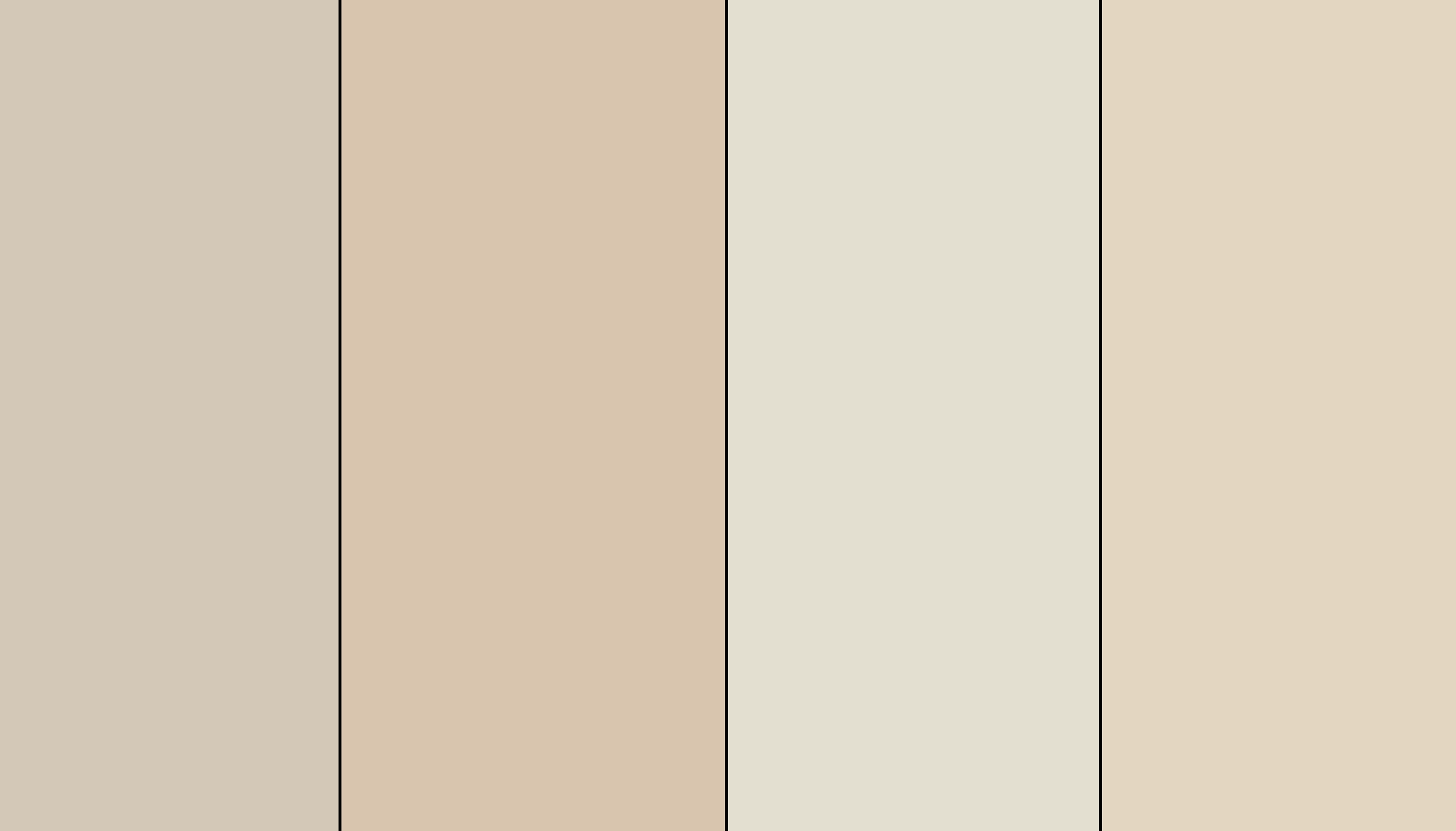
| Detail | Value |
| Color Name | Natural Linen |
| Code | SW 9109 |
| Brand | Sherwin-Williams |
| LRV | 66 |
| HEX | #DFD3C3 |
| Color Family | Warm yellow/beige neutral |
| Color Temperature | Warm |
| Undertones | Warm beige, greige, soft cream, possible peach-pink shift |
When people choose a warm neutral, the worry is almost always the same: will it look too yellow, too peachy, too beige, or too bland once it is on the wall?
I have had that exact conversation more times than I can count. People bring in a chip that looks soft and airy in the store, paint a room over the weekend, and call me Monday morning wondering why it looks nothing like they expected.
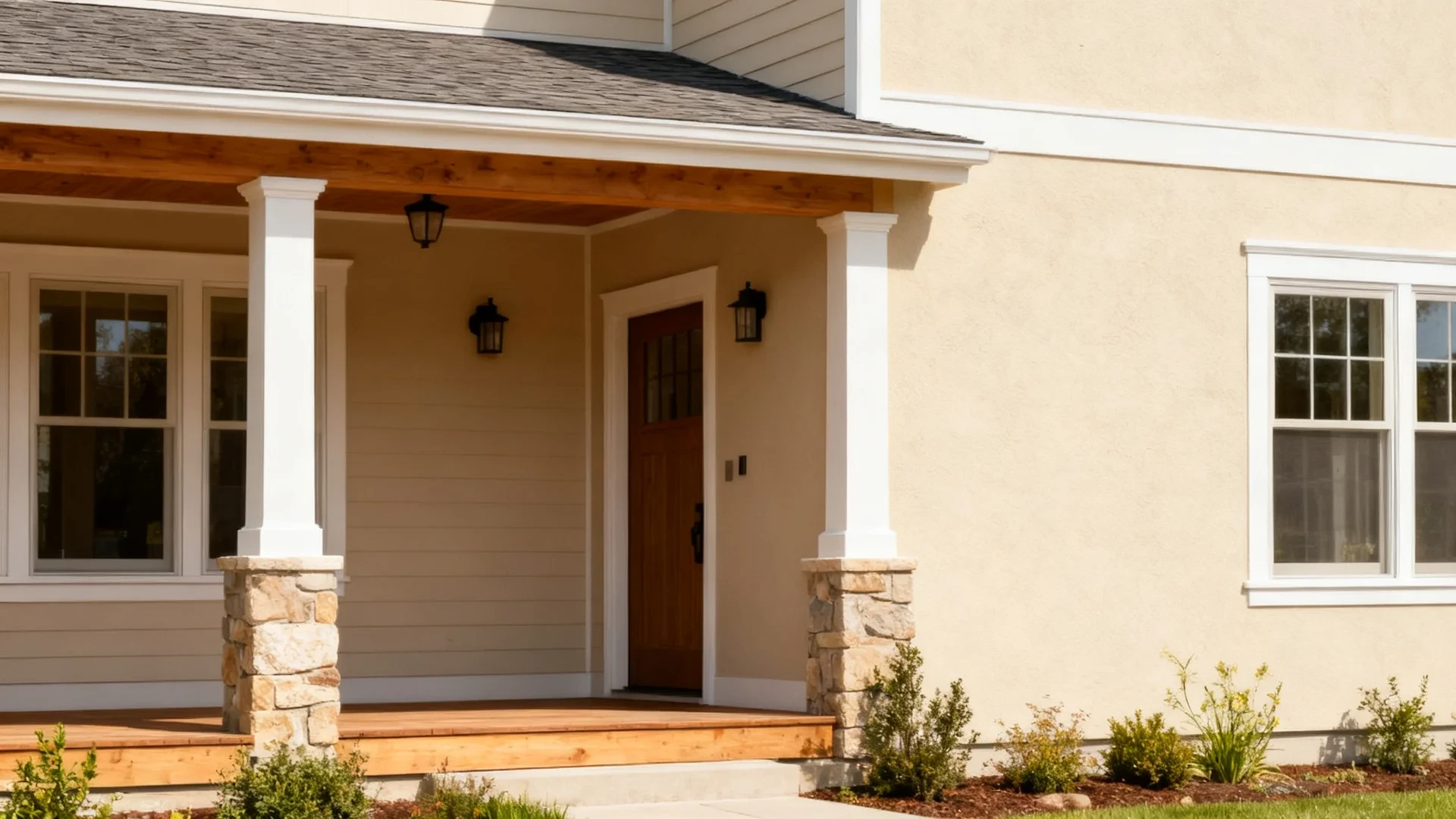
Sherwin Williams Natural Linen is that kind of color. It sits between beige, cream, and soft greige, which is exactly why it is popular for whole-home palettes, bedrooms, living rooms, kitchens, and exteriors. It looks calm and neutral on a chip.
On the wall, it has enough warmth and undertone movement to behave differently depending on the light in your room. This review covers undertones, lighting shifts, finishes, room use, proper testing, and which colors pair well with it.
What is Sherwin-Williams Natural Linen SW 9109?

Sherwin Williams Natural Linen SW 9109 is a light warm neutral from Sherwin-Williams’ yellow paint color family. Sherwin-Williams describes it as a light, warm neutral with a subtle breezy feel and a greige undertone.
It sits between beige, cream, and soft greige, which makes it useful when white feels too stark but a deeper beige feels too heavy.
With an LRV of 66, Natural Linen sits in a light-to-medium range. It reflects enough light to keep rooms feeling open, but it still gives walls warmth and body. It is neither crisp white nor heavy beige. That middle position is what makes it useful across room types and design styles.
Natural Linen looks easy on paper, but the undertones decide whether it feels soft, warm, peachy, or slightly dull in your room.
What Undertones Does SW 9109 Have?
Sherwin-Williams Natural Linen has warm beige and greige undertones, with a soft cream base. In some lighting, it can also show a slight peach or pink warmth that catches people off guard.
Lighting plays a major role in how Natural Linen reads. Its warmth is the reason people are drawn to it, but that same warmth can shift depending on whether the room has cool light, warm flooring, or certain bulb temperatures.
Natural Light
Natural Linen reacts strongly to the direction of sunlight. In brighter rooms, it can feel airy and soft. In cooler rooms, the greige side becomes more noticeable, and the color settles into something more muted and neutral.
North-Facing Rooms: Natural Linen can look more muted and slightly greige in north-facing rooms. Use warm bulbs and lighter trim to keep it from feeling flat.
South-Facing Rooms: South-facing light brings out Natural Linen’s warm beige and cream side. Be careful with orange or golden wood floors; make the color look peachier.
East-Facing Rooms: Morning light makes Natural Linen feel soft and fresh. Later in the day, it settles into a calmer beige-greige.
West-Facing Rooms: Afternoon light makes Natural Linen look warmer and richer. If you dislike peach or golden undertones, test it late in the day.
Artificial Light
Warm bulbs in the 2700K to 3000K range make Natural Linen feel cozy and warm, bringing out the beige quality. Cool bulbs at 4000K or above can pull the greige side forward and make it look less warm and more neutral gray-beige.
Strong yellow bulbs may push the color too far toward creamy or peachy, so test with your actual bulbs before deciding. If your lighting is the variable you are unsure about, comparing cool white and daylight bulbs first will save you a repaint later.
Once the undertones are clear, the next step is choosing the right finish so the color performs well on the surface.
What Paint Finish Should You Use for Natural Linen?
Finish affects how much light reflects from the wall. Natural Linen in matte will look softer and more muted. In satin, it may look slightly cleaner and warmer. Choosing the right sheen based on the surface and room type makes a real difference in the final result.
- Flat / Matte: Best for ceilings and low-traffic walls. It gives Natural Linen its softest look but is not ideal for busy rooms where cleaning the walls regularly is part of daily life.
- Eggshell: Best for living rooms, bedrooms, dining rooms, and most walls. It keeps the color balanced, easy to clean, and true to its warm beige quality without adding noticeable sheen.
- Satin: Best for kitchens, bathrooms, hallways, and laundry rooms. It adds durability and a little more light reflection, which helps Natural Linen stay bright in rooms with more moisture or traffic.
- Semi-Gloss: Best for trim, doors, and cabinets. It gives a sharper definition and a harder surface, but is too reflective for most walls.
- High Gloss: Best for small accents only. It can make Natural Linen look deeper and shinier than most rooms need.
My usual recommendation is eggshell for most walls, satin for busy rooms, and semi-gloss for trim or cabinets. A quick read on how paint sheens work makes the matte versus satin call much easier.
How Does Sherwin Williams Natural Linen Look in Different Rooms?
Natural Linen can work in many rooms, but the room’s lighting and fixed finishes determine whether it feels warm and soft or too creamy. Here is what to expect in the most common spaces.
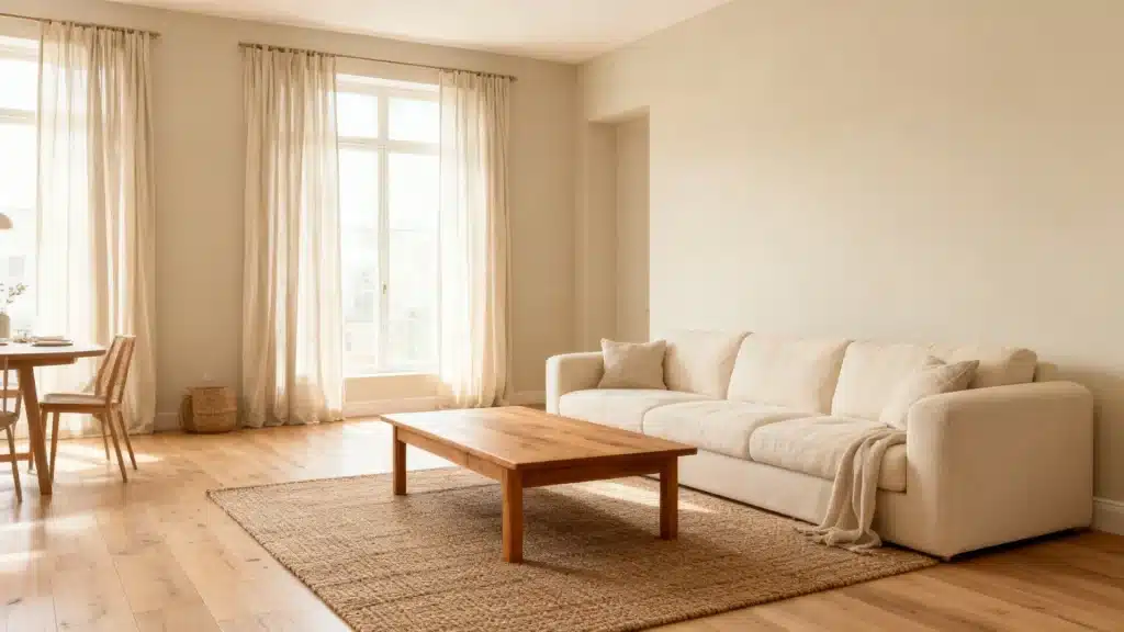
1. Living Rooms
Natural Linen works well in living rooms with light wood furniture, woven textures, cream upholstery, linen curtains, and warm ambient lighting. It adds enough warmth to make the space feel settled without making it heavy.
It suits transitional, modern farmhouse, coastal, traditional, and soft organic spaces particularly well. Pair it with a warm white trim, and the combination reads clean, grounded, and intentional.
2. Bedrooms
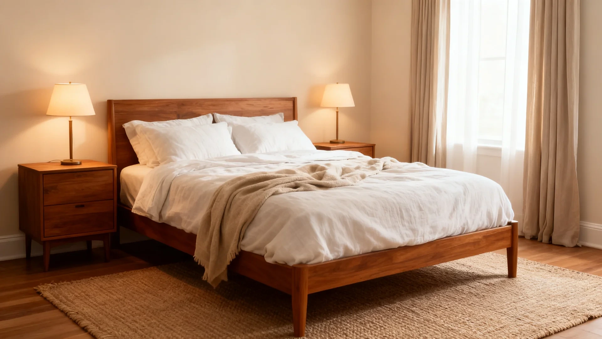
In bedrooms, Natural Linen creates a restful, warm backdrop. It pairs well with white or soft linen bedding, warm wood nightstands, natural fabrics, and soft lamps that create a gentle glow.
Avoid pairing it with icy gray bedding or cool blue-white trim because the warmth of the walls can look uneven or disconnected against those cooler elements.
3. Kitchens
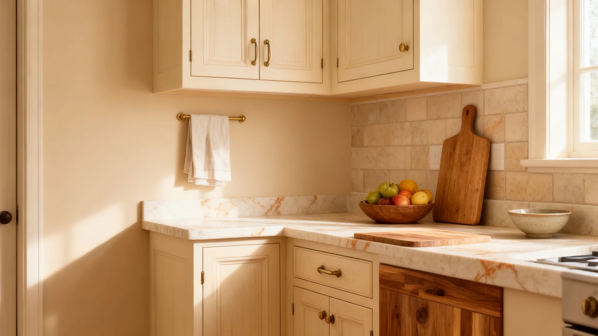
On kitchen walls, Natural Linen works well beside warm wood cabinets, cream cabinets, light stone, butcher block countertops, and brass hardware. It brings a soft warmth to the kitchen without competing with the materials around it.
If the kitchen has cool white quartz, gray tile, or chrome-heavy finishes, test Natural Linen carefully first because the warmth in the color can clash visually with a very cool room.
4. Cabinets
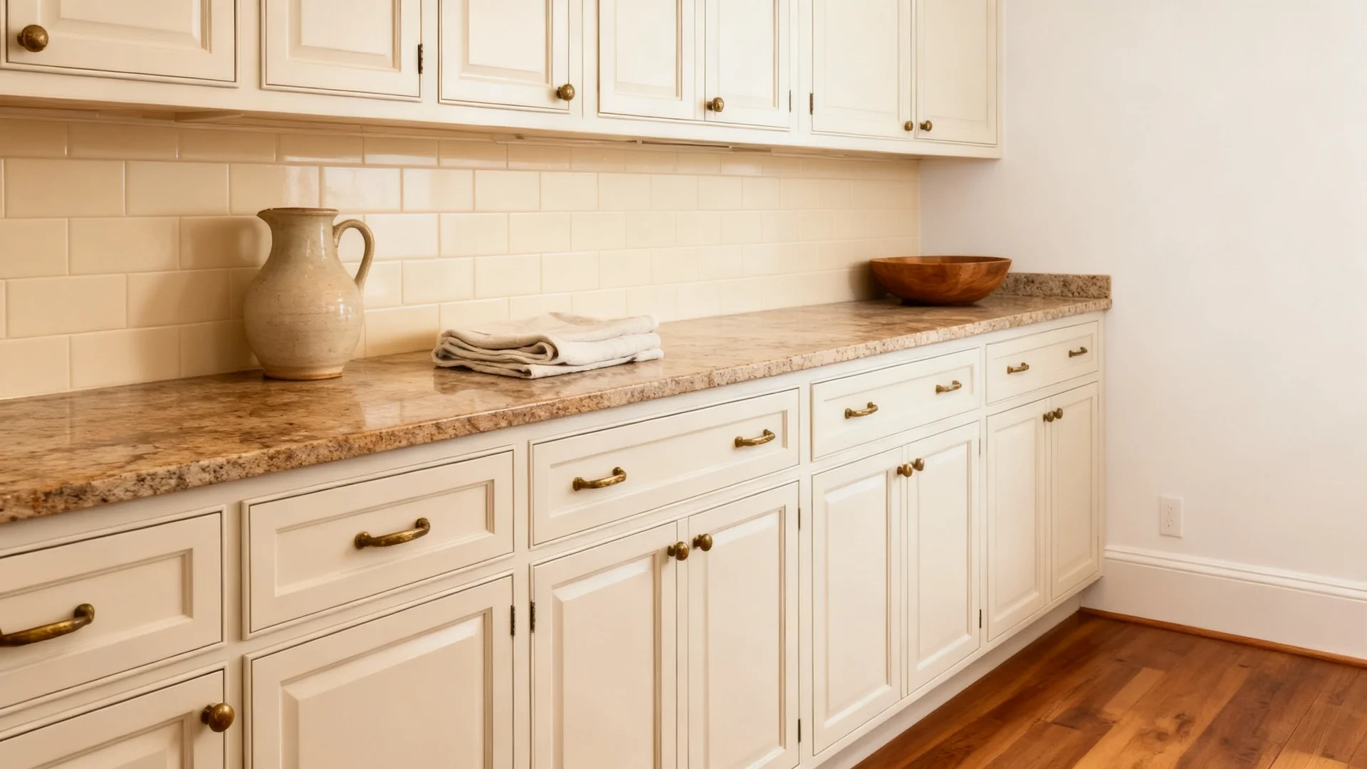
Natural Linen can work on cabinets when you want a soft beige-cream look instead of white. It suits warm countertops, natural stone surfaces, wood floors, and aged brass hardware well.
If the counters are cool white or light gray, they may look too beige or show a slight peach on the cabinet surface, which tends to look unintentional rather than warm.
5. Bathrooms
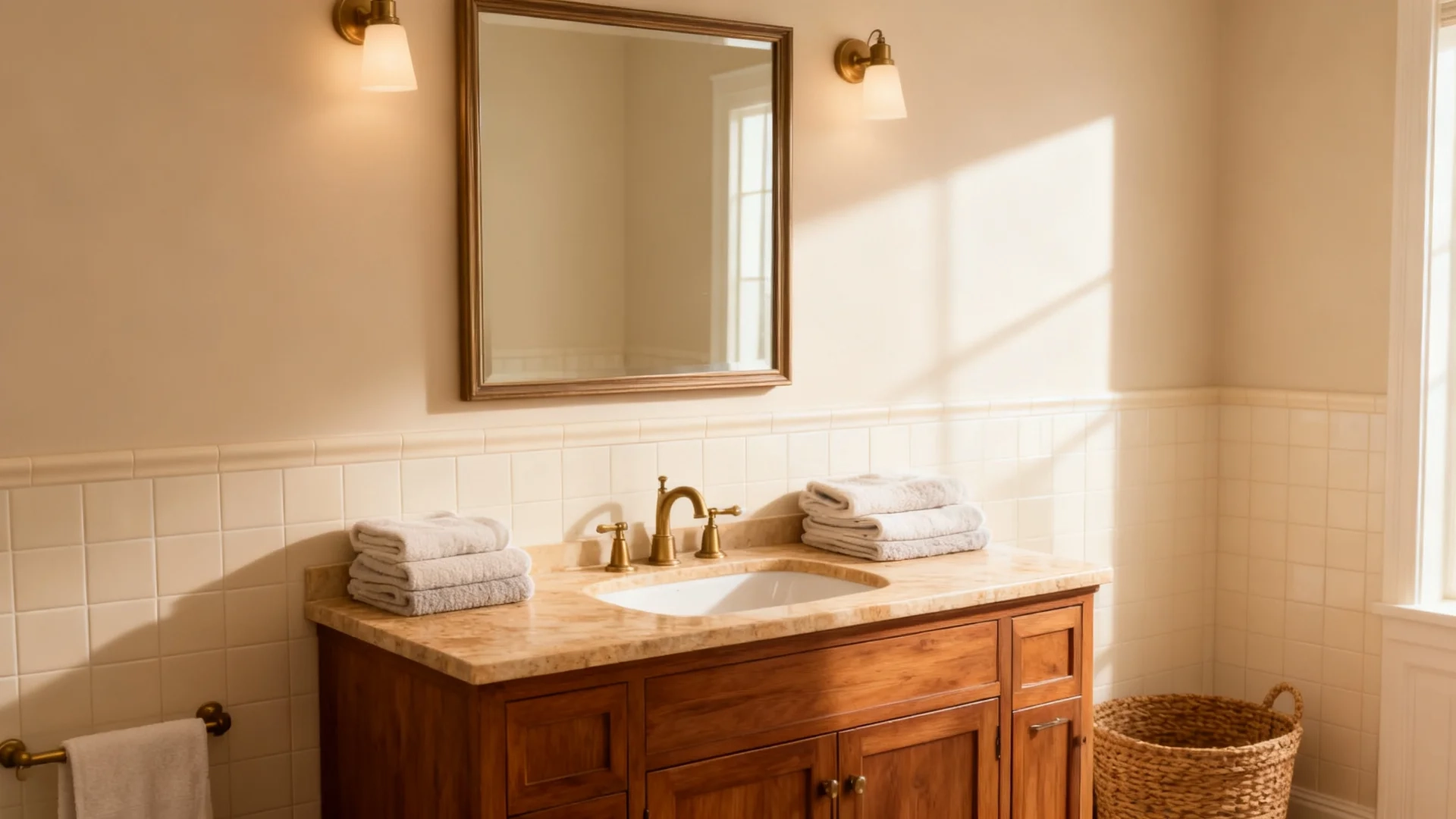
Natural Linen can look warm and soft in bathrooms that have cream tile, warm stone, wood vanities, brass or bronze fixtures, or sandy neutral tile.
In bathrooms with blue-gray tile, stark white porcelain, or cool LED overhead lighting, it can look slightly off. The greige side can become more visible in a cool, small bathroom, and the result may feel less soft than the chip suggested.
6. Exteriors
Natural Linen can work well outdoors because natural daylight makes it read lighter and more neutral than it does indoors. It suits stucco, siding, porches, brick, and homes with wood and stone accents.
Test it in both full sun and full shade before committing. Shaded exterior walls may show more beige-greige depth, while direct sunlight may make it look lighter and creamier than expected.
After room use, the next step is testing it correctly because Natural Linen can shift more than people expect from a single swatch.
What Homeowners Say About Sherwin Williams Natural Linen

On Reddit, Natural Linen came up in a discussion about choosing a paint color for a darker room with wood flooring and very little natural light. That kind of setting is useful because it shows why people often consider Natural Linen when plain white feels too stark but deeper beige feels risky.
The general takeaway from the conversation is that Natural Linen is seen as a warm, easy neutral with enough depth to keep a room from feeling flat.
It was suggested as a light cream with an orange-warm base, which lines up with how this color can read in real homes. It is not a cold white, nor a heavy tan. It sits in that softer middle space where a room can feel lighter while still keeping warmth.
The thread also reflects a common homeowner concern: paint has to work with the floor, furniture, lighting, and room use. Natural Linen was mentioned because it could brighten the space while still working with warm wood floors. That makes it a practical option for living rooms, basements, bedrooms, and casual spaces where comfort matters.
The review opinion is simple: Natural Linen is best for rooms that need warmth, softness, and a neutral base that feels more lived-in than white. Still, it should be sampled first, especially in rooms with low light or strong warm flooring.
How to Test Natural Linen Before Painting
Here is the common mistake: someone sees Natural Linen looking soft and airy in an online photo, paints a room, and wonders why it looks peachy, dull, or more beige than expected. The photo was taken in different light with different materials. The solution is straightforward and costs very little.
- Step 1: Get the Right Sample: Order a Sherwin-Williams peel-and-stick sample or paint sample for Natural Linen SW 9109. Do not use a small chip or a digital swatch. The liquid sample applied to the wall or a board is the only format that shows the true color accurately.
- Step 2: Test Two Coats: Apply two coats to a large foam board or wall patch. One coat is not enough to accurately judge the depth and tone.
- Step 3: Use More Than One Wall: Place the sample on a wall that receives direct light and one that does not. Natural Linen can look noticeably different between these two positions in the same room.
- Step 4: Check It at Four Points in the Day: Check the sample in the morning, at midday, in the late afternoon, and at night under your usual lighting. That full range tells you more than any single snapshot.
- Step 5: Hold It Against Fixed Finishes: Hold the sample next to your trim, flooring, tile, countertops, cabinets, and fabrics. The color lives in the room alongside all those materials, not in isolation on the wall.
- Step 6: Check Your Bulbs: If the color looks flat or slightly peachy under artificial light, swap in a warm 2700K bulb before deciding the color is wrong. The bulb change often resolves the problem.
- Step 7: Wait 48 Hours Before Deciding: Paint cures differently than it looks wet. Give the sample 48 hours before making a final call.
Testing is especially important with Natural Linen because its soft warmth can shift toward beige, cream, or peach depending on the room and the light.
Similar Colors to Sherwin Williams Natural Linen SW 9109
If you are shortlisting warm neutrals, comparing Natural Linen with nearby colors before committing helps you decide whether you need something lighter, grayer, warmer, or deeper.
Browsing the most popular greige and beige colors side by side is also helpful when your shortlist is still wide. This is also where the accessible beige vs natural linen comparison comes up most often.
| Color | Code | Brand | LRV | Tone | Key Difference vs Natural Linen |
| Accessible Beige | SW 7036 | Sherwin-Williams | 58 | Warm greige | Darker, grayer, and more grounded than Natural Linen |
| Kilim Beige | SW 6106 | Sherwin-Williams | 57 | Warm beige | Deeper and more traditional beige, warmer leaning |
| Natural Choice | SW 7011 | Sherwin-Williams | 73 | Warm off-white | Lighter and cleaner, less beige depth than Natural Linen |
| Benjamin Moore Muslin OC-12 | OC-12 | Benjamin Moore | 66.54 | Soft warm neutral | Softer and creamier cross-brand alternative |
In the accessible beige vs natural linen comparison, Natural Linen is the better choice if you want a lighter, softer, warmer neutral with a relaxed feel. Accessible Beige is the better choice if you want more gray balance, stronger depth, and a more grounded result on the wall.
If the lighter end of that table appeals to you, Natural Choice SW 7011 behaves like a cleaner, brighter cousin of Natural Linen and deserves a sample of its own.
Sherwin Williams Natural Linen Coordinating Colors
Natural Linen is easiest to pair when the surrounding colors feel calm and connected rather than sharp or overly bright. Since it already has warmth, beige softness, and a greige undertone, the best pairings either add gentle contrast or deepen the palette without fighting the base color.
- Divine White SW 6105: A warm off-white that works beautifully for trim, ceilings, and doors. It gives a soft, warm transition rather than a sharp contrast.
- Antler Velvet SW 911: A deeper warm neutral that adds depth and richness in adjoining rooms, built-ins, or accent surfaces without leaving the warm color family.
- Gris Morado SW 9156: A muted purple-gray that gives Natural Linen a cooler, more unexpected contrast without clashing. It works well as an accent in connected spaces.
- Pure White SW 7005: A cleaner white option for trim if Divine White feels too warm for your space or trim style.
- Urbane Bronze SW 7048: A deeper warm-dark accent for doors, hardware finishes, exterior details, or contrast built-ins.
The safest approach is to let Natural Linen stay as the main soft neutral, then use whites for structure, deeper neutrals for depth, and muted accents only where the room needs contrast. If neither trim white above feels right, testing a few warm white paint colors against your sample usually settles the question.
Who Should Avoid Sherwin Williams Natural Linen?
Natural Linen is a soft warm neutral, but it is not the safest choice for every home. It works best when the room already has warmth in the flooring, lighting, furniture, or fixed finishes. In cooler spaces, it can look more peachy, beige, or muted than expected.
| Situation | Why It Can Be a Problem |
| Cool gray tile | The warm beige base can clash with blue-gray or icy gray tile. |
| Stark white trim | Cool white trim can make Natural Linen look creamier, warmer, or slightly peachy. |
| Chrome-heavy finishes | Chrome, cool nickel, and blue-gray stone can make the color feel disconnected. |
| Very dark north-facing rooms | Low, cool light can make Natural Linen look muted beige-greige instead of soft and warm. |
| Crisp modern white interiors | Natural Linen is not a clean white. It has warmth, body, and beige depth. |
| Strong orange flooring | Golden oak or orange-toned wood can pull out the peach or tan side of the color. |
Natural Linen is worth testing in homes with warm wood, natural textures, soft whites, and earthy finishes. It is less reliable in rooms built around cool gray, blue-white, or high-contrast modern materials.
If your floors are the sticking point, the pairing rules for wall color with hardwood floors make the undertone call much easier.
Decor Styles That Work Best With Sherwin Williams Natural Linen
Natural Linen works well across several decor styles because it is warm without feeling too heavy. Its beige-greige base, with a possible soft peach or earthy orange shift, helps it sit comfortably beside wood, stone, linen, warm metals, and muted accent colors.
- Modern Farmhouse & Rustic: Natural Linen works well with wood beams, worn finishes, black metal accents, and textured fabrics. It gives the room warmth without making the walls feel dark or overly beige.
- Coastal & Transitional: This color suits coastal and transitional spaces when paired with light wood, soft white trim, muted blues, sage greens, and sandy neutrals. It keeps the room light while adding more warmth than a plain white.
- Minimalist & Organic Modern: Natural Linen is a good choice when cool gray feels too cold. It adds quiet warmth to clean-lined rooms with natural wood, stone, woven textures, and simple furniture.
- Traditional & Classic: In traditional homes, Natural Linen works with crown molding, warm wood furniture, antique brass, layered fabrics, and soft white trim. It gives the space a settled look without feeling too formal.
- Cottage & Casual Interiors: Natural Linen also fits relaxed interiors with slipcovered furniture, warm lamps, vintage pieces, and natural fiber rugs. It keeps the palette soft and easy to live with.
The main thing to watch is the room’s undertone balance. Natural Linen looks best when the surrounding finishes are warm, muted, or natural. If the room is filled with cool gray tile, blue-white trim, or chrome finishes, test it carefully before choosing it.
Is Sherwin Williams Natural Linen Still Worth Choosing?
Yes. Natural Linen is worth choosing if you want a warm neutral that feels soft, light, and more relaxed than a classic beige. It works well in homes with light wood flooring, warm textures, soft white trim, and natural materials throughout.
It is not the best choice if the home has very cool gray finishes, stark white trim with a blue base, or artificial lighting that pulls out peachy warmth. In those conditions, a cooler neutral or a lighter off-white tends to perform more reliably.
Natural Linen is best treated as a warm neutral with movement, not a simple background beige. Test it in your own light and beside your actual materials before choosing.
Frequently Asked Questions
Is Natural Linen a good paint color for resale?
Yes, Natural Linen can be a good resale color if the home has warm finishes and good natural light. It feels softer than white but still neutral enough for most buyers. Avoid it in homes with lots of cool gray tile or blue-white trim.
Can Natural Linen work with gray furniture?
Natural Linen can work with gray furniture if the gray has a warm or taupe base. It may look less balanced beside cold blue-gray upholstery. Add warm wood, cream textiles, brass, or woven textures to help the wall color and furniture feel connected.
Should I use Natural Linen on the ceiling?
Natural Linen is usually better on walls than on ceilings. On a ceiling, it can make the room feel warmer and slightly lower. If you want a soft look, use a warm white ceiling color instead so the walls still have gentle contrast.
Does Natural Linen work with black accents?
Yes, black accents can work well with Natural Linen when used in small doses. Think black window frames, picture frames, curtain rods, or light fixtures. Too much black can feel harsh, so balance it with wood, linen, warm metal, and soft whites.
What flooring looks best with Natural Linen?
Natural Linen looks best with light oak, white oak, warm wood, limestone, travertine, and other natural materials. These finishes support its warm neutral base. Very cool gray floors can make it look more beige or slightly peachy than expected.
How many coats of Natural Linen do you need?
Two coats give Natural Linen full, even coverage on most primed or previously painted walls. One coat often looks patchy and lighter than the true color. Over dark or bold existing colors, plan for a primer coat first, then two finish coats.
Final Thoughts
Choosing a warm neutral is not only about liking the swatch. Natural Linen changes with light, flooring, trim, and finish in ways that are hard to predict from a chip or an online photo.
Sherwin Williams Natural Linen is a strong choice when you want a soft, warm neutral that feels easy to live with, but it needs the right setting to look the way people expect it to.
Give it warm materials, good lighting, and a clean trim color, and it delivers. Place it in a cool, low-light room with chrome finishes and stark white trim, and it can feel off without you being able to explain exactly why.
Test it properly before you commit. Sample it on two walls, check it across the full day, and hold it beside your fixed finishes. That single step saves more paint regrets than anything else.
Drop a comment with your room direction, flooring color, and whether you are using Natural Linen on walls, cabinets, or exterior siding. I will share my honest take.


