


Greige and beige sound like straightforward color categories until you’re standing in your living room holding paint chips that all look different at the store. One reads too yellow, another goes gray, and the one you loved online looks nothing like it does on your wall.
You’re not imagining it. These colors shift depending on your lighting, flooring, countertops, and even the time of day.
Pick the wrong undertone and a warm beige can look orange next to cool tile, or a greige can turn flat and blue-gray in a north-facing room.
From real-room performance to perfect pairings, every popular greige and beige Sherwin-Williams makes, broken down so you can get it right the first time.
Greige and Beige: What You Need to Know Before Choosing
Most people use greige and beige interchangeably, but they behave very differently on a wall. Greige is a direct blend of gray and beige with a subtle cool undertone, giving it a muted, considered quality.
Beige is warmer, leaning toward tan, cream, or yellow, and depending on the formula, it can carry pink or orange undertones. That is why two beiges that look identical on a chip can read completely differently on your walls.
Getting the category wrong is costly; the stakes are even higher when choosing colors that expand space in rooms where every decision shows. A beige with orange undertones next to cool gray tile looks dirty. A greige with blue undertones in a dark room turns cold and flat. The right choice comes down to your space, your lighting, and your existing finishes.
The Most Popular Sherwin-Williams Greige Paint Colors
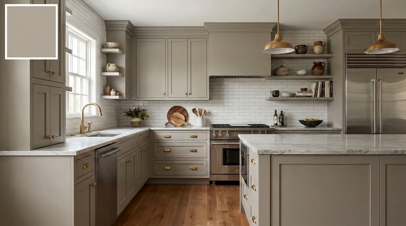
Not every greige works in every home. These are Sherwin-Williams’ most reached-for picks for versatility and consistent real-world results, and Natural Choice by Sherwin-Williams earns its place among them as one of the most reliably warm options available.
1. Agreeable Gray SW 7029
Sherwin-Williams’ single most popular color, greige or otherwise. What makes it so universally loved is its ability to sit right in the middle, not too warm, not too cool.
Its balanced gray-beige base with a whisper of green and taupe means it carries just enough warmth to feel inviting without ever tipping into full beige territory.
It balances warm and cool tones better than almost anything else in the lineup, making it work across nearly every room and finish combination. Pair with Pure White or Extra White trim for the cleanest result.
| Detail | Value |
|---|---|
| LRV | 60 |
| HEX | #D1C5B4 |
| RGB | 209 / 203 / 193 |
| Best For | Whole-home, living rooms, bedrooms |
2. Worldly Gray SW 7043
Worldly Gray is the rare greige that doesn’t commit hard to any one direction, and that’s precisely its strength.
Its soft gray-beige base with a barely-there taupe pull that never fully commits to green or purple gives it a vague, organic warmth that sits comfortably between gray and beige without pulling noticeably toward either.
That flexibility makes it highly adaptable to both warm and cool finishes. A slightly lighter feel than Amazing Gray, making it a great choice when you want depth without a noticeable green pull.
| Detail | Value |
|---|---|
| LRV | 57 |
| HEX | #CEC6BB |
| RGB | 206 / 198 / 187 |
| Best For | Open concepts, transitional spaces |
3. Anew Gray SW 7030
Anew Gray occupies a quietly confident space in the greige family. Its warm gray-beige base, with a soft taupe undercurrent and a faint earthy brown undertone, adds subtle warmth.
It quiet depth without tipping into full beige territory, making it a strong choice for homeowners who want more personality than Agreeable Gray but aren’t ready to commit to a true beige.
Needs decent natural light to perform at its best; in darker rooms, it can feel flat. Works beautifully paired with warm accent tones like Urbane Bronze or Dovetail on trim and cabinetry.
| Detail | Value |
|---|---|
| LRV | 47 |
| HEX | #BFB6AA |
| RGB | 191 / 182 / 170 |
| Best For | Whole-home, well-lit spaces |
4. Amazing Gray SW 7044
Amazing Gray earns its name by delivering something genuinely beautiful in the right space. Its muted gray-beige base with a quiet but unmistakable olive-green undertone rooted in earthy, organic warmth gives it a grounded quality that most neutrals simply can’t replicate.
That green hue can flash depending on your lighting and surrounding finishes, but it’s never overwhelming. Gorgeous alongside brick, natural wood floors, and stone. Also holds up exceptionally well as an exterior color on homes with natural materials.
| Detail | Value |
|---|---|
| LRV | 45 |
| HEX | #B0A695 |
| RGB | 176, 166, 149 |
| Best For | Exteriors, brick and stone homes |
5. Intellectual Gray SW 7045
Intellectual Gray sits at a depth that makes it one of the most versatile and popular cabinet greiges Sherwin-Williams offers.
Its medium-toned gray-beige base, with a grounded, slightly smoky undertone that leans neither warm nor cool, holds a quiet, authoritative presence and is strong enough to add real presence without overpowering a space
which is exactly what you want on cabinetry, where the color needs to anchor the room without competing with countertops or backsplash.
| Detail | Value |
|---|---|
| LRV | 36 |
| HEX | #A8A093 |
| RGB | 168 / 160 / 147 |
| Best For | Cabinets, accent walls, exteriors |
6. Analytical Gray SW 7051
Analytical Gray is for those who want their greige to actually commit. Unlike many grays that offer only a passive nod to green
This one carries a deep gray-beige base with a pronounced muddy olive-green undertone that reads earthy, complex, and deliberately organic.
A noticeable but never overwhelming character that gives it a genuine personality. Works best in spaces with neutral or cool fixed elements that won’t amplify the green further.
| Detail | Value |
|---|---|
| LRV | 47 |
| HEX | #A9A090 |
| RGB | 169, 160, 144 |
| Best For | Neutral or cool fixed elements |
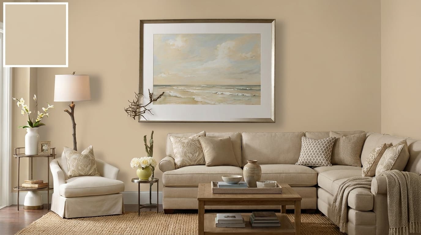
7. Mega Greige SW 7031
Mega Greige earns its cozy reputation through its rich gray-beige base layered with warm yellow-brown undertones that read almost like a sun-warmed tan, inviting, soft, and deeply comfortable.
A blend that makes any space feel instantly welcoming the moment it hits the walls. The extra warmth works in its favor in living rooms and bedrooms where a snug atmosphere is the goal.
Balance it with lighter textiles and décor to avoid the room feeling too heavy or closed in.
| Detail | Value |
|---|---|
| LRV | 37 |
| HEX | #ADA295 |
| RGB | 173 / 162 / 149 |
| Best For | Living rooms, bedrooms, cozy spaces |
8. Functional Gray SW 7024
Functional Gray is the darkest and most saturated pick on this list. It carries a deep, fully saturated gray-beige base with a dense, complex undertone that blends cool gray authority with just enough warm beige to keep it from feeling cold or industrial.
A commanding quality that makes it unlike anything else in this lineup. Built for accent walls, focal points, and feature spaces where a lighter color simply wouldn’t have enough presence.
| Detail | Value |
|---|---|
| LRV | 37 |
| HEX | #ABA39A |
| RGB | 171 / 163 / 154 |
| Best For | Accent walls, focal points, feature spaces |
These eight cover the full range from light and airy to deep and dramatic; there’s a greige here for every room, every lighting condition, and every combination of fixed elements.
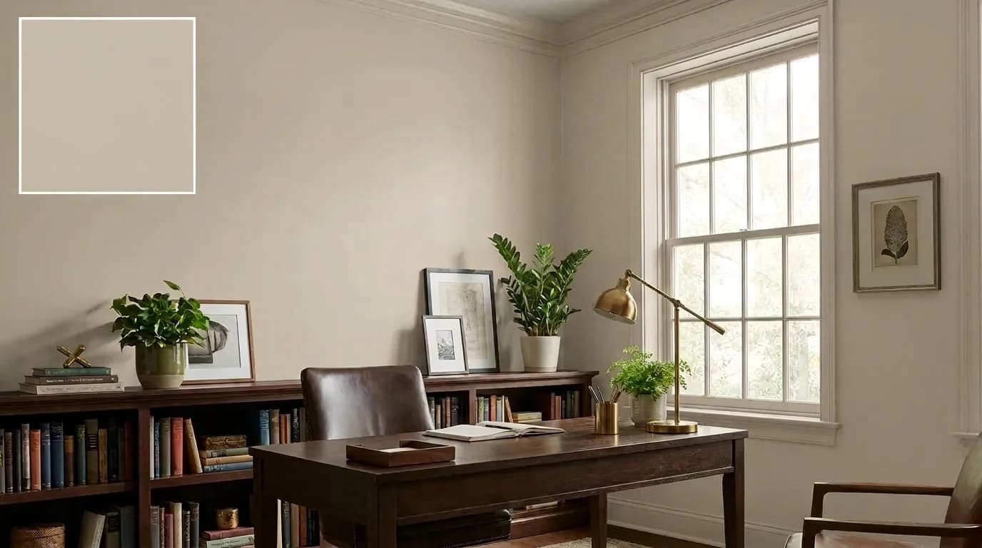
The Most Popular Sherwin-Williams Beige Paint Colors
Beige is back, and it never really left. These seven Sherwin-Williams beiges bring warmth, approachability, and classic appeal to any space, without the starkness of white or the coolness of gray.
9. Accessible Beige SW 7036
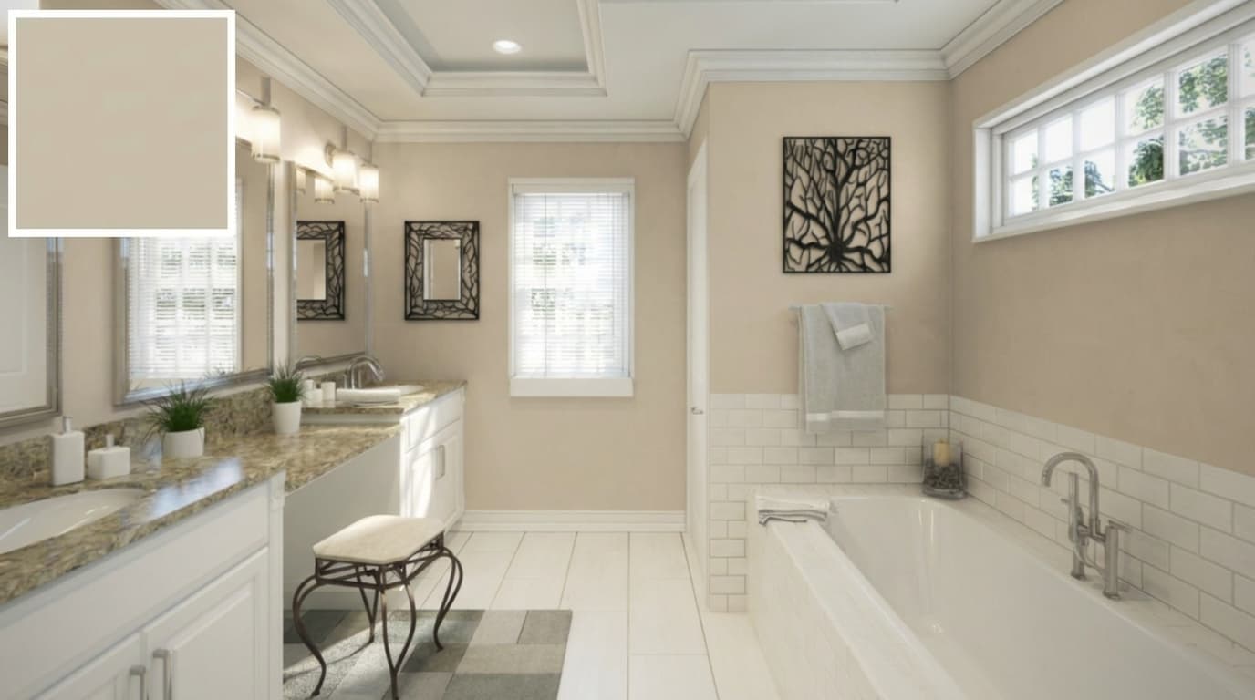
Accessible Beige holds the title of Sherwin-Williams’ most popular beige for good reason. Its soft, warm beige base with a gentle tan undertone that sits cleanly between yellow and orange, without tipping into either, gives it a natural adaptability
It works across an incredibly wide range of finishes and room types. Keep surrounding colors warm to avoid them looking dingy.
| Detail | Value |
|---|---|
| LRV | 58 |
| HEX | #C9B99A |
| RGB | 201, 185, 154 |
| Best For | Open concepts, mixed wood tones |
10. Balanced Beige SW 7037
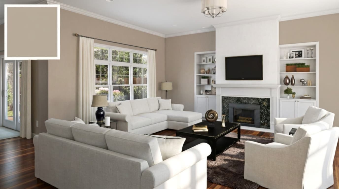
Balanced Beige is the natural next step when Accessible Beige feels too light for your space. Its medium warm-beige base with a richer, slightly deeper tan undertone.
It carries a quiet golden warmth. Without reading, yellow deepens the palette, adding richness and body while maintaining the same approachable warmth.
Pairs well with creamy whites, creating a cohesive, grounded palette without feeling heavy.
| Detail | Value |
|---|---|
| LRV | 46 |
| HEX | #C0B2A2 |
| RGB | 192 / 178 / 162 |
| Best For | Well-lit rooms, warm wood finishes |
11. Canvas Tan SW 7531
Canvas Tan brings an earthy, grounded quality that sets it apart from lighter beiges. Its deep, warm tan-beige base, with a strong earthy brown undertone that leans toward natural clay and raw linen,is grounded, organic, and unapologetically warm.
It works particularly well in spaces anchored by dark furniture and accessories. Use lighter trim and textiles alongside it to keep the overall palette feeling balanced and breathable.
| Detail | Value |
|---|---|
| LRV | 64 |
| HEX | #DCD1BF |
| RGB | 220 / 209 / 191 |
| Best For | Dark furniture, brown floors, earthy spaces |
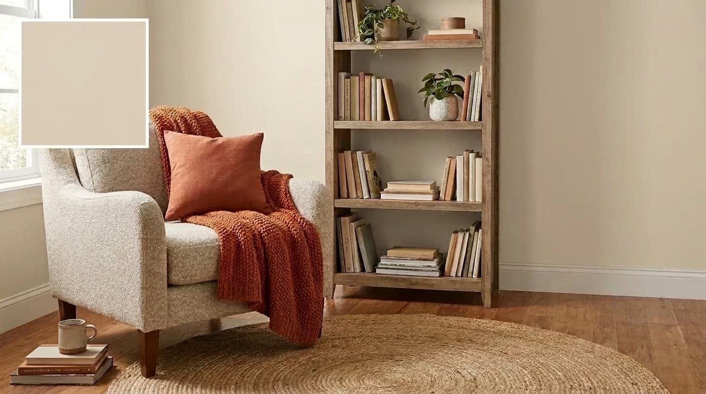
12. Neutral Ground SW 7568
Neutral Ground occupies a unique position in the beige family. Its light, warm tan-beige base with a soft, diffused undertone that blends equal parts sandy beige and muted brown without any yellow push or gray pull makes it genuinely one of the easiest neutrals to live with.
That balance is what makes it so appealing for spaces where you need warmth spread across a significant amount of wall area without any one undertone taking over.
| Detail | Value |
|---|---|
| LRV | 53 |
| HEX | #C0AE96 |
| RGB | 192, 174, 150 |
| Best For | Large open spaces, transitional homes |
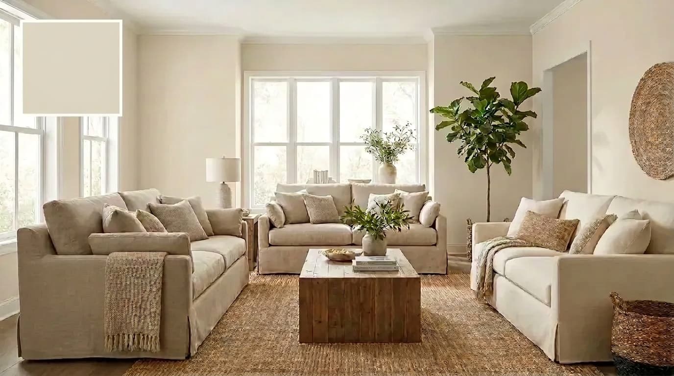
13. Shoji White SW 7042
Shoji White is one of those rare colors that crosses comfortably between two families. Its light, warm beige base with a soft green-gray undertone that reads like a sun-warmed off-white, quietly urbane, never yellow, never stark.
Gives it a light, warm refinement that creates an inviting atmosphere without reading yellow. Light enough to feel fresh, warm enough to feel welcoming.
| Detail | Value |
|---|---|
| LRV | 74 |
| HEX | #E6DFD3 |
| RGB | 230 / 223 / 211 |
| Best For | Whole-home, paired with soft white trim |
14. White Duck SW 7010
White Duck manages something that very few colors in this family pull off: it feels simultaneously warm, light, and inviting.
Its airy, warm-beige base with a delicate green undertone, sitting at the intersection of beige, greige, and soft sage, is luminous, fresh, and naturally warm without a trace of yellow, giving it that rare quality.
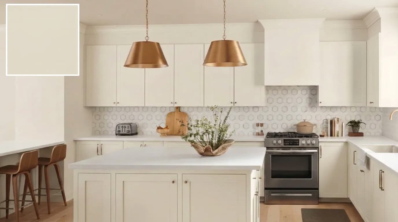
Pairs beautifully with SW Alabaster and Greek Villa on cabinetry for a cohesive kitchen palette.
| Detail | Value |
|---|---|
| LRV | 74 |
| HEX | #E5DFD2 |
| RGB | 229 / 223 / 210 |
| Best For | South-facing rooms, warm, earthy homes |
15. Sand Beach SW 7529
Sand Beach earns its place as the great middle ground of this beige lineup. Its light sandy-beige base with a warm, sun-bleached undertone that evokes natural linen and pale driftwood, soft, approachable, and completely free of any dominant color pull, makes it so useful
When you want warmth without commitment. Sits lighter than Canvas Tan but warmer than Accessible Beige, making it the natural choice when neither feels quite right.
| Detail | Value |
|---|---|
| LRV | 63 |
| HEX | #CEBEAB |
| RGB | 206, 190, 171 |
| Best For | Transitional spaces, open floor plans |
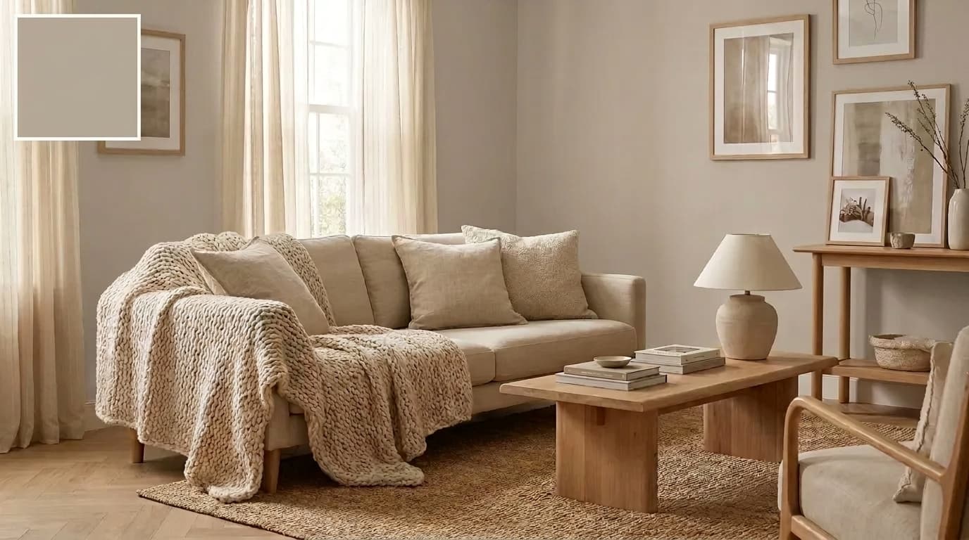
From light and barely-there to warm and grounding, these seven beiges cover every scenario, whether you’re painting one room or looking for a color that carries through an entire home.
How Lighting Changes Greige and Beige
Lighting is the single most overlooked factor in paint color selection. The same color can look warm and inviting in one room and cold and flat in another, and the paint hasn’t changed.
Natural Light: How Room Exposure Affects Color
- North-Facing: Pulls gray out of greige and makes beige look dull; always choose warmer undertones in both families
- South-Facing: Both families perform at their best, with the most flexibility to go lighter or deeper with confidence
- East-Facing: Warm morning light fades to cool blue tones by afternoon, test samples at multiple times before committing
- West-Facing: Cool and flat in the morning, warm golden light by evening, best for rooms used primarily in the afternoon or evening
Artificial Light: How Bulb Temperature Shifts Color
- Warm Bulbs (2700K–3000K): Amplify warmth in both families, watch yellow-leaning beiges as they can push toward orange on large surfaces
- Cool Bulbs (4000K–5000K): Pull gray out of greige and flatten warm beiges. If your color looks off at night, the bulbs are usually the culprit
- Dimmer Switches: Give real-time control over how warm or cool your color reads, one of the most underused tools in paint selection
Before finalizing any color, test your sample under both natural and artificial light at different times of day. What looks perfect at noon needs to look just as good at Night.
How to Choose Between Greige and Beige
These things determine the right call every time: fixed elements, light exposure, and LRV. Get these right, and the color almost picks itself.
- Check fixed elements first: flooring, tile, and cabinetry stay. Your paint works around them.
- Warm elements pair with beige: honey oak floors and earthy stone lean toward beige.
- Cool elements pair well with greige: gray tile, white quartz, and stainless steel look better with it.
- Match undertones before sampling: the undertone in your paint needs to complement what’s already in the room.
- Use LRV for room size: small or dark rooms need an LRV of 60 or higher. Larger rooms can handle lower values.
Get these things right, and the color stops feeling like a guess and becomes the only logical choice for your specific space.
Tips Before You Pick Up a Paintbrush
A few things most paint guides skip over, but genuinely make a difference when choosing between greige and beige.
- Keep samples large: at least 12×12 inches for an accurate read
- Photograph your samples: a quick photo often reveals undertones the eye misses when standing in the room
- Order peel-and-stick samples: mess-free, repositionable, and easy to test across multiple walls without painted swatches
- Avoid choosing in the paint store: fluorescent lighting misrepresents both greige and beige every single time
- Prime over sample patches: leftover swatches bleed through new paint if not primed, especially with lighter colors
These small details are easy to overlook but consistently separate a result you love from one you repaint six months later.
Final Thoughts
Picking the right paint color is never just about what looks good on a chip; it’s about how it performs in your actual space.
The popular Sherwin-Williams greige and beige paint colors each bring something different to a room, and understanding undertones, LRV, and lighting is what separates a great result from a costly repaint.
In my experience, the homeowners who get it right are the ones who test first and trust what they see in their own light, not someone else’s photos.
Check your samples at different times of day, hold them against your fixed elements, and commit with confidence. Drop your color choice in the comments or share it with someone still stuck on paint chips.
Frequently Asked Questions (FAQs)
How many paint samples should you test before committing?
Three to five is a reasonable range. Test each one in at least two spots on the same wall and revisit them at different times of day before making a final decision.
Can greige and beige be used together in the same home?
Yes, the key is varying the depth. Use a lighter beige in one zone and a slightly deeper greige in an adjacent space, keeping trim consistent throughout to tie everything together.
Does paint finish affect how greige and beige look?
Yes. Flat and matte finishes make colors appear darker and warmer. Eggshell and satin reflect more light and can shift undertones; always sample in the finish you plan to use


