


| Color Name | Pale Oak OC-20 (also known as Athena 858) |
| Brand | Benjamin Moore |
| Collection | Off-White Collection |
| LRV | 68.64 — light, reflects well without reading as white |
| Undertones | Warm gray-greige with a taupe base; can shift pink or lavender in cool or mixed light |
| Best For | Whole-home walls, bedrooms, living rooms, open layouts, hallways, south- and west-facing rooms |
| Avoid In | Dark rooms with little natural light; rooms with cherry, mahogany, or reddish wood floors; spaces with cool LED-only lighting |
Ever paint a room and feel the color shift the moment the sun goes down? Choosing a wall color is frustrating when it looks perfect in the store but different at home, especially with Pale Oak OC-20.
I know how confusing that can feel when lighting keeps changing the tone. Here, I break down how this soft greige behaves in real rooms, from natural light to evening lamps.
You will see where it works best, where it fails, and how to avoid undertone surprises so your space feels consistent and calm. I focus on practical lighting tips so you can test them before committing.
What Pale Oak Benjamin Moore Actually Looks Like in a Real Room
Pale Oak OC-20 is a greige, that mix of gray and beige that reads neither cold nor heavy. Most of the time, on a well-lit wall, pale oak by Benjamin Moore looks like a soft, warm neutral that falls somewhere between an off-white and a classic taupe.
That description is accurate, but incomplete. Here’s the part that catches people off guard: Pale Oak has pink and lavender undertones that show up in certain light. It doesn’t look rosy in the way peach paint does.
But in a north-facing room at midday, or under cool LED bulbs after dark, you can see a definite purple-pink cast that surprises people who only sampled it in a sunny spot. That’s not a flaw. It’s the color’s character.
But it’s the reason I tell every client to test Pale Oak on multiple walls in different light before committing to a gallon.
| Pro Tip: Test Pale Oak on at least two walls, one that gets direct light and one that doesn’t. Check it at 7 am, at noon, at 5 pm, and after 8 pm with your artificial lighting on. If you see lavender after dark, swap your bulbs for warm white (2700K) before deciding against the color. |
Understanding Pale Oak’s Undertones
The official description calls Pale Oak a warm gray-greige. That’s technically true, but it leaves out what makes this color interesting and occasionally tricky. Pale Oak sits in the yellow-to-yellow-red hue family on the color wheel.
Colors in that neighborhood are known to shift purple in imbalanced or cool light. In a room with balanced, neutral light, Pale Oak looks like a calm warm gray-beige. Add a cool-spectrum light source, an overcast north-facing window, a daylight LED bulb, or even a gray tile floor, and the lavender-pink side appears.
This is low chroma, which means the color has very little saturation. Low-chroma colors are chameleons. The room around them has as much influence on their appearance as the pigment itself. A cream sofa can make Pale Oak read warm and golden. A bright white cabinet can make the same wall look distinctly gray-pink.
Understanding this before you paint a room saves a lot of regret. If you’re still working out how to choose paint colors that hold up against your fixed elements, that process applies here as much as anywhere.
The practical takeaway: Pale Oak is not for anyone who dislikes even subtle pink or purple tones. If that’s a hard no, look at Edgecomb Gray HC-173 (warmer, more beige) or Classic Gray OC-23 (cooler, closer to off-white) instead. But if a soft, complex neutral that shifts through the day sounds appealing rather than alarming, Pale Oak earns its reputation.
How Pale Oak Looks in Natural Light
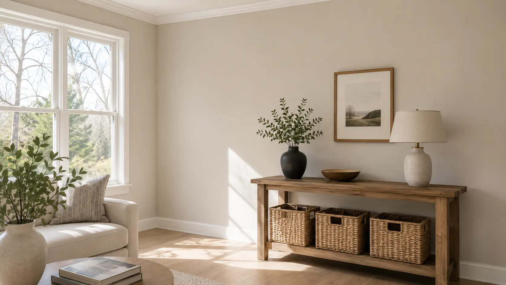
Natural light can make Pale Oak look warmer, cooler, brighter, or more muted depending on where your windows face. In bright rooms, it often feels soft and open. In cooler rooms, it may show more of its gray side.
North-facing rooms: The light is usually cooler and softer. Pale Oak may look slightly grayer here and less warm than it does in sunny spaces. It can still feel calm and gentle, but it may need support from warm whites, natural wood tones, and soft lighting to keep the room from feeling flat.
South-facing rooms: South-facing rooms get warmer daylight for much of the day. This light can bring out the beige or greige side of Pale Oak, making it feel brighter, softer, and warmer. This is one of the easiest lighting conditions for this color because the warmth helps balance its gray undertone.
East-facing rooms: East-facing rooms get bright morning light, which can make Pale Oak look fresh and slightly warm early in the day. As the light fades later, the color may look more muted and gray. Warm bulbs can help keep the room from feeling too cool at night.
West-facing rooms: West-facing rooms get stronger afternoon and evening light. During this time, Pale Oak can appear warmer and a little creamier. It often feels cozy and soft in the evening, which makes it a good fit for living rooms, dining rooms, and bedrooms.
How Pale Oak Looks in Artificial Light
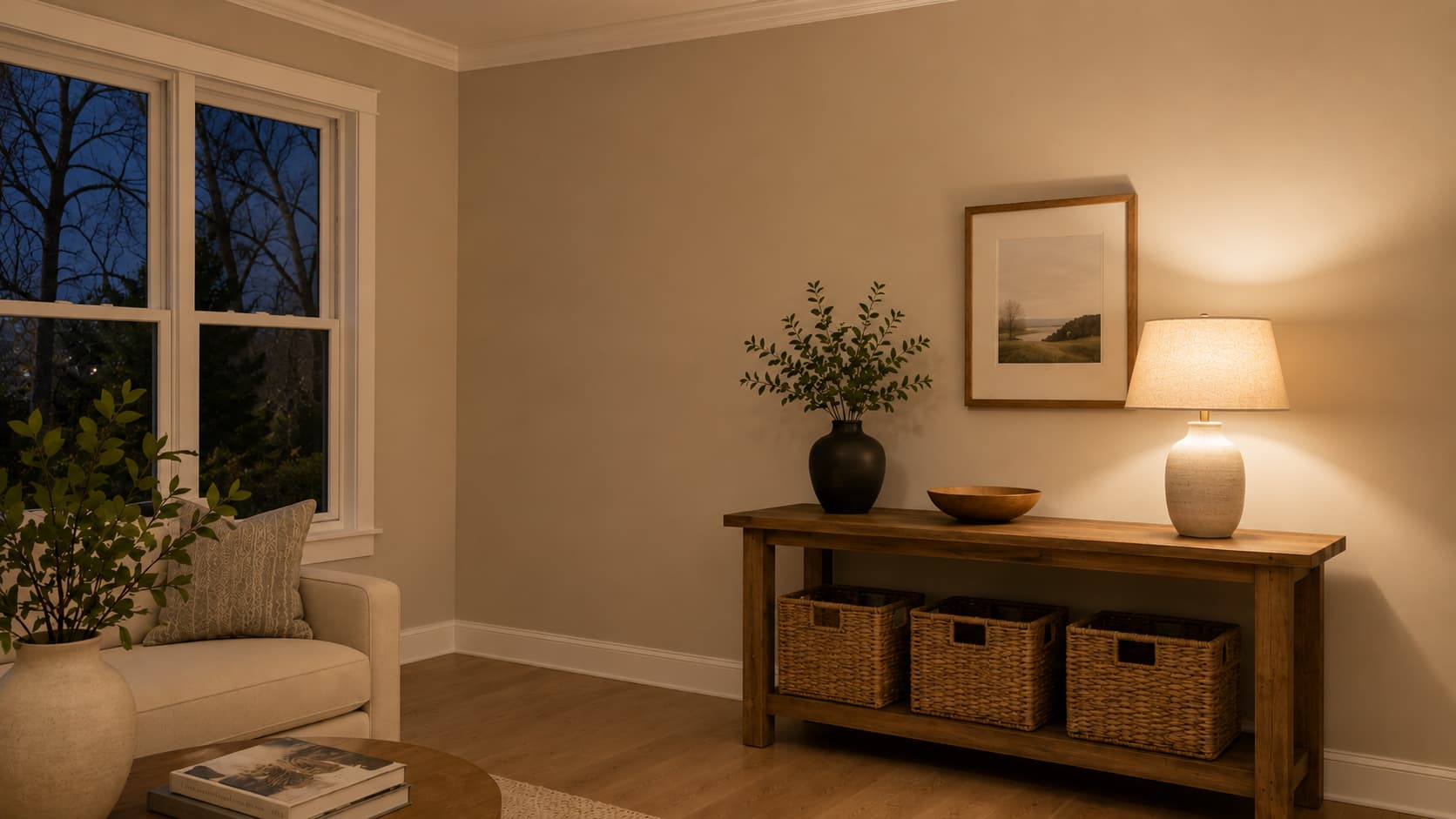
Artificial lighting is where Pale Oak surprises people most often. Warm incandescent bulbs (2700K) bring out the soft beige side and keep the room feeling settled after dark. Soft white bulbs (3000K) are also a safe choice.
The problem starts with daylight or cool white LED bulbs (4000K and above). Under those, Pale Oak’s lavender-pink undertone surfaces clearly. It doesn’t look bad on its own, but if you were expecting a classic greige, the shift reads as an error rather than a feature.
Layering your light sources helps more than any single bulb swap. Combining overhead ceiling fixtures with table lamps, floor lamps, or wall sconces gives the color multiple light angles to interact with, which tends to smooth out any single undertone from dominating. If the room looks off after dark, start with the bulbs before repainting.
Choosing the Right Finish for Pale Oak OC-20
Finish affects both how Pale Oak looks and how the surface performs over time. Flat and matte finishes absorb light, keeping the color soft and slightly deeper. Glossier finishes reflect light and make the color appear fractionally brighter. The practical guidance is straightforward.
| Finish | Best For | Why It Works |
| Matte | Bedrooms, low-traffic walls | Absorbs light, keeps color soft and calm |
| Eggshell | Living rooms, hallways, family rooms | Slight sheen, easy to clean, most popular for walls |
| Satin | Trim, doors, bathrooms, kitchens | More washable, reflects enough light to look crisp |
| Semi-gloss | Cabinets, doors, trim details | Durable, easy to wipe, holds up in high-contact spots |
Eggshell is the most common choice for Pale Oak walls. It gives the color a subtle depth without the washout that comes with flat finishes in well-lit rooms.
Use satin or semi-gloss on any trim, door, or cabinet that gets regular contact; the finish difference between wall and trim also helps define the two surfaces, which matters for contrast against a near-neutral like Pale Oak.
If you’re deciding between those two sheens, the satin vs. semi-gloss, exactly when each makes sense for trim and doors.
Pale Oak in Different Rooms
Pale Oak adapts well across most room types, but it performs differently depending on what else is in the space. Here’s how it actually behaves room by room.
Living Room
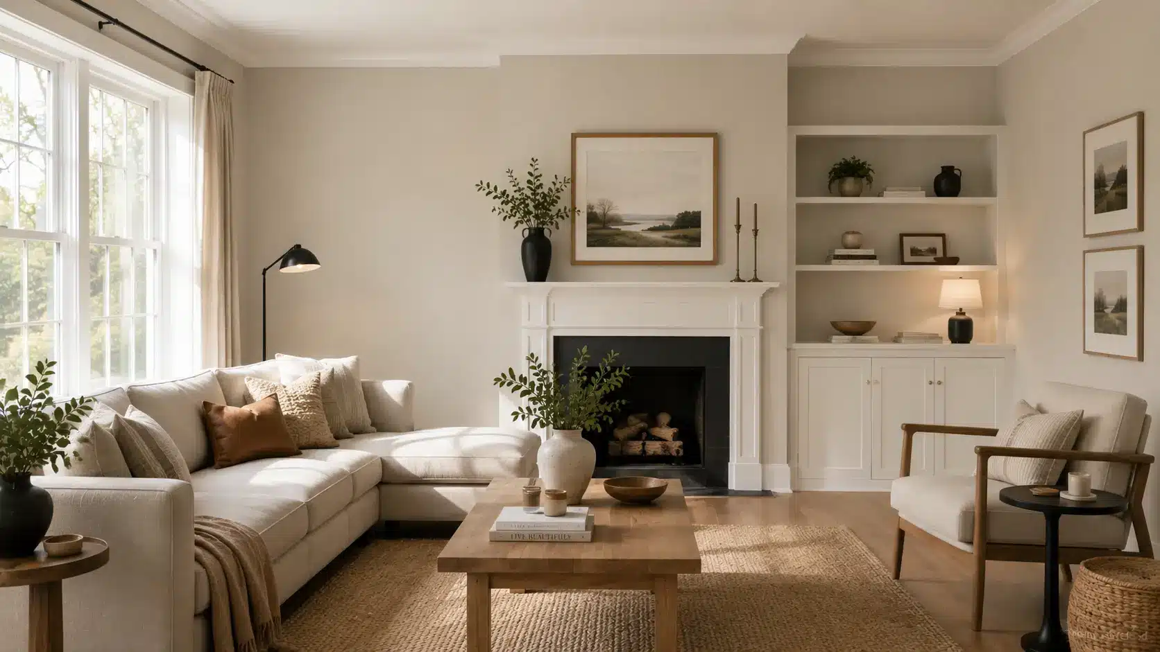
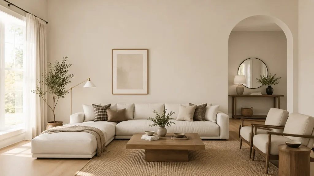
Pale Oak works well as a main wall color in living rooms, particularly open-plan layouts where you need a neutral that stays calm across different light exposures throughout the day. Pair it with Chantilly Lace trim, natural wood floors, and linen furniture.
The color needs contrast to avoid looking washed out; introduce it through darker accents like Wrought Iron 2124-10 on a built-in or deep wood furniture. Without enough contrast, the room can feel like one flat field of beige.
Bedroom
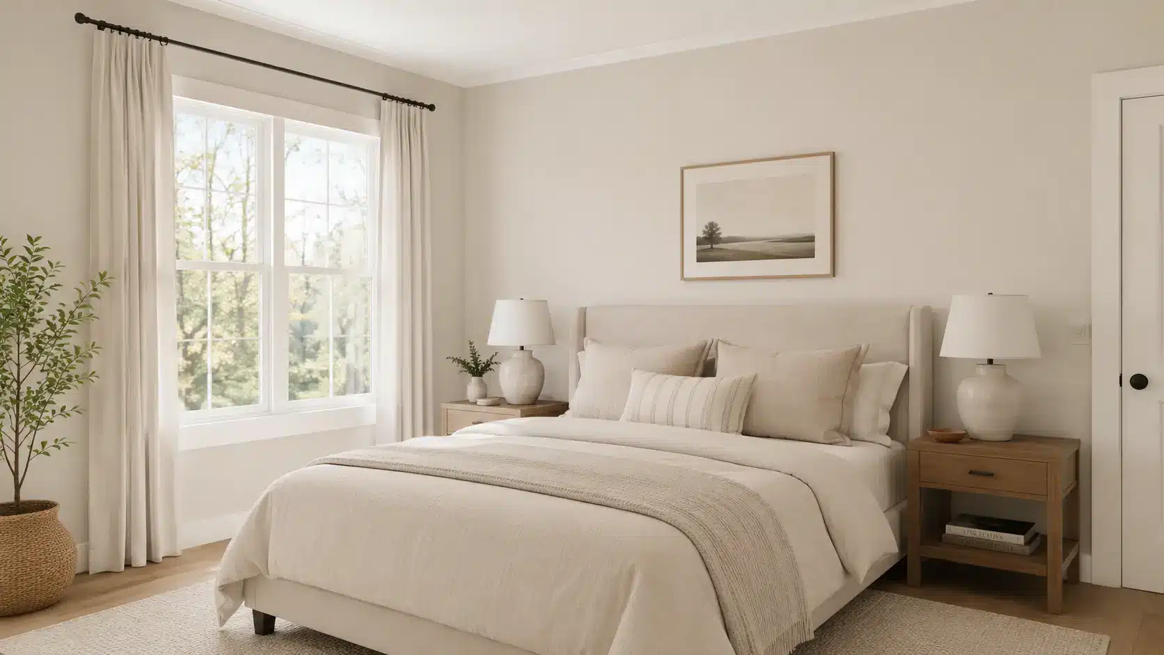
Bedrooms are where Pale Oak earns most of its reputation. The soft, low-saturation quality that can make it tricky in high-traffic living spaces becomes an asset in a room built for rest. Matte or eggshell finish keeps it genuinely calm.
White Dove OC-17 on the trim blends softly rather than cutting harshly. Keep bedding and fabrics in cream, warm white, or muted linen tones; bright whites can pull the lavender undertone forward.
If you’re still comparing options, there’s a full palette of cozy bedroom paint colors worth checking before you decide.
Kitchen
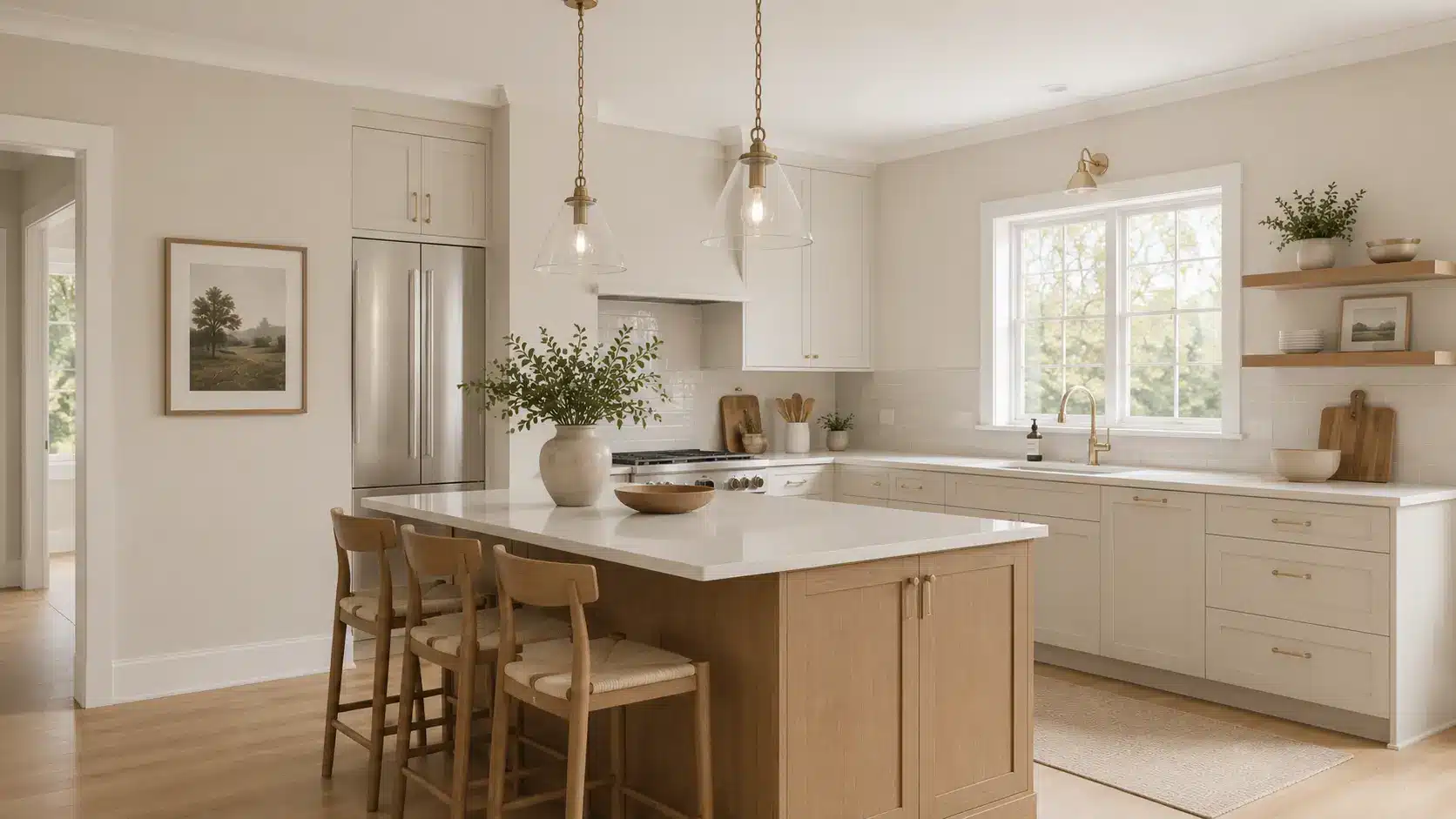
Pale Oak works as a kitchen wall color, especially paired with white or natural wood cabinets. White cabinets can pull the cooler, grayer side of OC-20 forward, which looks refined, while cream cabinets amplify the pink-beige side.
Test your specific cabinet finish against a Pale Oak sample before committing. Brass and nickel hardware read well against it either way. Use a satin or eggshell finish for ease of cleaning. If you’re designing the wider kitchen layout, minimalist kitchen design pairs naturally with a neutral like Pale Oak as its wall color.
Bathroom
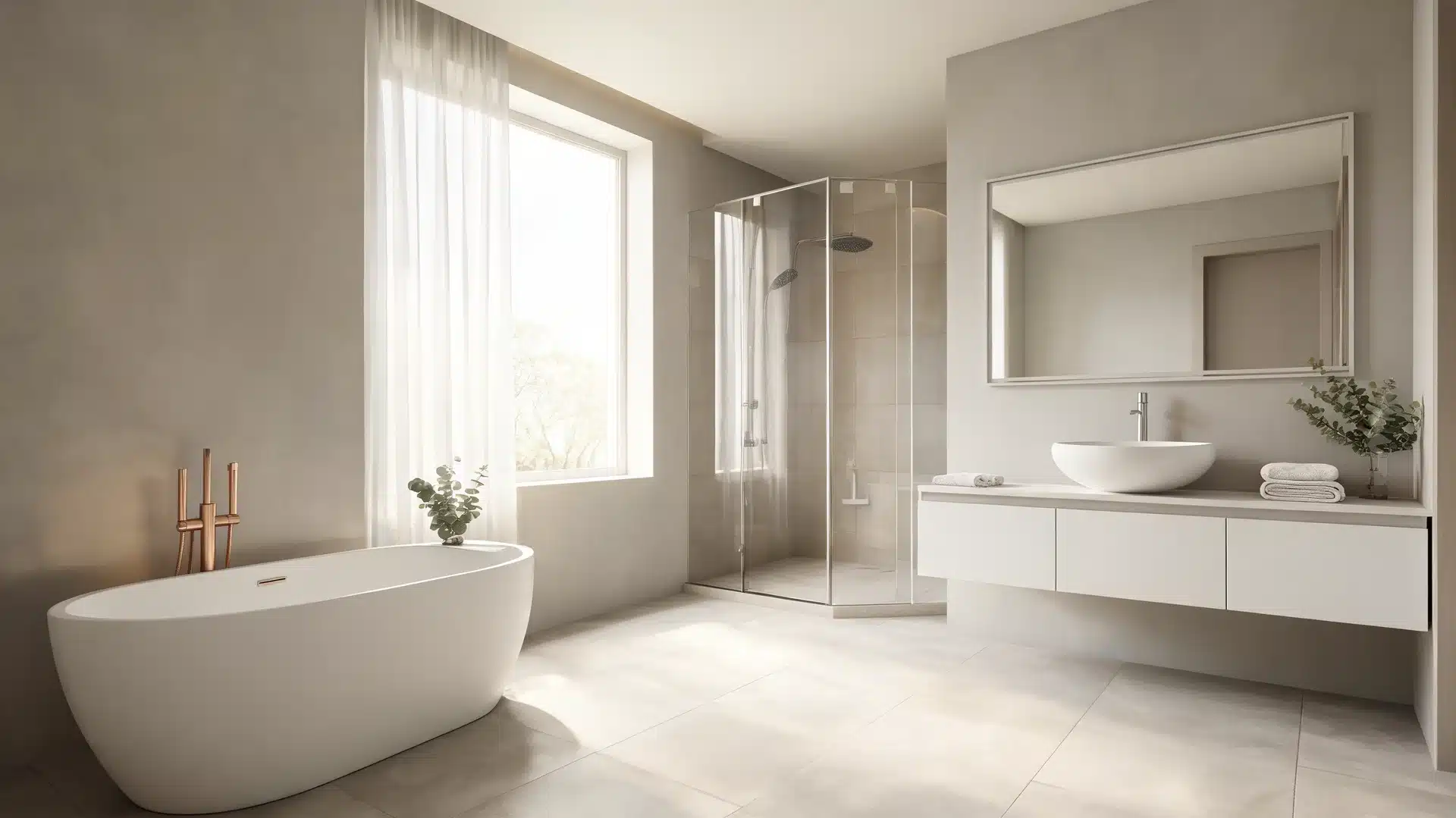
In bathrooms with bright tile and reflective surfaces, Pale Oak softens the clinical quality that white-on-white schemes can have. Its warm gray-greige base creates a spa-like calm without requiring any warm-toned tile to get there.
Satin or moisture-resistant finish is the right call for humidity. One caution: bathrooms with cool, recessed lighting and white tile together can bring out the lavender undertone fairly strongly. Test it under your actual bathroom lighting before rolling it out on all four walls.
Exterior
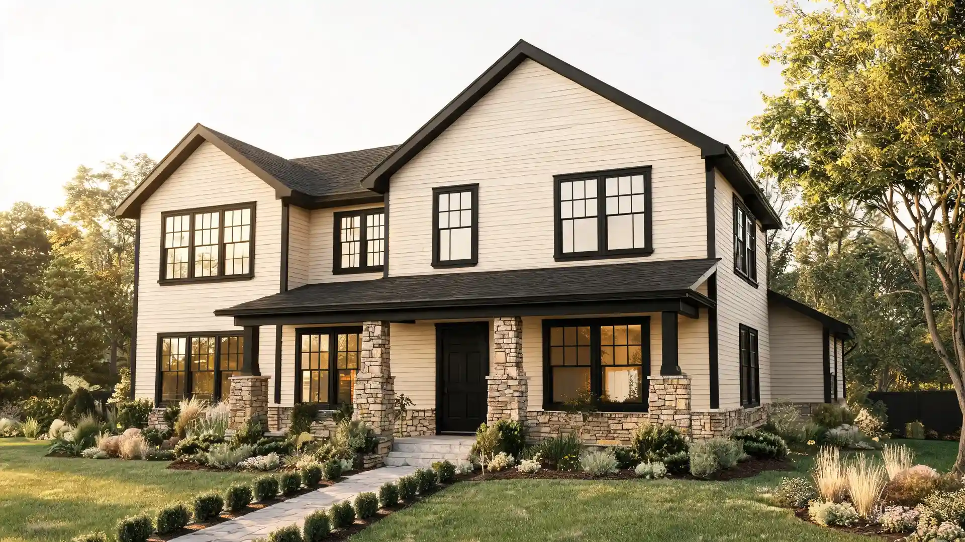
Pale Oak on an exterior reads lighter than it does indoors; direct sun bleaches the depth out of it. It works best for homes that want a warm, soft-white exterior rather than a true white.
Pair it with deep charcoal or black window trim (Wrought Iron 2124-10 is a strong choice), and the contrast holds the facade together. It reads well against stone and brick too.
For modern farmhouse and transitional exteriors, this is a genuinely useful color — softer than a true white, more refined than a heavy beige. Paint a large sample board (at least 12×12 inches) and look at it at multiple times of day before committing to the full exterior.
Coordinating Colors for Pale Oak OC-20

Pale Oak pairs best with colors that either provide clean contrast or share its warm gray register without competing with it. When building a cohesive pale oak color palette, these four combinations are thoroughly tested formulas, each serving a distinct purpose:
| Color | Pairing Character | LRV | Best Use |
| Chantilly Lace OC-65 | Clean contrast, crisp edge | 90.04 | Trim, ceilings, cabinets |
| Gray Cardigan 1600 | Cool, grounded contrast | 34.74 | Accent walls, doors, built-ins |
| Dinner Party AF-300 | Rich, warm depth | 8.43 | Dining room accent wall |
| Wrought Iron 2124-10 | Dramatic contrast, high impact | 8.17 | Doors, trim, exterior accents |
Chantilly Lace and Wrought Iron give you the clearest version of Pale Oak’s range, soft and airy at the top, bold and grounded at the bottom. Dinner Party is worth knowing if you’re working in a dining room or study where a moody accent wall alongside Pale Oak walls would give the space some real character.
How Pale Oak Compares to Similar Colors
The comparison questions about Pale Oak come up constantly, mostly because it reads so similarly to several other popular neutrals on a paint chip but behaves quite differently on the wall. Here are the three comparisons that matter most.
Pale Oak vs. Balboa Mist 1549
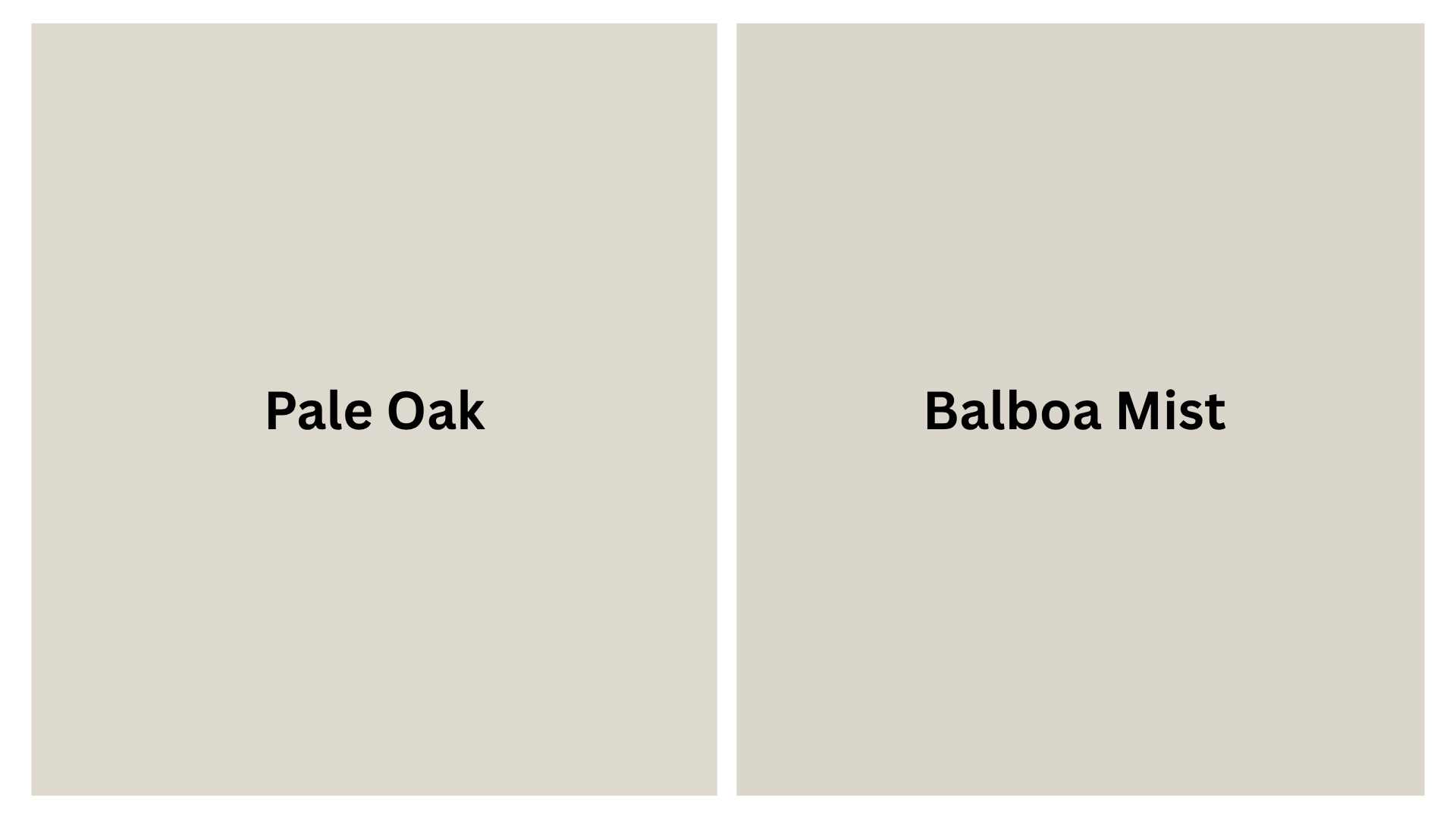
Pale Oak (LRV 68.64) is lighter and a touch warmer. Balboa Mist 1549 (LRV 65.53) leans grayer and cooler; it has less of the pink-taupe quality and reads more cleanly as a classic gray-greige.
If the lavender undertone in Pale Oak is a concern, Balboa Mist is worth sampling alongside it. It’s also a stronger choice for rooms where you want a color that reads definitively “gray” rather than “neutral greige.”
The Moonshine BM another off-white in the same family if you want a third option to compare in that lighter neutral range.
Pale Oak vs. Classic Gray OC-23
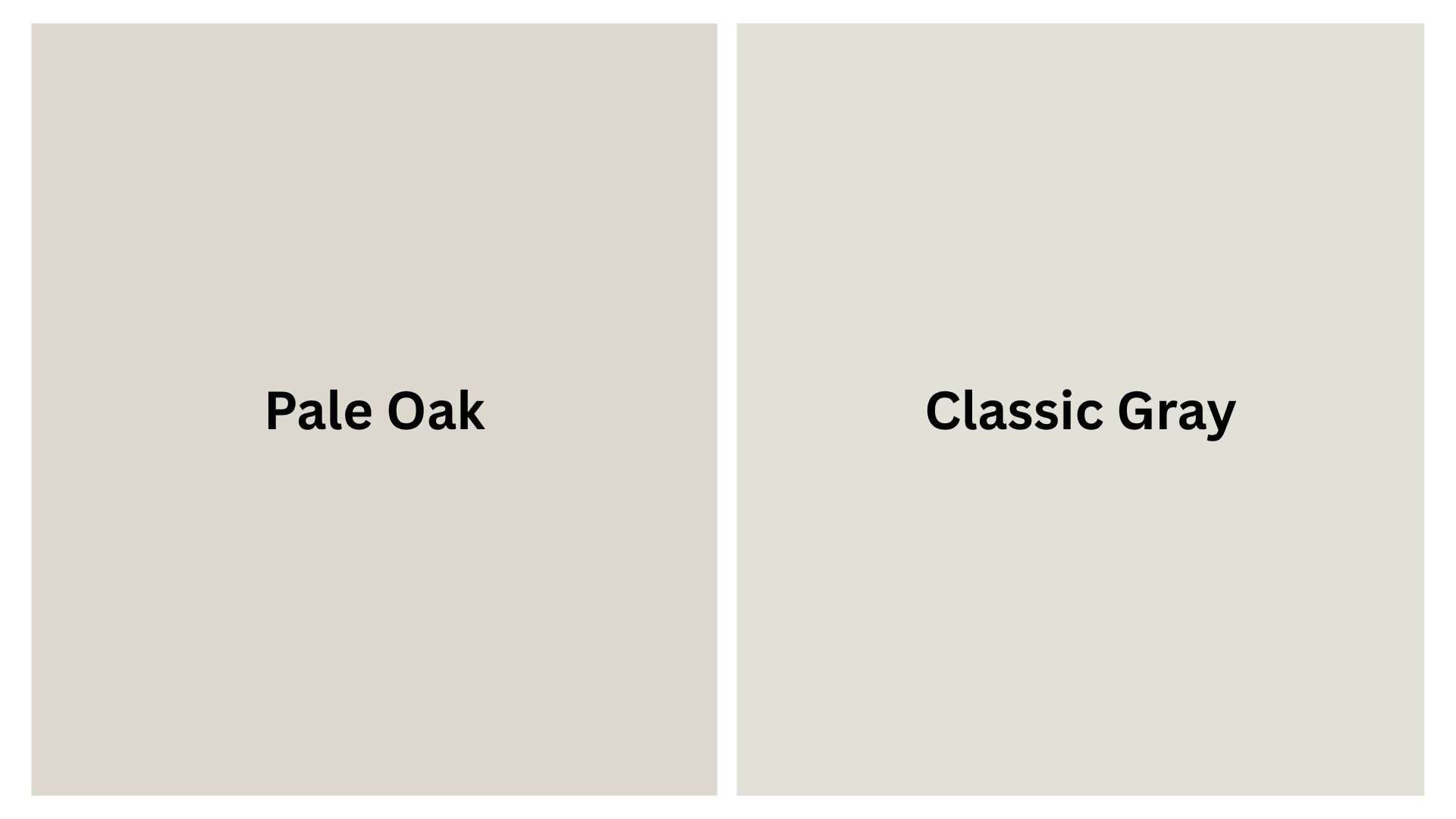
Classic Gray OC-23 is lighter (LRV around 73) and leans closer to off-white. It has a warm gray quality but far less of the taupe-pink complexity that makes Pale Oak interesting in some rooms and challenging in others.
Choose Classic Gray if you want something cleaner and less inconsistent. Choose Pale Oak if you want more depth and are willing to manage the undertone.
Pale Oak vs. Edgecomb Gray HC-173
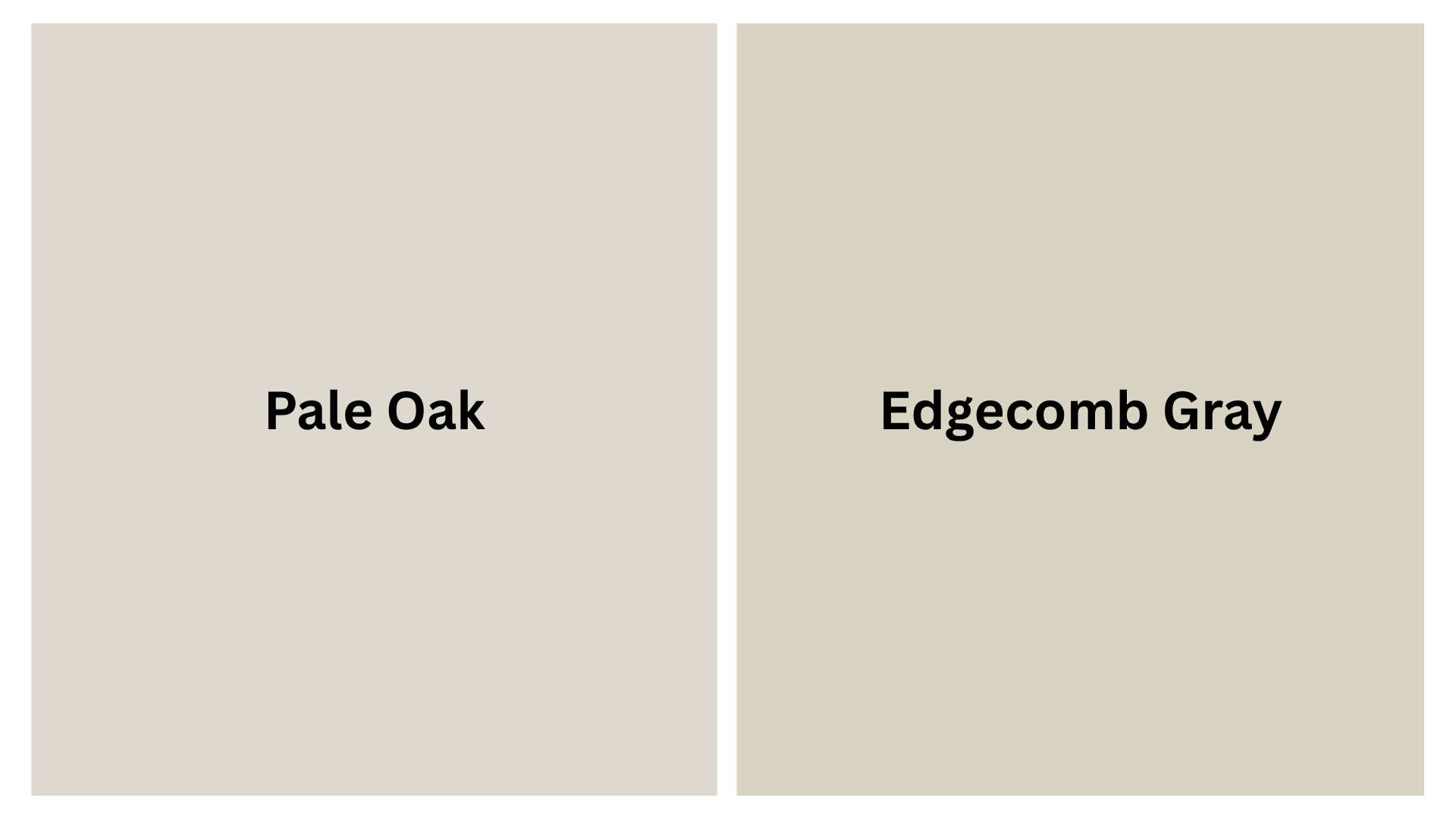
Edgecomb Gray HC-173 is warmer and more distinctly beige than Pale Oak. It has less of the gray quality and leans toward a warm taupe without the lavender shift.
If you want a beige-greige that stays consistent across light conditions and doesn’t surprise you after dark, Edgecomb Gray is more predictable. Pale Oak is more versatile across different décor styles but less stable in color behavior.
When Not to Use Pale Oak
Being specific about where a color fails is more useful than listing where it works well, because the failures are what cost people time and money.
Skip Pale Oak in rooms with very little natural light and only cool-toned artificial lighting. Under those conditions, the lavender-pink undertone dominates, and the color looks neither gray nor beige, just slightly off. North-facing basements and interior bathrooms with recessed daylight LEDs are the most common problem scenarios.
Also avoid Pale Oak on walls adjacent to cherry, mahogany, or reddish oak floors. Those warm red-brown tones conflict with the taupe undertone and amplify the pinkish quality to an unflattering degree. Pale Oak paired with those woods tends to look unintentional rather than warm.
One more: rooms with predominantly yellow or yellow-beige finishes — think warm travertine tile or honey-toned hardwood throughout- can make Pale Oak read pink by contrast. Test carefully in those environments before painting all four walls.
Tips for Using Pale Oak Successfully
- Always test on at least two walls — one sun-exposed, one not — before buying more than a sample.
- Check the sample at different times of day and under your actual artificial lighting, not just in daylight.
- Pair with warm whites (White Dove or Chantilly Lace) for trim; avoid cool-toned whites.
- Use warm (2700K) or soft white (3000K) bulbs — cool LEDs surface the lavender undertone.
- Add contrast through dark accents, wood tones, or pattern; without it, the room can look flat.
- Use Samplize peel-and-stick samples if you want to test multiple walls without painting directly on them.
- Avoid judging the color from photos on screens — screens shift undertones significantly.
Where to Buy Benjamin Moore Pale Oak OC-20
Pale Oak OC-20 is available at any authorized Benjamin Moore retailer and directly through the official Benjamin Moore website. The color is offered in both interior and exterior formulas across multiple product lines.
Use Benjamin Moore’s Find a Store tool on their website to locate the nearest authorized dealer. Order a physical sample or a Samplize peel-and-stick sample before buying a full gallon. Pale Oak is a color that earns its testing time.
Frequently Asked Questions
Does Pale Oak look purple or pink on the wall?
It can. Pale Oak has taupe-pink undertones that shift toward lavender in cool or north-facing light. In balanced or warm light, it reads as a calm gray-greige. The purple cast surprises people who only sampled it in a sunny room. Always test under your actual lighting conditions, especially after dark.
What is the best trim color for Pale Oak?
Chantilly Lace OC-65 for crisp contrast, or White Dove OC-17 for a softer, more blended look. Avoid cool-toned whites and stark whites — they can make Pale Oak look dingy or amplify its pink undertone.
Is Pale Oak too beige or too gray?
Neither, in most lighting. It sits squarely between the two, which is exactly its appeal. South-facing rooms pull it beige; north-facing rooms pull it gray. The lavender undertone occasionally shows up under cool artificial light. Testing in your specific room tells you which side dominates.
Can Pale Oak be used for whole-house paint?
Yes, and it’s one of the most common uses. Its neutrality makes it easy to carry through connected rooms. The one risk with whole-house application is that rooms with different light exposures will show the color differently — some owners find that variation pleasing, others find it inconsistent.
What is a good Sherwin-Williams equivalent to Pale Oak?
Limewash SW 7520 is frequently cited as the closest match — similar warm greige base, slight taupe quality. Egret White SW 7022 is another option, sitting at a comparable LRV. Neither is an exact duplicate; always sample both in your space rather than substituting by spec alone.
When should I not use Pale Oak?
Avoid it in rooms with no natural light and cool artificial lighting, rooms with cherry or mahogany wood floors, and spaces where you need a truly bright white or a definitive gray. It’s a greige, not a neutral utility player — it has an undertone that shows up in the wrong conditions.
Does Pale Oak work with gray furniture?
Warm gray furniture pairs well. Cool gray furniture with blue or green undertones can clash, pulling the lavender quality in the wall forward. If your furniture reads blue-gray, test Pale Oak carefully — Balboa Mist or Classic Gray may be a better match for that combination.
Final thoughts
Paint color choices often feel simple until light changes how they behave in real spaces.
You see how this soft greige can lean warm, cool, or even slightly lavender depending on lighting conditions. You also understand where it performs well, like balanced living rooms, and where it struggles, such as dark or cool-lit rooms.
I also highlight how pairing furniture, flooring, and bulbs shapes the final look more than the paint itself. Pale Oak OC-20 works best when you test it under real lighting before deciding on full-room coverage.
I encourage you to try samples in your space and share what changes you notice across different times of day.


