

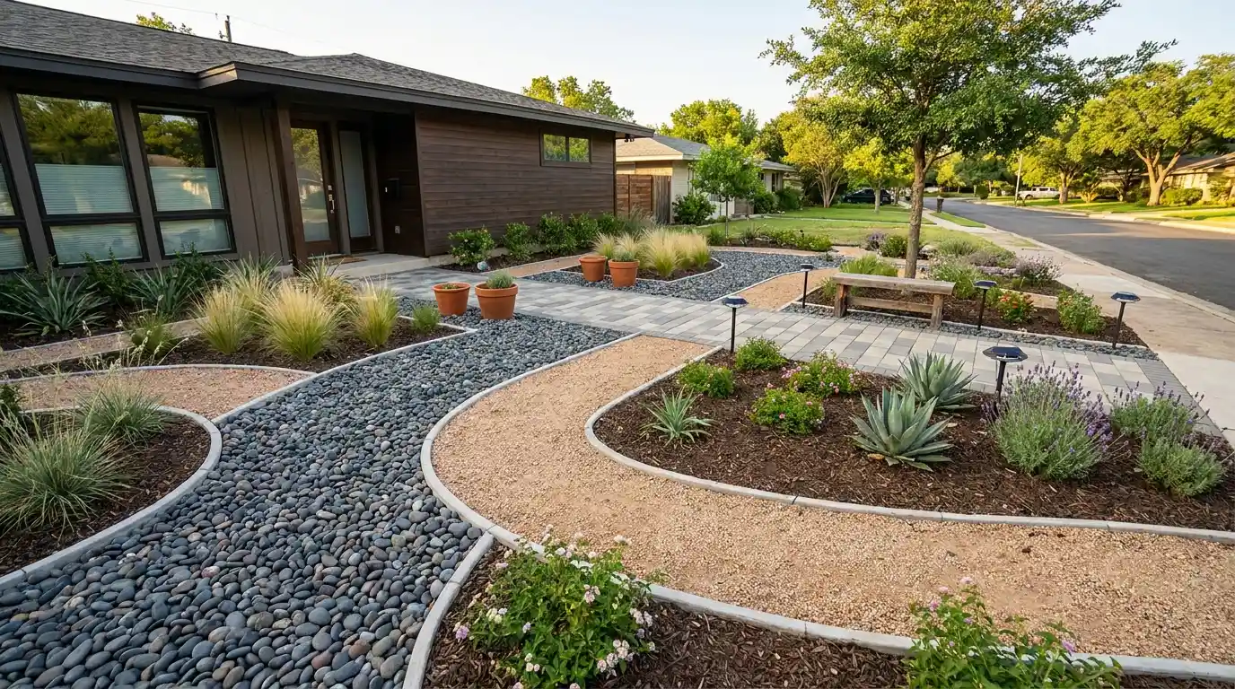
Gravel holds, mulch shifts, decorative concrete stays flat for decades if it’s sealed properly, and cracks if it isn’t. That’s what I’ve seen after years of evaluating front yard materials through freeze-thaw cycles, hard rains, and summers that bake surfaces to 140 degrees. Cheap no grass front yard ideas aren’t hard to find. What’s harder to find is honest information about which ones still look good two winters from now and which ones require you to start over. This article covers materials, costs, failure modes, and the decisions that matter before you spend anything. If you’re replacing a lawn you’re tired of maintaining, here’s what I’d actually tell a homeowner standing in their driveway trying to figure out where to start. Material Comparison: No Grass Front Yard Options Before choosing a material, understand its real-world performance, not just what it costs per bag at the hardware store. These figures reflect installed costs for a standard 500–800 square foot front yard in the US. Regional labor rates can shift costs by 20–40% in either direction. Material Installed Cost (per sq ft) Lifespan Maintenance Climate Suitability Pea gravel $1.50–$3.50 Indefinite with top-ups Low: re-rake 1–2x per year All climates; avoid on slopes Decomposed granite $1.00–$3.00 3–5 years before refresh Low: compacts well, minimal drift Excellent in dry climates; muddies in wet Organic bark mulch $0.50–$2.00 1–2 years per layer Medium: annual refresh required All climates; avoid in standing water zones Concrete pavers $8.00–$20.00 25–50 years Low: occasional re-sanding of joints All climates; needs proper base in freeze zones Stamped concrete $8.00–$18.00 25+ years if sealed Low: reseal every 2–3 years Good in mild climates; cracks in heavy freeze-thaw Artificial turf $5.00–$20.00 8–15 years Low: rinse and rake periodically Heat-prone without cooling fill; not for very wet climates Succulents + rock bed $3.00–$8.00 Plants 10+ years with right species Low: water twice monthly in summer Zones 8–11; frost kills most varieties Creeping thyme or ground cover $2.00–$5.00 Perennial, self-spreads Very low: trim once or twice yearly Zones 4–9; handles foot traffic and drought well Pea gravel and mulch have the lowest sticker price but aren’t always the cheapest over five years once annual refresh costs are factored in. That’s the math most homeowners miss when pricing out a no-grass yard. Cheap No Grass Front Yard Ideas That Hold Up These aren’t decoration ideas. They’re real installations I’ve seen survive multiple weather cycles. Cheap to install is not the same as cheap to own, and I’ll flag the difference where it exists. Pea Gravel with Weed Barrier Pea gravel installed over commercial-grade landscape fabric is the lowest-cost no-grass setup that actually stays put. Budget $1.50–$3.50 per square foot installed, plus edging. Skip the fabric, and you’ll be pulling weeds out of the gravel within one season. Use steel or aluminum edging along all borders, not plastic, which buckles in summer heat and heaves in freeze-thaw zones. On flat ground, this is a solid DIY project. Spread the gravel 2–3 inches deep and rake it level. The failure I see most often: people put down too little gravel, the fabric shows through, and the yard looks unfinished within a year. Minimum depth is 2 inches; 3 inches is better on a front-facing surface. Pro Tip: Use ¾-inch crushed gravel near the path you walk most often. Pea gravel is round and rolls underfoot. Crushed angular gravel locks in place and handles foot traffic far better over time. Rock Garden with Drought-Tolerant Plants A layered rock garden with drought-tolerant plants costs $3.00–$8.00 per square foot depending on stone sourcing. The bigger expense is plant selection: native and drought-adapted species cost more up front but stop needing supplemental water within two growing seasons, while cheap nursery plants often need irrigation for years. Grade the ground before setting the stone. The biggest failure mode with rock gardens isn’t aesthetics. It’s water pooling near the foundation because nobody graded the bed away from the house. A 2% slope (roughly ¼ inch per foot) directed away from the house solves this. Any contractor can handle regrading; a homeowner with basic tools can too if the slope change is minor. Paver Pathway Yard Concrete pavers are the highest upfront cost in this list, but the lowest long-term cost per year. Installed at $8–$20 per square foot, a properly laid paver surface with a compacted gravel base and sand joint fill will outlast the house. A 4-inch compacted gravel base under pavers prevents settling in freeze-thaw zones. Skip the base and individual pavers tip and crack within three winters. Fill joints with polymeric sand, not regular sand. Regular sand washes out, letting weeds take root between pavers within a season. Polymeric sand sets firmly when wet and effectively locks out weed seeds. Mulch Beds with Defined Edging Mulch is the cheapest per square foot but requires the most ongoing investment of any material here. Budget $0.50–$2.00 per square foot installed, then expect to refresh 1–2 inches every 12–18 months. Organic bark mulch breaks down and feeds the soil, which is genuinely useful around plants, but it disappears faster than homeowners expect. The thing that makes or breaks a mulch yard is edging. Sharp metal edging separating mulch from the driveway and walkway is not optional if you want the yard to look clean for more than one season. Without it, mulch drifts, the edge blurs, and the whole design reads as neglected within a few months. For a low-maintenance front yard landscaping setup, mulch works best when paired with a defined plant structure, not spread across open ground. Desert-Inspired Xeriscaping Xeriscaping is drought-tolerant landscaping that minimizes or eliminates the need for supplemental irrigation. It’s the most climate-appropriate option for homeowners in USDA zones 8–11 and most of the Southwest. The EPA WaterSense program estimates that replacing a 1,000-square-foot lawn with xeriscaping can reduce outdoor water use by 50–70%, which translates to $200–$600 annually in warm climates where lawn irrigation runs spring through fall. The setup: compacted decomposed granite as the base surface, boulders and decorative rock for structure, and species like agave, salvia, ornamental grasses, or native shrubs for planting pockets. Installed cost ranges from $3.00 to $8.00 per square foot, depending on plant density. Avoid using the same xeriscape design in a Zone 5 or 6 yard. Most desert-adapted species won’t survive the first winter, and the gravel base will hold water without the drainage that warmer, sandier soils provide. For a broader look at how climate affects material choices across regions, the garden landscaping guide by region covers what actually works zone by zone. Succulent Front Yard Succulents work in the right climate and fail badly in the wrong one. In Zone 9 or warmer, a succulent bed over fast-draining sandy amended soil is genuinely low effort after establishment: water twice monthly in summer, less in winter, and the plants largely take care of themselves. Mix shapes deliberately: flat rosette types (Echeveria, Sempervivum), upright varieties (Aloe, Agave), and trailing ground cover types (Sedum, Delosperma) create the visual variation that keeps the front yard from looking flat. In Zone 7 or colder, limit succulents to containers you can move inside for winter. Ground-planted succulents at those latitudes freeze out, and replacing them each spring costs more than the design is worth. Artificial Turf Zones Artificial turf costs $5–$20 per square foot installed, depending on pile height, backing type, and infill material. The range is wide because quality varies enormously. Budget turf bought off Amazon at $2 per square foot looks fine on day one and starts looking matted, faded, and plastic-like by year three. Mid-grade turf from a reputable installer, with a UV-stabilized backing and silica sand or crumb rubber infill, realistically lasts 10–15 years. Heat is the issue nobody mentions when they’re browsing turf samples. Black-backed turf in direct sun can reach 150–180°F on a summer afternoon. For a front yard facing south or west in a warm climate, specify light-colored infill or heat-reflective backing. Using turf only in select zones along a walkway or near an entry keeps costs manageable while still reducing the lawn area that needs mowing. Pair it with gravel or pavers for the rest of the yard rather than going all-turf, which maximizes surface heat. Flower Bed-Focused Layout Structured flower beds replacing a full lawn are mid-range in both cost and maintenance. The budget is roughly $2–$5 per square foot for mulch and edging, plus plant costs that vary widely by species. Annual flowers need replanting every season, which adds cost and time. Perennial beds come back on their own once established and require only a spring cleanup and occasional division. Group plants by water needs, not just by color. Putting drought-adapted lavender next to thirsty impatiens means one of them is always wrong. Defined stone or metal edging between bed sections is what keeps a multi-species layout looking intentional rather than overgrown. Without it, root systems compete, and the defined planting zones blur within a growing season. Japanese-Inspired Minimal Yard The appeal of a Japanese-inspired minimal front yard is restraint: a small number of materials, placed deliberately, with clear negative space between them. Done well, this holds up for years with almost no intervention. Done poorly, it looks like a gravel lot with a few rocks thrown in. The elements that make this work: Decomposed granite or fine gravel raked to a consistent surface 2–3 large feature stones (not a dozen small ones) One structural plant such as a Japanese maple, ornamental pine, or compact boxwood as the focal point Maintain the raked surface monthly to keep the pattern defined. The design fails when homeowners add too many elements, trying to make it look “fuller.” It’s supposed to be spare. For a modern landscape design approach where fewer materials do more work, this is one of the strongest examples in a front-yard context. Gravel and Planter Combination A gravel base with large planters is the most flexible setup for renters, people who move frequently, or anyone not ready to commit to a permanent design. The gravel base costs $1.50–$3.50 per square foot installed; containers range from $30 for basic terracotta to several hundred dollars for powder-coated steel or large glazed ceramic. Every container needs drainage holes. A planter sitting on gravel without drainage will waterlog plant roots and rot them within one season. Use containers at least 12 inches deep for shrubs or ornamental grasses, and at least 8 inches for annuals and succulents. Large ceramic planters filled with saturated soil can weigh 80–100 pounds and damage a gravel surface if you need to move them. Lightweight fiberglass containers in large sizes are worth the price difference if repositioning matters. Creeping Thyme Ground Cover Creeping thyme is the most overlooked grass replacement in this list. At $2–$5 per square foot installed for plugs spaced 6–12 inches apart, it fills in within one growing season, handles moderate foot traffic, suppresses weeds once established, and requires no mowing. A once-yearly trim keeps it from going woody. It’s a perennial across Zones 4–9, which means it covers most of the US, including climates that would kill succulents over winter. It takes one full growing season to cover the ground, so your front yard will look like sparse plugs for the first summer. Use temporary mulch around the plugs to suppress weeds during establishment. After that first year, it spreads on its own, and maintenance drops to close to zero. It’s the most honest answer to “cheap no grass front yard” in a temperate climate, with a lower annual cost than gravel once refresh cycles are factored in. Mixed Texture Landscape Design A mixed-texture approach combines gravel in the open areas, mulch around plantings, pavers for pathways, and rock accents at borders. It’s how most well-executed no-grass yards are actually built because no single material does everything well. Gravel provides drainage and low-maintenance, low-cost options. Mulch feeds the soil around plants. Pavers provide durable walking surfaces. Rock adds visual weight where structure is needed. Every material needs a clear zone. Gravel paths, mulch beds, and paver areas need defined edging between them, or the boundaries blur within one rainy season, and the yard looks like it wasn’t planned. Sketch the layout before ordering anything, because the edging requirements between zones are what drive installation cost up when homeowners skip this step. Vertical Garden Front Yard Wall-mounted or fence-mounted planters take the planting off the ground entirely, which works well for yards with very small footprints, poor soil, or privacy fencing that needs softening. Installed systems run $20–$50 per linear foot for modular wall planters; a basic DIY trellis with hanging pots costs significantly less. The maintenance reality of vertical plantings: watering frequency increases because containers dry out faster than in-ground plantings, and root zones are smaller. A drip irrigation line running along the mounting rail, with emitters at each planter, is the only way to manage a vertical setup at scale without constant hand-watering. That adds $200–$600 to the project cost but makes the system actually sustainable. Without irrigation, most vertical gardens look good for a few weeks and then suffer from inconsistent watering. What Fails Two Winters Later Most no-grass front yards that look bad after a few years have one of four problems. None of them are design failures. They’re installation shortcuts that show up on a delay. Gravel without edging Round gravel migrates onto the driveway, lawn, and sidewalk within one season without steel or aluminum restraint edging. Reinstalling edging after gravel is spread costs significantly more than doing it right the first time. The edging needs to be set 2–3 inches into the ground and pinned with landscape stakes every 18–24 inches. Mulch without fabric Skip the weed barrier under mulch, and you’ll be pulling weeds through it every few weeks. Use commercial-grade non-woven landscape fabric, not the thin woven kind sold in home improvement stores. The woven type lets fine soil wash through over time and eventually provides a seed bed for weeds right on top of the barrier. Paver base on inadequate gravel Concrete pavers set on a 1-inch sand base over native soil will start heaving and tipping within two to three winters in freeze-thaw climates. The correct base is 4–6 inches of compacted gravel, then 1 inch of bedding sand, then pavers. Shortcuts here are expensive to correct after the fact: fixing it requires pulling up all the pavers and rebuilding the base. Wrong plants for the climate A front yard designed around succulent species planted in Zone 6 will lose most of its plants in the first hard freeze. Verify hardiness zone compatibility before buying plants, not after. The USDA Plant Hardiness Zone Map is the reference for this, and it’s free online. A front yard that loses its primary plant material in year one is not a cheap option, regardless of what the plants cost at the nursery. Cost Breakdown and Installation Guide Cost Note: Figures in this article are estimates based on national averages. Actual costs vary significantly by region, contractor, materials, and project scope. Always get at least three quotes before committing to any project above $1,000. A 600 square foot front yard conversion typically falls into one of three cost tiers. Understanding which tier fits your yard and budget before you start prevents the most common planning mistake: choosing a design that looks right but costs twice what you expected. Line Item Low End High End What Drives the Variation Sod/grass removal $0 (DIY) $600–$1,200 Sod depth, root systems, disposal cost Grading/leveling $200 $800–$2,000 Slope correction, drainage rerouting Landscape fabric $50–$100 $200–$400 Coverage area and fabric grade Edging (steel/aluminum) $100 $400–$800 Linear footage and material type Primary surface material (gravel, mulch, pavers) $300–$900 $4,800–$12,000 Material choice; pea gravel is cheapest, pavers most expensive Plants $50–$300 $800–$3,000+ Species, maturity size, quantity Labor (if contracted) $0 (full DIY) $800–$3,500 Project scope and regional labor rates The DIY ceiling on this work is real but limited. Spreading gravel, laying landscape fabric, setting stepping stones, and planting are all well within a capable homeowner’s range with no specialized skills or equipment needed. The two situations that require a licensed contractor: any irrigation work connected to the main water line (backflow prevention requirements vary by jurisdiction), and retaining walls or regrading projects that affect drainage toward a neighboring property. For design principles that connect the front yard to the rest of the property’s outdoor system, the deck skirting and foundation guide cover how exterior transitions affect the overall look at ground level. HOA and Permit Considerations Before converting a front yard from grass, check two things: your HOA covenants and your local municipality’s front-yard ordinances. Both can restrict material type, plant height, coverage percentage of hardscape versus landscaping, and whether gravel or artificial turf is permitted in the front yard at all. HOA restrictions vary widely. Some prohibit decomposed granite because it can drift onto sidewalks; others require a minimum percentage of “live vegetation” in front yard landscaping. Most municipalities don’t require permits for surface material changes unless they involve grading, retaining walls over a set height (often 18–24 inches), or connections to irrigation infrastructure. Call your local building department before starting any grading or drainage-redirect work; the call takes five minutes and can save a costly correction order. Frequently Asked Questions These are the questions I hear most often once someone has decided to replace the lawn but isn’t sure which direction to go. What is the cheapest way to replace a front yard lawn? Pea gravel over landscape fabric is the lowest installed cost at $1.50–$3.50 per square foot, followed by bark mulch at $0.50–$2.00. Both require steel edging to hold properly. Creeping thyme ground cover is cheaper long-term than gravel once annual refresh costs are factored in, but it requires one full growing season to establish. How do I keep weeds out of a no-grass front yard? Commercial-grade non-woven landscape fabric under any loose surface material (gravel, mulch, decomposed granite) is the primary weed barrier. Top it with a minimum of 2–3 inches of material. Treat any gaps in edging or at plant bases with a pre-emergent herbicide in early spring. Avoid woven landscape fabric: it breaks down faster and provides a seed bed once soil filters through it. Does a no-grass front yard add or reduce home value? Professionally installed hardscape and drought-tolerant landscaping generally hold or improve curb appeal and resale value, particularly in drought-prone markets. Poorly maintained gravel, faded artificial turf, or patchy mixed installations can reduce curb appeal. The NAR landscape impact report estimates that quality front yard landscaping adds 5–11% to perceived home value. What looks good as a grass alternative that isn’t gravel or concrete? Creeping thyme fills like a lawn, handles light foot traffic, and requires no mowing. It’s suitable for Zones 4–9. Low-growing buffalo grass or native ground covers work in warm, dry climates. Clover lawns are legal in most areas and require minimal care. Each of these is a living surface that performs similarly to turf but at far lower maintenance cost once established. How long does it take to install a no-grass front yard? A single-material gravel or mulch install on a 600 square foot yard takes one to two weekends for a capable DIYer, once grass removal is complete. Paver installations take longer: two to three weekends for the same area including base preparation. Hiring a landscape contractor typically reduces that to one to two days of crew time. Do I need to remove the grass before installing gravel or mulch? Yes. Laying gravel or mulch directly over living grass will result in the grass growing through the material within one to two seasons. Either sod-cut and remove the turf (rent a sod cutter for $60–$100 per day), apply a non-selective herbicide and wait two weeks before installing, or use sheet mulching (cardboard over the grass, covered with 4–6 inches of wood chips) for a slower, no-herbicide method. Is artificial turf a good, cheap option for a front yard? Budget artificial turf ($2–$4 per sq ft materials only) is not a good long-term value. It fades within 3–5 years and sheds microplastics. Mid-grade turf from a reputable installer ($8–$12 per sq ft installed) lasts 10–15 years with proper maintenance and is a reasonable trade-off against lawn upkeep costs. Avoid any turf without UV stabilization: it’s the single biggest quality differentiator. Summing Up The most durable cheap no grass front yard ideas are the ones that treat material performance as the first decision, not appearance. Pea gravel and landscape fabric hold for years if the edging is right. Pavers last a generation if the base is built correctly. Creeping thyme outperforms every other option on long-term cost in a temperate climate once it’s established. The failure modes, migrating gravel, weed-infested mulch, heaving pavers, almost always trace back to a skipped installation step, not the material itself. Before you order anything, check your climate zone, verify what your HOA permits, and decide whether the surface change requires any regrading. If the yard needs regrading toward the street or away from the foundation, get that done first. It’s the one step that’s nearly impossible to fix after the surface material is in place.
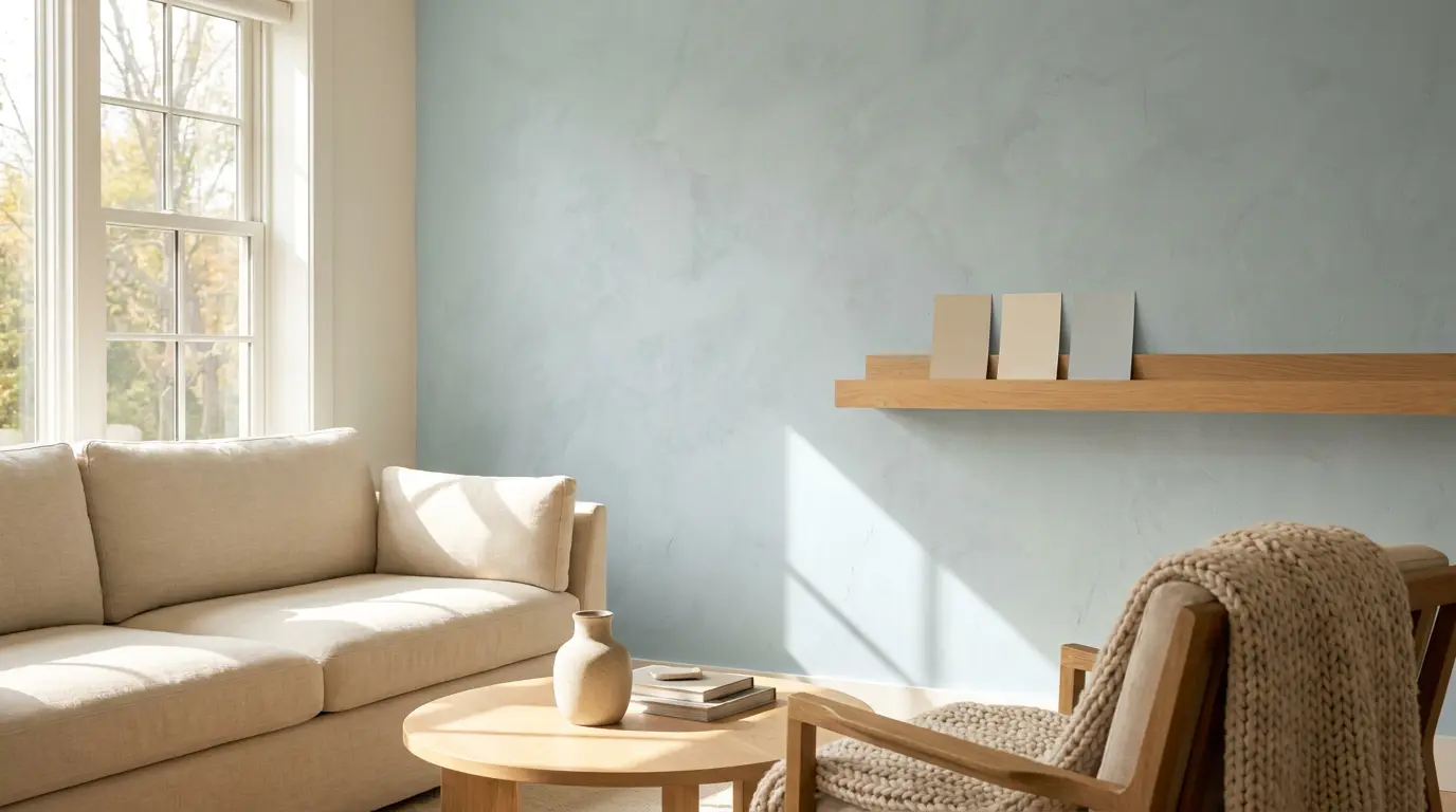
Color Name Woodlawn Blue HC-147 Brand Benjamin Moore Collection Historical Colors LRV 60.65 — medium-light Undertones Blue-green with a gray cast Best For Bedrooms, bathrooms, laundry rooms, porch ceilings, south- or east-facing rooms Avoid In Very dim rooms, spaces with cool gray floors, rooms where you want a true clear blue Ever stare at a paint chip and wonder why it looks different once it’s on your walls? Choosing Woodlawn Blue Benjamin Moore HC-147 can feel tricky when lighting, flooring, and finishes all shift its blue-green balance in unexpected ways. I know it gets frustrating when a calm color suddenly turns gray or green once painted. I’ll help you understand how this shade behaves in real rooms, what affects its undertones, and how to test it properly before committing. By the end, you’ll know where it works best, where it falls flat, and how to choose trim and lighting that keep it consistent across your space. What Woodlawn Blue Benjamin Moore Actually Looks Like on a Wall Woodlawn Blue HC-147 is a soft blue-green from Benjamin Moore’s Historical Colors collection with an LRV of 60.65 and a gray cast that keeps it from reading as bright or saturated. That gray influence is what gives it its restrained, almost collected quality; it never shouts blue, but it’s clearly there. The green undertone runs underneath the blue base, and depending on your light, it can push forward or quietly step back. What that means in a real room is that Woodlawn Blue reads differently at 8am than it does at 8pm, and it reads differently beside warm wood than it does against cool gray tile. That’s the tension at the heart of this color. It’s versatile, but it isn’t effortless. It needs the right light and the right surroundings to stay in its blue-green lane rather than tipping toward green-gray or dull. The rest of this review explains exactly when it works and when it doesn’t. How Woodlawn Blue Looks in Different Lighting Room direction is the single biggest variable with Woodlawn Blue. Test it in the actual moments when you use the space — not just at noon. North-facing rooms: The blue-gray side becomes dominant. The color can look flat and cool without strong natural light to bring it forward. I would sample carefully here before committing to four walls. South-facing rooms: The best-case scenario. Steady daylight keeps the blue-green balance intact and the color feels airy rather than muted. It may look a touch lighter than the chip at peak brightness. East-facing rooms: Morning light makes Woodlawn Blue feel fresh and clean. By afternoon it softens considerably, which works well for a bedroom or nursery that you want to feel gentle by evening. West-facing rooms: Muted during morning hours, then warmer and slightly greener as afternoon sun strengthens. The evening shift can be dramatic — sample it specifically at 6pm if this is a dining or living room. Artificial light: Warm incandescent or yellow LED bulbs pull the green undertone forward. Cooler daylight-spectrum LEDs keep the color closer to its blue-gray base. Always check the sample under your actual bulbs at night before painting. Real-Life Reviews of Woodlawn Blue Benjamin Moore Most Woodlawn Blue owners online notice that it actually feels like color, even though it’s muted. They say it doesn’t fade into the walls like a bland neutral, yet it doesn’t feel overwhelming either; it just fits. One Reddit user talked about it being “very soft and serene, but still plenty of color” in their bedroom, which is exactly the kind of nuance that paint chips don’t show. Because it’s not screaming “blue!”, it gives a room depth without clashing with furniture or décor. Many people who have used it in plenty of natural light say it stays calm without washing out. It reads as a thoughtful, not a loud shade. Whether it was a nursery wall or a grown‑up bedroom, Best Rooms to Use Woodlawn Blue Woodlawn Blue works best where the light and fixed finishes support its blue-green-gray base. Each room below outlines the best pairings and the conditions that cause problems. Bedroom In a bedroom, Woodlawn Blue creates a restful backdrop without disappearing into the wall. Its muted tone works well when you want color that feels calm at night and soft in the morning. Pair it with warm white trim, pale linen bedding, light oak furniture, or soft beige accents. If you’re weighing several bedroom colors for a cozy feel, Woodlawn Blue sits in the quieter end of that range, more settled than vivid. In darker rooms, sample it first, as the shade may lean more toward gray than blue when natural light is limited. Bathroom Woodlawn Blue can make a bathroom feel clean and gentle without turning cold. It works well with white tile, marble-style counters, chrome, brushed nickel, or warm brass. Check it beside your tile before deciding, bathroom surfaces reflect color quickly, and yellow, green, or strong gray undertones in the tile can shift how the wall color reads. Laundry Room A laundry room is a practical place for Woodlawn Blue because the color adds softness to a utilitarian space. It looks fresh with white cabinets, wood shelves, woven baskets, and simple beige or gray flooring. Since laundry rooms often have limited daylight, test it under your actual bulbs. That check will tell you whether the shade holds its blue-green balance or reads flat during daily use. Kitchen or Cabinets On kitchen walls, Woodlawn Blue brings a light, calm feel around white or warm neutral finishes. On cabinets, shadows fall differently on doors and corners, so the color can look deeper and more saturated than it does on a flat wall. Pair it with white counters, brass hardware, simple tile, and warm wood floors. For cabinetry, paint a vertical test board and view it beside the handles and counters before committing. Dining Room In a dining room, Woodlawn Blue feels relaxed and easy to gather around. It suits spaces with wood dining tables, cream chairs, linen curtains, black accents, and warm white trim. Because dining rooms are often used after dark, lamp light matters as much as daylight here. Check the sample during dinner hours before choosing; the goal is soft and inviting, not cool and washed out. Nursery Woodlawn Blue is a lovely nursery color when you want something peaceful but not too pale. It works with white furniture, natural wood, soft rugs, and pale green accents. The color grows well with the room, so it doesn’t feel limited to a baby stage. Keep the palette simple, particularly curtains and rugs, larger fabric pieces can shift how blue or green the walls appear through the day. Porch Ceiling For a porch ceiling, Woodlawn Blue gives a soft sky-like effect without reading too bright. This is the same blue-green family used in traditional haint-blue porch ceilings, though Woodlawn Blue reads as quieter and more gray-blue than the brighter haint shades. Outdoor light usually makes it appear cleaner and lighter than it does inside, so sample it outside specifically. It pairs well with white trim, stone, natural wood, and surrounding greenery. Because ceilings reflect light differently than walls, the color may look more airy overhead than the same sample appears in the room below. Best Trim Colors to Pair with Woodlawn Blue Trim changes how Woodlawn Blue reads on the wall. A softer white holds the color in its calmer range; a cleaner white brings the blue-green tone into sharper focus. Use this table to match the trim to the mood you’re after, then sample both together before painting. Trim Color Why It Works Benjamin Moore White Dove OC-17 A soft warm white that keeps Woodlawn Blue calm and gentle. The right call when your room has warm floors, wood furniture, or creamy fabrics. Benjamin Moore Chantilly Lace OC-65 A clean, bright white that sharpens the edge of the blue-green. Works well in rooms with white tile, modern finishes, or cooler surfaces. Benjamin Moore Simply White OC-117 A fresh white with slight warmth. Keeps the room bright without making Woodlawn Blue look too cold or too gray. Benjamin Moore Cloud White OC-130 A creamy white that softens the blue-green tone. Best when you want a warm, relaxed look rather than high contrast. Whites shift significantly once they sit beside blue-green paint, real flooring, and natural light, sample before painting, not after. Colors That Go with Woodlawn Blue Woodlawn Blue pairs best with colors and materials that support its soft blue-green-gray base rather than pulling it toward green or cold. Build the palette in layers: light colors for brightness, grounded accents for warmth, natural textures to keep the room from feeling flat. Soft whites: On ceilings, doors, and larger furniture pieces, they keep the room feeling open and help Woodlawn Blue stay light without looking stark. Warm neutrals: Beige, sandy tones, taupe, and soft greige soften the cooler side of the color and make the room feel more settled. Natural wood: Light oak, white oak, and maple add organic warmth through flooring, furniture, shelves, or woven pieces. This is the pairing that keeps Woodlawn Blue from reading too cool. Brass: In lighting, cabinet pulls, mirror frames, and small decor, brass adds warmth without overpowering the wall color. Black accents: Picture frames, curtain rods, hardware, or chairs in black give the soft wall color more definition without competing with it. Navy: Works well on pillows, art, rugs, or one statement furniture piece. It gives Woodlawn Blue a richer partner than bright blue would. Muted greens: Soft sage and gray-green shades link back to Woodlawn Blue’s green undertone. Keep them muted so the palette stays calm rather than becoming overly botanical. Linen textures: Linen curtains, cotton bedding, woven shades, and textured rugs make the color feel lived-in. These pieces prevent the room from looking overly styled. Test larger pieces beside the wall color first, particularly rugs, curtains, and wood furniture — these are the elements most likely to shift how the undertone reads. Woodlawn Blue vs. Palladian Blue Woodlawn Blue and Palladian Blue HC-144 are the two colors that come up on the same shortlist most often, and at first glance they look nearly identical. The LRV gap is negligible (60.65 vs. 60.4). The real difference is in the undertone: Woodlawn Blue reads more blue-gray, while Palladian Blue tilts toward green-blue. In practical terms, Woodlawn Blue tends to feel quieter and slightly more muted; Palladian Blue reads a touch fresher and airier. Feature Woodlawn Blue HC-147 Palladian Blue HC-144 LRV 60.65 60.4 General feel Muted, calm, slightly blue-gray Airy, soft, slightly green-blue Main risk Can look dull or gray in weak light Can look minty in bright or warm light Best for Bedrooms, baths, laundry rooms, porches Bedrooms, baths, coastal rooms, open spaces Choose Woodlawn Blue if you want a quieter, more grounded shade. Choose Palladian Blue if you want something with a slightly fresher, brighter lift. Because they are so close, the only reliable way to choose is to sample them side by side in your actual room under your actual light. Closest Matches in Other Paint Brands These are the most comparable colors from other brands, useful for comparison shopping, but not as direct substitutes. Every brand uses different pigment bases, so what reads as a match on screen may behave differently on your wall. Sample any candidate beside Woodlawn Blue before buying. Brand Color How It Compares Sherwin-Williams Rainwashed SW 6211 Light blue-green with a calm, airy feel. May show more green than Woodlawn Blue in some rooms. Sherwin-Williams Copen Blue SW 0068 Muted blue-green with similar softness, but slightly different depth and character. Behr Nature’s Reflection N430-2 A soft blue-green option in the same family, though not a direct match in every light condition. Farrow and Ball Light Blue No. 22 A silvery blue with a calm feel. Reads more layered and muted than Woodlawn Blue. Judge these options on your wall in your light — not on a screen or a store chip. When Not to Use Woodlawn Blue Woodlawn Blue needs light to show its character. In very dim rooms, it loses the blue-green balance and can read flat, shadowy, or gray rather than the serene shade people choose it for. That’s the clearest case for skipping it. It also needs care beside cool gray flooring, blue-gray tile, or stark white surfaces. Those finishes can push the whole room toward cold. Strong yellow bulbs are the other risk: warm artificial light tends to activate the green undertone more than most people expect, which can make the room feel greener than the chip suggested. If your goal is a clear, true blue with no green movement, Woodlawn Blue will likely disappoint. For a crisper coastal blue without the blue-green shift, consider Yarmouth Blue HC-155 or a saturated coastal shade instead. Sample first in all cases. How to Sample Woodlawn Blue the Right Way A small chip will not tell you enough about how Woodlawn Blue behaves in your home. This shade shifts with light, direction, and surrounding finishes in ways that only become clear at poster scale or larger. Use a large sample: A peel-and-stick sample or a painted board at least 12×12 inches shows the undertone far better than a chip. Larger is better. Test on more than one wall: A wall near the window and a shaded interior wall can show meaningfully different versions of the same color. Check throughout the day: Morning, afternoon, evening, and lamp light. The evening check under artificial bulbs is the one people most often skip and most often regret skipping. Compare it beside fixed finishes: Hold the sample against trim, flooring, tile, counters, and any large fabric pieces already in the room. These are the elements it has to live with. Sample it beside Palladian Blue: If you’re undecided between the two, put them on the same wall in the same light. The difference becomes clear in person in a way that side-by-side photos rarely capture. Leave it up for two full days: One afternoon is not enough. You need to see it across the full range of light your room actually receives. These are the questions I hear most often from people who already have the chip on their wall — and who want to make sure the full room goes right. Frequently Asked Questions What undertones does Woodlawn Blue have? Woodlawn Blue HC-147 has a blue base with a green undertone and a gray cast. The green side is stronger than most people expect from the chip, and it becomes more visible in warm light or beside yellow-toned bulbs. The gray cast is what gives the color its muted, historic quality. Does Woodlawn Blue look green in some lighting? Yes. In warm artificial light or west-facing rooms with strong afternoon sun, the green undertone can push forward enough that the color reads more green-blue than blue-green. This is the primary surprise for first-time users. Testing under your actual bulbs at night is non-negotiable before painting. Is Woodlawn Blue the same as Palladian Blue? No. They are close in LRV (60.65 vs. 60.4), but Woodlawn Blue reads more blue-gray while Palladian Blue leans green-blue. Woodlawn Blue is quieter and more muted; Palladian Blue is slightly airier. Sample both side by side in your room before choosing. What trim color goes best with Woodlawn Blue? White Dove OC-17 is the most reliable match — warm enough to hold the color in its calmer range without competing. Chantilly Lace OC-65 works if you want a sharper, cleaner contrast. Simply White OC-117 splits the difference and keeps the room bright without turning cold. Is Woodlawn Blue a good choice for a north-facing room? With caution. North-facing rooms make the blue-gray side dominant, and the color can look flat or cool without strong daylight to support it. If your north-facing room has large windows or white surfaces that bounce available light, sample it first on both the well-lit and shaded walls before deciding. What finish is best for Woodlawn Blue? Matte or eggshell for bedrooms and low-traffic areas — it hides wall imperfections and gives the color a softer, more relaxed appearance. Satin for bathrooms, kitchens, and laundry rooms — easier to clean and reflects slightly more light, which helps in spaces that run dim. Does Woodlawn Blue work on exterior walls? Yes, with the right primer and finish. All exterior paints fade with UV exposure over time, so a high-quality exterior formula and a proper primer extend the color’s life, particularly on walls with direct southern or western sun exposure. Final Thoughts Paint color decisions often come down to how a shade actually behaves once it’s on your walls rather than how it looks on a chip. Woodlawn Blue Benjamin Moore HC-147 stands out because it shifts between blue, green, and gray depending on light, which makes testing in your own space essential. I find it works best when you match it with the right trim, lighting, and surrounding materials so it stays balanced throughout the day. You should review your current rooms, test samples carefully, and choose combinations that keep the color steady in different conditions. Try a few samples besides your existing finishes and share how they respond in your lighting setup.
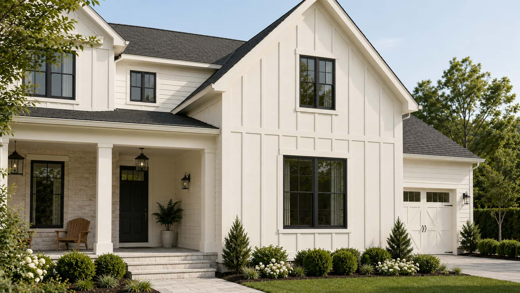
Color Name White Duck SW 7010 Brand Sherwin-Williams LRV 74, medium-light; reflects well without washing out Undertones Creamy beige with a soft greige pull; occasionally a faint pink in certain lighting Best For South- and west-facing rooms, exteriors, kitchens with warm wood, open-plan spaces Avoid In North-facing rooms with no warm lighting, spaces with cool gray floors or blue-gray tile Picking a white paint color sounds simple until you’re staring at 47 swatches that all look identical in the store. White Duck Sherwin Williams is one of those colors that genuinely surprises people; it reads differently depending on your light, your flooring, and your existing décor. It’s warm without being yellow, neutral without being cold, and versatile enough for both interiors and exteriors. If you’ve been going back and forth between creamy whites and greige neutrals, this color might be sitting right in your sweet spot. I’ll keep things practical here, with undertones, lighting, pairings, exterior use, and the Shoji White comparison covered clearly. What Sherwin-Williams White Duck SW 7010 Actually Looks Like on Your Walls Sherwin-Williams White Duck SW 7010 is a warm off-white that sits between a true white and a light greige, creamy without reading yellow, neutral without going cold. If you’ve been going back and forth between soft creams and warm neutrals, this color lands right in that overlap. At an LRV of 74, it reflects a solid amount of light while keeping enough depth to look intentional rather than washed out. A step warmer than Natural Choice SW 7011 and noticeably softer than a bright white, it sits in a genuinely useful middle range. I’ve placed White Duck in everything from sunny open-plan kitchens to dimmer east-facing bedrooms, and the results depend almost entirely on what surrounds it: your light, your trim, and your flooring matter here more than they do with most whites. White Duck Undertones and Lighting Effects Lighting strongly affects how Sherwin-Williams White Duck looks in a real home. This warm off-white has creamy beige and soft greige undertones, so it can shift between warm white, light beige, and muted greige depending on the room. Because White Duck is not a crisp white, it should be tested beside flooring, trim, cabinets, counters, and exterior materials before painting a full space. Check the sample in the morning, afternoon, evening, and at night so you can see how much warmth or depth appears throughout the day. In Natural Light Natural light can make White Duck look lighter, warmer, creamier, or more muted based on the direction of the room. In bright spaces, it often looks soft and clean. In shaded spaces, its beige and greige tones may become more noticeable. North-facing rooms: The light is usually cooler and softer. White Duck may look more muted, greige, or slightly beige in these rooms. It can still feel calm and cozy, but it works best with warm lighting, natural wood, soft white trim, and warm decor to keep the space from feeling dull. South-facing rooms: South-facing rooms get warmer daylight for much of the day. This light can make White Duck feel brighter, creamier, and more welcoming. It is one of the easier lighting conditions for this color because the natural warmth makes the paint look soft rather than flat. East-facing rooms: East-facing rooms get bright morning light, which can make White Duck look fresh and softly warm early in the day. As the light fades, the color may look more beige or greige. Warm bulbs can help keep the room feeling balanced later. West-facing rooms: West-facing rooms get stronger afternoon and evening light. During this time, White Duck can look warmer, creamier, and a little richer. This makes it a good choice for living rooms, bedrooms, dining rooms, and spaces where a cozy evening feel matters. In Artificial Light Artificial lighting can significantly change White Duck after sunset. Warm white bulbs can bring out more of its creamy beige side, making the room feel softer and cozier. Cool LED or daylight bulbs can make White Duck look flatter, grayer, or less warm. If you want the color to stay balanced, soft white bulbs are usually the safest choice. Layered lighting also helps White Duck look better. Use ceiling lights, table lamps, floor lamps, or wall sconces together so the color feels even across the room. This keeps White Duck looking soft, warm, and comfortable during the day and at night. Pro Tip: Before sampling on a wall, tape the chip next to your flooring, your trim, and the largest fixed surface in the room. White Duck’s undertones shift based on what surrounds it more than almost any other color in this range. The chip alone will not tell you what you need to know. Shoji White vs White Duck: Which One Do You Actually Need? These two come up together constantly, and with good reason — they’re close. But they’re not interchangeable, and getting this wrong means a repaint. Feature White Duck SW 7010 Shoji White SW 7042 LRV 74 74 Undertones Creamy beige with soft greige Warm cream with greige depth; occasional faint pink Overall Feel Slightly cleaner, more balanced Warmer, cozier, slightly richer Best For Exteriors, open-plan walls, cabinets Cozy interiors, bedrooms, spaces that need warmth Watch Out For Can look beige beside cool finishes Can look too warm or muted in low light The honest answer: if you want a soft off-white that reads a bit cleaner and works as well outside as it does inside, White Duck is the call. If you want more cozy warmth and you’re staying interior, Shoji White often suits a wider range of fixed finishes. Test both on the actual wall before committing, the difference between them is exactly subtle enough to read clearly only once they’re up. Choosing the Right Finish for White Duck Finish changes how White Duck reads on the wall, a higher sheen intensifies the undertones, while matte and flat finishes keep it soft and even. How paint sheens behave in different lighting conditions matters more with a warm off-white like White Duck than with most mid-tone colors, because sheen directly amplifies whether you see cream or greige on the wall. The right choice depends on the room’s traffic, moisture level, and how much shine you want. Finish Best For Why It Works Flat / Matte Bedrooms, ceilings, low-traffic walls Softest look; hides imperfections well; keeps White Duck from looking shiny Eggshell Living rooms, hallways, family rooms Balanced softness with light washability; most common choice for main walls Satin Kitchens, bathrooms, trim, doors Washable and durable; handles moisture without compromising the warm tone Semi-Gloss Cabinets, doors, exterior trim Hardest finish for high-contact surfaces; clean contrast at edges One note on trim: White Duck is generally not my recommendation as an interior trim color. At LRV 74, it’s deep enough that it won’t create meaningful contrast against most wall colors. Use it on the walls and bring the trim up, Pure White (SW 7005) or Extra White (SW 7006) create the clean separation that lets White Duck read as the warm wall it’s meant to be. Where White Duck Works Best, Room by Room White Duck is flexible, but it performs differently depending on the room’s light, fixed finishes, and how much warmth the space already carries. Here’s where it does its best work and what to pair it with in each space. Living Room White Duck creates a relaxed, livable backdrop in a living room. It works particularly well with linen sofas, wood coffee tables, black frames, woven rugs, and warm white curtains. Because it reads light without looking stark, it doesn’t compete with furniture — it recedes and lets the room breathe. In open-plan spaces, this color moves well through living, dining, and entry zones without getting tired. Bedroom In a bedroom, White Duck is quiet in the best way. It pairs naturally with white bedding, beige or taupe throws, wood nightstands, and muted green accents. Warm enough to feel cozy at 10pm under soft lighting, clean enough to feel fresh at 7am when the morning light comes in. For bedrooms, flat or matte finish is the call — it keeps the color soft and absorbs rather than reflects the overhead light. Kitchen White Duck on kitchen cabinets works well when the surrounding finishes are warm — brass hardware, wood floors, stone countertops, and warm white backsplashes all support it. The color brings softness without making the kitchen feel dim. Where it runs into trouble is beside icy quartz, blue-gray tile, or very cool white cabinet pairings; those cooler surfaces pull out the beige side of White Duck in a way that reads less warm, more muddy. Bathroom Bathrooms with warm stone, cream tile, beige floors, brushed brass, or wood vanities are where White Duck looks most at home. In bathrooms with cool gray tile or blue-toned marble, expect the beige undertones to become more pronounced- not necessarily a problem, but worth testing with a real sample before committing. Good layered lighting is more important in bathrooms than in any other room for this color; a single overhead bulb will not give you an accurate read. Hallways and Open Layouts White Duck is genuinely good for hallways and open-plan spaces because it stays consistent across different light exposures without getting dramatic. It threads through entries, stairways, dining rooms, and living areas without changing color. That said, open layouts with a mix of warm and cool fixed finishes need a careful sample test; what looks balanced in the south-facing living room can read more beige in the north-facing hallway off the same paint can. Sherwin-Williams White Duck on the Exterior Choosing a Sherwin-Williams White Duck exterior finish gives your home a soft white look that reads warm without the harshness of a bright white in direct sun. Its creamy beige and greige undertones help it sit naturally beside brick, stone, and wood; the color feels like it belongs rather than being applied on top. For modern farmhouse, craftsman, colonial, and transitional homes, this is a reliable exterior choice. Exterior Area Best Use Why It Works Siding Whole-house body color Soft white look that holds in direct sun without glare Painted Brick Full brick or accent surfaces Warms up the brick texture without flattening it Stucco Main exterior body Softens rough texture; creates a warm, finished look Trim and Fascia Subtle contrast with deeper body colors Works when you want trim that reads soft rather than bright white Garage Doors Matching or blended with siding Reduces the visual weight of large garage doors from the street Shutters Paired with dark accents Warm base for black, bronze, navy, or sage shutters The critical exterior testing note: sample White Duck on more than one side of the house. In direct sunlight, it reads as a clean, soft white. In shade, the north-facing wall, the covered porch, the areas under the roofline, the greige and beige pull forward. Both reads can work beautifully, but you want to see them before painting the whole house. For the strongest exterior contrast, pair it with a near-black like Greenblack for contrast on shutters, doors, and trim, the warm white and deep near-black combination is hard to get wrong. What People Discuss About Benjamin Moore White Dove Reddit user was overwhelmed by the paint selection process and worried that most creamy whites would look too yellow or dirty, or clash with orange-toned wood flooring. After trying different options, they chose Sherwin-Williams Creamy and were pleasantly surprised by how balanced and versatile it looked. Another Reddit user joined the discussion and specifically recommended Sherwin-Williams White Duck, noting that it is one of the brand’s strongest white paint colors and a reliable choice when searching for a warm off-white that works with a variety of finishes and lighting conditions. The conversation highlights how White Duck is often suggested by homeowners seeking a soft, warm white that avoids the harshness of bright whites yet remains flexible enough for different spaces. Coordinating Colors That Work With White Duck White Duck’s warm off-white base pairs best with colors that add warmth, depth, or contrast without pushing toward yellow or cool gray. Since it sits at LRV 74, it can hold its own against both light neutrals and deeper accent colors without disappearing. If you’re still deciding between White Duck and other options in this range, the broader comparison of warm white paint colors lays out how the whole family behaves side by side. Coordinating Color Code LRV Best Use With White Duck Accessible Beige SW 7036 58 Adjoining rooms; soft whole-home palette Natural Linen SW 9109 66 Layered neutral palette for bedrooms and living rooms Urbane Bronze SW 7048 8 Doors, shutters, accent walls, exterior accents Dried Thyme SW 6186 21 Cabinets, shutters, accent walls Tony Taupe SW 7038 37 Accent walls, adjoining rooms, exterior trim Use Accessible Beige or Natural Linen when you want a layered, soft neutral palette that moves between rooms without contrast. Reach for Urbane Bronze, Dried Thyme, or Tony Taupe when you need depth and contrast that White Duck’s warmth can anchor without being overwhelmed. When NOT to Use White Duck White Duck is versatile, but it has limits. These are the situations where it consistently underperforms, and where a different color would serve you better. Rooms with predominantly cool gray flooring will pull out the muted, beige side of White Duck, and the walls can end up looking dull rather than warm. Spaces with blue-gray tile, cool quartz countertops, or silver-toned fixtures have the same problem: the cool finishes win, and White Duck looks like it can’t decide what it wants to be. Very bright white trim– particularly cool whites like Chantilly Lace (BM OC-65), can make White Duck look darker or creamier than intended, especially in rooms where the trim is a dominant visual element. That’s not always a bad thing, but it’s rarely what people expect when they choose White Duck for its soft white quality. Basements and rooms with no natural light are a risk. White Duck’s warmth is an asset in light-starved spaces, but without the right artificial lighting setup, soft white bulbs, and layered sources, it can read more beige and flat than you’d want. If the artificial lighting can’t be improved, consider a lighter option like Alabaster (SW 7008) at LRV 82. Finally, if you’re expecting a true crisp white, White Duck will not deliver that. At LRV 74 with a creamy greige base, it is a deeper, warmer off-white by design. Going in with that expectation prevents the most common source of disappointment with this color. Mistakes to Avoid With White Duck SW 7010 Testing White Duck paint without proper sampling can lead to unexpected color shifts on your walls, exteriors, and trim. Relying on digital screens: Monitor settings and photo editing distort the color, causing a soft white to look beige in person. Pairing with warm trim: Matching it with Alabaster blends the tones together, creating a flat look instead of crisp separation. Testing one exterior spot: Different lighting conditions cause north-facing walls to look greige while south-facing walls look much brighter. Always test your paint swatches in multiple locations and different lighting environments to ensure you love the final results. How to Sample White Duck the Right Way A careful sample process is the difference between getting White Duck right and repainting a room three months later. Here’s what I recommend before buying the gallons. Buy the actual sample pot, not a peel-and-stick chip. Samplize and similar services are useful, but nothing replaces painting two large swatches, at least 12 by 12 inches, directly on different walls in the same room. Check those swatches at 7 am, noon, 5 pm, and again at 9 pm under your actual lighting. That sequence tells you more about how White Duck will behave in your space than any chip or digital swatch can. Place the swatches next to your real furniture, rugs, flooring, and cabinets, not on an empty wall in a stripped room. The color reads entirely differently when it’s surrounded by the fixed finishes it’ll actually live with. Check it against your trim color specifically; that relationship determines whether the undertones read as intentional warmth or as a muddy, indecisive beige. Let the paint dry completely before judging it; wet White Duck reads darker and warmer than the final dried result. Frequently Asked Questions About Sherwin-Williams White Duck Can you use White Duck on ceilings? Yes. Using it on ceilings creates a cohesive, wrap-around feel in large spaces. Pair it with Matte or Flat finish to soften the room’s corners, prevent glare from artificial lights, and mask minor drywall imperfections without making the ceiling feel too low or heavy. Does it look yellow in low-light basements? Instead of shifting yellow, White Duck leans flat and muddy in dark basements. Without natural sunlight, its greige undertones take over, turning the color a shadow-like beige. You will need strong, layered 3000K lighting to keep it looking like a fresh, warm off-white. How does White Duck handle wood rot or exterior grime? Its medium-light depth hides dust, pollen, and minor outdoor scuffs much better than a bright, crisp white. While it will not mask severe wood rot, the subtle greige baseline helps your exterior siding look cleaner for longer between seasonal power washings. Will it clash with trendy black steel windows? Not at all. It provides a stunning, high-contrast backdrop for modern black window frames. The inherent warmth of the paint softens the industrial look of the black steel, creating a balanced, contemporary facade that feels inviting rather than stark or clinical. Does White Duck work well in nursery spaces? It is an excellent choice for a calming nursery backdrop. The neutral base grows easily with your child, shifting effortlessly from soft pastel decor to vibrant toddler bedding without requiring a repaint. It stays peaceful under dim nightlight conditions. Can it be used for color-drenching a room? Color-drenching walls, trim, and doors in White Duck works beautifully if you vary the sheens. Apply Satin to the trim and Satin or Semi-Gloss to doors while keeping walls Eggshell. This maintains monochromatic harmony while preventing the architectural details from completely disappearing. Final Thoughts White Duck proves that a soft white can feel warm, clean, and practical when it complements the surrounding space. I like how it gives you a gentle off-white look without the sharp feel of a bright white. You just need to watch its creamy beige and greige undertones, especially near trim, flooring, lighting, brick, stone, and roof colors. The room-by-room notes, finish tips, exterior ideas, and sampling steps all point to one thing: test first. That small step helps you avoid costly mistakes and choose with more confidence. If White Duck Sherwin Williams paint is on your list, try a real sample and share how it looks in your home, or check a related paint color review next.
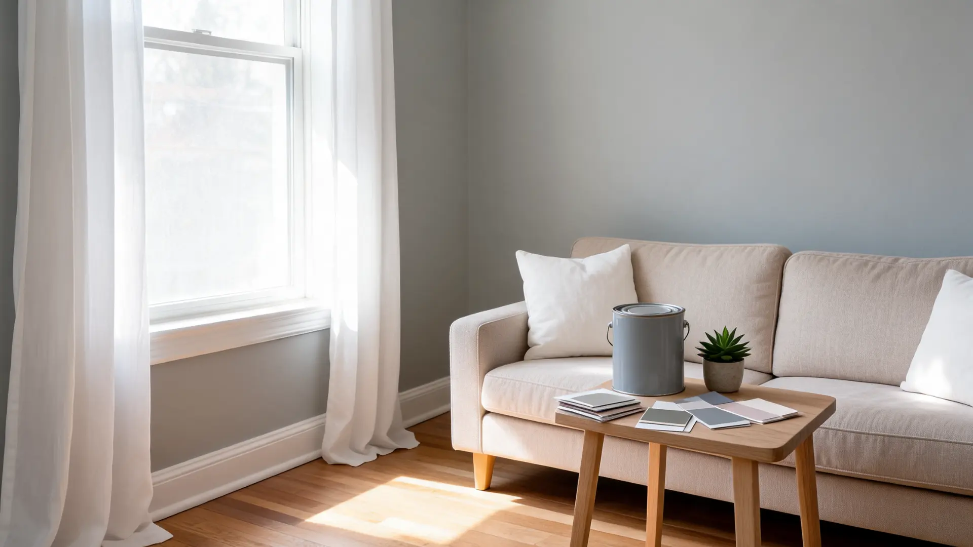
Benjamin Moore Gray Owl is a light gray paint color with a cool, crisp feel that shifts with lighting and surrounding finishes. It is often labeled as Gray Owl OC-52 or 2137-60, both of which refer to the same shade. I came across this color while comparing neutral paints for different rooms, and I noticed how easily it changes tone from space to space. I find it works best for me when tested on walls instead of relying on screens or chips. My focus here is to help you understand how it behaves in real rooms, from bright spaces to low-light corners. Small changes in trim, flooring, and light can make it look different, so sample testing before final paint choice matters Understanding Benjamin Moore Gray Owl Before choosing Benjamin Moore Gray Owl, check the key color details in one place. This quick table helps you confirm the right shade, compare samples, and understand the main paint information before buying. Detail Gray Owl Information Color Name Gray Owl Brand Benjamin Moore Color Codes OC-52 And 2137-60 LRV 64.51 Hex Value #D3D4CC Official Description A use-anywhere light gray with a cool, crisp cast Collections Off White Collection And Color Preview® Also Known As Gray Owl OC-52 / Gray Owl 2137-60 Buying Options Store locator, samples, paint, color chips, and digital dollop With an LRV of 64.51, Gray Owl sits in the light gray range. It is not white, but it can help a room feel brighter than deeper gray paint colors. Are Gray Owl OC-52 And 2137-60 The Same Color? Quick Answer: Yes, Gray Owl OC-52 and Gray Owl 2137-60 are the same Benjamin Moore paint color. They are not two separate shades, even though the two codes may appear on different Benjamin Moore pages, retailer listings, sample pages, or paint store systems. The difference comes from how Benjamin Moore organizes its color collections. Gray Owl OC-52 is listed with the Off White Collection, while Gray Owl 2137-60 is listed with the Color Preview Collection. Because the same color appears in more than one collection, shoppers may see either code while looking for samples, checking product pages, or asking a local retailer to mix the paint. Before buying, confirm the color name, color code, product line, and sheen. This matters most when ordering tinted paint, buying a sample, or choosing among wall, trim, cabinet, or bathroom paint. A quick check before checkout helps make sure you get Benjamin Moore Gray Owl, not a similar-looking gray. What Undertones Does Benjamin Moore Gray Owl Have? Benjamin Moore Gray Owl has soft blue-green undertones. This brief table shows how it may shift in different room conditions. Room Condition How Gray Owl May Look Cool Rooms Can lean slightly blue or feel crisper Warmer Rooms Can feel softer with a subtle green side Mixed Lighting Can shift throughout the day White Trim Often looks clean and fresh Beige Or Warm Finishes Needs testing to avoid undertone clashes Gray Owl is still a light gray, but lighting and nearby finishes can change how its undertones appear. Test a sample before buying full paint. Room Performance Of Benjamin Moore Gray Owl Benjamin Moore Gray Owl can work in different rooms, but it will not look exactly the same in every room. Lighting, trim, flooring, tile, cabinets, and sheen can all change how this light gray appears once it is on the wall. In bright spaces, Gray Owl may look clean and fresh. In darker rooms, it can feel cooler or slightly flat. Warm wood, white trim, gray tile, and artificial lighting can also pull out different sides of the color. These five room notes can help you decide where to sample it first and what to check before buying full paint. 1. Living Room Gray Owl can create a clean, soft gray backdrop in a living room without making the space feel too dark. It works well with white trim, warm wood floors, neutral sofas, black accents, and natural textures. If the room gets good daylight, Gray Owl can feel fresh and balanced. If the living room has limited natural light, it may look cooler or flatter. Warm lamps, wood furniture, and textured rugs can help soften the look. Quick Tip: Test Gray Owl behind the sofa and near the main window because these areas often show the biggest color shift. 2. Bedroom Gray Owl can feel calm and restful in a bedroom, especially with soft bedding, white or off-white trim, wood furniture, and muted accents. It gives the room a light gray base without feeling too heavy. In bedrooms with cool bulbs or north-facing light, Gray Owl may show more of its blue side. For a softer look, pair it with warm white bedding, beige linen, natural wood, or woven textures. Quick Tip: Check the sample at night with your bedside lamps on. Bedroom paint often looks different in evening lighting. 3. Kitchen Gray Owl can work well in kitchens with white cabinets, quartz counters, stainless steel appliances, chrome fixtures, and navy or charcoal accents. It can make the walls feel clean without competing with cabinets or countertops. Be careful if your kitchen has cream cabinets, beige backsplash tile, warm granite, or yellow-toned flooring. These finishes can make Gray Owl look cooler or slightly off. Quick Tip: Hold the sample beside your countertop and backsplash, not just on an empty wall. 4. Bathroom Gray Owl can look fresh in bathrooms with white tile, marble-style finishes, chrome, nickel, or clean white vanities. Its cool cast often works well because many bathroom finishes already feel crisp and light. If the bathroom has cool gray tile, Gray Owl may lean bluer. If it has beige tile or warm stone, the undertone may feel less balanced. Use a bathroom-friendly paint product for humid spaces. Quick Tip: Test Gray Owl beside the vanity, shower tile, and floor tile before buying full paint. 5. Hallway Gray Owl can brighten a hallway more than deeper gray colors, but hallways can be tricky because they often have limited natural light. In a narrow or shadowed hallway, it may look cooler, darker, or flatter than expected. If you use it in a hallway, add warm lighting and compare it with your trim color. Since hallways connect rooms, Gray Owl should also work with nearby wall colors, flooring, and doors. Quick Tip: Test it on both ends of the hallway. One side may look cooler than the other Benjamin Moore Gray Owl Paint Product Options Choosing the right Benjamin Moore Gray Owl product depends on where the paint will be applied, surface durability needs, finish preference for different rooms and surfaces, and overall usage requirements. Use Area Product Best Sheen Notes Walls Aura® waterborne Interior Paint / Regal® Select / ben® Interior Paint Matte or Eggshell Works well for bedrooms, living rooms, hallways, dining rooms, and open spaces with a soft, balanced finish. Bathrooms Aura® Bath & Spa Matte Designed for humid spaces like bathrooms, spas, and laundry rooms with added moisture resistance. Cabinets, Doors, Trim ADVANCE® Interior Paint Satin or Semi-Gloss (trim/doors), Satin or High Gloss (cabinets) Best for high-contact surfaces when properly cleaned, sanded, and primed before painting. Ceilings Benjamin Moore Ceiling Paint Flat Creates a smooth, low-sheen ceiling finish that keeps overhead surfaces subtle and clean. Matching product type and sheen to the space ensures better durability, appearance, and long-term performance of Gray Owl across walls, bathrooms, cabinets, and ceilings in any home. Overall, results matter. Official Benjamin Moore Coordinating Colors For Gray Owl Benjamin Moore lists several coordinating colors for Gray Owl. Use these bullet points as a quick starting point when planning trim, ceilings, accent walls, cabinets, or colors in nearby rooms. Super White (OC-152): Use this when you want a crisp white pairing with Gray Owl. It can work well for trim, ceilings, doors, and clean contrast. White Heron (OC-57): Choose this for a softer white option. It can feel less sharp than a bright white while still keeping the palette light. Silver Satin (OC-26): Use this for a soft, quiet neutral pairing. It works well when you want a lighter palette around Gray Owl. Taos Taupe (2111-40): Choose this when you want to add warmth beside Gray Owl’s cooler cast. It can help balance the palette. Hale Navy (HC-154): Use this for a classic dark blue accent. It can work for doors, cabinets, accent walls, or decor. Kendall Charcoal (HC-166): Choose this for a deep gray contrast. It pairs well with a stronger, more grounded look. Before choosing a final palette, test the coordinating colors beside your flooring, cabinets, counters, tile, and lighting. Gray Owl can shift slightly depending on the room. Similar Benjamin Moore Colors To Gray Owl Benjamin Moore Gray Owl is a popular light gray that many people choose for its soft, balanced look, but it can appear very different depending on the surrounding colors and lighting conditions. Comparing it with similar shades helps you see how subtle changes in undertone, depth, and brightness can completely shift the mood of a room. Some grays may feel cooler, others warmer, and some may stay more neutral throughout the day. Because of these variations, even small differences in paint selection can noticeably affect how walls look in real spaces, making side-by-side testing of close alternatives an important step before finalizing your room’s overall design and paint choice. 1. Vapor Trails (1556) Vapor Trails is a soft, light neutral that closely matches Benjamin Moore Gray Owl in brightness and overall tone. It offers a similar airy gray look but can appear slightly more muted depending on lighting conditions. In bright rooms, it stays clean, while in dim light, it feels softer and more blended with its surroundings. Works best in living rooms, bedrooms, and open-plan spaces 2. Moonshine (2140-60) Moonshine is a light, clean gray that feels more neutral compared to Gray Owl. It avoids strong blue-green undertones, so it looks more consistent across different lighting. In bright areas, it appears soft and smooth, while in lower light, it maintains a calm, balanced gray presence without feeling too heavy or dark. Works best in modern interiors and open living spaces 3. Alaskan Husky (1479) Alaskan Husky is a fresh light gray that can shift slightly depending on lighting and surrounding finishes. It feels crisp and airy in natural daylight, while artificial lighting can soften its appearance. Compared to Gray Owl, it has a bit more variation, making it important to test in multiple areas before final selection. Works best in bedrooms, hallways, and everyday living areas 4. Oystershell (864) Oystershell is a soft muted neutral that feels more relaxed and less crisp than Gray Owl. It leans slightly warm in some lighting and stays subtle in most spaces. It does not show strong undertones, making it an easy, forgiving choice for rooms where you want a gentle background color. Works best in calm, low-contrast interior spaces 5. Stonington Gray (HC-170) Stonington Gray is a cleaner, more structured gray than Gray Owl. It holds its tone better across different lighting conditions and feels more defined on walls. While Gray Owl has softer blue-green undertones, this shade appears more neutral and steady, especially in bright or evenly lit rooms. Works best in contemporary spaces with white trim 6. Wickham Gray (HC-171) Wickham Gray has stronger blue-green undertones than Gray Owl, giving it a cooler and slightly more noticeable color presence. It can look brighter in daylight and more pronounced in shaded rooms. Compared to Gray Owl, it feels more distinct and cooler, especially in north-facing or low-warmth lighting environments. Works best in bathrooms, bedrooms, and cool-toned interiors Benjamin Moore Gray Owl Sample Options Before buying full paint, test Benjamin Moore Gray Owl in your own space so you can see how it reacts to your lighting, trim, flooring, cabinets, and other fixed finishes. Start With A Color Chip: Pick up a Gray Owl color chip first for a quick look at the shade before buying a sample. Buy A Paint Sample: Order or buy a real paint sample before purchasing full paint. This gives you a better idea of how Gray Owl looks in your room. Test Near Trim: Place the sample beside your trim color because white, cream, or off-white trim can change how Gray Owl appears. Check Flooring and Tile: Test the sample near flooring, tile, counters, and cabinets since these fixed finishes can affect the undertone. Review Different Lighting: Look at Gray Owl in the morning, afternoon, evening, and artificial light before making a final choice. Compare Similar Colors: Check Gray Owl OC-52 / 2137-60 beside one or two similar Benjamin Moore colors if you are unsure. Confirm The Sheen: Choose the final sheen before ordering paint because matte, eggshell, satin, and semi-gloss can make the same color look slightly different. Avoid Screen-Only Decisions: A sample is more reliable than a screen image because Gray Owl can shift depending on lighting and surrounding finishes. Where To Buy Benjamin Moore Gray Owl Paint And Samples Benjamin Moore Gray Owl can be checked and purchased through official Benjamin Moore options and authorized retailers. Use the table below to decide which buying route makes the most sense before ordering full paint. Buying Option Best For Benjamin Moore Website Checking Gray Owl OC-52 or 2137-60 on the official color pages Find A Store Tool Locating a nearby Benjamin Moore retailer Buy Samples And Paint Ordering paint or samples directly through available Benjamin Moore buying options Free Color Chips Getting a first look at Gray Owl before buying a sample Local Retailers Buying Gray Owl samples, paint, and related Benjamin Moore products in person Digital Dollop Saving a digital color reference for planning, but not final color approval Screen colors and printed colors may differ from actual paint. For the safest result, test a Gray Owl sample in your own room before buying full paint. Common Mistakes To Avoid When Buying Benjamin Moore Gray Owl Gray Owl is a light gray that can shift in real rooms, so it is worth checking a few details before buying full paint. Choosing From A Screen Only: Digital colors may not match actual paint, so use a chip or sample. Skipping A Paint Sample: A real sample shows how Gray Owl looks in your lighting. Ignoring The Two Codes: Gray Owl may appear as OC-52 or 2137-60, but both refer to the same color. Testing One Wall Only: Check it near trim, flooring, cabinets, tile, and windows. Forgetting The Undertones: Gray Owl has soft blue-green undertones that can shift from room to room. Choosing The Wrong Sheen: Matte, eggshell, satin, and semi-gloss can change how the color reflects light. Buying Too Quickly: Compare samples first, then choose the final product and sheen. Frequently Asked Questions Can Benjamin Moore Gray Owl Be Used For A Whole House? Yes, Gray Owl can be used as a whole-house color if the lighting and fixed finishes work with its cool gray look. Test it in several rooms first, as it may shift slightly from room to room. Is Benjamin Moore Gray Owl Good For Small Rooms? Gray Owl can work in small rooms because it is a light gray. It may help the space feel open, but the final look depends on lighting, trim, flooring, and the paint sheen. Can Gray Owl Be Used On Exteriors? Gray Owl can be considered for exterior projects, but exterior light can make paint look much lighter. Always test a large outdoor sample before using it on siding, trim, doors, or shutters. Does Gray Owl Work In Rental Properties? Gray Owl can be a good rental paint color if you want a clean, neutral backdrop. It feels more current than many beige tones, but it still needs testing with flooring, cabinets, and existing trim. Is Gray Owl A Good Paint Color For Resale? Gray Owl can support resale because it is a soft neutral gray that many buyers may find easy to work with. It is best used in spaces where it looks clean, bright, and not too cool. How Long Does Benjamin Moore Paint Take To Dry? Dry time depends on the Benjamin Moore product, room temperature, humidity, and ventilation. Check the specific product label before recoating or moving furniture back against freshly painted walls. Is Gray Owl Easy To Clean? Cleanability depends more on the paint product and sheen than the color itself. Eggshell, satin, and semi-gloss finishes are usually easier to wipe than flat finishes, especially in busy areas. Can Gray Owl Work With Wood Floors? Yes, Gray Owl can work with wood floors, but the wood tone matters. Warm or orange-toned floors may make the color feel different, so place a sample beside the flooring before buying paint. Conclusion Gray Owl is easier to choose when you know what to check before buying. I would start with the official color details, then test a real sample in your own room. Benjamin Moore Gray Owl has two color codes, several buying options, and a light gray look that can shift with lighting, sheen, trim, flooring, and nearby finishes. You also have coordinating colors and similar Benjamin Moore shades to compare before making the final call. This matters because paint can look very different once it moves from a screen to your wall. If you are thinking about using Gray Owl, try a sample first, check it at different times of day, and read related blogs for more paint color ideas.
Color Name Pale Oak OC-20 (also known as Athena 858) Brand Benjamin Moore Collection Off-White Collection LRV 68.64 — light, reflects well without reading as white Undertones Warm gray-greige with a taupe base; can shift pink or lavender in cool or mixed light Best For Whole-home walls, bedrooms, living rooms, open layouts, hallways, south- and west-facing rooms Avoid In Dark rooms with little natural light; rooms with cherry, mahogany, or reddish wood floors; spaces with cool LED-only lighting Ever paint a room and feel the color shift the moment the sun goes down? Choosing a wall color is frustrating when it looks perfect in the store but different at home, especially with Pale Oak OC-20. I know how confusing that can feel when lighting keeps changing the tone. Here, I break down how this soft greige behaves in real rooms, from natural light to evening lamps. You will see where it works best, where it fails, and how to avoid undertone surprises so your space feels consistent and calm. I focus on practical lighting tips so you can test them before committing. What Pale Oak Benjamin Moore Actually Looks Like in a Real Room Pale Oak OC-20 is a greige, that mix of gray and beige that reads neither cold nor heavy. Most of the time, on a well-lit wall, pale oak by Benjamin Moore looks like a soft, warm neutral that falls somewhere between an off-white and a classic taupe. That description is accurate, but incomplete. Here’s the part that catches people off guard: Pale Oak has pink and lavender undertones that show up in certain light. It doesn’t look rosy in the way peach paint does. But in a north-facing room at midday, or under cool LED bulbs after dark, you can see a definite purple-pink cast that surprises people who only sampled it in a sunny spot. That’s not a flaw. It’s the color’s character. But it’s the reason I tell every client to test Pale Oak on multiple walls in different light before committing to a gallon. Pro Tip: Test Pale Oak on at least two walls, one that gets direct light and one that doesn’t. Check it at 7 am, at noon, at 5 pm, and after 8 pm with your artificial lighting on. If you see lavender after dark, swap your bulbs for warm white (2700K) before deciding against the color. Understanding Pale Oak’s Undertones The official description calls Pale Oak a warm gray-greige. That’s technically true, but it leaves out what makes this color interesting and occasionally tricky. Pale Oak sits in the yellow-to-yellow-red hue family on the color wheel. Colors in that neighborhood are known to shift purple in imbalanced or cool light. In a room with balanced, neutral light, Pale Oak looks like a calm warm gray-beige. Add a cool-spectrum light source, an overcast north-facing window, a daylight LED bulb, or even a gray tile floor, and the lavender-pink side appears. This is low chroma, which means the color has very little saturation. Low-chroma colors are chameleons. The room around them has as much influence on their appearance as the pigment itself. A cream sofa can make Pale Oak read warm and golden. A bright white cabinet can make the same wall look distinctly gray-pink. Understanding this before you paint a room saves a lot of regret. If you’re still working out how to choose paint colors that hold up against your fixed elements, that process applies here as much as anywhere. The practical takeaway: Pale Oak is not for anyone who dislikes even subtle pink or purple tones. If that’s a hard no, look at Edgecomb Gray HC-173 (warmer, more beige) or Classic Gray OC-23 (cooler, closer to off-white) instead. But if a soft, complex neutral that shifts through the day sounds appealing rather than alarming, Pale Oak earns its reputation. How Pale Oak Looks in Natural Light Natural light can make Pale Oak look warmer, cooler, brighter, or more muted depending on where your windows face. In bright rooms, it often feels soft and open. In cooler rooms, it may show more of its gray side. North-facing rooms: The light is usually cooler and softer. Pale Oak may look slightly grayer here and less warm than it does in sunny spaces. It can still feel calm and gentle, but it may need support from warm whites, natural wood tones, and soft lighting to keep the room from feeling flat. South-facing rooms: South-facing rooms get warmer daylight for much of the day. This light can bring out the beige or greige side of Pale Oak, making it feel brighter, softer, and warmer. This is one of the easiest lighting conditions for this color because the warmth helps balance its gray undertone. East-facing rooms: East-facing rooms get bright morning light, which can make Pale Oak look fresh and slightly warm early in the day. As the light fades later, the color may look more muted and gray. Warm bulbs can help keep the room from feeling too cool at night. West-facing rooms: West-facing rooms get stronger afternoon and evening light. During this time, Pale Oak can appear warmer and a little creamier. It often feels cozy and soft in the evening, which makes it a good fit for living rooms, dining rooms, and bedrooms. How Pale Oak Looks in Artificial Light Artificial lighting is where Pale Oak surprises people most often. Warm incandescent bulbs (2700K) bring out the soft beige side and keep the room feeling settled after dark. Soft white bulbs (3000K) are also a safe choice. The problem starts with daylight or cool white LED bulbs (4000K and above). Under those, Pale Oak’s lavender-pink undertone surfaces clearly. It doesn’t look bad on its own, but if you were expecting a classic greige, the shift reads as an error rather than a feature. Layering your light sources helps more than any single bulb swap. Combining overhead ceiling fixtures with table lamps, floor lamps, or wall sconces gives the color multiple light angles to interact with, which tends to smooth out any single undertone from dominating. If the room looks off after dark, start with the bulbs before repainting. Choosing the Right Finish for Pale Oak OC-20 Finish affects both how Pale Oak looks and how the surface performs over time. Flat and matte finishes absorb light, keeping the color soft and slightly deeper. Glossier finishes reflect light and make the color appear fractionally brighter. The practical guidance is straightforward. Finish Best For Why It Works Matte Bedrooms, low-traffic walls Absorbs light, keeps color soft and calm Eggshell Living rooms, hallways, family rooms Slight sheen, easy to clean, most popular for walls Satin Trim, doors, bathrooms, kitchens More washable, reflects enough light to look crisp Semi-gloss Cabinets, doors, trim details Durable, easy to wipe, holds up in high-contact spots Eggshell is the most common choice for Pale Oak walls. It gives the color a subtle depth without the washout that comes with flat finishes in well-lit rooms. Use satin or semi-gloss on any trim, door, or cabinet that gets regular contact; the finish difference between wall and trim also helps define the two surfaces, which matters for contrast against a near-neutral like Pale Oak. If you’re deciding between those two sheens, the satin vs. semi-gloss, exactly when each makes sense for trim and doors. Pale Oak in Different Rooms Pale Oak adapts well across most room types, but it performs differently depending on what else is in the space. Here’s how it actually behaves room by room. Living Room Pale Oak works well as a main wall color in living rooms, particularly open-plan layouts where you need a neutral that stays calm across different light exposures throughout the day. Pair it with Chantilly Lace trim, natural wood floors, and linen furniture. The color needs contrast to avoid looking washed out; introduce it through darker accents like Wrought Iron 2124-10 on a built-in or deep wood furniture. Without enough contrast, the room can feel like one flat field of beige. Bedroom Bedrooms are where Pale Oak earns most of its reputation. The soft, low-saturation quality that can make it tricky in high-traffic living spaces becomes an asset in a room built for rest. Matte or eggshell finish keeps it genuinely calm. White Dove OC-17 on the trim blends softly rather than cutting harshly. Keep bedding and fabrics in cream, warm white, or muted linen tones; bright whites can pull the lavender undertone forward. If you’re still comparing options, there’s a full palette of cozy bedroom paint colors worth checking before you decide. Kitchen Pale Oak works as a kitchen wall color, especially paired with white or natural wood cabinets. White cabinets can pull the cooler, grayer side of OC-20 forward, which looks refined, while cream cabinets amplify the pink-beige side. Test your specific cabinet finish against a Pale Oak sample before committing. Brass and nickel hardware read well against it either way. Use a satin or eggshell finish for ease of cleaning. If you’re designing the wider kitchen layout, minimalist kitchen design pairs naturally with a neutral like Pale Oak as its wall color. Bathroom In bathrooms with bright tile and reflective surfaces, Pale Oak softens the clinical quality that white-on-white schemes can have. Its warm gray-greige base creates a spa-like calm without requiring any warm-toned tile to get there. Satin or moisture-resistant finish is the right call for humidity. One caution: bathrooms with cool, recessed lighting and white tile together can bring out the lavender undertone fairly strongly. Test it under your actual bathroom lighting before rolling it out on all four walls. Exterior Pale Oak on an exterior reads lighter than it does indoors; direct sun bleaches the depth out of it. It works best for homes that want a warm, soft-white exterior rather than a true white. Pair it with deep charcoal or black window trim (Wrought Iron 2124-10 is a strong choice), and the contrast holds the facade together. It reads well against stone and brick too. For modern farmhouse and transitional exteriors, this is a genuinely useful color — softer than a true white, more refined than a heavy beige. Paint a large sample board (at least 12×12 inches) and look at it at multiple times of day before committing to the full exterior. Coordinating Colors for Pale Oak OC-20 Pale Oak pairs best with colors that either provide clean contrast or share its warm gray register without competing with it. When building a cohesive pale oak color palette, these four combinations are thoroughly tested formulas, each serving a distinct purpose: Color Pairing Character LRV Best Use Chantilly Lace OC-65 Clean contrast, crisp edge 90.04 Trim, ceilings, cabinets Gray Cardigan 1600 Cool, grounded contrast 34.74 Accent walls, doors, built-ins Dinner Party AF-300 Rich, warm depth 8.43 Dining room accent wall Wrought Iron 2124-10 Dramatic contrast, high impact 8.17 Doors, trim, exterior accents Chantilly Lace and Wrought Iron give you the clearest version of Pale Oak’s range, soft and airy at the top, bold and grounded at the bottom. Dinner Party is worth knowing if you’re working in a dining room or study where a moody accent wall alongside Pale Oak walls would give the space some real character. How Pale Oak Compares to Similar Colors The comparison questions about Pale Oak come up constantly, mostly because it reads so similarly to several other popular neutrals on a paint chip but behaves quite differently on the wall. Here are the three comparisons that matter most. Pale Oak vs. Balboa Mist 1549 Pale Oak (LRV 68.64) is lighter and a touch warmer. Balboa Mist 1549 (LRV 65.53) leans grayer and cooler; it has less of the pink-taupe quality and reads more cleanly as a classic gray-greige. If the lavender undertone in Pale Oak is a concern, Balboa Mist is worth sampling alongside it. It’s also a stronger choice for rooms where you want a color that reads definitively “gray” rather than “neutral greige.” The Moonshine BM another off-white in the same family if you want a third option to compare in that lighter neutral range. Pale Oak vs. Classic Gray OC-23 Classic Gray OC-23 is lighter (LRV around 73) and leans closer to off-white. It has a warm gray quality but far less of the taupe-pink complexity that makes Pale Oak interesting in some rooms and challenging in others. Choose Classic Gray if you want something cleaner and less inconsistent. Choose Pale Oak if you want more depth and are willing to manage the undertone. Pale Oak vs. Edgecomb Gray HC-173 Edgecomb Gray HC-173 is warmer and more distinctly beige than Pale Oak. It has less of the gray quality and leans toward a warm taupe without the lavender shift. If you want a beige-greige that stays consistent across light conditions and doesn’t surprise you after dark, Edgecomb Gray is more predictable. Pale Oak is more versatile across different décor styles but less stable in color behavior. When Not to Use Pale Oak Being specific about where a color fails is more useful than listing where it works well, because the failures are what cost people time and money. Skip Pale Oak in rooms with very little natural light and only cool-toned artificial lighting. Under those conditions, the lavender-pink undertone dominates, and the color looks neither gray nor beige, just slightly off. North-facing basements and interior bathrooms with recessed daylight LEDs are the most common problem scenarios. Also avoid Pale Oak on walls adjacent to cherry, mahogany, or reddish oak floors. Those warm red-brown tones conflict with the taupe undertone and amplify the pinkish quality to an unflattering degree. Pale Oak paired with those woods tends to look unintentional rather than warm. One more: rooms with predominantly yellow or yellow-beige finishes — think warm travertine tile or honey-toned hardwood throughout- can make Pale Oak read pink by contrast. Test carefully in those environments before painting all four walls. Tips for Using Pale Oak Successfully Always test on at least two walls — one sun-exposed, one not — before buying more than a sample. Check the sample at different times of day and under your actual artificial lighting, not just in daylight. Pair with warm whites (White Dove or Chantilly Lace) for trim; avoid cool-toned whites. Use warm (2700K) or soft white (3000K) bulbs — cool LEDs surface the lavender undertone. Add contrast through dark accents, wood tones, or pattern; without it, the room can look flat. Use Samplize peel-and-stick samples if you want to test multiple walls without painting directly on them. Avoid judging the color from photos on screens — screens shift undertones significantly. Where to Buy Benjamin Moore Pale Oak OC-20 Pale Oak OC-20 is available at any authorized Benjamin Moore retailer and directly through the official Benjamin Moore website. The color is offered in both interior and exterior formulas across multiple product lines. Use Benjamin Moore’s Find a Store tool on their website to locate the nearest authorized dealer. Order a physical sample or a Samplize peel-and-stick sample before buying a full gallon. Pale Oak is a color that earns its testing time. Frequently Asked Questions Does Pale Oak look purple or pink on the wall? It can. Pale Oak has taupe-pink undertones that shift toward lavender in cool or north-facing light. In balanced or warm light, it reads as a calm gray-greige. The purple cast surprises people who only sampled it in a sunny room. Always test under your actual lighting conditions, especially after dark. What is the best trim color for Pale Oak? Chantilly Lace OC-65 for crisp contrast, or White Dove OC-17 for a softer, more blended look. Avoid cool-toned whites and stark whites — they can make Pale Oak look dingy or amplify its pink undertone. Is Pale Oak too beige or too gray? Neither, in most lighting. It sits squarely between the two, which is exactly its appeal. South-facing rooms pull it beige; north-facing rooms pull it gray. The lavender undertone occasionally shows up under cool artificial light. Testing in your specific room tells you which side dominates. Can Pale Oak be used for whole-house paint? Yes, and it’s one of the most common uses. Its neutrality makes it easy to carry through connected rooms. The one risk with whole-house application is that rooms with different light exposures will show the color differently — some owners find that variation pleasing, others find it inconsistent. What is a good Sherwin-Williams equivalent to Pale Oak? Limewash SW 7520 is frequently cited as the closest match — similar warm greige base, slight taupe quality. Egret White SW 7022 is another option, sitting at a comparable LRV. Neither is an exact duplicate; always sample both in your space rather than substituting by spec alone. When should I not use Pale Oak? Avoid it in rooms with no natural light and cool artificial lighting, rooms with cherry or mahogany wood floors, and spaces where you need a truly bright white or a definitive gray. It’s a greige, not a neutral utility player — it has an undertone that shows up in the wrong conditions. Does Pale Oak work with gray furniture? Warm gray furniture pairs well. Cool gray furniture with blue or green undertones can clash, pulling the lavender quality in the wall forward. If your furniture reads blue-gray, test Pale Oak carefully — Balboa Mist or Classic Gray may be a better match for that combination. Final thoughts Paint color choices often feel simple until light changes how they behave in real spaces. You see how this soft greige can lean warm, cool, or even slightly lavender depending on lighting conditions. You also understand where it performs well, like balanced living rooms, and where it struggles, such as dark or cool-lit rooms. I also highlight how pairing furniture, flooring, and bulbs shapes the final look more than the paint itself. Pale Oak OC-20 works best when you test it under real lighting before deciding on full-room coverage. I encourage you to try samples in your space and share what changes you notice across different times of day.

Most driveway repair cracks start small enough to step over. A year later, they’re wide enough to catch a tire edge, and the repair bill has gone from $150 in materials to a conversation with a contractor about full resurfacing. I’ve watched that sequence happen enough times to know where it goes wrong: people recognize the crack and then wait for it to get “bad enough” to deal with. By the time it looks bad, the base has usually started to move. This guide covers what causes driveways to crack, how to read whether yours needs repair, resurfacing, or replacement, the full step-by-step DIY driveway repair process for both asphalt and concrete, a realistic cost breakdown, and the factors that push those numbers up or down. The goal is to help you make the right call before the repair window closes. Cost Note: Figures in this article are estimates based on national averages. Actual costs vary significantly by region, contractor, materials, and project scope. Always get at least three quotes before committing to any project above $1,000. Why Driveways Crack: The Mechanics Behind the Damage A driveway doesn’t crack because it’s old. It cracks because water found a way in. Everything else is downstream of that. Here’s how the cycle runs: Water infiltration Rain and snowmelt enter hairline cracks on the surface, sit in the base layer, and soften the ground underneath. Once the base loses density, the surface above it cracks further under ordinary vehicle weight. The surface crack isn’t the problem. It’s the entry point for what becomes the real problem. Freeze-thaw pressure Water expands roughly 9% when it freezes. A narrow crack that collects moisture and sits through a cold night comes out the other side slightly wider. Do that cycle forty times across one winter in a northern state, and a hairline crack becomes a structural gap. This is why driveway repair matters more in cold climates. Not because the pavement is weaker, but because the physics are more aggressive. Surface aging and UV breakdown UV radiation dries out asphalt binder over time, making the surface brittle and more prone to cracking under load. Concrete slabs can shrink slightly as they cure over years, opening control joints and creating new moisture entry points. Neither process is fast, but neither one stops on its own. Asphalt vs. Concrete Driveways: What Changes the Repair Approach Before you buy anything, you need to know what your driveway is made of. Asphalt crack filler won’t bond to a concrete slab. Concrete patching compound won’t hold on asphalt. The wrong product means the repair fails in one season, sometimes faster. Feature Asphalt Driveway Concrete Driveway Material Bitumen and aggregate mix Cement, sand, and gravel Appearance Black or dark grey Light grey or tan Common damage types Cracks, potholes, alligator cracking, surface erosion Spalling, scaling, hairline cracking, edge breakout DIY repair product Elastomeric crack filler, cold patch, polymer resurfacer Concrete crack filler, hydraulic cement, concrete resurfacer Sealer required Yes, every 2 to 3 years Optional but recommended Typical lifespan with maintenance 20–30 years 30–50 years Primary repair cost driver Surface area and damage depth Slab thickness and crack pattern Asphalt is more flexible, which helps it handle minor ground movement without cracking, but it needs regular sealing to stay water-resistant. If your asphalt driveway was installed less than 90 days ago, wait before applying any sealer. The binder needs time to fully cure, and sealing too early traps off-gassing and weakens the bond. Concrete is harder and longer-lasting, but when the ground shifts under it, the cracks follow specific patterns. Control joints and slab edges are typically the first places to show it, and both tell you something about the base beneath. Repair, Resurface, or Replace? Reading the Right Answer from Your Driveway This decision saves or wastes more money than any product choice you’ll make. Getting it right matters before you spend anything. Repair: Isolated Damage with a Sound Base If you have a few cracks under an inch wide, a pothole or two, or a limited rough patch, repair is the right call. The base is still solid. You’re filling specific damage and sealing against water, not rebuilding anything. Most DIY driveway repair projects fall here, and materials run $100 to $250 for a standard two-car driveway. Resurface: Widespread Wear with the Base Still Intact If the whole surface looks worn or faded, or shows many hairline cracks, but the driveway isn’t sinking, heaving, or soft underfoot along the edges, resurfacing can add five to eight years. A new layer goes over the old one. The key qualifier is a stable base. Don’t waste money resurfacing a driveway that sinks slightly at the edges or holds standing water after rain. That water is sitting on a compromised base, and a new surface coat will fail in one season on top of it. Replace: structural base failure Replacement is the answer when sections are sinking or heaving, the base has softened, drainage is broken, or more than a third of the surface is cracked and uneven. No amount of patching changes that outcome. If replacement opens the question of switching materials entirely, paver costs vary significantly by type and square footage, and it’s worth knowing before you commit to like-for-like asphalt again. Recognizing Alligator Cracking Before It Becomes a Replacement Decision There’s a damage pattern worth knowing by name: alligator cracking. It looks like a network of interconnected cracks forming irregular polygons across the surface, similar to dried mud or, as the name suggests, the texture of alligator skin. It almost always signals base failure underneath, not just surface aging. Standard crack filler doesn’t solve alligator cracking. The surface cracks are a symptom of a base that has lost density and support. If you fill them without addressing the cause, the pattern returns within a season. Small sections of alligator cracking can sometimes be cut out, the base rebuilt, and the area cold-patched. Widespread alligator cracking across more than a third of the driveway is a replacement signal. Pro Tip: Walk the edges and corners of your driveway on a dry day. Press down with your heel. Any flex or soft give underfoot indicates base saturation, even if the surface looks intact. That’s your real repair signal, not the visible crack width. Driveway Repair DIY: Step-by-Step Asphalt driveway repair isn’t just filling cracks and spreading a coat on top. The order of operations matters because each step creates the conditions the next one needs to work. Dirt weakens filler. Open cracks compromise resurfacing. Oil stops new material from bonding. Do these in sequence, and the repair holds. Skip steps, and you’ll be doing it again. Tools and Materials Cleaning & Prep Crack & Pothole Repair Resurfacing Wire brush Liquid elastomeric crack filler Polymer-modified asphalt resurfacer Leaf blower or stiff broom Trowel-grade filler Bonding agent Scrub brush Cold patch asphalt (for potholes) 4-inch paintbrush Garden hose with spray nozzle 2-inch putty knife Wide squeegee Pressure washer Wide putty knife/trowel Cordless drill with paddle mixer Household bleach & degreaser Caulking gun (if filler uses cartridge) Work gloves and safety glasses Step 1: Pull weeds and clear loose debris Remove weeds growing from any crack, taking the roots where you can. Roots left behind will push through fresh filler. Clear loose surface debris around damaged areas before brushing or washing. Step 2: Loosen packed material from cracks Use a wire brush to break up compacted dirt, gravel, and old filler from wider cracks. Follow with a leaf blower to clear the cracks out. A blower reaches into gaps where a broom can’t. The goal is open, clean crack edges, not just a swept surface. Step 3: Kill algae and biological growth Mix one gallon of household bleach with four gallons of water. Apply with a scrub brush and let it sit for about 10 minutes. No heavy scrubbing needed. Rinse with fresh water, then use the hose nozzle to flush remaining debris out of the cracks. Step 4: Pressure wash (optional but worth it) Pressure washing removes embedded dirt that a broom and hose miss. A cleaner surface means better adhesion for filler, bonding agent, and resurfacer. Let the driveway dry fully before applying any repair product. Visually dry isn’t always dry. Give it several hours on a warm day. Step 5: Fill narrow cracks with liquid elastomeric filler For cracks up to about half an inch wide, use liquid elastomeric crack filler. Cut the nozzle to about a quarter inch. Move backward while slightly overfilling the crack, adjusting speed for depth. Smooth the bead with a 2-inch putty knife. Elastomeric filler stays flexible after curing, which matters. A rigid fill in a flexible surface cracks again at the repair edge. Step 6: Patch eroded areas, larger cracks, and potholes Use trowel-grade filler for cracks up to about one inch wide and eroded surface areas. For potholes deeper than an inch, use a cold-patch asphalt product. Remove all loose material from the pothole first. Square up crumbling edges with a chisel until you’re working against solid pavement. Fill in lifts for deep holes rather than one pour, compacting each layer. Smooth the patch flush with the surrounding surface. Step 7: Treat oil stains before sealing Clean oil-stained areas with a degreaser, then apply a bonding agent over the treated spot before resurfacing. Oil residue stops the resurfacer from bonding. Skipping this step produces a soft spot that peels within one season. The bonding agent dries clear. Step 8: Mix and apply the resurfacer Mix the resurfacer with a cordless drill and paddle mixer attachment before pouring. Even the texture before application matters. Unmixed product spreads unevenly and cures with soft spots. Brush the driveway edges first with a 4-inch paintbrush for control near curbs, borders, and lawn edges. Then pour and spread from the top of the driveway toward the street, using a wide squeegee in steady back-and-forth passes. Keep a wet edge moving. If a section dries before you reach the overlap, you’ll have a visible seam and a weak bond at that line. Two people make this step significantly easier: one to pour, one to spread. Keep all traffic off the driveway for a minimum of 24 to 48 hours. Check the product label, as cure times vary by formulation and temperature. How to Repair Concrete Driveways Concrete driveway repair follows the same principle: clean, fill, protect. But the products are different, and applying asphalt products to concrete is a mistake that won’t hold. Concrete needs cement-based materials. Damage Type Right Repair What to Do Hairline and narrow cracks Concrete crack filler Clean loose material, blow out dust, fill the crack, smooth flush with a putty knife Surface scaling and spalling Concrete resurfacer Sound slabs only, no heaving. Keep the slab damp (not wet) before applying for adhesion Broken edges and deep holes Hydraulic cement or patching compound Patch the structural damage first, let it set fully, then decide whether resurfacing makes sense on top One more thing specific to concrete: if your slab shows cracking along multiple control joints or across slab boundaries, the ground beneath may be settling unevenly. Patching the surface won’t stop that movement. If you’re weighing whether concrete is even the right long-term material for your situation, the comparison between stamped concrete and alternatives is worth knowing before you invest in repairs. When to Call a Contractor Instead of Doing It Yourself Most driveway repair on isolated cracks and potholes with a sound base is DIY territory. A few conditions change that calculation. Call a professional when cracks are wider than one inch across most of the surface. Call one if any section sinks or flexes underfoot, if visible alligator cracking covers more than a quarter of the surface, or if drainage is pooling toward the foundation of your house. Potholes that reappear within a season of patching are also a contractor signal. These conditions require base work: excavation, gravel replacement, and proper grading. That goes beyond what a DIY surface repair can address. Professional driveway repair costs $300 to $1,000+ for targeted work, and full resurfacing or replacement typically starts at $2,000 and scales with the job’s size. Get at least three quotes before committing to anything above $1,000. DIY Driveway Repair Cost Breakdown Repair Stage Typical Product Approx. Cost Notes Cleaning Bleach, degreaser, scrub brush $5–$20 Pressure washer rental adds $40–$80/day Crack filling (under ½ in.) Liquid elastomeric filler $8–$20 per tube One tube covers 30–60 linear ft Patching (cracks up to 1 in. / potholes) Trowel-grade compound or cold patch $15–$40 per bucket Coverage varies with damage depth Oil stain treatment Degreaser + bonding sealer $10–$25 Required step. Skipping causes failure Resurfacing Polymer asphalt resurfacer $20–$75 per pail One pail covers 250–500 sq ft Sealcoating Asphalt driveway sealer $20–$50 per pail One pail covers 250–500 sq ft For a standard two-car driveway of 400 to 600 square feet, a complete DIY driveway repair and resurfacing project runs roughly $100 to $250 in materials when damage is moderate. Larger driveways or deeper damage push that range higher, and tool rental adds $40 to $100 if you don’t already own a pressure washer or drill. Factors That Push the Price Up or Down Two driveways with identical surface cracks can have very different repair costs depending on what’s going on underneath. Surface area scales cost almost directly. More square footage means more filler, more resurfacer, more sealer. Damage depth matters more than crack count. A surface crack is cheap. A two-inch-deep pothole needs multiple fill lifts and significantly more material. Driveway material affects both product cost and long-term maintenance frequency. Asphalt products generally cost less upfront, but asphalt driveways need sealing every two to three years. Drainage problems are the hidden cost driver. If water is pooling because the slope is off or the base is soft, no surface repair lasts, and drainage correction adds real cost. Tool ownership changes the equation significantly. If you already have a pressure washer, drill, and squeegee, you’re paying almost entirely for materials. Product grade matters too. Budget elastomeric and polymer products cost less upfront but don’t perform as well through freeze-thaw cycles. Mid-grade products hold better and typically justify the price difference in cold-climate states. How Long Does Driveway Repair Last? A well-prepped crack fill on an asphalt driveway can hold for two to five years before needing attention. A full resurfacing job on a sound base, done correctly and sealed afterward, can add five to eight years to the driveway’s life. Concrete patch repairs on stable slabs often last longer still. What shortens that lifespan: shallow prep before filling patching over a soft or shifting base skipping the sealer after resurfacing, driving on the repair before it fully cures repeated freeze-thaw cycles without seasonal maintenance A useful habit is to walk the driveway in early spring after the last hard freeze. Look for new cracks, soft edges, or spots where last year’s repair has shifted. A small top-up caught then is a fraction of the cost of a repair left to a second winter. Most homeowners in cold-climate states who sealcoat their asphalt driveways every two to three years significantly reduce the rate of new crack formation. Mistakes That Cause Driveway Repairs to Fail Most driveway repair failures trace back to steps that happened, or didn’t happen, before the first product went on. The surface looked ready, the filler looked easy, and one skipped step later the repair is peeling by spring. Skipping the cleaning step. Filler applied over dirt, algae, or debris doesn’t bond. The surface needs to be clean and completely dry before anything else goes on. Repairing on a wet surface. Moisture under a filler prevents adhesion. After rinsing or pressure washing, wait several hours, not just until it looks dry. Using the wrong filler for the crack size. Liquid elastomeric filler is for cracks under half an inch. Trowel-grade or cold patch is for wider gaps and potholes. The thinner product in a deep gap shrinks and cracks again. Ignoring oil stains. Resurfacer won’t bond to oil. The degreaser-and-bonding-agent step on stained areas is not optional. Skip it, and that spot fails within one season. Applying resurfacer too thick. Thicker isn’t stronger. Applying it beyond the label’s coverage rate causes uneven curing and surface cracking. Follow the spread rate. Working in the wrong weather. Most driveway repair products require 50 to 90°F and dry conditions. Cold temperatures slow curing. Rain before the product sets washes it off entirely. Direct high heat dries the surface before you can spread it evenly. Breaking the wet edge. Letting the squeegee edge dry before completing a pass creates a visible seam and a weak bond at the overlap. Keep it moving. Frequently Asked Questions About Driveway Repair These come up consistently once someone is standing in front of an actual crack, trying to figure out what to do. How do you repair cracks in a concrete driveway? Clean the crack thoroughly, blow out all dust, and apply a concrete-specific crack filler, not asphalt filler. Smooth it flush with a putty knife. For wider cracks, use hydraulic cement or a patching compound. For surface spalling across a stable slab, a concrete resurfacer applied over a damp (not wet) surface is the right call. How do you repair cracks in an asphalt driveway? Clean and dry the crack completely, apply liquid elastomeric filler for gaps under half an inch, and trowel-grade compound for wider damage. Smooth flush, let it cure, then sealcoat the full surface to protect the repair. Don’t use concrete products on asphalt. The materials are chemically incompatible. How do you repair large cracks in a concrete driveway? Remove all loose material, undercut the crack edges slightly if possible for better mechanical adhesion, and fill in stages with hydraulic cement or a structural patching compound. Let each lift set before adding the next. Smooth flush and allow full cure before traffic. How do you repair large cracks in an asphalt driveway? Use trowel-grade filler or cold patch asphalt for cracks wider than half an inch. Fill in layers for deep gaps, compacting each one. For cracks approaching or exceeding one inch wide across a significant area, assess the base. Widespread large cracks usually signal base movement, not just surface wear. How do you repair driveway cracks yourself? Clean thoroughly, remove weeds and debris, dry completely, fill with the right product for your material and crack width, and seal when done. The cleaning and drying steps are where most DIY repairs fail, not the filling itself. Does homeowners insurance cover driveway repair? Only if the damage came from a covered sudden event: a falling tree, storm impact, or vehicle accident. Normal aging, frost heave, and surface cracking are maintenance, not claims. Document the cause with photos and check your specific policy before making repairs. How long should I stay off a repaired driveway? At least 24 to 48 hours for most products. Check the label. Walking on it too early leaves marks. Driving too soon can damage the repair before it bonds properly. Why do driveway cracks keep coming back after repair? Usually, because the cause wasn’t addressed. A soft base, drainage that pulls water under the surface, or incomplete cleaning before filling are the common culprits. Filler closes the gap but can’t stop ongoing base movement. If the same crack returns within a season, the problem is underneath the surface, not in the filler you used. Summing Up DIY driveway repair works when the base is solid and the damage is surface-level. If you’ve got isolated cracks under an inch wide, a pothole or two, and a driveway that doesn’t flex or hold water, you can handle this with a weekend and $150 to $250 in materials. The freeze-thaw cycle won’t wait for you to get around to it, and every season you leave a crack open makes the next repair more expensive. Before you buy anything, walk the edges of your driveway and press down with your heel. If it’s firm, you’re in repair territory. If it gives, get a professional to look at the base before you spend money on the surface. That’s the one decision worth making before anything else.
Bed Size or Type Mattress Size Best Rug Size Works Best When Twin bed 38 x 75 in 5 x 7 or runner Small bedroom, one-sided landing space Full bed 54 x 75 in 6 x 9 or 8 x 10 Guest room or compact main bedroom Queen bed 60 x 80 in 8 x 10 Most standard bedrooms Queen bed in a small room 60 x 80 in 5 x 8 or 6 x 9 The rug sits near the lower half or foot of the bed Queen bed in a large room 60 x 80 in 9 x 12 Nightstands can sit fully on the rug King bed 76 x 80 in 9 x 12 A wider bed needs more side coverage California king bed 72 x 84 in 9 x 12 or 10 x 14 Longer bed and larger room Platform bed Varies by frame 8 x 10 or 9 x 12 A low profile needs enough visible rug around it Storage bed Varies by frame 8 x 10 or runners Drawer clearance matters near bed sides A rug under a queen bed sounds simple until the room starts arguing back. One size looks too small. Another covers too much floor. The bed frame, nightstands, room width, and walking paths all change what actually works. After years of solving real bedroom layout problems, I have seen the same mistake often: people choose a rug size before checking the full room. A standard queen mattress is 60 inches wide and 80 inches long, but the frame, bedding, and furniture make the footprint feel larger. That is why choosing a queen bed rug size should start with the layout, not just the label. The right rug gives your feet a soft landing, makes the bed feel settled, and leaves enough open floor around it. What Is the Best Queen Bed Rug Size? For most bedrooms with a queen bed, the best queen bed rug size is 8 x 10. It gives enough width on both sides of the bed for a comfortable landing, enough length to extend past the foot, and it does not take over the room. In a small bedroom, 6 x 9 or 5 x 8 can work when the rug sits lower under the bed or only near the foot. In a larger room, 9 x 12 gives a more complete layout because the bed and nightstands can both sit on it. A queen mattress is 60 inches wide. That sounds like a lot, but a rug needs to extend well beyond the mattress edges to look intentional rather than accidentally small. If the rug ends too close to the mattress, the bed can look like it is sitting on a narrow strip. If the rug is too large for the room, it starts to feel like wall-to-wall carpet rather than a defined area. The general rule that works most often is to aim for about 18 to 24 inches of rug showing on each side of the bed. That is why 8 x 10 is the safe middle answer for most queen bedrooms. For a small room where that much exposure would eat up the floor, size down. For a larger room with space to spare, size up. One thing worth saying clearly before moving forward: the rug does not need to match the mattress size exactly. It needs to fit the room and the full furniture footprint, which is a different calculation. If one rule is worth keeping: Choose 8 x 10 for a standard queen bedroom, then size up or down based on how much walking space is left after the bed and nightstands are placed. Important Factors When Choosing an Area Rug The right rug size depends on more than the mattress. A queen bed can feel very different once the frame, nightstands, bench, closet doors, and room width are all considered. Measuring the full layout before choosing is far more reliable than guessing from a mattress dimension alone. Room size: A tight room usually needs a smaller rug or runners. A larger room can handle 8 x 10 or 9 x 12 without crowding the floor. The rug should not press against every wall. Bed frame width: Upholstered beds, platform frames, and storage beds often extend beyond the mattress by several inches on each side. Measure the frame, not just the mattress, before sizing. Nightstand placement: Decide before buying whether the nightstands should sit on the rug, off the rug, or near its edge. That decision alone often determines whether 8 x 10 or 9 x 12 is the right call. Walking space: Leave enough clear floor around the bed so the rug does not block doors, closets, or dresser drawers. A rug that fights the room’s moving parts never looks right. Rug exposure: The visible rug matters most on both sides of the bed and at the foot, where it affects both comfort and visual balance. Those are the spots where size becomes obvious. Rug thickness: Thick rugs can block storage drawers and make furniture feel slightly uneven. Low-to-medium pile tends to be more practical under heavy bedroom furniture. Budget: Larger rugs cost more. It helps to know whether the room genuinely needs 9 x 12 or if an 8 x 10 in the right position looks just as complete. Cleaning needs: Bedrooms with pets, kids, or high dust may need washable, low-pile, or easy-vacuum options. Material choices matter as much as dimensions. Note: Measure the open floor around the bed before shopping. A rug that looks right online can feel wrong once it is in the room and partially under a heavy bed frame. Check door and drawer clearance before placing any order. The best rug is not always the largest one. It is the one that fits the room’s daily use, clears the furniture, and gives the bed enough visual weight without making the floor feel completely covered. Queen Bed Rug Size Ideas With Visual Layout Examples Each rug size changes the bedroom in a different way. Some create only a soft landing near the bed. Others make the whole sleeping area feel connected. Use these examples to match the rug size to the room and the layout, not just the mattress dimensions. 1. Small Accent Choice: 4 x 6 Rug A 4 x 6 rug is usually too small to support a queen bed layout on its own. It works better near the foot of the bed, beside one side, or as part of a layered setup. Use this size only when the bedroom is very tight, the budget is limited, or the goal is a small landing area rather than full coverage for the whole bed or frame choice. 2. Tight-Room Option: 5 x 7 Rug A 5 x 7 rug can work in a small bedroom, but it gives limited coverage around a queen bed. It is best placed toward the lower half of the bed instead of trying to reach the nightstands. This size is useful when floor space is tight, and the main goal is comfort near the foot and sides rather than a fully connected layout in narrow rooms with less clearance. 3. Small Practical Pick: 5 x 8 Rug A 5 x 8 rug is one of the smallest useful choices for a queen bed. It can sit under the lower third or lower half of the bed, depending on the room. This size works best in compact bedrooms where a larger rug would block walkways, doors, or drawers. It is not ideal for a fully connected bed area or wider side coverage on both sides of the bed. 4. Compact Standard Choice: 6 x 9 Rug A 6 x 9 rug gives better coverage than a 5 x 8 and can work well in smaller standard bedrooms. It usually starts below the nightstands and extends past the foot of the bed. This size is a good compromise when 8 x 10 feels too large, but the room still needs softness and structure around the bed without crowding the floor or making the bedroom layout feel overfilled. 5. Middle-Ground Layout: 7 x 10 Rug A 7 x 10 rug is useful when a 6 x 9 feels too narrow, but an 8 x 10 takes up too much floor space. It gives more side coverage and better length at the foot while still leaving the floor open. This size works well in average bedrooms, especially when the nightstands stay off the rug, and the bed is centered in the room with clear walking space left. 6. Best Overall Fit: 8 x 10 Rug An 8 x 10 is usually the safest queen bed rug size for most bedrooms. It gives enough coverage on both sides for a comfortable landing and enough length at the foot for the bed area to feel complete. This size works well under the lower two-thirds of the bed and is the best starting point before sizing up or down for the room without taking over the entire floor. 7. Large Bedroom Choice: 9 x 12 Rug A 9 x 12 rug works best in a larger bedroom with enough open floor around the bed. It can sit under the bed, on nightstands, and even on a bench at the foot of the room if the room allows it. This size gives the most coverage, but it can feel too large in a compact room where the rug sits too close to the walls or doors, or leaves almost no visible floor. 8. Runner Rugs Beside a Queen Bed Runners are a practical alternative when a full area rug is too expensive, too hard to move under the bed, or too large for the room. Place one on each side of the bed for symmetry, or use a single runner on the main walking side. This gives softness underfoot without forcing a large rug into a space that was not built for it. The visual difference between sizes is mostly about how much rug appears at the sides and foot of the bed. Smaller rugs act as accents. Medium rugs create a landing zone. Larger rugs connect the entire sleeping area into a single defined space. Ways to Place a Rug Under a Queen Bed Rug placement changes how the same size looks under a queen bed. The rug can sit under the lower two-thirds of the bed, run fully under the bed and nightstands, sit only at the foot, or be replaced by runners in narrow rooms. Knowing the placement option first makes size decisions much easier. Placement Style How It Works Best Rug Size Useful When Lower two-thirds Rug starts below the nightstands, extends past the foot 6 x 9 or 8 x 10 Standard room with a centered bed Full bed placement The rug sits under the bed, and both nightstands 9 x 12 for queen bed Larger bedroom with space to spare Foot-only Rug near the foot of the bed, extends into the open floor 5 x 7 or 5 x 8 Minimal rooms or tight floor plans Side runners Two runners sit beside the bed instead of one rug Runners 2.5 x 8 Narrow rooms or very heavy beds Asymmetrical shift The rug moves toward the open side when one side is near the wall Any size, adjusted Beds against a wall or corner layout Bench-at-foot layout Rug extends past the bench at the foot of the bed 8 x 10 minimum Rooms with a bench or storage at the foot Placement decides whether the rug feels connected to the bed or looks like a separate piece sitting nearby. Center the rug on the bed first, then adjust for nightstands, benches, doors, and walking space. Tip: Center the rug under the bed, keep equal rug exposure on both sides, and leave enough visible at the foot. Avoid placing nightstands half on and half off the rug. Use a rug pad for stability, test dimensions with painter’s tape before buying, check door and drawer clearance, and leave some floor visible around the edges for a balanced look. Should the Rug Go Under the Nightstands? This is one of the most common layout questions that comes up after the rug is purchased, which is usually the wrong time to be asking it. The answer depends on the rug size and the room. With a 9 x 12 rug, nightstands in a queen bedroom can usually sit fully on the rug with room to spare. With an 8 x 10 rug, nightstands may sit off the rug or partly near the edge, depending on how deep the bed and room are. With a 5 x 8 or 6 x 9, the cleaner look is usually to keep the nightstands off the rug entirely and let the rug sit lower under the bed. A rug placed under nightstands can look very intentional when done with the right size. When it is done with a rug that is slightly too small, the nightstand legs end up partially hanging off the edge, which tends to look more like a measurement error than a design choice. The cleaner rule is this: put both nightstands fully on the rug or keep both fully off it. Consistency matters more than forcing a large rug into a room that was not quite sized for it. This also applies when one nightstand is taller or deeper than the other, if the legs will not land cleanly on both sides, leave both off. What Rug Material Works Best Under a Queen Bed? A bedroom rug should feel good under bare feet, sit flat under furniture, and be easy enough to clean. The right material depends on budget, pets, allergies, and how frequently the bedroom is used. Rug Material Best For What to Know Wool Long-term use and comfort Soft, durable, and long-lasting. It is usually the most expensive option, but it holds up well under furniture over time. Cotton Guest rooms and low-use bedrooms Light, casual, and easy to move. It may wear faster in high-traffic rooms but works well in rooms with lighter daily use. Synthetic fibers Pets, kids, and easier cleaning Usually more budget-friendly and easier to clean. A practical choice for families, pet owners, or anyone who wants a washable option. Jute or sisal Natural texture and layered layouts Adds texture and a grounded look, but it is not always soft enough for bare feet beside a bed. Low-pile rugs Storage beds, robot vacuums, and heavy furniture Easier under-bed legs and less likely to make furniture sit unevenly. Also, simpler to vacuum. Medium-pile rugs Comfort-first bedrooms Softer underfoot than low-pile rugs. Check that doors, drawers, and storage bed openings still clear the pile height. For most queen bedrooms, comfort and daily maintenance matter more than a perfect showroom look. A soft, natural-fiber rug with a rug pad underneath will perform better over time than a more fragile option that shows wear near the nightstands. If there is any doubt between two pile heights, go lower, heavier furniture legs compress a thick pile unevenly and the uneven legs become the more noticeable problem. Common Queen Bed Rug Size Mistakes Most rug mistakes happen before the rug arrives. The size looks fine online, but the bedroom tells a different story once the bed, nightstands, doors, and walking paths are taken into account. Measuring only the mattress: A queen mattress is not the full footprint. Measure the bed frame, bedding overhang, and nearby furniture before choosing the rug. Choosing a rug that is too narrow: If the rug barely extends past the bed sides, it will not give enough landing space or visual weight. Letting the rug stop too short: The rug should extend past the foot of the bed so the lower part of the layout does not feel cut off. Pushing the rug against the wall: Center the rug on the bed, not the wall. Leave some visible floor around the room edges. Placing furniture legs unevenly: Avoid nightstands with one leg on the rug and one leg off. Decide furniture placement before buying. Skipping a rug pad: A rug pad improves grip, comfort, and shifting, especially under a bed and along daily walking paths. Skipping the tape test: Tape the rug size on the floor before ordering. This catches layout problems better than numbers alone. Choosing by price only: A smaller rug may cost less, but it can make the whole bed area feel unfinished if the size does not work. The safest way to avoid these is to measure the full bed wall, not just the mattress. If the rug provides enough side-landing space and clears the room’s moving parts, the choice is usually sound. Getting this right is one of those basic space planning decisions that changes how the whole room reads once it is done. Frequently Asked Questions Does the rug need to match the headboard wall exactly? No. Center the rug on the bed, not the wall. Rooms are rarely perfectly even, and centering on the wall can make the rug look slightly off. The bed is the main anchor point for placement. Should the rug extend under a bench at the foot of the bed? Yes. If the bench sits off the rug, the two pieces can look disconnected. For a bench at the foot, a minimum of 8 x 10 is usually needed. A 9 x 12 is better if the bench is deep. Can two smaller rugs work instead of one large rug? Yes. Two runners placed on each side of the bed can work well in narrow rooms. Keep both runners the same size for visual balance. This works best when the space between the bed and wall is tight on both sides. How much floor should show around the rug? Aim for about 18 to 24 inches of bare floor between the rug edge and the wall. In very tight rooms, even 12 inches of visible floor on the sides can be enough to keep the rug from looking wall-to-wall. Does a patterned rug change which size works best? Yes. Patterned rugs with large repeats need enough space for the pattern to read fully. A large bold pattern on a small rug can look cut off. For strong patterns, sizing up by one step, such as from 8 x 10 to 9 x 12, often gives the pattern room to work. What is the minimum rug size for a queen bed? A 5 x 8 is generally the smallest size that works as a standalone area rug under a queen bed. Anything smaller functions as an accent piece at the foot rather than a rug that supports the full layout. Does rug size change for a platform bed versus a standard frame? Not significantly, but a low platform bed needs more visible rug around it to keep the profile from disappearing into the floor. An 8 x 10 or 9 x 12 tends to work better with platform frames than a 6 x 9, which can make a low-profile bed feel even more compressed. Is an 8 x 10 rug big enough for a queen bed with two nightstands? In most standard-sized bedrooms, yes. The nightstands will likely sit off the rug or at its edge with an 8 x 10. If you want both nightstands fully on the rug, size up to 9 x 12 and confirm the room has enough open floor left around the edges. Final Takeaway Choosing the right queen bed rug size depends on the room, not just the mattress. For most standard bedrooms, 8 x 10 is the safest choice because it gives good side coverage, enough length at the foot, and still leaves open floor. For smaller rooms, 6 x 9 or 5 x 8 can work when placed lower under the bed. For larger rooms, 9 x 12 works well when the nightstands can sit on the rug too. Before buying, tape the rug size on the floor and check the bed, nightstands, doors, and walking paths. The right rug should give your feet a soft landing, keep the furniture balanced, and leave enough floor visible around the edges.