


| Color Name | Woodlawn Blue HC-147 |
| Brand | Benjamin Moore |
| Collection | Historical Colors |
| LRV | 60.65 — medium-light |
| Undertones | Blue-green with a gray cast |
| Best For | Bedrooms, bathrooms, laundry rooms, porch ceilings, south- or east-facing rooms |
| Avoid In | Very dim rooms, spaces with cool gray floors, rooms where you want a true clear blue |
Ever stare at a paint chip and wonder why it looks different once it’s on your walls? Choosing Woodlawn Blue Benjamin Moore HC-147 can feel tricky when lighting, flooring, and finishes all shift its blue-green balance in unexpected ways.
I know it gets frustrating when a calm color suddenly turns gray or green once painted. I’ll help you understand how this shade behaves in real rooms, what affects its undertones, and how to test it properly before committing.
By the end, you’ll know where it works best, where it falls flat, and how to choose trim and lighting that keep it consistent across your space.
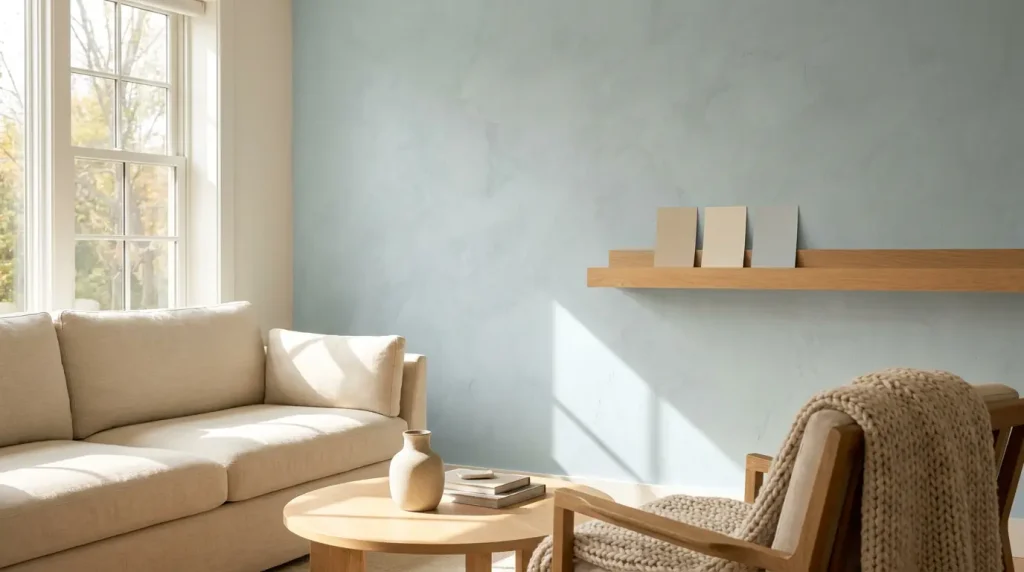
What Woodlawn Blue Benjamin Moore Actually Looks Like on a Wall
Woodlawn Blue HC-147 is a soft blue-green from Benjamin Moore’s Historical Colors collection with an LRV of 60.65 and a gray cast that keeps it from reading as bright or saturated. That gray influence is what gives it its restrained, almost collected quality; it never shouts blue, but it’s clearly there.
The green undertone runs underneath the blue base, and depending on your light, it can push forward or quietly step back.
What that means in a real room is that Woodlawn Blue reads differently at 8am than it does at 8pm, and it reads differently beside warm wood than it does against cool gray tile.
That’s the tension at the heart of this color. It’s versatile, but it isn’t effortless. It needs the right light and the right surroundings to stay in its blue-green lane rather than tipping toward green-gray or dull. The rest of this review explains exactly when it works and when it doesn’t.
How Woodlawn Blue Looks in Different Lighting

Room direction is the single biggest variable with Woodlawn Blue. Test it in the actual moments when you use the space — not just at noon.
- North-facing rooms: The blue-gray side becomes dominant. The color can look flat and cool without strong natural light to bring it forward. I would sample carefully here before committing to four walls.
- South-facing rooms: The best-case scenario. Steady daylight keeps the blue-green balance intact and the color feels airy rather than muted. It may look a touch lighter than the chip at peak brightness.
- East-facing rooms: Morning light makes Woodlawn Blue feel fresh and clean. By afternoon it softens considerably, which works well for a bedroom or nursery that you want to feel gentle by evening.
- West-facing rooms: Muted during morning hours, then warmer and slightly greener as afternoon sun strengthens. The evening shift can be dramatic — sample it specifically at 6pm if this is a dining or living room.
- Artificial light: Warm incandescent or yellow LED bulbs pull the green undertone forward. Cooler daylight-spectrum LEDs keep the color closer to its blue-gray base. Always check the sample under your actual bulbs at night before painting.
Real-Life Reviews of Woodlawn Blue Benjamin Moore
Most Woodlawn Blue owners online notice that it actually feels like color, even though it’s muted. They say it doesn’t fade into the walls like a bland neutral, yet it doesn’t feel overwhelming either; it just fits.
One Reddit user talked about it being “very soft and serene, but still plenty of color” in their bedroom, which is exactly the kind of nuance that paint chips don’t show. Because it’s not screaming “blue!”,
it gives a room depth without clashing with furniture or décor. Many people who have used it in plenty of natural light say it stays calm without washing out. It reads as a thoughtful, not a loud shade. Whether it was a nursery wall or a grown‑up bedroom,
Best Rooms to Use Woodlawn Blue
Woodlawn Blue works best where the light and fixed finishes support its blue-green-gray base. Each room below outlines the best pairings and the conditions that cause problems.
Bedroom
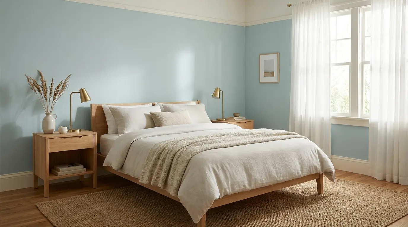
In a bedroom, Woodlawn Blue creates a restful backdrop without disappearing into the wall. Its muted tone works well when you want color that feels calm at night and soft in the morning.
Pair it with warm white trim, pale linen bedding, light oak furniture, or soft beige accents. If you’re weighing several bedroom colors for a cozy feel, Woodlawn Blue sits in the quieter end of that range, more settled than vivid. In darker rooms, sample it first, as the shade may lean more toward gray than blue when natural light is limited.
Bathroom
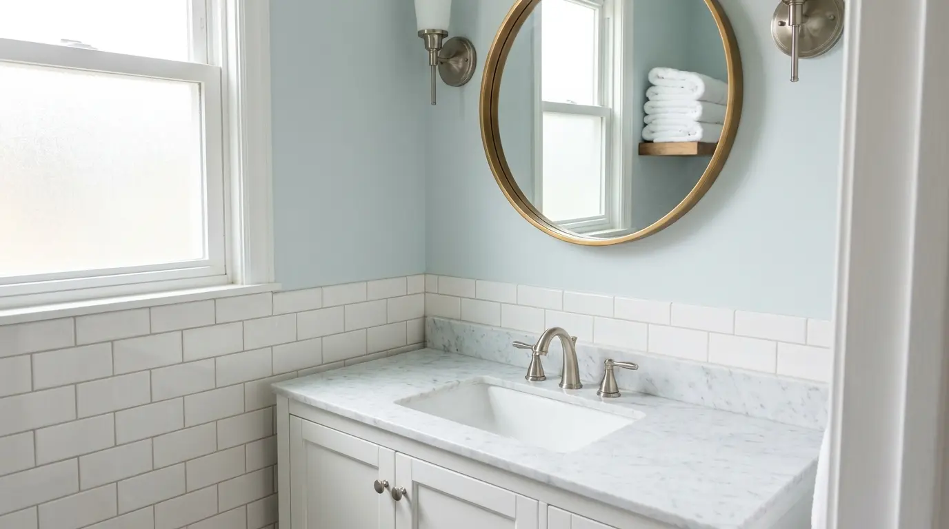
Woodlawn Blue can make a bathroom feel clean and gentle without turning cold. It works well with white tile, marble-style counters, chrome, brushed nickel, or warm brass.
Check it beside your tile before deciding, bathroom surfaces reflect color quickly, and yellow, green, or strong gray undertones in the tile can shift how the wall color reads.
Laundry Room
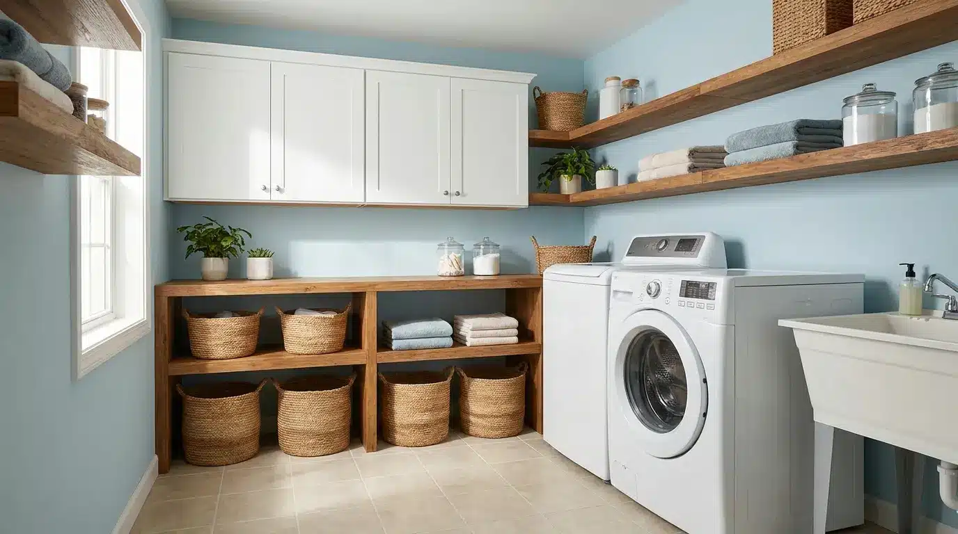
A laundry room is a practical place for Woodlawn Blue because the color adds softness to a utilitarian space. It looks fresh with white cabinets, wood shelves, woven baskets, and simple beige or gray flooring.
Since laundry rooms often have limited daylight, test it under your actual bulbs. That check will tell you whether the shade holds its blue-green balance or reads flat during daily use.
Kitchen or Cabinets
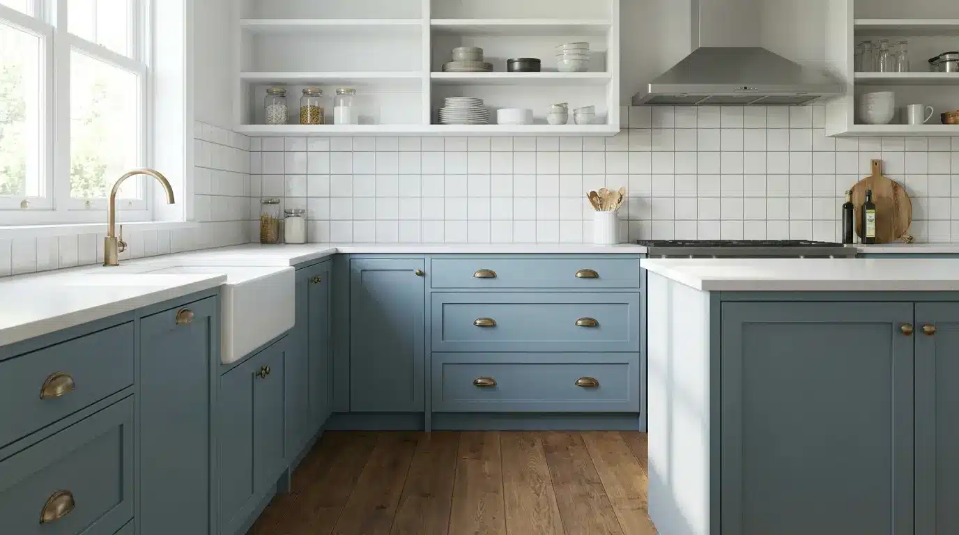
On kitchen walls, Woodlawn Blue brings a light, calm feel around white or warm neutral finishes. On cabinets, shadows fall differently on doors and corners, so the color can look deeper and more saturated than it does on a flat wall.
Pair it with white counters, brass hardware, simple tile, and warm wood floors. For cabinetry, paint a vertical test board and view it beside the handles and counters before committing.
Dining Room
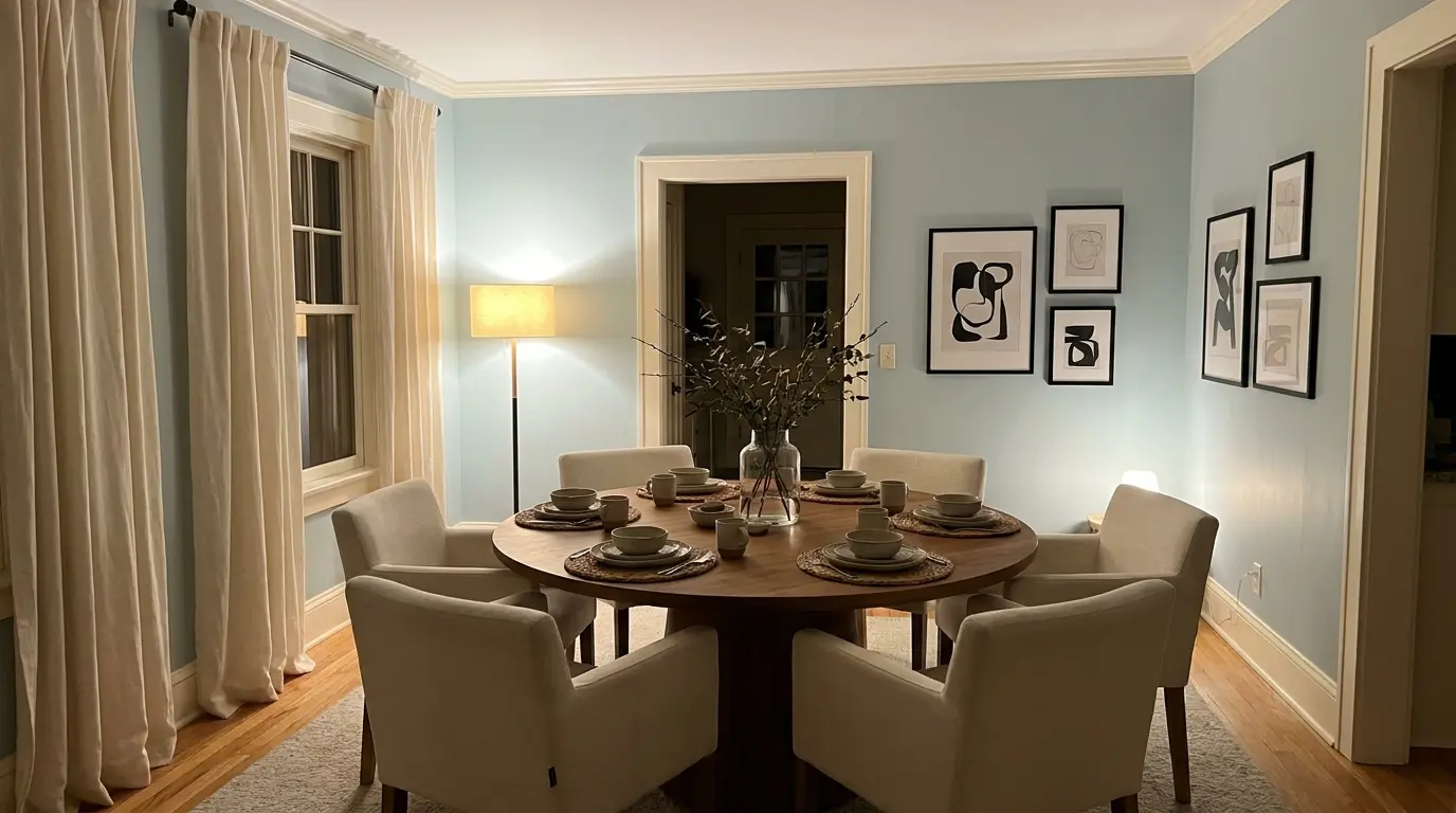
In a dining room, Woodlawn Blue feels relaxed and easy to gather around. It suits spaces with wood dining tables, cream chairs, linen curtains, black accents, and warm white trim.
Because dining rooms are often used after dark, lamp light matters as much as daylight here. Check the sample during dinner hours before choosing; the goal is soft and inviting, not cool and washed out.
Nursery
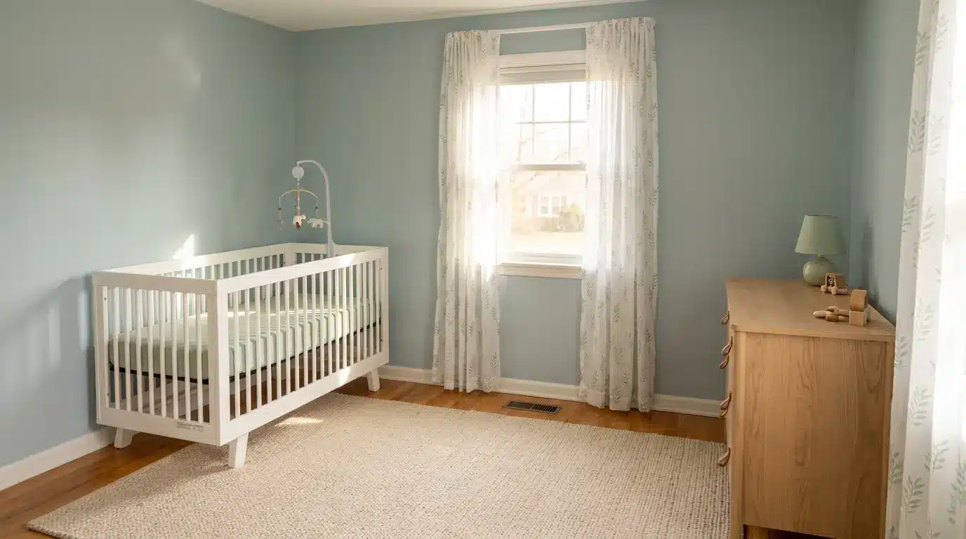
Woodlawn Blue is a lovely nursery color when you want something peaceful but not too pale. It works with white furniture, natural wood, soft rugs, and pale green accents.
The color grows well with the room, so it doesn’t feel limited to a baby stage. Keep the palette simple, particularly curtains and rugs, larger fabric pieces can shift how blue or green the walls appear through the day.
Porch Ceiling
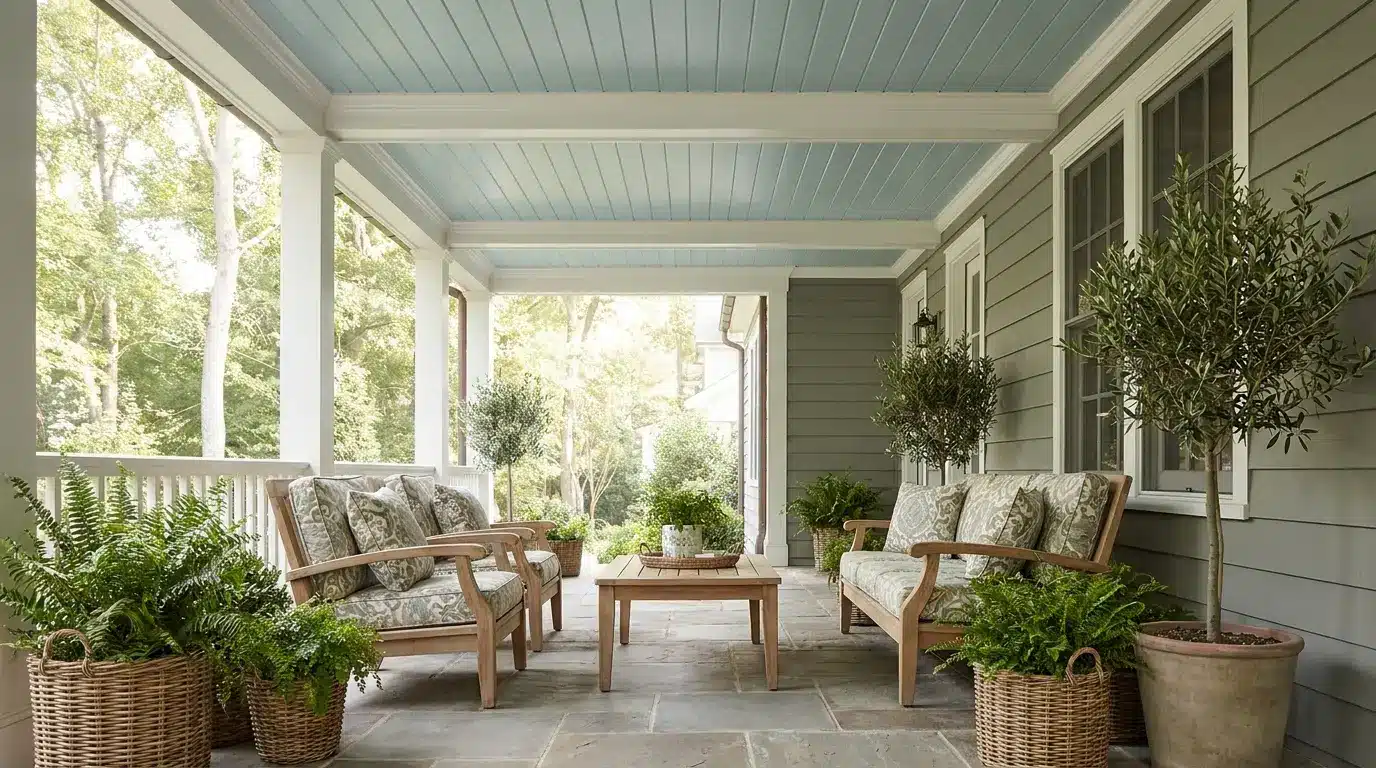
For a porch ceiling, Woodlawn Blue gives a soft sky-like effect without reading too bright. This is the same blue-green family used in traditional haint-blue porch ceilings, though Woodlawn Blue reads as quieter and more gray-blue than the brighter haint shades.
Outdoor light usually makes it appear cleaner and lighter than it does inside, so sample it outside specifically. It pairs well with white trim, stone, natural wood, and surrounding greenery. Because ceilings reflect light differently than walls, the color may look more airy overhead than the same sample appears in the room below.
Best Trim Colors to Pair with Woodlawn Blue
Trim changes how Woodlawn Blue reads on the wall. A softer white holds the color in its calmer range; a cleaner white brings the blue-green tone into sharper focus. Use this table to match the trim to the mood you’re after, then sample both together before painting.
| Trim Color | Why It Works |
| Benjamin Moore White Dove OC-17 | A soft warm white that keeps Woodlawn Blue calm and gentle. The right call when your room has warm floors, wood furniture, or creamy fabrics. |
| Benjamin Moore Chantilly Lace OC-65 | A clean, bright white that sharpens the edge of the blue-green. Works well in rooms with white tile, modern finishes, or cooler surfaces. |
| Benjamin Moore Simply White OC-117 | A fresh white with slight warmth. Keeps the room bright without making Woodlawn Blue look too cold or too gray. |
| Benjamin Moore Cloud White OC-130 | A creamy white that softens the blue-green tone. Best when you want a warm, relaxed look rather than high contrast. |
Whites shift significantly once they sit beside blue-green paint, real flooring, and natural light, sample before painting, not after.
Colors That Go with Woodlawn Blue
Woodlawn Blue pairs best with colors and materials that support its soft blue-green-gray base rather than pulling it toward green or cold. Build the palette in layers: light colors for brightness, grounded accents for warmth, natural textures to keep the room from feeling flat.
- Soft whites: On ceilings, doors, and larger furniture pieces, they keep the room feeling open and help Woodlawn Blue stay light without looking stark.
- Warm neutrals: Beige, sandy tones, taupe, and soft greige soften the cooler side of the color and make the room feel more settled.
- Natural wood: Light oak, white oak, and maple add organic warmth through flooring, furniture, shelves, or woven pieces. This is the pairing that keeps Woodlawn Blue from reading too cool.
- Brass: In lighting, cabinet pulls, mirror frames, and small decor, brass adds warmth without overpowering the wall color.
- Black accents: Picture frames, curtain rods, hardware, or chairs in black give the soft wall color more definition without competing with it.
- Navy: Works well on pillows, art, rugs, or one statement furniture piece. It gives Woodlawn Blue a richer partner than bright blue would.
- Muted greens: Soft sage and gray-green shades link back to Woodlawn Blue’s green undertone. Keep them muted so the palette stays calm rather than becoming overly botanical.
- Linen textures: Linen curtains, cotton bedding, woven shades, and textured rugs make the color feel lived-in. These pieces prevent the room from looking overly styled.
Test larger pieces beside the wall color first, particularly rugs, curtains, and wood furniture — these are the elements most likely to shift how the undertone reads.
Woodlawn Blue vs. Palladian Blue
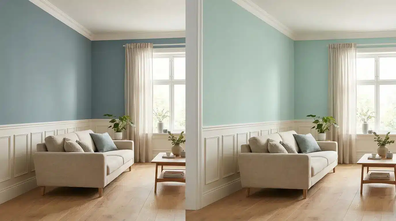
Woodlawn Blue and Palladian Blue HC-144 are the two colors that come up on the same shortlist most often, and at first glance they look nearly identical. The LRV gap is negligible (60.65 vs. 60.4).
The real difference is in the undertone: Woodlawn Blue reads more blue-gray, while Palladian Blue tilts toward green-blue. In practical terms, Woodlawn Blue tends to feel quieter and slightly more muted; Palladian Blue reads a touch fresher and airier.
| Feature | Woodlawn Blue HC-147 | Palladian Blue HC-144 |
| LRV | 60.65 | 60.4 |
| General feel | Muted, calm, slightly blue-gray | Airy, soft, slightly green-blue |
| Main risk | Can look dull or gray in weak light | Can look minty in bright or warm light |
| Best for | Bedrooms, baths, laundry rooms, porches | Bedrooms, baths, coastal rooms, open spaces |
Choose Woodlawn Blue if you want a quieter, more grounded shade. Choose Palladian Blue if you want something with a slightly fresher, brighter lift. Because they are so close, the only reliable way to choose is to sample them side by side in your actual room under your actual light.
Closest Matches in Other Paint Brands
These are the most comparable colors from other brands, useful for comparison shopping, but not as direct substitutes. Every brand uses different pigment bases, so what reads as a match on screen may behave differently on your wall. Sample any candidate beside Woodlawn Blue before buying.
| Brand | Color | How It Compares |
| Sherwin-Williams | Rainwashed SW 6211 | Light blue-green with a calm, airy feel. May show more green than Woodlawn Blue in some rooms. |
| Sherwin-Williams | Copen Blue SW 0068 | Muted blue-green with similar softness, but slightly different depth and character. |
| Behr | Nature’s Reflection N430-2 | A soft blue-green option in the same family, though not a direct match in every light condition. |
| Farrow and Ball | Light Blue No. 22 | A silvery blue with a calm feel. Reads more layered and muted than Woodlawn Blue. |
Judge these options on your wall in your light — not on a screen or a store chip.
When Not to Use Woodlawn Blue
Woodlawn Blue needs light to show its character. In very dim rooms, it loses the blue-green balance and can read flat, shadowy, or gray rather than the serene shade people choose it for. That’s the clearest case for skipping it.
It also needs care beside cool gray flooring, blue-gray tile, or stark white surfaces. Those finishes can push the whole room toward cold. Strong yellow bulbs are the other risk: warm artificial light tends to activate the green undertone more than most people expect, which can make the room feel greener than the chip suggested.
If your goal is a clear, true blue with no green movement, Woodlawn Blue will likely disappoint. For a crisper coastal blue without the blue-green shift, consider Yarmouth Blue HC-155 or a saturated coastal shade instead. Sample first in all cases.
How to Sample Woodlawn Blue the Right Way
A small chip will not tell you enough about how Woodlawn Blue behaves in your home. This shade shifts with light, direction, and surrounding finishes in ways that only become clear at poster scale or larger.
- Use a large sample: A peel-and-stick sample or a painted board at least 12×12 inches shows the undertone far better than a chip. Larger is better.
- Test on more than one wall: A wall near the window and a shaded interior wall can show meaningfully different versions of the same color.
- Check throughout the day: Morning, afternoon, evening, and lamp light. The evening check under artificial bulbs is the one people most often skip and most often regret skipping.
- Compare it beside fixed finishes: Hold the sample against trim, flooring, tile, counters, and any large fabric pieces already in the room. These are the elements it has to live with.
- Sample it beside Palladian Blue: If you’re undecided between the two, put them on the same wall in the same light. The difference becomes clear in person in a way that side-by-side photos rarely capture.
- Leave it up for two full days: One afternoon is not enough. You need to see it across the full range of light your room actually receives.
These are the questions I hear most often from people who already have the chip on their wall — and who want to make sure the full room goes right.
Frequently Asked Questions
What undertones does Woodlawn Blue have?
Woodlawn Blue HC-147 has a blue base with a green undertone and a gray cast. The green side is stronger than most people expect from the chip, and it becomes more visible in warm light or beside yellow-toned bulbs. The gray cast is what gives the color its muted, historic quality.
Does Woodlawn Blue look green in some lighting?
Yes. In warm artificial light or west-facing rooms with strong afternoon sun, the green undertone can push forward enough that the color reads more green-blue than blue-green. This is the primary surprise for first-time users. Testing under your actual bulbs at night is non-negotiable before painting.
Is Woodlawn Blue the same as Palladian Blue?
No. They are close in LRV (60.65 vs. 60.4), but Woodlawn Blue reads more blue-gray while Palladian Blue leans green-blue. Woodlawn Blue is quieter and more muted; Palladian Blue is slightly airier. Sample both side by side in your room before choosing.
What trim color goes best with Woodlawn Blue?
White Dove OC-17 is the most reliable match — warm enough to hold the color in its calmer range without competing. Chantilly Lace OC-65 works if you want a sharper, cleaner contrast. Simply White OC-117 splits the difference and keeps the room bright without turning cold.
Is Woodlawn Blue a good choice for a north-facing room?
With caution. North-facing rooms make the blue-gray side dominant, and the color can look flat or cool without strong daylight to support it. If your north-facing room has large windows or white surfaces that bounce available light, sample it first on both the well-lit and shaded walls before deciding.
What finish is best for Woodlawn Blue?
Matte or eggshell for bedrooms and low-traffic areas — it hides wall imperfections and gives the color a softer, more relaxed appearance. Satin for bathrooms, kitchens, and laundry rooms — easier to clean and reflects slightly more light, which helps in spaces that run dim.
Does Woodlawn Blue work on exterior walls?
Yes, with the right primer and finish. All exterior paints fade with UV exposure over time, so a high-quality exterior formula and a proper primer extend the color’s life, particularly on walls with direct southern or western sun exposure.
Final Thoughts
Paint color decisions often come down to how a shade actually behaves once it’s on your walls rather than how it looks on a chip.
Woodlawn Blue Benjamin Moore HC-147 stands out because it shifts between blue, green, and gray depending on light, which makes testing in your own space essential.
I find it works best when you match it with the right trim, lighting, and surrounding materials so it stays balanced throughout the day. You should review your current rooms, test samples carefully, and choose combinations that keep the color steady in different conditions.
Try a few samples besides your existing finishes and share how they respond in your lighting setup.


