


| Color Name | White Duck SW 7010 |
| Brand | Sherwin-Williams |
| LRV | 74, medium-light; reflects well without washing out |
| Undertones | Creamy beige with a soft greige pull; occasionally a faint pink in certain lighting |
| Best For | South- and west-facing rooms, exteriors, kitchens with warm wood, open-plan spaces |
| Avoid In | North-facing rooms with no warm lighting, spaces with cool gray floors or blue-gray tile |
Picking a white paint color sounds simple until you’re staring at 47 swatches that all look identical in the store. White Duck Sherwin Williams is one of those colors that genuinely surprises people; it reads differently depending on your light, your flooring, and your existing décor.
It’s warm without being yellow, neutral without being cold, and versatile enough for both interiors and exteriors. If you’ve been going back and forth between creamy whites and greige neutrals, this color might be sitting right in your sweet spot.
I’ll keep things practical here, with undertones, lighting, pairings, exterior use, and the Shoji White comparison covered clearly.
What Sherwin-Williams White Duck SW 7010 Actually Looks Like on Your Walls
Sherwin-Williams White Duck SW 7010 is a warm off-white that sits between a true white and a light greige, creamy without reading yellow, neutral without going cold.
If you’ve been going back and forth between soft creams and warm neutrals, this color lands right in that overlap. At an LRV of 74, it reflects a solid amount of light while keeping enough depth to look intentional rather than washed out.
A step warmer than Natural Choice SW 7011 and noticeably softer than a bright white, it sits in a genuinely useful middle range.
I’ve placed White Duck in everything from sunny open-plan kitchens to dimmer east-facing bedrooms, and the results depend almost entirely on what surrounds it: your light, your trim, and your flooring matter here more than they do with most whites.
White Duck Undertones and Lighting Effects
Lighting strongly affects how Sherwin-Williams White Duck looks in a real home. This warm off-white has creamy beige and soft greige undertones, so it can shift between warm white, light beige, and muted greige depending on the room.
Because White Duck is not a crisp white, it should be tested beside flooring, trim, cabinets, counters, and exterior materials before painting a full space. Check the sample in the morning, afternoon, evening, and at night so you can see how much warmth or depth appears throughout the day.
In Natural Light
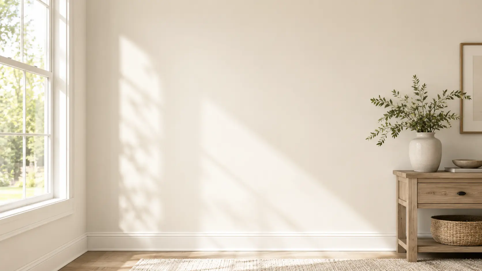
Natural light can make White Duck look lighter, warmer, creamier, or more muted based on the direction of the room. In bright spaces, it often looks soft and clean. In shaded spaces, its beige and greige tones may become more noticeable.
North-facing rooms: The light is usually cooler and softer. White Duck may look more muted, greige, or slightly beige in these rooms. It can still feel calm and cozy, but it works best with warm lighting, natural wood, soft white trim, and warm decor to keep the space from feeling dull.
South-facing rooms: South-facing rooms get warmer daylight for much of the day. This light can make White Duck feel brighter, creamier, and more welcoming. It is one of the easier lighting conditions for this color because the natural warmth makes the paint look soft rather than flat.
East-facing rooms: East-facing rooms get bright morning light, which can make White Duck look fresh and softly warm early in the day. As the light fades, the color may look more beige or greige. Warm bulbs can help keep the room feeling balanced later.
West-facing rooms: West-facing rooms get stronger afternoon and evening light. During this time, White Duck can look warmer, creamier, and a little richer. This makes it a good choice for living rooms, bedrooms, dining rooms, and spaces where a cozy evening feel matters.
In Artificial Light
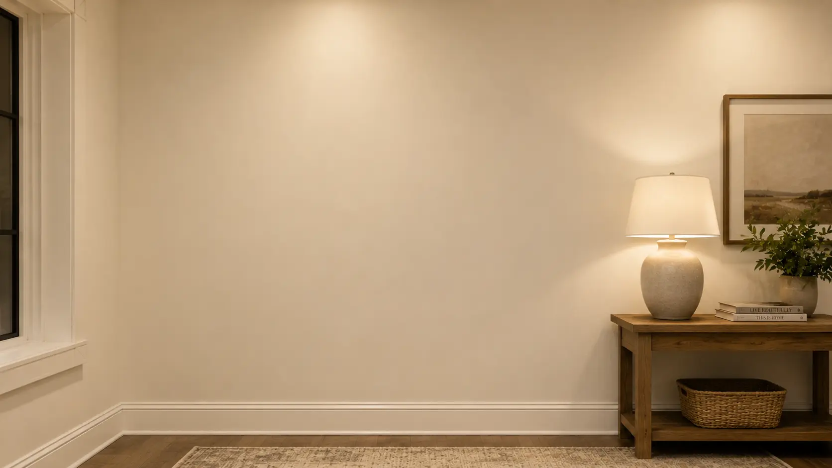
Artificial lighting can significantly change White Duck after sunset. Warm white bulbs can bring out more of its creamy beige side, making the room feel softer and cozier.
Cool LED or daylight bulbs can make White Duck look flatter, grayer, or less warm. If you want the color to stay balanced, soft white bulbs are usually the safest choice.
Layered lighting also helps White Duck look better. Use ceiling lights, table lamps, floor lamps, or wall sconces together so the color feels even across the room. This keeps White Duck looking soft, warm, and comfortable during the day and at night.
| Pro Tip: Before sampling on a wall, tape the chip next to your flooring, your trim, and the largest fixed surface in the room. White Duck’s undertones shift based on what surrounds it more than almost any other color in this range. The chip alone will not tell you what you need to know. |
Shoji White vs White Duck: Which One Do You Actually Need?
These two come up together constantly, and with good reason — they’re close. But they’re not interchangeable, and getting this wrong means a repaint.

| Feature | White Duck SW 7010 | Shoji White SW 7042 |
|---|---|---|
| LRV | 74 | 74 |
| Undertones | Creamy beige with soft greige | Warm cream with greige depth; occasional faint pink |
| Overall Feel | Slightly cleaner, more balanced | Warmer, cozier, slightly richer |
| Best For | Exteriors, open-plan walls, cabinets | Cozy interiors, bedrooms, spaces that need warmth |
| Watch Out For | Can look beige beside cool finishes | Can look too warm or muted in low light |
The honest answer: if you want a soft off-white that reads a bit cleaner and works as well outside as it does inside, White Duck is the call. If you want more cozy warmth and you’re staying interior, Shoji White often suits a wider range of fixed finishes.
Test both on the actual wall before committing, the difference between them is exactly subtle enough to read clearly only once they’re up.
Choosing the Right Finish for White Duck
Finish changes how White Duck reads on the wall, a higher sheen intensifies the undertones, while matte and flat finishes keep it soft and even. How paint sheens behave in different lighting conditions matters more with a warm off-white like White Duck than with most mid-tone colors, because sheen directly amplifies whether you see cream or greige on the wall. The right choice depends on the room’s traffic, moisture level, and how much shine you want.
| Finish | Best For | Why It Works |
|---|---|---|
| Flat / Matte | Bedrooms, ceilings, low-traffic walls | Softest look; hides imperfections well; keeps White Duck from looking shiny |
| Eggshell | Living rooms, hallways, family rooms | Balanced softness with light washability; most common choice for main walls |
| Satin | Kitchens, bathrooms, trim, doors | Washable and durable; handles moisture without compromising the warm tone |
| Semi-Gloss | Cabinets, doors, exterior trim | Hardest finish for high-contact surfaces; clean contrast at edges |
One note on trim: White Duck is generally not my recommendation as an interior trim color. At LRV 74, it’s deep enough that it won’t create meaningful contrast against most wall colors.
Use it on the walls and bring the trim up, Pure White (SW 7005) or Extra White (SW 7006) create the clean separation that lets White Duck read as the warm wall it’s meant to be.
Where White Duck Works Best, Room by Room
White Duck is flexible, but it performs differently depending on the room’s light, fixed finishes, and how much warmth the space already carries. Here’s where it does its best work and what to pair it with in each space.
Living Room
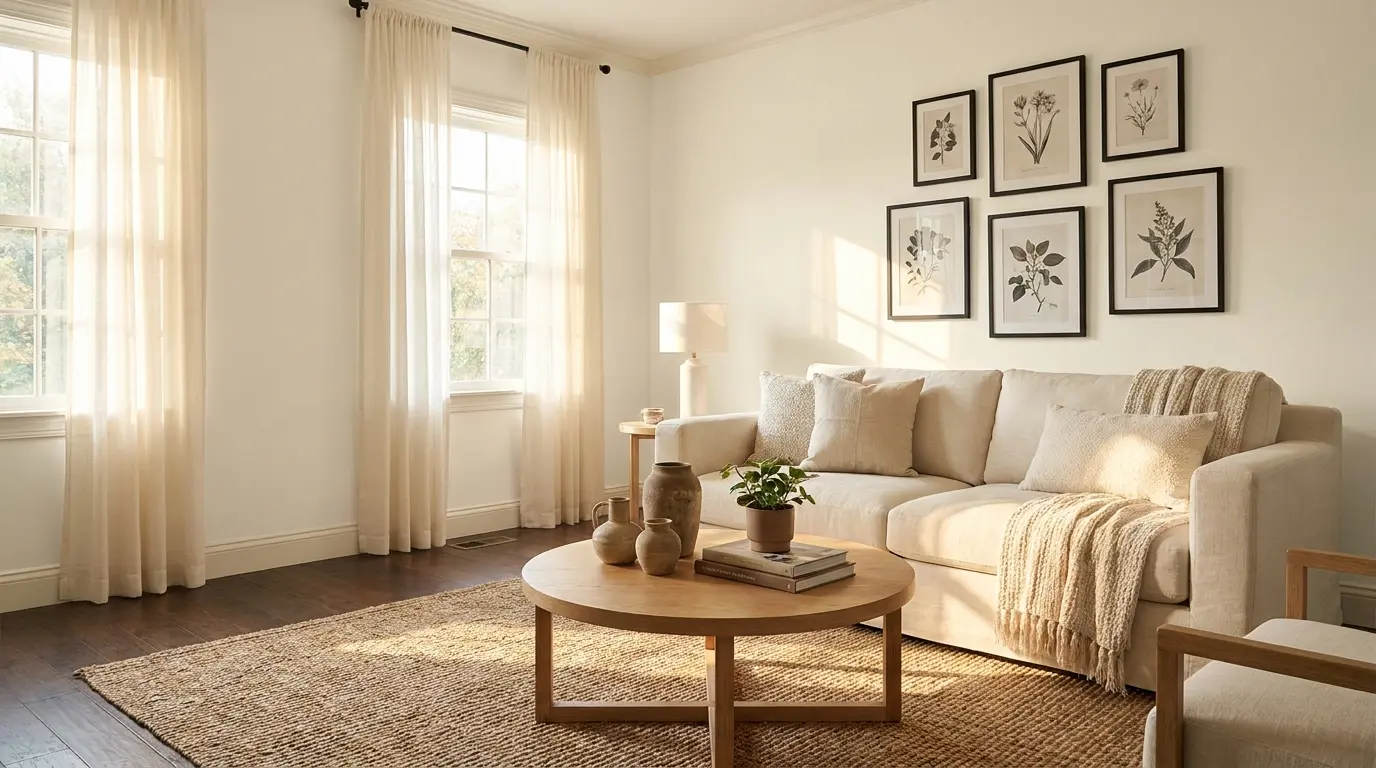
White Duck creates a relaxed, livable backdrop in a living room. It works particularly well with linen sofas, wood coffee tables, black frames, woven rugs, and warm white curtains. Because it reads light without looking stark, it doesn’t compete with furniture — it recedes and lets the room breathe. In open-plan spaces, this color moves well through living, dining, and entry zones without getting tired.
Bedroom
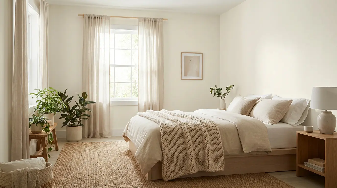
In a bedroom, White Duck is quiet in the best way. It pairs naturally with white bedding, beige or taupe throws, wood nightstands, and muted green accents.
Warm enough to feel cozy at 10pm under soft lighting, clean enough to feel fresh at 7am when the morning light comes in. For bedrooms, flat or matte finish is the call — it keeps the color soft and absorbs rather than reflects the overhead light.
Kitchen
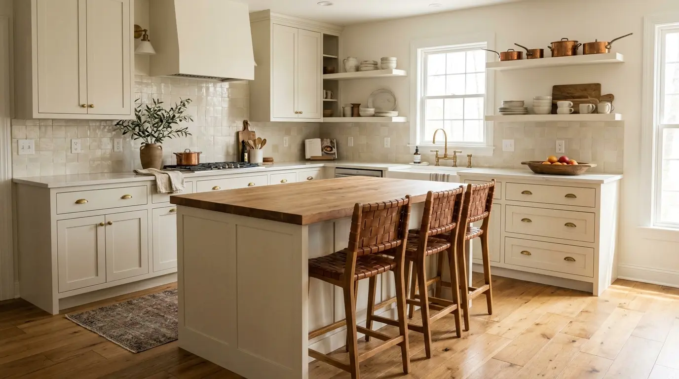
White Duck on kitchen cabinets works well when the surrounding finishes are warm — brass hardware, wood floors, stone countertops, and warm white backsplashes all support it.
The color brings softness without making the kitchen feel dim. Where it runs into trouble is beside icy quartz, blue-gray tile, or very cool white cabinet pairings; those cooler surfaces pull out the beige side of White Duck in a way that reads less warm, more muddy. Bathroom

Bathrooms with warm stone, cream tile, beige floors, brushed brass, or wood vanities are where White Duck looks most at home. In bathrooms with cool gray tile or blue-toned marble, expect the beige undertones to become more pronounced- not necessarily a problem, but worth testing with a real sample before committing.
Good layered lighting is more important in bathrooms than in any other room for this color; a single overhead bulb will not give you an accurate read.
Hallways and Open Layouts
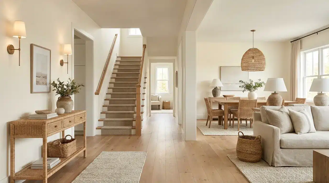
White Duck is genuinely good for hallways and open-plan spaces because it stays consistent across different light exposures without getting dramatic. It threads through entries, stairways, dining rooms, and living areas without changing color.
That said, open layouts with a mix of warm and cool fixed finishes need a careful sample test; what looks balanced in the south-facing living room can read more beige in the north-facing hallway off the same paint can.
Sherwin-Williams White Duck on the Exterior

Choosing a Sherwin-Williams White Duck exterior finish gives your home a soft white look that reads warm without the harshness of a bright white in direct sun.
Its creamy beige and greige undertones help it sit naturally beside brick, stone, and wood; the color feels like it belongs rather than being applied on top. For modern farmhouse, craftsman, colonial, and transitional homes, this is a reliable exterior choice.
| Exterior Area | Best Use | Why It Works |
|---|---|---|
| Siding | Whole-house body color | Soft white look that holds in direct sun without glare |
| Painted Brick | Full brick or accent surfaces | Warms up the brick texture without flattening it |
| Stucco | Main exterior body | Softens rough texture; creates a warm, finished look |
| Trim and Fascia | Subtle contrast with deeper body colors | Works when you want trim that reads soft rather than bright white |
| Garage Doors | Matching or blended with siding | Reduces the visual weight of large garage doors from the street |
| Shutters | Paired with dark accents | Warm base for black, bronze, navy, or sage shutters |
The critical exterior testing note: sample White Duck on more than one side of the house. In direct sunlight, it reads as a clean, soft white. In shade, the north-facing wall, the covered porch, the areas under the roofline, the greige and beige pull forward. Both reads can work beautifully, but you want to see them before painting the whole house.
For the strongest exterior contrast, pair it with a near-black like Greenblack for contrast on shutters, doors, and trim, the warm white and deep near-black combination is hard to get wrong.
What People Discuss About Benjamin Moore White Dove
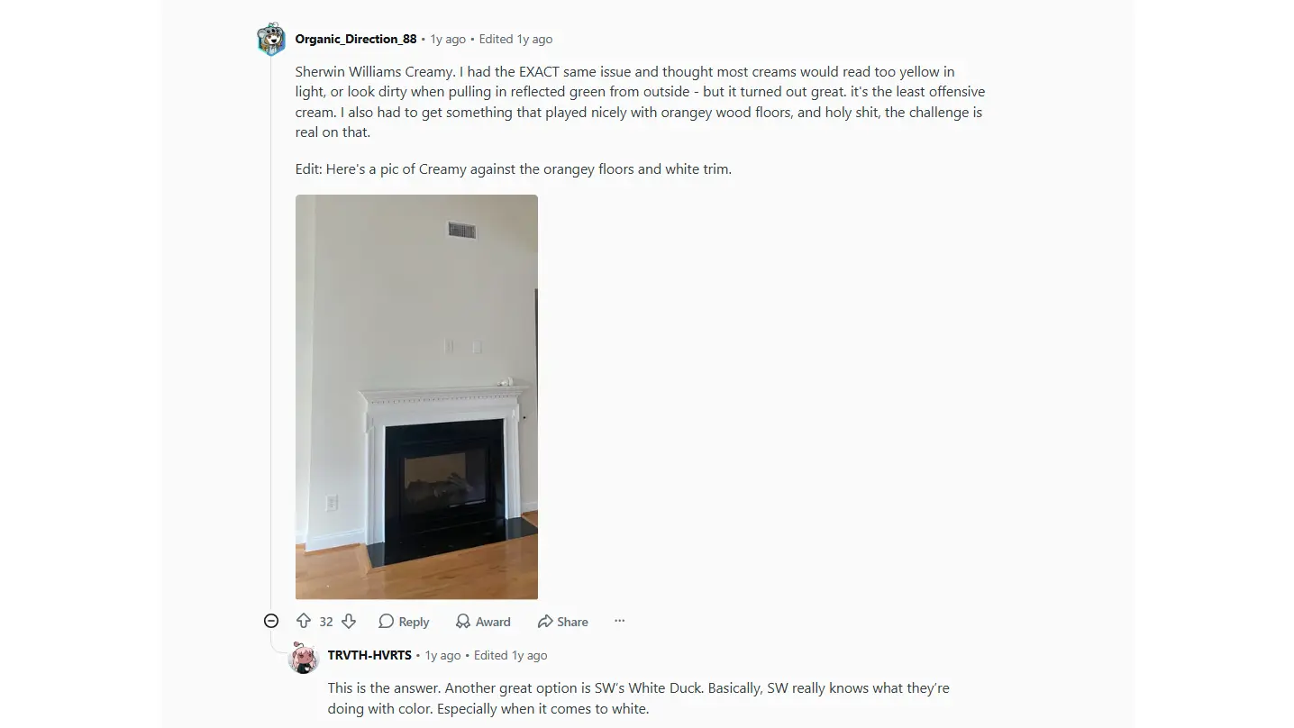
Reddit user was overwhelmed by the paint selection process and worried that most creamy whites would look too yellow or dirty, or clash with orange-toned wood flooring. After trying different options, they chose Sherwin-Williams Creamy and were pleasantly surprised by how balanced and versatile it looked.
Another Reddit user joined the discussion and specifically recommended Sherwin-Williams White Duck, noting that it is one of the brand’s strongest white paint colors and a reliable choice when searching for a warm off-white that works with a variety of finishes and lighting conditions.
The conversation highlights how White Duck is often suggested by homeowners seeking a soft, warm white that avoids the harshness of bright whites yet remains flexible enough for different spaces.
Coordinating Colors That Work With White Duck
White Duck’s warm off-white base pairs best with colors that add warmth, depth, or contrast without pushing toward yellow or cool gray. Since it sits at LRV 74, it can hold its own against both light neutrals and deeper accent colors without disappearing.
If you’re still deciding between White Duck and other options in this range, the broader comparison of warm white paint colors lays out how the whole family behaves side by side.
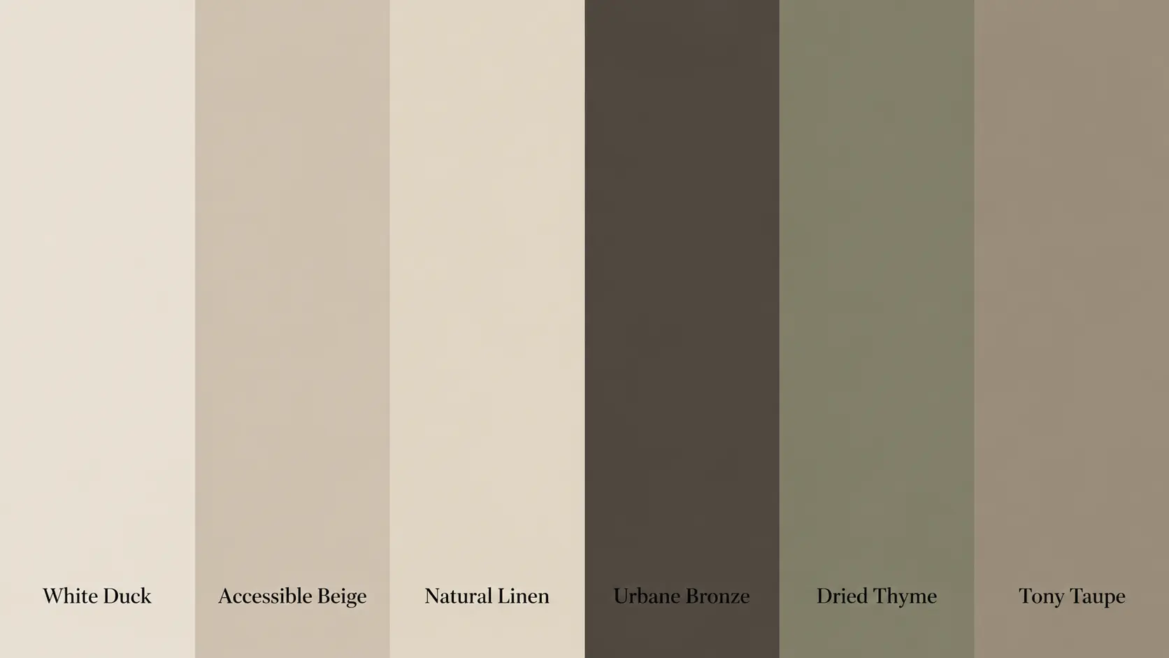
| Coordinating Color | Code | LRV | Best Use With White Duck |
|---|---|---|---|
| Accessible Beige | SW 7036 | 58 | Adjoining rooms; soft whole-home palette |
| Natural Linen | SW 9109 | 66 | Layered neutral palette for bedrooms and living rooms |
| Urbane Bronze | SW 7048 | 8 | Doors, shutters, accent walls, exterior accents |
| Dried Thyme | SW 6186 | 21 | Cabinets, shutters, accent walls |
| Tony Taupe | SW 7038 | 37 | Accent walls, adjoining rooms, exterior trim |
Use Accessible Beige or Natural Linen when you want a layered, soft neutral palette that moves between rooms without contrast. Reach for Urbane Bronze, Dried Thyme, or Tony Taupe when you need depth and contrast that White Duck’s warmth can anchor without being overwhelmed.
When NOT to Use White Duck
White Duck is versatile, but it has limits. These are the situations where it consistently underperforms, and where a different color would serve you better.
Rooms with predominantly cool gray flooring will pull out the muted, beige side of White Duck, and the walls can end up looking dull rather than warm.
Spaces with blue-gray tile, cool quartz countertops, or silver-toned fixtures have the same problem: the cool finishes win, and White Duck looks like it can’t decide what it wants to be.
Very bright white trim– particularly cool whites like Chantilly Lace (BM OC-65), can make White Duck look darker or creamier than intended, especially in rooms where the trim is a dominant visual element. That’s not always a bad thing, but it’s rarely what people expect when they choose White Duck for its soft white quality.
Basements and rooms with no natural light are a risk. White Duck’s warmth is an asset in light-starved spaces, but without the right artificial lighting setup, soft white bulbs, and layered sources, it can read more beige and flat than you’d want. If the artificial lighting can’t be improved, consider a lighter option like Alabaster (SW 7008) at LRV 82.
Finally, if you’re expecting a true crisp white, White Duck will not deliver that. At LRV 74 with a creamy greige base, it is a deeper, warmer off-white by design. Going in with that expectation prevents the most common source of disappointment with this color.
Mistakes to Avoid With White Duck SW 7010
Testing White Duck paint without proper sampling can lead to unexpected color shifts on your walls, exteriors, and trim.
- Relying on digital screens: Monitor settings and photo editing distort the color, causing a soft white to look beige in person.
- Pairing with warm trim: Matching it with Alabaster blends the tones together, creating a flat look instead of crisp separation.
- Testing one exterior spot: Different lighting conditions cause north-facing walls to look greige while south-facing walls look much brighter.
Always test your paint swatches in multiple locations and different lighting environments to ensure you love the final results.
How to Sample White Duck the Right Way
A careful sample process is the difference between getting White Duck right and repainting a room three months later. Here’s what I recommend before buying the gallons.
Buy the actual sample pot, not a peel-and-stick chip. Samplize and similar services are useful, but nothing replaces painting two large swatches, at least 12 by 12 inches, directly on different walls in the same room.
Check those swatches at 7 am, noon, 5 pm, and again at 9 pm under your actual lighting. That sequence tells you more about how White Duck will behave in your space than any chip or digital swatch can.
Place the swatches next to your real furniture, rugs, flooring, and cabinets, not on an empty wall in a stripped room. The color reads entirely differently when it’s surrounded by the fixed finishes it’ll actually live with.
Check it against your trim color specifically; that relationship determines whether the undertones read as intentional warmth or as a muddy, indecisive beige. Let the paint dry completely before judging it; wet White Duck reads darker and warmer than the final dried result.
Frequently Asked Questions About Sherwin-Williams White Duck
Can you use White Duck on ceilings?
Yes. Using it on ceilings creates a cohesive, wrap-around feel in large spaces. Pair it with Matte or Flat finish to soften the room’s corners, prevent glare from artificial lights, and mask minor drywall imperfections without making the ceiling feel too low or heavy.
Does it look yellow in low-light basements?
Instead of shifting yellow, White Duck leans flat and muddy in dark basements. Without natural sunlight, its greige undertones take over, turning the color a shadow-like beige. You will need strong, layered 3000K lighting to keep it looking like a fresh, warm off-white.
How does White Duck handle wood rot or exterior grime?
Its medium-light depth hides dust, pollen, and minor outdoor scuffs much better than a bright, crisp white. While it will not mask severe wood rot, the subtle greige baseline helps your exterior siding look cleaner for longer between seasonal power washings.
Will it clash with trendy black steel windows?
Not at all. It provides a stunning, high-contrast backdrop for modern black window frames. The inherent warmth of the paint softens the industrial look of the black steel, creating a balanced, contemporary facade that feels inviting rather than stark or clinical.
Does White Duck work well in nursery spaces?
It is an excellent choice for a calming nursery backdrop. The neutral base grows easily with your child, shifting effortlessly from soft pastel decor to vibrant toddler bedding without requiring a repaint. It stays peaceful under dim nightlight conditions.
Can it be used for color-drenching a room?
Color-drenching walls, trim, and doors in White Duck works beautifully if you vary the sheens. Apply Satin to the trim and Satin or Semi-Gloss to doors while keeping walls Eggshell. This maintains monochromatic harmony while preventing the architectural details from completely disappearing.
Final Thoughts
White Duck proves that a soft white can feel warm, clean, and practical when it complements the surrounding space. I like how it gives you a gentle off-white look without the sharp feel of a bright white.
You just need to watch its creamy beige and greige undertones, especially near trim, flooring, lighting, brick, stone, and roof colors. The room-by-room notes, finish tips, exterior ideas, and sampling steps all point to one thing: test first.
That small step helps you avoid costly mistakes and choose with more confidence. If White Duck Sherwin Williams paint is on your list, try a real sample and share how it looks in your home, or check a related paint color review next.


