


Stonington Gray can look calm, blue, or even stormy depending on the light in your room, and that often catches people off guard.
Stonington Gray HC-170 is a cool gray with blue-green undertones and a medium depth that reacts strongly to its surroundings.
You might think you’ve picked a safe neutral, but lighting, trim, and nearby finishes can quickly shift how it reads on your walls.
I’ll help you understand how this color behaves so you know what to expect before painting. You and I will break down its undertones, lighting effects, and best uses so you can decide if it truly fits your space.
Stonington Gray at a Glance
| Color Name | Benjamin Moore Stonington Gray HC-170 |
| Brand | Benjamin Moore |
| LRV | 59, medium depth, not light and airy |
| Undertones | Blue-green (blue more noticeable than green) |
| Best For | Walls, cabinets, bathrooms, exteriors, in spaces with average to bright natural light |
| Avoid In | Rooms with yellow trim, cream tile, orange-toned floors, or minimal natural light |
Stonington Gray sits in the medium range. It will reflect a decent amount of light, but it will never disappear into the background. In rooms with strong natural light, it reads as a clean, composed gray. In darker rooms, it can feel heavier and cooler than the chip suggested.
Stonington Gray Undertones: What the Blue-Green Actually Does

The undertone in Stonington Gray is primarily blue, with a secondary green note that tends to show up in south-facing rooms and under warm afternoon light. Most of the time, the blue is the one you’ll notice. The green is subtle enough that many people never see it at all.
What matters practically is this: that blue undertone is context-dependent. It stays quiet beside clean, cool whites. It becomes obvious beside creamy whites, warm beige tile, or orange-toned wood floors.
If your existing finishes run warm, the undertone will read as blue because the warm surroundings amplify the contrast. This is the reason Stonington Gray can look exactly right in one room and strangely blue in the next.
Besides Revere Pewter HC-172, the difference is stark. Revere Pewter reads warm and slightly green-beige. Stonington Gray reads noticeably cooler. If you’re comparing the two on a chip and thinking they look close, put them on a wall beside your trim and floors. The gap will show.
| Pro Tip: Before buying gallons, order a peel-and-stick sample from Samplize and move it around your room at different times of day. Test it beside your trim, your flooring, and the wall opposite your main window. One hour of testing prevents a costly mistake. |
How Light Changes Stonington Gray
Light does more work on Stonington Gray than on most grays, because the undertone is responsive rather than neutral.
The same color at 8 am can look markedly different at 4 pm, and markedly different again under your overhead lights at 9 pm. This is not unusual for cool grays, but it’s more pronounced here than in something closer to a true neutral.
| Light Direction | How Stonington Gray Reads | How to Balance It |
|---|---|---|
| North-facing | Cooler, bluer, sometimes close to stormy | Warm bulbs, wood accents, soft white trim |
| South-facing | Softer, sometimes shows more green in the undertone | Crisp white trim, navy accents |
| East-facing | Cleaner and fresher in the morning, flatter by evening | Test at multiple times before committing |
| West-facing | Picks up warmth in the afternoon; reads softer | Charcoal, navy, or warm wood to ground it |
Artificial light matters just as much. Cool LED bulbs will push the blue undertone further. Warm white bulbs (around 2700K) bring the gray back into balance. If a room relies on overhead lighting in the evenings, test Stonington Gray under both bulb types before painting.
North-facing rooms are the riskiest application. I’ve seen Stonington Gray look genuinely beautiful in bright south-facing rooms and genuinely bleak in north-facing ones with no artificial warm light to compensate. The same can of paint. That’s how sensitive this color is to its environment.
Colors That Pair Well With Stonington Gray
When designing around Benjamin Moore Stonington Gray HC-170, selecting the right palette is crucial because its cool, context-dependent blue-green undertone reacts strongly to neighboring tones.
To build cohesive Stonington gray color combinations, blue accents and clean white boundaries offer the most reliable ways to lean into or balance its shifting personality.
White Trim Pairings
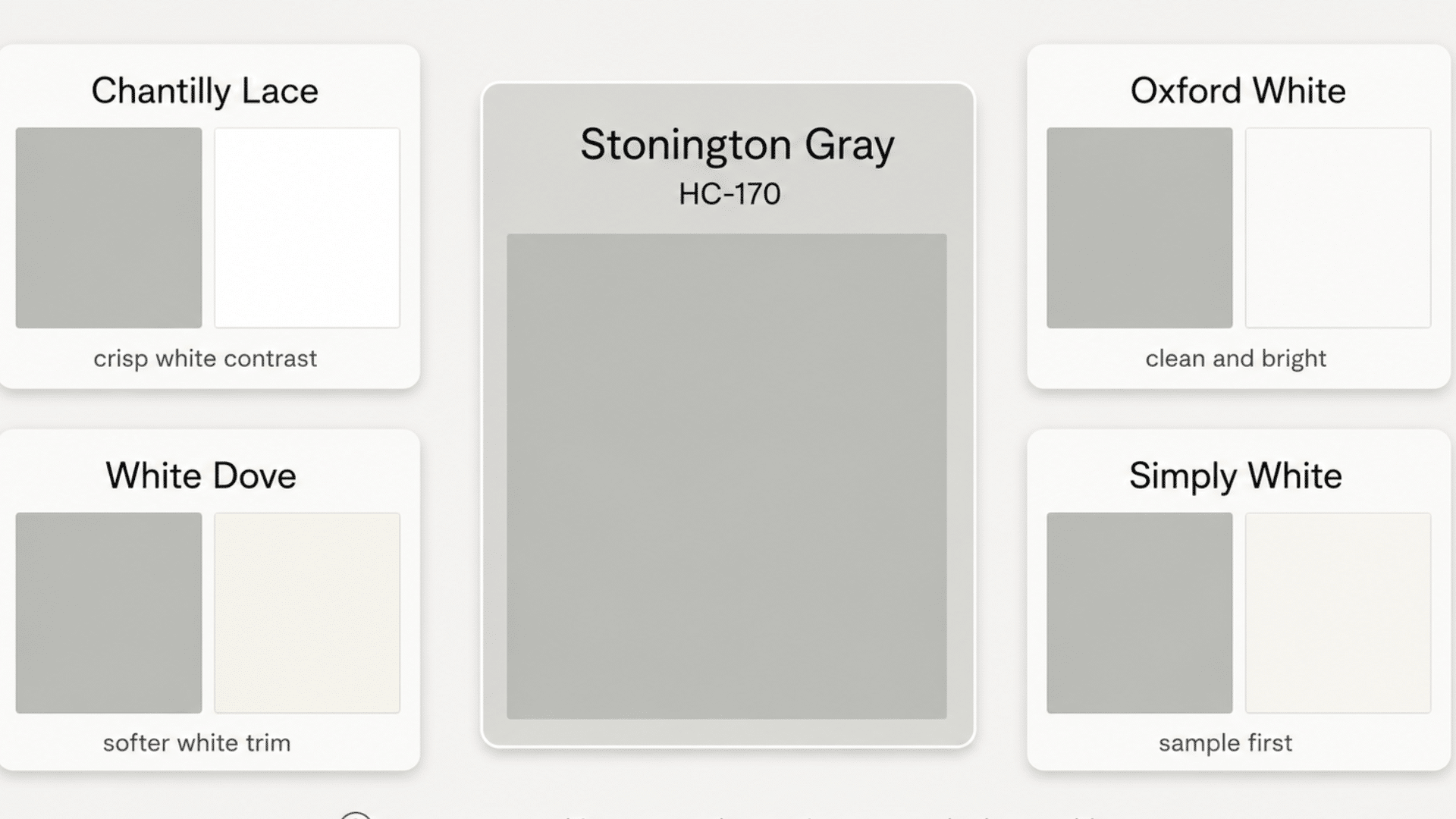
The wrong white will turn Stonington Gray noticeably blue. Creamy whites with yellow undertones, like Antique White or some versions of Linen White, are the main culprits. The cool-blue undertone in Stonington Gray reacts against yellow-warm whites, and the contrast reads as “is that wall actually blue?”
- Chantilly Lace OC-65 gives the sharpest, cleanest contrast and is the safest choice for anyone who wants Stonington Gray to read as a true gray rather than a blue-gray.
- Oxford White CC-30 keeps the palette crisp without being as stark as Chantilly Lace.
- White Dove OC-17 works in rooms where the light is bright enough to carry the softness; it gives a warmer trim look without crossing into creamy territory.
- Simply White OC-117 can work, but sample it carefully beside your specific walls and lighting before committing.
Blue Accent Colors
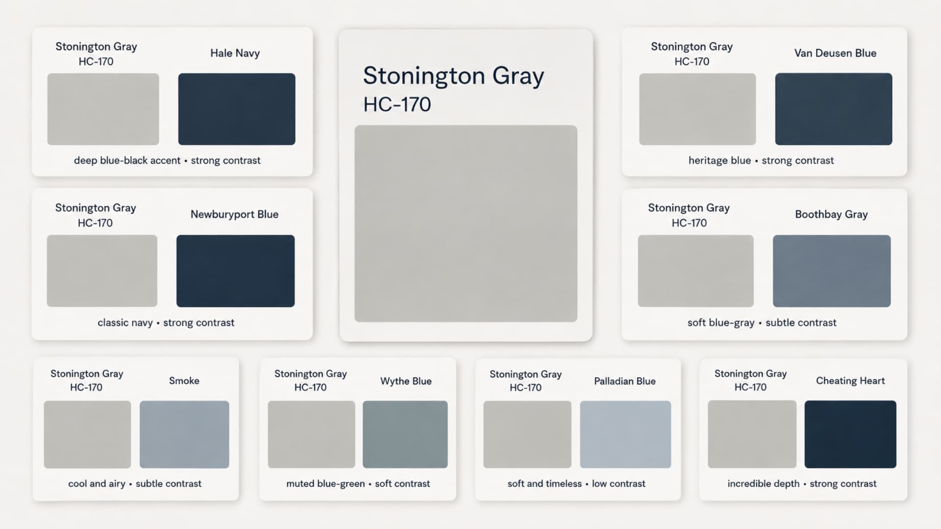
Stonington Gray’s undertone already leans blue-green, so deeper blues create contrast rather than competition. Pale blues placed beside it tend to flatten the whole palette; the room starts to feel like a single wash of cool rather than a composed design.
- Hale Navy HC-154 is the most versatile accent; it works on front doors, kitchen islands, built-in cabinetry, and vanities. The contrast with Stonington Gray is strong without feeling harsh.
- Van Deusen Blue HC-156 is a slightly softer navy that works well on office built-ins and dining room accents.
- Boothbay Gray HC-165 creates a quieter blue palette, better suited to bedrooms and bathrooms where calm is the priority over contrast.
- Cheating Heart 1617 is a deep blue-black that works as a front door color or for a single dramatic accent wall. If you also want a deep, nearly-black wall color for interior spaces, the Sherwin-Williams Greenblack is a comparable dark option worth considering alongside it.
Warm Materials as Counterbalance
Wood is the easiest way to stop Stonington Gray from feeling clinical. White oak flooring, natural wood shelving, linen textiles, and woven baskets all add warmth without clashing with the cool undertone.
You’re not trying to make the color warm; you’re giving the room enough warmth elsewhere that the gray feels intentional rather than cold.
If you’re weighing whether to go warm or cool overall on your neutral palette, the Sherwin-Williams Natural Choice shows what a warm off-white approach looks like as a contrast.
Best Rooms for Stonington Gray
1. Living Rooms
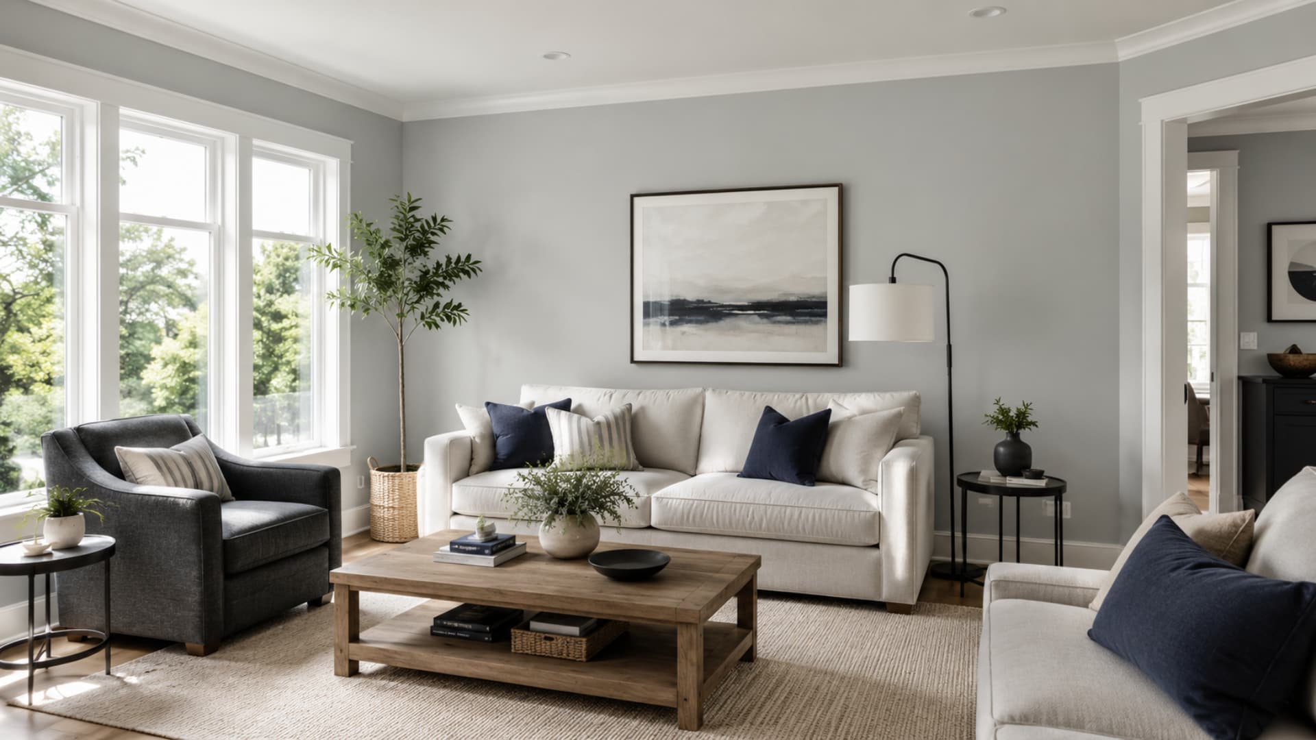
Living rooms with average or better natural light are where Stonington Gray tends to earn its reputation. The color reads composed, clean, and calm without sliding into beige. White trim keeps it defined; warm wood floors and linen sofas keep it from feeling cold.
In open-plan spaces, check how Stonington Gray reads beside adjacent wall colors. On a long wall facing a room with warm finishes, the blue undertone can become more noticeable than expected. Test the color on at least two walls, not just the sample board.
2. Bedrooms
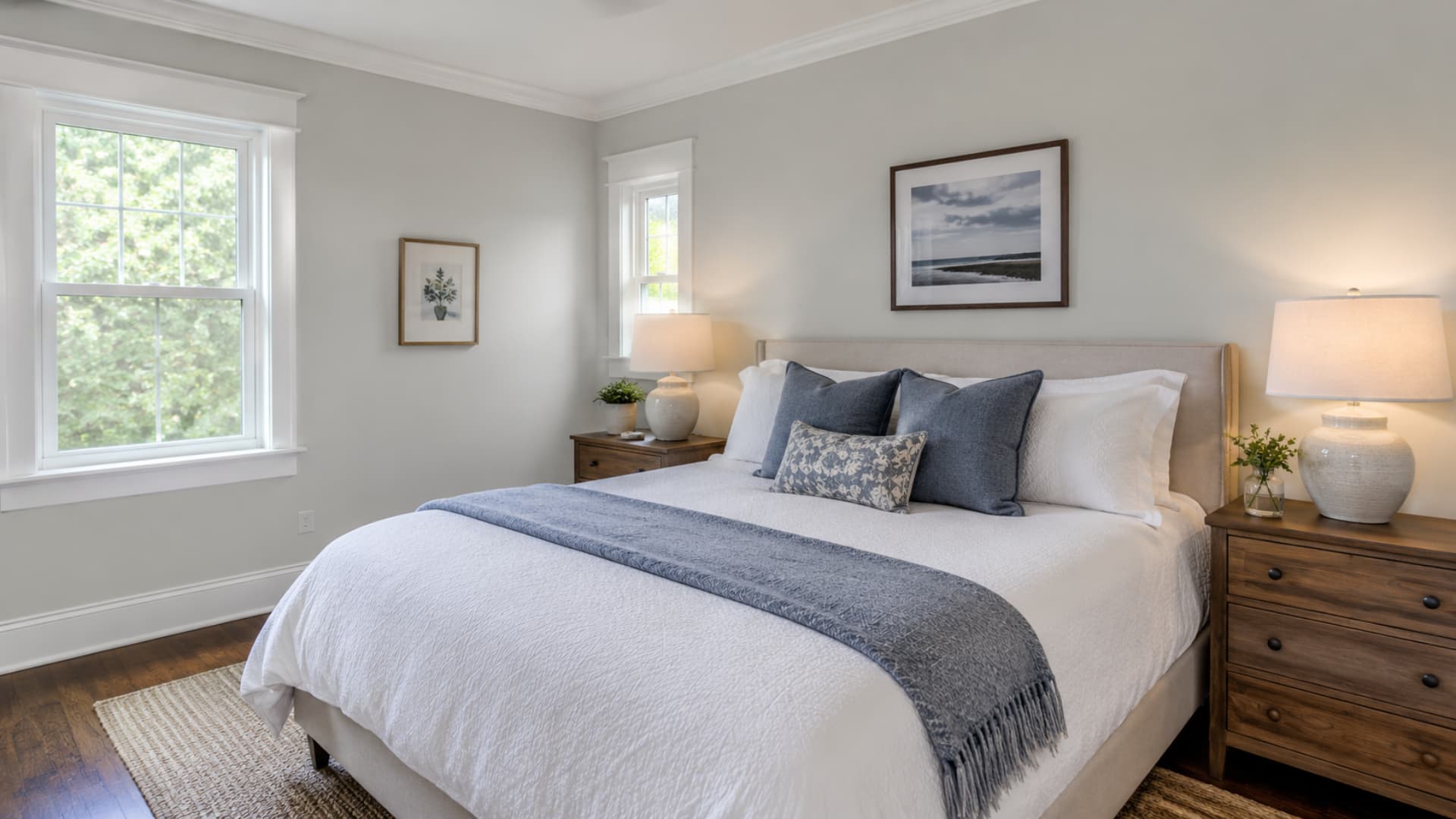
Stonington Gray suits bedrooms where the goal is quiet and composed rather than cozy and warm. Soft white bedding, muted navy or blue-gray textiles, and warm wood nightstands are the combination I’d lean on. The color has enough depth to feel present on the walls without overwhelming the room.
North-facing bedrooms are the one application where I’d pause. Warm bulbs help, and wood furniture helps, but if the room already feels dim and cool, Stonington Gray can accentuate that rather than soften it.
In that situation, Wickham Gray HC-171 is worth sampling alongside it, it’s a hair lighter, and the cooler feel is slightly less pronounced.
3. Bathrooms and Laundry Rooms
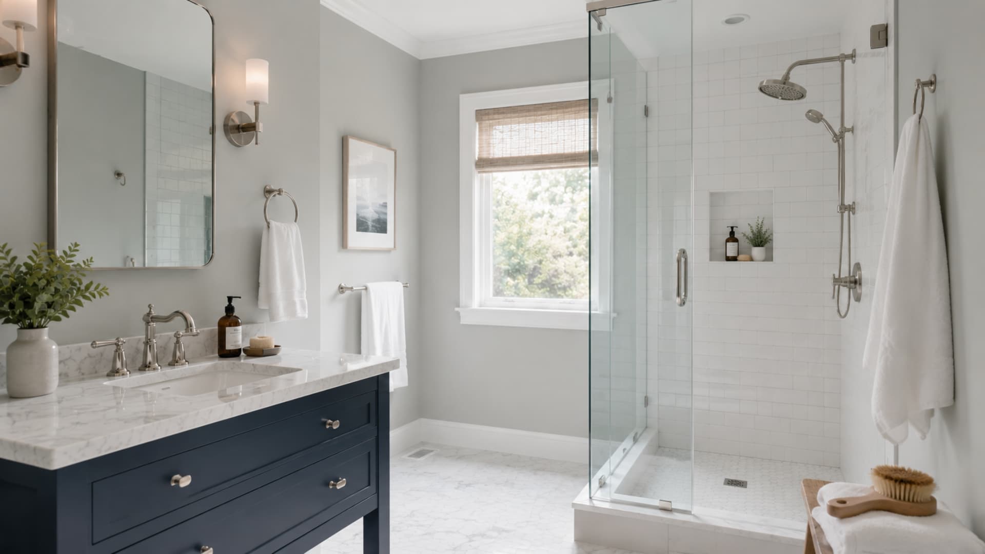
Bathrooms are one of the stronger fits for Stonington Gray, particularly when the finishes run white and cool. White subway tile, marble-look quartz, chrome fixtures, and polished nickel hardware all work with the undertone rather than against it. The color reads crisp without feeling harsh in a tiled space.
In laundry rooms, Stonington Gray combines well with white cabinets, black hooks or hardware, patterned floor tile, and light wood shelving. The cool-clean combination suits a utilitarian space without making it feel like a basement.
Cream tile and beige flooring are the cautions here. Both warm finishes can make the blue undertone show more than expected. If your bathroom has travertine tile or warm stone, sample carefully, the contrast can make Stonington Gray read much bluer on the wall than the chip suggested.
4. Kitchens and Cabinets
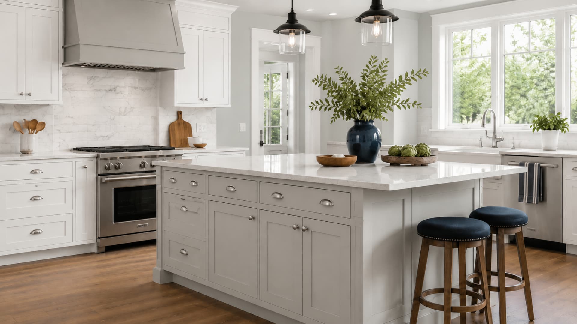
On kitchen walls, Stonington Gray works when the surrounding finishes support its cool undertone: white cabinets, white quartz or marble-look counters, chrome or matte black hardware, and navy accents. On cabinets, it gives more presence than white while keeping the kitchen from feeling heavy.
A Stonington Gray island against white perimeter cabinets is one of the more reliable applications of this color — the contrast creates a focal point, and the cool undertone reads as intentional rather than accidental beside clean whites.
The surfaces to watch carefully: cream backsplash tile, warm beige flooring, orange-toned wood floors, and yellow-beige granite. Any of these can pull the undertone visibly toward blue.
For cabinets specifically, use a cabinet-grade paint rather than standard wall paint; the finish needs to handle regular cleaning and wear without showing scuffs.
5. Exteriors
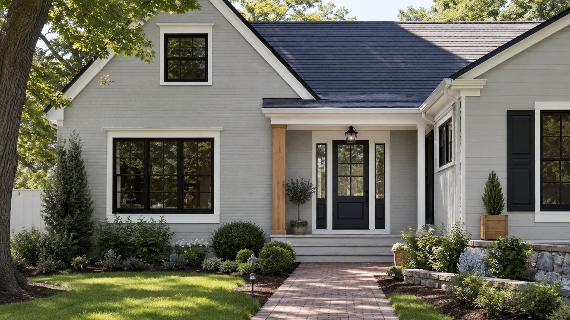
Stonington Gray has built a genuine following as an exterior color, and it earns it — but outdoor light tends to make it look lighter and cooler than it does inside. The sunny-side-of-the-house reading and the shaded reading can feel like two different colors on the same exterior.
Good exterior combinations include:
- Stonington Gray siding, Chantilly Lace trim, and a Cheating Heart door
- Stonington Gray siding, White Dove trim, and Hale Navy shutters
- Stonington Gray painted brick, Oxford White trim, and a Soot front door
- Stonington Gray siding with Wrought Iron accents and black windows
- Stonington Gray with warm cedar, natural stone, or a brick path as an organic counterweight to the cool siding
Before choosing it for an exterior, test on each side of the house, the north and south faces often read quite differently from each other. Test it beside the roof, driveway material, and any brick or stone detail. A cool gray on a warm stone foundation can look disconnected rather than style.
Stonington Gray vs. Similar Benjamin Moore Colors
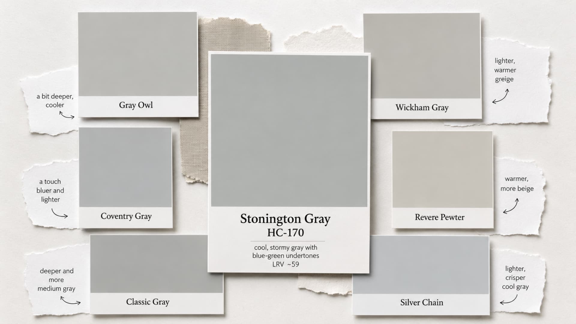
Stonington Gray is often compared with other Benjamin Moore grays because the differences are subtle on a chip and significant on a wall. Here is where each comparison actually matters.
| Color | How It Differs from Stonington Gray | Choose It When |
|---|---|---|
| Gray Owl OC-52 | Lighter (LRV 65) with a green undertone; reads warmer than Stonington | The room needs a paler, less directionally cool gray |
| Wickham Gray HC-171 | Slightly lighter with a similar cool feel; less pronounced in low light | The room has less natural light and needs Stonington softened slightly |
| Coventry Gray HC-169 | Darker (LRV 46) and distinctly cooler; more dramatic | More contrast and depth are needed, especially on cabinets or accent walls |
| Revere Pewter HC-172 | Warmer, with a beige-green undertone; clearly greige by comparison | A warm neutral or greige fits the room better than a cool gray |
| Classic Gray OC-23 | Much lighter and warmer; a whisper of gray rather than a committed one | A very pale gray is needed, and the room already runs cool |
| Silver Chain 1472 | Similar cool family; slightly different undertone character | A comparable cool gray with a slightly different undertone signature is preferred |
The Stonington Gray vs Gray Owl comparison deserves a note: they look close on a chip, but they pull in opposite directions once they’re on a wall. Gray Owl leans green-warm.
Stonington Gray leans blue-cool. In mixed lighting, Gray Owl tends to read as a fresh neutral, while Stonington Gray tends to read as more assertively gray.
Neither is better, they suit different rooms. If you’re comparing the two and can’t decide, the undertone tells you everything: warm finishes in the room favor Gray Owl, and cool finishes favor Stonington Gray.
For blue-gray color comparisons beyond Benjamin Moore, the Sherwin-Williams Debonair review covers a comparable blue-gray that behaves similarly to Stonington Gray in north-facing rooms.
Paint Finish and Fixed Finishes Guide
Finish affects how the undertone reads. A high-sheen finish amplifies undertones; a matte finish quiets them. That said, practical durability usually decides the finish in most rooms.
- Walls: Matte or eggshell. Eggshell gives enough durability for cleaning without amplifying the blue undertone.
- Bathrooms and laundry rooms: Eggshell or satin for moisture resistance.
- Trim, doors, cabinets: Satin or semi-gloss. These surfaces take wear and need to be wipeable.
- Exteriors: Low-luster or satin, depending on the Benjamin Moore product specified. Test the sheen choice on the actual surface, high sheen on a rough exterior wall can make undertones more visible than expected.
The fixed finishes checklist for Stonington Gray: white oak floors, marble-look quartz, white tile, cool stone, and black windows all work with the undertone.
Red oak floors, beige carpet, warm brick, cream granite, travertine, and orange-toned wood are the ones to sample against carefully first. The warmer finishes already fixed in a space, the more the blue undertone will push forward.
Common Mistakes When Choosing Stonington Gray
- Expecting it to be a warm or neutral greige, it reads cool and blue in most conditions
- Pairing it with creamy white trim without testing first
- Using it in a dark or north-facing room and assuming warm bulbs will fully compensate
- Choosing it for the exterior and not testing it on both the sunny and shaded sides of the house
- Testing only one wall, or testing it at only one time of day
- Picking blue accents that are too similar in depth, pale blue beside Stonington Gray, tends to flatten the palette
- Judging it only from online photos, which vary dramatically by camera settings and screen calibration
How to Sample Stonington Gray Before You Commit
- Place a large sample (at least 8 inches by 10 inches) beside the existing trim
- Move the sample to the wall beside the flooring
- Check it near counters, tile, and any large fixed furniture pieces
- View it in morning light, afternoon light, evening, and under both cool and warm artificial light
- Test it on more than one wall,1 the wall facing the window and the wall that the light falls on can read differently
- For exteriors, test on each elevation of the house
- Compare it directly beside Gray Owl, Wickham Gray, and Revere Pewter before making a final call
Frequently Asked Questions
Does Stonington Gray work well in small, windowless hallways?
It can feel heavy and cool without light. Instead, use it in open areas and choose a lighter shade like Wickham Gray for dark hallways.
Can I use brass or gold hardware with this paint color?
Yes. Warm brass and gold fixtures beautifully contrast the cool blue undertones, preventing a utilitarian space from feeling overly clinical or cold.
Will this paint show scuffs easily in high-traffic areas?
An eggshell finish offers durability for walls. However, always use a specialized cabinet-grade paint for high-touch surfaces like doors and kitchen cabinets.
What color ceiling should I pair with Stonington Gray?
A clean, flat white ceiling like Chantilly Lace maintains a crisp boundary and ensures the cool gray walls don’t appear muddy or dark.
How does it look paired alongside a true black accent?
Excellent. True black or matte black accents ground the cool tones, creating a highly sophisticated, modern look with crisp, tailored visual contrast.
Does it complement modern concrete or industrial finishes?
Yes. It pairs seamlessly with cool concrete and industrial elements, though you should add warm wood or textiles to prevent it from feeling clinical.
Is Stonington Gray a good choice for coastal decor styles?
Absolutely. Its strong blue undertone acts as a sophisticated, stormy neutral that perfectly complements coastal palettes, crisp white trims, and natural jute textures.
Should I use a tinted primer before applying this color?
A standard white primer works best. Tinted primers are unnecessary because this medium-depth hue achieves excellent coverage and true color accuracy in two coats.
Final Verdict
Stonington Gray behaves like a shifting neutral that changes with light, surfaces, and surrounding finishes, so it requires careful testing before use.
I’ve explained how its blue-green undertone responds differently in each room, how lighting can push it cooler or softer, and which trims and materials keep it balanced.
You’ve also seen where it works best, from bright living spaces to bathrooms and exteriors. Stonington Gray fits beautifully when its cool nature is supported rather than fought.
I’ve learned that sampling it in real conditions saves mistakes, and you should always do the same. Try testing it in your own space and see how it reacts before committing to paint.


