

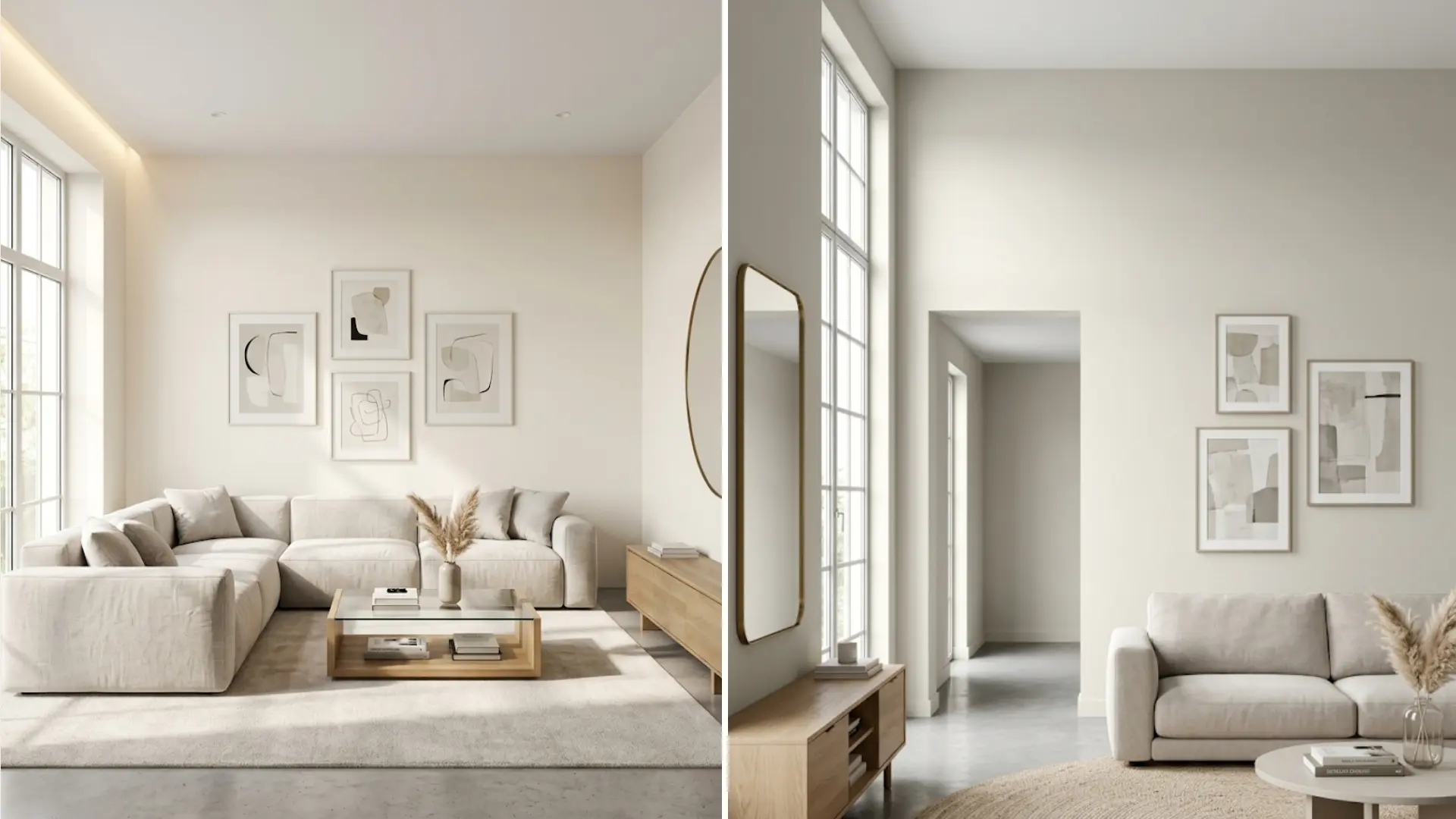
Picking between Greek Villa and Alabaster should feel like a simple decision. It rarely is. Both are warm Sherwin-Williams whites, both read soft and livable on the chip, and both end up on shortlists for nearly every room where the goal is “not too stark, not too creamy.” But once they hit the wall, they behave quite differently. Understanding the Greek Villa vs Alabaster distinction comes down to one key detail: their undertones are not the same, even though they look close on paper. I have watched clients choose Greek Villa expecting a quiet neutral and get a noticeably warm, creamy room instead. I have also seen Alabaster in rooms where it looked perfect, and in rooms where it read muddy next to the trim. The difference between those outcomes was almost never the paint. It was the light, the floors, and the fixed finishes around it. That is what this article will actually help you sort out. Greek Villa vs Alabaster: Side by Side Before getting into how each one behaves in a room, here is a direct comparison of the technical specs. These numbers are the starting point, not the decision. Feature Greek Villa SW 7551 Alabaster SW 7008 Color family Warm white Warm white LRV 84 82 Undertones Yellow-beige Yellow-beige with a gray base On-wall character Bright, creamy, warmer Softer, more muted, more stable Light stability Shifts noticeably in warm or evening light Holds closer to its chip color across conditions Main risk Reads creamy or yellow-warm under incandescent bulbs Can look dull or flat beside cool or bright whites Works well on Walls, trim, cabinets, exteriors Walls, trim, cabinets, ceilings, whole-house use The two-point LRV gap matters less than the undertone difference. Benjamin Moore Greek Villa runs warmer and shifts more. Alabaster is steadier. That distinction drives almost every room-use recommendation below. The Undertone Difference That Actually Matters This is the part most articles get wrong by calling both colors “warm white with beige undertones” and leaving it there. They are not the same. Greek Villa has yellow-beige undertones. That warmth is visible, and it intensifies as light changes. In a south-facing room in the afternoon, or under warm incandescent bulbs in the evening, Greek Villa can look noticeably creamy. If you were hoping for something that reads closer to white, that shift can feel like a surprise. Alabaster also has yellow-beige warmth, but there is a gray component in its base. That gray is its stabilizer. It keeps Alabaster from drifting too far into cream territory, which is why it holds its character across a wider range of light conditions. In a bright room, it still reads as white. In a dim room, it warms up without turning yellow. That behavior is why so many designers reach for Alabaster as a whole-house neutral: it is predictable in a way that Greek Villa is not. The Alabaster full color goes deeper into how that gray base performs across real rooms. The practical difference is this. Greek Villa gives you more visible warmth. Alabaster gives you warmth that stays controlled. Which one you want depends entirely on what your room already has going on around it. How Each Color Responds to Light Lighting is not just a variable. For these two whites, it is the deciding factor. Test both in your room before committing to either one. Light Condition Greek Villa Alabaster Better Pick North-facing rooms Holds brightness well in cool, indirect light Can read slightly muted or soft Greek Villa South-facing rooms May look creamy or yellow-warm by afternoon Stays balanced, does not shift much Alabaster East-facing rooms Bright and warm in morning light, cooler by afternoon Calm and soft throughout the day Greek Villa for brightness, Alabaster for softness West-facing rooms Turns creamier as afternoon sun hits it May lean warmer or beige in late light Test both carefully Warm incandescent bulbs Pushes into noticeable cream territory at night Warms up but stays controlled Alabaster Cool LED or daylight bulbs Reads cleaner, more white Holds its soft character without going gray Both can work Never judge either color from a single wall or a single time of day. Paint a large sample board, prop it upright against the wall, and check it in morning light, afternoon light, and with your actual room lamps on. The cool white vs daylight bulb how bulb color temperature interacts with warm whites like these two. Which One Is Brighter and Which One Is Warmer? Greek Villa is brighter. Its LRV of 84 means it reflects more light, which helps darker rooms feel more open. If the room needs lift, Greek Villa is the more direct tool for that job. Alabaster is warmer in a different sense. Its warmth is quieter, more settled. It does not push the room toward cream the way Greek Villa can. That is actually why many people describe Alabaster as feeling “cozy” rather than “warm.” The gray component in its base keeps the warmth from dominating. So the simple version is: choose Greek Villa when the room needs brightness, and choose Alabaster when the room needs softness without visual shift. If you want a white that is lighter and more energetic, Greek Villa. If you want a white that behaves the same in every corner of the house from 7am to 9pm, Alabaster. How Fixed Finishes Change Both Colors The biggest mistake I see is choosing a white paint without looking at what stays in the room. Floors, tile, counters, and trim are not neutral. They pull undertones out of the wall color, sometimes dramatically. Warm wood floors tend to support both colors. Greek Villa reads richer alongside pale or natural oak. Alabaster pairs well with medium and darker-stained wood because its gray component keeps it from fighting the floor. The wall color and wood floor exactly how warm whites interact with different stain tones. Gray or cool floors create contrast against either color’s warm undertones. That contrast makes both look creamier than they do in isolation. If your floors are cool-toned and you want a white that does not read beige, test Alabaster first. Its gray base gives it more resilience against cool surroundings. Cool marble with blue or white movement will pull the warmth out of both colors and make their undertones visible. Test samples directly against the stone before choosing. Warm bulbs at night are the most common source of surprise. A room that looked clean and balanced at noon can look like a different color by 8pm under incandescent light. This is especially true for Greek Villa. If your room has warm bulbs and warm floors together, Alabaster is the safer pick. Greek Villa vs Alabaster by Room Greek Villa and Alabaster can both work throughout the home, but each one performs better in certain spaces. The right choice depends on light, finishes, and the mood you want. 1. Living Room Greek Villa works well in living rooms that feel heavy, shaded, or north-facing. The extra brightness lifts the room without pushing it toward a stark or cold white. It pairs well with natural linen, pale wood, and black or iron accents. Alabaster is the better choice when the living room already has good light and you want the walls to sit quietly behind furniture, rugs, and artwork. It will not compete. Rooms with warm wood floors, layered textiles, and earthy neutrals consistently look settled with Alabaster on the walls. 2. Kitchen Kitchens are high-contrast environments. Cabinets, counters, backsplash, and hardware all sit close together, which means undertones become visible faster here than in any other room. Greek Villa works well in kitchens with wood shelving, black or matte hardware, and natural stone counters. It reads clean and bright without going sterile. Alabaster is better when the kitchen has cream-colored tile, brass hardware, warm countertops, or traditional shaker cabinets. Its softer warmth keeps the room from feeling too bright or clinical. 3. Bedroom Bedrooms need to work in morning light and under evening lamps. That dual requirement is where Alabaster often outperforms Greek Villa. Its more stable undertone means it reads soft and livable at night without looking like a different color than it did in the morning. Greek Villa is still a good bedroom choice in low-light rooms, particularly small or shaded spaces that need more brightness. But in a bedroom with warm bulbs and warm bedding, it can feel unexpectedly creamy by evening. If comfort and stability are the goal, Alabaster is the more reliable pick. 4. Bathroom Bathrooms amplify undertones faster than almost any other room because tile, mirrors, and vanity finishes all react to the wall color. Greek Villa performs well with warm tile, wood vanities, and lighter stone where a brighter, cleaner white is needed. Alabaster holds better beside cream or beige tile, warm stone, and natural wood accents. Both need to be tested against cool marble before committing. The gray movement in white marble can make either white read distinctly beige or cream depending on the stone’s exact undertone. 5. Trim and Doors Using either color on trim and walls together (in different sheens) can work well. Greek Villa creates a warm-white edge that reads clean beside beige, greige, and soft taupe wall colors. Alabaster on trim gives a creamier, gentler border and blends naturally with warm wall colors and wood floors. One thing to check before choosing: if your trim will be next to a brighter white on ceilings or adjacent rooms, Alabaster can sometimes look flat or slightly yellow by comparison. Test the trim color beside whatever white is on the ceiling before committing. 6. Exterior Exterior daylight is stronger and more variable than interior light. Both colors will look lighter on an exterior than they do inside, and undertones will be more visible on a large facade. Greek Villa on an exterior reads as a warm, lightly creamy white. It pairs well with black window frames, tan or warm stone, brick, and wood accents. Alabaster gives a softer, slightly more muted exterior white that suits homes with warm roofing, traditional trim, or cream-toned stonework. If you are working with cool siding colors or a very bright white roofline, test Alabaster carefully before using it as the main body color. Coordinating Colors for Greek Villa Greek Villa’s yellow-beige warmth pairs best with colors that support rather than fight that warmth. These are coordinates that consistently work well in real rooms: Accessible Beige SW 7036 for an adjacent room or lower wall where more color depth is needed Natural Linen SW 9109 for a warm transition between rooms without adding saturation Black Magic SW 6991 for trim, doors, or accents where strong contrast is needed Antique White SW 6119 for ceiling use when the walls are Greek Villa and you want the warmest possible whole-room feel Avoid pairing Greek Villa with very cool or gray-based whites on trim and ceilings. The contrast will make the wall color read yellower than it actually is. Coordinating Colors for Alabaster Alabaster’s gray-stabilized warmth makes it one of the most flexible whole-house whites available. It coordinates well with a wide range of neutrals. The Alabaster coordinating colors the full palette with room-by-room examples. Agreeable Gray SW 7029 for adjacent spaces or lower walls, the most common Alabaster pairing Repose Gray SW 7015 for a slightly cooler adjacent gray that still works with Alabaster’s undertone Intellectual Gray SW 7045 for accent walls or furniture in rooms where Alabaster is the primary wall color Eider White SW 7014 for a slightly cooler ceiling option when Alabaster is on the walls Alabaster also works well beside its close relatives. Among the cooler warm whites, Shoji White vs Alabaster how a grayer warm white sits beside it in real rooms. When NOT to Use Greek Villa Greek Villa is not the right choice in every “warm white” situation. Skip it when: The room has warm floors, warm bulbs, and warm wood furniture together. All that warmth will pull Greek Villa toward a yellow-cream that feels dated rather than cozy. You are painting beside a stark or cool white on ceilings. The contrast will make Greek Villa look yellower than it should. The room is south-facing with strong afternoon sun. Greek Villa will feel noticeably creamy in that light, which can make the room feel smaller and warmer than intended. The design direction is modern or minimal. Greek Villa’s visible warmth reads more traditional or Mediterranean. It works against clean-lined, cool-neutral interiors. When NOT to Use Alabaster Alabaster is close to a universal neutral, but there are conditions where it underperforms: The room has very cool floors (gray tile, blue-gray stone) and cool-toned furniture. Alabaster’s warmth will look muddy against that coolness rather than warm and intentional. You need true brightness. A shaded room with poor natural light needs more lift than Alabaster provides. Greek Villa or an even higher-LRV white would serve better. The trim and adjacent rooms use a bright or pure white. Alabaster will read as beige or cream beside those whites rather than as a warm white in its own right. Greek Villa vs Dover White and Dover White Dover White SW 6385 is the third option that comes up most often alongside these two. Here is how all three compare: Point Greek Villa SW 7551 Alabaster SW 7008 Dover White SW 6385 Overall look Bright warm white, slightly creamy Soft warm white, stable across light Creamy white with a clear yellow lean Undertones Yellow-beige Yellow-beige with gray base Yellow, more saturated Light behavior Shifts noticeably in warm light Holds steady across most conditions Turns distinctly yellow in warm light Best for Rooms needing brightness and lift Whole-house use, cozy rooms, cabinets Rooms with golden wood and traditional decor Main risk Looks creamy in warm or bright light Looks flat beside cool or bright whites Looks yellow beside cool finishes Dover White is the one to choose when you genuinely want a creamier white and the room supports it. Greek Villa and Alabaster are safer if you want warmth without a strong yellow cast. How to Test Greek Villa and Alabaster the Right Way These are the questions I hear most from people who already have the chip on the wall and are still not sure. The testing process is the answer to almost all of them. Use large boards, not small chips. A chip is too small to show how the color reads across four walls with your light hitting it at an angle. Stand them upright. A sample lying flat on a table catches light differently than a vertical wall. Always prop the board upright. Check at three times of day. Morning, afternoon, and evening with your room lamps on. For Greek Villa especially, the evening check is the one that surprises people. Move the board to different walls. The north wall of a room and the south wall can read as different colors with the same paint. Check both. Test the sheen you plan to use. Matte and eggshell absorb light. Satin reflects it. The same color in two sheens can feel different in the same room. Pro Tip: If you are torn between the two after testing, look at your trim. If your trim is a brighter or cooler white, Alabaster may look beige beside it. Greek Villa will hold up better in that situation. If your trim is warm or cream-toned, either color works. Frequently Asked Questions Does Greek Villa work better with warm or cool furniture pieces? Greek Villa usually works better with warm or natural furniture pieces. Think pale oak, rattan, linen, tan leather, beige upholstery, or black accents. Cool gray furniture can still work, but it may make Greek Villa’s creamy side more noticeable. Test it near your largest furniture pieces before painting. Can Alabaster make a small room feel too closed in? Alabaster can make a small room feel calm, but it may not always make it feel larger. If the room has weak light or dark flooring, it can feel a little soft instead of open. Use good lighting, lighter fabrics, and simple decor if you want Alabaster to feel less heavy. What ceiling color works best with Greek Villa walls? Greek Villa walls usually look best with a ceiling white that is warm, not icy or blue-based. A very bright ceiling white can make Greek Villa look creamier by contrast. For a softer look, use Greek Villa on both walls and ceiling, then change the sheen for trim. What ceiling color works best with Alabaster walls? Alabaster walls pair well with a soft white ceiling that does not feel too sharp. A cooler ceiling can make Alabaster look beige or slightly flat. If you want a seamless look, Alabaster can also go on the ceiling, especially in bedrooms, hallways, and calm living spaces. Is Greek Villa a good choice for open-concept spaces? Greek Villa can work in open-concept spaces if the flooring, trim, and lighting stay fairly consistent. It may shift more between bright and shaded zones, so large sample boards are important. If one area gets strong warm light, check that it does not turn too creamy there. Is Alabaster too creamy for a modern home interior? Alabaster is not too creamy for a modern home if the rest of the design has warm, simple finishes. It works well with wood, black accents, soft grays, and natural textures. It may feel less modern beside bright white trim, cool gray floors, or very sleek blue-toned materials. Should Greek Villa or Alabaster be used in rental homes? Alabaster is often the easier rental choice because it feels soft, neutral, and steady across different rooms. Greek Villa can also work if the rental needs brightness, but it may show more warmth under certain bulbs. For rentals, pick the shade that works with the existing floors and trim. Final Take Greek Villa and Alabaster may look close at first, but they create different results once they are on your walls. Greek Villa gives you more brightness and lift, so it works well in rooms that feel shaded or small. Alabaster feels softer and steadier, which makes it a strong choice for cozy rooms, cabinets, and whole-house use. I would not choose either color from a chip alone because lighting and fixed finishes can change everything. Test both beside your trim, floors, counters, and lamps before making the final call. If you have used either shade, share what it looked like in your home.
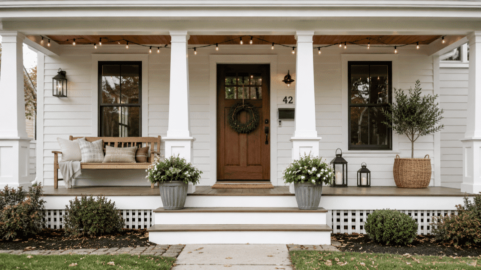
A front porch should do more than hold a wreath and a mat. It should make daily life easier, soften the entry, and give the house a clearer first impression. These front porch decorating ideas are built as complete setups, not loose styling tips. I focused on porches people actually live with: tiny stoops, baby gear, older adults, privacy needs, renters, plants, reading corners, and seasonal curb appeal. You will also find small front porch ideas that respect tight spaces rather than crowding them. The goal is simple: give you porch ideas that look good because they work. Cost Note: Figures in this article are estimates based on national averages. Actual costs vary significantly by region, materials, and project scope. Always get at least three quotes before committing to any project above $1,000. Before You Decorate, Decide What Your Porch Needs to Do A porch can look pretty and still fail if it blocks the door, crowds the steps, traps rainwater, or ignores how the household uses the entry. Good front porch decorating starts with the boring details first. Check the door swing, walking space, porch depth, weather exposure, light, and the path guests naturally take. A tiny stoop may only need one strong planter, a mat, a wreath, and better lighting. A deeper porch can handle seating, storage, layered plants, or a private corner. Once the function is clear, the decor feels intentional instead of random. That is where outdoor decor starts looking personal, not copied from a seasonal aisle. With that in mind, here are setups built for real situations. Front Porch Decorating Ideas for Privacy, Comfort, and Daily Life These porch ideas solve everyday problems first, then make the space beautiful through better placement, sizing, materials, and outdoor decor choices. 1. The Fog-of-War Privacy Screen Mount a horizontal cedar slat panel, about 6 ft wide and 4 ft tall, against your street-facing railing using angle brackets. Choose slats with half-inch gaps, so it breathes instead of walling you in. Angle it 10 degrees inward so it reads like a design choice, not a defensive fence. Flank the steps with two Areca palms in dark resin planters. The fronds should spill loosely over the top edge of the panel. From the chair, you see layered green against warm wood. From the pavement, there is nothing interesting to inspect. What you need: 2 Areca palms, two 14-inch dark resin planters, one pre-cut cedar slat panel, exterior angle brackets, and 4 railing mounting clamps. The non-obvious bit: The 10-degree inward angle signals intention rather than paranoia. Cost: $180 to $240, depending on palm size. 2. The Sit-and-Stay Porch for Older Adults Place a 48-inch bench with arms against the wall closest to the door, but not in the door swing. Choose a seat height between 17 and 19 inches, so sitting and standing feel easier. Add a side table on the dominant-hand side, about 18 inches wide, for glasses, keys, tea, or a book. Use a flat outdoor rug instead of a thick layered mat. Add two low-glare solar step lights and two heavy planters pushed tight to the porch corners. The porch should feel calm, steady, and easy to move through. What you need: 48-inch bench with arms, a flat 4 x 6 ft outdoor rug, an 18-inch side table, 2 solar step lights, and 2 heavy planters. The non-obvious bit: The arms matter more than the cushion because they help someone push up safely. Cost: $220 to $450, depending on bench quality. 3. The Package-Proof Porch Place a small weatherproof delivery cabinet on the right side of the porch, around 30 to 36 inches wide, so it sits off to the side and does not block the front door. Choose one with closed gray doors and a flat top, so it looks neat against the siding and blends in more like porch storage than a parcel bin. Add a simple “PACKAGE” sign above it so delivery drivers know exactly where to leave boxes. Put one medium planter beside the cabinet, so the setup feels styled while still keeping the entry steps and front door clear. What you need: A 30- to 36-inch weatherproof delivery cabinet, a package sign, a medium planter, and a slim outdoor tray or cushion for the cabinet top. The non-obvious bit: A clear package sign makes the drop-off spot obvious, while closed cabinet doors keep parcels hidden from the street. Cost: $150 to $320. 4. The Renter-Friendly Porch With No Drilling Use only freestanding pieces: a rollable outdoor rug, weighted planters, battery lanterns, a removable wreath hanger, and a folding chair if the porch is deep enough. Add height with a freestanding plant stand instead of mounted shelves. For privacy, place a trellis inside a heavy rectangular planter and grow jasmine, ivy, or faux outdoor greenery through it. Nothing permanently touches the wall, railing, or doorframe, but the porch still feels layered. What you need: Removable wreath hanger, outdoor rug, weighted planter, battery lanterns, folding chair, freestanding plant stand, or planter trellis. The non-obvious bit: Weight replaces drilling. Heavy planters let renters add height, privacy, and structure safely. Cost: $90 to $220. 5. The Working Doorstep for Tiny Porch Charm Use only one side of the door. Place a 24 x 36-inch coir mat underfoot, then set one narrow planter, no wider than 10 to 12 inches, on the side where the door does not swing. Add a small wreath, around 18 to 20 inches, and a clean house number plaque. Do not add chairs, baskets, layered rugs, or double planters. The goal is a finished entry that still leaves room for feet, packages, and the door. What you need: 24 x 36-inch mat, 10 to 12-inch planter, 18 to 20-inch wreath, house number plaque, compact light source. The non-obvious bit: One styled side looks more expensive than two cramped sides. Cost: $70 to $160. Front Porch Decorating Ideas for Plants, Hobbies, and Personality These ideas give the porch a stronger identity, whether the goal is greenery, herbs, reading space, vintage character, or a bolder aesthetic. Each one works because the decor choice has a function behind it. 6. The Cottage Herb Garden Porch Place a 3-tier plant stand near the kitchen-side door or the sunniest porch wall. Use 6 to 10-inch pots for rosemary, thyme, basil, parsley, oregano, and chives. Keep mint in its own pot because it spreads aggressively. Add a small stool for a watering can and snips. The porch now smells good, looks soft, and gives you something useful before dinner. What you need: 3-tier plant stand, 6 to 10-inch herb pots, plant markers, watering can, garden snips, rosemary, thyme, basil, parsley. The non-obvious bit: Put herbs near the door, not the prettiest corner, or they will not get used. Cost: $80 to $180. 7. The Front Porch Reading Nook Place one deep chair, at least 30 inches wide, in the quietest corner of the porch. Add an 18 to 22-inch side table on the hand you naturally reach with. Place a covered basket underneath for books, a throw, or bug spray. Use a small outdoor rug to frame the nook and a clip-on rechargeable lamp if there is no outlet. This should feel like a one-person retreat, not leftover patio furniture. What you need: 30-inch deep chair, 18 to 22-inch side table, covered basket, 4 x 6 ft rug, rechargeable lamp, cushion. The non-obvious bit: The table side matters because comfort depends on small repeated movements. Cost: $180 to $380. 8. The Symmetry Porch for Graceful Kept Spaces Place two matching planters on either side of the door, each 18 to 22 inches wide. Add matching lanterns in front of them, but keep them smaller than the planters. Center a 22 to 26-inch wreath on the door and align the mat with the doorframe. Use boxwood, olive trees, hydrangeas, or topiaries. This works best when every object has a twin or a clear center point. What you need: 2 matching planters, 2 matching lanterns, a centered wreath, an outdoor mat, and boxwood or topiary plants. The non-obvious bit: Symmetry only works when the mat is centered too; otherwise, the whole setup feels slightly off. Cost: $140 to $300. 9. The Salvage and Reclaimed Porch Start with one reclaimed anchor: a weathered bench, an old church pew, a vintage metal chair, or a wooden crate table. Add only two smaller vintage pieces, such as a galvanized planter and an old watering can. Keep cushions plain and modern, so the porch does not become a junk-shop display. The charm should come from age, texture, and patina, not from piling up every thrifted object. What you need: Reclaimed bench or chair, vintage crate, galvanized planter, old watering can, plain cushion, and one modern lantern. The non-obvious bit: One modern piece keeps reclaimed decor looking curated instead of accidental. Cost: $90 to $260, depending on what is thrifted. 10. The Maximalist Tropical Porch Use two oversized leafy plants, at least 4 to 5 ft tall, as the back layer. Add rattan or cane seating, a patterned outdoor rug, and cushions in two strong accent colors. Hang one basket overhead if the porch is covered. Keep the plants big and the accessories fewer. The porch should feel lush and vacation-like, not like every tropical print was used at once. What you need: 2 large leafy plants, a patterned outdoor rug, rattan seating, 2 to 3 cushions, a hanging basket, and a warm lantern. The non-obvious bit: Tropical style needs scale more than clutter; big leaves do the heavy lifting. Cost: $240 to $520. Seasonal Front Porch Decorating Ideas That Still Look Intentional These seasonal setups satisfy the aesthetic side without turning the entry into a pile of disposable decorations. The rule is the same as every other setup here: the entry still has to work when the decor goes up. 11. The Zero-Maintenance Winter Porch Fill two 18-inch planters with evergreen branches, cedar, pinecones, and birch logs. Use real greenery if the weather is cold enough to preserve it, or use high-quality faux stems on exposed porches. Add one lantern with a battery candle and a sturdy mat. For tiny porches, use one planter and one lantern. The look should feel wintery, not overly holiday-specific. What you need: 18-inch planters, evergreen branches, cedar stems, birch logs, pinecones, a lantern, and a battery candle. The non-obvious bit: Birch logs add height when flowers are out of season. Cost: $80 to $180. 12. The Spring Basket Porch Use two woven baskets as planters: a large one on the floor and a smaller one on a stool. Fill them with tulips, daffodils, pansies, hyacinths, or realistic faux spring stems. Add a grapevine wreath with only one ribbon color. Keep the flowers gathered near the door instead of spreading tiny pots everywhere. The porch feels fresh, not busy. What you need: 2 woven baskets, a small stool, spring flowers or faux stems, a grapevine wreath, and a light mat. The non-obvious bit: Baskets need hidden plastic liners, or watering will ruin them fast. Cost: $75 to $170. 13. The Summer Coastal Porch Start with a striped outdoor rug, then add one woven planter and either two compact chairs or one small bench. Use white, navy, tan, pale blue, or weathered wood. Add grasses, palms, or hydrangeas instead of beach signs. The porch should suggest summer through texture and color, not seashells, anchors, or word art. What you need: Striped rug, woven planter, compact chairs or bench, simple lanterns, grasses or hydrangeas, 2 cushions. The non-obvious bit: Coastal decor looks better when it avoids literal beach objects. Cost: $170 to $360. 14. The Fall Harvest Porch That Still Looks Neat Group three to five pumpkins in one corner, using a mix of sizes and soft color variations. Add one mum planter, one natural wreath, and one lantern. For a large porch, add corn stalks only if they can stand upright without brushing the walkway. Do not line every step with pumpkins. One controlled harvest cluster looks warmer and more expensive. What you need: 3 to 5 pumpkins, mum planter, natural wreath, lantern, optional corn stalks, warm pillow for seating. The non-obvious bit: A single cluster photographs better and keeps the steps usable. Cost: $70 to $180. 15. The Polished Halloween Porch Choose one spooky focal point: a skeleton in a chair, a crow-covered wreath, a ghost by the steps, or a webbed corner. Keep everything else restrained with black lanterns, matte pumpkins, dark greenery, and warm orange light. This porch feels festive without becoming a full haunted-house scene. It works especially well for homes that still want curb appeal in October. What you need: One Halloween focal piece, black lanterns, matte pumpkins, a dark wreath, battery lights, and optional faux webbing. The non-obvious bit: One focal scare is stronger than twelve scattered Halloween objects. Cost: $60 to $160. 16. The Classic Christmas Evergreen Porch Frame the door with evergreen garland if the porch is covered, then add a 22 to 26-inch wreath and two lanterns at the base. Use velvet ribbon in burgundy, navy, forest green, or deep red. Add birch logs or wrapped faux gifts only where they will not block the entry. For tiny porches, skip the garland and use one wreath, one planter, and one lantern. What you need: Evergreen wreath, garland, 2 lanterns, velvet ribbon, birch logs, warm white lights, and optional faux gifts. The non-obvious bit: Garland looks best when it has enough depth around the doorframe, not when it is squeezed flat. Cost: $120 to $300. How to Choose the Right Front Porch Idea for Your Home The right front porch decorating idea depends less on trends than on size, weather, privacy, household routines, and how often the entry is used. Four questions get you to the right setup faster than browsing photos. Use porch depth first. If the porch is under 5 ft deep, avoid chairs and benches. Focus on a mat, a slim planter, a wreath, a light, or vertical decor. Match the idea to your real life. Choose privacy if the porch faces neighbors, storage if packages pile up, and greenery if the entry feels hard or bare. Respect weather exposure. Covered porches can handle cushions, baskets, and layered rugs. Exposed porches need weatherproof planters, sturdy mats, and fewer soft pieces. Pick one main mood. A porch can be cottage, classic, tropical, moody, rustic, seasonal, or minimal. Too many moods make the outdoor decor feel confused. Start with the setup you can maintain. A porch designed for real life will always look better than one styled only for photos. Front Porch Decorating Mistakes That Make the Space Less Useful A decorated porch still needs to work as an entry, so the prettiest pieces can become problems when placed incorrectly. These are the mistakes that show up most often and are easiest to avoid. Choosing furniture that is too deep. Large chairs and benches can block the walkway, especially on narrow porches. Seating needs enough depth to feel natural without cutting the clearance path below 36 inches. Blocking the door swing. Planters, lanterns, baskets, and pumpkins should never sit where the door opens or where guests naturally step. Using too many tiny decorations. Small signs, mini pots, and scattered objects often look messy from the street. Larger, fewer pieces usually look cleaner. Forgetting nighttime lighting. Warm lighting near the door, steps, or seating makes the porch safer and more inviting after sunset. Using indoor pieces outside. Indoor rugs, untreated wood, and delicate fabrics fade, warp, or trap moisture quickly on exposed porches. Frequently Asked Questions About Front Porch Decorating What is the cheapest way to decorate a front porch? One clean doormat, one healthy plant, one door wreath, and better lighting cover the entry first and cost less than replacing the seating. Matching finishes, such as black metal or warm wood, also make budget pieces look more intentional. How do I decorate a small front porch without it looking crowded? Work one side of the door only. A 10 to 12-inch planter, a coir mat, and an 18-inch wreath are enough for a stoop under 4 ft deep. Every item you add after that should earn its place by replacing something, not sitting beside it. What plants work best on a covered front porch? Ferns, boxwood, and topiaries hold up well in covered low-light conditions. For color, impatiens and caladiums work in shaded spots. On sunny exposed porches, rosemary, ornamental grasses, and lavender handle heat and drought better than most flowering annuals. How often should front porch decor be changed? Keep permanent pieces such as planters, rugs, lanterns, and seating in place year-round. Swap smaller accents only: wreaths, flowers, ribbons, pillow covers, or pumpkins as the season changes. A full seasonal overhaul is rarely necessary. What colors work best for front porch decor? Brick exteriors pair well with cream, olive, black, and warm wood. White siding takes green, navy, terracotta, or charcoal. Gray homes usually look better with contrast such as black, burgundy, cedar, or soft yellow. Pull the secondary color from the front door, not from a seasonal trend. Can I decorate a front porch without plants? Yes. Use texture instead: a rug, wreath, lanterns, baskets, cushions, house numbers, or a painted door. If the porch gets poor light, high-quality faux greenery can also work when used sparingly. What is the best outdoor rug size for a front porch? For a typical 6 x 10 ft covered porch, a 4 x 6 ft rug works well. For a stoop or entry under 4 ft deep, a 24 x 36-inch coir mat is the safer choice. The rug should sit fully under any seating with at least 6 inches of clearance from the edge to the railing. Final Decor The best front porch decorating ideas begin with how the space is used, then build the style around that purpose. A porch can offer privacy, hold baby gear, help older adults sit safely, grow herbs, welcome packages, or create a quiet reading corner. Small front porch ideas can still feel complete when the scale is right and the walking path stays clear. I always trust a porch more when every piece has a reason to be there. My suggestion is to choose the setup that matches your space first, then adjust the colors, plants, and seasonal details around it.
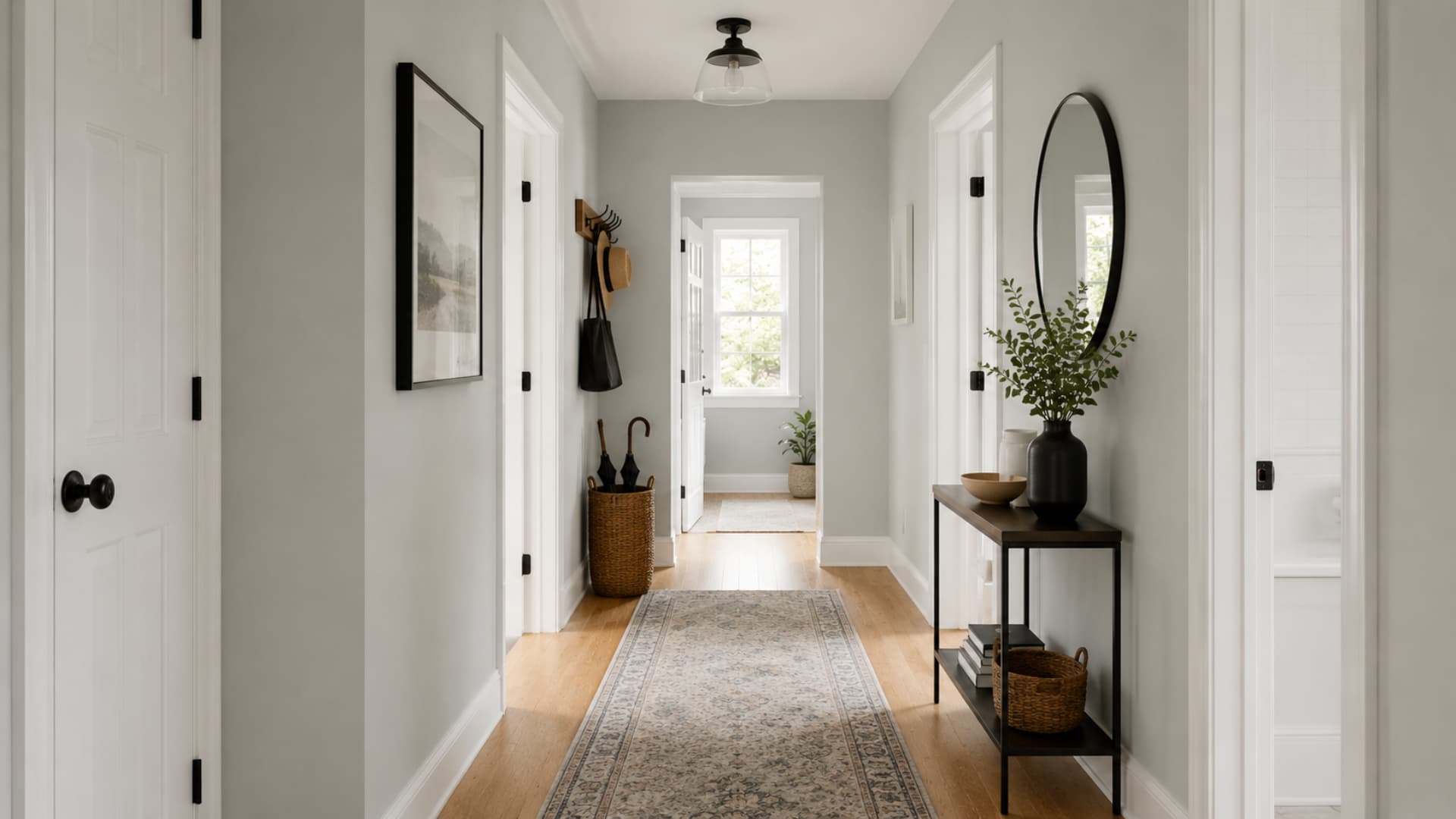
Stonington Gray can look calm, blue, or even stormy depending on the light in your room, and that often catches people off guard. Stonington Gray HC-170 is a cool gray with blue-green undertones and a medium depth that reacts strongly to its surroundings. You might think you’ve picked a safe neutral, but lighting, trim, and nearby finishes can quickly shift how it reads on your walls. I’ll help you understand how this color behaves so you know what to expect before painting. You and I will break down its undertones, lighting effects, and best uses so you can decide if it truly fits your space. Stonington Gray at a Glance Color Name Benjamin Moore Stonington Gray HC-170 Brand Benjamin Moore LRV 59, medium depth, not light and airy Undertones Blue-green (blue more noticeable than green) Best For Walls, cabinets, bathrooms, exteriors, in spaces with average to bright natural light Avoid In Rooms with yellow trim, cream tile, orange-toned floors, or minimal natural light Stonington Gray sits in the medium range. It will reflect a decent amount of light, but it will never disappear into the background. In rooms with strong natural light, it reads as a clean, composed gray. In darker rooms, it can feel heavier and cooler than the chip suggested. Stonington Gray Undertones: What the Blue-Green Actually Does The undertone in Stonington Gray is primarily blue, with a secondary green note that tends to show up in south-facing rooms and under warm afternoon light. Most of the time, the blue is the one you’ll notice. The green is subtle enough that many people never see it at all. What matters practically is this: that blue undertone is context-dependent. It stays quiet beside clean, cool whites. It becomes obvious beside creamy whites, warm beige tile, or orange-toned wood floors. If your existing finishes run warm, the undertone will read as blue because the warm surroundings amplify the contrast. This is the reason Stonington Gray can look exactly right in one room and strangely blue in the next. Besides Revere Pewter HC-172, the difference is stark. Revere Pewter reads warm and slightly green-beige. Stonington Gray reads noticeably cooler. If you’re comparing the two on a chip and thinking they look close, put them on a wall beside your trim and floors. The gap will show. Pro Tip: Before buying gallons, order a peel-and-stick sample from Samplize and move it around your room at different times of day. Test it beside your trim, your flooring, and the wall opposite your main window. One hour of testing prevents a costly mistake. How Light Changes Stonington Gray Light does more work on Stonington Gray than on most grays, because the undertone is responsive rather than neutral. The same color at 8 am can look markedly different at 4 pm, and markedly different again under your overhead lights at 9 pm. This is not unusual for cool grays, but it’s more pronounced here than in something closer to a true neutral. Light Direction How Stonington Gray Reads How to Balance It North-facing Cooler, bluer, sometimes close to stormy Warm bulbs, wood accents, soft white trim South-facing Softer, sometimes shows more green in the undertone Crisp white trim, navy accents East-facing Cleaner and fresher in the morning, flatter by evening Test at multiple times before committing West-facing Picks up warmth in the afternoon; reads softer Charcoal, navy, or warm wood to ground it Artificial light matters just as much. Cool LED bulbs will push the blue undertone further. Warm white bulbs (around 2700K) bring the gray back into balance. If a room relies on overhead lighting in the evenings, test Stonington Gray under both bulb types before painting. North-facing rooms are the riskiest application. I’ve seen Stonington Gray look genuinely beautiful in bright south-facing rooms and genuinely bleak in north-facing ones with no artificial warm light to compensate. The same can of paint. That’s how sensitive this color is to its environment. Colors That Pair Well With Stonington Gray When designing around Benjamin Moore Stonington Gray HC-170, selecting the right palette is crucial because its cool, context-dependent blue-green undertone reacts strongly to neighboring tones. To build cohesive Stonington gray color combinations, blue accents and clean white boundaries offer the most reliable ways to lean into or balance its shifting personality. White Trim Pairings The wrong white will turn Stonington Gray noticeably blue. Creamy whites with yellow undertones, like Antique White or some versions of Linen White, are the main culprits. The cool-blue undertone in Stonington Gray reacts against yellow-warm whites, and the contrast reads as “is that wall actually blue?” Chantilly Lace OC-65 gives the sharpest, cleanest contrast and is the safest choice for anyone who wants Stonington Gray to read as a true gray rather than a blue-gray. Oxford White CC-30 keeps the palette crisp without being as stark as Chantilly Lace. White Dove OC-17 works in rooms where the light is bright enough to carry the softness; it gives a warmer trim look without crossing into creamy territory. Simply White OC-117 can work, but sample it carefully beside your specific walls and lighting before committing. Blue Accent Colors Stonington Gray’s undertone already leans blue-green, so deeper blues create contrast rather than competition. Pale blues placed beside it tend to flatten the whole palette; the room starts to feel like a single wash of cool rather than a composed design. Hale Navy HC-154 is the most versatile accent; it works on front doors, kitchen islands, built-in cabinetry, and vanities. The contrast with Stonington Gray is strong without feeling harsh. Van Deusen Blue HC-156 is a slightly softer navy that works well on office built-ins and dining room accents. Boothbay Gray HC-165 creates a quieter blue palette, better suited to bedrooms and bathrooms where calm is the priority over contrast. Cheating Heart 1617 is a deep blue-black that works as a front door color or for a single dramatic accent wall. If you also want a deep, nearly-black wall color for interior spaces, the Sherwin-Williams Greenblack is a comparable dark option worth considering alongside it. Warm Materials as Counterbalance Wood is the easiest way to stop Stonington Gray from feeling clinical. White oak flooring, natural wood shelving, linen textiles, and woven baskets all add warmth without clashing with the cool undertone. You’re not trying to make the color warm; you’re giving the room enough warmth elsewhere that the gray feels intentional rather than cold. If you’re weighing whether to go warm or cool overall on your neutral palette, the Sherwin-Williams Natural Choice shows what a warm off-white approach looks like as a contrast. Best Rooms for Stonington Gray 1. Living Rooms Living rooms with average or better natural light are where Stonington Gray tends to earn its reputation. The color reads composed, clean, and calm without sliding into beige. White trim keeps it defined; warm wood floors and linen sofas keep it from feeling cold. In open-plan spaces, check how Stonington Gray reads beside adjacent wall colors. On a long wall facing a room with warm finishes, the blue undertone can become more noticeable than expected. Test the color on at least two walls, not just the sample board. 2. Bedrooms Stonington Gray suits bedrooms where the goal is quiet and composed rather than cozy and warm. Soft white bedding, muted navy or blue-gray textiles, and warm wood nightstands are the combination I’d lean on. The color has enough depth to feel present on the walls without overwhelming the room. North-facing bedrooms are the one application where I’d pause. Warm bulbs help, and wood furniture helps, but if the room already feels dim and cool, Stonington Gray can accentuate that rather than soften it. In that situation, Wickham Gray HC-171 is worth sampling alongside it, it’s a hair lighter, and the cooler feel is slightly less pronounced. 3. Bathrooms and Laundry Rooms Bathrooms are one of the stronger fits for Stonington Gray, particularly when the finishes run white and cool. White subway tile, marble-look quartz, chrome fixtures, and polished nickel hardware all work with the undertone rather than against it. The color reads crisp without feeling harsh in a tiled space. In laundry rooms, Stonington Gray combines well with white cabinets, black hooks or hardware, patterned floor tile, and light wood shelving. The cool-clean combination suits a utilitarian space without making it feel like a basement. Cream tile and beige flooring are the cautions here. Both warm finishes can make the blue undertone show more than expected. If your bathroom has travertine tile or warm stone, sample carefully, the contrast can make Stonington Gray read much bluer on the wall than the chip suggested. 4. Kitchens and Cabinets On kitchen walls, Stonington Gray works when the surrounding finishes support its cool undertone: white cabinets, white quartz or marble-look counters, chrome or matte black hardware, and navy accents. On cabinets, it gives more presence than white while keeping the kitchen from feeling heavy. A Stonington Gray island against white perimeter cabinets is one of the more reliable applications of this color — the contrast creates a focal point, and the cool undertone reads as intentional rather than accidental beside clean whites. The surfaces to watch carefully: cream backsplash tile, warm beige flooring, orange-toned wood floors, and yellow-beige granite. Any of these can pull the undertone visibly toward blue. For cabinets specifically, use a cabinet-grade paint rather than standard wall paint; the finish needs to handle regular cleaning and wear without showing scuffs. 5. Exteriors Stonington Gray has built a genuine following as an exterior color, and it earns it — but outdoor light tends to make it look lighter and cooler than it does inside. The sunny-side-of-the-house reading and the shaded reading can feel like two different colors on the same exterior. Good exterior combinations include: Stonington Gray siding, Chantilly Lace trim, and a Cheating Heart door Stonington Gray siding, White Dove trim, and Hale Navy shutters Stonington Gray painted brick, Oxford White trim, and a Soot front door Stonington Gray siding with Wrought Iron accents and black windows Stonington Gray with warm cedar, natural stone, or a brick path as an organic counterweight to the cool siding Before choosing it for an exterior, test on each side of the house, the north and south faces often read quite differently from each other. Test it beside the roof, driveway material, and any brick or stone detail. A cool gray on a warm stone foundation can look disconnected rather than style. Stonington Gray vs. Similar Benjamin Moore Colors Stonington Gray is often compared with other Benjamin Moore grays because the differences are subtle on a chip and significant on a wall. Here is where each comparison actually matters. Color How It Differs from Stonington Gray Choose It When Gray Owl OC-52 Lighter (LRV 65) with a green undertone; reads warmer than Stonington The room needs a paler, less directionally cool gray Wickham Gray HC-171 Slightly lighter with a similar cool feel; less pronounced in low light The room has less natural light and needs Stonington softened slightly Coventry Gray HC-169 Darker (LRV 46) and distinctly cooler; more dramatic More contrast and depth are needed, especially on cabinets or accent walls Revere Pewter HC-172 Warmer, with a beige-green undertone; clearly greige by comparison A warm neutral or greige fits the room better than a cool gray Classic Gray OC-23 Much lighter and warmer; a whisper of gray rather than a committed one A very pale gray is needed, and the room already runs cool Silver Chain 1472 Similar cool family; slightly different undertone character A comparable cool gray with a slightly different undertone signature is preferred The Stonington Gray vs Gray Owl comparison deserves a note: they look close on a chip, but they pull in opposite directions once they’re on a wall. Gray Owl leans green-warm. Stonington Gray leans blue-cool. In mixed lighting, Gray Owl tends to read as a fresh neutral, while Stonington Gray tends to read as more assertively gray. Neither is better, they suit different rooms. If you’re comparing the two and can’t decide, the undertone tells you everything: warm finishes in the room favor Gray Owl, and cool finishes favor Stonington Gray. For blue-gray color comparisons beyond Benjamin Moore, the Sherwin-Williams Debonair review covers a comparable blue-gray that behaves similarly to Stonington Gray in north-facing rooms. Paint Finish and Fixed Finishes Guide Finish affects how the undertone reads. A high-sheen finish amplifies undertones; a matte finish quiets them. That said, practical durability usually decides the finish in most rooms. Walls: Matte or eggshell. Eggshell gives enough durability for cleaning without amplifying the blue undertone. Bathrooms and laundry rooms: Eggshell or satin for moisture resistance. Trim, doors, cabinets: Satin or semi-gloss. These surfaces take wear and need to be wipeable. Exteriors: Low-luster or satin, depending on the Benjamin Moore product specified. Test the sheen choice on the actual surface, high sheen on a rough exterior wall can make undertones more visible than expected. The fixed finishes checklist for Stonington Gray: white oak floors, marble-look quartz, white tile, cool stone, and black windows all work with the undertone. Red oak floors, beige carpet, warm brick, cream granite, travertine, and orange-toned wood are the ones to sample against carefully first. The warmer finishes already fixed in a space, the more the blue undertone will push forward. Common Mistakes When Choosing Stonington Gray Expecting it to be a warm or neutral greige, it reads cool and blue in most conditions Pairing it with creamy white trim without testing first Using it in a dark or north-facing room and assuming warm bulbs will fully compensate Choosing it for the exterior and not testing it on both the sunny and shaded sides of the house Testing only one wall, or testing it at only one time of day Picking blue accents that are too similar in depth, pale blue beside Stonington Gray, tends to flatten the palette Judging it only from online photos, which vary dramatically by camera settings and screen calibration How to Sample Stonington Gray Before You Commit Place a large sample (at least 8 inches by 10 inches) beside the existing trim Move the sample to the wall beside the flooring Check it near counters, tile, and any large fixed furniture pieces View it in morning light, afternoon light, evening, and under both cool and warm artificial light Test it on more than one wall,1 the wall facing the window and the wall that the light falls on can read differently For exteriors, test on each elevation of the house Compare it directly beside Gray Owl, Wickham Gray, and Revere Pewter before making a final call Frequently Asked Questions Does Stonington Gray work well in small, windowless hallways? It can feel heavy and cool without light. Instead, use it in open areas and choose a lighter shade like Wickham Gray for dark hallways. Can I use brass or gold hardware with this paint color? Yes. Warm brass and gold fixtures beautifully contrast the cool blue undertones, preventing a utilitarian space from feeling overly clinical or cold. Will this paint show scuffs easily in high-traffic areas? An eggshell finish offers durability for walls. However, always use a specialized cabinet-grade paint for high-touch surfaces like doors and kitchen cabinets. What color ceiling should I pair with Stonington Gray? A clean, flat white ceiling like Chantilly Lace maintains a crisp boundary and ensures the cool gray walls don’t appear muddy or dark. How does it look paired alongside a true black accent? Excellent. True black or matte black accents ground the cool tones, creating a highly sophisticated, modern look with crisp, tailored visual contrast. Does it complement modern concrete or industrial finishes? Yes. It pairs seamlessly with cool concrete and industrial elements, though you should add warm wood or textiles to prevent it from feeling clinical. Is Stonington Gray a good choice for coastal decor styles? Absolutely. Its strong blue undertone acts as a sophisticated, stormy neutral that perfectly complements coastal palettes, crisp white trims, and natural jute textures. Should I use a tinted primer before applying this color? A standard white primer works best. Tinted primers are unnecessary because this medium-depth hue achieves excellent coverage and true color accuracy in two coats. Final Verdict Stonington Gray behaves like a shifting neutral that changes with light, surfaces, and surrounding finishes, so it requires careful testing before use. I’ve explained how its blue-green undertone responds differently in each room, how lighting can push it cooler or softer, and which trims and materials keep it balanced. You’ve also seen where it works best, from bright living spaces to bathrooms and exteriors. Stonington Gray fits beautifully when its cool nature is supported rather than fought. I’ve learned that sampling it in real conditions saves mistakes, and you should always do the same. Try testing it in your own space and see how it reacts before committing to paint.
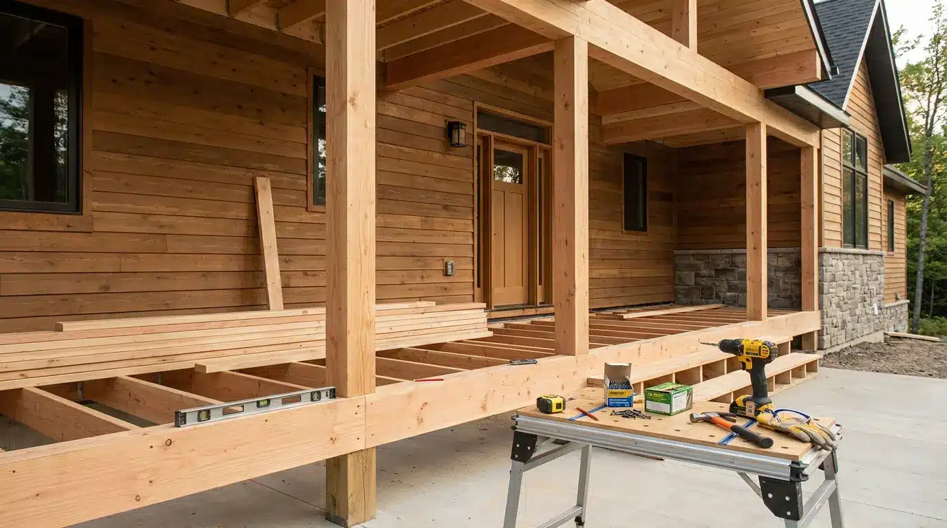
A porch looks simple until you start planning one. Then the questions show up fast, right? If you want to know how to build a porch without turning your entryway into a half-finished mess, you need a clear order before the first board is cut. I’ve seen porch jobs go sideways because someone rushed the layout, guessed the beam size, or left temporary supports doing permanent work. That’s where a calm plan helps. You’ll learn what a porch includes, which type fits your home, what tools and materials to gather, and how the main framing steps come together. By the end, you’ll know where DIY makes sense and where a pro should step in before you spend real money wisely. Cost Note: Figures in this article are estimates based on national averages. Actual costs vary significantly by region, contractor, materials, and project scope. Always get at least three quotes before committing to any project above $1,000. What Building a Porch Involves? A porch that supports only foot traffic is a different structural problem than one that carries roof framing. That’s the first thing to understand before you price lumber. The load path, where weight travels from the surface down to the ground, determines every beam size, post spacing, and footing depth in the design. A basic porch frame includes footings or a slab, posts, beams, blocking, decking, stairs, and railings. A covered porch adds roof framing, flashing, and ceiling work. Each component has a job. Posts carry weight vertically. Beams spread that weight horizontally across the opening. Fasteners hold the assembly together under wind, foot traffic, furniture, and weather cycles. For a small open porch, a capable DIYer can handle most of the framing. For anything with a roof, structural spans over eight feet, or attachment to the house’s main framing, get a builder or structural engineer involved before cutting a single board. The cost of that consultation is cheap compared to a failed inspection or a porch that racks in the first winter. Types of Porches Before you pick up a saw, choose the porch style that fits your home and daily use. A front entry needs different choices than a backyard sitting space. This table provides a clear way to compare common porch types. Here’s how the main porch styles differ. Porch Type Best For What to Know Before Building Front porch Entry appeal, seating, and weather cover near the main door It should match the home’s front layout and leave enough space for safe entry. Back porch Backyard access, outdoor meals, and quiet sitting It often connects to patios, gardens, or yard paths, so traffic flow matters. Open porch A simple porch floor with no roof It’s usually easier to build than a covered porch, but it still needs safe support. Covered porch Shade, rain cover, and a more finished entry Roof weight changes the framing plan, so beam and post sizing matter more. Screened porch Sitting outside with fewer bugs It needs extra framing for screens and may need planning for airflow and doors. Wraparound porch Larger homes and wide outdoor sitting areas It uses more material, more support points, and more careful layout work. Your choice here affects everything that follows. An open porch keeps the build simpler, while a covered or wraparound porch requires more planning. Once the type is clear, you can move on to layout, framing, and safe support decisions. Common Porch Materials: What Holds Up and What Doesn’t The material choices you make for decking and framing will still be visible, or failing, ten years from now. Here’s how the main options compare on cost, durability, and maintenance load after two or three winters. Material Cost per Sq Ft (Installed) Lifespan Maintenance Climate Suitability Pressure-treated pine $8–$15 15–25 years Seal every 2–3 years; watch for checking All climates; standard choice for framing Cedar $14–$22 20–30 years Oil or stain every 2–3 years to prevent grey weathering Good in wet climates; naturally rot-resistant Composite decking $20–$38 25–30 years Minimal; rinse annually, check for mold in shaded areas All climates; watch for heat buildup in direct sun Ipe (hardwood) $30–$50 40–75 years Oil annually if keeping color; greys naturally without it Excellent in all climates; heavy and dense Concrete/slab $6–$18 30–50 years Seal every 3–5 years; repair cracks before they spread Good overall; avoid in areas with heavy freeze-thaw without proper drainage Pressure-treated pine is the right call for framing regardless of what decking goes on top, it’s what building codes expect, and it holds fasteners well. For decking itself, composite costs more upfront but removes the annual sealing labor. Cedar is the middle option: real wood feel with better rot resistance than standard pine, but it still needs maintenance. Ipe lasts a generation but requires pre-drilling every fastener and is harder to source than big-box options. If you’re building a deck alongside the porch, consistent decking material across both keeps the look cleaner and the maintenance schedule simpler. What Fails After Two or Three Winters Most porch problems don’t show up on day one. They show up after the first freeze-thaw cycle, the first heavy rain season, or the first summer of direct UV exposure on an unsealed surface. The failures are almost always in the same places. Ledger connection rot: If the ledger board that attaches the porch to the house isn’t properly flashed, water gets behind it. The house rim joist behind it rots quietly for two or three years before the porch starts to pull away. This is one of the most expensive repairs in porch construction and one of the most preventable. Post base failures: Posts set directly in concrete without post anchors hold moisture against the wood end grain. In climates with wet winters, the base of an embedded post can rot from the inside while looking fine from the outside. Use rated post anchors on top of footings, not posts buried in concrete. Undersized footings in freeze-thaw zones: A footing that doesn’t reach below the frost line will heave. One hard winter pushes a post up; the next one drops it. The deck boards crack, the railings go out of plumb, and the whole frame racks over time. Local code specifies frost depth for a reason — don’t shortcut it. Inferior fasteners: Standard zinc-plated screws corrode when used with pressure-treated lumber, which contains copper compounds that accelerate corrosion. Within a few years, fastener heads rust, the wood stains brown-red, and connections loosen. Use hot-dipped galvanized or stainless steel hardware rated for ACQ-treated lumber throughout. How to Build a Porch Step by Step To build a porch correctly, start with the plan on paper before touching lumber. Every step that follows depends on the load math and layout decisions made before the first cut. Here’s the full sequence for framing an open or covered porch. Difficulty 3/5, Open porch; 4/5, Covered porch Time 2–3 days (open); 1–2 weeks (covered) Cost $4,000–$30,000+ depending on type and size Tools Needed Tape measure, chalk line, framing square, level, circular saw, drill, impact driver, post hole digger, ladders, safety gear Skill Required Intermediate, open porch; Experienced or professional, covered/wraparound Materials list: Pressure-treated lumber (posts, beams, joists, rim boards) Concrete mix and gravel for footings Post anchors (rated for ACQ lumber) Hot-dipped galvanized or stainless structural screws and joist hangers Decking boards (PT pine, cedar, or composite) Temporary bracing boards (2x4s) Railing posts, rails, and balusters Stair stringers and treads Flashing (for covered porches attaching to the house) Step 1: Read the Porch Plan and Understand the Load Before you touch the lumber, look at the porch plan and figure out what the frame has to carry. A porch that supports only foot traffic is different from one that also carries roof framing. Check where the posts land, where each beam runs, and how the load is transferred to the slab or footings. This is also the time to spot special details, such as built-up beams, notches, or a roofline that must stay level with the house framing. Caution: Don’t guess structural sizes. If the porch carries roof weight, use approved plans or ask a qualified builder or engineer before cutting anything. Step 2: Gather Your Tools and Materials First Get everything on-site before you start building. You’ll need measuring tools, a chalk line, a level, a framing square, saws, a drill, an impact driver, ladders, screws, glue (if specified), plywood spacers, 2x lumber, posts, and temporary bracing boards. This may feel like basic prep, but it saves a lot of wasted time. When the beams are half-built, you don’t want to stop because one fastener, board, or support post is missing from the pile. Advice: Group materials by use before work starts. Keep beam lumber, post material, screws, and bracing boards separate so you can move faster. Step 3: Build the Main Porch Beams Build the beams before you try to install them. For a built-up beam, lay one board down, add the spacer material, then place the second board on top. Keep the edges flush and fasten the layers with the correct structural screws. If glue is called for, apply it evenly before screwing the beam together. Let the beam run a little long during assembly. Once the beam is solid, you can cut it to the final length with better control. Note: Built-up beams should match your own plan. The board size, spacer, glue, and screws all depend on the porch span and load. Step 4: Cut and Fit the Short Side Beams Start with the shorter side beams because they help set the porch frame’s first fixed points. Mark where each beam sits against the house framing or beam pocket. If a notch is needed, make it clean and only as deep as required. The top of the beam should line up with the framing height it supports. Take your time here. A short beam that sits too high, too low, or twisted can affect the front beam later. Caution: Check every notch before cutting. Removing too much wood weakens the beam and can make the fit loose or uneven. Step 5: Brace the Frame and Square the First Beams Once a beam is lifted into place, don’t trust it to stay still on its own. Use temporary posts and diagonal bracing to hold it. To square the porch frame, use the 3-4-5 method. Measure three feet along one side, four feet along the other, and five feet across the diagonal. When those marks line up, the corner is square. Fasten the brace so the beam cannot drift while you work on the other side. Advice: Bracing may look temporary, but it protects the whole setup. A few minutes of bracing can prevent a long reset later. Step 6: Install the Support Posts After the side beams are held in the right position, install the support posts that will actually carry the load. Set each post on its proper base or bearing point, then check it with a level. The post should be plumb before it is fastened. If temporary 2x4s helped during layout, replace them with the correct permanent posts now. This step turns the beam from “held in place” into “properly supported.” Caution: Never leave temporary boards as final supports. They are useful for setup, but they are not meant to carry porch loads long-term. Step 7: Lift and Set the Front Beams The front beams are often the heaviest and most awkward pieces in the porch frame. Before lifting, cut them to fit and plan how to hold each end. Temporary T-supports or blocks can make the lift safer and easier. Start screws before climbing if that helps. Once the beam is up, align it with the side beams and house reference points. Fasten it only after you know the height and bearing points are right. Advice: Don’t rush a heavy lift. Have enough help, clear the work area, and decide each person’s job before anyone climbs a ladder. Step 8: Confirm the Frame Is Aligned With the beams and posts in place, pause and measure the frame carefully. Check that the front beam is parallel to the house. Measure both ends from the same reference points and compare the numbers. Sight across the beam tops to see whether they line up. Also check for side movement, loose points, or spots that still depend on temporary blocks. This is the best time to correct small errors before more framing covers them. Note: A frame can look straight and still be off. Use measurements, not just your eye, before moving to the next stage. Step 9: Add Ceiling Nailers or Framing Support If the porch will have a finished ceiling, install nailers before closing the area. Mark the height with a laser or chalk line, then add temporary cleats to support the nailer frame while you lift it. You can build sections on the ground first, then raise them into position. Fasten the frame to the house side and the beam side so the ceiling material has a flat, steady surface to attach to later. Advice: Think about lights before fastening every nailer. Leave open space where a fixture box, wiring, or extra blocking may be needed. Step 10: Fasten Everything and Remove Temporary Pieces Finish the porch frame by securing every connection that the plan calls for. Drive the remaining screws or nails, then remove cleats, blocks, and temporary braces only after the permanent frame is solid. Recheck posts, beams, and nailers one last time. Look for gaps, loose fasteners, uneven bearing, or parts that moved during lifting. When everything is tight, square, and supported, the porch frame is ready for the next phase. Caution: Don’t hide framing mistakes under finish materials. Fix loose, crooked, or unsupported parts now while everything is still easy to reach Watch this video for a step-by-step process: How Much Does It Cost to Build a Porch? Porch costs change quickly because size, material, height, and roof support all affect the bill. A simple open porch may stay fairly modest, while a covered porch needs more framing, stronger support, and often skilled labor. Use this breakdown to see where most of the budget goes. Cost Area What It Includes Estimated Cost Range Permits and planning Local permits, inspections, drawings, or basic design help $100 to $2,000 Foundation and support Footings, concrete, gravel, post anchors, posts, and beams $1,800 to $12,500 Framing and porch floor Joists, rim boards, blocking, hangers, screws, and porch boards $2,500 to $14,000 Stairs and railings Stringers, treads, railing posts, rails, balusters, and handrails $1,000 to $6,500 Roof and finishing Roof framing, roofing, flashing, gutters, paint, stain, sealer, and trim $3,300 to $18,000+ Labor Builder, carpenter, concrete crew, electrician, or engineer $3,000 to $20,000+ Note: These costs can vary by location, porch size, labor rates, material prices, permit rules, soil condition, roof design, railing style, and how much of the work you do yourself. The foundation and framing lines are where you should spend without cutting corners. Footings that fail and beams that sag are the two most expensive repairs a porch owner faces. Spend what the structure requires, then choose finish materials at whatever price point fits the remaining budget. The balcony vs deck cost comparison covers how these structural costs stack up across similar outdoor builds if you’re weighing your options before committing. How Long Does It Take to Build a Porch? A porch timeline gets easier to judge when you separate framing work from waiting time. You may build quickly on a clear day, only to lose hours to drying concrete, inspections, or weather. Plan the calendar, not just the labor involved. Here’s what usually affects the schedule. Small open porch: A skilled DIYer may frame and finish a basic open porch in a few days, especially when materials are ready and the ground requires little prep. Larger porch: A wider or deeper porch can stretch into one or more weeks because every extra span adds cutting, fastening, checking, and finish work. Covered porch: A roofed build takes longer because posts, beams, roof framing, flashing, and ceiling work need careful setup. Concrete timing: Footings or slab work can slow the project because concrete needs time to reach full working strength. Permit and inspection windows: Local approval can add waiting days, even when the actual work is moving well. Weather delays: Rain, high heat, wind, and muddy soil can slow framing and make lifting beams less safe. Material delivery: Having lumber and hardware on-site before the build starts can save a full day or more. Common Porch Building Mistakes to Avoid A lot of porch problems start before the first board is fastened. Most issues come from small shortcuts, like skipping layout checks, using the wrong hardware, or guessing structural details. Catch these early, and the whole build becomes safer and cleaner. Mistake Why It Causes Problems Better Move Starting without a permit It can lead to fines, failed inspections, or resale issues. Check local rules before work begins. Guessing beam sizes The porch may not carry the load safely. Follow approved plans or ask an engineer. Using indoor fasteners They can rust or fail outdoors. Use exterior-rated structural hardware. Leaving temporary posts in place Temporary supports are not made for long-term loads. Replace them with proper permanent posts. Cutting oversized notches Removing too much wood can weaken the beam. Mark carefully and cut only what the plan allows. Skipping bracing and alignment checks Beams can shift, and finishes may not fit cleanly. Brace the frame and check for square before fastening. Poor flashing at the house Water can enter the wall and cause rot. Install flashing before closing the area. Weak railings or uneven stairs These can create fall or trip hazards. Build stairs and rails to local code. Mistakes are easier to avoid when each step has a stopping point. Set the beam, then check it. Set the post, then check it. That rhythm may feel slow, but it saves time near the finish When to Hire a Professional An open ground-level porch with basic framing is a realistic DIY project for someone with structural framing experience. Once the project moves beyond that, a professional isn’t optional, it’s what keeps the structure sound and the permit process clean. Hire a licensed carpenter or builder for any covered porch, any porch that attaches to the house’s main structural framing, any porch that needs deep footings, or any build on uneven or unstable soil. The roof framing, ledger attachment, and flashing are the three areas where amateur work most often creates expensive problems later. Hire a structural engineer when spans, roof loads, or support points aren’t clearly specified in the plan, and any time the porch ties into a load-bearing wall. Use a licensed electrician for any wiring, whether it’s a single outlet, ceiling fan, or exterior lighting circuit. Attempting unlicensed electrical work on an outdoor structure is both a code violation and a fire risk. Hiring a professional for a portion of the work doesn’t mean handing over the whole project. You can frame and finish independently while a pro handles the roof, flashing, and inspection sign-off. If you’re planning adding a pergola overhead instead of a full roof, that’s a simpler structural problem that many experienced DIYers can take on without an engineer. How to Maintain a Porch After Building It Good porch maintenance is plain, small work done before damage spreads. You’re watching for movement, moisture, wear, and weak spots. A porch that gets checked twice a year is much easier to protect than one ignored for several full seasons. Here’s a simple care routine to follow. Clean the surface: Sweep off leaves, dirt, and grit so moisture does not sit against the porch boards. Check fasteners: Look for raised screws, rusted hardware, or loose connectors around posts, beams, stairs, and railings. Watch for movement: Step on different areas and feel for any bounce, wobble, or shifting that wasn’t there before. Look for wood damage: Soft spots, dark stains, cracks, and a peeling finish can indicate trapped water. Protect exposed wood: Repaint, restain, or reseal when the surface starts looking dry, faded, or worn. Keep water moving away: Clear gutters on covered porches and make sure water does not collect near the house. Trim nearby plants: Keep shrubs and vines from trapping moisture against posts, railings, or siding. Inspect stairs and rails: These take the most daily wear. Fix loose balusters and wobbly newel posts before they become a fall hazard. Pair the porch space with durable outdoor furniture built to last and you’ll spend less time on overall upkeep. Frequently Asked Questions How do I know what size beams my porch needs? Beam sizing is determined by the span (distance between supports) and the load the beam carries. For an open porch, use a residential span table, the IRC (International Residential Code) publishes these and most local building departments have them. For a covered porch carrying roof weight, have a structural engineer or licensed builder specify the beam before you buy lumber. Can I add a roof to an existing open porch? Yes, but only if the existing frame can carry the added load. The posts, footings, beams, and house connection all need to be evaluated before any roof framing goes up. A roof adds dead load plus wind and snow load depending on your region. Get a builder or structural engineer to assess the existing frame first. Should a porch floor slope away from the house? Yes. A slope of about 1/8 inch per foot away from the house is standard for solid porch floors and slabs. Open-gap decking drains naturally, but solid surfaces need that pitch to move water away from the ledger and foundation. What is the minimum roof pitch for a covered porch? It depends on the roofing material. Asphalt shingles typically require a 2:12 pitch minimum; metal panels can work at 1:12 or lower with correct detailing; membrane roofing can handle near-flat. Check the roofing manufacturer’s spec sheet and local code before framing the roof. Can I attach a porch roof to the fascia board? No. Fascia is finish trim, it’s not rated to carry roof loads. A porch roof must connect to structural framing: either a properly installed ledger board bolted to the house rim joist, or a freestanding beam structure. Attaching to fascia is a structural defect that will eventually pull the connection apart. Do I need a permit to build a porch? Almost always, yes. Most US jurisdictions require a permit for any attached structure with a roof, any structure over 200 square feet, or any build that involves structural connection to the house. Check with your local building department before starting. An unpermitted porch can create problems at resale and may need to be removed or rebuilt to pass inspection. What type of wood is best for porch framing? Pressure-treated pine is the standard for all structural framing, posts, beams, joists, and rim boards. It’s what building codes expect, widely available, and holds structural fasteners well. For decking surfaces, cedar or composite adds rot resistance and visual appeal. Never use untreated dimensional lumber for any part of the frame in contact with the ground or exposed to weather. Final Thoughts Learning how to build a porch is really about slowing down before the heavy work starts. You’re not just adding boards near a door. You’re creating a place that has to stand straight, carry weight, shed water, and feel safe every time someone steps on it. I’d treat the plan, beams, posts, and final checks with the same respect as the visible finish, because that hidden structure does the real work. If your porch is simple, you can take this one stage at a time and build with care. If it carries a roof or ties into the house, bring in help. Ready to start? Measure your space, check your code, and plan your build today with confidence and patience.
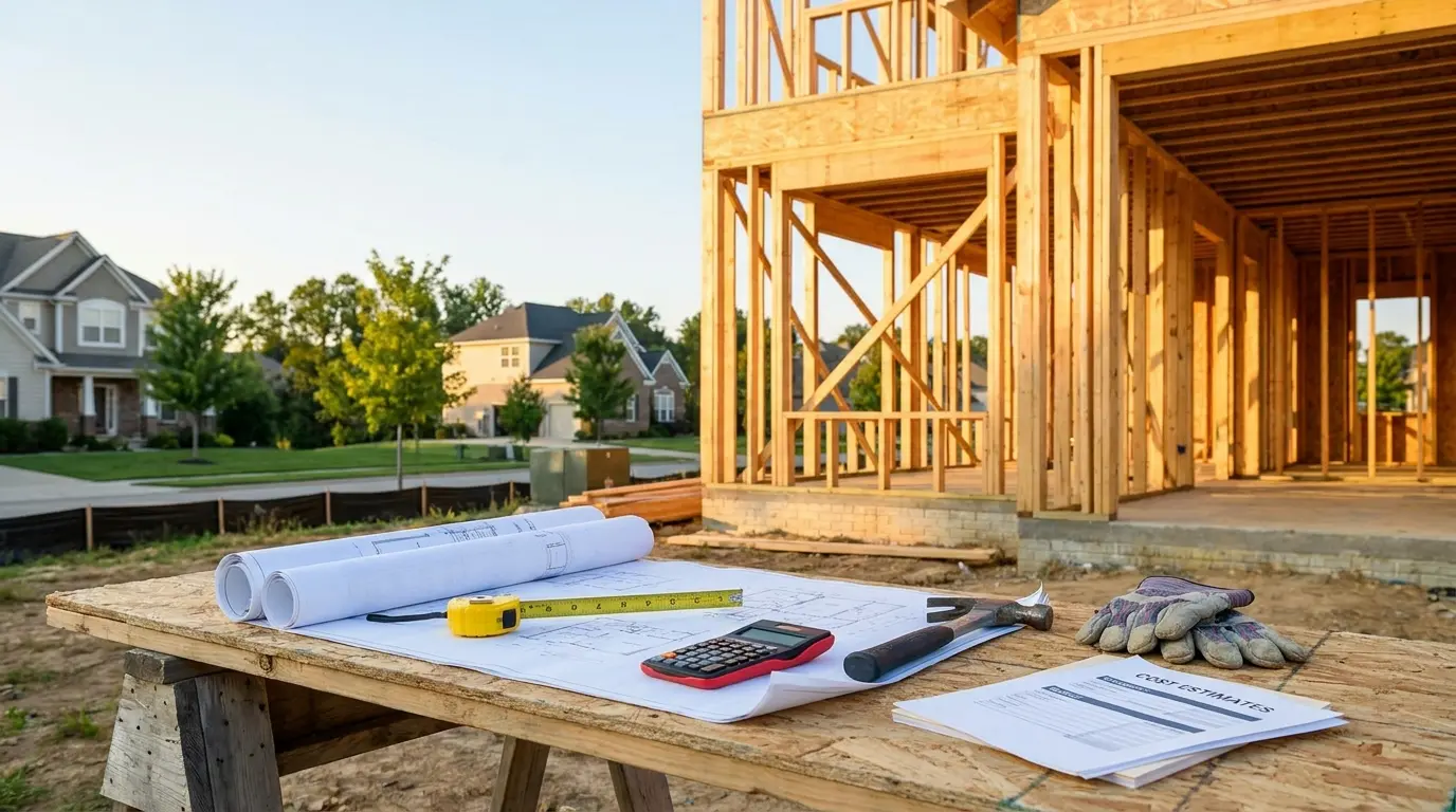
Building a new home in the U.S. costs between $150 and $300 per square foot on average, which puts a 2,000-square-foot house somewhere between $300,000 and $600,000 in construction costs alone, before land, permits, or site work enter the picture. That range sounds wide because it is. The average cost to build a house shifts meaningfully based on where you build, who you hire, and what you choose to include. Most people arrive at this number after seeing a single figure online and wondering why their local builder’s quote looks so different. The gap usually comes down to what the quote actually covers and what it quietly leaves out. This article breaks that down so you can read a builder’s bid with your eyes open. Quick Glance: Average Cost to Build a House Before you get into the line items, it helps to see the full range in one place. These figures reflect construction costs for a new build. Land, site prep, permits, and utilities are separate. Build Type Cost Per Square Foot Estimated Cost for 2,000 Sq. Ft. What Drives the Variation Basic build $150 to $200 $300,000 to $400,000 Standard floor plans, builder-grade finishes, minimal customization. Mid-range build $200 to $300 $400,000 to $600,000 Upgraded finishes, better materials, more design flexibility. High-end or custom build $300 to $500+ $600,000 to $1,000,000+ Custom layouts, premium finishes, specialized labor, high-end features. These ranges track with NAHB’s 2024 Cost of Constructing a Home survey, which puts the national average at roughly $162 per square foot excluding land and general contractor overhead. Once you add a GC’s fee, typically 15 to 25%, the effective average climbs closer to $195 per square foot. Use this table as a planning baseline, not a final bid. What Is Included in the Average Cost to Build a House? The average cost to build a house in the U.S. typically covers the work required to make the home livable: foundation, framing, roof, siding, windows, exterior doors, plumbing, electrical, HVAC, insulation, drywall, flooring, paint, cabinets, countertops, standard fixtures, and basic appliances. What varies is the quality level assigned to each of those line items. One builder’s quote may include vinyl flooring and stock cabinets. Another allows for hardwood, tile, or semi-custom cabinetry. The gap between those two quotes can be $30,000 to $80,000 on a mid-size home, without a single layout change. That is why the allowance sheet matters more than the total number. Several costs commonly sit outside the base price. These include: Land purchase and survey fees Soil testing and geotechnical reports Lot clearing, grading, and drainage work Permits, impact fees, and plan review Utility hookups, water, sewer, electric, gas Septic systems or well drilling on rural lots Driveway construction and landscaping Construction loan interest and temporary housing Change orders added after work begins Before comparing bids, ask every builder for a written scope, a finish allowance list, and a clear exclusions page. The builder with the lowest number may simply be the one who excluded the most. Average Cost Per Square Foot to Build a House The average cost per square foot to build a house helps you create a rough budget before you talk to builders or choose finishes. It is useful, but it should not be treated as a final quote, as location, design, labor, and materials can affect the price. Here is a simple way to compare common square-foot cost ranges: Cost Range Per Sq. Ft. Typical Build Type Common Characteristics $150 to $200 Basic Home Standard floor plans, builder-grade finishes, straightforward construction, and fewer custom features. $200 to $300 Mid-Range Home Larger floor plans, upgraded finishes, better-quality materials, and more design flexibility. $300 to $500+ Custom or Luxury Home Custom layouts, premium finishes, specialized labor, and high-end features. Use these ranges as a planning guide, not a fixed price. A 2,000-square-foot house at $225 per square foot may start around $450,000 for construction, but that may not include land, permits, utilities, site prep, driveway work, or landscaping. Note: Costs can vary significantly depending on where you build. The Northeast and West Coast often run higher due to labor, code requirements, and land prices. Many parts of the Midwest and South may be more affordable. Mountain areas can increase excavation costs, while coastal locations may require stronger materials to withstand storms, moisture, or wind. How to Estimate Your Total Home-Building Budget A smart budget should not stop at the builder’s base price. I would build it in layers so you can see the full project, not just the house. Start with the main construction number, then add land, site work, permits, design, utilities, outdoor basics, financing costs, and a safety cushion. Use this simple formula before speaking with builders: Total estimated cost = construction + land + site work + permits and design + utilities + outdoor work + financing costs + contingency Note: A full home-building budget should always leave room for surprises. Even with a clear estimate, site issues, permit delays, material changes, or upgrades can shift the final price. I would keep a 10% to 20% cushion so you are not forced into rushed decisions later What Affects the Average Cost to Build a House? No two home builds price out the same way. Even if two homes have the same square footage, the final quote can change because of the market, the lot, the plan, and the finish choices. These factors explain why your estimate may look different from someone else’s. 1. Location, Labor, and Local Rules Your building area sets the pricing environment before any work begins. A home in a busy metro area, coastal county, or fast-growing suburb may be priced differently than one in a smaller inland town because builders work under different market pressures. Here are the local cost factors that can change your quote: Contractor availability: When good builders and subcontractors are booked out, prices can rise because there is more demand for their time. This can affect scheduling, bid amounts, and how flexible the builder is with changes. Local approval process: Some areas require more inspections, review steps, energy standards, or impact fees. These rules can add cost even when the house plan itself stays the same. 2. Land, Site Condition, and Utility Access The lot shapes the budget before the foundation is poured. A piece of land priced below market often has a reason: access issues, unstable soil, or a need for significant prep work. The two site-related factors worth checking early: Build-ready versus raw land: A developed subdivision lot typically has road access, drainage, and nearby utilities. Raw land may need clearing, grading, soil testing, and drainage planning before construction can start. Knowing what you are buying changes the true land cost significantly. Once you have chosen your lot, it is worth reading through the different foundation types for residential homes early, since the site condition often dictates which option is structurally viable. Utility connection needs: Lots on public water and sewer have predictable hookup costs. Rural properties may need a well, septic system, propane setup, or a long run of electric line from the nearest service point, costs that can easily reach $20,000 to $50,000 before framing begins. 3. Home Design, Size, and Finish Level The house plan determines how much labor and coordination the build requires. A simple rectangular layout with a single roofline is less expensive to build than the same square footage spread across a complex shape. These two design choices move the number the most: Structural complexity: Vaulted ceilings, large open spans, oversized windows, multiple rooflines, and unusual room geometry all require more planning and more skilled trades. A hip roof, for example, costs more to frame and flash than a gable. Understanding how hip roofs are built and priced helps you evaluate whether the design premium is worth it on your specific plan. Finish allowances: Builders set dollar allowances for cabinets, flooring, countertops, lighting, and appliances. If your selections exceed those amounts, the difference is added to your final invoice. A $5,000 cabinet allowance and a $20,000 cabinet allowance produce the same floor plan on paper but a very different final bill. How to Control Costs During the Building Process A home-building budget changes as the project moves from planning to final touches. If you know where money usually goes, you can make smarter choices early and avoid spending on changes that do not add real value. Here is a simple way to see where costs appear and how you can control them: Budget Area Where Money Goes How to Control the Cost Planning Stage Design, permits, engineering, builder scope, and finish allowances. Finalize the floor plan, review the builder scope, and set clear allowances before work starts. Structure Foundation, framing, roofing, windows, doors, and exterior walls. Keep the layout simple, use standard sizes, and avoid too many rooflines or unusual shapes. Major Systems Plumbing, electrical, HVAC, insulation, and behind-the-wall work. Avoid late layout changes and keep kitchens, bathrooms, and mechanical areas planned clearly. Interior Finishes Cabinets, countertops, flooring, lighting, fixtures, trim, and appliances. Choose mid-range durable finishes and track every selection against your allowance list. This is where most new home budgets quietly break. If you are planning to paint the interior after move-in, factor that into your finish budget now rather than treating it as a later expense. Final Extras Landscaping, fencing, decks, built-ins, bonus rooms, and outdoor details. Defer non-essential exterior work if the main budget is running tight. A driveway and basic grading should be in the original scope, but driveway materials and finishes can be decided and priced separately from the house structure. The goal is not to cut every corner. It is to spend with intention. I would protect the parts that affect safety, comfort, and long-term use, then delay extras that can be added later Common Budget Mistakes to Avoid When Building a House Budget mistakes usually happen when the early estimate looks simpler than the real project. A house build has many moving parts, so you need to check the quote, track decisions, and leave room for changes before work begins. Here are the mistakes I would avoid before signing a builder contract: Online averages: Treating broad cost ranges as final numbers can lead to a weak budget. Your city, lot, builder, design, and finish choices will shape the real cost. Unclear scope: Comparing builder quotes without checking what each one includes can mislead you. A lower bid may leave out allowances, site work, or key project details. Loose allowances: Choosing finishes without clear allowance limits can push your budget up fast. Cabinets, flooring, lighting, and appliances should have set price ranges early. Late changes: Making design changes after construction starts can increase labor, delay the schedule, and add change-order fees. Finalize major choices before work begins. Lowest bid: Picking the cheapest builder without checking past work, reviews, licensing, insurance, and communication style can create higher costs later. Building a House vs Buying a House Choosing between building and buying depends on your timeline, budget, location, and how much control you want. In fast-moving markets like parts of the West Coast or Northeast, buying may feel faster but more competitive. In many Midwest, Southern, or suburban areas, buildings may give you more room to plan around your needs. Here is a simple comparison to help you decide which option fits your situation better: Factor Building a House Buying a House Timeline Usually takes longer because you need land, permits, design, and construction time. Usually faster if you find a move-in-ready home. Cost Control Less predictable because site work, materials, and changes can affect the final price. More predictable because you know the sale price before closing. Design Choice Gives you more control over layout, finishes, energy features, and future use. Limited to the existing layout unless you renovate. Buyers who go this route often find that home renovation costs after purchase can close much of the gap with new construction. Location Options Depends on available lots, zoning rules, and utility access. Often gives more options in established neighborhoods. Early Repairs Usually fewer at first because the home, systems, and materials are new. Depends on the age, condition, and inspection results of the home. Best Fit Better if you want control and have time to manage the process. Better if you need to move sooner or want price certainty. Both choices can make sense. If you want a home shaped around your lifestyle, building may be worth the wait. If you need speed, a known price, or a specific school district or neighborhood, buying may be the smarter path. Frequently Asked Questions How long does it take to build a house? Most new homes take 7 to 12 months to build after permits are approved. The timeline depends on the builder’s schedule, weather, inspection delays, material lead times, and how quickly you finalize finish selections like flooring, cabinets, and fixtures. Do I need a construction loan to build a house? Most buyers use a construction loan if they are not paying cash. The loan covers building costs in draws as work is completed. Once the home is finished, it typically converts into a standard mortgage, though lender terms vary. Is it cheaper to build a one-story or two-story house? A two-story home can cost less per square foot because it uses a smaller foundation and roof footprint. A single-story home spread over a larger slab may carry higher foundation and roofing costs, though it is often easier for long-term accessibility. What is not included in a builder’s base price? Commonly excluded items include land, lot clearing, grading, permits, impact fees, utility hookups, septic or well systems, driveway work, landscaping, window coverings, and construction loan interest. Always request the exclusions list before comparing quotes. How much does land add to the cost of building a house? Land cost varies widely, from $5,000 to $10,000 per acre in rural areas to $100,000 or more for suburban or urban lots. According to NAHB data, finished lot cost represents roughly 18% of the total price of a new home nationally, though that share is higher in supply-constrained markets. What is a realistic contingency budget for a new home build? A 10% to 15% contingency is standard practice. On a $400,000 build, that means keeping $40,000 to $60,000 uncommitted until the project is substantially complete. Soil surprises, permit delays, and mid-build material changes are the most common reasons contingency gets used. Final Thoughts The average cost to build a house is only the starting point, not the finish line. I would use it to shape your budget, compare builder quotes, and decide what matters most before you commit. You now know how square-foot pricing works, why land and site costs matter, and where extra money can slip in. The best move is to take these ranges, adjust them for your area, and ask builders clear questions about scope, allowances, and change orders. When you plan this way, you are not just chasing a number. You are building with more control. If you are getting serious about your project, start by listing your must-haves and request detailed local estimates today.