


If you’ve been thinking about trying a dark paint color that feels rich but not overpowering, Sherwin-Williams Greenblack (SW 6994) is worth a look.
It’s a deep shade with a touch of green that gives it balance and softness, making it easy to use in different parts of your home. I’ve used this color in spaces that needed more contrast, and it always adds just the right amount of depth.
In this guide, you’ll learn how Greenblack behaves under different lighting, the best finishes for every room, and smart color pairings that work beautifully.
You’ll also find practical tips and common mistakes to avoid when using this bold shade in your next project.
Understanding Sherwin-Williams Greenblack (SW 6994)
Sherwin-Williams Greenblack is a deep, dramatic paint color that balances black with a subtle green tone. It’s not a true black, but rather a cool neutral that adds depth without feeling flat or harsh.
The green undertone gives it a quiet richness that makes it work well in both modern and classic spaces. Unlike pure black shades, Greenblack carries a softer edge, creating dimension and warmth instead of absorbing all light.
It fits beautifully within the Sherwin-Williams neutral palette, offering a darker option for those who want contrast but still prefer a natural, grounded color.
It is used on walls, cabinets, or exteriors. This shade holds its form and complements a wide range of other colors.
Color Details:
- RGB: 55 / 58 / 58
- HEX: #373A3A
- LRV: 4
Greenblack Undertones and Lighting Effects
Lighting changes how Sherwin-Williams Greenblack appears, shaping its depth and overall mood. Its green undertone shifts subtly depending on whether the space has natural or artificial light.
In Natural Light

Natural light improves the soft green undertone in Greenblack, especially during daytime hours. In bright, open rooms, it feels balanced and bold without overpowering the space.
North-facing rooms: In north-facing rooms, natural light is cooler and softer. Greenblack will look deeper here, with more of its charcoal-green tone coming through. It gives the space a moody, dramatic feel that works beautifully for offices or accent walls.
South-facing rooms: South-facing rooms receive warm, golden light most of the day. That warmth softens the green tint, making Greenblack feel more neutral and balanced. It keeps its depth but appears smoother and slightly lighter in strong daylight.
East-facing rooms: Morning light is bright and cool in east-facing spaces. Early in the day, Greenblack can look darker and sharper, while by noon, it settles into a classic near-black with subtle green depth.
West-facing rooms: Afternoon and evening sunlight from the west brings out warmth in the tone. Greenblack appears softer and slightly richer here, giving rooms a cozy yet sophisticated look as the day ends.
In Artificial Light
Artificial lighting changes how Greenblack feels after sunset. Under warm bulbs, it takes on a smoky charcoal look, with the green undertone fading into the background.
Cool LED or daylight bulbs, on the other hand, highlight the green tint, giving the color a crisp and modern edge. In rooms with mostly south-facing windows, using layered lighting helps balance the shift between day and night.
Combine overhead fixtures with lamps or sconces to keep Greenblack looking deep but not overly heavy. This keeps your space comfortable and consistent through every hour of the day.
Choosing the Right Finish
The finish you choose for Sherwin-Williams Greenblack makes a noticeable difference in both appearance and performance. While the color itself is rich and dramatic, its look can shift depending on how much sheen you use.
Glossier finishes reflect more light, which can make Greenblack appear slightly lighter, while flatter finishes absorb light and create a deeper, more velvety look.
Matte finishes help hide surface imperfections and are ideal for walls, giving a smooth, even appearance. Satin finishes add a gentle sheen, making them a great choice for trim, doors, or areas that need light reflection without glare.
Semi-gloss finishes are more reflective and durable, perfect for cabinets, furniture, or high-use spaces where easy cleaning is important.
Greenblack in Different Spaces
Greenblack adapts beautifully to different areas of the home, offering versatility and depth when paired with the right finish and surface prep.
1. Living Room
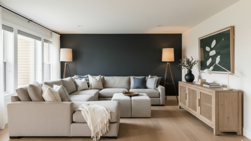
In a living room, Greenblack makes a bold statement on a single feature wall or fireplace surround. It brings depth and contrast, especially when combined with lighter furnishings and soft textiles.
A satin finish works best here; it’s easy to clean yet maintains a smooth, velvety look.
Pair the color with light wood floors, warm lighting, and textured fabrics to keep the space inviting. This setup lets you enjoy the dramatic tone of Greenblack without making the room feel overly dark or heavy.
2. Bedroom
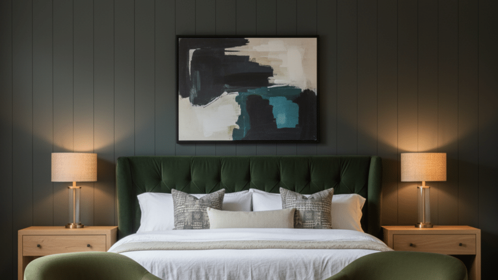
Greenblack creates a calm, grounded mood in bedrooms. Use it on the wall behind your bed for a subtle yet striking backdrop. The matte finish softens the color, reducing glare and adding a cozy feel that promotes rest.
Pair it with neutral bedding, soft lighting, and light-toned furniture to balance the darker hue. Proper surface prep is key; smooth walls and primer ensure even coverage and a refined finish.
Greenblack works especially well in rooms with natural light, where it adds depth without feeling too intense.
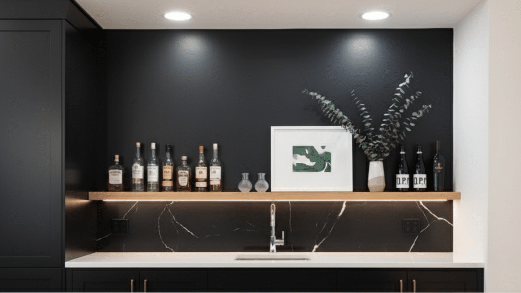
3. Kitchen and Cabinets
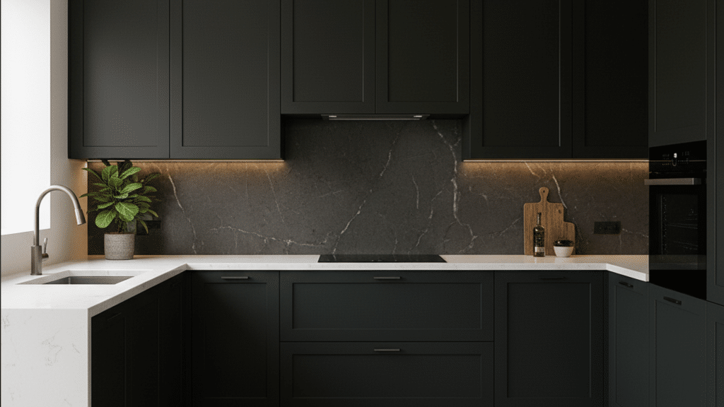
In kitchens, Greenblack shines on lower cabinets, kitchen islands, or open shelving. It gives a sleek, refined appearance that pairs well with light countertops and metallic accents.
A semi-gloss finish is ideal because it’s durable and easy to wipe down. When prepping cabinets, make sure to sand and prime surfaces to help the color bond evenly.
Greenblack pairs beautifully with brushed brass, stainless steel, or matte black hardware, allowing you to mix styles while keeping the look modern and polished.
4. Exterior

Greenblack makes a strong impression on exteriors, whether used for the entire facade or just a front door. Its cool tone holds up beautifully in natural light, offering a clean yet bold presence.
Pair it with crisp white or natural wood trim for a classic balance. For durability, use an exterior-grade satin or semi-gloss finish to withstand sun and moisture. Always clean and prime surfaces before painting to ensure long-lasting coverage.
The result is a classic, confident look that stands out without feeling too stark.
Coordinating and Complementary Colors
Pairing Greenblack with the right colors helps balance its depth and create harmony between walls, trim, and accent details throughout your space.
Best Whites to Pair With Greenblack
Whites like Snowbound (SW 7004) and Extra White (SW 7006) make Greenblack stand out beautifully. Use cool whites when you want a crisp, modern contrast that feels fresh and defined.
Warm whites, on the other hand, soften the color’s dramatic edge and add a touch of coziness. For trim and ceilings, stick to a bright, clean white to prevent the space from feeling too heavy.
In rooms with natural light, cool whites highlight Greenblack’s green undertone, while warm whites help tone it down and create a balanced, welcoming finish.
Accent Colors for Contrast
Greenblack works well with both bold and subtle accents. A pop of Rave Red (SW 6608) brings energy and depth, while cooler grays or slate tones create a refined contrast.
If you prefer a moody palette, pair Greenblack with deep teal or navy accents for added interest. Metallic finishes like brushed gold or matte black hardware also work beautifully, providing balance without overwhelming the color.
Keep accent tones minimal so Greenblack remains the focal point of the design, giving your room a strong yet grounded look.
Complementary Neutrals
For a softer, layered effect, pair Greenblack with muted neutrals such as taupe, greige, or off-white. These shades help lighten the overall palette while keeping the space cohesive.
Greige walls with Greenblack trim, for example, create depth without harsh contrast. In open layouts, complementary neutrals allow Greenblack to blend naturally with adjoining rooms.
If you prefer subtle warmth, choose a beige-based neutral; for cooler interiors, opt for a soft gray. These pairings keep Greenblack looking rich and classic, offering flexibility for furniture and décor choices.
How Greenblack Compares to Similar Colors

Comparing Sherwin-Williams Greenblack with other dark tones helps you see how undertones, depth, and warmth influence its look and ideal use.
| Shade | Tone | Best Use | Warm/Cool | Softness Level | LRV | Notes |
|---|---|---|---|---|---|---|
| Greenblack (SW 6994) | Deep charcoal with green undertone | Exteriors, cabinets, feature walls | Cool | Medium | 4 | Balanced black with a subtle green tint for added depth |
| Iron Ore (SW 7069) | Dark gray-black | Interior walls, trim, built-ins | Warm-neutral | Medium | 6 | Softer and warmer, lacks the green tint of Greenblack |
| Tricorn Black (SW 6258) | True jet black | Doors, exteriors, accents | Neutral | Low | 3 | Pure black, crisp and bold with no visible undertones |
| Black Magic (SW 6991) | Black with a warm brown undertone | Cabinets, bedrooms, moody spaces | Warm | Medium | 3 | Feels cozier and more traditional than Greenblack |
Greenblack sits between these shades in tone and versatility. It’s cooler than Iron Ore, less stark than Tricorn Black, and more modern than Black Magic.
Each color has its own mood. Greenblack leans balanced and adaptable, making it ideal for homeowners who want depth without losing softness or visual comfort.
Tips for Using Dark Paints Like Greenblack
Using dark paint shades can feel tricky, but the right techniques make them look refined, balanced, and easy to live with.
- Test Before Painting: Always sample Greenblack on multiple walls. Check it in daylight and artificial light to see how the undertone shifts.
- Prep the Surface: Smooth, clean walls give dark paint a flawless finish. Use primer to prevent uneven absorption or patchy coverage.
- Use Quality Tools: High-quality rollers and brushes ensure even color distribution and fewer streaks, especially with rich tones like Greenblack.
- Add Contrast: Balance the darkness with light trim, neutral décor, or soft furnishings to keep the room open and inviting.
- Layer Lighting: Combine ceiling, wall, and table lighting. Dark shades absorb more light, so layered lighting helps maintain depth and comfort.
- Mind the Finish: Choose satin or semi-gloss in high-traffic areas for easier cleaning, and matte for walls where softness matters most.
Where to Get Sherwin-Williams Greenblack
You can buy Sherwin-Williams Greenblack (SW 6994) at any Sherwin-Williams retail location or directly from the official website at www.sherwin-williams.com.
The color is available in both interior and exterior formulas, giving you flexibility for any project. Choose from matte, satin, or semi-gloss finishes depending on where you plan to use it.
For easy testing, order a Samplize peel-and-stick sample online. It shows the real color on your wall without leaving marks, helping you see how Greenblack looks in your lighting before purchasing the full-size paint.
Common Mistakes When Using Greenblack
1. Skipping Surface Preparation: Greenblack is a deep color that highlights imperfections. If walls aren’t properly cleaned, sanded, and primed, small flaws or patchy areas will stand out once the paint dries.
2. Using the Wrong Finish: Choosing the wrong sheen can change the entire look. Flat finishes can make Greenblack appear dull and show scuffs easily, while high gloss can feel too reflective. Satin or semi-gloss works best for balance and durability.
3. Ignoring Lighting Conditions: Lighting heavily affects how Greenblack reads. Without testing samples in both daylight and artificial light, you may end up with a tone that feels colder or darker than expected.
4. Painting Too Many Walls Dark: Covering every wall in Greenblack can make small rooms feel enclosed. It works best on accent walls, cabinetry, or paired with lighter neutrals to maintain visual balance.
5. Neglecting Trim and Ceiling Contrast: Using Greenblack without contrasting trim or ceiling colors can make a space feel flat. Pair it with crisp whites or soft neutrals to define edges and keep the look refined.
6. Rushing Between Coats: Deep colors like Greenblack need full drying time between coats. Rushing can cause streaks, uneven coverage, or a blotchy finish that’s hard to fix later.
7. Using Poor-Quality Tools: Low-quality rollers or brushes can leave marks, especially with dark paint. Always use premium, lint-free rollers and angled brushes for smooth, even application.
Conclusion
Sherwin-Williams Greenblack (SW 6994) stands out as a dark color that feels strong yet inviting. It adds style, depth, and balance when paired with the right lighting and finishes.
You now know how its undertones shift, what colors complement it, and how to apply it in different spaces.
Testing a sample first helps you see how it behaves in your home’s light before painting larger areas. This shade brings contrast without feeling too heavy, making it perfect for walls, cabinets, or exteriors.
If you found this helpful, take a look at my other paint color guides for more simple and practical home design ideas.