


When I first saw Sherwin-Williams Gossamer Veil (SW 9165) on a wall, I understood why so many people love it. It’s that perfect middle ground, not too gray, not too beige, just calm, balanced, and comfortable.
If you’ve ever struggled to find a neutral that looks good in every light, this one’s worth your attention. I’ve seen it make small rooms feel open and large rooms feel grounded, all without stealing the spotlight.
If you’re planning to paint your living room, bedroom, or even the exterior, Gossamer Veil adjusts beautifully to different spaces and styles.
You’ll see how its quiet warmth and subtle undertones create a home that feels soft, natural, and welcoming.
What is Sherwin-Williams Gossamer Veil?
Sherwin-Williams Gossamer Veil (SW 9165) is a soft greige that sits between gray and beige, offering a balanced tone that feels calm and inviting.
It’s part of Sherwin-Williams’ neutral color family, known for its versatility across styles like modern farmhouse, transitional, and minimalist spaces.
The shade gets its name from the word “gossamer,” which means light and delicate, a fitting description for a color that brings quiet softness to any room.
Gossamer Veil works beautifully on walls, cabinetry, and even exteriors, adapting easily to both warm and cool surroundings.
Its moderate depth ensures it doesn’t appear too dark or washed out, making it an easy go-to neutral for many homes.
- HEX: #D3CEC4
- RGB: 211, 206, 196
- LRV: 62
Gossamer Veil Undertones Explained

Gossamer Veil is a warm gray with subtle green undertones that can occasionally show a hint of violet depending on the light. These undertones shift gently with the room’s direction and surrounding materials.
In north-facing rooms, the shade appears cooler, and the gray-green tones stand out more.
In south-facing spaces, it takes on a warmer look, showing a soft beige cast.
In east-facing rooms, the morning light feels warmer, offering a gentle, welcoming glow.
In west-facing rooms, it may reveal slight yellow or muted green tones during the late afternoon.
Before painting, test large samples on multiple walls to observe how the undertones change throughout the day.
Viewing photos or comparison boards can help you see these subtle shifts more clearly, ensuring you capture the color’s true personality in your space.
Gossamer Veil in Real Homes
Gossamer Veil works beautifully across home styles, bringing warmth, balance, and adaptability to modern, farmhouse, or coastal spaces.
1. Living Rooms
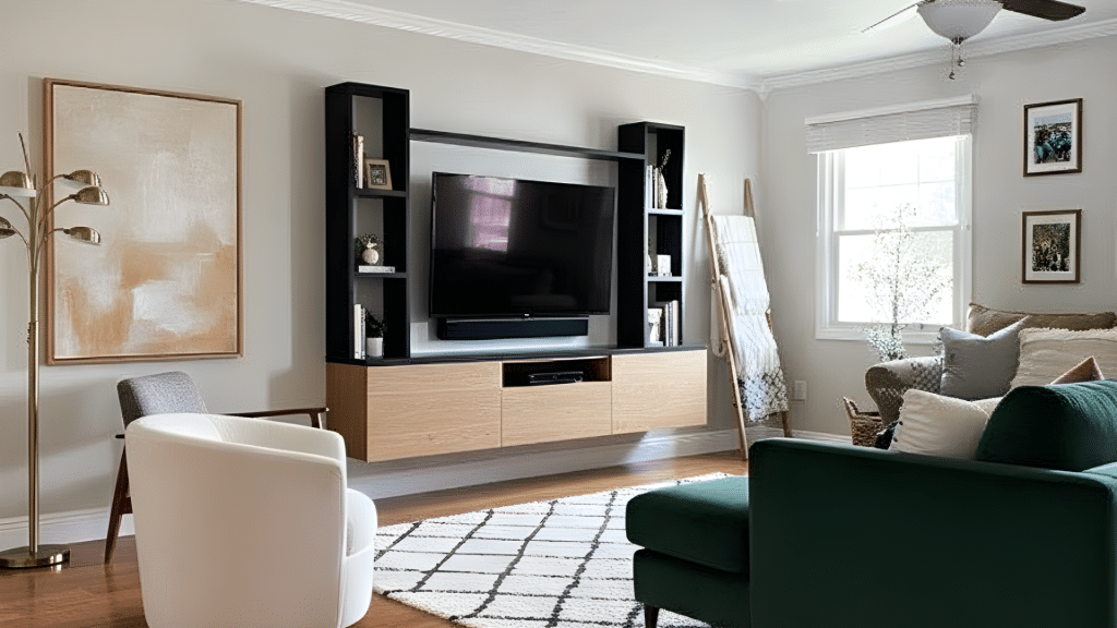
In living rooms, Gossamer Veil creates a calm, open feel that complements both cozy and modern decor. It pairs beautifully with warm wood furniture, woven textures, and matte black accents for added contrast.
For trim, use crisp whites like Extra White or Pure White to frame the walls cleanly. Adding linen curtains or textured rugs can improve its softness while keeping the space grounded.
The color’s subtle green undertone gives the room a relaxed, natural warmth that works in both daylight and lamp light.
2. Bedrooms
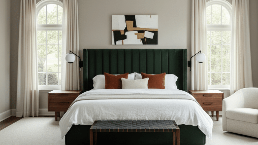
In bedrooms, Gossamer Veil brings a soothing, restful feel that makes it perfect for layered neutrals or soft coastal bedding. It creates a cozy atmosphere without feeling heavy or dark.
Under warm bulbs, the tone leans slightly beige and comforting, while cooler LED lighting highlights its gray-green side.
Pair it with crisp white trim, woven throws, and light oak or rattan furniture for a natural, serene look that encourages relaxation at any time of day.
3. Kitchens and Dining Rooms
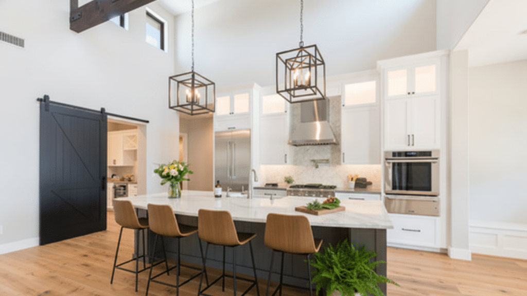
Gossamer Veil looks elegant and easygoing in kitchens and dining rooms, especially beside white or cream cabinets. Its undertones remain steady but may appear warmer under daylight and cooler under LEDs.
Brass, black, or brushed nickel hardware improves its flexible tone. Pair it with marble, quartz, or butcher block countertops for texture contrast.
Light wood floors or white oak add warmth that balances the greige hue, making it inviting without feeling overly traditional.
4. Bathrooms
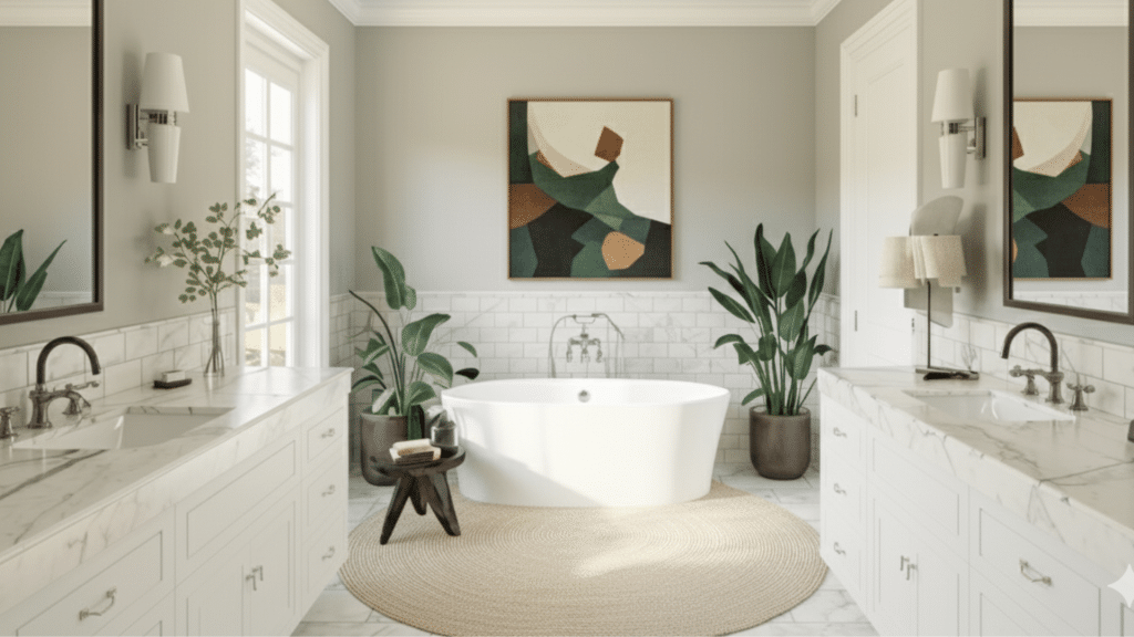
In bathrooms, Gossamer Veil shifts slightly cooler because of the moisture and smaller space lighting.
It reflects light beautifully, keeping the area open and fresh. Pair it with bright white tile, polished nickel or brass mirrors, and soft gray vanities for balance.
White trim, such as Extra White, helps prevent shadows from dulling the walls. This shade keeps bathrooms feeling clean yet comfortable, with just enough depth to add quiet sophistication.
5. Exteriors
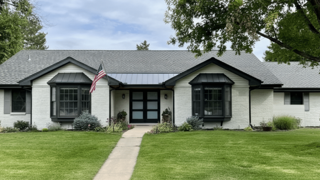
Outdoors, Gossamer Veil reacts to sunlight and shadows, showing a perfect balance between warm greige and soft gray.
In direct sunlight, it reads brighter and more neutral; in shade, subtle green undertones emerge. For trim, pair it with Extra White or Greek Villa for a clean contrast, or Iron Ore for a bold, modern edge.
It complements stone, brick, and wood beautifully, making it a versatile choice for classic or contemporary home exteriors.
Colors That Go With Gossamer Veil
Gossamer Veil’s balanced tone makes it easy to coordinate with a wide range of whites, neutrals, and bold accent colors.
Trim and Ceiling Colors
For trim and ceilings, crisp whites bring out Gossamer Veil’s soft warmth. Extra White SW 7006, Pure White SW 7005, Greek Villa SW 7551, and Zurich White SW 7626 are perfect matches.
Extra White adds a bright modern contrast, while Greek Villa softens the transition for warmer interiors.
Pure White is a safe, flexible choice for both trim and ceilings, keeping the look consistent across lighting changes.
These whites highlight the subtle greige undertones and make Gossamer Veil feel lighter and more defined in any room.
Accent and Complementary Colors
Gossamer Veil pairs beautifully with other neutrals like Threshold Taupe SW 7501, Mineral Deposit SW 7652, and Iron Ore SW 7069. These create subtle depth and contrast without overpowering the wall color.
For bolder accents, try Indigo Batik SW 7602, Naval SW 6244, or Urbane Bronze SW 7048 to add rich dimension and modern edge.
If you prefer a calm, natural palette or a high-contrast design, these tones work seamlessly to improve Gossamer Veil’s flexible character and keep your space balanced and inviting.
Room Palette Examples by Style
Gossamer Veil adapts easily to different home styles.
For a modern palette, pair Gossamer Veil, Iron Ore, and Extra White for clean contrast.
A farmhouse look comes alive with Gossamer Veil, Alabaster SW 7008, and natural wood SW 9508, creating warmth and comfort.
For a coastal vibe, mix Gossamer Veil, Sea Salt SW 6204, and Snowbound SW 7004 to achieve a soft, breezy feel.
Each combination brings out different aspects of the color’s tone, letting you customize your space effortlessly.
Gossamer Veil Compared to Similar Colors
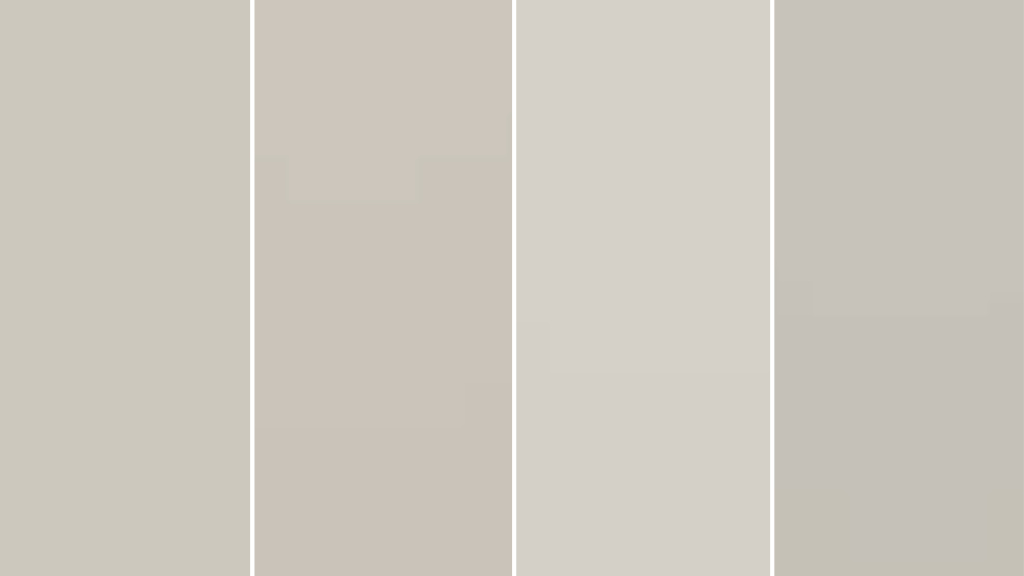
Comparing Gossamer Veil with other Sherwin-Williams neutrals helps you spot subtle undertone differences and choose the right shade for your space.
| Color Name | Tone & Warmth | Undertones | LRV | Best For |
|---|---|---|---|---|
| Gossamer Veil (SW 9165) | Balanced warm greige | Soft green with slight violet | 62 | Versatile for living rooms, bedrooms, and kitchens |
| Agreeable Gray (SW 7029) | Slightly warmer and more beige | Subtle brown with faint green | 60 | Cozy spaces needing warmth, like bedrooms or dining areas |
| Drift of Mist (SW 9166) | Lighter and softer | Faint green-gray | 69 | Small rooms, hallways, or spaces needing more light |
| Repose Gray (SW 7015) | Cooler and more neutral | Blue-violet with gray depth | 58 | Modern rooms or cooler-toned interiors need contrast |
Use this comparison to pick the tone that best matches your lighting and decor goals.
Long-Term Color Behavior
Over time, Gossamer Veil’s undertones can appear slightly different depending on lighting and environmental factors. Under warm LED bulbs, the color leans beige and cozier, while cool LEDs bring out its soft gray-green side.
Natural daylight can shift the tone, too. Spaces with strong sunlight may see the color brighten, while shaded areas can reveal more muted green undertones.
As paint ages, exposure to UV light or moisture may cause subtle fading, especially on exteriors. To maintain a consistent appearance, clean walls gently with a soft cloth, avoid harsh cleaners, and consider repainting high-traffic areas every few years.
Testing bulb temperatures before finalizing lighting can also help preserve Gossamer Veil’s balanced, natural look for years to come.
Practical Painting Tips for Gossamer Veil
Applying Gossamer Veil is simple with the right approach. Follow these steps to achieve a smooth, professional-looking finish.
- Choose the right finish: Use satin or eggshell for walls, semi-gloss for trim, and satin enamel for cabinets.
- Prep the surface: Clean and lightly sand before painting to ensure proper adhesion and even coverage.
- Test the color first: Paint large samples on poster boards and move them around the room to see undertone changes.
- Use quality tools: A high-density roller and angled brush provide even coverage without streaks.
- Mind the lighting: Observe how warm and cool bulbs affect the tone before finalizing.
- Apply two coats: Allow proper drying time between coats for consistent depth and durability.
- Maintain regularly: Wipe walls gently with a soft cloth to prevent dullness over time.
Pros and Cons of Gossamer Veil
Understanding the strengths and limits of Gossamer Veil helps you decide if it suits your space and lighting conditions best.
| Pros | Cons |
|---|---|
| Versatile and neutral in most lighting conditions. | It may appear slightly green in shaded or north-facing rooms. |
| Works well across different interior styles and finishes. | It can look flat if the room lacks contrast or texture. |
| Balanced LRV (62), neither too light nor too dark. | Needs thoughtful lighting and décor pairing for best results. |
Tip: Always sample on large boards and observe in different lights before painting the entire room.
Designer Tips for Styling Gossamer Veil
Gossamer Veil pairs best with natural materials and warm, balanced textures that highlight its soft, beige tone.
Think light oak furniture, woven baskets, linen drapes, and soft neutral rugs to keep the room grounded and welcoming.
Brass or matte black accents, like light fixtures, cabinet handles, or frames, add depth without overpowering the wall color. Avoid strong yellow tones in fabrics or lighting, as they can distort the color’s gentle warmth.
For wall art, choose pieces with muted blues, creams, or earthy greens that echo its undertones. Add layered lighting, floor lamps, sconces, and soft overhead bulbs to reveal its color shifts throughout the day.
With the right mix of texture, tone, and light, Gossamer Veil feels timeless and comfortably balanced in any room.
Conclusion
After spending time with Sherwin-Williams Gossamer Veil, I’ve learned it’s one of those colors that quietly changes a space without trying too hard. It gives you flexibility, if you want your home to feel warm, relaxed, or just clean and balanced.
If you’re unsure how it’ll look in your lighting, sample it first and watch how it changes through the day. You’ll see its true beauty come alive in subtle ways.
I hope this helped you picture how Gossamer Veil can work in your home and take the guesswork out of choosing the right neutral. When you’re ready, check out my other color guides for more paint ideas that fit your style perfectly.