


Choosing wall and trim color feels deceptively simple until the paint dries and something feels off. Maybe that charming dark trim color scheme looked moody in the catalog, but now it swallows the room whole.
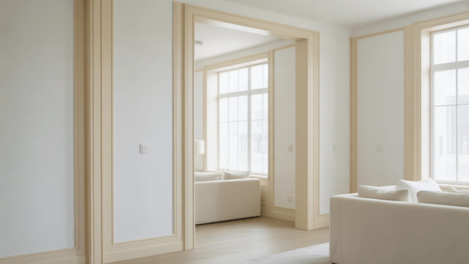
Those white walls with white trim seem foolproof, but the space feels flat. The issue isn’t the colors but the invisible rules about undertones, sheen, lighting, and flow that most advice ignores.
This isn’t about following trends or mimicking Pinterest boards.
It’s about understanding why certain pairings amplify architecture while others erase it, and how to make intentional choices that transform rooms instead of just covering walls.
The Quick Science of Wall and Trim Pairings
Understanding wall and trim color combinations doesn’t require a design degree, just a few practical truths.
Contrast acts like volume control for architecture: high contrast makes trim pop and adds dimension, while low contrast (think white walls with white trim) creates seamless, airy flow.
Here’s the trick most overlook: finish creates contrast, too. Semi-gloss trim paired with matte walls distinguishes boundaries even when using identical colors.
Lighting changes everything. Cool whites can feel sterile under evening bulbs, warm whites might read yellow in bright daylight.
Room size matters: generous spaces handle bold contrasts beautifully, while compact or dimly lit rooms benefit from monochromatic schemes that expand visual space.
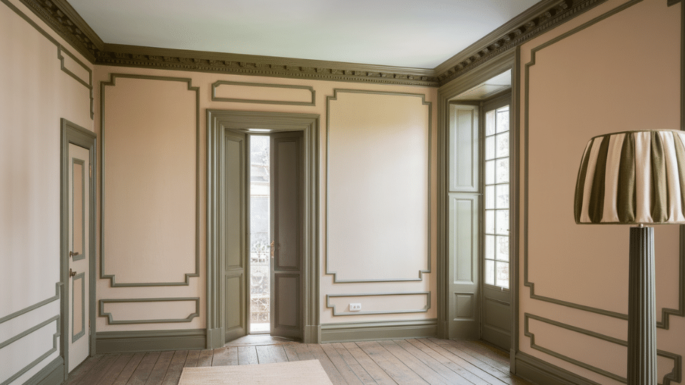
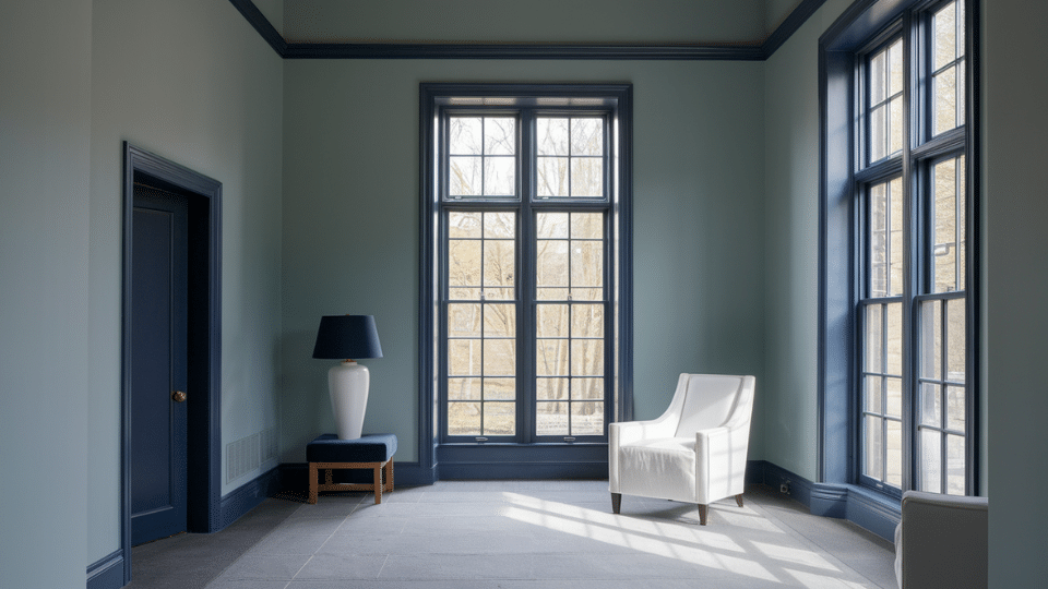
Bold Dark Trim Color Schemes
Dark trim creates strong architectural definition and instantly changes a room’s personality. These pairings suit readers who want their trim to stand out, add depth, and frame spaces beautifully.
1. Soft Warm White Walls with True Black Trim
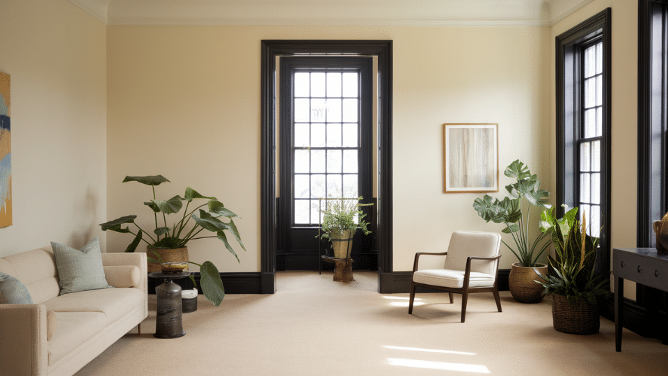
A classic high-contrast pairing that feels crisp and architectural. Warm white softens harshness while black frames the room and highlights windows and doorways beautifully.
- Best for: Medium or large rooms, vintage or modern homes
- Why it works: Warm walls prevent black trim from feeling too stark
- Pair with: Natural wood, matte black hardware, textured fabrics
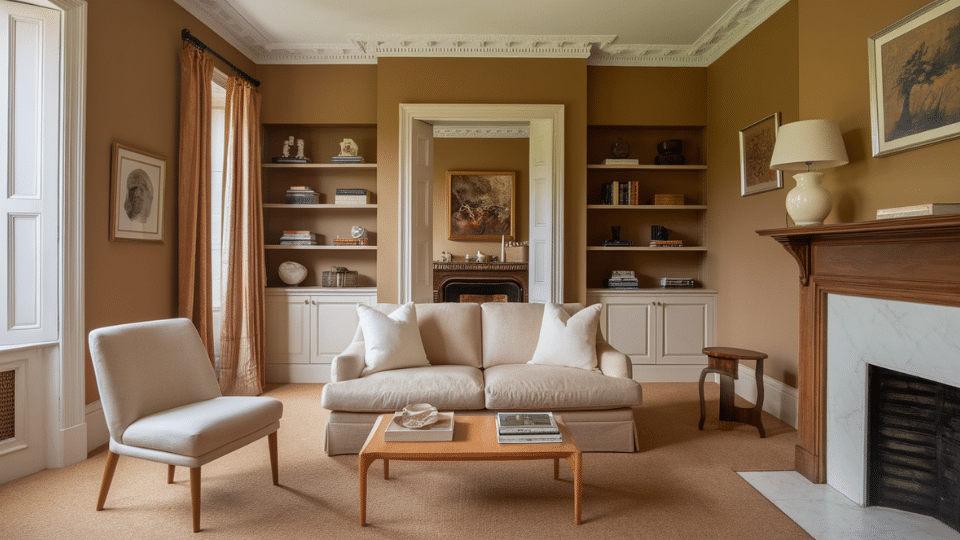
2. Creamy Beige Walls and Deep Espresso Trim
A rich, inviting combination that replaces stark black with warm depth. Espresso trim adds sophistication and pairs well with warm flooring and cozy decor styles.
- Best for: Traditional homes, warm-light rooms
- Why it works: Espresso echoes natural wood tones for cohesive warmth
- Pair with: Tan rugs, brass accents, warm woods
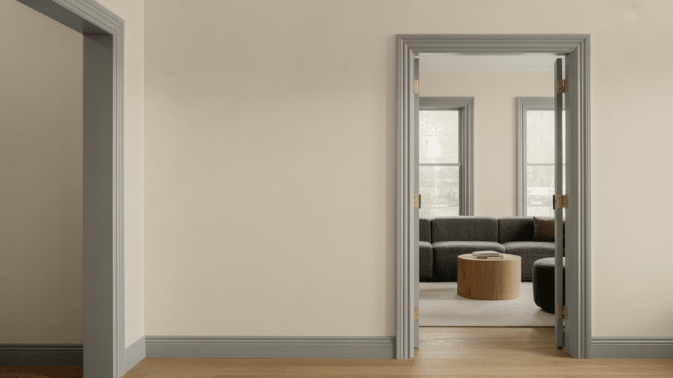
3. Light Greige Walls Paired with Charcoal Trim
A softer dark-trim alternative that feels grown-up and calm. Charcoal defines architecture without overwhelming the room, creating a modern, understated sense of contrast.
- Best for: Minimalist or transitional interiors
- Why it works: Greige and charcoal share neutral undertones
- Pair with: Black fixtures, gray textiles, neutral art
4. Pale Putty Walls with Deep Olive Trim
Earthy yet graceful, this pairing gives quiet drama. Deep olive adds character without harshness, working well in moody spaces or rooms with natural textures and warm materials.
- Best for: Studies, reading rooms, design-forward homes
- Why it works: Olive adds depth while remaining grounded and natural
- Pair with: Leather, linen, natural stone
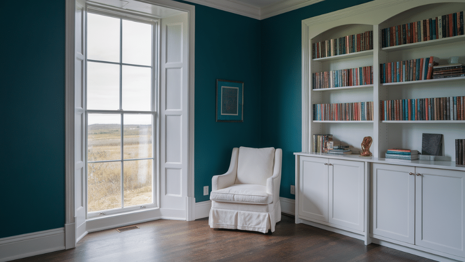
5. Misty Blue-Gray Walls paired with Navy Trim
A layered cool-toned combination that feels serene and coastal. Navy trim deepens the palette without feeling heavy, especially in well-lit rooms or spaces with warm flooring.
- Best for: Bedrooms or offices needing calm
- Why it works: Cool colors stack harmoniously and feel intentional
- Pair with: Light woods, silver metals, soft blues
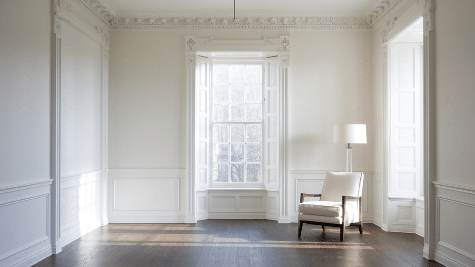
Clean White on White Pairings
White on white can look effortless or flat, depending on undertones, lighting, and sheen. These combinations keep spaces bright, cohesive, and layered instead of sterile or washed out.
6. Pure Bright White Walls and Same White Trim
This seamless pairing works when you rely on sheen differences instead of color contrast. Matte walls and semi-gloss trim create subtle depth within a clean, unified palette.
- Best for: Small rooms, low-light spaces, minimalist homes
- Why it works: Different finishes add dimension without changing color
- Pair with: Light woods, woven textures, soft neutral fabrics
7. Warm White Walls with Crisp Neutral White Trim
Warm walls soften the space while neutral white trim adds clarity. This subtle contrast helps large rooms feel structured and prevents an all-white palette from looking overly creamy.
- Best for: Open floor plans, warm climates
- Why it works: Balances warm and neutral undertones for stability
- Pair with: Oak floors, natural fabrics, black accents
8. Cool White Walls with Soft Cream Trim
A gentle warm-cool mix that creates lift and contrast. Cream trim takes the edge off cool whites in bright rooms, keeping the palette inviting instead of sharp or blue.
- Best for: Sunny rooms, contemporary homes
- Why it works: Cream trim warms up the reflective quality of cool walls
- Pair with: Beige textiles, warm woods, brass details
9. Off-White Walls with Gray-White Trim
Subtle but intentional, this pairing adds a quiet definition to otherwise soft walls. Gray-white trim keeps the space feeling structured without introducing harsh lines or stark contrast.
- Best for: Transitional interiors, mixed wood tones
- Why it works: Gray undertones add refinement without heaviness
- Pair with: Soft grays, muted blues, natural oak
10. Soft Ivory Walls paired with Bone-White Trim
A warm, comforting pairing that still feels polished. Ivory creates a welcoming backdrop, while bone-white trim offers a gentle highlight perfect for traditional or mid-century inspired rooms.
- Best for: Bedrooms, living rooms, warm lighting
- Why it works: Warm whites complement each other without clashing
- Pair with: Walnut furniture, warm metal finishes, textured fabrics
Soft Contrast and Low Contrast Combinations
Soft contrast is ideal for homes that need harmony instead of strong graphic lines. These combinations use gentle shifts in tone to create depth without visual tension or sharp edges.
11. Greige Walls with Soft Beige Trim
A calm and cohesive pairing that blends warm and cool undertones. Soft beige trim warms up greige walls, creating a neutral envelope that feels balanced and comfortable throughout the day.
- Best for: Versatile family spaces, rentals, mixed lighting
- Why it works: Undertones align without matching too closely
- Pair with: Beige rugs, warm woods, soft gray accents
12. Pale Sage Walls with Creamy Off-White Trim
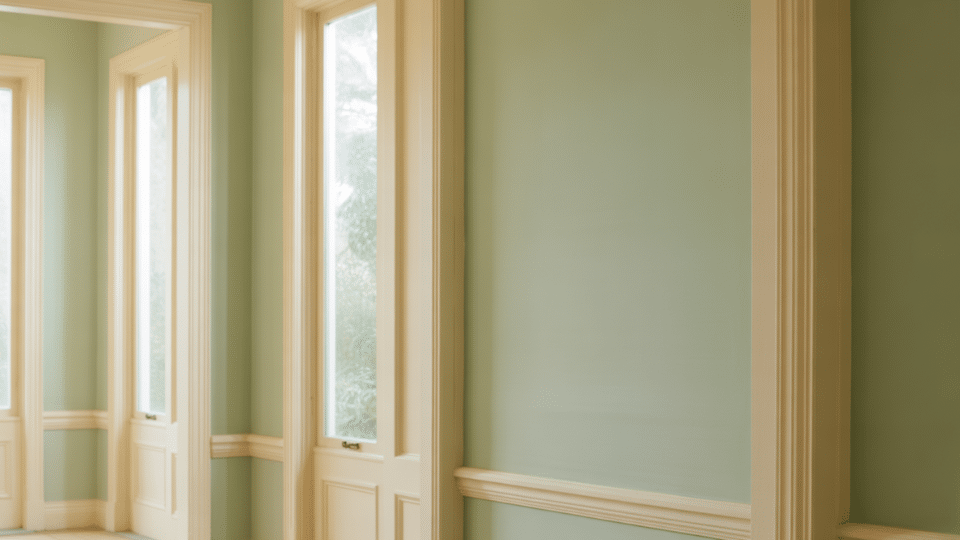
This biophilic-inspired pairing feels peaceful without leaning trendy. The soft cream trim gently outlines sage walls, offering just enough definition to keep the room feeling light and natural.
- Best for: Bedrooms, kitchens, calm spaces
- Why it works: Cream amplifies sage’s warmth and earthiness
- Pair with: Woven baskets, oak decor, matte black accents
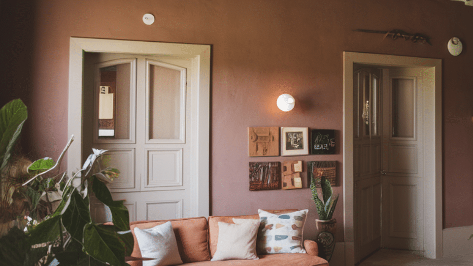
13. Dusty Rose Walls Paired with Mushroom Taupe Trim
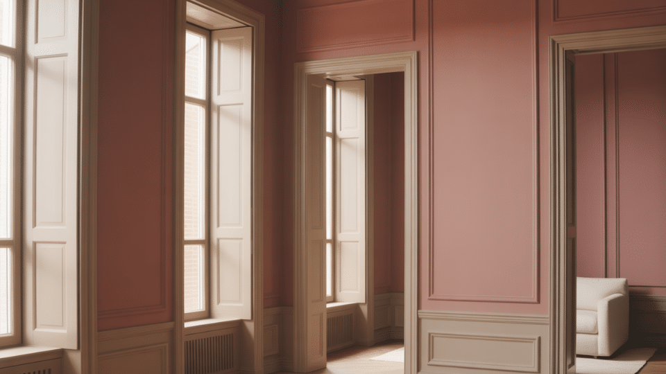
A warm and modern mix that avoids overly sweet tones. Taupe trim grounds dusty rose, creating a mature and cozy palette perfect for intimate rooms and personal spaces.
- Best for: Bedrooms, nurseries, reading corners
- Why it works: Muted taupe balances rosy warmth
- Pair with: Warm woods, gold accents, neutral textiles
14. Light French Gray Walls Paired with Warm Gray Trim
A monochrome palette that feels refined and airy. Warm gray trim adds depth without breaking the color flow, ideal for minimalist homes that still want quiet style.
- Best for: Modern apartments, clean-lined interiors
- Why it works: Warm gray keeps cool gray from feeling cold
- Pair with: Stone textures, black metals, soft white fabrics
15. Pale Sand Walls with Light Latte Trim
A gentle and welcoming combination reminiscent of coastal neutrals. Light latte trim enhances the warmth of pale sand without overpowering it, creating a laid-back but polished aesthetic.
- Best for: Living rooms, dining rooms, relaxed interiors
- Why it works: Natural warm tones complement each other effortlessly
- Pair with: Linen upholstery, rattan details, warm metals
Colorful Wall and Trim Pairings
Color-forward rooms work best when the trim balances saturation rather than competes with it. These combinations offer depth, personality, and livability while avoiding the harsh mismatches common with bright colors.
16. Muted Terracotta Walls with Cream Trim
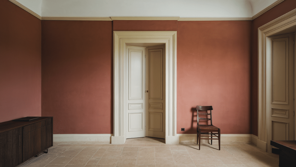
A warm, inviting palette that feels grounded and timeless. Cream trim lightens terracotta’s richness, preventing heaviness and creating a softly glowing space perfect for cozy or Mediterranean-inspired interiors.
- Best for: Living rooms, dining rooms, warm-light spaces
- Why it works: Cream softens terracotta without dulling its warmth
- Pair with: Textured rugs, brass accents, warm woods
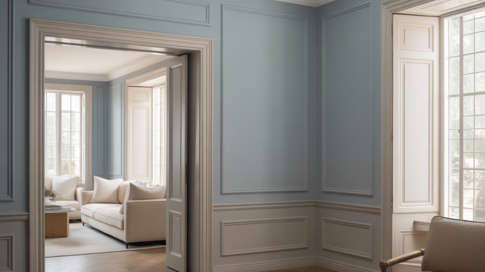
17. Dusty Blue Walls Paired with Soft Gray Trim
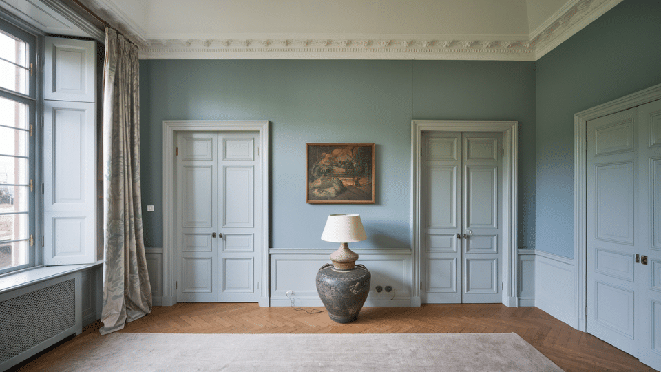
A serene, airy combination that offers subtle contrast without sharp edges. Soft gray trim adds a calming frame, making dusty blue feel sophisticated rather than juvenile or overly coastal.
- Best for: Bedrooms, offices, calm environments
- Why it works: Gray trim echoes blue undertones for harmony
- Pair with: Light wood, silver metals, white bedding
18. Moody Teal Walls and Bright White Trim
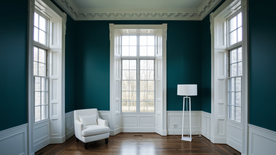
A bold, artsy pairing for dramatic spaces. Bright white trim refreshes the depth of teal, creating crisp lines that elevate architectural details without overwhelming the room’s visual balance.
- Best for: Feature walls, dining rooms, high-ceiling spaces
- Why it works: White creates clarity against deep saturated teal
- Pair with: Brass lighting, deep woods, patterned textiles
19. Soft Blush Walls with Clean White Trim
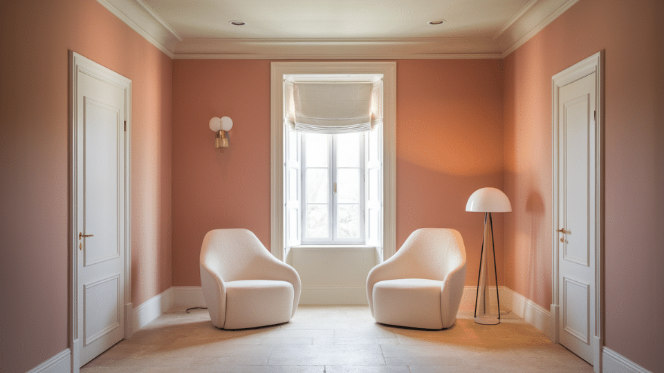
A gentle, upbeat pairing that feels chic and modern. Clean white trim prevents blush walls from leaning too pink, making the palette fresh, neutral-leaning, and easy to style.
- Best for: Bedrooms, nurseries, home offices
- Why it works: White cools blush just enough for balance
- Pair with: Light woods, gold accents, soft fabrics
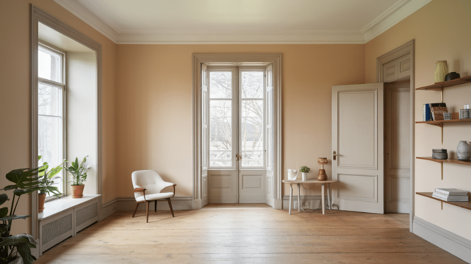
20. Muted Mustard Walls Paired with Warm White Trim
A heritage-inspired combination that feels rich yet modern. Warm white trim steadies mustard’s boldness, adding lift and preventing the walls from appearing too vintage or overpowering in smaller rooms.
- Best for: Accent rooms, eclectic homes, sunny spaces
- Why it works: Warm white harmonizes with mustard’s golden tones
- Pair with: Dark woods, black accents, warm textiles
21. Forest Green Walls and Greige Trim
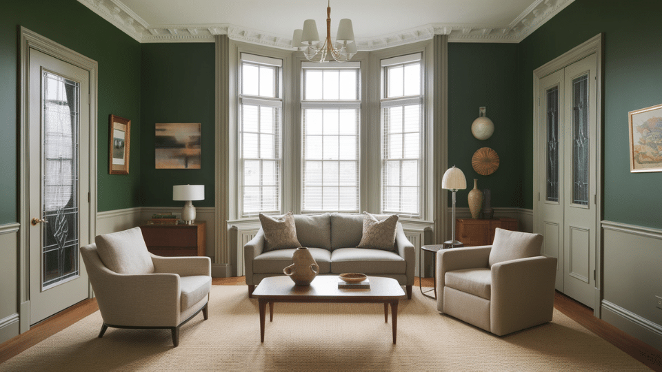
A deep, luxurious palette ideal for moody spaces. Greige trim grounds forest green’s intensity and adds an earthy softness that feels upscale and layered rather than monochromatic or heavy.
- Best for: Libraries, dens, dramatic dining rooms
- Why it works: Greige adds gentle warmth without competing with green
- Pair with: Leather accents, dark woods, brass hardware
22. Lavender Gray Walls Paired with Stone Taupe Trim
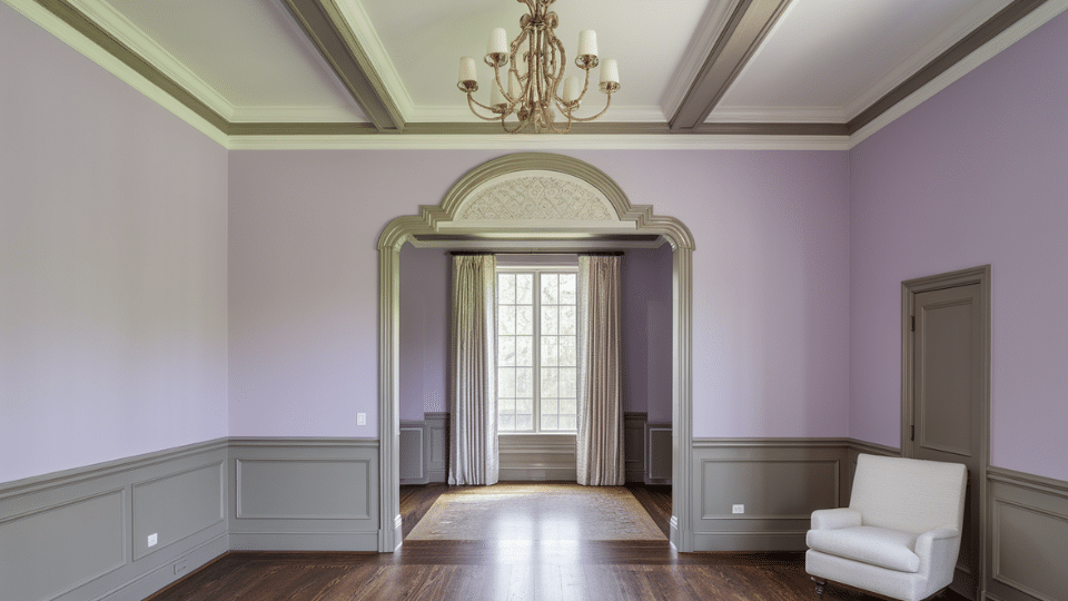
A soft, elegant mix that reads mature and refined. Stone taupe trim neutralizes lavender’s coolness, creating an elevated palette suitable for serene bedrooms or romantic, soft-lit spaces.
- Best for: Bedrooms, boutique-style interiors
- Why it works: Taupe tempers lavender’s cool floral undertones
- Pair with: Soft whites, brushed nickel, muted florals
Designer Midtone and Boutique Pairings
These combinations draw from boutique hotels and designer studios, using midtone colors that feel curated rather than bold. They balance saturation with softness, creating polished, layered, high-end looking spaces.
23. Charcoal Blue Walls with Soft White Trim
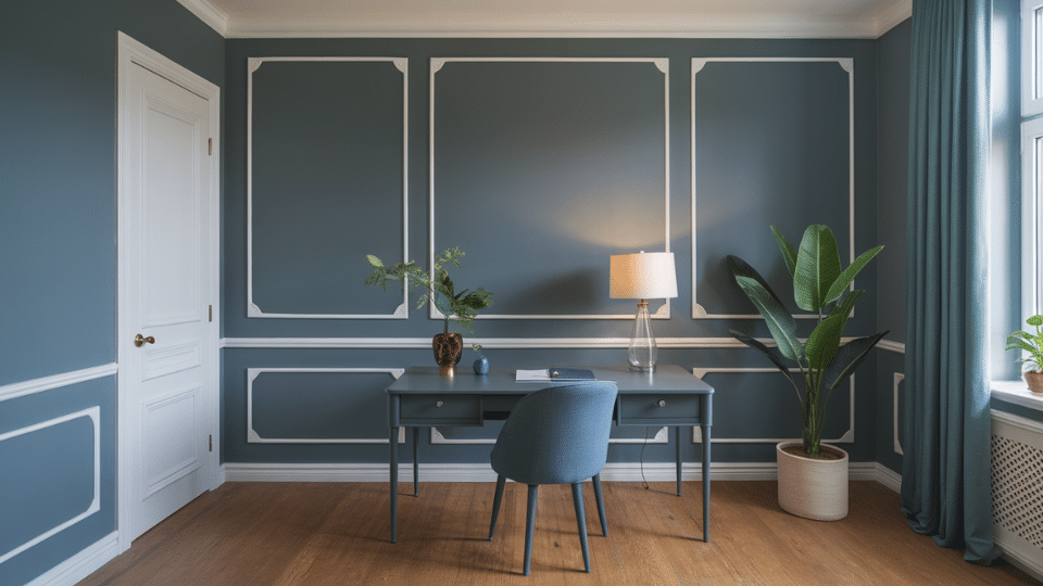
A dramatic yet calming palette that avoids the heaviness of navy. Soft white trim brightens charcoal blue, adding clarity without breaking the rich, moody atmosphere of the room.
- Best for: Bedrooms, studies, modern homes
- Why it works: Soft white lifts deep blue without harsh contrast
- Pair with: Walnut furniture, brass lighting, textured fabrics
24. Warm Clay Walls and Light Taupe Trim
A grounded, earthy combination with subtle sophistication. Light taupe trim complements clay’s warmth, offering definition without stark edges and creating a soft, inviting palette suitable for modern rustic interiors.
- Best for: Living rooms, hallways, warm-toned homes
- Why it works: Taupe gently outlines clay’s warm midtone depth
- Pair with: Woven textiles, natural woods, matte black accents
25. Muted Plum Walls paired with Mushroom Gray Trim
A rich, boutique-inspired pairing that feels intentional and elegant. Mushroom gray trim neutralizes plum’s intensity, creating a moody yet refined palette perfect for dramatic or softly lit rooms.
- Best for: Dining rooms, guest rooms, statement spaces
- Why it works: Gray undertones stabilize plum’s deep color
- Pair with: Velvet textures, dark woods, metallic accents
Interior Paint Tips for Coordinating Walls and Trim
Most color combinations fail on overlooked basics, not bold choices. Here’s what actually moves the needle in real spaces:
- Match undertones religiously: Warm walls need warm trim; cool walls need cool trim. Mixing them only works when intentional, not accidental.
- Sheen creates contrast: Matte walls with semi-gloss trim generate dimension even in identical colors. This trick makes white walls with white trim feel layered, not flat.
- Decide trim’s role early: Want modern simplicity? Low contrast. Crave architectural character? High contrast.
- Room realities matter: Small or dim spaces struggle with a dark trim color scheme. Bright, spacious rooms risk looking washed out with monochromatic pairings.
Natural light dictates everything, test samples on opposite walls, and check morning versus evening. What looks crisp at noon might feel sterile at dusk.
The Bottom Line
The difference between forgettable paint jobs and spaces that feel intentionally designed comes down to deliberate choices, not bigger budgets.
Committing to a dramatic dark trim color scheme or refining white walls with white trim through strategic sheen, every decision either amplifies or erases architectural character.
Small rooms gain breathing room through thoughtful contrast. Bright spaces avoid sterility with warm undertones. The real skill isn’t picking trendy colors; it’s understanding how light, finish, and scale interact in specific spaces.
Walk through the room at different times of day and trust what feels right, not what looks good on a screen.


