


When I first tried Sherwin-Williams Alabaster, I loved its soft, creamy warmth, but finding the right colors to match it wasn’t easy.
Some shades made it look too yellow, while others felt too flat. If you’ve ever faced the same challenge, you know how tricky it can be to create balance.
That’s why I decided to break down the best SW Alabaster coordinating colors that truly work. In this post, I’ll share how lighting changes its look, which shades pair beautifully, and how you can use them in different rooms.
By the end, you’ll know exactly how to build color combinations that make Alabaster feel calm, bright, and effortless in your home.
Sherwin-Williams Alabaster SW 7008 is a warm off-white paint with an LRV of 82 and soft creamy undertones. It pairs best with warm neutrals, muted greens, and darker contrast colors like Urbane Bronze to create a balanced and cohesive look.
What Makes Sherwin-Williams Alabaster Unique
Sherwin-Williams Alabaster (SW 7008) as a color consultant working with neutral palettes in real homes, I’ve seen how Alabaster shifts under different lighting and why the right coordinating colors make or break the final look.
Alabaster Quick Facts
- LRV: 82
- HEX: #EDEAE0
- RGB: 237, 234, 224
- Undertones: Warm, creamy, slight yellow-beige
- Color Type: Warm off-white
- Best Rooms: Living rooms, bedrooms, kitchens, exteriors
Alabaster falls in the middle of the warm-white spectrum. It’s light and cozy without leaning too yellow, making it a favorite for both modern and classic interiors.
The color reflects light beautifully, giving rooms a calm and welcoming look that fits both day and evening settings.
Design Tip: Alabaster pairs especially well with natural textures like wood, linen, or rattan for a balanced, cozy finish.
Understanding SW Alabaster Coordinating Colors

Choosing the right SW Alabaster coordinating colors starts with understanding how undertones, contrast, and lighting affect the way this shade looks in your space.
Undertones
Alabaster has a warm, creamy base with subtle yellow and beige notes. These undertones give it a soft glow that works beautifully with colors that share a warm foundation.
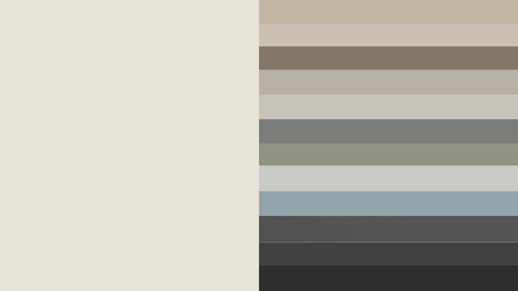
- Best pairings: Accessible Beige (SW 7036, LRV 58), Neutral Ground (SW 7568, LRV 70), Sea Salt (SW 6204, LRV 63), and Sherwin-Williams Natural Choice for a softer warm-white option.
- Avoid icy or overly cool tones that can make Alabaster look muted or dull.
Contrast
Contrast is key to making Alabaster stand out while maintaining balance. Pair it with mid-tone neutrals or deep accent shades to create dimension.
- Medium contrast: Repose Gray (SW 7015), Mindful Gray (SW 7016).
- High contrast: Urbane Bronze (SW 7048), Tricorn Black (SW 6258) for a striking, modern edge.
3. Lighting
Lighting plays a big role in how coordinating colors interact with Alabaster.
- In bright natural light, Alabaster feels lighter and creamier.
- In cool or artificial light, it can appear slightly whiter and more neutral.
Tip: Always test samples under your room’s actual lighting before painting large areas.
A simple color chart showing warm, cool, and neutral options can help you visualize how each shade complements Alabaster. This makes it easier to build a balanced palette that feels cohesive in every light.
Best Alabaster Color Combinations for Interiors
When planning your home design, Alabaster color combinations can completely change the mood of each room. Here’s how to make them work beautifully indoors.
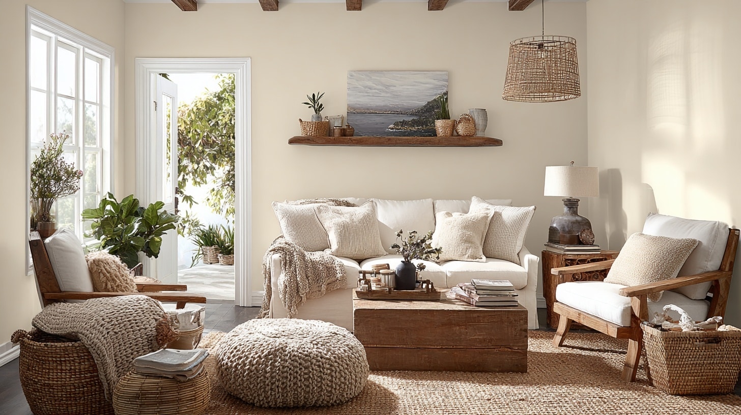
1. Warm Neutrals That Create a Cozy Feel
Warm neutrals like Accessible Beige SW 7036, Shiitake SW 9173, and Warm Stone SW 7032, and Sherwin-Williams Alpaca blend easily with Alabaster’s soft undertones.
Great for: Bedrooms and living rooms
Why it works: Beige and taupe tones bring out Alabaster’s creamy warmth, making the room feel inviting without leaning too yellow. These subtle hues create harmony while keeping your space light and soothing. When used on walls or furniture, they build an atmosphere that feels restful and lived-in.
Style tip: Add depth with warm wood furniture, woven baskets, or brass lighting. Try layering soft textiles like linen or wool to emphasize coziness. This mix works beautifully in traditional, farmhouse, or transitional interiors.
2. Cool Grays for Modern Homes
Pair Alabaster with cool grays like Repose Gray (SW 7015, LRV 58), Mindful Gray (SW 7016, LRV 48), or Cityscape SW 7067 for a clean, contemporary look.
Great for: Kitchens, offices, and hallways
Why it works: Cool grays create contrast against Alabaster’s creamy base, highlighting its subtle softness while keeping the room sleek and structured. This pairing balances warmth and freshness, ideal for bright, naturally lit areas. It feels crisp but not harsh, creating a sense of modern calm.
Style tip: Use matte black hardware, stainless-steel fixtures, or glass details to sharpen the edges. Try mixing in white oak or light concrete finishes to add natural texture. This color scheme is perfect for minimalist or Scandinavian-inspired interiors that value simplicity.
3. Nature-Inspired Greens and Blues
Soft shades like Sea Salt (SW 6204, LRV 63), Evergreen Fog (SW 9130, LRV 30), and Meditative (SW 6227, LRV 44) add an earthy, balanced tone to Alabaster’s brightness.
Great for: Coastal, boho, or spa-style spaces
Why it works: These hues mimic the tranquility of nature, softening Alabaster’s clean white while introducing gentle color variation. The blend feels fresh and peaceful, ideal for spaces meant to relax or recharge. Green and blue tones enhance natural light and keep rooms feeling airy and open.
Style tip: Pair with organic textures like jute rugs, rattan chairs, or linen curtains to bring out the natural feel. Add greenery or botanical prints for subtle contrast. This combination creates a calm retreat that feels timeless and easy to live with.
4. Bold Accents for Statement Looks
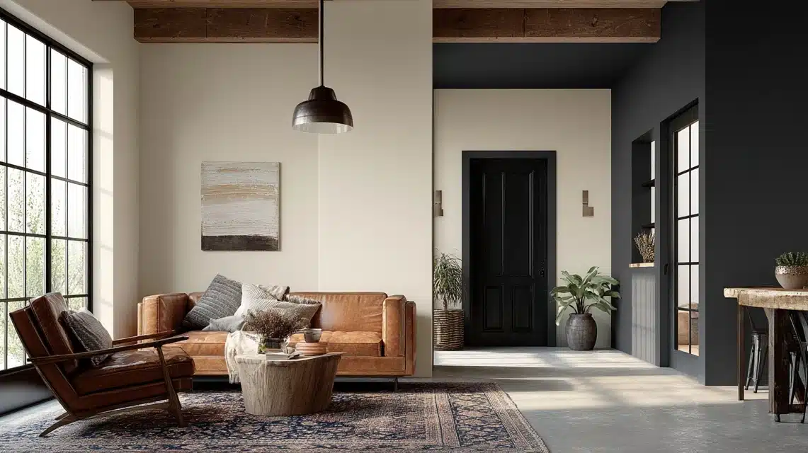
For contrast and drama, pair Alabaster with bold shades like Tricorn Black SW 6258, Iron Ore SW 7069, or Peppercorn SW 7674.
Great for: Doors, trim, and built-in cabinetry
Why it works: Dark accents highlight Alabaster’s brightness, giving your home an elegant yet grounded look. The contrast defines architecture, draws attention to clean lines, and adds a sense of structure. It’s a classic pairing that looks confident without overwhelming the space.
Style tip: Keep the bold colors limited to one or two focal points, like interior doors or window trim, and balance them with neutral furniture and warm lighting. Add textures like matte metal, dark wood, or leather for sophistication. This look shines in modern, industrial, and transitional homes.
SW Alabaster Coordinating Colors by Room Type
Here’s how SW Alabaster coordinating colors can upgrade different areas of your home while keeping the look consistent and balanced.
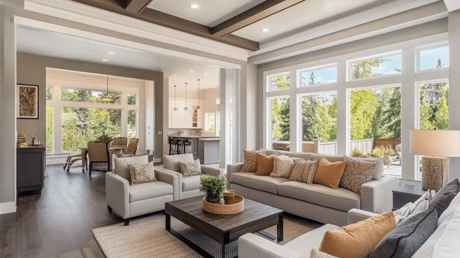
1. Living Room
Create a cozy and welcoming space by pairing Alabaster with warm neutrals and earthy browns. This mix brings comfort and depth without feeling heavy.
Best Coordinating Colors
- Accessible Beige (SW 7036)
- Warm Stone (SW 7032)
- Dakota Wheat (SW 9023)
- Urbane Bronze (SW 7048) or Iron Ore (SW 7069) for contrast
Design Tip: Add wood, leather, and linen textures to improve warmth. These colors and materials make the space relaxed and natural while keeping Alabaster’s soft glow.
Style It Like This
Paint the walls in Alabaster and use Accessible Beige on accent furniture or shelving. Add a jute rug, woven baskets, and bronze lighting fixtures for layered texture.
If your living room has large windows, let in natural light to emphasize Alabaster’s creamy tone during the day and its cozy glow at night. Include greenery or houseplants to bring life to the neutral palette
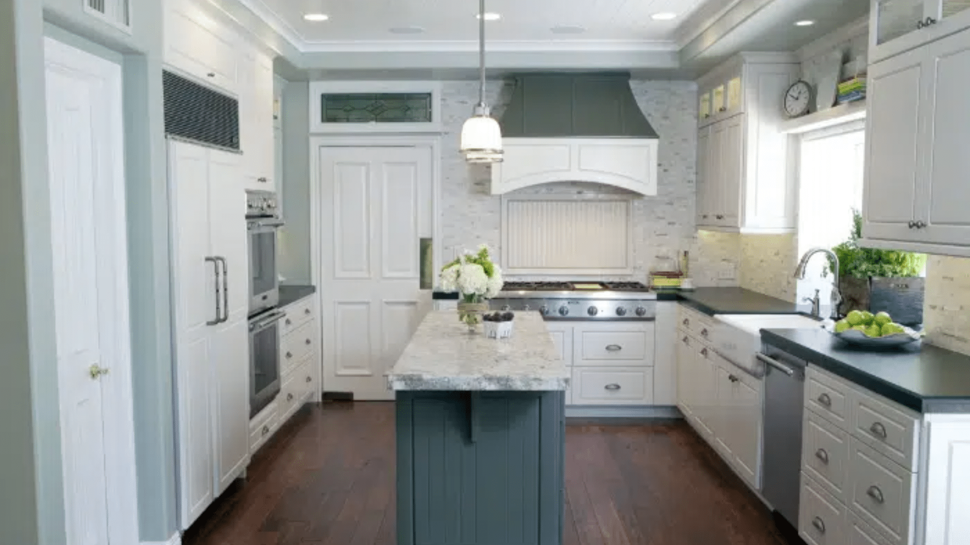
2. Kitchen
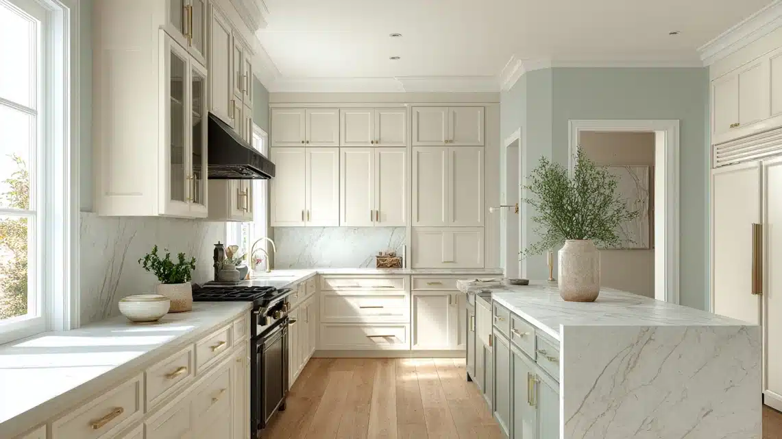
Alabaster cabinets bring a clean, bright look that still feels inviting. Pairing it with subtle contrast colors keeps the kitchen fresh and balanced.
Best Coordinating Colors
- Sea Salt (SW 6204)
- Repose Gray (SW 7015)
- Tricorn Black (SW 6258) for hardware or accent trim
Design Tip: Combine light wood floors with brass or matte black fixtures to create a modern yet comfortable kitchen. The Alabaster base helps the space stay airy and timeless.
Style It Like This
Use Alabaster for upper cabinets and Repose Gray for lower ones to add visual balance. Pair this with marble or quartz countertops in a soft gray or beige tone.
Add open wooden shelving for warmth and brass handles for a touch of sophistication. Under-cabinet lighting enhances Alabaster’s soft reflection, keeping your kitchen bright without feeling sterile.
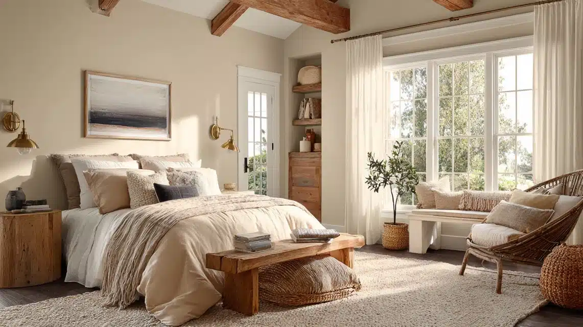
3. Bedroom
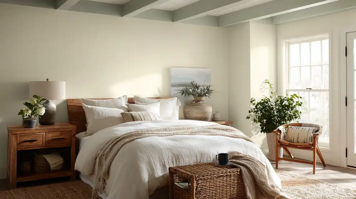
Alabaster works beautifully in bedrooms and pairs well with best bedroom paint colors that focus on calm and comfort.
Best Coordinating Colors
- Meditative (SW 6227)
- Evergreen Fog (SW 9130)
- Neutral Ground (SW 7568) for soft balance
Design Tip: Use these colors for feature walls, bedding, or accessories. Layer fabrics like cotton, linen, or wool to keep the room restful and soothing.
Style It Like This
Paint walls in Alabaster and the ceiling in Neutral Ground for subtle contrast. Use Evergreen Fog on your nightstands or dresser for a relaxing accent.
Add neutral linen bedding, a soft throw blanket, and warm bedside lighting for evening coziness. For an extra layer of depth, use woven textures and matte finishes that reflect soft light instead of glare.
4. Exterior
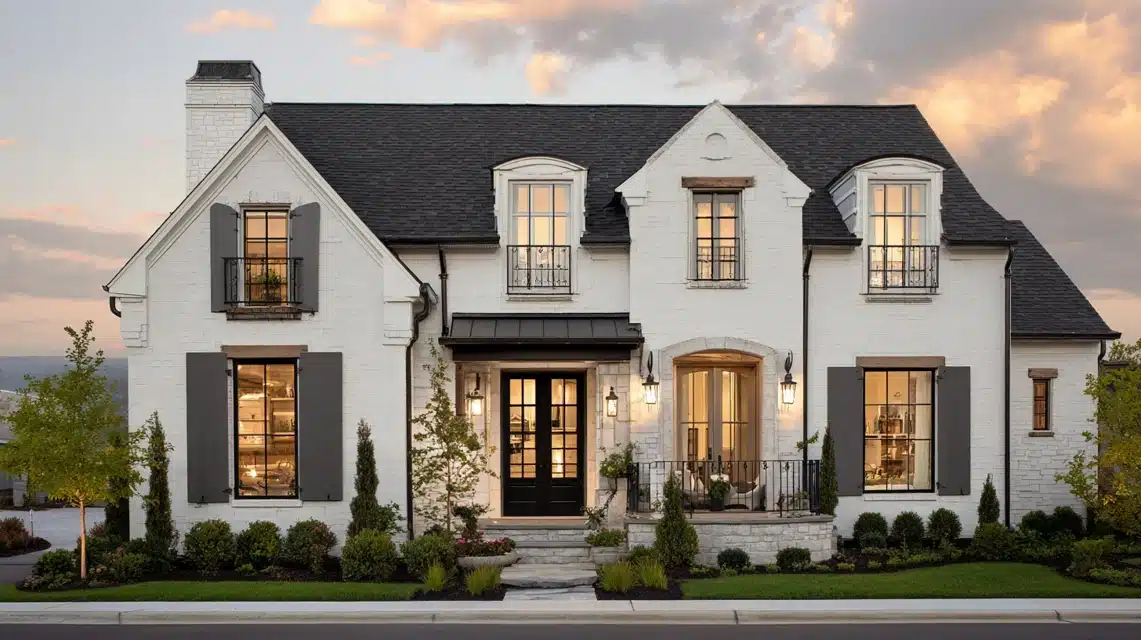
Alabaster is just as striking outdoors. It brings brightness and warmth without being stark, making it ideal for classic or modern homes.
Best Coordinating Colors
- Iron Ore (SW 7069) for shutters or doors
- Pure White (SW 7005) for trim and fascia
- Urbane Bronze (SW 7048) for accent details
Design Tip: Add black or bronze lighting and hardware to highlight architectural lines. The soft contrast between Alabaster and darker tones gives your exterior lasting curb appeal.
Style It Like This
Use Alabaster as your main exterior color, Pure White for window trims, and Iron Ore or Urbane Bronze for doors, shutters, or railings. Pair with natural stone accents or wood beams to add texture.
For a classic farmhouse look, include black-framed windows. If you want a coastal vibe, choose light tan or soft blue planters to complement the warm base of Alabaster. Finish with warm outdoor lighting that improves the creamy tone in the evening.
Trim, Ceiling, and Door Color Pairings
Choosing the right wall and trim color combinations helps SW Alabaster coordinate colors to look balanced and finished.
For trim, Pure White, High Reflective White, and Extra White are top picks. These shades add crisp contrast against Alabaster’s warm base without overpowering it. Using slightly cooler whites keeps the look clean and defined.
White-on-white layering works because of subtle tone differences. Alabaster’s creamy warmth softens the brightness of cooler whites, creating depth instead of flatness.
For ceilings, stick to lighter whites to reflect more light and keep rooms open.
Tip: Use a satin or semi-gloss finish for trim and doors, and a flat finish for walls to maintain consistency and visual flow throughout your space, similar to how flat vs satin paint differs in finish and appearance.
How Lighting Affects Alabaster and Its Coordinating Colors
Lighting can completely change how Alabaster and its coordinating colors look in your space. Understanding these changes helps you choose the right palette for each room.
- Warm Lighting: In rooms with warm bulbs or sunlight during golden hours, Alabaster appears creamier and softer. Its warm undertones become more visible, giving walls a cozy and inviting look. Pair it with cool grays or greens to balance the warmth.
- Cool Lighting: Under cooler bulbs or LED lights, Alabaster takes on a cleaner and slightly brighter tone. The warmth fades, making it feel closer to a soft white. It works well with warm neutrals or wood tones to maintain balance.
- North-Facing Rooms: These rooms get indirect light, which makes Alabaster appear cooler and slightly grayish. Use warmer coordinating colors like Accessible Beige or Dakota Wheat to keep the space from feeling dull.
- South-Facing Rooms: Strong sunlight in south-facing rooms brings out Alabaster’s warm glow. Pair it with cooler shades like Repose Gray or Sea Salt to tone down the intensity and keep the palette fresh.
Tip: Always test paint samples in your room’s natural and artificial light before finalizing your colors. It’s the best way to see how undertones shift throughout the day.
Comparing Alabaster With Similar Whites

Many homeowners compare SW Alabaster with other popular whites before choosing one. Here’s a quick look at how they differ.
| Color | Undertone | LRV | Best Use | Pros | Cons |
|---|---|---|---|---|---|
| Alabaster (SW 7008) | Warm, creamy white with soft undertone | 82 | Walls, trim, cabinets | Cozy feel, versatile, soft glow | It can look yellow in very warm light |
| White Dove (OC-17) | Slightly cooler with a gray undertone | 83 | Traditional or transitional interiors | Balanced tone, suits warm and cool palettes | Less warmth than Alabaster |
| Greek Villa (SW 7551) | Warm but lighter and softer than Alabaster | 84 | Bright, open interiors | Airy, works with earthy or coastal tones | May appear flat in low light |
| Pure White (SW 7005) | Neutral white with subtle warmth | 84 | Trim, ceilings, and doors | Clean, crisp, great contrast color | Can feel stark in shaded areas |
These comparisons help you decide which shade fits your lighting, decor, and desired mood best.
Mistakes to Avoid When Using Alabaster
Even though Alabaster is versatile, a few common mistakes can keep it from looking its best in your space.
- Pairing It With Too Cool Tones: Cool tones like icy grays or stark whites can clash with Alabaster’s warmth, making it appear dull or mismatched. Choose balanced neutrals or earthy shades instead.
- Ignoring Lighting Variation: Lighting changes Alabaster’s appearance throughout the day. Without testing samples in your space, it might look warmer or cooler than expected.
- Using the Wrong Finish or Sheen: Flat finishes can mute Alabaster’s glow, while overly glossy ones may highlight imperfections.
Satin or eggshell finishes work best for walls. You can also compare options like satin vs semi-gloss to get the right balance of durability and shine. - Overusing Bright White Trim: Too much bright white trim can overpower Alabaster’s softness. Use slightly warmer whites for a smoother, more natural transition.
Conclusion
Now that you’ve seen how flexible Sherwin-Williams Alabaster can be, you know why it’s such a favorite choice for many homes.
It’s warm without being too creamy, bright without feeling stark, and easy to match with so many shades. From cozy neutrals to bold accents, every pairing brings out a new side of this classic white.
I hope this guide helped you see how SW Alabaster coordinating colors can work in your own rooms.
Try a few sample combinations, watch how the light changes them, and find what feels best for your space. Which pairing do you think fits your home style the most? I’d love to hear what you choose.
Frequently Asked Questions
What colors go best with SW Alabaster?
SW Alabaster pairs best with warm neutrals like Accessible Beige, soft greens like Sea Salt, and darker accents like Urbane Bronze.
Is SW Alabaster warm or cool?
Alabaster is a warm off-white with creamy undertones. It can look more neutral under cooler lighting conditions.
What is the LRV of SW Alabaster?
The LRV of SW Alabaster is 82, which means it reflects a high amount of light and helps spaces feel bright and open.
What trim color goes with Alabaster?
Pure White SW 7005 and Extra White SW 7006 work best for trim. They create clean contrast without overpowering Alabaster.
Can Alabaster be used on cabinets?
Yes, Alabaster is a popular cabinet color. It gives a soft white finish that feels warm and timeless without looking too stark.


