


There’s a reason that haint blue paint has become such an unforgettable part of Southern homes; it’s more than just a color.
I’ve always been drawn to its soft, airy shade and the calm feeling it brings to porches and rooms. But what makes it truly special is the story behind it, one that connects history, belief, and design in a beautiful way.
In this blog, I’ll share the origins of haint blue, what it symbolizes, and why it still matters today.
You’ll also find ideas for choosing the right shade, styling it in your home, and understanding the deeper meaning behind the tradition.
By the end, you’ll see why haint blue isn’t just paint, it’s a piece of living history.
What is Haint Blue Paint and Where Did it Come From?
Haint blue is a soft, pale shade that sits between blue and green, most often seen on porch ceilings across the American South. It gives homes a calm, welcoming feel and carries a story that connects history, belief, and design.
The word “haint” comes from African folklore, referring to restless or wandering spirits. Enslaved Africans brought these beliefs to the South, where color became both a symbol of protection and a piece of living heritage.
The Gullah Geechee people, descendants of enslaved Africans along the Southeastern coast, were the first to introduce this tradition.
They used indigo dye from local plants to create the sky-like shade, believing it protected their homes from “haints,” or harmful spirits. Painting doors, shutters, and ceilings blue became both a spiritual shield and a form of cultural expression.
Over time, this practice spread across the South, blending faith, craftsmanship, and community. The light blue hue wasn’t just spiritual; homeowners also noticed it brightened shaded spaces and, according to some, helped deter insects.
Today, haint blue remains one of the South’s most enduring color traditions. Beyond folklore, it symbolizes peace, openness, and continuity, reflecting the region’s resilience and the lasting influence of African heritage in Southern design.
Symbolism and Meaning Behind Haint Blue Paint
Haint blue paint carries a deep sense of meaning that goes beyond its soft, calming color. Rooted in African and Southern folklore, it was believed to protect homes from spirits and bad energy.
Many thought the pale blue-green shade resembled water or the open sky, two elements that ghosts and restless spirits could not cross. This belief gave families comfort and a sense of safety within their homes.
Beyond superstition, haint blue also came to symbolize peace, harmony, and renewal. Its cool tone brings a feeling of open space, lightness, and serenity, making it a natural fit for porches and calm gathering areas.
Over time, it became more than just paint; it represented hope, spiritual balance, and connection to nature. Today, homeowners still use haint blue for its soothing energy and the timeless sense of protection it evokes.
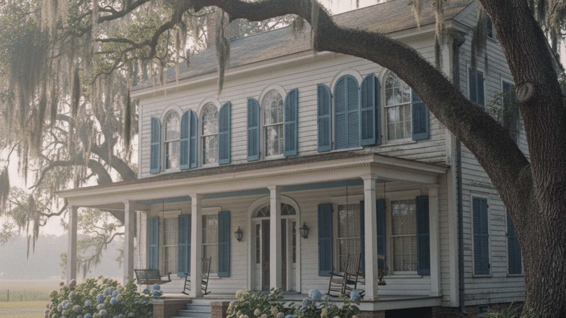
Haint Blue Paint in Southern Architecture and Cultural Preservation
Haint blue paint holds a lasting place in Southern architecture, blending cultural heritage with timeless design.
Historically, this soft blue appeared on porch ceilings, shutters, and doors throughout states like South Carolina, Georgia, and Louisiana.
Many of these early homes were influenced by the Gullah Geechee community, whose craftsmanship and beliefs shaped regional design traditions.
Builders and homeowners across the South adopted the color not only for its folklore but also for its bright, airy quality that kept porches feeling open and welcoming.
Today, haint blue is recognized by preservation experts as a defining feature of historic Southern homes. It’s often included in restoration projects and heritage districts where maintaining authentic colors helps tell the story of local history.
Across the South, preservationists and cultural organizations continue to honor this legacy. They restore historic homes with authentic blue ceilings and shutters, while modern designers create updated shades inspired by traditional pigments.
These efforts ensure haint blue remains more than a decorative trend; it stands as a living tribute to African heritage, Southern craftsmanship, and the enduring belief that color can hold deep cultural meaning.
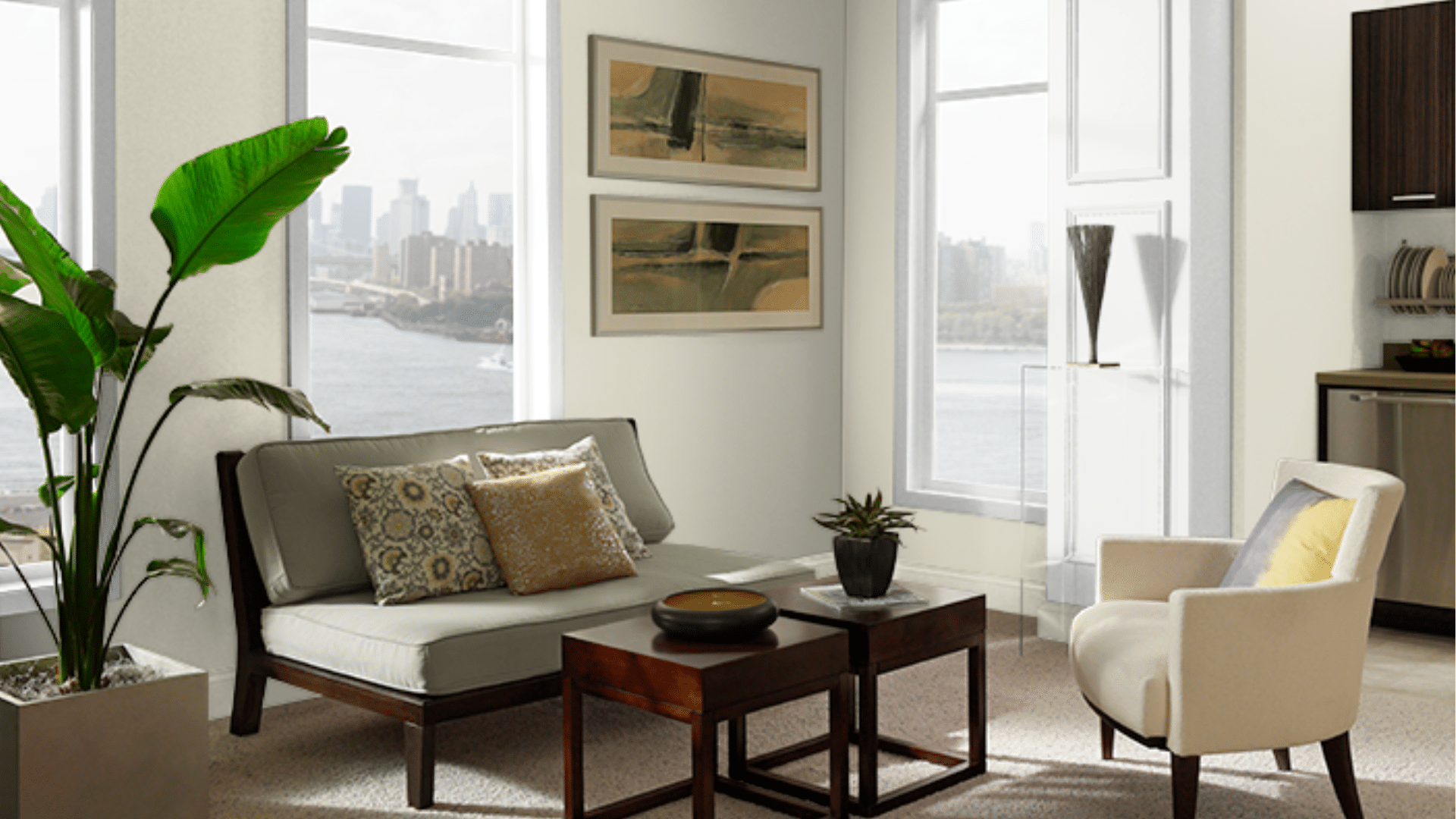
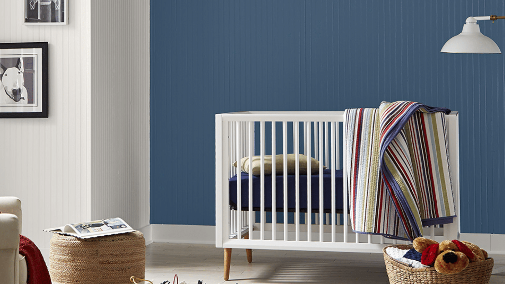
Where to Use Haint Blue in Home Design
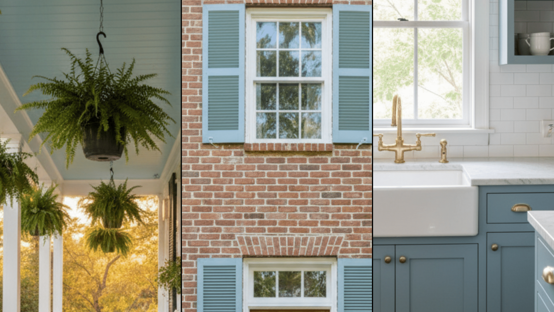
Haint blue isn’t just for porches anymore. You can use this soothing color throughout your home, indoors and outdoors, to bring calm, light, and timeless Southern character to any space.
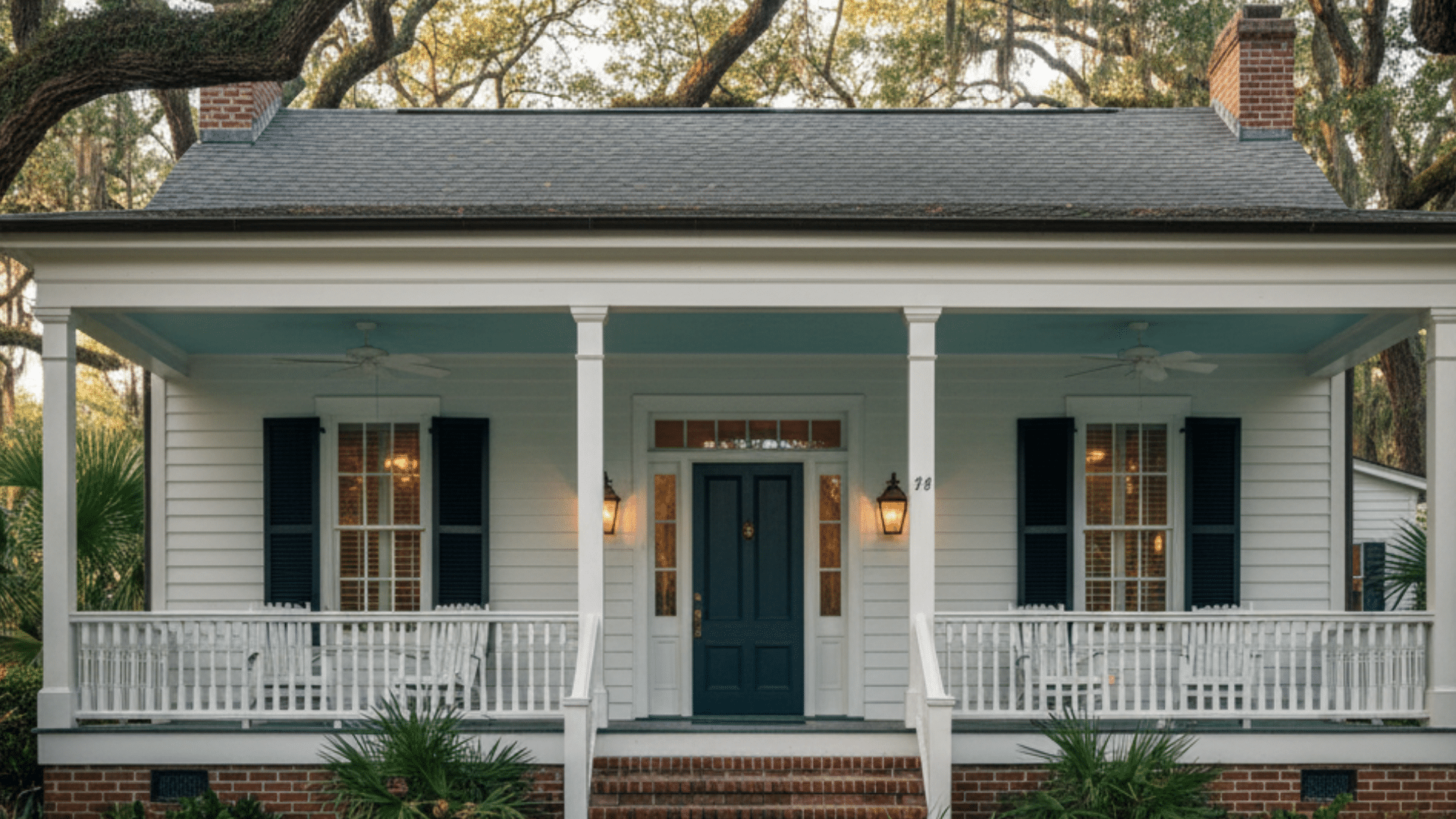
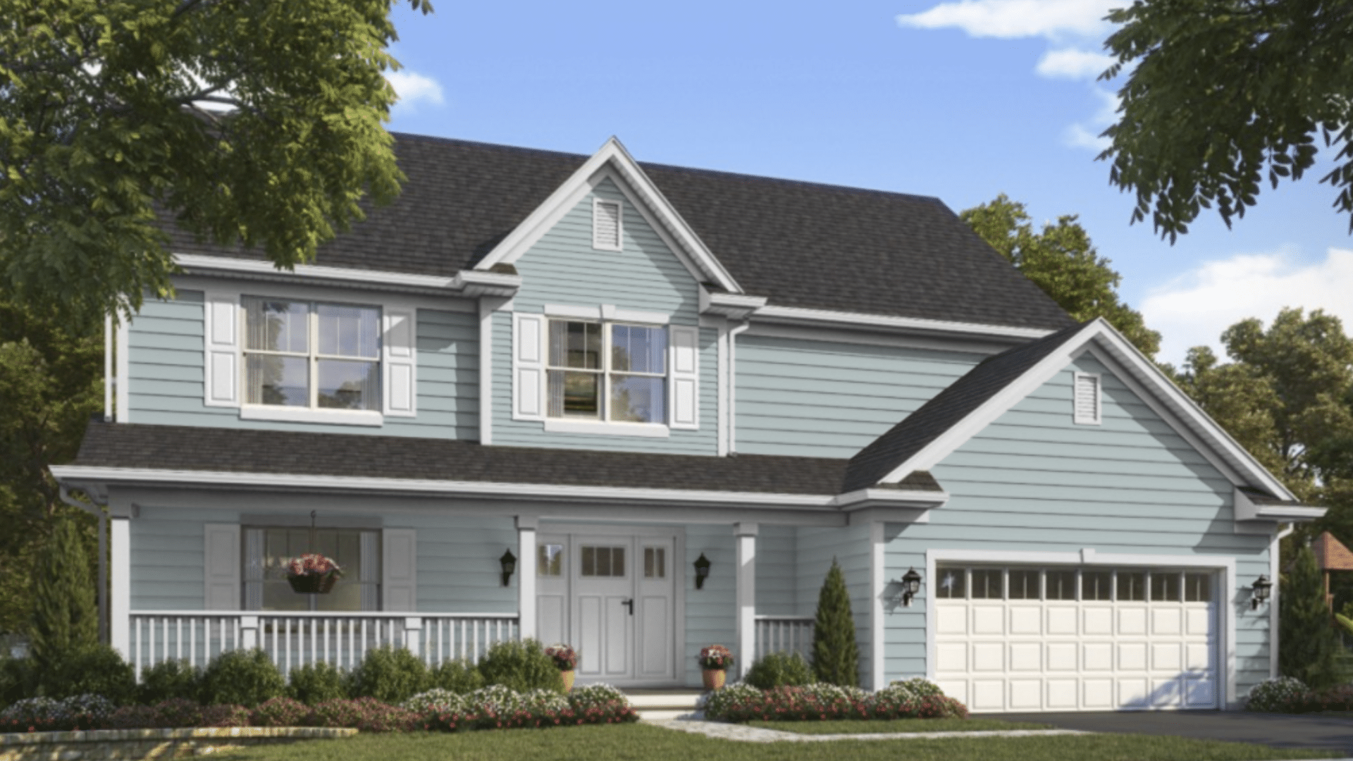
Classic Porch Ceilings
Painting your porch ceiling haint blue is a beloved Southern tradition that blends beauty with folklore. Choose a soft, satin, or eggshell sheen for a smooth, reflective finish that mimics the open sky.
This color brightens shaded porches, making them feel more spacious and airy. Use mildew-resistant exterior paint for longevity, especially in humid climates.
Pair it with crisp white trim or natural wood tones to keep the look fresh. Haint blue porch ceilings remain a hallmark of welcoming, relaxed homes.
Doors, Shutters, and Trim
Using haint blue on doors, shutters, and trim adds subtle charm and ties outdoor spaces together.
A semi-gloss finish works best for these elements, giving durability and a soft shine. Light blue-green doors can make entrances feel friendly and open, while matching shutters or window frames create balance.
Combine the color with neutral siding, brick, or white exteriors for a classic coastal appeal. Whether you prefer a bold or gentle shade, haint blue accents can instantly refresh your home’s exterior style.
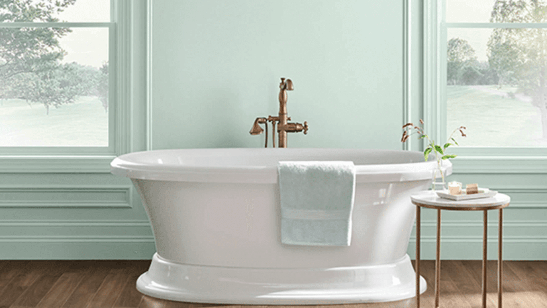
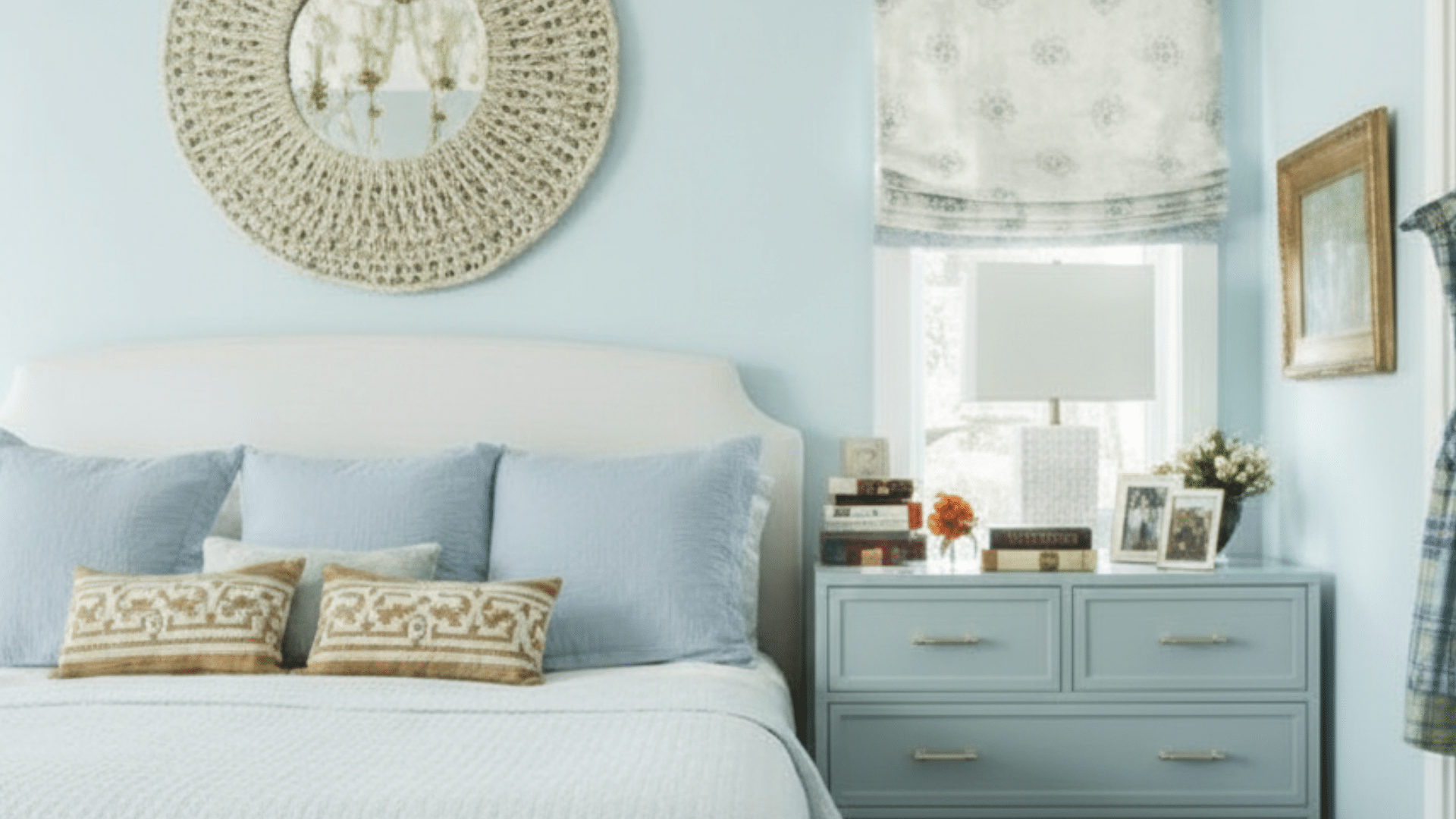
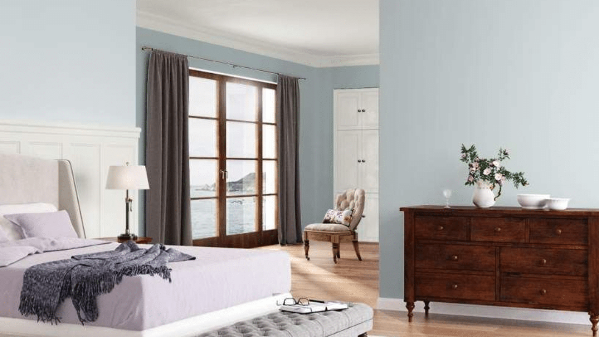
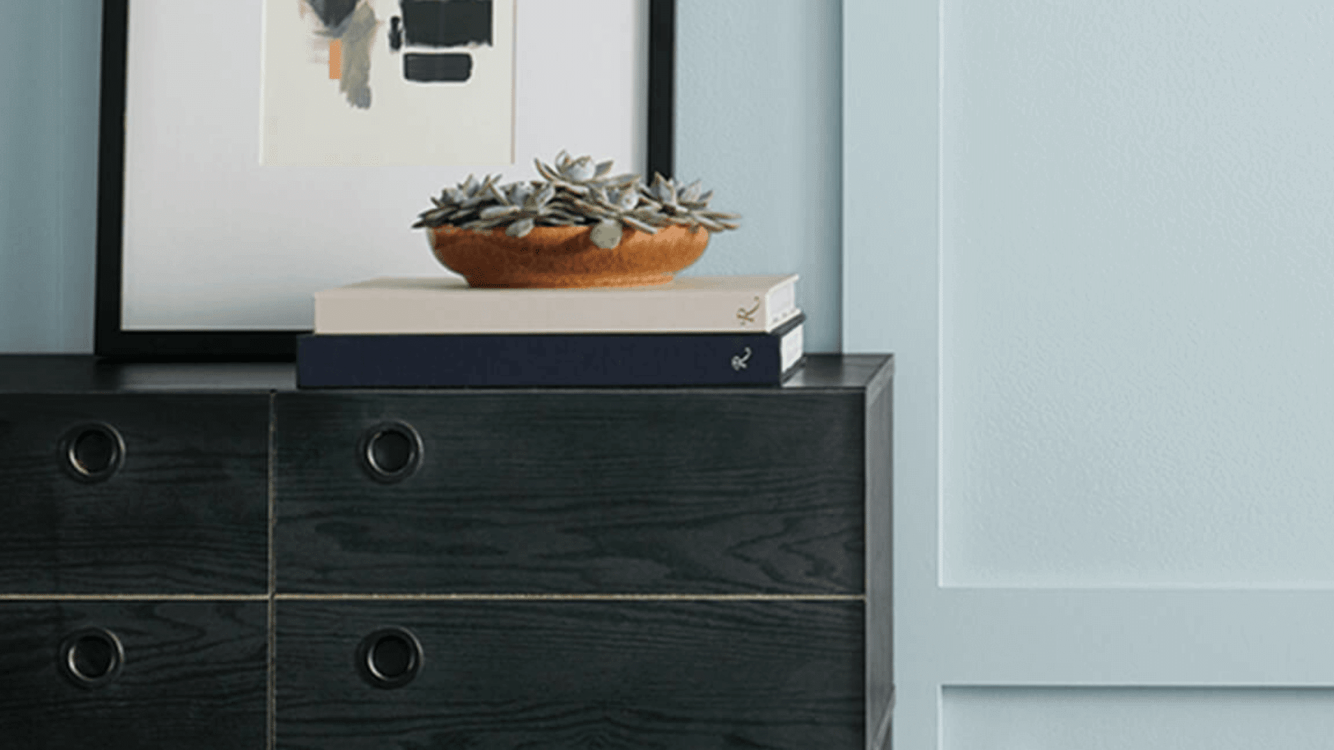
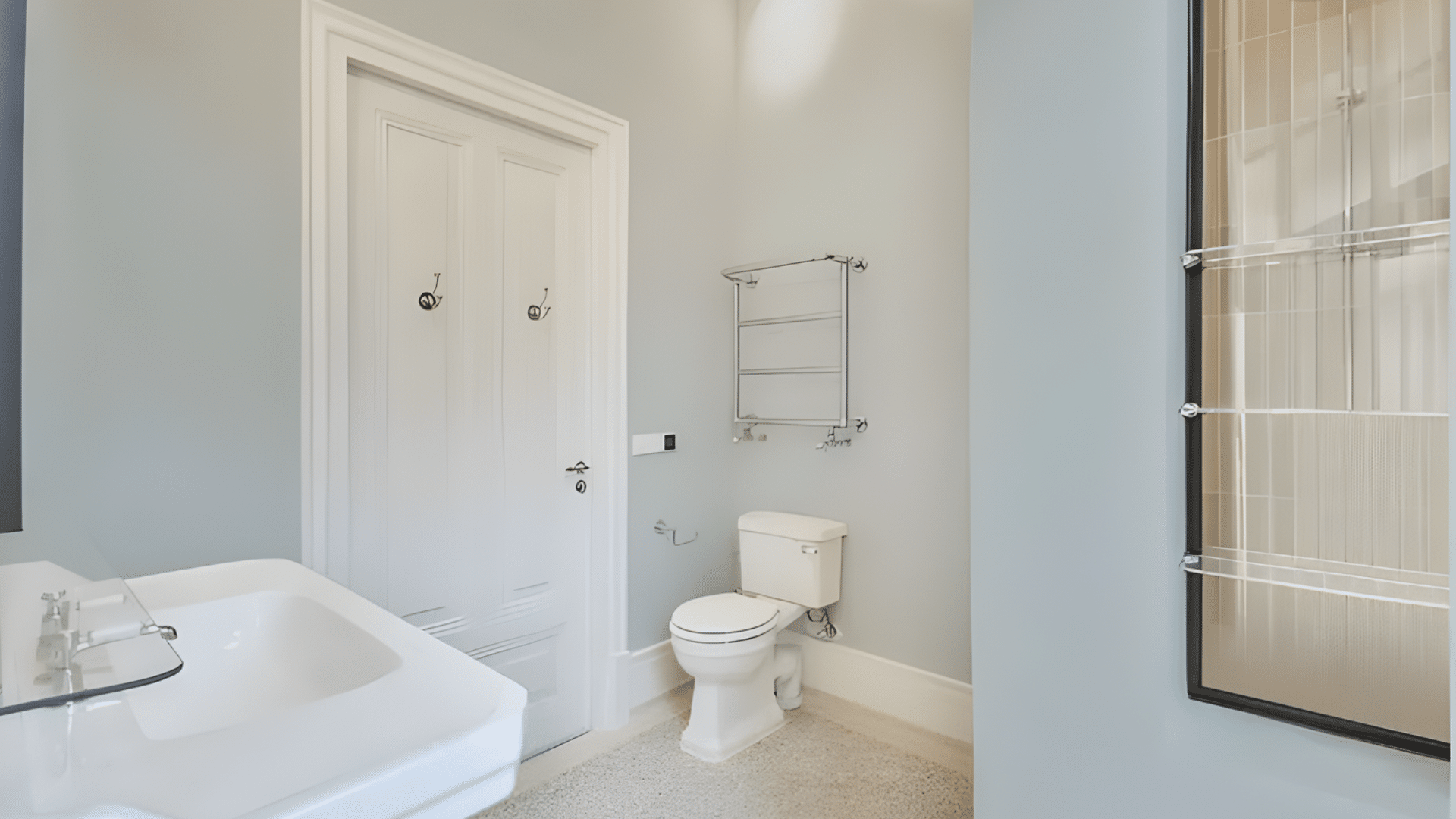
Interior Uses
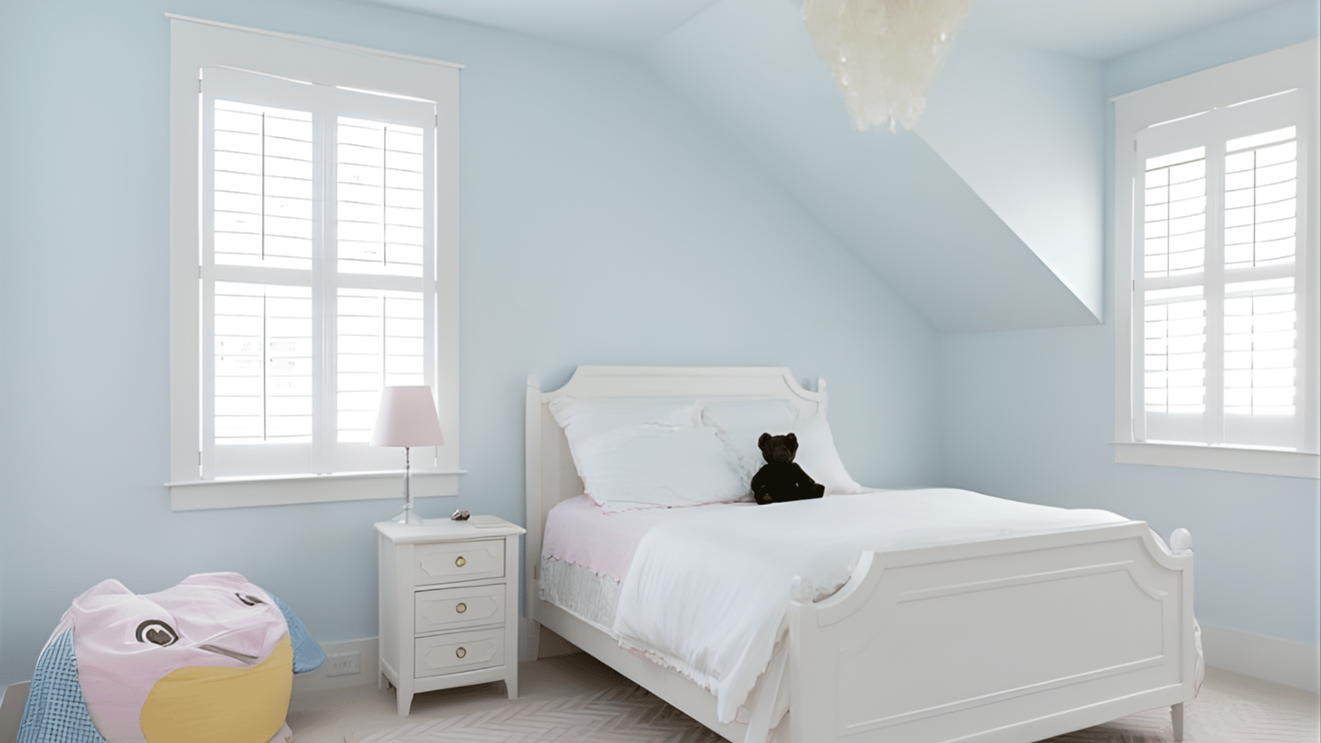
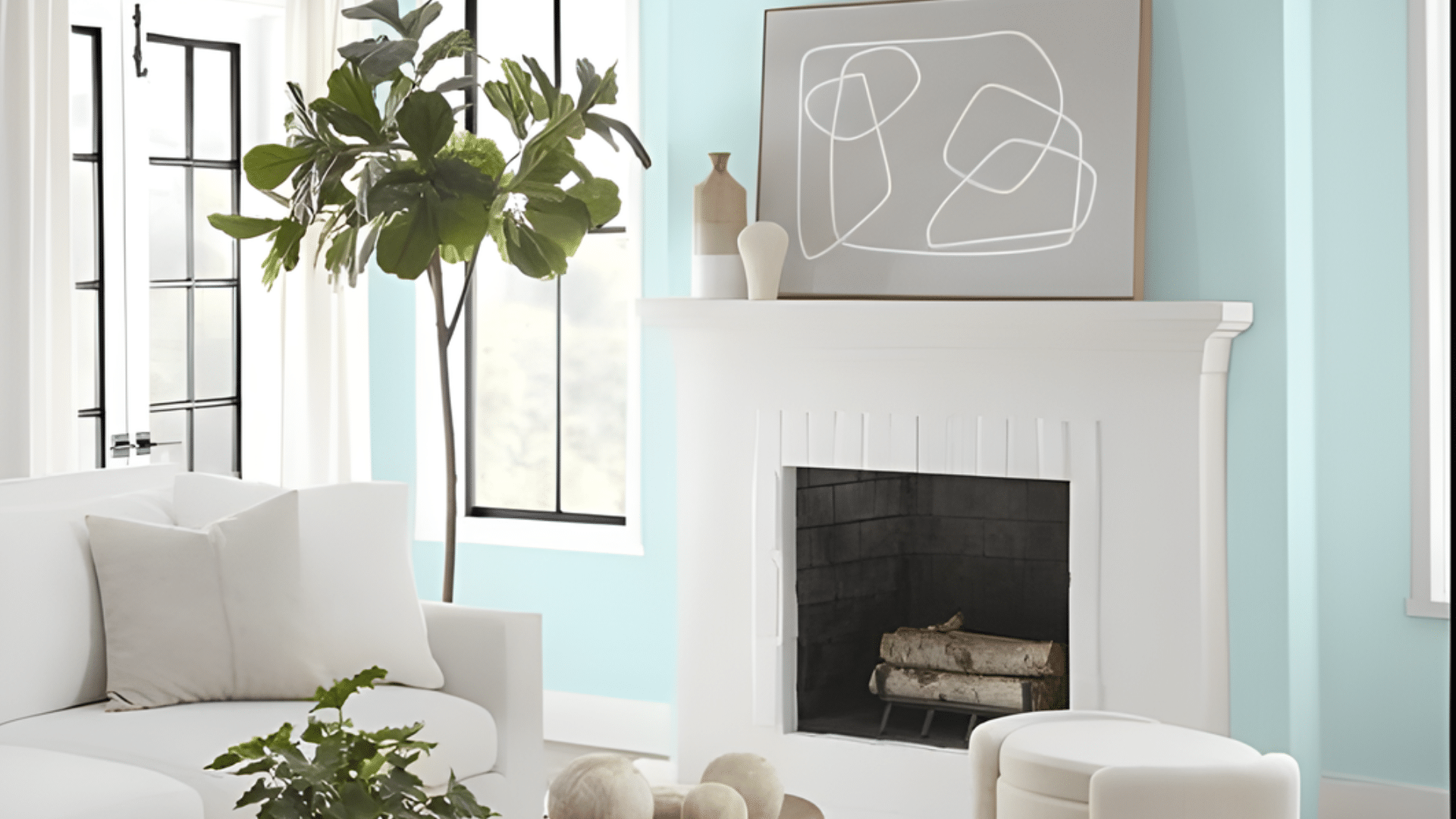
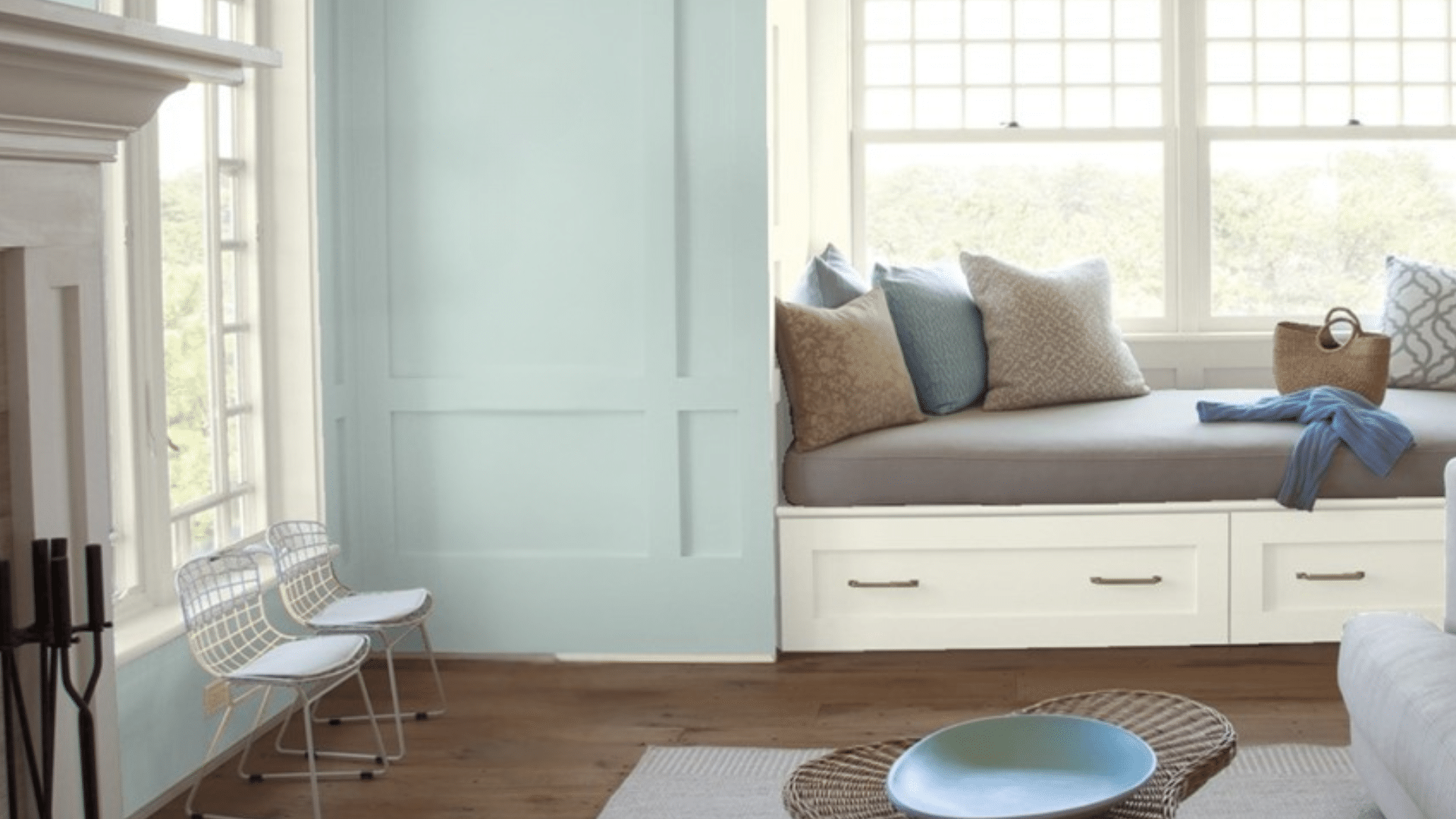
Haint blue brings peace indoors, offering a gentle pop of color that feels calm and airy. It’s especially beautiful on interior ceilings, where it creates the illusion of height and natural light.
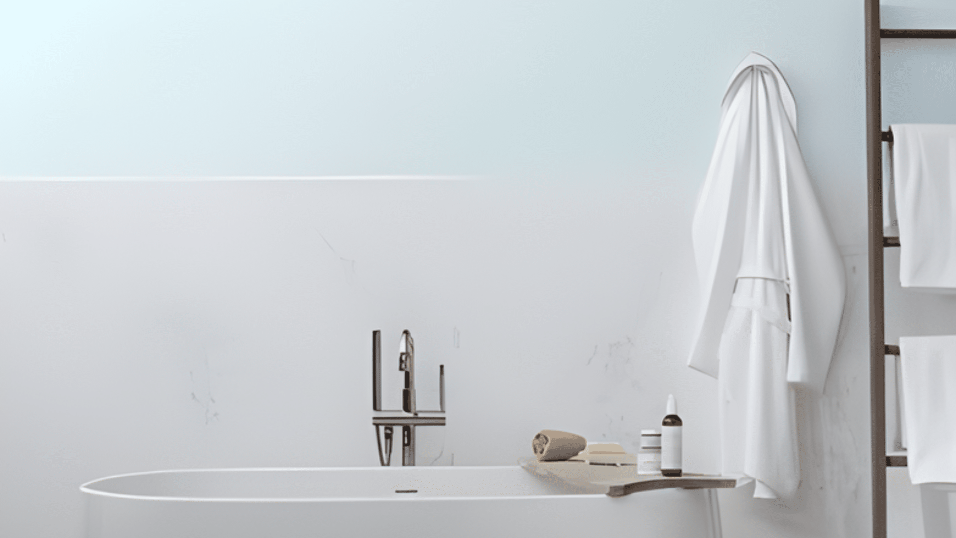
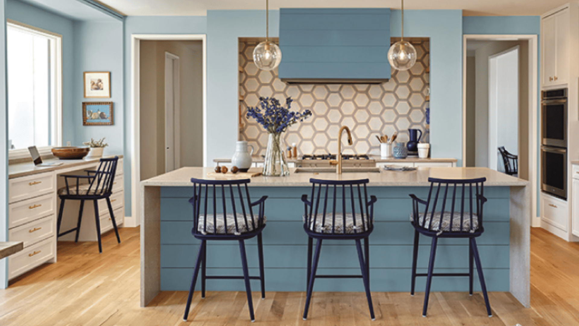
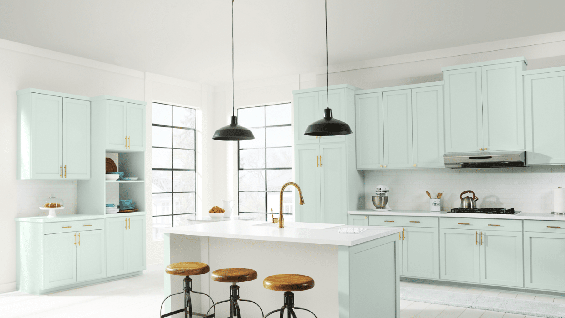
In bathrooms and kitchens, haint blue pairs wonderfully with white tile, brass hardware, and natural materials like rattan or oak. It softens bright rooms and balances cool-toned lighting.
Use it on walls for a subtle statement or cabinetry for a refreshing twist. Inside, haint blue radiates calm, livable energy.
Style Integration
Haint blue fits seamlessly across multiple design styles.
- In farmhouse homes, it complements white shiplap and rustic wood.
- For coastal interiors, it mirrors sea tones and pairs well with sandy beige or driftwood hues.
- In colonial settings, it improves historical authenticity on doors and shutters.
- For modern homes, it adds softness to clean lines and minimalist spaces.
Its versatility lies in its tone, subtle enough for tradition, yet fresh enough for contemporary design. Every style benefits from its relaxed, airy beauty.
Choosing the Right Haint Blue Paint Shade for Your Home
Selecting the right haint blue paint shade depends on your home’s lighting, undertone preferences, and where the color will appear.
Find these soothing haint blue paint shades from trusted brands, each offering unique undertones and versatile design potential.
1. Sherwin-Williams Rainwashed
A soothing blend of blue, green, and gray that resembles sea glass under soft light. Rainwashed feels calm and natural, offering a relaxed, coastal-inspired effect.
It brings quiet depth to both sunlit and shaded spaces, making rooms feel open yet grounded. This shade is ideal for homeowners who want serenity with a subtle hint of color.
- Undertone: Blue-green with soft gray
- LRV: 60
- Best for: Porches, bathrooms, or cottage-inspired interiors
- Pair with: Warm white trim, sandy neutrals, or driftwood tones for a breezy look
2. Sherwin-Williams Tradewind
A muted turquoise with soft gray undertones that feels both refreshing and grounded. Tradewind maintains balance through changing light, staying calm and easy on the eyes.
It’s an excellent choice for adding subtle color without overpowering your décor. Perfect for Southern-style homes, it delivers quiet personality and coastal charm.
- Undertone: Blue-gray with a hint of green
- LRV: 61
- Best for: Entryways, laundry rooms, or porch ceilings
- Pair with: Warm whites, soft beige, or sandy neutrals for a serene finish
3. Sherwin-Williams Sky High
A light, airy blue that captures the calm of a Southern sky on a clear morning. Its slightly cool tone adds brightness to shaded porches and north-facing rooms without feeling icy.
Sky High creates a refreshing openness while keeping the space soft and welcoming. It’s classic, versatile, and perfect for achieving that classic Southern porch charm.
- Undertone: Cool blue with a touch of gray
- LRV: 65
- Best for: Porch ceilings, sunrooms, or outdoor spaces needing gentle lift
- Pair with: Crisp whites like Sherwin-Williams Extra White or natural woods for a timeless look
4. Benjamin Moore Wythe Blue

A classic haint blue with soft teal undertones, slightly deeper than traditional ceiling blues.
Wythe Blue offers warmth and depth while maintaining calmness, echoing the classic colors of historic Southern homes. It feels welcoming in any light and brings an inviting, vintage-inspired charm to your space.
- Undertone: Teal-blue with gray hints
- LRV: 48
- Best for: Front doors, shutters, or accent walls
- Pair with: Creamy whites, brass hardware, or light woods for warmth and depth
5. Benjamin Moore Breath of Fresh Air
A clear, uplifting blue that instantly brightens dark or shaded areas. Its soft, airy tone mimics open skies, adding a sense of space and serenity to your home.
Breath of Fresh Air feels both refreshing and classic, creating light-filled rooms that feel calm and relaxed throughout the day.
- Undertone: Pure blue with a soft warm base
- LRV: 70
- Best for: Porch ceilings, bedrooms, or hallways
- Pair with: Bright whites or pale grays for a crisp, timeless look
6. Benjamin Moore Constellation
A refined blue-gray with a misty, modern appeal that bridges traditional and contemporary design.
Constellation’s cool tone adds calm sophistication to any setting, creating a clean, calm atmosphere. It works beautifully in minimalist interiors or spaces that need subtle color without distraction.
- Undertone: Cool blue with gray undertones
- LRV: 63
- Best for: Interior ceilings, doors, or trim
- Pair with: White or beige walls for a serene, sophisticated effect
7. Behr Watery
A gentle aqua that captures the calm of early coastal mornings. Behr Watery blends blue and green perfectly, giving spaces a refreshing, open-air feel.
It reflects natural light beautifully, making shaded porches and bathrooms appear brighter and more inviting. Its versatile tone works across coastal, farmhouse, or modern spaces, keeping interiors light and soothing all year round.
- Undertone: Balanced blue-green with soft gray
- LRV: 66
- Best for: Porch ceilings, patio accents, or bathroom walls
- Pair with: White trim, wicker furniture, and tropical plants for a classic Southern porch look
8. Behr Spa
A soft green-blue that lives up to its name, creating a calm and restorative environment. Behr Spa feels airy and refreshing under natural light, shifting gently between aqua and misty blue throughout the day.
Its balanced tone works beautifully in both small and large spaces, offering quiet elegance without feeling cold.
- Undertone: Green-blue with cool aqua hints
- LRV: 64
- Best for: Bathrooms, bedrooms, or covered porches
- Pair with: White beadboard or light natural wood for a breezy, relaxed touch
9. Behr Light Mint
A modern interpretation of haint blue with a fresh green undertone that adds a playful, uplifting twist.
Light Mint feels bright and cheerful without overwhelming your space. Its soft tone brings energy to kitchens and creative areas while maintaining the calm essence of traditional haint shades.
- Undertone: Cool green with soft blue undertones
- LRV: 68
- Best for: Kitchens, garden rooms, or creative workspaces
- Pair with: White, tan, or charcoal accents for a clean, fresh contrast
10. Benjamin Moore Palladian Blue
A soft, sea-glass hue that gracefully shifts between blue and green, reflecting coastal light beautifully. Palladian Blue feels airy and calm, filling rooms with coastal freshness and classic beauty.
It adapts well to different lighting, appearing slightly more blue by day and greener by night.
- Undertone: Blue-green with soft gray influence
- LRV: 60
- Best for: Kitchens, bathrooms, or porches
- Pair with: Whites, sandy tans, and driftwood tones for a coastal palette
11. Benjamin Moore Clear Skies
A delicate, true blue that enlivens dark or shaded spaces with a refreshing sense of openness. Clear Skies reflects light beautifully, creating a crisp and balanced look that keeps interiors feeling clean and airy.
It’s versatile enough for both modern and classic homes, offering just the right amount of brightness without being overpowering. This color works wonderfully in areas where natural light is limited, instantly lifting the mood of the space.
- Undertone: True blue with a cool, clear base
- LRV: 66
- Best for: Bathrooms, ceilings, or airy sunrooms
- Pair with: White trim, brushed nickel, or pale gray walls for a fresh, polished finish
12. Benjamin Moore Iceberg
A cool, modern blue with refined gray undertones that bring calm and clarity to any space. Iceberg’s crisp brightness opens up rooms beautifully, adding light without feeling stark.
Its subtle tone works perfectly for minimalist or Scandinavian-inspired interiors, offering a soft contrast against natural textures and light woods. The color maintains its balance throughout the day, making it ideal for clean, modern designs that emphasize simplicity and airiness.
- Undertone: Cool blue with soft gray notes
- LRV: 73
- Best for: Bedrooms, living rooms, or home offices
- Pair with: Silver hardware, oak furniture, or white walls for a sleek, balanced look
13. Sherwin-Williams Sleepy Blue
A soft, dreamy tone with a touch of gray that creates calm, restful energy. Sleepy Blue delivers a soothing backdrop that complements both rustic and coastal interiors.
Its muted hue enhances natural materials like wicker and wood while reflecting enough light to keep rooms open and peaceful. Perfect for spaces where relaxation matters, this color provides timeless comfort and gentle warmth.
- Undertone: Soft blue with gray for balance
- LRV: 58
- Best for: Bedrooms, porches, or reading nooks
- Pair with: White trim, wicker textures, or natural fabrics for a serene Southern look
14. Sherwin-Williams Topsail
A pale blue with a gentle touch of green that captures the feeling of cool sea air.
Topsail keeps rooms bright and soothing, reflecting light beautifully in any setting. It offers the perfect balance of freshness and softness, ideal for porches or interiors that need subtle character.
- Undertone: Blue with a whisper of green
- LRV: 75
- Best for: Porch ceilings, bathrooms, or kitchen cabinets
- Pair with: Soft grays, white trim, or woven accents for a coastal-cottage feel
15. Behr Ocean Pearl
Ocean Pearl offers a subtle blue-green hue with an airy sophistication. It brings gentle color to living rooms or exterior siding, pairing seamlessly with neutrals.
LRV: 62.
16. Benjamin Moore Harbor Haze
A misty blue with subtle gray-green undertones that creates a soft, maritime feel. Harbor Haze brings a sense of ocean calm to interiors and exteriors alike. Its breezy, balanced tone feels coastal but still grounded enough for everyday living spaces.
- Undertone: Blue-gray with a hint of green
- LRV: 64
- Best for: Porches, bedrooms, or coastal interiors
- Pair with: White trims, wicker textures, and sandy beige tones for seaside serenity
17. Sherwin-Williams Dew Drop
An airy aqua-silver blend that adds a clean, uplifting touch to any space. Dew Drop reflects brightness beautifully, enhancing natural light and making rooms feel fresh and open.
Its subtle shimmer works especially well in spaces that need a cheerful lift without overwhelming color. This gentle tone keeps interiors soothing while still offering personality and charm, perfect for both traditional and coastal homes.
- Undertone: Aqua with soft silver-gray notes
- LRV: 72
- Best for: Porch ceilings, laundry rooms, or bright transitional spaces
- Pair with: White beadboard, silver fixtures, or pale gray trim for a crisp, breezy finish
18. Behr Sea Salt Blue
A balanced blend of blue and green that captures the calm, refreshing feel of the ocean. Sea Salt Blue brings a soothing energy to any room, creating a relaxed coastal vibe that feels natural and classic.
Its subtle depth gives spaces character without heaviness, while its light-reflecting quality keeps rooms bright and airy. Perfect for homeowners who want serenity with a hint of color that feels grounded and warm.
- Undertone: Balanced blue-green with soft gray influence
- LRV: 63
- Best for: Bathrooms, sunrooms, or reading nooks
- Pair with: Warm wood tones, white trim, or woven textures for an inviting coastal look
19. Benjamin Moore Blue Veil
A delicate pastel blue that nearly glows white in sunlight, creating an airy and graceful atmosphere. Blue Veil opens up hallways, ceilings, and smaller rooms, giving them a sense of height and spaciousness.
Its soft tone feels elegant yet approachable, offering a subtle hint of color that brightens without overpowering. Ideal for spaces where light plays a major role, it maintains its fresh look throughout the day.
- Undertone: Pale blue with cool white influences
- LRV: 75
- Best for: Hallways, ceilings, or minimalist interiors
- Pair with: Light gray, cream, or off-white finishes for a balanced, refined look
Myth Versus Reality: What Science Says About Haint Blue Paint
The calming effect of haint blue paint has long been linked to folklore, but modern psychology offers a more nuanced explanation.
A 2015 review published in Frontiers in Psychology by Andrew J. Elliot, titled “Color and Psychological Functioning: A Review of Theoretical and Empirical Work,” explains that color influences mood and behavior, yet its impact depends heavily on context, lightness, and chroma.
The study found that blue light can enhance alertness and focus, though such effects relate more to physiology than to spiritual or supernatural beliefs.
When applied to haint blue, this research helps separate myth from measurable benefit. The soothing impression of blue ceilings may stem from visual brightness and reflection, not mystical power.
Science supports the peaceful feelings haint blue evokes, but its magic lies in perception, not protection.
Additional Belief: Wasp Repellent
Some Southerners believe that haint blue paint helps deter wasps from nesting on porch ceilings. This idea dates back to the early days when paint often contained lime or lye, natural ingredients that repelled insects.
Modern paints, however, no longer include these materials, so the same effect doesn’t apply today. Still, the tradition continues, partly because the light blue color reflects sunlight, giving ceilings a bright, open look.
Whether it keeps bugs away or not, many homeowners enjoy the peace of mind and charm that haint blue adds to their outdoor spaces.
DIY Steps to Paint Your Porch Ceiling Haint Blue
Follow these simple steps to achieve a smooth, lasting finish when painting your porch ceiling or interior surfaces.
- Prep the Surface: Clean thoroughly and remove dirt, cobwebs, or peeling paint before applying primer.
- Choose the Right Finish: Use exterior-grade satin or semi-gloss for porches; interior eggshell for indoor walls or ceilings.
- Prime for Durability: Apply a mildew-resistant primer to help the paint adhere evenly and resist moisture.
- Apply Even Coats: Use two thin layers of haint blue paint, allowing each coat to dry completely for a smooth finish.
- Protect and Maintain: Seal outdoor areas with a UV-resistant topcoat and clean surfaces seasonally to preserve color vibrancy.
Conclusion
Now that you know the story behind haint blue paint, you can appreciate it for more than its soft, soothing color. I love how it bridges generations, linking African heritage, Southern craftsmanship, and modern design in one classic shade.
If you’re restoring a historic home or refreshing a front porch, this color carries meaning that never fades.
You’ve learned how it started, why it mattered, and how it still shapes design today. Now it’s your turn to use it in a way that fits your own space and story.
Try painting a ceiling, door, or accent wall and see how it changes the feel of your home. And if you’re inspired, check out more of my blogs for fresh color ideas.


