


I’ve gone back and forth more than once between Benjamin Moore Hale Navy and Sherwin-Williams Naval for painting projects.
These two gorgeous navy blues are among the most popular dark paint colors that homeowners love using today.
Both colors bring refinement and style to any room, but they each have their own special personality and class. I created this comparison to help you understand which navy blue fits your space and decorating dreams perfectly.
You’ll learn how these colors behave in different lighting, which rooms they work best in, and what colors pair beautifully with each shade. Get ready to find your perfect navy blue match!
Color Comparison: Hale Navy vs. Naval
Both Benjamin moore Hale Navy (HC-154) and Sherwin-Williams Naval (SW 6244) are popular dark blue paint colors that work well in many different rooms.
These rich blues create calming spaces while adding refinement to your home decor.
Hale Navy has a softer, more muted blue tone with subtle gray undertones that feel gentle and welcoming. This color works beautifully with white trim and creates a classic look in bedrooms and living rooms.
Naval is a deeper, more intense blue with stronger pigments that make a bold statement in any space. This darker shade works especially well as an accent wall or in rooms with plenty of natural light for a dramatic effect.
Color Terminologies and Undertones
Understanding the technical specifications of these two popular navy paint colors helps you make the right choice for your space.
These details highlight the key differences between the Naval and the Hale Navy, which affect their appearance in your room:
| Color | LRV | Hex Code | RGB Values | Undertones |
|---|---|---|---|---|
| Sherwin-Williams Naval (SW 6244) | 4 | #2F3D4C | 47, 61, 76 | Blue with subtle maritime undertones |
| Benjamin Moore Hale Navy (HC-154) | 8.36 | #434B56 | 67, 75, 86 | Blue with charcoal undertones |
Naval has a very low LRV, making it an intensely dark color that absorbs most light, while Hale Navy has a slightly higher LRV, making it somewhat lighter but still a dark color.
These technical differences help explain why the colors appear different on your walls and work better in certain lighting conditions.
How Hale Navy and Naval Look in Different Spaces
These two navy colors perform differently depending on which room you choose to paint in your home. Understanding how each color works in various spaces helps you pick the right shade for your specific needs.
Here’s how the Hale Navy and Naval work in various spaces:
Living Room
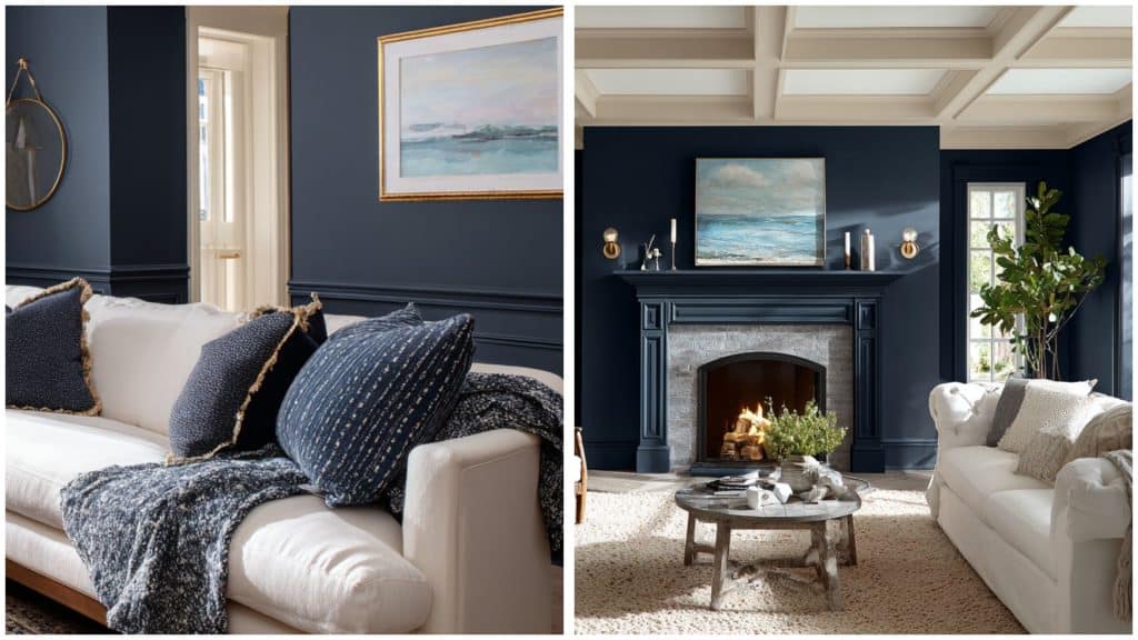
Hale Navy offers similar enlightenment with a softer approach that works better in various lighting conditions. It creates depth without being too intense, making it perfect for larger wall areas in living rooms.
Naval creates a dramatic focal point when used on an accent wall behind your couch or fireplace. The deep color makes lighter furniture and artwork pop against its rich backdrop, but might feel overwhelming in smaller spaces.
Bedroom
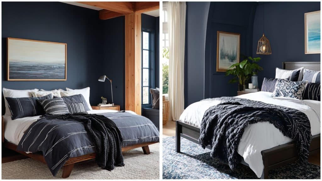
Hale Navy feels more relaxing and peaceful in bedrooms, creating a calming atmosphere perfect for rest. Its softer tone works well on multiple walls without overwhelming the room with darkness.
Naval brings bold drama to bedrooms, working especially well behind headboards as a statement wall. The intense color creates a cocooning effect that some people love for their sleeping retreat space.
Bathroom
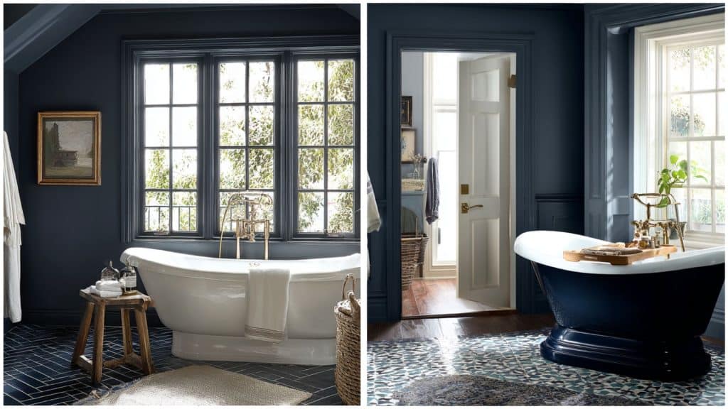
Hale Navy performs better in most bathroom sizes because it reflects more light while maintaining refinement. It creates a calming, spa-like atmosphere without making the space feel too closed in.
Naval works best in larger bathrooms with excellent lighting, creating a spa-like luxury feel. However, it can make smaller powder rooms feel cramped and dark if not used carefully with proper lighting.
Kitchen
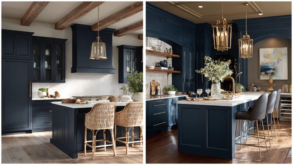
Hale Navy offers a refined style that works better in smaller kitchens or galley layouts. It provides depth and classiness while maintaining a more approachable feel for everyday cooking and family gatherings.
Naval makes an attractive statement on lower cabinets or kitchen islands, hiding fingerprints well in busy cooking spaces.
The dramatic color needs plenty of lighting to prevent the kitchen from feeling too dark and closed off.
Color Pairing of Both Blues
Both Naval and Hale Navy work beautifully with different color palettes that bring out their unique undertones.
Choosing the right companion colors helps these navy shades shine in your home decorating projects. Here’s how they compare:
Sherwin-Williams Naval (SW 6244)
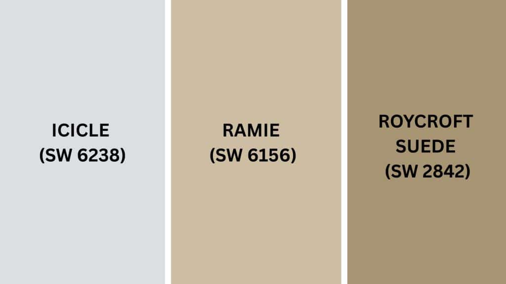
Naval’s deep maritime character with subtle blue hues creates a urbane backdrop that pairs beautifully with both warm and cool colors.
The color’s low light reflectance makes it perfect for creating dramatic contrast with lighter shades. Its rich depth brings out the best in crisp whites, soft neutrals, and warm earth tones throughout your home.
- Icicle (SW 6238): A cool, crisp white that creates a surprising contrast
- Ramie (SW 6156): A warm beige that softens Naval’s intensity
- Roycroft Suede (SW 2842): An earthy brown that complements maritime undertones
Benjamin Moore Hale Navy (HC-154)
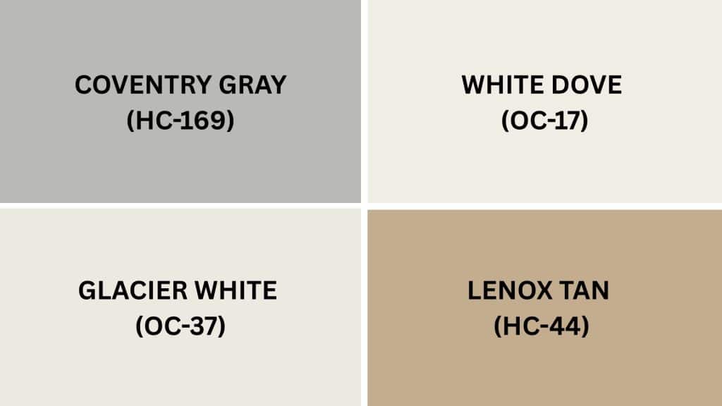
Hale Navy’s charcoal influences with blue hues offer versatility that works with both contemporary and traditional color schemes.
The subtle gray qualities make it easier to pair with various neutrals and accent colors. Its balanced depth allows for flexible decorating while maintaining refinement in any room setting you choose.
- Coventry Gray (HC-169): A light gray that echoes Hale Navy’s undertones
- White Dove (OC-17): A soft white that balances the navy perfectly
- Lenox Tan (HC-44): A warm neutral that adds cozy contrast
- Glacier White (OC-37): A clean white for crisp, modern pairings
Hale Navy vs. Naval: How to Decide
Choosing between these two popular navy colors depends on your specific room and personal style preferences. Sherwin-Williams Naval (SW 6244) works best when you want to make a bold, dramatic statement in spaces with plenty of natural light.
Its deeper tone creates a unique contrast but needs careful planning to avoid overwhelming smaller rooms.
Benjamin Moore Hale Navy (HC-154) offers more flexibility for everyday living spaces because it feels less intense than Naval. It works well in various lighting conditions and room sizes without feeling too dark or heavy.
Both colors create refined, classy looks that work with many decorating styles. Consider your room size, lighting, and how bold you want the space to feel.
Benjamin Moore Hale Navy: Similar Colors from Sherwin-Williams
Finding similar colors from different paint brands helps when you prefer a specific manufacturer or need better availability.
These Sherwin-Williams alternatives offer comparable looks to Benjamin Moore Hale Navy for various projects:
- Sea Mariner (SW 9640): Often used as a close substitute for Hale Navy, especially for exterior projects where the result is almost identical
- Charcoal Blue (SW 2739): A deep blue-gray paint that is often listed by online color converters as a substitution for Hale Navy, though it has stronger violet undertones
- Indigo Batik (SW 7602): A bit lighter and brighter than Hale Navy with an LRV of 8, straddling the navy blue and regular blue line
- Sea Serpent (SW 7615): A dark, muted blue-green with stronger green undertones than Hale Navy, but often used as a substitute
- Naval (SW 6244): While not exactly similar, it’s frequently compared to Hale Navy as both are popular navy colors, though Naval is darker and more purely blue
Keep in mind that no Sherwin-Williams color perfectly matches Hale Navy’s unique undertones and characteristics.
Testing samples in your specific lighting conditions will help you choose the best alternative for your space.
Can You Use Both Hale Navy and Naval in the Same Home
Using both Hale Navy and Naval in the same home is definitely possible with careful planning. These colors work well together because they share similar blue undertones and complement each other nicely.
You can use Naval in larger, well-lit spaces like living rooms for dramatic impact. Then use Hale Navy in smaller areas like bedrooms or bathrooms where you want enlightenment without overwhelming darkness.
The key is creating visual flow by separating the colors with neutral hallways or different floor levels. Both colors pair with similar accent colors, so your decorating scheme stays coordinated throughout the house.
Final Thoughts
Now you have all the essential information about Benjamin Moore Hale Navy or Sherwin-Williams Naval to make the right choice. I’ve shown you how these navy blues differ in darkness, undertones, and performance across various rooms in your home.
If you choose the softer grace of Hale Navy or the bold drama of Naval, both colors create beautiful, classy spaces.
Remember that testing paint samples in your actual lighting conditions always gives you the best results before making your final decision.
Your dream navy blue from Sherwin-Williams is ready to make your room look incredible, so drop a comment below about which shade you love most!


