


I get it, you pick a paint color that looks perfect in the store, but once it’s on your wall, it feels completely off. I’ve seen it happen countless times, and it’s one of the biggest reasons people dread repainting.
The truth is, color isn’t just about the shade you like; it’s how light, undertones, and your décor work together.
In this guide, I’ll walk you through how to choose paint colors the smart way, from testing samples and using color visualizers to understanding undertones and lighting.
You’ll learn simple, practical steps that actually work in real homes. By the end, you’ll know how to pick colors that look beautiful in every light and truly reflect your style.
Why Learning How To Choose Paint Colors Matters
Choosing paint isn’t just about picking a color you like; it’s about understanding how light, space, and tone work together to shape how your home feels.
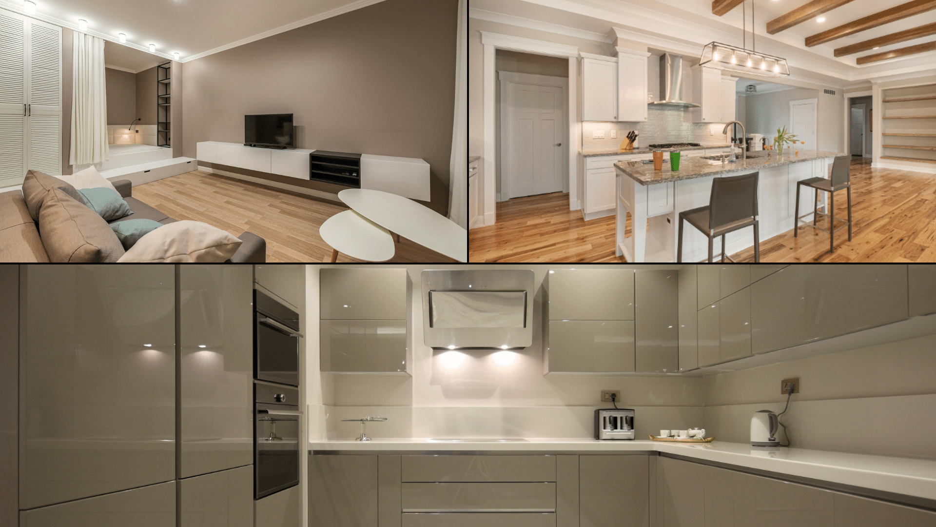
When you know how to test paint under real lighting, you avoid costly mistakes and wasted gallons from the wrong shade. You also learn how to match color to a room’s purpose: soft, calming hues for bedrooms, brighter tones for kitchens, and warm neutrals for cozy living spaces.
A thoughtful color plan ties your entire home together. Understanding undertones helps you prevent clashing with flooring or furniture, while knowing how colors flow from one room to the next keeps your space visually balanced.
Plus, with paint visualizers, swatches, and color apps, you can preview your choices before you even open a can.
Learning how to choose paint colors gives you confidence, saves time, and helps you create a home that truly feels like you.
How To Choose Paint Colors
It’s easier than you think to find paint colors that work with your décor, lighting, and personality when you follow these steps.
Step 1: Start with the Big Elements First
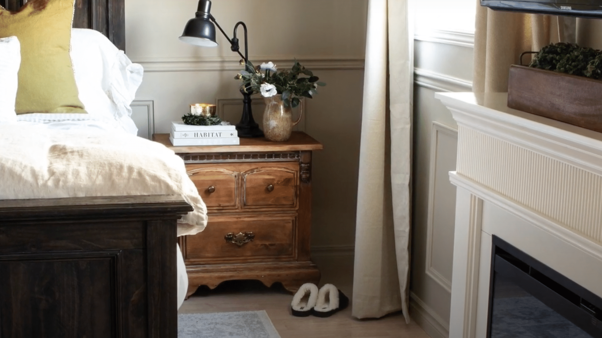
Don’t choose your wall color before picking furniture, rugs, curtains, and flooring. These larger pieces already define your room’s style and undertones. Once you’ve set those, finding a matching paint color becomes simple.
A sofa, rug, or art piece can guide your palette naturally. It’s much easier to select one color from thousands of options that blend with what you already have than to redesign your décor around one wall color.
Step 2: Understand Undertones and Color Temperature

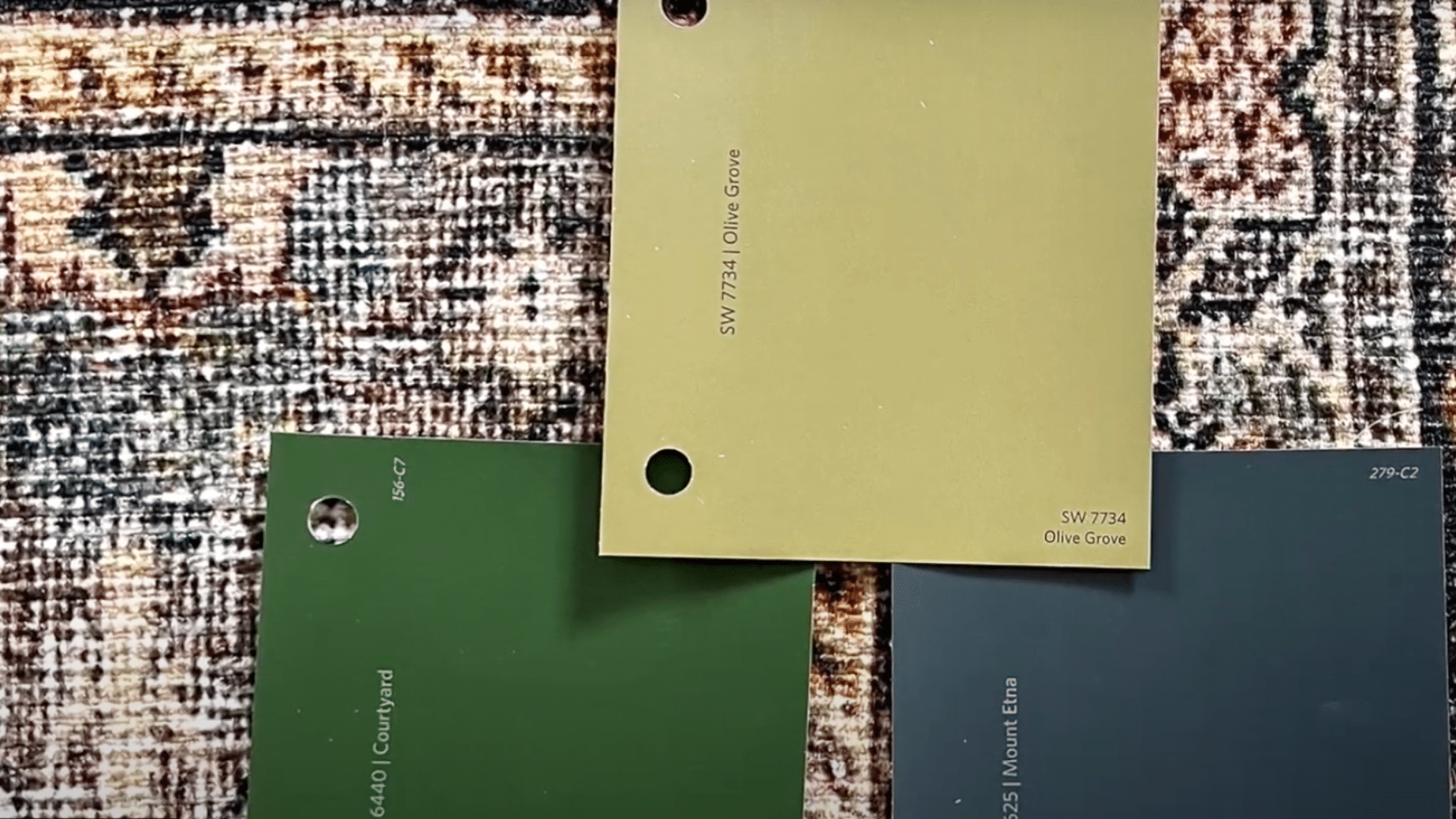
Every paint color carries subtle undertones that affect how it appears on your walls. Warm undertones come from red, orange, or yellow bases, while cool undertones lean toward blue, green, or gray.
To see the true tone, place your paint swatch on a plain white sheet of paper and look closely at the color that stands out. Matching these undertones to your furniture and fabrics helps maintain flow and prevents clashing shades throughout your space.
Step 3: Never Choose Paint Colors at the Store
Store lighting can make paint colors appear completely different from how they’ll look in your home.
Harsh fluorescent lights distort color and undertones. Instead, always test your colors at home, where your natural and artificial lighting will affect the tone differently.
Paint a small sample section or use peel-and-stick swatches to see how your chosen shade behaves on your actual wall. It’s the only reliable way to avoid disappointment once the paint dries.
Step 4: Use an Inspiration Piece as Your Guide
If you feel overwhelmed, start with an item you already love, like a patterned rug, pillow, or piece of art.
Pull your wall color and accents directly from that object’s existing palette. This ensures harmony between your décor and paint, making choosing wall colors much easier.
Inspiration pieces naturally help you find complementary or contrasting tones that work together. It’s a designer trick that guarantees your room color combinations feel intentional and cohesive.
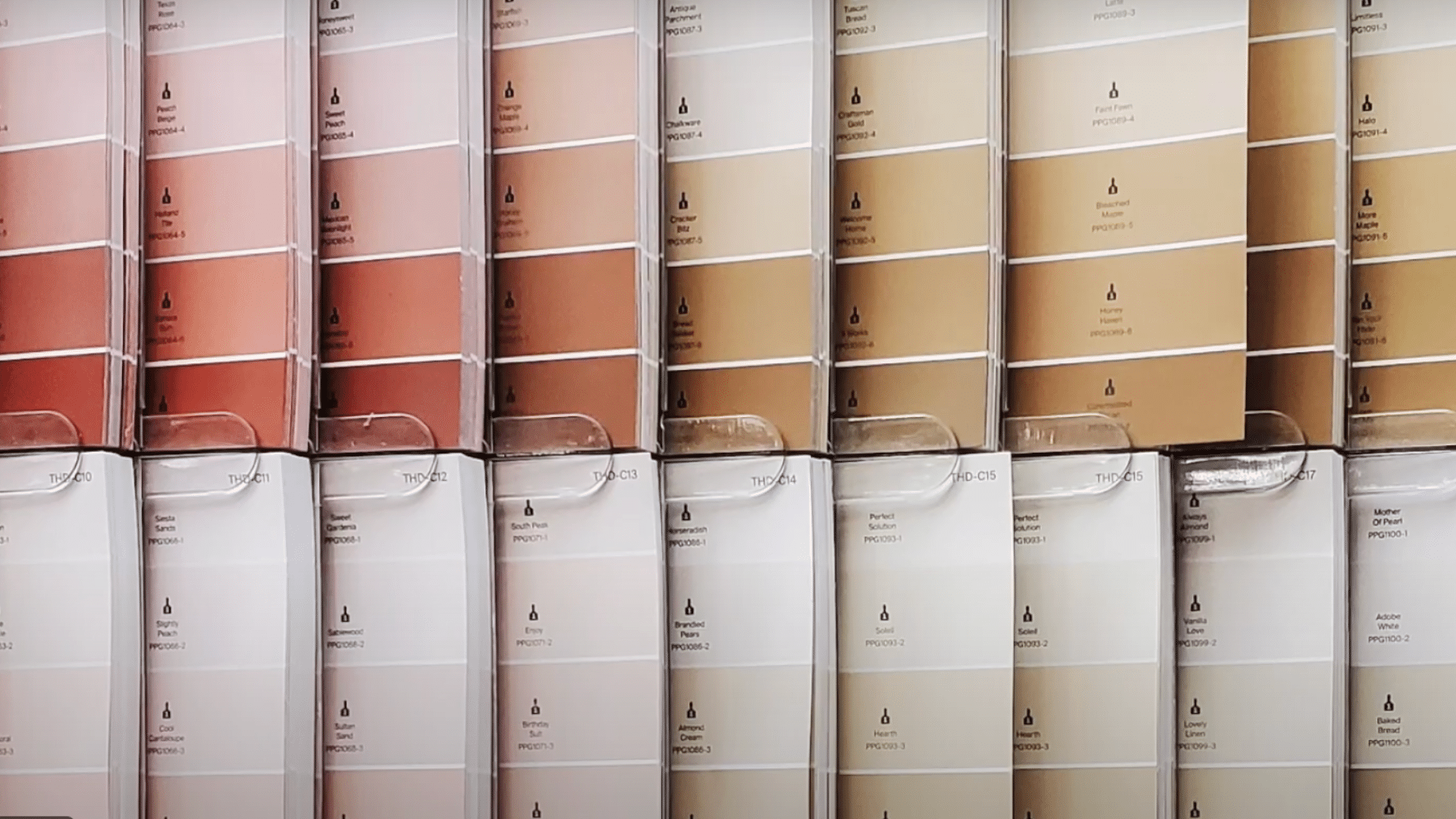
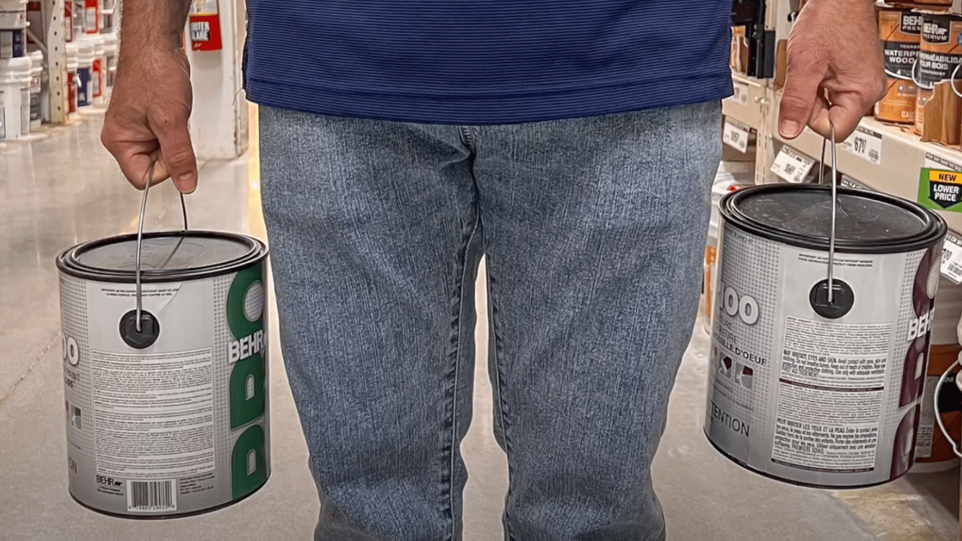
Step 5: Test Paint Samples Before You Commit
Large paint swatches or peel-and-stick samples are worth the effort. Place them on multiple walls and view them throughout the day, morning, afternoon, and evening.
Lighting constantly shifts, and what looks soft beige in daylight might turn yellow under lamplight. Move your samples around and live with them for a few days before deciding.
This simple test prevents costly mistakes and helps you choose a color you’ll truly love in all lighting conditions.
Step 6: Keep Lighting Direction In Mind
Lighting direction plays a major role in color appearance.
- South-facing rooms get warm light, so cooler tones like blue or gray add balance.
- North-facing rooms receive cooler light, so warmer shades, like cream or tan, keep them inviting.
- East and west-facing rooms shift throughout the day, allowing flexibility with both warm and cool hues.
Understanding how light behaves in each space will make choosing wall colors more predictable and ensure every room feels just right.
Watch this quick video to see how experts test and choose paint colors in real homes:
Understand Room Mood, Function, and Undertones
Every color influences how a room feels and how undertones shift under lighting. Use this guide to match color type, undertone, and purpose for a balanced home.
| Color Type & Undertone | Best For | How It Feels / What It Does | Lighting Behavior | Tips for Use |
|---|---|---|---|---|
| Warm Colors & Undertones (Yellow, Terracotta, Beige, Soft Red) | Living rooms, dining rooms, and kitchens | Create warmth, energy, and a welcoming vibe, perfect for social spaces. | Look richer and cozier under warm lighting; it may appear more intense in afternoon light. | Use in rooms where you want comfort and connection. Pair with soft lighting or wood accents for balance. |
| Cool Colors & Undertones (Blue, Green, Gray, Aqua) | Bedrooms, offices, and bathrooms | Calm the mind, reduce stress, and create a peaceful, airy mood. | Appears crisp and soothing in natural daylight; can feel cooler under north-facing light. | Great for restful areas. Balance with warm décor or white trim to avoid a cold look. |
| Neutral Colors & Undertones (White, Cream, Taupe, Greige) | Any room or transitional spaces | Provide balance and flexibility, making décor and architecture stand out. | Reflect surrounding light tones — can appear warmer near yellow bulbs or cooler near daylight. | Ideal for trim, hallways, and open layouts. Add accent colors or textures to prevent flatness. |
Warm tones bring energy and comfort. Cool tones create calm and clarity. Neutrals keep everything balanced, but always test colors in your own lighting before committing.
Build a Color Palette You Can Trust
A thoughtful color palette helps your home feel connected, balanced, and visually calm from one room to the next.
Use The 60/30/10 Rule for Balance: This classic design formula keeps colors visually balanced. Use your main color for about 60% of the room (like walls), a secondary color for 30% (like furniture or rugs), and an accent color for 10% (like pillows or artwork). This method ensures variety without visual clutter.
Combine Colors Across Rooms For Flow: Choose colors with similar undertones to create harmony throughout your home. For example, soft warm neutrals or cool grays can easily connect open spaces. When your palette flows naturally, each room feels unified but still has its own personality.
Add Accent Colors Without Clashing: Accent colors bring energy and personality, but they should complement your main tones. Use decor items, like throws, vases, or cushions, to introduce these accents. Keep them consistent across nearby spaces for a polished, balanced look that ties everything together.
Pick the Right Paint Finish For Each Room
Choosing the right paint finish matters just as much as the color itself. Each finish reflects light differently and affects durability, texture, and how easy your walls are to clean.
Matte and eggshell finishes are ideal for most walls because they hide imperfections and create a soft, smooth look. They’re great for bedrooms, living rooms, and ceilings where you want a subtle finish without shine.
For higher-traffic areas like kitchens, bathrooms, and hallways, satin or semi-gloss finishes work best. They resist moisture, handle frequent cleaning, and add a gentle sheen that brightens the space.
Gloss finishes, though less common, can highlight trim, doors, and cabinetry, giving them a crisp, polished effect. Understanding how sheen interacts with light helps you choose finishes that not only look right but also stand up to everyday use.
Visualize Paint Colors Before Painting
Seeing colors in your own space before painting helps you avoid costly mistakes. Use digital tools, real samples, and mobile apps to compare shades and find the perfect match for your walls.
1. Try a Paint Color Visualizer Tool
A paint color visualizer lets you preview different shades on your walls without lifting a brush.
Top tools include Sherwin-Williams ColorSnap® Visualizer, Behr Paint Your Place®, Benjamin Moore Personal Color Viewer®, and HGTV Home Visualizer®. You can upload photos of your room or test colors on sample spaces provided within each tool.
These programs show how undertones, lighting, and wall texture affect the final look. They’re perfect for comparing warm versus cool shades, trying accent walls, or experimenting with bold tones safely before you commit to gallons of paint.
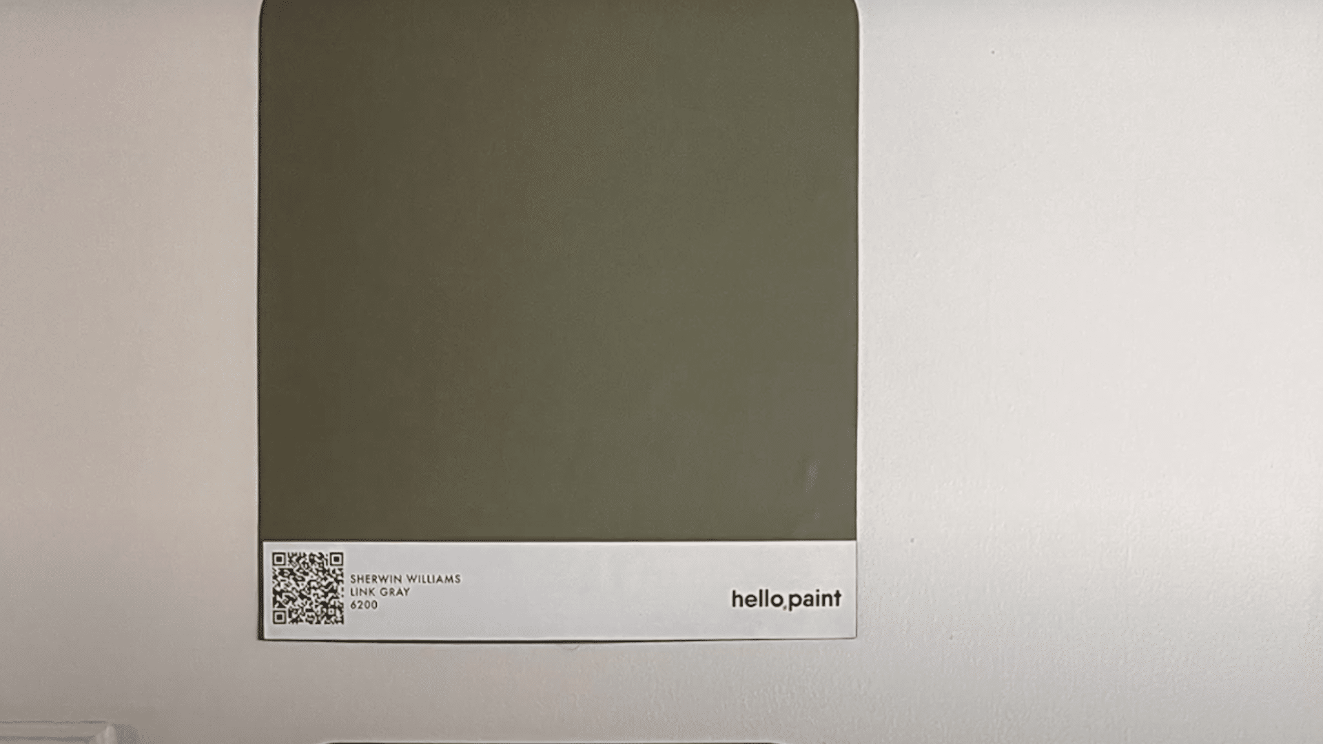
2. Use Paint Sample Sheets and Peel-and-Stick Swatches
Once you’ve narrowed your favorites, test them in real life. Use large paint sample sheets or peel-and-stick swatches from brands like Samplize or Benjamin Moore to see how colors truly appear under your lighting.
Place samples on multiple walls, including areas near windows and corners, to check how shades shift between daylight and lamplight. This method works best in living rooms, bedrooms, and hallways, where lighting changes throughout the day.
These large, movable samples reveal undertones that digital screens often hide, helping you make a confident choice before painting.
3. Test Paint Color Apps On Your Phone
The best paint color apps make it easy to preview shades anytime, anywhere. Try Sherwin-Williams ColorSnap®, Behr Project Color®, or Benjamin Moore Color Portfolio®.
Each app uses your camera to visualize paint colors directly on your walls or match hues from furniture, fabrics, and décor.
Some even generate coordinating palettes automatically. These tools are great for quick color comparisons while shopping or browsing online.
When paired with real-life swatches, paint apps make your color selection faster, smarter, and more accurate, so you can start painting with total confidence.
Avoid These Common Paint Color Mistakes
Even small mistakes can make the perfect color look wrong. Avoid these common errors to save time, money, and frustration.
- Choosing paint online without testing: Colors on screens rarely match real-life shades. Always test samples on your actual walls before painting.
- Ignoring undertones: Overlooking warm or cool undertones can make your paint clash with furniture, flooring, or décor.
- Forgetting trim or ceiling contrast: Trim and ceiling colors affect how your wall shade appears. Choose tones that complement each other.
- Testing directly on old paint: Old wall colors distort new paint tones. Use a white background when testing samples for accuracy.
- Rushing without daylight checks: View your samples in natural and artificial light. What looks right at night might feel different during the day.
Summing Up
I know choosing the right paint color can feel like a big decision, but now you’ve got the tools to do it confidently. You’ve learned how to choose paint colors that actually work in your lighting, match your furniture, and feel right for every room.
So here’s what I’d suggest: grab a few sample swatches, test them on your walls, and live with them for a couple of days. You’ll be surprised how quickly the perfect one stands out.
If this helped you feel more confident about your next project, I’d love for you to check out my other paint and home styling guides. The more you experiment, the closer you’ll get to colors that truly feel like you.


