


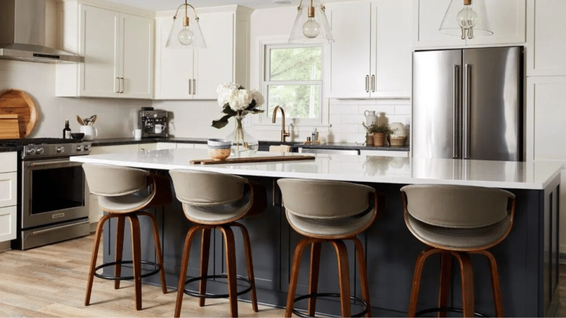
I used to think choosing a kitchen paint color was simple, but once you pair anything with white cabinets, the details start to matter.
You notice the light, the shadows, the small shifts in tone that change the whole room.
If you’re sorting through kitchen paint colors for white cabinets, you might feel stuck between warm shades, cool shades, and colors that seem to change every time you look at them.
I’ve been there too, and I know how important it is to look at what truly fits your space. This guide walks you through steady options, clear steps, and real examples so you can make a choice that feels right.
Considerations Before Choosing a Kitchen Paint Color
Picking a color for your kitchen walls or cabinets works best when you slow down and look at a few key details first. Start by checking the shade of your cabinets.
Some whites lean warm, while others look cool or bright, and this will affect how any wall color appears beside them. Then look at the light in your kitchen during the day and at night.
Sun, shadows, and bulbs can shift a color more than most people expect. Think about the look you want.
Soft and calm? Bold and dark? Light and open? Once you know these basics, it becomes much easier to choose a color that feels right in your space.
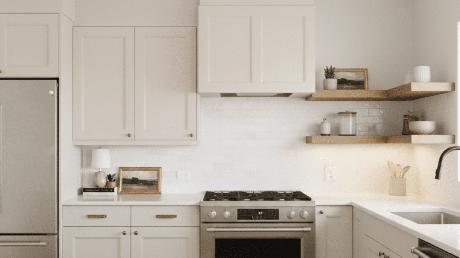
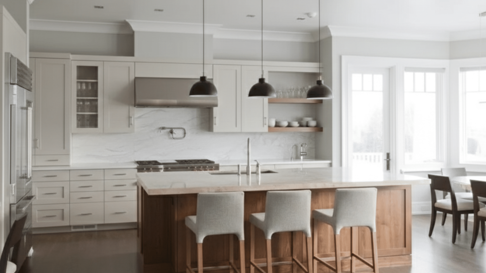
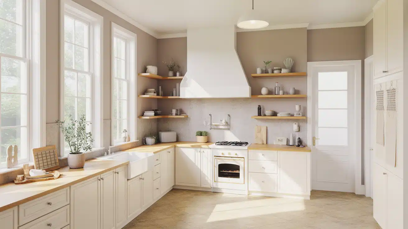
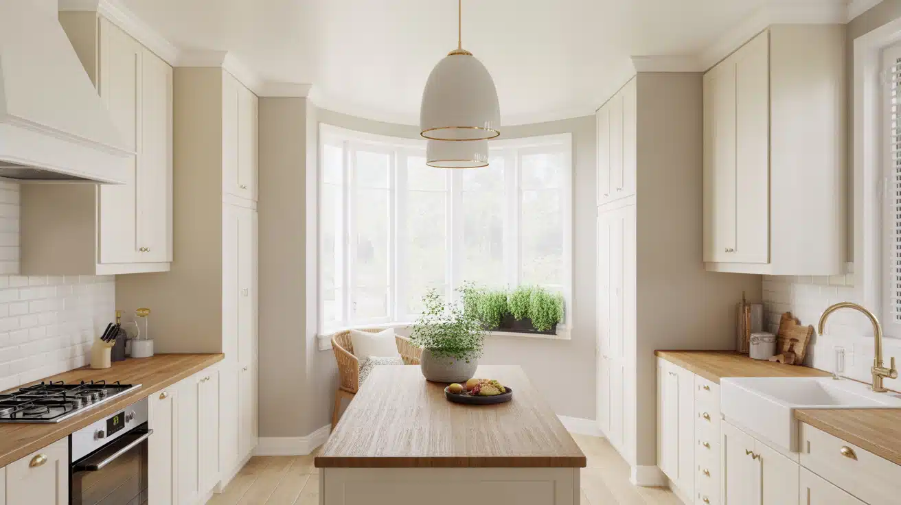
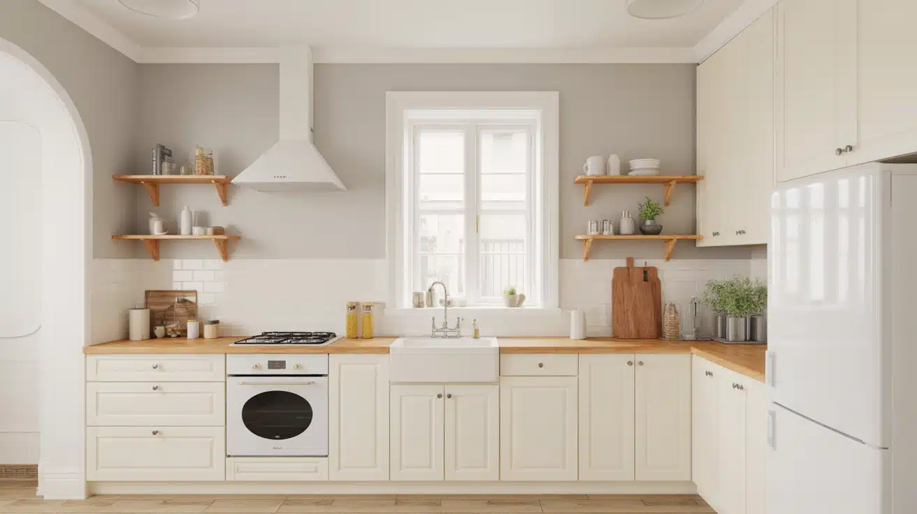
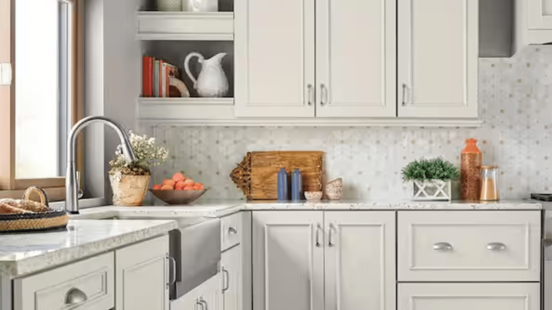
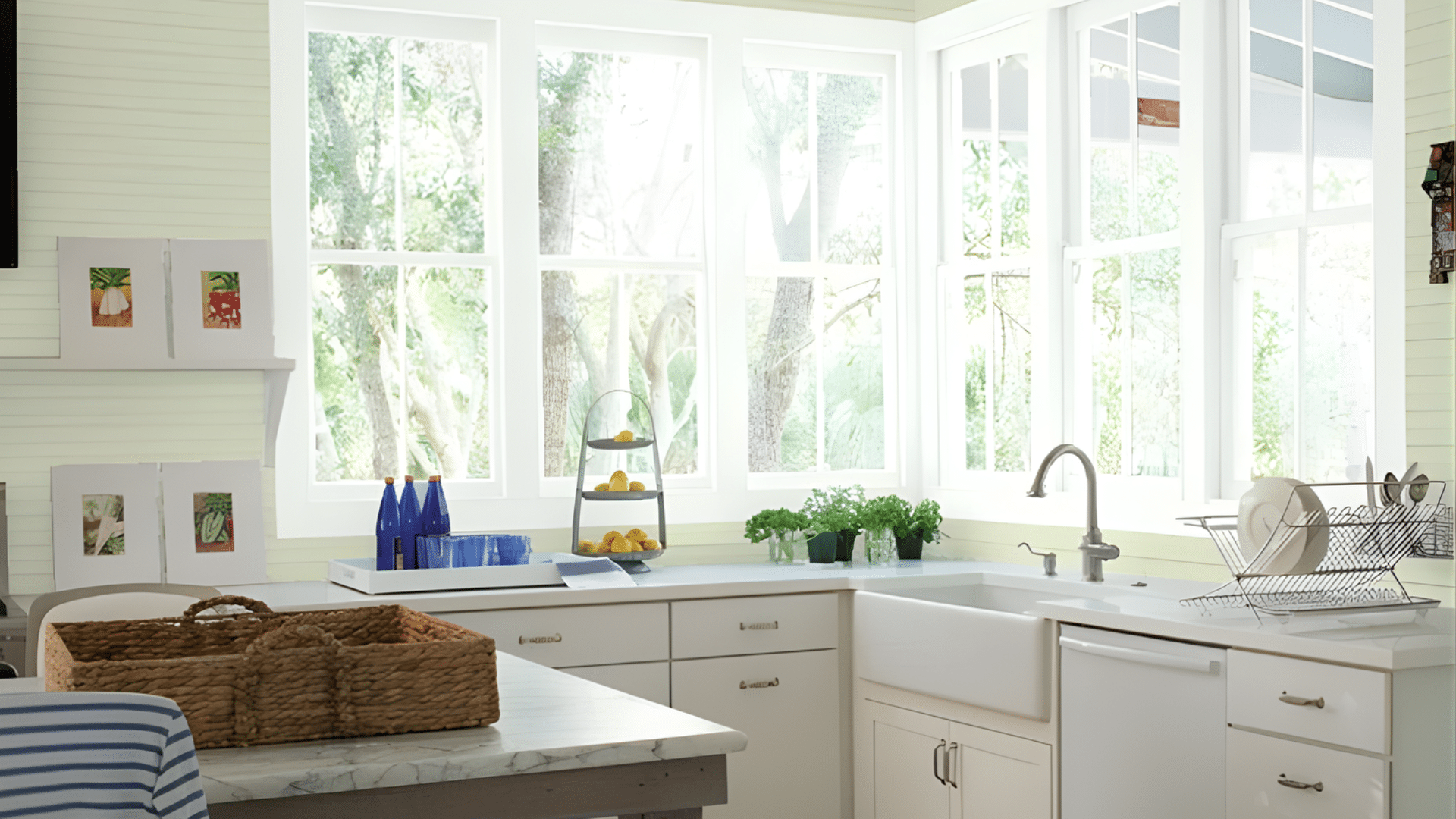
Kitchen Paint Colors with White Cabinets
These shades give you steady options when comparing white kitchen paint colors for rooms with bright or warm cabinets.
Soft Neutral Kitchen Paint Colors
These shades stay steady in most rooms and give you an easy, low-stress match with almost any white cabinet finish.
1. Sherwin-Williams Accessible Beige
This shade works well when you want warmth without a heavy look. It sits between beige and gray, so it helps soften bright white cabinets while still keeping the room light.
It works well in both sunny and low-light kitchens because it stays steady through the day. It also pairs nicely with stainless steel, wood floors, and warm counters.
Accessible Beige is a safe pick if you want a gentle touch that never competes with other features.
2. Sherwin-Williams Repose Gray
Repose Gray sits in the middle of warm and cool, giving steady balance around white cabinets. It helps calm strong whites without making the room feel dark. It works well in kitchens with steady daylight but also holds up under soft evening light.
Many people like it because it fits modern and older homes without feeling heavy. If your cabinets look bright or sharp, this shade helps tone them down in a simple, clean way.
3. Sherwin-Williams Agreeable Gray
Agreeable Gray is a soft mix of gray and beige that works well beside warm or cool white cabinets.
It keeps the room feeling open while adding enough color to avoid a flat look. This shade performs well in many lighting setups, which makes it a steady option if your kitchen has both bright areas and shadowed corners.
The color pairs well with stone counters, wood shelves, and simple hardware. It’s a strong pick if you want a calm space without strong undertones.
4. Benjamin Moore Edgecomb Gray
Edgecomb Gray leans warm and gentle, making it a great match for white cabinets that look bright or sharp.
It adds a soft backdrop that keeps the room from feeling plain. This shade works well in kitchens with warm floors, stone counters, or natural wood accents.
It stays steady through most lighting changes, which makes it easy to trust in busy homes. If your space needs a light touch that still brings warmth, this color fits well.
5. Benjamin Moore Classic Gray
Classic Gray is a pale gray with understated warmth, making it ideal for kitchens where you want a quiet, steady feel beside white cabinets. It does not compete with other colors in the room, which helps your cabinets stand out without looking harsh.
This shade works well with natural light because it reflects enough brightness to keep the space open. It also pairs well with stainless steel and light counters. Choose this color if you want a soft, clean backdrop that stays calm all day.
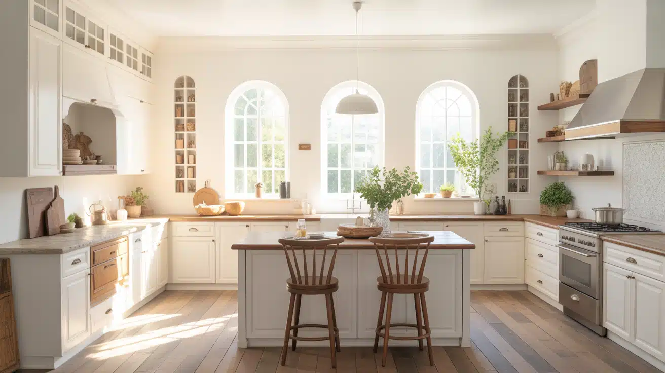
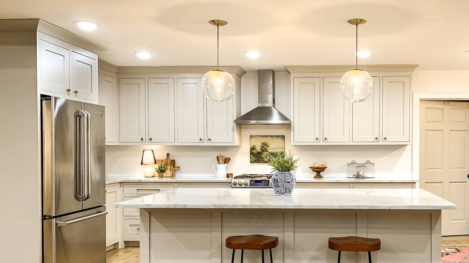
Warm and Cozy Kitchen Paint Colors
These shades help soften bright cabinets and bring calm warmth into the room without making the walls feel heavy or dark.
6. Sherwin-Williams Alabaster
Alabaster gives you a warm white that feels steady around bright cabinets. It adds a soft layer that reduces glare and makes strong whites feel calmer. Many kitchens benefit from its gentle tone because it sits between bright white and beige.
It works well with wood floors, brass hardware, and warm counters. Alabaster also holds steady in shadowed areas, which helps the room look even throughout the day. Choose it when you want warmth without any strong color.
7. Sherwin-Williams Shoji White
Shoji White brings a mix of warm beige and soft gray, making it a useful choice for bright white cabinets that feel too sharp. It adds gentle warmth while keeping the room light and open.
This shade works well with both warm and cool counters, giving you flexibility during updates. Shoji White also looks steady under different lighting, so it’s helpful in kitchens with shadowed corners. Use this color if you want a warm look without strong yellow notes.
8. Benjamin Moore White Dove
White Dove is a warm white that softens crisp cabinets and adds a smooth, steady backdrop. It offers warmth without feeling heavy, making it ideal for kitchens that need a calm touch. The shade works well with stone counters, wood accents, and soft lighting.
It also handles bright sun without turning harsh. Many homeowners pick it because it gives the room a gentle glow while keeping the layout light. Choose this color when your cabinets feel too bright and need balance.
9. Benjamin Moore Swiss Coffee
Swiss Coffee brings warm depth without overpowering white cabinets. It gives the room a soft, steady look while reducing the sharp edges of bright whites. This shade works especially well with warm floors, beige counters, and low-light kitchens.
It stays consistent during the day, which helps the room feel even. Swiss Coffee also pairs nicely with brushed metal hardware and wood shelves. Use this color if you want your kitchen to feel warm, smooth, and grounded.
Soft Color Kitchen Paints with White Cabinets
These shades add gentle color while staying light enough to match bright cabinets in small or large kitchens.
10. Sherwin-Williams Sea Salt
Sea Salt offers a soft mix of green and gray that shifts gently with the light. It pairs well with bright cabinets because it adds color without feeling bold. This shade works in sunny kitchens, shadowed areas, and open layouts.
It matches well with brushed metal, natural wood, and stone counters.
Sea Salt brings a calm feel to the space, giving you a hint of color that never feels strong. Choose this shade if you want a light color with a steady look.
11. Sherwin-Williams Evergreen Fog
Evergreen Fog is a muted green with gray notes that works well beside crisp white cabinets. It adds depth without overwhelming the room. This shade performs well in bright and low-light areas, holding a steady tone throughout the day.
It pairs with wood accents, black hardware, and warm counters. Evergreen Fog is a good fit for kitchens needing a grounded wall color that still feels light enough for everyday use. Choose it when you want gentle depth.
12. Benjamin Moore Palladian Blue
Palladian Blue is a soft blue with a gentle green touch, making it great for bright, cabinet kitchens needing subtle color. It brings a calm feel that stays steady in many lighting setups. The shade pairs with white trim, stone counters, and natural wood elements.
It works especially well in kitchens with steady daylight, keeping the room light and open. Palladian Blue offers color without sharp contrast. Choose this shade when you want a soft, airy look beside white cabinets.
13. Benjamin Moore Soft Fern
Soft Fern gives you a muted green tone that fits well with white cabinets in both small and large kitchens. It adds color without pulling attention away from cabinets or counters. This shade works well with warm floors, stone surfaces, and simple hardware.
It stays even with changing light, which helps the room look smooth throughout the day. Soft Fern is a great pick when you want gentle color with a natural feel that still keeps the space light.
Bold Accent Kitchen Paint Colors
These deeper shades work well on small areas, feature walls, or islands when you want a stronger contrast beside white cabinets.
14. Sherwin-Williams Naval
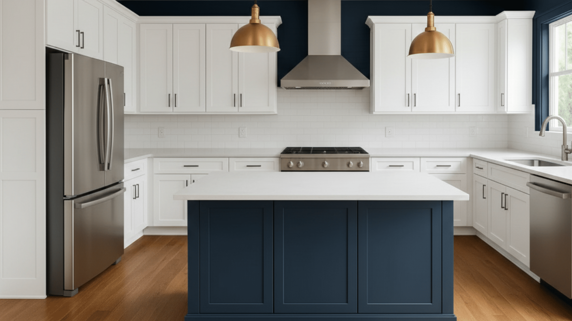
Naval is a deep blue that brings strong contrast to bright cabinets without overpowering the room. It works well on islands, hood covers, and short walls. The color holds steady under most lighting, which keeps it looking rich throughout the day.
Naval also pairs nicely with brushed metal, warm wood, and stone counters. This shade helps highlight key features while keeping the rest of the kitchen calm and simple. Choose it when you want a dark color that still feels controlled.
15. Benjamin Moore Hale Navy
Hale Navy offers a dark blue tone that gives clear contrast beside white cabinets. It works well in kitchens with good light and can be used on islands or accent areas. The shade pairs smoothly with silver hardware, wood shelves, and white trim.
It stays steady as the light changes, which makes it easy to trust in busy homes. Hale Navy adds depth without causing the kitchen to feel tight. Pick this shade when you want a strong yet steady accent.
16. Benjamin Moore Revere Pewter
Revere Pewter is a warm gray that brings a deeper look without feeling harsh. It works well around white cabinets because it adds contrast while staying soft enough for daily use. The color fits many features, including warm floors, stone counters, and brushed metal hardware.
Revere Pewter stays even in most lighting, which helps the kitchen look smooth from morning to evening. This shade is useful for small walls or islands where you want depth without a strong dark tone.
17. Sherwin-Williams Iron Ore
Iron Ore is a very dark charcoal that gives a strong contrast next to white cabinets. It works well on islands, pantry doors, or a single short wall. The shade looks almost black but has enough softness to keep the space from feeling closed in.
It pairs nicely with light counters, wood floors, and simple hardware in black or brass. Iron Ore is a smart pick when you want a bold accent that still ties in with the rest of the kitchen.
How to Choose the Right Kitchen Paint Color with White Cabinets
Choosing a kitchen paint color works best when you look at your cabinet shade, room light, and the level of contrast you want.
- Check if your cabinets lean warm, cool, or bright.
- Look at how sunlight and bulbs change the wall color during the day.
- Pick soft walls if you want a calm look with less contrast.
- Pick darker walls if you want a strong contrast around bright cabinets.
- Test small paint samples on different walls before choosing one.
- Match the wall color to your counters and floors so nothing clashes.
Kitchen Paint Colors for White Cabinets: Quick Guide
Use this chart to match wall tones with your kitchen style and countertop, so white cabinets stay balanced and simple.
| Kitchen Situation | Good Wall Tone | Why It Helps |
|---|---|---|
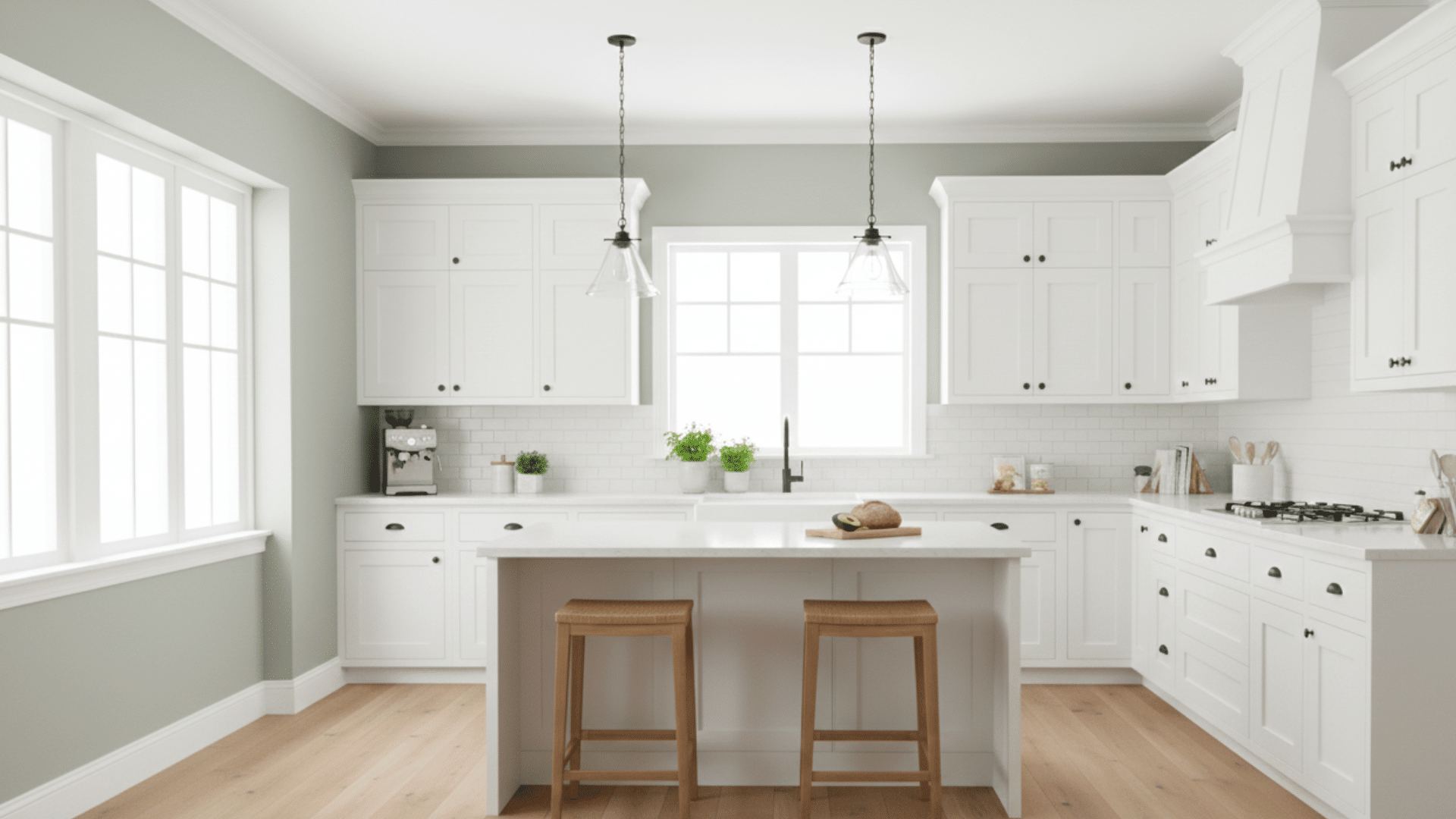
| Modern white cabinet kitchen | Cool gray | Keeps lines clean and cuts harsh glare. |
| Farmhouse white cabinet kitchen | Warm greige | Softens bright cabinets and wood tones. |
| Coastal white cabinet kitchen | Soft blue | Works well with sun and light finishes. |
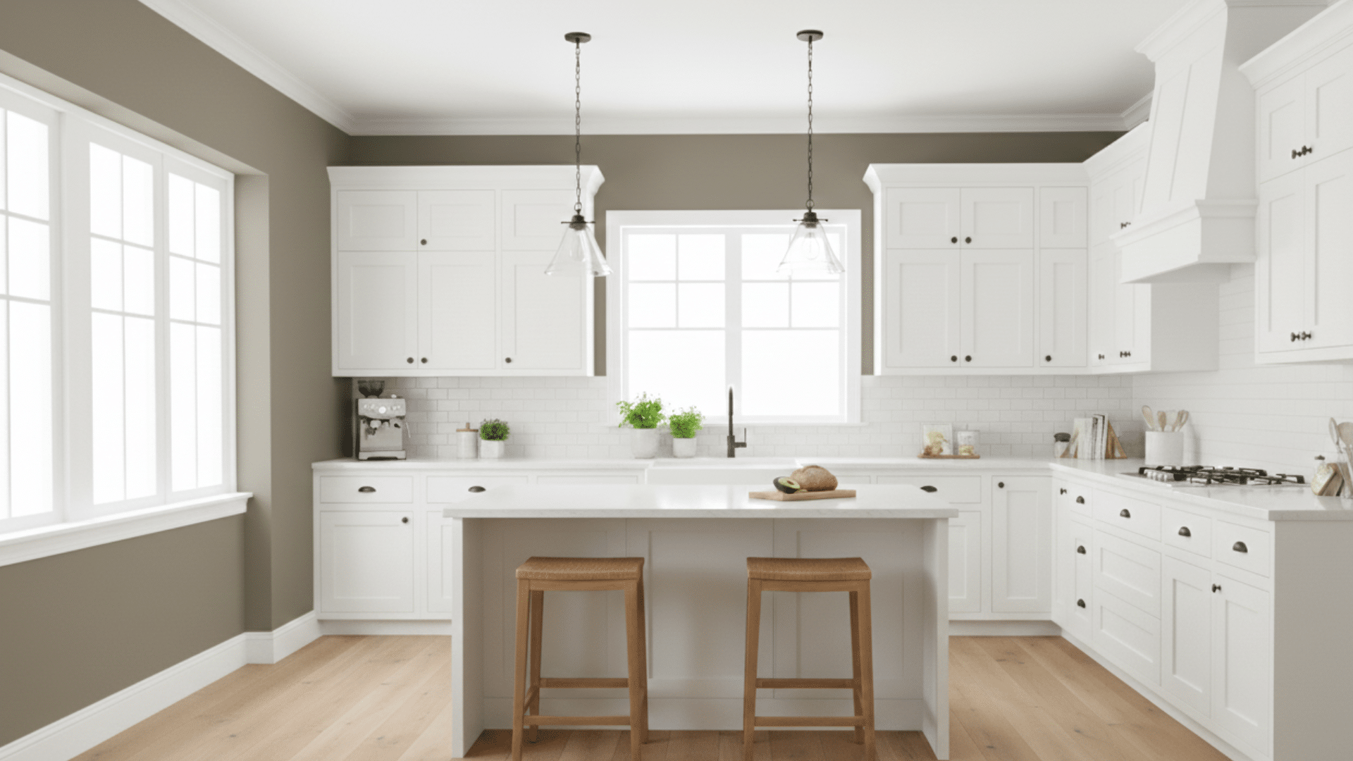
| Traditional white cabinet kitchen | Beige | Adds steady warmth beside white cabinets. |
| Quartz with cool veining | Cool gray | Matches cool stone lines and trim. |
| Quartz with warm veining | Warm neutral | Balances warm pattern without feeling dark. |
| Busy granite counters | Soft neutral | Calms strong movement in the stone. |
| Butcher block counters | Warm neutral | Fits the wood and keeps cabinets clear. |
| Marble counters | Soft gray | Echoes light gray lines in the stone. |
Use these groups as a starting point when testing white kitchen paint colors from your sample cards.
Common Mistakes to Avoid
Many problems come from quick choices, missed undertones, and skipping sample tests, which can make white cabinets look uneven or sharp.
- Picking a wall color without checking cabinet undertones first.
- Ignoring how sunlight and bulbs change the paint during the day.
- Choosing a white that makes cabinets look yellow or washed out.
- Skipping large paint samples on more than one wall.
- Forgetting to compare the wall color with the floors and counters.
- Using one sheen for walls, trim, and cabinets when each needs a different finish.
Concluison
By now, you should have a clearer sense of how small paint choices can shape the overall look of your kitchen, especially when you’re working with white cabinets.
The key steps stay simple. Check your cabinet tone. Pay attention to your natural and artificial light. Pick colors that support the space instead of competing with it. When you follow that process, choosing the right shade feels much less stressful.
If you’re still deciding on kitchen paint colors with white cabinets, test a few samples and watch them from morning to night. The right one will stand out once you see it in real light.
Want more help narrowing it down? Browse other kitchen color guides and cabinet paint ideas on the website to find combinations that fit your style and space.


