


Feeling overwhelmed by too many color choices when designing your space or project? A minimalist color palette simplifies everything by focusing on just a few intentional colors.
I used to struggle with picking colors until I learned how powerful simplicity can be. Minimalist palettes create calm, make spaces feel larger, and reduce visual clutter instantly.
You don’t need design experience to use these color combinations successfully. Each palette works for interiors, websites, fashion, branding, or any creative project you tackle.
Understanding which colors pair well together saves time and eliminates guesswork. This approach helps you create beautiful, cohesive designs without stress or confusion.
The Basics of Minimalist Color Schemes
A minimalist color palette strips away the extra and focuses on just a few carefully chosen colors. When I first found minimalism, I realized it’s all about simplicity, functionality, and keeping things neutral.
You won’t find busy patterns or clashing bright colors here. Instead, soft whites, grays, beiges, and subtle earth tones create the foundation. These colors bring instant calm and clarity to any space or design.
Sometimes a bold accent like black or navy adds just enough contrast without feeling overwhelming. The beauty lies in using fewer colors more intentionally.
Minimalist palettes make rooms feel bigger, cleaner, and more peaceful. They help your mind relax because there’s less visual noise competing for attention.
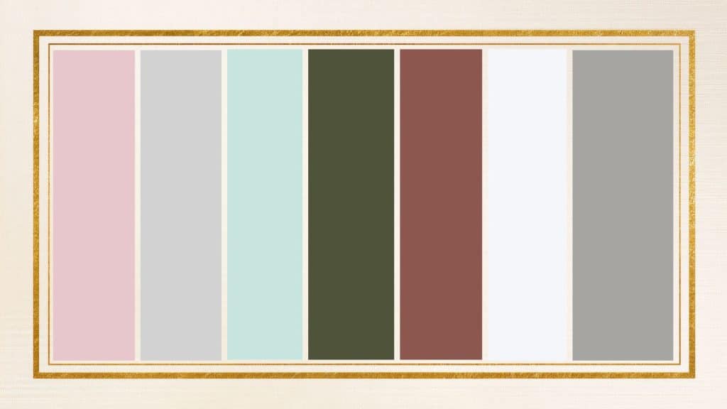
Beautiful Minimalist Color Combinations for Every Project
I spent years experimenting with colors before understanding what makes minimalist palettes truly work. Each combination below uses just a few colors to create maximum impact and tranquility.
Palette 1: Quiet Morning

Colors: Soft White, Misty Gray, Light Taupe
These three colors combine like a calm, foggy morning. The soft white keeps everything feeling light and open. Misty gray adds just enough depth without being too dark or heavy.
Light taupe brings a touch of warmth that makes the whole combination feel cozy. Together, they create a peaceful, clean look that never feels boring or cold.
Palette 2: Gentle Waves
Colors: Powder Blue, White Sand, Foggy Grey
I painted my home office with this palette, and it instantly felt more relaxing. The powder blue is so soft it barely registers as a color. White sand keeps everything bright and airy throughout the space.
Foggy grey grounds the palette without adding any harshness. The combination flows together smoothly, like gentle ocean waves rolling onto shore.
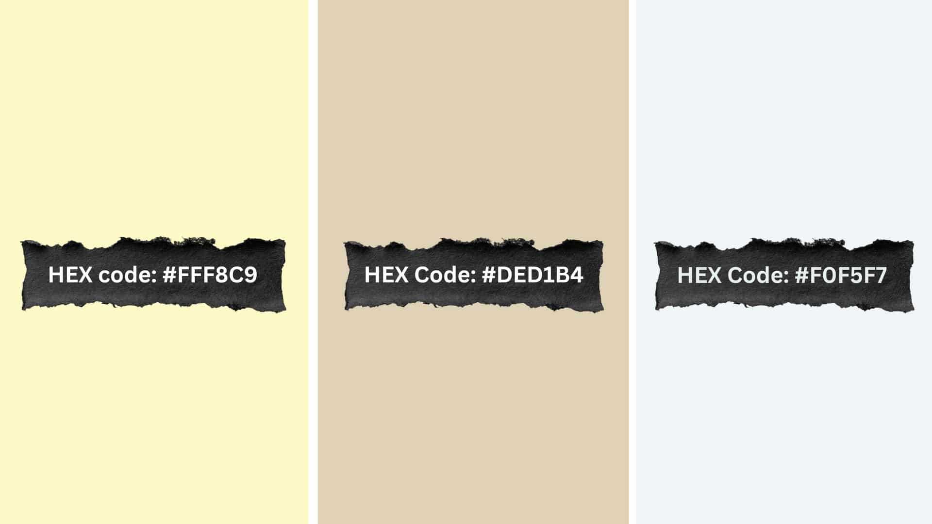
Palette 3: Dune Breeze

Colors: Warm Beige, Sandy Brown, Ivory
This palette wraps around you like warm sunshine on desert sand. Warm beige forms the foundation with its earthy, comfortable feel.
Sandy brown adds just a bit more richness and depth. Ivory lightens everything up and keeps it from feeling too heavy. The three colors work together to create a naturally cozy atmosphere.
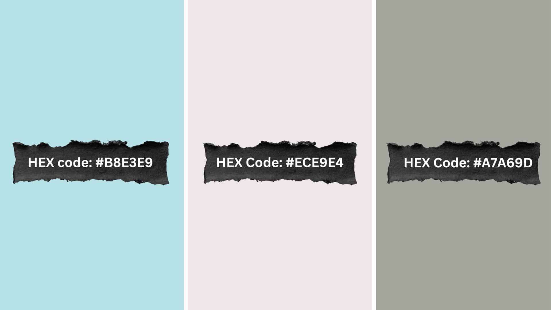
Palette 4: Urban Fog

Colors: Charcoal Grey, Mist White, Slate Blue
Charcoal grey brings refinement and strength to this modern combination. Mist white softens the darkness and adds breathing room between colors. Slate blue introduces a subtle, cool tone that feels both calm and contemporary.
These colors balance industrial edge with peaceful simplicity. The result feels sleek and polished without being cold.
Palette 5: Soft Linen
Colors: Light Ivory, Pale Beige, Cloud White
Light ivory creates a gentle warmth that feels welcoming and natural. Pale beige adds slightly more depth while staying incredibly soft and subtle.
Cloud white brightens the whole palette without feeling stark or clinical. All three colors mix so smoothly you barely notice where one ends and another begins. It’s like wrapping yourself in the softest blanket.
Palette 6: Calm Stone
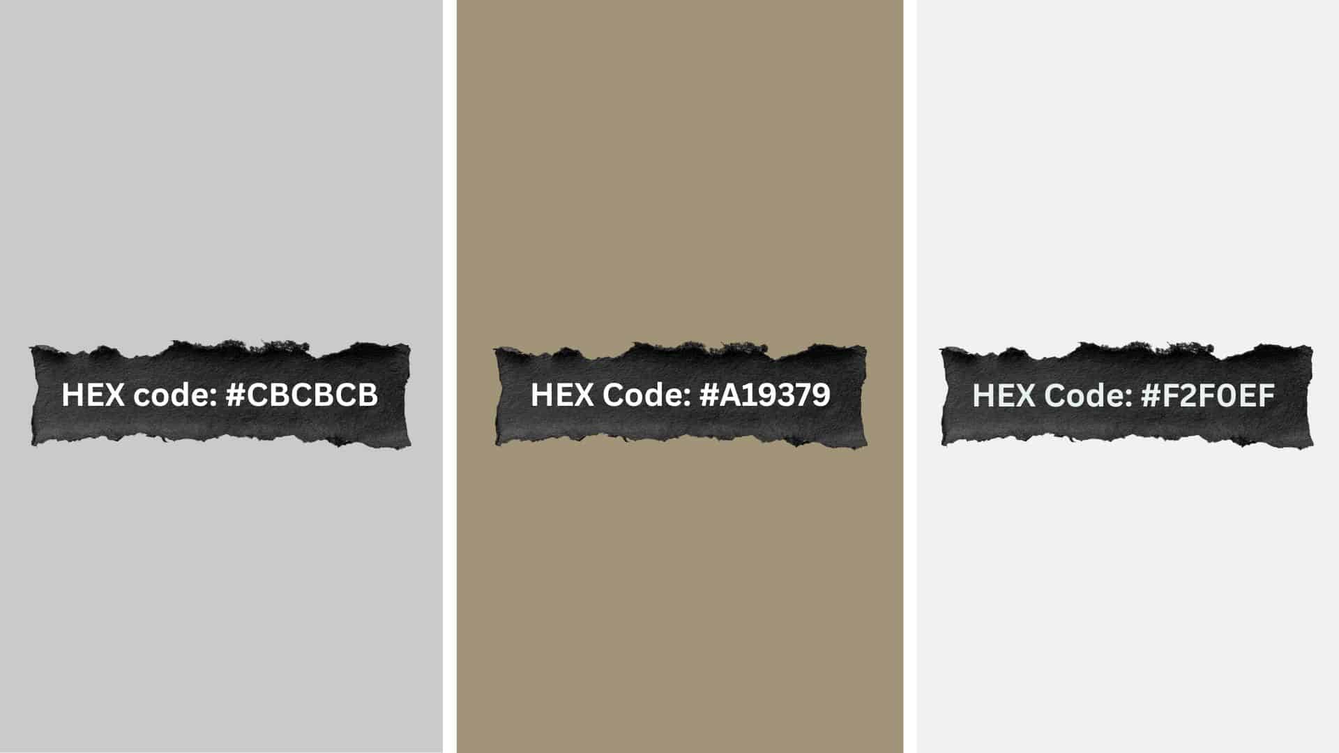
Colors: Cool Gray, Pebble, Off-White
Cool gray establishes a solid, grounding base for this combination. Pebble adds texture and interest with its slightly warmer neutral tone. Off-white lifts everything and prevents the palette from feeling too heavy.
The colors work together like smooth stones stacked in perfect balance. They create strength and serenity at the same time.
Palette 7: Frosted Blush
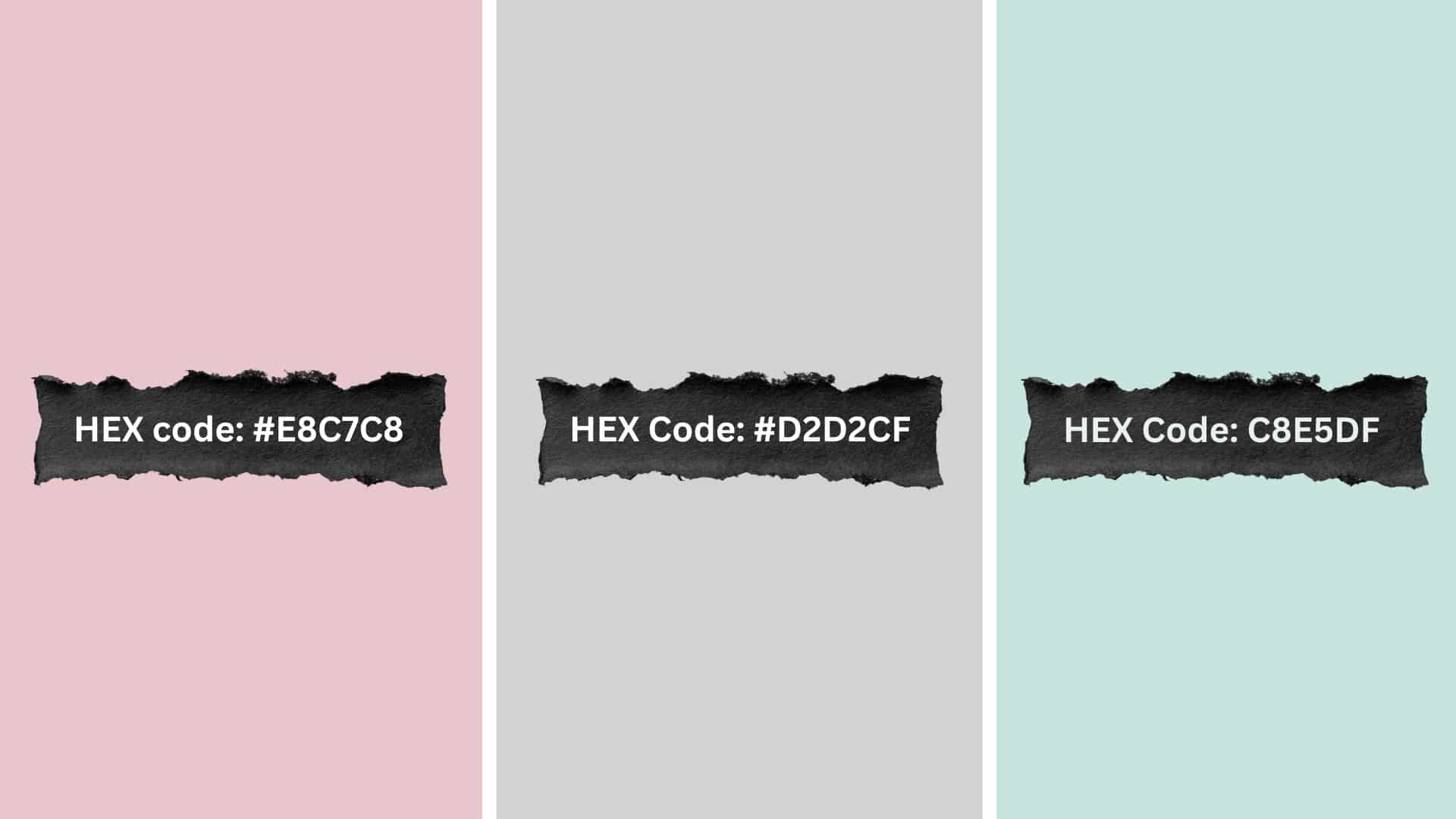
Colors: Blush Pink, Soft Gray, White Mist
Blush pink adds gentle warmth that feels welcoming without being overly sweet. Soft gray balances the pink and keeps it graceful and mature.
White mist brightens everything while maintaining that dreamy, smooth quality. The three colors merge like morning light filtering through frosted glass. It’s delicate but never feels fragile or overdone.
Palette 8: Natural Slate

Colors: Slate Gray, Soft Stone, Frost White
Slate gray provides depth and creates a strong foundation for this palette. Soft stone warms things up just enough to prevent coldness. Frost white adds necessary brightness and keeps the darker tones from overwhelming.
The combination feels solid and reliable, like natural rock formations. It creates a urbane look that still feels approachable.
Palette 9: Desert Mist
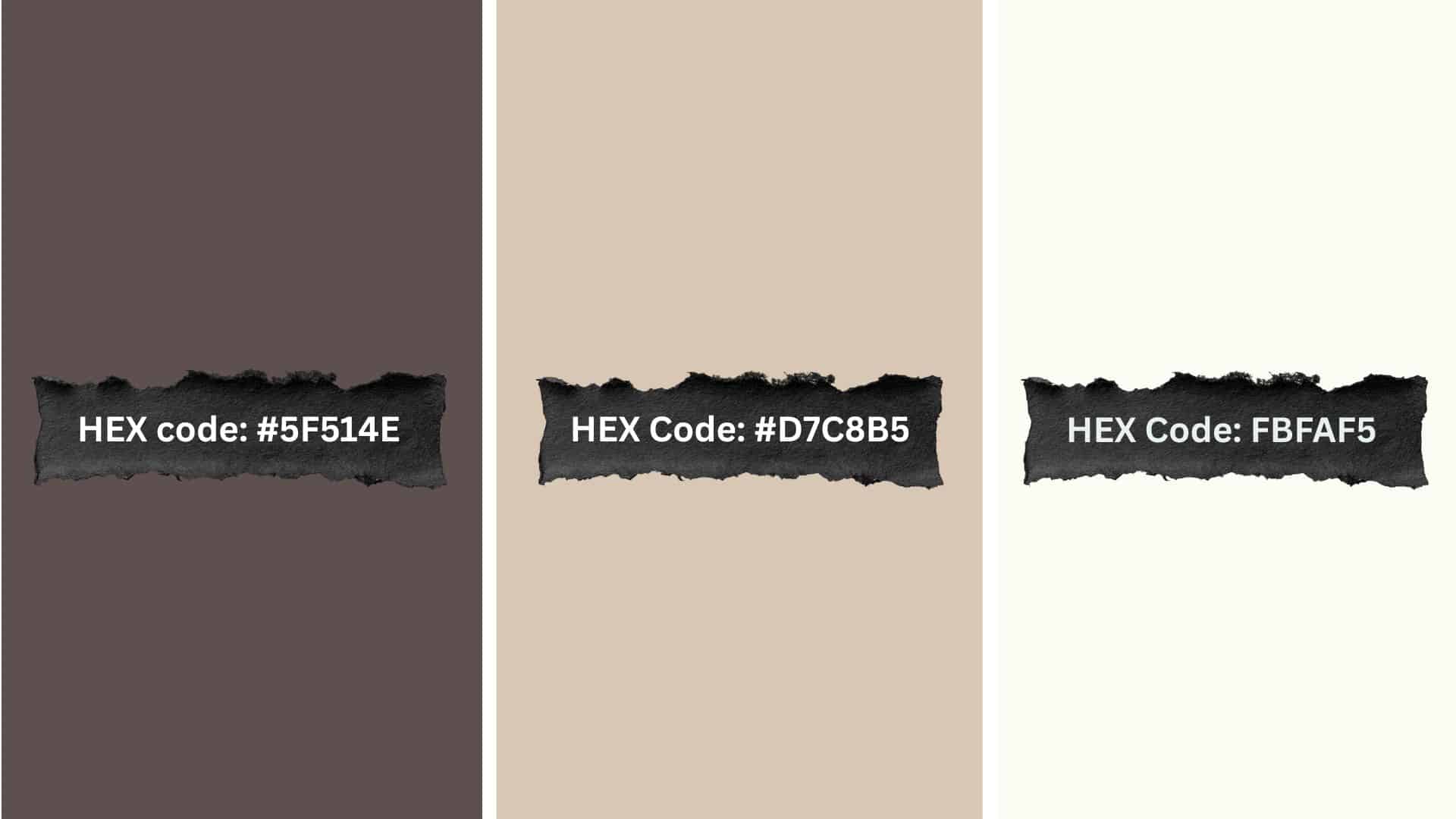
Colors: Warm Taupe, Sandy Beige, Soft White
I chose this palette for my living room because it feels like perpetual golden hour. Warm taupe brings that sun-baked, earthy quality that feels instantly comfortable.
Sandy beige adds richness without going too dark or heavy. Soft white keeps everything feeling fresh and prevents the warmth from becoming overwhelming. The colors flow together like desert landscapes at sunset.
Palette 10: Whispering Gray

Colors: Light Charcoal, Soft Ash, Snow White
Light charcoal creates depth without feeling too dark or dramatic. Soft ash sits perfectly in the middle, bridging the gap between dark and light.
Snow white adds brightness and keeps the whole palette feeling clean and modern. The contrast between these grays feels urbane and intentional. Together, they create a polished look that works anywhere.
Palette 11: Golden Hour

Colors: Warm Gold, Soft White, Light Gray
I used this palette for my bedroom accent wall, and it completely changed the space. Warm gold adds just enough richness and grace without being flashy. Soft white keeps everything feeling light and airy.
Light gray balances the warmth and adds refinement. The combination feels like that perfect moment when sunset light fills a room.
Palette 12: Quiet Forest
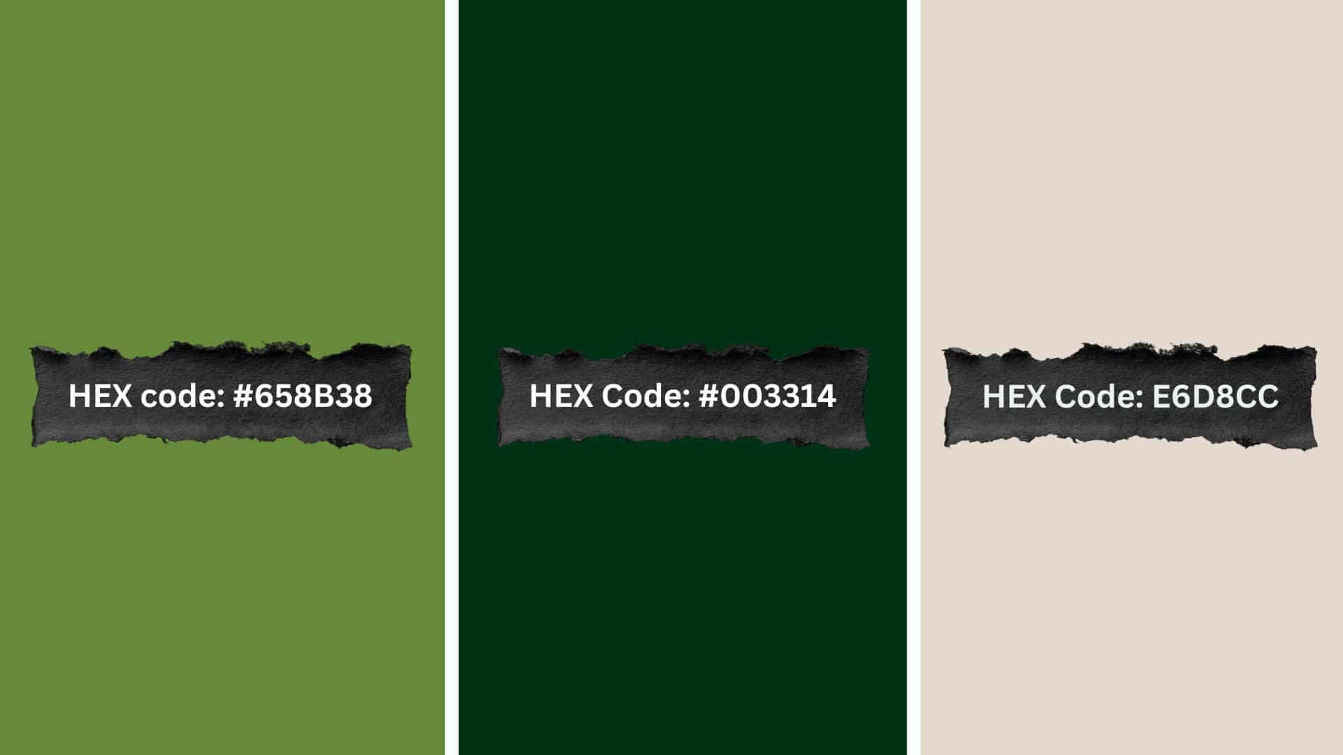
Colors: Moss Green, Deep Forest Green, Light Beige
Moss green creates a soft, earthy foundation that feels organic and natural. Deep forest green adds depth and richness to the combination. Light beige lightens everything and prevents the greens from feeling too heavy.
These colors work together like walking through a peaceful woodland. The palette feels grounded and connected to nature.
Palette 13: Pure Slate

Colors: Dark Slate, Cool Grey, Pale White
Dark slate provides a strong, dramatic foundation for this monochromatic palette. Cool grey softens the darkness while maintaining that urbane edge. Pale white adds necessary contrast and breathing room between the darker tones.
All three shades work together to create depth and interest. The result feels modern, polished, and intentionally minimalist.
Palette 14: Winter Breeze
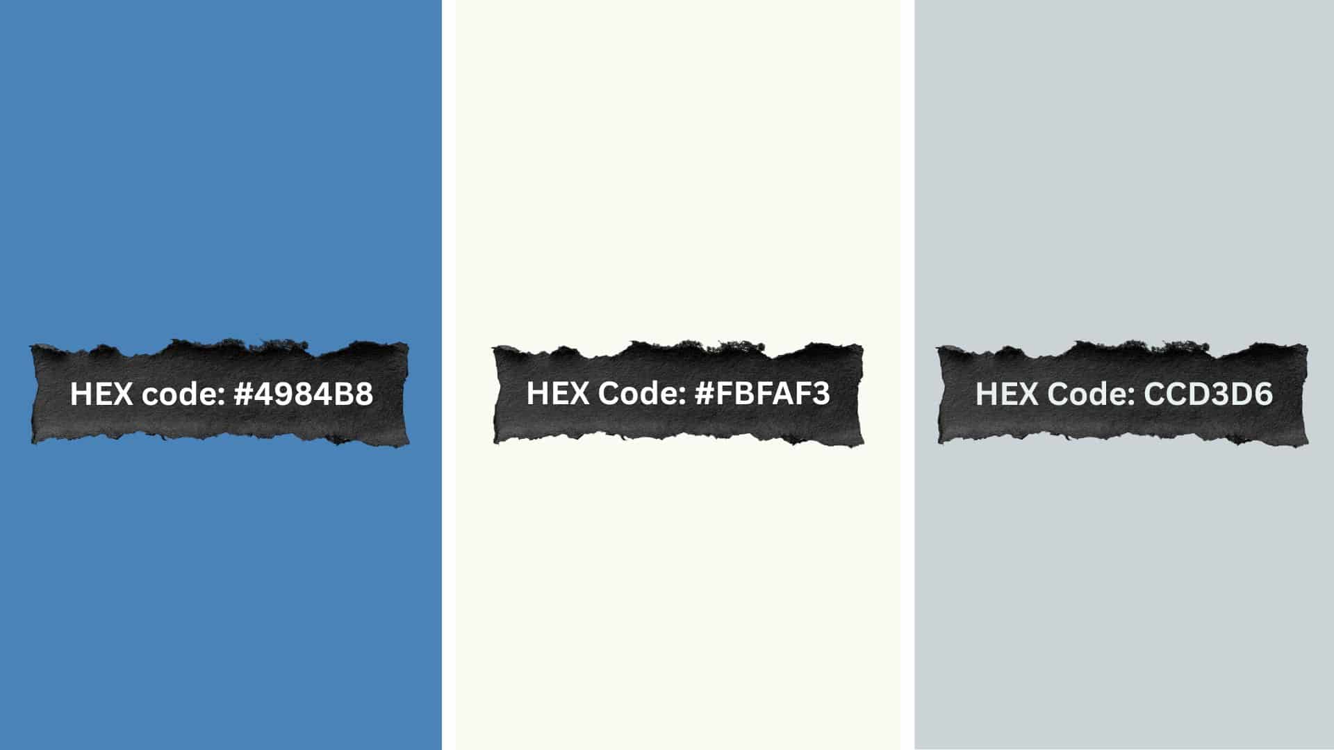
Colors: Cool Blue, Frost White, Light Slate
Cool blue brings a crisp, refreshing quality that feels clean and energizing. Frost white adds airiness and makes everything feel more spacious. Light slate grounds the cooler tones and adds subtle complexity.
Together, these colors feel like breathing in fresh winter air. The palette is refreshing without being too cold or harsh.
Palette 15: Minimal Indigo

Colors: Indigo Blue, Soft Gray, White Smoke
Indigo blue creates a rich, striking foundation that feels both bold and calm. Soft gray balances the intensity of the blue perfectly. White smoke adds lightness and keeps the deeper colors from overwhelming.
The combination feels confident and urbane without being loud. It creates visual interest while staying true to minimalist principles.
Palette 16: Soft Ember

Colors: Warm Red, Soft Ash, Snow White
Warm red adds energy and warmth in a subtle, controlled way. Soft ash tones down the red and creates a urbane balance.
Snow white keeps everything feeling fresh and prevents the warmth from becoming too much. These colors work together to create gentle energy. The palette feels alive without being overwhelming or aggressive.
Palette 17: Quiet Earth
Colors: Earthy Brown, Olive Green, Pale Sand
I chose this palette for my studio because it makes me feel instantly grounded. Earthy brown creates a solid, comfortable foundation that feels natural.
Olive green adds life and freshness while staying muted and calm. Pale sand lightens everything and ties the whole combination together. The colors feel like they came straight from nature itself.
How to Incorporate a Minimalist Color Palette in Your Design Projects
Understanding how to apply these simple color schemes helps you create cohesive, impactful work. Here’s how to use minimalist colors in various design areas:
| Design Area | Where to Use | Color Approach | Implementation Tips | Visual Balance |
|---|---|---|---|---|
| Home Interior Design | Living rooms, kitchens, bedrooms, bathrooms | Neutral walls with simple furniture and natural accents | Paint walls in soft neutrals, choose furniture in complementary muted tones | Add texture through wood or metal finishes, limit accent colors to 1-2 per room |
| Graphic and Web Design | Websites, apps, digital interfaces, social media | Limited palette with strategic whitespace | Use 2-3 core colors consistently across pages | Pair with clean typography and simple icons, ensuring good contrast for readability |
| Fashion and Apparel Design | Clothing, accessories, complete outfits | Neutral bases with optional bold accents | Build around beige, gray, white, or black foundations | Add one statement piece or keep entirely monochromatic for a classy style |
| Branding and Logo Design | Company logos, business cards, marketing materials | Two or three signature brand colors | Choose colors reflecting brand personality and values | Ensure logo works in color and black-and-white, keep design clean and recognizable |
I’ve used these exact approaches across my own design projects with consistently great results. The simplicity makes every project feel more intentional and polished without extra effort.
Tips for Creating Your Own Minimalist Color Palette
Learning these simple principles helped me create balanced, cohesive color schemes that actually work. Here’s how to build your perfect minimalist palette:
- Start with a Neutral Base: Begin with whites, grays, or beige as your foundation since they create calm and let other elements shine.
- Use Accent Colors Sparingly: Choose only one or two accent colors that complement your neutral base without overwhelming the simplicity.
- Consider Natural Elements: Bring in earthy tones like wood browns or stone grays to create a grounded, balanced feel that connects to nature.
- Think About Lighting: Remember that natural and artificial light dramatically change how colors appear throughout the day in your space.
These guidelines make creating your own palette much easier and less overwhelming. The key is adopting simplicity and resisting the urge to add unnecessary colors to your scheme.
Final Thoughts
A minimalist color palette changes how you approach design by removing unnecessary complexity and confusion.
These simple schemes prove that limiting colors actually increases visual impact and creates better results. I still use these exact palettes whenever I need clean, urbane design solutions quickly.
Remember that successful minimalism comes down to choosing fewer colors and using them more intentionally. Your spaces and designs will feel more cohesive, peaceful, and professionally polished immediately.
Start experimenting with these palettes and notice how much easier design decisions become. Which minimalist color palette caught your eye? Share your favorite in the comments below!


