


If you are considering Privilege Green SW 6193, you likely want to know how the color behaves in real life before committing to a full gallon.
As a color consultant with over a decade of interior design experience, I have worked with dozens of green paint colors across hundreds of projects. Privilege Green is one of the few I recommend without hesitation, but only when the conditions are right.
I have seen it go from gorgeous to flat when placed in the wrong lighting, which is exactly why I want to walk you through every variable before you open a can.
In this guide, you will see how Privilege Green responds to light, where it performs best, and how you can pair it with other colors to create a balanced space.
Getting to Know Privilege Green by Sherwin-Williams
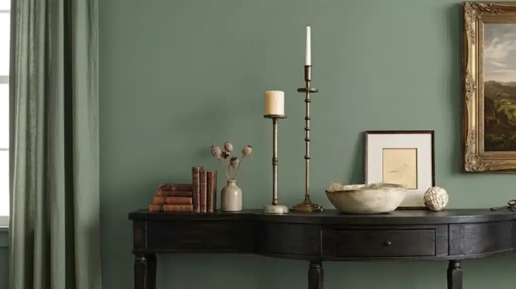
Privilege Green (SW 6193) sits in a nuanced middle ground, deeper than a classic sage, quieter than a forest green, and less blue-forward than many of its neighbors on the color strip.
Its RGB breakdown (Red: 122, Green: 135, Blue: 117) confirms what you see in person: green dominates, but just barely, which is what gives it that refined, almost muted sophistication.
The color looks different depending on your room, your lighting, and what is already on your floors and furniture. It does not demand attention, but it is never invisible either.
If you have been cycling through greens that pull too olive or too teal, this is the color that tends to put an end to that search. It lands in a place that feels genuinely livable, grounded without feeling heavy, deep without feeling dramatic.
Before buying a full gallon, having the exact specs in one place saves you from second-guessing at the paint counter:
|
Detail |
Value |
Notes |
|
Color Code |
SW 6193 |
Sherwin-Williams reference |
|
LRV |
22–23 |
Confirmed darker-range color; absorbs more light than it reflects |
|
HEX |
#7A8775 |
Digital reference |
|
RGB |
122, 135, 117 |
Green-dominant, low saturation |
|
Coverage |
350–400 sq ft per gallon |
Two coats recommended |
|
Dry Time |
1 hour touch / 2 hours recoat |
Depends on conditions |
|
Interior Lines |
Emerald, Duration, SuperPaint, Cashmere |
Choose based on durability needs |
|
Exterior Lines |
Duration Exterior, Emerald Exterior |
Strong weather resistance |
|
Best Cross-Brand Match |
Benjamin Moore Cedar Path |
Very close RGB and LRV match for those not using SW |
The commonly cited figure of 26 is slightly off. Multiple authoritative color databases list Privilege Green’s LRV at approximately 22–23, placing it firmly in the darker category.
In practical terms, that means it will make rooms feel more intimate and cozy, but it can also feel heavy in spaces with limited natural light. Plan accordingly.
When in doubt about the product line, Emerald is worth the extra cost for high-traffic rooms; its coverage and washability make a visible difference over time.
Privilege Green Undertones and Lighting Effects
One of the most common mistakes I see clients make is assuming that a green this muted must be neutral. It is not.
The gray undertone in Privilege Green is real, and in the wrong light it can push the color toward khaki or even a faint blue-gray.
I had one client who nearly repainted her entire dining room because she had tested it only in midday light. She had not accounted for how dramatically it shifted under the warm, incandescent light of her fixtures at dinner.
Testing across multiple light conditions is non-negotiable with this color.
Lighting has a strong impact on how Privilege Green SW 6193 appears throughout the day. Its deep green base with soft gray undertones can shift subtly depending on natural and artificial light conditions.
In Natural Light
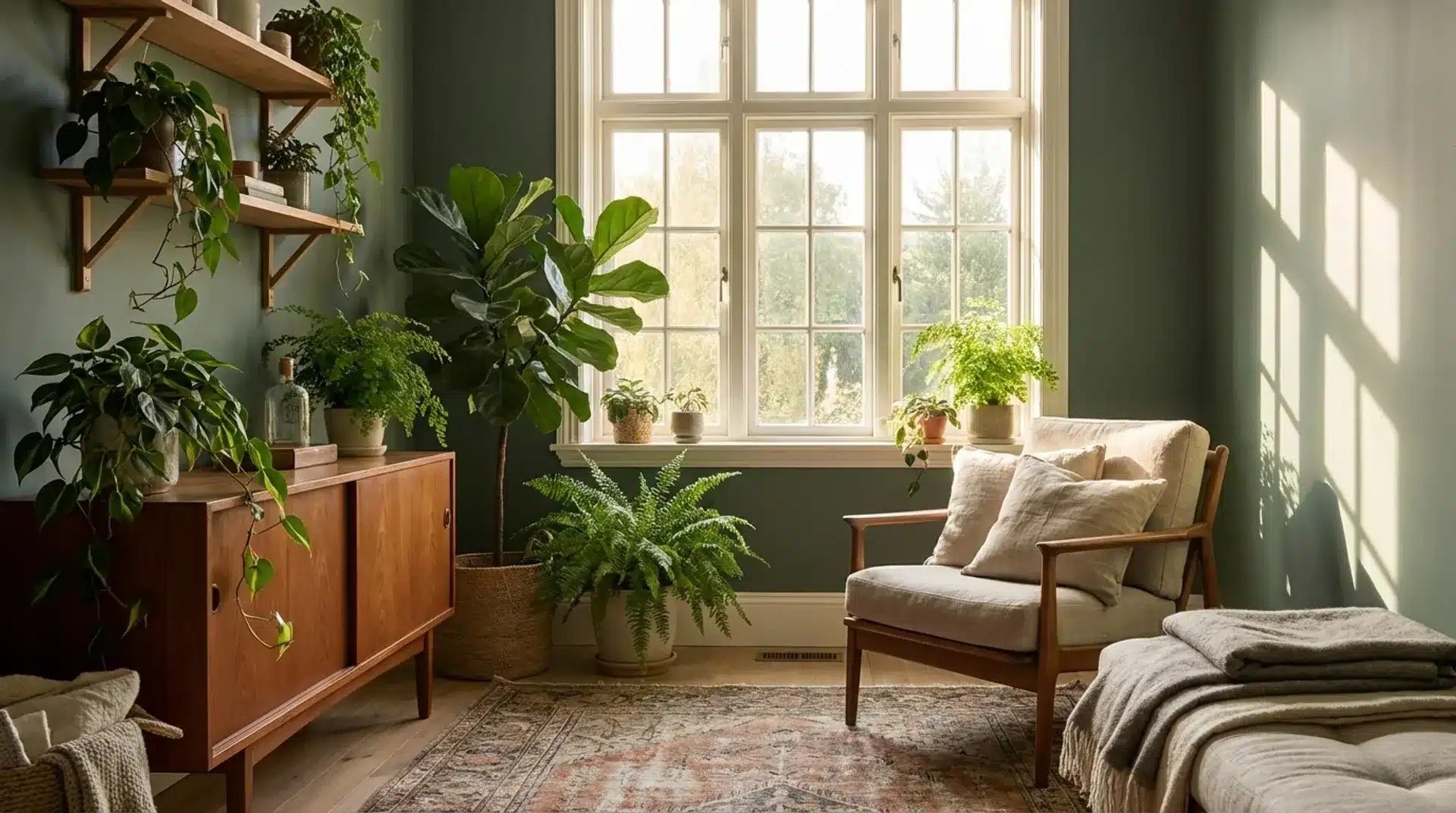
Natural light brings out the botanical richness in this shade, helping it feel layered and grounded rather than flat or dull.
North-facing rooms: North light is cooler and slightly muted. In these spaces, Privilege Green may appear deeper and more shadowed. The gray undertone becomes more prominent, giving the color a calm, quiet, and slightly moody appearance.
South-facing rooms: South-facing rooms receive warmer sunlight throughout the day. This draws out the green’s natural warmth, making the color feel more alive and lush. It reads as slightly more saturated in strong daylight.
East-facing rooms: Morning light is cool and bright. Early in the day, Privilege Green can look fresher and more clearly green. As the light fades into the afternoon, it settles into a deeper, quieter tone.
West-facing rooms: Afternoon and evening sunlight adds warmth. Privilege Green may take on a richer, more amber-like quality later in the day, creating a cozy, intimate atmosphere.
In Artificial Light
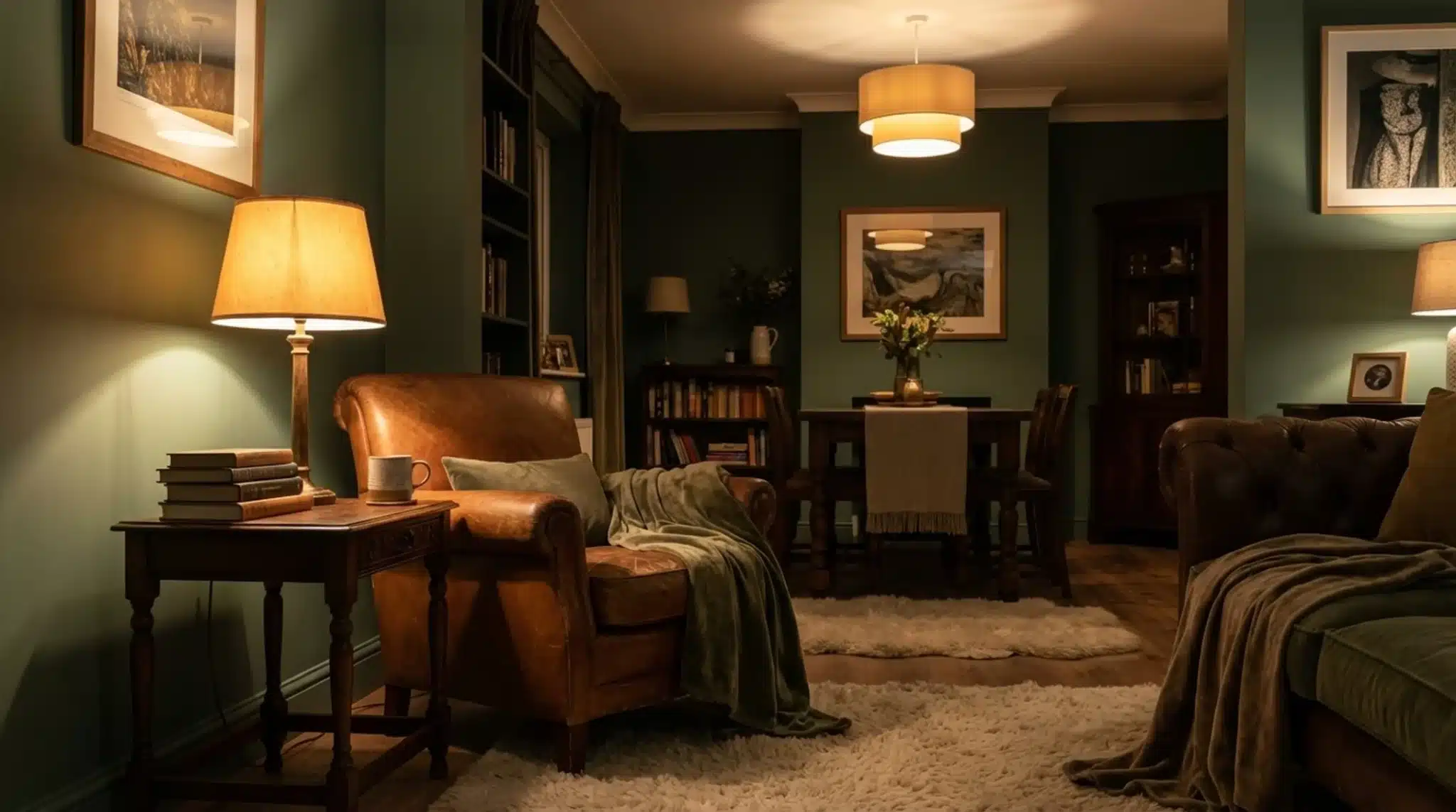
Artificial lighting changes how Privilege Green feels after sunset. Under warm bulbs, the green tones soften, and the gray undertone pulls forward slightly, giving the space a settled and sophisticated look.
Cool LED or daylight bulbs can bring out more of the true green and reduce the muted quality, making the color feel crisper and more saturated.
Using layered lighting, combining overhead fixtures with lamps, helps maintain balance and prevents the color from feeling too dark or too flat at night.
Choosing the Right Finish
The finish you select for Privilege Green SW 6193 can noticeably change how the color feels in your space. While the shade itself is deep and muted, the level of sheen affects depth, light reflection, and durability.
Higher-sheen finishes reflect more light, which can subtly brighten Privilege Green. Flatter finishes absorb light and reinforce the color’s muted, grounded character.
Matte finishes work well on walls, especially in living rooms and bedrooms, because they help hide minor surface imperfections and keep the moody quality intact. Eggshell offers a slight sheen and is a popular choice for main living areas due to its ease of cleaning.
Satin finishes are ideal for kitchens, bathrooms, and high-traffic spaces where durability matters. Semi-gloss works best for trim, doors, and cabinets, providing durability and easy wipe-down maintenance.
One detail worth noting: at an LRV of 22–23, Privilege Green already absorbs a significant amount of light. A flat or matte finish will deepen this further. If your room is on the darker side, choose eggshell at minimum to recover some brightness without losing the color’s grounded character.
How Privilege Green Looks in Different Rooms
This color shows up differently depending on the room, and that versatility is a big part of why it works across full homes rather than just one carefully styled space.
1. Living Rooms
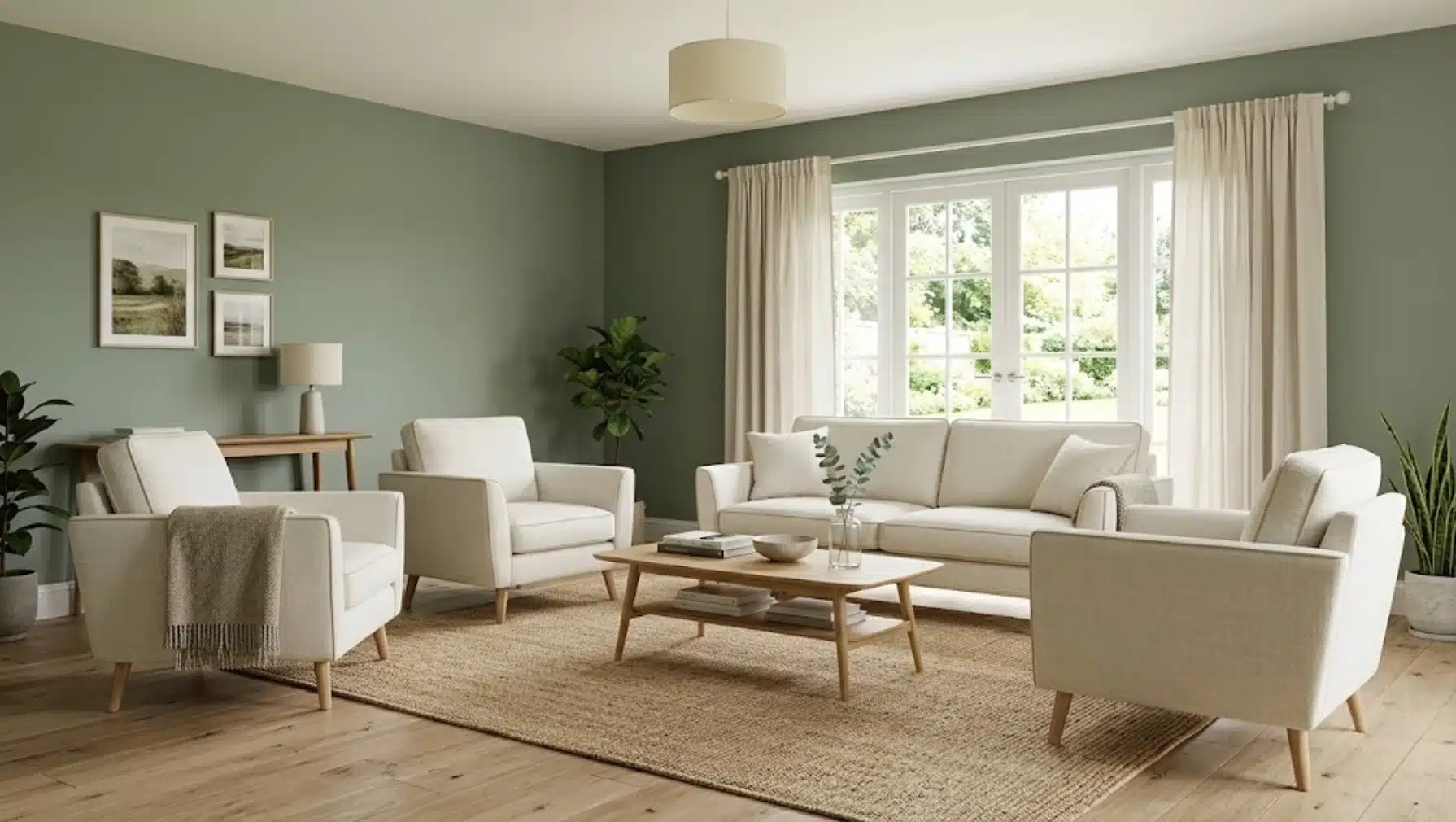
In open living areas, I often recommend this color when homeowners want a space that feels grounded but not overly dark. Privilege Green tends to look especially balanced when paired with warm wood flooring and lighter upholstery.
The contrast helps the color feel rich without overpowering the room, and it allows natural textures like linen, oak, and woven materials to stand out.
When the space has plenty of daylight, the green develops greater depth and character throughout the day, keeping the living room feeling layered and comfortable rather than flat.
In one living room project I worked on, the homeowner had tried three different greens before landing on Privilege Green.
The space had south-facing windows, warm white trim, and oak floors – a combination that let the color reach its full potential.
She told me a few months later that guests consistently ask about the paint color, which tells me everything about how it performs when the conditions align.
2. Bedrooms
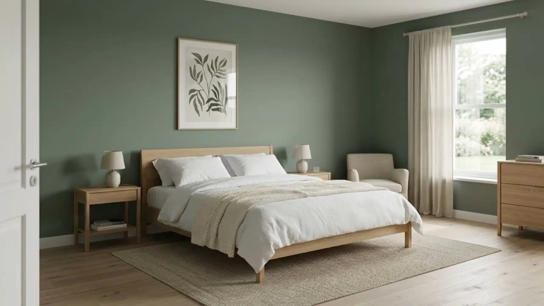
In many bedroom projects, I see clients choose this shade when they want a calm environment without relying on very pale neutrals.
Privilege Green creates a relaxed, settled feeling that works well with soft textiles and simple bedding. When combined with warm whites on trim and ceilings, the room keeps a light, balanced atmosphere while still feeling cozy.
I often recommend adding natural textures such as linen curtains, wood nightstands, or woven rugs to enhance the grounded quality of the color.
From a design psychology standpoint, deep muted greens like this one work in bedrooms partly because of their visual weight. They read as calm rather than stimulating, which supports winding down.
I pair it consistently with warm-toned lighting (2700K–3000K bulbs) to prevent the gray undertone from taking over in the evening.
3. Kitchens
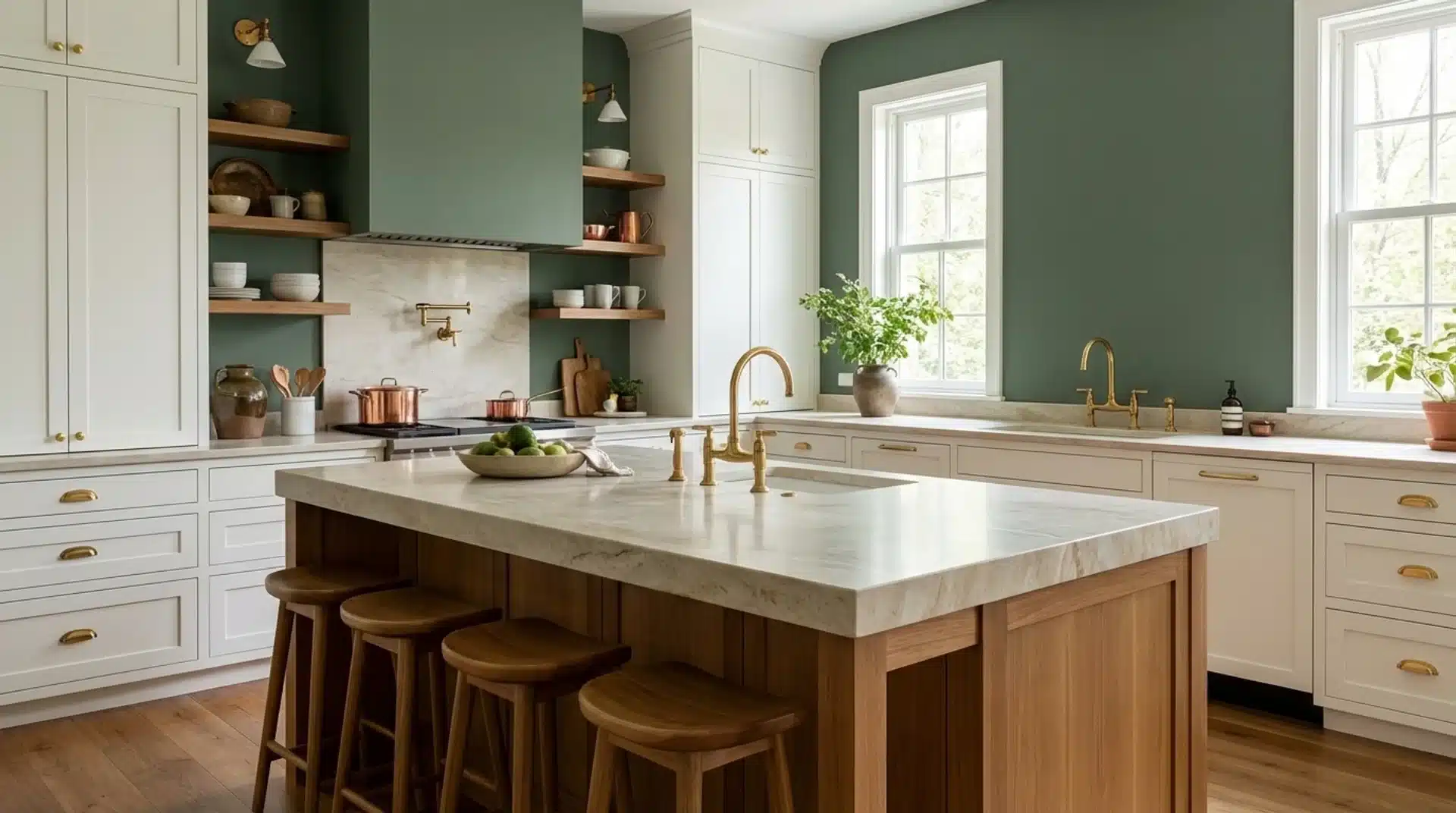
On kitchen walls, Privilege Green is one of those colors I find genuinely exceptional. It creates a strong visual backdrop that feels grounded and fresh without competing with colorful ceramics, open shelving displays, or the natural tones of food styling.
What I appreciate most is how well it holds its character alongside white or cream cabinetry, letting the walls do the work while everything else sits comfortably around it.
If you’re pairing green walls with white upper cabinets, choosing a connecting trim color ensures the transition reads as intentional rather than abrupt throughout the space.
Privilege Green also works surprisingly well on kitchen cabinets themselves, not just walls. I have used it as a lower cabinet color with white uppers in a two-tone kitchen, and the depth it adds at counter level grounds the entire space without making it feel enclosed.
4. Bathrooms
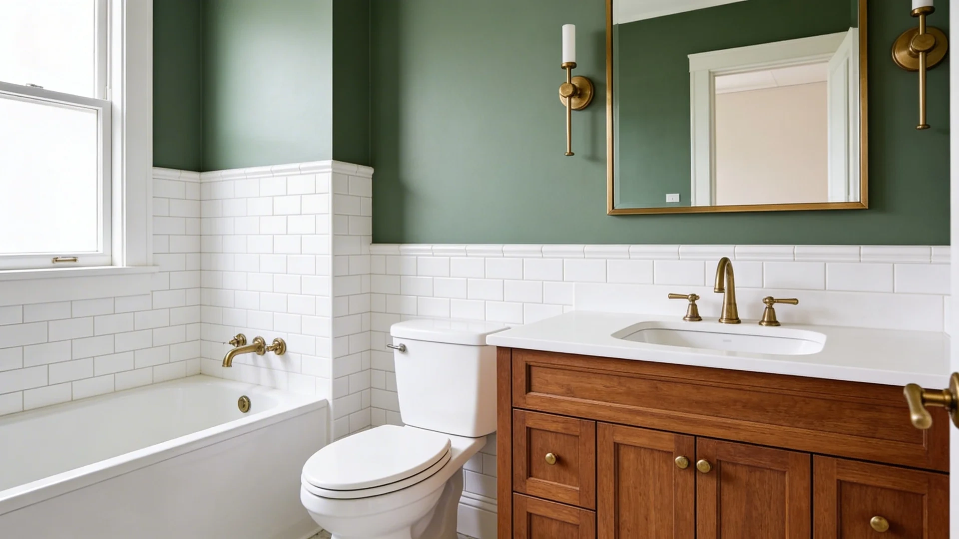
I have also seen this color used beautifully on bathroom walls, and it’s one of those applications that genuinely impresses me every time.
Privilege Green brings enough depth to make a small bathroom feel considered and intentional rather than plain or forgettable. It stands out naturally against white fixtures and tilework while blending warmly with wood vanities and warm metal accents.
In many bathrooms, pairing these walls with brass or brushed gold fixtures creates a balanced, timeless look that adds real character without overwhelming the overall feel of the space.
For smaller bathrooms with no window, I would hesitate. At LRV 22–23, Privilege Green can make an already dim space feel considerably heavier.
My recommendation in those cases is to keep it on a single accent wall behind the vanity rather than wrapping the full room.
5. Cabinets and Interior Doors
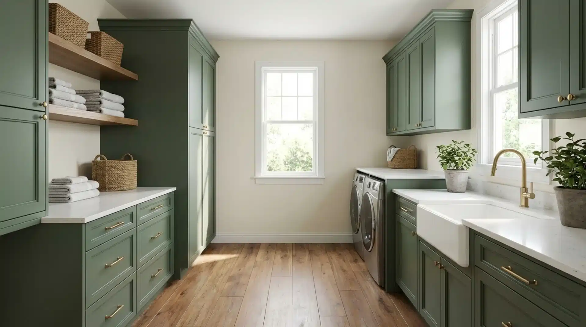
Privilege Green provides enough depth on cabinetry and interior doors to feel intentional rather than accidental. It performs well as a full kitchen cabinet color, bathroom vanity finish, or accent door shade in homes with warm wood flooring.
The balanced undertone prevents it from appearing too gray or too saturated against lighter walls. Its medium saturation allows it to stand on its own while still coordinating easily with surrounding neutral palettes and architectural details.
Exterior Applications
Privilege Green is rated for exterior use (Interior/Exterior, Color Usage Code B), and it performs well in this context.
On exteriors, it reads as a sophisticated, nature-forward shade that sits beautifully against natural stone, brick, and wood trim.
I have recommended it for front doors, shutters, and full exterior walls on craftsman-style and cottage homes where the color’s botanical quality feels native to the architecture.
Use Duration Exterior or Emerald Exterior for the paint line; both handle UV exposure without significant fading in medium-sunlight climates.
Comparisons to Other Similar Sherwin-Williams Colors
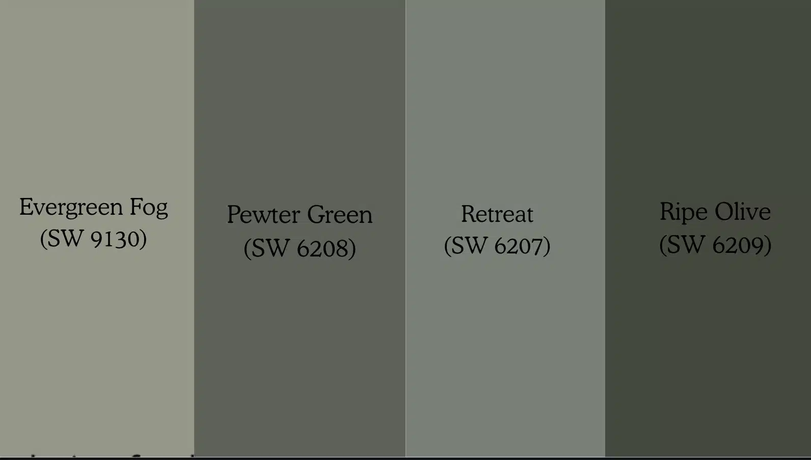
If you are deciding between similar Sherwin-Williams greens, these comparisons cut through the guesswork faster than holding swatches under a store light ever will:
|
Shade |
Tone |
Best Use |
Warm/Cool |
LRV |
Notes |
|
Soft gray-green |
Bedrooms, transitional spaces |
Cool-neutral |
30 |
Lighter and more gray-forward than Privilege Green |
|
|
Deep blue-green with gray |
Feature walls, moody interiors |
Cool |
14 |
Darker and cooler with a stronger blue influence |
|
|
Muted sage green |
Bedrooms, bathrooms |
Warm-neutral |
28 |
Softer and slightly warmer than Privilege Green |
|
|
Deep olive with a yellow base |
Accent walls, exterior trim |
Warm |
11 |
Much darker with a noticeable warm yellow undertone |
|
|
Cool botanical green |
Accent walls, offices |
Cool |
30 |
Similar feel but reflects 7% more light; better for rooms with limited natural light |
|
|
Lighter muted green |
Open-plan spaces, bathrooms |
Neutral |
37 |
14 LRV points lighter than Privilege Green; good alternative for dimmer rooms |
If you are still unsure, sample two or three of these directly on your wall, side by side, and test in your actual light to settle the comparison faster than any description.
Benjamin Moore Equivalent and Cross-Brand Matching
If you are working with Benjamin Moore or want a second-brand comparison before committing, the closest match to Privilege Green SW 6193 is Benjamin Moore Cedar Path.
Their RGB values are nearly identical (BM Cedar Path: 117/134/110 vs. SW Privilege Green: 122/135/117), and both share an LRV right around 23.
In side-by-side testing, Cedar Path reads very slightly cooler and marginally less saturated, but in practice, the difference is minor.
If you are using a contractor who works primarily with one brand, this gives you the flexibility to stay true to the color.
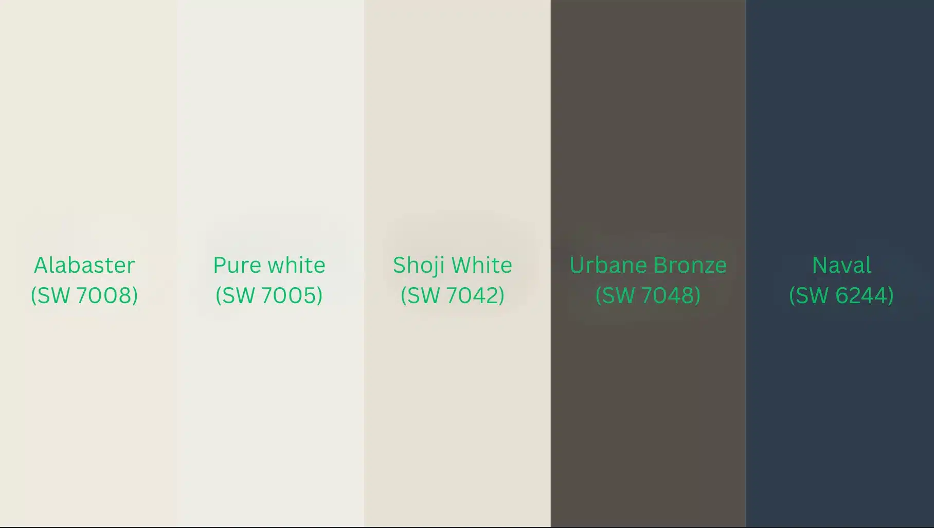
Top Coordinating Paint Colors to Consider
Getting coordinating colors right matters as much as the wall color itself; these pairings work consistently across different room types and lighting conditions:
- Alabaster (SW 7008): Soft, creamy trim pairing that keeps the overall palette warm and cohesive without harsh contrast
- Pure White (SW 7005): Crisper, cleaner trim option for spaces where you want more definition between the wall and the woodwork
- Shoji White (SW 7042): A warm off-white that softens the transition between Privilege Green and lighter ceilings
- Urbane Bronze (SW 7048): Rich, earthy accent that sits naturally alongside the green’s botanical character without competing
- Naval (SW 6244): Deep navy that adds bold contrast; the warm undertone in both colors stops the pairing from feeling cold
- Accessible Beige (SW 7036): A warm greige that harmonizes well with the earthy undertones in Privilege Green; works particularly well on adjacent walls in open-plan spaces
- Tricorn Black (SW 6258): A strong contrast option for door frames or cabinetry hardware; adds dramatic definition without fighting the green
When in doubt, start with trim and flooring; getting those two right makes every other coordinating decision noticeably easier.
One of the best colors to coordinate with SW Privilege Green is Alabaster (SW 7008), which reads as genuinely warm and bridges the gap between the green and your ceiling without either fighting the other.
Sampling Before You Commit
Testing the color in your own space is the safest way to avoid surprises. Privilege Green can shift depending on lighting, surrounding finishes, and room size.
Peel-and-stick samples from Samplize are a convenient way to preview the color without painting. Place them on at least two walls, preferably one that receives direct light and another that sits in shadow. Check the color at different times of day to see how it changes as lighting shifts.
If you prefer traditional testing, purchase a sample can from Sherwin-Williams and paint a section about 2×2 feet on your wall. Allow the paint to dry completely before evaluating the color.
Leave the sample up for at least 48 hours and compare it with your trim, flooring, and furniture before making a final decision.
My professional practice is to also test the color against a white sheet of paper held next to the swatch.
It sounds simple, but it immediately reveals whether the undertone pulls toward gray, blue, or stays true green, something very hard to see without a reference point. Try it before you commit.
Final Thoughts
After reviewing Privilege Green SW 6193 in different lighting conditions, finishes, and room settings, you now have a clearer picture of how this color behaves in real spaces.
I have shared how its muted green base and soft gray undertones interact with natural light, how it works in living areas, bedrooms, kitchens, and bathrooms, and which coordinating colors support it best.
When you understand these details, choosing paint becomes far less stressful. My advice is simple: test the color in your own lighting and observe it throughout the day before making your final decision.
If you decide to try this shade, I would love to hear how it looks in your home, so feel free to share your experience or questions below.


