


When I first started looking for a rich gray paint that felt warm but still classic, Rockport Gray by Benjamin Moore quickly showed up everywhere.
It’s one of those colors that designers keep recommending because it adds depth without feeling too dark or cold. Here, I’ll walk you through everything you need to know about Rockport Gray Benjamin Moore.
I’ll explain its undertones, best rooms to use it in, colors that match it, comparisons with other popular grays, and where you can buy it. By the end, you’ll know if this timeless gray is right for your home.
Understanding Rockport Gray HC-105 by Benjamin Moore
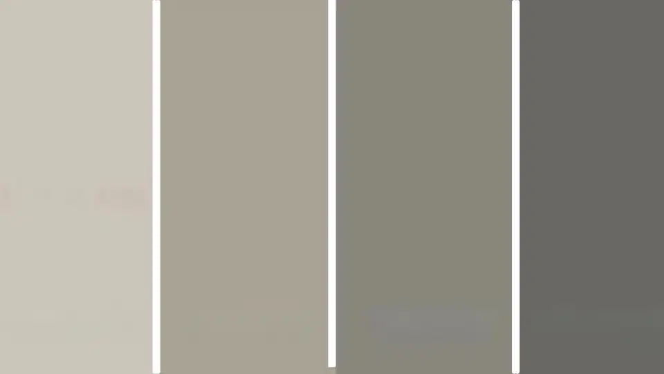
Rockport Gray (HC-105) is a rich, medium-depth gray from the Historic Color Collection, known for adding depth while still feeling warm and inviting.
With a Light Reflectance Value (LRV) of about 35, it sits in the mid-tone range, meaning it won’t look too pale or overly dark in most rooms.
Designers often call it a warm gray because of its subtle brown and soft violet undertones, which help it feel balanced instead of cold.
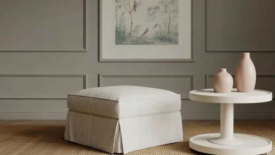
Rockport Gray works well in many interior spaces, such as living rooms, cabinets, and accent walls, and it can also be used on exteriors when paired with lighter trim for contrast and a classic, classic look.
Rockport Gray Undertones Explained
If you’re trying to understand how Rockport Gray really looks on the wall, the secret is in its undertones. Here’s a simple breakdown to help you picture it better:
- Main base color: Medium gray that feels rich but not too dark
- Warm hint: Soft brown undertone that keeps it from looking cold
- Subtle extra tone: Very light violet touch that adds depth
- In bright sunlight, Can look warmer and slightly lighter
- In low light or cloudy rooms, May appear deeper and a bit cooler
- South-facing rooms: Usually show its warm, cozy side
- North-facing rooms: Can make the color look darker and more muted
Overall, these subtle undertones make Benjamin Moore Rockport Gray feel balanced, cozy, and easy to use in many rooms.
Where Does Rockport Gray Work Best?
If you’re wondering where this color really shines, I’ve seen Benjamin Moore Rockport Gray work beautifully in many parts of a home. Here’s a simple room-by-room guide:
1. Living Rooms
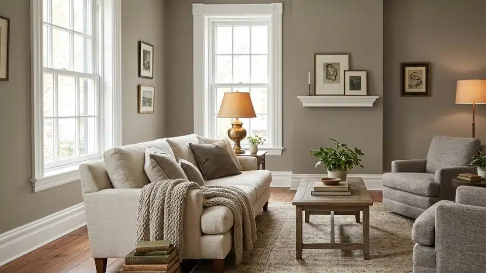
I love using Benjamin Moore’s Rockport Gray in living rooms because it adds depth while still feeling warm and welcoming. It’s darker than light grays, so the space feels cozy rather than washed out.
This color works especially well with white trim, wood floors, and soft neutral furniture. If the room gets good natural light, the gray feels balanced and calm. Add warm lamps and textured fabrics to keep the space comfortable and inviting.
2. Bedrooms
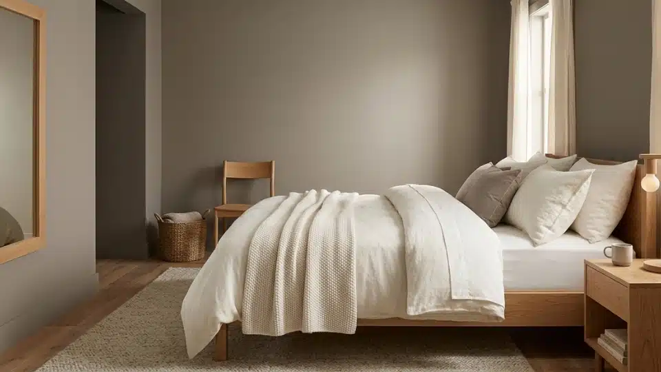
Rockport Gray is a great choice for bedrooms if you want a calm, slightly dramatic look without going too dark. I find it helps the room feel peaceful and restful, which is perfect for sleep spaces.
Pair it with soft bedding, warm whites, and natural wood tones for a relaxed style. In brighter bedrooms, it feels warm and soothing, while in dim lighting, it creates a cozy, cocoon-like mood that many people really enjoy.
3. Kitchen Cabinets
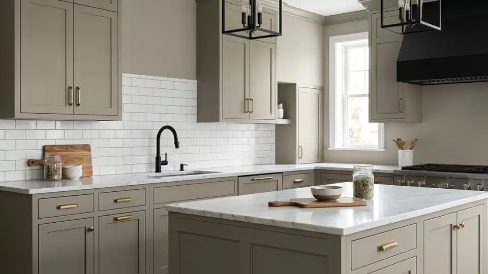
On kitchen cabinets, Rockport Gray can look rich, stylish, and timeless. I often suggest it when someone wants a darker neutral that still feels warm and friendly.
It pairs beautifully with white or marble countertops, subway tile backsplashes, and brass or black hardware. Because it’s a mid-to-deep gray, it hides small marks better than lighter colors, too.
4. Exterior Siding
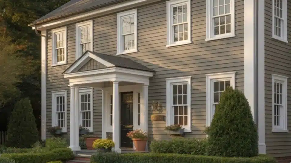
Rockport Gray can also look beautiful on home exteriors when you want a classic, slightly bold neutral. I usually recommend pairing it with crisp white trim, stone details, or warm-wood doors to balance it.
Because it’s deeper than many exterior grays, it gives the house strong curb appeal and a timeless feel. Always test it outside first, since sunlight can make it appear lighter during the day and much deeper in shade.
Where to Buy Rockport Gray by Benjamin Moore
If you’re ready to try Rockport Gray, here’s a quick guide to the easiest places to find it and what each option is best for.
| Where to Buy | What You’ll Get | Best For |
|---|---|---|
| Official Benjamin Moore retailers | Exact HC-105 color mixing, full paint lines, and finish advice | Safest option for final purchase |
| Local independent paint stores | Same Benjamin Moore paints, staff guidance, and possible ordering | Quick local pickup and expert help |
| Online paint sample shops | Small sample pots or peel-and-stick swatches delivered home | Testing the color before buying gallons |
| Large home improvement partners (select locations) | Limited Benjamin Moore selections depending on the store | Checking availability nearby |
I always suggest testing a sample first so you can be sure the color looks right in your own lighting before buying the full paint.
Best Coordinating Colors for Rockport Gray
Choosing the right coordinating colors can truly elevate Rockport Gray and help it feel balanced and intentional in your space. The shades you pair with it will influence whether the room feels warm, modern, cozy, or dramatic.
1. Best Whites to Pair With Rockport Gray

Rockport Gray looks stunning with soft, warm whites that keep the space bright without creating harsh contrast. Shades like White Dove (OC-17) and Simply White (OC-117) work beautifully for trim and ceilings.
If you want a cozy feel, choose a creamy white; for a cleaner, more modern look, go with a brighter neutral white. The right white will prevent the gray from feeling heavy and keep the room fresh and balanced.
2. Accent Colors for Contrast

Rockport Gray serves as a sophisticated anchor, effortlessly balancing depth and neutrality. To elevate the space, pair it with Hale Navy (HC-154) or Wrought Iron (2124-10) for a dramatic, high-contrast look on cabinetry or interior doors.
For a warmer touch, consider dusty blue, soft sage, or even a muted blush to add personality without overwhelming the space. Brass or matte black hardware also complements its depth. Keep accent tones intentional, so Rockport Gray remains the anchor of the design.
3. Complementary Neutrals

For a layered and cohesive look, combine Rockport Gray with greige, taupe, or soft beige tones. Shades like Revere Pewter (HC-172),Edgecomb Gray (HC-173), or a warm putty-neutral blend seamlessly fit into open layouts.
These colors allow smooth transitions between rooms while maintaining subtle contrast. Warmer neutrals emphasize Rockport Gray’s inviting side, while cooler grays create a more modern, streamlined aesthetic.
Rockport Gray vs. Popular Benjamin MooreGrays
If you’re picking a gray paint, it really helps to compare a few popular options side by side. I like doing this because small differences in depth and undertones can totally change how a room feels.
| Comparison | Rockport Gray | Other Color | Best For |
|---|---|---|---|
| Revere Pewter | Deeper, richer, and warmer. Adds noticeable depth and feels cozy on walls or cabinetry. | Revere Pewter is lighter, softer, and more airy. It keeps spaces bright and works well as a whole-house neutral. | Choose Revere Pewter for open, light-filled spaces. Choose Rockport Gray when you want more warmth and presence. |
| Chelsea Gray | Balanced mid-tone gray with warmth. Offers depth without feeling overly dark or dramatic. | Chelsea Gray is darker and moodier, leaning toward a charcoal look. Makes a bold statement. | Use Rockport Gray in everyday living areas. Choose Chelsea Gray for accent walls or dramatic spaces. |
| Kendall Charcoal | Lighter and warmer, making it easier to use throughout most homes. | Kendall Charcoal is much darker and creates a strong, modern, moody feel. | Pick Rockport Gray for kitchens and living rooms. Use Kendall Charcoal in large, bright rooms that can handle deep color. |
Overall, Rockport Gray sits comfortably in the middle, offering warmth and depth without the heaviness of darker charcoals or the lightness of softer grays.
How to Test Rockport Gray the Right Way
Before picking Rockport Gray from Benjamin Moore, I always test it in the actual room because paint can look very different on the wall than in photos or stores.
First, try the Paint Swatch Method by painting a large square on your wall so you can see the real depth and undertones next to your floors and furniture.
If you want a mess-free option, use Peel-and-Stick Samples and move them around the room during the day to compare lighting and décor.
Finally, View It at Different Times of Day by checking the color in morning sun, afternoon light, and evening lamps. This simple process helps you avoid surprises and choose the shade with confidence.
Final Coat
After researching and seeing Rockport Gray in real homes, I’ve found it’s a strong choice if you want a gray that feels warm, elegant, and a little dramatic without going too dark.
It works especially well in living spaces, cabinets, and feature walls where you want depth and character. Still, like any paint color, lighting makes a big difference, so I always suggest testing a sample before committing to a full room.
If you’re thinking about using Rockport Gray by Benjamin Moore, start by grabbing a sample and checking it in your space during both the day and the night.
And if you want, bookmark this post or share it with someone planning a repaint so you can come back to it when choosing your final color.


