


Choosing a paint color sounds easy until every shade of gray and greige starts mixing together. I’ve been there, staring at samples that all look the same, wondering which one will actually work once it’s on the wall.
If you’ve been eyeing Sherwin-Williams Alpaca but aren’t sure how it’ll hold up in real rooms, you’re not alone. With so many options out there, it’s tough to tell what’s warm, what’s cool, and what won’t throw off the whole space.
That’s why I put together this guide. I’ll walk you through how Alpaca looks in different lighting, how it compares to similar shades, what it pairs well with, and where it works best.
Still not sure if it’s the right fit? Let’s take a closer look and figure it out together.
Getting to Know Sherwin-Williams Alpaca
Sherwin-Williams Alpaca (SW 7022) is a warm, soft gray paint color that fits beautifully into modern and cozy homes. It’s part of the neutral palette but has unique undertones that make it stand out.
Basic Color Profile
HEX code: #D4CEC5
RGB: 212, 206, 197
LRV (Light Reflectance Value): 57; a mid-range value that reflects a fair amount of light
Color family: Warm gray, also known as greige
Paint collection:Sherwin-Williams Neutrals
This color gives off a relaxed and inviting tone. It’s not harsh or cold. It leans warm, with just enough depth to feel balanced.
Undertones Explained
Alpaca has subtle undertones of taupe, purple, and pink. These hints are soft and muted but noticeable in the right lighting.
- In warm light (like morning or afternoon sun), Alpaca tends to show more of its taupe or beige side.
- In cool light (like north-facing rooms), the purple-pink undertones can appear stronger.
- Under artificial light, it may shift depending on the bulb temperature (warm white vs. daylight).
This is why Alpaca can look slightly different from room to room. It reacts to its surroundings, especially wall decor, furniture, and light conditions.
SW Alpaca in Real Spaces
I’ve found that Sherwin-Williams Alpaca works really well in different parts of the home. Its warm gray tone adds a cozy feel without making the space look too dark or heavy.
How It Looks in Different Rooms
Alpaca adapts easily to different rooms. Below are examples of how it looks and feels in each space.
Living Rooms
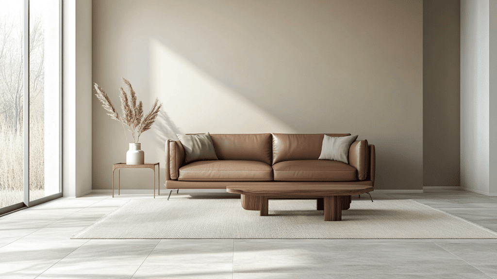
Alpaca creates a cozy, grounded feel in living rooms. It softens the space while staying neutral enough to pair with bold or subtle decor, from leather furniture to textured fabrics.
Bedrooms
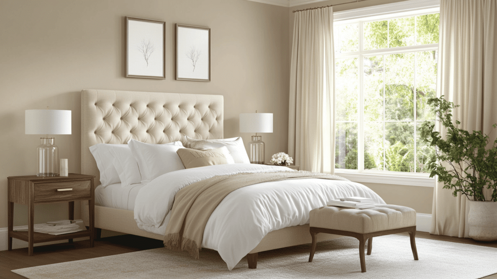
This color adds a soothing touch to bedrooms. It complements soft linens, tufted headboards, and natural wood tones, making the room feel calm, comfortable, and perfect for winding down.
Kitchens
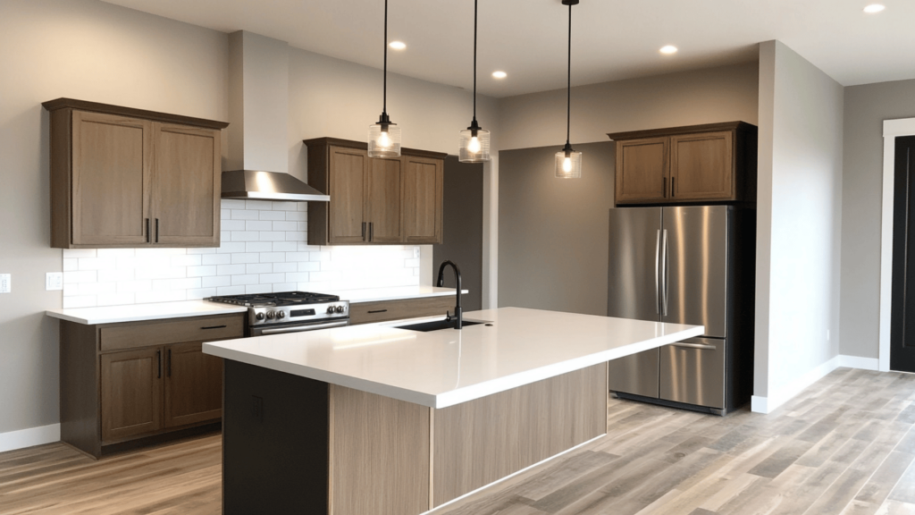
Alpaca is a smart choice for kitchen cabinets or walls. It pairs nicely with white tile, stainless steel, and wood accents, giving the kitchen a modern yet relaxed and welcoming feel.
Bathrooms
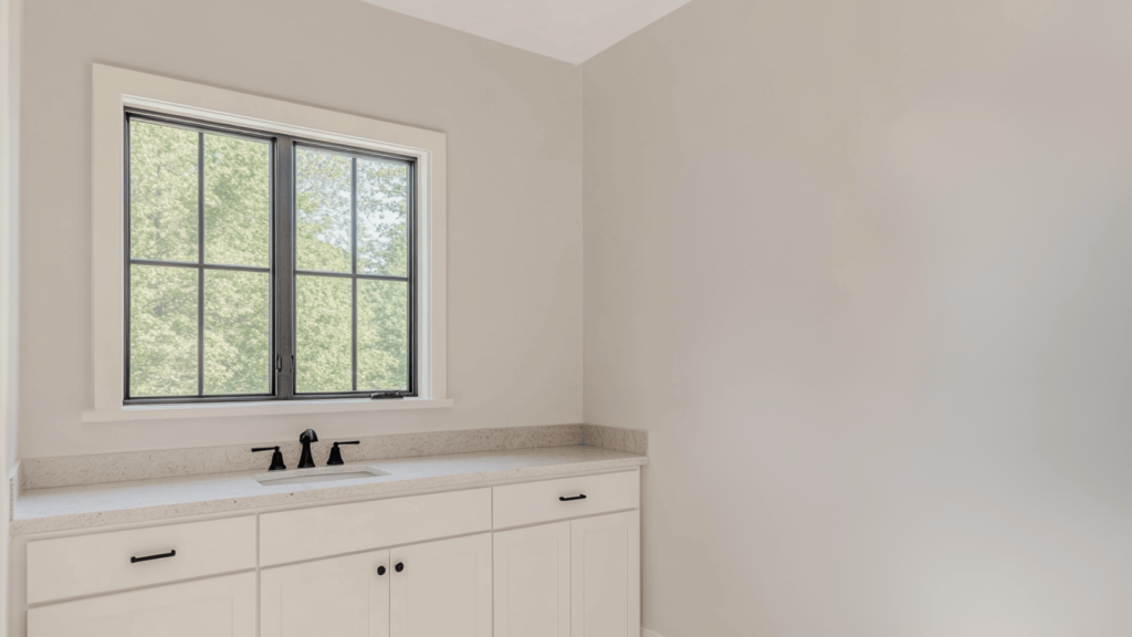
In bathrooms, Alpaca works especially well with white vanities and marble countertops. It adds gentle contrast while keeping things light, clean, and spa-like without becoming too cold or sterile.
Dining Areas and Hallways
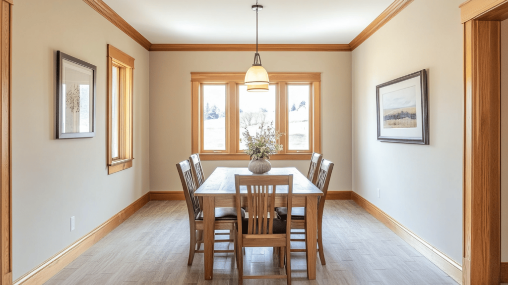
This shade brings understated warmth to dining spaces and hallways. It adds a soft, beautiful backdrop that highlights wood trim, framed art, or pendant lights without drawing too much attention.
How Lighting Affects It
Alpaca’s appearance changes based on the direction and strength of light in the room.
North-facing rooms: It can look slightly cooler or muted, sometimes bringing out faint purple tones.
South-facing rooms: Warm sunlight boosts its beige and greige qualities.
East-facing rooms: Light starts soft in the morning and fades quickly, giving Alpaca a light gray appearance.
West-facing rooms: Afternoon and evening light bring out its warmth and slight pink/taupe hints.
Testing it in your space before committing is always a good idea. Lighting and surrounding materials make a big difference.
SW Alpaca vs. Other Popular Sherwin-Williams Colors
Alpaca is often compared to other top Sherwin-Williams neutrals. Here’s how it stacks up against four popular choices:
Alpaca vs. Agreeable Gray

Agreeable Gray (SW 7029 / HEX #D1CCC1) is a soft, warm greige that leans more beige.
- Undertones and Warmth: Agreeable Gray feels warmer and more beige. Alpaca has more of a muted gray-pink look in some lights.
- Lighting Reaction: Alpaca may shift slightly purple in north-facing rooms. Agreeable Gray holds steady and looks more neutral under most lights.
Choose Alpaca for depth and softness, or Agreeable Gray for a safe, neutral backdrop that works in nearly any room.
Alpaca vs. Repose Gray

Repose Gray (SW 7015 / HEX #CCC8C1) is a light gray with cool green undertones. It’s cooler and less “taupey” than Alpaca.
- Tone Difference: Repose Gray is clean and airy. Alpaca leans warm and layered.
- Best Fit: Repose Gray suits modern or minimalist homes. Alpaca is great for cozy, transitional spaces with soft textures.
Use Repose Gray in bright rooms for a crisp feel. Use Alpaca where you want warmth without going full beige.
Alpaca vs. Accessible Beige
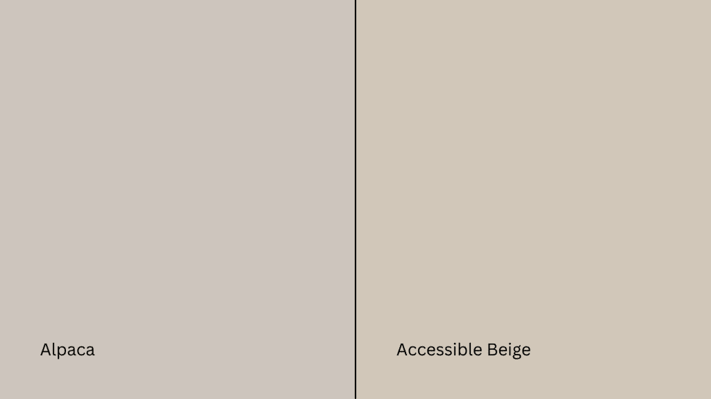
Accessible Beige (SW 7036 / HEX #D0C4B4) leans warmer than Alpaca, with less gray in the mix.
- Color Contrast: Alpaca is more balanced between gray and beige. Accessible Beige is clearly more beige and earthy.
- Room Style: Accessible Beige is ideal for farmhouse or classic styles. Alpaca fits transitional and modern homes with light wood, rattan, or soft textures.
Both are versatile, but Alpaca feels more updated and subtle.
Alpaca vs. City Loft

City Loft (SW 7631 / HEX #DDD7CE) is brighter and softer than Alpaca, with fewer visible undertones.
- Lightness and Neutrality: City Loft has a higher LRV (70) and feels brighter overall. Alpaca is slightly deeper and moodier.
- Best Use: City Loft is perfect for open layouts and connected spaces. Alpaca shines in cozy rooms like bedrooms or living rooms.
If you want light and breezy, go with City Loft. For layered warmth, Alpaca wins.
Quick Comparison Table
| Color | Undertones | LRV | Pros | Cons |
|---|---|---|---|---|
| Alpaca | Taupe, pink/purple | 57 | Warm, cozy, layered look | May shift pink in some lighting |
| Agreeable Gray | Beige, slight green | 60 | Safe, balanced, flexible | Can feel flat in dim spaces |
| Repose Gray | Cool gray, green | 58 | Crisp, clean, modern | Too cool in north-facing rooms |
| Accessible Beige | Beige with warm tones | 58 | Soft and warm, classic vibe | Lacks gray for cooler schemes |
| City Loft | Neutral beige/gray | 70 | Light, versatile, non-distracting | May feel too light or washed out |
Best Color Pairings for SW Alpaca
I’ve noticed that Alpaca really comes to life when it’s paired with the right colors, finishes, and materials.
These are the combos that have helped me create a more balanced, pulled-together look:
Trim and Ceiling Suggestions
The right trim color can make Alpaca stand out or blend in smoothly, depending on the effect you want.
Pure White (SW 7005, #F8F8F6) and Extra White (SW 7006, #F4F4F4) offer clean contrast. These are great choices if you want fresh, modern lines around baseboards and ceilings.
Try Alabaster (SW 7008, #EDEAE0) or Greek Villa (SW 7551, #F7F5EF) for a warmer, more traditional feel. These pair well if you’re using wood tones or vintage decor.
Finish Tips: Use flat or matte paint on ceilings to reduce glare. For trim, semi-gloss or satin finishes are ideal. They highlight edges and are easier to clean.
Accent Wall and Furniture Colors
Accent colors can bring out Alpaca’s subtle undertones and add dimension to your space.
Coordinating Shades: Navy, charcoal, sage green, and terracotta all pair beautifully with Alpaca. These create contrast without overpowering the soft gray walls.
Best Uses: Use these shades in textiles like pillows, rugs, curtains, or statement furniture to build a layered look.
Sherwin-Williams Picks: Consider Tricorn Black (SW 6258, #2D2A26) for bold accents or Pewter Green (SW 6208, #5E6B5B) for earthy balance. These work well for feature walls or painted furniture pieces.
Hardware and Flooring Compatibility
The finish on your fixtures and the tone of your flooring can either ground or brighten up Alpaca-painted spaces.
- Metal Hardware Options: Matte black and brushed nickel give a modern, clean finish. Antique brass adds a bit of warmth and pairs well with vintage decor.
- Best Flooring Matches: Light oak and gray-stained wood bring out Alpaca’s greige tones. Neutral or white-washed tile floors also keep the space feeling airy.
- Balance Tips: Use darker floors or metals if you want contrast. Stick to lighter tones and subtle textures if you want a calm, blended look overall.
Pairing Alpaca with the right colors and finishes will help you make the most of this warm, versatile neutral.
Paint Finish Recommendations
In my experience, picking the right finish for Sherwin-Williams Alpaca makes a big difference.
Each one reacts a bit differently depending on the light, texture, and the room it’s in, so it’s worth thinking through before you start painting.
When to Use Each Finish
Each paint finish has its place. Here’s how to choose based on room use and durability needs:
Flat: Best for ceilings and low-traffic areas like adult bedrooms or formal dining rooms. It hides surface flaws well and has a soft, non-reflective look.
Eggshell: Ideal for living rooms and bedrooms. It offers a slight sheen that reflects just enough light to feel clean, but not shiny. Easier to clean than flat.
Satin: Great for kitchens, bathrooms, and hallways. It’s more moisture-resistant than eggshell and stands up to occasional scrubbing without looking glossy.
Semi-gloss: Best for doors, cabinets, and high-traffic trim areas. It has a smooth, shiny finish that’s easy to wipe clean and highlights architectural details.
Finish and Color Behavior
Paint sheen not only affects durability but also how Alpaca appears on your walls.
- Undertones: The higher the sheen, the more it reflects light. This can make Alpaca’s subtle pink or taupe undertones more visible, especially in bright rooms.
- Reflectivity: Glossy finishes bounce light and may show more wall imperfections. Matte or flat finishes absorb light, creating a more muted and even tone.
I’ve found that the right finish really helps Alpaca look its best while still working for each room’s needs.
When unsure, always test a small patch in the actual lighting. It’s the easiest way to see how it’ll behave on your walls.
Sampling and Buying Options
Before I committed to painting with Sherwin-Williams Alpaca (SW 7022), I tested it in a few spots around the house, and I’m glad I did. Lighting really changes how it looks.
Here’s how you can get samples and where to buy the paint in the U.S.:
Where to Get Peel-and-Stick Samples
Peel-and-stick samples are mess-free and show the true paint color on your wall.
- Samplize ($5.95): These 9″ x 14″ samples are made with real Sherwin-Williams paint and can be repositioned without damaging walls. Order directly from samplize.com.
- Sherwin-Williams: Visit a nearby location to get traditional swatches or small test pots. Find a store using the Sherwin-Williams Store Locator.
Place samples on multiple walls to see how Alpaca shifts in different lighting. Always check during both day and evening.
Where to Buy the Paint
Once you’re ready to paint, you’ve got several reliable options:
- Sherwin-Williams Stores: Available nationwide, these stores carry all finishes and offer helpful in-person advice.
- Local Hardware Stores: Ace Hardware and Lowe’s often stock or can mix Sherwin-Williams colors. Check with your local store for availability.
- Online Orders and Delivery: Order directly from Sherwin-Williams for home delivery or in-store pickup. Their website shows current stock, delivery options, and any deals.
Sampling first ensures Alpaca fits your lighting and style before you make the full investment.
Paint Equivalents in Other Brands
If you can’t get Sherwin-Williams Alpaca or want a similar color from another brand, here are close matches from Benjamin Moore, Behr, and Valspar. Each offers a comparable look with slight variations.
Benjamin Moore Equivalents
Sherwin-Williams Alpaca is often compared to:
Pale Oak (OC-20, #EAE3D8): A light greige with warm undertones. It’s slightly creamier and brighter than Alpaca, making it great for open spaces.
Edgecomb Gray (HC-173, #DAD2C8): A balanced beige-gray that shares Alpaca’s warmth but leans a bit more into beige with less taupe.
Both are great choices if you like Alpaca’s feel but want a slightly lighter or more neutral base.
Behr Equivalents
Behr has a couple of options that come close to Alpaca’s tone:
Silver Drop (790C-2, #DEDBD5): A cool gray that may appear warmer in natural light, similar in depth but less taupe.
Campfire Ash (PPU18-08, #D7D0C7): A soft greige with a muted, cozy feel. It shares Alpaca’s warmth but has fewer pink undertones.
These shades work well in calm, modern spaces or transitional rooms.
Valspar Equivalents
For Valspar users, these are close alternatives:
Gravity (4005-1B, #D4D7DC): A cool, silvery gray with blue undertones. Lighter and airier than Alpaca, but visually related in low light.
Filtered Shade (4003-1B, #CDCBC4): A warm gray that matches Alpaca’s depth and softness with a slightly less pronounced undertone.
They offer a similar neutral backdrop, especially when paired with crisp white trim or warm wood floors.
Just a heads-up, these colors are close in tone, but they’re not exact matches. I’ve learned that each brand uses different base formulas and finishes, so the final look on your walls might vary a bit.
Conclusion
If you’ve made it this far, you probably have a good feel for whether Sherwin-Williams Alpaca is right for your home. It’s a warm, soft gray that fits nicely in cozy, modern, or transitional spaces. If you want a neutral with depth, it’s a solid pick.
This guide walked you through how it compares to similar shades, how lighting affects it, and what colors pair well with it. Before you commit, be sure to test a sample in your space; lighting can change everything.
Still deciding or looking for similar tones? Check out my other paint reviews and comparisons on the website. They’re built to save you time, stress, and second-guessing.


