


Choosing a neutral paint sounds simple until you start testing samples on your walls. I’ve been there, staring at swatches that looked perfect in the store but completely different at home.
If you’re searching for clear answers about Balanced Beige SW 7037 by Sherwin-Williams, you probably want to know exactly what it looks like, how warm it feels, and whether it will actually work in your space.
Balanced Beige SW 7037 sits in the warm-neutral family with soft gray-tan undertones that keep it from turning too yellow or too cool.
In this blog, I’ll walk you through undertones, lighting behavior, room performance, specs, and pairing options so you can make a confident decision before buying a gallon.
Getting to Know Balanced Beige by Sherwin-Williams
Balanced Beige (SW 7037) comes from Sherwin-Williams’ neutral family, and the name does exactly what it promises. It sits between warm beige and cool greige without fully committing to either side, and that middle-ground quality is what makes it so hard to pin down on a paint swatch alone.
The color looks different depending on your room, your lighting, and what’s already on your floors and furniture. That’s what drew me to it in the first place. It doesn’t demand attention, but it’s never invisible either.
If you’ve been cycling through warm neutrals that keep pulling orange or pink, or cool gray paint colors that feel too flat, this is the color that tends to put an end to that search. The medium-depth neutral lands in a place that feels genuinely livable, grounded without feeling heavy, warm without feeling dated.
Before buying a full gallon, having the exact specs in one place saves you from second-guessing at the paint counter or ordering the wrong product line:
| Detail | Value | Notes |
| Color Code | SW 7037 | Sherwin-Williams reference |
| LRV | 46 | Medium depth |
| HEX | #C2A98A | Digital reference |
| Coverage | 350–400 sq ft per gallon | Two coats recommended |
| Dry Time | 1 hour touch / 2 hours recoat | Depends on conditions |
| Interior Lines | Emerald, Duration, SuperPaint, Cashmere | Choose based on durability needs |
| Exterior Lines | Duration Exterior, Emerald Exterior | Strong weather resistance |
When in doubt about the product line, Emerald is worth the extra cost for high-traffic rooms; its coverage and washability make a visible difference over time.
Balanced Beige Undertones and Lighting Effects
Lighting has a strong impact on how Balanced Beige SW 7037 appears throughout the day. Its warm beige base with soft gray-tan undertones can shift subtly depending on natural and artificial light conditions.
In Natural Light
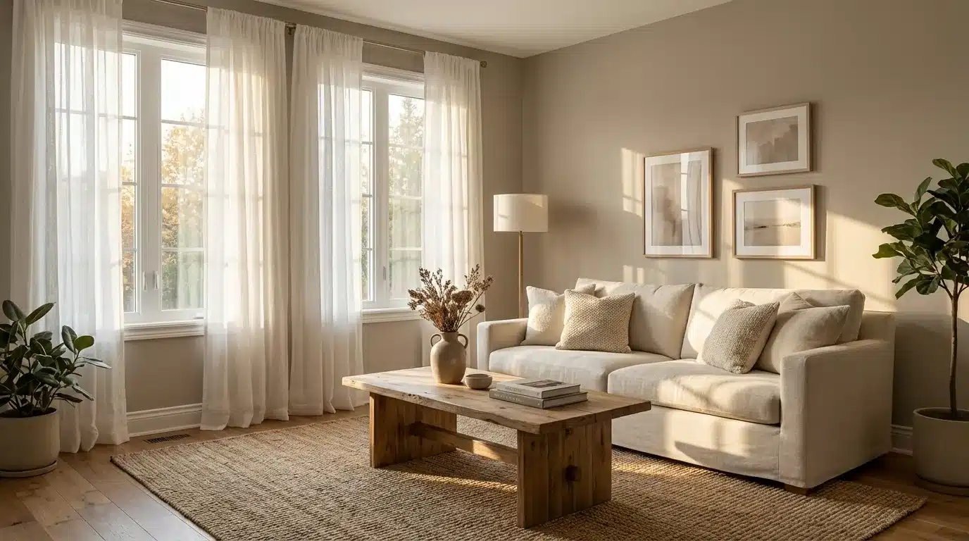
Natural light brings out the balanced warmth in this shade, helping it feel soft and grounded rather than overly tan.
North-facing rooms: North light is cooler and slightly muted. In these spaces, Balanced Beige may appear a bit deeper and more subdued. The gray undertone becomes more noticeable, giving the color a calm and slightly muted appearance.
South-facing rooms: South-facing rooms receive warmer sunlight. This improves the beige warmth, making the color feel brighter and more welcoming. It looks smoother and slightly lighter in strong daylight.
East-facing rooms: Morning light is bright and cool. Early in the day, Balanced Beige can appear more neutral with less visible warmth. As the day progresses, it settles into its true warm-beige tone.
West-facing rooms: Afternoon and evening sunlight adds warmth. Balanced Beige may look richer and cozier later in the day, creating a soft and comfortable atmosphere.
In Artificial Light
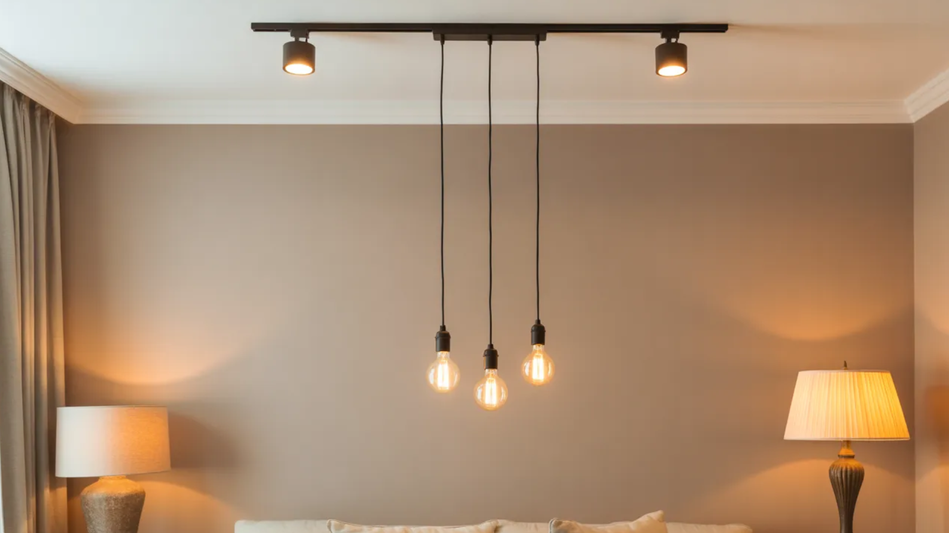
Artificial lighting changes how Balanced Beige feels after sunset. Under warm bulbs, the beige tones become more noticeable, giving the space a cozy and inviting look.
Cool LED or daylight bulbs can slightly mute the warmth and bring forward the subtle gray undertone.
Using layered lighting, such as combining overhead fixtures with lamps, helps maintain balance and prevents the color from feeling too flat or too warm at night.
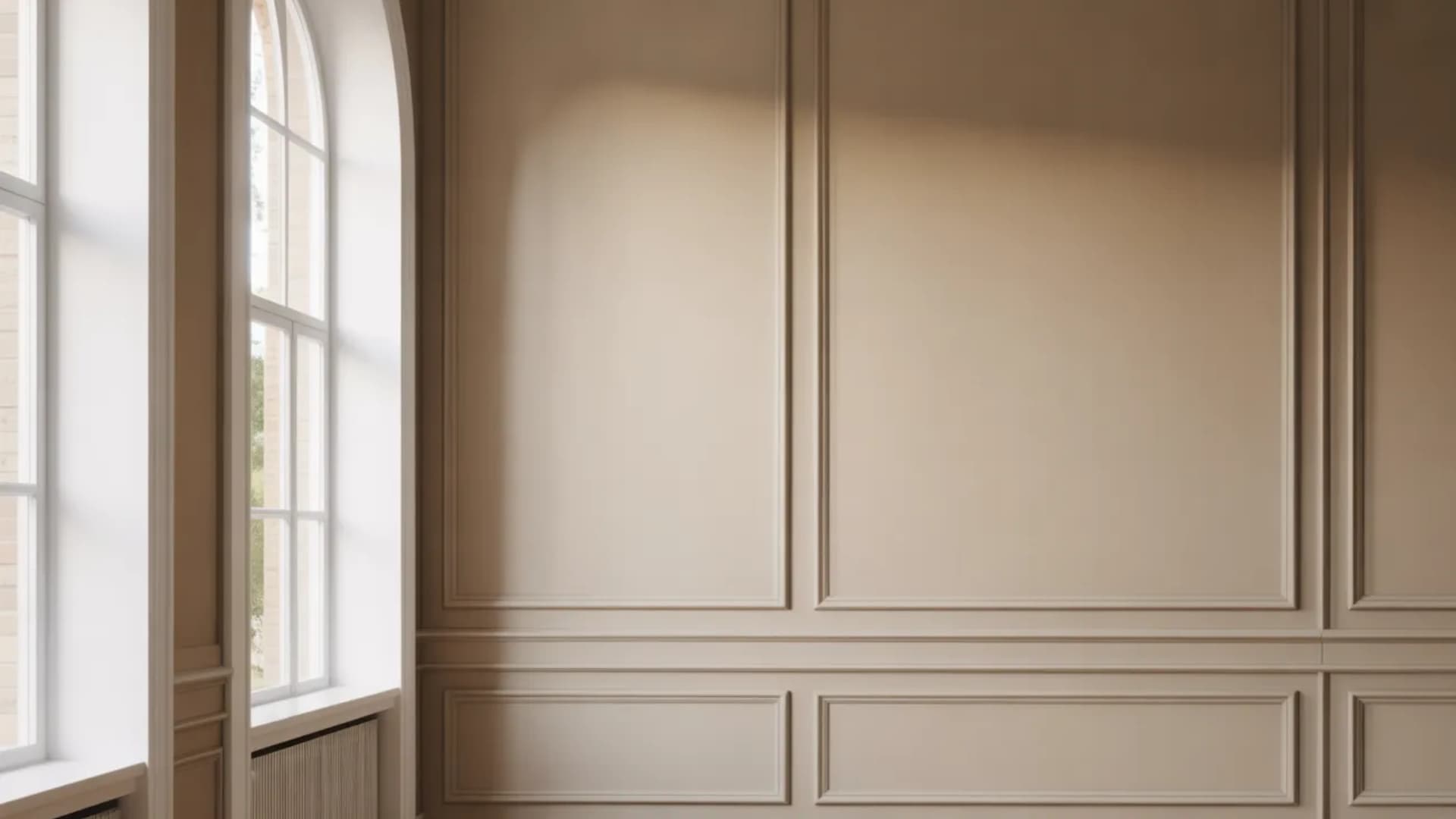
Choosing the Right Finish
The finish you select for Balanced Beige SW 7037 can noticeably change how the color feels in your space. While the shade itself is warm and grounded, the level of sheen affects depth, light reflection, and durability.
Higher-sheen finishes reflect more light, which can make Balanced Beige appear slightly brighter. Flatter finishes absorb light and create a softer, more muted look.
Matte finishes work well on walls, especially in living rooms and bedrooms, because they help hide minor surface imperfections. Eggshell offers a slight sheen and is a popular choice for main living areas due to easier cleaning.
Satin finishes are ideal for kitchens, bathrooms, and high-traffic spaces where durability matters. Semi-gloss works best for trim, doors, and cabinets, providing durability and easy wipe-down maintenance.
How Balanced Beige Looks in Different Rooms
This color shows up differently depending on the room, and that versatility is a big part of why it works in full homes rather than just one carefully lit space.
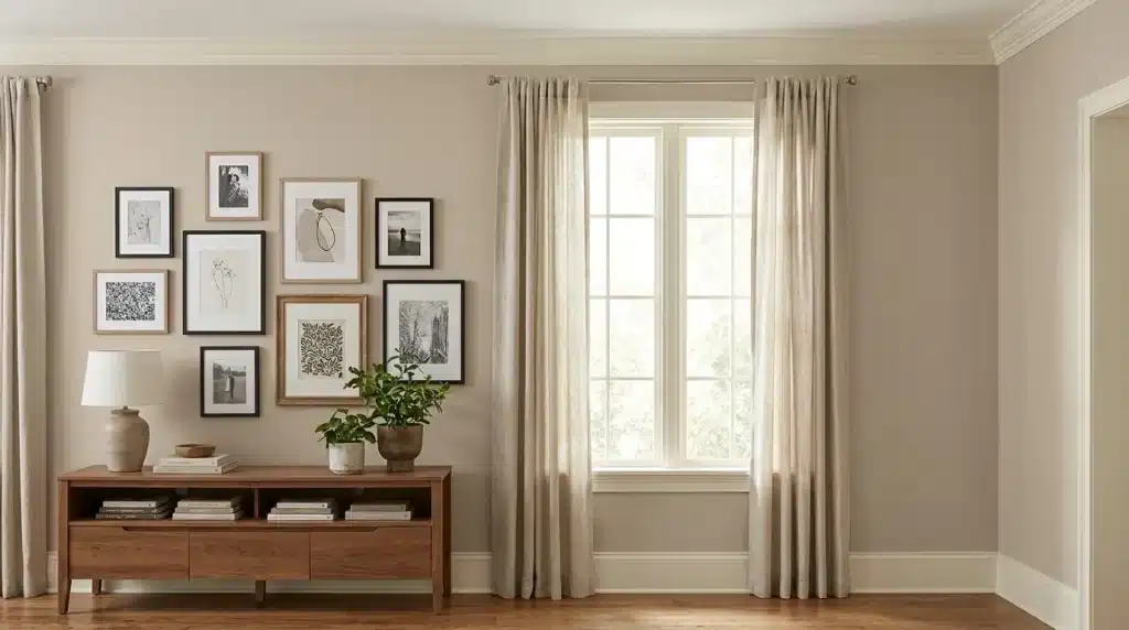
1. Living Rooms
Balanced Beige performs especially well in open-concept living rooms where medium-depth neutrals are needed to anchor larger spaces. It provides enough presence to feel grounded without overwhelming the room.
The soft gray-tan undertone keeps it from appearing too warm, allowing it to pair comfortably with warm wood floors, cream upholstery, and matte black or brushed bronze accents.
It also blends smoothly with cooler decorative elements, making furniture and accent choices more flexible across different design styles.
2. Bedrooms
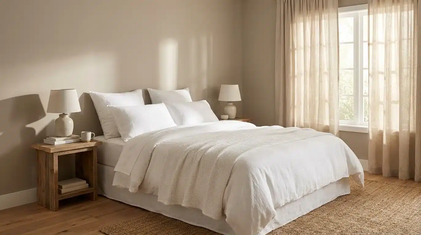
In bedrooms, Balanced Beige creates a settled and comfortable atmosphere without making the space feel closed in. Its warmth offers a softer alternative to cooler grays while still maintaining a calm appearance.
When paired with Alabaster or Pure White trim, the contrast feels clean yet subtle. Neutral bedding enhances the grounded tone, while layered textiles in rust, clay, or natural linen add depth.
The color maintains a steady presence throughout the day, supporting a restful environment under both natural and artificial lighting.
3. Kitchens
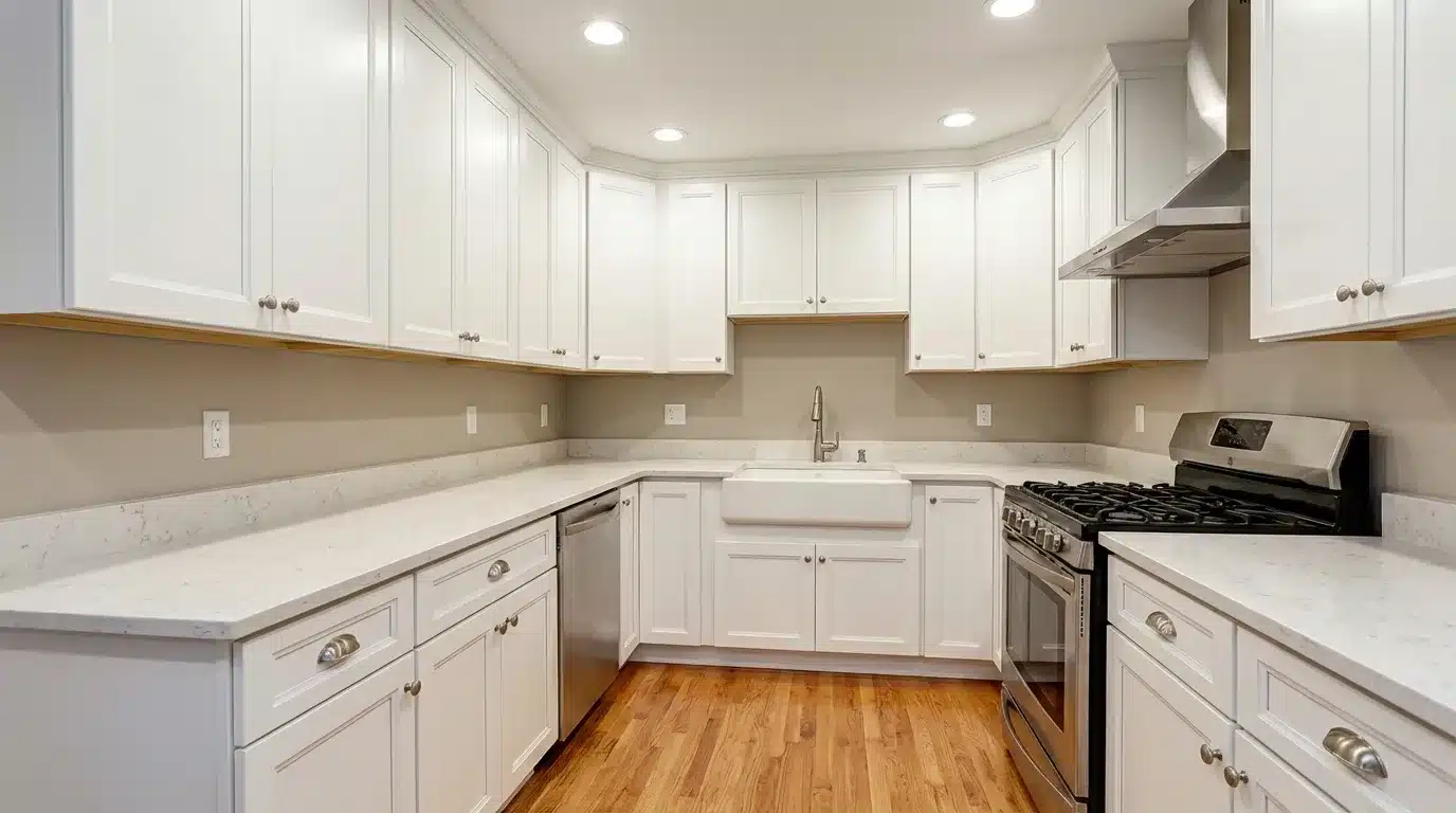
As a kitchen wall color, Balanced Beige complements white cabinetry without introducing harsh contrast. Its warm-gray undertone keeps the space feeling clean while avoiding a cold appearance.
It works consistently with brushed nickel, matte black, or brass hardware, maintaining cohesion across finishes. When used on cabinetry, the medium depth creates a deliberate statement that feels substantial.
If combining beige lower cabinets with white uppers, selecting a trim color that connects both tones ensures a seamless transition throughout the space
4. Cabinets and Interior Doors
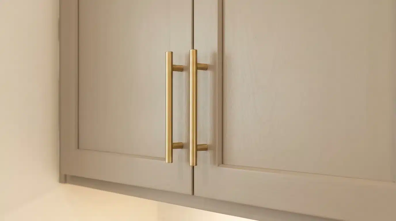
Balanced Beige provides enough depth on cabinetry and interior doors to feel intentional rather than faded. It performs well as a full kitchen cabinet color, bathroom vanity finish, or accent door shade in homes with warm wood flooring.
The balanced undertone prevents it from appearing too yellow or flat against lighter walls. Its medium saturation allows it to stand on its own while still coordinating easily with surrounding neutral palettes and architectural details
5. Bathrooms
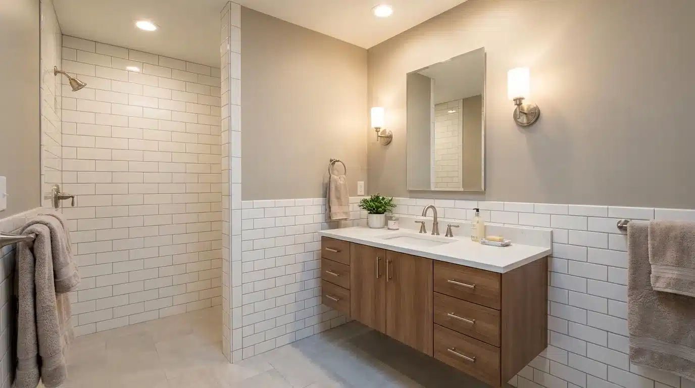
Balanced Beige holds its composure under artificial lighting, which is especially important in bathrooms. Many warm neutrals shift noticeably toward orange or pink, but this shade maintains a steady gray-tan balance.
It pairs effectively with white subway tile, marble countertops, and chrome or brushed nickel fixtures without competing for attention.
The warmth adds comfort, while the gray influence keeps the space feeling clean. This makes it a dependable option for creating a calm, spa-inspired bathroom environment.
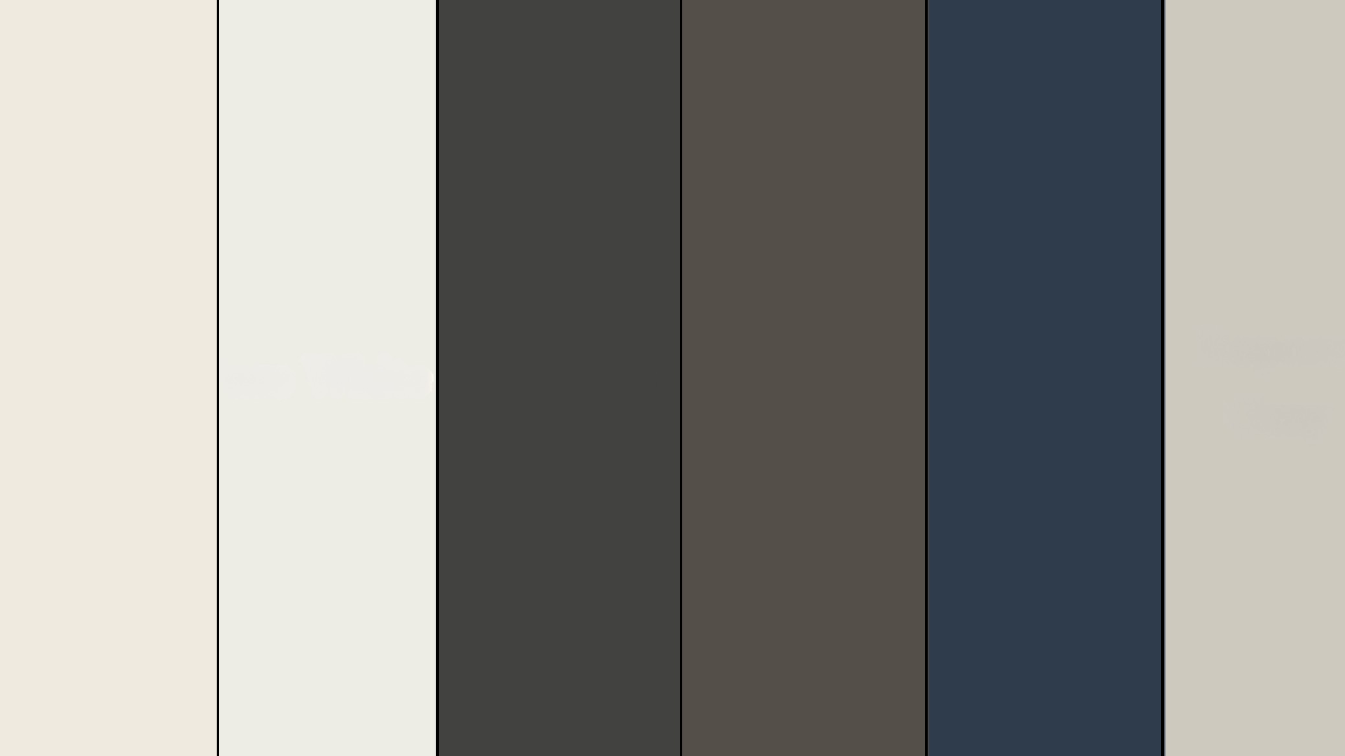
Comparisons to Other Similar Sherwin-Williams Colors

If you’re deciding between similar Sherwin-Williams neutrals, these comparisons cut through the guesswork faster than holding swatches under a store light ever will:
| Shade | Tone | Best Use | Warm/Cool | Softness Level | LRV | Notes |
| Balanced Beige (SW 7037) | Warm beige with soft gray-tan undertones | Living rooms, bedrooms, whole-home neutral | Warm-neutral | Medium | 46 | Versatile warm neutral that avoids yellow and orange tones |
| Shiitake (SW 9173) | Deeper beige with a stronger gray base | Offices, feature walls, modern interiors | Cool-neutral | Medium | 51 | Reads slightly cooler and more urban than Balanced Beige |
| Bungalow Beige (SW 7511) | Golden beige with noticeable warmth | Traditional homes, sunlit spaces | Warm | Medium-High | 53 | Pulls more yellow and golden in bright lighting |
| Sandbar (SW 7547) | Light sandy tan | Open-concept spaces, hallways | Warm | High | 64 | Brighter and warmer, reflects more light than Balanced Beige |
| Loggia (SW 7506) | Muted tan-gray blend | Transitional interiors, accent walls | Warm-neutral | Medium | 48 | Dustier and flatter appearance with less warmth |
| Agreeable Gray (SW 7029) | Light greige (gray + beige mix) | Whole-home neutral, resale-friendly interiors | Warm-neutral | High | 60 | Lighter and airier, leans more gray than Balanced Beige |
If you’re still unsure, sample two or three of these directly on your wall, side by side, and test in your actual light to settle the comparison faster than any description.
Top Coordinating Paint Colors to Consider
Getting coordinating colors right matters as much as the wall color itself; these pairings work consistently across different room types and lighting conditions:
- Alabaster (SW 7008): Soft, warm trim pairing that keeps the overall feel cohesive without sharp contrast
- Pure White (SW 7005): Crisper, cleaner trim option for spaces where you want more definition at the edges
- Iron Ore (SW 7069): Strong dark accent that creates contrast without fighting the warm undertone
- Urbane Bronze (SW 7048): Earthy, broad accent that sits naturally against the beige-gray base
- Naval (SW 6244): Deep navy that adds bold contrast, while the warm undertone stops it from feeling cold
- Repose Gray (SW 7015): Works well in adjacent rooms where a cooler, softer transition feels natural
When in doubt, start with trim and flooring; getting those two right makes every other coordinating decision noticeably easier.
One of the best colors to co-ordinate SW Balanced Beige is to pair it with SW Alpaca (7022) because this color looks very neutral and pairs well with most color combination if you do it right!
Sampling Before You Commit
Peel-and-stick samples from Samplize are the easiest way to test this color without picking up a brush, my first move before committing to any medium-depth neutral. Stick them on at least two walls, one with direct light and one without, then check them at different times of day.
Morning and evening light can give you dramatically different reads at this LRV, and that gap is worth seeing before you buy a gallon. If you prefer, you can get a sample can from Sherwin-Williams and paint at least a 2×2-foot section, and let it dry completely before judging.
Wet paint always looks richer and darker than the dried finish. Leave it up for 48 hours and compare it directly against your trim, flooring, and furniture before making a final call.
Final Thoughts
Now you have a full picture of Balanced Beige SW 7037, including its undertones, lighting shifts, finishes, room performance, and coordinating colors.
I’ve broken down how it behaves in natural and artificial light, where it works best, and what to test before committing. When you understand those details, you avoid costly mistakes and second-guessing later.
The key takeaway is simple: test it in your own lighting and compare it against your trim and flooring before making a final decision. That one step protects your time and budget.
If you’ve already tried this color, I’d love to hear how it looked in your space. Share your experience or questions below.


