


Standing in front of a wall of gray paint chips can feel strangely overwhelming. The differences look subtle in the store, yet once the paint hits your wall, everything changes.
As a color consultant, I’ve watched this happen in homes countless times, and Repose Gray SW 7015 is one shade clients often ask about when they want a balanced neutral.
You might be wondering how it really behaves in different rooms, how lighting shifts its undertones, and whether it will actually work with your flooring and trim.
I’ll walk you through what I’ve seen in real homes over the years. You’ll learn how the color responds to light, where it works best, and which pairings help it feel intentional rather than accidental.
Overview of Sherwin-Williams Repose Gray
Sherwin-Williams Repose Gray (SW 7015) is a popular, versatile gray paint color with subtle warm undertones. It’s perfect for those looking for a soft, neutral backdrop in a variety of spaces.
The color leans toward a light, almost greige shade, making it a perfect choice for both modern and traditional settings. Repose Gray is a great option for living rooms, kitchens, and bedrooms, as it pairs well with almost any other color, offering design flexibility.
- LRV: 58
- Hex: #CCC9C0
- RGB: 204 / 201 / 192
- Collection: Sherwin-Williams Neutrals
- Finish options: Flat, Matte, Eggshell, Satin, Semi-Gloss, Gloss
Repose Gray works wonderfully in spaces where you want a calm, inviting atmosphere without feeling too cold.
Repose Gray Undertones and Lighting Behavior

This is where Repose Gray gets genuinely interesting and where most people run into trouble.
The color has a taupe base, which prevents it from reading cold or stark, but it also carries violet undertones that most people don’t notice until the paint is on the wall.
In low light, north-facing rooms, or spaces with cool-toned artificial lighting, those violet undertones come forward noticeably. This is the most common surprise I see clients encounter with this color.
Depending on the room, faint green, blue, or purple hints can come forward, making the color behave differently across spaces.
- In north-facing rooms, Repose Gray pulls cooler and darker, with blue and purple undertones becoming more noticeable throughout the day.
- In south-facing spaces, natural light brings out the warm taupe base, making it read as a soft, inviting greige for most of the day.
- In east-facing rooms, warm morning light softens the color early on, though it shifts to a cooler, grayer tone by afternoon.
- In west-facing rooms, late-afternoon golden light makes the taupe base glow, giving the color its warmest, most grounded appearance.
Watch out for this: Warm or yellow-toned artificial lighting will draw out the taupe and make the room feel cozier. Cool recessed lighting or daylight-temperature LED bulbs flip the switch and amplify the violet undertone. If your home has cool-temperature recessed lighting throughout, test Repose Gray very carefully before committing. I’ve seen it read distinctly purple in spaces with 5000K overhead lighting.
Before committing, test a large sample on the biggest wall and check it at different times of day. Flooring, trim, and surrounding colors all influence how Repose Gray reads in a specific space.
Pairing SW Repose Gray with Pure White SW 7005 is one of the most reliable combinations for keeping the color looking clean and intentional. It works across room styles without feeling overdone.
Undertone cheat sheet: If you place Repose Gray next to a warm yellow-white like SW Alabaster or SW Greek Villa, it can read slightly green in comparison. If you place it next to a cool, stark white, the violet undertone becomes more visible. Pure White SW 7005 sits in the middle. It’s the trim color I recommend most often with this wall color precisely because it doesn’t push either undertone.
Which Paint Finish to Use for Repose Gray
This is one of the most searched questions about this color and one that most paint reviews skip. Finish affects how Repose Gray reads on the wall and it affects durability.
| Room / Surface | Recommended Finish | Why |
|---|---|---|
| Bedroom and living room walls | Eggshell or matte | Low sheen keeps the color soft; matte hides imperfections but marks easily |
| Kitchen and bathroom walls | Satin | Wipeable, moisture-resistant; eggshell is acceptable in low-splash zones |
| Cabinets and trim | Satin or semi-gloss | Durability for high-touch surfaces; semi-gloss makes cleaning easier |
| Exterior siding | Satin | Holds up to weather while allowing the color’s warmth to read correctly |
| Ceilings | Flat | Flat hides texture and prevents light reflection that would make the ceiling look gray |
One finish note worth knowing: flat and matte finishes on walls amplify the depth of Repose Gray’s undertones slightly.
A satin finish on the same wall will read a touch lighter and less saturated. In darker rooms where you want the color to feel as warm as possible, satin is the better choice.
Best Rooms for Repose Gray
Repose Gray is one of those rare neutrals that adapts well across different spaces. Here is how it actually performs room by room.
1. Living Rooms
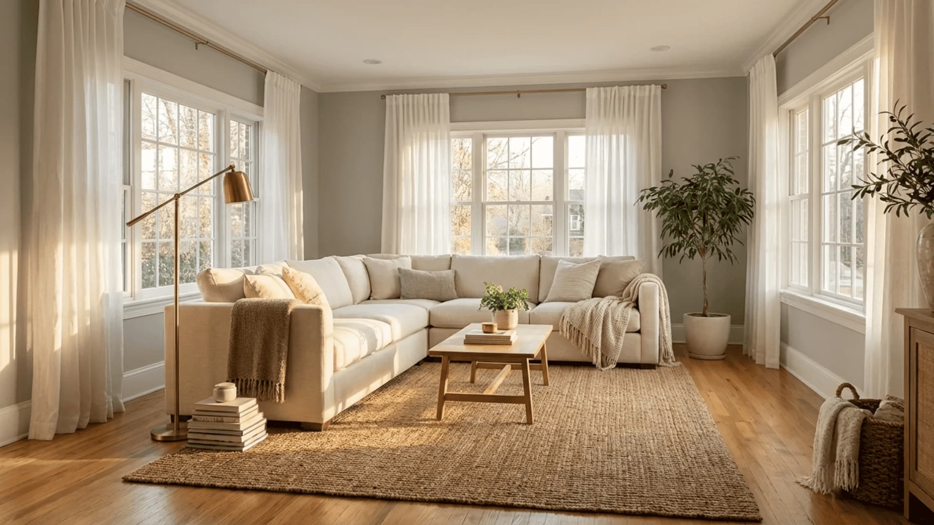
Living rooms are where Repose Gray consistently performs best. The color holds up across different furniture styles, flooring types, and lighting conditions without demanding much from the rest of the room.
It works with both cool and warm tones, making it easy to style around. In open-plan spaces with good natural light, it reads as a soft, inviting neutral that keeps the room feeling cohesive without looking flat.
I used Repose Gray in an open-plan living and dining room with wide-plank white oak floors and warm brass fixtures.
The south-facing windows kept the taupe base dominant all day, and the color looked intentional across both zones without any transition color needed.
That versatility is genuinely hard to replicate with a more strongly directional color.
2. Bedrooms
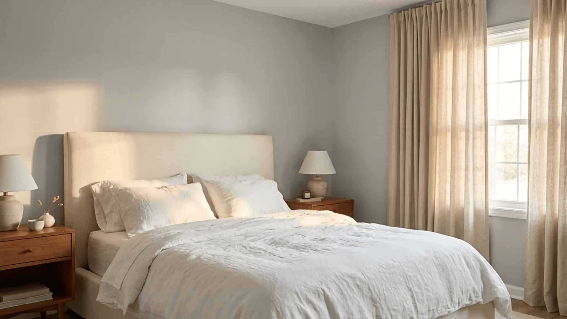
Repose Gray brings a calm, restful quality to bedrooms that heavier or cooler grays often miss. It does not feel clinical or cold, which matters in a space meant for winding down.
Paired with soft white bedding and warm wood furniture, it creates a relaxed atmosphere without much effort. North-facing bedrooms may need warmer lighting to avoid feeling too cool in the evenings.
North-facing bedroom caution: This is one room where I actively recommend testing before painting. In a north-facing bedroom with cool recessed lighting, Repose Gray can read distinctly lavender in the corners by evening. A warm sconce or bedside lamp mitigates this, but if you want to avoid it entirely, Agreeable Gray SW 7029 is a safer call in that specific scenario.
3. Kitchens
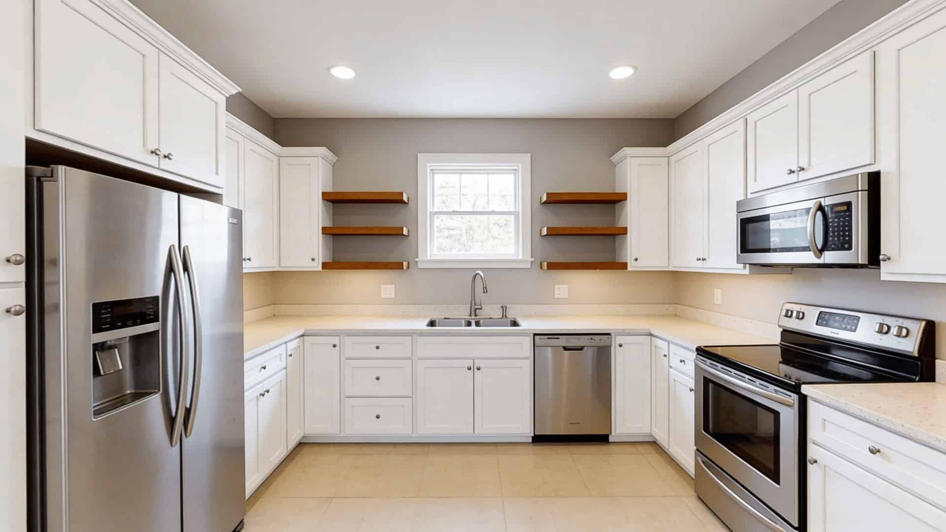
Kitchens are a strong fit for Repose Gray, especially in spaces with white or light wood cabinetry. The color works as wall paint, staying out of the way while still adding depth.
It pairs well with both warm and cool countertop materials. In well-lit kitchens, it reads clean and fresh. In darker kitchens, it can feel a little heavy, so testing a sample first is worth the effort.
On cabinets specifically: Repose Gray has become one of the most popular cabinet colors of the past decade. It looks sharp paired with brass or matte black hardware and works with most countertop materials from white quartz to dark granite. Use satin or semi-gloss finish on cabinets for durability. Flat paint on kitchen cabinets wears through quickly and is difficult to clean.
4. Cabinets
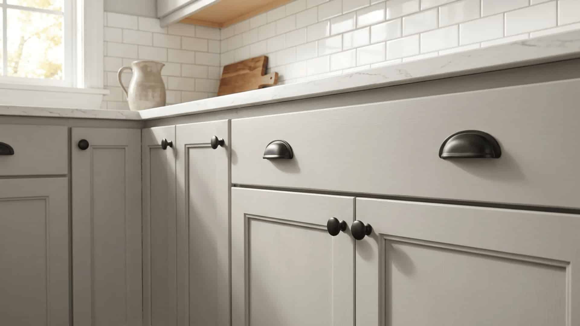
Repose Gray on cabinets has become increasingly popular, and it holds up well in that application. It works particularly well on kitchen or bathroom vanity cabinets paired with brass, matte black, or chrome hardware.
The color gives cabinets a soft, updated look without going too bold. A satin or semi-gloss finish is recommended for durability and easy cleaning, especially in high-use areas like kitchens.
One flag worth knowing: If your walls are also Repose Gray and you’re painting the cabinets the same color, you’ll need at least 15–20 LRV points between the wall color and the cabinet color for the cabinetry to read as distinct. Otherwise the room feels flat. Consider SW Eider White on the walls (LRV 73) if keeping Repose Gray on the cabinets.
5. Exterior
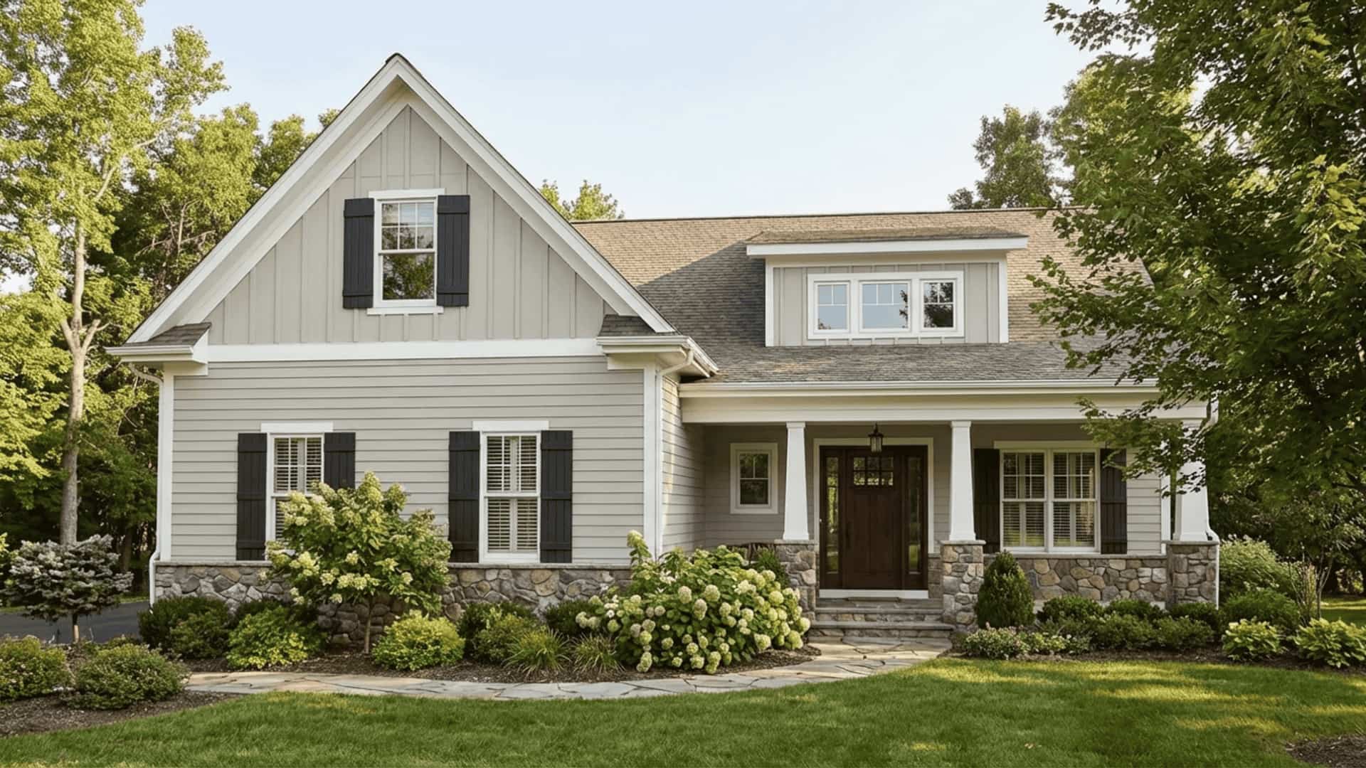
Repose Gray works surprisingly well on exterior siding, particularly on craftsman, colonial, and modern farmhouse styles. It reads as a clean, understated gray from the outside without pulling too blue or too beige in direct sunlight.
Pairing it with crisp white trim sharpens the contrast cleanly. Dark shutters in charcoal or black add definition, and natural stone or brick accents sit comfortably alongside them without clashing.
One specific pairing I’ve used repeatedly on exteriors: Repose Gray siding, SW Dorian Gray on shutters and doors, SW Alabaster on trim. The three colors sit on the same warm-gray family but create enough tonal variation to read as intentional layering rather than a single flat gray. Particularly effective on homes surrounded by trees, where the warm base of Repose Gray neutralizes the green cast from foliage.
6. Bathrooms
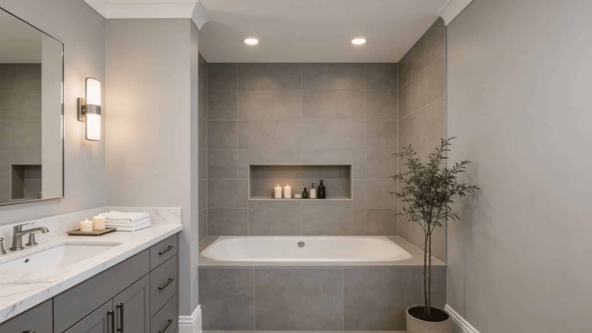
Repose Gray performs well in bathrooms but requires careful consideration.
In a bathroom with a window and white tile, it reads as a sophisticated, calming neutral that pairs well with marble, quartz, and granite countertops.
In a windowless powder bath, it can go heavy and purple-adjacent under warm artificial light.
For bathroom applications, I recommend a satin finish for its moisture resistance and ease of cleaning. Pair with crisp white trim rather than a creamy or yellow-toned white.
In a small space, the undertone clash between Repose Gray and a warm white becomes more visible than it does on a large living room wall.
Small bathroom tip: In powder rooms or half baths under 40 square feet, Repose Gray can feel heavy if used on all four walls. Try it on three walls with the fourth in a lighter shade from the same color card, or simply use it on the vanity cabinet and paint the walls a lighter companion like SW City Loft (LRV 70).
What Homeowners Say About Repose Gray
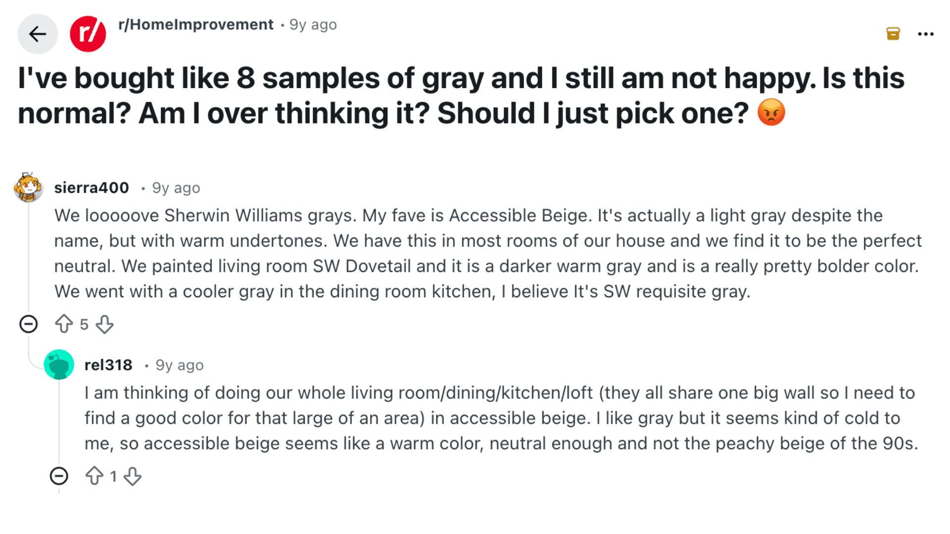
In a recent r/HomeImprovement discussion titled “I’ve bought like..”, several users shared practical lessons from their own gray paint searches.
u/sierra400 noted that Sherwin-Williams grays behave very differently depending on the room. u/TramStopDan pointed out that the existing wall color is reflected in the sample patches, distorting how a new shade appears.
u/rynmcdm switched from buying samples to taping 12 paint chips together to better visualize the color. u/bigbadmax found that pairing gray with white trim made a noticeable difference.
u/skimmer suggested identifying what feels wrong about each sample before moving on. u/SmithForLife went through 15 samples before finding the right one.
Gray shifts more than expected, and testing in the actual space is the only step that consistently works.
What these comments reflect, and what I’ve heard from my own clients, is that the paint store experience and the at-home experience diverge more with gray than with almost any other color family.
The store lighting is typically fluorescent and consistent. Your home is not. That gap is why so many people end up with a shade that felt right in the store but surprises them on the wall.
Repose Gray Coordinating Colors

Choosing the right coordinating colors makes Repose Gray look intentional and pulled together. Since it carries taupe undertones with occasional green, blue, or purple shifts, it pairs best with shades that feel warm, clean, and grounded.
| Coordinating Color | Undertone | Why It Works with Repose Gray | Best Ways to Use It |
|---|---|---|---|
| Pure White SW 7005 | Soft neutral white | Creates clean contrast without pushing Repose Gray’s undertones in an unwanted direction | Trim, ceilings, cabinets |
| Alabaster SW 7008 | Warm creamy white | Strengthens the greige quality and keeps the overall space feeling warm and cohesive | Trim, upper cabinets, ceilings |
| Agreeable Gray SW 7029 | Warm greige | Sits just one step warmer, making it a natural transition color in open floor plans | Adjacent walls, hallways |
| Urbane Bronze SW 7048 | Deep warm charcoal | Adds depth and contrast for a modern, grounded look without clashing with the taupe base | Doors, accent trim, exteriors |
| Naval SW 6244 | Deep navy blue | Creates bold contrast against Repose Gray while playing off its cool undertones cleanly | Accent walls, cabinetry, doors |
This mix of warm neutrals, soft whites, and broader accents helps Repose Gray look balanced and intentional across both modern and traditional spaces.
A note on what to avoid: do not pair Repose Gray with whites that have strong yellow undertones (SW Greek Villa, SW Antique White, or similar). In a well-lit room, the yellow-white and the violet undertone in Repose Gray create a visual conflict that makes both colors look slightly off. This is not obvious on individual chips, but it shows up clearly once both are on full walls next to each other. I’ve had to repaint trim in a client’s home for exactly this reason.
Repose Gray vs. Similar Colors
Before choosing Repose Gray, it helps to compare it with other popular gray and greige shades. Small differences in undertones can completely change how a color feels on the wall.
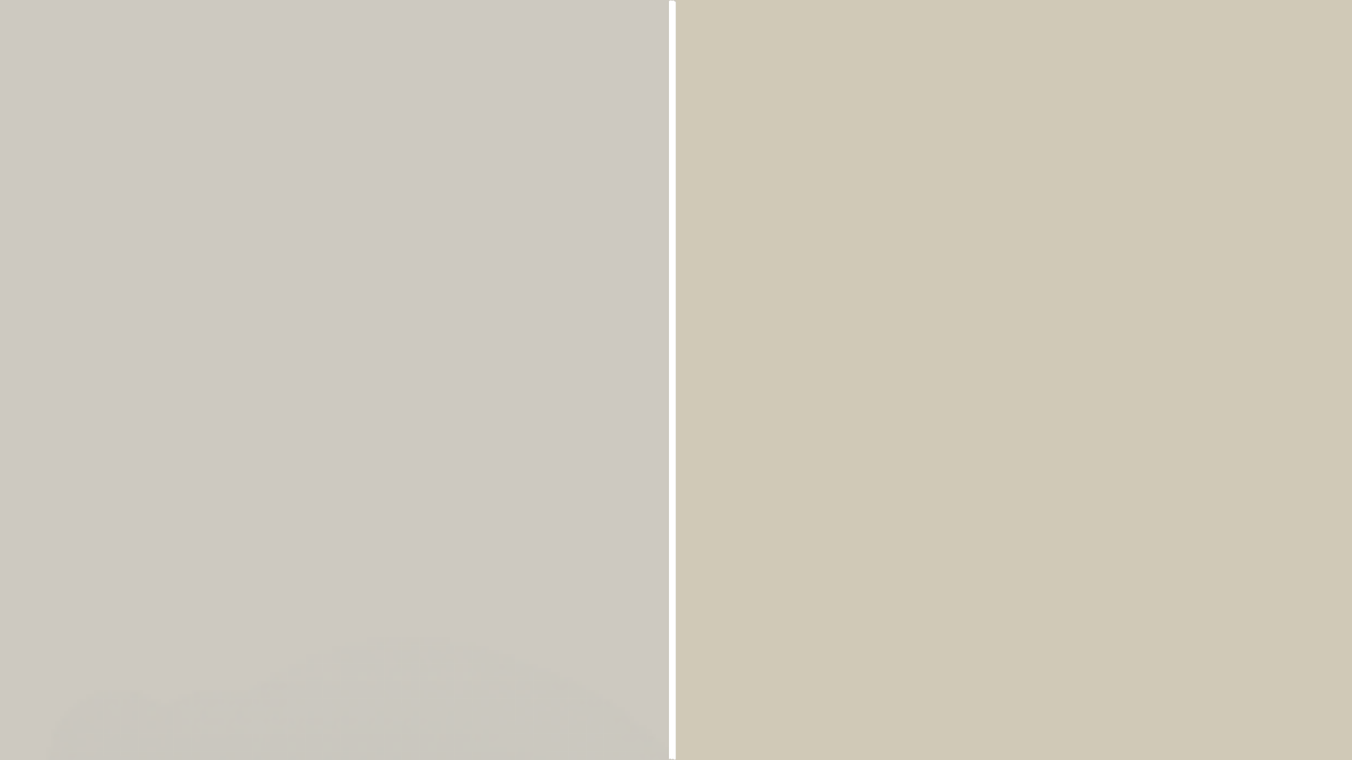
Repose Gray vs. Agreeable Gray SW 7029

|
Repose Gray SW 7015 LRV: 58 Undertone: Taupe + violet Reads more gray, holds up in mixed warm/cool spaces |
Agreeable Gray SW 7029 LRV: 60 Undertone: Beige + pink Reads more greige, softer in warm-dominant rooms |
Agreeable Gray sits one step warmer than Repose Gray. It leans more toward beige with pink and violet undertones, giving it a softer, cozier feel in most rooms.
Repose Gray has stronger taupe and occasional cool undertones, making it feel more versatile across both warm and cool spaces.
If the room has warm wood floors and furniture, Agreeable Gray feels more natural. If the space mixes cool and warm elements, Repose Gray holds up better.
Repose Gray vs. Accessible Beige SW 7036
|
Repose Gray SW 7015 LRV: 58 True neutral gray-greige Works in warm and cool spaces |
Accessible Beige SW 7036 LRV: 58 Warm beige with orange/yellow Reads consistently warm regardless of light |
Accessible Beige is noticeably warmer than Repose Gray. It carries beige, orange, and yellow undertones that read consistently warm regardless of lighting conditions.
Repose Gray is the cooler, more neutral option between the two. In rooms with warm flooring and furniture, Accessible Beige feels grounded and traditional.
Repose Gray works better in spaces that need a true neutral without leaning too far into beige territory.
Repose Gray vs. Modern Gray SW 7632
|
Repose Gray SW 7015 LRV: 58 True neutral gray-greige Works in warm and cool spaces |
Modern Gray SW 7632 LRV: 62 Warm greige with soft beige undertones Leans warmer than Repose Gray and can look slightly creamy in strong light |
Modern Gray sits slightly cooler and lighter than Repose Gray. It has a stronger gray base with less visible warmth, making it feel cleaner and more minimal in well-lit spaces. Repose Gray carries more depth and a warmer taupe quality than Modern Gray.
In brighter rooms, Modern Gray can feel almost like a warm white. Repose Gray holds more character and reads as a true medium-light gray across a wider range of lighting conditions.
Repose Gray vs. Mindful Gray SW 7016
|
Repose Gray SW 7015 LRV: 58 Lighter, warmer taupe base Versatile across lighting conditions |
Mindful Gray SW 7016 LRV: 48 One step darker, stronger gray More dramatic; test carefully for violet risk |
Mindful Gray is the next shade darker on the same Sherwin-Williams color card. It has a stronger gray base and is more likely to show violet undertones in lower-light rooms.
It’s a good option if you want more presence and depth than Repose Gray offers, but it requires more careful testing before committing. The violet undertone risk is higher than with Repose Gray.
Closest Benjamin Moore Match
There is no true cross-brand match for Repose Gray. The closest Benjamin Moore equivalent is Collingwood (OC-28), which is slightly lighter.
Color matching between brands is generally not recommended for light neutrals, as the undertones shift during mixing, and you can end up with an unexpected green cast on the wall.
Tips Before Choosing Repose Gray
Repose Gray rewards a little patience before committing. A few simple steps upfront save a lot of repainting later.
- Buy a sample first: The swatch at the store never tells the full story; a painted sample on your actual wall does.
- Test in your specific lighting: Check the sample in morning, afternoon, and evening light before making a final call.
- Live with it for 48 hours: The color looks different across days and under artificial lighting than it did on day one.
- Test next to your trim color: Place the sample directly beside your trim to catch any undertone conflicts before committing.
- Check against your flooring: warm wood or cool stone floors can bring out unexpected undertones in Repose Gray.
- Sample on the largest wall: Smaller walls can misrepresent how the color reads across a full room at scale.
A little testing goes a long way with this color. Getting it right the first time is always easier than repainting.
One technique I use with clients: Paint the sample on a large piece of white foam board rather than directly on the wall. That way you can move it around the room, hold it next to the trim, hold it next to the floor, and check it under your actual artificial lighting, all without committing to a patchy wall. It also lets you compare two or three colors side by side at the same time.
When Repose Gray is Not the Right Call
In my experience, there are specific situations where I steer clients away from this color despite its popularity.
- North-facing rooms with cool LED lighting: The violet undertone can read as purple-gray in this combination. Agreeable Gray or Accessible Beige will behave more predictably.
- Rooms with warm orange or red-toned wood floors: Repose Gray’s cool undertone can clash with Brazilian cherry or orange-stained oak. A warmer greige, like SW Accessible Beige or BM Revere Pewter, handles this pairing better.
- Spaces you want to feel bold or distinctive: Repose Gray is a background color. If you want a room with real personality, use it as a base and introduce a stronger accent color. Don’t expect Repose Gray alone to carry the room.
The Bottom Line
I’ve seen SW Repose Gray look a little different in almost every home I visit. When you put it on your walls, the undertones shift with the light, which can change the whole feel of a room. The finish you choose matters too.
Even your trim color can either pull the look together or make the gray feel slightly off. As you read through the specs, room examples, lighting notes, and comparisons, you’ll start to see where it might work best for you.
Still, I always tell people the same thing: nothing beats painting a real sample on your wall. Watch it through morning light, afternoon sun, and evening lamps.
If you’ve used this color, share your experience below. Your tip might help someone else make a confident choice.


