


I used to think Sage was just “green,” until I saw it turn gray in one room and olive in another. If you are trying to figure out what color Sage is, that shift can feel confusing fast.
The good news is, Sage is pretty simple once you know what to look for. It is a muted gray-green, and lighting plus undertones decide if it feels warm or cool.
I will walk you through Sage’s mood in a room, easy palettes that work, and quick tips to pick the right shade with confidence. By the end of this blog, the question, “what color is Sage?” will feel much clearer.
Sage Color Meaning and Mood in Design
Sage is a muted green that feels calm and easy to live with. It sits between green and gray, so it reads softer than most greens.
In a room, Sage often gives a clean, relaxed feel without looking cold. It also adds a natural, grounded touch that works with wood, stone, and simple fabrics.
You will see Sage used a lot because it blends in like a neutral, but still adds color. It can feel fresh in bright light, or cozy in warmer light. That balance is why it fits modern farmhouse, cottage, Scandinavian, boho, traditional, and organic modern spaces.
Quick Summary: Sage feels calm and natural, and it works in many design styles.
Sage Color Palettes You Can Use Right Away
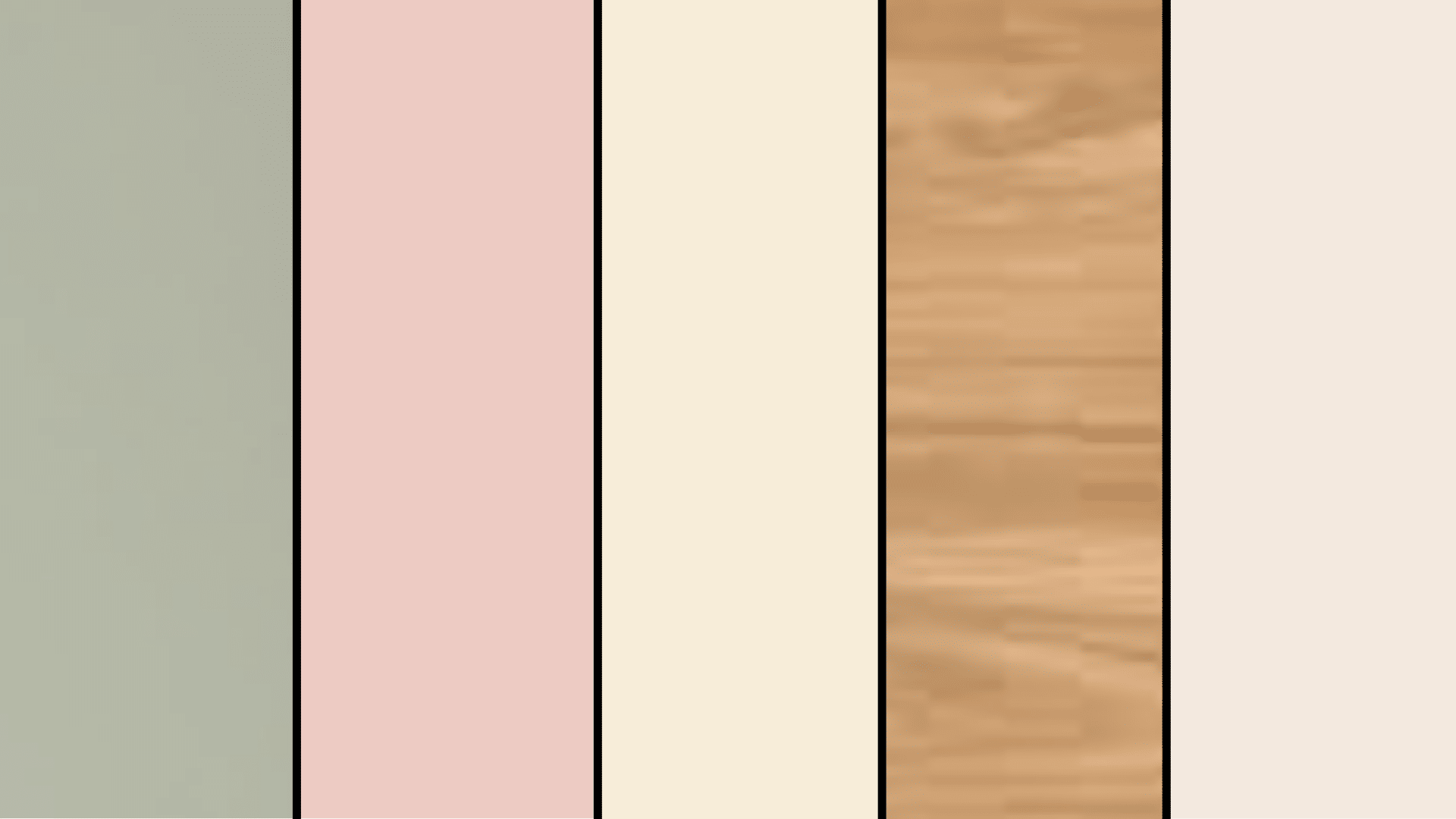
These palettes help you use the color Sage with the right undertones, so your room feels balanced, calm, and planned.
Warm Sage Palette (Cozy and Earthy)
Warm Sage leans olive or slightly brown, so it looks best with warm neutrals and earthy accents. This palette feels relaxed and grounded, which works great in living rooms, bedrooms, and kitchens with warm lighting.
If your space has warm wood floors or creamy trim, this mix usually looks natural right away. Keep the contrast soft, then add one deeper element for depth.
- Sage + Cream
- Sage + Warm Beige
- Sage + Terracotta
- Sage + Brass
- Sage + Walnut Wood
Cool Sage Palette (Clean and Airy)

Cool Sage leans gray or slightly blue, so it pairs well with crisp, cooler shades. This palette feels fresh and light, making it a safe pick for bathrooms, offices, and smaller rooms.
If your home has cooler light, gray tile, or modern finishes, this combo helps Sage look smooth instead of muddy. Add one wood tone to keep it from feeling too flat.
- Sage + Bright White
- Sage + Cool Gray
- Sage + Dusty Blue
- Sage + Chrome
Modern Contrast Palette

If you want Sage to look modern, you need contrast. Dark accents make Sage feel sharper and more current, especially on cabinets, built-ins, or an accent wall. This palette works well in open spaces where you want clean lines and bold edges.
Keep the background light, then use black or charcoal in small, repeated spots to make it feel intentional.
- Sage + Charcoal
- Sage + Black
- Sage + Crisp White
- Sage + Concrete Tones
Soft and Romantic Palette

This palette keeps Sage gentle by pairing it with light, warm tones and soft textures. It works best in bedrooms, nurseries, or quiet corners where you want a calm look without heavy contrast.
Use blush as a small accent, not the main color. Linen tones and pale wood help the whole space feel light and easy.
- Sage + Blush
- Sage + Warm White
- Sage + Light Wood
- Sage + Linen Tones
Nature Palette
If you want Sage to feel outdoorsy and organic, pair it with clay, sand, and stone shades. This palette suits entryways, living rooms, and any space with natural materials like jute, rattan, or textured walls.
Keep the colors muted so Sage stays the main “green,” while the other shades support it. Olive works best here when it is slightly darker than your Sage.
- Sage + Clay
- Sage + Sand
- Sage + Olive
- Sage + Stone
Where Sage Works Best in Home Design
Sage works best where you want soft color without heaviness, and where lighting and nearby finishes support its undertone.
Sage Walls
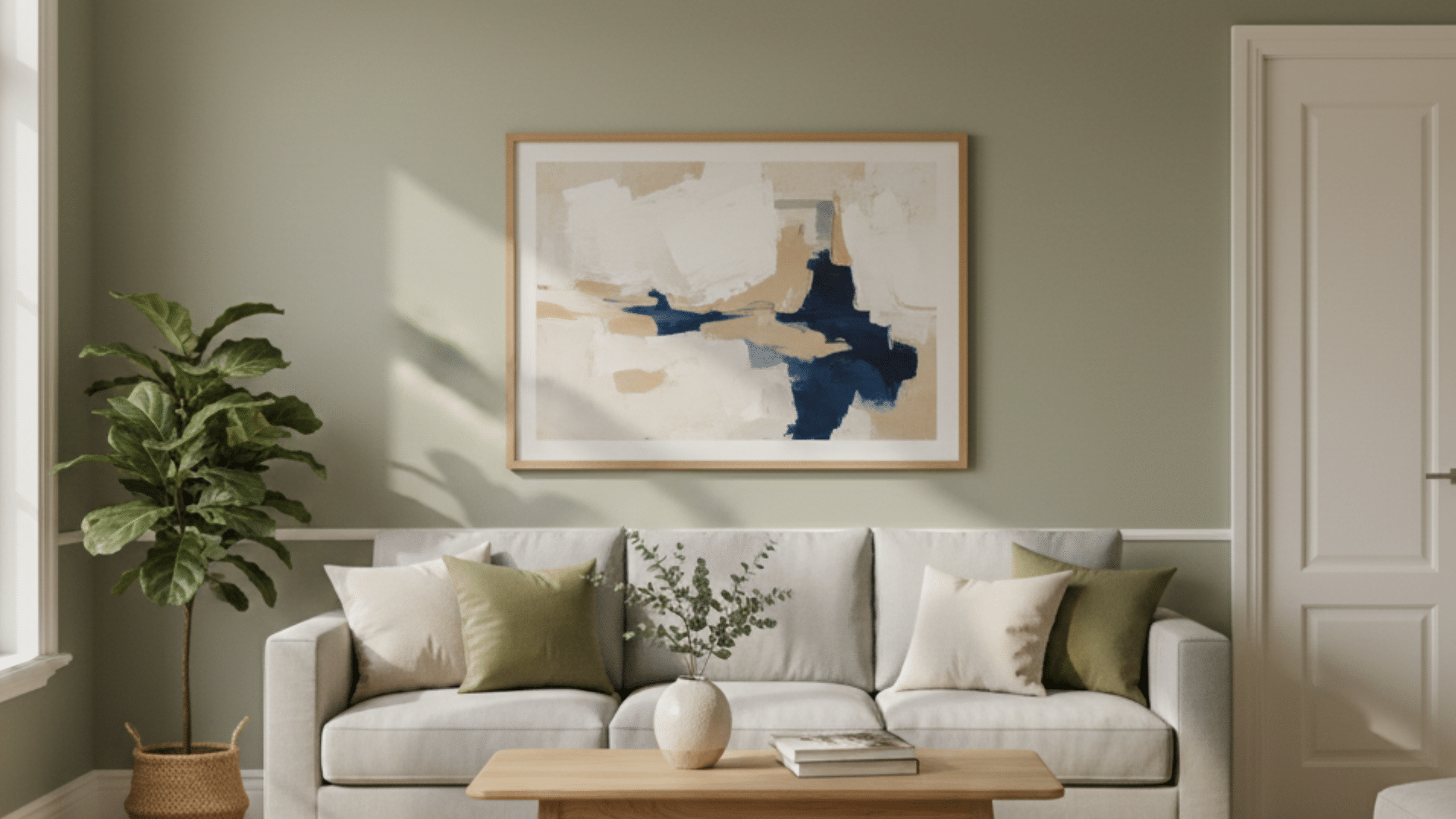
Sage walls work well in bedrooms, living rooms, home offices, and hallways because the color feels calm without going dull. It reads like a neutral, so it does not fight with rugs, art, or furniture.
In bright rooms, Sage can feel fresh and clean. In dim rooms, it can look grayer and softer, which still works if you like a quiet look. Pair it with the right white trim, and it looks more finished.
Best rooms: bedrooms, living rooms, offices, hallways
Best trim: warm white for warm Sage, clean white for cool Sage
Sage Cabinets and Islands
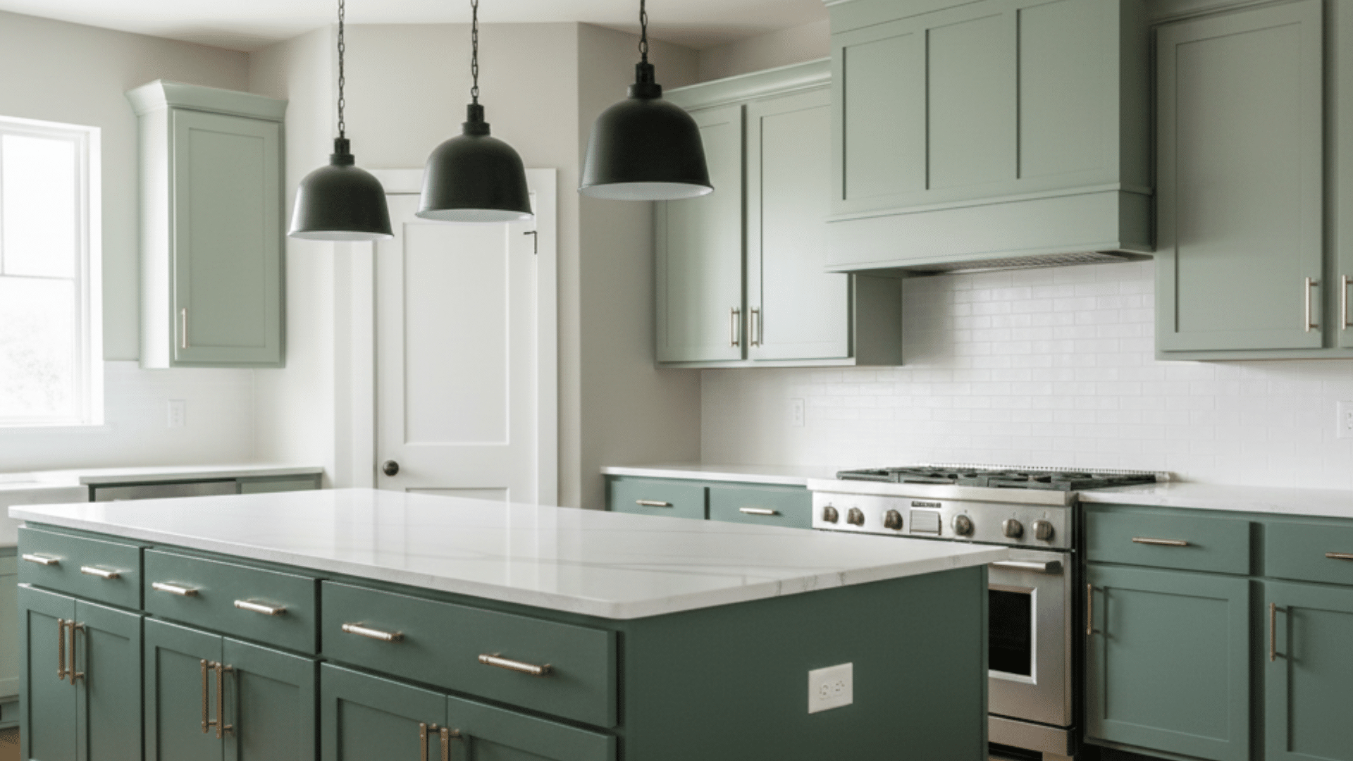
Sage is a strong choice for cabinets and islands because it adds color without feeling loud. Many bright greens can look trendy fast or feel too bold in a kitchen.
Sage stays softer, so it works with wood floors, stone counters, and metal hardware. It also hides daily smudges better than pure white. Use deeper Sage for islands if you want contrast, or lighter Sage for full cabinets.
Works well with: white counters, warm wood, black or brass hardware
Great spots: lower cabinets, islands, pantry doors
Sage Bathrooms
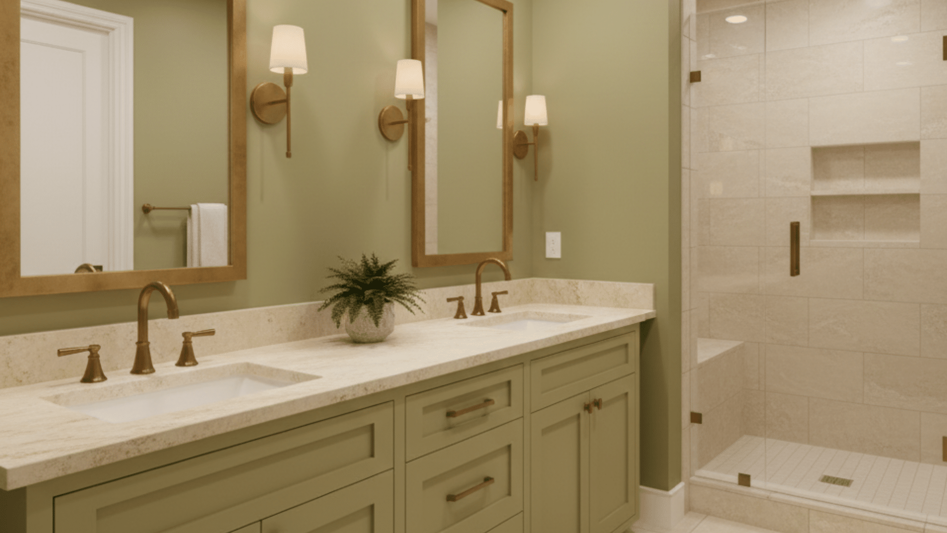
Sage works in bathrooms because it pairs easily with tile and stone, and it gives a clean but softer feel than plain white. Cool Sage looks great with gray tile, marble looks, and chrome.
Warm Sage looks better with cream tile, travertine, and brushed brass. Since bathrooms can have mixed lighting, test the shade under your vanity lights too. Keep other colors simple so Sage stays calm.
Cool look: Sage + gray stone + chrome
Warm look: Sage + cream tile + brass or bronze
Sage Exteriors and Front Doors
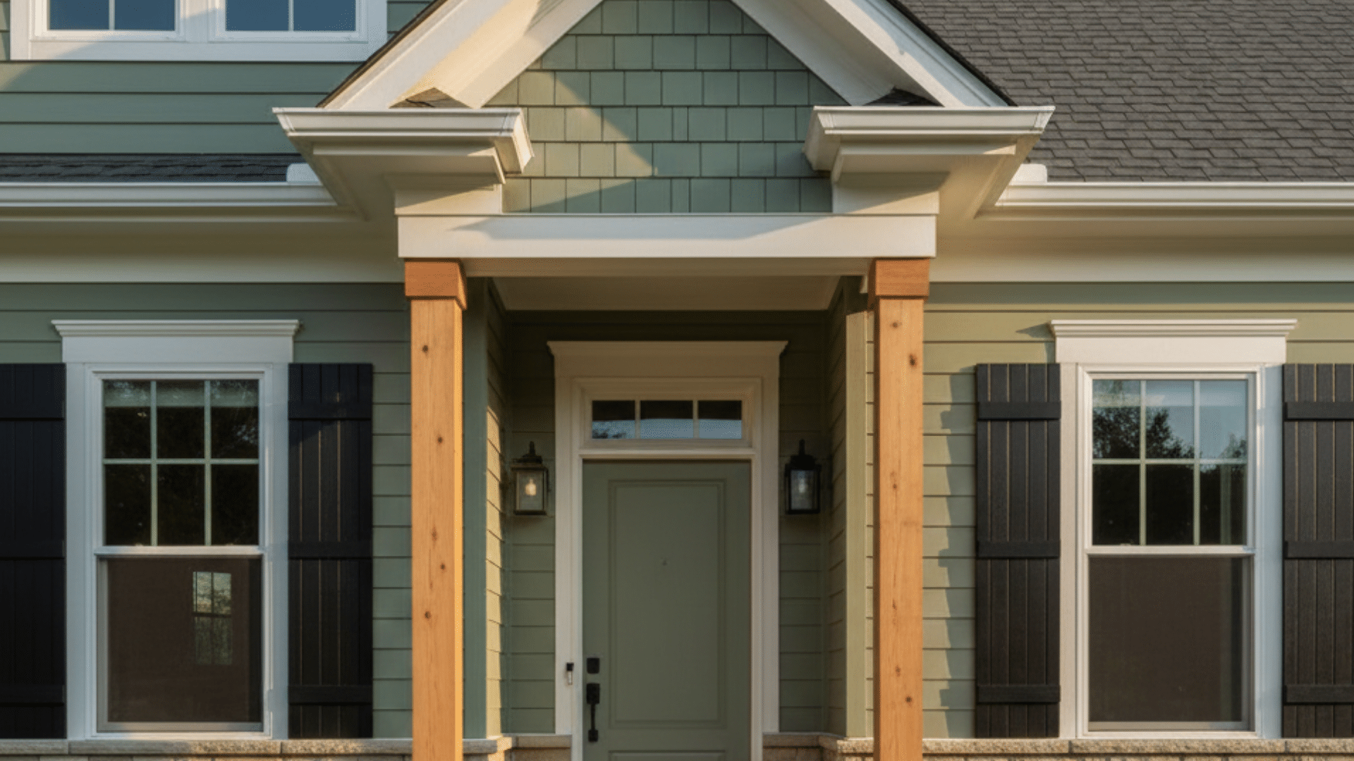
Sage can look great outside, but outdoor light changes it a lot. Sun can pull Sage warmer and greener, while shade can pull it grayer or bluer. That is why testing is important.
Paint a large sample board and check it in the morning, midday, and evening. Sage works well for front doors, shutters, and even siding if your roof, brick, or stone tones match its undertone.
Test outside in: sun and shade, different times of day
Best pairings: warm white trim, black accents, natural stone, wood tones
Sage Undertones (How To Choose The Right One)
Sage undertones decide if your shade looks warm, cool, or balanced once it is on the wall. Many Sages hide hints of gray, blue, yellow, or brown.
To spot it fast, do a simple undertone test. Place your Sage sample next to pure white, medium gray, and warm beige. If it looks bluer next to white, it is cool.
If it looks earthier next to beige, it is warm. Then do the neighbor color test. Hold the sample next to your flooring, countertop, and trim. If it clashes there, it will clash on the wall too.
Sage Variations (Silvery, Olive, Minty, Deep)
These Sage types help you pick the right shade faster, based on lighting, undertone, and how bold you want it.
| Sage Type | What It Looks Like | Feels Like | Best For | Avoid If |
|---|---|---|---|---|
| Silvery Sage | Pale gray-green | Light, soft, neutral | Small rooms, low light, calm walls | You want warmth or richness |
| Olive Sage | Green with a warm, earthy tone | Cozy, grounded | Warm lighting, rustic spaces, warm woods | Your room is cool or shadowy |
| Minty Sage | Green with a fresher, cooler cast | Crisp, airy | Bathrooms, bright rooms, modern spaces | You dislike blue-leaning greens |
| Deep Sage | Darker, richer muted green | Bold, settled | Cabinets, doors, accent walls | You want an airy, light look |
Pick Your Sage
- Want neutral and soft: Silvery Sage
- Want cozy and earthy: Olive Sage
- Want fresh and light: Minty Sage
- Want bold and deep: Deep Sage
Conclusion
Now you know why Sage feels so easy to use, even when it shifts a little in a different light.
You saw how Sage sits between green and gray, how warm and cool undertones change the look, and where it works best in a home. You also got ready-to-use palettes, so you can match trim, wood, tile, and metals without guessing.
My biggest tip is to test a large sample near your flooring and trim before you commit.
If you still feel stuck on what color is Sage, tell me your room light and finishes in the comments. Also, check out my other blogs for more color help and pairing ideas.


