


If you’ve ever hunted for a paint color that feels soft but not washed out, warm but not yellow, I completely get it. I went through the same thing before finding Sherwin-Williams Oyster White (SW 7637).
It’s that rare neutral that makes any room feel calm and welcoming without looking plain. I’ve seen it work beautifully in living rooms, bedrooms, and even exteriors.
This post breaks down everything I’ve learned about Oyster White, how it looks in different lighting, what undertones to expect, and where it fits best.
You’ll also see how it compares to other Sherwin-Williams whites and find similar colors in other brands. By the end, you’ll know exactly if this shade matches the look you want for your home.
What is Sherwin-Williams Oyster White?
Sherwin-Williams Oyster White (SW 7637) is a warm, beige paint that bridges the space between white and beige. It’s part of the neutral color family and works well for both interior and exterior surfaces.
The shade gives off a soft, creamy look with a gentle green-beige undertone that changes slightly depending on lighting.
| Attribute | Detail |
|---|---|
| LRV | 72 |
| RGB | 218 / 213 / 200 |
| HEX | #DAD5C8 |
| Color Family | Warm Greige |
| Finish Options | Flat, Satin, Semi-Gloss |
Oyster White by Sherwin-Williams offers more depth than a plain white but stays lighter than most beige tones.
It’s sold at Sherwin-Williams stores and through sample providers like Samplize and Lowe’s. This balance of warmth and softness makes it a dependable choice for spaces that need a gentle, adaptable neutral.
Understanding Oyster White’s Undertones

Oyster White can look different depending on the light and surroundings, which often causes confusion. It’s not a true gray or beige but a balanced mix of both with a slight green tint.
This faint green-beige undertone gives the color a warm, earthy look that keeps it from feeling cold or flat. In rooms with natural sunlight, it appears softer and creamier, while in shaded spaces, it leans more neutral.
Wall texture, trim color, and nearby furnishings also affect how the undertone shows. For example, pairing it with pure white trim highlights its warmth, while darker accents draw out the gray side.
How Lighting Changes Oyster White
Lighting has a major effect on how Oyster White looks once applied. It shifts noticeably under both natural and artificial light, so it’s important to see it in real conditions before painting.
- North-facing rooms: Natural light from the north is cooler, which makes Oyster White lean toward gray. It feels soft and muted in these spaces.
- South-facing rooms: Warm sunlight brightens the beige undertone, giving the color a creamy, cozy look during the day.
- East-facing rooms: Morning light adds a gentle warmth that fades into a balanced neutral tone by afternoon.
- West-facing rooms: Evening sun deepens the color, bringing out a warm beige hue with a touch of gray.
- Artificial lighting: Warm bulbs enhance its beige notes, while cool LED lights make it appear more gray.
Test large samples on multiple walls to see how the tone shifts through the day.
Where to Use Sherwin-Williams Oyster White
Oyster White adapts easily to different spaces, offering a balanced tone that complements both warm and cool materials.
1. Living Room / Dining

This shade works beautifully in shared spaces where comfort and balance matter. Its soft undertone pairs well with natural wood, greenery, and neutral furnishings, giving the room a calm and cozy feel.
Oyster White provides enough warmth to feel inviting yet remains light enough to keep the area open and airy.
Try pairing it with medium-toned wood furniture, woven textures, or linen curtains for a balanced look that works across different design styles.
2. Kitchen Cabinets

Oyster White is a great choice for kitchen cabinetry because it adds softness without looking stark. It pairs well with brass, nickel, or matte-black hardware, offering flexibility across styles from farmhouse to modern.
Against white countertops, it shows more beige warmth, while with darker surfaces, it reads as a gentle greige.
The color’s neutrality makes it easy to coordinate with tile, backsplash, and flooring choices, creating a consistent, natural flow throughout the kitchen.
3. Bedrooms / Bathrooms
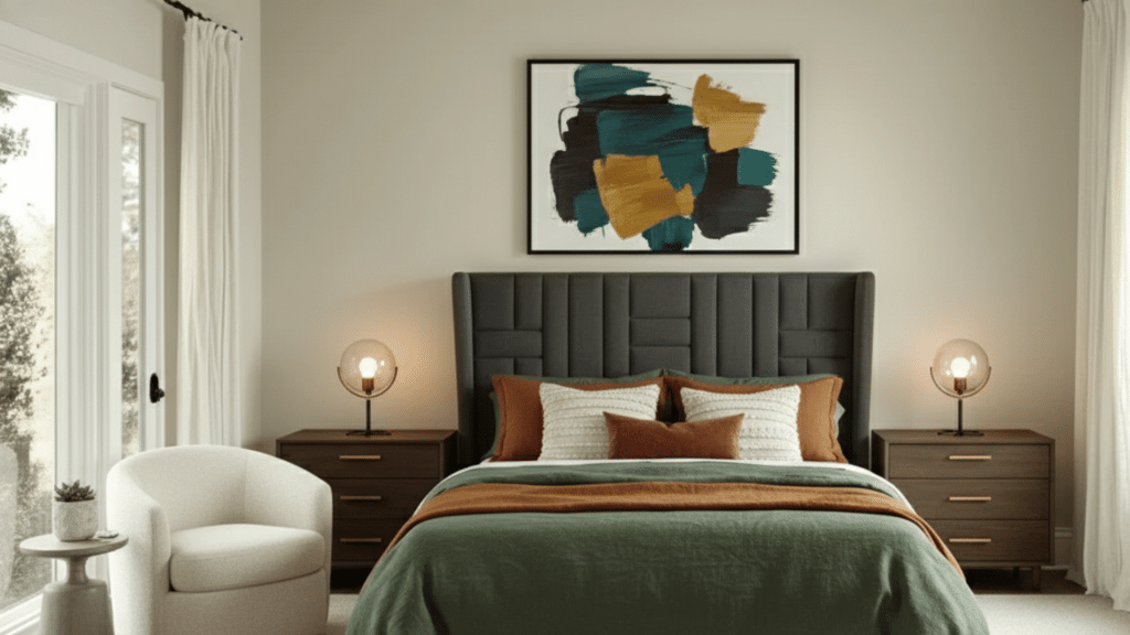
For bedrooms and bathrooms, Oyster White brings a quiet, spa-like feel. Its green-beige base adds warmth without being too creamy, helping the space feel peaceful and light. It complements soft fabrics, woven textures, and brushed-metal fixtures perfectly.
Use it with crisp white trim for a clean contrast or with muted greens and taupes for a layered, restful palette. The result is a relaxed, classic look that feels both fresh and grounded.
4. Exterior

Outside, Oyster White performs just as well. It’s an excellent option for siding, brick, or stucco, offering enough depth to stand out in bright daylight. Pair it with black, greige, or deep charcoal trim for a refined contrast.
On exteriors surrounded by natural elements like stone or wood, the subtle undertone blends beautifully. Its ability to handle strong sunlight without looking yellow makes it a dependable color for year-round curb appeal.
Choosing the Right Finish for Oyster White
The finish you choose affects how Oyster White looks and how well it holds up over time.
Flat finish: Best for ceilings or low-traffic walls. It hides imperfections well but can be harder to clean.
Satin finish: Ideal for most walls. It reflects a small amount of light, showing the color’s depth without glare, and offers easy wipe-down maintenance.
Semi-gloss finish: Great for trim, doors, and cabinetry. It highlights architectural details and resists scuffs and moisture better than lower-sheen paints.
Color depth and sheen: Higher sheens slightly deepen the color, making Oyster White appear warmer and richer under direct light.
How Oyster White Compares to Other Popular Whites
Oyster White often gets compared to other Sherwin-Williams neutrals because of its balance between gray, beige, and warmth.
Each color has its own LRV (light reflectance value), undertone, and ideal setting, which can change how it looks in your space.
Oyster White vs. Shoji White SW 7042

Shoji White (SW 7042) has an LRV of 74, slightly higher than Oyster White’s 72, meaning it reflects more light and appears brighter.
Shoji has a cream-beige undertone, making it warmer and softer overall. It suits farmhouse or cottage-style homes where you want a cozy, creamy feel.
Oyster White’s green-beige undertone keeps it more neutral, offering a calm, balanced finish that pairs well with both warm and cool accents. Choose Shoji White for warmth and comfort, or Oyster White for subtle depth and balance.
Oyster White vs. Alabaster SW 7008

Alabaster (SW 7008) is noticeably lighter, with an LRV of 82, making it one of Sherwin-Williams’ brighter whites. It carries a cream-yellow undertone that feels soft and classic, perfect for traditional interiors or rooms with limited natural light.
In comparison, Oyster White’s greige tone feels more grounded, offering warmth without looking creamy. If your goal is brightness and airiness, Alabaster works best.
For a softer, low-contrast neutral that still feels warm, Oyster White is the better fit.
Oyster White vs. White Duck SW 7010

White Duck (SW 7010) has an LRV of 74 and a beige-gray undertone, placing it close to Oyster White but with a smoother, less variable appearance. It reflects slightly more light, giving interiors a soft, blended look.
Oyster White, with its green-beige base, can appear cooler or warmer depending on lighting. White Duck is ideal for transitional or modern farmhouse spaces that require steady warmth.
Choose Oyster White if you prefer a color with gentle shifts and a touch more visual depth.
Coordinating Colors That Work With Oyster White
Oyster White pairs easily with both warm and cool shades, giving you flexibility in designing balanced color schemes.
The best coordinating colors come from similar natural tones and subtle contrasts:
- SW Evergreen Fog (SW 9130): A muted green that works beautifully as an accent color on furniture or feature walls.
- SW Greek Villa (SW 7551): A clean, creamy white perfect for trim and ceilings, keeping the space light and cohesive.
- SW Urbane Bronze (SW 7048): A deep brown-gray ideal for doors, cabinets, or window frames, grounding the palette with contrast.
Use these together to build a soft, layered look. For example, Oyster White walls with Greek Villa trim and Urbane Bronze accents create a calm yet refined balance suitable for both interiors and exteriors.
How Oyster White Feels in a Room
Oyster White gives a room a calm and restful atmosphere. Its soft tone helps create a welcoming feel without appearing too warm or too cool. The color naturally brings balance, making spaces feel open yet comfortable.
In cozy, natural interiors, it works as a quiet backdrop that lets wood textures, greenery, or woven materials stand out. Because it’s neither stark white nor dark beige, it adds gentle depth that feels easy on the eyes.
Rooms painted in Oyster White often feel steady, clean, and soothing, perfect for bedrooms, living areas, and reading corners. It’s the kind of neutral that helps you relax while still giving the space a finished, well-balanced look.
Expert Tips for Testing and Sampling
Before painting, it’s smart to see how Oyster White looks in your own lighting. You can start with Samplize peel-and-stick samples to preview the color directly on your walls without any mess. These reusable samples make testing fast and simple.
- Start with peel-and-stick samples: Large stickers help you view the color across multiple walls and spaces.
- Test under different lighting: Look at the paint in both natural daylight and artificial light to catch tone shifts.
- Paint sample boards: Apply two full coats on foam or poster boards for accurate color depth.
- Move samples around: Check the boards in various rooms and corners throughout the day.
- Compare with trim and flooring: Hold samples near existing finishes to confirm harmony.
- Wait 24 hours: Let the paint dry completely before finalizing your decision.
Colors Similar to Sherwin-Williams Oyster White in Other Brands

If you like the look of SW Oyster White but want to explore similar tones in other brands, there are a few close matches worth checking out.
Each one carries the same soft, warm greige balance with slight shifts in undertone and depth.
| Brand | Color Name | Undertone / Character | LRV (if known) | Notes |
|---|---|---|---|---|
| Benjamin Moore | White Dove (OC-17) | Warm, creamy, slightly muted yellow | ~85.4 | Lighter and brighter than Oyster White; excellent for walls, trim, or lighter rooms. |
| Behr | Swiss Coffee (12) | Warm neutral/soft beige | ~84 | Similar brightness, but leans a bit more toward creamy tones. |
| Valspar | Drumskin (7003-10) | Beige-gray | — | Close in tone; it may read slightly warmer than Oyster White. |
| Farrow & Ball | School House White (291) | Muted greige with soft warmth | — | Slightly cooler and softer in tone; fits classic or layered interiors. |
| Benjamin Moore | Simply White (OC-117) | Pure neutral white (low undertone) | ~91.7 | Much brighter and cleaner, useful when you want more contrast or a crisper white. |
These options offer similar versatility and can help you achieve the same inviting, balanced look if you prefer a different paint brand.
Maintenance Tips for Sherwin-Williams Oyster White
Keeping Oyster White looking fresh doesn’t take much effort if you care for it the right way. Follow these simple maintenance steps to help it stay clean and bright over time.
- Dust walls regularly: Use a microfiber cloth or duster to prevent buildup, especially in high-traffic areas.
- Wipe gently: For marks or smudges, use a soft sponge with mild soap and water; avoid harsh cleaners.
- Spot clean early: Address scuffs or stains quickly to stop them from setting into the paint.
- Protect corners and baseboards: These areas take the most wear; touch them up once or twice a year.
- Store leftover paint properly: Seal the can tightly and label it for easy touch-ups later.
- Avoid strong sunlight exposure: In bright rooms, use window coverings to reduce fading over time.
Summing Up
After trying SW Oyster White in different spaces, I can honestly say it’s one of the most dependable neutrals out there. It strikes that perfect balance, warm but not yellow, soft but not flat.
On walls, it gives a relaxed, lived-in look. On cabinets or exteriors, it adds quiet depth that fits right in with almost any style.
If you’re thinking about using it, start with a small sample first. Move it around, check it in morning and evening light, and see how it changes through the day. You’ll quickly notice how natural and easy it feels in every setting.
When you’re ready, check out my other paint color guides and ideas to find shades that pair beautifully with Oyster White. Your perfect palette might be just a scroll away.