
I’ll be honest, when I first heard about two tone kitchen cabinets, I wasn’t sure if they were right for me. But after seeing how they can totally upgrade a home, I’m completely sold!
Two-tone cabinets use two different colors or finishes to create a look that’s both stylish and unique. Think white upper cabinets with dark navy lower cabinets, or a natural-wood island paired with painted perimeter cabinets.
I’m going to walk you through everything you need to know about dual-colour kitchen cabinets. We’ll look at the best color combinations, the pros and cons, and common mistakes to avoid when tackling this project yourself.
Understanding Two Tone Kitchen Cabinets
When I talk about this style, I simply mean using two different cabinet colors, finishes, or even materials in the same kitchen.
Instead of everything matching, you intentionally mix things up. It could be white upper cabinets with dark lower ones, a wood island paired with painted perimeter cabinets, or even the same color in two different finishes.
The most common layout I see is lighter cabinets on top and darker ones on the bottom. This keeps the room feeling bright while still adding depth and contrast.
This trend is popular because it makes a home feel more custom, modern, and visually interesting without needing a full remodel.
Two-Tone Kitchen Cabinet Ideas
If you’re anything like me, you need real examples to imagine the possibilities. Here are some beautiful dual colour cabinet ideas to spark inspiration.
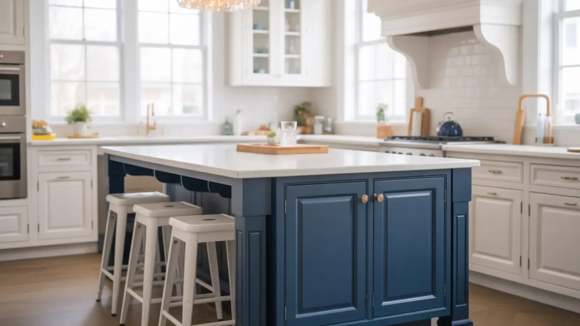
1. White Upper + Navy Lower Cabinets

This classic pairing keeps the room feeling bright while adding depth below. White upper cabinets reflect light and make the area feel open, while navy lowers ground the space with rich contrast.
It works beautifully in coastal, transitional, and modern designs. Add brass or gold hardware for a polished, designer-inspired finish that completes the look perfectly.
2. White + Natural Wood Cabinets

Combining white cabinets with natural wood creates warmth without losing brightness. The wood adds texture and character, while white keeps the space clean and airy.
This look is perfect for Scandinavian, modern farmhouse, or minimalist designs. It feels cozy yet fresh, making it a timeless choice for homeowners who value both style and function in their cooking space.
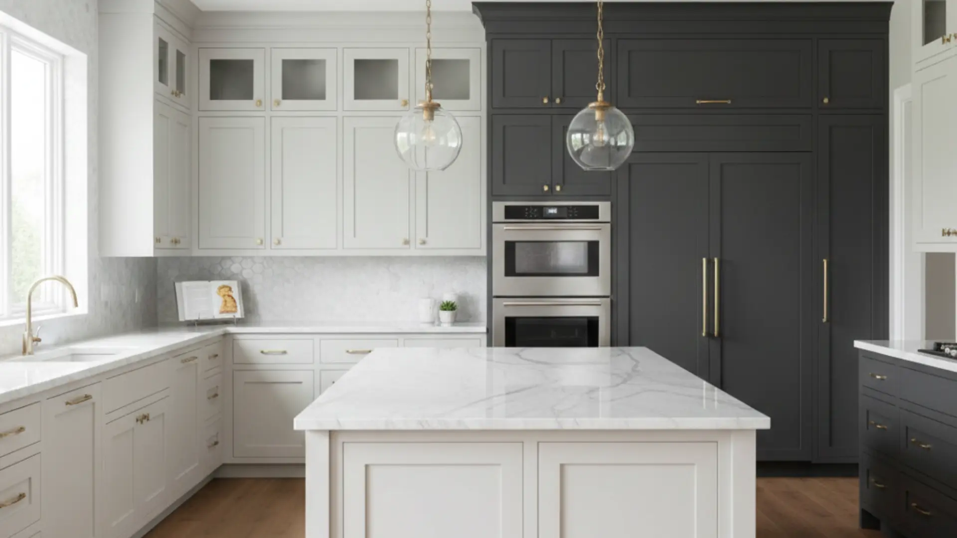
3. Black Lower + Light Gray Upper Cabinets

Black base cabinets anchor the room and hide wear and tear, while light gray uppers soften the contrast. This combination feels bold but not overwhelming.
It works well in contemporary spaces where you want drama without going full dark. Pair with light countertops to keep everything balanced and inviting. The result is a modern look that feels grounded and complete.
4. Sage Green + White Cabinets

Sage green lowers bring a calm, nature-inspired vibe to the area. When paired with crisp white uppers, the result feels airy and grounded at the same time.
This combination works especially well in farmhouse or cottage-style designs. Natural wood accents and brushed brass hardware complete the look beautifully. It creates a fresh feeling that homeowners love for years.
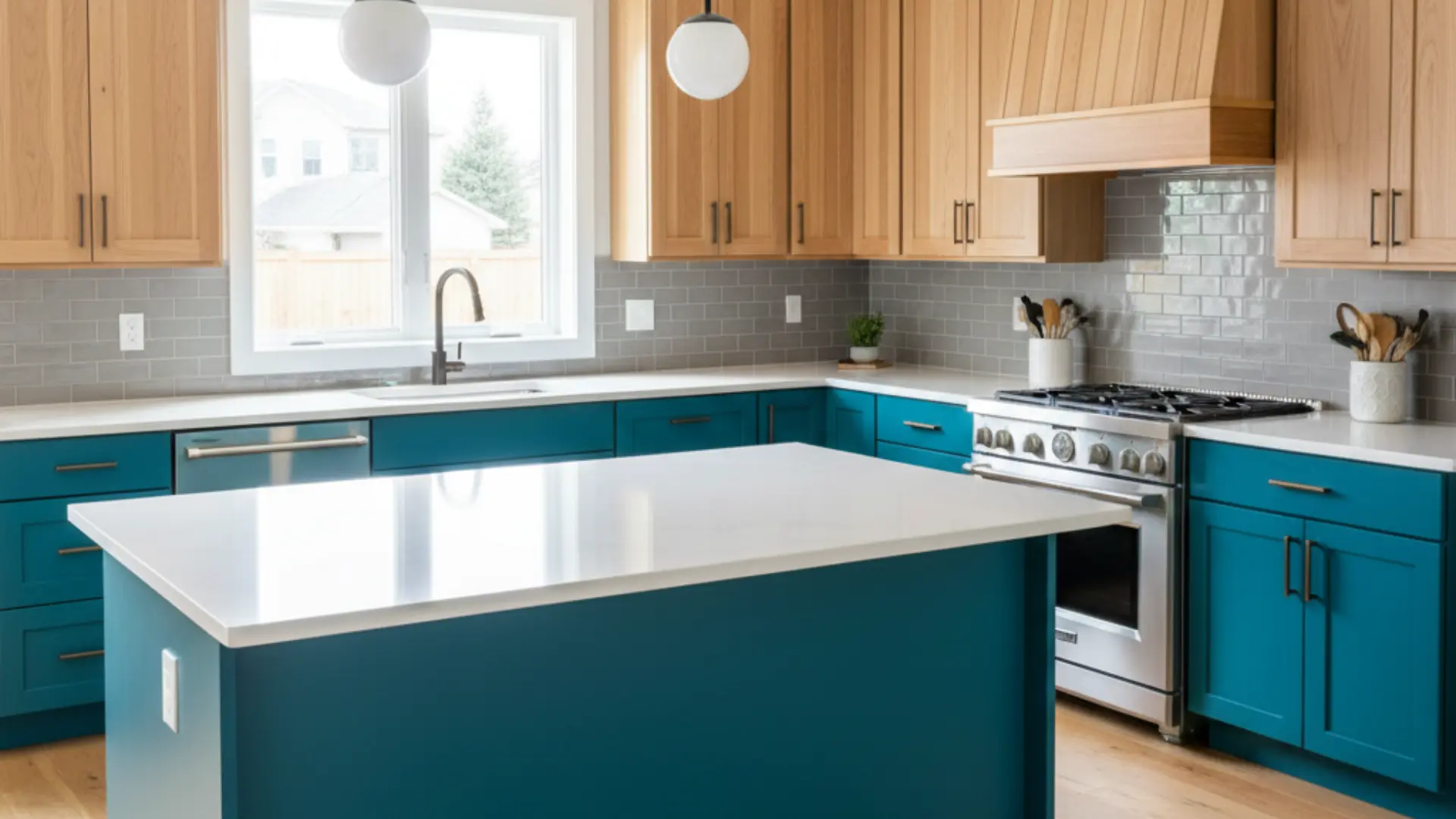
5. Blue + Warm Oak Cabinets

Deep blue cabinets paired with warm oak create a rich, layered design. The wood softens the boldness of the blue, making the space feel welcoming instead of dramatic.
This pairing works well in both modern and transitional styles. It gives a custom, high-end appearance without feeling trendy. The combination effortlessly brings warmth and personality to any cooking area.
6. Charcoal + Cream Cabinets

Charcoal lowers add an upgrade, while cream uppers keep the room soft and inviting. This pairing offers contrast without the starkness of black-and-white. It’s perfect for homeowners who want something moody but still warm.
Add warm lighting to boost the creamy tones and prevent the space from feeling cold. This combination creates a cozy yet refined atmosphere throughout.
7. Dark Island + Light Perimeter Cabinets

Keeping the perimeter cabinets light while painting the island a darker color creates a natural focal point. The island becomes the centerpiece of the room.
This approach is ideal if you want a contrasting look without committing to upper and lower variations throughout the entire space. It offers flexibility and visual interest while maintaining an open, bright feeling overall.
8. Wood Lower + Painted Upper Cabinets

Wood lowers add warmth and durability, while painted uppers keep the room feeling open. This combination blends rustic and refined elements effortlessly.
It’s especially popular in modern farmhouse and transitional designs. Choose a soft neutral paint color to balance the natural richness of the wood tones. The result is a layered look that feels both inviting and polished.
9. Matte and Gloss Same-Color Mix

Using the same cabinet color in both matte and gloss finishes creates a subtle contrast. The difference in sheen adds depth without introducing a second color.
This approach works well in modern spaces where simplicity is key. It keeps the palette cohesive while still adding visual interest and texture. The layered finish brings dimension to the room in a refined way.
10. Beige + Brown Cabinets

Layering beige and brown creates a soft, inviting neutral palette. The lighter beige keeps things airy, while the deeper brown adds warmth and depth.
This pairing works beautifully in traditional or Mediterranean-inspired designs. It’s ideal for homeowners who want subtle contrast without bold color choices or dramatic statements. The combination feels timeless and comfortable in any home setting.
11. Classic Black and White Cabinets
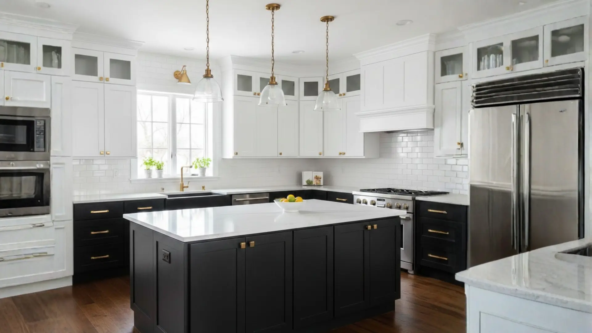
This classic tuxedo look delivers strong contrast and visual drama. White upper cabinets prevent the room from feeling heavy, while black lowers provide grounding. It suits both modern and traditional homes.
Adding metallic hardware can improve the overall design and give it a more luxurious, polished touch. This pairing never goes out of style and works in many settings.
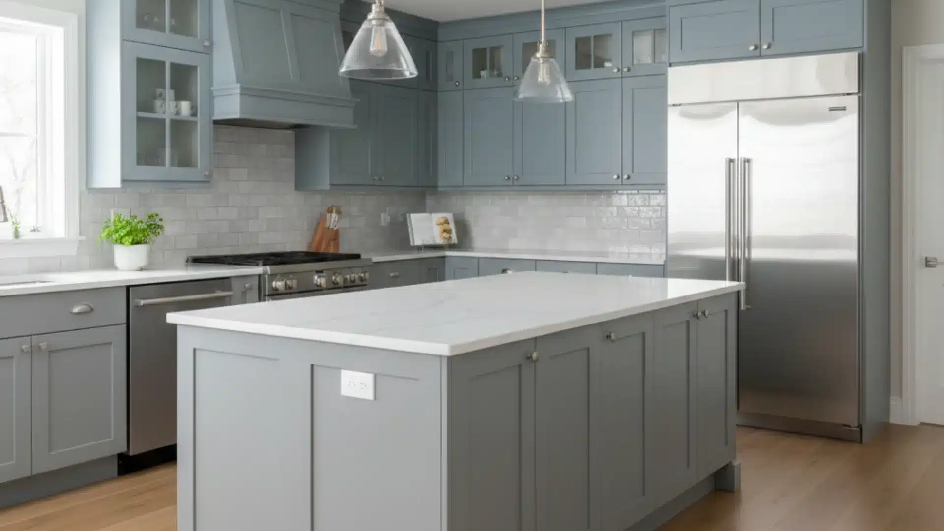
12. Blue and Gray Combination
Blue and gray create a cool, contemporary feel. The tones blend well without clashing, making the area feel cohesive and calm. This pairing works well in modern spaces with stainless steel appliances.
Choose lighter shades in smaller rooms to maintain brightness, openness, and a sense of airiness. The combination brings a serene quality, making the space feel peaceful.
13. Dusty Lavender + Soft Gray
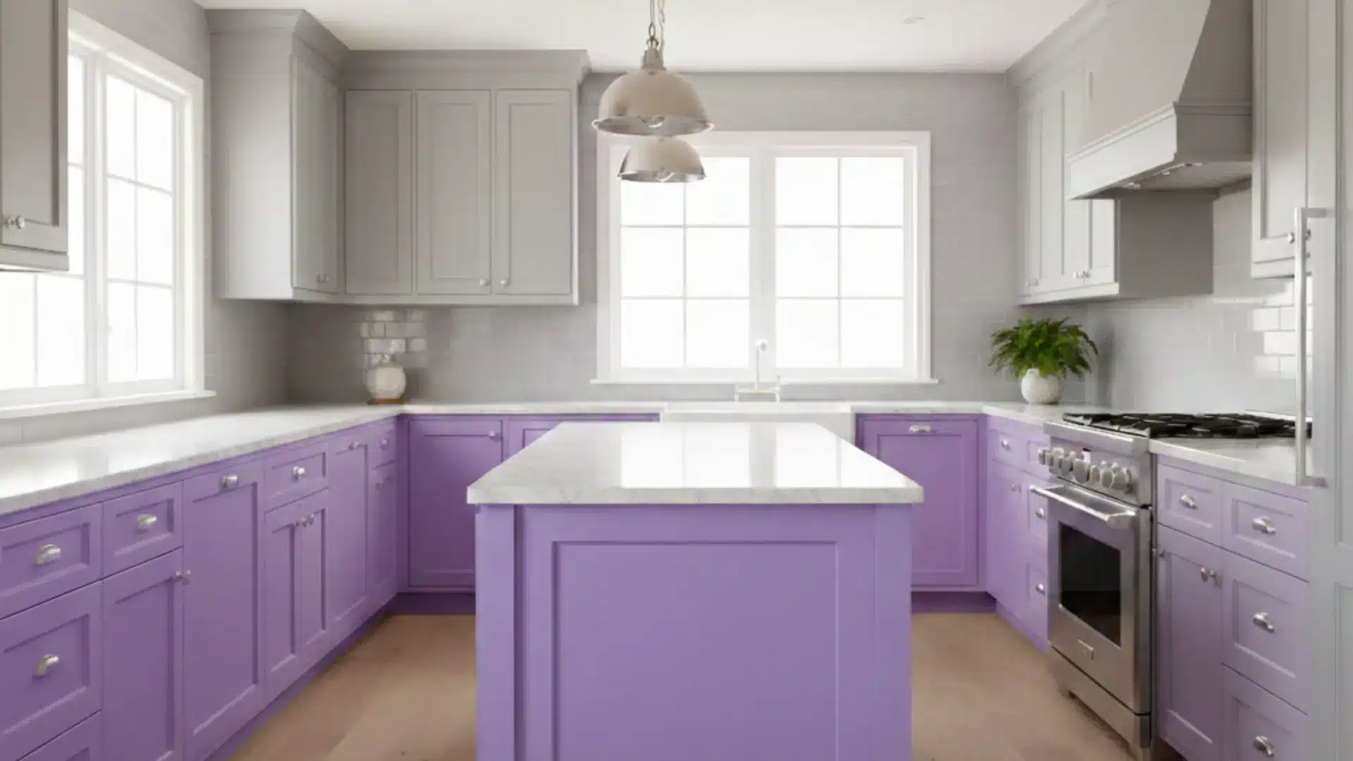
Dusty lavender brings a soft, unexpected touch of color that feels calming rather than bold. When paired with soft gray cabinets, the combination creates balance and visual appeal.
I love this pairing for spaces that want personality without overwhelming the area. The gray keeps everything grounded, while lavender adds warmth and subtle charm that feels fresh and inviting throughout.
14. Appliance Wall in a Different Color
Painting one cabinet wall in a contrasting shade creates subtle zoning within the space. The appliance or pantry wall becomes a visual feature that naturally draws attention.
This approach works well in larger rooms where you want dimension without overwhelming the entire area with too much contrast or competing color schemes. It adds interest while maintaining overall balance and flow.
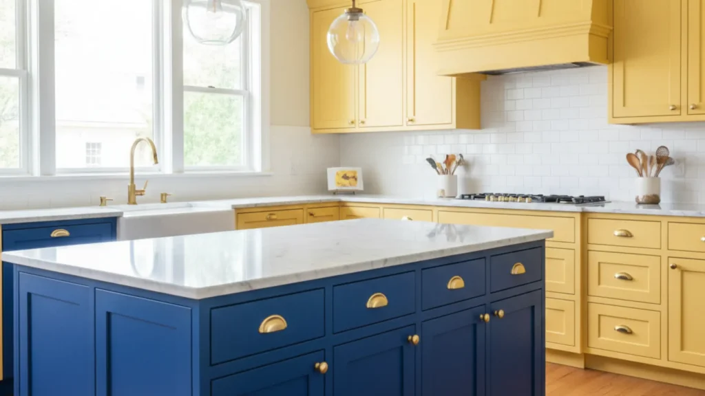
15. Butter Yellow + Charcoal
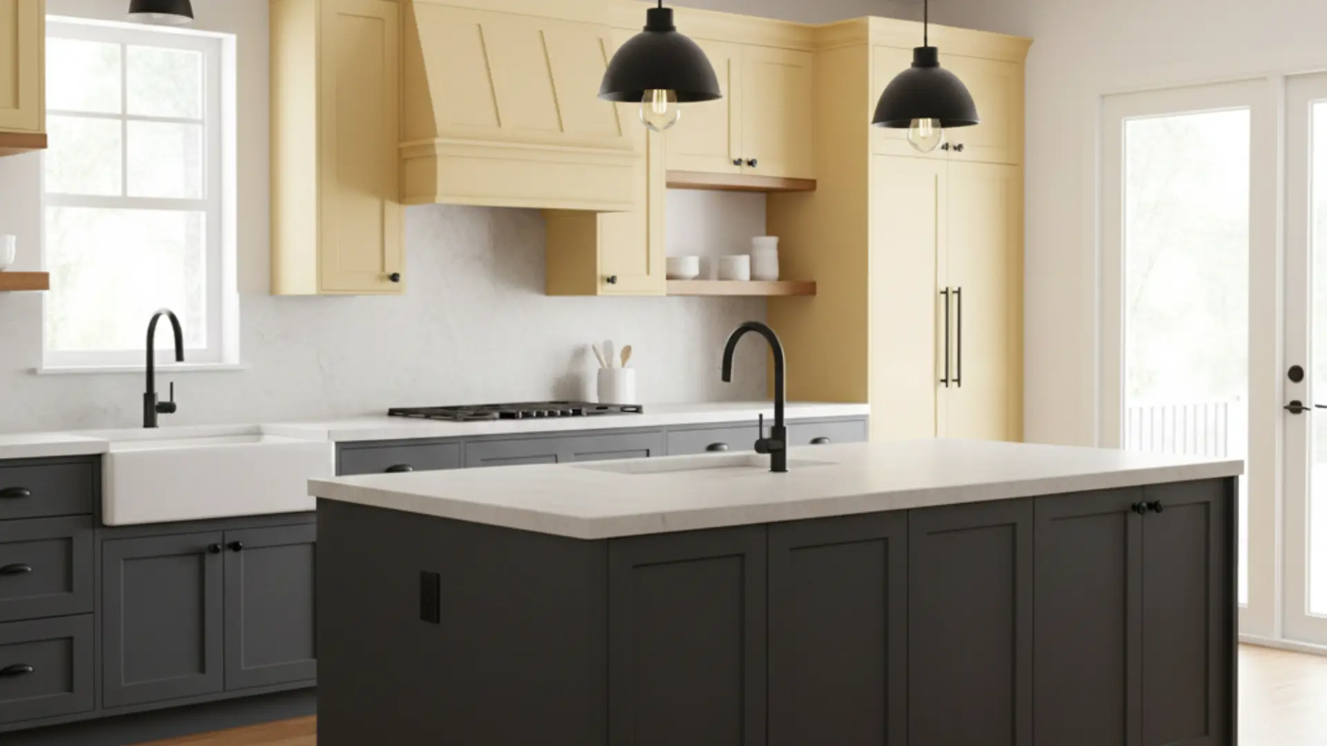
Butter yellow instantly brightens a cooking space and adds cheerful warmth. When I pair it with deep charcoal cabinets, the contrast feels bold yet subtle.
The charcoal prevents the yellow from looking too playful, creating a mature and balanced design that works well in rooms with natural light. This combination brings energy while staying grounded and functional for everyday use.
16. All White Kitchen + Wood Range Hood
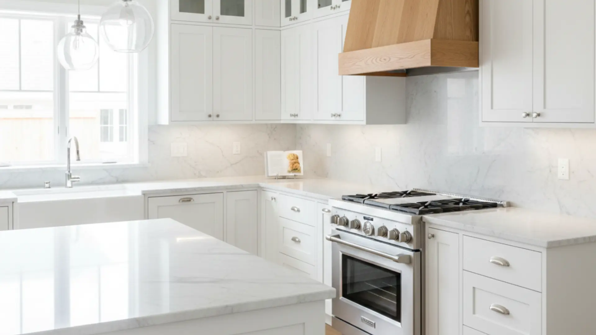
An all-white design feels bright and clean, but adding a wood range hood introduces warmth and texture. This subtle contrast creates a focal point without requiring two full cabinet colors.
The natural wood element softens the crispness of white and makes the space feel more inviting and layered rather than sterile. It’s perfect for those wanting minimal contrast.
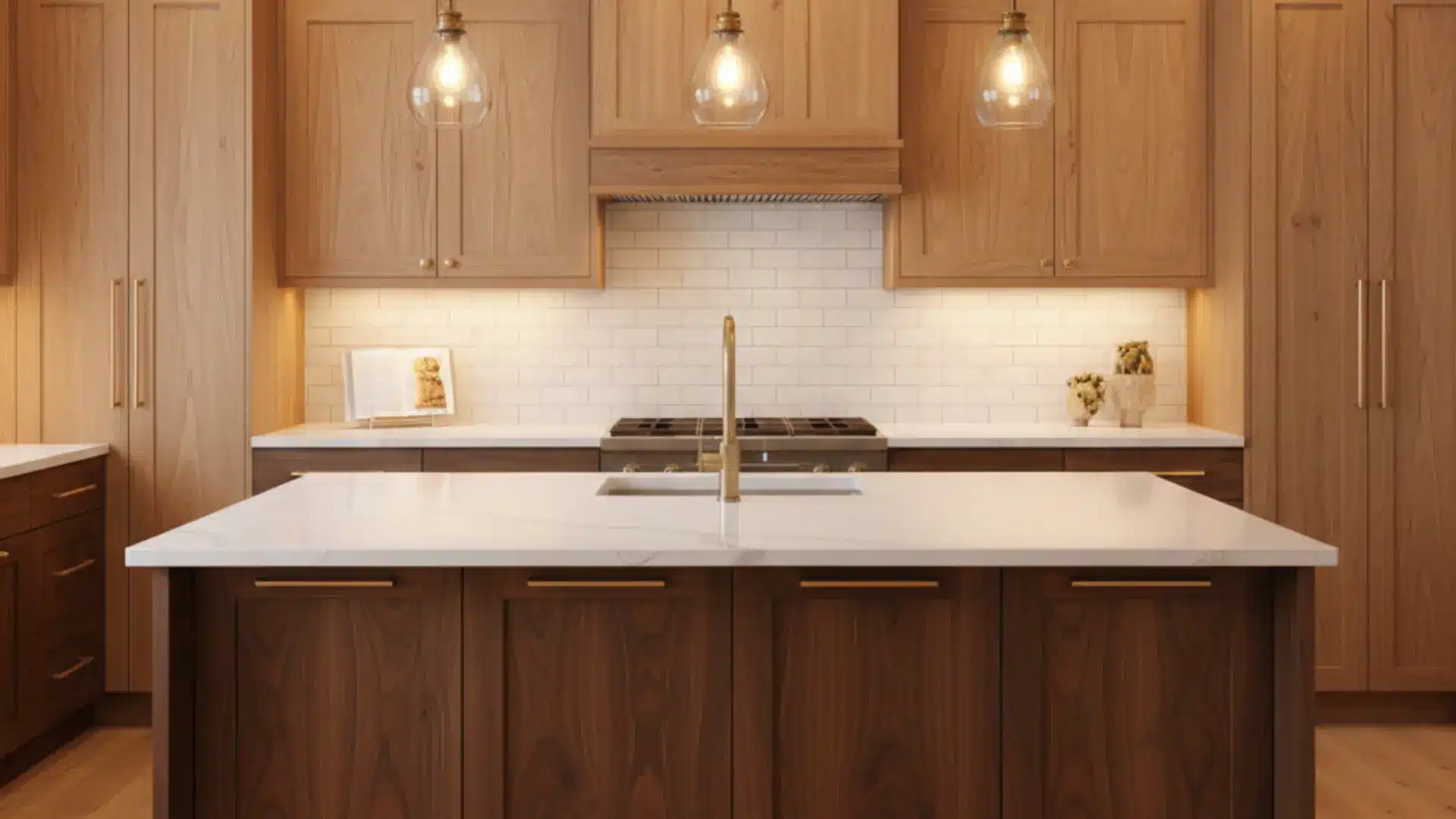
17. Walnut Cabinets + Soft White Uppers
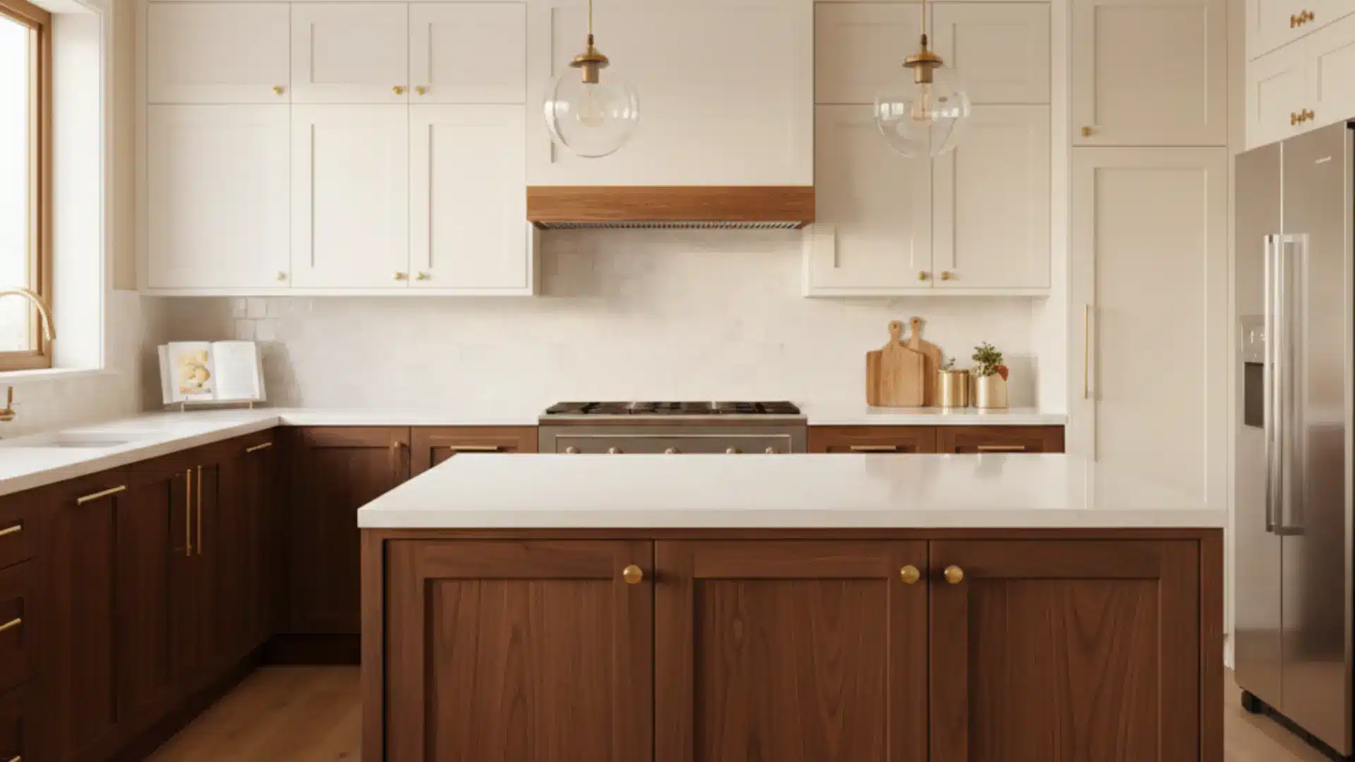
Walnut lowers provide deep, natural texture, while soft white uppers maintain brightness throughout the space. This pairing feels refined and timeless. It works beautifully in upscale spaces where natural materials are the focus.
The wood grain adds warmth and visual interest without overpowering the room or feeling too heavy overall. This combination suits traditional and contemporary homes equally well.
18. Navy Island + WhiteCabinets
Painting only the island navy adds contrast without overwhelming the space entirely. White cabinets around the perimeter keep the area bright and open.
This subtle approach is perfect for homeowners who want a hint of bold color without committing to darker base cabinets throughout their entire cooking or dining area. It creates a focal point while maintaining overall brightness.
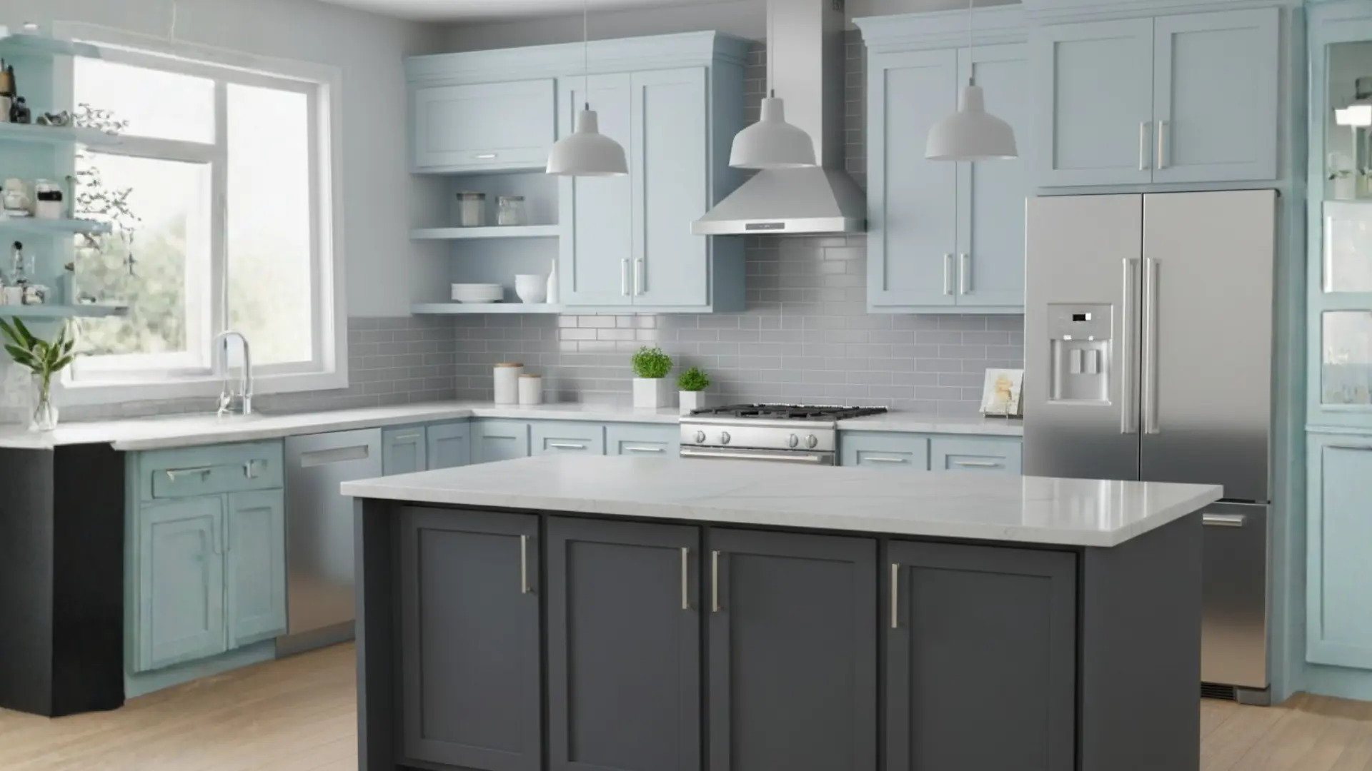
19. Soft Gray + Dusty Blue Cabinets
Muted gray and dusty blue create a layered, calming effect throughout the room. The colors blend naturally, offering gentle contrast that feels cohesive. This pairing works well in transitional or coastal-inspired designs.
Keeping the tones soft helps the space feel cohesive rather than busy, making it ideal for relaxed, comfortable home atmospheres where serenity matters most to homeowners.
20. Cream Uppers + Forest Green Lowers
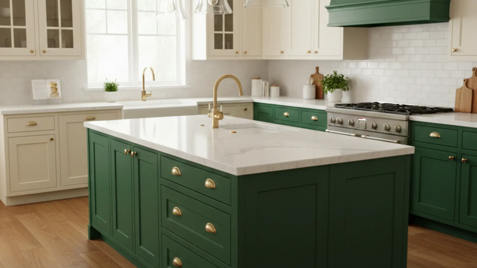
Cream-colored upper cabinets keep the room feeling light and open, while forest-green lower cabinets add richness and depth. This combination feels classic but still fresh, especially in traditional or cottage-style homes.
The darker base grounds the room without making it feel heavy. Pair it with brass hardware, warm wood floors, and soft lighting for a complete look.
21. Light Wood + Matte Black Cabinets
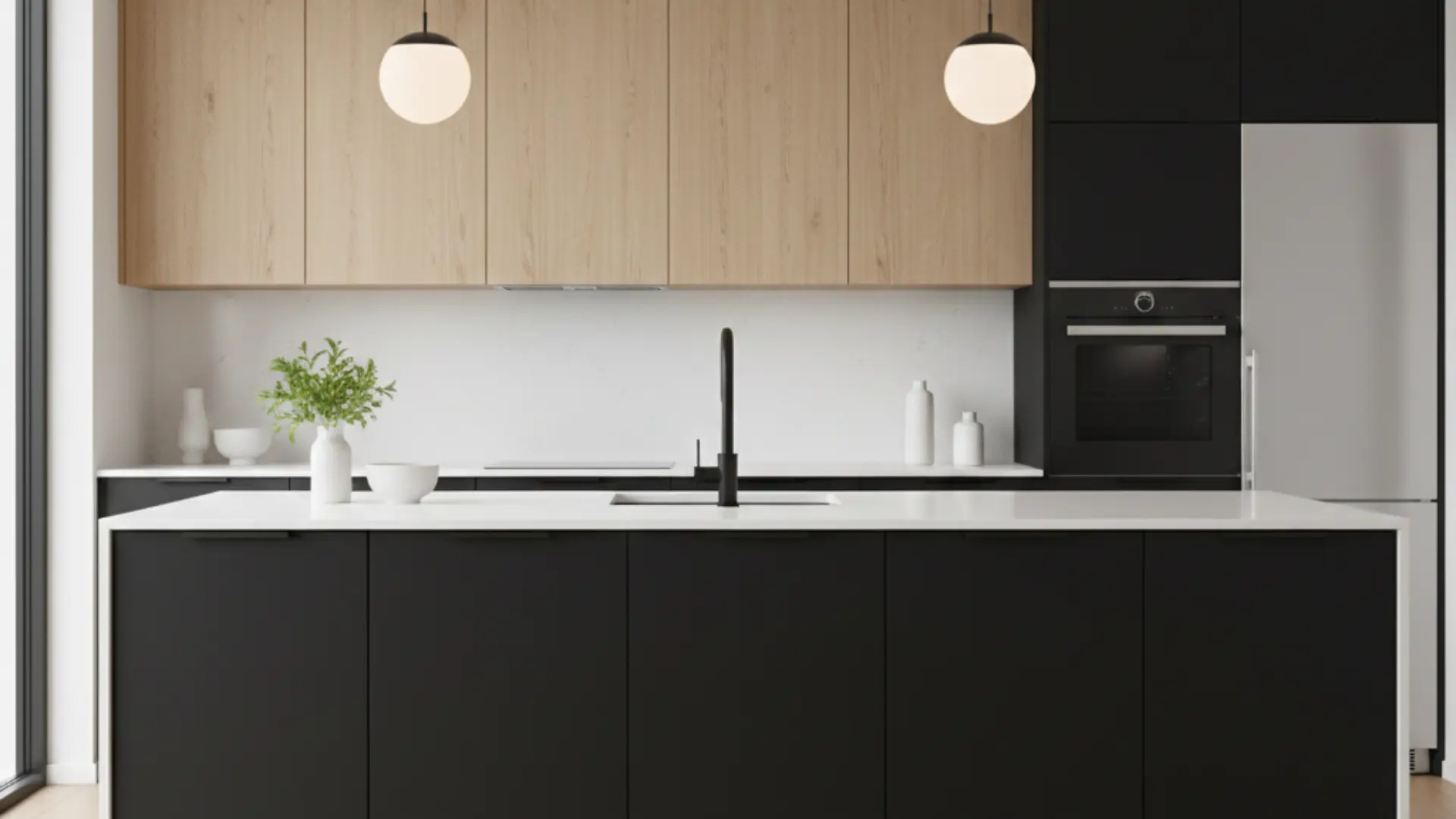
Light wood cabinets soften the boldness of matte black, creating a striking yet balanced contrast throughout the space. The natural wood grain adds warmth, while black delivers modern drama.
This pairing works beautifully in Scandinavian or minimalist spaces where clean lines matter most. Keep countertops simple and décor minimal so the contrast between texture and tone becomes the statement.
22. Blush + White Cabinets
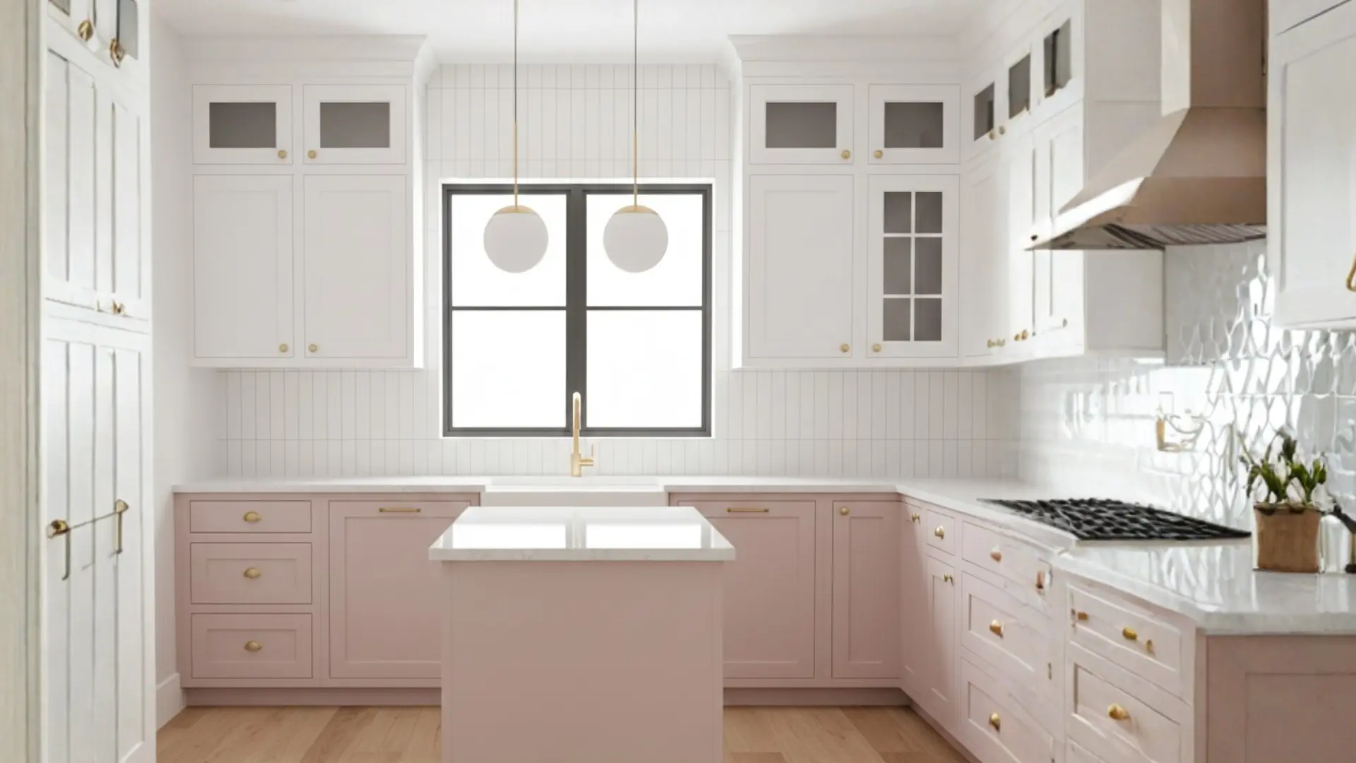
Blush cabinets add a gentle touch of color without overpowering the space entirely. When paired with crisp white, the room feels airy, bright, and subtly playful throughout.
This pairing works especially well in small cooking areas where you want personality but still need light reflection for an open, welcoming feel. Add gold or brushed-nickel hardware to complete the look.
23. Greige + Dark Brown Cabinets
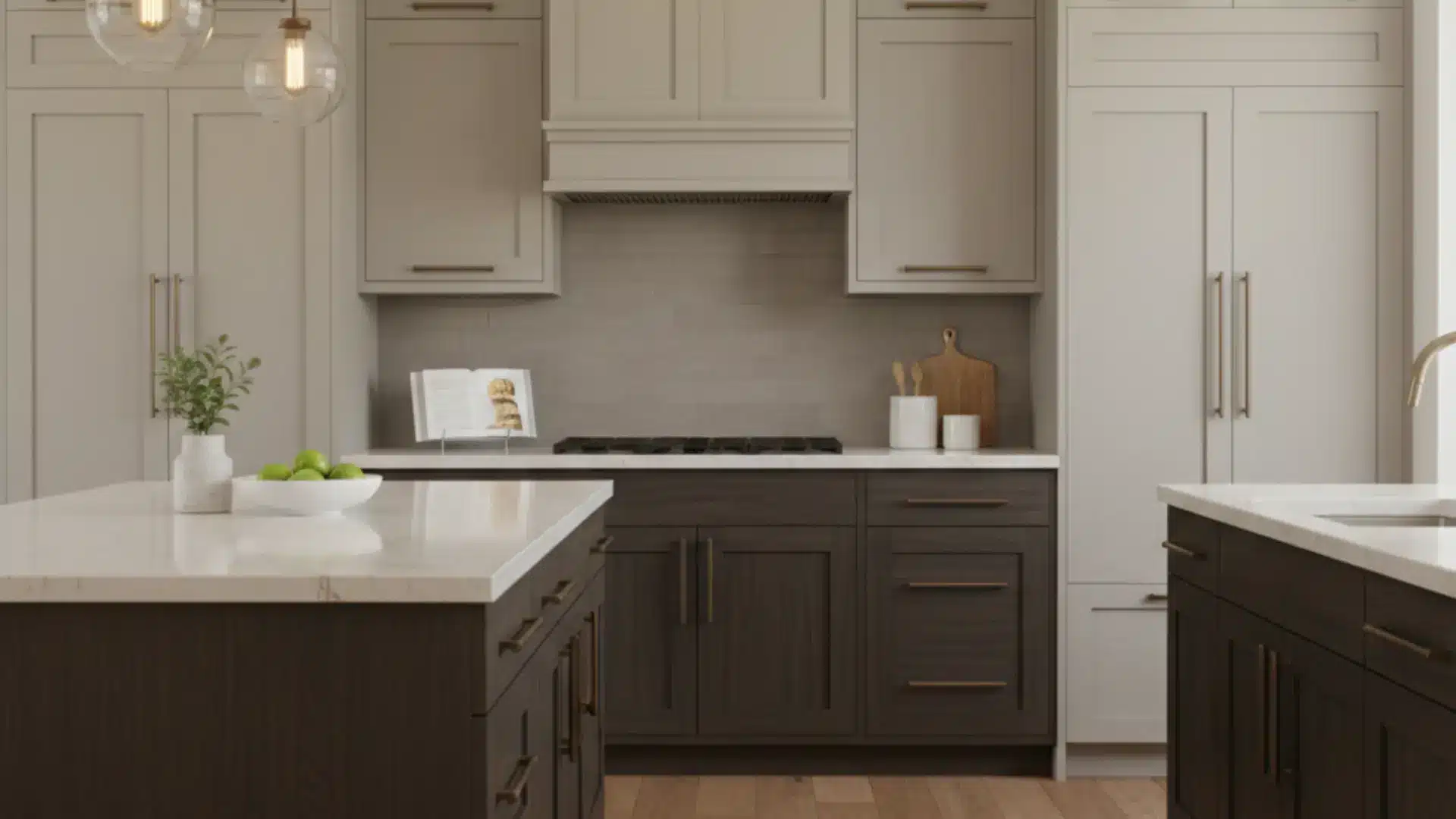
Greige is a soft, modern neutral that blends gray and beige tones beautifully. When paired with dark brown cabinets, the result feels layered and warm rather than stark.
This combination works well in contemporary homes that lean toward earthy finishes while maintaining a calm, cohesive atmosphere throughout the space. It’s perfect for those wanting a subtle yet meaningful contrast.
24. Teal + Natural Maple Cabinets
Teal cabinets introduce vibrancy and character, while natural maple keeps the design grounded and balanced throughout. The wood tones soften the boldness of teal, preventing it from feeling overwhelming in the space.
This pairing works well in eclectic or transitional spaces that embrace personality and color. Add simple countertops and understated hardware to keep the overall design cohesive and welcoming.
25. Two Different Wood Tones
Using two wood tones creates a natural contrast without paint or additional finishes. Light oak upper cabinets paired with darker walnut lowers add depth and dimension while maintaining warmth throughout the room.
The variation in grain and shade makes the room feel layered and custom. This approach works beautifully in modern, rustic, or Scandinavian-inspired designs that seek an overall organic feel.
These color pairings demonstrate the versatility of contrasting cabinets. Choose the one that fits your style and begin planning your makeover.
Pros and Cons of Two-Tone Kitchen Cabinets
Before I commit to a design choice, I always like to clearly see the advantages and drawbacks laid out side by side.
| Pros | Cons |
|---|---|
| Adds more personality and visual character | Harder to match finishes, undertones, and hardware correctly. |
| Creates contrast that makes the space feel layered and dynamic. | Risk of clashing colors if combinations are not tested properly. |
| Can increase perceived home value with a custom, upgraded look. | May date faster if overly trendy or bold colors are chosen. |
| Works beautifully in both modern and traditional homes. | Requires more planning compared to single-color cabinetry. |
In my experience, thoughtful color choices and good lighting make all the difference when deciding if this style works long-term.
Common Mistakes to Avoid
When I work with clients on cabinet colors, I always remind them that small design choices can have a big visual impact later. What looks great on a paint card or showroom sample can feel very different once it’s inside your kitchen.
Over the years, I’ve seen a few common mistakes come up again and again. Catching them early usually saves my clients time, money, and a lot of frustration.
Using Too Many Bold Colors
Sometimes it’s tempting to combine several bold shades in one kitchen. I usually guide clients toward limiting strong colors to one main focus.
Too many bold tones competing with each other can make the space feel chaotic instead of balanced.
Ignoring Color Undertones
Two colors might look similar at first glance, but their undertones can be completely different. I always check whether a color leans warm or cool before pairing it with another finish.
When undertones clash, cabinets can suddenly look mismatched even though the colors seemed fine on their own.
Skipping Paint or Finish Samples
I never recommend choosing cabinet colors without testing samples first. Lighting, wall colors, and flooring all affect how a shade appears.
I usually suggest placing samples in the actual kitchen space and looking at them throughout the day before making the final decision.
Overlooking Lighting
Lighting changes everything in a kitchen. Natural daylight, overhead lighting, and under-cabinet lights all affect how cabinet colors appear.
I always help clients think about the full lighting setup so darker cabinets don’t feel too heavy and lighter shades don’t end up looking dull.
From my experience, slowing down and testing each choice carefully makes the entire design process smoother. When clients take that extra time upfront, they usually end up with a kitchen that feels balanced and exactly how they imagined it.
Final Thoughts
After looking at so many examples, I truly believe two tone kitchen cabinets are one of the easiest ways to make a home feel custom and thoughtfully designed.
If you choose soft neutrals or bold contrast, the key is balance. I always suggest testing samples, checking your lighting, and keeping your overall style in mind before making a final decision.
When done right, this design can make your kitchen feel brighter, bigger, and more modern without a full renovation. If you’re planning an update, start by choosing one area to highlight and build from there.
Thinking about going two-tone? Tell me your favorite color combo in the comments below!