


| Color Name | Sherwin-Williams Smoky Blue SW 7604 |
| Brand | Sherwin-Williams |
| LRV | 15, dark (reflects very little light) |
| Undertones | Cool gray, with subtle teal in bright south-facing light |
| Best For | Accent walls, kitchen cabinets, bedrooms with natural light, south- and east-facing rooms |
| Avoid In | Small, north-facing rooms with no natural light; spaces that already feel dark or enclosed |
What Sherwin-Williams Smoky Blue SW 7604 Actually Looks Like in a Real Room
Sherwin-Williams Smoky Blue SW 7604 is a deep blue-gray that reads muted and sophisticated — not bold, not cold, and nowhere near a true navy. The gray undertones are what give it that distinctive smoky character: they pull it back from the edge of being too sharp or too saturated, making it livable in a way that a pure blue never quite is.
If you’ve been staring at the chip in the store and wondering whether it’s too much, the honest answer is: it depends entirely on your room’s light, not on the color itself.
I’ve used this color in a handful of client projects over the years, accent walls, kitchen cabinetry, built-in shelving, and the one thing I tell everyone before they commit is that LRV 15 means it’s working against the light, not with it. It absorbs most of what hits it.
In the right room, that creates exactly the depth and calm you’re looking for. In the wrong room, it can feel like the walls closed in overnight.
Here’s what you need to know before you open that can.
Smoky Blue SW 7604 Undertones Explained

The primary undertone is gray — a cool, slate-leaning gray that softens the blue rather than neutralizing it. This is what separates Smoky Blue from a standard dark blue: the gray is always present, doing the work of keeping the color from feeling aggressive or jarring against white trim. What surprises some people is the secondary note that surfaces in certain light conditions: a faint teal or green hint that shows up in south-facing rooms with strong midday sun. It’s subtle, but it’s there. If your room gets a lot of direct light, test the sample at noon before you decide.
How those undertones behave is almost entirely dictated by which direction your windows face:
- North-facing rooms: The gray undertones become dominant. The color reads cooler and heavier, closer to a blue-gray slate. You’ll feel the LRV more strongly here — rooms that already lack warmth can start to feel dim.
- South-facing rooms: This is where Smoky Blue performs best. The warmth in the light enriches the blue and brings out a hint of depth and richness that makes the color feel intentional rather than heavy.
- East-facing rooms: Morning light is soft and diffused, which keeps the color calm and balanced throughout the early hours. By afternoon, it settles to a quieter, more neutral blue-gray.
- West-facing rooms: Late afternoon sun shifts the color warmer and more atmospheric — the most dramatic version of this paint, in a good way.
Before committing to any of these applications, test large peel-and-stick samples on multiple walls and check them at 7am, noon, and 7 pm. The color shifts more than you’d expect.
| Color Specs: RGB 89 / 110 / 121 | HEX #596E79 | LRV 15 |
How Light Affects Sherwin-Williams Smoky Blue
An LRV of 15 puts Smoky Blue near the darker end of the usable color spectrum, not a near-black, but not forgiving either. In rooms with ample natural light, especially south-facing spaces, it reads rich and grounded. In rooms without it, that same depth can tip into something that feels oppressive by 4 pm.
The finish you choose also changes how the color reads. Higher-sheen finishes reflect more light back into the room, which makes the color appear marginally brighter and slightly more saturated.
Flat and matte finishes absorb even more light, delivering the softest, most velvety version of the color, but giving up some of that reflected depth.
For most wall applications in rooms with decent natural light, eggshell is the right call: a little durability, a little sheen, without killing the color’s quieter qualities.
Choosing the Right Finish for Smoky Blue
The finish decision for SW 7604 isn’t complicated, but it matters more than it does with lighter colors because you’re starting from a lower LRV baseline.
- Matte or flat: Best on walls in low-traffic bedrooms or dining rooms where you want maximum softness. Hides surface imperfections well, but not cleanable.
- Eggshell: The standard for living rooms, hallways, and bedrooms. A practical balance of durability and a subtle sheen that doesn’t fight the color.
- Satin: Ideal for kitchens, bathrooms, and high-traffic areas. Easier to wipe down. Adds a slight luminosity that works especially well on cabinetry.
- Semi-gloss: Reserve this for trim, doors, and cabinet faces. It creates a crisp, polished contrast when the walls are matte or eggshell.
If you’re using Smoky Blue on kitchen cabinets — which is one of its strongest applications — go satin or semi-gloss. The sheen holds up to daily cleaning and keeps the color from going flat under cabinet lighting.
Where to Use Sherwin-Williams Smoky Blue SW 7604
Because of its muted gray undertones, Smoky Blue is more versatile than its depth suggests. It works across several applications, though each one has conditions worth knowing before you commit.
1. Kitchen Cabinets
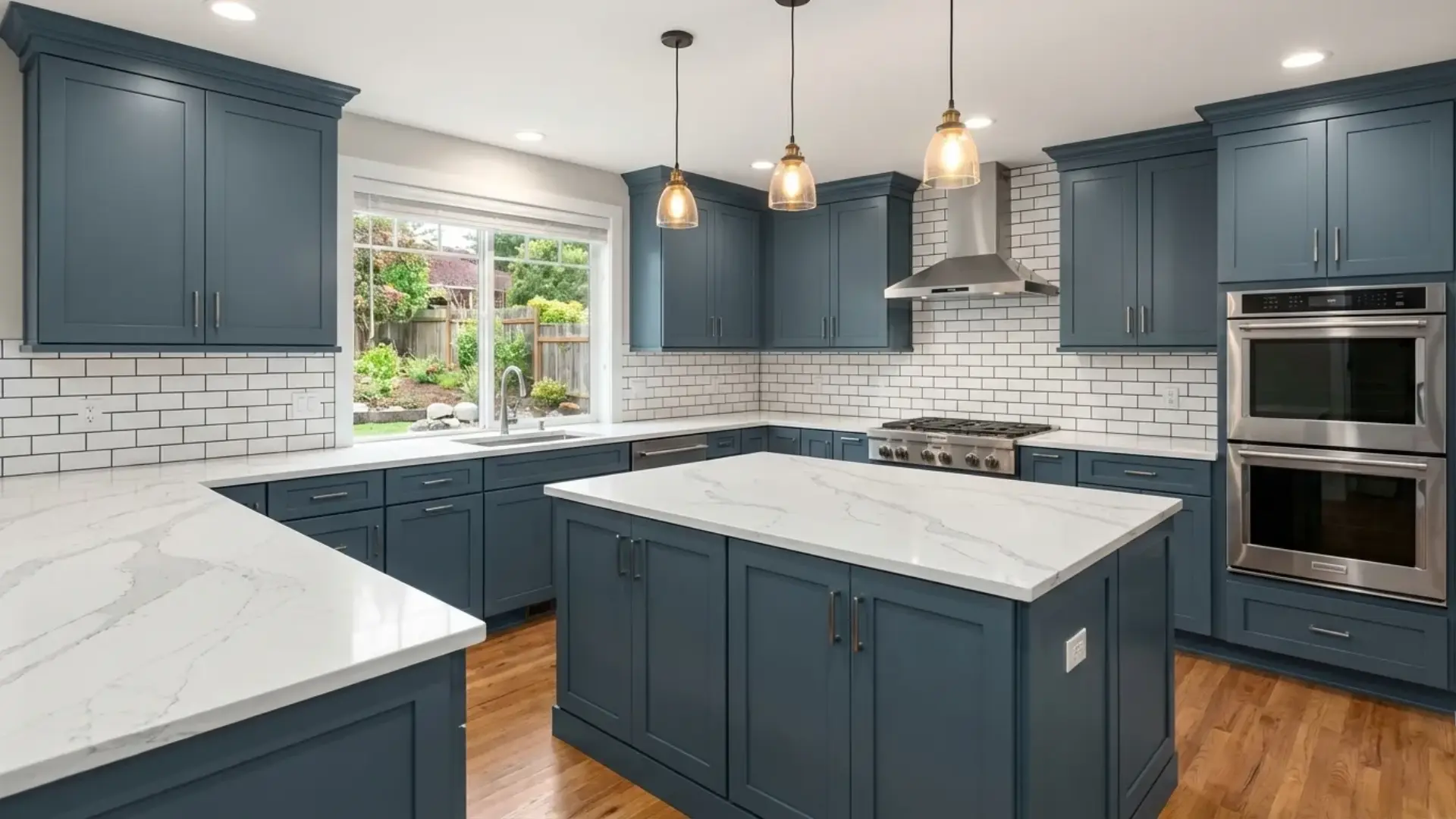
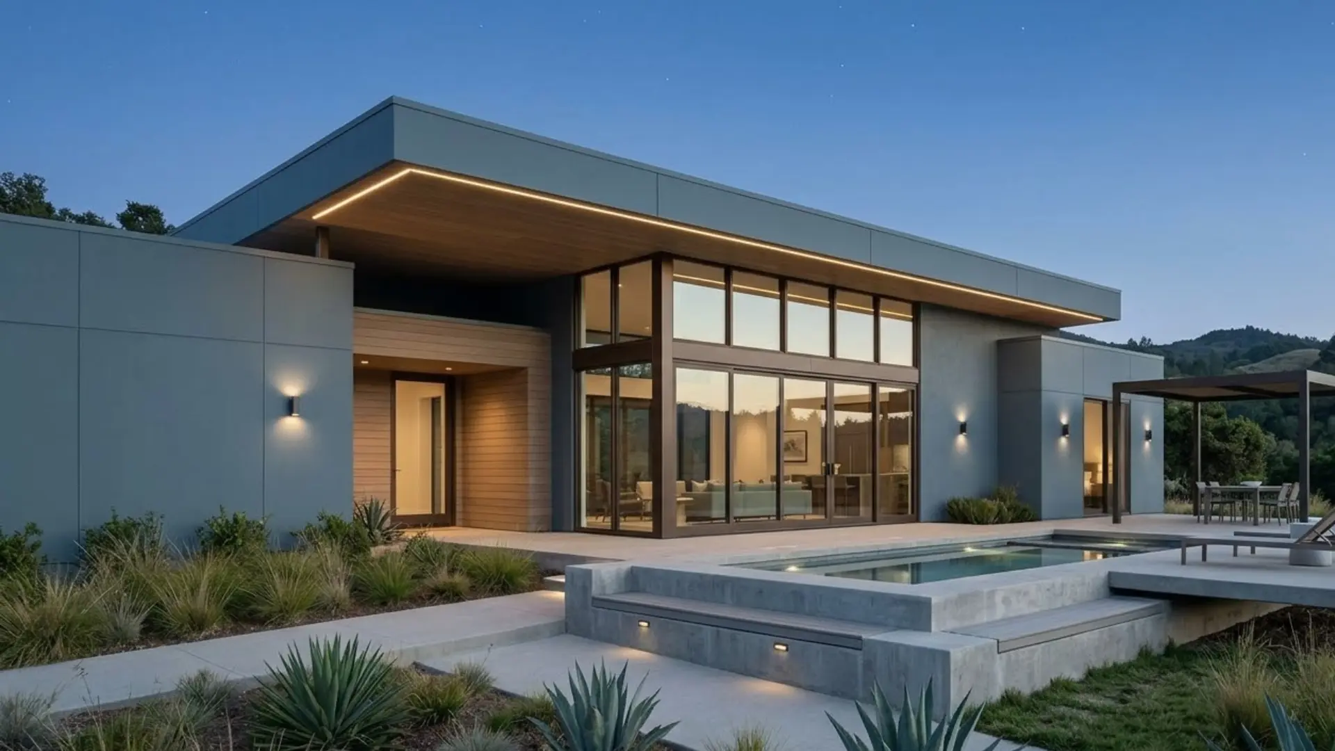
This is where I’ve seen Smoky Blue do its best work. On lower cabinets paired with white or cream uppers, the color creates that high-low contrast that feels intentional and modern without being trendy.
Brushed gold or unlacquered brass hardware reads exceptionally well against it; the warm metal pulls out the blue’s depth and prevents the whole thing from feeling cold.
White quartz or marble countertops complete the pairing without competing. If you’re painting a full kitchen in Smoky Blue, all uppers and lowers, make sure you have strong under-cabinet lighting. LRV 15 will make the interior of those cabinets very dark.
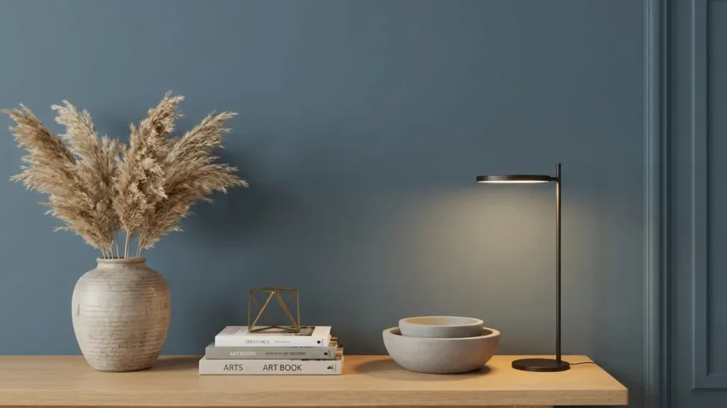
2. Bedrooms
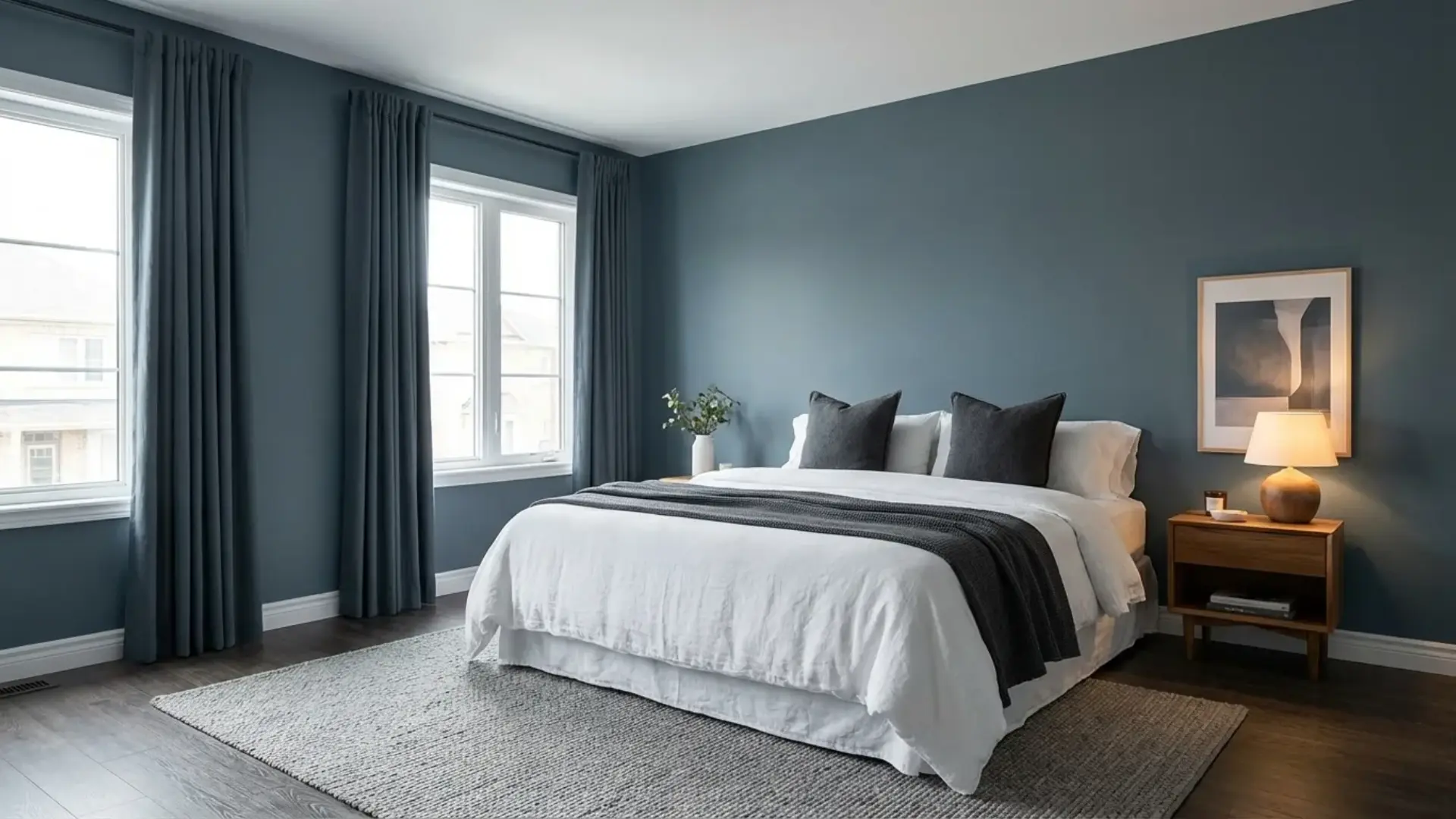
In bedrooms, the gray undertones carry the emotional weight; this color genuinely reads calm and restful rather than moody or dramatic, provided the room has some natural light.
I usually suggest it first as an accent wall behind the bed rather than all four walls, which lets you test the depth in your specific light conditions before committing to a full room.
Pair it with linen or cream bedding, warm wood furniture, and layered lighting at the nightstand level. The warmth of wood against the cool blue is the pairing that makes this work; without it, the room can start to feel clinical.
3. Living Rooms
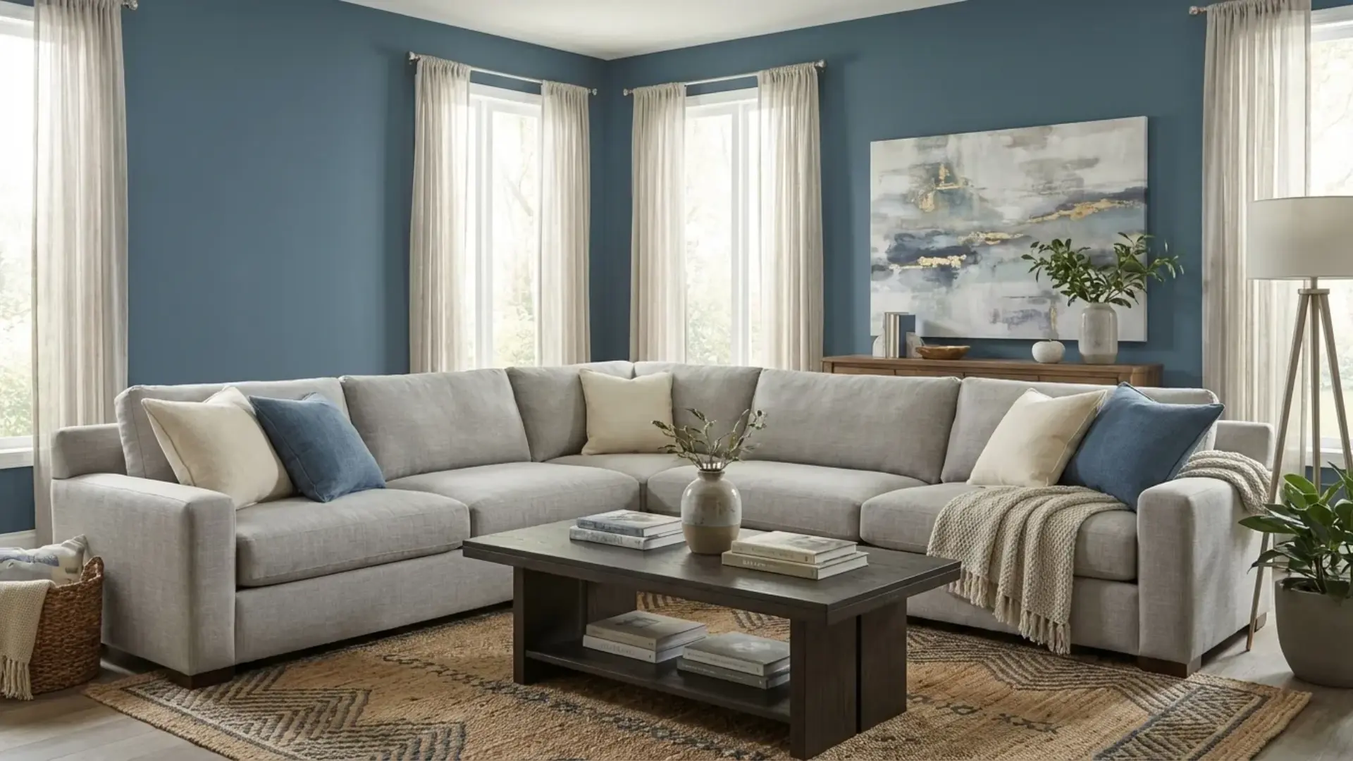
Smoky Blue on a living room accent wall, particularly behind a sofa or a fireplace, is one of its most effective uses. The color adds depth and character to a space without demanding that the entire room be restyled around it.
Built-in shelving in Smoky Blue is another strong option: it makes the objects on the shelves pop and creates a backdrop that feels considered rather than accidental.
Light sofas in cream, beige, or warm gray balance the cool tone. Add a textured rug and brass or aged-bronze metal accents, and the room finds its equilibrium quickly.
4. Exterior
On exterior siding, Smoky Blue reads stately and grounded; it has more visual weight than coastal blues but less severity than navy.
White trim sharpens it considerably; black shutters push it into a more contemporary look. It works particularly well with homes that have natural stone or brick elements, where the gray undertone ties into the existing material palette.
For front doors, it makes a quieter but more distinctive statement than the trendy blacks and navies that have become common. Make sure you’re using SW’s exterior formula; the color can read slightly lighter outdoors under open sky than it does on an interior chip.
Sherwin-Williams Smoky Blue Coordinating Colors
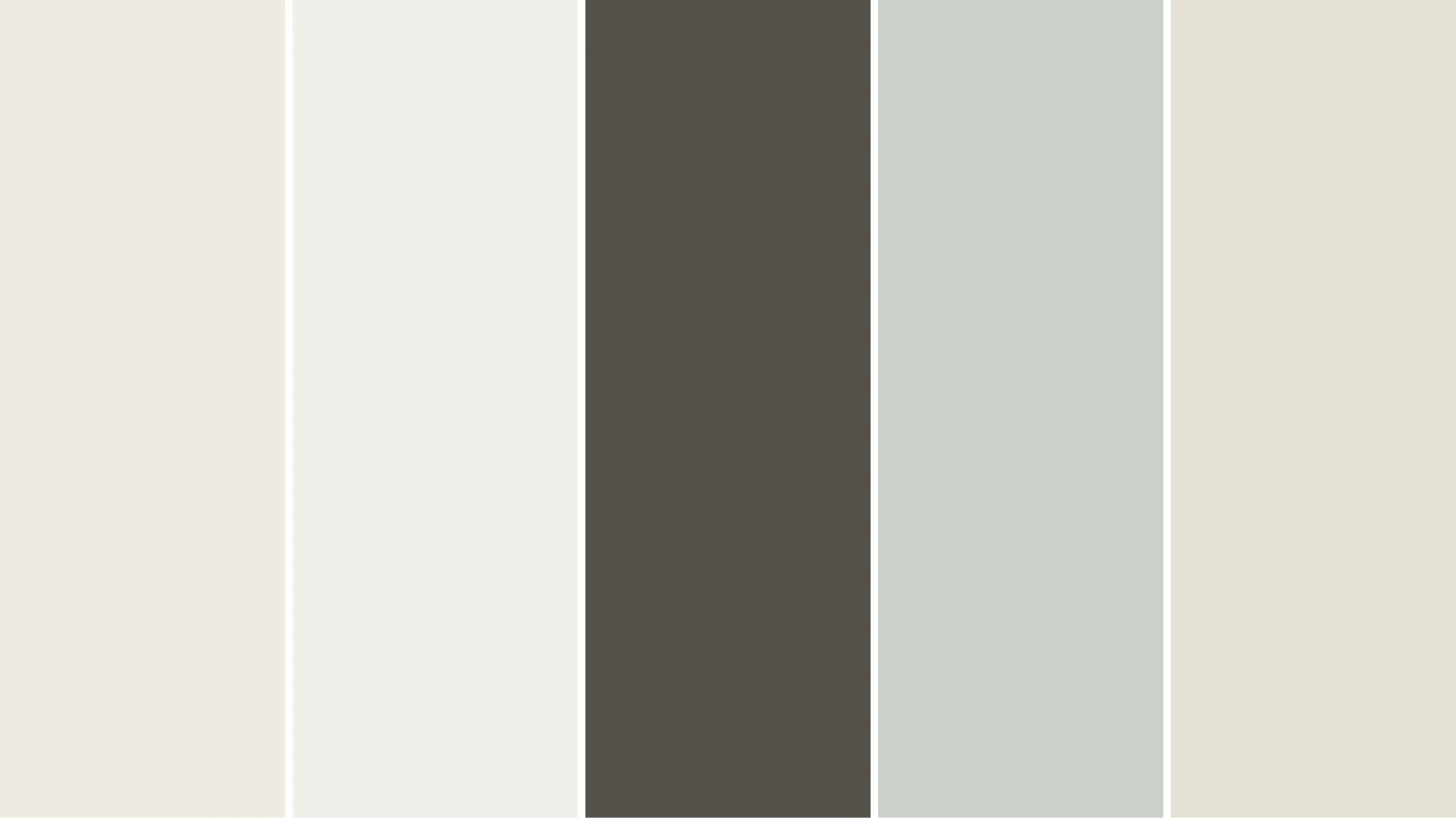
Because Smoky Blue has cool gray undertones, it pairs best with colors that bring warmth or softness — not more cool tones. The risk is creating a palette that reads entirely cold, which is what happens when you pair it with crisp whites that lean cool or with other blue-grays. The coordinating colors below are chosen specifically to prevent that.
| Coordinating Color | Undertone | Why It Works with Smoky Blue | Best Use |
| Alabaster SW 7008 | Warm creamy white | Softens Smoky Blue’s cool undertones without harsh contrast. The classic pairing. | Trim, ceilings, upper cabinets |
| Extra White SW 7006 | Crisp clean white | Creates high contrast that makes Smoky Blue pop. Best in rooms with strong natural light. | Trim, doors, window frames |
| Urbane Bronze SW 7048 | Deep warm charcoal | Adds depth for a modern, moody look. Grounds the palette with earthy warmth. | Doors, accent trim, exteriors |
| Sea Salt SW 6204 | Soft aqua-gray | Shares Smoky Blue’s cool family but is significantly lighter. Creates a coastal palette without a color clash. | Adjacent walls, bathrooms |
| Shoji White SW 7042 | Warm greige-white | Neutral enough to work in any adjacent space. Blends smoothly with Smoky Blue’s muted base. | Bedrooms, large wall areas |
The consistent thread across all of these pairings is warmth. Alabaster and Shoji White bring warm undertones that counterbalance the cool gray in Smoky Blue, while Urbane Bronze anchors the palette with earthiness. Avoid pairing Smoky Blue with cool whites like Chantilly Lace or Bright White, they’ll pull the whole palette cold.
Sherwin-Williams Smoky Blue vs. Similar Colors
Several blue-grays in the same family can look almost identical on a chip but read very differently on the wall. Here’s how Smoky Blue stacks up against the four comparisons that come up most often.
Smoky Blue vs. Naval SW 6244

Naval is a true, saturated navy with very little gray mixed in. It reads bold and declarative in most lighting conditions. Smoky Blue, with its stronger gray undertones, feels calmer and more muted; there’s a smokiness to it that Naval doesn’t have.
If you want a statement navy, use Naval. If you want depth that doesn’t dominate the room, Smoky Blue is the better choice. They’re not interchangeable.
Smoky Blue vs. Gale Force SW 7605

Gale Force sits directly below Smoky Blue on the same color strip and is the darker of the two. It has more intensity and reads heavier in rooms with limited natural light.
Smoky Blue is the more approachable option; it gives you depth without the heaviness that Gale Force can carry in dimmer spaces.
Smoky Blue vs. Riverway SW 6222

These two are close siblings, with nearly identical LRVs. The meaningful difference is in which direction the undertone leans: Riverway carries more gray and can read almost entirely gray-blue in bright light, while Smoky Blue holds its blue identity more clearly.
If you want something that reads bluer, go with Smoky Blue. If you want the gray to do more of the work, Riverway is the pick.
When Not to Use Sherwin-Williams Smoky Blue
This is the section most paint reviews skip, and it’s the one most worth reading.
- Small, north-facing rooms with no natural light: an LRV of 15 in a room that already struggles for light will make the space feel significantly smaller and darker than it actually is. This isn’t a color to use in a windowless powder room or a narrow hallway that faces north.
- Rooms that already have cool-leaning finishes: If your floors are gray, your countertops are white-gray, and your furniture leans cool, adding a blue-gray wall creates a palette where nothing is warm enough to create contrast. The result feels flat and slightly clinical.
- If you’re hoping it reads like a lighter blue in real life, what you see on the chip is darker than what you imagine, not lighter. At LRV 15, the wall version will be noticeably deeper than any physical or digital sample suggests. If you’re on the fence, test first, don’t assume it’ll lighten up on the wall.
- Low-ceilinged spaces without layered lighting: The color visually pulls the ceiling and walls closer together. If your ceiling is already at 8 feet and you have only one overhead fixture, this combination can feel more enclosed than cozy.
Design Styles That Work with Smoky Blue SW 7604
The blue-gray balance in Smoky Blue makes it adaptable across a range of design vocabularies. Here’s where it genuinely fits — and what makes each pairing work:
- Coastal: Paired with crisp whites, natural rattan, wicker, and light linen, Smoky Blue reads fresh and breezy without being clichéd. The gray undertone keeps it from going too bright or too “beach house.”
- Modern Farmhouse: Against shiplap walls, warm wood beams, and unlacquered brass fixtures, the color adds depth while keeping the warmth that defines the style. The key is making sure the warm elements outweigh the cool ones in the room.
- Contemporary: Clean lines and minimal décor let Smoky Blue function as a refined neutral backdrop. It adds enough color to feel considered without being decorative in a way that dates the space.
- Traditional: With brass hardware, rich wood furniture, and classic white trim, this color reads timeless — closer to a classic library or study blue than anything trend-dependent.
- Moody Modern: Matte black fixtures, dark-toned furniture, and Smoky Blue walls or cabinetry create a palette that reads bold but controlled. The gray prevents it from tipping into maximalism.
Frequently Asked Questions
Does Smoky Blue work in small spaces?
Yes, but use it with balance. In a small space, Smoky Blue can feel cozy and rich instead of cramped when paired with lighter trim, mirrors, and simple decor. Keep large furniture pieces light or warm-toned so the room still feels open and comfortable.
Can I paint the ceiling Smoky Blue?
Yes, Smoky Blue can look beautiful on a ceiling if you want a cozy, wrapped-in feel. It works best in bedrooms, offices, or powder rooms. For a softer look, keep the walls light. For drama, use it on both walls and the ceiling.
What curtain colors go with Smoky Blue?
Cream, oatmeal, warm white, soft gray, and muted beige curtains pair well with Smoky Blue. These shades keep the room calm without fighting the wall color. If you want more contrast, try rust, camel, or patterned curtains with small blue-gray details.
Is Smoky Blue good for resale?
Smoky Blue can be good for resale when used thoughtfully. It feels classic and refined, especially on cabinets, built-ins, or a single accent wall. For broad buyer appeal, pair it with neutral walls, clean trim, and simple finishes instead of heavy, dark decor.
Should I use primer with Smoky Blue?
Primer is a smart choice, especially if you are painting over bright, dark, glossy, or uneven walls. It helps Smoky Blue look smoother and more accurate. A tinted primer may also reduce the number of coats needed for a rich, even finish.
What flooring looks best with Smoky Blue?
Smoky Blue pairs well with oak, walnut, warm-toned wood, light tile, and neutral carpet. Warm floors help soften the cool blue-gray tone. Very cool gray flooring can still work, but the space may need brass, cream, or wood accents for balance.
Can Smoky Blue work with black accents?
Yes, black accents can make Smoky Blue feel sharp and modern. Use black in small amounts through lighting, picture frames, cabinet pulls, or furniture legs. Too much black can make the room feel heavy, so balance it with warm whites and natural textures.
How many coats does Smoky Blue need?
Most projects need two coats of Smoky Blue for full, even coverage. If the surface is very light, very dark, glossy, or patched, primer may be needed first. Always let each coat dry properly so the final color looks smooth and consistent.
Final Verdict
Here’s what I’d tell you if you were standing at the paint counter right now: Sherwin-Williams Smoky Blue is an excellent color in the right room, specifically, a room with meaningful natural light, warm wood or cream elements to balance its cool undertones, and a clear application (accent wall, cabinet color, or all four walls in a well-lit south-facing space).
If your room ticks those boxes, the LRV 15 depth will read exactly the way you’re hoping: rich, grounded, and sophisticated.
If it doesn’t, particularly if you’re dealing with a north-facing or low-light space, order a Samplize sample and check it at multiple times of day before you open a can.
That one step has saved more clients from expensive repaints than any other advice I give.
Sources: Sherwin-Williams official color page, SW 7604 Smoky Blue. LRV value verified against official Sherwin-Williams product specifications.


