


I recently visited a friend’s home, and the first thing I noticed was the wall color. It felt calm, rich, and grounded. When I asked, she smiled and said it was SW Retreat (6207) by Sherwin-Williams.
The color instantly made the space feel warm and settled without looking dark or heavy. You can spot this shade in living rooms, kitchen cabinets, bedrooms, and even on exteriors around your neighborhood.
It stands out in a quiet way. If you look closely, you’ll notice how it shifts with light and pairs beautifully with wood, white trim, and brass. This color doesn’t shout for attention.
Instead, it gently shapes the mood of a space and makes your home feel more relaxed and pulled together.
Understanding: Color Data & Technical Details
Before you choose a paint color, you need the facts. These details help you understand how it will truly look in your space. Here is a clear and simple breakdown of its full color profile:
|
Detail |
Value |
Why It Matters |
|
Color Name |
Retreat |
Official name |
|
Color Number |
SW 6207 |
For ordering |
|
Color Family |
Green-Gray |
Reads as muted green with noticeable gray influence – not a pure green |
|
LRV |
~21 |
Absorbs more light than it reflects; sits at the bottom edge of medium-depth range, close to dark territory |
|
RGB |
122, 128, 118 |
Digital match |
|
HEX |
#7A8076 |
Web use |
|
Hue Angle |
96° |
Low-saturation green, this is why it reads closer to neutral than saturated green in many lights |
|
Undertone |
Blue-gray |
Slight cooling effect |
|
Temperature |
Cool |
Balanced, not warm |
Two corrections worth flagging before you go any further: the LRV for SW Retreat is approximately 21, not “21” as a round number pulled from a chart. Multiple authoritative databases place it between 20.61 and 20.87.
That matters because at LRV 21, this color sits at the very bottom edge of the medium-depth range, nearly crossing into dark territory.
Plan your lighting accordingly. Additionally, the correct HEX code is #7A8076, and the confirmed RGB is 122/128/118, figures that are consistent with Sherwin-Williams’ own data and major color databases.
These details may seem small, but they shape the final result. Once you understand the numbers and undertones, you can predict how it will behave. That clarity makes choosing it much easier and more confident.
Visual and Practical Examples of SW Retreat
Now let’s look at how it actually works in real spaces. Seeing it in action helps you decide if it fits your home and lighting.
1. SW Retreat on Kitchen Cabinets
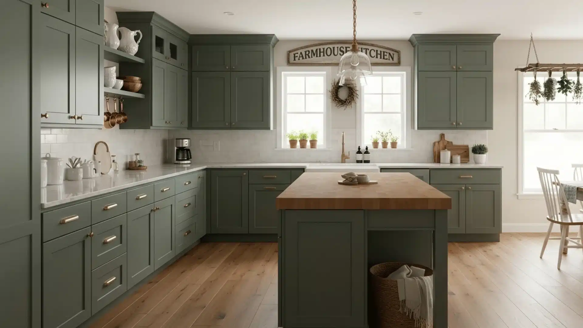
Looks rich and grounded on the kitchen cabinets. If you paint all cabinets this shade, your kitchen will feel bold yet calm, especially with good natural light. If you use it only on the island, it adds contrast without making the space feel heavy.
Brass hardware adds warmth, while matte black gives a sharper look. It pairs beautifully with white quartz, marble, or light butcher block countertops.
In practice, SW Retreat on full kitchen cabinetry works best in kitchens with substantial natural light or well-layered artificial lighting.
I have seen it used on lower cabinets paired with white uppers in multiple projects, and that two-tone application consistently outperforms all-over coverage in kitchens under 150 square feet.
It gives you the color’s depth and character without the weight that comes from surrounding yourself with it on all sides.
2. SW Retreat in Bedrooms
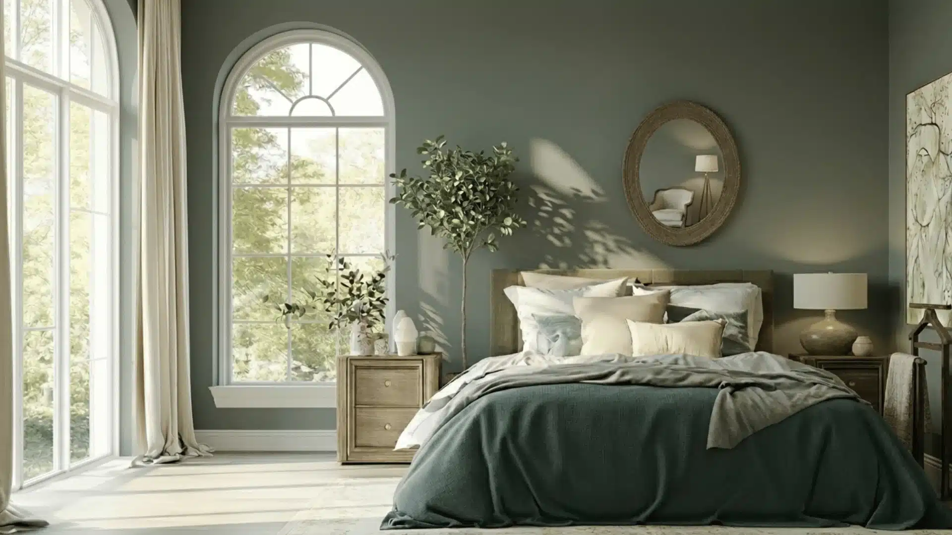
In a bedroom, it creates a quiet and restful mood. The gray undertone keeps it from feeling too bright or overpowering. You’ll notice it feels cozy, especially in the evening light.
Pair it with cream bedding, soft white sheets, and natural wood furniture for balance. Linen, cotton, and woven textures help soften the depth of the color and keep the room feeling relaxed.
For bedrooms, I consistently recommend keeping bulb temperature between 2700K and 3000K.
At LRV 21, Retreat already absorbs significant light, and a cool LED above 4000K will pull the blue-gray undertone forward to the point where the room can start to feel cold rather than calm.
Warm bulbs keep the green front and center in the evenings, which is where this color performs best.
3. SW Retreat in Bathrooms
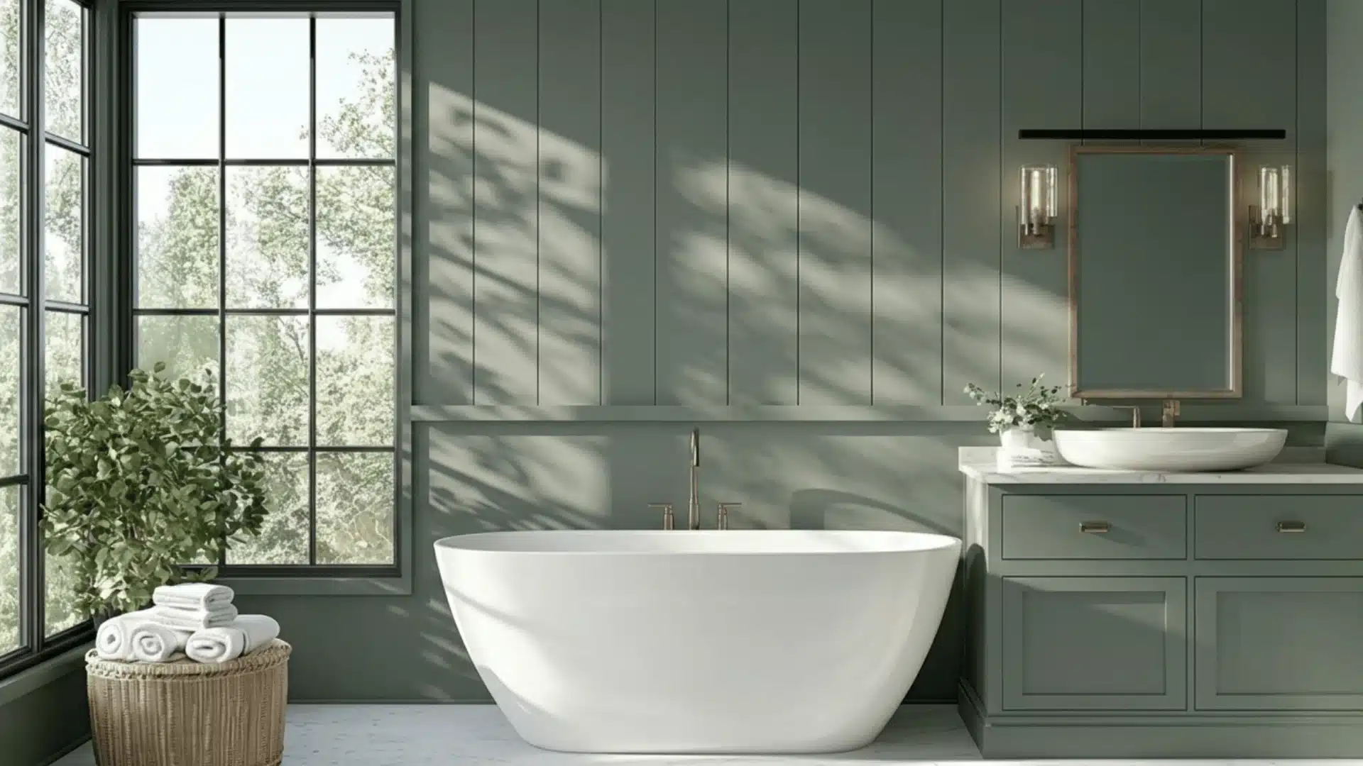
Works beautifully in bathrooms with the right lighting. It pairs especially well with brass fixtures for warmth and contrast. Black hardware creates a clean and modern look. For tile, white subway tile keeps things fresh and balanced.
Marble with light gray veining also works nicely. Make sure the space has enough light, since this shade can feel darker in small bathrooms.
For bathrooms without a window, I would not recommend wrapping all four walls.
An accent wall behind the vanity or a wainscoting application on the lower half of the room gives you the color’s depth and personality without the enclosed feeling that comes from using a dark LRV color in an already dim, enclosed space.
4. SW Retreat for Exterior Use
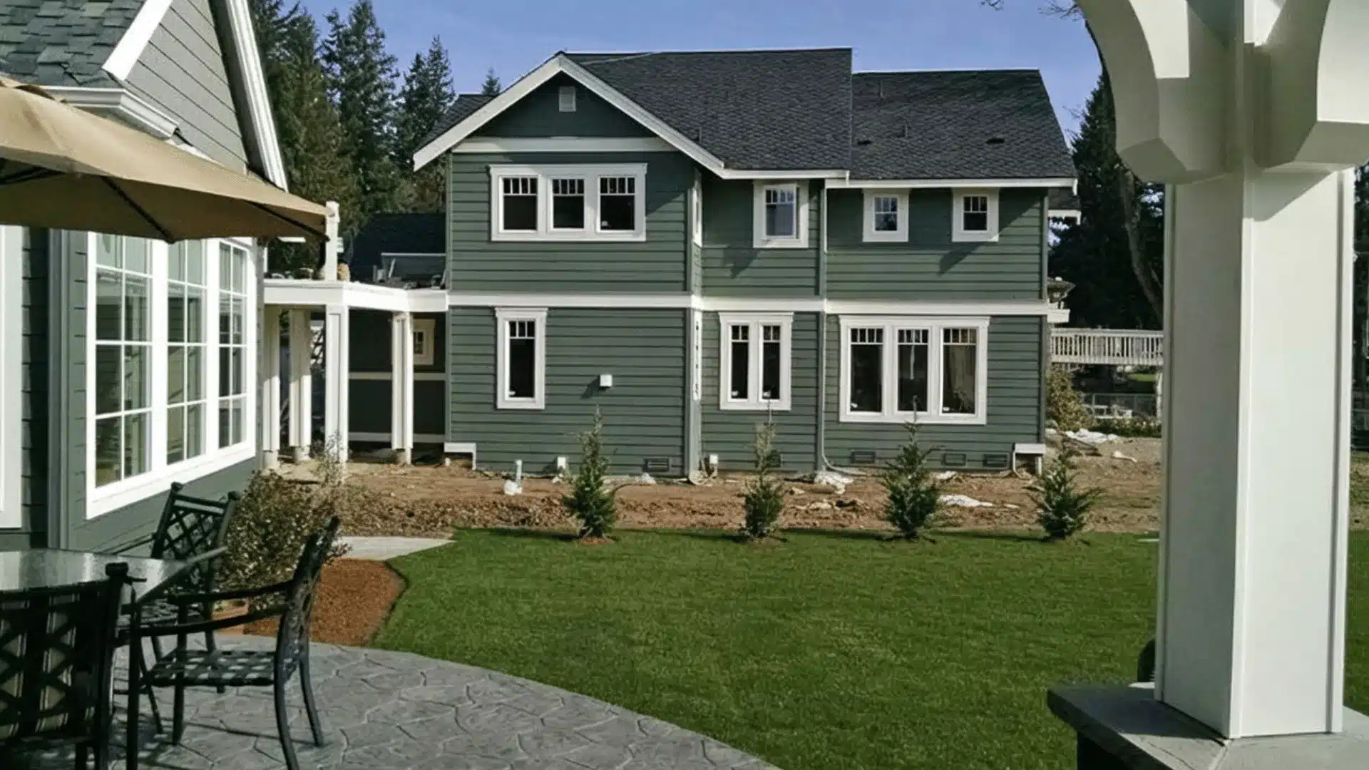
They can look striking on exteriors, especially with natural stone or brick. It pairs well with light trim, such as Alabaster or Pure White, to create contrast. If your roof is dark gray or charcoal, this color blends nicely.
Avoid pairing it with very warm red brick, since the undertones may clash. In bright sunlight, it appears greener, while shade brings out the gray.
Colors at this LRV tend to read somewhat lighter on exterior surfaces than on interior walls, due to greater exposure to ambient light.
So if you have sampled Retreat inside and found it a touch dark, the exterior application may actually suit you better.
Use Duration Exterior or Emerald Exterior for maximum UV resistance and color stability over time.
SW Retreat Compared to Similar Colors
Choosing the right green means understanding subtle shifts in depth, warmth, and tone. Here’s how Retreat stacks up against its closest neighbors.
1. SW Retreat (SW 6207) vs. Evergreen Fog (SW 9130)
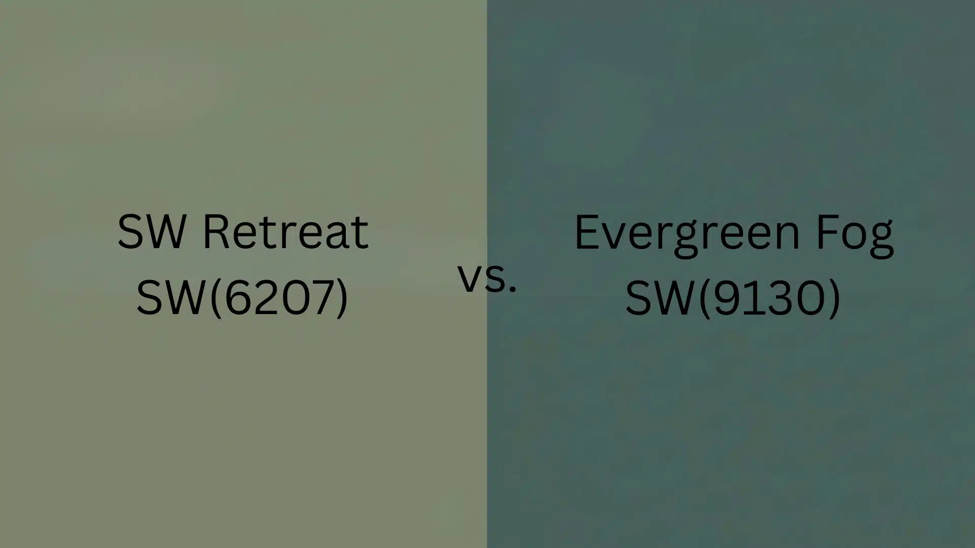
Evergreen Fog carries about 10 more LRV points, making it noticeably lighter and airier. While Retreat reads as a grounded, medium sage.
Evergreen Fog drifts toward a soft gray-green mist, ideal when you want depth without committing to a darker room. Retreat wins for cozy layered spaces; Evergreen Fog is better in low-light rooms needing lift.
2. SW Retreat (SW 6207) vs. Pewter Green (SW 6208)
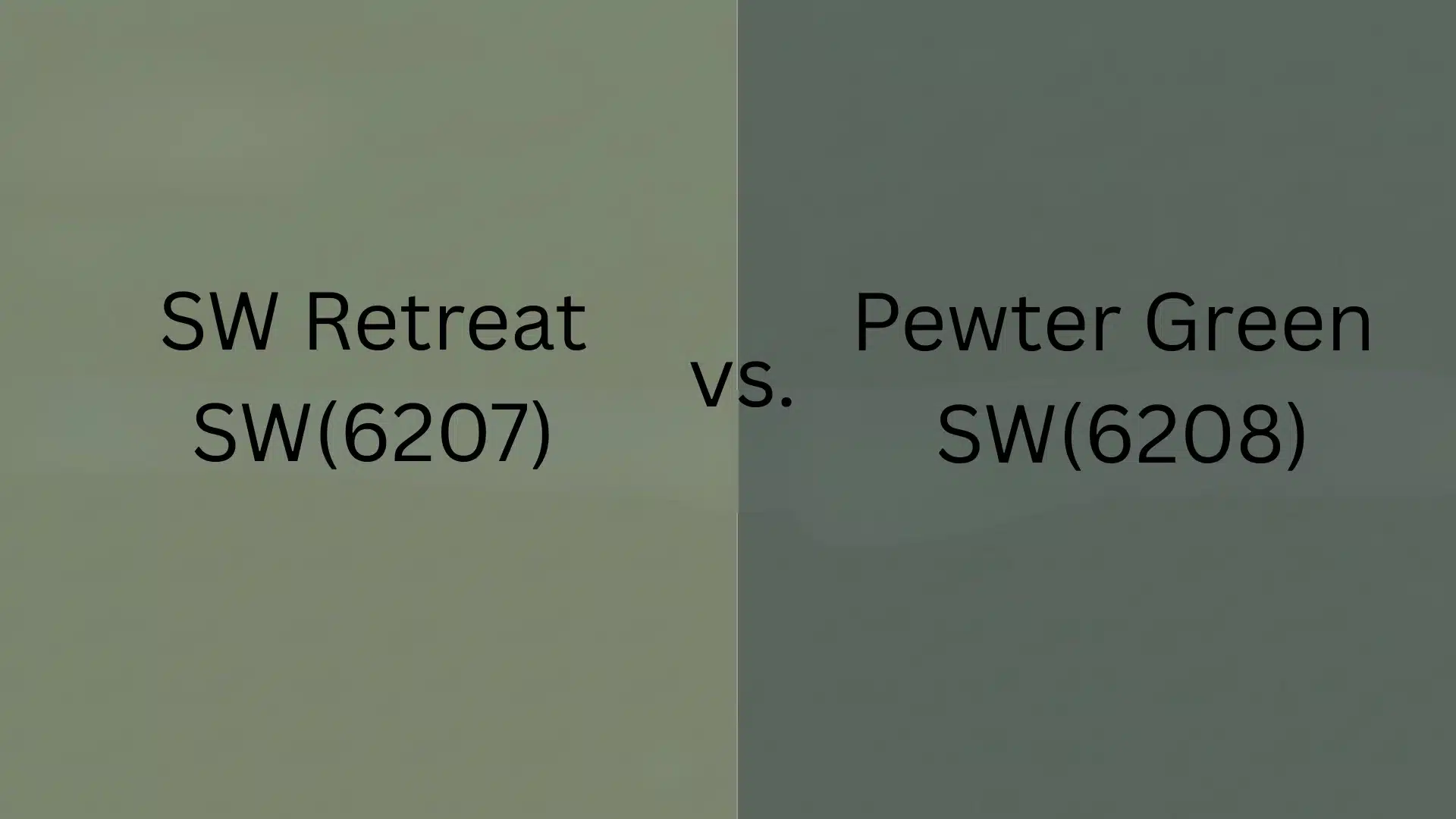
These two sit right next to each other on strip 217, but Pewter Green is a full shade darker with an LRV nearly half that of Retreat.
Pewter Green is moody, metallic, and bold, best reserved for accent walls, cabinetry, or rooms intentionally designed around depth. Retreat is the safer everyday choice that still reads as a true green.
3. SW Retreat (SW 6207) vs. Succulent (SW 9650)
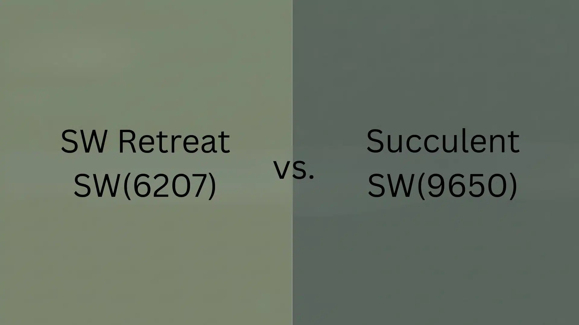
Despite their visual similarity, Succulent carries a noticeably stronger, cooler green hue (hue angle 136°) compared to Retreat’s more muted, gray-leaning sage (hue angle 96°).
Succulent from the Emerald Designer Edition has a more saturated personality and works best as a statement color. Retreat is the whole-home workhorse: versatile, restful, and easy to live with.
4. SW Retreat (SW 6207) vs. Acacia Haze (SW 9132)
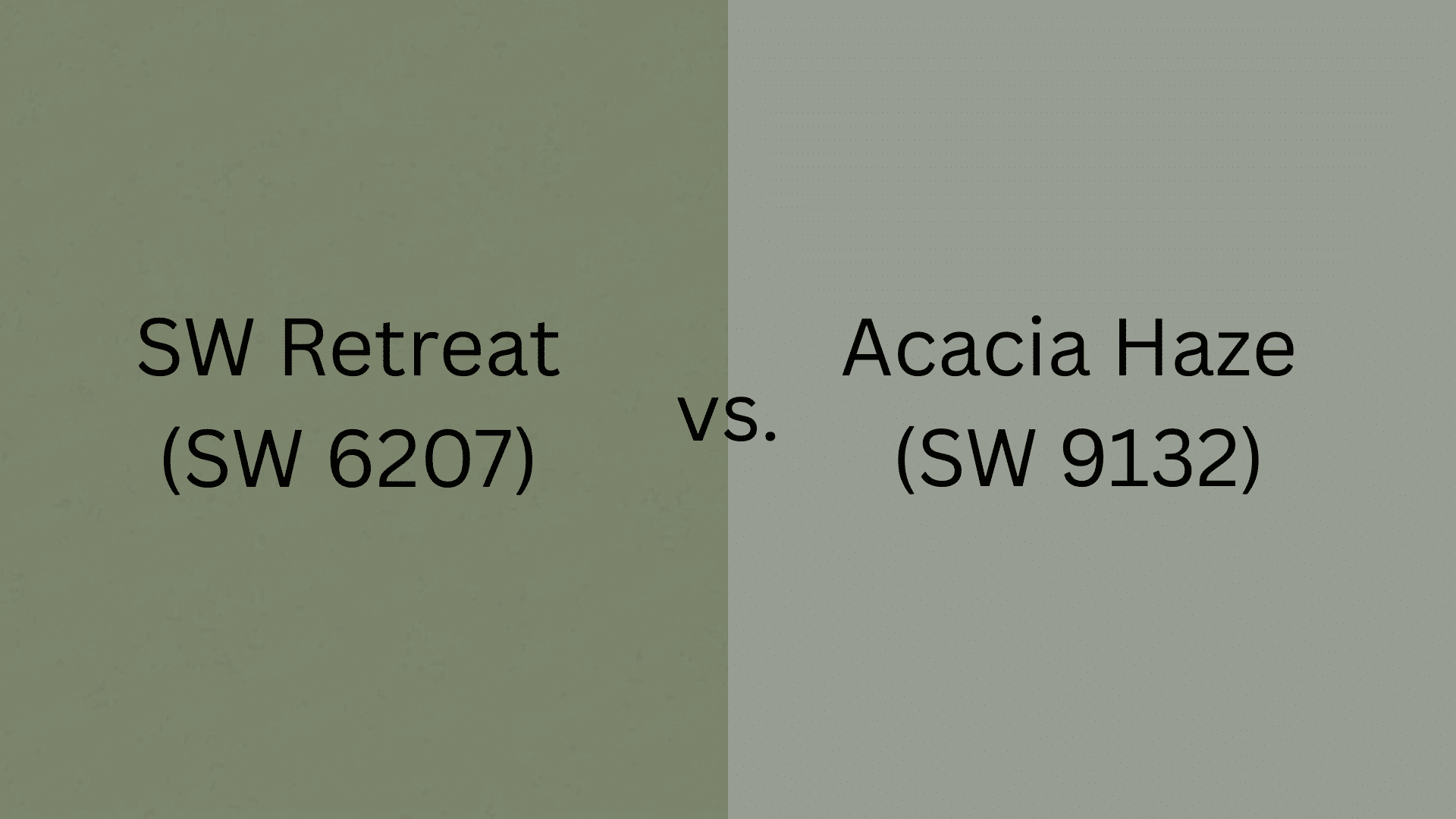
If Retreat feels a touch too deep for your space, Acacia Haze is the logical next step. It carries about 11 more LRV points, giving you a noticeably lighter sage-green that still shares Retreat’s organic, non-saturated quality.
Where Retreat reads as a grounded, medium-depth green, Acacia Haze is airier and slightly more gray-forward. It is a strong alternative for north-facing rooms or spaces that cannot afford to lose more light.
5. SW Retreat (SW 6207) vs. Dried Thyme (SW 6186)
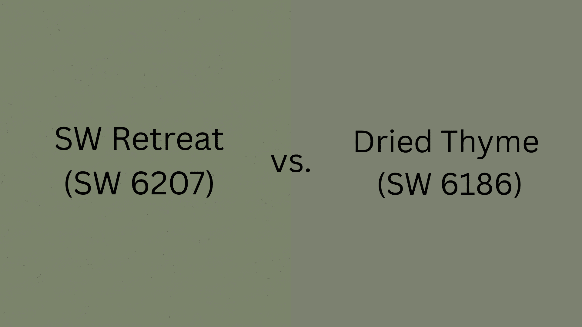
Dried Thyme is the warmer, earthier sibling. It shares the same medium-depth family but pulls more yellow-olive in its undertone rather than Retreat’s cool blue-gray.
If you have a space filled with warm wood tones and you find Retreat reading a touch cold, Dried Thyme bridges the gap. Choose Retreat when you want muted and relaxed; choose Dried Thyme when you want earthy and grounded.
Comparison Table: Which Green Works for You?
Choosing the right green-gray paint can make or break a room. Here’s how six of Sherwin-Williams’ most popular muted greens stack up across key factors from light reflectance to tone and ideal use cases.
|
Color |
HEX |
LRV |
Tone |
Best For |
|
SW Retreat (SW 6207) |
#7A8076 |
~21 |
Neutral-cool |
Whole-home use, cabinets, accent walls |
|
Evergreen Fog (SW 9130) |
#95978A |
30 |
Warmer, lighter |
Low-light rooms, layered spaces |
|
Pewter Green (SW 6208) |
#5E6259 |
~12 |
Darker, dusty |
Moody accents, statement cabinetry |
|
Succulent (SW 9650) |
#616C64 |
~14 |
Cooler, bolder |
Statement rooms |
|
Acacia Haze (SW 9132) |
#8D9184 |
~32 |
Lighter, sage |
North-facing rooms, low-light spaces |
|
Dried Thyme (SW 6186) |
#7A7A61 |
~20 |
Warmer, earthier |
Spaces with warm wood, rustic interiors |
Retreat sits at the comfortable middle, not too light, not too dark, and neither aggressively cool nor warm. When balance matters most across an entire home, Retreat is your go-to.
SW Retreat Uses and Pairing Ideas
Is a natural team player; the materials, finishes, and colors you pair it with will either elevate its quiet sophistication or work against it: choose intentionally.
Best Uses
The right backdrop and surface choices unlock the full potential. Here’s where it performs best:
- Best White Trim: Alabaster adds warmth and softness, Greek Villa keeps it creamy and organic, Pure White sharpens contrast for a crisper, more modern edge; each shifts the mood meaningfully.
- Best Neutral Pairings: Warm beiges, soft taupes, and greige tones complement without competing, keeping the palette grounded, layered, and cohesive throughout the space.
- Flooring That Works: Light oak brightens the pairing, walnut adds rich contrast, and natural stone brings an earthy, tactile quality. Avoid cool gray or stark white floors, which flatten the tone.
- What to Avoid: Stark cool-white trim, high-gloss finishes, or overly saturated accent colors; these clash with muted, organic character and undermine its quiet depth.
Nail these surface choices, and it transforms from a simple wall color into the foundation of a fully considered, cohesive interior.
Best Pairing Ideas
Beyond the surfaces, the finishing details of metals, fabrics, and textures make one feel truly styled. Here’s what works:
- Hardware & Metals: Brass introduces warmth and a touch of elegance, matte black creates bold modern contrast, and aged bronze adds an organic, lived-in richness that complements the green beautifully.
- Fabric & Soft Furnishings: Cream linen, raw cotton, and oatmeal-toned textiles feel natural alongside it, keeping the palette soft, breathable, and effortlessly layered.
- Wood & Natural Decor: Warm walnut furniture, light oak accents, and rattan or woven pieces echo the earthy undertones, grounding the space in organic, nature-inspired texture.
- Accent Colors That Work: Dusty terracotta, warm ivory, and deep navy make confident accent choices; each adds dimension without pulling focus from the wall color’s understated elegance.
- Accent Colors to Approach with Caution: Bright or saturated purples, vivid yellows, and high-contrast lime green all clash with the low-saturation, gray-leaning quality of Retreat. These pairings undermine the color’s calm rather than supporting it.
A pairing I come back to consistently in client projects: Retreat walls, Alabaster trim, warm walnut furniture, and aged brass hardware.
It is not a surprising combination, but there is a reason it appears in so many well-executed interiors.
The warmth of the brass and wood offsets the color’s cool blue-gray undertone just enough to keep the space from reading cold, while the Alabaster trim holds everything together without going stark white.
Pros and Cons of SW Retreat
Brings quiet sophistication, but like any color, it thrives in the right conditions: here’s what to know before you commit.
| Pros | Cons |
|---|---|
| Sophisticated, muted look that feels curated | Can feel dark and heavy in low-light rooms |
| Pairs beautifully with wood, linen, and stone | May read cooler or bluer than expected on walls |
| Versatile enough to work across multiple rooms | Not ideal for very small or north-facing dim spaces |
| Works well on both interiors and exteriors | Low saturation (4%) means it can read almost neutral under some artificial lights, losing its green quality entirely |
Tip: Sample in your actual lighting before committing. Its tone shifts noticeably between natural and artificial light, and the gap between morning and evening is wider than most people expect at this LRV.
Get the most from this color by pairing it with warm wood tones and ample light, and it will reward you with effortless, enduring style.
Who Should Choose or Skip the SW Retreat?
Rewards the right space, knowing where it shines and where it struggles, saving you a costly repaint: here’s your quick guide.
Choose if: You love muted, moody greens that feel collected rather than loud. This color is made for homeowners layering earthy wood tones, natural textiles, and warm finishes.
Well-lit, open rooms allow its soft depth to breathe, making them a timeless, versatile anchor for a nature-inspired palette with real staying power.
Skip if: Your room lacks natural light or leans into crisp, ultra-bright white interiors, the muted tone can easily read flat, cold, or uninspired.
It’s also a poor fit for very small or north-facing rooms. If you want a vivid, saturated green with bold presence, a brighter, warmer shade will serve you far better.
|
A note specifically for renters and apartment dwellers: Retreat’s LRV of 21 can make smaller rooms feel noticeably more enclosed. If your ceilings are under nine feet and your primary light source is overhead recessed lighting rather than windows, consider Acacia Haze (SW 9132) or Evergreen Fog (SW 9130) instead. You get the same color family without the weight penalty. |
Sampling SW Retreat: What to Do Before You Commit
Given how dramatically SW Retreat can shift between lighting conditions, warmer and more clearly green in south-facing daylight, deeper and more gray-forward in north-facing or artificial light, I recommend a 48-hour minimum sampling period before purchasing a full gallon.
Paint a 2×2 foot section on at least two walls: one that receives direct natural light and one that sits in shadow. Evaluate it at four distinct points: morning, midday, afternoon, and evening, with your artificial lights on.
Peel-and-stick samples from Samplize are a fast and mess-free way to test the color without committing to a paint pot. They ship quickly and can be repositioned, which makes them useful for comparing Retreat against Acacia Haze or Dried Thyme side by side on the same wall.
One practical technique I use with clients: hold a plain white sheet of paper next to your sample. It immediately reveals whether the gray undertone or the green is dominating in your specific light, something that is very difficult to see without a neutral reference point.
If the sample reads mostly gray against the white paper, your room may not have enough warmth to let the green show through consistently.
Final Thoughts
I used SW Retreat in a client’s living room paired with warm oak shelving, cream linen curtains, and aged brass hardware. The space had good south-facing light and 9-foot ceilings, which gave the room the color it needed.
What struck me when I returned for a follow-up visit a few months later was how the room felt at night: the warm bulbs kept the green honest, and the layered textiles softened any heaviness. It never overwhelmed and never faded. It just worked.
That said, it shines brightest in well-lit rooms with natural materials. If that sounds like your space, sample it first and watch how it shifts from morning to evening light before committing.
Tried SW Retreat or planning to? Drop your color choice and experience in the comments. I’d love to hear how it worked in your space.


