


Your walls are the largest canvas in your home, yet most people gamble on trendy shades that look outdated within years.
The secret to a space that always feels polished comes down to understanding which paint colors never go out of style.
These are not just safe choices. They are smart, strategic ones that lift your home’s atmosphere, complement any furniture, and hold their visual charm year after year.
If you are refreshing one room or reimagining your entire home, these shades are the only starting point I would ever recommend.
The Psychological Power of Paint Colors
Color is far more than a visual choice; it is a silent, powerful force that shapes how we feel, think, and live within our spaces every single day.
Classy paint colors have endured not just because they look beautiful, but because they speak directly to our deepest psychological needs for comfort, calm, and belonging.
From the crisp clarity of white to the grounding depth of navy blue, these shades create emotional atmospheres that trendy colors simply cannot replicate.
Understanding the psychological power behind classic paint colors helps you move beyond surface-level decorating and make intentional choices that genuinely change how your home feels to everyone who walks through the door.
Key Factors That Affect How Paint Colors Look
Even the most lasting shade can look completely different once it hits your walls. Here is what actually matters before you commit to any color:
- Natural light direction changes how a color reads throughout the day, making the same shade look warm, cool, dark, or soft depending on which way your room faces.
- Artificial lighting at night shifts color significantly: warm bulbs soften tones, while cool white bulbs make the same shade appear sharper or washed out.
- Room size and height determine how a color feels, with lighter tones opening up small spaces and deeper shades grounding larger ones.
- Existing floors and fixtures interact with wall color in ways most people underestimate, making undertone matching far more important than simply matching the color itself.
- Every neutral has undertones of yellow, pink, green, or gray that become visible depending on your lighting, surroundings, and the other elements already in the room.
- Finish and outdoor reflection are the two most overlooked variables, as sheen level and nearby trees or brick can quietly change how your chosen color actually reads on the wall.
Getting these factors right before choosing saves far more time and money than sampling after the fact.
The Top 3 Graceful Paint Colors for Your Home
When it comes to creating a home that feels both stylish and enduring, the right paint color makes all the difference. These three classics have stood the test of time for good reason.
1. Classic White: The Neutral
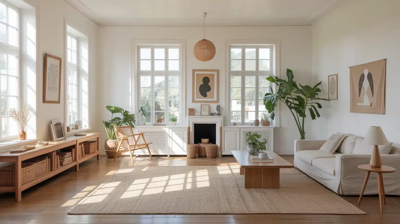
White is the undisputed king of Classic paint colors. It instantly brightens any space, reflects natural light beautifully, and creates the illusion of greater square footage.
Whether your style is minimalist, traditional, or coastal, white adapts effortlessly. It pairs with every furniture tone and accent color, making it the most versatile choice a homeowner can reach for, room after room, year after year.
Here are other White Paint Shades options you can consider:
- Sherwin-Williams Pure White (SW 7005): A clean, warm-toned white that works beautifully in living rooms and kitchens without feeling stark.
- Benjamin Moore Chantilly Lace (OC-65) : A crisp, bright white with cool undertones, perfect for trim, ceilings, and modern interiors.
- Behr Ultra Pure White (PR-W15): An affordable, versatile bright white ideal for bathrooms, ceilings, and open-plan spaces.
2. Soft Gray: A Cool, Urbane Hue
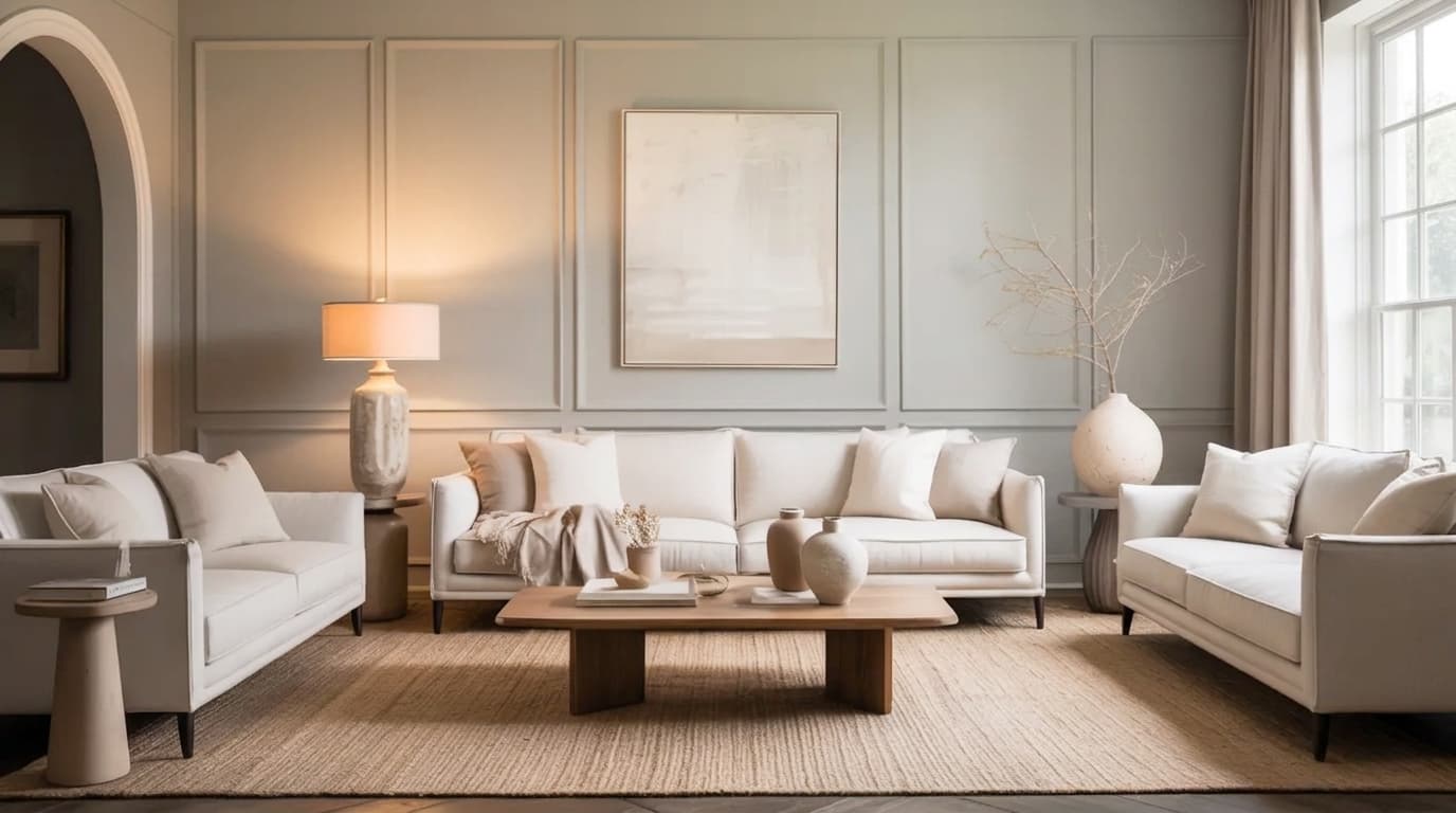
Soft gray has quietly become one of the most beloved neutrals in interior design, and it’s easy to see why. It carries just enough depth to add character without overwhelming a space.
Gray bridges the gap between warm and cool tones; shades that sit comfortably alongside wood finishes, metallics, and bold accent colors.
Understanding when Pale Oak fails can actually help clarify why soft gray works so reliably in the spaces where warmer neutrals struggle.
From contemporary apartments to classic suburban homes, soft gray brings polish and calm to every room it touches.
Here are other soft gray paint shades you can consider:
- Sherwin-Williams Repose Gray (SW 7015): A perfectly balanced greige that shifts beautifully between warm and cool lighting conditions.
- Benjamin Moore Edgecomb Gray (HC-173): A warm, soft gray with subtle beige undertones, ideal for bedrooms and living rooms.
- Sherwin-Williams Alpaca (SW 7022): A warm mid-tone greige with soft brown-gray undertones that adapts effortlessly to both warm and cool lighting conditions.
3. Navy Blue: Bold a nd Classic
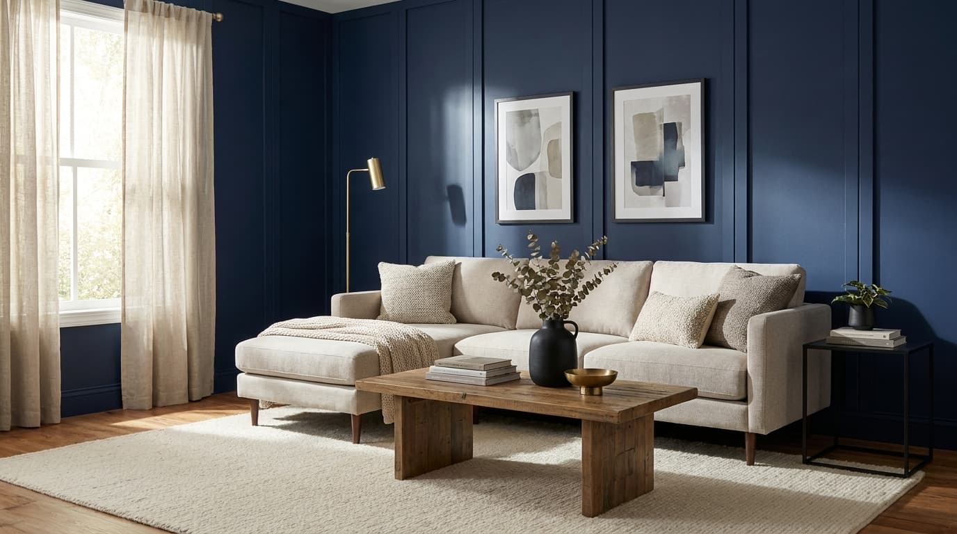
Navy blue is proof that a bold color can still be lasting. Its deep, rich tone carries an air of depth and confidence that has graced everything from coastal cottages to luxury interiors for centuries.
Navy adds instant drama as an accent wall, brings a refined look to kitchen cabinetry, and even works as an all-over room color when paired with the right lighting and furnishings.
It’s the rare bold hue that never goes out of style.
You can also consider this navy blue paint shade for your next project.
- Benjamin Moore Hale Navy (HC-154) : A rich, classic navy with slight warm undertones, bold on cabinetry and accent walls alike.
- Sherwin-Williams Naval (SW 6244) : A deep, moody navy that creates a striking statement wall or whole-room Shifting with ease.
- Farrow & Ball Hague Blue (No.30) : A dramatic, heritage navy-teal hybrid that adds depth and luxury to any living space
How to Choose the Right Shade Within These Colors?
Picking the right shade is where most people get stuck. Two whites can look completely different on your wall, and the same goes for gray or navy.
Start by looking at your existing elements. Your flooring, furniture, and trim all pull color in a direction, and your wall shade needs to work with them, not against them.
Always test swatches before committing. Pin them next to your fixed elements and step back to see how everything sits together in the actual space.
Check your samples at different times of the day. Morning light and evening light can make the same shade look completely different.
Getting this right saves you from having to repaint twice.
Matching Paint Colors to Your Interior Style and Space
Choosing Classic paint colors for your home can be tricky. These key factors will guide you toward the perfect choice.
| Factor | Key Consideration | Best Pick |
|---|---|---|
| Modern Style | Clean lines, minimal décor | Cool whites, soft grays |
| Farmhouse Style | Warm, cozy textures | Creamy whites, warm greiges |
| Coastal Style | Breezy, natural tones | Bright whites, blue-grays |
| Traditional Style | Formal, structured spaces | Navy blue, warm whites |
| Small Room | Needs to feel open | Light white, pale gray |
| Large Room | Needs warmth and depth | Soft gray, navy accent |
| Low Natural Light | Colors appear flat | Light-reflective whites |
| Bright Natural Light | Colors can wash out | Medium grays, cool whites |
By considering style and space, you’ll confidently select colors that fit your home’s needs and stand the test of time.
Tips for Applying Paint Colors
Applying paint colors requires more than just choosing the right shade. These tips will help you improve the overall look by coordinating furnishings, fabrics, and decor.
- Complementary Furnishings: Pair lasting colors with neutral or contrasting furniture to maintain balance and avoid overpowering the space.
- Fabric Coordination: Choose fabrics that improve the wall color, opting for textures that complement its depth and tone.
- Artwork Placement: Incorporate artwork that either contrasts with or complements the wall color to create visual interest.
- Avoid Overuse: Don’t overwhelm a room with a single color; balance it with accents.
Frequently Asked Questions (FAQs)
What Is The Best Front Door Color for Resale Value?
Neutral shades like navy blue, deep gray, and muted green tend to appeal to a wider range of buyers. They feel safe, clean, and easy to match with most home styles.
Should Your Front Door Color Match Your Interior Doors?
Not always. Your front door can stand out more than interior doors. It should match your home’s outside colors, not your indoor palette.
How Do I Test a Front Door Color Before Painting?
Paint a small section on the door and check it at different times of day. Light changes how the color looks, so testing helps avoid regret.
What Paint Finish Is Best for a Front door?
A satin or semi-gloss finish works best. It is easier to clean, resists weather damage, and keeps your door looking fresh longer
Final Words
Choosing the right colors does not have to feel complicated. The paint colors that never go out of style work because they are built around balance, light, and versatility rather than trends, and that is something I come back to every time I advise on a space.
Classic white, soft gray, and navy blue have proven that over and over again. Pair them with the right furniture, fabrics, and decor, and your space will always feel fresh and considered.
If working with a small room or an open floor plan, these shades offer flexibility that most colors simply cannot match. Try applying even one of these to your next project and see the difference for yourself.


