


After more than a decade of helping clients choose paint colors, one thing stands out clearly: white is never just white.
The right off-white can make a room feel settled and warm. The wrong one can leave it looking dingy or flat before the furniture even arrives.
From my work as a color consultant, the questions about warm whites come up constantly, and Benjamin Moore White Down (OC-131) is one that deserves a thorough answer. If you’re planning a full refresh, it also helps to understand the cost to paint a house before making final color decisions.
What does it actually look like on a wall? How does it behave in different lighting? And most importantly, will it work in your specific space? Let me answer all your questions.
This review covers undertones, LRV, lighting performance, finish options, and coordinating colors, so you can make a well-informed call before opening a can.
Getting to Know Benjamin Moore White Down
White Down (OC-131) is part of Benjamin Moore’s Off-White Collection, a curated group of roughly 150 neutral shades that sit between true white and cream.
The color also appears under the codes 970 and CC-50, depending on which Benjamin Moore collection you’re browsing; all three refer to the same paint.
It’s also worth knowing that White Down has roots in Benjamin Moore’s Historical Collection, drawing on the warm cream palettes common in America’s colonial and federal-era interiors. That heritage shows up in how the color reads on a wall, settled, considered, and timeless, rather than trendy.
With an LRV of 76.7, it reflects a generous amount of light without tipping into stark or clinical territory. That middle-ground quality is exactly why it shows up in so many designer palettes. It feels livable rather than loud.
Homes with warm wood flooring, natural stone, or beige textiles tend to respond especially well to it, because those materials echo the color’s warmth without competing with it.
Undertones and Lighting: What Shapes This Color
White Down carries a cream-beige undertone that stays quiet until the surrounding light or materials draw it out.
Multiple sources and my own client work confirm it has both a yellow base and a soft gray balancing element; the gray is what keeps it from tipping into pure cream territory and makes it more adaptable than most off-whites.
If you’ve looked at similar shades like the Natural Choice SW 7011, you’ll notice how slight shifts in undertone can completely change how a color behaves in real spaces.
It rarely pulls gray, which keeps it consistent across different rooms. Here is how light shapes it in practice.
Natural Light
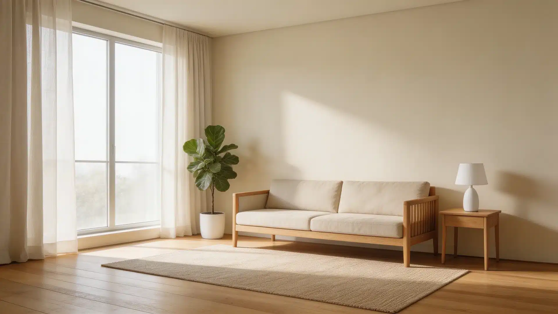
Natural light changes how White Down (OC-131) shows up throughout the day. In my experience consulting on color for rooms with complex orientation, direction matters far more than most people expect, and White Down is unusually sensitive to it. I’ve noticed that direction matters more than people think.
In north-facing rooms , the color stays soft and slightly more beige, with less visible warmth due to cooler light.
South-facing rooms do the opposite, bringing out the cream undertone and making the color feel warmer and fuller.
East-facing rooms start the day brighter and a bit cooler, then settle into a gentle warmth by midday.
West-facing rooms build warmth in the afternoon light, where the color looks richer before calming again in the evening.
These small shifts keep the color feeling steady but never flat.
Artificial Light
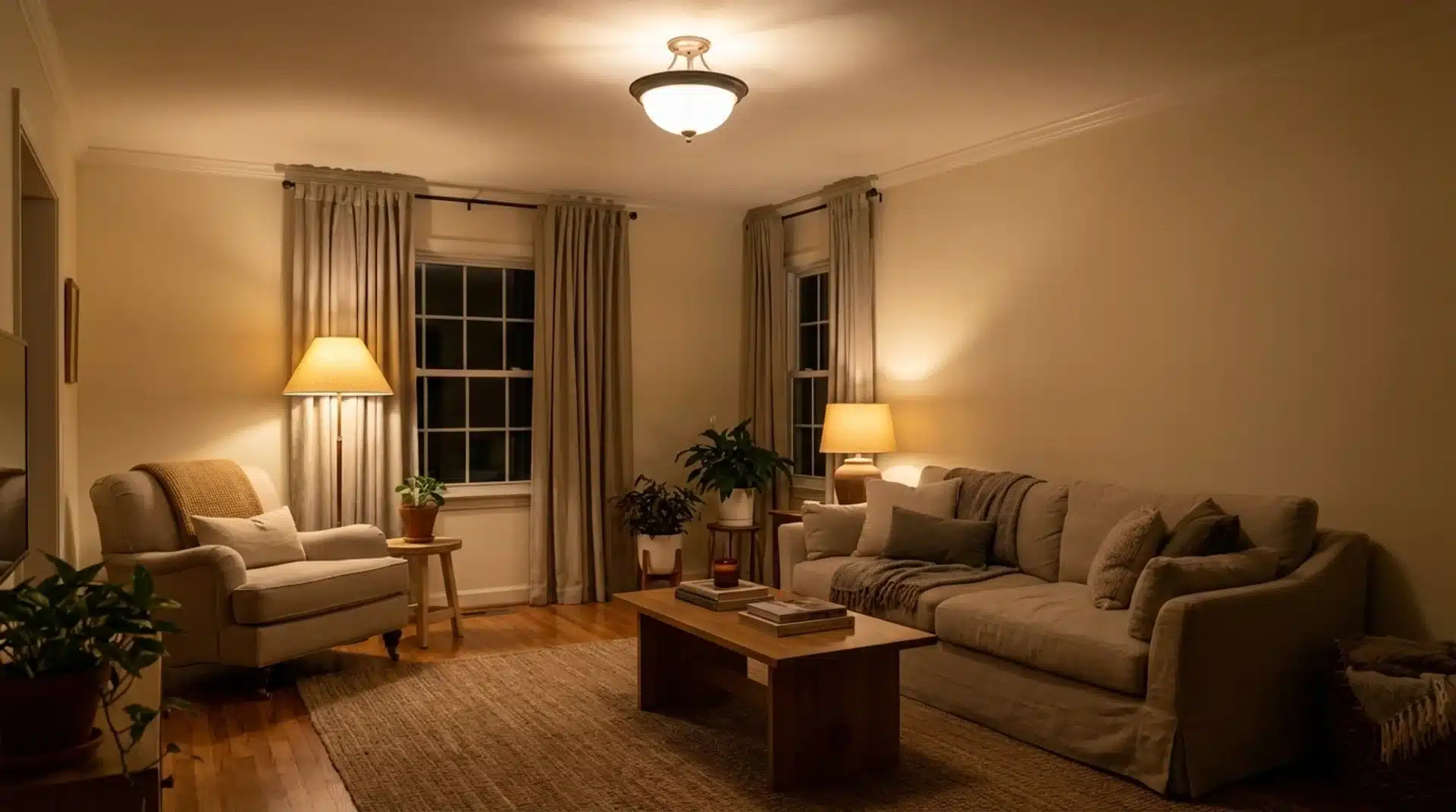
Artificial lighting takes over once natural light fades, and bulb type makes a clear difference. Warm bulbs in the 2700K–3000K range highlight the cream undertones and create a softer, more relaxed feel.
Cooler LEDs at 4000K or higher reduce that warmth and make the color appear more neutral. Using a mix of overhead lights and lamps helps balance the tone and keeps the color from looking too dull or overly warm at night.
Practical tip from client projects: In rooms where I’ve seen White Down fall flat at night, the culprit was almost always a single overhead fixture with a cool-white bulb. Swapping in a 2700K bulb and adding one warm lamp transformed how the color read. It’s a $10 fix worth trying before repainting
Finish Options and What They Do to the Color
Sheen affects more than durability; it alters how light interacts with the paint surface, thereby altering how the color reads.
- Matte /Flat absorbs light, giving the color its softest, most grounded appearance. Best for low-traffic walls where you want the paint to recede quietly.
- Eggshell is the most versatile option for living rooms and bedrooms. It has just enough sheen to clean easily, without adding noticeable brightness.
- Satin works well in kitchens, hallways, and bathrooms. The slight sheen adds durability and makes the color appear a touch crisper.
- Semi-Gloss is the standard for trim, doors, and cabinetry. On cabinets, especially, it pulls more light into the color, making it appear slightly brighter and more defined.
A note on paint lines: Benjamin Moore’s Aura formula in White Down offers notably better durability and color depth than their entry-level lines.
For high-traffic areas or cabinets, Aura is worth the price difference. Regal Select is a solid mid-tier option for standard walls.
When in doubt, match the finish to how hard the surface works; the busier the space, the higher the sheen needs to be.
Room Performance: Where This Color Works Best
That range, from living rooms to cabinet finishes, is what makes this color worth serious consideration.
The key is matching it to spaces where its warmth adds something rather than fighting what’s already there.
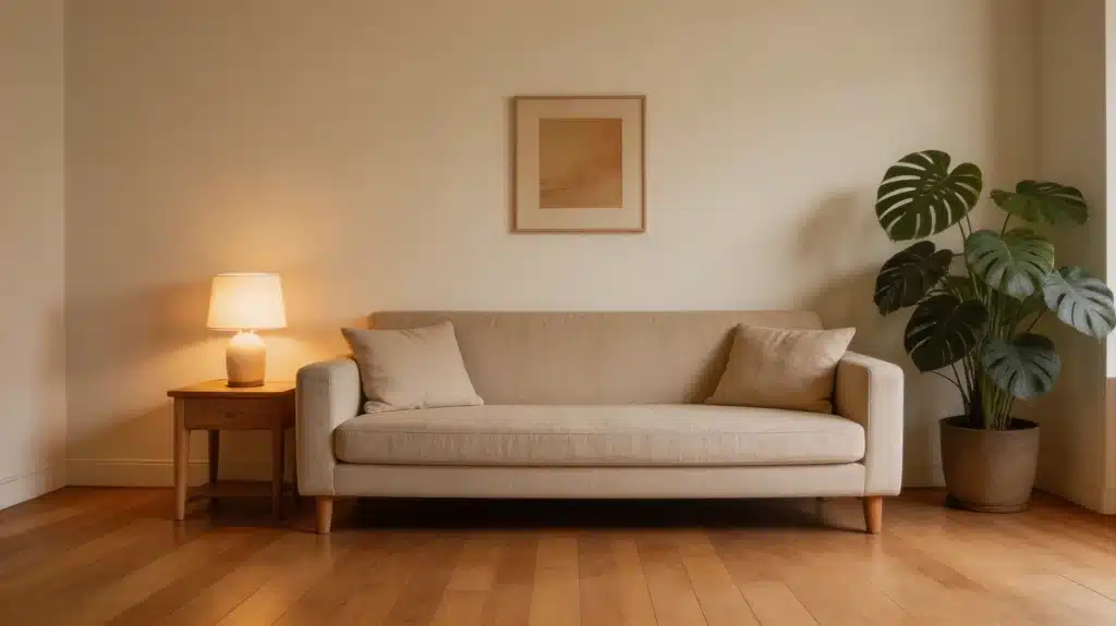
1. Living Rooms
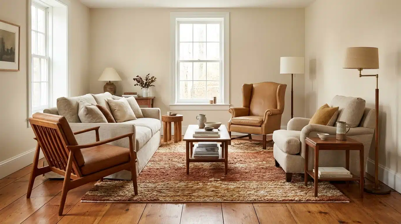
A natural fit for this space. The warmth creates a comfortable, settled atmosphere that works with wood floors, linen upholstery, and both traditional and contemporary furniture.
It doesn’t compete with existing materials; it supports them. Rooms that already carry warm tones in their flooring or textiles tend to respond especially well.
In open-plan layouts, White Down’s gray-balanced undertone is a particular asset: it creates a cohesive visual flow between connected spaces without looking monotonous.
I’ve used it across a combined living-dining area where one end received direct afternoon sun, and the other didn’t, and it held together beautifully throughout the day.
2. Bedrooms
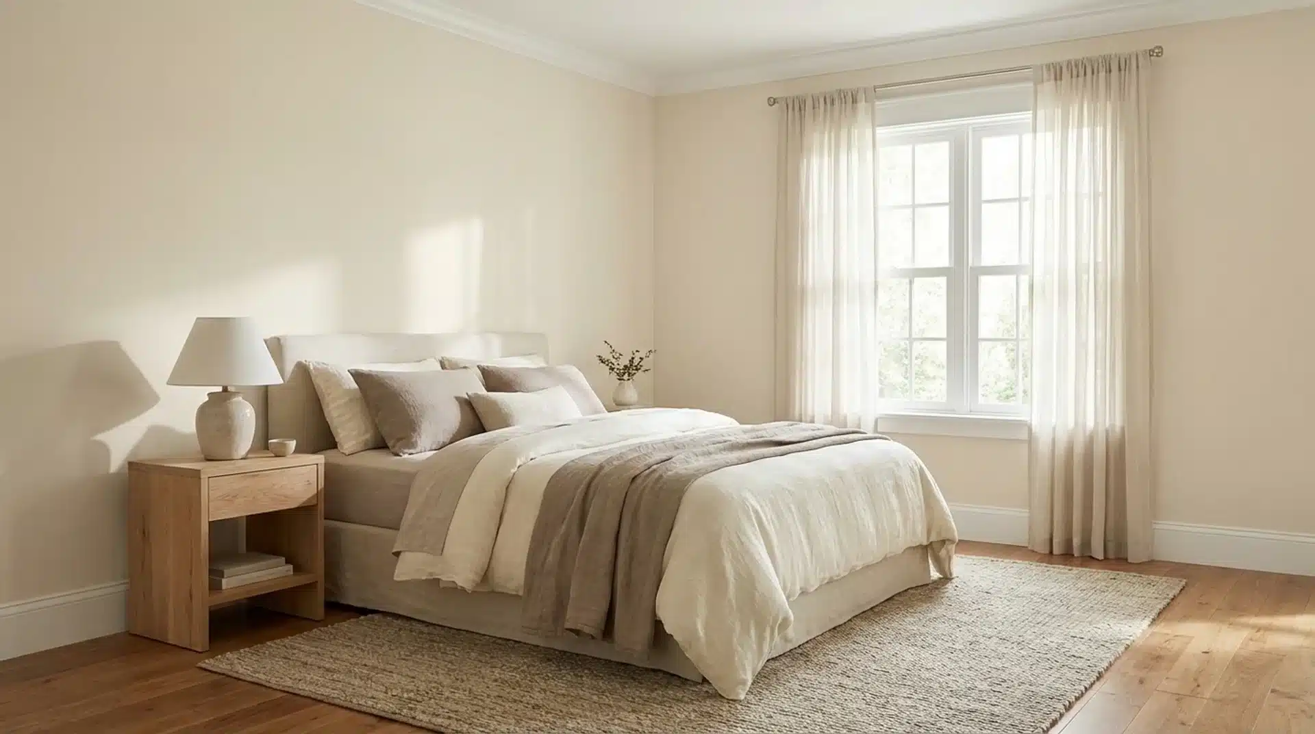
The low-key warmth keeps the space feeling restful without making it feel heavy or closed in.
Pairing it with soft white trim in the same warm family maintains cohesion without sharp contrast. It’s a reliable choice when the goal is a calm, easy room that holds up across changing daylight.
3. Kitchens
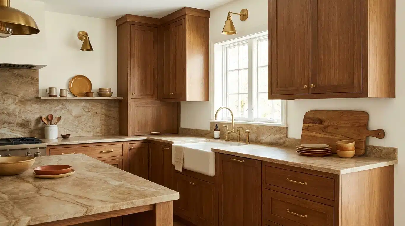
Works best when the surrounding materials are warm, such as wood cabinetry, brass hardware, or natural stone countertops.
It reads clean without going cold, which solves a common problem with brighter whites in food spaces. If your kitchen runs cool in materials or light, a sample test first is the smarter move.
4. Bathrooms
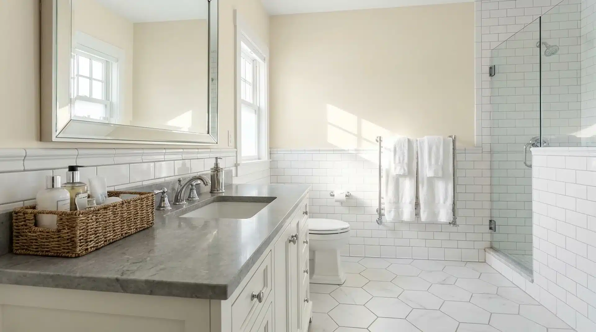
Can work well or fall flat depending on what else is in the room. In bathrooms with white tile and cool stone, the warmth reads as a welcome contrast.
In spaces that already run warm from materials or light exposure, test a sample first; the undertone can tip too creamy in those conditions.
One specific scenario worth noting: if your bathroom has beige fixtures or warm-toned tile that you can’t replace, White Down can actually help unify those elements. I’ve recommended it in exactly that situation to avoid the clash a cooler white would create.
5. Cabinets
Cream-adjacent cabinet colors have staying power in current design, and this shade delivers a softer alternative to crisp white.
It pairs particularly well with marble, warm quartz, and open wood shelving. The muted quality keeps cabinets feeling considered rather than flat.
That range, from living rooms to cabinet finishes, is what makes this color worth serious consideration. The key is matching it to spaces where its warmth adds something rather than fighting what’s already there.
If you’re considering White Down on cabinets, the semi-gloss finish is worth the investment. I’ve seen flat or eggshell on cabinets look soft and lovely at first, but they show handling marks faster, and touch-ups become a recurring chore.
How It Compares to Similar Colors
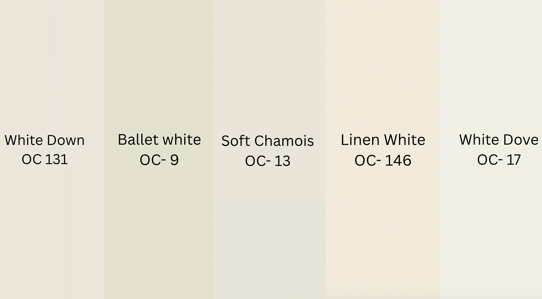
Not all whites are created equal. Seeing how White Down stacks up against similar shades helps you spot exactly what makes it tick and whether it suits your space. Here are some similar colors:
| Color | Undertone | LRV | Key Difference |
| White Down(OC- 131) | Cream-beige | 76.7 | Soft, muted warmth |
| Ballet White(OC- 9) | Beige-white | 73 | Slightly darker, more beige |
| Soft Chamois(OC- 13) | Light beige | 77 | Richer and warmer overall |
| Linen White(OC- 146) | Cream | 80 | More noticeably yellow |
| White Dove(OC- 17) | Warm-neutral | 83 | Brighter, less creamy |
Ballet White runs slightly deeper and more beige, a good option if you want a bit more visual weight. Soft Chamois is warmer and richer, closer to a true cream.
If you’re cross-shopping with Sherwin-Williams, White Duck is a frequently compared alternative; it leans grayer and cooler, which works better in rooms with very warm existing materials that could make White Duck look too yellow.
Your final pick really comes down to how much warmth you want and how much natural light your room gets. White Down sits comfortably in the middle.
Coordinating Colors That Work Well With It
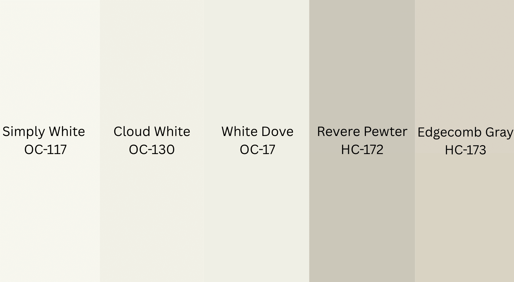
White Down plays well with others, but a thoughtful pairing makes all the difference. These coordinating colors share its warmth without competing or clashing. Here are some coordinating colors:
- Simply White (OC-117): A brighter, cleaner trim choice that creates intentional contrast against White Down’s creamier tone.
- Cloud White (OC-130): A close Off-White neighbor, perfect for ceilings or adjacent rooms to keep your palette visually connected.
- White Dove (OC-17) : Slightly brighter than White Down, this warm trim option keeps the whole scheme feeling cohesive.
- Revere Pewter (HC-172): A warm gray that transitions cleanly from White Down in open-plan layouts without feeling disconnected.
- Edgecomb Gray (HC-173): This light greige sits comfortably beside White Down in connecting rooms, avoiding any jarring visual contrast.
These pairings give you flexibility whether you’re working with trim, ceilings, or adjoining rooms. The shared warmth keeps everything feeling intentional and well-thought-out.
When White Down Doesn’t Work (And What to Use Instead)
Most paint reviews focus on where a color shines. After years of consulting, I find it equally useful to flag situations where a color is likely to disappoint, because the wrong shade on a wall costs real time and money.
White Down tends to struggle in these specific situations:
- Rooms with beige or almond fixtures you can’t replace: The undertones can clash subtly, creating a “double beige” effect that reads as unintentional rather than warm. In these rooms, a cooler off-white like White Dove often works better.
- Very bright, south-facing rooms with white or cool-tone countertops: White Down can read noticeably yellow against cool stone in strong sunlight. I’ve had clients repaint cabinets from White Down after discovering this in full afternoon sun. Test in those exact conditions before committing.
- Rooms trying to read as crisp and modern: If the design intent is clean-lined and contemporary with cool metals and white stone, White Down’s creaminess can undercut that aesthetic. A higher-LRV white like Chantilly Lace (OC-65) would serve better.
- Open-plan spaces with a cooler adjacent room: If the connecting room is painted in a cool gray or blue-toned neutral, White Down can look out of place. Make sure the warmth of your full palette is consistent across the connected space
Sampling: The One Step Worth Doing
Before committing to a full gallon, put a sample on the actual walls you plan to paint. Samplize peel-and-stick samples are a convenient option, no brushes, no mess, and they sit flush against the wall for an accurate read.
Place them on at least two walls in the room, preferably one that gets direct light and one that doesn’t.
Check the sample in the morning, midday, late afternoon, and at night under your usual lighting. The color will shift each time, and that range tells you more about how the paint will perform than any store swatch.
Leave the sample up for at least 48 hours before deciding. Paint dries differently than it looks wet, and undertones can shift slightly as the finish cures.
I also recommend holding the sample against your largest fixed elements, flooring, countertops, and cabinetry, rather than looking at it in isolation.
The color doesn’t live on the wall alone; it lives in conversation with everything else in the room. That context check has saved many of my clients from a repaint.
Final Thoughts
In my experience working with clients across all kinds of spaces, the colors that perform best are rarely the ones that look boldest on a swatch; they’re the ones that hold steady across changing light, work quietly with the materials already in the room, and make people feel good the moment they walk in.
Benjamin Moore White Down does all three when placed in the right conditions. The cream-beige undertone is gentle enough to stay calm, the LRV keeps rooms feeling open, and the overall warmth translates into spaces that feel considered rather than accidental.
Sample it in your own light, hold it next to your trim and flooring, and give it a full 48 hours. That process has never steered my clients wrong, and it won’t steer you wrong either.
Have you used White Down in your home? Drop a comment below with what space you used it in and how the light treated it; those real-world details help everyone make a better decision.
Frequently Asked Questions
What undertones does White Down OC-131 have?
White Down carries soft cream and beige undertones with a slight gray balance. This mix keeps it from feeling overly yellow, allowing it to appear warm yet controlled in most interior settings.
Is White Down a good choice for cabinets?
White Down works well on cabinets when paired with warm materials like wood or brass. Use a semi-gloss finish for durability, as lower sheens may show wear and require more frequent maintenance.
How does White Down compare to White Dove?
White Down is slightly creamier and more muted, while White Dove appears brighter and more neutral. White Down offers a softer, cozier feel, whereas White Dove leans cleaner and more versatile in mixed palettes.
Does White Down work in low-light rooms?
Yes, it performs well in low-light spaces due to its higher LRV. It helps reflect available light while maintaining warmth, preventing the room from feeling dull or overly shadowed.


