


Choosing the right wall color for wood floors tripped me up for years, and I say that as someone who has spent over a decade helping clients do exactly that.
Pick the wrong shade and the room feels off, dull, cramped, or disconnected, even when every other detail is right. What I’ve learned through hundreds of client consultations is that color affects how you feel the moment you walk in, it is the foundation of creating a cozy and warm living room aesthetic.
Knowing how to match wall color with wood floor comes down to three things: undertones, contrast, and light. Get those right and the whole room shifts.
This covers floor-specific pairings, wall colors by floor type, a 4-step framework, current trends, and the most common mistakes to avoid.
The Impact of Wall Color on Wood Floors
Most people pick a paint color they love and hope it works; that’s where things go wrong. Wall color doesn’t exist in isolation. It reacts with your floor’s tone, the room’s lighting, and the undertones in the wood itself.
When those elements don’t align, even a beautiful paint color makes a room feel flat, cold, or overpowering. Color harmony is about balance, not matching. You’re not looking for a wall color that mimics your floor; you’re looking for one that complements it.
The color wheel is my starting point with every client. Warm floors, red, orange, or golden wood, pair naturally with cool walls like soft blue, sage, or muted gray. Cool floors need warm walls like beige, taupe, or creamy white to feel complete.
I call this the “temperature balance” principle: the wall and floor should sit on opposite ends of the warm-cool spectrum. When both run warm, or both run cool, the room loses tension, and without tension, it loses life.
The undertone test I use with every client: Take a piece of pure white paper and lay it flat on your floor in natural daylight. The contrast will make the floor’s undertone visible immediately. Red or orange cast? Warm floor. Grayish or silvery cast? Cool floor. Almost no shift? Neutral floor, and you have the most flexibility of any floor type.
Framework for How to Match Wall Color With Wood Floor
Getting this right doesn’t require a design degree. Follow these four steps in order, and you’ll have a confident color decision every time.
Step 1: Check your floor in natural daylight; warm tones look red, gold, or orange; cool tones appear gray, silver, or cool brown.
Step 2: Light floors pair with darker walls; dark floors pair with lighter walls; avoid similar tones to prevent a flat look.
Step 3: Shortlist one warm, one cool, and one neutral color based on undertone and contrast.
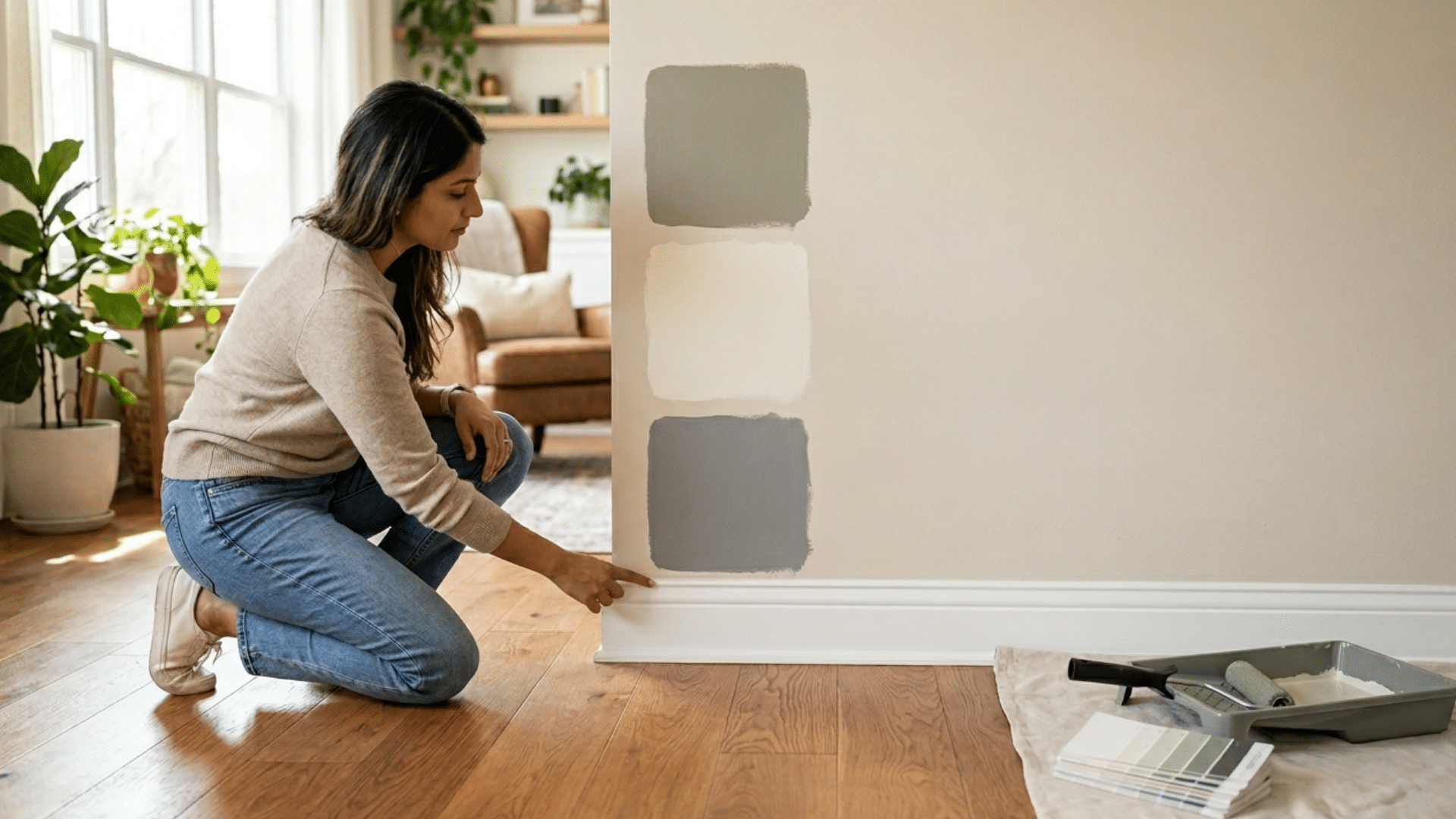
Step 4: Paint a large sample (at least 12×12 inches), apply two coats, and observe it in different lighting for 3–5 days.
Colors shift dramatically across lighting conditions, and what looks perfect on day one can reveal problems by day three. This step alone saves most people from a costly repaint.
Where to put your test swatch: Paint it directly on the wall above the baseboard so it sits as close to the floor as possible, that proximity is where the color interaction actually happens. Don’t test it in the center of the wall in isolation. The floor is part of the equation, and your swatch needs to be near it to give you an honest reading.
Best Wall Colors by Wood Floor Type
Not every color works with every floor. Here’s what actually pairs well with yours.
1. Best Whites for Any Wood Floor
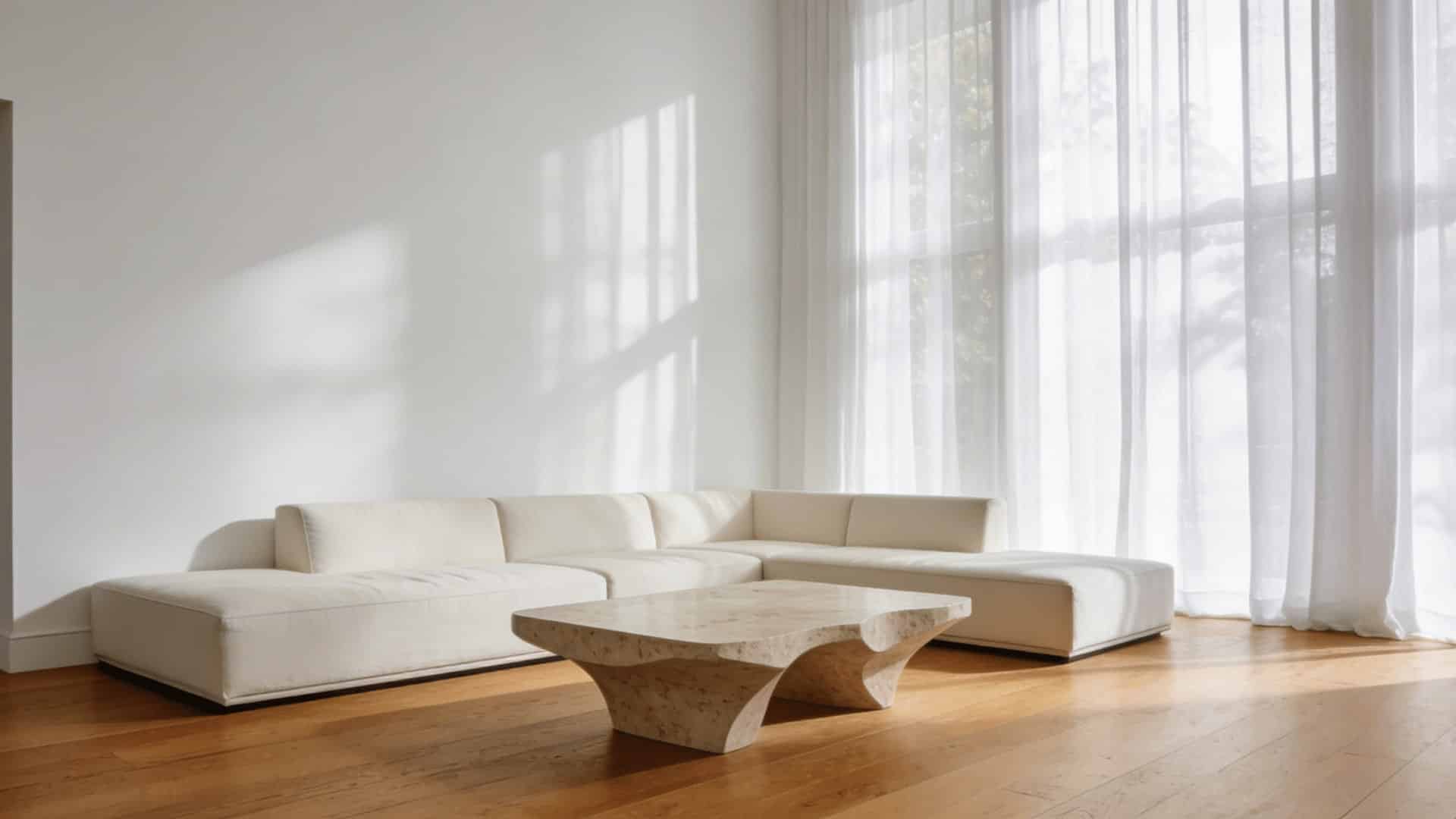
White walls create bright, airy foundations that let wood floors take center stage without competing for attention. These shades work across living rooms, bedrooms, and open-concept spaces where you want walls to recede and floors to lead.
Choosing the right white depends entirely on your floor’s undertone and the mood you’re after.
- Warm white: soft and balancing for yellow or honey-toned floors. Test Sherwin-Williams Alabaster (SW 7008) or Benjamin Moore White Dove (OC-17)
- Soft cream: gentle warmth for traditional or farmhouse styles. Check Benjamin Moore Linen White (OC-146)
- Clean white: crisp and modern; best for cool or neutral floors. Try out Benjamin Moore Chantilly Lace (OC-65) or Sherwin-Williams Extra White (SW 7006)
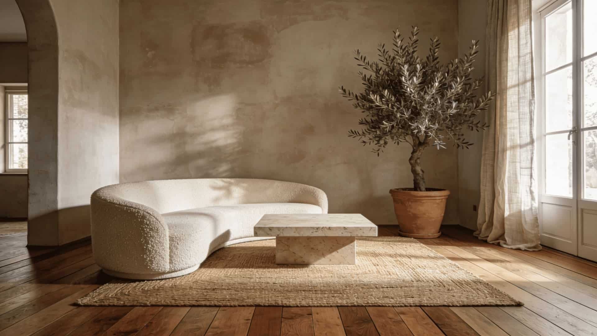
2. Best Neutrals for Wood Floors
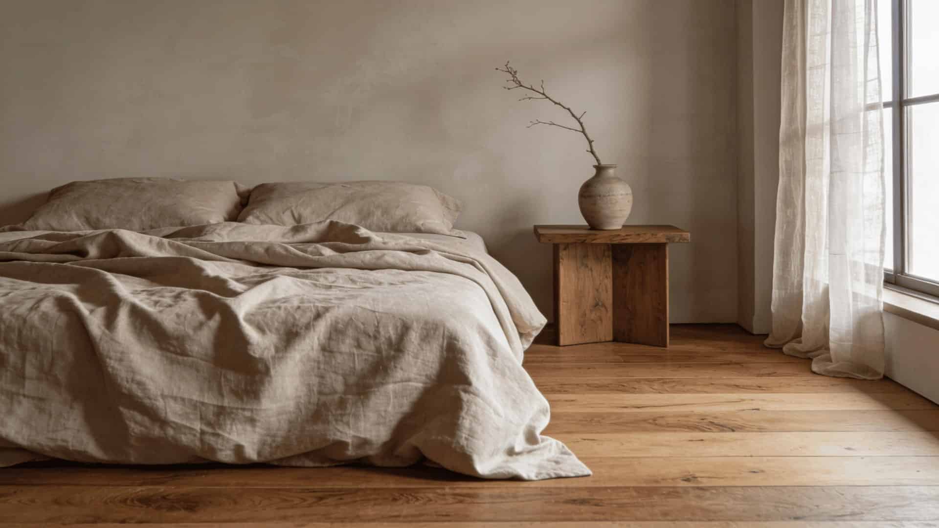
Today’s Trending Colors and Pairings: Warm neutrals are taking over from cool grays. Mushroom, warm khaki, and smoky taupe are replacing the icy gray-white combos that dominated the last decade. These tones are essential for anyone designing an earthy, organic modern space where the wood floor acts as the primary natural element.
The key is matching your neutral’s undertone to your floor’s undertone so the two feel intentional rather than accidental.
- Greige: works with every undertone; the safest all-around neutral. Test Sherwin-Williams Accessible Beige (SW 7036) or Benjamin Moore Pale Oak (OC-20)
- Pale taupe: subtle depth without overpowering; avoid with pink-leaning floors. Try Benjamin Moore Revere Pewter (HC-172)
- Light warm beige: cozy and natural; avoid with heavily yellow floors. Check Sherwin-Williams Antique White (SW 6119)
3. Best Soft Colors for Wood Floors
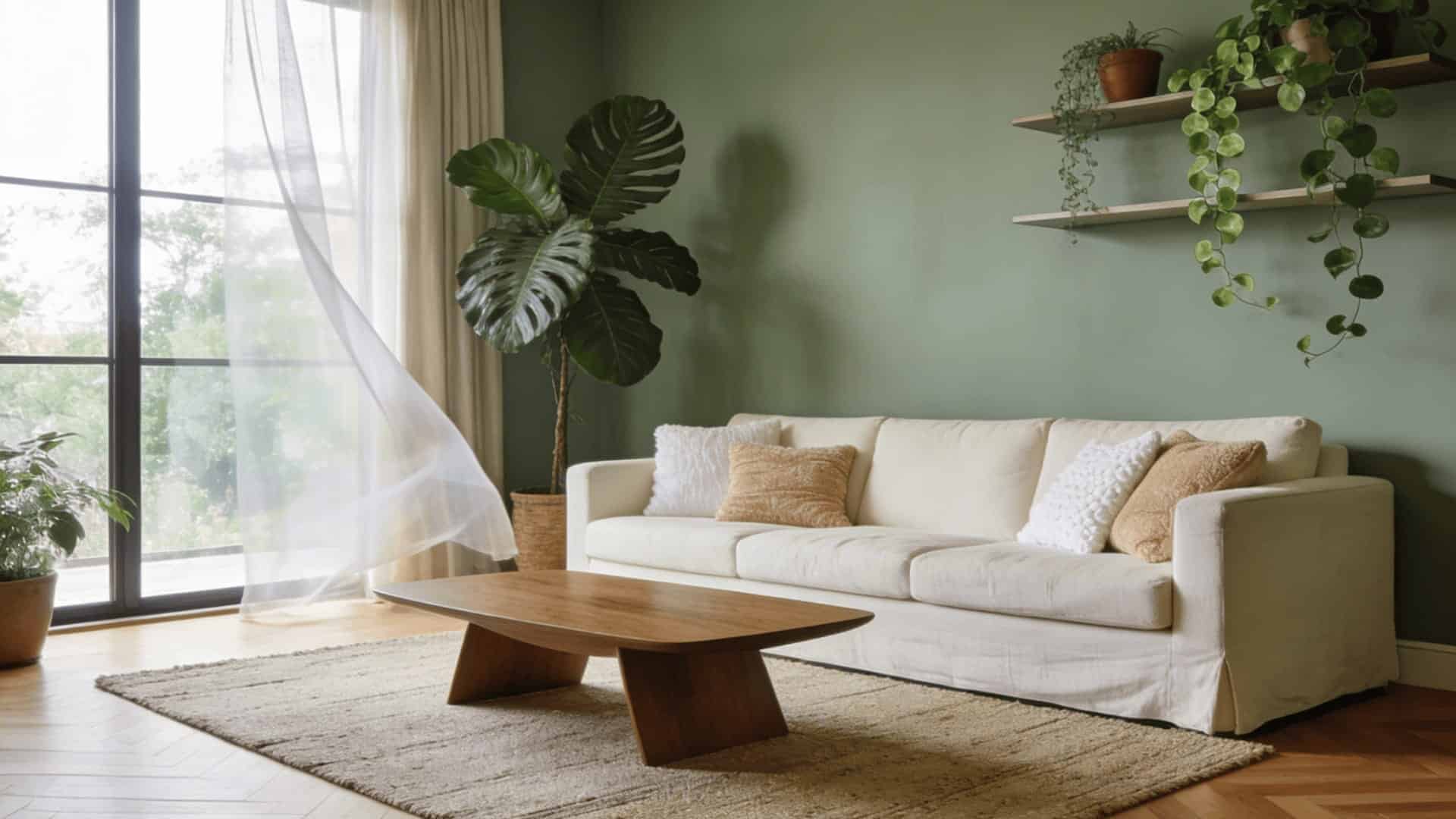
Soft colors add personality while keeping the calm, airy quality that wood floors naturally bring to a room. These gentle hues work well in bedrooms, living areas, and bathrooms where you want subtle color without a bold statement.
They sit between neutral safety and full color, enough to give a room character without overwhelming it.
- Sage green: grounding and fresh; balances warm wood tones naturally. Check Sherwin-Williams Clary Sage (SW 6178) or Benjamin Moore October Mist (1495)
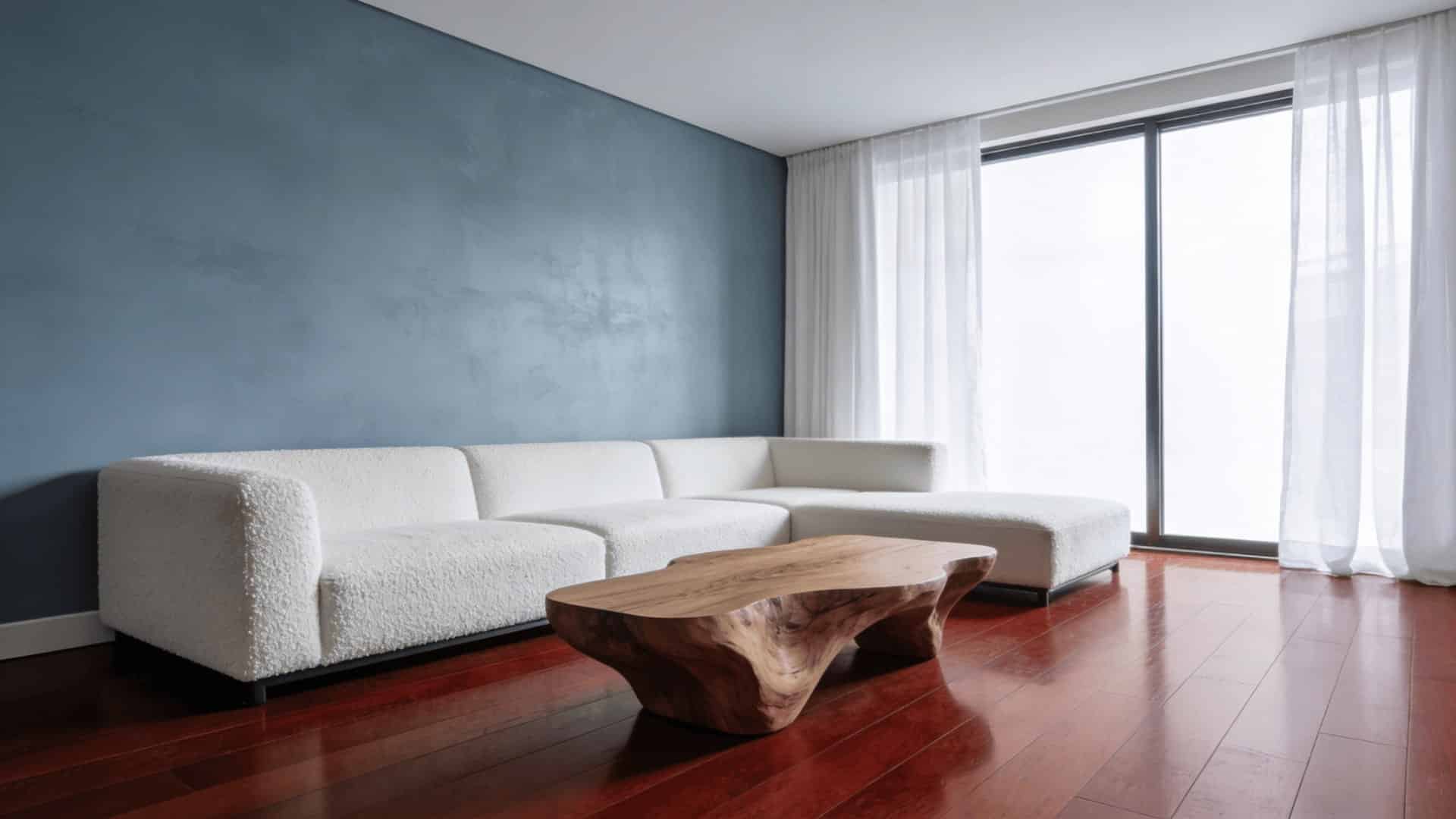
- Dusty blue: cools down warm floors; serene and very current. Try out Sherwin-Williams Watery (SW 6478) or Benjamin Moore Blue Echo (1648)
- Muted blue-green: flexible and modern; works well with neutral floors. Check Sherwin-Williams Sea Salt (SW 6204)
4. Best Dark Accent Colors for Wood Floors
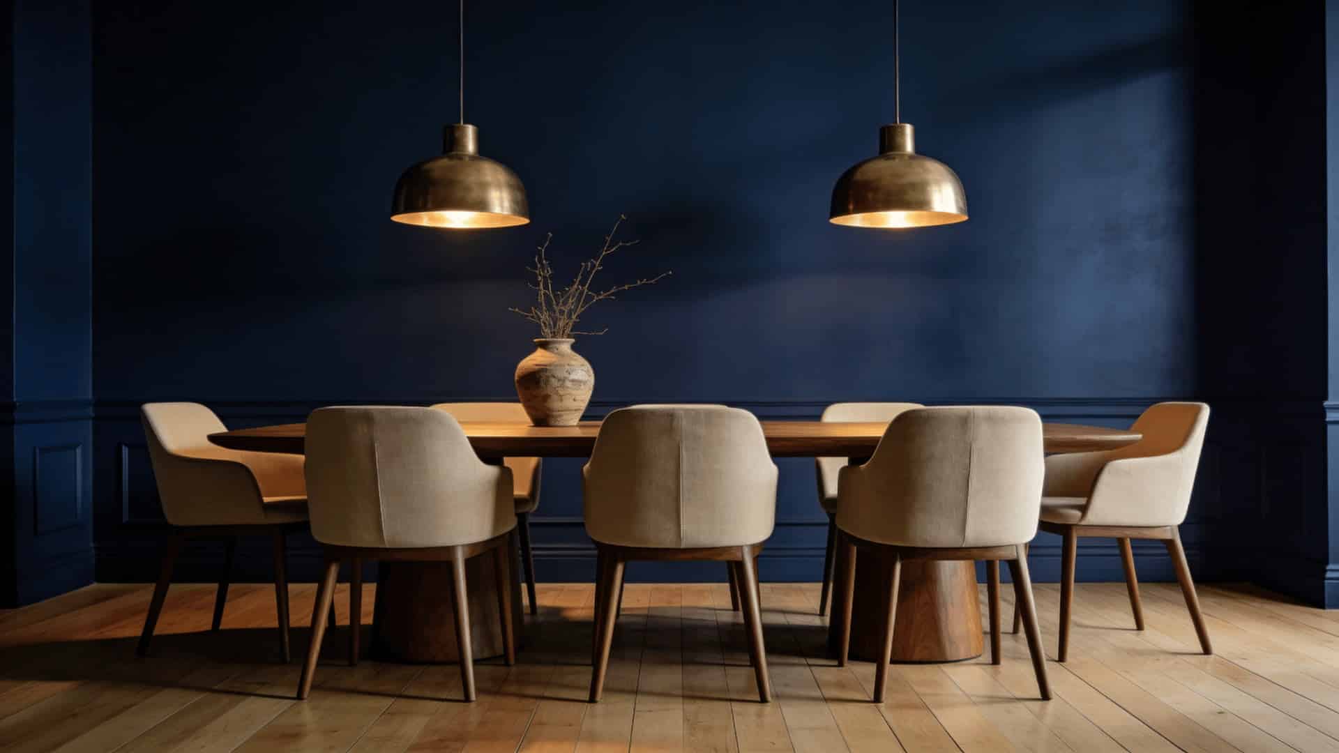
Dark accent colors create the kind of contrast that makes wood floors stand out. These shades work best as accent walls in living rooms, dining rooms, or bedrooms where you want impact without committing to a fully dark room.
Used strategically, they ground a space and prevent it from feeling too lightweight or flat.
- Charcoal: modern contrast that gives light floors strong definition. Try Sherwin-Williams Tricorn Black (SW 6258) or Benjamin Moore Kendall Charcoal (HC-166)
- Deep green: earthy and rich; pairs beautifully with light to medium wood. Check Benjamin Moore Hunter Green (2041-10) or Sherwin-Williams Jasper (SW 6216)
- Navy: dramatic and grounding; works especially well with light oak floors. Test Benjamin Moore Hale Navy (HC-154) or Sherwin-Williams Naval (SW 6244)
5. Wild Card Shades That Surprisingly Work
These unexpected colors prove that wood floors can handle more unusual choices than most people think when selected carefully.
They work best in bedrooms, creative spaces, and powder rooms where personality matters more than playing it safe. Each one creates a memorable space that still feels balanced and considered.
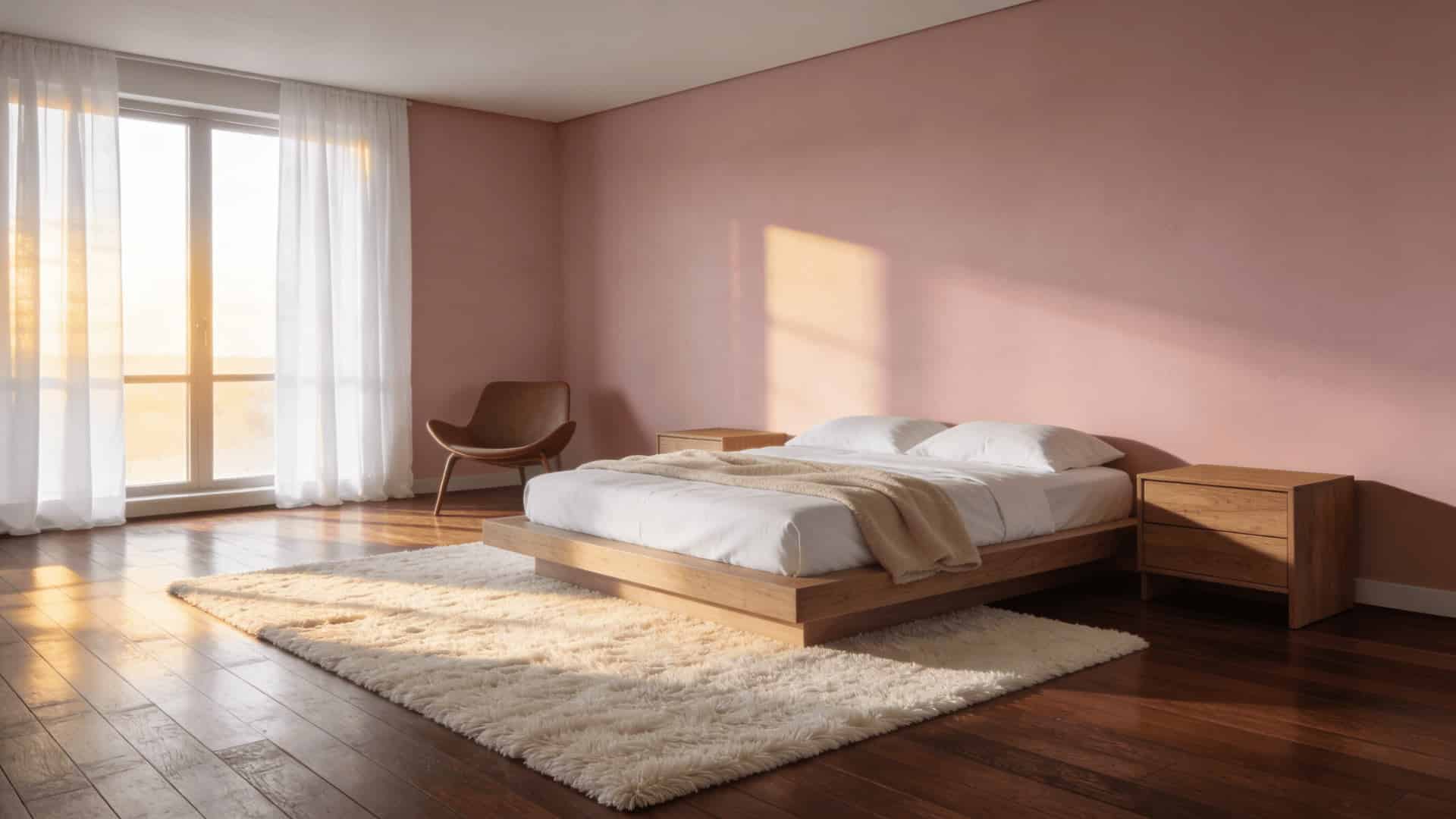
- Soft blush: barely-there pink that warms neutral wood without reading overtly pink. Check Benjamin Moore Pale Blush (2173-60)
- Smoky lavender: subdued lavender-gray that offsets yellow or orange undertones beautifully. Try Sherwin-Williams Quixotic Plum (SW 6293)
- Warm terracotta: earthy and bold; pairs surprisingly well with medium and dark wood floors. Test Benjamin Moore Terra Mauve (2173-30)
Common Mistakes to Avoid
Even experienced decorators fall into these traps. Here’s what to watch for:
- Matching your wall color to your floor exactly: This makes the room look monotone and aged. Contrast creates depth; always aim for a clear difference in tone or temperature.
- Choosing paint from a small chip: Colors shift dramatically at scale. A soft gray chip can look blue or purple on a full wall. Always test large swatches (at least 12×12 inches, ideally larger).
- Ignoring artificial lighting: Your floor looks different under warm Edison bulbs versus cool LED overhead lighting. Test your swatches under the actual bulbs you use in the space.
- Stacking warm on warm: This is the most common mistake with honey oak and pine floors. Adding a warm yellow or beige wall doubles the warmth and overwhelms the room fast.
- Forgetting trim and ceilings: White trim with a warm wall and warm floors can create a jarring three-way clash. Match your trim undertone to the rest of the palette.
Current and Future Wall Color Trends for Wood Floors
Design trends continue to shift as homeowners seek fresh ways to style their spaces.
Understanding current and future color directions helps you make choices that stay relevant and appealing for years to come.
Today’s Trending Colors and Pairings
Warm neutrals are taking over from cool grays. Mushroom, warm khaki, and smoky taupe are replacing the icy gray-white combos that dominated the last decade.
Colors like BM Pale Oak and SW Accessible Beige pair beautifully with medium oak and natural walnut, creating a biophilic, grounded look.
Color drenching is another major trend, painting walls, ceilings, and trim in one deep tone. Deep charcoal, espresso, or forest green paired with dark walnut floors creates a moody, library-style atmosphere that feels rich and intentional.
What’s Next: Future Design Directions?
Warm mahogany and reddish-brown floors are gaining ground as homeowners move away from pale Scandinavian woods. The emerging pairing combines rich red-brown floors with icy blues or soft aquas, a striking warm-meets-cool contrast expected to dominate modern interiors over the next few years.
Earthy terracottas and dusty warm pinks are also showing up more frequently alongside natural wood floors, especially in living rooms and dining areas.
From a psychological standpoint, this shift makes sense: after years of the emotionally cool gray-and-white palette, people are gravitating toward colors that feel physiologically warmer and more human-scaled.
Terracotta and warm pink are the interior design world’s response to a broader cultural desire for comfort and groundedness.
Tips to Test Wall Colors in Your Space
Testing paint colors properly saves time and money and prevents costly mistakes. Use these practical tips to ensure your wall color complements your wood floors in all lighting conditions:
- Paint Large Swatches: Apply two coats on 2ft x 2ft sections and observe them in morning, afternoon, and evening light for 3-5 days.
- Check Adjoining Rooms: Test colors in connected spaces to ensure smooth transitions and maintain consistent undertones throughout open-concept layouts.
- Compare Side by Side: Review all options together after several days, take photos for clarity, and eliminate any that clash with your floors.
- Trust Natural Light: View samples during different times of day to see how sunlight and artificial lighting change the color’s appearance against your floors.
- Photograph under artificial light: Most people test swatches in the afternoon but forget to check under the actual evening lighting they use daily. A warm recessed downlight can shift a cool sage to a yellow-green overnight, and take photos in every lighting condition you actually live in.
With the right approach, matching wall colors to wood floors becomes simple. Use these tips to test confidently and create a space that feels perfectly balanced
Final Thoughts
Matching the wall color with the wood floor doesn’t have to be overwhelming. Start with your floor’s undertone, deliberately choose a contrasting color, and test before you commit.
If you’re working with light oak, rich cherry, or cool gray planks, the right wall color is out there; you just need the right process to find it.
Every client I’ve walked through how to match wall color with wood floor has landed on a choice they felt confident about, not just hopeful. It works every time.
The biggest takeaway: avoid matching and embrace balance. Your floor already brings character to the room. The right wall color simply lets it shine. What wood floor are you working with? Drop your question in the comments, I’d love to help.


