


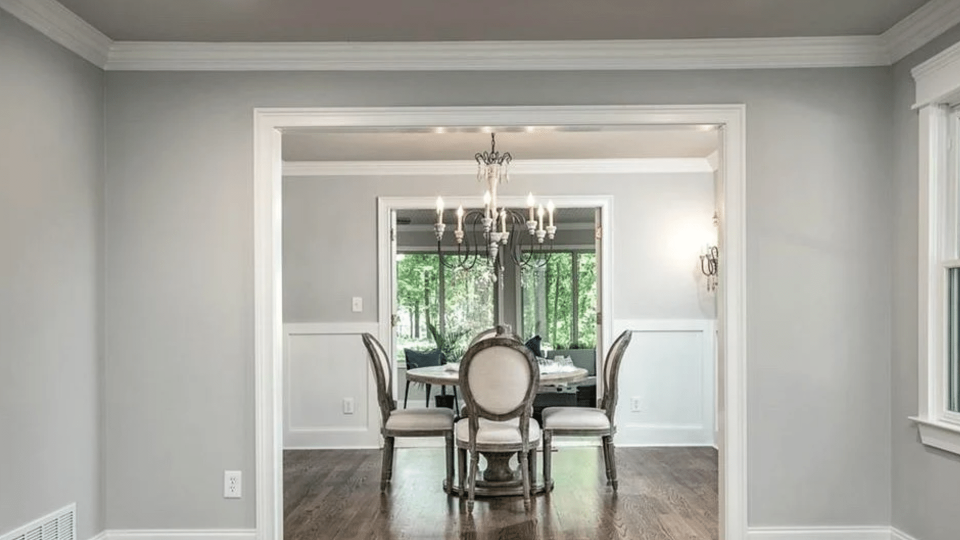
When I first saw Sherwin-Williams Gossamer Veil (SW 9165) on a wall, I understood why so many people love it. It’s that perfect middle ground, not too gray, not too beige, just calm, balanced, and comfortable. If you’ve ever struggled to find a neutral that looks good in every light, this one’s worth your attention. I’ve seen it make small rooms feel open and large rooms feel grounded, all without stealing the spotlight. If you’re planning to paint your living room, bedroom, or even the exterior, Gossamer Veil adjusts beautifully to different spaces and styles. You’ll see how its quiet warmth and subtle undertones create a home that feels soft, natural, and welcoming. What is Sherwin-Williams Gossamer Veil? Sherwin-Williams Gossamer Veil (SW 9165) is a soft greige that sits between gray and beige, offering a balanced tone that feels calm and inviting. It’s part of Sherwin-Williams’ neutral color family, known for its versatility across styles like modern farmhouse, transitional, and minimalist spaces. The shade gets its name from the word “gossamer,” which means light and delicate, a fitting description for a color that brings quiet softness to any room. Gossamer Veil works beautifully on walls, cabinetry, and even exteriors, adapting easily to both warm and cool surroundings. Its moderate depth ensures it doesn’t appear too dark or washed out, making it an easy go-to neutral for many homes. HEX: #D3CEC4 RGB: 211, 206, 196 LRV: 62 Gossamer Veil Undertones Explained Gossamer Veil is a warm gray with subtle green undertones that can occasionally show a hint of violet depending on the light. These undertones shift gently with the room’s direction and surrounding materials. In north-facing rooms, the shade appears cooler, and the gray-green tones stand out more.In south-facing spaces, it takes on a warmer look, showing a soft beige cast.In east-facing rooms, the morning light feels warmer, offering a gentle, welcoming glow.In west-facing rooms, it may reveal slight yellow or muted green tones during the late afternoon. Before painting, test large samples on multiple walls to observe how the undertones change throughout the day. Viewing photos or comparison boards can help you see these subtle shifts more clearly, ensuring you capture the color’s true personality in your space. Gossamer Veil in Real Homes Gossamer Veil works beautifully across home styles, bringing warmth, balance, and adaptability to modern, farmhouse, or coastal spaces. 1. Living Rooms In living rooms, Gossamer Veil creates a calm, open feel that complements both cozy and modern decor. It pairs beautifully with warm wood furniture, woven textures, and matte black accents for added contrast. For trim, use crisp whites like Extra White or Pure White to frame the walls cleanly. Adding linen curtains or textured rugs can improve its softness while keeping the space grounded. The color’s subtle green undertone gives the room a relaxed, natural warmth that works in both daylight and lamp light. 2. Bedrooms In bedrooms, Gossamer Veil brings a soothing, restful feel that makes it perfect for layered neutrals or soft coastal bedding. It creates a cozy atmosphere without feeling heavy or dark. Under warm bulbs, the tone leans slightly beige and comforting, while cooler LED lighting highlights its gray-green side. Pair it with crisp white trim, woven throws, and light oak or rattan furniture for a natural, serene look that encourages relaxation at any time of day. 3. Kitchens and Dining Rooms Gossamer Veil looks elegant and easygoing in kitchens and dining rooms, especially beside white or cream cabinets. Its undertones remain steady but may appear warmer under daylight and cooler under LEDs. Brass, black, or brushed nickel hardware improves its flexible tone. Pair it with marble, quartz, or butcher block countertops for texture contrast. Light wood floors or white oak add warmth that balances the greige hue, making it inviting without feeling overly traditional. 4. Bathrooms In bathrooms, Gossamer Veil shifts slightly cooler because of the moisture and smaller space lighting. It reflects light beautifully, keeping the area open and fresh. Pair it with bright white tile, polished nickel or brass mirrors, and soft gray vanities for balance. White trim, such as Extra White, helps prevent shadows from dulling the walls. This shade keeps bathrooms feeling clean yet comfortable, with just enough depth to add quiet sophistication. 5. Exteriors Outdoors, Gossamer Veil reacts to sunlight and shadows, showing a perfect balance between warm greige and soft gray. In direct sunlight, it reads brighter and more neutral; in shade, subtle green undertones emerge. For trim, pair it with Extra White or Greek Villa for a clean contrast, or Iron Ore for a bold, modern edge. It complements stone, brick, and wood beautifully, making it a versatile choice for classic or contemporary home exteriors. Colors That Go With Gossamer Veil Gossamer Veil’s balanced tone makes it easy to coordinate with a wide range of whites, neutrals, and bold accent colors. Trim and Ceiling Colors For trim and ceilings, crisp whites bring out Gossamer Veil’s soft warmth. Extra White SW 7006, Pure White SW 7005, Greek Villa SW 7551, and Zurich White SW 7626 are perfect matches. Extra White adds a bright modern contrast, while Greek Villa softens the transition for warmer interiors. Pure White is a safe, flexible choice for both trim and ceilings, keeping the look consistent across lighting changes. These whites highlight the subtle greige undertones and make Gossamer Veil feel lighter and more defined in any room. Accent and Complementary Colors Gossamer Veil pairs beautifully with other neutrals like Threshold Taupe SW 7501, Mineral Deposit SW 7652, and Iron Ore SW 7069. These create subtle depth and contrast without overpowering the wall color. For bolder accents, try Indigo Batik SW 7602, Naval SW 6244, or Urbane Bronze SW 7048 to add rich dimension and modern edge. If you prefer a calm, natural palette or a high-contrast design, these tones work seamlessly to improve Gossamer Veil’s flexible character and keep your space balanced and inviting. Room Palette Examples by Style Gossamer Veil adapts easily to different home styles. For a modern palette, pair Gossamer Veil, Iron Ore, and Extra White for clean contrast. A farmhouse look comes alive with Gossamer Veil, Alabaster SW 7008, and natural wood SW 9508, creating warmth and comfort. For a coastal vibe, mix Gossamer Veil, Sea Salt SW 6204, and Snowbound SW 7004 to achieve a soft, breezy feel. Each combination brings out different aspects of the color’s tone, letting you customize your space effortlessly. Gossamer Veil Compared to Similar Colors Comparing Gossamer Veil with other Sherwin-Williams neutrals helps you spot subtle undertone differences and choose the right shade for your space. Color Name Tone & Warmth Undertones LRV Best For Gossamer Veil (SW 9165) Balanced warm greige Soft green with slight violet 62 Versatile for living rooms, bedrooms, and kitchens Agreeable Gray (SW 7029) Slightly warmer and more beige Subtle brown with faint green 60 Cozy spaces needing warmth, like bedrooms or dining areas Drift of Mist (SW 9166) Lighter and softer Faint green-gray 69 Small rooms, hallways, or spaces needing more light Repose Gray (SW 7015) Cooler and more neutral Blue-violet with gray depth 58 Modern rooms or cooler-toned interiors need contrast Use this comparison to pick the tone that best matches your lighting and decor goals. Long-Term Color Behavior Over time, Gossamer Veil’s undertones can appear slightly different depending on lighting and environmental factors. Under warm LED bulbs, the color leans beige and cozier, while cool LEDs bring out its soft gray-green side. Natural daylight can shift the tone, too. Spaces with strong sunlight may see the color brighten, while shaded areas can reveal more muted green undertones. As paint ages, exposure to UV light or moisture may cause subtle fading, especially on exteriors. To maintain a consistent appearance, clean walls gently with a soft cloth, avoid harsh cleaners, and consider repainting high-traffic areas every few years. Testing bulb temperatures before finalizing lighting can also help preserve Gossamer Veil’s balanced, natural look for years to come. Practical Painting Tips for Gossamer Veil Applying Gossamer Veil is simple with the right approach. Follow these steps to achieve a smooth, professional-looking finish. Choose the right finish: Use satin or eggshell for walls, semi-gloss for trim, and satin enamel for cabinets. Prep the surface: Clean and lightly sand before painting to ensure proper adhesion and even coverage. Test the color first: Paint large samples on poster boards and move them around the room to see undertone changes. Use quality tools: A high-density roller and angled brush provide even coverage without streaks. Mind the lighting: Observe how warm and cool bulbs affect the tone before finalizing. Apply two coats: Allow proper drying time between coats for consistent depth and durability. Maintain regularly: Wipe walls gently with a soft cloth to prevent dullness over time. Pros and Cons of Gossamer Veil Understanding the strengths and limits of Gossamer Veil helps you decide if it suits your space and lighting conditions best. Pros Cons Versatile and neutral in most lighting conditions. It may appear slightly green in shaded or north-facing rooms. Works well across different interior styles and finishes. It can look flat if the room lacks contrast or texture. Balanced LRV (62), neither too light nor too dark. Needs thoughtful lighting and décor pairing for best results. Tip: Always sample on large boards and observe in different lights before painting the entire room. Designer Tips for Styling Gossamer Veil Gossamer Veil pairs best with natural materials and warm, balanced textures that highlight its soft, beige tone. Think light oak furniture, woven baskets, linen drapes, and soft neutral rugs to keep the room grounded and welcoming. Brass or matte black accents, like light fixtures, cabinet handles, or frames, add depth without overpowering the wall color. Avoid strong yellow tones in fabrics or lighting, as they can distort the color’s gentle warmth. For wall art, choose pieces with muted blues, creams, or earthy greens that echo its undertones. Add layered lighting, floor lamps, sconces, and soft overhead bulbs to reveal its color shifts throughout the day. With the right mix of texture, tone, and light, Gossamer Veil feels timeless and comfortably balanced in any room. Conclusion After spending time with Sherwin-Williams Gossamer Veil, I’ve learned it’s one of those colors that quietly changes a space without trying too hard. It gives you flexibility, if you want your home to feel warm, relaxed, or just clean and balanced. If you’re unsure how it’ll look in your lighting, sample it first and watch how it changes through the day. You’ll see its true beauty come alive in subtle ways. I hope this helped you picture how Gossamer Veil can work in your home and take the guesswork out of choosing the right neutral. When you’re ready, check out my other color guides for more paint ideas that fit your style perfectly.

When I first tried Sherwin-Williams Alabaster, I loved its soft, creamy warmth, but finding the right colors to match it wasn’t easy. Some shades made it look too yellow, while others felt too flat. If you’ve ever faced the same challenge, you know how tricky it can be to create balance. That’s why I decided to break down the best SW Alabaster coordinating colors that truly work. In this post, I’ll share how lighting changes its look, which shades pair beautifully, and how you can use them in different rooms. By the end, you’ll know exactly how to build color combinations that make Alabaster feel calm, bright, and effortless in your home. Sherwin-Williams Alabaster SW 7008 is a warm off-white paint with an LRV of 82 and soft creamy undertones. It pairs best with warm neutrals, muted greens, and darker contrast colors like Urbane Bronze to create a balanced and cohesive look. What Makes Sherwin-Williams Alabaster Unique Sherwin-Williams Alabaster (SW 7008) as a color consultant working with neutral palettes in real homes, I’ve seen how Alabaster shifts under different lighting and why the right coordinating colors make or break the final look. Alabaster Quick Facts LRV: 82 HEX: #EDEAE0 RGB: 237, 234, 224 Undertones: Warm, creamy, slight yellow-beige Color Type: Warm off-white Best Rooms: Living rooms, bedrooms, kitchens, exteriors Alabaster falls in the middle of the warm-white spectrum. It’s light and cozy without leaning too yellow, making it a favorite for both modern and classic interiors. The color reflects light beautifully, giving rooms a calm and welcoming look that fits both day and evening settings. Design Tip: Alabaster pairs especially well with natural textures like wood, linen, or rattan for a balanced, cozy finish. Understanding SW Alabaster Coordinating Colors Choosing the right SW Alabaster coordinating colors starts with understanding how undertones, contrast, and lighting affect the way this shade looks in your space. Undertones Alabaster has a warm, creamy base with subtle yellow and beige notes. These undertones give it a soft glow that works beautifully with colors that share a warm foundation. Best pairings: Accessible Beige (SW 7036, LRV 58), Neutral Ground (SW 7568, LRV 70), Sea Salt (SW 6204, LRV 63), and Sherwin-Williams Natural Choice for a softer warm-white option. Avoid icy or overly cool tones that can make Alabaster look muted or dull. Contrast Contrast is key to making Alabaster stand out while maintaining balance. Pair it with mid-tone neutrals or deep accent shades to create dimension. Medium contrast: Repose Gray (SW 7015), Mindful Gray (SW 7016). High contrast: Urbane Bronze (SW 7048), Tricorn Black (SW 6258) for a striking, modern edge. 3. Lighting Lighting plays a big role in how coordinating colors interact with Alabaster. In bright natural light, Alabaster feels lighter and creamier. In cool or artificial light, it can appear slightly whiter and more neutral. Tip: Always test samples under your room’s actual lighting before painting large areas. A simple color chart showing warm, cool, and neutral options can help you visualize how each shade complements Alabaster. This makes it easier to build a balanced palette that feels cohesive in every light. Best Alabaster Color Combinations for Interiors When planning your home design, Alabaster color combinations can completely change the mood of each room. Here’s how to make them work beautifully indoors. 1. Warm Neutrals That Create a Cozy Feel Warm neutrals like Accessible Beige SW 7036, Shiitake SW 9173, and Warm Stone SW 7032, and Sherwin-Williams Alpaca blend easily with Alabaster’s soft undertones. Great for: Bedrooms and living rooms Why it works: Beige and taupe tones bring out Alabaster’s creamy warmth, making the room feel inviting without leaning too yellow. These subtle hues create harmony while keeping your space light and soothing. When used on walls or furniture, they build an atmosphere that feels restful and lived-in. Style tip: Add depth with warm wood furniture, woven baskets, or brass lighting. Try layering soft textiles like linen or wool to emphasize coziness. This mix works beautifully in traditional, farmhouse, or transitional interiors. 2. Cool Grays for Modern Homes Pair Alabaster with cool grays like Repose Gray (SW 7015, LRV 58), Mindful Gray (SW 7016, LRV 48), or Cityscape SW 7067 for a clean, contemporary look. Great for: Kitchens, offices, and hallways Why it works: Cool grays create contrast against Alabaster’s creamy base, highlighting its subtle softness while keeping the room sleek and structured. This pairing balances warmth and freshness, ideal for bright, naturally lit areas. It feels crisp but not harsh, creating a sense of modern calm. Style tip: Use matte black hardware, stainless-steel fixtures, or glass details to sharpen the edges. Try mixing in white oak or light concrete finishes to add natural texture. This color scheme is perfect for minimalist or Scandinavian-inspired interiors that value simplicity. 3. Nature-Inspired Greens and Blues Soft shades like Sea Salt (SW 6204, LRV 63), Evergreen Fog (SW 9130, LRV 30), and Meditative (SW 6227, LRV 44) add an earthy, balanced tone to Alabaster’s brightness. Great for: Coastal, boho, or spa-style spaces Why it works: These hues mimic the tranquility of nature, softening Alabaster’s clean white while introducing gentle color variation. The blend feels fresh and peaceful, ideal for spaces meant to relax or recharge. Green and blue tones enhance natural light and keep rooms feeling airy and open. Style tip: Pair with organic textures like jute rugs, rattan chairs, or linen curtains to bring out the natural feel. Add greenery or botanical prints for subtle contrast. This combination creates a calm retreat that feels timeless and easy to live with. 4. Bold Accents for Statement Looks For contrast and drama, pair Alabaster with bold shades like Tricorn Black SW 6258, Iron Ore SW 7069, or Peppercorn SW 7674. Great for: Doors, trim, and built-in cabinetry Why it works: Dark accents highlight Alabaster’s brightness, giving your home an elegant yet grounded look. The contrast defines architecture, draws attention to clean lines, and adds a sense of structure. It’s a classic pairing that looks confident without overwhelming the space. Style tip: Keep the bold colors limited to one or two focal points, like interior doors or window trim, and balance them with neutral furniture and warm lighting. Add textures like matte metal, dark wood, or leather for sophistication. This look shines in modern, industrial, and transitional homes. SW Alabaster Coordinating Colors by Room Type Here’s how SW Alabaster coordinating colors can upgrade different areas of your home while keeping the look consistent and balanced. 1. Living Room Create a cozy and welcoming space by pairing Alabaster with warm neutrals and earthy browns. This mix brings comfort and depth without feeling heavy. Best Coordinating Colors Accessible Beige (SW 7036) Warm Stone (SW 7032) Dakota Wheat (SW 9023) Urbane Bronze (SW 7048) or Iron Ore (SW 7069) for contrast Design Tip: Add wood, leather, and linen textures to improve warmth. These colors and materials make the space relaxed and natural while keeping Alabaster’s soft glow. Style It Like This Paint the walls in Alabaster and use Accessible Beige on accent furniture or shelving. Add a jute rug, woven baskets, and bronze lighting fixtures for layered texture. If your living room has large windows, let in natural light to emphasize Alabaster’s creamy tone during the day and its cozy glow at night. Include greenery or houseplants to bring life to the neutral palette 2. Kitchen Alabaster cabinets bring a clean, bright look that still feels inviting. Pairing it with subtle contrast colors keeps the kitchen fresh and balanced. Best Coordinating Colors Sea Salt (SW 6204) Repose Gray (SW 7015) Tricorn Black (SW 6258) for hardware or accent trim Design Tip: Combine light wood floors with brass or matte black fixtures to create a modern yet comfortable kitchen. The Alabaster base helps the space stay airy and timeless. Style It Like This Use Alabaster for upper cabinets and Repose Gray for lower ones to add visual balance. Pair this with marble or quartz countertops in a soft gray or beige tone. Add open wooden shelving for warmth and brass handles for a touch of sophistication. Under-cabinet lighting enhances Alabaster’s soft reflection, keeping your kitchen bright without feeling sterile. 3. Bedroom Alabaster works beautifully in bedrooms and pairs well with best bedroom paint colors that focus on calm and comfort. Best Coordinating Colors Meditative (SW 6227) Evergreen Fog (SW 9130) Neutral Ground (SW 7568) for soft balance Design Tip: Use these colors for feature walls, bedding, or accessories. Layer fabrics like cotton, linen, or wool to keep the room restful and soothing. Style It Like This Paint walls in Alabaster and the ceiling in Neutral Ground for subtle contrast. Use Evergreen Fog on your nightstands or dresser for a relaxing accent. Add neutral linen bedding, a soft throw blanket, and warm bedside lighting for evening coziness. For an extra layer of depth, use woven textures and matte finishes that reflect soft light instead of glare. 4. Exterior Alabaster is just as striking outdoors. It brings brightness and warmth without being stark, making it ideal for classic or modern homes. Best Coordinating Colors Iron Ore (SW 7069) for shutters or doors Pure White (SW 7005) for trim and fascia Urbane Bronze (SW 7048) for accent details Design Tip: Add black or bronze lighting and hardware to highlight architectural lines. The soft contrast between Alabaster and darker tones gives your exterior lasting curb appeal. Style It Like This Use Alabaster as your main exterior color, Pure White for window trims, and Iron Ore or Urbane Bronze for doors, shutters, or railings. Pair with natural stone accents or wood beams to add texture. For a classic farmhouse look, include black-framed windows. If you want a coastal vibe, choose light tan or soft blue planters to complement the warm base of Alabaster. Finish with warm outdoor lighting that improves the creamy tone in the evening. Trim, Ceiling, and Door Color Pairings Choosing the right wall and trim color combinations helps SW Alabaster coordinate colors to look balanced and finished. For trim, Pure White, High Reflective White, and Extra White are top picks. These shades add crisp contrast against Alabaster’s warm base without overpowering it. Using slightly cooler whites keeps the look clean and defined. White-on-white layering works because of subtle tone differences. Alabaster’s creamy warmth softens the brightness of cooler whites, creating depth instead of flatness. For ceilings, stick to lighter whites to reflect more light and keep rooms open. Tip: Use a satin or semi-gloss finish for trim and doors, and a flat finish for walls to maintain consistency and visual flow throughout your space, similar to how flat vs satin paint differs in finish and appearance. How Lighting Affects Alabaster and Its Coordinating Colors Lighting can completely change how Alabaster and its coordinating colors look in your space. Understanding these changes helps you choose the right palette for each room. Warm Lighting: In rooms with warm bulbs or sunlight during golden hours, Alabaster appears creamier and softer. Its warm undertones become more visible, giving walls a cozy and inviting look. Pair it with cool grays or greens to balance the warmth. Cool Lighting: Under cooler bulbs or LED lights, Alabaster takes on a cleaner and slightly brighter tone. The warmth fades, making it feel closer to a soft white. It works well with warm neutrals or wood tones to maintain balance. North-Facing Rooms: These rooms get indirect light, which makes Alabaster appear cooler and slightly grayish. Use warmer coordinating colors like Accessible Beige or Dakota Wheat to keep the space from feeling dull. South-Facing Rooms: Strong sunlight in south-facing rooms brings out Alabaster’s warm glow. Pair it with cooler shades like Repose Gray or Sea Salt to tone down the intensity and keep the palette fresh. Tip: Always test paint samples in your room’s natural and artificial light before finalizing your colors. It’s the best way to see how undertones shift throughout the day. Comparing Alabaster With Similar Whites Many homeowners compare SW Alabaster with other popular whites before choosing one. Here’s a quick look at how they differ. Color Undertone LRV Best Use Pros Cons Alabaster (SW 7008) Warm, creamy white with soft undertone 82 Walls, trim, cabinets Cozy feel, versatile, soft glow It can look yellow in very warm light White Dove (OC-17) Slightly cooler with a gray undertone 83 Traditional or transitional interiors Balanced tone, suits warm and cool palettes Less warmth than Alabaster Greek Villa (SW 7551) Warm but lighter and softer than Alabaster 84 Bright, open interiors Airy, works with earthy or coastal tones May appear flat in low light Pure White (SW 7005) Neutral white with subtle warmth 84 Trim, ceilings, and doors Clean, crisp, great contrast color Can feel stark in shaded areas These comparisons help you decide which shade fits your lighting, decor, and desired mood best. Mistakes to Avoid When Using Alabaster Even though Alabaster is versatile, a few common mistakes can keep it from looking its best in your space. Pairing It With Too Cool Tones: Cool tones like icy grays or stark whites can clash with Alabaster’s warmth, making it appear dull or mismatched. Choose balanced neutrals or earthy shades instead. Ignoring Lighting Variation: Lighting changes Alabaster’s appearance throughout the day. Without testing samples in your space, it might look warmer or cooler than expected. Using the Wrong Finish or Sheen: Flat finishes can mute Alabaster’s glow, while overly glossy ones may highlight imperfections. Satin or eggshell finishes work best for walls. You can also compare options like satin vs semi-gloss to get the right balance of durability and shine. Overusing Bright White Trim: Too much bright white trim can overpower Alabaster’s softness. Use slightly warmer whites for a smoother, more natural transition. Frequently Asked Questions Does Alabaster work with oak cabinets? Yes, Alabaster works well with oak cabinets because its warm base connects naturally with golden wood tones. It can soften older oak and make the room feel brighter. Add simple hardware, light counters, and balanced wall colors to keep the space from feeling too yellow. Can Alabaster be used in a basement? Alabaster can work in a basement, but lighting matters a lot. Since basements often lack natural light, the color may look creamier or slightly dull. Use warm layered lighting, lighter flooring, and soft contrast colors to keep the space feeling open and comfortable. What flooring pairs well with Alabaster? Alabaster pairs nicely with light oak, medium brown wood, warm greige tile, limestone, and neutral carpet. These flooring choices support its creamy undertones without clashing. Very cool gray floors may need warmer rugs, wood accents, or brass finishes to balance the room. Does Alabaster look good with marble? Yes, Alabaster can look beautiful with marble, especially marble that has warm gray, beige, or soft gold veining. Very icy marble may make Alabaster look creamier by contrast. Always compare samples together before choosing counters, backsplash, or bathroom tile. Can Alabaster work in a laundry room? Alabaster is a good laundry room color because it feels bright, soft, and clean without looking cold. Pair it with light wood shelves, black hooks, woven baskets, or soft green accents. It helps small utility spaces feel more finished and welcoming. What rug colors go with Alabaster walls? Rugs in beige, taupe, rust, sage, charcoal, muted blue, or warm gray pair well with Alabaster walls. These colors add depth without fighting the soft white base. Patterned rugs also work if they include warm neutrals that connect with the wall color. Is Alabaster good for a whole house? Yes, Alabaster can work as a whole-house color when the lighting and finishes support it. It creates a soft, consistent backdrop from room to room. Use different accent colors, textures, and trim details so each space still feels personal and layered. Does Alabaster match stainless steel appliances? Alabaster can pair well with stainless steel appliances when the room has warm balancing elements. Add wood floors, brass hardware, warm counters, or beige accents to soften the cooler metal finish. This keeps the kitchen from feeling too cold or mismatched. Conclusion Now that you’ve seen how flexible Sherwin-Williams Alabaster can be, you know why it’s such a favorite choice for many homes. It’s warm without being too creamy, bright without feeling stark, and easy to match with so many shades. From cozy neutrals to bold accents, every pairing brings out a new side of this classic white. I hope this guide helped you see how SW Alabaster coordinating colors can work in your own rooms. Try a few sample combinations, watch how the light changes them, and find what feels best for your space. Which pairing do you think fits your home style the most? I’d love to hear what you choose.
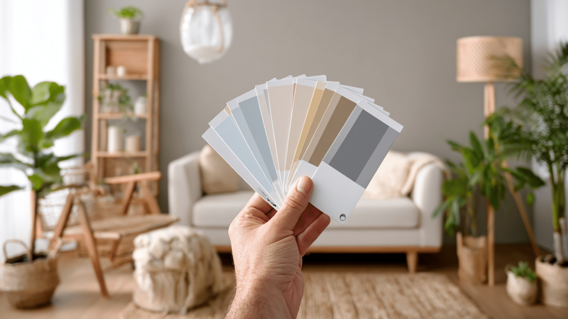
I get it, you pick a paint color that looks perfect in the store, but once it’s on your wall, it feels completely off. I’ve seen it happen countless times, and it’s one of the biggest reasons people dread repainting. The truth is, color isn’t just about the shade you like; it’s how light, undertones, and your décor work together. In this guide, I’ll walk you through how to choose paint colors the smart way, from testing samples and using color visualizers to understanding undertones and lighting. You’ll learn simple, practical steps that actually work in real homes. By the end, you’ll know how to pick colors that look beautiful in every light and truly reflect your style. Why Learning How To Choose Paint Colors Matters Choosing paint isn’t just about picking a color you like; it’s about understanding how light, space, and tone work together to shape how your home feels. When you know how to test paint under real lighting, you avoid costly mistakes and wasted gallons from the wrong shade. You also learn how to match color to a room’s purpose: soft, calming hues for bedrooms, brighter tones for kitchens, and warm neutrals for cozy living spaces. A thoughtful color plan ties your entire home together. Understanding undertones helps you prevent clashing with flooring or furniture, while knowing how colors flow from one room to the next keeps your space visually balanced. Plus, with paint visualizers, swatches, and color apps, you can preview your choices before you even open a can. Learning how to choose paint colors gives you confidence, saves time, and helps you create a home that truly feels like you. How To Choose Paint Colors It’s easier than you think to find paint colors that work with your décor, lighting, and personality when you follow these steps. Step 1: Start with the Big Elements First Don’t choose your wall color before picking furniture, rugs, curtains, and flooring. These larger pieces already define your room’s style and undertones. Once you’ve set those, finding a matching paint color becomes simple. A sofa, rug, or art piece can guide your palette naturally. It’s much easier to select one color from thousands of options that blend with what you already have than to redesign your décor around one wall color. Step 2: Understand Undertones and Color Temperature Every paint color carries subtle undertones that affect how it appears on your walls. Warm undertones come from red, orange, or yellow bases, while cool undertones lean toward blue, green, or gray. To see the true tone, place your paint swatch on a plain white sheet of paper and look closely at the color that stands out. Matching these undertones to your furniture and fabrics helps maintain flow and prevents clashing shades throughout your space. Step 3: Never Choose Paint Colors at the Store Store lighting can make paint colors appear completely different from how they’ll look in your home. Harsh fluorescent lights distort color and undertones. Instead, always test your colors at home, where your natural and artificial lighting will affect the tone differently. Paint a small sample section or use peel-and-stick swatches to see how your chosen shade behaves on your actual wall. It’s the only reliable way to avoid disappointment once the paint dries. Step 4: Use an Inspiration Piece as Your Guide If you feel overwhelmed, start with an item you already love, like a patterned rug, pillow, or piece of art. Pull your wall color and accents directly from that object’s existing palette. This ensures harmony between your décor and paint, making choosing wall colors much easier. Inspiration pieces naturally help you find complementary or contrasting tones that work together. It’s a designer trick that guarantees your room color combinations feel intentional and cohesive. Step 5: Test Paint Samples Before You Commit Large paint swatches or peel-and-stick samples are worth the effort. Place them on multiple walls and view them throughout the day, morning, afternoon, and evening. Lighting constantly shifts, and what looks soft beige in daylight might turn yellow under lamplight. Move your samples around and live with them for a few days before deciding. This simple test prevents costly mistakes and helps you choose a color you’ll truly love in all lighting conditions. Step 6: Keep Lighting Direction In Mind Lighting direction plays a major role in color appearance. South-facing rooms get warm light, so cooler tones like blue or gray add balance. North-facing rooms receive cooler light, so warmer shades, like cream or tan, keep them inviting. East and west-facing rooms shift throughout the day, allowing flexibility with both warm and cool hues. Understanding how light behaves in each space will make choosing wall colors more predictable and ensure every room feels just right. Watch this quick video to see how experts test and choose paint colors in real homes: Understand Room Mood, Function, and Undertones Every color influences how a room feels and how undertones shift under lighting. Use this guide to match color type, undertone, and purpose for a balanced home. Color Type & Undertone Best For How It Feels / What It Does Lighting Behavior Tips for Use Warm Colors & Undertones (Yellow, Terracotta, Beige, Soft Red) Living rooms, dining rooms, and kitchens Create warmth, energy, and a welcoming vibe, perfect for social spaces. Look richer and cozier under warm lighting; it may appear more intense in afternoon light. Use in rooms where you want comfort and connection. Pair with soft lighting or wood accents for balance. Cool Colors & Undertones (Blue, Green, Gray, Aqua) Bedrooms, offices, and bathrooms Calm the mind, reduce stress, and create a peaceful, airy mood. Appears crisp and soothing in natural daylight; can feel cooler under north-facing light. Great for restful areas. Balance with warm décor or white trim to avoid a cold look. Neutral Colors & Undertones (White, Cream, Taupe, Greige) Any room or transitional spaces Provide balance and flexibility, making décor and architecture stand out. Reflect surrounding light tones — can appear warmer near yellow bulbs or cooler near daylight. Ideal for trim, hallways, and open layouts. Add accent colors or textures to prevent flatness. Warm tones bring energy and comfort. Cool tones create calm and clarity. Neutrals keep everything balanced, but always test colors in your own lighting before committing. Build a Color Palette You Can Trust A thoughtful color palette helps your home feel connected, balanced, and visually calm from one room to the next. Use The 60/30/10 Rule for Balance: This classic design formula keeps colors visually balanced. Use your main color for about 60% of the room (like walls), a secondary color for 30% (like furniture or rugs), and an accent color for 10% (like pillows or artwork). This method ensures variety without visual clutter. Combine Colors Across Rooms For Flow: Choose colors with similar undertones to create harmony throughout your home. For example, soft warm neutrals or cool grays can easily connect open spaces. When your palette flows naturally, each room feels unified but still has its own personality. Add Accent Colors Without Clashing: Accent colors bring energy and personality, but they should complement your main tones. Use decor items, like throws, vases, or cushions, to introduce these accents. Keep them consistent across nearby spaces for a polished, balanced look that ties everything together. Pick the Right Paint Finish For Each Room Choosing the right paint finish matters just as much as the color itself. Each finish reflects light differently and affects durability, texture, and how easy your walls are to clean. Matte and eggshell finishes are ideal for most walls because they hide imperfections and create a soft, smooth look. They’re great for bedrooms, living rooms, and ceilings where you want a subtle finish without shine. For higher-traffic areas like kitchens, bathrooms, and hallways, satin or semi-gloss finishes work best. They resist moisture, handle frequent cleaning, and add a gentle sheen that brightens the space. Gloss finishes, though less common, can highlight trim, doors, and cabinetry, giving them a crisp, polished effect. Understanding how sheen interacts with light helps you choose finishes that not only look right but also stand up to everyday use. Visualize Paint Colors Before Painting Seeing colors in your own space before painting helps you avoid costly mistakes. Use digital tools, real samples, and mobile apps to compare shades and find the perfect match for your walls. 1. Try a Paint Color Visualizer Tool A paint color visualizer lets you preview different shades on your walls without lifting a brush. Top tools include Sherwin-Williams ColorSnap® Visualizer, Behr Paint Your Place®, Benjamin Moore Personal Color Viewer®, and HGTV Home Visualizer®. You can upload photos of your room or test colors on sample spaces provided within each tool. These programs show how undertones, lighting, and wall texture affect the final look. They’re perfect for comparing warm versus cool shades, trying accent walls, or experimenting with bold tones safely before you commit to gallons of paint. 2. Use Paint Sample Sheets and Peel-and-Stick Swatches Once you’ve narrowed your favorites, test them in real life. Use large paint sample sheets or peel-and-stick swatches from brands like Samplize or Benjamin Moore to see how colors truly appear under your lighting. Place samples on multiple walls, including areas near windows and corners, to check how shades shift between daylight and lamplight. This method works best in living rooms, bedrooms, and hallways, where lighting changes throughout the day. These large, movable samples reveal undertones that digital screens often hide, helping you make a confident choice before painting. 3. Test Paint Color Apps On Your Phone The best paint color apps make it easy to preview shades anytime, anywhere. Try Sherwin-Williams ColorSnap®, Behr Project Color®, or Benjamin Moore Color Portfolio®. Each app uses your camera to visualize paint colors directly on your walls or match hues from furniture, fabrics, and décor. Some even generate coordinating palettes automatically. These tools are great for quick color comparisons while shopping or browsing online. When paired with real-life swatches, paint apps make your color selection faster, smarter, and more accurate, so you can start painting with total confidence. Avoid These Common Paint Color Mistakes Even small mistakes can make the perfect color look wrong. Avoid these common errors to save time, money, and frustration. Choosing paint online without testing: Colors on screens rarely match real-life shades. Always test samples on your actual walls before painting. Ignoring undertones: Overlooking warm or cool undertones can make your paint clash with furniture, flooring, or décor. Forgetting trim or ceiling contrast: Trim and ceiling colors affect how your wall shade appears. Choose tones that complement each other. Testing directly on old paint: Old wall colors distort new paint tones. Use a white background when testing samples for accuracy. Rushing without daylight checks: View your samples in natural and artificial light. What looks right at night might feel different during the day. Summing Up I know choosing the right paint color can feel like a big decision, but now you’ve got the tools to do it confidently. You’ve learned how to choose paint colors that actually work in your lighting, match your furniture, and feel right for every room. So here’s what I’d suggest: grab a few sample swatches, test them on your walls, and live with them for a couple of days. You’ll be surprised how quickly the perfect one stands out. If this helped you feel more confident about your next project, I’d love for you to check out my other paint and home styling guides. The more you experiment, the closer you’ll get to colors that truly feel like you.
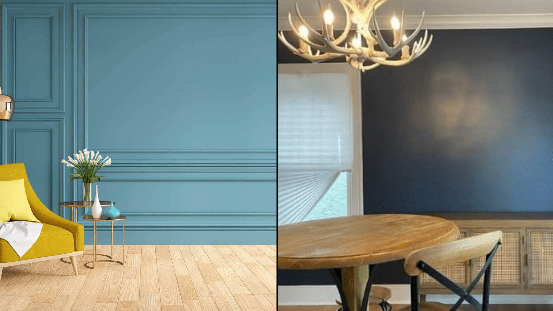
When I first started painting rooms in my home, I thought choosing the right color was the hardest part, until I learned how much the finish matters. The difference between flat vs satin paint isn’t just about shine. It changes how your walls handle light, how durable they are, and even how easy they are to clean. If you’ve ever wondered why one room looks soft and cozy while another feels brighter and livelier, it often comes down to the finish. Here, I’ll share what I’ve learned about how each sheen works, which spaces they suit best, and how to pick the right one so your paint looks great and lasts. Understanding Paint Finishes: Flat, Satin, Gloss, and More Paint finishes do more than change color; they shape how your walls look, feel, and perform over time. The finish, also called sheen, affects light reflection, durability, and how easy your walls are to clean. Flat paint gives a smooth, non-reflective look that hides flaws and creates a calm, even tone. Satin offers a soft glow that adds gentle light without being shiny. Semi-gloss and gloss finishes, on the other hand, reflect more light and resist moisture, making them great for kitchens, bathrooms, and trim. Many homeowners want to understand the differences between flat, satin, semi-gloss, and gloss before painting, because each one plays a key role in how a room feels, functions, and lasts. Quick Comparison of Paint Finishes: Finish Type Shine Level Durability Best For Flat No shine, fully matte Low Ceilings, bedrooms, low-traffic rooms Satin Soft, subtle glow High Hallways, kitchens, family rooms Semi-Gloss Noticeable sheen Very high Bathrooms, doors, trim Gloss Bright reflective shine Extremely high Cabinets, furniture, and accent walls Each finish has its own balance of beauty and function. Flat gives a soft look, while gloss delivers maximum shine and durability. Where to Use Flat Paint (and When Not To) Flat paint works best in calm, low-traffic spaces where walls don’t need frequent cleaning. It hides surface flaws but lacks durability. Best Rooms for Flat Paint Flat paint is ideal for spaces that don’t see heavy wear. It gives a soft, smooth look that hides imperfections and creates a calm, uniform finish. Because it absorbs light instead of reflecting it, it’s great for rooms where you want a relaxed, even appearance. Best places to use flat paint: Bedrooms: Creates a cozy, restful atmosphere while hiding minor wall flaws. Ceilings: Reduce glare and help surfaces look clean and even. Home offices: Keep the space professional-looking without distracting reflections. Formal dining rooms: Adds a muted finish perfect for low-use areas. Low-traffic hallways: Works well in spaces less prone to scuffs and fingerprints. Guest rooms: Offers a clean look that doesn’t need frequent touch-ups. Media or theater rooms: Absorbs light for a darker, glare-free viewing experience. Library or study areas: Provides a quiet, smooth backdrop ideal for focus and comfort. Flat paint gives each of these rooms a soft, classic appearance while minimizing visible flaws and surface inconsistencies. Pros and Cons of Flat Paint Flat paint offers a beautiful matte look but trades off durability for appearance. Pros Cons Hides wall flaws and patches easily Difficult to clean and prone to marks Gives a smooth, modern appearance It can fade faster with frequent scrubbing Ideal for ceilings and low-use rooms Not suitable for kitchens or bathrooms Flat paint is great for aesthetics but requires mindful placement. Use it where walls stay dry and untouched. Maintenance and Touch-Up Tips Flat paint requires gentle care to preserve its finish. Use mild methods and avoid harsh scrubbing to prevent visible marks. Dust regularly: Use a soft microfiber cloth or dry mop. Spot clean carefully: Gently dab stains using mild soap and water. Avoid excess moisture: Prevent bubbling or peeling on older paint. Touch up often: Flat paint blends easily when repainting small spots. Use quality paint: Higher-grade options resist fading and last longer. Regular light maintenance helps keep flat walls looking even and fresh without frequent full repaints. Where to Use Satin Paint (and When to Avoid It) Satin paint is a go-to choice for busy spaces that need regular cleaning. It has a soft, velvety sheen that resists moisture and wear, making it a versatile option for most homes. However, it highlights wall imperfections more than flat finishes, so surface prep is important before painting. Best Rooms for Satin Paint Satin paint offers durability and a gentle shine, making it perfect for high-traffic or humid areas. It’s easy to wipe clean, which keeps walls looking fresh longer. Best places to use satin paint: Kitchens: Handles grease, stains, and cleaning with ease. Bathrooms: Moisture-resistant surface prevents peeling or bubbling. Hallways: Withstands frequent contact from hands or furniture. Kids’ rooms: Durable enough for scuffs, crayons, and frequent cleaning. Laundry rooms: Resists humidity and cleans up easily after spills. Entryways: Keep up with dirt and movement from daily use. Family rooms: Add light reflection while staying easy to maintain. Trim and moldings: Provides a smooth, wipeable finish that looks neat and crisp. Satin paint fits anywhere you need both beauty and practicality, offering long-lasting protection with simple upkeep. Pros and Cons of Satin Paint Satin paint balances durability and style but needs careful application to avoid visible brush or roller marks. Pros Cons Easy to clean and moisture-resistant Highlights wall imperfections easily Durable enough for high-traffic areas May show roller or brush strokes Adds a gentle sheen without being glossy Needs extra prep for a smooth result Works well on walls, trim, and wood Slightly more expensive than flat paint Satin paint gives you durability and a polished appearance, but smooth wall prep and even coating are key for the best outcome. Cleaning and Touch-Up Tips Satin paint is designed for easy maintenance, but it still requires the right cleaning approach to preserve its soft sheen and finish. Use mild soap and water: Gently clean spots using a soft sponge. Avoid abrasive cleaners: Harsh chemicals can dull the sheen. Wipe regularly: Prevent buildup of dust and grime for consistent color. Touch up carefully: Use light coats and the same roller texture to blend seamlessly. Dry immediately: Always wipe away moisture to prevent streaks or spotting. Proper care keeps satin walls looking bright and smooth while protecting their durability for years. Flat vs. Satin Paint: Key Differences Explained Flat and satin paints differ in how they look, feel, and perform over time. Each offers unique benefits depending on your room’s needs and maintenance level. Feature Flat Paint Satin Paint Finish Look Matte and non-reflective Soft, velvety sheen Durability Low — can mark or scuff easily High — resists wear and cleaning Cleaning Ease Hard to clean, needs gentle care Easy to wipe with mild soap and water Moisture Resistance Absorbs moisture, not ideal for humid rooms Moisture-resistant, suitable for bathrooms or kitchens Best For Ceilings, bedrooms, low-traffic spaces Hallways, kitchens, bathrooms, trim Wall Imperfections Hides flaws and uneven textures Highlights the wall texture and marks Appearance in Light Looks even and smooth under all lighting Reflects light slightly, adds depth Cost Slightly cheaper Moderately priced Flat paint works best for calm, low-traffic rooms, while satin is ideal for busy, easy-to-clean spaces. Both have unique strengths that suit different home areas. How Sheen Changes Color Depth and Wall Texture Sheen affects not only the light reflection but also how color and texture appear on your walls. A higher sheen, like satin, makes colors look richer and slightly darker because it reflects more light. In contrast, flat paint absorbs light, softening the color and giving it a more muted appearance. This means the same shade can look noticeably different depending on the finish you choose. Satin finishes also highlight wall texture, such as brush strokes or small dents, while flat paint helps mask these details for a smoother surface. Example: A medium gray in satin may appear deeper and slightly glossier in daylight, while the same gray in flat paint will look lighter and softer, giving a more uniform, velvety look. Choosing the right sheen ensures your walls show the color and texture you actually want. How Lighting Affects Flat and Satin Finishes Lighting plays a major role in how paint finishes appear on your walls. Both natural and artificial light can change how sheen, color, and texture look throughout the day. Natural light: Sunlight improves reflection, making satin paint appear glossier and brighter. Flat paint, however, stays consistent because it absorbs light rather than reflecting it. Rooms with large windows or bright daylight will show more sheen on satin walls and a softer tone on flat ones. Artificial light: Overhead lights or lamps create focused highlights that can make satin finishes appear shinier. Flat paint diffuses light evenly, reducing glare and keeping colors uniform, even under strong lighting. Example: In a sunlit living room, satin paint adds a gentle glow and depth to walls, while in a dim hallway, flat paint maintains a calm, even finish that hides imperfections effectively. Pro Tip: Under warm lighting, satin paint improves golden tones and can appear slightly glossier. Flat paint stays even and soft, especially under cool LED light. Durability and Moisture Resistance When comparing flat and satin paint, think beyond appearance. Factors like durability and moisture resistance determine how well each finish holds up over time. Flat paint absorbs moisture easily, making it prone to marks and mildew in humid areas such as bathrooms or laundry rooms. It’s less durable but works well in low-traffic, dry spaces like bedrooms or ceilings. Satin paint, on the other hand, resists moisture, stains, and scuffs. Its tougher surface makes it ideal for kitchens, hallways, and kids’ rooms. If you want walls that stay bright and clean with regular use, satin offers better long-term protection than flat finishes. Cost, Lifespan, and Long-Term Maintenance Value Before you decide between flat and satin paint, it helps to look at the overall cost, lifespan, and upkeep each finish requires. Flat paint has a lower upfront cost, usually $25–$40 per gallon, but it needs frequent touch-ups every few years. Satin paint costs a bit more, around $30–$50 per gallon, but it lasts longer and requires less maintenance. Feature Flat Paint Satin Paint Average Cost (per gallon) $25–$40 $30–$50 Repaint Frequency Every 3–5 years Every 5–8 years Maintenance Effort Needs frequent touch-ups Easy to clean, fewer repaints Long-Term Value Lower upfront, higher upkeep Higher upfront, lasts longer Satin paint may cost more initially, but it’s more durable, cost-effective, and easier to maintain in the long run. Professional Painter Shares Real Insights In this YouTube video, professional painter [Paint’s Life TV] breaks down how different paint sheens perform on ceilings, walls, and trim. He explains why flat paint works best for ceilings, it hides imperfections and prevents harsh glare, while satin is ideal for walls due to its easy-clean surface and subtle shine. He also shares his go-to Sherwin-Williams products like Eminence for ceilings and Solo for trim, based on years of on-site experience. His practical tips make sheen selection easier for both homeowners and DIY painters. Common Mistakes to Avoid When Choosing a Paint Finish Choosing the wrong sheen can make even high-quality paint look uneven or wear out quickly. Avoid these common paint finish mistakes: Using flat paint in high-traffic rooms: It scuffs easily and is difficult to clean, making it unsuitable for busy spaces like kitchens or hallways. Using satin paint on uneven walls: Its reflective surface highlights dents, scratches, and patches that flat paint would normally hide. Ignoring lighting direction: Light can exaggerate sheen; satin looks glossier in bright sunlight, while flat appears duller under direct light. Skipping wall prep: Uneven sanding or leftover dust causes inconsistent sheen and visible streaks. Mixing finishes in one area: Combining sheens on the same wall creates patchy, mismatched results. Careful planning prevents costly repainting and ensures a consistent, smooth finish throughout your space. Conclusion Now you know how much a paint’s finish can change the look and feel of your space. Flat paint gives you a calm, soft surface that hides flaws, while satin adds a bit more life, shine, and easy cleaning power. The right choice depends on how you live, not just how you want the walls to look. If you’re still torn between flat vs. satin paint, test both on a small wall section and see how they react to your lighting. You’ll spot the difference right away. Which finish do you think fits your home best? Take a look at my other home painting blogs to learn more simple tips before starting your next project.
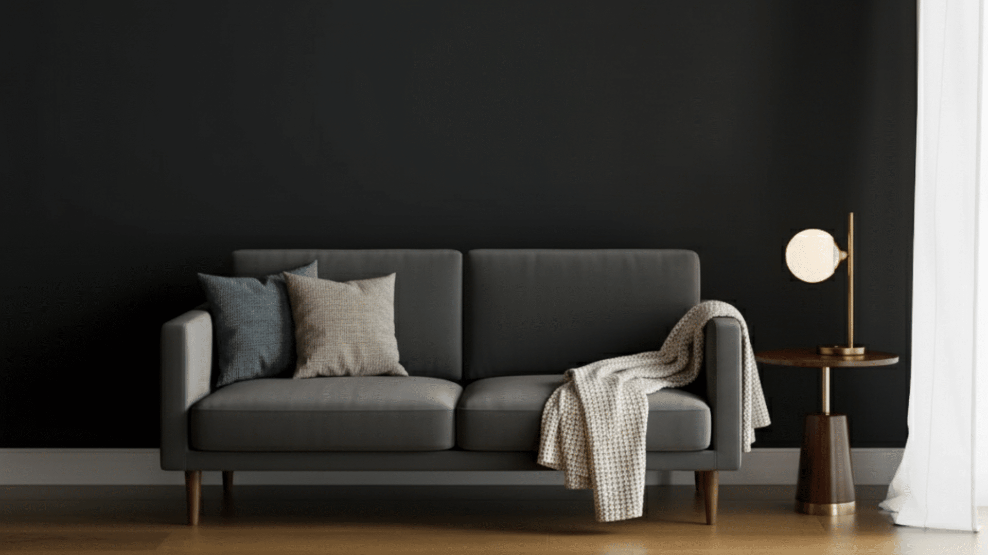
SW Greenblack SW 6994 is a deep near-black paint with a subtle green undertone and an LRV of 4, making it one of the darkest colors in the Sherwin-Williams range. Its cool, balanced tone works on walls, cabinets, and exteriors, adding rich depth without feeling flat or harsh. If you’ve been thinking about trying a dark paint color that feels rich but not overpowering, Sherwin-Williams Greenblack (SW 6994) is worth a look. It’s a deep shade with a touch of green that gives it balance and softness, making it easy to use in different parts of your home, similar to how Rosemary SW 6187 brings a softer green tone into interiors. I’ve used this color in spaces that needed more contrast, and it always adds just the right amount of depth. In this guide, you’ll learn how Greenblack behaves under different lighting, the best finishes for every room, and smart color pairings that work beautifully. You’ll also find practical tips and common mistakes to avoid when using this bold shade in your next project. Understanding Sherwin-Williams Greenblack (SW 6994) Sherwin-Williams Greenblack is a deep, dramatic paint color that balances black with a subtle green tone. It’s not a true black, but rather a cool neutral that adds depth without feeling flat or harsh. The green undertone gives it a quiet richness that makes it work well in both modern and classic spaces. Unlike pure black shades, Greenblack carries a softer edge, creating dimension and warmth instead of absorbing all light. It fits beautifully within the Sherwin-Williams neutral palette, offering a darker option for those who want contrast but still prefer a natural, grounded color. It is used on walls, cabinets, or exteriors. This shade holds its form and complements a wide range of other colors. Pairing it with tones like Indigo Batik SW 7602 can create a deeper, layered look without losing balance. Color Details: Spec Value HEX #373A3A RGB 55 / 58 / 58 LRV 4 Undertones Subtle green, cool charcoal Best rooms Exteriors, cabinets, feature walls, bedrooms Finish options Matte, Satin, Semi-gloss Paint line Sherwin-Williams Emerald / Duration Greenblack Undertones and Lighting Effects Lighting changes how Sherwin-Williams Greenblack appears, shaping its depth and overall mood. Its green undertone shifts subtly depending on whether the space has natural or artificial light. In Natural Light Natural light improves the soft green undertone in Greenblack, especially during daytime hours. In bright, open rooms, it feels balanced and bold without overpowering the space. North-facing rooms: In north-facing rooms, natural light is cooler and softer. Greenblack will look deeper here, with more of its charcoal-green tone coming through. It gives the space a moody, dramatic feel that works beautifully for offices or accent walls. South-facing rooms: South-facing rooms receive warm, golden light most of the day. That warmth softens the green tint, making Greenblack feel more neutral and balanced. It keeps its depth but appears smoother and slightly lighter in strong daylight. East-facing rooms: Morning light is bright and cool in east-facing spaces. Early in the day, Greenblack can look darker and sharper, while by noon, it settles into a classic near-black with subtle green depth. West-facing rooms: Afternoon and evening sunlight from the west brings out warmth in the tone. Greenblack appears softer and slightly richer here, giving rooms a cozy yet sophisticated look as the day ends. In Artificial Light Artificial lighting changes how Greenblack feels after sunset. Under warm bulbs, it takes on a smoky charcoal look, with the green undertone fading into the background. Cool LED or daylight bulbs, on the other hand, highlight the green tint, giving the color a crisp and modern edge. In rooms with mostly south-facing windows, using layered lighting helps balance the shift between day and night. Combine overhead fixtures with lamps or sconces to keep Greenblack looking deep but not overly heavy. This keeps your space comfortable and consistent through every hour of the day. Choosing the Right Finish The finish you choose for Sherwin-Williams Greenblack makes a noticeable difference in both appearance and performance. While the color itself is rich and dramatic, its look can shift depending on how much sheen you use. Glossier finishes reflect more light, which can make Greenblack appear slightly lighter, while flatter finishes absorb light and create a deeper, more velvety look. Matte finishes help hide surface imperfections and are ideal for walls, giving a smooth, even appearance. Satin finishes add a gentle sheen, making them a great choice for trim, doors, or areas that need light reflection without glare. Semi-gloss finishes are more reflective and durable, perfect for cabinets, furniture, or high-use spaces where easy cleaning is important. Greenblack in Different Spaces Greenblack adapts beautifully to different areas of the home, offering versatility and depth when paired with the right finish and surface prep. 1. Living Room In a living room, Greenblack makes a bold statement on a single feature wall or fireplace surround. It brings depth and contrast, especially when combined with lighter furnishings and soft textiles. A satin finish works best here; it’s easy to clean yet maintains a smooth, velvety look. Pair the color with light wood floors, warm lighting, and textured fabrics to keep the space inviting. This setup lets you enjoy the dramatic tone of Greenblack without making the room feel overly dark or heavy. 2. Bedroom Greenblack creates a calm, grounded mood in bedrooms. Use it on the wall behind your bed for a subtle yet striking backdrop. The matte finish softens the color, reducing glare and adding a cozy feel that promotes rest. Pair it with neutral bedding, soft lighting, and light-toned furniture to balance the darker hue. Proper surface prep is key; smooth walls and primer ensure even coverage and a refined finish. Greenblack works especially well in rooms with natural light, where it adds depth without feeling too intense. 3. Kitchen and Cabinets In kitchens, Greenblack shines on lower cabinets, kitchen islands, or open shelving. It gives a sleek, refined appearance that pairs well with light countertops and metallic accents. A semi-gloss finish is ideal because it’s durable and easy to wipe down. When prepping cabinets, make sure to sand and prime surfaces to help the color bond evenly. Greenblack pairs beautifully with brushed brass, stainless steel, or matte black hardware, allowing you to mix styles while keeping the look modern and polished. 4. Exterior Greenblack makes a strong impression on exteriors, whether used for the entire facade or just a front door. Its cool tone holds up beautifully in natural light, offering a clean yet bold presence. Pair it with crisp white or natural wood trim for a classic balance. It also works well in bold exterior paint color combinations for a high-contrast look. For durability, use an exterior-grade satin or semi-gloss finish to withstand sun and moisture. Always clean and prime surfaces before painting to ensure long-lasting coverage. The result is a classic, confident look that stands out without feeling too stark. Coordinating and Complementary Colors Pairing Greenblack with the right colors helps balance its depth and create harmony between walls, trim, and accent details throughout your space. Best Whites to Pair With Greenblack As a color consultant, I recommend starting with cool whites when pairing with Greenblack, they sharpen its green undertone and create a crisp, modern contrast. Whites like Snowbound (SW 7004) and Extra White (SW 7006) make Greenblack stand out beautifully. Use cool whites when you want a crisp, modern contrast that feels fresh and defined. Warm whites, on the other hand, soften the color’s dramatic edge and add a touch of coziness. For trim and ceilings, stick to a bright, clean white to prevent the space from feeling too heavy. In rooms with natural light, cool whites highlight Greenblack’s green undertone, while warm whites help tone it down and create a balanced, welcoming finish. Accent Colors for Contrast Greenblack works well with both bold and subtle accents. A pop of Rave Red (SW 6608) brings energy and depth, while cooler grays or slate tones create a refined contrast. If you prefer a moody palette, pair Greenblack with deep teal or navy accents for added interest. Metallic finishes like brushed gold or matte black hardware also work beautifully, providing balance without overwhelming the color. Keep accent tones minimal so Greenblack remains the focal point of the design, giving your room a strong yet grounded look. Complementary Neutrals For a softer, layered effect, pair Greenblack with muted neutrals such as taupe, greige, or off-white. These shades help lighten the overall palette while keeping the space cohesive. Greige walls with Greenblack trim, for example, create depth without harsh contrast. In open layouts, complementary neutrals allow Greenblack to blend naturally with adjoining rooms. If you prefer subtle warmth, choose a beige-based neutral; for cooler interiors, opt for a soft gray. These pairings keep Greenblack looking rich and classic, offering flexibility for furniture and décor choices. How Greenblack Compares to Similar Colors Comparing Sherwin-Williams Greenblack with other dark tones helps you see how undertones, depth, and warmth influence its look and ideal use. Shade Tone Best Use Warm/Cool LRV Notes Greenblack SW 6994 Deep charcoal, green undertone Exteriors, cabinets, feature walls Cool 4 Balanced near-black with subtle green tint BM Wrought Iron 2124-10 Deep charcoal, blue undertone Exteriors, front doors, cabinets Cool 6 Slightly lighter; blue rather than green undertone Iron Ore SW 7069 Dark gray-black Interior walls, trim, and built-ins Warm-neutral 6 Softer and warmer; no green tint Tricorn Black SW 6258 True jet black Doors, exteriors, accents Neutral 3 Pure black, no visible undertones Black Magic SW 6991 Black, warm brown undertone Cabinets, bedrooms, moody spaces Warm 3 Cozier and more traditional feel Greenblack sits between these shades in tone and versatility. If you’re also considering Benjamin Moore Soot, it’s one of the most common alternatives readers compare side by side. Each color has its own mood. Greenblack leans balanced and adaptable, making it ideal for homeowners who want depth without losing softness or visual comfort. Tips for Using Dark Paints Like Greenblack Using dark paint shades can feel tricky, but the right techniques make them look refined, balanced, and easy to live with. Test Before Painting: Always sample Greenblack on multiple walls. Check it in daylight and artificial light to see how the undertone shifts. Prep the Surface: Smooth, clean walls give dark paint a flawless finish. Use primer to prevent uneven absorption or patchy coverage. Use Quality Tools: High-quality rollers and brushes ensure even color distribution and fewer streaks, especially with rich tones like Greenblack. Add Contrast: Balance the darkness with light trim, neutral décor, or soft furnishings to keep the room open and inviting. Layer Lighting: Combine ceiling, wall, and table lighting. Dark shades absorb more light, so layered lighting helps maintain depth and comfort. Mind the Finish: Choose satin or semi-gloss in high-traffic areas for easier cleaning, and matte for walls where softness matters most. Where to Get Sherwin-Williams Greenblack You can buy Sherwin-Williams Greenblack (SW 6994) at any Sherwin-Williams retail location or directly from the official website at www.sherwin-williams.com. The color is available in both interior and exterior formulas, giving you flexibility for any project. Choose from matte, satin, or semi-gloss finishes depending on where you plan to use it. For easy testing, order a Samplize peel-and-stick sample online. It shows the real color on your wall without leaving marks, helping you see how Greenblack looks in your lighting before purchasing the full-size paint. Common Mistakes When Using Greenblack 1. Skipping Surface Preparation: Greenblack is a deep color that highlights imperfections. If walls aren’t properly cleaned, sanded, and primed, small flaws or patchy areas will stand out once the paint dries. 2. Using the Wrong Finish: Choosing the wrong sheen can change the entire look. Flat finishes can make Greenblack appear dull and show scuffs easily, while high gloss can feel too reflective. Satin or semi-gloss works best for balance and durability. 3. Ignoring Lighting Conditions: Lighting heavily affects how Greenblack reads. Without testing samples in both daylight and artificial light, you may end up with a tone that feels colder or darker than expected. 4. Painting Too Many Walls Dark: Covering every wall in Greenblack can make small rooms feel enclosed. It works best on accent walls, cabinetry, or paired with lighter neutrals to maintain visual balance. 5. Neglecting Trim and Ceiling Contrast: Using Greenblack without contrasting trim or ceiling colors can make a space feel flat. Pair it with crisp whites or soft neutrals to define edges and keep the look refined. 6. Rushing Between Coats: Deep colors like Greenblack need full drying time between coats. Rushing can cause streaks, uneven coverage, or a blotchy finish that’s hard to fix later. 7. Using Poor-Quality Tools: Low-quality rollers or brushes can leave marks, especially with dark paint. Always use premium, lint-free rollers and angled brushes for smooth, even application. Conclusion Sherwin-Williams Greenblack (SW 6994) stands out as a dark color that feels strong yet inviting. It adds style, depth, and balance when paired with the right lighting and finishes. You now know how its undertones shift, what colors complement it, and how to apply it in different spaces. Testing a sample first helps you see how it behaves in your home’s light before painting larger areas. This shade brings contrast without feeling too heavy, making it perfect for walls, cabinets, or exteriors. If you found this helpful, take a look at my other paint color guides for more simple and practical home design ideas. Frequently Asked Questions Is SW Greenblack black or green? Greenblack reads as a very deep green with strong black undertones. In most lighting, it appears nearly black, but subtle green notes show in brighter or natural light. What is the LRV of Greenblack? Greenblack has a low Light Reflectance Value of around 4. This means it absorbs most light, making it a very dark color that adds depth and contrast. Is Greenblack good for exteriors? Greenblack works well for exteriors, especially for modern or classic looks. It pairs nicely with stone, brick, and wood, and holds up well in varying light conditions. What colors go with Greenblack? Greenblack pairs well with warm whites, soft beiges, muted golds, natural wood tones, and brushed metals. It also complements earthy greens and subtle grays for a cohesive palette. Is Greenblack the same as black? Greenblack is not the same as black. It looks similar at first glance, but has a green undertone that adds softness and dimension compared to a flat, pure black.
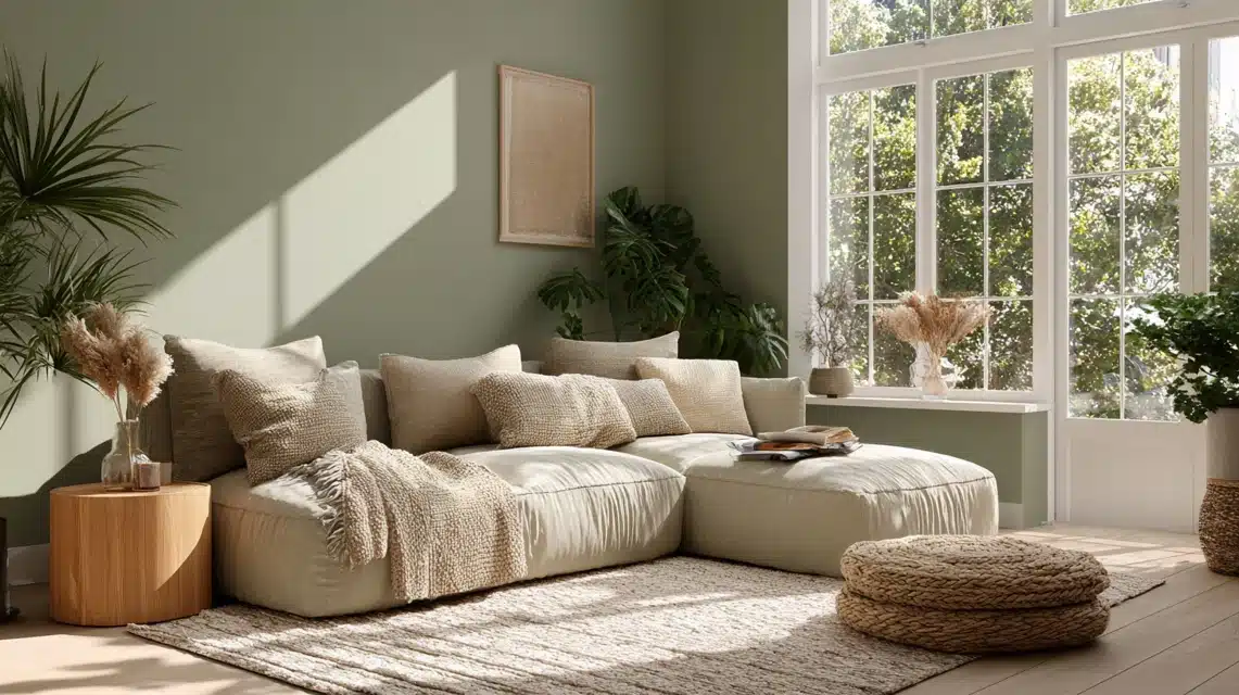
If you’ve been searching for a paint color that feels calm, natural, and easy on the eyes, sage green paint might be what you need. It brings just the right mix of warmth and freshness, working well in both bright and shaded rooms. Many homeowners love it because it blends smoothly with most styles, modern, rustic, or traditional. Here, you’ll find the most popular sage green options from trusted brands like Sherwin-Williams, Behr, Benjamin Moore, and Little Greene. You’ll also learn how lighting, undertones, and finishes can change the look of this shade. By the time you’re done reading, you’ll know exactly which tone fits your space best and how to make it shine in your home. Understanding Sage Green Paint Sage green is a mix of gray and green that feels soft and natural. It’s not too dark or too light, making it a calm middle ground for any room. The gray tones keep it muted, while the green adds a hint of freshness. Some shades lean warmer with beige or yellow tones, while others feel cooler with more gray or blue mixed in. That’s what gives sage green its flexibility; it works in modern, classic, and rustic homes alike. Its quiet color helps rooms feel peaceful without looking dull or flat. You’ll also notice that each paint brand has its own take on sage green, from pale and airy to rich and earthy. Up next, you’ll see how different paint companies create their own versions of this popular shade. The Best Sage Green Paint Colors by Brand Finding the right sage green shade starts with knowing which paint brand best matches your style, lighting, and room purpose. 1. Sherwin-Williams Sage Green Shades Sherwin-Williams provides a range of sage tones that work well in almost any interior. These shades offer versatility, blending smoothly with whites, creams, and soft neutral tones to create a peaceful, balanced atmosphere. If you want a cozy living room, calm bedroom, or inviting kitchen, Sherwin-Williams has options that adapt to different spaces and lighting conditions. Their sage greens allow you to create rooms that feel relaxing yet stylish, complementing wood accents, natural textures, and minimalistic designs. Each shade brings its own character while maintaining a soothing and harmonious vibe throughout your home. Clary Sage SW 6178: Soft gray undertones, perfect for living rooms. Softened Green SW 6177: Muted tone, ideal for bedrooms or entryways. Svelte Sage SW 6164: Warm beige tint, excellent for kitchens. Halcyon Green SW 6213: Blue-gray lean, creates a relaxed, airy atmosphere. 2. Behr Sage Green Paints Behr’s sage green collection highlights earthy and approachable tones, making them suitable for both interior and exterior applications. These colors are versatile and adapt beautifully to different lighting conditions, offering spaces that feel calm, modern, and welcoming. If you want to refresh your kitchen cabinets, living room walls, or even outdoor areas, Behr’s sage tones can create a sense of comfort and natural balance. These shades provide a gentle backdrop that pairs well with warm accents, neutral furnishings, or metallic decor. Behr paints are also easy to apply, ensuring a smooth, consistent finish for a professional look in any room. ICC-77 Sage Green: Neutral tone that anchors open spaces. Nature’s Gift N410-4: Warm undertones, pairs beautifully with gold or brass. Laurel Tree S390-5: Deep olive undertones, ideal for cabinets. Silver Marlin N360-2: Cooler hue, perfect for bathrooms or north-facing rooms. 3. Benjamin Moore Sage Greens Benjamin Moore’s sage palette is prized for its soft, airy tones that create tranquil and adaptable spaces. Each shade offers a unique balance of calm and warmth, perfect for bedrooms, hallways, or open living areas. The palette allows for flexibility in decorating, working well with natural woods, neutral furnishings, or minimalistic designs. If you prefer a botanical green or a muted gray-green, Benjamin Moore provides tones that enhance relaxation, focus, and comfort. Their sage shades help create serene environments that feel inviting, peaceful, and visually cohesive, making them ideal for homes that need a quiet and adaptable color foundation. October Mist 1495: Light botanical green, perfect for open spaces Saybrook Sage HC-114: Warmth and depth, ideal for bedrooms and hallways Healing Aloe 1562: Gentle gray undertone, great for bathrooms or minimalistic designs Camouflage 2143-40: Between green and beige, versatile for classic and modern décor 4. Little Greene Sage Greens Little Greene’s sage palette is loved for its classic depth and heritage-inspired charm. The soft gray-green base works well in living rooms, studies, or bedrooms, creating calm, grounded spaces. Little Greene’s shades complement both traditional and contemporary furnishings, as well as natural wood tones. The colors adapt beautifully to different lighting conditions, making rooms feel serene throughout the day. Sage Green from Little Greene allows you to craft spaces that feel inviting and sophisticated without overpowering the décor. Its versatility ensures that it blends seamlessly with other neutral or soft hues, providing a classic and refined foundation for your home interiors. Sage Green: Soft gray-green base, perfect for creating calm, versatile spaces Brand-to-Brand Comparison Table Here’s a quick reference to help you compare undertones, finishes, and best uses before selecting your paint. Brand Shade Undertone LRV Best For Finish Sherwin-Williams Clary Sage Warm gray-green 41 Living rooms Satin Behr ICC-77 Neutral green-gray 43 Exterior Semi-gloss Benjamin Moore Saybrook Sage Warm earthy 44 Bedrooms Matte Little Greene Sage Green Cool green-gray 46 Kitchens Eggshell Use this chart as a quick comparison before sampling; each option shines differently based on room lighting and surface type. Choosing the Right Shade for Each Room The right sage green shade depends on the lighting, the room’s purpose, and how you want the space to feel overall. 1. Living Room Choose a mid-tone sage like Clary Sage or Saybrook Sage to create warmth and balance. These tones pair beautifully with white trim, soft beige furniture, and wood accents. If your living room gets natural sunlight, it’ll appear lighter and more refreshing. In dim lighting, the subtle gray undertones add depth and coziness, keeping the room calm and inviting for daily use. 2. Bedroom Opt for muted shades such as Healing Aloe or Softened Green for a peaceful, relaxing feel. Their gentle gray undertones make them soothing under low light, perfect for restful evenings. Pair with warm neutrals, textured linens, and natural fabrics to keep the space calm. These colors also blend easily with light wood or white furniture, creating a cozy, spa-like atmosphere in your bedroom. 3. Kitchen & Cabinets For kitchens, go with warmer sage tones like Laurel Tree or Svelte Sage. They add color while still feeling neutral and balanced. These greens complement brass or matte black hardware and look great with white or natural wood cabinetry. In daylight, they appear fresh and clean; under warm light, they gain richness and warmth. Perfect for bringing a soft, organic feel into the heart of your home. 4. Bathroom Light, airy shades such as Silver Marlin or October Mist are ideal for bathrooms. These hues reflect light beautifully, helping small or low-lit rooms feel larger. The gray-green undertones give a crisp, fresh look while maintaining a soft, spa-like vibe. Pair them with white tile, brushed nickel finishes, or pale wood details for a refreshing, calming retreat. 5. Exterior & Front Door Darker sage greens like ICC-77 Sage Green or Mizzle look striking on exteriors and front doors. They complement brick, stone, and neutral siding beautifully. These tones stay soft yet grounded outdoors, adapting well to natural light changes throughout the day. Add white or black trim for contrast, and you’ll get a classic, welcoming appearance that fits both modern and traditional homes. How Undertones and Lighting Affect Sage Green Sage green is one of those colors that completely changes depending on its undertone, lighting source, and the room’s direction. Understanding these factors before painting helps you get the exact look you want. Undertones make the biggest difference. Warm sage greens, like Clary Sage or Laurel Tree, have soft yellow or beige bases that create a relaxed, earthy feel, while tones like healing aloe review lean more toward a gentle gray-green balance. Cool sage greens, such as Silver Marlin or Mizzle, contain gray or blue hints that make spaces feel crisp and refreshing. Natural daylight changes how sage appears throughout the day. Morning light brings out its freshness, making it look lighter and cleaner. Afternoon sunlight adds richness and warmth, deepening the green. Cloudy days often highlight the gray undertones, giving a calm, muted look. Artificial lighting shifts the scene in another way. Warm bulbs (soft white or yellow) enhance its cozy, olive side, while cool LEDs emphasize gray or blue notes. Room direction influences light quality, too. North-facing rooms receive cooler, softer light, making sage appear slightly gray or shadowed. South-facing rooms get strong, warm light, bringing out yellow-green depth. East-facing rooms have bright, clear morning light and dimmer afternoons, keeping sage fresh early in the day. West-facing rooms glow golden by evening, giving sage a warmer, richer tone. Testing large paint swatches on multiple walls at different times of day is the best way to see your true shade before committing. How Different Finishes and Paint Types Change Sage Green The finish and paint type you choose can completely alter how sage green looks and feels in your space. Matte finishes create a soft, velvety surface that absorbs light, making sage green appear deeper and smoother. This option is ideal for bedrooms or living rooms where you want a cozy, calm atmosphere. Eggshell has a slight sheen that reflects a touch of light, helping sage green colors look cleaner and brighter without becoming glossy. It’s great for high-traffic areas like hallways or dining rooms. Satin finishes add more reflection, giving sage green a lively, polished appearance. Kitchens and bathrooms benefit from satin because it’s easier to clean and resists moisture. Semi-gloss highlights details like trim, doors, or cabinets, emphasizing contrast between walls and woodwork. Chalk paint offers a flat, rustic texture, perfect for furniture or accent pieces when you want a soft, natural look. Proper application, using even coats, quality brushes, and testing in good lighting, ensures the color appears true to your vision. Colors That Go With Sage Green Sage green pairs beautifully with a mix of warm neutrals and subtle accents, creating a balanced and natural color palette. Color Type Complementary Shades Best Use Effect on Space Neutral Tones White, Cream, Beige, Taupe Walls, trim, and large surfaces Keeps the look fresh and balanced Warm Accents Terracotta, Rust, Blush Decor, textiles, pottery Adds warmth and contrast without overpowering Cool Accents Navy, Charcoal, Slate Gray Cabinets, furniture, or statement walls Brings sophistication and grounding balance Natural Textures Light Wood, Rattan, Woven Fibers Furniture and accessories Complements sage’s earthy tone and softens the look Metal Finishes Brass, Black, Bronze Lighting, hardware, and decor Creates depth and a polished, cohesive style Use these combinations to build calm, coordinated spaces that highlight sage green’s subtle and versatile beauty. Choosing Sage Green Based on Climate and Light The way sage green appears can vary depending on where you live and the natural light your home receives. In warm climates, strong sunlight can make colors appear lighter and more vibrant. Cooler sage tones with gray or blue undertones, like Mizzle or Silver Marlin, help balance brightness and create a refreshing feel. These shades keep interiors from feeling overly warm or yellow in direct sun. In cool or cloudy climates, sunlight is softer and less intense. Warmer sage greens, such as Clary Sage or Laurel Tree, add cozy warmth and prevent rooms from feeling cold or flat. If your home faces heavy shade or indirect light, test paint samples first; cooler shades can turn gray, while warmer tones stay rich and inviting. How to Maintain Sage Green Walls and Choose Quality Paint Keeping sage green paint looking fresh and consistent requires good-quality products and simple care habits. Here’s what matters most: Choose durable paint formulas: Go for premium brands such as Sherwin-Williams, Behr, or Benjamin Moore. Their paints have stronger coverage, resist fading, and handle frequent cleaning better than budget lines. Pick washable or scrubbable finishes: In busy spaces like hallways, kitchens, or bathrooms, choose paints labeled washable or scrubbable to prevent dull spots from regular wiping. Use low-VOC or zero-VOC paints: These options release fewer chemicals, making them safer for indoor air, perfect for homes with children, pets, or allergies. Maintain regularly: Dust walls occasionally, wipe gently with mild soap and water, and touch up small marks quickly to keep the color rich and smooth. Avoid harsh cleaners: Bleach or abrasive sponges can strip paint sheen or leave uneven patches over time. Conclusion Sage green paint is one of those rare colors that stays beautiful no matter where it’s used. From soft gray-greens to warmer, earthy tones, there’s a version for every style and mood. Once you understand how light, direction, and finish affect the final result, it becomes much easier to pick the right one. Now that you’ve seen the top shades and how they perform, you can confidently choose the one that fits your home’s lighting and personality. Try a few samples before painting, and see how they shift throughout the day. When you’re ready for more simple color ideas, check out my other paint guides for practical tips that actually help you decide.
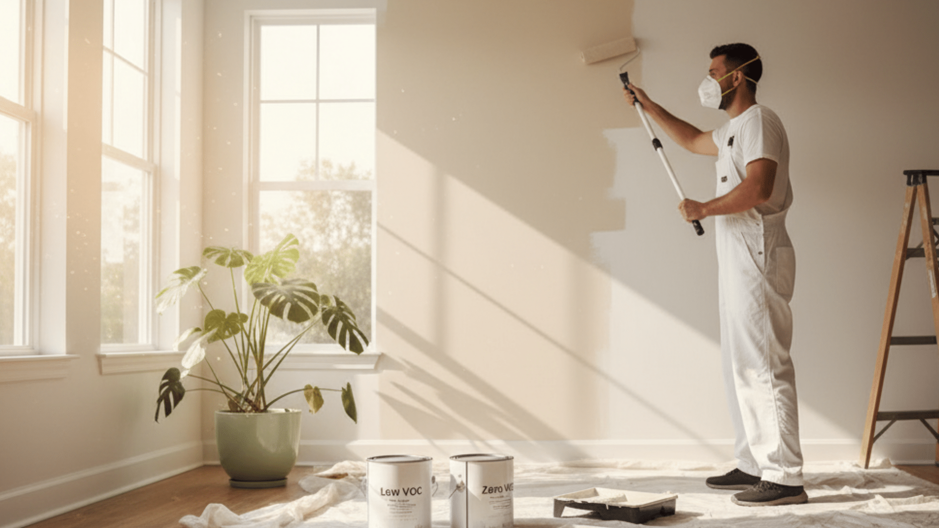
I still remember opening a new can of paint and being hit by that strong chemical smell. At the time, I had no idea those fumes came from VOCs. If you’ve ever wondered what VOCs are in paint, they’re gases that escape as paint dries. These gases, known as Volatile Organic Compounds, can stay in your home’s air for days or even weeks. You’ve probably smelled that same “fresh paint” scent after painting a room. What you might not realize is that VOCs can affect your air quality and cause mild irritation or headaches. In this guide, I’ll help you understand VOCs in paint, why they’re used, and how to choose safer, low-VOC options. What Does VOC Mean in Paint? The term VOC in paint stands for Volatile Organic Compounds. These are carbon-based chemicals that easily turn into gases at room temperature, a process known as off-gassing. When you apply paint, VOCs evaporate into the air as it dries, releasing invisible fumes that affect indoor air quality. The VOC paint meaning simply refers to paints that contain these volatile compounds in varying amounts. They’re often found in common paint ingredients such as solvents, binders, and colorants, which help the paint spread smoothly and dry evenly. However, the release of these gases is what causes that familiar fresh-paint smell, and it can also lead to health concerns if the room isn’t well ventilated. Think of VOCs like steam from boiling water. As the paint dries, these compounds lift off into the air, mixing with your indoor environment. Composition of VOCs in Paint and Their Role VOCs in paint are made up of different chemicals that help with drying, adhesion, and a smooth finish, but release harmful fumes. 1. Formaldehyde (CH₂O) Formaldehyde is a colorless, strong-smelling gas used in paint as a preservative and hardening agent. It helps the coating resist moisture and last longer. When paint dries, formaldehyde off-gases into the air, releasing fumes that can irritate your eyes, nose, and throat. Continuous exposure may also impact respiratory health. Many modern low-VOC paints eliminate formaldehyde or replace it with safer compounds that still provide strong protection and durability. 2. Xylene (C₈H₁₀) Xylene works as a solvent, allowing paint to flow evenly during application. It helps dissolve pigments and keeps the paint smooth while brushing or rolling. As the paint dries, xylene evaporates and releases VOCs into the air. Overexposure can cause dizziness, headaches, or nausea. Choosing water-based or low VOC paint options significantly reduces xylene levels, making indoor painting safer while maintaining even coverage and strong adhesion. 3. Benzene (C₆H₆) Benzene acts as a flow agent in many oil-based paints, helping maintain a uniform consistency. It ensures smooth texture and prevents clumping during application. However, benzene is highly toxic and a known carcinogen. When paint dries, it evaporates quickly, releasing harmful fumes. Prolonged exposure can harm the nervous system or lungs. Most modern VOC paint products have phased out benzene, replacing it with safer ingredients that perform the same role without long-term health risks. 4. Toluene (C₇H₈) Toluene is used as a stabilizer and solvent, helping paint dry faster and spread smoothly. It keeps pigments suspended evenly, preventing streaking or uneven color. Once paint is applied, toluene vaporizes into the air, contributing to VOC emissions. Breathing these vapors can cause headaches, irritation, or fatigue. Safer zero VOC paint alternatives now avoid toluene entirely, using eco-friendly compounds that provide the same finish and performance without affecting indoor air quality. Health Effects of VOCs in Paint VOCs in paint can impact health in both the short and long term. Some effects appear right after painting, while others build up with continued exposure. Certain groups, like children, pets, and pregnant individuals, are more sensitive to these fumes and may experience stronger symptoms. Short-Term Health Effects Headaches and lightheadedness Dizziness or nausea after painting Eye, nose, or throat irritation Allergic reactions or coughing Fatigue or poor concentration due to strong fumes Long-Term Health Effects Liver and kidney damage from continuous exposure Respiratory issues such as asthma or chronic bronchitis Nervous system effects, including memory or balance problems Increased risk of certain cancers from compounds like benzene Weakened immunity or hormone disruption with prolonged indoor exposure Environmental Impact of VOC Emissions VOCs don’t just affect indoor air; they also contribute to outdoor pollution. When VOCs mix with nitrogen oxides in sunlight, they form ground-level ozone, a major part of smog. This reaction lowers air clarity and harms the lungs of humans and animals alike. According to the U.S. Environmental Protection Agency (EPA), indoor VOC levels can be two to five times higher than outdoor levels, especially in rooms without proper airflow. Poor ventilation traps these gases, increasing long-term exposure risks. A study published in Environmental Research (RIOPA, NIH, 2013) found that over 70% of VOC exposure happens indoors, showing that household activities and poor ventilation play a greater role than outdoor sources. The EPA and Green Seal both recommend using low or zero-VOC paint to reduce emissions and improve overall air quality. Lowering VOC use benefits everyone: cleaner air, safer breathing, and a healthier climate. VOC Levels in Paints Explained VOC levels tell you how much gas a paint releases during and after drying. High-VOC paints usually contain 250 grams per liter or more, giving off a strong odor and taking longer to dry. Low-VOC paints have less than 250 grams per liter, making them safer for indoor use with a milder smell. Zero-VOC paints contain less than 5 grams per liter, producing minimal emissions and working best in sensitive spaces such as bedrooms or nurseries. Tinting paint can raise VOC levels slightly since some colorants contain solvents. Always ask about the tint VOC content before mixing. Green Seal standards recommend keeping VOC content below 50 grams per liter (g/L) for interior paints to maintain good indoor air quality. When reading labels, look for VOC numbers within this safe range, especially for bedrooms, nurseries, or other enclosed spaces. How to Read Paint Labels and Check VOC Content Understanding paint labels helps you choose safer products and avoid misleading claims about “low-odor” or “eco-friendly” paints. 1. Finding VOC Information Most paint cans list VOC content on the back label or technical data sheet. Look for a number shown as “VOC: ___ g/L.” Lower numbers mean cleaner air and fewer fumes. Always check this before purchase, as color additives or primers may raise VOC levels even if the base paint is labeled low-VOC. 2. VOC Units VOC levels are measured in grams per liter (g/L). Paints under 50 g/L are considered safe for most indoor projects. The lower the number, the fewer gases are released into your room. Always compare these numbers rather than relying on terms like “eco” or “odor-free,” which may not reflect actual VOC content. 3. Eco-Certifications to Look For Reliable certifications make it easier to find safe, tested paint options. Labels like Green Seal, GREENGUARD Gold, and EPA Safer Choice indicate that the product meets strict emission standards. These certifications ensure the paint contributes to better indoor air quality and minimizes environmental harm. Always look for at least one certification when selecting interior paints. 4. Low-Odor vs. Low-VOC “Low-odor” and “low-VOC” don’t mean the same thing. A low-odor paint may still release high VOC levels without a strong smell, while a low-VOC paint truly emits fewer chemicals. Always trust the VOC number on the label over fragrance claims; smell alone doesn’t determine safety or air quality. How Long VOCs Last and How to Reduce Indoor Exposure VOCs begin evaporating as soon as paint is applied and may linger for days or even months, depending on paint type and room conditions. Factors like humidity, temperature, and ventilation affect how long fumes remain noticeable. Tips to Reduce VOC Exposure: Keep windows and doors open for at least 2–3 days. Use fans or air purifiers with carbon filters to improve airflow. Avoid painting in enclosed rooms without ventilation. Remove pets and children from freshly painted spaces. Use activated charcoal or baking soda bowls to absorb lingering odors. Consistent airflow and time are the most effective ways to reduce VOCs indoors. Low-VOC vs Zero-VOC Paint: How to Choose the Right One Both low-VOC and zero-VOC paints help reduce harmful emissions, but they differ slightly in composition and performance. Feature Low-VOC Paint Zero-VOC Paint VOC Content Under 250 g/L Under 5 g/L Odor Level Noticeable but milder Very faint or none Health Impact Lower irritation risk Safest for sensitive users Color Tinting Effect Can slightly raise VOCs Usually minimal Best Use General home projects Nurseries, bedrooms, hospitals When buying paint, check the VOC content (g/L) and certification labels such as Green Seal or EPA Safer Choice. Reliable brands include Behr Premium Plus, Benjamin Moore Natura, and Sherwin-Williams Harmony. Before You Paint, Quick Prep Checklist: Ventilate the space well. Remove fabrics or soft furnishings. Stir paint slowly to avoid bubbles. Use a clean brush or roller. Keep the room off-limits until the paint dries. This ensures a smooth application and safer air after painting. VOC Myths vs. Facts Many people misunderstand VOCs in paint. Knowing the truth helps you make safer, informed choices for your home and health. Myth Fact Zero-VOC means zero emissions Trace VOCs may still exist even in zero-VOC paints. No smell = no VOCs Odorless paints can still emit invisible gases into the air. VOCs only matter while painting Off-gassing continues for weeks or even months after drying. Understanding these facts ensures you rely on VOC levels and certifications, not smell or marketing claims, when choosing paint. Conclusion When you paint, you’re not just changing a color, you’re also changing the air you breathe. Now that you understand what VOCs are in paint, you know these gases are released as paint dries and can affect both your health and indoor air quality. Choosing low-VOC or zero-VOC paints, checking labels carefully, and keeping rooms ventilated can make a real difference. I’ve learned that small choices, like reading a label before buying, add up over time. What about you? The next time you pick up a paint can, will you check the VOC level first? Your home and your lungs will thank you. For more helpful tips, check out my guide on choosing safe, eco-friendly paints.
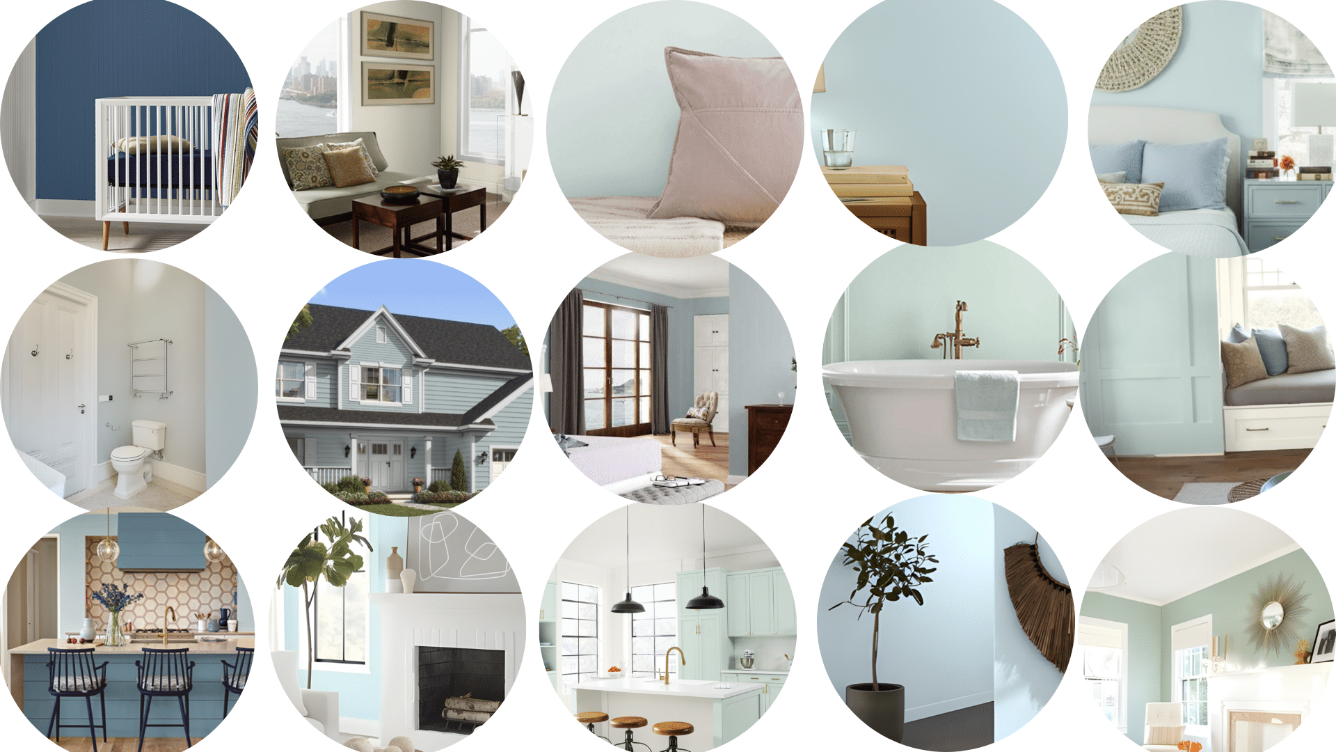
There’s a reason that haint blue paint has become such an unforgettable part of Southern homes; it’s more than just a color. I’ve always been drawn to its soft, airy shade and the calm feeling it brings to porches and rooms. But what makes it truly special is the story behind it, one that connects history, belief, and design in a beautiful way. In this blog, I’ll share the origins of haint blue, what it symbolizes, and why it still matters today. You’ll also find ideas for choosing the right shade, styling it in your home, and understanding the deeper meaning behind the tradition. By the end, you’ll see why haint blue isn’t just paint, it’s a piece of living history. What is Haint Blue Paint and Where Did it Come From? Haint blue is a soft, pale shade that sits between blue and green, most often seen on porch ceilings across the American South. It gives homes a calm, welcoming feel and carries a story that connects history, belief, and design. The word “haint” comes from African folklore, referring to restless or wandering spirits. Enslaved Africans brought these beliefs to the South, where color became both a symbol of protection and a piece of living heritage. The Gullah Geechee people, descendants of enslaved Africans along the Southeastern coast, were the first to introduce this tradition. They used indigo dye from local plants to create the sky-like shade, believing it protected their homes from “haints,” or harmful spirits. Painting doors, shutters, and ceilings blue became both a spiritual shield and a form of cultural expression. Over time, this practice spread across the South, blending faith, craftsmanship, and community. The light blue hue wasn’t just spiritual; homeowners also noticed it brightened shaded spaces and, according to some, helped deter insects. Today, haint blue remains one of the South’s most enduring color traditions. Beyond folklore, it symbolizes peace, openness, and continuity, reflecting the region’s resilience and the lasting influence of African heritage in Southern design. Symbolism and Meaning Behind Haint Blue Paint Haint blue paint carries a deep sense of meaning that goes beyond its soft, calming color. Rooted in African and Southern folklore, it was believed to protect homes from spirits and bad energy. Many thought the pale blue-green shade resembled water or the open sky, two elements that ghosts and restless spirits could not cross. This belief gave families comfort and a sense of safety within their homes. Beyond superstition, haint blue also came to symbolize peace, harmony, and renewal. Its cool tone brings a feeling of open space, lightness, and serenity, making it a natural fit for porches and calm gathering areas. Over time, it became more than just paint; it represented hope, spiritual balance, and connection to nature. Today, homeowners still use haint blue for its soothing energy and the timeless sense of protection it evokes. Haint Blue Paint in Southern Architecture and Cultural Preservation Haint blue paint holds a lasting place in Southern architecture, blending cultural heritage with timeless design. Historically, this soft blue appeared on porch ceilings, shutters, and doors throughout states like South Carolina, Georgia, and Louisiana. Many of these early homes were influenced by the Gullah Geechee community, whose craftsmanship and beliefs shaped regional design traditions. Builders and homeowners across the South adopted the color not only for its folklore but also for its bright, airy quality that kept porches feeling open and welcoming. Today, haint blue is recognized by preservation experts as a defining feature of historic Southern homes. It’s often included in restoration projects and heritage districts where maintaining authentic colors helps tell the story of local history. Across the South, preservationists and cultural organizations continue to honor this legacy. They restore historic homes with authentic blue ceilings and shutters, while modern designers create updated shades inspired by traditional pigments. These efforts ensure haint blue remains more than a decorative trend; it stands as a living tribute to African heritage, Southern craftsmanship, and the enduring belief that color can hold deep cultural meaning. Where to Use Haint Blue in Home Design Haint blue isn’t just for porches anymore. You can use this soothing color throughout your home, indoors and outdoors, to bring calm, light, and timeless Southern character to any space. Classic Porch Ceilings Painting your porch ceiling haint blue is a beloved Southern tradition that blends beauty with folklore. Choose a soft, satin, or eggshell sheen for a smooth, reflective finish that mimics the open sky. This color brightens shaded porches, making them feel more spacious and airy. Use mildew-resistant exterior paint for longevity, especially in humid climates. Pair it with crisp white trim or natural wood tones to keep the look fresh. Haint blue porch ceilings remain a hallmark of welcoming, relaxed homes. Doors, Shutters, and Trim Using haint blue on doors, shutters, and trim adds subtle charm and ties outdoor spaces together. A semi-gloss finish works best for these elements, giving durability and a soft shine. Light blue-green doors can make entrances feel friendly and open, while matching shutters or window frames create balance. Combine the color with neutral siding, brick, or white exteriors for a classic coastal appeal. Whether you prefer a bold or gentle shade, haint blue accents can instantly refresh your home’s exterior style. Interior Uses Haint blue brings peace indoors, offering a gentle pop of color that feels calm and airy. It’s especially beautiful on interior ceilings, where it creates the illusion of height and natural light. In bathrooms and kitchens, haint blue pairs wonderfully with white tile, brass hardware, and natural materials like rattan or oak. It softens bright rooms and balances cool-toned lighting. Use it on walls for a subtle statement or cabinetry for a refreshing twist. Inside, haint blue radiates calm, livable energy. Style Integration Haint blue fits seamlessly across multiple design styles. In farmhouse homes, it complements white shiplap and rustic wood. For coastal interiors, it mirrors sea tones and pairs well with sandy beige or driftwood hues. In colonial settings, it improves historical authenticity on doors and shutters. For modern homes, it adds softness to clean lines and minimalist spaces. Its versatility lies in its tone, subtle enough for tradition, yet fresh enough for contemporary design. Every style benefits from its relaxed, airy beauty. Choosing the Right Haint Blue Paint Shade for Your Home Selecting the right haint blue paint shade depends on your home’s lighting, undertone preferences, and where the color will appear. Find these soothing haint blue paint shades from trusted brands, each offering unique undertones and versatile design potential. 1. Sherwin-Williams Rainwashed A soothing blend of blue, green, and gray that resembles sea glass under soft light. Rainwashed feels calm and natural, offering a relaxed, coastal-inspired effect. It brings quiet depth to both sunlit and shaded spaces, making rooms feel open yet grounded. This shade is ideal for homeowners who want serenity with a subtle hint of color. Undertone: Blue-green with soft gray LRV: 60 Best for: Porches, bathrooms, or cottage-inspired interiors Pair with: Warm white trim, sandy neutrals, or driftwood tones for a breezy look 2. Sherwin-Williams Tradewind A muted turquoise with soft gray undertones that feels both refreshing and grounded. Tradewind maintains balance through changing light, staying calm and easy on the eyes. It’s an excellent choice for adding subtle color without overpowering your décor. Perfect for Southern-style homes, it delivers quiet personality and coastal charm. Undertone: Blue-gray with a hint of green LRV: 61 Best for: Entryways, laundry rooms, or porch ceilings Pair with: Warm whites, soft beige, or sandy neutrals for a serene finish 3. Sherwin-Williams Sky High A light, airy blue that captures the calm of a Southern sky on a clear morning. Its slightly cool tone adds brightness to shaded porches and north-facing rooms without feeling icy. Sky High creates a refreshing openness while keeping the space soft and welcoming. It’s classic, versatile, and perfect for achieving that classic Southern porch charm. Undertone: Cool blue with a touch of gray LRV: 65 Best for: Porch ceilings, sunrooms, or outdoor spaces needing gentle lift Pair with: Crisp whites like Sherwin-Williams Extra White or natural woods for a timeless look 4. Benjamin Moore Wythe Blue A classic haint blue with soft teal undertones, slightly deeper than traditional ceiling blues. Wythe Blue offers warmth and depth while maintaining calmness, echoing the classic colors of historic Southern homes. It feels welcoming in any light and brings an inviting, vintage-inspired charm to your space. Undertone: Teal-blue with gray hints LRV: 48 Best for: Front doors, shutters, or accent walls Pair with: Creamy whites, brass hardware, or light woods for warmth and depth 5. Benjamin Moore Breath of Fresh Air A clear, uplifting blue that instantly brightens dark or shaded areas. Its soft, airy tone mimics open skies, adding a sense of space and serenity to your home. Breath of Fresh Air feels both refreshing and classic, creating light-filled rooms that feel calm and relaxed throughout the day. Undertone: Pure blue with a soft warm base LRV: 70 Best for: Porch ceilings, bedrooms, or hallways Pair with: Bright whites or pale grays for a crisp, timeless look 6. Benjamin Moore Constellation A refined blue-gray with a misty, modern appeal that bridges traditional and contemporary design. Constellation’s cool tone adds calm sophistication to any setting, creating a clean, calm atmosphere. It works beautifully in minimalist interiors or spaces that need subtle color without distraction. Undertone: Cool blue with gray undertones LRV: 63 Best for: Interior ceilings, doors, or trim Pair with: White or beige walls for a serene, sophisticated effect 7. Behr Watery A gentle aqua that captures the calm of early coastal mornings. Behr Watery blends blue and green perfectly, giving spaces a refreshing, open-air feel. It reflects natural light beautifully, making shaded porches and bathrooms appear brighter and more inviting. Its versatile tone works across coastal, farmhouse, or modern spaces, keeping interiors light and soothing all year round. Undertone: Balanced blue-green with soft gray LRV: 66 Best for: Porch ceilings, patio accents, or bathroom walls Pair with: White trim, wicker furniture, and tropical plants for a classic Southern porch look 8. Behr Spa A soft green-blue that lives up to its name, creating a calm and restorative environment. Behr Spa feels airy and refreshing under natural light, shifting gently between aqua and misty blue throughout the day. Its balanced tone works beautifully in both small and large spaces, offering quiet elegance without feeling cold. Undertone: Green-blue with cool aqua hints LRV: 64 Best for: Bathrooms, bedrooms, or covered porches Pair with: White beadboard or light natural wood for a breezy, relaxed touch 9. Behr Light Mint A modern interpretation of haint blue with a fresh green undertone that adds a playful, uplifting twist. Light Mint feels bright and cheerful without overwhelming your space. Its soft tone brings energy to kitchens and creative areas while maintaining the calm essence of traditional haint shades. Undertone: Cool green with soft blue undertones LRV: 68 Best for: Kitchens, garden rooms, or creative workspaces Pair with: White, tan, or charcoal accents for a clean, fresh contrast 10. Benjamin Moore Palladian Blue A soft, sea-glass hue that gracefully shifts between blue and green, reflecting coastal light beautifully. Palladian Blue feels airy and calm, filling rooms with coastal freshness and classic beauty. It adapts well to different lighting, appearing slightly more blue by day and greener by night. Undertone: Blue-green with soft gray influence LRV: 60 Best for: Kitchens, bathrooms, or porches Pair with: Whites, sandy tans, and driftwood tones for a coastal palette 11. Benjamin Moore Clear Skies A delicate, true blue that enlivens dark or shaded spaces with a refreshing sense of openness. Clear Skies reflects light beautifully, creating a crisp and balanced look that keeps interiors feeling clean and airy. It’s versatile enough for both modern and classic homes, offering just the right amount of brightness without being overpowering. This color works wonderfully in areas where natural light is limited, instantly lifting the mood of the space. Undertone: True blue with a cool, clear base LRV: 66 Best for: Bathrooms, ceilings, or airy sunrooms Pair with: White trim, brushed nickel, or pale gray walls for a fresh, polished finish 12. Benjamin Moore Iceberg A cool, modern blue with refined gray undertones that bring calm and clarity to any space. Iceberg’s crisp brightness opens up rooms beautifully, adding light without feeling stark. Its subtle tone works perfectly for minimalist or Scandinavian-inspired interiors, offering a soft contrast against natural textures and light woods. The color maintains its balance throughout the day, making it ideal for clean, modern designs that emphasize simplicity and airiness. Undertone: Cool blue with soft gray notes LRV: 73 Best for: Bedrooms, living rooms, or home offices Pair with: Silver hardware, oak furniture, or white walls for a sleek, balanced look 13. Sherwin-Williams Sleepy Blue A soft, dreamy tone with a touch of gray that creates calm, restful energy. Sleepy Blue delivers a soothing backdrop that complements both rustic and coastal interiors. Its muted hue enhances natural materials like wicker and wood while reflecting enough light to keep rooms open and peaceful. Perfect for spaces where relaxation matters, this color provides timeless comfort and gentle warmth. Undertone: Soft blue with gray for balance LRV: 58 Best for: Bedrooms, porches, or reading nooks Pair with: White trim, wicker textures, or natural fabrics for a serene Southern look 14. Sherwin-Williams Topsail A pale blue with a gentle touch of green that captures the feeling of cool sea air. Topsail keeps rooms bright and soothing, reflecting light beautifully in any setting. It offers the perfect balance of freshness and softness, ideal for porches or interiors that need subtle character. Undertone: Blue with a whisper of green LRV: 75 Best for: Porch ceilings, bathrooms, or kitchen cabinets Pair with: Soft grays, white trim, or woven accents for a coastal-cottage feel 15. Behr Ocean Pearl Ocean Pearl offers a subtle blue-green hue with an airy sophistication. It brings gentle color to living rooms or exterior siding, pairing seamlessly with neutrals. LRV: 62. 16. Benjamin Moore Harbor Haze A misty blue with subtle gray-green undertones that creates a soft, maritime feel. Harbor Haze brings a sense of ocean calm to interiors and exteriors alike. Its breezy, balanced tone feels coastal but still grounded enough for everyday living spaces. Undertone: Blue-gray with a hint of green LRV: 64 Best for: Porches, bedrooms, or coastal interiors Pair with: White trims, wicker textures, and sandy beige tones for seaside serenity 17. Sherwin-Williams Dew Drop An airy aqua-silver blend that adds a clean, uplifting touch to any space. Dew Drop reflects brightness beautifully, enhancing natural light and making rooms feel fresh and open. Its subtle shimmer works especially well in spaces that need a cheerful lift without overwhelming color. This gentle tone keeps interiors soothing while still offering personality and charm, perfect for both traditional and coastal homes. Undertone: Aqua with soft silver-gray notes LRV: 72 Best for: Porch ceilings, laundry rooms, or bright transitional spaces Pair with: White beadboard, silver fixtures, or pale gray trim for a crisp, breezy finish 18. Behr Sea Salt Blue A balanced blend of blue and green that captures the calm, refreshing feel of the ocean. Sea Salt Blue brings a soothing energy to any room, creating a relaxed coastal vibe that feels natural and classic. Its subtle depth gives spaces character without heaviness, while its light-reflecting quality keeps rooms bright and airy. Perfect for homeowners who want serenity with a hint of color that feels grounded and warm. Undertone: Balanced blue-green with soft gray influence LRV: 63 Best for: Bathrooms, sunrooms, or reading nooks Pair with: Warm wood tones, white trim, or woven textures for an inviting coastal look 19. Benjamin Moore Blue Veil A delicate pastel blue that nearly glows white in sunlight, creating an airy and graceful atmosphere. Blue Veil opens up hallways, ceilings, and smaller rooms, giving them a sense of height and spaciousness. Its soft tone feels elegant yet approachable, offering a subtle hint of color that brightens without overpowering. Ideal for spaces where light plays a major role, it maintains its fresh look throughout the day. Undertone: Pale blue with cool white influences LRV: 75 Best for: Hallways, ceilings, or minimalist interiors Pair with: Light gray, cream, or off-white finishes for a balanced, refined look Myth Versus Reality: What Science Says About Haint Blue Paint The calming effect of haint blue paint has long been linked to folklore, but modern psychology offers a more nuanced explanation. A 2015 review published in Frontiers in Psychology by Andrew J. Elliot, titled “Color and Psychological Functioning: A Review of Theoretical and Empirical Work,” explains that color influences mood and behavior, yet its impact depends heavily on context, lightness, and chroma. The study found that blue light can enhance alertness and focus, though such effects relate more to physiology than to spiritual or supernatural beliefs. When applied to haint blue, this research helps separate myth from measurable benefit. The soothing impression of blue ceilings may stem from visual brightness and reflection, not mystical power. Science supports the peaceful feelings haint blue evokes, but its magic lies in perception, not protection. Additional Belief: Wasp Repellent Some Southerners believe that haint blue paint helps deter wasps from nesting on porch ceilings. This idea dates back to the early days when paint often contained lime or lye, natural ingredients that repelled insects. Modern paints, however, no longer include these materials, so the same effect doesn’t apply today. Still, the tradition continues, partly because the light blue color reflects sunlight, giving ceilings a bright, open look. Whether it keeps bugs away or not, many homeowners enjoy the peace of mind and charm that haint blue adds to their outdoor spaces. DIY Steps to Paint Your Porch Ceiling Haint Blue Follow these simple steps to achieve a smooth, lasting finish when painting your porch ceiling or interior surfaces. Prep the Surface: Clean thoroughly and remove dirt, cobwebs, or peeling paint before applying primer. Choose the Right Finish: Use exterior-grade satin or semi-gloss for porches; interior eggshell for indoor walls or ceilings. Prime for Durability: Apply a mildew-resistant primer to help the paint adhere evenly and resist moisture. Apply Even Coats: Use two thin layers of haint blue paint, allowing each coat to dry completely for a smooth finish. Protect and Maintain: Seal outdoor areas with a UV-resistant topcoat and clean surfaces seasonally to preserve color vibrancy. Conclusion Now that you know the story behind haint blue paint, you can appreciate it for more than its soft, soothing color. I love how it bridges generations, linking African heritage, Southern craftsmanship, and modern design in one classic shade. If you’re restoring a historic home or refreshing a front porch, this color carries meaning that never fades. You’ve learned how it started, why it mattered, and how it still shapes design today. Now it’s your turn to use it in a way that fits your own space and story. Try painting a ceiling, door, or accent wall and see how it changes the feel of your home. And if you’re inspired, check out more of my blogs for fresh color ideas.
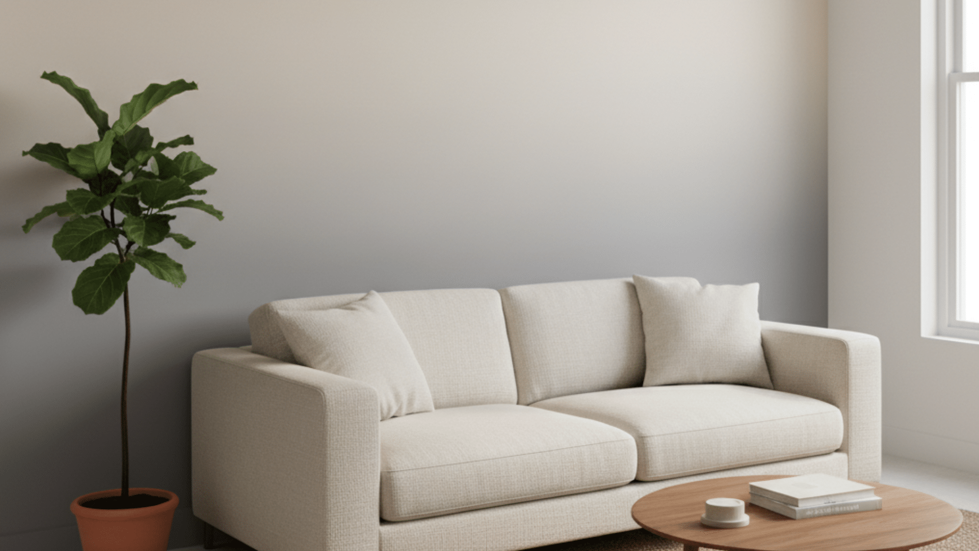
Have you ever looked at your walls and felt they needed something more? I know that feeling, wanting a fresh look without turning your space upside down. That’s where ombre wall paints come in. With a smooth color fade, you can give your walls a soft, subtle movement and life without going overboard. You’ll love how this style adds depth, hides small flaws, and makes rooms feel brighter and more open. In this guide, I’ll walk you through how to paint ombre walls step by step, pick the right colors, and handle small mistakes like a pro. By the end, you’ll feel confident creating your own gradient wall that feels calm, clean, and completely yours. What are Ombre Wall Paints? Ombre wall paints create a soft color fade that moves gradually from one shade to another. This technique gives your walls a gentle transition, often from light to dark or between two related colors. It adds more life than a solid color while keeping the look simple and balanced. People choose ombre walls because they offer visual depth and texture, making plain walls feel more dynamic. The gradual fade can also make small spaces seem larger and help hide uneven wall surfaces. Ombre walls are a favorite in modern interiors because they work with many styles, from minimalist to boho. You can use this paint style in bedrooms for a calm feel, living rooms for an open, airy look, kids’ rooms for playful energy, or bathrooms for a soft, relaxed vibe. It’s flexible, creative, and easy to match with different color palettes. Step-by-Step Guide to Painting Ombre Walls I’ll walk you through each stage of painting ombre wall paints so your wall looks smooth and professional. Tools and Materials You’ll Need You don’t need special tools for this project. Just gather: 2–3 shades of latex paint (in the same color family) Chip brushes, rollers, or sponges A spray bottle with water for blending Painter’s tape, chalk, and a drop cloth Optional: glaze medium to slow drying and make blending easier Tip: Use a separate brush for each paint color and keep a clean rag nearby to wipe off extra paint before switching shades. Step 1: Prep the Wall Before you start painting, make sure your wall is ready for a clean and even ombre finish. Preparation makes blending easier and gives you a smoother result. Mask off the edges: Use painter’s tape around doors, trim, crown molding, and baseboards for a neat finish. Clean and inspect: Wipe down the wall to remove dust or grease. Prime if needed: If your wall is dark or has old paint, cover it with a coat of white paint first. Set up your paints: Have two to three shades ready in the same color family before you begin. Why this matters: Good prep ensures your paint sticks evenly, prevents color interference, and helps your ombre fade look clean once blended. Step 2: Paint the Base Layer Start your ombre wall paint from light to dark. Begin with your lightest shade — usually white or a pale tone — and roll it across the top half of the wall.Work in smooth, overlapping strokes until you get an even coat. Let this layer dry completely before you move on. Pro Tip: If your second color is much darker than your base, save a little of each in separate trays. You can mix a mid-tone later to help the two blend more naturally. Step 3: Mark the Transition Zones Now, decide where your colors will meet. Divide your wall visually into three zones: top (light), middle (mixed), and bottom (dark). Use painter’s tape or chalk marks as a rough guide. When mixing, don’t combine paints directly on the wall without saving a separate mix; otherwise, you’ll lose your mid-tone shade. Instead, use small trays or plastic bowls to create your blend color in advance. This middle tone helps bridge the gap between your top and bottom colors. Do: Work in sections and keep both paints wet while blending. Don’t: Rush or mix directly from the can; it’s easy to lose your color balance. Step 4: Blend the Shades Here’s where the ombre magic happens. Start by applying your second color in the middle and your darkest shade at the bottom. Then, blend where the two colors meet using a clean brush or sponge. Work while both colors are still wet; this is key to getting a soft transition. Use light horizontal or crisscross strokes to merge the shades. If one area looks too harsh, dip your brush lightly in the mid-tone color or mist it with water to soften the edges. Always blend in small sections, moving from left to right. Pro Tip: Paint looks different wet vs. dry, so don’t panic if your colors seem uneven. Once dry, the gradient will appear softer and more natural. Step 5: Refine and Seal When you’re done, step back and let the wall rest. Check your ombre in both natural and artificial light; it’s easier to notice rough spots once your eyes are fresh. Touch up any patchy areas by gently brushing on the mid-tone or blending again with a damp brush. If you want extra durability, seal your wall with a thin matte topcoat once everything’s dry. Final Tip: Ombre walls are forgiving; if something doesn’t look right, just re-blend with paint and water. No two walls ever look the same, and that’s what makes yours personal. Watch this easy video tutorial on painting ombre wall paints step by step to follow along visually: Choosing the Right Paint and Finish for Ombre Walls Picking the right paint type and finish makes a big difference in how smooth and soft your ombre wall looks. Latex or Acrylic Paints: Easy to blend and quick to clean up. Great for beginners and most wall surfaces. Avoid Fast-Drying Paints: These make blending harder because they dry before you can smooth the transitions. Matte Finish: Best for subtle fades and soft transitions since it doesn’t reflect much light. Satin Finish: Easier to clean and gives a mild sheen that brightens rooms slightly. Eggshell Finish: Works well for most walls and keeps a gentle balance between flat and shiny. Glaze Medium: Add a small amount to slow drying time and extend blending time. Test Colors First: Try small patches to see how light affects the shades before painting the entire wall. Ombre Wall Color Ideas and Inspiration Here are color combinations and styles to inspire your ombre wall paints and help match them to different rooms and moods. 1. Soft Neutrals Neutral tones like beige, gray, and cream create a calm, classic look that fits almost any space. These shades make rooms feel open, clean, and restful. A soft beige fading into white gives a warm glow, while gray blending into off-white feels modern and subtle. Cream-based ombre walls work beautifully in bedrooms and entryways, bringing a sense of comfort and lightness. Pair them with natural wood furniture or linen textures to keep the look balanced. This option is great if you prefer something simple but still want a little visual interest. 2. Pastel Gradients Pastel ombre walls add a gentle touch of color without feeling overwhelming. Try lavender fading into soft gray for a dreamy bedroom, or peach blending into ivory for a cozy nursery. Mint transitioning into white gives a fresh and airy look, perfect for small spaces. These light gradients help brighten rooms while keeping them peaceful. You can pair pastel ombre walls with white trim and light wood floors to maintain a soft, open feeling. If you love subtle color but want to avoid bold tones, pastel gradients give your space a soothing and cheerful charm. 3. Bold Transitions For living rooms or feature walls, bold ombre colors make a strong statement. Teal fading into turquoise creates a coastal vibe, while coral melting into blush adds warmth and energy. Sunset-inspired tones, gold, orange, and soft red, give your space a lively yet cozy feel. These combinations work best in areas where you want personality and movement. Use them behind a sofa, in a hallway, or even on a stair wall for instant style. To balance the boldness, keep furniture and décor simple with whites, beiges, or natural wood accents. 4. Two-Color vs. Three-Color Ombre Walls A two-color ombre wall is ideal if you’re new to painting. It uses one transition point, like white fading into gray, for a clean and simple look. It’s easier to blend and requires fewer tools. A three-color ombre wall adds more depth and contrast, for example, dark blue at the bottom, soft blue in the middle, and white on top. This approach gives more control over how gradual or dramatic your gradient appears. The three-color style takes more time but delivers a richer, layered finish that works beautifully in large or open rooms. Color Psychology and Mood in Ombre Design Colors do more than decorate a wall; they shape how a room feels. When you choose ombre wall paints, think about the emotion you want to bring into your space. Each color transition creates a different mood and energy. Blue Tones Peaceful and Calm: Blue fades remind you of the sky or ocean. They make bedrooms and offices feel quiet, cool, and relaxing. Green Fades Refreshing and Natural: Green gradients bring a sense of balance and growth. They work well in living rooms or bathrooms for a gentle, nature-inspired look. Pink Tones Warm and Inviting: Soft pinks create comfort and warmth, especially in bedrooms or nurseries. They add a friendly, cozy touch without feeling heavy. Gray to White Modern and Airy: This combination keeps spaces bright and clean. It’s perfect for minimalist or modern designs where you want light and openness. Choosing colors with purpose helps your ombre wall not just look good but also feel right for your space. Beginner vs. Advanced Ombre Techniques Not every ombre wall project needs to be complex. Here’s how to match your skill level to the right technique. Skill Level Technique Type Difficulty Tools Needed Estimated Time Beginner Two-color horizontal fade Easy Roller, sponge, painter’s tape 2–4 hours Intermediate Three-color blend Moderate Three brushes, spray bottle, glaze medium 4–6 hours Advanced Diagonal or sunset-style gradient Challenging Multiple brushes, blending rags, a spray bottle, and patience 6–8 hours Each level offers a different look, so start simple and move up as your confidence grows. Fixing Common Ombre Painting Mistakes Even with care and patience, small mistakes can happen while painting ombre wall paints. Here’s how to correct them easily. Harsh Lines Between Colors If your paint dries too quickly, it can leave sharp lines where colors meet. To fix this, dampen the area slightly with a clean, wet brush and blend again using light strokes. You can also apply a thin layer of glaze medium to reactivate the paint and smooth the transition. Always blend while the paint is still damp to avoid hard edges, and work section by section so the gradient stays soft and natural. Patchy or Uneven Transitions Uneven spots happen when the paint dries before you finish blending. Add a small amount of diluted glaze or water to the dry area and use a clean brush to blend in short, overlapping strokes. Step back often to check for color balance across the wall. If needed, apply another thin coat of the lighter color and blend it again while wet. Slow, light motions help restore an even fade without dark patches. Paint Drips or Overlaps Drips appear when there’s too much paint on the brush or roller. Let the spot dry completely before fixing it; never try to wipe wet drips. Once dry, lightly sand the area with fine-grit paper until smooth. Reapply a thin coat of the lighter shade, then blend gently into the darker tone using a sponge or clean brush. Work slowly and keep your brush slightly damp to avoid visible patch marks. Ombre Alternatives and Shortcuts If you rent or want a faster way to get the ombre look, try these simple and removable options. Alternative 1: Peel-and-Stick Ombre Wallpapers: Easy to apply and remove, these wallpapers mimic real paint gradients. Perfect for renters or anyone wanting a quick wall update without painting. Alternative 2: Gradient Wall Decals: Decals come in various colors and sizes. They let you create an ombre-style accent without tools, mess, or long drying times. Alternative 3: Painted Ombre Canvas Art: If you prefer smaller projects, paint ombre designs on canvas. Hang them together to create a soft, gradient look without touching your walls. Budget and Time Estimate for DIY Ombre Walls Before starting your ombre wall paint project, it helps to plan your budget and time. The overall cost depends on paint brand, wall size, and how many shades you use. For an average wall, you’ll need about one quart of each color. Popular options like Sherwin-Williams, Behr, or Dulux offer durable paints with good blending ability. Expect to spend between $50 and $120 for paint and supplies. Small accent walls may take around three to four hours for beginners, while larger walls or advanced multi-color fades can take up to eight hours. Professionals can complete a full room in half that time. Planning ahead ensures smooth blending, proper drying time, and fewer unexpected costs during your DIY project. Aftercare and Maintenance Tips Keeping your ombre wall paints looking fresh is simple with a few easy cleaning and care steps. Use Gentle Cleaners: Wipe walls with a soft, damp cloth and mild soap. Avoid harsh chemicals that can fade colors. Clean Regularly: Dust your wall occasionally to prevent buildup that dulls the gradient effect. Avoid Scrubbing: Use light pressure when cleaning. Rubbing too hard may damage the finish or blend lines. Check for Wear: In high-traffic areas, touch up scuffed spots with leftover paint to keep colors even. Mind the Finish: Matte finishes need extra care, while satin or eggshell finishes are easier to clean. Repaint Carefully: If repainting, apply primer first to cover the gradient fully before adding a new color. Conclusion Painting an ombre wall is one of the easiest ways to add personality and calm movement to your space. You’ve learned how to prepare your wall, choose the right shades, and blend them smoothly for a soft, seamless finish. The best part is that no two walls ever look the same; your gradient will always reflect your own style. Take your time, be patient with the blending, and enjoy watching the colors flow together. I’ve seen how rewarding it feels to step back and admire your work once it’s done. If you enjoyed this project, check out my other blog for more simple DIY paint ideas, design inspiration, and easy home updates you can try next.
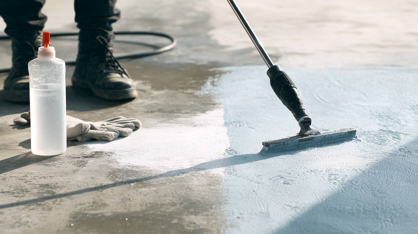
If you’ve ever tried to figure out how to remove paint from concrete, you know it’s tougher than it seems. I remember spending hours scrubbing my garage floor, wondering if the paint was permanently part of the concrete. It’s frustrating, especially when every cleaner claims to work but barely makes a difference. The truth is, concrete traps paint deep inside its pores, which is why it takes more than just elbow grease to get it off. But don’t worry, with the right method, tools, and patience, you can restore your surface without damaging it. In this post, I’ll show you how to remove paint from concrete safely and effectively, whether you’re working indoors or outdoors. To remove paint from concrete, the most effective methods are chemical paint strippers for thick or old paint and pressure washing or vinegar for lighter stains. Always test a small area first and use proper safety gear. From my experience working on concrete surfaces, the right method makes a huge difference in how fast and clean the result looks. Understanding Why Paint Sticks to Concrete Concrete might look solid, but it’s actually full of tiny pores that soak up paint like a sponge. When paint seeps into these pores, it clings tightly and forms a bond that’s tough to break. Over time, layers of paint can settle deeper, especially if the surface wasn’t sealed first. That’s why removing paint from concrete takes more effort than from wood or metal. The texture and condition of the surface also matter; rough, unsealed concrete traps more paint than smooth or sealed areas. Knowing this helps you choose the right removal method. For example, thick or old paint often needs grinding or a chemical stripper, while newer, thinner coats might come off with vinegar, a pressure washer, or a wire brush. Identify Your Paint Type and Surface Before choosing a removal method, you need to know what kind of paint and concrete you’re dealing with. This helps prevent damage and saves time. Water-Based vs. Oil-Based Paint You can easily tell the difference between these two types with a quick alcohol or acetone test. Apply a small amount on a cloth and rub the painted surface. If the paint softens or starts to come off, it’s water-based. If nothing happens, it’s oil-based. Knowing this matters because water-based paint can usually be removed with milder methods like vinegar or warm water. While oil-based paint needs stronger options such as chemical strippers or solvents, especially when dealing with painting over lead paint safely. Identifying paint type ensures you use the safest and most effective removal approach for your project. Sealed vs. Unsealed Concrete To find out whether your concrete is sealed, pour a few drops of water onto the surface. If the water beads up or stays on top, the concrete is sealed. If it soaks in quickly, it’s unsealed. Sealed concrete prevents chemicals from penetrating, so you’ll need to lightly sand or etch it before applying any paint remover. Unsealed concrete absorbs solutions more easily, which helps break down paint faster, but may also stain if harsh chemicals are used. This quick test helps you choose the right preparation steps before starting paint removal. Best Methods to Remove Paint from Concrete There are several ways to remove paint from concrete, depending on the paint type, surface condition, and tools you already have. Mechanical Methods Mechanical removal works best for thick, old, or stubborn paint layers (Best for: outdoor surfaces and heavy buildup). Tools like an angle grinder, pressure washer, or drill-mounted wire brush can break down hardened coatings quickly. Start by scraping loose paint, then move to a grinder or washer for deeper removal. Always wear a respirator and goggles since these methods create dust and debris. Mechanical techniques are ideal for outdoor areas like patios, driveways, and garages where ventilation isn’t an issue. Though they take effort and may roughen the surface slightly, they’re fast and chemical-free, making them a reliable choice for tough jobs. Mechanical removal works best for thick, old, or stubborn paint layers (Best for: outdoor surfaces and heavy buildup). Chemical Methods Chemical removers, such as paint strippers or acetone, dissolve paint without heavy scrubbing (Best for: oil-based paint and thick layers). Apply a generous layer and let it sit (the dwell time) as directed on the product label, usually 30 minutes to several hours. Once the paint softens, scrape it off and rinse the area thoroughly with water. Always use gloves, goggles, and a respirator, and work in a well-ventilated space to avoid inhaling fumes. Chemical methods are best for oil-based paints and thick layers that don’t respond to simple scraping. They save time and effort but require careful cleanup to prevent residue from harming plants or drains. Natural or Eco-Friendly Methods Natural paint removal options are safe, affordable, and perfect for smaller or indoor projects (Best for: indoor use and small stains). Common choices include vinegar, baking soda paste, or citrus-based strippers made from orange oil. Start by applying the solution to the painted area, wait 15–30 minutes, and scrub gently with a wire brush. These mild solutions may take longer but are less toxic and emit little to no odor. They’re ideal for water-based paints or when chemical use isn’t practical. Eco-friendly methods protect indoor air quality, reduce health risks, and benefit the environment, all while achieving clean, noticeable results with a little patience. Method Cost Effort Best For Chemical Stripper Medium Low Thick or old paint Pressure Washing Medium Medium Outdoor surfaces Grinding High High Very stubborn layers Vinegar / Natural Low Low Small or indoor stains Step-By-Step Methods to Remove Paint from Concrete for Each Paint Type Follow these step-by-step methods based on paint type and surface for the most effective results. How to Get Paint Off Concrete (Water-Based) Water-based paint softens easily with moisture and mild removers. This method uses a gel stripper and power washing for deep cleaning. Tools and Materials: Strip This gel remover Plastic sheets Pressure washer with extra gas A scraper and a wire brush Rags, buckets, plywood, or 2x4s Step 1: Apply the Gel Remover: Spread a thick coat of the Strip This product evenly across the painted area. Work quickly before it starts to dry. Step 2: Cover with Plastic Sheets: Lay plastic over the surface to keep the stripper moist. Secure it with plywood or boards to hold it down. Step 3: Allow it to sit: Let the product dwell for one to three hours. In cooler weather, extend the wait time for stronger results. Step 4: Remove and Pressure Wash: Peel back the plastic and use a pressure washer to blast off loosened paint. Work in sections for consistency. Step 5: Repeat If Needed: For old or thick layers, reapply the stripper and wash again. Three coats may be necessary for full removal. Step 6: Clean and Dry the Surface: Use a drain protector or debris catcher to trap runoff. Rinse thoroughly and let the surface dry for 24–48 hours. How to Get Paint Off of Concrete (Oil-Based) Oil-based paints are tougher and need stronger solvents. Lacquer thinner breaks down dried layers effectively without harsh scraping. Tools and Materials: Lacquer thinner (not mineral spirits) Rags and a wire brush Respirator mask Fire-safe disposal container Gloves and safety goggles Step 1: Pour the Lacquer Thinner: Apply a small amount directly on the paint spot. Avoid overpouring to prevent runoff into grass or soil. Step 2: Let It Soak Briefly: Allow the thinner to sit for a few minutes so it penetrates and softens the paint layer beneath. Step 3: Scrub with Wire Brush: Use a wire brush to loosen the paint. Apply pressure in circular motions to reach deep pores in the concrete. Step 4: Wipe with Rags: Press down firmly with your foot or hand on the rag to absorb loosened paint. Replace rags once they become saturated. Step 5: Repeat the Process: Continue adding thinner, scrubbing, and wiping until no color transfers to your rag. This may take several passes. Step 6: Dry and Dispose Safely: Lay used rags flat outdoors to evaporate before discarding. Lacquer thinner is flammable—never ball up wet rags. Spray Paint or Graffiti Stains Spray paint and graffiti require a strong paint stripper, along with scraping and pressure washing, for full removal, which often relates to understanding spray paint dry time. Tools and Materials: Paint stripper (gel or liquid) Plastic sheets Metal scraper Pressure washer Safety gloves and a mask Step 1: Apply the Paint Stripper: Pour or brush the stripper over the painted area, ensuring full coverage. Work in sections for control. Step 2: Cover with Plastic: Seal the treated area with plastic wrap. This prevents evaporation and allows the stripper to soften the paint fully. Step 3: Wait for Dwell Time: Let it sit for 30 minutes to 24 hours, depending on the paint thickness. Longer times yield deeper penetration. Step 4: Scrape the Paint Off: Use a metal scraper to lift softened paint. Start at the edges and work inward, removing as much as possible. Step 5: Pressure Wash Residue: Blast away leftover paint using a high-pressure washer. This helps clear any remaining pigment below the surface. Step 6: Repeat If Needed: For stubborn or layered graffiti, reapply stripper and pressure wash again until clean. Allow the surface to dry before repainting. Online Community Talking About Pressure Washing Online forums like Reddit reveal real-world experiences and practical troubleshooting tips for DIY cleaning projects. Users on r/pressurewashing often share issues such as streaking, uneven results, or grass damage from chemicals, helping others learn from firsthand experience. For example, one user asked, “What caused these streaks and how do I avoid them next time?” The community explained that wand-only cleaning often leaves streaks, and using a surface cleaner provides even coverage. Others advised post-treating with a mild bleach mix (2–3%) and soaking nearby grass before and after washing to prevent damage. These shared experiences give valuable, realistic insight into what works and what doesn’t, especially for beginners. However, advice from online forums should always be verified before using strong chemicals or equipment. What DIYers and Pros Say About Removing Paint from Concrete Online discussions on Reddit forums show a wide range of personal experiences. Users in communities like r/pressurewashing and r/HomeImprovement often mention how tough older paint can be to remove, especially from rough or unsealed concrete. Many recommend scraping or sanding before washing, while others warn that pressure washers can cause damage or scatter lead paint chips. Professionals often note that a chemical stripper or grinder gives faster results, though the process is messy and time-consuming. Most agree there’s no one-size-fits-all fix; the right method depends on your surface, paint type, and patience. “Pressure washing helps, but it’s not magic; scraping is still part of the job.” “Lead paint? Don’t touch it, get it tested first.” “Grinders make quick work but leave dust everywhere.” Aftercare and Surface Maintenance for Concrete Once the paint is removed, proper aftercare keeps your concrete strong, clean, and protected against future stains or damage. Wash the surface with mild soap and warm water to remove residue. Let the concrete dry naturally for 24–48 hours before sealing. Apply a high-quality sealer or primer to protect from moisture and staining. Reapply sealant every 2–3 years to maintain durability. Use drop cloths or tarps when painting nearby to prevent future spills. Keep a small cleanup kit ready for quick spill response. Regular maintenance ensures your concrete looks new and lasts longer. Time, Cost, and Effort Comparison Choosing the right paint removal method depends on your budget, time, and skill. Here’s how each option compares in practice. Method Cost Range Time Needed Skill Level Best For Pressure Washer $100–$300 1–3 hrs Intermediate Outdoor areas Paint Stripper $20–$60 2–6 hrs Beginner Large areas Solvents $10–$25 1–2 hrs Beginner Small stains Grinder $50–$200 1–3 hrs Advanced Thick layers Vinegar/Baking Soda $5–$15 1–2 hrs Beginner Indoor cleaning Soda Blasting $200–$500 2–4 hrs Professional Decorative work Each method varies in cost and effort, so consider your project size, paint type, and experience level before starting. Common Mistakes to Avoid When Removing Paint Even small missteps can damage your concrete or waste effort. Keep these common mistakes in mind before and during paint removal. Skipping the paint type test: Using the wrong method can cause stains or poor results. Letting chemical strippers dry: Always cover them with plastic to keep them active. Using too much pressure with grinders or washers: This can scar or chip the concrete surface. Ignoring safety gear: Solvents and dust can irritate your skin, eyes, and lungs. Forgetting to neutralize or rinse: Leftover residue can affect new paint or sealers. Skipping the drying phase: Sealing damp concrete traps moisture and leads to peeling. Overlooking cleanup: Paint flakes and chemicals can harm nearby plants or drains. Conclusion So now you know the best ways to handle the tricky job of getting old paint off concrete. If you’re using a pressure washer, a chemical stripper, or simple household items, the key is patience and the right prep. Once the surface is clean, sealing it keeps it looking fresh and easier to maintain next time. I’ve done this myself, and trust me, once you see that clean concrete again, it’s worth every bit of effort. If you’ve tried any of these methods or found your own trick for how to remove paint from concrete, I’d love to hear about it. Drop a comment or share what worked best for you. Frequently Asked Questions What is the easiest way to remove paint from concrete? The easiest way is using a chemical paint stripper for thick paint or vinegar for small stains. Does vinegar remove paint from concrete? Yes, vinegar can soften water-based paint, making it easier to scrub off. What chemical removes paint from concrete? Paint strippers, acetone, and lacquer thinner are commonly used to dissolve paint effectively. Can you pressure wash paint off concrete? Yes, pressure washing works well for loose or softened paint, especially outdoors. How do you remove dried paint from concrete floors? Use a combination of chemical strippers, scraping, and pressure washing for best results.
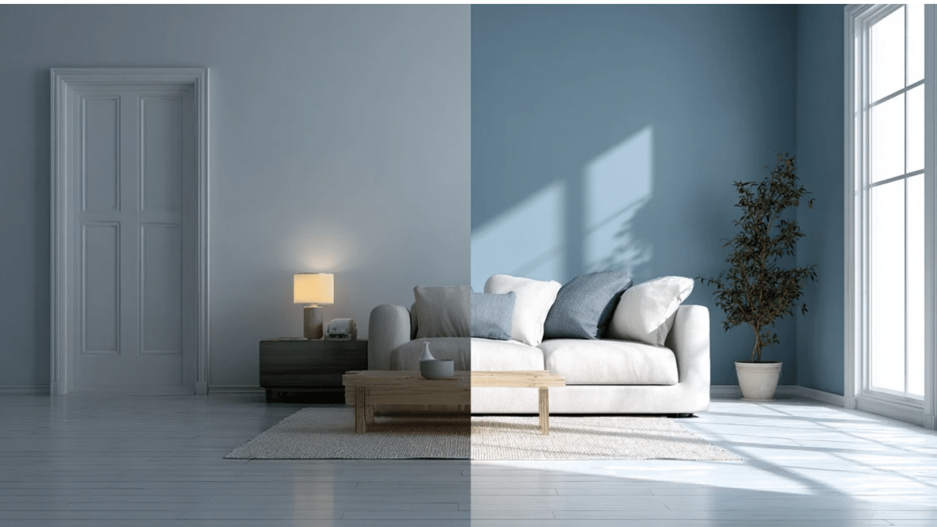
Have you ever stood in the paint aisle, holding two cans that look almost the same, wondering which one’s right? I’ve been there too, thinking the color was all that mattered, until I learned how much the difference between satin and semi-gloss finishes can change everything. The finish decides how your walls reflect light, how easy they are to clean, and how long they stay looking fresh. Maybe you want a cozy, soft glow for your bedroom or a shiny, easy-wipe surface for the kitchen. Once you understand paint finishes, choosing the right one becomes simple and stress-free. Let’s make sure your next paint job looks exactly the way you picture it, no surprises this time. Understanding Paint Finishes Paint finishes describe how much light a surface reflects once the paint dries. This reflection level, known as sheen, changes both how a wall looks and how it performs over time. A higher sheen means a shinier finish that’s easier to clean, while a lower sheen gives a softer look but may need more upkeep. Paints are available in several gloss levels, arranged from least to most reflective: flat, matte, eggshell, satin, semi-gloss, and gloss. Flat and matte paints absorb light, creating a smooth and muted surface that hides flaws well. As you move up the sheen scale, light reflection increases, resulting in a brighter and more durable finish. Sheen also influences texture and maintenance. Low-sheen paints offer a calm, even look but are harder to clean. High-sheen options resist moisture, wipe easily, and last longer in active areas like kitchens or hallways. Comparing Appearance and Sheen Paint sheen affects how light interacts with a surface, shaping the overall mood, brightness, and texture of a room. Satin Finish Look Satin paint has a smooth, soft glow that falls between matte and shiny. With a 25–35% gloss range, it reflects just enough light to create warmth without glare. This finish works well in cozy spaces like bedrooms or living rooms where you want a gentle, inviting feel. Satin also hides surface flaws better than glossier paints, making it ideal for older walls or uneven textures. It offers a clean, modern look while remaining subtle and versatile across different wall colors and lighting types. Semi-Gloss Finish Look Semi-gloss paint delivers a noticeable shine with a 40–70% gloss range, giving walls and trim a brighter, polished appearance. It reflects more light, emphasizing details such as doors, moldings, and cabinetry. Because of its glossy texture, it tends to reveal surface flaws like bumps or brush marks. However, it’s much easier to clean and maintain, making it a great choice for bathrooms, kitchens, or entryways where durability and shine matter most. The science behind sheen is simple: the more resin a paint contains, the shinier and tougher it becomes. That’s why high-gloss paints are easier to wipe down, while flat ones absorb light and hide flaws better. Durability and Upkeep: Satin vs Semi Gloss Paint durability determines how well a surface resists wear, moisture, and cleaning over time in different room conditions. How Satin Paint Holds Up Satin paint provides moderate protection from daily wear and light moisture. Its smooth texture makes it easy to clean but still gentle enough for regular wall repainting. It’s forgiving during touch-ups since brush or roller marks blend easily once dry. This finish works well for living rooms, hallways, and bedrooms, offering a balance between looks and resilience. While not as tough as semi-gloss, satin remains a dependable choice for areas that need both soft style and easy maintenance. How Semi-Gloss Paint Performs Semi-gloss paint delivers strong moisture resistance and durability, making it ideal for kitchens, bathrooms, and trims. It handles frequent wiping, splashes, and scrubbing without losing shine. However, because of its reflective finish, touch-ups can appear more noticeable, requiring careful blending. This type of paint is perfect for spaces that demand high durability and regular cleaning. It maintains its appearance longer than lower-sheen options, even under daily use or changing humidity levels. Best Uses for Satin and Semi Gloss Finish Each paint finish serves a different purpose depending on the room’s lighting, activity level, and surface condition. When to Choose Satin Satin paint is a great middle ground between flat and glossy finishes. It gives walls a soft glow while being easier to clean than matte paints. This finish works best when you want a cozy look that hides small flaws or uneven surfaces. Best rooms for satin paint: Bedrooms: Satin paint adds a soft, calm glow that feels relaxing and cozy, perfect for creating a peaceful atmosphere in your personal space. Hallways: Its smooth finish resists scuffs and fingerprints, keeping high-traffic hallways looking clean and fresh even with daily use. Living areas: Satin balances warmth and durability, giving living rooms a welcoming feel while standing up well to occasional cleaning and rearranging. Because it reflects light gently, satin paint creates a balanced look that feels cozy yet polished. It’s the perfect choice when you want comfort, warmth, and easy upkeep in everyday living spaces. When to Choose Semi-Gloss Semi-gloss paint is best for rooms that face frequent cleaning or high humidity. Its smooth surface makes wiping off stains and splashes quick and easy. This finish gives trim, cabinets, and doors a clean, crisp appearance that stands out under light. Best rooms for semi-gloss paint: Kitchens: Semi-gloss works perfectly in kitchens since it resists grease, splashes, and frequent cleaning, keeping walls and cabinets shiny and easy to maintain. Bathrooms: Its moisture-resistant surface prevents peeling and mildew, ideal for humid bathrooms where steam and water exposure are common. Trim and doors: The glossy finish highlights edges and details beautifully, giving them a bright, polished look that’s durable and easy to clean. Because of its strong shine and lasting durability, semi-gloss paint is your best choice for busy, high-humidity spaces that need frequent cleaning while still looking bright and fresh. Using Both Finishes Together Pairing satin and semi-gloss can make your room look balanced and polished. Satin walls create a soft background, while semi-gloss trim adds a touch of brightness and contrast. This combination helps define architectural details without overwhelming the space. It’s a simple way to highlight edges, doors, and moldings while keeping the overall room calm and consistent in tone. Lighting and Impact on Room Lighting changes how paint finishes appear, so the same color can look completely different under varying conditions. Satin paint diffuses light gently, creating a warm and balanced glow that works beautifully in rooms with soft or natural lighting. It helps reduce glare and keeps spaces like bedrooms or living areas looking calm and even. Semi-gloss paint, on the other hand, reflects more light. This makes it ideal for rooms with bright artificial lighting or modern spaces where you want a clean, vibrant look. However, its shine can highlight imperfections on uneven surfaces. Before committing to a finish, it’s best to test small paint swatches on your wall and observe them at different times of the day. Morning sunlight, afternoon brightness, and evening indoor light can all change how satin and semi-gloss paints appear in your space. Key Difference Between Satin and Semi-Gloss Paint Here’s a simple side-by-side look at how satin and semi-gloss paints differ in performance, appearance, and practical use. Feature Satin Paint Semi-Gloss Paint Sheen Level Soft, low to medium sheen High sheen, shiny finish Durability Moderate; resists light wear Strong; resists heavy use and moisture Cleaning & Maintenance Easy to clean; touch-ups blend well Very easy to clean; harder to touch up Imperfection Visibility Hides wall flaws and uneven texture Highlights imperfections and brush marks Light Reflection (%) 25–35% 40–70% Recommended Uses Bedrooms, hallways, and living rooms Kitchens, bathrooms, doors, trim Use this guide to quickly decide which finish best fits your room’s lighting, moisture, and maintenance needs. Professional Insights and Brand Comparisons Different paint brands classify sheen levels in their own way, which slightly changes how satin and semi-gloss finishes look and perform. Sherwin-Williams defines satin as having a gloss range of 25–35%, while semi-gloss sits higher at 40–70%, offering a brighter appearance and stronger moisture protection. Behr uses a similar scale, noting that satin gives walls a smooth, soft glow, whereas semi-gloss is easier to clean and ideal for trim or cabinets. Benjamin Moore sometimes labels satin as “Pearl,” which features a touch more sheen than typical satin options, blending appearance with durability. Experienced painters often suggest matching the finish to the room’s use and light exposure. Their simple rule: more gloss means better washability but greater visibility of wall imperfections. Testing small samples first ensures the chosen finish fits your lighting and design goals. Cost and Application Guide Before choosing between satin and semi-gloss, it helps to know how they differ in price, coverage, and application needs. Factor Satin Paint Semi-Gloss Paint Average Cost (per gallon) $30–$50 $35–$55 Coverage 300–400 sq. ft. per gallon 250–350 sq. ft. per gallon Number of Coats Usually 2 for even color 2 coats recommended for full shine Application Tools Roller or brush for smooth walls Brush or sprayer for trim and doors Drying Time Between Coats 2–4 hours 4–6 hours Understanding these factors helps you plan your project cost, schedule, and finish expectations more accurately. Final Thoughts Now that you know how much a paint’s sheen can change the look and feel of a room, choosing the right one should feel easier. From satin’s soft glow to semi-gloss’s bright shine, each finish has its place depending on how you use the space. The key is matching the finish to your lifestyle, one that fits both your style and how much cleaning you want to do. I’ve made that mistake before, and trust me, it’s worth testing a sample first. Which paint finish do you think fits your home best? Share your thoughts or your favorite go-to finish below. I’d love to hear what works for you.

Is acrylic paint safe for skin? No, it isn’t. Acrylic paint may be labeled “non-toxic,” but that doesn’t mean it’s safe to use on your body. It can cause dryness, irritation, rashes, or even allergic reactions, especially with frequent or long contact. I used to think it was harmless too, until I learned what “non-toxic” really means. If you’ve ever painted your skin for crafts or face art, you’re not alone. But knowing what’s actually inside acrylic paint can help you understand why it’s not meant for skin use. In this post, I’ll break down what’s in acrylic paint, how it affects your skin, what to do if you’ve already used it, and safer options for painting on your body. What is Acrylic Paint Actually? Acrylic paint is a type of fast-drying paint made from pigment mixed into a plastic-like liquid. When it dries, it becomes water-resistant. It’s different from oil paints, which take longer to dry and need special cleaners. Acrylics only need water for cleanup, which makes them simple to use. This kind of paint is often used by beginners and pros because it’s flexible. You can make it thick like oil paint or thin like watercolor. It sticks well to many surfaces, like canvas, wood, paper, and even fabric. It dries pretty fast, so you don’t have to wait long to keep painting. That’s a big reason why people like it. It’s also strong and doesn’t crack easily. If you want something easy to work with and strong enough to last, acrylic paint is a solid choice. Why You Should Never Use Acrylic Paint on Skin, Even if it says “non-toxic,” acrylic paint can still cause problems on your skin. Here’s why it’s not safe to use on your body. What’s Inside Acrylic Paint Acrylic paint is made for art, not your body. It includes things that don’t belong on skin: Chemical binders help the paint stick to canvas or paper. These binders are not meant for skin and can block pores or cause rashes. Plastics in the paint dry into a hard layer. This layer doesn’t let your skin breathe and can lead to itching or breakouts. Ammonia is used to help with drying and texture. It can sting and dry out your skin. Toxic pigments like cadmium and cobalt are sometimes used for bright colors. These are dangerous and can be harmful if they get into your body through cuts or pores. Extra chemicals, like drying agents or thickeners, are made for surfaces like canvas—not for contact with skin. “Non-Toxic” Doesn’t Mean Skin-Safe Many people think “non-toxic” means safe to use on skin. But in art supplies, that’s not true. Here’s why: Art products follow different rules than makeup or skincare. Acrylic paint is labeled based on ASTM standards (for art use), not FDA rules (for skin use). ASTM checks if it’s safe to breathe or touch while painting, but not if it’s safe to leave on your skin for hours. The FDA, on the other hand, tests products made for your body, like lotion or makeup, to make sure they don’t harm your skin. Acrylic paint never goes through these skin-safety tests, so it’s risky to use on your body, even for fun projects. Expert Tip: Dr. Jenna Marks, a dermatologist, says, “Just because it says ‘non-toxic’ doesn’t mean it’s safe for skin. I’ve seen cases of rashes, burning, and even chemical burns caused by acrylic paints used on the body.” What Happens When Acrylic Paint Touches Skin Acrylic paint may seem harmless, but it can cause real problems when it touches your skin, right away and in the long run. Short-Term Effects These issues can show up fast after acrylic paint touches your skin, even for a short time. Dryness: The paint takes away your skin’s natural moisture as it dries. Tightness: It forms a plastic-like layer that pulls and tightens your skin. Itchiness: Ingredients in the paint can irritate and make your skin itchy. Rash: Staying on your skin too long can lead to redness and small bumps. Burning: Some people feel a stinging or burning feeling right after contact. Peeling: Dried paint can flake off and take skin with it. Blocked pores: It seals your skin, which can cause clogged pores and breakouts. Stinging in cuts: If you have any cuts, paint can make them sting. Sweat build-up: The layer of paint can trap sweat under the skin. Discoloration: Some colors may leave stains or react badly with skin. Long-Term Effects Is acrylic paint harmful to the skin over time? Yes. These long-term effects can show up after repeated use. Skin sensitivity: Your skin may react more strongly after each use. Metal buildup: Some paints contain heavy metals like cadmium or cobalt, which can be absorbed. Allergies: Your body may develop allergies to paint ingredients. Skin damage: Using paint often can lead to dryness, cracks, or long-term irritation. Pigment stains: Bold pigments can stain deeper layers of your skin. Chemical reactions: Your skin might react more negatively over time to the same paint. Rough patches: Repeated use can make skin feel rough and flaky. Weaker skin barrier: Your skin’s natural shield can become damaged. Infection risk: Irritated or broken skin is easier for bacteria to enter. Worsened skin conditions: Conditions like eczema or acne may flare up more often. What to Do If You Have Already Used Acrylic Paint If you’ve already used acrylic paint on your body, don’t panic. Here’s a safe way to remove it without hurting your skin. Step-by-Step Guide: How to Remove Acrylic Paint from Skin Step 1: Use warm water to rinse the area right away. This helps loosen the paint. Step 2: Gently wash the area with mild soap while the paint is still soft. This should remove most of it. Step 3: If the paint has dried, apply a little baby oil to the spot. Massage it into your skin to help lift the paint. Then rinse again with warm water. Step 4: If any paint remains, use a cotton ball or cloth with rubbing alcohol. Gently scrub the area to help break down the paint. Step 5: After using rubbing alcohol, wash the area again with soap and water, then pat it dry with a clean towel. Step 6: If the paint still won’t come off, you can use a small amount of acetone (like nail polish remover) on a towel. Be careful, this can be harsh on your skin. Step 7: After all the cleaning, apply moisturizer or lotion to soothe your skin and help it heal. When to See a Doctor If the skin stays red, itchy, or swollen after 24 hours, it’s time to get medical help. The same goes for burning, peeling, or if the area starts to feel warm or painful. These can be signs of a reaction or infection. People with skin problems like eczema or allergies should also be extra careful. If you used the paint near your eyes, mouth, or on broken skin, see a doctor right away. It’s better to be safe and get treatment early than wait and risk a bigger skin problem. Safe Paint Alternatives for Skin If you want to paint on skin, for fun, art, or costumes, it’s important to choose products made for the body. Acrylic paint is not safe for this use, even if it says “non-toxic.” Instead, look for skin-safe options made with tested ingredients. Face paints are the best choice. These are made to be used on the skin and are tested under FDA guidelines. They wash off easily with water and don’t block your pores. Body paint used by makeup artists is also a great option. These are safe for larger areas and come in many colors. Some even come in spray form for full coverage. You can also use water-activated face paint, grease-based makeup, or natural color powders made for skin. Always check the label for “skin-safe” or “cosmetic-grade” and avoid products with unknown chemicals. These choices are safer, easier to clean, and won’t cause harmful reactions or long-term skin problems. How Acrylic Paint Stacks Up Against Other Paint Types Want to know how acrylic paint compares to other types? This simple chart shows which paints are safe and what they’re best for. Paint Type Safe for Skin? Risk Level Removal Best For Acrylic No High Hard Canvas Tempera Moderate Medium Easy Kids’ crafts Body Paint Yes Low Easy Skin art Watercolor Mild Low Easy Paper art Before You Paint, Know Which Type Is Safe for Skin and Which Ones Are Better Left on Paper or Canvas. Real-Life Safety Tips from Acrylic Painters These real experiences from painters online show what matters most when it comes to safety, health, and painting habits. Learn from their mistakes and tips so you can stay safe too. Ventilation and Pigment Awareness Matter One Reddit user asked if acrylic painting was safe for health. Many replies pointed out that while acrylic is water-based, it can still contain harmful pigments like cadmium or cobalt, especially in higher-grade paints. Even if the smell is low, mediums and varnishes can release VOCs (volatile organic compounds). That’s why many painters shared that they use acrylics in well-ventilated spaces. They also warned not to eat, drink, or touch your face while painting. Choosing synthetic pigments instead of heavy metals was another smart tip from experienced artists. They reminded everyone to check labels and use caution, especially with pro-level paints. Key Tip: Look for safer pigment alternatives marked as “Hue,” and always paint in rooms with fresh air. Long-Term Skin Contact Adds Up A second Reddit post came from an artist who had painted for over 10 years without gloves and started questioning the safety of long-term skin exposure. They admitted liking the feel of paint on their hands but realized safety had to come first. Other users replied with helpful tips, like using barrier creams such as Artguard or Gloves in a Bottle. These products add a layer on the skin to keep chemicals from soaking in. Someone also mentioned contacting paint brands for full safety info. Most companies will share MSDS sheets (Material Safety Data Sheets), which explain what’s in the paint and how to use it safely. Key Tip: If you paint often and get messy, use gloves or barrier cream. Your skin absorbs what you put on it, even paint. Closed Spaces Can Trap Chemicals In the third Reddit thread, a painter asked if it was okay to use acrylics in a small room. The replies agreed that acrylics are safer than oils, but still not totally free of risks. Some acrylic brands use small amounts of formaldehyde or ammonia to stop mold. These chemicals are usually low in amount, but can still affect people with allergies or sensitivities. That’s why even with “non-toxic” labels, some air flow is still smart. Painters also mentioned that while acrylic doesn’t off-gas like oil, the pigment ingredients can still be harmful if left out or used in certain ways, like sanding. Key Tip: Even in small spaces, crack open a window. Read the paint brand’s safety info to see if ventilation is suggested. It doesn’t take much to make painting safer. Wear gloves, read the label, open a window, and avoid harmful pigments. These small steps make a big difference, especially if kids are around or if you paint often. Common Myths About Acrylic Paint Safety Many people online believe acrylic paint is totally safe because it’s “non-toxic.” But the truth is, these labels can be misleading. Here are the most common myths and the real facts behind them — written simply and clearly. Myth: “It’s labeled non-toxic, so it’s safe for skin.” Fact: “Non-toxic” means it won’t poison you if used correctly; it doesn’t mean skin-safe. Art labels follow ASTM standards, not FDA rules. That means acrylic paint is tested for art use, not for touching or staying on skin. Myth: “Short exposure is fine, it’s only for a few minutes.” Fact: Even short contact can cause dryness, redness, or burning, especially if the paint has ammonia or formaldehyde. The longer it stays, the more likely irritation or an allergic reaction will happen. Myth: “Kids’ craft acrylics are 100% safe.” Fact: Children’s acrylics are usually safer, but that doesn’t mean they belong on skin. They’re still meant for paper, wood, or canvas, not for faces or hands. Choose face paint or cosmetic-grade body paint instead. Myth: “Dried acrylic paint is harmless.” Fact: Dried paint may look solid, but it’s still made of plastic that can trap bacteria or break down into micro-particles. These can irritate skin if left on or rubbed off roughly. Quick Reminder: Acrylic paint is great for art, not skin. Safe painting means good ventilation, reading labels, and using the right type of paint for the surface you’re working on. Common Products You Should Never Mix with Acrylic Paint Many people online try to make acrylic paint safer for skin by mixing it with lotion, baby oil, or other soft products. It might seem like a clever idea, but it’s actually more harmful than helpful. Lotion doesn’t remove the chemicals in acrylic paint. It just spreads them around and thins the texture. The toxic ingredients, like ammonia or plastic binders, are still there. Baby oil or petroleum jelly may feel smooth, but they trap the paint close to your skin. This makes it harder to wash off and gives the chemicals more time to soak in. Some people think this makes it “skin-safe,” but it can actually make things worse. You may see DIY videos or blog posts that say, “Just mix acrylic with moisturizer to make body paint.” Don’t follow those tips. They’re not based on real safety science. Instead, use cosmetic-grade face paint or body paint. These are made for skin, tested for safety, and wash off easily with water. That’s the best way to stay safe and enjoy colorful art. Final Thought If you’re anything like me, you’ve probably used acrylic paint without thinking much about it. I used to do the same, until I noticed how my skin reacted. That’s what made me start asking: Is acrylic paint safe for skin? Now you know the truth: it’s not made for your body, even if it’s labeled “non-toxic.” We’ve looked at what’s in it, what it can do, and what safer options you can use instead. I hope this helped you feel more confident about choosing the right paint for crafts, cosplay, or kids’ art. Have you ever used acrylic paint on your skin? What happened? I’d really like to hear your story, drop a comment, or share it with me!