


Choosing a gray paint seems easy, until you realize how many versions of “light gray” exist. I’ve been there too, trying to figure out which one won’t feel too blue, too beige, or just plain dull once it’s on the wall.
That’s exactly why I put this guide together: to help you decide if Benjamin Moore’s Moonshine is the right shade for your home.
I’ll walk you through how it looks in real spaces, how it compares to other popular light grays, and what colors it works best with.
You’ll also get tips on sampling, buying, and what to expect in different lighting. Let’s figure this out together.
Getting to Know Benjamin Moore’s Moonshine
Moonshine (OC-56 or 2140-60) by Benjamin Moore is a soft, muted paint color that’s often described as a cool light gray.
Basic Color Profile
HEX code: #D8D9D2
LRV (Light Reflectance Value): 68.28
Color family: Light gray with subtle cool tones
This color belongs to Benjamin Moore’s Off-White Collection, also referred to as the Color Preview Collection, depending on where you find it.
Moonshine sits in that sweet spot between warm and stark. It’s cool without feeling icy, giving your space a calm, clean look.
Undertones Explained
Moonshine has blue and green undertones hiding just beneath the surface. These don’t jump out right away, but come through more clearly depending on the light in your room.
- In daylight, especially from north-facing windows, you’ll likely see more of the blue undertone.
- Under warm artificial light, the green undertone can appear more noticeable.
This shifting undertone effect is what makes Moonshine such a flexible color. But it also means you should test it in your actual space before painting the whole room.
Moonshine in Real Spaces
Moonshine looks different depending on the room and lighting. Here’s how it usually behaves, so you can decide if it’s the right fit for your home.
How It Looks in Different Rooms
Kitchens
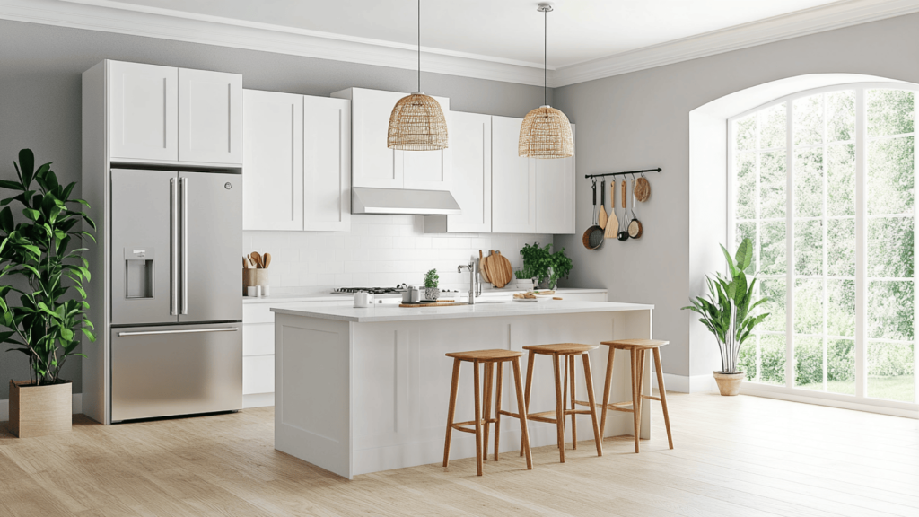
Moonshine gives kitchens a soft, clean base. It works well with white cabinets, stainless steel, and natural wood tones. The cool undertones help balance out warm lighting from pendant or overhead fixtures.
Bathrooms
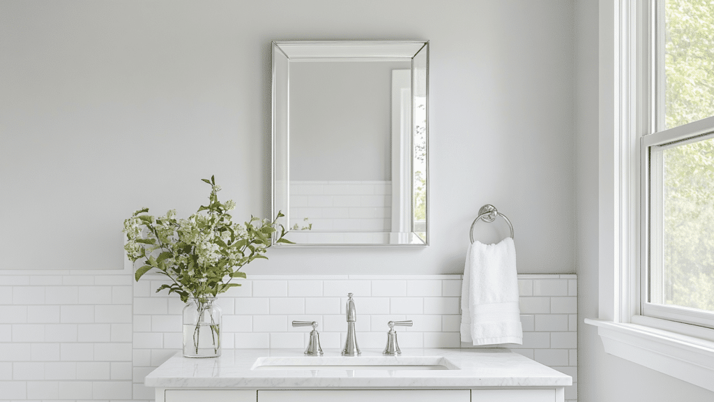
In bathrooms, it feels fresh and calming. Pair it with white or marble tile to keep the space feeling bright. Just keep in mind, small bathrooms with little natural light may bring out more of the green tint.
Living Rooms
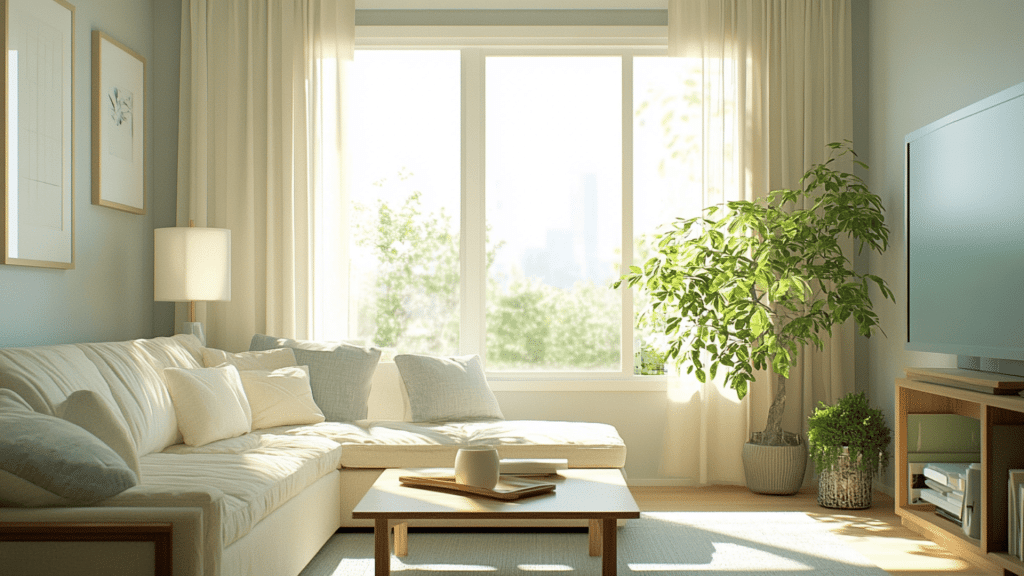
This color adds a relaxed and airy feel to living rooms. It works with both modern and traditional styles and doesn’t overpower other colors. The subtle tone keeps things neutral while adding a bit of depth to your walls.
Bedrooms
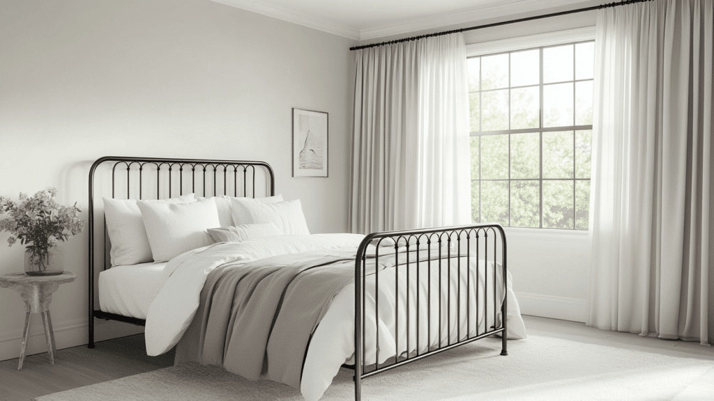
Moonshine can make a bedroom feel peaceful and light. It pairs nicely with soft bedding and wood or metal furniture. Just be mindful of how your windows face, it’ll change how the undertones show up.
Overall, Moonshine works best in rooms where you want a light, easy-going backdrop without stark white walls.
How Lighting Affects It
Lighting plays a huge role in how Moonshine looks. The same paint can shift tones depending on direction and time of day.
North-facing rooms: These get cooler light, so Moonshine may look more blue-gray.
South-facing rooms: These are bright and warm, which can soften Moonshine and make it feel more neutral.
East-facing rooms: Morning light brings out its crispness; it may feel cooler and cleaner early in the day.
West-facing rooms: In the evening, warm sunlight can draw out subtle green or slightly beige tones.
Light changes throughout the day, so always test a sample on multiple walls and check it morning, noon, and night. That way, you’ll know exactly how it behaves in different lighting conditions.
Moonshine vs. Other Benjamin Moore Grays
Benjamin Moore has a lot of popular gray shades, and it can be tough to pick the right one. Here’s how Moonshine stacks up against some of the most talked-about grays from the brand.
Moonshine vs. Gray Owl
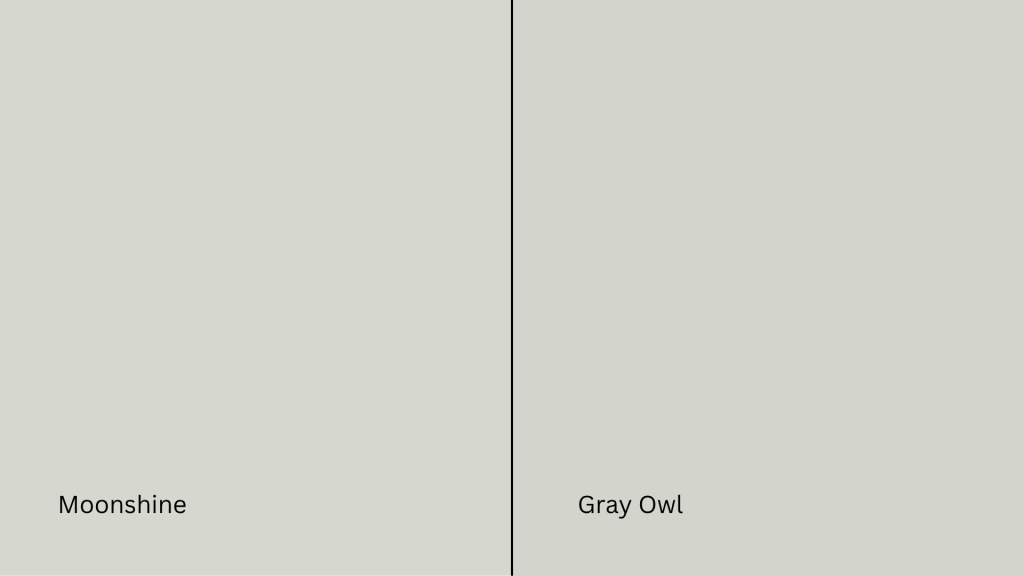
Gray Owl (OC-52, #D3D4CC) is a fan favorite. It is a flexible, soft gray with blue-green undertones—just like Moonshine.
- Gray Owl is lighter and can look cooler, especially in low light.
- Moonshine has a slightly softer and less crisp feel, with less of a blue cast.
If you want a sharper gray, Gray Owl may suit you better. If you’re after something more muted, Moonshine is a safer bet.
Moonshine vs. Balboa Mist
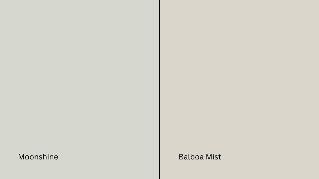
Balboa Mist (OC-27, #DAD5CC) leans toward the warm gray side (a.k.a. greige). It has purple-pink undertones that make it feel warmer than Moonshine.
- Balboa Mist is ideal for cozy, soft-toned spaces.
- Moonshine stays more neutral and cooler, especially in daylight.
Choose Balboa Mist if you want warmth without going beige. Stick with Moonshine for cooler, more modern rooms.
Moonshine vs. Classic Gray
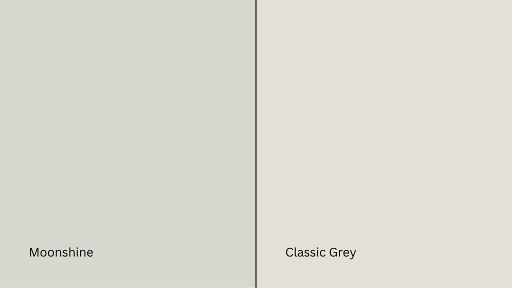
Classic Gray (OC-23, #E3DFD5) is a warm, almost off-white gray that’s very soft and subtle.
- Classic Gray can appear almost beige or greige.
- Moonshine is cooler, with clearer gray tones.
Classic Gray works better in traditional spaces or paired with warm woods. Moonshine is better if you’re leaning modern or coastal.
Moonshine vs. Edgecomb Gray
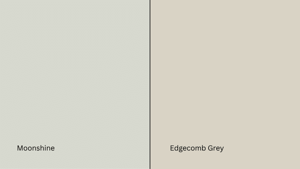
Edgecomb Gray (HC-173, #DAD1C4) is another warm greige with earthy undertones.
- Edgecomb Gray shifts beige in warm light.
- Moonshine stays cool with green/blue hints.
If your room has warm light and wood accents, Edgecomb Gray may feel more balanced. For cooler light or a fresher look, go with Moonshine.
Undertone and LRV Comparison Table
| Paint Color | Undertones | LRV | Warm or Cool |
|---|---|---|---|
| Moonshine | Blue-green | 68.28 | Cool |
| Gray Owl | Blue-green | 65.77 | Cool |
| Balboa Mist | Violet-pink | 67.37 | Warm |
| Classic Gray | Warm beige | 73.67 | Warm |
| Edgecomb Gray | Taupe/beige | 63.88 | Warm |
All of these shades are popular for a reason, but they behave differently in real homes. Test them side by side before making a final call.
Best Color Pairings for Moonshine
I’ve found that Moonshine is a flexible neutral, but it really shines when paired with the right trim, accents, and finishes. Here’s how I like to match it throughout the home for a clean, balanced look.
Trim and Ceiling Suggestions
Pairing Moonshine with the right white paint helps keep the room feeling bright and clean. Here are some options that work best:
Chantilly Lace (OC-65, #F5F5EF): Crisp, bright white with no strong undertones. Keeps the space modern and sharp.
White Dove (OC-17, #F0EDE4): A soft, warm white that pairs well with Moonshine’s cooler tones for a subtle contrast.
Super White (OC-152, #F1F2EE): A high-brightness option if you want a stark trim or ceiling.
If you’re painting the ceiling the same color as the trim, stick to one of these whites in a flat finish to avoid glare.
Accent Wall and Furniture Colors
You can go in two directions with Moonshine: soft and serene, or bold and dramatic.
For a calm, layered feel, try pairing it with pale blue, warm greige, soft sage, or dusty rose. These colors add dimension without overwhelming the space. They’re especially nice for bedrooms and living rooms where you want a gentle atmosphere.
If you’re after more contrast and personality, go for navy blue, charcoal gray, forest green, or even matte black. These shades stand out against Moonshine’s cool backdrop and bring depth to modern or industrial-style spaces.
When it comes to furniture, neutral upholstery, like beige, off-white, or light gray, keeps the look cohesive. But adding a bold accent chair, colorful throw, or rich-toned wood piece can bring the whole room to life.
Hardware and Flooring Compatibility
I’ve noticed that Moonshine works well with all kinds of materials, but pairing it with the right metal finishes and flooring really brings out its undertones.
For hardware, brushed brass adds a touch of warmth and makes Moonshine feel more inviting. If you prefer a cleaner, sleeker look, polished chrome is a great choice. Want a bold, modern vibe? Go with matte black, it creates a striking contrast against the soft gray.
When choosing flooring, light oak or whitewashed wood will keep the room feeling open and breezy. Medium brown tones like walnut add a cozy richness that grounds the space. If you’re using tile or stone, try soft grays with similar undertones for a smooth, tonal effect.
No matter what you choose, always test samples together in your space. Moonshine is subtle but responsive.
Paint Finish Recommendations
I’ve learned that the finish you pick doesn’t just change how tough your walls are, it also changes how Moonshine shows up in your space. Here’s what each finish does and how it can shift the look of the color.
Matte is great for low-traffic areas like ceilings or guest rooms. It hides wall flaws and gives Moonshine a soft, powdery appearance. The cool undertones feel more subtle, especially in dim or shadowed spaces.
Eggshell works well in living rooms and dining rooms. It offers a slight sheen that reflects just enough light to keep things bright without highlighting wall texture. This finish makes Moonshine feel balanced; still soft, but a little more lively.
Satin is ideal for kitchens, bathrooms, and busy hallways. It’s smooth, easy to clean, and moisture-resistant. The extra shine can bring out Moonshine’s green or blue undertones more clearly, especially in natural or overhead lighting.
If you’re stuck between finishes, try a sample swatch on your wall with your room’s lighting. That’ll give you the best feel for how Moonshine will behave.
Sampling and Buying Options
Before you commit to a gallon, it’s smart to test Moonshine in your own space. Light, room size, and surrounding colors can all affect how it looks.
Where to Get Peel-and-Stick Samples
The easiest way to try Moonshine without making a mess is with peel-and-stick samples.
- Samplize offers real paint samples with an adhesive back. They’re removable, repositionable, and damage-free.
- Local hardware stores often carry Moonshine chips or small sample pots.
- Benjamin Moore retailers usually offer both painted cards and tester jars for brushing on small sections of your wall.
Stick samples on different walls and check them in morning and evening light to see how the undertones shift.
Where to Buy the Paint
You can buy Benjamin Moore Moonshine both online and in-store.
- benjaminmoore.com offers direct ordering with store pickup or home delivery.
- Independent retailers often carry Moonshine in various finishes.
- Larger hardware stores may have it in stock or can place custom orders.
- Some retailers also offer curbside pickup or delivery options. Check ahead for availability.
Moonshine Equivalents in Other Brands
If you don’t have access to Benjamin Moore paint nearby or you’re trying to match another brand, I’ve found a few close alternatives to Moonshine.
Just remember that each brand has its own formula, so the finish and undertones might look a little different.
Sherwin-Williams: Look at Olympus White (SW 6253, #D8DDE1) or First Star (SW 7646, #E5E5E1) for a similar soft gray with cool undertones.
Behr: Try Silver Drop (790C-2, #DDDACF) or Dolphin Fin (790C-3, #CCCAC1) for a comparable light gray with a muted look.
Valspar: Check out Gravity (4005-1B, #C6C9CB) or Filtered Shade (4003-1B, #CBC9C4) for subtle, cool-leaning grays.
These options can come close, but it’s always best to sample them side by side if possible. Even a small difference in base color or gloss level can change how the paint feels on your wall.
Conclusion
If you’ve made it this far, you’ve got a clear idea of whether Benjamin Moore’s Moonshine is the right fit for you.
You’ve seen how it looks in real rooms, how light and finishes affect it, and which colors it pairs best with.
Now, shopping online or in-store will feel a lot easier. One last tip: always sample it on your own walls. Lighting can shift the color more than you’d expect.
Still comparing shades? Take a look at my other paint guides on the website. They’re laid out just like this one to help you choose with confidence.


