

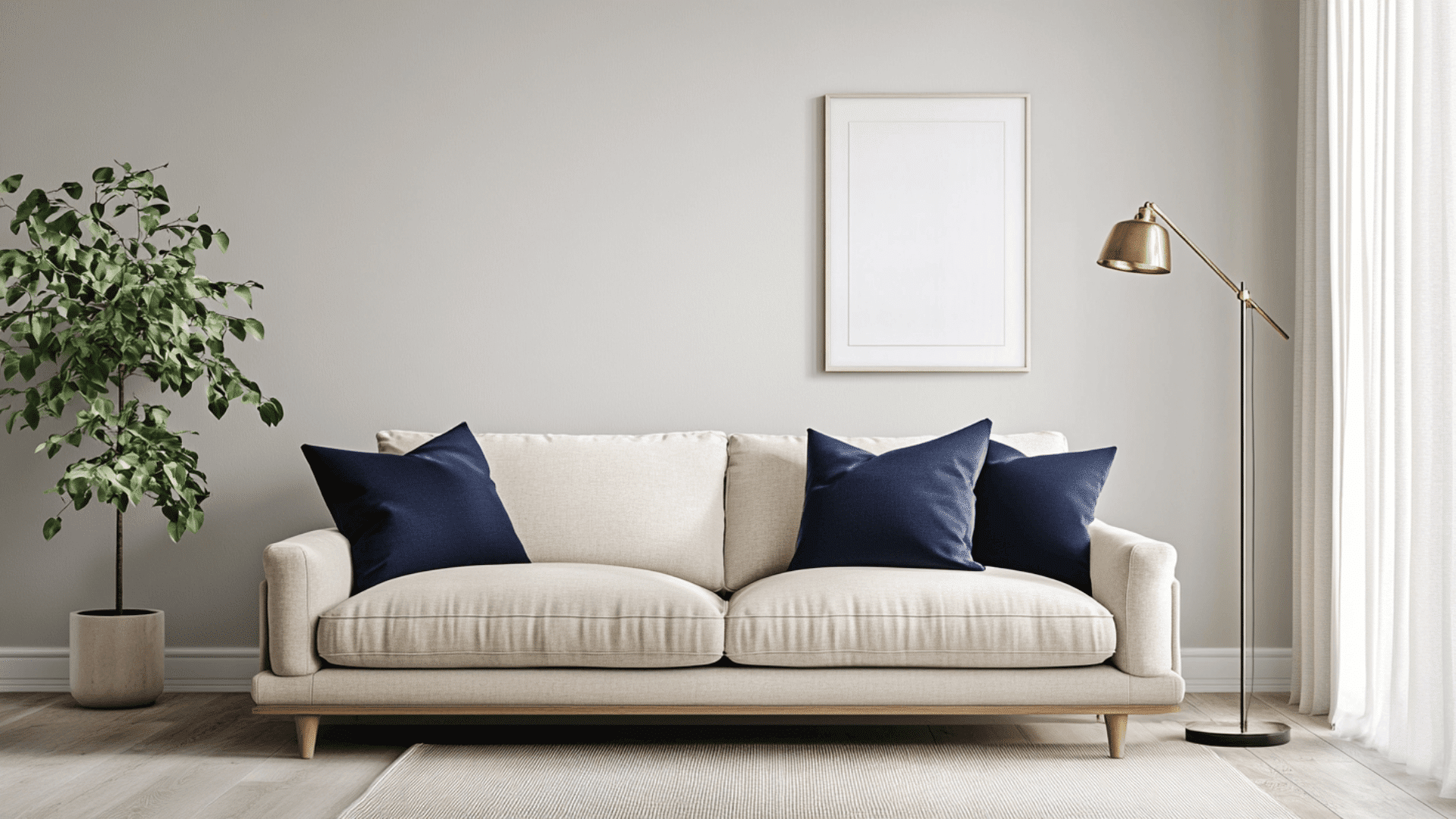
Choosing a gray paint seems easy, until you realize how many versions of “light gray” exist. I’ve been there too, trying to figure out which one won’t feel too blue, too beige, or just plain dull once it’s on the wall. That’s exactly why I put this guide together: to help you decide if Benjamin Moore’s Moonshine is the right shade for your home. I’ll walk you through how it looks in real spaces, how it compares to other popular light grays, and what colors it works best with. You’ll also get tips on sampling, buying, and what to expect in different lighting. Let’s figure this out together. Getting to Know Benjamin Moore’s Moonshine Moonshine (OC-56 or 2140-60) by Benjamin Moore is a soft, muted paint color that’s often described as a cool light gray. Basic Color Profile HEX code: #D8D9D2 LRV (Light Reflectance Value): 68.28 Color family: Light gray with subtle cool tones This color belongs to Benjamin Moore’s Off-White Collection, also referred to as the Color Preview Collection, depending on where you find it. Moonshine sits in that sweet spot between warm and stark. It’s cool without feeling icy, giving your space a calm, clean look. Undertones Explained Moonshine has blue and green undertones hiding just beneath the surface. These don’t jump out right away, but come through more clearly depending on the light in your room. In daylight, especially from north-facing windows, you’ll likely see more of the blue undertone. Under warm artificial light, the green undertone can appear more noticeable. This shifting undertone effect is what makes Moonshine such a flexible color. But it also means you should test it in your actual space before painting the whole room. Moonshine in Real Spaces Moonshine looks different depending on the room and lighting. Here’s how it usually behaves, so you can decide if it’s the right fit for your home. How It Looks in Different Rooms Kitchens Moonshine gives kitchens a soft, clean base. It works well with white cabinets, stainless steel, and natural wood tones. The cool undertones help balance out warm lighting from pendant or overhead fixtures. Bathrooms In bathrooms, it feels fresh and calming. Pair it with white or marble tile to keep the space feeling bright. Just keep in mind, small bathrooms with little natural light may bring out more of the green tint. Living Rooms This color adds a relaxed and airy feel to living rooms. It works with both modern and traditional styles and doesn’t overpower other colors. The subtle tone keeps things neutral while adding a bit of depth to your walls. Bedrooms Moonshine can make a bedroom feel peaceful and light. It pairs nicely with soft bedding and wood or metal furniture. Just be mindful of how your windows face, it’ll change how the undertones show up. Overall, Moonshine works best in rooms where you want a light, easy-going backdrop without stark white walls. How Lighting Affects It Lighting plays a huge role in how Moonshine looks. The same paint can shift tones depending on direction and time of day. North-facing rooms: These get cooler light, so Moonshine may look more blue-gray. South-facing rooms: These are bright and warm, which can soften Moonshine and make it feel more neutral. East-facing rooms: Morning light brings out its crispness; it may feel cooler and cleaner early in the day. West-facing rooms: In the evening, warm sunlight can draw out subtle green or slightly beige tones. Light changes throughout the day, so always test a sample on multiple walls and check it morning, noon, and night. That way, you’ll know exactly how it behaves in different lighting conditions. Moonshine vs. Other Benjamin Moore Grays Benjamin Moore has a lot of popular gray shades, and it can be tough to pick the right one. Here’s how Moonshine stacks up against some of the most talked-about grays from the brand. Moonshine vs. Gray Owl Gray Owl (OC-52, #D3D4CC) is a fan favorite. It is a flexible, soft gray with blue-green undertones—just like Moonshine. Gray Owl is lighter and can look cooler, especially in low light. Moonshine has a slightly softer and less crisp feel, with less of a blue cast. If you want a sharper gray, Gray Owl may suit you better. If you’re after something more muted, Moonshine is a safer bet. Moonshine vs. Balboa Mist Balboa Mist (OC-27, #DAD5CC) leans toward the warm gray side (a.k.a. greige). It has purple-pink undertones that make it feel warmer than Moonshine. Balboa Mist is ideal for cozy, soft-toned spaces. Moonshine stays more neutral and cooler, especially in daylight. Choose Balboa Mist if you want warmth without going beige. Stick with Moonshine for cooler, more modern rooms. Moonshine vs. Classic Gray Classic Gray (OC-23, #E3DFD5) is a warm, almost off-white gray that’s very soft and subtle. Classic Gray can appear almost beige or greige. Moonshine is cooler, with clearer gray tones. Classic Gray works better in traditional spaces or paired with warm woods. Moonshine is better if you’re leaning modern or coastal. Moonshine vs. Edgecomb Gray Edgecomb Gray (HC-173, #DAD1C4) is another warm greige with earthy undertones. Edgecomb Gray shifts beige in warm light. Moonshine stays cool with green/blue hints. If your room has warm light and wood accents, Edgecomb Gray may feel more balanced. For cooler light or a fresher look, go with Moonshine. Undertone and LRV Comparison Table Paint Color Undertones LRV Warm or Cool Moonshine Blue-green 68.28 Cool Gray Owl Blue-green 65.77 Cool Balboa Mist Violet-pink 67.37 Warm Classic Gray Warm beige 73.67 Warm Edgecomb Gray Taupe/beige 63.88 Warm All of these shades are popular for a reason, but they behave differently in real homes. Test them side by side before making a final call. Best Color Pairings for Moonshine I’ve found that Moonshine is a flexible neutral, but it really shines when paired with the right trim, accents, and finishes. Here’s how I like to match it throughout the home for a clean, balanced look. Trim and Ceiling Suggestions Pairing Moonshine with the right white paint helps keep the room feeling bright and clean. Here are some options that work best: Chantilly Lace (OC-65, #F5F5EF): Crisp, bright white with no strong undertones. Keeps the space modern and sharp. White Dove (OC-17, #F0EDE4): A soft, warm white that pairs well with Moonshine’s cooler tones for a subtle contrast. Super White (OC-152, #F1F2EE): A high-brightness option if you want a stark trim or ceiling. If you’re painting the ceiling the same color as the trim, stick to one of these whites in a flat finish to avoid glare. Accent Wall and Furniture Colors You can go in two directions with Moonshine: soft and serene, or bold and dramatic. For a calm, layered feel, try pairing it with pale blue, warm greige, soft sage, or dusty rose. These colors add dimension without overwhelming the space. They’re especially nice for bedrooms and living rooms where you want a gentle atmosphere. If you’re after more contrast and personality, go for navy blue, charcoal gray, forest green, or even matte black. These shades stand out against Moonshine’s cool backdrop and bring depth to modern or industrial-style spaces. When it comes to furniture, neutral upholstery, like beige, off-white, or light gray, keeps the look cohesive. But adding a bold accent chair, colorful throw, or rich-toned wood piece can bring the whole room to life. Hardware and Flooring Compatibility I’ve noticed that Moonshine works well with all kinds of materials, but pairing it with the right metal finishes and flooring really brings out its undertones. For hardware, brushed brass adds a touch of warmth and makes Moonshine feel more inviting. If you prefer a cleaner, sleeker look, polished chrome is a great choice. Want a bold, modern vibe? Go with matte black, it creates a striking contrast against the soft gray. When choosing flooring, light oak or whitewashed wood will keep the room feeling open and breezy. Medium brown tones like walnut add a cozy richness that grounds the space. If you’re using tile or stone, try soft grays with similar undertones for a smooth, tonal effect. No matter what you choose, always test samples together in your space. Moonshine is subtle but responsive. Paint Finish Recommendations I’ve learned that the finish you pick doesn’t just change how tough your walls are, it also changes how Moonshine shows up in your space. Here’s what each finish does and how it can shift the look of the color. Matte is great for low-traffic areas like ceilings or guest rooms. It hides wall flaws and gives Moonshine a soft, powdery appearance. The cool undertones feel more subtle, especially in dim or shadowed spaces. Eggshell works well in living rooms and dining rooms. It offers a slight sheen that reflects just enough light to keep things bright without highlighting wall texture. This finish makes Moonshine feel balanced; still soft, but a little more lively. Satin is ideal for kitchens, bathrooms, and busy hallways. It’s smooth, easy to clean, and moisture-resistant. The extra shine can bring out Moonshine’s green or blue undertones more clearly, especially in natural or overhead lighting. If you’re stuck between finishes, try a sample swatch on your wall with your room’s lighting. That’ll give you the best feel for how Moonshine will behave. Sampling and Buying Options Before you commit to a gallon, it’s smart to test Moonshine in your own space. Light, room size, and surrounding colors can all affect how it looks. Where to Get Peel-and-Stick Samples The easiest way to try Moonshine without making a mess is with peel-and-stick samples. Samplize offers real paint samples with an adhesive back. They’re removable, repositionable, and damage-free. Local hardware stores often carry Moonshine chips or small sample pots. Benjamin Moore retailers usually offer both painted cards and tester jars for brushing on small sections of your wall. Stick samples on different walls and check them in morning and evening light to see how the undertones shift. Where to Buy the Paint You can buy Benjamin Moore Moonshine both online and in-store. benjaminmoore.com offers direct ordering with store pickup or home delivery. Independent retailers often carry Moonshine in various finishes. Larger hardware stores may have it in stock or can place custom orders. Some retailers also offer curbside pickup or delivery options. Check ahead for availability. Moonshine Equivalents in Other Brands If you don’t have access to Benjamin Moore paint nearby or you’re trying to match another brand, I’ve found a few close alternatives to Moonshine. Just remember that each brand has its own formula, so the finish and undertones might look a little different. Sherwin-Williams: Look at Olympus White (SW 6253, #D8DDE1) or First Star (SW 7646, #E5E5E1) for a similar soft gray with cool undertones. Behr: Try Silver Drop (790C-2, #DDDACF) or Dolphin Fin (790C-3, #CCCAC1) for a comparable light gray with a muted look. Valspar: Check out Gravity (4005-1B, #C6C9CB) or Filtered Shade (4003-1B, #CBC9C4) for subtle, cool-leaning grays. These options can come close, but it’s always best to sample them side by side if possible. Even a small difference in base color or gloss level can change how the paint feels on your wall. Conclusion If you’ve made it this far, you’ve got a clear idea of whether Benjamin Moore’s Moonshine is the right fit for you. You’ve seen how it looks in real rooms, how light and finishes affect it, and which colors it pairs best with. Now, shopping online or in-store will feel a lot easier. One last tip: always sample it on your own walls. Lighting can shift the color more than you’d expect. Still comparing shades? Take a look at my other paint guides on the website. They’re laid out just like this one to help you choose with confidence.
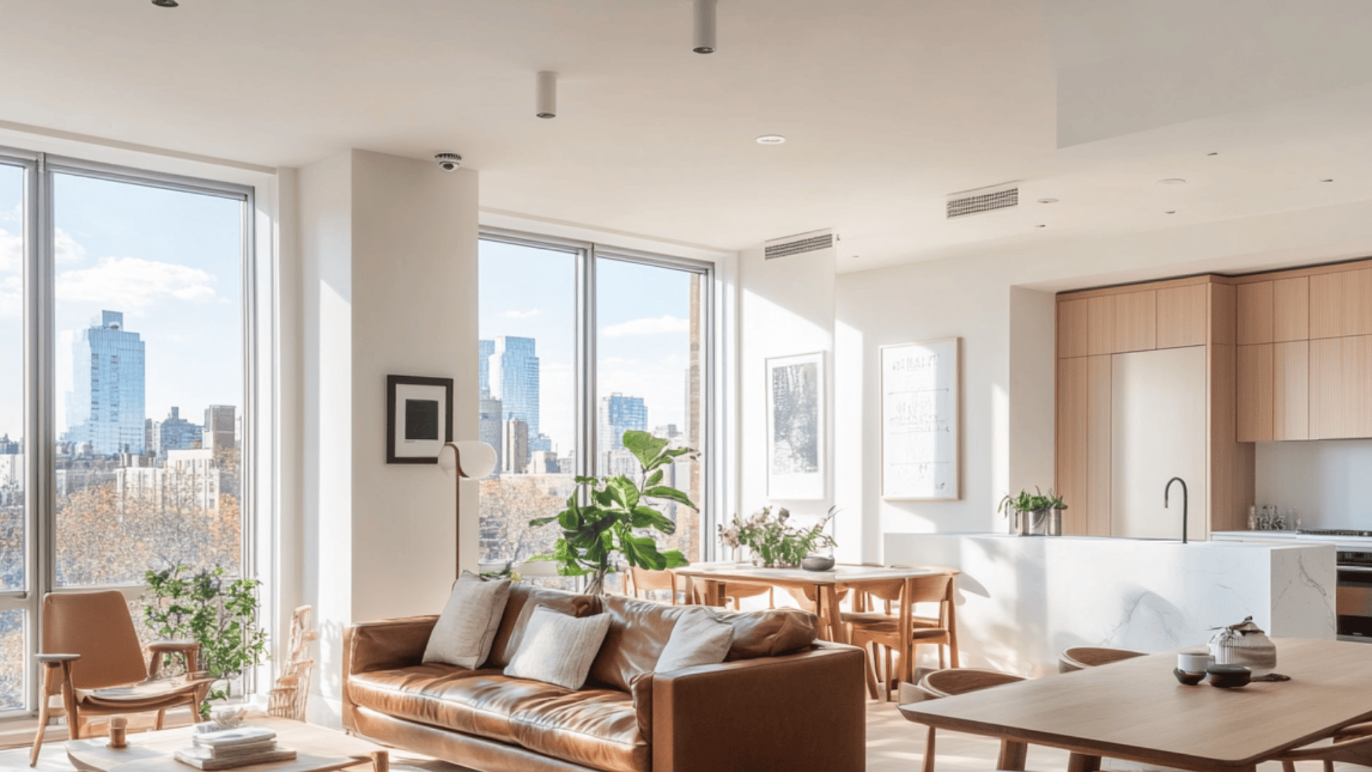
Choosing white paint sounds simple until you’re standing in front of a dozen shades that all look the same. I’ve been there too, wondering which one won’t feel too yellow, too cold, or too flat once it’s on the wall. That’s why I put this guide together to help you figure out if Benjamin Moore’s Snowfall White is the right pick for your space, along with other warm white paint colors that create a soft and balanced look. I’ll show you how it looks in real rooms, how it compares to other popular whites, and what it pairs well with. I’ll also share tips on where to buy it, how to sample it, and what to watch out for. Still unsure how it’ll look in your lighting? Let’s find out together. Getting to Know Benjamin Moore Snowfall White If you’re thinking about painting a room white but want something softer than a pure bright white, Snowfall White might be just what you need. It’s clean, calm, and just warm enough to avoid feeling cold or sterile. Basic Color Profile Snowfall White (2144-70) is part of Benjamin Moore’s Color Preview collection. It has a HEX code of #F7F6F1 and a Light Reflectance Value (LRV) of 92.4, which means it bounces a lot of light around the room. It’s not a harsh white. It leans slightly warm, which makes it feel cozy without looking yellow or dingy. That’s why I like it for rooms where I want a fresh but not clinical look. Undertones Explained Snowfall White has soft yellow undertones. That doesn’t mean it looks yellow on the wall, but in certain lighting, especially warm bulbs or morning sun, you might catch a hint of that creamy warmth. In cooler, natural daylight, it reads more neutral and soft. So if your space gets different kinds of light throughout the day, you’ll probably notice it shifting subtly but always staying peaceful and easy on the eyes. Snowfall White in Real Spaces Snowfall White changes slightly depending on where you use it. The room’s size, light, and purpose can all affect how the color feels. Based on my own experience and what others have shared, here’s what to expect in each space. How It Looks in Different Rooms Kitchens In a kitchen, Snowfall White feels clean and airy. It works well with both stainless steel and warm-toned appliances. I’ve seen it used with wood cabinets and white quartz counters. It keeps the space looking bright without being harsh, and works even better when paired with the right tones using light hardwood floor matching. Bathrooms This shade adds a soft glow to bathrooms. If your bathroom doesn’t get much light, Snowfall White can help make it feel more open. Pair it with soft grays or brushed nickel fixtures for a fresh, relaxed look. Living Rooms In a living room, this color creates a cozy but open feel. It pairs well with warm woods, leather furniture, and even bold accent colors. I like how it reflects light without overpowering the space. Bedrooms Snowfall White in a bedroom feels restful and soft. If you want a calm, peaceful retreat, this color gives you that. It also works great with light bedding and soft pastels for a gentle finish. How Lighting Affects It Lighting plays a big role in how Snowfall White shows up on your walls. Depending on which direction your room faces, this color can shift slightly in tone throughout the day. North-facing rooms: In a north-facing room, you’ll notice cooler natural light. Snowfall White might take on a slightly muted or grayish look here, but it still feels soft, not cold. It’s a good choice if you want to warm up the space just a bit. South-facing rooms: South-facing rooms get warm, golden light most of the day. That really brings out the soft yellow undertones in Snowfall White. It’ll look warm, glowy, and comforting without leaning too yellow. East-facing rooms: Morning light from the east is cooler and brighter. In these spaces, Snowfall White looks clean and fresh early in the day, with a touch of warmth that balances out the cool light. West-facing rooms: With warmer afternoon and evening light, west-facing rooms tend to make Snowfall White look richer and cozier as the day goes on. It’s a great way to add softness without darkening the space. Daylight vs. evening lighting: During the day, it looks brighter and more neutral. In the evening, under warm bulbs, it shifts slightly warmer but still stays balanced and calm. Snowfall White vs. Other Benjamin Moore Whites When you’re choosing between white paints, the small differences can make a big impact. Here’s how Snowfall White compares to other popular Benjamin Moore whites, along with their color codes. Snowfall White vs. Simply White Simply White OC-117 / HEX: #F8F5E9 Simply White leans warmer and more yellow than Snowfall White. That difference is easy to spot in rooms with lots of natural light. Pros of Simply White: Bright, cheerful, and cozy. Cons: It can look too yellow in sunny spaces or under warm bulbs. Why pick Snowfall White: It stays more neutral and feels softer in changing light. Snowfall White vs. White Dove White Dove OC-17 / HEX: #F0EFE8 White Dove is more muted, with gray undertones that give it a creamier, softer feel. Pros of White Dove: Ideal for concealing imperfections and creating a cozy ambiance. Cons: Might look dull or dingy in low-light areas. Why pick Snowfall White: It offers a lighter, fresher appearance without being stark. Snowfall White vs. Chantilly Lace Chantilly Lace OC-65 / HEX: #F8F8F3 Chantilly Lace is Benjamin Moore’s brightest white, with a clean and crisp look. Pros of Chantilly Lace: Pure and bright; perfect for modern or minimalist styles. Cons: Can feel cold or too clinical in cool light. Why choose Snowfall White: It adds a subtle warmth while still feeling bright. Snowfall White vs. Swiss Coffee Swiss Coffee OC-45 / HEX: #F4F0E6 Swiss Coffee has noticeable beige and yellow tones, making it much creamier. Pros of Swiss Coffee: Warm and rich, ideal for traditional or rustic rooms. Cons: It can appear too yellow in some lighting. Why pick Snowfall White: It keeps a cleaner, more balanced tone across different light sources. Best Color Pairings for Snowfall White Snowfall White is soft and flexible, so it works well with a wide range of colors and finishes. If you’re wondering what matches best, here are some simple pairing ideas to help you create a balanced, pulled-together space. Trim and Ceiling Suggestions For trim and ceilings, you’ll want something that keeps the look clean but adds just enough contrast. Chantilly Lace or Super White (OC-152) works great if you want crisp, sharp lines against the softness of Snowfall White. For a seamless look, you can use Snowfall White on the walls and ceiling and go one shade brighter on the trim. In older homes, try White Dove for a gentler contrast that still feels warm. Stick with a satin or semi-gloss finish on the trim to highlight the shape without overwhelming the room. Accent Wall and Furniture Colors Accent colors help break up all the white and add personality to the space. Soft blues, sage greens, or earthy taupes add a calm, natural feel. For something bolder, go with charcoal, navy, or even black as a striking accent. Wood tones, like oak or walnut, warm things up and bring out Snowfall White’s subtle warmth. Light fabrics, woven textures, and neutral upholstery also pair beautifully with it. Hardware and Flooring Compatibility Snowfall White pairs well with a variety of hardware and flooring tones. Brushed nickel and matte black hardware create clean, modern lines. For a warmer look, use brass or aged bronze, which brings out the soft yellow undertones. On the floor, medium-tone hardwoods, white oak, or even warm tile look great. Avoid very cool grays or icy tones. They can clash with Snowfall White’s warmth and make the room feel off balance. Stick with soft, natural finishes for the most cohesive look. Sampling and Buying Options Where to Get Peel-and-Stick Samples Before you commit, it’s smart to test colors on your walls. Peel-and-stick samples give you flexibility and instant feedback. Samplize: Samplize offers reusable peel-and-stick samples from Benjamin Moore and other major brands like Sherwin-Williams and PPG. Their Snowfall White sample costs around $5.95, ships fast, and peels off cleanly, so you can test it on multiple walls. Many people love how easy they are to use, with no mess and no cleanup. Local paint stores: They also offer helpful sampling tools. At places like Sherwin-Williams, Home Depot (for Behr), and Lowe’s (for Valspar), you can get free color swatches and purchase small brush-on sample pots. These liquid samples usually cover about 2 square feet and cost around $5.99. Online: If you prefer to shop from home, you can order peel-and-stick or liquid samples directly from Samplize or Benjamin Moore’s website. Colors Similar to Snowfall White in Other Brands If you want a similar white to Snowfall White using other popular brands in the U.S., here’s what will align best: High Reflective White (SW 7757) This shade from Sherwin-Williams closely matches Snowfall White in brightness and neutrality. Great if you want a crisp, clean white without warmth. Whisper White (HDC-MD-08) Behr shows Whisper White as the top match on Match My Paint Color. Other close alternatives include Fresh Popcorn, Polar Bear, and Snowy Egret. Valspar’s Ewe (8007‑5A) Valspar’s Ewe is a very close match with nearly identical lightness and warmth (ΔE ≈ 1.01). Crumb Cookie, Gypsum, or Clear Yellow PPG lists Crumb Cookie (PPG18-01), Gypsum (PPG1006-1), and Clear Yellow (PPG1215-1) as strong matches to Snowfall White based on warmth and brightness. These shades offer a soft, creamy look without leaning too yellow. Where to Buy the Paint You can buy Benjamin Moore Snowfall White at several convenient places, both in-store and online. Benjamin Moore retailers: Use the store locator on the Benjamin Moore website to find an authorized dealer near you. Many of these stores offer custom mixing, expert advice, and same-day pickup. Local paint shops: Independent hardware stores and paint centers often carry Benjamin Moore products. They may even offer small batch mixing or delivery options. Online: You can order Snowfall White directly from the Benjamin Moore website. Most orders ship within a few days, and you can choose your preferred finish and size. Some local dealers also allow online ordering through their own sites. When ordering online, make sure to confirm the sheen (matte, eggshell, satin, semi-gloss, etc.) and paint type (Regal Select, Aura, ben®, etc.), so you get the right version for your space. Conclusion If you’ve made it this far, you’ve got a solid feel for whether Benjamin Moore’s Snowfall White is right for your space. You’ve seen how it looks, what it pairs with, and where to try or buy it. Now, you can walk into a store or shop online, knowing exactly what to look for. Just one last tip from me: always sample it on your walls first. The lighting in your home can significantly impact its appearance more than you might expect. If you’re still unsure or comparing other shades, take a look at my other blogs for honest paint reviews and real-world tips. I’ve broken things down the same way to help you choose with confidence. Frequently Asked Questions Is Snowfall White too warm for most rooms? Snowfall White has a soft warmth without looking yellow. It stays balanced in most lighting, making it suitable for living rooms, bedrooms, and kitchens without feeling overly creamy. What finish works best for Snowfall White walls? Eggshell or satin finishes are commonly used for walls. They provide a slight sheen, are easy to clean, and help reflect light without making imperfections too noticeable. Does Snowfall White work with gray furniture? It can work, but choose warmer grays. Very cool or bluish grays may clash slightly, while soft, warm-toned grays create a more cohesive and comfortable look. How many samples should I test before painting? Test at least two or three similar whites. Compare them on different walls and check throughout the day to see how lighting changes the color before making a final decision. Can Snowfall White be used on trim and ceilings? Yes, but it’s often better to use a slightly brighter white for trim. This adds contrast and keeps edges looking crisp while maintaining a soft overall appearance. Is Snowfall White good for small spaces? It works well in small rooms because of its high light reflectance. It helps spaces feel brighter and more open without appearing stark or overly cold.

Many people think all soft pinks look the same, but Pleasant Pink by Benjamin Moore proves that wrong. This shade adds warmth without being too strong, and it works in many types of spaces. If you’re trying to find a pink that feels clean, calm, and not too sweet. In this guide, I will help you learn where it works best, how it compares to similar shades, what finishes to choose, and how to care for it. Want a pink that feels right in any light? Keep reading. Color Overview: BM Pleasant Pink Pleasant Pink 2094-60 brings warmth and softness to any room. It is a soft blush with a muted base. It feels calm without looking faded or flat. The color has just enough warmth to keep it from feeling cold. It’s easy on the eyes and adds a quiet touch to a room. This pink is often used in spaces where people want comfort without anything too bold. It works well with neutrals and soft whites, offering a grounded and gentle look. LRV and Technical Details This color has a Light Reflectance Value (LRV) of 68.86, making it bright enough to reflect light and keep rooms feeling open. The HEX code is #F5E3E1, and the RGB mix is 245, 227, and 225. That balance gives it a slightly warm feel. It’s available in finishes like matte, eggshell, and satin. Each finish gives the color a slightly different look, depending on the lighting and surface. It’s easy to apply and holds color well. Where it Sits in the Benjamin Moore Collection Pleasant Pink is part of the Color Preview Collection. This collection includes rich and expressive tones, and Pleasant Pink offers a soft contrast. It’s one of the lighter pinks in the group, making it suitable for walls, ceilings, or accents. The collection is popular for design flexibility, and this shade fits well into many home styles. It’s often chosen for rooms that need a calm backdrop but still want a bit of personality through color. Room-by-Room Paint Ideas Using Pleasant Pink Pleasant Pink shade fits in many parts of the home, but a few stand out more than others. Below, we will find out how it performs in specific rooms and why it works. Bedroom Pleasant Pink adds a soft touch to bedrooms, making the space feel calm and easy to rest in. It works well with simple decor or layered textures like quilts, curtains, and throw pillows. The color doesn’t feel loud, so it fits on full walls or in small corners. Under warm lighting, it brings a cozy feel. Under cooler lights, it stays fresh and light. Try pairing it with off-white bedding, tan furniture, or natural wood pieces for a soft and steady look that helps promote rest. Nursery This pink is a gentle choice for nurseries. It offers warmth without being too bold. It creates a quiet feel that’s great for rest and comfort. Pleasant Pink works with pale gray, soft yellow, or baby blue accents. It’s easy to match with neutral furniture and looks good with both modern and classic styles. You can add colorful toys, wall art, or playful patterns without clashing. The color supports a soft base while letting other items in the room stand out. It’s a flexible pick for long-term use as the child grows. Bathroom In a bathroom, Pleasant Pink gives a fresh and clean look while keeping things soft. It pairs nicely with white tiles, brushed nickel or brass fixtures, and soft cotton towels. This color helps small spaces feel more open and less sharp. You can use it on the walls or as a surprise inside cabinets or shelves. Pleasant Pink also blends well with stone, wood, or marble elements. It offers a gentle shift from plain white without being too strong. This makes it a useful shade for both new and classic designs. Living Room Pleasant Pink makes living rooms feel warm and easy to relax in. It adds just enough color to bring interest without being loud. You can pair it with cream furniture, soft brown woods, or cool gray tones. The shade works well across different styles, from simple setups to cozy seating areas. It suits both full wall coverage and as an accent behind bookshelves or art. If you’re reading, talking with guests, or spending time with family, this color brings a steady tone that helps the room feel balanced and welcoming. How Pleasant Pink Affects Light and Mood I’ll cover how lighting influences the appearance of Pleasant Pink and how the color shapes the feel of a space in this section. Both factors are important to consider before painting. How Lighting Affects the Color Pleasant Pink reacts strongly to lighting. In warm lighting, it appears creamy, adding a soft and cozy feel to the room. In cool lighting, it shifts to a fresher and cleaner tone. South-facing rooms bring out their warmth and blush tones. North-facing rooms show more of their muted and calm side. Because light changes throughout the day, it’s best to try a sample first. This lets you see the full range of color shifts and helps you plan where the shade will look its best. Mood and Style Impact This pink brings a steady, peaceful mood to any room. It doesn’t shout for attention but adds quiet charm and warmth. Pleasant Pink fits nicely in cozy bedrooms, open living areas, or calm bathrooms. Its soft presence blends with many styles, vintage, soft, modern, or simple layouts. The color helps the space feel settled without being dull. Light woods, white fabrics, or soft tan accents can be added to create a room that feels both personal and restful. It’s a helpful choice for anyone who prefers calm color over bold contrast. Pleasant Pink Compared to Similar Shades Many soft pinks look alike at first, but small differences change how they feel in a room. Here’s how Pleasant Pink compares to other well-known Benjamin Moore shades. Shade Tone Best Use Warm/Cool Softness Level Notes Pleasant Pink 2094-60 Muted blush Bedrooms, bathrooms, nurseries Warm Very soft Balanced and quiet, not too sweet First Light 2102-70 Fresh rose Entryways, living rooms, studios Cool Soft Lighter and cooler, and feels a bit brighter Tissue Pink 1163 Slightly peachy Kids’ rooms, accents, trim Warm Soft-medium Has a hint of peach, a touch more color Tender Pink 2090-50 Bright pink Playrooms, accent walls Neutral Low softness More bold and lively, it works as a pop Styling Tips from Paint Experts This section offers helpful tips on how to make Pleasant Pink work well in real homes. From finish choices to matching colors, these ideas can help you use this shade with more confidence. Best Accent Colors Pleasant Pink pairs well with creamy whites, soft gold, and natural woods. These accents help the pink stay gentle while adding interest. Gold adds warmth, cream keeps things light, and wood tones bring comfort. You can use white trim for a clean frame, or mix in light taupe or tan furniture for extra depth. These combinations work in both simple and more styled spaces. Keep the tones soft to match Pleasant Pink’s calm feeling. Finish Options for Each Room The finish you choose affects how Pleasant Pink looks and feels. Eggshell is a great option for most walls. It gives a smooth look and handles light wear well. Satin is better in bathrooms or kitchens because it’s more moisture-friendly and easy to clean. Flat finishes offer a soft look for ceilings or low-traffic spots. Trim usually works best in semi-gloss or satin to add just a bit of shine. Choosing the right finish helps the color stay fresh and clean-looking. Expert Color Pairings Designers often suggest pairing Pleasant Pink with warm whites, pale tan, or soft blush tones. These choices keep the look light and steady. Some also mix in muted greens or grays for a calm contrast. A painter might say it’s best used in rooms with steady light to enjoy its full tone. While quotes weren’t found directly, advice from professionals often focuses on keeping the space grounded and simple. Pleasant Pink does best when paired with other soft shades. Wall Care Tips and Mistakes to Avoid Keep your Pleasant Pink walls looking great by following a few simple maintenance tips and avoiding common pitfalls. Care Tips With the right cleaning routine and a bit of protection, your Pleasant Pink walls can stay fresh and inviting for years. Clean gently: Use a soft cloth or sponge with mild soap and water—ideal for satin or eggshell finishes. Avoid harsh scrubbing: It can dull the paint, especially in high-touch areas. Touch up as needed: Check for scuffs in places like hallways or kids’ rooms and plan to repaint every 2–3 years. Block direct sunlight: Use curtains or shades during peak sun hours to help prevent fading. Dust regularly: This keeps the color looking clean and even. Mistakes to Avoid Small errors in painting or color pairing can diminish Pleasant Pink’s charm. Here are the most common mistakes to avoid. Skipping samples: Always test the paint under both natural and artificial light. Using the wrong finish: Avoid flat paint in high-use areas; it marks and wears faster. Overlooking undertones: Clashing shades, like cool grays or bright reds, can disrupt the look. Skipping prep: Dust, cracks, or rough patches will show through if not smoothed first. Overusing in small rooms: Too much pink in tight spaces can feel overwhelming instead of soft. Where to Buy Pleasant Pink 2094-60 Finding Pleasant Pink is easy, thanks to its wide availability through trusted paint retailers. If you prefer shopping online or visiting a local store, you’ll find several ways to get this popular Benjamin Moore shade. Most sellers offer samples, quarts, and gallons in different finishes. You can test the color at home before buying a larger size, which helps ensure it works well in your lighting. Some retailers also provide advice or help with product selection. If you’re planning a project, it’s smart to check for seasonal promotions or store deals. Summing Up Pleasant Pink offers a soft, steady tone that works in nearly any room. It’s easy to pair, simple to maintain, and flexible in style. You now know how lighting affects it, what colors go well with it, and how it compares to other pinks. I make it easier to decide if it fits your space and needs. Test it in your home, check the light, and see how it feels. Browse our other posts for more paint ideas and color guides.
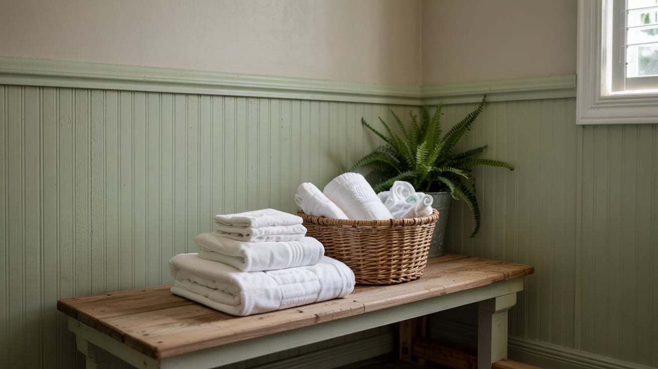
Have you been thinking about giving your space a fresh update without going through a full renovation? I’ve been in that spot too. Adding a green beadboard might be just what you need. It’s a straightforward way to add color, texture, and personality while keeping things simple and functional. In this guide, I’ll show you exactly what green beadboard is, how you can install it yourself, where it looks best in your home, and how to keep it looking great over time. If you’re ready to take on a project that’s both easy and rewarding, let’s get started. What is a Green Beadboard Green beadboard refers to vertically grooved wall paneling painted in various green shades, commonly used to add character and texture to interior spaces. Originating in the 19th century, beadboard was a practical wall finish that protected surfaces while adding visual structure. Over time, it became popular in cottages and traditional homes. The use of green introduces a calm, grounded feel to a room. Earthy tones, such as sage or olive, work especially well in spaces where relaxation, freshness, and a connection to nature are desired. Steps for Installing Beadboard at Home You can easily install green beadboard in your own space by following these steps, which require only a few basic tools. Tools and Materials 4’x8′ beadboard sheets 18-gauge brad nailer and 2” nails Hammer and finishing nails (optional) Stud finder, measuring tape, pencil Jigsaw, table saw, or circular saw Level, painter’s tape Caulk and caulking gun Spackling paste or wood filler 1×4 primed pine (for trim) Outlet extender ring (if needed) Step 1: Cutting Beadboard to Size If full panels are too large for transport, request in-store cutting to accommodate your needs. For a 48″ height, cut 4’x8′ panels in half. This simplifies handling and matches standard wainscot height. Be sure to inspect the edges for consistent grooves to ensure they align when joined. Some stores also offer smaller pre-cut options suited for various wall heights. Step 2: Marking Studs Use a stud finder to locate wall studs. Mark each stud with a small strip of painter’s tape above the intended panel height. This ensures nails are driven into solid support behind the drywall, keeping panels secure. Step 3: Installing the First Panel Place the first panel on top of the baseboard. Using a Brad nailer, drive 2” nails into the marked stud locations. Confirm the panel is level before securing it fully. If using hand tools, attach them with finishing nails, though this takes longer. Step 4: Fitting Partial Panels Measure gaps with a tape measure and mark your cut on the panel. Ensure the groove or rib pattern aligns with the previous panel. Use a table saw, jigsaw, or circular saw to make precise cuts. Dry-fit before securing. Step 5: Making Cutouts for Windows and Outlets Measure carefully around windows or obstacles. Mark vertical and horizontal distances on the panel. For outlets, use double-sided painter’s tape to temporarily attach the cover to the panel’s back, trace the shape, and cut with a multi-tool or jigsaw. Add an extender ring if the outlet sits behind the panel. Step 6: Installing Trim Molding Use 1×4 primed pine for top molding. Measure accurately and cut using a miter saw. Secure trim with brad nails into wall studs. Trim adds a finished edge and conceals any uneven panel tops. Step 7: Filling Gaps and Holes Apply spackling or wood filler to nail holes. Smooth with your finger and sand lightly after drying. For panel seams and corners, use caulk. Cut the tip to a small size and apply with steady pressure. Optionally, use painter’s tape to keep caulk lines neat. Step 8: Final Prep Before Paint Once the paneling, trim, and caulking are finished, lightly sand all surfaces and wipe clean. The panels are already primed so that any standard interior wall paint can be applied directly. Watch the full video tutorial below to see each step in action. Best Rooms to Use Green Beadboard Bathrooms Beadboard is often installed up to 36″–48″ high in bathrooms, offering protection from splashes and visual structure to small spaces. It pairs well with pedestal sinks and vintage or modern fixtures. Combining beadboard with patterned wallpaper or hexagonal tile above creates a two-tone wall effect that’s clean and balanced while also protecting lower walls from moisture. Laundry Rooms Green beadboard is ideal for laundry rooms, especially in homes with moisture concerns. It provides a protective layer over drywall while enhancing visual interest in utilitarian spaces. Choose moisture-resistant panels and pair them with proper caulking and paint for added durability. Whether behind machines or along free walls, this paneling hides scuffs and keeps the space looking fresh with minimal upkeep. Mudrooms & Entryways Mudrooms and entryways benefit from the scuff-resistant, easy-to-clean surface that beadboard provides. When installed at chair rail height or higher, it protects walls from bags, shoes, and coats while giving structure to high-traffic zones. In green tones, beadboard also adds warmth and a sense of order to spaces where functionality is just as important as appearance. Hooks, shelves, or benches pair well with this setup. Choosing the Right Shade of Green When selecting a shade of green for your beadboard, keep a few key points in mind: Sage Green has a soft, muted tone that works well in bathrooms and laundry rooms. It pairs nicely with white trim and marble tile. Olive Green brings an earthy, warm feel, perfect for mudrooms or entryways. It looks great with natural wood and brass accents. Emerald Green offers a rich, bold look, ideal for accent walls or formal spaces. It complements gold accents and dark flooring. Tranquil Green is a cool, pale tone suited for small or relaxed rooms. It blends well with light wood and neutral decor. Meadow Green is a bright, fresh shade that complements kitchens or craft areas well. It pairs best with floral prints and open shelving. Beadboard Types & Materials Understanding the available beadboard options helps you choose a style and material that fits your room’s conditions, budget, and use. Material Description Best Use Notes MDF (Medium Density Fiberboard) Smooth surface, affordable, easy to paint. Dry areas like bedrooms or hallways Avoid in bathrooms or laundry rooms. PVC Water-resistant, lightweight, low-maintenance. Bathrooms, laundry rooms Ideal for humid environments. Wood Natural finish, a classic appearance, and is more expensive. Living rooms, entryways May require sealing in damp areas. Plywood Panels Budget-friendly, available in large sheets, and easy to install. Utility spaces, garages May have visible grain or seams. Peel-and-Stick Vinyl Faux beadboard looks, fast install, minimal tools required. Rentals, quick updates Less durable; not ideal for high-traffic Product Buying Guide for Beadboard When shopping for green beadboard, you’ll want to compare materials, sizing, and finishes to find the best match for your space. Best Retailers & Pricing Familiar sources include major home improvement stores, specialty wall panel providers, and online marketplaces. Most offer a range of materials, from PVC to wood, and some involve cutting services. Retailers may differ in return policies, shipping availability, and panel finish types. Local availability often determines the styles and materials that can be selected. Popular Sizes & Styles Standard beadboard panels are often available in 32″, 42″, or 48” heights with widths up to 96“. Styles include narrow or wide grooves, primed or unfinished surfaces, and decorative edge details. Some panels are tongue-and-groove, while others are flat sheets, affecting ease of installation and seam visibility once mounted on the wall. Peel-and-Stick Options Peel-and-stick beadboard provides a fast, tool-free option for achieving a similar look to traditional paneling. These adhesive panels typically come in vinyl or paper-based materials and are suited for low-moisture areas. They offer flexibility for renters or short-term updates but may lack the texture and durability of true beadboard panels. Maintenance Tips for Beadboard Keep green beadboard looking its best by following a few simple maintenance practices to preserve finish, cleanliness, and durability. How to clean: Wipe with a damp cloth and mild soap. Avoid abrasive scrubbers to prevent surface damage or finish wear. Repainting or sealing: Use quality interior paint for touch-ups. In moisture-prone areas, apply a sealant to protect against water damage. Mold prevention: Ensure proper ventilation. Use mold-resistant materials in bathrooms or laundry spaces and check caulked seams regularly. Summing Up Now that you’ve seen how to choose the right style, install it step by step, and care for your green beadboard, you’re fully equipped to bring this look into your home. I hope this guide has given you the clarity and confidence you need to move forward with your project. If you’re updating one wall or an entire room, you’ve got a smart, stylish option to work with. If you’re ready to keep improving your space, don’t stop here. I’ve put together some simple, helpful tips and how-to guides just for you. Head over to my other posts and find more!

Have you ever looked around your room and thought, “Why does everything feel so tight?” I know the feeling. When the ceiling is lower than you’d like, it can make the entire space feel cramped. However, you don’t need to take down walls or make any significant changes to fix them. In this post, I’ll share low-ceiling design tricks you can start using today. You’ll learn how small changes in color, lighting, and layout can make your space feel more open. Ready to give it a fresh look? Why Low Ceilings Feel Cramped, and What to Do Low ceilings can make rooms feel tighter and more confined than they are. This effect comes from both physical constraints and visual missteps. Poor lighting, dark or heavy finishes, clutter, and oversized fixtures draw the eye downward, compressing the space. Visually breaking the room’s vertical flow also amplifies this sense of constraint. Understanding what contributes to the cramped feeling and avoiding these common design mistakes helps create a more open, airy look without structural changes. The goal is to correct what shrinks space and emphasize what opens it up. Paint & Color Techniques to Visually Raise Ceilings By adjusting how you paint your ceiling and walls, you can create more visual height in your room. These simple techniques help you and your space feel less boxed in and more open. 1. Light Ceiling Colors for Spaciousness If your ceiling feels low, try using white or a very light neutral color. Lighter shades reflect more natural and artificial light, helping the ceiling feel less heavy and more distant. When you choose soft tones, you reduce shadows and make the entire room feel brighter. This is one of the easiest and most effective ways to visually stretch your space without doing anything structural. Stick with consistent finishes and test swatches in natural light to find what works best in your home. 2. Glossy or Reflective Paint Finishes You can make your ceiling appear higher by applying semi-gloss or satin paint. These finishes bounce light, reducing shadows and increasing the sense of openness. When light reflects off the surface, it tricks your eye into thinking the ceiling is farther away. Try this in rooms with good lighting, natural or artificial. Just make sure the surface is smooth before applying, as gloss tends to show imperfections more than flat finishes. A simple change in finish goes a long way in opening up the space. 3. Wall and Ceiling Color Blending Try painting the top portion of your walls the same color as the ceiling, or use a tone just slightly darker. This removes the rigid visual boundary where the wall meets the ceiling, which often draws attention to the room’s height. When that line disappears, your eye moves more easily around the space, helping the ceiling feel taller. It’s a subtle shift but one that can make a real difference. This works especially well in smaller rooms or areas with limited natural light. 4. Vertical Wall Stripes (Paint or Wallpaper) You can draw attention upward by using vertical stripes on your walls. Whether you use paint or wallpaper, these lines create a steady upward visual path that makes the ceiling feel farther away. Choose soft, thin lines in neutral or gentle tones for the most natural look. Broad stripes can be used too, but keep the contrast low to avoid making the room feel busy. Even a slight texture or print in a vertical direction can help you break up horizontal compression in a low-ceilinged space. 5. Painted Trim to Match Ceiling Paint your crown molding or upper trim the same color as your ceiling to blur the boundary where they meet. This prevents your eye from stopping abruptly at the trim, which visually lowers the ceiling. By keeping this area unified in color, you allow the eye to continue moving upward, improving the feeling of extra height. It’s a subtle adjustment that can create a much smoother, taller-looking transition between wall and ceiling, especially in older homes with prominent molding. 6. Bold Ceilings as Visual Features If you want to shift focus upward, consider using a high-contrast or patterned ceiling color. While most designs lean light, a stronger tone can make your ceiling stand out intentionally and shift how the height feels. Use this technique in rooms where you want visual interest above, such as a hallway, reading nook, or dining space. Keep wall colors subdued to support the upward focus. Done carefully, this can make your ceiling feel like a design strength rather than a limitation. Lighting Design That Improves Height When your ceilings feel low, the type and placement of lighting make a noticeable difference. You can use specific light sources and fixture styles to direct the eye upward and reduce downward visual pressure, helping your space feel more open. 7. Uplighting with Sconces or Cove Fixtures To create a sense of height, use lighting that shines upward instead of down. Wall sconces and cove fixtures bounce light off the ceiling, making it appear higher. This soft illumination also reduces shadows in corners and opens up the room. Try placing sconces above eye level to guide the eye upward naturally. You don’t have to install expensive lighting; simple plug-in sconces or LED strip lights can offer the same effect and make your space feel more vertical. 8. Flush or Semi-Flush Mounted Lighting Instead of heavy chandeliers or pendant lights that hang low, choose flush or semi-flush-mounted ceiling lights. These sit close to the ceiling and free up overhead space, which helps the room feel taller. This is especially useful in small rooms or hallways where head clearance is limited. When you install lighting that blends into the ceiling, you reduce visual clutter and draw less attention to the ceiling height itself. Choose sleek designs that complement your decor without overwhelming it. 9. Perimeter Cove LED Lighting Adding soft LED lighting along the edges of your ceiling can create a “floating” effect. These lights sit inside a narrow cove or molding and cast a gentle glow upward, giving the illusion that your ceiling is lifted. This technique works well in bedrooms, living rooms, or any space where you want a calm, ambient feel. You can install flexible LED strips along the top of your walls or behind a shallow ceiling drop. It’s a simple upgrade that brings a big visual payoff. 10. Avoid Low-Hanging Fixtures or Chandeliers Fixtures that hang too low draw attention to the ceiling’s actual height and make it feel even lower. If your room isn’t tall, avoid using oversized chandeliers, bulky pendant lights, or anything with a deep drop. These can interrupt sightlines and create a visual boundary between the floor and the ceiling. Instead, choose compact lighting that hugs the ceiling or opt for multiple wall-mounted sources. Keeping the vertical path clear is key to helping your room feel more spacious. Smart Furniture Layout & Decor Ideas You can influence how tall a room feels just by the way you arrange your furniture and choose decor. By lowering your furniture profile and using vertical accents, you create more space above and keep your room visually open and balanced. 11. Low-Profile Sofas, Beds, and Tables When you use low-profile furniture, like a sofa or bed close to the ground, you automatically create more room between the top of the piece and the ceiling. This extra space helps your room feel taller. Avoid bulky or tall headboards, coffee tables, or cabinetry that take up vertical space. Instead, go for pieces with clean lines and minimal height. You don’t lose function, but you gain a more open, balanced feel from floor to ceiling. It’s an easy design win. 12. Tall, Slim Mirrors Placing a tall, narrow mirror along the wall draws the eye upward and makes the room feel deeper and taller. You benefit from both light reflection and vertical emphasis. Mirrors also expand the sense of space by duplicating views and amplifying brightness. Whether freestanding or wall-mounted, keep the shape elongated and the frame simple. Position it where it can reflect natural light or face a window if possible. This one piece can completely change the feel of your room. 13. Floor-to-ceiling Bookshelves Tall shelving units create vertical lines that instantly add the appearance of height. A floor-to-ceiling bookcase, even if it’s not filled, emphasizes the room’s full vertical span. \It gives structure to an empty wall and visually stretches the height of the space. You don’t need custom cabinetry. Modular shelves or tall units work just as well. Arrange books and decor with space in between to avoid making it feel cluttered. Keep the color consistent with your walls for a more seamless look. 14. Style TV and Furniture Lower to the Ground Mount your TV slightly lower on the wall and keep consoles or media cabinets shorter. When the furniture around your focal point is lower, everything above feels more spacious. This not only improves vertical balance but also helps the ceiling feel farther away. Avoid stacking devices or decorations that add height unnecessarily. The goal is to keep your eye level below the midpoint of the wall so that the ceiling becomes part of the visual field, not a limiting boundary. 15. Use a Bold Area Rug to Anchor Floor Space While this may seem unrelated to ceiling height, a strong rug pulls focus downward and defines the base of your room. When your floor is grounded visually, it balances out the vertical plane and helps everything above feel lighter and less compressed. You don’t have to go with large prints; pick a pattern or texture that adds contrast to your flooring. Keep furniture legs clear or partially exposed to avoid a cluttered look, and let the rug frame the space. 16. Declutter to Open Up Space Clutter can visually crowd a room and lower your perceived ceiling height. When too many items compete for attention, your eye has no clear place to land, and that makes the space feel tighter. Keep surfaces clean, decor minimal, and furniture arrangements open. Use only what you need and love. By simplifying your space, you allow the vertical elements you do have to stand out. This is one of the most effective, no-cost ways to make your ceiling feel higher. Window Treatments That Stretch Vertical Space How you hang curtains can change the way your ceiling looks. By placing them higher and using the right fabrics, you can shift the eye upward and add vertical rhythm. These minor adjustments help you create a more open, taller feel. 17. Hang Curtains at Ceiling Height Instead of mounting your curtain rod just above the window frame, place it close to the ceiling. This draws the eye upward and makes the entire wall appear taller. When you raise the height of your curtain rod, you elongate the visual space from floor to ceiling. Even a few inches of difference in placement can give your room a stronger vertical stretch. Pair with ceiling-mounted tracks for an even cleaner look, especially in modern or minimalist rooms. 18. Use Long, Flowing Panels to the Floor Choose curtain panels that fall all the way to the floor, even slightly pooling if needed. This creates a continuous vertical line from top to bottom, improving the room’s height. Avoid curtains that stop at or above the window sill, as these shorten the visual flow. Long panels also soften the wall and provide a stylish frame for your windows. Stick with lighter fabrics to avoid overpowering the room’s proportions. 19. Single Panel Curtains for Clean Lines Using one wide panel instead of two creates a smoother, uninterrupted line. This reduces visual breaks that can interrupt the upward flow of the wall. A single panel also takes up less space, which is especially helpful in smaller or narrow rooms. You can slide it fully aside during the day for a streamlined look. Keep the panel tall and narrow for maximum impact, and be sure it complements the surrounding wall color or texture. 20. Light, Unfussy Drapery to Reduce Visual Weight Select curtain materials that are lightweight and breathable, such as cotton, linen, or sheer blends. Heavy drapery can visually weigh down a room and feel bulky in spaces with low ceilings. Light fabrics filter natural light, keeping the overall feel open and airy. You want your window treatments to frame the space, not weigh it down. Keep patterns subtle, or go for solids that blend with the wall. The goal is soft height, not heavy drama. Architectural & Structural Tweaks You don’t have to start from scratch to improve ceiling perception. With a few well-placed adjustments to moldings or finishes, you can change how the space feels without major renovation. Focus on clean lines and minimal interruption at the top of your walls. 21. Remove or Slim Down Crown Molding If your ceiling already feels low, thick crown molding can make it feel even shorter. Removing it or replacing it with a thinner profile helps the wall flow more smoothly into the ceiling. A flat or minimal molding draws less attention and reduces the visual cutoff that often happens at the top of the wall. If you keep molding, paint it the same color as the ceiling to blend the transition and help the room feel more spacious overall. 22. Slim, Flat Trim Profiles Thinner trim around the ceiling and door frames contributes to a cleaner look and reduces visual noise. Thick or layered trim can dominate small rooms and compress the height. Instead, opt for flat or square-edge profiles that sit close to the surface. This makes the room look streamlined and modern while maximizing perceived vertical space. Keep the trim color consistent with the walls or ceilings for better flow. Small design choices like this make a noticeable difference in how open your room feels. 23. Light Ceiling Wallpaper or Tin Tiles (Minimal Use) Adding subtle texture or pattern to your ceiling can draw attention upward when done with restraint. Consider light-colored wallpaper, simple geometric patterns, or tin tiles in soft finishes. This technique works best in rooms where the rest of the decor is minimal. Avoid anything too busy or dark, as that can reverse the effect. You want to create gentle interest that pulls the eye upward without overwhelming the space. A touch of pattern above can break the ceiling’s flatness without adding bulk. 24. Faux Beams or Ceiling Panels (Strategically Used) Exposed beams or panels can visually lift or lengthen a ceiling if designed with care. Keep them slim and run them lengthwise to stretch the room visually. Use light wood tones or paint them to match the ceiling for a subtle effect. Avoid dark or heavy-looking beams, which can weigh down the space. This trick works exceptionally well in open-concept rooms or spaces with a rustic-modern aesthetic. When installed properly, they bring structure and direction without compromising height. Vertical Accents that Lead the Eye Up You can shape how someone experiences height in a room by adding vertical design features. When you use tall accents or align your decor vertically, you give the ceiling more presence, helping your space feel taller without making any structural changes. 25. Tall Indoor Plants Place tall, slim plants like fiddle leaf figs, snake plants, or palms in corners to direct attention upward. Their natural height and structure create a vertical rhythm that guides the eye from floor to ceiling. You benefit from greenery and height in one step. Keep the planter minimal to avoid visual weight at the base. Grouping a few plants at staggered heights also improves the vertical pull. This works especially well near windows or unused corners that need visual height support. 26. Artwork Hung Higher Than Eye Level When you hang artwork slightly higher than usual, you lift the natural sightline in the room. This simple shift draws attention away from the center of the wall and toward the upper space near the ceiling. Choose medium to large-scale art and ensure it’s proportionate to the wall height. You don’t need a gallery wall; just a few well-placed pieces with strong vertical alignment can make a big difference. Keep frames light or neutral to avoid visual heaviness. 27. Vertical Sculptures and Wall Panels Sculptural elements that stretch upward add instant height to a room. Tall, narrow wall panels, open-frame structures, or vertical metal art create a continuous flow that brings the ceiling into view. Place them where they won’t compete with other decor, such as beside doorways, in entryways, or along narrow walls. Materials like wood, metal, or matte stone work well without drawing too much weight. Make sure the piece contrasts gently with your wall to stay noticeable without overpowering the room. Customize Your Ceiling: Try These Fixes Room by Room You and your space have unique needs depending on the room. What works in a kitchen may not work in a bedroom. Let’s apply height-enhancing ideas by room type for best results. Living Rooms: Soft Lighting, Bold Rugs, Floating Bookshelves In your living room, keep lighting soft and indirect to reduce harsh shadows that highlight the ceiling height. Add a bold rug to define the floor and draw focus downward. Use floating bookshelves that stretch vertically instead of wide, bulky ones. These simple layout choices balance visual weight and shift attention away from the ceiling height. You’ll get a cozy space that feels more open without changing your entire layout. Bedrooms: Low Headboards, Tall Mirrors, Layered Curtains A low headboard helps open vertical space above your bed, keeping the room from feeling compressed. Pair this with a tall, slim mirror near a window to reflect light and stretch your space upward. Add layered curtains that start at ceiling height and fall to the floor. These combine texture and softness with vertical emphasis, making your bedroom feel taller and more inviting without overwhelming it. Kitchens: Avoid Bulky Overhead Cabinets, Tall Backsplash Lines In your kitchen, ditch bulky cabinets that reach too far into the room and opt for open shelving or cabinets that align closely with the ceiling. This keeps the upper half of your kitchen feeling clean. Add a tall backsplash, either tile or stone, that runs up to the bottom of the cabinets or higher. This vertical surface adds height and helps your kitchen feel more spacious, especially in tight spaces. Bathrooms: Tall Mirrors, Vertical Tile Patterns, Compact Lighting A tall mirror over the sink or vanity can stretch your wall space visually and reflect more light throughout the room. Choose vertical tile patterns, such as stacked subway tiles, to guide the eye upward. Compact, ceiling-mounted lighting or vertical sconces keep things bright without taking up valuable space. These subtle design choices create a sense of vertical movement in small bathrooms, making them feel open, efficient, and far from cramped. Common Mistakes That Make Ceilings Feel Lower Even with good intentions, a few design choices can unintentionally make your ceiling feel even lower. Avoid these common visual mistakes to keep your space feeling open. Using bulky chandeliers that hang too low and dominate the vertical space Dark paint on both walls and the ceiling, which absorbs light and compresses the room Hanging artwork too low, pulling the eye downward instead of up Heavy curtains or ornate valances that visually weigh down the upper wall Ignoring clutter and oversized furniture that disrupts openness and balance Conclusion Now that you’ve gone through these low-ceiling design tricks, you’ve got several ways to make your space feel taller and more comfortable. You don’t have to do everything at once; start with what best fits your needs. If it’s adjusting your curtain height or tweaking your lighting, each step makes a noticeable difference. I hope you find these ideas helpful in your own space. If you’re looking for more simple home updates, feel free to check out more posts like this one.