


Many people think all soft pinks look the same, but Pleasant Pink by Benjamin Moore proves that wrong.
This shade adds warmth without being too strong, and it works in many types of spaces. If you’re trying to find a pink that feels clean, calm, and not too sweet.
In this guide, I will help you learn where it works best, how it compares to similar shades, what finishes to choose, and how to care for it.
Want a pink that feels right in any light? Keep reading.
Color Overview: BM Pleasant Pink
Pleasant Pink 2094-60 brings warmth and softness to any room. It is a soft blush with a muted base. It feels calm without looking faded or flat.
The color has just enough warmth to keep it from feeling cold. It’s easy on the eyes and adds a quiet touch to a room. This pink is often used in spaces where people want comfort without anything too bold.
It works well with neutrals and soft whites, offering a grounded and gentle look.
LRV and Technical Details
This color has a Light Reflectance Value (LRV) of 68.86, making it bright enough to reflect light and keep rooms feeling open.
The HEX code is #F5E3E1, and the RGB mix is 245, 227, and 225. That balance gives it a slightly warm feel. It’s available in finishes like matte, eggshell, and satin.
Each finish gives the color a slightly different look, depending on the lighting and surface. It’s easy to apply and holds color well.
Where it Sits in the Benjamin Moore Collection
Pleasant Pink is part of the Color Preview Collection. This collection includes rich and expressive tones, and Pleasant Pink offers a soft contrast.
It’s one of the lighter pinks in the group, making it suitable for walls, ceilings, or accents. The collection is popular for design flexibility, and this shade fits well into many home styles.
It’s often chosen for rooms that need a calm backdrop but still want a bit of personality through color.
Room-by-Room Paint Ideas Using Pleasant Pink
Pleasant Pink shade fits in many parts of the home, but a few stand out more than others. Below, we will find out how it performs in specific rooms and why it works.
Bedroom
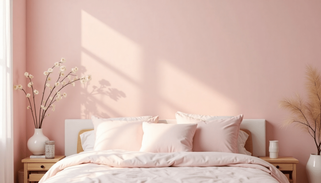
Pleasant Pink adds a soft touch to bedrooms, making the space feel calm and easy to rest in. It works well with simple decor or layered textures like quilts, curtains, and throw pillows.
The color doesn’t feel loud, so it fits on full walls or in small corners. Under warm lighting, it brings a cozy feel. Under cooler lights, it stays fresh and light.
Try pairing it with off-white bedding, tan furniture, or natural wood pieces for a soft and steady look that helps promote rest.
Nursery
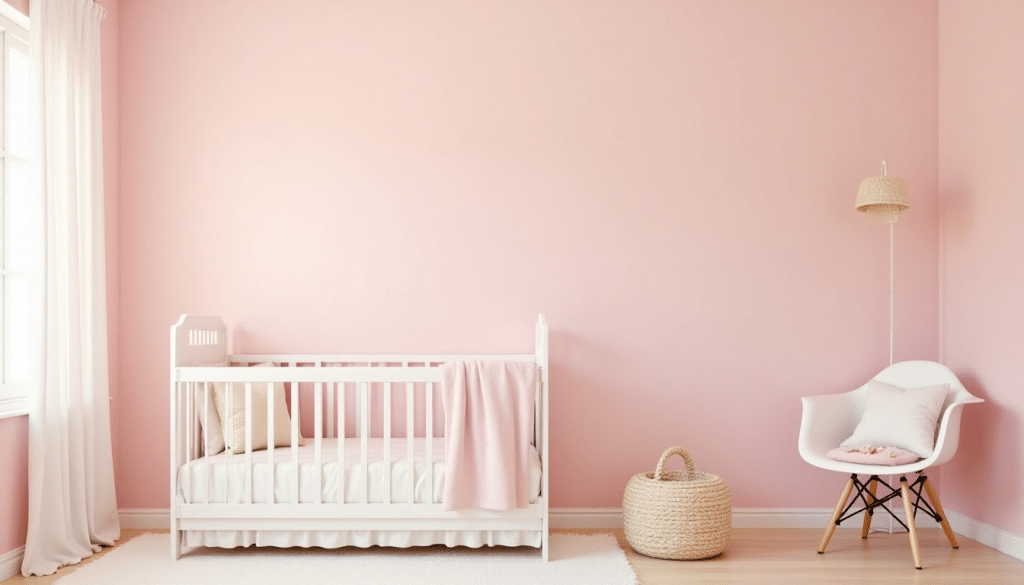
This pink is a gentle choice for nurseries. It offers warmth without being too bold. It creates a quiet feel that’s great for rest and comfort.
Pleasant Pink works with pale gray, soft yellow, or baby blue accents. It’s easy to match with neutral furniture and looks good with both modern and classic styles.
You can add colorful toys, wall art, or playful patterns without clashing. The color supports a soft base while letting other items in the room stand out. It’s a flexible pick for long-term use as the child grows.
Bathroom
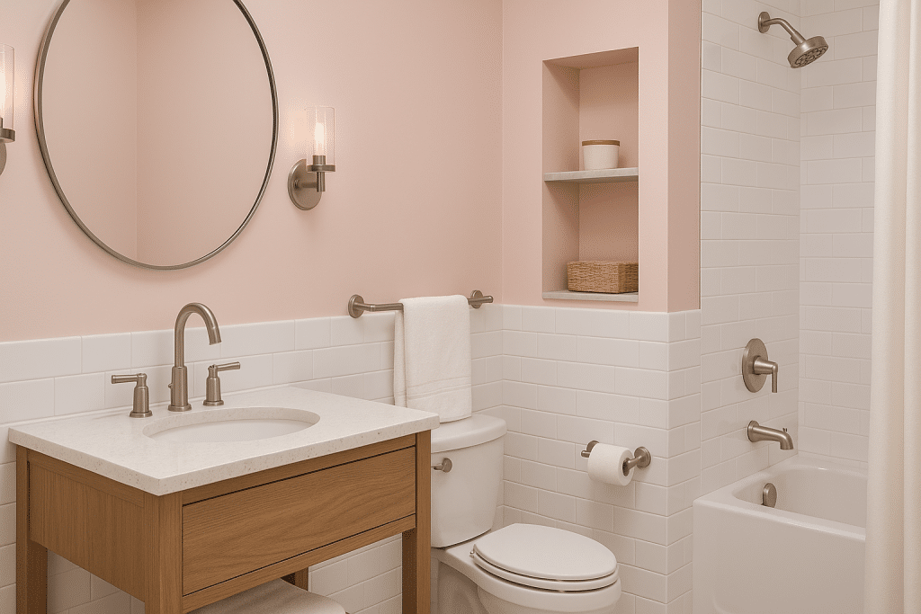
In a bathroom, Pleasant Pink gives a fresh and clean look while keeping things soft. It pairs nicely with white tiles, brushed nickel or brass fixtures, and soft cotton towels.
This color helps small spaces feel more open and less sharp. You can use it on the walls or as a surprise inside cabinets or shelves.
Pleasant Pink also blends well with stone, wood, or marble elements. It offers a gentle shift from plain white without being too strong. This makes it a useful shade for both new and classic designs.
Living Room
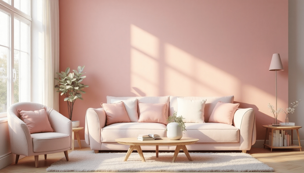
Pleasant Pink makes living rooms feel warm and easy to relax in. It adds just enough color to bring interest without being loud. You can pair it with cream furniture, soft brown woods, or cool gray tones.
The shade works well across different styles, from simple setups to cozy seating areas. It suits both full wall coverage and as an accent behind bookshelves or art.
If you’re reading, talking with guests, or spending time with family, this color brings a steady tone that helps the room feel balanced and welcoming.
How Pleasant Pink Affects Light and Mood
I’ll cover how lighting influences the appearance of Pleasant Pink and how the color shapes the feel of a space in this section. Both factors are important to consider before painting.
How Lighting Affects the Color
Pleasant Pink reacts strongly to lighting. In warm lighting, it appears creamy, adding a soft and cozy feel to the room.
In cool lighting, it shifts to a fresher and cleaner tone. South-facing rooms bring out their warmth and blush tones.
North-facing rooms show more of their muted and calm side. Because light changes throughout the day, it’s best to try a sample first.
This lets you see the full range of color shifts and helps you plan where the shade will look its best.
Mood and Style Impact
This pink brings a steady, peaceful mood to any room. It doesn’t shout for attention but adds quiet charm and warmth.
Pleasant Pink fits nicely in cozy bedrooms, open living areas, or calm bathrooms. Its soft presence blends with many styles, vintage, soft, modern, or simple layouts.
The color helps the space feel settled without being dull. Light woods, white fabrics, or soft tan accents can be added to create a room that feels both personal and restful.
It’s a helpful choice for anyone who prefers calm color over bold contrast.
Pleasant Pink Compared to Similar Shades

Many soft pinks look alike at first, but small differences change how they feel in a room. Here’s how Pleasant Pink compares to other well-known Benjamin Moore shades.
| Shade | Tone | Best Use | Warm/Cool | Softness Level | Notes |
| Pleasant Pink 2094-60 | Muted blush | Bedrooms, bathrooms, nurseries | Warm | Very soft | Balanced and quiet, not too sweet |
| First Light 2102-70 | Fresh rose | Entryways, living rooms, studios | Cool | Soft | Lighter and cooler, and feels a bit brighter |
| Tissue Pink 1163 | Slightly peachy | Kids’ rooms, accents, trim | Warm | Soft-medium | Has a hint of peach, a touch more color |
| Tender Pink 2090-50 | Bright pink | Playrooms, accent walls | Neutral | Low softness | More bold and lively, it works as a pop |
Styling Tips from Paint Experts
This section offers helpful tips on how to make Pleasant Pink work well in real homes. From finish choices to matching colors, these ideas can help you use this shade with more confidence.
Best Accent Colors
Pleasant Pink pairs well with creamy whites, soft gold, and natural woods. These accents help the pink stay gentle while adding interest.
Gold adds warmth, cream keeps things light, and wood tones bring comfort. You can use white trim for a clean frame, or mix in light taupe or tan furniture for extra depth.
These combinations work in both simple and more styled spaces. Keep the tones soft to match Pleasant Pink’s calm feeling.
Finish Options for Each Room
The finish you choose affects how Pleasant Pink looks and feels. Eggshell is a great option for most walls. It gives a smooth look and handles light wear well.
Satin is better in bathrooms or kitchens because it’s more moisture-friendly and easy to clean. Flat finishes offer a soft look for ceilings or low-traffic spots.
Trim usually works best in semi-gloss or satin to add just a bit of shine. Choosing the right finish helps the color stay fresh and clean-looking.
Expert Color Pairings
Designers often suggest pairing Pleasant Pink with warm whites, pale tan, or soft blush tones. These choices keep the look light and steady.
Some also mix in muted greens or grays for a calm contrast. A painter might say it’s best used in rooms with steady light to enjoy its full tone.
While quotes weren’t found directly, advice from professionals often focuses on keeping the space grounded and simple. Pleasant Pink does best when paired with other soft shades.
Wall Care Tips and Mistakes to Avoid
Keep your Pleasant Pink walls looking great by following a few simple maintenance tips and avoiding common pitfalls.
Care Tips
With the right cleaning routine and a bit of protection, your Pleasant Pink walls can stay fresh and inviting for years.
- Clean gently: Use a soft cloth or sponge with mild soap and water—ideal for satin or eggshell finishes.
- Avoid harsh scrubbing: It can dull the paint, especially in high-touch areas.
- Touch up as needed: Check for scuffs in places like hallways or kids’ rooms and plan to repaint every 2–3 years.
- Block direct sunlight: Use curtains or shades during peak sun hours to help prevent fading.
- Dust regularly: This keeps the color looking clean and even.
Mistakes to Avoid
Small errors in painting or color pairing can diminish Pleasant Pink’s charm. Here are the most common mistakes to avoid.
- Skipping samples: Always test the paint under both natural and artificial light.
- Using the wrong finish: Avoid flat paint in high-use areas; it marks and wears faster.
- Overlooking undertones: Clashing shades, like cool grays or bright reds, can disrupt the look.
- Skipping prep: Dust, cracks, or rough patches will show through if not smoothed first.
- Overusing in small rooms: Too much pink in tight spaces can feel overwhelming instead of soft.
Where to Buy Pleasant Pink 2094-60
Finding Pleasant Pink is easy, thanks to its wide availability through trusted paint retailers.
If you prefer shopping online or visiting a local store, you’ll find several ways to get this popular Benjamin Moore shade. Most sellers offer samples, quarts, and gallons in different finishes.
You can test the color at home before buying a larger size, which helps ensure it works well in your lighting. Some retailers also provide advice or help with product selection.
If you’re planning a project, it’s smart to check for seasonal promotions or store deals.
Summing Up
Pleasant Pink offers a soft, steady tone that works in nearly any room. It’s easy to pair, simple to maintain, and flexible in style.
You now know how lighting affects it, what colors go well with it, and how it compares to other pinks. I make it easier to decide if it fits your space and needs.
Test it in your home, check the light, and see how it feels. Browse our other posts for more paint ideas and color guides.


