


Gray has had a long run, but the walls are shifting, and the colors taking its place are warmer, richer, and far more personal.
If you have been asking what color is replacing gray in modern homes, the answer is not one shade but a whole movement toward tones that feel lived-in rather than curated.
The shades taking over bring depth, warmth, and personality that cool gray simply never delivered, and the shift is showing up in homes everywhere.
I walk you through the top emerging home paint trends so you can find the shade that actually fits your space, your light, and the atmosphere you want to wake up to every day.
Why Home Paint Colors Are Shifting
For well over a decade, gray ruled the world of interior design, and honestly, it made a lot of sense. When minimalism swept into mainstream homes around the early 2010s, gray offered something no other color could. It was sleek without being stark, neutral without being boring, and effortlessly modern.
From cool silver-tones to warm charcoal, it became the universal answer to the question of what color should I paint this, right down to picking a door paint color that felt safe and contemporary.
As people spent more time at home, especially through the years of global disruption, they started craving color that felt alive, grounding, and deeply personal.
Today, homeowners are turning to colors rooted in nature, memory, and warmth, signaling not just a design change, but a cultural one.
Colors That Are Replacing Gray: Home Paint
Home paint trends are shifting towards warmer, earthier tones, replacing cool grays with hues that bring personality, warmth, and depth to any space. These emerging shades are both inviting and versatile.
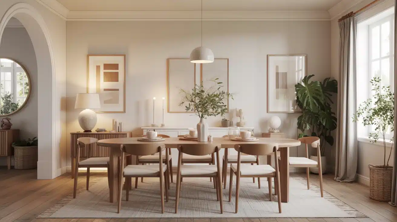
1. Warm Beige
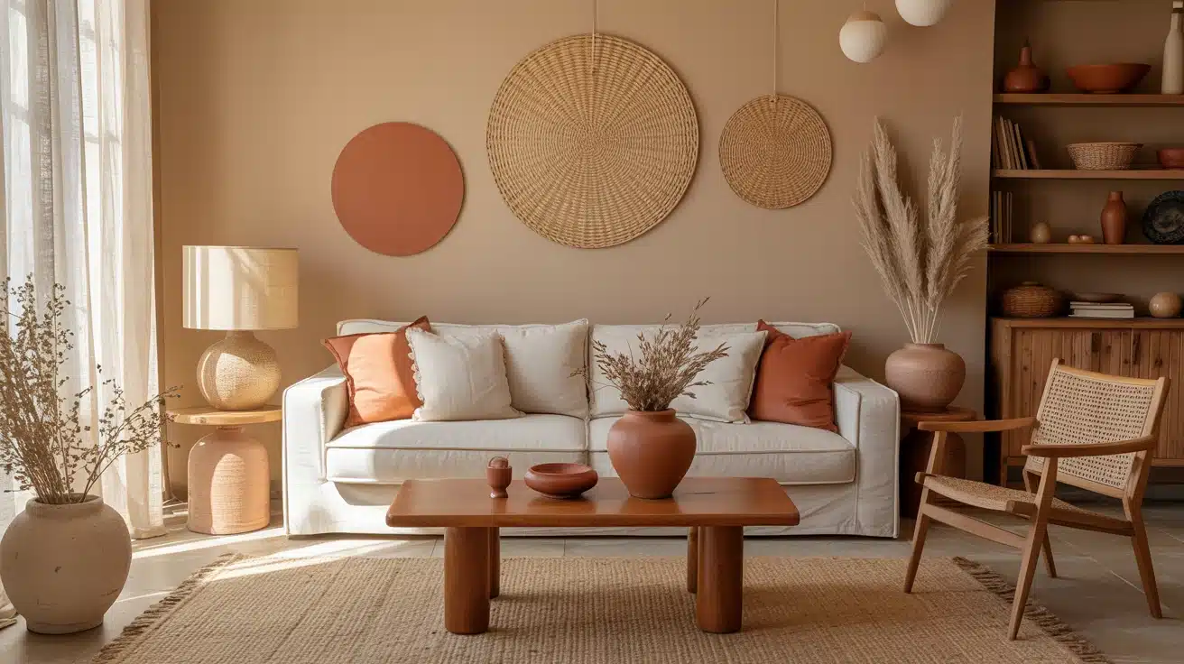
Warm beige creates an immediate sense of welcome, offering a soft and inviting atmosphere. Unlike gray, it adds warmth and comfort to any space, making it feel more lived-in.
Beige evokes the familiar emotions of hearth and sand, blending effortlessly with natural elements like wood, linen, and terracotta.
This versatile color is ideal for creating a cozy and relaxing environment that feels both stylish and inviting.
Here are three great options for incorporating warm beige into your home, each offering unique qualities to suit different spaces:
- Sherwin-Williams Accessible Beige: A soft, versatile beige that pairs well with natural wood and linens.
- Benjamin Moore Revere Pewter: A warm, light beige perfect for creating bright, cozy spaces.
- Behr Swiss Coffee: A soft, light beige that brightens rooms without feeling sterile.
2. Soft Taupe
Soft taupe strikes a balance between traditional richness and modern restraint, creating a refined and grounded atmosphere in any room.
Its soft brown undertones add depth and dimension, offering more warmth than gray. Taupe pairs seamlessly with both antique and contemporary furniture, adding a touch of luxury without overwhelming the space.
Perfect for creating a refined, welcoming environment, taupe works wonders in living rooms, bedrooms, or dining areas.
Here are some great taupe options to consider for your next project:
- Sherwin-Williams Perfect Greige: A balanced taupe that adds warmth without overwhelming the space.
- Benjamin Moore Edgecomb Gray: A versatile taupe perfect for creating subtle refinement in any room.
- Behr Classic Taupe: A warm, neutral taupe ideal for both traditional and modern spaces.
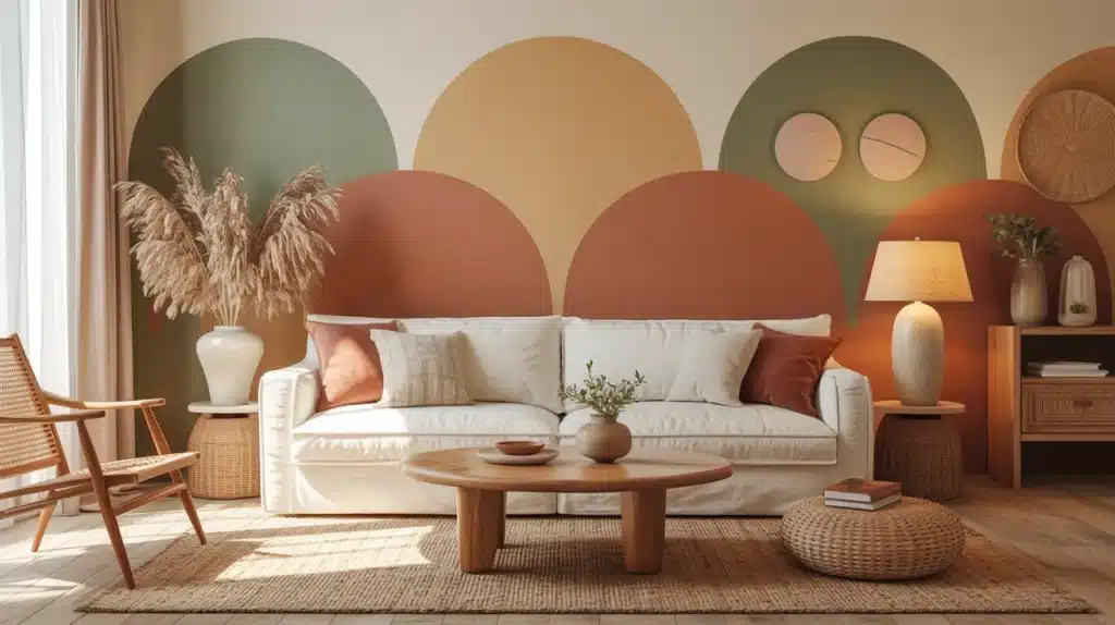
3. Earthy Terracotta
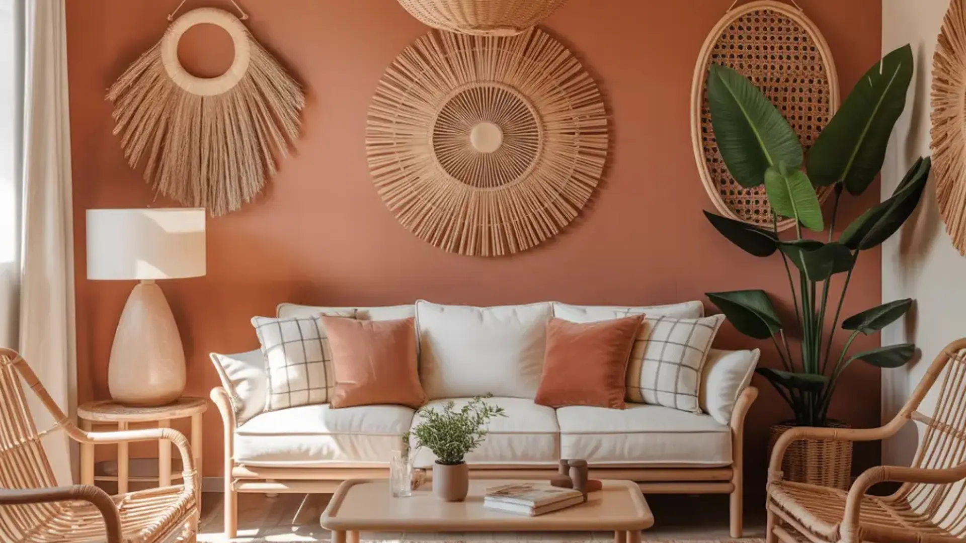
Terracotta brings a sun-baked warmth into your home, evoking imagery of clay pots and Mediterranean villages.
This rich, earthy color connects interiors with nature, offering a bold statement while grounding a space. Its warmth conjures images of soil, pottery, and ancient earthen walls.
Terracotta pairs beautifully with natural textures like rattan and woven materials, making it a perfect color for boho-inspired decor or accent walls.
Here are some great examples of earthy terracotta hues to brighten your space:
- Sherwin-Williams Cavern Clay: A warm, sun-baked terracotta that adds rustic appeal.
- Benjamin Moore Rust: A rich, warm terracotta that brings depth and an earthy, grounded quality to accent walls and living spaces.
- Behr Red Curry: A deep terracotta that brings an earthy vibe to any room.
4. Sage Green
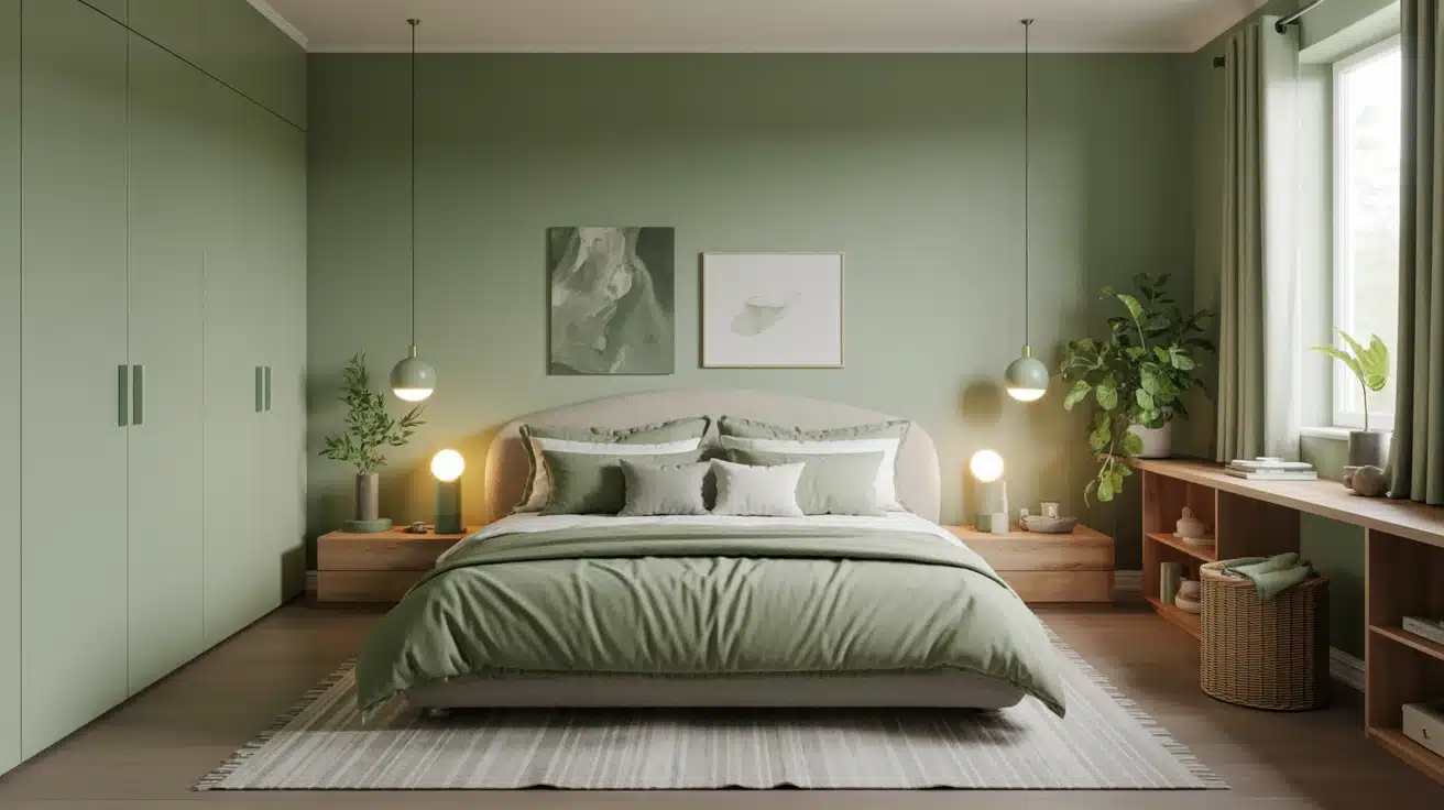
Sage green soothes the mind, bringing calmness and serenity to a space. It embodies the tranquility of a garden at dusk and is ideal for bedrooms or wellness-focused rooms.
The calming hue connects interiors to nature, helping lower stress levels.
Sage green remains classy, never out of style, making it a versatile choice for creating a restful environment that fosters relaxation and peace.
Here are three great sage green options to try in your home:
- Sherwin-Williams Sage: A muted green that evokes a calming, natural ambiance.
- Benjamin Moore Hollingsworth Green: A soft and serene shade, perfect for creating calm, restful spaces.
- Behr Silver Sage: A cool, relaxing sage green that pairs well with light neutrals
5. Warm Off-White
Off-white with warm undertones is a gentler alternative to gray. It brightens a room while neutralizing the harshness of cooler tones.
This soft, welcoming color creates a cozy atmosphere, offering more warmth and personality than traditional white or gray.
Perfect for ceilings, walls, and trim, it improves the natural light in a room and serves as an ideal backdrop for art and furniture.
Here are some warm off-white shades to try:
- Sherwin-Williams Alabaster (SW 7008): A creamy, warm off-white with subtle yellow undertones that feels inviting on walls, ceilings, and trim alike.
- Benjamin Moore White Dove: A clean, warm off-white that feels fresh without reading as stark or cold.
- Behr Antique White: A soft, warm neutral that works beautifully on walls, trim, and cabinetry alike.
6. Muted Blue
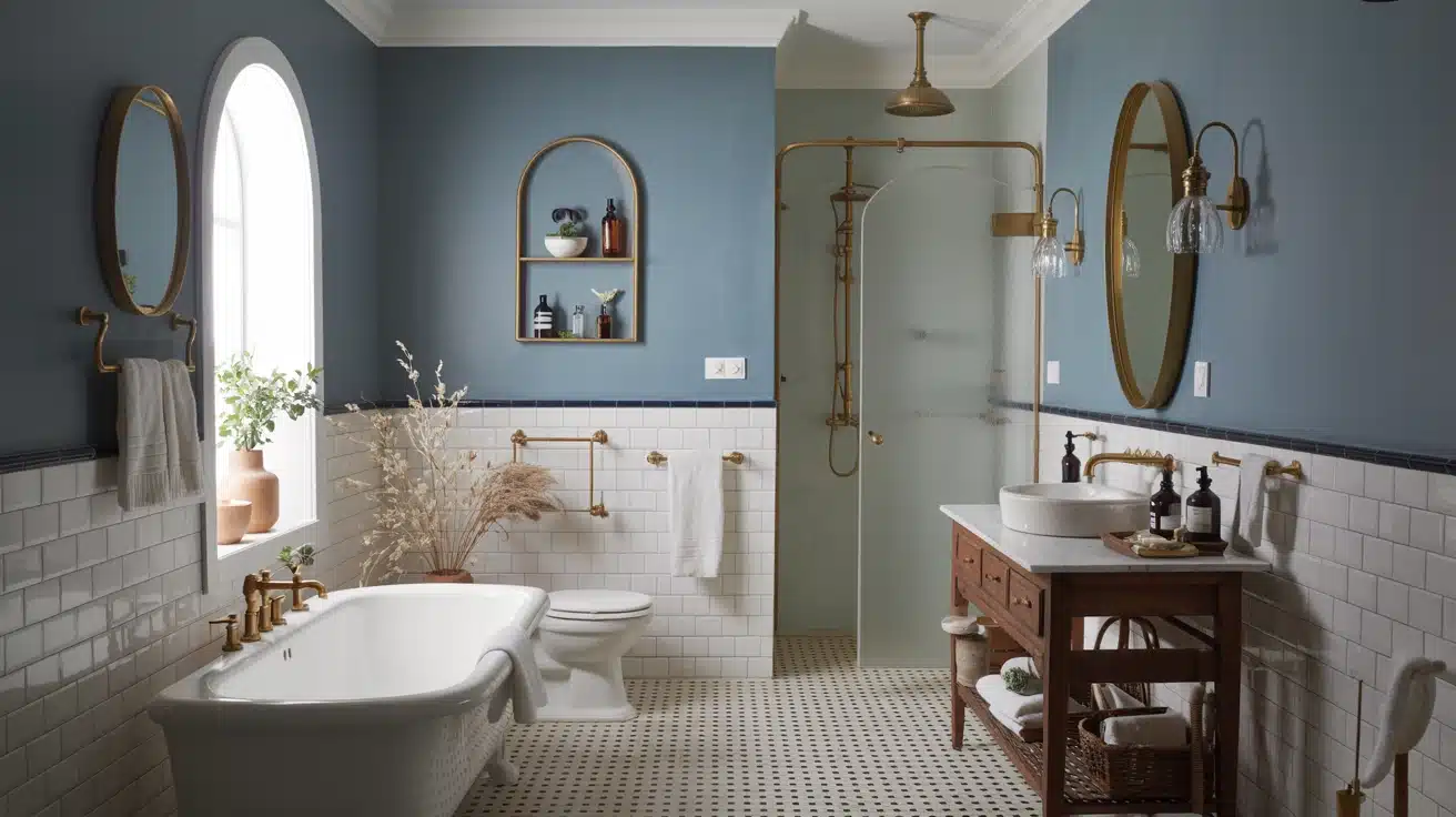
Muted blues bring serenity and a peaceful vibe, making them perfect for bathrooms or spaces meant for relaxation. This cool color evokes the calmness of water and sky, adding depth without overwhelming the space.
Muted blue pairs effortlessly with warm brass accents and white tile, creating an urbane and restful atmosphere.
Ideal for coastal or Scandinavian-inspired designs, it’s both calming and stylish.
Here are three beautiful muted blue shades to try:
- Sherwin-Williams Debonair: A refined, muted blue with quiet refinement that works beautifully in bathrooms and relaxation-focused spaces
- Benjamin Moore Misty Blue: A cool, muted blue perfect for adding calm refinement to a room.
- Behr Blueprint: A deep, tranquil blue that offers intricacy without feeling too bold.
7. Dusty Pink
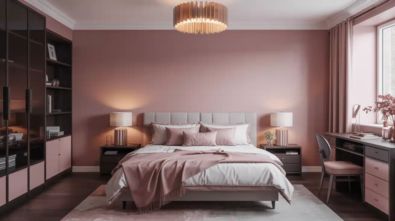
Dusty pink offers refinement and warmth without being overpowering.
This refined shade is gender-neutral and adds a touch of classiness to bedrooms, dressing rooms, or living spaces. Unlike traditional pinks, dusty pink feels mature and welcoming, balancing warmth with subtlety.
It pairs beautifully with dark woods, olive greens, and warm metallics, making it a versatile choice for any style.
Here are some great dusty pink options to try:
- Sherwin-Williams Romance: A muted, refined pink perfect for creating soft, inviting spaces.
- Benjamin Moore First Light: A delicate, dusty pink ideal for adding warmth and character.
- Behr Rosewater: A soft, muted pink perfect for creating a cozy, feminine feel.
8. Olive Green
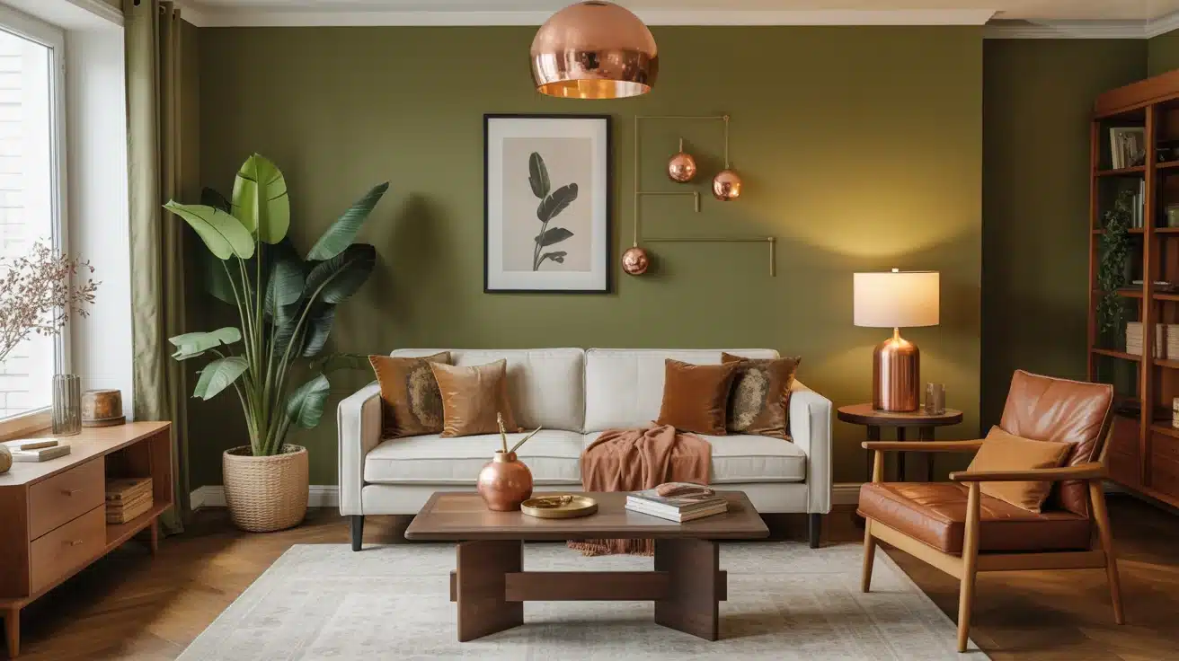
Olive green brings a deep, earthy tone that grounds a room with its rich, natural feel. It adds depth and visual weight, making it perfect for living rooms, kitchens, or any space that needs a bit of grounding energy.
Olive green pairs well with natural materials like wood, stone, and copper, creating a warm, inviting environment. This color is ideal for adding personality and purpose to your space without overwhelming it.
Here are some top olive green shades to try:
- Sherwin-Williams Ripe Olive: A rich, earthy olive green perfect for living rooms and kitchens.
- Benjamin Moore Olive Branch: A warm, green that complements natural textures.
- Behr Chinese Jade: A deep green with brown undertones that creates a cozy, grounded space.
9. Deep Charcoal
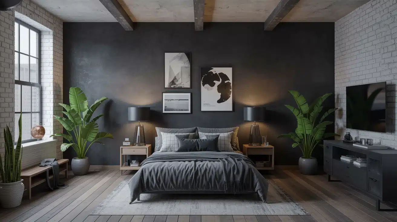
Deep charcoal adds drama to a room, providing a bold alternative to gray. This color offers rich depth and a striking contrast, making it perfect for accent walls or modern industrial spaces.
Charcoal pairs beautifully with exposed concrete, steel, and raw timber, improving the natural textures of the room. It’s ideal for creating a striking focal point or adding an air of modern refinement to any room.
Here are some bold, deep charcoal options to consider:
- Sherwin-Williams Peppercorn: A deep, dramatic charcoal that pairs beautifully with lighter accents. Sherwin-Williams has a strong lineup ofdeep, moody wall colors that work exceptionally well in accent-focused spaces.
- Benjamin Moore Kendall Charcoal: A rich, urbane charcoal that adds depth and drama to any space.
- Behr Cracked Pepper: A bold charcoal that creates contrast without overwhelming the space
10. Pale Lavender
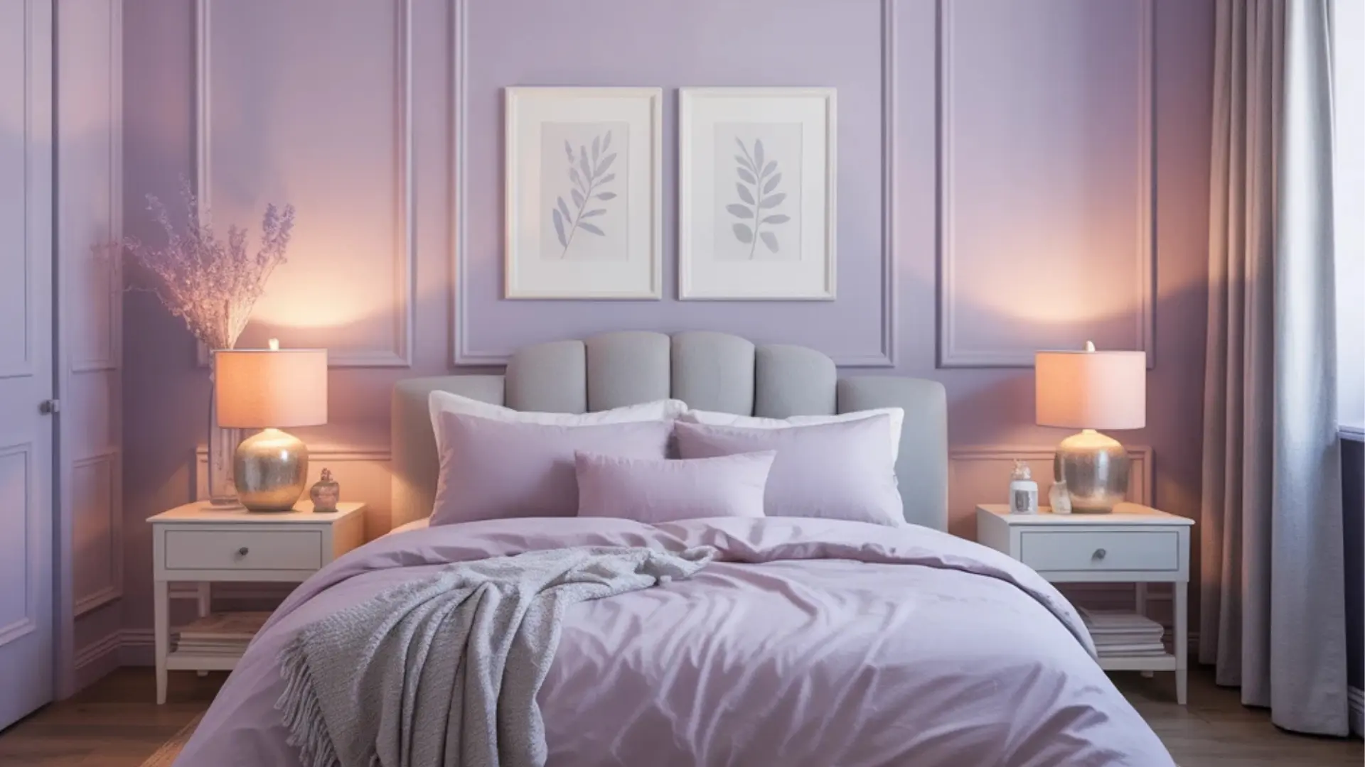
Pale lavender introduces a subtle grace that converts spaces into serene, dreamy environments. This soft color offers a calming atmosphere without being overly feminine or childish.
Lavender pairs beautifully with warm grays, creating a layered, urbane look. It’s perfect for bedrooms, bathrooms, or any space where you want to evoke tranquility and relaxation.
This color works in various interiors, making it a refined alternative to traditional neutrals.
Here are some lovely pale lavender shades to explore:
- Sherwin-Williams Grape Mist: A soft, pastel lavender that improves the tranquility of any room.
- Benjamin Moore Misty Lilac: A soft, airy lavender that brings a delicate and refined quality to bedroom and bathroom walls.
- Behr Lavender Cloud: A calming, light lavender that pairs well with gray for a refined look
11. Golden Mustard
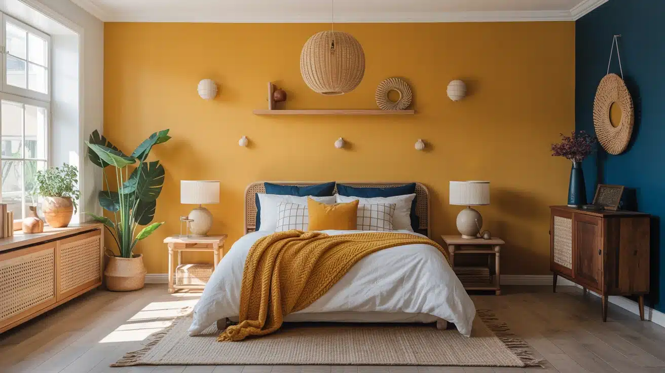
Golden mustard adds warmth and personality to any room, infusing spaces with energy and vibrancy. This retro-inspired color offers a bold, sun-soaked feel, making it perfect for accent walls or small decor pieces.
Mustard adds a sense of memories while remaining contemporary and fresh. It pairs beautifully with deep navy, black, and natural wood, adding a memorable touch to your home without being overwhelming.
Here are some golden mustard options to brighten your space:
- Sherwin-Williams Gold Crest: A vibrant mustard that adds warmth and energy to any room.
- Benjamin Moore Golden Honey: A rich, golden mustard ideal for creating a statement wall.
- Behr Mustard Seedx: A bold, energetic mustard that adds a sunny pop of color to your space.
How to Incorporate these New Home Paint Trends
Introducing a new paint color doesn’t require a full renovation. Start small with an accent wall or a single room, and let the color breathe alongside your existing pieces before committing fully.
| Color | Best Rooms | Room Size & Light | Pairs With |
|---|---|---|---|
| Warm Beige | Living rooms, hallways | Any size; expands dim spaces | Linen, oak wood, cream textiles |
| Soft Taupe | Bedrooms, dining rooms | Medium–large; warm south light | Bronze fixtures, walnut, velvet |
| Terracotta | Kitchens, accent walls | Use sparingly in small, dark rooms | Rattan, terrazzo, raw linen |
| Sage Green | Bedrooms, home offices | Great in north-facing rooms | White trim, matte black, natural wood |
| Warm Off-White | Any room, ceilings | Best for small or low-light spaces | works with everything |
| Muted Blue | Bathrooms, reading nooks | Brightens north-facing rooms | Warm brass, driftwood, white |
| Dusty Pink | Bedrooms, dressing rooms | Mid-size, well-lit rooms | Dark walnut, olive green, warm gold |
| Olive Green | Kitchens, living rooms | Large rooms with bright windows | Stone, copper, timber, terracotta |
| Deep Charcoal | Accent walls, offices | Large, well-lit spaces only | White plaster, brass, warm timber |
| Pale Lavender | Bedrooms, bathrooms | Morning light improves it best | Warm gray, ivory, soft metallics |
| Golden Mustard | Accent walls, alcoves | Avoid in very dark or tiny rooms | Deep navy, black iron, natural wood |
Creating harmony between new paint and existing furniture is less about matching and more about balancing. Anchor bold wall colors with neutral furnishings, and let warm tones in rugs, throws, or wood finishes bridge any contrast naturally.
Tips for Maintaining Your New Trendy Walls
- Finish matters: Choose eggshell or satin finishes, which resist scuffs and help keep rich color tones intact longer.
- Gentle cleaning: Wipe walls with a damp microfiber cloth; harsh cleaners fade warm earthy tones and dusty hues prematurely.
- Touch-up stock: Always keep a small sealed tin of the exact paint. Color-matching years later is notoriously unreliable and frustrating.
- Sunlight protection: UV-filtering window film prevents warm tones like mustard and terracotta from fading or shifting over several years.
- Accessory harmony: Refresh cushions, throws, and art to complement your new wall color. Small changes make the palette feel intentional and complete
Wrapping Up
As homes move away from gray, warmer and more personal hues are gaining popularity in interior design. The answer to what color is replacing gray points clearly toward earthy tones that foster comfort and connection.
Beige, taupe, terracotta, and sage green are just a few of the colors bringing warmth, dimension, and depth to your home.
These shades help create a welcoming environment that gray simply could not. Each color offers unique benefits, from calming sage to bold terracotta, helping you craft the perfect atmosphere.
If you are updating a room or making a bold change, these colors convert spaces into something special. I would love to hear your thoughts, drop a comment below or check out other ideas in related blogs.


