


Struggling to fit a functional shower into your cramped bathroom space? Limited space and small bathroom designs with showers require creative solutions that maximize every available inch. You need layouts that work without making the room feel even tinier than it already is. I’ve gathered practical design ideas that change tight bathrooms into comfortable bathing areas you’ll actually enjoy using. You’ll find shower styles, storage tricks, fixture choices, and layout options specifically for compact spaces. These solutions help you avoid common mistakes that waste space or create awkward layouts in small bathrooms. If you’re renovating an existing bathroom or designing a new one, these ideas work for real homes. Here’s how to create a shower setup that perfectly fits your limited space. Why Small Bathroom Design with a Shower is a Smart Solution Small bathrooms need smart planning to work well without feeling cramped or cluttered every day. Showers take up much less floor space than bathtubs, freeing room for storage or easier movement. A well-designed shower makes the entire bathroom feel open and modern instead of tight and outdated. Glass enclosures let light flow through, preventing dark corners that make spaces seem even smaller visually. Vertical storage, like built-in niches, keeps essentials organized without eating up precious square footage unnecessarily. Modern shower fixtures and clean tile lines create a fresh look that increases your home’s value. Smart design turns limitation into an advantage, proving small bathrooms can still feel comfortable and stylish. Small Bathroom Shower Ideas for Limited Space Small bathrooms require thoughtful planning, which is why I’ve put together these shower ideas for small bathrooms. Let me show you practical solutions that make tight spaces work better: 1. Walk-in Glass Shower This shower features clear glass panels on three sides with one open entrance and no door needed. Water drains through a flat floor tile into a central or side drain. The glass reaches from floor to ceiling, creating a bright and spacious bathing area. Chrome or brushed nickel fixtures mount directly on the tile wall for easy access. 2. Corner Shower with Sliding Doors Two glass doors glide along metal tracks installed at the top and bottom of the enclosure. The shower fits snugly into a bathroom corner, using two existing walls as the back surfaces. One door overlaps the other when opening, saving space compared to swinging options. A raised curb keeps water contained inside the bathing zone. 3. Alcove Shower with Recessed Storage Three walls surround this shower, with the fourth side open for entry through a curtain or door. Built-in niches carved into the wall hold shampoo bottles and soap without taking up floor space. The alcove design maximizes limited bathroom square footage while providing full shower functionality. Tile covers all surfaces for water resistance. 4. Curved Glass Shower Enclosure Bent glass panels form a gentle arc around the shower entrance instead of sharp corner angles. The rounded shape softens the bathroom’s appearance while directing water spray away from the opening. Hinged doors or no door at all provide entry into the curved bathing space. Polished hardware complements the smooth glass lines beautifully. 5. Walk-In Rainfall Shower A large overhead showerhead mounted in the ceiling delivers water straight down like natural rain. Glass panels or a half wall define the wet zone without fully enclosing the space completely. No door blocks the entrance, making access simple for everyone using the bathroom daily. Floor tiles slope gently toward a linear drain for proper water flow. 6. Shower-Tub Combo A bathtub sits beneath a showerhead mounted on the wall, combining two bathing methods in one fixture. Curtains hang from a rod above, or glass doors slide along tracks to contain water splashing. The tub edge provides a step-in barrier that holds water for soaking or showering purposes. This versatile setup works well in smaller bathrooms needing dual functionality. 7. Bi-Fold Shower Doors Two glass panels fold inward like an accordion when opening, taking up minimal space beside the shower. Hinges connect the panels in the middle, allowing them to collapse against the shower wall. This compact door style works perfectly in tight bathrooms where swinging doors would hit nearby fixtures. Handles attach to the outer panels for easy gripping. 8. Foldable Shower Seat with Wall Storage A hinged bench attaches to the wall, folding up when not needed to clear valuable floor area. When lowered, the seat locks securely in place, supporting weight safely during bathing activities. Open shelving or cabinets mounted above or beside the fold-down seat, storing toiletries within easy reach. This dual-purpose setup benefits anyone who needs occasional seating without permanently sacrificing space in cramped quarters. 9. Shower Panel with Multi-Function Jets A vertical tower system replaces traditional fixtures, delivering water through multiple outlets at various body heights. Body jets spray horizontally while overhead rain streams cascade down, creating a customized bathing experience. Temperature and pressure controls integrate into one sleek panel for simplified operation during daily routines. This all-in-one solution eliminates separate installations while providing luxury spa features in confined bathroom footprints. 10. Floating Vanity with Built-In Shower The bathroom vanity cabinet hangs on the wall without touching the floor, creating storage underneath. The shower sits directly adjacent, sharing a wall with the vanity for efficient plumbing connections. Glass separates the wet shower zone from the dry vanity area, where you store toiletries. This integrated layout maximizes every inch of available bathroom space effectively. 11. Frameless Glass Shower Walls Thick glass panels attach directly to walls and floors using minimal metal clips instead of bulky frames. The nearly invisible hardware creates a clean, modern appearance that showcases beautiful tile work inside. Panels meet at hinges or remain stationary, depending on whether doors are included in the design. This sleek style makes small bathrooms appear larger and more open. 12. Mosaic Tiled Shower Small tiles in various colors or patterns cover the shower walls and floor, creating artistic visual interest. The tiny tiles allow for curved surfaces and detailed designs that larger tiles cannot achieve easily. Grout lines run between each piece, requiring proper sealing to prevent water damage over time. Coordinating fixtures in matching finishes completes the decorative look. 13. Shower with Built-in Bench A tiled seat extends from one wall at a comfortable sitting height for resting during bathing. The bench provides a safe spot for shaving legs or a place for elderly users needing support. Waterproof materials cover the seating surface, matching the surrounding shower walls and floor exactly. This thoughtful addition increases comfort and accessibility for all family members using the space. 14. Minimalist Tile Shower Large-format tiles in neutral colors cover the walls with very few grout lines visible throughout. Simple fixtures in chrome or matte black mount flush against the tile for an understated appearance. No decorative niches or shelves interrupt the clean surfaces, maintaining a streamlined and uncluttered aesthetic. A single glass panel or no barrier at all defines the bathing area. 15. Steam Shower with Compact Seating An enclosed bathing chamber generates steam that fills the space, changing ordinary showers into relaxing treatments. A small built-in perch provides comfortable seating during extended steam sessions without dominating the enclosure. Sealed doors and waterproof construction trap heat and moisture effectively inside the designated zone. Digital controls regulate steam intensity and duration based on personal preference and wellness goals. 16. Shower with Foldable Glass Door Hinged glass sections fold back on themselves, compacting into a small space beside the shower opening. Multiple panels connect through pivoting hardware that allows them to stack neatly when not in use. This flexible door style adapts to various bathroom layouts and opening widths as needed. When closed, the panels extend fully to create a complete water barrier. 17. Open Shower with Half Wall A short tiled wall rises partway up, stopping well below ceiling height to block water spray. No door or glass panel covers the remaining open space above the partial wall barrier. This design creates an airy, spacious feeling while still containing most water within the bathing zone. The half wall may include a ledge for placing bath products during use. 18. Black Frame Shower Enclosure Dark metal frames outline glass panels, creating bold contrast against light-colored bathroom tiles and fixtures. The thick black lines define the shower boundaries while adding industrial or contemporary styling to the space. Hinged or sliding doors operate within the framed structure, opening smoothly for easy entry. This dramatic look pairs well with modern bathroom designs. 19. Wet Room Style Shower with Drain on Floor The entire bathroom functions as one waterproof zone without separate shower enclosures or barriers dividing spaces. Floor tiles slope subtly toward a centrally positioned drain that handles water from all directions. This barrier-free approach creates maximum accessibility while visually expanding the perceived room dimensions significantly. Proper waterproofing beneath all surfaces ensures moisture never penetrates underlying structures or causes damage. 20. Sliding Glass Shower Door A single large glass panel glides horizontally along a metal track mounted at the top edge. The door overlaps a fixed glass panel, creating a water-tight seal when closed for bathing. Handles attach to the movable panel for easy pushing and pulling during entry and exit. This classic door style works reliably in standard-sized shower openings throughout residential bathrooms. Here are the shower designs starting from serial number 21: 21. Shower Area with Recessed LED Lighting Waterproof light fixtures nest into ceiling or wall cavities, illuminating the bathing zone without protruding hardware. LED technology provides bright, energy-efficient illumination that lasts for years without bulb replacements needed. Color temperature options range from warm amber to cool daylight, setting different moods for morning or evening bathing. The flush installation maintains clean lines while directing light exactly where grooming tasks require visibility. 22. Hexagonal Tile Floor Six-sided tiles are arranged in a honeycomb pattern across the shower base, creating geometric visual appeal. The numerous grout lines between tiles provide excellent slip resistance when surfaces become wet during use. Water flows toward a centered or offset drain positioned strategically within the tile layout. This distinctive flooring choice adds character while maintaining practical functionality. 23. Compact Sauna and Shower Combo A single enclosure houses both dry heat sauna capabilities and traditional shower functions within one footprint. Wooden benches line the walls for sauna sessions, while a drain and showerhead enable rinsing afterward. Switching between modes requires adjusting controls that activate heating elements or water flow as desired. This space-efficient combination delivers two wellness experiences without building separate rooms for each function. 24. Textured Wall Tiles in Shower Three-dimensional tiles feature raised patterns or grooves that add tactile interest to vertical surfaces. These dimensional surfaces catch light differently throughout the day, creating shifting shadows and highlights on walls. The texture prevents monotony in single-color schemes while maintaining a cohesive appearance throughout the space. Proper installation ensures water cannot collect in recessed areas. 25. Minimalist Floating Shelves in Shower Slim platforms extend from the wall without visible brackets underneath, appearing to hover in mid-air. These clean-lined ledges hold essential bathing items at convenient heights for easy grabbing during use. Waterproof materials resist moisture damage while maintaining their sleek, unadorned appearance over time. The streamlined design avoids clutter and maintains an organized bathing environment. 26. Glass Door with Patterning Etched or printed designs decorate the glass surface, adding privacy while still permitting light transmission through. Geometric shapes, nature-inspired motifs, or abstract patterns create visual interest on otherwise plain transparent panels. The decorative treatment partially obscures the view while maintaining the bright, airy quality that glass provides. Patterns can match or complement other bathroom design elements. 27. Frameless Shower with Light Fixtures Thick glass panels stand independently without metal borders, while dedicated lighting illuminates the bathing zone directly. Recessed ceiling lights or wall sconces position light exactly where needed for grooming tasks and ambiance. The absence of frames keeps sightlines clear, allowing the lighting to become a prominent design feature. Waterproof fixtures withstand constant moisture exposure safely. 28. Narrow Shower Stall A compact rectangular footprint maximizes functionality in tight bathroom layouts where space is extremely limited. The slender design accommodates one person comfortably while conserving precious square footage for other fixtures nearby. A single door or curtain provides access to the confined bathing area efficiently. Strategic fixture placement ensures comfortable showering despite the reduced width. 29. Shower with Vertical Window A tall, narrow window brings natural daylight into the bathing area from an exterior wall. Frosted or textured glass maintains privacy from outside views while permitting sunlight to filter through brightly. The vertical orientation emphasizes ceiling height, creating a lavish structural detail within the space. Proper sealing prevents water intrusion around the window frame. 30. Shower with Skylight An overhead window in the ceiling floods the bathing area with natural illumination from above. Daylight streams down directly onto the shower floor, eliminating shadows and creating a bright environment naturally. Waterproof installation prevents leaks while allowing the skylight to open for ventilation when the weather permits. This addition converts an ordinary shower into an outdoor-feeling retreat. 31. Frosted Glass Partition Shower Translucent glass panels obscure detailed views while still allowing light and shapes to pass through softly. The semi-opaque barrier provides privacy without creating a dark, enclosed feeling within the bathing zone. A single fixed panel or hinged door separates wet and dry areas clearly. The milky finish complements various bathroom styles from traditional to contemporary. 32. Shower Curtain with Print Fabric or vinyl curtains display colorful designs, patterns, or images that add personality to the space. The decorative curtain hangs from rings attached to a rod spanning the shower opening width. Easy replacement allows seasonal updates or style changes without renovating permanent fixtures or tiles. Water-resistant materials prevent mildew growth while maintaining vibrant colors over time. 33. Dark-tone Shower Tiles Deep charcoal, navy, or black tiles cover walls and floors, creating a dramatic and refined atmosphere. The moody palette contrasts beautifully with white fixtures and bright chrome hardware throughout the space. Light-colored grout lines may outline each tile, adding definition to the dark surfaces clearly. Proper lighting prevents the dark colors from making the area feel too enclosed. 34. Shower with Pivot Glass Door A single hinged panel rotates on central pivot hardware rather than swinging from one side edge. The door opens either inward or outward, depending on which direction you push during entry. Central positioning distributes weight evenly, reducing stress on mounting points compared to traditional offset hinges. This balanced mechanism operates smoothly while accommodating various approach angles in awkward bathroom configurations. 35. Towel Rack Near Shower A horizontal bar or hook mounts on the wall within easy reach of the bathing area. The convenient placement allows you to grab a towel immediately after finishing without dripping across the floor. Heated towel racks warm fabric before use, adding comfort during cold months, especially. Proper positioning keeps towels dry while maintaining accessibility when needed most. 36. Bright White Shower Tiles Pure white tiles cover every surface, reflecting light and creating a fresh, clean appearance throughout. The neutral backdrop works with any accent color or hardware finish you choose later. Light bounces off the glossy surfaces, making even small bathing areas feel open and airy. Regular cleaning maintains the pristine appearance that white surfaces require for lasting beauty. 37. Compact Shower with Storage Basket A wire or mesh container hangs from the showerhead or attaches to the wall securely. The portable basket holds bottles and supplies within arm’s reach without requiring built-in shelving or niches. Drainage holes in the bottom prevent water from pooling around stored items during and after use. This affordable solution works well in rental properties or temporary living situations. 38. Shower with Bench and Handrail A seat protrudes from one wall at sitting height, paired with a sturdy grab bar nearby. The combination provides safety and comfort for elderly users or anyone needing extra support during bathing. Both elements install securely into wall studs to support body weight safely without wobbling. Non-slip surfaces on the bench prevent sliding when seated on wet materials. 39. Shower Floor with Pebble Tiles Smooth river stones are embedded in the floor surface, creating a natural massage sensation underfoot. The irregular shapes provide excellent traction, reducing slip hazards on wet surfaces significantly compared to flat tiles. Each stone varies slightly in color, adding organic visual texture to the bathing area naturally. Epoxy grout fills spaces between pebbles, creating a durable and water-resistant base. 40. Wall-Mounted Shower Controls Knobs or levers attach directly to the tiled wall at waist height for comfortable adjustment. The exposed controls allow temperature and pressure changes without reaching overhead or bending down awkwardly. Thermostatic valves maintain a consistent water temperature even when other household fixtures turn on elsewhere. Sleek trim plates cover rough plumbing connections behind the wall completely. 41. Shoji Screen-Inspired Shower Translucent panels in geometric grids prompt traditional Japanese sliding doors within a modern bathing context. The screen-like barrier provides privacy while maintaining an open, zen-inspired atmosphere throughout the bathroom. Materials may include frosted glass, acrylic, or actual rice paper substitutes designed for wet environments. This distinctive style brings cultural grace to everyday routines. 42. Shower with Plant Display A waterproof shelf or hanging planter holds moisture-loving greenery inside the bathing area safely. Plants like ferns or pothos thrive in the humid environment, adding natural beauty and air purification. Drainage considerations prevent overwatering while keeping plants healthy and vibrant long-term. The living elements soften hard tile surfaces and create a spa-like ambiance. 43. Acrylic Shower Enclosure Durable plastic panels form the walls and base in a single molded unit for easy installation. The lightweight material resists cracking and requires less structural support than heavier tile or stone alternatives. Smooth surfaces clean quickly without grout lines that trap dirt and mildew over the years of use. Various colors and patterns integrate with different bathroom aesthetics affordably. 44. Frameless Bidirectional Shower Door A single glass panel swings both inward and outward, offering flexibility in tight bathroom configurations. Specialized hinges permit movement in either direction, adapting to different entry preferences or spatial constraints. This versatile solution prevents the door from blocking nearby fixtures regardless of which way it opens. Magnetic seals create water-tight closures when positioned correctly. 45. Mosaic Accent Wall Shower One vertical surface features intricate small-tile artwork, while the remaining walls use larger, simpler tiles for contrast. The decorative focal point draws attention and adds artistic flair to an otherwise utilitarian space effectively. Colors in the mosaic may coordinate with fixtures, flooring, or other bathroom elements throughout the room. Professional installation ensures the detailed pattern aligns perfectly. 46. Minimalist Black Shower Hardware Matte black fixtures, including the showerhead, faucet handles, and drain cover, create a bold contrast against lighter tiles. The monochromatic hardware adds modern refinement while maintaining simple, unadorned shapes throughout the design. Fingerprints show less on matte finishes compared to polished alternatives, reducing visible maintenance needs. This striking choice elevates basic white or neutral tile schemes dramatically. 47. Shower with Stainless Steel Frame Brushed metal borders outline glass panels, providing an industrial-style structure and support throughout the enclosure. The metallic finish resists corrosion from constant water exposure while maintaining its distinctive silvery appearance. Visible screws and hardware embrace the utilitarian aesthetic rather than concealing mechanical components behind trim. This robust construction suits contemporary or loft-style bathroom designs perfectly. 48. Custom-Size Corner Shower Non-standard dimensions accommodate unusual bathroom layouts or specific spatial requirements that standard units cannot satisfy. A fabricator builds the enclosure to exact measurements, ensuring a perfect fit within available space constraints. This tailored approach maximizes usable bathing area while working around obstacles like sloped ceilings or angled walls. Higher costs reflect the individualized design and construction process required. 49. Shower Niche with Glass Shelves A recessed cavity in the wall contains transparent shelves that appear to float within the opening. Glass shelving allows light to pass through, preventing the storage area from appearing heavy or cluttered. Multiple levels accommodate different bottle heights while maintaining visual lightness throughout the vertical space. Easy-to-clean surfaces resist soap scum buildup better than porous materials. 50. Shower with Built-in Bluetooth Speaker Waterproof audio devices mount permanently inside the enclosure, streaming music wirelessly from phones or tablets. Sound quality remains clear despite moisture and spray hitting the speaker housing throughout use. Rechargeable batteries or hardwired power keep the system running without frequent maintenance or battery swaps. Volume and track controls may appear on the speaker itself or operate through connected devices. 51. Shower with Hex Tile Accent Hexagonal tiles in a contrasting color or finish create visual interest on one wall or floor section. The geometric shapes add dimension and personality to otherwise plain surroundings without overwhelming the entire space. Placement options include a single accent wall, floor border, or scattered throughout the design strategically. The six-sided pattern offers a fresh alternative to standard square or rectangular tile layouts. Common Mistakes to Avoid in Small Bathroom Shower Design Even small design mistakes can make a tiny bathroom feel even more cramped and uncomfortable. Knowing what to avoid helps you create a shower space that actually works well daily. Here are the biggest mistakes people make: Overcrowding with large fixtures: Oversized showerheads, bulky faucets, or wide grab bars eat up visual space and make tight bathrooms feel claustrophobic. Ignoring proper ventilation: Without an exhaust fan or window, moisture gets trapped and creates mold, mildew, and peeling paint problems quickly. Not maximizing vertical space: Forgetting to add wall-mounted shelves, niches, or tall storage means wasted space that could hold your essentials. Choosing dark colors everywhere: Deep colors on all surfaces absorb light and make small showers feel like dark, closed-in caves. Avoiding these common pitfalls ensures your small bathroom shower feels open, clean, and functional instead of cramped. Take time during planning to check off each mistake so you don’t accidentally create problems later. Final thoughts Limited space, small bathroom designs with a shower prove that small doesn’t mean sacrificing style or functionality. Smart fixture choices, glass enclosures, and vertical storage maximize your available square footage without feeling cramped. Corner showers, walk-in designs, and curbless options work especially well in tight layouts where traditional setups fail. Light colors, minimal hardware, and strategic storage keep everything organized without visual clutter. The right shower design makes your compact bathroom feel open and completely functional for daily use. Measure carefully before buying anything, and prioritize features that truly matter for your specific space constraints. What’s your biggest challenge with your small bathroom shower? Share your space concerns in the comments below!
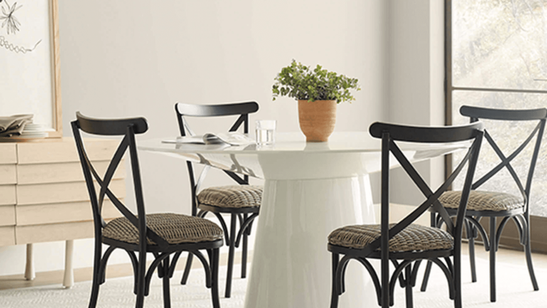
If you’ve ever hunted for a paint color that feels soft but not washed out, warm but not yellow, I completely get it. I went through the same thing before finding Sherwin-Williams Oyster White (SW 7637). It’s that rare neutral that makes any room feel calm and welcoming without looking plain. I’ve seen it work beautifully in living rooms, bedrooms, and even exteriors. This post breaks down everything I’ve learned about Oyster White, how it looks in different lighting, what undertones to expect, and where it fits best. You’ll also see how it compares to other Sherwin-Williams whites and find similar colors in other brands. By the end, you’ll know exactly if this shade matches the look you want for your home. What is Sherwin-Williams Oyster White? Sherwin-Williams Oyster White (SW 7637) is a warm, beige paint that bridges the space between white and beige. It’s part of the neutral color family and works well for both interior and exterior surfaces. The shade gives off a soft, creamy look with a gentle green-beige undertone that changes slightly depending on lighting. Attribute Detail LRV 72 RGB 218 / 213 / 200 HEX #DAD5C8 Color Family Warm Greige Finish Options Flat, Satin, Semi-Gloss Oyster White by Sherwin-Williams offers more depth than a plain white but stays lighter than most beige tones. It’s sold at Sherwin-Williams stores and through sample providers like Samplize and Lowe’s. This balance of warmth and softness makes it a dependable choice for spaces that need a gentle, adaptable neutral. Understanding Oyster White’s Undertones Oyster White can look different depending on the light and surroundings, which often causes confusion. It’s not a true gray or beige but a balanced mix of both with a slight green tint. This faint green-beige undertone gives the color a warm, earthy look that keeps it from feeling cold or flat. In rooms with natural sunlight, it appears softer and creamier, while in shaded spaces, it leans more neutral. Wall texture, trim color, and nearby furnishings also affect how the undertone shows. For example, pairing it with pure white trim highlights its warmth, while darker accents draw out the gray side. How Lighting Changes Oyster White Lighting has a major effect on how Oyster White looks once applied. It shifts noticeably under both natural and artificial light, so it’s important to see it in real conditions before painting. North-facing rooms: Natural light from the north is cooler, which makes Oyster White lean toward gray. It feels soft and muted in these spaces. South-facing rooms: Warm sunlight brightens the beige undertone, giving the color a creamy, cozy look during the day. East-facing rooms: Morning light adds a gentle warmth that fades into a balanced neutral tone by afternoon. West-facing rooms: Evening sun deepens the color, bringing out a warm beige hue with a touch of gray. Artificial lighting: Warm bulbs enhance its beige notes, while cool LED lights make it appear more gray. Test large samples on multiple walls to see how the tone shifts through the day. Where to Use Sherwin-Williams Oyster White Oyster White adapts easily to different spaces, offering a balanced tone that complements both warm and cool materials. 1. Living Room / Dining This shade works beautifully in shared spaces where comfort and balance matter. Its soft undertone pairs well with natural wood, greenery, and neutral furnishings, giving the room a calm and cozy feel. Oyster White provides enough warmth to feel inviting yet remains light enough to keep the area open and airy. Try pairing it with medium-toned wood furniture, woven textures, or linen curtains for a balanced look that works across different design styles. 2. Kitchen Cabinets Oyster White is a great choice for kitchen cabinetry because it adds softness without looking stark. It pairs well with brass, nickel, or matte-black hardware, offering flexibility across styles from farmhouse to modern. Against white countertops, it shows more beige warmth, while with darker surfaces, it reads as a gentle greige. The color’s neutrality makes it easy to coordinate with tile, backsplash, and flooring choices, creating a consistent, natural flow throughout the kitchen. 3. Bedrooms / Bathrooms For bedrooms and bathrooms, Oyster White brings a quiet, spa-like feel. Its green-beige base adds warmth without being too creamy, helping the space feel peaceful and light. It complements soft fabrics, woven textures, and brushed-metal fixtures perfectly. Use it with crisp white trim for a clean contrast or with muted greens and taupes for a layered, restful palette. The result is a relaxed, classic look that feels both fresh and grounded. 4. Exterior Outside, Oyster White performs just as well. It’s an excellent option for siding, brick, or stucco, offering enough depth to stand out in bright daylight. Pair it with black, greige, or deep charcoal trim for a refined contrast. On exteriors surrounded by natural elements like stone or wood, the subtle undertone blends beautifully. Its ability to handle strong sunlight without looking yellow makes it a dependable color for year-round curb appeal. Choosing the Right Finish for Oyster White The finish you choose affects how Oyster White looks and how well it holds up over time. Flat finish: Best for ceilings or low-traffic walls. It hides imperfections well but can be harder to clean. Satin finish: Ideal for most walls. It reflects a small amount of light, showing the color’s depth without glare, and offers easy wipe-down maintenance. Semi-gloss finish: Great for trim, doors, and cabinetry. It highlights architectural details and resists scuffs and moisture better than lower-sheen paints. Color depth and sheen: Higher sheens slightly deepen the color, making Oyster White appear warmer and richer under direct light. How Oyster White Compares to Other Popular Whites Oyster White often gets compared to other Sherwin-Williams neutrals because of its balance between gray, beige, and warmth. Each color has its own LRV (light reflectance value), undertone, and ideal setting, which can change how it looks in your space. Oyster White vs. Shoji White SW 7042 Shoji White (SW 7042) has an LRV of 74, slightly higher than Oyster White’s 72, meaning it reflects more light and appears brighter. Shoji has a cream-beige undertone, making it warmer and softer overall. It suits farmhouse or cottage-style homes where you want a cozy, creamy feel. Oyster White’s green-beige undertone keeps it more neutral, offering a calm, balanced finish that pairs well with both warm and cool accents. Choose Shoji White for warmth and comfort, or Oyster White for subtle depth and balance. Oyster White vs. Alabaster SW 7008 Alabaster (SW 7008) is noticeably lighter, with an LRV of 82, making it one of Sherwin-Williams’ brighter whites. It carries a cream-yellow undertone that feels soft and classic, perfect for traditional interiors or rooms with limited natural light. In comparison, Oyster White’s greige tone feels more grounded, offering warmth without looking creamy. If your goal is brightness and airiness, Alabaster works best. For a softer, low-contrast neutral that still feels warm, Oyster White is the better fit. Oyster White vs. White Duck SW 7010 White Duck (SW 7010) has an LRV of 74 and a beige-gray undertone, placing it close to Oyster White but with a smoother, less variable appearance. It reflects slightly more light, giving interiors a soft, blended look. Oyster White, with its green-beige base, can appear cooler or warmer depending on lighting. White Duck is ideal for transitional or modern farmhouse spaces that require steady warmth. Choose Oyster White if you prefer a color with gentle shifts and a touch more visual depth. Coordinating Colors That Work With Oyster White Oyster White pairs easily with both warm and cool shades, giving you flexibility in designing balanced color schemes. The best coordinating colors come from similar natural tones and subtle contrasts: SW Evergreen Fog (SW 9130): A muted green that works beautifully as an accent color on furniture or feature walls. SW Greek Villa (SW 7551): A clean, creamy white perfect for trim and ceilings, keeping the space light and cohesive. SW Urbane Bronze (SW 7048): A deep brown-gray ideal for doors, cabinets, or window frames, grounding the palette with contrast. Use these together to build a soft, layered look. For example, Oyster White walls with Greek Villa trim and Urbane Bronze accents create a calm yet refined balance suitable for both interiors and exteriors. How Oyster White Feels in a Room Oyster White gives a room a calm and restful atmosphere. Its soft tone helps create a welcoming feel without appearing too warm or too cool. The color naturally brings balance, making spaces feel open yet comfortable. In cozy, natural interiors, it works as a quiet backdrop that lets wood textures, greenery, or woven materials stand out. Because it’s neither stark white nor dark beige, it adds gentle depth that feels easy on the eyes. Rooms painted in Oyster White often feel steady, clean, and soothing, perfect for bedrooms, living areas, and reading corners. It’s the kind of neutral that helps you relax while still giving the space a finished, well-balanced look. Expert Tips for Testing and Sampling Before painting, it’s smart to see how Oyster White looks in your own lighting. You can start with Samplize peel-and-stick samples to preview the color directly on your walls without any mess. These reusable samples make testing fast and simple. Start with peel-and-stick samples: Large stickers help you view the color across multiple walls and spaces. Test under different lighting: Look at the paint in both natural daylight and artificial light to catch tone shifts. Paint sample boards: Apply two full coats on foam or poster boards for accurate color depth. Move samples around: Check the boards in various rooms and corners throughout the day. Compare with trim and flooring: Hold samples near existing finishes to confirm harmony. Wait 24 hours: Let the paint dry completely before finalizing your decision. Colors Similar to Sherwin-Williams Oyster White in Other Brands If you like the look of SW Oyster White but want to explore similar tones in other brands, there are a few close matches worth checking out. Each one carries the same soft, warm greige balance with slight shifts in undertone and depth. Brand Color Name Undertone / Character LRV (if known) Notes Benjamin Moore White Dove (OC-17) Warm, creamy, slightly muted yellow ~85.4 Lighter and brighter than Oyster White; excellent for walls, trim, or lighter rooms. Behr Swiss Coffee (12) Warm neutral/soft beige ~84 Similar brightness, but leans a bit more toward creamy tones. Valspar Drumskin (7003-10) Beige-gray — Close in tone; it may read slightly warmer than Oyster White. Farrow & Ball School House White (291) Muted greige with soft warmth — Slightly cooler and softer in tone; fits classic or layered interiors. Benjamin Moore Simply White (OC-117) Pure neutral white (low undertone) ~91.7 Much brighter and cleaner, useful when you want more contrast or a crisper white. These options offer similar versatility and can help you achieve the same inviting, balanced look if you prefer a different paint brand. Maintenance Tips for Sherwin-Williams Oyster White Keeping Oyster White looking fresh doesn’t take much effort if you care for it the right way. Follow these simple maintenance steps to help it stay clean and bright over time. Dust walls regularly: Use a microfiber cloth or duster to prevent buildup, especially in high-traffic areas. Wipe gently: For marks or smudges, use a soft sponge with mild soap and water; avoid harsh cleaners. Spot clean early: Address scuffs or stains quickly to stop them from setting into the paint. Protect corners and baseboards: These areas take the most wear; touch them up once or twice a year. Store leftover paint properly: Seal the can tightly and label it for easy touch-ups later. Avoid strong sunlight exposure: In bright rooms, use window coverings to reduce fading over time. Summing Up After trying SW Oyster White in different spaces, I can honestly say it’s one of the most dependable neutrals out there. It strikes that perfect balance, warm but not yellow, soft but not flat. On walls, it gives a relaxed, lived-in look. On cabinets or exteriors, it adds quiet depth that fits right in with almost any style. If you’re thinking about using it, start with a small sample first. Move it around, check it in morning and evening light, and see how it changes through the day. You’ll quickly notice how natural and easy it feels in every setting. When you’re ready, check out my other paint color guides and ideas to find shades that pair beautifully with Oyster White. Your perfect palette might be just a scroll away.
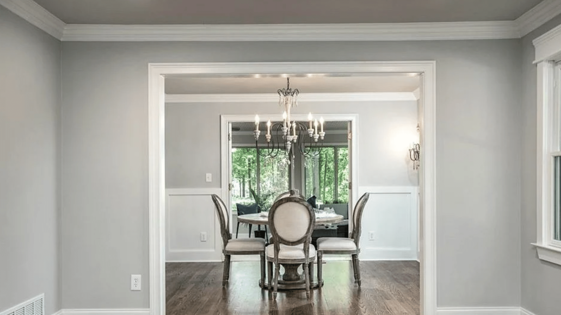
When I first saw Sherwin-Williams Gossamer Veil (SW 9165) on a wall, I understood why so many people love it. It’s that perfect middle ground, not too gray, not too beige, just calm, balanced, and comfortable. If you’ve ever struggled to find a neutral that looks good in every light, this one’s worth your attention. I’ve seen it make small rooms feel open and large rooms feel grounded, all without stealing the spotlight. If you’re planning to paint your living room, bedroom, or even the exterior, Gossamer Veil adjusts beautifully to different spaces and styles. You’ll see how its quiet warmth and subtle undertones create a home that feels soft, natural, and welcoming. What is Sherwin-Williams Gossamer Veil? Sherwin-Williams Gossamer Veil (SW 9165) is a soft greige that sits between gray and beige, offering a balanced tone that feels calm and inviting. It’s part of Sherwin-Williams’ neutral color family, known for its versatility across styles like modern farmhouse, transitional, and minimalist spaces. The shade gets its name from the word “gossamer,” which means light and delicate, a fitting description for a color that brings quiet softness to any room. Gossamer Veil works beautifully on walls, cabinetry, and even exteriors, adapting easily to both warm and cool surroundings. Its moderate depth ensures it doesn’t appear too dark or washed out, making it an easy go-to neutral for many homes. HEX: #D3CEC4 RGB: 211, 206, 196 LRV: 62 Gossamer Veil Undertones Explained Gossamer Veil is a warm gray with subtle green undertones that can occasionally show a hint of violet depending on the light. These undertones shift gently with the room’s direction and surrounding materials. In north-facing rooms, the shade appears cooler, and the gray-green tones stand out more.In south-facing spaces, it takes on a warmer look, showing a soft beige cast.In east-facing rooms, the morning light feels warmer, offering a gentle, welcoming glow.In west-facing rooms, it may reveal slight yellow or muted green tones during the late afternoon. Before painting, test large samples on multiple walls to observe how the undertones change throughout the day. Viewing photos or comparison boards can help you see these subtle shifts more clearly, ensuring you capture the color’s true personality in your space. Gossamer Veil in Real Homes Gossamer Veil works beautifully across home styles, bringing warmth, balance, and adaptability to modern, farmhouse, or coastal spaces. 1. Living Rooms In living rooms, Gossamer Veil creates a calm, open feel that complements both cozy and modern decor. It pairs beautifully with warm wood furniture, woven textures, and matte black accents for added contrast. For trim, use crisp whites like Extra White or Pure White to frame the walls cleanly. Adding linen curtains or textured rugs can improve its softness while keeping the space grounded. The color’s subtle green undertone gives the room a relaxed, natural warmth that works in both daylight and lamp light. 2. Bedrooms In bedrooms, Gossamer Veil brings a soothing, restful feel that makes it perfect for layered neutrals or soft coastal bedding. It creates a cozy atmosphere without feeling heavy or dark. Under warm bulbs, the tone leans slightly beige and comforting, while cooler LED lighting highlights its gray-green side. Pair it with crisp white trim, woven throws, and light oak or rattan furniture for a natural, serene look that encourages relaxation at any time of day. 3. Kitchens and Dining Rooms Gossamer Veil looks elegant and easygoing in kitchens and dining rooms, especially beside white or cream cabinets. Its undertones remain steady but may appear warmer under daylight and cooler under LEDs. Brass, black, or brushed nickel hardware improves its flexible tone. Pair it with marble, quartz, or butcher block countertops for texture contrast. Light wood floors or white oak add warmth that balances the greige hue, making it inviting without feeling overly traditional. 4. Bathrooms In bathrooms, Gossamer Veil shifts slightly cooler because of the moisture and smaller space lighting. It reflects light beautifully, keeping the area open and fresh. Pair it with bright white tile, polished nickel or brass mirrors, and soft gray vanities for balance. White trim, such as Extra White, helps prevent shadows from dulling the walls. This shade keeps bathrooms feeling clean yet comfortable, with just enough depth to add quiet sophistication. 5. Exteriors Outdoors, Gossamer Veil reacts to sunlight and shadows, showing a perfect balance between warm greige and soft gray. In direct sunlight, it reads brighter and more neutral; in shade, subtle green undertones emerge. For trim, pair it with Extra White or Greek Villa for a clean contrast, or Iron Ore for a bold, modern edge. It complements stone, brick, and wood beautifully, making it a versatile choice for classic or contemporary home exteriors. Colors That Go With Gossamer Veil Gossamer Veil’s balanced tone makes it easy to coordinate with a wide range of whites, neutrals, and bold accent colors. Trim and Ceiling Colors For trim and ceilings, crisp whites bring out Gossamer Veil’s soft warmth. Extra White SW 7006, Pure White SW 7005, Greek Villa SW 7551, and Zurich White SW 7626 are perfect matches. Extra White adds a bright modern contrast, while Greek Villa softens the transition for warmer interiors. Pure White is a safe, flexible choice for both trim and ceilings, keeping the look consistent across lighting changes. These whites highlight the subtle greige undertones and make Gossamer Veil feel lighter and more defined in any room. Accent and Complementary Colors Gossamer Veil pairs beautifully with other neutrals like Threshold Taupe SW 7501, Mineral Deposit SW 7652, and Iron Ore SW 7069. These create subtle depth and contrast without overpowering the wall color. For bolder accents, try Indigo Batik SW 7602, Naval SW 6244, or Urbane Bronze SW 7048 to add rich dimension and modern edge. If you prefer a calm, natural palette or a high-contrast design, these tones work seamlessly to improve Gossamer Veil’s flexible character and keep your space balanced and inviting. Room Palette Examples by Style Gossamer Veil adapts easily to different home styles. For a modern palette, pair Gossamer Veil, Iron Ore, and Extra White for clean contrast. A farmhouse look comes alive with Gossamer Veil, Alabaster SW 7008, and natural wood SW 9508, creating warmth and comfort. For a coastal vibe, mix Gossamer Veil, Sea Salt SW 6204, and Snowbound SW 7004 to achieve a soft, breezy feel. Each combination brings out different aspects of the color’s tone, letting you customize your space effortlessly. Gossamer Veil Compared to Similar Colors Comparing Gossamer Veil with other Sherwin-Williams neutrals helps you spot subtle undertone differences and choose the right shade for your space. Color Name Tone & Warmth Undertones LRV Best For Gossamer Veil (SW 9165) Balanced warm greige Soft green with slight violet 62 Versatile for living rooms, bedrooms, and kitchens Agreeable Gray (SW 7029) Slightly warmer and more beige Subtle brown with faint green 60 Cozy spaces needing warmth, like bedrooms or dining areas Drift of Mist (SW 9166) Lighter and softer Faint green-gray 69 Small rooms, hallways, or spaces needing more light Repose Gray (SW 7015) Cooler and more neutral Blue-violet with gray depth 58 Modern rooms or cooler-toned interiors need contrast Use this comparison to pick the tone that best matches your lighting and decor goals. Long-Term Color Behavior Over time, Gossamer Veil’s undertones can appear slightly different depending on lighting and environmental factors. Under warm LED bulbs, the color leans beige and cozier, while cool LEDs bring out its soft gray-green side. Natural daylight can shift the tone, too. Spaces with strong sunlight may see the color brighten, while shaded areas can reveal more muted green undertones. As paint ages, exposure to UV light or moisture may cause subtle fading, especially on exteriors. To maintain a consistent appearance, clean walls gently with a soft cloth, avoid harsh cleaners, and consider repainting high-traffic areas every few years. Testing bulb temperatures before finalizing lighting can also help preserve Gossamer Veil’s balanced, natural look for years to come. Practical Painting Tips for Gossamer Veil Applying Gossamer Veil is simple with the right approach. Follow these steps to achieve a smooth, professional-looking finish. Choose the right finish: Use satin or eggshell for walls, semi-gloss for trim, and satin enamel for cabinets. Prep the surface: Clean and lightly sand before painting to ensure proper adhesion and even coverage. Test the color first: Paint large samples on poster boards and move them around the room to see undertone changes. Use quality tools: A high-density roller and angled brush provide even coverage without streaks. Mind the lighting: Observe how warm and cool bulbs affect the tone before finalizing. Apply two coats: Allow proper drying time between coats for consistent depth and durability. Maintain regularly: Wipe walls gently with a soft cloth to prevent dullness over time. Pros and Cons of Gossamer Veil Understanding the strengths and limits of Gossamer Veil helps you decide if it suits your space and lighting conditions best. Pros Cons Versatile and neutral in most lighting conditions. It may appear slightly green in shaded or north-facing rooms. Works well across different interior styles and finishes. It can look flat if the room lacks contrast or texture. Balanced LRV (62), neither too light nor too dark. Needs thoughtful lighting and décor pairing for best results. Tip: Always sample on large boards and observe in different lights before painting the entire room. Designer Tips for Styling Gossamer Veil Gossamer Veil pairs best with natural materials and warm, balanced textures that highlight its soft, beige tone. Think light oak furniture, woven baskets, linen drapes, and soft neutral rugs to keep the room grounded and welcoming. Brass or matte black accents, like light fixtures, cabinet handles, or frames, add depth without overpowering the wall color. Avoid strong yellow tones in fabrics or lighting, as they can distort the color’s gentle warmth. For wall art, choose pieces with muted blues, creams, or earthy greens that echo its undertones. Add layered lighting, floor lamps, sconces, and soft overhead bulbs to reveal its color shifts throughout the day. With the right mix of texture, tone, and light, Gossamer Veil feels timeless and comfortably balanced in any room. Conclusion After spending time with Sherwin-Williams Gossamer Veil, I’ve learned it’s one of those colors that quietly changes a space without trying too hard. It gives you flexibility, if you want your home to feel warm, relaxed, or just clean and balanced. If you’re unsure how it’ll look in your lighting, sample it first and watch how it changes through the day. You’ll see its true beauty come alive in subtle ways. I hope this helped you picture how Gossamer Veil can work in your home and take the guesswork out of choosing the right neutral. When you’re ready, check out my other color guides for more paint ideas that fit your style perfectly.
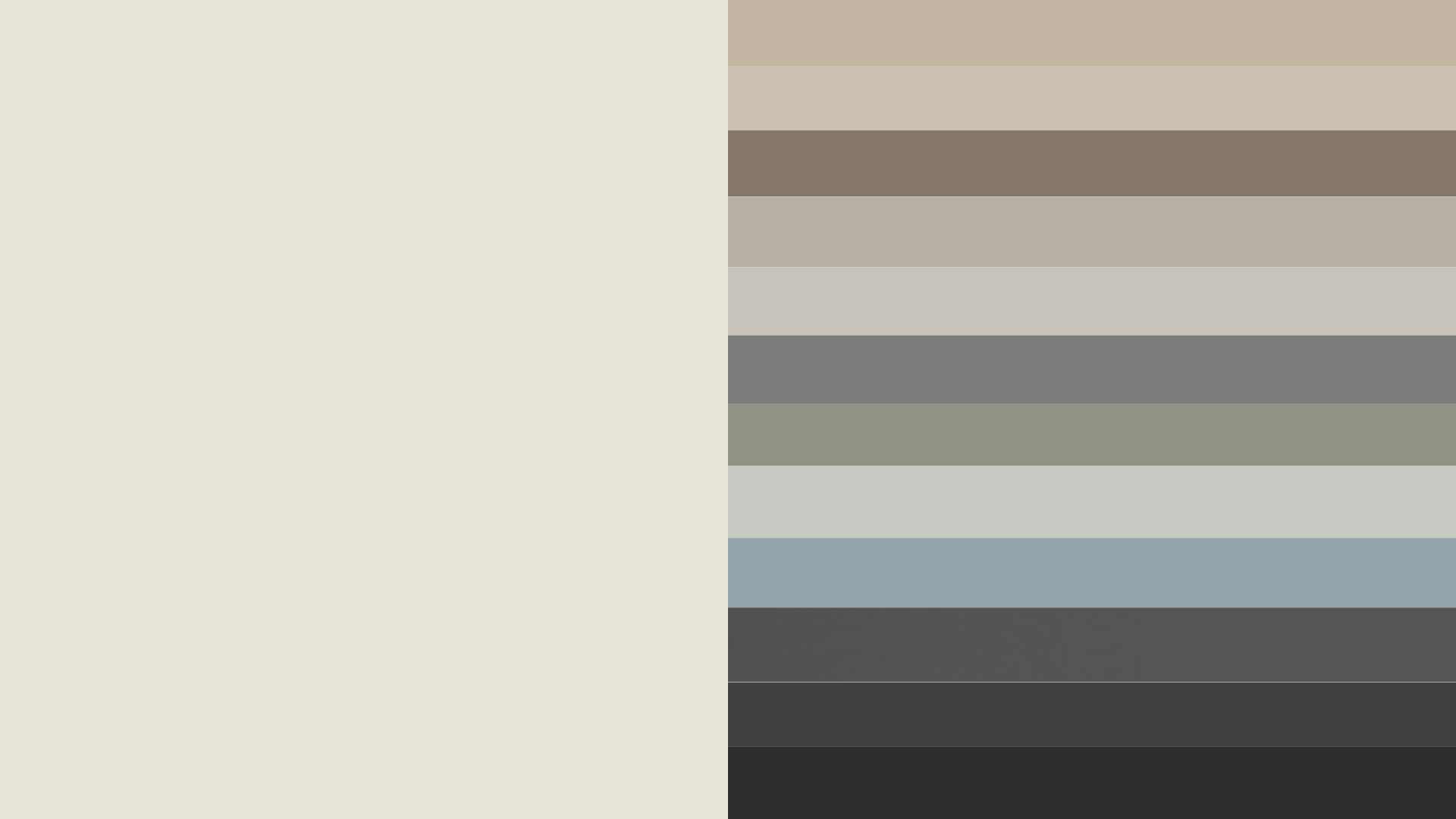
When I first tried Sherwin-Williams Alabaster, I loved its soft, creamy warmth, but finding the right colors to match it wasn’t easy. Some shades made it look too yellow, while others felt too flat. If you’ve ever faced the same challenge, you know how tricky it can be to create balance. That’s why I decided to break down the best SW Alabaster coordinating colors that truly work. In this post, I’ll share how lighting changes its look, which shades pair beautifully, and how you can use them in different rooms. By the end, you’ll know exactly how to build color combinations that make Alabaster feel calm, bright, and effortless in your home. Sherwin-Williams Alabaster SW 7008 is a warm off-white paint with an LRV of 82 and soft creamy undertones. It pairs best with warm neutrals, muted greens, and darker contrast colors like Urbane Bronze to create a balanced and cohesive look. What Makes Sherwin-Williams Alabaster Unique Sherwin-Williams Alabaster (SW 7008) as a color consultant working with neutral palettes in real homes, I’ve seen how Alabaster shifts under different lighting and why the right coordinating colors make or break the final look. Alabaster Quick Facts LRV: 82 HEX: #EDEAE0 RGB: 237, 234, 224 Undertones: Warm, creamy, slight yellow-beige Color Type: Warm off-white Best Rooms: Living rooms, bedrooms, kitchens, exteriors Alabaster falls in the middle of the warm-white spectrum. It’s light and cozy without leaning too yellow, making it a favorite for both modern and classic interiors. The color reflects light beautifully, giving rooms a calm and welcoming look that fits both day and evening settings. Design Tip: Alabaster pairs especially well with natural textures like wood, linen, or rattan for a balanced, cozy finish. Understanding SW Alabaster Coordinating Colors Choosing the right SW Alabaster coordinating colors starts with understanding how undertones, contrast, and lighting affect the way this shade looks in your space. Undertones Alabaster has a warm, creamy base with subtle yellow and beige notes. These undertones give it a soft glow that works beautifully with colors that share a warm foundation. Best pairings: Accessible Beige (SW 7036, LRV 58), Neutral Ground (SW 7568, LRV 70), Sea Salt (SW 6204, LRV 63), and Sherwin-Williams Natural Choice for a softer warm-white option. Avoid icy or overly cool tones that can make Alabaster look muted or dull. Contrast Contrast is key to making Alabaster stand out while maintaining balance. Pair it with mid-tone neutrals or deep accent shades to create dimension. Medium contrast: Repose Gray (SW 7015), Mindful Gray (SW 7016). High contrast: Urbane Bronze (SW 7048), Tricorn Black (SW 6258) for a striking, modern edge. 3. Lighting Lighting plays a big role in how coordinating colors interact with Alabaster. In bright natural light, Alabaster feels lighter and creamier. In cool or artificial light, it can appear slightly whiter and more neutral. Tip: Always test samples under your room’s actual lighting before painting large areas. A simple color chart showing warm, cool, and neutral options can help you visualize how each shade complements Alabaster. This makes it easier to build a balanced palette that feels cohesive in every light. Best Alabaster Color Combinations for Interiors When planning your home design, Alabaster color combinations can completely change the mood of each room. Here’s how to make them work beautifully indoors. 1. Warm Neutrals That Create a Cozy Feel Warm neutrals like Accessible Beige SW 7036, Shiitake SW 9173, and Warm Stone SW 7032, and Sherwin-Williams Alpaca blend easily with Alabaster’s soft undertones. Great for: Bedrooms and living rooms Why it works: Beige and taupe tones bring out Alabaster’s creamy warmth, making the room feel inviting without leaning too yellow. These subtle hues create harmony while keeping your space light and soothing. When used on walls or furniture, they build an atmosphere that feels restful and lived-in. Style tip: Add depth with warm wood furniture, woven baskets, or brass lighting. Try layering soft textiles like linen or wool to emphasize coziness. This mix works beautifully in traditional, farmhouse, or transitional interiors. 2. Cool Grays for Modern Homes Pair Alabaster with cool grays like Repose Gray (SW 7015, LRV 58), Mindful Gray (SW 7016, LRV 48), or Cityscape SW 7067 for a clean, contemporary look. Great for: Kitchens, offices, and hallways Why it works: Cool grays create contrast against Alabaster’s creamy base, highlighting its subtle softness while keeping the room sleek and structured. This pairing balances warmth and freshness, ideal for bright, naturally lit areas. It feels crisp but not harsh, creating a sense of modern calm. Style tip: Use matte black hardware, stainless-steel fixtures, or glass details to sharpen the edges. Try mixing in white oak or light concrete finishes to add natural texture. This color scheme is perfect for minimalist or Scandinavian-inspired interiors that value simplicity. 3. Nature-Inspired Greens and Blues Soft shades like Sea Salt (SW 6204, LRV 63), Evergreen Fog (SW 9130, LRV 30), and Meditative (SW 6227, LRV 44) add an earthy, balanced tone to Alabaster’s brightness. Great for: Coastal, boho, or spa-style spaces Why it works: These hues mimic the tranquility of nature, softening Alabaster’s clean white while introducing gentle color variation. The blend feels fresh and peaceful, ideal for spaces meant to relax or recharge. Green and blue tones enhance natural light and keep rooms feeling airy and open. Style tip: Pair with organic textures like jute rugs, rattan chairs, or linen curtains to bring out the natural feel. Add greenery or botanical prints for subtle contrast. This combination creates a calm retreat that feels timeless and easy to live with. 4. Bold Accents for Statement Looks For contrast and drama, pair Alabaster with bold shades like Tricorn Black SW 6258, Iron Ore SW 7069, or Peppercorn SW 7674. Great for: Doors, trim, and built-in cabinetry Why it works: Dark accents highlight Alabaster’s brightness, giving your home an elegant yet grounded look. The contrast defines architecture, draws attention to clean lines, and adds a sense of structure. It’s a classic pairing that looks confident without overwhelming the space. Style tip: Keep the bold colors limited to one or two focal points, like interior doors or window trim, and balance them with neutral furniture and warm lighting. Add textures like matte metal, dark wood, or leather for sophistication. This look shines in modern, industrial, and transitional homes. SW Alabaster Coordinating Colors by Room Type Here’s how SW Alabaster coordinating colors can upgrade different areas of your home while keeping the look consistent and balanced. 1. Living Room Create a cozy and welcoming space by pairing Alabaster with warm neutrals and earthy browns. This mix brings comfort and depth without feeling heavy. Best Coordinating Colors Accessible Beige (SW 7036) Warm Stone (SW 7032) Dakota Wheat (SW 9023) Urbane Bronze (SW 7048) or Iron Ore (SW 7069) for contrast Design Tip: Add wood, leather, and linen textures to improve warmth. These colors and materials make the space relaxed and natural while keeping Alabaster’s soft glow. Style It Like This Paint the walls in Alabaster and use Accessible Beige on accent furniture or shelving. Add a jute rug, woven baskets, and bronze lighting fixtures for layered texture. If your living room has large windows, let in natural light to emphasize Alabaster’s creamy tone during the day and its cozy glow at night. Include greenery or houseplants to bring life to the neutral palette 2. Kitchen Alabaster cabinets bring a clean, bright look that still feels inviting. Pairing it with subtle contrast colors keeps the kitchen fresh and balanced. Best Coordinating Colors Sea Salt (SW 6204) Repose Gray (SW 7015) Tricorn Black (SW 6258) for hardware or accent trim Design Tip: Combine light wood floors with brass or matte black fixtures to create a modern yet comfortable kitchen. The Alabaster base helps the space stay airy and timeless. Style It Like This Use Alabaster for upper cabinets and Repose Gray for lower ones to add visual balance. Pair this with marble or quartz countertops in a soft gray or beige tone. Add open wooden shelving for warmth and brass handles for a touch of sophistication. Under-cabinet lighting enhances Alabaster’s soft reflection, keeping your kitchen bright without feeling sterile. 3. Bedroom Alabaster works beautifully in bedrooms and pairs well with best bedroom paint colors that focus on calm and comfort. Best Coordinating Colors Meditative (SW 6227) Evergreen Fog (SW 9130) Neutral Ground (SW 7568) for soft balance Design Tip: Use these colors for feature walls, bedding, or accessories. Layer fabrics like cotton, linen, or wool to keep the room restful and soothing. Style It Like This Paint walls in Alabaster and the ceiling in Neutral Ground for subtle contrast. Use Evergreen Fog on your nightstands or dresser for a relaxing accent. Add neutral linen bedding, a soft throw blanket, and warm bedside lighting for evening coziness. For an extra layer of depth, use woven textures and matte finishes that reflect soft light instead of glare. 4. Exterior Alabaster is just as striking outdoors. It brings brightness and warmth without being stark, making it ideal for classic or modern homes. Best Coordinating Colors Iron Ore (SW 7069) for shutters or doors Pure White (SW 7005) for trim and fascia Urbane Bronze (SW 7048) for accent details Design Tip: Add black or bronze lighting and hardware to highlight architectural lines. The soft contrast between Alabaster and darker tones gives your exterior lasting curb appeal. Style It Like This Use Alabaster as your main exterior color, Pure White for window trims, and Iron Ore or Urbane Bronze for doors, shutters, or railings. Pair with natural stone accents or wood beams to add texture. For a classic farmhouse look, include black-framed windows. If you want a coastal vibe, choose light tan or soft blue planters to complement the warm base of Alabaster. Finish with warm outdoor lighting that improves the creamy tone in the evening. Trim, Ceiling, and Door Color Pairings Choosing the right wall and trim color combinations helps SW Alabaster coordinate colors to look balanced and finished. For trim, Pure White, High Reflective White, and Extra White are top picks. These shades add crisp contrast against Alabaster’s warm base without overpowering it. Using slightly cooler whites keeps the look clean and defined. White-on-white layering works because of subtle tone differences. Alabaster’s creamy warmth softens the brightness of cooler whites, creating depth instead of flatness. For ceilings, stick to lighter whites to reflect more light and keep rooms open. Tip: Use a satin or semi-gloss finish for trim and doors, and a flat finish for walls to maintain consistency and visual flow throughout your space, similar to how flat vs satin paint differs in finish and appearance. How Lighting Affects Alabaster and Its Coordinating Colors Lighting can completely change how Alabaster and its coordinating colors look in your space. Understanding these changes helps you choose the right palette for each room. Warm Lighting: In rooms with warm bulbs or sunlight during golden hours, Alabaster appears creamier and softer. Its warm undertones become more visible, giving walls a cozy and inviting look. Pair it with cool grays or greens to balance the warmth. Cool Lighting: Under cooler bulbs or LED lights, Alabaster takes on a cleaner and slightly brighter tone. The warmth fades, making it feel closer to a soft white. It works well with warm neutrals or wood tones to maintain balance. North-Facing Rooms: These rooms get indirect light, which makes Alabaster appear cooler and slightly grayish. Use warmer coordinating colors like Accessible Beige or Dakota Wheat to keep the space from feeling dull. South-Facing Rooms: Strong sunlight in south-facing rooms brings out Alabaster’s warm glow. Pair it with cooler shades like Repose Gray or Sea Salt to tone down the intensity and keep the palette fresh. Tip: Always test paint samples in your room’s natural and artificial light before finalizing your colors. It’s the best way to see how undertones shift throughout the day. Comparing Alabaster With Similar Whites Many homeowners compare SW Alabaster with other popular whites before choosing one. Here’s a quick look at how they differ. Color Undertone LRV Best Use Pros Cons Alabaster (SW 7008) Warm, creamy white with soft undertone 82 Walls, trim, cabinets Cozy feel, versatile, soft glow It can look yellow in very warm light White Dove (OC-17) Slightly cooler with a gray undertone 83 Traditional or transitional interiors Balanced tone, suits warm and cool palettes Less warmth than Alabaster Greek Villa (SW 7551) Warm but lighter and softer than Alabaster 84 Bright, open interiors Airy, works with earthy or coastal tones May appear flat in low light Pure White (SW 7005) Neutral white with subtle warmth 84 Trim, ceilings, and doors Clean, crisp, great contrast color Can feel stark in shaded areas These comparisons help you decide which shade fits your lighting, decor, and desired mood best. Mistakes to Avoid When Using Alabaster Even though Alabaster is versatile, a few common mistakes can keep it from looking its best in your space. Pairing It With Too Cool Tones: Cool tones like icy grays or stark whites can clash with Alabaster’s warmth, making it appear dull or mismatched. Choose balanced neutrals or earthy shades instead. Ignoring Lighting Variation: Lighting changes Alabaster’s appearance throughout the day. Without testing samples in your space, it might look warmer or cooler than expected. Using the Wrong Finish or Sheen: Flat finishes can mute Alabaster’s glow, while overly glossy ones may highlight imperfections. Satin or eggshell finishes work best for walls. You can also compare options like satin vs semi-gloss to get the right balance of durability and shine. Overusing Bright White Trim: Too much bright white trim can overpower Alabaster’s softness. Use slightly warmer whites for a smoother, more natural transition. Frequently Asked Questions Does Alabaster work with oak cabinets? Yes, Alabaster works well with oak cabinets because its warm base connects naturally with golden wood tones. It can soften older oak and make the room feel brighter. Add simple hardware, light counters, and balanced wall colors to keep the space from feeling too yellow. Can Alabaster be used in a basement? Alabaster can work in a basement, but lighting matters a lot. Since basements often lack natural light, the color may look creamier or slightly dull. Use warm layered lighting, lighter flooring, and soft contrast colors to keep the space feeling open and comfortable. What flooring pairs well with Alabaster? Alabaster pairs nicely with light oak, medium brown wood, warm greige tile, limestone, and neutral carpet. These flooring choices support its creamy undertones without clashing. Very cool gray floors may need warmer rugs, wood accents, or brass finishes to balance the room. Does Alabaster look good with marble? Yes, Alabaster can look beautiful with marble, especially marble that has warm gray, beige, or soft gold veining. Very icy marble may make Alabaster look creamier by contrast. Always compare samples together before choosing counters, backsplash, or bathroom tile. Can Alabaster work in a laundry room? Alabaster is a good laundry room color because it feels bright, soft, and clean without looking cold. Pair it with light wood shelves, black hooks, woven baskets, or soft green accents. It helps small utility spaces feel more finished and welcoming. What rug colors go with Alabaster walls? Rugs in beige, taupe, rust, sage, charcoal, muted blue, or warm gray pair well with Alabaster walls. These colors add depth without fighting the soft white base. Patterned rugs also work if they include warm neutrals that connect with the wall color. Is Alabaster good for a whole house? Yes, Alabaster can work as a whole-house color when the lighting and finishes support it. It creates a soft, consistent backdrop from room to room. Use different accent colors, textures, and trim details so each space still feels personal and layered. Does Alabaster match stainless steel appliances? Alabaster can pair well with stainless steel appliances when the room has warm balancing elements. Add wood floors, brass hardware, warm counters, or beige accents to soften the cooler metal finish. This keeps the kitchen from feeling too cold or mismatched. Conclusion Now that you’ve seen how flexible Sherwin-Williams Alabaster can be, you know why it’s such a favorite choice for many homes. It’s warm without being too creamy, bright without feeling stark, and easy to match with so many shades. From cozy neutrals to bold accents, every pairing brings out a new side of this classic white. I hope this guide helped you see how SW Alabaster coordinating colors can work in your own rooms. Try a few sample combinations, watch how the light changes them, and find what feels best for your space. Which pairing do you think fits your home style the most? I’d love to hear what you choose.
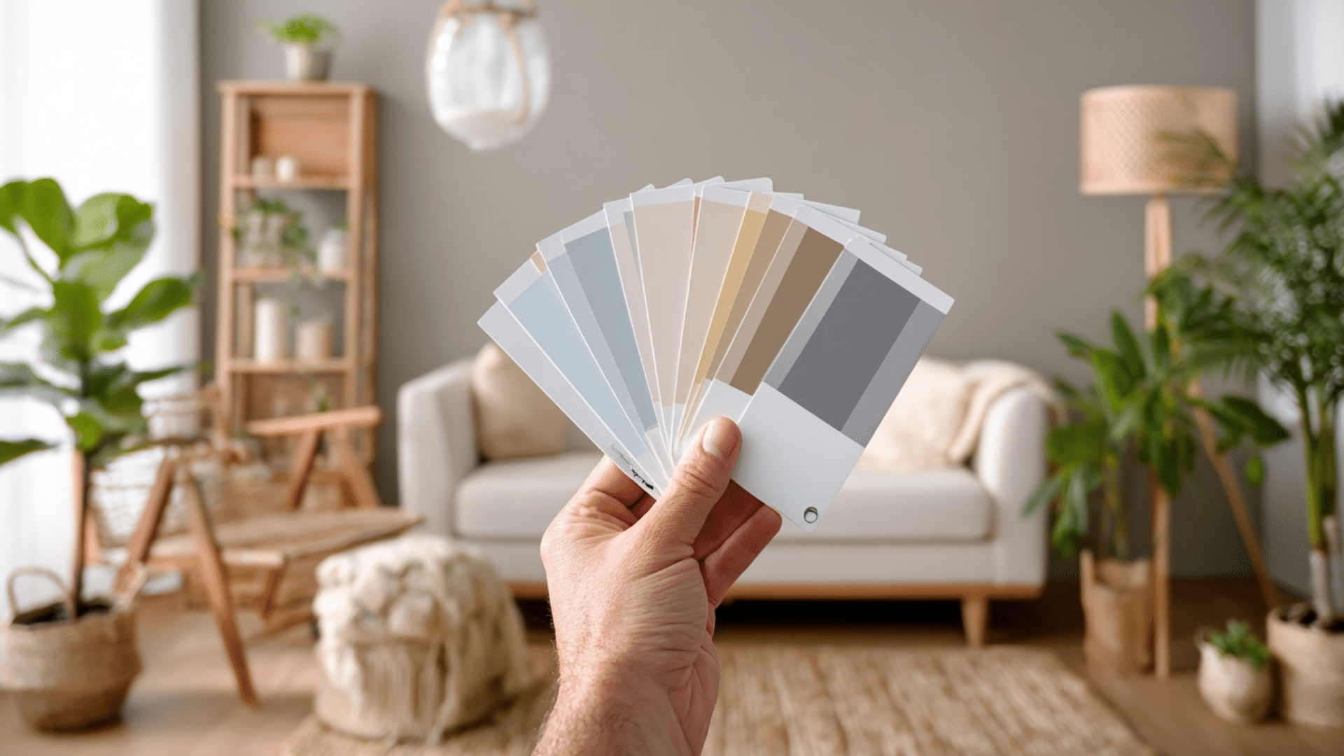
I get it, you pick a paint color that looks perfect in the store, but once it’s on your wall, it feels completely off. I’ve seen it happen countless times, and it’s one of the biggest reasons people dread repainting. The truth is, color isn’t just about the shade you like; it’s how light, undertones, and your décor work together. In this guide, I’ll walk you through how to choose paint colors the smart way, from testing samples and using color visualizers to understanding undertones and lighting. You’ll learn simple, practical steps that actually work in real homes. By the end, you’ll know how to pick colors that look beautiful in every light and truly reflect your style. Why Learning How To Choose Paint Colors Matters Choosing paint isn’t just about picking a color you like; it’s about understanding how light, space, and tone work together to shape how your home feels. When you know how to test paint under real lighting, you avoid costly mistakes and wasted gallons from the wrong shade. You also learn how to match color to a room’s purpose: soft, calming hues for bedrooms, brighter tones for kitchens, and warm neutrals for cozy living spaces. A thoughtful color plan ties your entire home together. Understanding undertones helps you prevent clashing with flooring or furniture, while knowing how colors flow from one room to the next keeps your space visually balanced. Plus, with paint visualizers, swatches, and color apps, you can preview your choices before you even open a can. Learning how to choose paint colors gives you confidence, saves time, and helps you create a home that truly feels like you. How To Choose Paint Colors It’s easier than you think to find paint colors that work with your décor, lighting, and personality when you follow these steps. Step 1: Start with the Big Elements First Don’t choose your wall color before picking furniture, rugs, curtains, and flooring. These larger pieces already define your room’s style and undertones. Once you’ve set those, finding a matching paint color becomes simple. A sofa, rug, or art piece can guide your palette naturally. It’s much easier to select one color from thousands of options that blend with what you already have than to redesign your décor around one wall color. Step 2: Understand Undertones and Color Temperature Every paint color carries subtle undertones that affect how it appears on your walls. Warm undertones come from red, orange, or yellow bases, while cool undertones lean toward blue, green, or gray. To see the true tone, place your paint swatch on a plain white sheet of paper and look closely at the color that stands out. Matching these undertones to your furniture and fabrics helps maintain flow and prevents clashing shades throughout your space. Step 3: Never Choose Paint Colors at the Store Store lighting can make paint colors appear completely different from how they’ll look in your home. Harsh fluorescent lights distort color and undertones. Instead, always test your colors at home, where your natural and artificial lighting will affect the tone differently. Paint a small sample section or use peel-and-stick swatches to see how your chosen shade behaves on your actual wall. It’s the only reliable way to avoid disappointment once the paint dries. Step 4: Use an Inspiration Piece as Your Guide If you feel overwhelmed, start with an item you already love, like a patterned rug, pillow, or piece of art. Pull your wall color and accents directly from that object’s existing palette. This ensures harmony between your décor and paint, making choosing wall colors much easier. Inspiration pieces naturally help you find complementary or contrasting tones that work together. It’s a designer trick that guarantees your room color combinations feel intentional and cohesive. Step 5: Test Paint Samples Before You Commit Large paint swatches or peel-and-stick samples are worth the effort. Place them on multiple walls and view them throughout the day, morning, afternoon, and evening. Lighting constantly shifts, and what looks soft beige in daylight might turn yellow under lamplight. Move your samples around and live with them for a few days before deciding. This simple test prevents costly mistakes and helps you choose a color you’ll truly love in all lighting conditions. Step 6: Keep Lighting Direction In Mind Lighting direction plays a major role in color appearance. South-facing rooms get warm light, so cooler tones like blue or gray add balance. North-facing rooms receive cooler light, so warmer shades, like cream or tan, keep them inviting. East and west-facing rooms shift throughout the day, allowing flexibility with both warm and cool hues. Understanding how light behaves in each space will make choosing wall colors more predictable and ensure every room feels just right. Watch this quick video to see how experts test and choose paint colors in real homes: Understand Room Mood, Function, and Undertones Every color influences how a room feels and how undertones shift under lighting. Use this guide to match color type, undertone, and purpose for a balanced home. Color Type & Undertone Best For How It Feels / What It Does Lighting Behavior Tips for Use Warm Colors & Undertones (Yellow, Terracotta, Beige, Soft Red) Living rooms, dining rooms, and kitchens Create warmth, energy, and a welcoming vibe, perfect for social spaces. Look richer and cozier under warm lighting; it may appear more intense in afternoon light. Use in rooms where you want comfort and connection. Pair with soft lighting or wood accents for balance. Cool Colors & Undertones (Blue, Green, Gray, Aqua) Bedrooms, offices, and bathrooms Calm the mind, reduce stress, and create a peaceful, airy mood. Appears crisp and soothing in natural daylight; can feel cooler under north-facing light. Great for restful areas. Balance with warm décor or white trim to avoid a cold look. Neutral Colors & Undertones (White, Cream, Taupe, Greige) Any room or transitional spaces Provide balance and flexibility, making décor and architecture stand out. Reflect surrounding light tones — can appear warmer near yellow bulbs or cooler near daylight. Ideal for trim, hallways, and open layouts. Add accent colors or textures to prevent flatness. Warm tones bring energy and comfort. Cool tones create calm and clarity. Neutrals keep everything balanced, but always test colors in your own lighting before committing. Build a Color Palette You Can Trust A thoughtful color palette helps your home feel connected, balanced, and visually calm from one room to the next. Use The 60/30/10 Rule for Balance: This classic design formula keeps colors visually balanced. Use your main color for about 60% of the room (like walls), a secondary color for 30% (like furniture or rugs), and an accent color for 10% (like pillows or artwork). This method ensures variety without visual clutter. Combine Colors Across Rooms For Flow: Choose colors with similar undertones to create harmony throughout your home. For example, soft warm neutrals or cool grays can easily connect open spaces. When your palette flows naturally, each room feels unified but still has its own personality. Add Accent Colors Without Clashing: Accent colors bring energy and personality, but they should complement your main tones. Use decor items, like throws, vases, or cushions, to introduce these accents. Keep them consistent across nearby spaces for a polished, balanced look that ties everything together. Pick the Right Paint Finish For Each Room Choosing the right paint finish matters just as much as the color itself. Each finish reflects light differently and affects durability, texture, and how easy your walls are to clean. Matte and eggshell finishes are ideal for most walls because they hide imperfections and create a soft, smooth look. They’re great for bedrooms, living rooms, and ceilings where you want a subtle finish without shine. For higher-traffic areas like kitchens, bathrooms, and hallways, satin or semi-gloss finishes work best. They resist moisture, handle frequent cleaning, and add a gentle sheen that brightens the space. Gloss finishes, though less common, can highlight trim, doors, and cabinetry, giving them a crisp, polished effect. Understanding how sheen interacts with light helps you choose finishes that not only look right but also stand up to everyday use. Visualize Paint Colors Before Painting Seeing colors in your own space before painting helps you avoid costly mistakes. Use digital tools, real samples, and mobile apps to compare shades and find the perfect match for your walls. 1. Try a Paint Color Visualizer Tool A paint color visualizer lets you preview different shades on your walls without lifting a brush. Top tools include Sherwin-Williams ColorSnap® Visualizer, Behr Paint Your Place®, Benjamin Moore Personal Color Viewer®, and HGTV Home Visualizer®. You can upload photos of your room or test colors on sample spaces provided within each tool. These programs show how undertones, lighting, and wall texture affect the final look. They’re perfect for comparing warm versus cool shades, trying accent walls, or experimenting with bold tones safely before you commit to gallons of paint. 2. Use Paint Sample Sheets and Peel-and-Stick Swatches Once you’ve narrowed your favorites, test them in real life. Use large paint sample sheets or peel-and-stick swatches from brands like Samplize or Benjamin Moore to see how colors truly appear under your lighting. Place samples on multiple walls, including areas near windows and corners, to check how shades shift between daylight and lamplight. This method works best in living rooms, bedrooms, and hallways, where lighting changes throughout the day. These large, movable samples reveal undertones that digital screens often hide, helping you make a confident choice before painting. 3. Test Paint Color Apps On Your Phone The best paint color apps make it easy to preview shades anytime, anywhere. Try Sherwin-Williams ColorSnap®, Behr Project Color®, or Benjamin Moore Color Portfolio®. Each app uses your camera to visualize paint colors directly on your walls or match hues from furniture, fabrics, and décor. Some even generate coordinating palettes automatically. These tools are great for quick color comparisons while shopping or browsing online. When paired with real-life swatches, paint apps make your color selection faster, smarter, and more accurate, so you can start painting with total confidence. Avoid These Common Paint Color Mistakes Even small mistakes can make the perfect color look wrong. Avoid these common errors to save time, money, and frustration. Choosing paint online without testing: Colors on screens rarely match real-life shades. Always test samples on your actual walls before painting. Ignoring undertones: Overlooking warm or cool undertones can make your paint clash with furniture, flooring, or décor. Forgetting trim or ceiling contrast: Trim and ceiling colors affect how your wall shade appears. Choose tones that complement each other. Testing directly on old paint: Old wall colors distort new paint tones. Use a white background when testing samples for accuracy. Rushing without daylight checks: View your samples in natural and artificial light. What looks right at night might feel different during the day. Summing Up I know choosing the right paint color can feel like a big decision, but now you’ve got the tools to do it confidently. You’ve learned how to choose paint colors that actually work in your lighting, match your furniture, and feel right for every room. So here’s what I’d suggest: grab a few sample swatches, test them on your walls, and live with them for a couple of days. You’ll be surprised how quickly the perfect one stands out. If this helped you feel more confident about your next project, I’d love for you to check out my other paint and home styling guides. The more you experiment, the closer you’ll get to colors that truly feel like you.
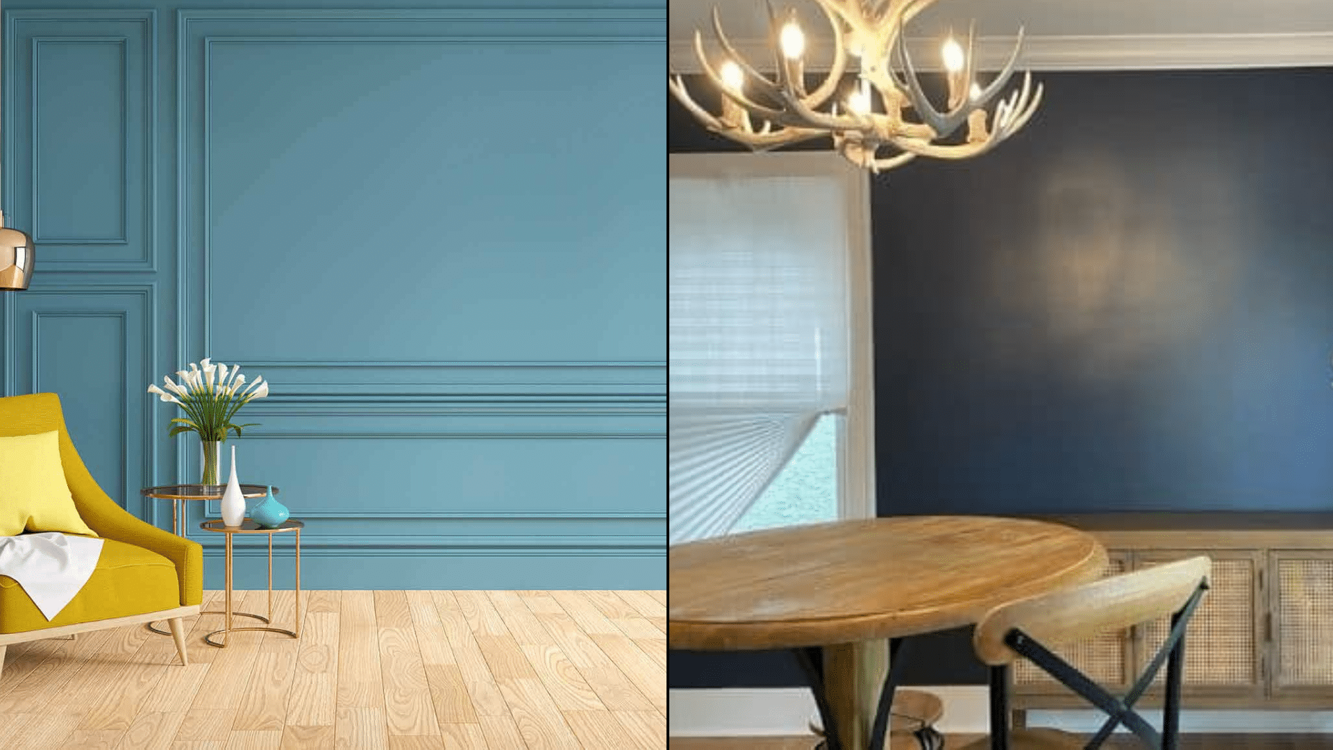
When I first started painting rooms in my home, I thought choosing the right color was the hardest part, until I learned how much the finish matters. The difference between flat vs satin paint isn’t just about shine. It changes how your walls handle light, how durable they are, and even how easy they are to clean. If you’ve ever wondered why one room looks soft and cozy while another feels brighter and livelier, it often comes down to the finish. Here, I’ll share what I’ve learned about how each sheen works, which spaces they suit best, and how to pick the right one so your paint looks great and lasts. Understanding Paint Finishes: Flat, Satin, Gloss, and More Paint finishes do more than change color; they shape how your walls look, feel, and perform over time. The finish, also called sheen, affects light reflection, durability, and how easy your walls are to clean. Flat paint gives a smooth, non-reflective look that hides flaws and creates a calm, even tone. Satin offers a soft glow that adds gentle light without being shiny. Semi-gloss and gloss finishes, on the other hand, reflect more light and resist moisture, making them great for kitchens, bathrooms, and trim. Many homeowners want to understand the differences between flat, satin, semi-gloss, and gloss before painting, because each one plays a key role in how a room feels, functions, and lasts. Quick Comparison of Paint Finishes: Finish Type Shine Level Durability Best For Flat No shine, fully matte Low Ceilings, bedrooms, low-traffic rooms Satin Soft, subtle glow High Hallways, kitchens, family rooms Semi-Gloss Noticeable sheen Very high Bathrooms, doors, trim Gloss Bright reflective shine Extremely high Cabinets, furniture, and accent walls Each finish has its own balance of beauty and function. Flat gives a soft look, while gloss delivers maximum shine and durability. Where to Use Flat Paint (and When Not To) Flat paint works best in calm, low-traffic spaces where walls don’t need frequent cleaning. It hides surface flaws but lacks durability. Best Rooms for Flat Paint Flat paint is ideal for spaces that don’t see heavy wear. It gives a soft, smooth look that hides imperfections and creates a calm, uniform finish. Because it absorbs light instead of reflecting it, it’s great for rooms where you want a relaxed, even appearance. Best places to use flat paint: Bedrooms: Creates a cozy, restful atmosphere while hiding minor wall flaws. Ceilings: Reduce glare and help surfaces look clean and even. Home offices: Keep the space professional-looking without distracting reflections. Formal dining rooms: Adds a muted finish perfect for low-use areas. Low-traffic hallways: Works well in spaces less prone to scuffs and fingerprints. Guest rooms: Offers a clean look that doesn’t need frequent touch-ups. Media or theater rooms: Absorbs light for a darker, glare-free viewing experience. Library or study areas: Provides a quiet, smooth backdrop ideal for focus and comfort. Flat paint gives each of these rooms a soft, classic appearance while minimizing visible flaws and surface inconsistencies. Pros and Cons of Flat Paint Flat paint offers a beautiful matte look but trades off durability for appearance. Pros Cons Hides wall flaws and patches easily Difficult to clean and prone to marks Gives a smooth, modern appearance It can fade faster with frequent scrubbing Ideal for ceilings and low-use rooms Not suitable for kitchens or bathrooms Flat paint is great for aesthetics but requires mindful placement. Use it where walls stay dry and untouched. Maintenance and Touch-Up Tips Flat paint requires gentle care to preserve its finish. Use mild methods and avoid harsh scrubbing to prevent visible marks. Dust regularly: Use a soft microfiber cloth or dry mop. Spot clean carefully: Gently dab stains using mild soap and water. Avoid excess moisture: Prevent bubbling or peeling on older paint. Touch up often: Flat paint blends easily when repainting small spots. Use quality paint: Higher-grade options resist fading and last longer. Regular light maintenance helps keep flat walls looking even and fresh without frequent full repaints. Where to Use Satin Paint (and When to Avoid It) Satin paint is a go-to choice for busy spaces that need regular cleaning. It has a soft, velvety sheen that resists moisture and wear, making it a versatile option for most homes. However, it highlights wall imperfections more than flat finishes, so surface prep is important before painting. Best Rooms for Satin Paint Satin paint offers durability and a gentle shine, making it perfect for high-traffic or humid areas. It’s easy to wipe clean, which keeps walls looking fresh longer. Best places to use satin paint: Kitchens: Handles grease, stains, and cleaning with ease. Bathrooms: Moisture-resistant surface prevents peeling or bubbling. Hallways: Withstands frequent contact from hands or furniture. Kids’ rooms: Durable enough for scuffs, crayons, and frequent cleaning. Laundry rooms: Resists humidity and cleans up easily after spills. Entryways: Keep up with dirt and movement from daily use. Family rooms: Add light reflection while staying easy to maintain. Trim and moldings: Provides a smooth, wipeable finish that looks neat and crisp. Satin paint fits anywhere you need both beauty and practicality, offering long-lasting protection with simple upkeep. Pros and Cons of Satin Paint Satin paint balances durability and style but needs careful application to avoid visible brush or roller marks. Pros Cons Easy to clean and moisture-resistant Highlights wall imperfections easily Durable enough for high-traffic areas May show roller or brush strokes Adds a gentle sheen without being glossy Needs extra prep for a smooth result Works well on walls, trim, and wood Slightly more expensive than flat paint Satin paint gives you durability and a polished appearance, but smooth wall prep and even coating are key for the best outcome. Cleaning and Touch-Up Tips Satin paint is designed for easy maintenance, but it still requires the right cleaning approach to preserve its soft sheen and finish. Use mild soap and water: Gently clean spots using a soft sponge. Avoid abrasive cleaners: Harsh chemicals can dull the sheen. Wipe regularly: Prevent buildup of dust and grime for consistent color. Touch up carefully: Use light coats and the same roller texture to blend seamlessly. Dry immediately: Always wipe away moisture to prevent streaks or spotting. Proper care keeps satin walls looking bright and smooth while protecting their durability for years. Flat vs. Satin Paint: Key Differences Explained Flat and satin paints differ in how they look, feel, and perform over time. Each offers unique benefits depending on your room’s needs and maintenance level. Feature Flat Paint Satin Paint Finish Look Matte and non-reflective Soft, velvety sheen Durability Low — can mark or scuff easily High — resists wear and cleaning Cleaning Ease Hard to clean, needs gentle care Easy to wipe with mild soap and water Moisture Resistance Absorbs moisture, not ideal for humid rooms Moisture-resistant, suitable for bathrooms or kitchens Best For Ceilings, bedrooms, low-traffic spaces Hallways, kitchens, bathrooms, trim Wall Imperfections Hides flaws and uneven textures Highlights the wall texture and marks Appearance in Light Looks even and smooth under all lighting Reflects light slightly, adds depth Cost Slightly cheaper Moderately priced Flat paint works best for calm, low-traffic rooms, while satin is ideal for busy, easy-to-clean spaces. Both have unique strengths that suit different home areas. How Sheen Changes Color Depth and Wall Texture Sheen affects not only the light reflection but also how color and texture appear on your walls. A higher sheen, like satin, makes colors look richer and slightly darker because it reflects more light. In contrast, flat paint absorbs light, softening the color and giving it a more muted appearance. This means the same shade can look noticeably different depending on the finish you choose. Satin finishes also highlight wall texture, such as brush strokes or small dents, while flat paint helps mask these details for a smoother surface. Example: A medium gray in satin may appear deeper and slightly glossier in daylight, while the same gray in flat paint will look lighter and softer, giving a more uniform, velvety look. Choosing the right sheen ensures your walls show the color and texture you actually want. How Lighting Affects Flat and Satin Finishes Lighting plays a major role in how paint finishes appear on your walls. Both natural and artificial light can change how sheen, color, and texture look throughout the day. Natural light: Sunlight improves reflection, making satin paint appear glossier and brighter. Flat paint, however, stays consistent because it absorbs light rather than reflecting it. Rooms with large windows or bright daylight will show more sheen on satin walls and a softer tone on flat ones. Artificial light: Overhead lights or lamps create focused highlights that can make satin finishes appear shinier. Flat paint diffuses light evenly, reducing glare and keeping colors uniform, even under strong lighting. Example: In a sunlit living room, satin paint adds a gentle glow and depth to walls, while in a dim hallway, flat paint maintains a calm, even finish that hides imperfections effectively. Pro Tip: Under warm lighting, satin paint improves golden tones and can appear slightly glossier. Flat paint stays even and soft, especially under cool LED light. Durability and Moisture Resistance When comparing flat and satin paint, think beyond appearance. Factors like durability and moisture resistance determine how well each finish holds up over time. Flat paint absorbs moisture easily, making it prone to marks and mildew in humid areas such as bathrooms or laundry rooms. It’s less durable but works well in low-traffic, dry spaces like bedrooms or ceilings. Satin paint, on the other hand, resists moisture, stains, and scuffs. Its tougher surface makes it ideal for kitchens, hallways, and kids’ rooms. If you want walls that stay bright and clean with regular use, satin offers better long-term protection than flat finishes. Cost, Lifespan, and Long-Term Maintenance Value Before you decide between flat and satin paint, it helps to look at the overall cost, lifespan, and upkeep each finish requires. Flat paint has a lower upfront cost, usually $25–$40 per gallon, but it needs frequent touch-ups every few years. Satin paint costs a bit more, around $30–$50 per gallon, but it lasts longer and requires less maintenance. Feature Flat Paint Satin Paint Average Cost (per gallon) $25–$40 $30–$50 Repaint Frequency Every 3–5 years Every 5–8 years Maintenance Effort Needs frequent touch-ups Easy to clean, fewer repaints Long-Term Value Lower upfront, higher upkeep Higher upfront, lasts longer Satin paint may cost more initially, but it’s more durable, cost-effective, and easier to maintain in the long run. Professional Painter Shares Real Insights In this YouTube video, professional painter [Paint’s Life TV] breaks down how different paint sheens perform on ceilings, walls, and trim. He explains why flat paint works best for ceilings, it hides imperfections and prevents harsh glare, while satin is ideal for walls due to its easy-clean surface and subtle shine. He also shares his go-to Sherwin-Williams products like Eminence for ceilings and Solo for trim, based on years of on-site experience. His practical tips make sheen selection easier for both homeowners and DIY painters. Common Mistakes to Avoid When Choosing a Paint Finish Choosing the wrong sheen can make even high-quality paint look uneven or wear out quickly. Avoid these common paint finish mistakes: Using flat paint in high-traffic rooms: It scuffs easily and is difficult to clean, making it unsuitable for busy spaces like kitchens or hallways. Using satin paint on uneven walls: Its reflective surface highlights dents, scratches, and patches that flat paint would normally hide. Ignoring lighting direction: Light can exaggerate sheen; satin looks glossier in bright sunlight, while flat appears duller under direct light. Skipping wall prep: Uneven sanding or leftover dust causes inconsistent sheen and visible streaks. Mixing finishes in one area: Combining sheens on the same wall creates patchy, mismatched results. Careful planning prevents costly repainting and ensures a consistent, smooth finish throughout your space. Conclusion Now you know how much a paint’s finish can change the look and feel of your space. Flat paint gives you a calm, soft surface that hides flaws, while satin adds a bit more life, shine, and easy cleaning power. The right choice depends on how you live, not just how you want the walls to look. If you’re still torn between flat vs. satin paint, test both on a small wall section and see how they react to your lighting. You’ll spot the difference right away. Which finish do you think fits your home best? Take a look at my other home painting blogs to learn more simple tips before starting your next project.
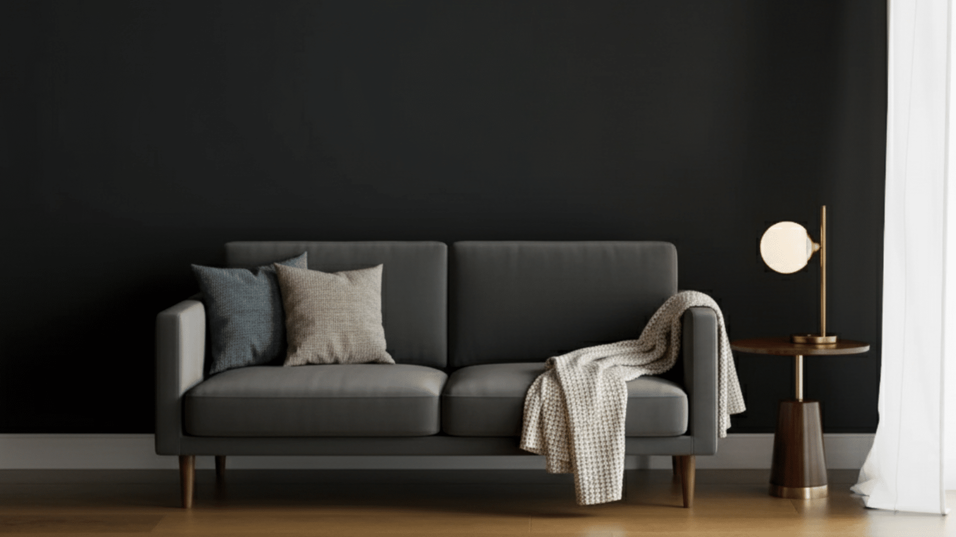
SW Greenblack SW 6994 is a deep near-black paint with a subtle green undertone and an LRV of 4, making it one of the darkest colors in the Sherwin-Williams range. Its cool, balanced tone works on walls, cabinets, and exteriors, adding rich depth without feeling flat or harsh. If you’ve been thinking about trying a dark paint color that feels rich but not overpowering, Sherwin-Williams Greenblack (SW 6994) is worth a look. It’s a deep shade with a touch of green that gives it balance and softness, making it easy to use in different parts of your home, similar to how Rosemary SW 6187 brings a softer green tone into interiors. I’ve used this color in spaces that needed more contrast, and it always adds just the right amount of depth. In this guide, you’ll learn how Greenblack behaves under different lighting, the best finishes for every room, and smart color pairings that work beautifully. You’ll also find practical tips and common mistakes to avoid when using this bold shade in your next project. Understanding Sherwin-Williams Greenblack (SW 6994) Sherwin-Williams Greenblack is a deep, dramatic paint color that balances black with a subtle green tone. It’s not a true black, but rather a cool neutral that adds depth without feeling flat or harsh. The green undertone gives it a quiet richness that makes it work well in both modern and classic spaces. Unlike pure black shades, Greenblack carries a softer edge, creating dimension and warmth instead of absorbing all light. It fits beautifully within the Sherwin-Williams neutral palette, offering a darker option for those who want contrast but still prefer a natural, grounded color. It is used on walls, cabinets, or exteriors. This shade holds its form and complements a wide range of other colors. Pairing it with tones like Indigo Batik SW 7602 can create a deeper, layered look without losing balance. Color Details: Spec Value HEX #373A3A RGB 55 / 58 / 58 LRV 4 Undertones Subtle green, cool charcoal Best rooms Exteriors, cabinets, feature walls, bedrooms Finish options Matte, Satin, Semi-gloss Paint line Sherwin-Williams Emerald / Duration Greenblack Undertones and Lighting Effects Lighting changes how Sherwin-Williams Greenblack appears, shaping its depth and overall mood. Its green undertone shifts subtly depending on whether the space has natural or artificial light. In Natural Light Natural light improves the soft green undertone in Greenblack, especially during daytime hours. In bright, open rooms, it feels balanced and bold without overpowering the space. North-facing rooms: In north-facing rooms, natural light is cooler and softer. Greenblack will look deeper here, with more of its charcoal-green tone coming through. It gives the space a moody, dramatic feel that works beautifully for offices or accent walls. South-facing rooms: South-facing rooms receive warm, golden light most of the day. That warmth softens the green tint, making Greenblack feel more neutral and balanced. It keeps its depth but appears smoother and slightly lighter in strong daylight. East-facing rooms: Morning light is bright and cool in east-facing spaces. Early in the day, Greenblack can look darker and sharper, while by noon, it settles into a classic near-black with subtle green depth. West-facing rooms: Afternoon and evening sunlight from the west brings out warmth in the tone. Greenblack appears softer and slightly richer here, giving rooms a cozy yet sophisticated look as the day ends. In Artificial Light Artificial lighting changes how Greenblack feels after sunset. Under warm bulbs, it takes on a smoky charcoal look, with the green undertone fading into the background. Cool LED or daylight bulbs, on the other hand, highlight the green tint, giving the color a crisp and modern edge. In rooms with mostly south-facing windows, using layered lighting helps balance the shift between day and night. Combine overhead fixtures with lamps or sconces to keep Greenblack looking deep but not overly heavy. This keeps your space comfortable and consistent through every hour of the day. Choosing the Right Finish The finish you choose for Sherwin-Williams Greenblack makes a noticeable difference in both appearance and performance. While the color itself is rich and dramatic, its look can shift depending on how much sheen you use. Glossier finishes reflect more light, which can make Greenblack appear slightly lighter, while flatter finishes absorb light and create a deeper, more velvety look. Matte finishes help hide surface imperfections and are ideal for walls, giving a smooth, even appearance. Satin finishes add a gentle sheen, making them a great choice for trim, doors, or areas that need light reflection without glare. Semi-gloss finishes are more reflective and durable, perfect for cabinets, furniture, or high-use spaces where easy cleaning is important. Greenblack in Different Spaces Greenblack adapts beautifully to different areas of the home, offering versatility and depth when paired with the right finish and surface prep. 1. Living Room In a living room, Greenblack makes a bold statement on a single feature wall or fireplace surround. It brings depth and contrast, especially when combined with lighter furnishings and soft textiles. A satin finish works best here; it’s easy to clean yet maintains a smooth, velvety look. Pair the color with light wood floors, warm lighting, and textured fabrics to keep the space inviting. This setup lets you enjoy the dramatic tone of Greenblack without making the room feel overly dark or heavy. 2. Bedroom Greenblack creates a calm, grounded mood in bedrooms. Use it on the wall behind your bed for a subtle yet striking backdrop. The matte finish softens the color, reducing glare and adding a cozy feel that promotes rest. Pair it with neutral bedding, soft lighting, and light-toned furniture to balance the darker hue. Proper surface prep is key; smooth walls and primer ensure even coverage and a refined finish. Greenblack works especially well in rooms with natural light, where it adds depth without feeling too intense. 3. Kitchen and Cabinets In kitchens, Greenblack shines on lower cabinets, kitchen islands, or open shelving. It gives a sleek, refined appearance that pairs well with light countertops and metallic accents. A semi-gloss finish is ideal because it’s durable and easy to wipe down. When prepping cabinets, make sure to sand and prime surfaces to help the color bond evenly. Greenblack pairs beautifully with brushed brass, stainless steel, or matte black hardware, allowing you to mix styles while keeping the look modern and polished. 4. Exterior Greenblack makes a strong impression on exteriors, whether used for the entire facade or just a front door. Its cool tone holds up beautifully in natural light, offering a clean yet bold presence. Pair it with crisp white or natural wood trim for a classic balance. It also works well in bold exterior paint color combinations for a high-contrast look. For durability, use an exterior-grade satin or semi-gloss finish to withstand sun and moisture. Always clean and prime surfaces before painting to ensure long-lasting coverage. The result is a classic, confident look that stands out without feeling too stark. Coordinating and Complementary Colors Pairing Greenblack with the right colors helps balance its depth and create harmony between walls, trim, and accent details throughout your space. Best Whites to Pair With Greenblack As a color consultant, I recommend starting with cool whites when pairing with Greenblack, they sharpen its green undertone and create a crisp, modern contrast. Whites like Snowbound (SW 7004) and Extra White (SW 7006) make Greenblack stand out beautifully. Use cool whites when you want a crisp, modern contrast that feels fresh and defined. Warm whites, on the other hand, soften the color’s dramatic edge and add a touch of coziness. For trim and ceilings, stick to a bright, clean white to prevent the space from feeling too heavy. In rooms with natural light, cool whites highlight Greenblack’s green undertone, while warm whites help tone it down and create a balanced, welcoming finish. Accent Colors for Contrast Greenblack works well with both bold and subtle accents. A pop of Rave Red (SW 6608) brings energy and depth, while cooler grays or slate tones create a refined contrast. If you prefer a moody palette, pair Greenblack with deep teal or navy accents for added interest. Metallic finishes like brushed gold or matte black hardware also work beautifully, providing balance without overwhelming the color. Keep accent tones minimal so Greenblack remains the focal point of the design, giving your room a strong yet grounded look. Complementary Neutrals For a softer, layered effect, pair Greenblack with muted neutrals such as taupe, greige, or off-white. These shades help lighten the overall palette while keeping the space cohesive. Greige walls with Greenblack trim, for example, create depth without harsh contrast. In open layouts, complementary neutrals allow Greenblack to blend naturally with adjoining rooms. If you prefer subtle warmth, choose a beige-based neutral; for cooler interiors, opt for a soft gray. These pairings keep Greenblack looking rich and classic, offering flexibility for furniture and décor choices. How Greenblack Compares to Similar Colors Comparing Sherwin-Williams Greenblack with other dark tones helps you see how undertones, depth, and warmth influence its look and ideal use. Shade Tone Best Use Warm/Cool LRV Notes Greenblack SW 6994 Deep charcoal, green undertone Exteriors, cabinets, feature walls Cool 4 Balanced near-black with subtle green tint BM Wrought Iron 2124-10 Deep charcoal, blue undertone Exteriors, front doors, cabinets Cool 6 Slightly lighter; blue rather than green undertone Iron Ore SW 7069 Dark gray-black Interior walls, trim, and built-ins Warm-neutral 6 Softer and warmer; no green tint Tricorn Black SW 6258 True jet black Doors, exteriors, accents Neutral 3 Pure black, no visible undertones Black Magic SW 6991 Black, warm brown undertone Cabinets, bedrooms, moody spaces Warm 3 Cozier and more traditional feel Greenblack sits between these shades in tone and versatility. If you’re also considering Benjamin Moore Soot, it’s one of the most common alternatives readers compare side by side. Each color has its own mood. Greenblack leans balanced and adaptable, making it ideal for homeowners who want depth without losing softness or visual comfort. Tips for Using Dark Paints Like Greenblack Using dark paint shades can feel tricky, but the right techniques make them look refined, balanced, and easy to live with. Test Before Painting: Always sample Greenblack on multiple walls. Check it in daylight and artificial light to see how the undertone shifts. Prep the Surface: Smooth, clean walls give dark paint a flawless finish. Use primer to prevent uneven absorption or patchy coverage. Use Quality Tools: High-quality rollers and brushes ensure even color distribution and fewer streaks, especially with rich tones like Greenblack. Add Contrast: Balance the darkness with light trim, neutral décor, or soft furnishings to keep the room open and inviting. Layer Lighting: Combine ceiling, wall, and table lighting. Dark shades absorb more light, so layered lighting helps maintain depth and comfort. Mind the Finish: Choose satin or semi-gloss in high-traffic areas for easier cleaning, and matte for walls where softness matters most. Where to Get Sherwin-Williams Greenblack You can buy Sherwin-Williams Greenblack (SW 6994) at any Sherwin-Williams retail location or directly from the official website at www.sherwin-williams.com. The color is available in both interior and exterior formulas, giving you flexibility for any project. Choose from matte, satin, or semi-gloss finishes depending on where you plan to use it. For easy testing, order a Samplize peel-and-stick sample online. It shows the real color on your wall without leaving marks, helping you see how Greenblack looks in your lighting before purchasing the full-size paint. Common Mistakes When Using Greenblack 1. Skipping Surface Preparation: Greenblack is a deep color that highlights imperfections. If walls aren’t properly cleaned, sanded, and primed, small flaws or patchy areas will stand out once the paint dries. 2. Using the Wrong Finish: Choosing the wrong sheen can change the entire look. Flat finishes can make Greenblack appear dull and show scuffs easily, while high gloss can feel too reflective. Satin or semi-gloss works best for balance and durability. 3. Ignoring Lighting Conditions: Lighting heavily affects how Greenblack reads. Without testing samples in both daylight and artificial light, you may end up with a tone that feels colder or darker than expected. 4. Painting Too Many Walls Dark: Covering every wall in Greenblack can make small rooms feel enclosed. It works best on accent walls, cabinetry, or paired with lighter neutrals to maintain visual balance. 5. Neglecting Trim and Ceiling Contrast: Using Greenblack without contrasting trim or ceiling colors can make a space feel flat. Pair it with crisp whites or soft neutrals to define edges and keep the look refined. 6. Rushing Between Coats: Deep colors like Greenblack need full drying time between coats. Rushing can cause streaks, uneven coverage, or a blotchy finish that’s hard to fix later. 7. Using Poor-Quality Tools: Low-quality rollers or brushes can leave marks, especially with dark paint. Always use premium, lint-free rollers and angled brushes for smooth, even application. Conclusion Sherwin-Williams Greenblack (SW 6994) stands out as a dark color that feels strong yet inviting. It adds style, depth, and balance when paired with the right lighting and finishes. You now know how its undertones shift, what colors complement it, and how to apply it in different spaces. Testing a sample first helps you see how it behaves in your home’s light before painting larger areas. This shade brings contrast without feeling too heavy, making it perfect for walls, cabinets, or exteriors. If you found this helpful, take a look at my other paint color guides for more simple and practical home design ideas. Frequently Asked Questions Is SW Greenblack black or green? Greenblack reads as a very deep green with strong black undertones. In most lighting, it appears nearly black, but subtle green notes show in brighter or natural light. What is the LRV of Greenblack? Greenblack has a low Light Reflectance Value of around 4. This means it absorbs most light, making it a very dark color that adds depth and contrast. Is Greenblack good for exteriors? Greenblack works well for exteriors, especially for modern or classic looks. It pairs nicely with stone, brick, and wood, and holds up well in varying light conditions. What colors go with Greenblack? Greenblack pairs well with warm whites, soft beiges, muted golds, natural wood tones, and brushed metals. It also complements earthy greens and subtle grays for a cohesive palette. Is Greenblack the same as black? Greenblack is not the same as black. It looks similar at first glance, but has a green undertone that adds softness and dimension compared to a flat, pure black.