

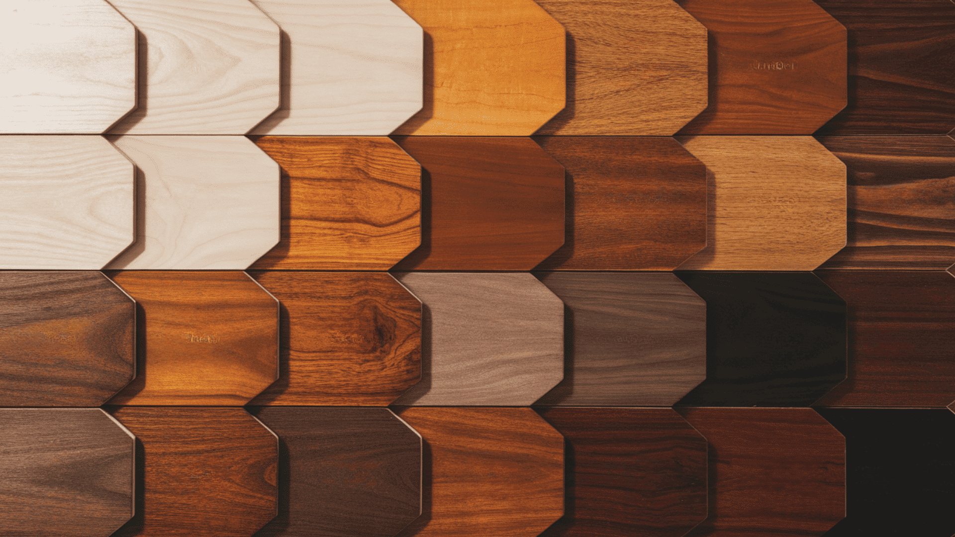
I remember staring at a stack of maple boards, trying to guess how each stain would actually look once it dried, especially when mixing different wood tones that go together. If you’ve been in that spot, you know the mix of curiosity and doubt that comes with choosing colors. A maple stain color chart sounds helpful, but the real challenge is knowing what those shades mean for your space. I want to make this easier for you by breaking things down in a clear, calm way that fits real projects. You’ll see what matters, what to expect, and how to pick shades with confidence using the maple stain color chart. So let’s move to the first step. Maple Stain Color Chart (Quick Overview) You can use this chart to compare common stain groups on maple. It helps you choose a shade before picking a brand or testing samples. Color Family Common Maple Stain Examples Light and Natural Natural, Fruitwood, Golden Maple Honey and Amber Golden Oak, Warm Maple, Light Brown Medium Browns Provincial, Special Walnut, Chestnut Dark and Espresso Coffee Brown, Dark Walnut, Espresso Maple Gray and Greige Classic Gray, Weathered Gray White and Washed Pickled Oak, Country White This simple chart keeps stain choices clear, so you can move forward with testing and planning your maple project confidently. Maple Stain Color Families Explained This section helps you compare colors fromcommon stain makers. Similar to how choices differ in walnut vs cherry wood, you can select products that match the look you want on maple before testing samples at home. 1. Light and Natural Maple Stains Light and natural stains keep maple close to its original state, which helps you see grain lines clearly across the surface. These colors work well when you want a calm look that does not draw attention away from nearby items or details in your room. They also reduce the chance of strong color shifts under different lights, giving you steady results during daily use. This group works for floors, cabinets, tables, and trim, where you prefer simple upkeep and easy matching with other wood pieces at home each day, safely. 2. Honey and Amber Maple Stains Honey and amber stains give maple a warm feel that highlights grain lines without making the surface too dark or heavy for most rooms. These colors work for kitchens, hallways, and living areas where you want a steady, welcoming look that supports daily use without drawing strong focus. They help reduce the sharp contrast between maple pieces and nearby wood, which is useful when you need smooth matching across older and newer sections. This group also keeps upkeep simple while allowing small marks to stay less noticeable during routine cleaning each day. 3. Medium Brown Maple Stains Medium brown stains bring steady color to maple and help reduce sharp contrast across the board, which makes surfaces look even under many lights. This group works well for floors in busy sections of your home because it hides minor marks that appear after shoes, chairs, or daily tasks move across it. These colors pair nicely with kitchens, family rooms, and trim where you want a steady color that stays reliable through different seasons and lighting changes. This group keeps upkeep simple and supports long use without quick fading or unevenness. 4. Dark Brown and Espresso Maple Stains Dark brown and espresso stains bring strong color to maple, helping you get deep results that stand out while still showing some grain. These colors work for large rooms, taller cabinets, and wide tables because they add depth and keep the surface steady under many lighting setups. This group is helpful when you want a solid base that hides small marks from chairs, shoes, and daily use across busy areas of your home. These colors support long use and remain steady through shifting light across different times of day. 5. Gray and Greige Maple Stains Gray and greige stains give maple a soft, calm look that reduces yellow notes and helps you keep a steady surface across many conditions. These colors work for modern rooms, open kitchens, and smaller areas because they lower the strong contrast and support even color across the wood. This group is useful when you want a quiet base that supports other items in the room without drawing too much focus toward the grain. These colors handle daily light changes well and help you keep surfaces steady through busy routines. 6. White, Pickled, and Bleached Maple Stains White, pickled, and bleached stains give maple a bright feel that reduces yellow notes and keeps the surface clear under many lighting setups. These colors work for small rooms, sunny spaces, and modern layouts because they open the area and help grain lines stay soft across the wood. This group helps you create a quiet base that supports other room items, letting light move across surfaces without strong color shifts. These colors handle daily changes well and give you steady results across cabinets, tables, trim, and other maple pieces. Maple Stain Colors by Brand This section helps you compare colors from common stain makers, so you can select products that match the look you want on maple before testing samples at home. Minwax Maple Stain Colors Minwax offers steady colors that work well on maple when you need simple matching and clear results under many lighting setups. Their range covers light, medium, dark, gray, and pale white shades, giving you enough room to find a tone that suits your room or project. These colors work for cabinets, floors, trim, and small items. Minwax shades also handle regular cleaning well, which helps your maple stay steady during long use. These options support everyday tasks and keep surfaces looking smooth without much upkeep from you. Light Picks: Natural, Golden Oak Medium Picks: Provincial, Special Walnut Dark Picks: Dark Walnut Gray and White Picks: Classic Gray, Pickled Oak Sherwin-Williams Maple Stain Colors Sherwin-Williams provides colors that hold steady on maple and give you clear results across many parts of your home. Their tones work well for cabinets, trim, and tables because they sit evenly on maple with good control over strong shifts in color. These options stay reliable under indoor light and help you reach a calm look across your surfaces. This brand is also handy when you want maple shades that match nearby wood or older items, giving you options that stay steady during daily use and regular cleaning routines. Warm Browns: Chestnut, Warm Hickory tones Gray Tones: Weathered Gray, Rustic Gray Duraseal Maple Stain Colors Duraseal colors handle high-traffic floors well, which makes them useful for maple in busy areas of your home. These tones stay steady under constant foot movement and regular cleaning, giving you long, steady results without sudden changes in shade. Duraseal options also help hide small marks that appear over time, which is helpful for homes with kids, pets, or heavy daily use. These colors give maple a clear, dependable look that supports strong use while keeping surfaces smooth across many lighting setups during regular routines at home. Floor Browns: Chestnut, Coffee Brown Floor Grays: Classic Gray, Country White How Maple Wood Takes Stain Maple has a tight grain that absorbs stain in uneven ways, which can change the final color across the surface. Some areas take in more stain than others, giving results that shift from light to dark if the wood is not prepared correctly. This happens on both hard and soft maple, and it can show up on floors, cabinets, and smaller projects. To control this, you often need a base coat that helps the stain spread evenly. When maple is prepared the right way, the color settles smoothly and stays steady under normal indoor light. How to Choose the Right Maple Stain Color Use these steps to pick a stain that fits your room, supports daily use, and keeps your maple pieces steady under different lights. Match Your Style: Choose a color that fits the room’s mood you want, such as light for calm spaces or deeper tones for strong, grounded surfaces. Match Room Size and Light: Small or dim rooms work better with lighter colors, while brighter or larger rooms can handle deeper tones without making the space feel tight. Match Existing Finishes: Check nearby floors, counters, and trim so your maple stain does not clash. Pick a tone that sits well beside other wood or surface colors. Pick Based on Project Type: Floors need colors that hide marks, cabinets need tones that suit counters, and tables need shades that stay steady under daily handling. Best Finishes and Topcoats for Maple A good finish protects maple, steadies the color, and helps the surface handle daily use without sudden changes in tone or texture. Oil vs. Water Finishes Oil finishes add warm notes over time and create a strong surface that holds up well with regular use. Water finishes stay clear, dry faster, and keep the original color closer to what you see during staining. Both options work on maple, but the right choice depends on how much warmth you want and how quickly you need to complete your project. Water finishes also reduce odor during use, which can help when working indoors on cabinets, trim, or smaller items. Choosing the Right Sheen Sheen affects how much light shows across your maple surface. Matte keeps reflections low and works well for rooms where you want a calm feel. Satin gives a small amount of shine that suits cabinets, tables, and trim without drawing too much focus. Gloss shows more reflections and highlights small marks, so it fits spaces that stay clean with gentle use. Picking the right sheen helps your maple stay steady under daily light and regular cleaning across busy areas in your home. Reducing Yellowing Over Time Maple can shift toward deeper tones if the finish reacts with light over long periods. Water finishes help keep color steady because they avoid warm notes that appear as time passes. Using a product with light protection can also slow color changes, especially near windows or bright areas. Keeping the surface clean and avoiding harsh products helps the finish stay smooth. With the right steps, your maple can hold its color for many years without quick shifts that make upkeep difficult. How to Test Maple Stain Colors Use these steps to check color changes on maple, control uneven spots, and see how each stain reacts under different lighting in your room. Prepare Sample Boards: Sand maple to the same grit as your project and use scrap pieces whenever possible for accurate color results. Use Conditioner: Apply a base coat that helps stain spread evenly and lowers the chance of dark patches across the surface. Apply and Label Stains: Brush or wipe on each stain the same way you plan to treat the final piece, then label every sample clearly. Check Lighting: View samples in morning, afternoon, and evening light to see how each shade shifts across the maple surface. Avoid Mistakes: Do not judge color while the stain is wet, skip uneven sanding, or rely on charts alone without real sample testing. Frequently Asked Questions Why does maple stain look blotchy? Maple has a tight, uneven grain that can absorb stain in patches. Some areas take more color while others stay lighter. Sanding evenly, using a wood conditioner, and testing samples first can help reduce blotching and create a smoother final look. Can maple be stained to look like walnut? Yes, maple can be stained darker to look closer to walnut, but it will not match walnut perfectly. Maple has a different grain pattern and density. Use dark brown or espresso stains, test first, and expect a cleaner, less grain-heavy result. Is gel stain better for maple? Gel stain can work well on maple because it sits more on the surface instead of soaking deeply into the wood. This helps reduce blotchy areas. It is especially useful for cabinets, furniture, and vertical surfaces where even color control matters. Should maple be sanded before staining? Yes, maple should be sanded before staining. Even sanding helps the stain absorb more evenly and prevents rough spots from showing through. Use consistent grit across the whole surface, and remove all dust before applying conditioner, stain, or finish. Can you stain maple without conditioner? You can stain maple without conditioner, but the result may look uneven or blotchy. Conditioner helps control absorption and gives you a more balanced color. It is especially helpful with darker stains, large surfaces, cabinets, and visible furniture pieces. What stain hides maple grain best? Darker stains, gel stains, and painted-style stains hide maple grain better than light or natural stains. Espresso, dark walnut, and deep brown shades reduce visible grain variation. However, maple grain may still show slightly depending on sanding, stain type, and finish. Does maple darken after staining? Yes, maple can appear darker after stain and topcoat are applied. Oil-based finishes may add warmth and deepen the color over time. Water-based finishes usually keep the stained color closer to the original sample, with less yellowing or darkening. Can stained maple be refinished later? Yes, stained maple can usually be refinished later if the wood is thick enough to sand safely. Old finish and stain must be removed evenly before applying a new color. Veneered maple needs extra care because sanding too much can damage the surface. Conclusion I hope this helped you feel more sure about choosing colors for your maple projects. You now know how different stain groups behave, how brands compare, and how simple steps can guide you toward results that stay steady in daily use. The goal is to give you a clear footing as you work through each choice. If you want a quick reference, the maple stain color chart is a steady guide you can return to as you plan your project. I’d love to hear what you try next, so share your thoughts or check out the other guides for more ideas. Let’s keep building your skills one step at a time.
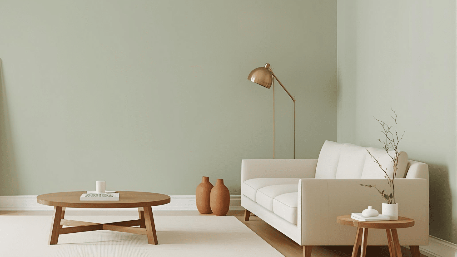
I used to think Sage was just “green,” until I saw it turn gray in one room and olive in another. If you are trying to figure out what color Sage is, that shift can feel confusing fast. The good news is, Sage is pretty simple once you know what to look for. It is a muted gray-green, and lighting plus undertones decide if it feels warm or cool. I will walk you through Sage’s mood in a room, easy palettes that work, and quick tips to pick the right shade with confidence. By the end of this blog, the question, “what color is Sage?” will feel much clearer. Sage Color Meaning and Mood in Design Sage is a muted green that feels calm and easy to live with. It sits between green and gray, so it reads softer than most greens. In a room, Sage often gives a clean, relaxed feel without looking cold. It also adds a natural, grounded touch that works with wood, stone, and simple fabrics. You will see Sage used a lot because it blends in like a neutral, but still adds color. It can feel fresh in bright light, or cozy in warmer light. That balance is why it fits modern farmhouse, cottage, Scandinavian, boho, traditional, and organic modern spaces. Quick Summary: Sage feels calm and natural, and it works in many design styles. Sage Color Palettes You Can Use Right Away These palettes help you use the color Sage with the right undertones, so your room feels balanced, calm, and planned. Warm Sage Palette (Cozy and Earthy) Warm Sage leans olive or slightly brown, so it looks best with warm neutrals and earthy accents. This palette feels relaxed and grounded, which works great in living rooms, bedrooms, and kitchens with warm lighting. If your space has warm wood floors or creamy trim, this mix usually looks natural right away. Keep the contrast soft, then add one deeper element for depth. Sage + Cream Sage + Warm Beige Sage + Terracotta Sage + Brass Sage + Walnut Wood Cool Sage Palette (Clean and Airy) Cool Sage leans gray or slightly blue, so it pairs well with crisp, cooler shades. This palette feels fresh and light, making it a safe pick for bathrooms, offices, and smaller rooms. If your home has cooler light, gray tile, or modern finishes, this combo helps Sage look smooth instead of muddy. Add one wood tone to keep it from feeling too flat. Sage + Bright White Sage + Cool Gray Sage + Dusty Blue Sage + Chrome Modern Contrast Palette If you want Sage to look modern, you need contrast. Dark accents make Sage feel sharper and more current, especially on cabinets, built-ins, or an accent wall. This palette works well in open spaces where you want clean lines and bold edges. Keep the background light, then use black or charcoal in small, repeated spots to make it feel intentional. Sage + Charcoal Sage + Black Sage + Crisp White Sage + Concrete Tones Soft and Romantic Palette This palette keeps Sage gentle by pairing it with light, warm tones and soft textures. It works best in bedrooms, nurseries, or quiet corners where you want a calm look without heavy contrast. Use blush as a small accent, not the main color. Linen tones and pale wood help the whole space feel light and easy. Sage + Blush Sage + Warm White Sage + Light Wood Sage + Linen Tones Nature Palette If you want Sage to feel outdoorsy and organic, pair it with clay, sand, and stone shades. This palette suits entryways, living rooms, and any space with natural materials like jute, rattan, or textured walls. Keep the colors muted so Sage stays the main “green,” while the other shades support it. Olive works best here when it is slightly darker than your Sage. Sage + Clay Sage + Sand Sage + Olive Sage + Stone Where Sage Works Best in Home Design Sage works best where you want soft color without heaviness, and where lighting and nearby finishes support its undertone. Sage Walls Sage walls work well in bedrooms, living rooms, home offices, and hallways because the color feels calm without going dull. It reads like a neutral, so it does not fight with rugs, art, or furniture. In bright rooms, Sage can feel fresh and clean. In dim rooms, it can look grayer and softer, which still works if you like a quiet look. Pair it with the right white trim, and it looks more finished. Best rooms: bedrooms, living rooms, offices, hallways Best trim: warm white for warm Sage, clean white for cool Sage Sage Cabinets and Islands Sage is a strong choice for cabinets and islands because it adds color without feeling loud. Many bright greens can look trendy fast or feel too bold in a kitchen. Sage stays softer, so it works with wood floors, stone counters, and metal hardware. It also hides daily smudges better than pure white. Use deeper Sage for islands if you want contrast, or lighter Sage for full cabinets. Works well with: white counters, warm wood, black or brass hardware Great spots: lower cabinets, islands, pantry doors Sage Bathrooms Sage works in bathrooms because it pairs easily with tile and stone, and it gives a clean but softer feel than plain white. Cool Sage looks great with gray tile, marble looks, and chrome. Warm Sage looks better with cream tile, travertine, and brushed brass. Since bathrooms can have mixed lighting, test the shade under your vanity lights too. Keep other colors simple so Sage stays calm. Cool look: Sage + gray stone + chrome Warm look: Sage + cream tile + brass or bronze Sage Exteriors and Front Doors Sage can look great outside, but outdoor light changes it a lot. Sun can pull Sage warmer and greener, while shade can pull it grayer or bluer. That is why testing is important. Paint a large sample board and check it in the morning, midday, and evening. Sage works well for front doors, shutters, and even siding if your roof, brick, or stone tones match its undertone. Test outside in: sun and shade, different times of day Best pairings: warm white trim, black accents, natural stone, wood tones Sage Undertones (How To Choose The Right One) Sage undertones decide if your shade looks warm, cool, or balanced once it is on the wall. Many Sages hide hints of gray, blue, yellow, or brown. To spot it fast, do a simple undertone test. Place your Sage sample next to pure white, medium gray, and warm beige. If it looks bluer next to white, it is cool. If it looks earthier next to beige, it is warm. Then do the neighbor color test. Hold the sample next to your flooring, countertop, and trim. If it clashes there, it will clash on the wall too. Sage Variations (Silvery, Olive, Minty, Deep) These Sage types help you pick the right shade faster, based on lighting, undertone, and how bold you want it. Sage Type What It Looks Like Feels Like Best For Avoid If Silvery Sage Pale gray-green Light, soft, neutral Small rooms, low light, calm walls You want warmth or richness Olive Sage Green with a warm, earthy tone Cozy, grounded Warm lighting, rustic spaces, warm woods Your room is cool or shadowy Minty Sage Green with a fresher, cooler cast Crisp, airy Bathrooms, bright rooms, modern spaces You dislike blue-leaning greens Deep Sage Darker, richer muted green Bold, settled Cabinets, doors, accent walls You want an airy, light look Pick Your Sage Want neutral and soft: Silvery Sage Want cozy and earthy: Olive Sage Want fresh and light: Minty Sage Want bold and deep: Deep Sage Conclusion Now you know why Sage feels so easy to use, even when it shifts a little in a different light. You saw how Sage sits between green and gray, how warm and cool undertones change the look, and where it works best in a home. You also got ready-to-use palettes, so you can match trim, wood, tile, and metals without guessing. My biggest tip is to test a large sample near your flooring and trim before you commit. If you still feel stuck on what color is Sage, tell me your room light and finishes in the comments. Also, check out my other blogs for more color help and pairing ideas.
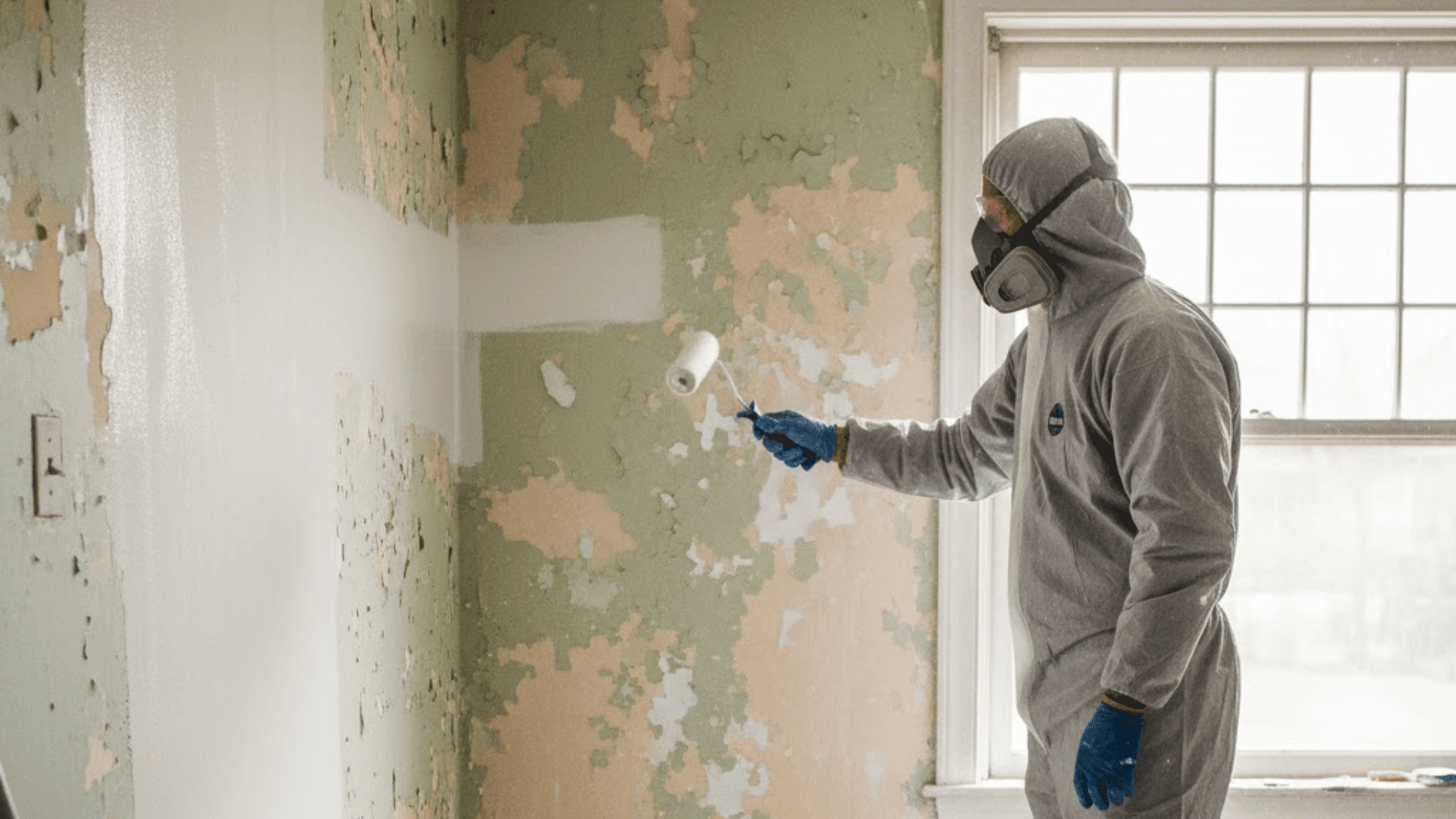
If you live in an older home, you may worry about lead paint. That worry often shows up right when you want to repaint. You might be asking, can you paint over lead paint and still keep your home safe. In this guide, I will walk you through what lead paint is and why it matters. You will learn when painting over it can work, and when it is a bad idea. You will also see what products to use, plus simple steps to prep, coat, and clean up. Along the way, you will get clear dos and don’ts, and signs it is time to call a lead-safe pro. What Lead Paint is and Why it Matters? Lead paint is paint that contains lead, a toxic metal. It becomes most dangerous when it breaks down into chips and dust. That dust can get into your body when you breathe it in or swallow it, even in tiny amounts. Lead paint is often found on: Window trim and sills Doors and door frames Baseboards Stair rails Cabinets and built-ins Exterior siding and trim Painting work can be risky because sanding, scraping, or grinding old paint can create lead dust. That dust can spread through your home and settle on floors, toys, and furniture. Kids and pregnant people face a higher risk from lead exposure, so it is important to be extra careful. Should You Paint Over Lead Paint or Not? You can paint over lead paint using encapsulation, which means sealing the old paint under a thick, strong coating so it cannot chip or create dust. This can be a safe option only when the old paint is in good shape, and the surface is not a heavy-wear area. Encapsulation may work if the paint is solid (not peeling or chalky), the surface is low-friction (nothing rubs or slides on it), the area is dry (no leaks or dampness), and the job can be done with no sanding or scraping. Do not paint over it if the paint is peeling, chipping, cracking a lot, or chalky, if moisture is present, or if prep would require sanding or scraping. Avoid encapsulation on wear zones like floors and stairs, sliding windows, doors, and door frames that rub, drawers and cabinets that scrape, and handrails in heavy-use areas. If any of the “do not” points fit your situation, it is safer to stop and choose another method or call a lead-safe pro. What Paint Can You Use Over Lead Paint? When you are covering lead paint, regular wall paint, and standard primer are not made to seal in lead risks. A lead encapsulant is the safer choice because it is built to form a stronger barrier. Encapsulant Type What It Is Where It Often Works Best Polymer-based coatings Thick coatings that form a flexible barrier Many painted walls and trim in low-friction areas Epoxy or polyurethane systems Tough coatings that can hold up better in some spots Areas that need a harder finish (but still not high-rub zones) Cement-like coatings Thick coatings are used more for masonry-type surfaces in some cases Masonry-style surfaces where a heavier coating makes sense After you pick the right product, always follow the label for where it can be used, how thick it must go on, and how long it needs to dry before the next step. Can Latex or Oil Paint Be Used? Yes, latex or oil paint can often be used, but usually only as a topcoat after the encapsulant fully cures, and only if the product label says it is allowed. Think of it like this: the encapsulant is the safety barrier that seals in the lead paint, while the topcoat is the finish color and the extra wear layer that helps protect the surface. Step by Step: How to Paint Over Lead Paint Safely Before you start, make sure the area is safe, sealed off, and ready so you do not spread lead dust while you work. Step 1: Test the Surface for Lead Before You Touch It Use a lead test stick (like the 3M LeadCheck style shown). Follow the kit directions, then check the color change. If it turns pink or red, treat it as a positive lead result. Step 2: Set up Containment and Prep for Lead-Safe Work Lay plastic in the work zone before scraping. Keep the work area separated so chips and dust do not spread. Wear a proper respirator before starting. Step 3: Wet the Area, Then Clean with Tsp (no Dry Dust) Lightly mist the surface with water to help keep dust down. Then spray or wipe on TSP cleaner and spread it across the area (the video shows a mop pad used for this). Let the surface dry after cleaning. Step 4: Mix and Apply the Sealant the Right Way Mix the EcoBond Lead Defender thoroughly until it is like heavy cream. Prep tools like the video shows (tape a roller to remove fuzz, slightly dampen the brush). Then apply with a quality roller (half-inch to three-quarter-inch nap) and brush for edges. Add a second coat after about 4 hours if needed, based on temperature and humidity. Step 5: Let It Cure, Then Re-Test and Recoat if Needed After the coating dries and cures (the video rechecks after two days), retest with a lead test stick. If the stick stays yellow, the test is negative. If your product allows it, add a topcoat or recoat after the listed dry time for extra protection. Watch this video for a detailed overview from YouTube: Dos and Don’ts for Painting Over Lead Paint Use these quick dos and don’ts to stay safer and avoid mistakes while painting over lead paint. Dos Don’ts Confirm lead paint when possible Sand or scrape lead paint Keep the area sealed off Paint over peeling or crumbling paint Use a true encapsulant product Encapsulate floors, stairs, or rubbing surfaces Keep kids and pets away Treat the standard primer as a lead barrier Clean with wet methods only Skip cleanup steps Follow cure and dry times Rush dry or recoat times If you stick to the “dos” and avoid the “don’ts,” you lower the risk and help the coating hold up longer. When to Hire a Lead-Safe Pro A lead-safe pro is the safer choice if paint is peeling, the job involves rubbing areas (windows, doors, stairs), the project is large, kids or pregnant people live there, or it is a rental or paid work. When hiring, ask about lead-safe certification, dust control, cleanup steps, and waste handling. Other Options Besides Painting Over Lead Paint If encapsulation is not a good fit, there are safer options that can reduce lead risk without relying on a coating to hold up in a tough spot. Enclosure: Cover the surface with a new barrier, like drywall over a wall, paneling over old trim (in some cases), or another cover layer that blocks access to the old paint. Replacement: Replace parts that fail often, like old windows, worn doors and frames, or damaged trim. Removal and abatement: This creates the highest dust risk, so it should be handled by trained pros using strict controls. Choosing the right option depends on the paint condition, how much the surface is rubbed, and how safely the work can be contained. Final Thoughts Before you start painting, it helps to slow down and plan for safety. In this post, I covered when it makes sense to seal lead paint in place, and when you should stop and choose another option. You also learned why sanding and scraping are risky, what an encapsulant does, and how to prep, coat, and clean up with care. If you are still asking, can you paint over lead paint, the key is simple: only do it when the old paint is solid, and the surface is not a high-wear spot. If things look damaged, I’d bring in a lead-safe pro. For more help, check out the other posts on my site.
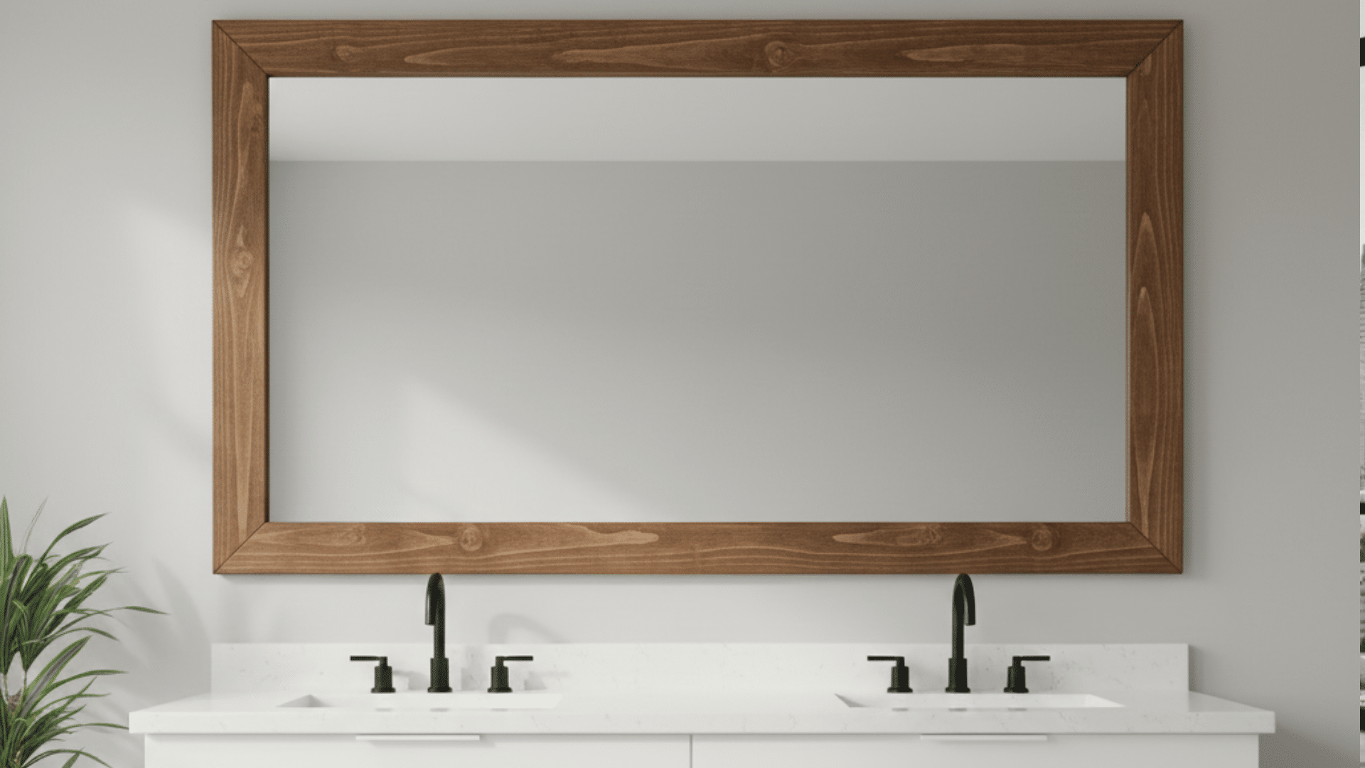
DIY mirror frame upgrades can feel like one of those projects that sounds simple, until you start pricing frames or staring at a bare mirror edge. I used to think you had to buy a custom frame or live with the plain look. The truth is, you can build something solid with basic boards, a few tools, and a little planning. The biggest headaches usually come from wrong measurements, corners that do not meet, or a finish that does not hold up in a bathroom. I am going to keep this simple and practical so you can get it done without wasting wood or time. Stick with me, and you will have a DIY mirror frame that fits right and looks finished. Quick Checklist Before You Start Before you buy wood or trim, take one minute to check three things. It saves you from bad cuts and loose frames. Mirror glued or clipped: Look at the edges. If you see metal clips, you may need to work around them. If the mirror looks flat against the wall with no clips, it is likely glued on. Bathroom moisture: If this is in a bathroom, plan to seal the frame. Steam and splashes can damage raw wood and some paints. Clearance over backsplash: Measure the gap between the mirror and backsplash or faucet. Make sure your frame will not hit tile, outlets, or light fixtures. Now you can choose the safest method. Step By Step: How To Build A DIY Mirror Frame Use this simple step-by-step plan to build a wood mirror frame with clean corners, a snug fit, and an easy finish. It works for many mirror sizes and styles. Tools & Materials Needed (2) 1×4 boards, 8 feet long (example cost was about $7 total) Measuring tape and pencil Miter saw (for 45-degree corners) Table saw (to cut a notch for the mirror to sit in) Sander or sandpaper Wood glue Brad nailer + 18 gauge brad nails (about 1 1/4 inch) Paint or stain (optional) Scrap boards for the back (to hold the mirror in place) Step 1: Measure the Mirror and Plan the Reveal First, decide how you want the frame to sit on the mirror. A flush fit means the frame lines up right at the mirror edge. An overlap fit means the frame covers a small strip of the mirror edge. Overlap hides mirror edges better and looks cleaner. Measure the mirror width and height. Your basic rule is simple: your frame opening must match your mirror size if the mirror sits inside a notch. If you plan to overlap, subtract that overlap from the opening size. Step 2: Cut Your Frame Pieces Cut your boards into four pieces: top, bottom, and two sides. If you want clean corners, cut 45-degree miters on each end. If you want a simpler build, use straight cuts and join with butt joints, but miters look more finished. Label each piece as you cut it so you do not mix up the top, bottom, and sides. For example, the top and bottom pieces were 36 inches, and the side pieces were 28 inches, but your sizes should match your mirror. Step 3: Dry Fit Everything Lay the four pieces on a flat surface and test the fit before gluing. Push the corners together and check for gaps. If you see gaps, recheck your cuts and make sure your miters match. Also, check the frame shape by measuring corner to corner both ways. If both diagonal measurements match, your frame is square. This helps your mirror sit right in the frame and keeps it from rocking later when you install it. Step 4: Assemble the Frame Once the dry fit looks good, glue the corners and assemble the frame. For a light frame, glue alone can work, but glue plus fasteners is stronger. Wood glue was added to the miter corners, then brad nails were used to lock the corners in place. Make sure the grooves or notches line up on all pieces before you nail. Wipe off excess glue so it does not harden on the wood surface and mess up your finish. Step 5: Install the Frame Prep the mirror and wall area first. Clean off dust so your frame sits flat and holds better. If your mirror will sit inside the frame notch, place the mirror into the groove once the front frame is built. Then add support boards on the back to keep the mirror from moving. In the example, backing boards were cut and attached to hold the mirror in place. If you are attaching a frame to a wall mirror, place the frame carefully, use tape to hold it in place, and support it until everything is set fully. Step 6: Finish (Paint Or Stain) Sand the whole frame, especially corners and edges, so it feels smooth. Then finish it before final attachment if your build needs backing boards added later. A thin coat of white paint was brushed onto to make a light wash look, like a pale stain. You can also use a regular stain and seal it. For bathrooms, add a clear sealer on top so steam and splashes do not damage the finish. Let it dry fully before you hang or install it near daily moisture. DIY Mirror Frame Ideas (Pick a Look) After you build the base frame, use these ideas to match your space. Each option tells you what to use, how it looks, and one tip to help it last. 1. Modern Box Frame A modern box frame uses flat boards and straight lines, so it feels clean and simple. Use 1×3 or 1×4 boards and keep the edges crisp with sanding. This style works well if you want the frame to look bold without extra detail. Paint it black for contrast, or white for a lighter look. If this is in a bathroom, add a clear topcoat so steam and splashes do not dull the paint. This style is also forgiving if your walls are not perfect. Best Materials: 1×3 or 1×4 pine, MDF, or poplar. Best Finish: Paint plus a moisture-safe clear topcoat. 2. Simple Trim and Molding Frame This is the fast upgrade many people use for builder mirrors. You attach trim that looks like doorway casing or base cap, so the mirror feels finished. It works well when you want a classic look without building a thick frame. Use a trim that is light enough to hold well, especially if you plan to attach it to the mirror surface. Paint it to match your vanity, wall trim, or cabinets so it blends in. This idea also helps hide rough mirror edges and small wall gaps. Best Materials: Base cap molding or door casing. Best Finish: Paint to match your vanity or wall color. 3. Layered Molding Frame Layered molding adds depth by stacking two trim styles. Start with a wider outer piece, then add a thinner inner piece to create a stepped look. This method gives more detail without needing fancy cuts. Keep both layers the same color so it stays neat and not busy. If you want the layers to feel tighter, fill small seams with paintable caulk before painting. This style works well in bathrooms because the extra trim detail makes a plain mirror look more finished. Best Materials: One wider trim plus a thinner inner trim. Best Finish: Same color paint on both layers. 4. Reclaimed Wood Frame Reclaimed wood gives a rough, aged look that feels warm and natural. Use straight boards only, because warped wood will not sit flat. Sand the edges so you do not get splinters, but do not sand away all the texture if you want that worn look. This style hides small wall flaws well because the wood grain and texture break up lines. In bathrooms, sealing matters most, since raw reclaimed wood can soak up moisture. Best Materials: Old fence boards or straight pallet-style planks. Best Finish: Light sand, then seal well. 5. White Painted Farmhouse Frame This uses thicker boards painted white for a strong, simple frame. It works best when you want the mirror to stand out against darker walls or wood vanities. Use 1×4 or 1×6 boards and sand the corners so they feel smooth and even. Semi-gloss paint can make cleaning easier, especially in a bathroom. If you like a softer look, you can do a thin white coat so some wood grain shows through, then seal it so it holds up. Best Materials: 1×4 or 1×6 boards. Best Finish: Semi-gloss paint with a clear topcoat. 6. Dark Stained Wood Frame A dark-stained frame adds contrast and pairs well with warm lighting and bronze or black hardware. Wood choice matters because pine can stain blotchy without prep. Use a wood conditioner if you pick pine, or use a hardwood like oak for a more even stain. After staining, add a clear coat so water does not leave marks. If you want a more even look, test stain on a scrap piece first. This style looks best with clean corners and a smooth sanded surface. Best Materials: Poplar, oak, or pine plus conditioner. Best Finish: Stain plus clear coat. 7. Picture Frame Style With Backing This style looks like a real wall frame because it uses a backing strip behind the front trim. The backing helps if the mirror edge is rough or uneven, and it gives you more support. It also helps keep the mirror snug if you are setting it into the frame. Use thin plywood as a backer, then attach trim on the front. Seal the edges well, because plywood edges can soak up moisture. This style is a good choice if your mirror is heavy or wide. Best Materials: Thin plywood backing strip plus trim. Best Finish: Paint or stain, then seal edges. 8. Shiplap Frame Border This idea frames the whole mirror zone, not just the mirror edge. Add shiplap boards around the mirror area, then finish it with simple trim on top. It works well if you want the mirror wall to feel like a feature. Use MDF shiplap panels for smoother paint, or wood planks for more texture. Keep the paint color the same as your wall trim so it does not fight for attention. Seal it well if it sits near a sink. Best Materials: Shiplap planks or MDF shiplap panels. Best Finish: Paint the same color as your trim. 9. Tile Border Frame A tile border is a smart pick near sinks because it handles water better than bare wood. Use mosaic tile for detail or thin subway tile for a clean look. Plan your tile layout so cuts land in less visible spots. Grout lines need sealing, or stains can set in over time. This option also helps match a backsplash, so the mirror feels tied into the whole wall. Keep the border width balanced, so it does not overpower the mirror. Best Materials: Mosaic tiles or thin subway tile. Best Finish: Sealed grout and clean edges. 10. Dowel Accent Frame This adds texture by attaching dowels to a simple base frame. Build the base first, then cut dowels to the same length and glue them evenly around the edge. A spacing guide helps keep gaps consistent. Paint the whole piece one color so it looks neat and unified. This style is lighter than it looks if you use smaller dowels, which can help with mounting. In bathrooms, seal it so paint does not chip from moisture and cleaning. Best Materials: Wood dowel rods plus a thin base frame. Best Finish: One color paint plus clear coat. 11. Rope Wrapped Frame A rope-wrapped frame brings a casual look and works well in guest baths. Start with a simple wood frame, then wrap rope tightly and glue as you go. Jute rope works well, but it can shed dust if left raw. A light sealer coat can help reduce shedding and make it easier to wipe clean. Keep rope joins at the bottom edge so they are less visible. This frame can get bulky, so check clearance near lights and outlets first. Best Materials: Jute rope plus strong glue. Best Finish: Light sealer coat to reduce dust. 12. Metal Look Painted Frame This gives an industrial feel without metal tools. Build a flat wood frame, then paint it in a dark tone. Add soft highlights with a dry brush so it looks like worn metal. Keep the edges sharp and smooth, because bumps show more with this finish. Seal it so cleaning does not dull the surface. This style pairs well with black faucets and simple lighting. It also works in a hallway mirror, not just bathrooms. Best Materials: Flat boards with smooth edges. Best Finish: Dark paint plus subtle dry brush highlights. 13. Oversized Frame with a Mini Shelf This idea adds a ledge at the bottom of the frame. It can hold a small item, but keep it simple so it stays easy to clean. Use a sturdy base frame and attach a shelf board along the bottom edge. Seal the shelf extra well because it will catch splashes and drips. Keep the shelf shallow so it does not block the sink or faucet. This style works well for half baths where you want more function without adding a cabinet. Best Materials: 1×4 frame plus a 1×3 ledge piece. Best Finish: Seal well to protect the shelf. Conclusion You just built the foundation for a clean mirror upgrade, and now you know what makes it work. You checked your mirror setup first, measured the right way, cut your pieces, and locked the corners so the frame stays tight. You also saw how sanding and sealing can help the finish hold up, especially in a bathroom. My biggest tip is to dry fit everything before gluing, because that step prevents most mistakes. If you try one of the style options, keep the materials simple and seal well near water. Want to take it a step further? Check out my other DIY posts for more low-cost upgrades, then tell me which DIY mirror frame style you plan to try.