

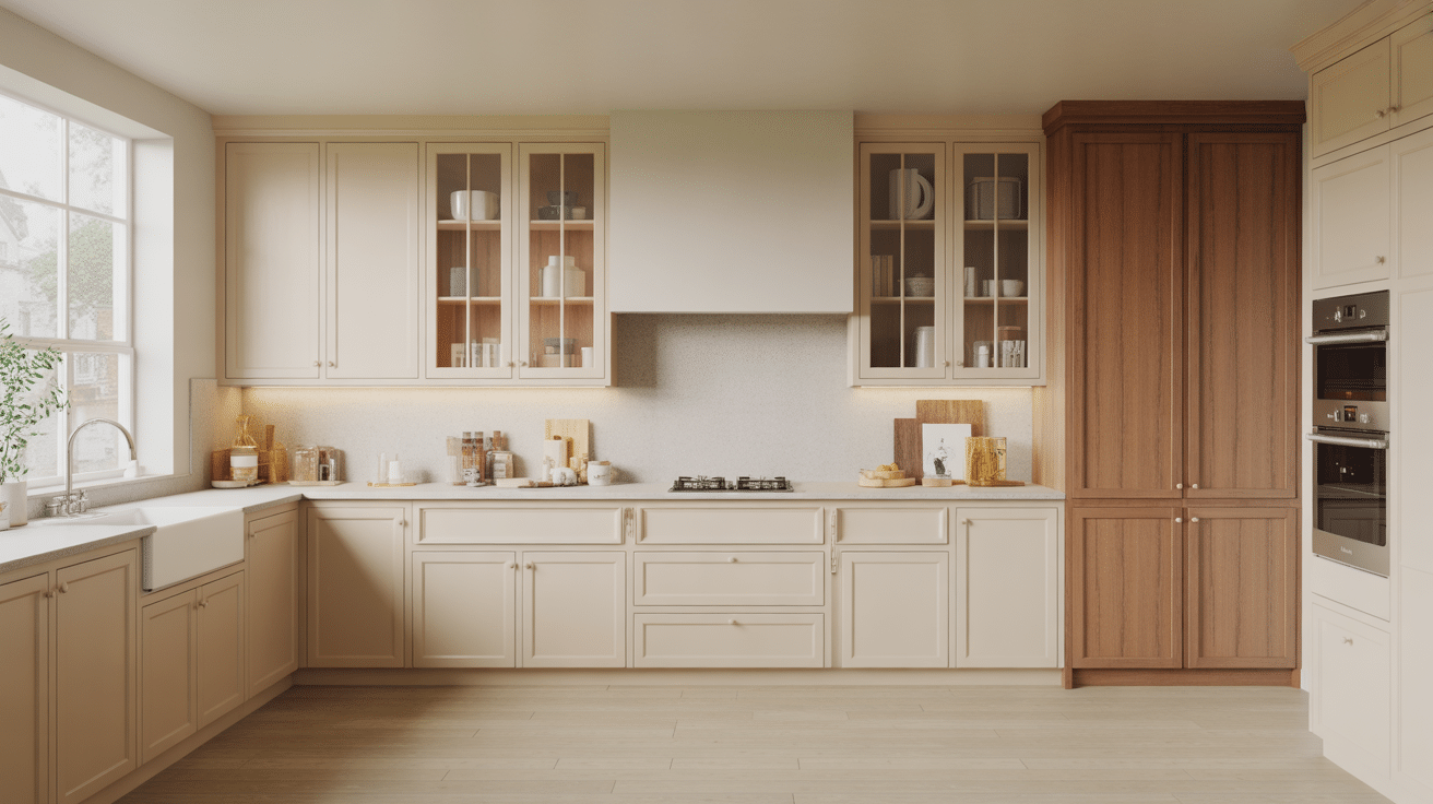
If you’ve been staring at kitchen photos and wondering why every cabinet starts to look the same, you’re not alone. Understanding the different types of cabinets is what helps you finally see the differences clearly. Once you know what separates shaker, slab, inset, overlay, and frameless styles, everything stops feeling overwhelming. I’m going to walk you through the main cabinet styles, construction types, and practical differences that actually matter in daily life. You’ll learn how each option affects storage, maintenance, budget, and overall design. By the end, you won’t just recognize cabinet names, you’ll understand which ones truly fit your kitchen, your habits, and your long-term plans. Why Understanding Different Cabinet Types Matters? Choosing cabinets for your kitchen can feel overwhelming with so many options available. Knowing the different cabinet styles helps you make informed decisions that match your space, budget, and lifestyle. Each cabinet type offers unique benefits in terms of functionality, appearance, and cost. When you understand these differences, you can pick options that work best for your needs rather than feeling confused by too many choices. This knowledge helps you create a kitchen that looks good and functions well for years to come. You’ll spend your money wisely and end up with a space you truly love. Kitchen Cabinet Styles and Types Kitchen cabinet doors come in many styles, and I’ve seen how the right one can change your whole space. Once you understand the options, it gets easier to match your taste and budget. The most common cabinet door styles include: 1. Shaker Cabinets Shaker cabinets feature a flat center panel surrounded by a clean, simple frame. Their timeless design adapts effortlessly to modern, farmhouse, and transitional kitchens. They pair well with virtually any hardware or color palette, making them one of the most widely chosen styles for homeowners who want flexibility without sacrificing character. 2. Slab / Flat-Front Cabinets Slab cabinets have a completely smooth, flat front with no panels or raised details. I like how simple and clean they look, especially in modern kitchens with bold colors or glossy finishes. I’ve noticed they’re also easy to wipe down since there are no grooves to trap dust. If you want a clutter-free feel with simple hardware or hidden handles, this style works really well. 3. Raised Panel Cabinets Raised panel cabinets feature a center panel that projects outward, adding dimension and a polished, traditional feel. The added depth creates visual interest that suits formal or classic kitchens. They pair naturally with warm wood tones and detailed hardware, giving spaces a sense of craftsmanship that feels both established and inviting. 4. Beadboard Cabinets Beadboard doors are defined by their vertical groove pattern, which adds gentle texture and a relaxed, cottage-like charm. They work especially well in farmhouse, coastal, and beach-inspired kitchens. Unlike flat doors, beadboard brings warmth through detail rather than ornamentation, making it a welcoming choice for casual, lived-in kitchen spaces. 5. Glass-Front Cabinets Glass-front cabinets swap a solid panel for clear, frosted, or decorative glass, allowing you to display dishware and décor while visually expanding the room. They work particularly well in smaller kitchens where creating a sense of openness matters. Paired with interior lighting, they add depth and a curated, intentional feel. 6. Louvered Cabinets Louvered cabinets use horizontal slats that create a breezy, textured look unique among cabinet styles. Originally popular in tropical climates, they suit coastal and island-themed kitchens where airflow and relaxed visuals matter. The slatted design introduces rhythm and shadow to cabinet doors, offering a distinctive alternative to flat or paneled options. 7. Distressed / Rustic Cabinets Distressed cabinets are intentionally aged using sanding, chipping, or layered staining techniques to achieve a worn, characterful finish. They thrive in rustic, farmhouse, or cabin-inspired spaces where imperfection is part of the appeal. Paired with natural stone or reclaimed wood elements, they bring genuine warmth that new, flawless finishes simply cannot replicate. 8. Craftsman / Mission-Style Cabinets Craftsman cabinets prioritize honest construction, visible wood grain, and clean horizontal and vertical lines without unnecessary decoration. Rooted in the Arts and Crafts movement, they suit older homes and classic interiors. Their sturdy, handcrafted quality speaks to people who appreciate natural materials and straightforward design over ornate or trend-driven choices. 9. Inset Cabinets Inset cabinets are set flush within the face frame rather than overlapping it, creating a precise, built-in appearance. The tight tolerances required make them a hallmark of custom cabinetry and high-end kitchens. They suit traditional and classic spaces where clean alignment and fine craftsmanship are priorities over maximizing interior cabinet storage. 10. Full Overlay Cabinets Full overlay cabinets cover nearly the entire face frame with their doors, leaving minimal frame visible between them. The result is a seamless, continuous surface that feels contemporary without being overly minimal. They offer slightly more interior access than partial overlay styles and work well in both transitional and modern kitchen designs. 11. Partial Overlay Cabinets Partial overlay cabinets leave a visible border of the face frame around each door, a look common in older homes and more budget-conscious builds. While less seamless than a full overlay, they remain fully functional and carry a simple, traditional quality. They make practical sense for kitchen updates that prioritize cost efficiency over a high-end finish. 12. Frameless (European-Style) Cabinets Frameless cabinets remove the front frame and attach the doors straight to the cabinet box. The cabinet box is usually thicker and built for strength since it holds everything together. I like how solid and simple it feels. This is my personal favorite for modern kitchens. You get more usable space inside, and the outside looks smooth and clean across the whole wall. 13. High-Gloss Cabinets High-gloss cabinets use lacquer or acrylic finishes to create a reflective, light-amplifying surface. Particularly effective in smaller kitchens, the sheen bounces light around the room to make it feel larger and brighter. They clean easily and pair well with bold or neutral tones, making them a strong choice for modern, polished interiors. 14. Plywood / Veneer-Front Cabinets Veneer-front cabinets showcase natural wood grain in a controlled, consistent way, offering warmth without heavy detailing. They suit Scandinavian, Japandi, and nature-inspired kitchen styles where simplicity and organic texture are central. The result feels calm and refined, appealing to those who want a connection to natural materials within a quietly contemporary design. 15. Thermofoil Cabinets Thermofoil cabinets apply a vinyl coating over MDF to produce a smooth, consistent finish that resists moisture and cleans effortlessly. They deliver a modern look at an accessible price point, making them a practical choice for budget-conscious renovations. If any of the above kitchen cabinet style suits you, check out this DIY kitchen cabinet to start working on your own cabinet. Getting the proper guidance according to your skill level will definitely help you in boosting your confidence. Different Types of Cabinets by Construction Before you even think about door styles, I always suggest you understand the basic cabinet structure first. Once you know these four cabinet types, everything else makes more sense. So here are the four main cabinet types you will find in almost every kitchen plan: Cabinet Type Key Dimensions Primary Use Wall (Upper) Cabinets ~12 inches deep; hung above counters with standard backsplash clearance Dishes, glasses, and lighter everyday items Base Cabinets ~34½ inches tall (without countertop); ~24 inches deep Supports counters, sinks, and cooktops; stores pots, pans, and heavier items Tall Cabinets / Pantries Full floor-to-ceiling height Pantry storage, oven towers, and large or bulky items Specialty Units Varies by unit type Corner units, lazy Susans, pull-out spice racks, trash units, appliance garages, hutches, and wine or bottle racks Knowing these four cabinet categories upfront makes it far easier to read floor plans, compare product catalogs, and plan a layout that works for how you actually use your kitchen. How to Choose the Right Cabinet Style Choosing the right cabinet style can feel overwhelming at first. I’ve found it gets much simpler when you focus on a few key factors that truly matter in daily life. Here’s what you should pay attention to before you decide: Match your cabinet style with your home’s overall design: shaker suits farmhouse spaces, slab fits modern builds perfectly. Set a realistic budget early: inset and custom cabinets cost far more than stock or thermofoil options ever will. Factor in daily maintenance: high-gloss shows fingerprints fast, while wood grain and distressed finishes hide everyday wear much better. Balance trends with personal taste: shaker and flat-front styles hold up over time without feeling dated too quickly. The right cabinet style sits at the intersection of what looks good, fits your budget, and holds up to how you actually live. Final Thoughts Now you’ve seen how cabinet styles, construction types, and layout categories all work together to shape your kitchen. When you understand the different types of cabinets, choosing becomes clearer and less stressful. You can match door style to your home’s design, balance cost with durability, and pick construction that supports how you cook and store items every day. I’ve found that once you narrow your choices to two or three solid options, the decision feels manageable. Take a moment to think about your space, your routine, and your budget. Then revisit the styles that stood out to you. Share your top pick in the comments and tell me what direction you’re leaning toward.

Choosing a neutral paint sounds simple until you start testing samples on your walls. I’ve been there, staring at swatches that looked perfect in the store but completely different at home. If you’re searching for clear answers about Balanced Beige SW 7037 by Sherwin-Williams, you probably want to know exactly what it looks like, how warm it feels, and whether it will actually work in your space. Balanced Beige SW 7037 sits in the warm-neutral family with soft gray-tan undertones that keep it from turning too yellow or too cool. In this blog, I’ll walk you through undertones, lighting behavior, room performance, specs, and pairing options so you can make a confident decision before buying a gallon. Getting to Know Balanced Beige by Sherwin-Williams Balanced Beige (SW 7037) comes from Sherwin-Williams’ neutral family, and the name does exactly what it promises. It sits between warm beige and cool greige without fully committing to either side, and that middle-ground quality is what makes it so hard to pin down on a paint swatch alone. The color looks different depending on your room, your lighting, and what’s already on your floors and furniture. That’s what drew me to it in the first place. It doesn’t demand attention, but it’s never invisible either. If you’ve been cycling through warm neutrals that keep pulling orange or pink, or cool gray paint colors that feel too flat, this is the color that tends to put an end to that search. The medium-depth neutral lands in a place that feels genuinely livable, grounded without feeling heavy, warm without feeling dated. Before buying a full gallon, having the exact specs in one place saves you from second-guessing at the paint counter or ordering the wrong product line: Detail Value Notes Color Code SW 7037 Sherwin-Williams reference LRV 46 Medium depth HEX #C2A98A Digital reference Coverage 350–400 sq ft per gallon Two coats recommended Dry Time 1 hour touch / 2 hours recoat Depends on conditions Interior Lines Emerald, Duration, SuperPaint, Cashmere Choose based on durability needs Exterior Lines Duration Exterior, Emerald Exterior Strong weather resistance When in doubt about the product line, Emerald is worth the extra cost for high-traffic rooms; its coverage and washability make a visible difference over time. Balanced Beige Undertones and Lighting Effects Lighting has a strong impact on how Balanced Beige SW 7037 appears throughout the day. Its warm beige base with soft gray-tan undertones can shift subtly depending on natural and artificial light conditions. In Natural Light Natural light brings out the balanced warmth in this shade, helping it feel soft and grounded rather than overly tan. North-facing rooms: North light is cooler and slightly muted. In these spaces, Balanced Beige may appear a bit deeper and more subdued. The gray undertone becomes more noticeable, giving the color a calm and slightly muted appearance. South-facing rooms: South-facing rooms receive warmer sunlight. This improves the beige warmth, making the color feel brighter and more welcoming. It looks smoother and slightly lighter in strong daylight. East-facing rooms: Morning light is bright and cool. Early in the day, Balanced Beige can appear more neutral with less visible warmth. As the day progresses, it settles into its true warm-beige tone. West-facing rooms: Afternoon and evening sunlight adds warmth. Balanced Beige may look richer and cozier later in the day, creating a soft and comfortable atmosphere. In Artificial Light Artificial lighting changes how Balanced Beige feels after sunset. Under warm bulbs, the beige tones become more noticeable, giving the space a cozy and inviting look. Cool LED or daylight bulbs can slightly mute the warmth and bring forward the subtle gray undertone. Using layered lighting, such as combining overhead fixtures with lamps, helps maintain balance and prevents the color from feeling too flat or too warm at night. Choosing the Right Finish The finish you select for Balanced Beige SW 7037 can noticeably change how the color feels in your space. While the shade itself is warm and grounded, the level of sheen affects depth, light reflection, and durability. Higher-sheen finishes reflect more light, which can make Balanced Beige appear slightly brighter. Flatter finishes absorb light and create a softer, more muted look. Matte finishes work well on walls, especially in living rooms and bedrooms, because they help hide minor surface imperfections. Eggshell offers a slight sheen and is a popular choice for main living areas due to easier cleaning. Satin finishes are ideal for kitchens, bathrooms, and high-traffic spaces where durability matters. Semi-gloss works best for trim, doors, and cabinets, providing durability and easy wipe-down maintenance. How Balanced Beige Looks in Different Rooms This color shows up differently depending on the room, and that versatility is a big part of why it works in full homes rather than just one carefully lit space. 1. Living Rooms Balanced Beige performs especially well in open-concept living rooms where medium-depth neutrals are needed to anchor larger spaces. It provides enough presence to feel grounded without overwhelming the room. The soft gray-tan undertone keeps it from appearing too warm, allowing it to pair comfortably with warm wood floors, cream upholstery, and matte black or brushed bronze accents. It also blends smoothly with cooler decorative elements, making furniture and accent choices more flexible across different design styles. 2. Bedrooms In bedrooms, Balanced Beige creates a settled and comfortable atmosphere without making the space feel closed in. Its warmth offers a softer alternative to cooler grays while still maintaining a calm appearance. When paired with Alabaster or Pure White trim, the contrast feels clean yet subtle. Neutral bedding enhances the grounded tone, while layered textiles in rust, clay, or natural linen add depth. The color maintains a steady presence throughout the day, supporting a restful environment under both natural and artificial lighting. 3. Kitchens As a kitchen wall color, Balanced Beige complements white cabinetry without introducing harsh contrast. Its warm-gray undertone keeps the space feeling clean while avoiding a cold appearance. It works consistently with brushed nickel, matte black, or brass hardware, maintaining cohesion across finishes. When used on cabinetry, the medium depth creates a deliberate statement that feels substantial. If combining beige lower cabinets with white uppers, selecting a trim color that connects both tones ensures a seamless transition throughout the space 4. Cabinets and Interior Doors Balanced Beige provides enough depth on cabinetry and interior doors to feel intentional rather than faded. It performs well as a full kitchen cabinet color, bathroom vanity finish, or accent door shade in homes with warm wood flooring. The balanced undertone prevents it from appearing too yellow or flat against lighter walls. Its medium saturation allows it to stand on its own while still coordinating easily with surrounding neutral palettes and architectural details 5. Bathrooms Balanced Beige holds its composure under artificial lighting, which is especially important in bathrooms. Many warm neutrals shift noticeably toward orange or pink, but this shade maintains a steady gray-tan balance. It pairs effectively with white subway tile, marble countertops, and chrome or brushed nickel fixtures without competing for attention. The warmth adds comfort, while the gray influence keeps the space feeling clean. This makes it a dependable option for creating a calm, spa-inspired bathroom environment. Comparisons to Other Similar Sherwin-Williams Colors If you’re deciding between similar Sherwin-Williams neutrals, these comparisons cut through the guesswork faster than holding swatches under a store light ever will: Shade Tone Best Use Warm/Cool Softness Level LRV Notes Balanced Beige (SW 7037) Warm beige with soft gray-tan undertones Living rooms, bedrooms, whole-home neutral Warm-neutral Medium 46 Versatile warm neutral that avoids yellow and orange tones Shiitake (SW 9173) Deeper beige with a stronger gray base Offices, feature walls, modern interiors Cool-neutral Medium 51 Reads slightly cooler and more urban than Balanced Beige Bungalow Beige (SW 7511) Golden beige with noticeable warmth Traditional homes, sunlit spaces Warm Medium-High 53 Pulls more yellow and golden in bright lighting Sandbar (SW 7547) Light sandy tan Open-concept spaces, hallways Warm High 64 Brighter and warmer, reflects more light than Balanced Beige Loggia (SW 7506) Muted tan-gray blend Transitional interiors, accent walls Warm-neutral Medium 48 Dustier and flatter appearance with less warmth Agreeable Gray (SW 7029) Light greige (gray + beige mix) Whole-home neutral, resale-friendly interiors Warm-neutral High 60 Lighter and airier, leans more gray than Balanced Beige If you’re still unsure, sample two or three of these directly on your wall, side by side, and test in your actual light to settle the comparison faster than any description. Top Coordinating Paint Colors to Consider Getting coordinating colors right matters as much as the wall color itself; these pairings work consistently across different room types and lighting conditions: Alabaster (SW 7008): Soft, warm trim pairing that keeps the overall feel cohesive without sharp contrast Pure White (SW 7005): Crisper, cleaner trim option for spaces where you want more definition at the edges Iron Ore (SW 7069): Strong dark accent that creates contrast without fighting the warm undertone Urbane Bronze (SW 7048): Earthy, broad accent that sits naturally against the beige-gray base Naval (SW 6244): Deep navy that adds bold contrast, while the warm undertone stops it from feeling cold Repose Gray (SW 7015): Works well in adjacent rooms where a cooler, softer transition feels natural When in doubt, start with trim and flooring; getting those two right makes every other coordinating decision noticeably easier. One of the best colors to co-ordinate SW Balanced Beige is to pair it with SW Alpaca (7022) because this color looks very neutral and pairs well with most color combination if you do it right! Sampling Before You Commit Peel-and-stick samples from Samplize are the easiest way to test this color without picking up a brush, my first move before committing to any medium-depth neutral. Stick them on at least two walls, one with direct light and one without, then check them at different times of day. Morning and evening light can give you dramatically different reads at this LRV, and that gap is worth seeing before you buy a gallon. If you prefer, you can get a sample can from Sherwin-Williams and paint at least a 2×2-foot section, and let it dry completely before judging. Wet paint always looks richer and darker than the dried finish. Leave it up for 48 hours and compare it directly against your trim, flooring, and furniture before making a final call. Final Thoughts Now you have a full picture of Balanced Beige SW 7037, including its undertones, lighting shifts, finishes, room performance, and coordinating colors. I’ve broken down how it behaves in natural and artificial light, where it works best, and what to test before committing. When you understand those details, you avoid costly mistakes and second-guessing later. The key takeaway is simple: test it in your own lighting and compare it against your trim and flooring before making a final decision. That one step protects your time and budget. If you’ve already tried this color, I’d love to hear how it looked in your space. Share your experience or questions below. Frequently Asked Questions Is Balanced Beige SW 7037 warm or cool? Balanced Beige is a warm-neutral color with gray-tan undertones that keep it from feeling too yellow or overly warm. What is the LRV of Balanced Beige? The LRV of Balanced Beige is 46, which places it in the medium-depth range. Does Balanced Beige look yellow? No, it rarely looks yellow because the gray undertone balances the warmth, especially in natural light. What trim color goes with Balanced Beige? Alabaster SW 7008 and Pure White SW 7005 are the most common trim pairings. Is Balanced Beige good for the whole house? Yes, it works well as a whole-home neutral due to its balanced undertone and medium depth.
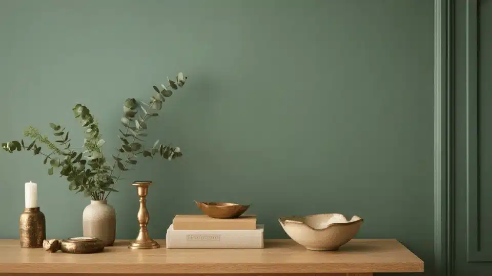
If you’re considering Sherwin-Williams Rosemary for your home, you probably want to know exactly how it will look on your walls before committing. I understand that feeling. Deep greens can shift quickly depending on light, and what looks perfect online can feel very different in your space. Sherwin-Williams Rosemary is a rich, gray-toned green that feels calm, grounded, and refined without becoming overpowering. In this guide, I’ll walk you through its undertones, lighting behavior, LRV, best finishes, ideal rooms, and coordinating colors. You’ll also see how it compares to similar shades so you can decide confidently. By the end, you’ll have a clear picture of whether this deep green truly fits your home and style. Sherwin-Williams Rosemary at a Glance Sherwin-Williams Rosemary is a deep green paint color with soft gray undertones. It is not a bright or bold green. Instead, it feels calm, earthy, and balanced. The gray mixed into it keeps it from looking too sharp or too colorful. This makes it easier to use in many rooms without feeling too dark or heavy. Rosemary has a natural, organic feel that works well in modern, farmhouse, and classic homes. Unlike very dark forest greens, it has a softer look that adds depth without taking over the space. It pairs beautifully with warm whites, brass hardware, and natural wood tones. You can use it on walls, kitchen cabinets, built-ins, or even exterior siding. It adds richness while still feeling welcoming and cozy. Color Details: RGB: 64 / 75 / 63HEX: #404B3FLRV: 14 Sherwin-Williams Rosemary Undertones Explained Rosemary is a deep green with soft gray undertones that keep it balanced and grounded. Those gray notes prevent it from looking overly bright, muddy, or too forest-dark. Depending on lighting, you may also notice a faint earthy warmth that gives it a natural, organic feel. In north-facing rooms, Rosemary can appear cooler and slightly deeper, with the gray undertones becoming more noticeable. In south-facing spaces, natural sunlight brings out a subtle warmth, making the green feel richer and more inviting. In east-facing rooms, morning light softens the color and highlights its calm, muted quality. In west-facing rooms, late afternoon light can introduce a slightly warmer, earthier tone. Before committing, test large samples on multiple walls and observe the color throughout the day. Lighting and surrounding materials can noticeably influence how Rosemary reads in your space. Pairing SW Rosemary with SW Oyster White is a classic never-going-out-of-style combination that you can consider. It looks so sleek and natural without doing much. Where to Use Sherwin-Williams Rosemary SW 6187 Rosemary is a versatile, deep green that works in many parts of the home. Because of its soft gray undertones, it feels balanced and easy to style in both modern and classic spaces. 1. Rosemary for Kitchen Cabinets Rosemary works beautifully on kitchen cabinets, especially lower cabinets. Since it is a deeper green with gray undertones, it adds contrast without feeling too bold. I love using it on base cabinets while keeping upper cabinets white or cream to balance the space. It pairs especially well with brass or brushed-gold hardware, which warms the cool green tone. It also looks beautiful next to white quartz or marble countertops because the light surface keeps the kitchen from feeling too dark. 2. Rosemary in Bedrooms In bedrooms, Rosemary creates a calm and cozy mood. The gray undertones soften the green, so the room feels relaxing instead of dramatic. I’ve found that it works especially well behind the bed as an accent wall. It pairs nicely with neutral bedding like beige, cream, or soft gray. Add warm wood furniture and layered lighting, and the space feels restful and inviting, perfect for winding down at the end of the day. 3. Rosemary in Living Rooms Rosemary can add depth to a living room without making it feel heavy. It looks beautiful on an accent wall, especially behind a fireplace or TV unit. I also like it on built-in shelves or cabinets because it makes décor pieces stand out. When paired with light sofas, textured rugs, and warm metals, the space feels balanced. The color adds character while still keeping the room comfortable and welcoming for everyday living. 4. Rosemary for Exterior Rosemary is also a strong choice for exterior use. On siding, it creates a rich, natural look that blends well with the surrounding outdoor environment. Pair it with warm white trim to keep the home looking fresh and clean. It also works beautifully on front doors, making a bold yet classy statement. If your home has stone details or natural wood accents, Rosemary ties everything together, giving the exterior a timeless, grounded feel. Sherwin-Williams Rosemary Coordinating Colors Choosing the right coordinating colors can make Sherwin-Williams Rosemary SW 6187 look even more beautiful. Since Rosemary has soft gray undertones, it pairs best with shades that feel warm, natural, and slightly muted. Coordinating Color Undertone Why It Works with Rosemary Best Ways to Use It Sherwin-Williams Alabaster SW 7008 Warm creamy white Softens Rosemary’s cool gray undertones and keeps the space bright without harsh contrast. Trim, ceilings, upper cabinets Sherwin-Williams Accessible Beige SW 7036 Warm greige Blends smoothly with Rosemary’s muted base, creating a natural and cohesive flow. Adjacent walls, living rooms Sherwin-Williams Natural Linen SW 9109 Warm beige Adds warmth and balances the depth of Rosemary, making the room feel cozy. Bedrooms, large wall areas Sherwin-Williams Urbane Bronze SW 7048 Deep warm charcoal Enhances depth for a modern, dramatic look while staying earthy. Doors, accent trim, exteriors Sherwin-Williams Pure White SW 7005 Soft neutral white Creates clean contrast without making Rosemary look too dark or heavy. Cabinet contrast, trim, ceilings This mix of warm neutrals, soft grays, and natural textures helps Rosemary look balanced, rich, and easy to live with in both modern and classic homes. Sherwin-Williams Rosemary vs. Similar Colors Before choosing Sherwin-Williams Rosemary SW 6187, it helps to compare it with other popular green shades, including tones like Healing Aloe Review, to see how undertones and depth differ. Even small differences in undertones can completely change how a color feels in your home. 1. Rosemary vs. Sherwin-Williams Dried Thyme SW 6186 Dried Thyme is slightly lighter and warmer than Rosemary. It leans more toward olive, giving it a softer, more relaxed feel. Rosemary, on the other hand, has stronger gray undertones that make it look cooler and a bit deeper. In bright rooms, Dried Thyme feels earthy and natural, while Rosemary feels richer and moodier. If you want warmth, choose Dried Thyme. If you prefer depth and contrast, Rosemary stands out more. 2. Rosemary vs. Sherwin-Williams Evergreen Fog SW 9130 Evergreen Fog is much lighter and more muted compared to Rosemary. It has a heavier gray undertone, which can make it look soft and airy, almost like sage green. Rosemary feels darker and more dramatic, especially in lower light. Evergreen Fog works well if you want a calm and subtle look. Rosemary is better if you want bold depth that still feels refined and balanced. 3. Rosemary vs. Sherwin-Williams Pewter Green SW 6208 Pewter Green is darker and cooler than Rosemary. It has more blue-gray undertones, which can make it feel sharper and more modern. Rosemary has a smoother balance of gray and green, giving it a softer and more organic look. In bright light, Pewter Green may feel slightly heavier. Rosemary keeps a touch of warmth, making it easier to use in both traditional and contemporary spaces. Is Sherwin-Williams Rosemary SW 6187 Right for Your Home? Choosing the right paint color can be stressful, especially when you are considering a darker shade. I’ve found that Rosemary is bold, but it’s also calm and balanced because of its soft gray undertones. It’s a great choice if you love rich, earthy colors that make a room feel cozy and grounded. It works beautifully on cabinets, built-ins, or accent walls, especially if you already have warm wood, brass hardware, or creamy whites. However, if your room has very little natural light, it may feel darker than you expect. In that case, a lighter sage green might be easier to live with. I always suggest testing a sample first and checking it throughout the day to see how the lighting affects it. Design Styles that Suit Rosemary Sherwin-Williams Sherwin-Williams Rosemary SW 6187 works beautifully across many design styles. Its gray-green balance makes it flexible, whether your home feels modern or more traditional. Here’s how it fits into popular interior looks: Moody Modern: Deep green walls, black accents, and clean lines create a bold yet refined space. Rosemary adds drama without feeling too sharp, especially when paired with matte black fixtures and minimal décor. Organic Modern: Natural wood, linen fabrics, and warm neutral tones soften Rosemary’s depth. The color feels earthy and grounded, perfect for calm, nature-inspired interiors. Cottage: Paired with creamy whites, floral patterns, and vintage details, Rosemary feels cozy and charming. It works beautifully on kitchen cabinets or built-ins. Traditional: With brass hardware, rich wood furniture, and classic trim, Rosemary feels timeless and elegant rather than trendy. Farmhouse: Combined with shiplap walls, rustic wood beams, and warm metals, Rosemary adds depth while keeping the space welcoming and relaxed. No matter your style, Rosemary adapts easily and brings a rich, natural feel to the room. The key is balancing it with lighter tones and warm textures so the space feels inviting, not heavy. Where to Get Sherwin-Williams Rosemary SW 6187 You can purchase Sherwin-Williams Rosemary (SW 6187) at any Sherwin-Williams retail store or directly through their official website at www.sherwin-williams.com. Rosemary is available in both interior and exterior paint formulas, so you can use it on walls, cabinets, furniture, or even siding. You can choose from finishes such as matte, satin, semi-gloss, or gloss, depending on your project. For example, satin or semi-gloss works beautifully on cabinets, while matte is great for walls. If you want to test it first, you can order a peel-and-stick sample from Samplize. It lets you see the true color in your own lighting without the mess of traditional sample paint. Frequently Asked Questions Is Rosemary good for small rooms? Rosemary can work in small rooms if used thoughtfully. Since it is a deeper green, it’s best applied on a single accent wall or lower cabinetry rather than all four walls. Pairing it with light neutrals helps reflect light and prevents the space from feeling closed in or overly dark. What sheen works best for cabinets? For cabinets, satin or semi-gloss finishes work best with Rosemary. Satin gives a soft, modern look while still being durable. Semi-gloss adds more reflectivity and makes cleaning easier in kitchens. Both finishes help highlight the richness of the color without making it feel overly flat or too shiny. How many coats for full coverage? Most surfaces painted with Rosemary typically need two coats for even coverage. On darker or porous walls, a third coat may be needed for a uniform finish. Using a quality primer underneath helps reduce the number of coats and improves color consistency across different lighting conditions. Does Rosemary change under LED light? Yes, LED lighting can slightly affect how Rosemary appears. Cooler LEDs may bring out more of its gray tones, making it look deeper and muted. Warmer LEDs tend to soften the color and add a gentle earthy warmth. Choosing a consistent lighting temperature helps maintain a balanced appearance. Can I use Rosemary with dark flooring? Rosemary can pair well with dark flooring if the rest of the room is balanced. Light furniture, neutral rugs, and warm accents help prevent the space from feeling too heavy. The combination works especially well in modern or moody interiors when contrast is intentionally layered. Is Rosemary easy to touch up later? Touch-ups with Rosemary are generally manageable, but consistency depends on finish type and application method. Flat finishes can show blending more easily, while satin or semi-gloss blends better. Keeping leftover paint and using the same roller or brush type improves touch-up results significantly over time. What primer should be used under it? A high-quality stain-blocking primer or tinted gray primer works best under Rosemary. This helps reduce the number of coats needed and ensures the green appears rich and even. Priming is especially important when painting over bold or uneven existing wall colors for a smoother final finish. How long does Rosemary take to dry? Rosemary typically dries to the touch within 1–2 hours under normal conditions. However, full curing can take up to two weeks depending on humidity and ventilation. Light use of the space is usually fine after 24 hours, but it’s best to avoid heavy cleaning during the curing period. Final Coat Now you have a complete understanding of Sherwin-Williams Rosemary, including its gray-green undertones, lighting shifts, ideal uses, and coordinating colors. I’ve covered how it performs in kitchens, bedrooms, living rooms, and exteriors, along with how it compares to similar greens. When you know how a color reacts to natural and artificial light, you avoid expensive mistakes and second-guessing. The key is simple: test it in your own space and observe it throughout the day before making a final decision. That small step protects your budget and your confidence. If you’re planning to use Rosemary, share where you’re considering it. I’d love to hear how it looks in your home.

The driveway is often the first thing visitors notice about a home, yet it frequently gets overlooked in design conversations. I’ve seen how modern driveway ideas have changed ordinary entrances into stunning focal points that genuinely improve the curb’s appeal. I’ve covered sleek concrete installations, natural stone patterns, eco-conscious permeable pavers, and creative lighting solutions. I’ll walk through material comparisons, budget considerations, maintenance realities, and design tricks that work across different architectural styles. You’ll see how texture, color, and layout choices can dramatically shift your home’s first impression. A thoughtfully designed driveway does more than provide parking; it bridges the gap between street and front door with intention, setting the tone for everything beyond. What Makes a Driveway Look Modern? Modern driveways share certain defining characteristics that separate them from traditional designs. Clean lines and simple layouts create visual clarity, while minimal color palettes, think gray, charcoal, black, and white tones, provide a polished foundation. The magic often happens when mixing materials like concrete with gravel or pavers with grass, adding texture without clutter. Integrated lighting changes functionality into ambiance, and smooth connections to landscaping blur boundaries between hardscape and garden. Above all, modern driveway designs prioritize both durability and function, ensuring beauty that lasts through daily use and changing seasons. These elements combine to create driveways that feel intentional, cohesive, and refreshingly contemporary. Modern Driveway Ideas for Every Style and Budget Today’s driveway designs prove that curb appeal and smart engineering go hand in hand. Here’s what modern construction looks like at its best: 1. Large Concrete Slab Driveway The ultimate minimalist statement, a poured concrete slab offers clean, uninterrupted surfaces that complement contemporary architecture beautifully. This approach creates visual spaciousness while providing a durable, long-lasting foundation. When finished with a smooth trowel or subtle broom texture, the result feels both refined and practical for everyday use. Notable Features: Control joint patterns add subtle geometric interest to expansive concrete surfaces Light gray finishes soften the appearance while hiding minor stains effectively Seamless integration with modern home exteriors creates cohesion throughout 2. Concrete and Gravel Combo This two-material design balances affordability with visual appeal while improving drainage naturally. Concrete tire tracks provide solid driving surfaces, while gravel fills center or side sections, reducing impervious coverage. The textural contrast between smooth and loose materials adds dimension without overwhelming the space. Notable Features: Cost-effective solution uses less concrete while maintaining a professional appearance Improved water management allows rainwater to permeate through gravel sections Customizable gravel colors coordinate with home exteriors and landscaping palettes 3. Permeable Paver Driveway Environmentally conscious and visually striking, permeable pavers allow water to filter naturally into the ground below. These specially designed units feature wider joints filled with gravel or planted groundcover, managing stormwater while maintaining structural strength. The variety of available shapes, sizes, and colors enables extensive customization. Notable Features: Eco-friendly drainage reduces runoff and supports local groundwater systems naturally Design flexibility ranges from industrial-modern to warm, textured appearances Long-term durability withstands heavy vehicle traffic while remaining environmentally responsible 4. Exposed Aggregate Concrete Revealing the natural beauty of embedded stones, exposed aggregate creates slip-resistant surfaces with organic color variation. After concrete sets, the top cement layer is removed to showcase decorative aggregate beneath. This finish weathers gracefully in various climates while maintaining its textured appeal over decades. Notable Features: Customizable stone colors match home exteriors from cool grays to warm earth tones Superior traction provides safety in wet conditions without harsh textures Freeze-thaw resistance makes this ideal for northern climates with temperature fluctuations 5. Porcelain Slab Driveway Large-format porcelain slabs bring luxury interior design outdoors with dramatic impact. These oversized tiles, often 3 feet by 5 feet or larger, create sleek surfaces with minimal grout lines. Porcelain offers exceptional stain resistance and color permanence while mimicking concrete or natural stone beautifully. Notable Features: Minimal maintenance requirements eliminate sealing needs common with natural stone Consistent coloring maintains appearance without fading from sun exposure Contemporary grace improves properties with high-end modern styling 6. Floating Concrete Squares with Gravel Individual concrete pavers spaced evenly across gravel beds create sculptural rhythm and visual interest. The squares appear to float above textured surfaces while naturally guiding traffic flow. Proportions can be customized to vehicle wheelbases, and excellent drainage occurs between each unit. Notable Features: Artistic functionality changes practical needs into landscape design features Natural drainage paths prevent water pooling while maintaining structural integrity Flexible spacing accommodates different vehicle sizes and traffic patterns 7. Grass Strip Driveway Concrete or paver tracks with living grass strips growing between them offer environmentally friendly beauty. This permeable design allows rainwater to soak naturally while softening hardscape with greenery. Reinforced grass pavers in high-traffic areas prevent rutting while maintaining the natural appeal. Notable Features: Reduced heat island effect keeps surfaces cooler than solid concrete installations Natural stormwater filtration supports healthy soil and reduces municipal drainage burden Living landscape integration connects the driveway seamlessly with the surrounding gardens 8. Stamped Concrete with Geometric Pattern Contemporary geometric patterns change standard concrete into striking design statements at reasonable costs. Rather than imitating traditional materials, modern stamping creates bold rectangles, hexagons, or linear designs. Monochromatic color schemes maintain refinement while adding surface dimension and visual movement. Notable Features: Cost-effective upgrade delivers designer looks without high-end material expenses Pattern customization matches styles from mid-century to ultra-contemporary Durable surface resists fading and wears better than painted alternatives 9. LED-Lit Driveway Edges Integrated LED lighting along driveway borders creates functional illumination with architectural drama. Recessed lights or LED strips guide vehicles safely while changing the space after dark. Low-voltage systems offer energy efficiency and can be programmed for various lighting effects and timing. Notable Features: Better nighttime safety clearly defines driving boundaries in all weather conditions Energy-efficient operation minimizes electrical costs with modern LED technology Design flexibility allows color temperature choices from warm to cool white 10. Driveway with Built-In Planters Incorporating planter boxes or strips directly into driveway design softens the hardscape with strategic greenery. These integrated garden beds break up large paved areas while adding color and texture. Plants can be chosen for seasonal interest, creating year-round visual appeal at the entrance. Notable Features: Softened appeal balances hard materials with natural elements seamlessly Strategic placement frames the driveway without obstructing vehicle movement Seasonal variety allows changing plantings for evolving color and texture 11. Stepped Modern Driveway (for Slopes) Sloped properties benefit from stepped driveway designs that manage grade changes with architectural intention. Terraced sections connected by angled ramps create visual interest while improving drainage and traction. The stepping can incorporate lighting, planters, or material flow between levels. Notable Features: Improved vehicle traction on steep grades through intentional level changes Structural drama changes challenging topography into design features Better drainage control prevents water from rushing and erosion on slopes 12. Concrete Driveway with Metal Inlays Metal strips or geometric inlays add industrial classiness to concrete surfaces with exceptional contrast. Stainless steel, corten steel, or aluminum elements create visual interest while serving as expansion joints. The metal develops natural patina over time, adding character and depth to the design. Notable Features: Industrial-modern aesthetic appeals to contemporary and mid-century home styles Functional expansion joints prevent concrete cracking while adding design detail Weather-resistant materials develop beautiful patina without structural deterioration 13. Eco-Friendly Grid System Plastic or concrete grid systems filled with gravel or grass provide load-bearing surfaces with maximum permeability. These honeycomb structures distribute vehicle weight while allowing water and oxygen to reach the soil. The result combines durability with environmental responsibility in one innovative system. Notable Features: Maximum permeability achieves the highest water infiltration rates among all options Strong load capacity supports heavy vehicles without compromising environmental benefits Low maintenance requirements reduce long-term care compared to traditional surfaces 14. Driveway-to-Walkway Design Unified material palettes and thoughtful transitions blur boundaries between driveway and walkway spaces. This approach creates cohesive flow from street to front door, making the entire entry sequence feel intentional. Consistent colors, textures, and patterns throughout establish visual balance. Notable Features: Cohesive site design eliminates jarring transitions between different surface areas Material continuity simplifies maintenance and creates an urbane appearance Visual flow guides visitors naturally from the parking to the entrance 15. Wide Entry Driveway with Statement Gate Generous driveway widths paired with gates create grand, welcoming entrances with security. Modern gate designs in metal, wood, or composite materials set the tone while providing privacy. The width accommodates multiple vehicles and creates impressive first impressions for visitors. Notable Features: Better security controls property access while maintaining visual appeal Architectural focal point establishes home’s design from the street Practical width allows easy maneuvering for multiple or larger vehicles 16. Circular Modern Driveway Breaking from linear traditions, circular or curved layouts add grace and improved functionality to larger properties. The rounded design creates natural turnaround space while framing central landscaping features. This layout works particularly well with modern homes that emphasize organic shapes and flowing lines. Notable Features: Easy vehicle turnaround eliminates backing onto busy streets safely Central landscape opportunity showcases specimen trees, sculptures, or gardens Structural softness balances angular modern home designs beautifully 17. Heated Modern Driveway Radiant heating systems embedded beneath driveway surfaces automatically melt snow and ice in cold climates. This luxury feature provides year-round convenience while protecting surface materials from freeze-thaw damage. Hydronic or electric systems can be installed during construction or renovation. Notable Features: Winter convenience eliminates manual snow removal and ice scraping An extended surface life prevents freeze-thaw damage to materials Safety enhancement maintains clear, slip-free surfaces throughout the winter months How to Choose the Right Modern Driveway Design Follow these steps to find a driveway that works for your home and lifestyle: Step 1: Assess Your Home’s Architecture: Examine your home’s style first. Ultra-modern homes pair well with sleek concrete or porcelain, while softer contemporary styles benefit from mixed materials that add warmth.Step 2: Evaluate Climate and Drainage: Consider local weather patterns. Areas with heavy rainfall need permeable options, while freeze-thaw climates require durable materials that withstand temperature fluctuations.Step 3: Set Your Budget: Calculate costs for materials, installation, and long-term maintenance. Basic concrete offers affordability, while porcelain or heated systems require larger investments.Step 4: Match Maintenance to Lifestyle: Decide on upkeep commitment. Low-maintenance options like stamped concrete suit busy schedules better than natural stone. The Bottom Line Modern driveway design blends style with smart construction. Today’s modern driveway ideas range from clean concrete layouts to heated systems built for cold climates. You can choose simple slabs, permeable options for better drainage, or subtle lighting for added safety. The right design depends on your home’s architecture, local weather, budget, and how you use the space each day. A driveway should not feel like an afterthought. It shapes first impressions and supports daily routines. From eco-friendly grid systems to bold geometric patterns, there’s a solution for every need. In my experience, focus on durability, function, and a look that fits your home naturally. The right choice will serve you well for years.

Setting up cornhole sounds simple until you realize how many people get the spacing wrong. From backyard cookouts to tailgate parties, the game gets rushed, boards dropped wherever there’s room, and suddenly the whole thing feels off. Too close, and every toss lands in the hole. Too far, and nobody’s scoring at all. Getting the distance for cornhole boards right is the single most important part of setup, and it’s easier than most people assume. Let me help you understand this by breaking it down clearly, from the official measurement to practical spacing tips, so your next game feels exactly the way it’s supposed to: balanced, competitive, and worth playing. Users are looking for the official rules regarding the setup of cornhole boards, including the standard distance between them. Understanding Cornhole Boards Cornhole is a competitive tossing game played with two raised wooden boards and fabric bags filled with corn or synthetic pellets. Each board has a 6-inch hole near the top, and a bag in the hole for 3 points, or flat on the board surface for 1. Games run to 21 using cancellation scoring, where only the net difference per round counts. Players take turns throwing from the same end, switching sides each round. The American Cornhole Association governs official specs for both board dimensions and spacing. That distance between boards determines how much skill the game actually demands; it shapes the throwing arc, the release angle, and how the bags slide once they land. Get it right, and every throw means something. Get it wrong, and even good players feel the imbalance. What is the Official Distance for Cornhole Boards? The official distance for cornhole boards depends on player age and level of play. Adult tournament rules follow strict measurements, while junior and casual games allow shorter distances for easier tossing. Adult Regulation Distance For official adult play, cornhole boards must be placed 27 feet apart, measured from the front edge of one board to the front edge of the other. In metric terms, that equals 8.23 meters. This measurement is defined in official rulebooks from the American Cornhole Association (ACA), American Cornhole Organization (ACO), and American Cornhole League (ACL). The distance creates a balanced level of difficulty and ensures consistent competitive play. Official Adult Distance: 27 feet 8.23 meters Front edge to front edge Junior & Recreational Distance Junior competitive play typically shortens the distance to 21 feet, measured front edge to front edge. For younger children, seniors, or casual backyard games, the boards may be placed 12 to 15 feet apart. Reducing the distance makes it easier to reach the board while still practicing proper throwing form. Importantly, the board size does not change for juniors or recreational players. Only the throwing distance is adjusted to match skill level and strength. Official Board Dimensions to Pair With Correct Spacing Spacing alone won’t give you a regulation setup; the boards themselves need to match official specs. Here are the dimensions that matter for a correctly built or bought board. Here’s a breakdown: Component Measurement Metrics Why It Matters Board length 4 feet 1.22 meters Shorter boards reduce the landing surface area significantly Board width 2 feet 0.61 meters Narrower boards make bag placement harder than intended Hole diameter 6 inches 15.24 cm Smaller or larger holes shift scoring rates noticeably Hole position 9 inches from the top, centered 22.86 cm Off-center holes change the target zone unfairly Back edge height 12 inches off the ground 30.48 cm Sets the playing slope that controls the bag slide distance Board size and spacing work together; using undersized boards at 27 feet makes the game harder than regulation, while oversized boards at the same distance make it easier. Match both to keep things consistent. How to Set Up the Boards Correctly Setting up the boards the right way keeps the game fair, stable, and safe. Follow these simple placement steps before starting play. Step 1: Measure the Distance Between Boards Start by placing both boards on a flat, level surface, such as grass, concrete, or indoor flooring. Measure the distance from the front edge of one board to the front edge of the other. For standard adult play, that distance is 27 feet. For casual backyard games or kids, you can shorten it to 12–15 feet. Always measure carefully so both sides agree on spacing before the game begins. Consistent distance keeps throws fair and scoring accurate throughout the match. Step 2: Position Boards at the Correct Angle Each board should sit at a slight upward angle, not flat on the ground. The back of the board must be raised so the top edge stands about 12 inches off the ground for regulation setup. Most boards have folding legs underneath to create this incline. Make sure both boards match in height and angle. If one board tilts differently, gameplay becomes uneven. Double-check stability so the board does not wobble when bags land on it. Step 3: Align the Boards Straight Across Both boards should face each other directly in a straight line. Stand behind one board and visually confirm that the hole aligns with the center of the opposite board. If needed, adjust slightly left or right until both are evenly positioned. This alignment ensures players throw toward the center and keeps the game balanced. Crooked placement can change throwing angles and affect scoring fairness. Step 4: Secure the Boards for Stability Before starting the game, test each board by pressing gently on the corners. The board should not rock, slide, or sink unevenly into the ground. On grass, press the legs firmly into the soil. On hard surfaces, consider placing non-slip pads underneath. Stability prevents movement when bags land with force. A secure setup improves accuracy and reduces frustration during play. Step 5: Create a Clear Throwing Line Mark a clear throwing line at the front edge of each board. Players must stay behind this line when tossing bags. You can use tape, chalk, or simply agree on the edge as the boundary. This keeps gameplay organized and fair. Remind players not to step past the front edge during throws, especially in competitive matches. A visible line helps everyone follow the same rules. Adjusted Distances for Different Players Not every player throws like a tournament competitor. Scaling the distance by age and skill level keeps the game competitive and worth playing for everyone involved. Here’s a breakdown: Player Type Recommended Distance What It Does Tournament / competitive adults 27 feet Full regulation play: tests skill, arc, and consistency Beginners or casual adults 21 feet More forgiving without losing the feel of real cornhole Kids aged 8–12 15 to 18 feet Keeps scoring realistically and holds their attention Young children under 8 10 to 12 feet Makes the game achievable and genuinely enjoyable From personal experience watching kids play at family gatherings, shortening the distance to match their ability changes the whole energy; they score more, stay engaged, and actually want to keep playing. Why 27 Feet Became the Standard The 27-foot distance wasn’t chosen randomly, and from my experience playing at different spacings, the difference is immediately noticeable. It sits at exactly the right point where the throwing arc requires genuine control. A good throw demands the right release height, correct arc, and enough spin to land flat so the bag slides rather than bounces toward the hole. Shorter distances make flat, skimming throws too easy. Greater distances push scoring rates so low that games stall and lose momentum entirely. Years of competitive refinement landed on 27 feet as the number that keeps games tight, scoring meaningful, and skill properly rewarded, and in my opinion, that balance is what makes cornhole worth playing seriously. Total Yard Space You’ll Actually Need Most people measure the 27 feet between boards and stop there, but that’s only part of the space the game actually requires to play comfortably and safely. Here’s a clear breakdown: Zone Space Required Metric Equivalent Purpose Between boards 27 feet 8.23 meters Official playing distance, front edge to front edge Behind each board 3 to 5 feet 0.91 to 1.52 meters Room for players to stand, step, and throw freely Each side of the lane 2 to 3 feet 0.61 to 0.91 meters Safety buffer and comfort space during play Total length needed 35 to 40 feet 10.67 to 12.19 meters Full playing area, including player zones at both ends A standard two-car driveway or an open backyard section comfortably covers this. Measure the full area before finalizing board placement; running short on space behind the boards mid-game affects every throw from that end. Common Mistakes That Throw Off Your Setup Small setup errors are more common than you’d think, and each one quietly ruins the game. Here’s what to avoid: Measuring from the wrong edge: Back edge to back edge cuts 4 feet off the playing distance. Always start at the front lip. Measuring hole-to-hole: The hole is 9 inches from the top, so this measurement falls short of the correct 27-foot spacing. Skipping the ground check: Sloped or uneven ground changes how bags behave on the board surface. Misaligning the boards: Boards angled toward each other create an uneven throwing lane. Sight down both boards before finalizing placement. Forgetting the foul line: Stepping past it during a throw affects the release point and fairness across a full game. Fix these before the first toss, and the rest of the game takes care of itself. Most of these mistakes take under a minute to avoid; the payoff is a setup that actually holds up through a full game. Final Thoughts Now you know that the official distance for cornhole boards is 27 feet, measured front edge to front edge for adult play. You’ve also seen how board dimensions, surface level, spacing behind each board, and proper alignment all shape how the game feels. When you measure carefully and set up the correct distance for cornhole boards, you create a fair playing area where skill actually matters. Take a few extra minutes with a tape measure before your next game. That small step makes a big difference in consistency and scoring. Set your boards at the proper distance today, then share your setup or questions in the comments.
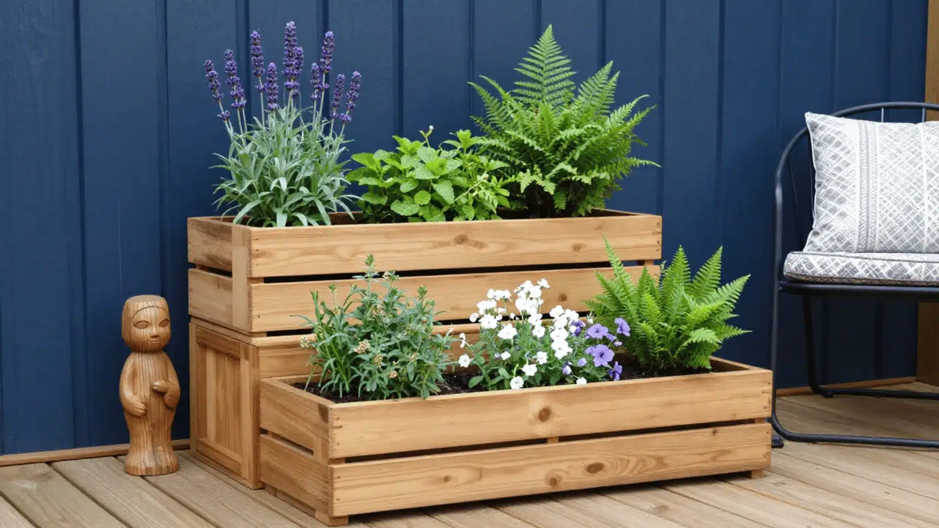
The first time I decided to build a planter box, I stood in the lumber aisle longer than I’d like to admit. If you’re here to learn how to build a DIY planter box, you probably want something simple, affordable, and sturdy enough to last. I get that. Store prices can feel ridiculous, and the quality doesn’t always match the cost. In this guide, I’ll walk you through the exact steps I use, the tools you actually need, and the small details that make a big difference in durability. You’ll also learn how to avoid common beginner mistakes that shorten a planter’s life. By the end, you’ll feel confident starting your own build. Building Your Own Planter Box Makes Sense Before you pick up a saw or buy your lumber, it helps to understand what really goes into building a DIY planter box that lasts. I’ve learned that a successful build starts with smart material choices, proper drainage planning, and using the right fasteners for outdoor conditions. You also want to think about size, depth, and placement so your plants have enough room to grow strong. Small details like sealing the wood and lift the base make a huge difference over time. When you approach the project with a clear plan, you avoid costly mistakes and end up with something sturdy, practical, and built to handle the seasons ahead. Step-by-Step: How to Build a DIY Planter Box Follow these five simple steps, and you’ll go from raw wood to a finished planter box that looks custom-built and lasts for years. No experience needed, just the right steps in the right order. Tools & Materials Checklist Table saw (or circular saw) Miter saw Drill Countersink bit Outdoor decking screws Clamps Merbau decking boards Treated pine lumber Heavy-duty plastic container LED strip light (cuttable) Aluminum LED channel Black exterior paint Rubber feet/stoppers Potting mix Step 1: Build the Legs and Prep the Frame Start by cutting your pressure-treated pine into legs all the same length. Use a stop block to keep every cut consistent. A circular saw works perfectly fine here. Once cut, paint the legs black for a clean, modern look. Drive a screw into one end so you can coat all four sides easily and let them dry without touching anything. Simple prep, big payoff. Step 2: Prepare and Cut the Decking Boards Use hardwood decking boards for the sides or pressure-treated wood if you’re on a budget. Before ripping, measure carefully so both pieces come out the same width. After cutting, run a router along the edges to smooth them out. This small step makes every board look neat and uniform. Then cut all sideboards to your final length, and you’re ready to start building. Step 3: Assemble the Side Panels and Box Set up a simple jig to keep everything square as you work. Use small plastic shims to create even gaps between boards. Always pre-drill and countersink before driving screws. This keeps the surface clean and stops the wood from cracking. Build two side panels first, then connect them all together like a puzzle. Go slow. A patient build always looks better than a rushed one. Step 4: Add the Plastic Insert and Bottom Support Skip the plastic lining and use a heavy-duty plastic container inside the box instead. Drill drainage holes in the bottom so water flows out and doesn’t sit against the wood. Then build a simple support floor inside, with a center drainage gap. This one step protects your wood from rot and makes your planter last years longer than most store-bought options ever will. Step 5: Install the Top Cap and Built-In Lighting Cut the top capping boards to size and use a spacer block to evenly position them. Rub nails with candle wax before driving into hardwood; it makes the job much smoother. Mount an aluminum LED channel under the cap, insert a cuttable LED strip, and snap on the diffuser. Tuck cords neatly inside, add rubber feet, fill with soil, plant, and water. For full measurements, cuts, and detailed instructions, watch the complete video for a clear visual walkthrough of every step DIYForKnuckleheads. Common Experience in Building First DIY Planter Box In this Reddit thread, user TessaMercury asked whether milk paint or chalk paint would work best for distressed built-in bookshelves in a 1936 bungalow. Several users pushed back on the distressed idea. Kittyroux said built-ins should match walls and trim, not look aged. EatsTheCheeseRind and others felt that shabby-chic styles are outdated. mortalwombat- suggested a clean, classic finish instead. Durability was a major concern. computer1490 regretted using chalk paint on cabinets due to poor wear and difficult touch-ups. csguydn recommended enamel paint with polyurethane for bookshelves. A few users, like NomDrop and [deleted], defended milk paint when used properly. Overall, most advised choosing a durable, classic finish over a distressed look. How to Make Your Planter Box Last for Years Building the box is only half the job; how you protect it afterwards is what separates a planter that lasts one season from one that lasts a decade: Seal wood: Apply an exterior-grade sealant or waterproof stain to all surfaces before adding soil. This blocks moisture and slows wood breakdown. Lift base: Raise the planter off the ground using rubber feet or risers. Airflow underneath prevents trapped moisture and rot. Add drainage: Drill proper drainage holes so excess water can escape instead of soaking into the wood. Use liner: Insert a heavy-duty plastic container or landscaping fabric to keep wet soil from touching the wood directly. Apply stain: Reapply exterior stain every couple of years to maintain protection and extend lifespan. Install rubber feet: Keep legs dry by preventing direct contact with wet surfaces. Winter storage: Empty soil, dry thoroughly, and store in a covered space during freezing months. Check screws yearly: Tighten loose screws and replace any that show rust to maintain structural strength. Take care of your build, and it will take care of your garden. These steps alone can easily add five or more years to your planter’s life. Budget Breakdown: What It Really Costs Here’s a realistic look at what you’ll spend building a DIY planter box using basic, budget-friendly materials. Item Estimated Cost Lumber (pressure-treated pine or decking boards) $20–$30 Outdoor screws $5–$8 Exterior sealant or stain $8–$15 Optional upgrades (LED lights, rubber feet, liner) $10–$25 Total Estimated Cost $35–$60, depending on upgrades Even with upgrades, you’ll likely spend far less than store-bought planters while getting better quality and custom sizing. Common DIY Planter Box Mistakes to Avoid Even simple builds can go wrong fast. Here are the five mistakes most beginners make and exactly how to dodge them: Skipping Drainage: No drainage holes means water sits at the bottom, rotting your wood and drowning your plants from the inside out. Using the Wrong Screws: Regular screws rust outdoors. Always use exterior-grade or stainless steel screws, or your box will fall apart within a season. Choosing Weak Wood: Soft, untreated wood warps and rots quickly. Stick with cedar, redwood, or pressure-treated pine for a build that actually lasts. Making It Too Shallow: A planter under 10 inches deep starves plant roots of the space they need to go deeper, and your plants will grow stronger and healthier. Not Sealing the Inside: Bare wood soaks up moisture like a sponge; line or seal the inside to protect the wood and double your planter’s lifespan. Avoid these five, and your planter will look great, hold strong, and outlast anything you’d find on a store shelf. Final Thoughts Building your own planter box gives you more than just a place to grow plants. You now understand why DIY makes financial sense, how to choose durable materials, and the step-by-step process to assemble a strong, long-lasting box. I have covered drainage, wood protection, proper screws, and the simple upgrades that prevent rot and extend lifespan. I’ve also shared the common mistakes that trip up beginners, so you can avoid them from day one. The best part is realizing you can build something solid with basic tools and patience. Start small, take your time, and trust the process. When you finish yours, share how it turned out. I’d love to hear about your build.