

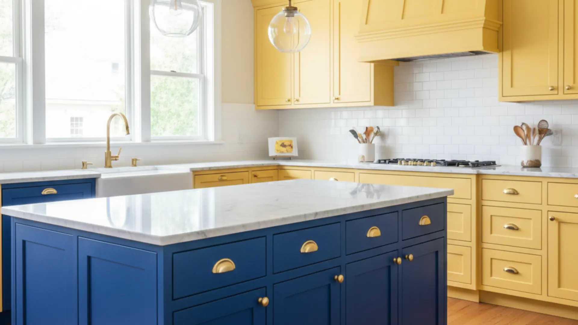
I’ll be honest, when I first heard about two tone kitchen cabinets, I wasn’t sure if they were right for me. But after seeing how they can totally upgrade a home, I’m completely sold! Two-tone cabinets use two different colors or finishes to create a look that’s both stylish and unique. Think white upper cabinets with dark navy lower cabinets, or a natural-wood island paired with painted perimeter cabinets. I’m going to walk you through everything you need to know about dual-colour kitchen cabinets. We’ll look at the best color combinations, the pros and cons, and common mistakes to avoid when tackling this project yourself. Understanding Two Tone Kitchen Cabinets When I talk about this style, I simply mean using two different cabinet colors, finishes, or even materials in the same kitchen. Instead of everything matching, you intentionally mix things up. It could be white upper cabinets with dark lower ones, a wood island paired with painted perimeter cabinets, or even the same color in two different finishes. The most common layout I see is lighter cabinets on top and darker ones on the bottom. This keeps the room feeling bright while still adding depth and contrast. This trend is popular because it makes a home feel more custom, modern, and visually interesting without needing a full remodel. Two-Tone Kitchen Cabinet Ideas If you’re anything like me, you need real examples to imagine the possibilities. Here are some beautiful dual colour cabinet ideas to spark inspiration. 1. White Upper + Navy Lower Cabinets This classic pairing keeps the room feeling bright while adding depth below. White upper cabinets reflect light and make the area feel open, while navy lowers ground the space with rich contrast. It works beautifully in coastal, transitional, and modern designs. Add brass or gold hardware for a polished, designer-inspired finish that completes the look perfectly. 2. White + Natural Wood Cabinets Combining white cabinets with natural wood creates warmth without losing brightness. The wood adds texture and character, while white keeps the space clean and airy. This look is perfect for Scandinavian, modern farmhouse, or minimalist designs. It feels cozy yet fresh, making it a timeless choice for homeowners who value both style and function in their cooking space. 3. Black Lower + Light Gray Upper Cabinets Black base cabinets anchor the room and hide wear and tear, while light gray uppers soften the contrast. This combination feels bold but not overwhelming. It works well in contemporary spaces where you want drama without going full dark. Pair with light countertops to keep everything balanced and inviting. The result is a modern look that feels grounded and complete. 4. Sage Green + White Cabinets Sage green lowers bring a calm, nature-inspired vibe to the area. When paired with crisp white uppers, the result feels airy and grounded at the same time. This combination works especially well in farmhouse or cottage-style designs. Natural wood accents and brushed brass hardware complete the look beautifully. It creates a fresh feeling that homeowners love for years. 5. Blue + Warm Oak Cabinets Deep blue cabinets paired with warm oak create a rich, layered design. The wood softens the boldness of the blue, making the space feel welcoming instead of dramatic. This pairing works well in both modern and transitional styles. It gives a custom, high-end appearance without feeling trendy. The combination effortlessly brings warmth and personality to any cooking area. 6. Charcoal + Cream Cabinets Charcoal lowers add an upgrade, while cream uppers keep the room soft and inviting. This pairing offers contrast without the starkness of black-and-white. It’s perfect for homeowners who want something moody but still warm. Add warm lighting to boost the creamy tones and prevent the space from feeling cold. This combination creates a cozy yet refined atmosphere throughout. 7. Dark Island + Light Perimeter Cabinets Keeping the perimeter cabinets light while painting the island a darker color creates a natural focal point. The island becomes the centerpiece of the room. This approach is ideal if you want a contrasting look without committing to upper and lower variations throughout the entire space. It offers flexibility and visual interest while maintaining an open, bright feeling overall. 8. Wood Lower + Painted Upper Cabinets Wood lowers add warmth and durability, while painted uppers keep the room feeling open. This combination blends rustic and refined elements effortlessly. It’s especially popular in modern farmhouse and transitional designs. Choose a soft neutral paint color to balance the natural richness of the wood tones. The result is a layered look that feels both inviting and polished. 9. Matte and Gloss Same-Color Mix Using the same cabinet color in both matte and gloss finishes creates a subtle contrast. The difference in sheen adds depth without introducing a second color. This approach works well in modern spaces where simplicity is key. It keeps the palette cohesive while still adding visual interest and texture. The layered finish brings dimension to the room in a refined way. 10. Beige + Brown Cabinets Layering beige and brown creates a soft, inviting neutral palette. The lighter beige keeps things airy, while the deeper brown adds warmth and depth. This pairing works beautifully in traditional or Mediterranean-inspired designs. It’s ideal for homeowners who want subtle contrast without bold color choices or dramatic statements. The combination feels timeless and comfortable in any home setting. 11. Classic Black and White Cabinets This classic tuxedo look delivers strong contrast and visual drama. White upper cabinets prevent the room from feeling heavy, while black lowers provide grounding. It suits both modern and traditional homes. Adding metallic hardware can improve the overall design and give it a more luxurious, polished touch. This pairing never goes out of style and works in many settings. 12. Blue and Gray Combination Blue and gray create a cool, contemporary feel. The tones blend well without clashing, making the area feel cohesive and calm. This pairing works well in modern spaces with stainless steel appliances. Choose lighter shades in smaller rooms to maintain brightness, openness, and a sense of airiness. The combination brings a serene quality, making the space feel peaceful. 13. Dusty Lavender + Soft Gray Dusty lavender brings a soft, unexpected touch of color that feels calming rather than bold. When paired with soft gray cabinets, the combination creates balance and visual appeal. I love this pairing for spaces that want personality without overwhelming the area. The gray keeps everything grounded, while lavender adds warmth and subtle charm that feels fresh and inviting throughout. 14. Appliance Wall in a Different Color Painting one cabinet wall in a contrasting shade creates subtle zoning within the space. The appliance or pantry wall becomes a visual feature that naturally draws attention. This approach works well in larger rooms where you want dimension without overwhelming the entire area with too much contrast or competing color schemes. It adds interest while maintaining overall balance and flow. 15. Butter Yellow + Charcoal Butter yellow instantly brightens a cooking space and adds cheerful warmth. When I pair it with deep charcoal cabinets, the contrast feels bold yet subtle. The charcoal prevents the yellow from looking too playful, creating a mature and balanced design that works well in rooms with natural light. This combination brings energy while staying grounded and functional for everyday use. 16. All White Kitchen + Wood Range Hood An all-white design feels bright and clean, but adding a wood range hood introduces warmth and texture. This subtle contrast creates a focal point without requiring two full cabinet colors. The natural wood element softens the crispness of white and makes the space feel more inviting and layered rather than sterile. It’s perfect for those wanting minimal contrast. 17. Walnut Cabinets + Soft White Uppers Walnut lowers provide deep, natural texture, while soft white uppers maintain brightness throughout the space. This pairing feels refined and timeless. It works beautifully in upscale spaces where natural materials are the focus. The wood grain adds warmth and visual interest without overpowering the room or feeling too heavy overall. This combination suits traditional and contemporary homes equally well. 18. Navy Island + WhiteCabinets Painting only the island navy adds contrast without overwhelming the space entirely. White cabinets around the perimeter keep the area bright and open. This subtle approach is perfect for homeowners who want a hint of bold color without committing to darker base cabinets throughout their entire cooking or dining area. It creates a focal point while maintaining overall brightness. 19. Soft Gray + Dusty Blue Cabinets Muted gray and dusty blue create a layered, calming effect throughout the room. The colors blend naturally, offering gentle contrast that feels cohesive. This pairing works well in transitional or coastal-inspired designs. Keeping the tones soft helps the space feel cohesive rather than busy, making it ideal for relaxed, comfortable home atmospheres where serenity matters most to homeowners. 20. Cream Uppers + Forest Green Lowers Cream-colored upper cabinets keep the room feeling light and open, while forest-green lower cabinets add richness and depth. This combination feels classic but still fresh, especially in traditional or cottage-style homes. The darker base grounds the room without making it feel heavy. Pair it with brass hardware, warm wood floors, and soft lighting for a complete look. 21. Light Wood + Matte Black Cabinets Light wood cabinets soften the boldness of matte black, creating a striking yet balanced contrast throughout the space. The natural wood grain adds warmth, while black delivers modern drama. This pairing works beautifully in Scandinavian or minimalist spaces where clean lines matter most. Keep countertops simple and décor minimal so the contrast between texture and tone becomes the statement. 22. Blush + White Cabinets Blush cabinets add a gentle touch of color without overpowering the space entirely. When paired with crisp white, the room feels airy, bright, and subtly playful throughout. This pairing works especially well in small cooking areas where you want personality but still need light reflection for an open, welcoming feel. Add gold or brushed-nickel hardware to complete the look. 23. Greige + Dark Brown Cabinets Greige is a soft, modern neutral that blends gray and beige tones beautifully. When paired with dark brown cabinets, the result feels layered and warm rather than stark. This combination works well in contemporary homes that lean toward earthy finishes while maintaining a calm, cohesive atmosphere throughout the space. It’s perfect for those wanting a subtle yet meaningful contrast. 24. Teal + Natural Maple Cabinets Teal cabinets introduce vibrancy and character, while natural maple keeps the design grounded and balanced throughout. The wood tones soften the boldness of teal, preventing it from feeling overwhelming in the space. This pairing works well in eclectic or transitional spaces that embrace personality and color. Add simple countertops and understated hardware to keep the overall design cohesive and welcoming. 25. Two Different Wood Tones Using two wood tones creates a natural contrast without paint or additional finishes. Light oak upper cabinets paired with darker walnut lowers add depth and dimension while maintaining warmth throughout the room. The variation in grain and shade makes the room feel layered and custom. This approach works beautifully in modern, rustic, or Scandinavian-inspired designs that seek an overall organic feel. These color pairings demonstrate the versatility of contrasting cabinets. Choose the one that fits your style and begin planning your makeover. Pros and Cons of Two-Tone Kitchen Cabinets Before I commit to a design choice, I always like to clearly see the advantages and drawbacks laid out side by side. Pros Cons Adds more personality and visual character Harder to match finishes, undertones, and hardware correctly. Creates contrast that makes the space feel layered and dynamic. Risk of clashing colors if combinations are not tested properly. Can increase perceived home value with a custom, upgraded look. May date faster if overly trendy or bold colors are chosen. Works beautifully in both modern and traditional homes. Requires more planning compared to single-color cabinetry. In my experience, thoughtful color choices and good lighting make all the difference when deciding if this style works long-term. Common Mistakes to Avoid When I work with clients on cabinet colors, I always remind them that small design choices can have a big visual impact later. What looks great on a paint card or showroom sample can feel very different once it’s inside your kitchen. Over the years, I’ve seen a few common mistakes come up again and again. Catching them early usually saves my clients time, money, and a lot of frustration. Using Too Many Bold Colors Sometimes it’s tempting to combine several bold shades in one kitchen. I usually guide clients toward limiting strong colors to one main focus. Too many bold tones competing with each other can make the space feel chaotic instead of balanced. Ignoring Color Undertones Two colors might look similar at first glance, but their undertones can be completely different. I always check whether a color leans warm or cool before pairing it with another finish. When undertones clash, cabinets can suddenly look mismatched even though the colors seemed fine on their own. Skipping Paint or Finish Samples I never recommend choosing cabinet colors without testing samples first. Lighting, wall colors, and flooring all affect how a shade appears. I usually suggest placing samples in the actual kitchen space and looking at them throughout the day before making the final decision. Overlooking Lighting Lighting changes everything in a kitchen. Natural daylight, overhead lighting, and under-cabinet lights all affect how cabinet colors appear. I always help clients think about the full lighting setup so darker cabinets don’t feel too heavy and lighter shades don’t end up looking dull. From my experience, slowing down and testing each choice carefully makes the entire design process smoother. When clients take that extra time upfront, they usually end up with a kitchen that feels balanced and exactly how they imagined it. Final Thoughts After looking at so many examples, I truly believe two tone kitchen cabinets are one of the easiest ways to make a home feel custom and thoughtfully designed. If you choose soft neutrals or bold contrast, the key is balance. I always suggest testing samples, checking your lighting, and keeping your overall style in mind before making a final decision. When done right, this design can make your kitchen feel brighter, bigger, and more modern without a full renovation. If you’re planning an update, start by choosing one area to highlight and build from there. Thinking about going two-tone? Tell me your favorite color combo in the comments below!
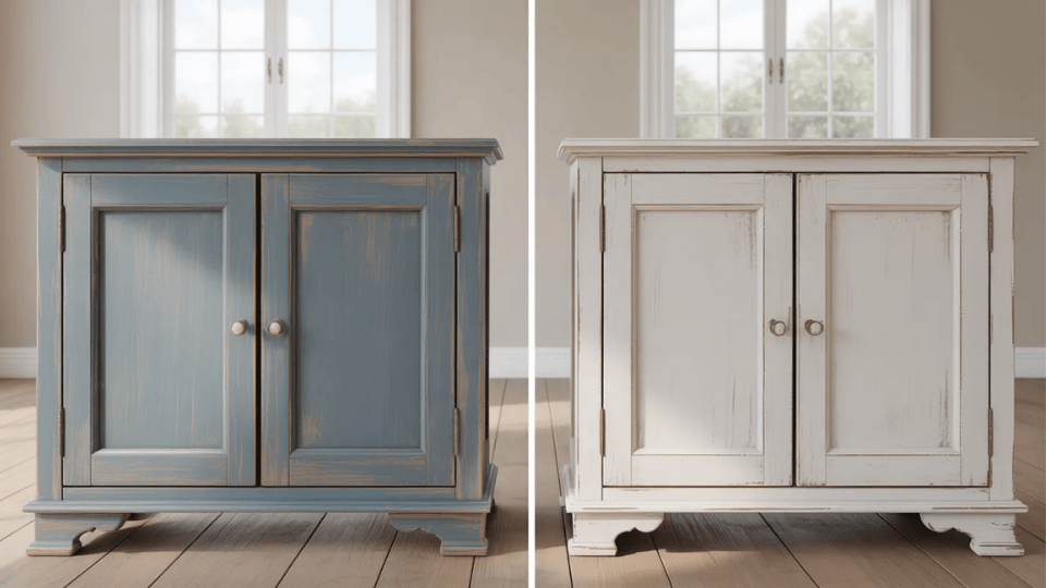
Standing in the paint aisle with two cans in your hand can feel more confusing than it should. If you’re trying to decide between milk paint vs chalk paint, you’re likely wondering which one will actually give you the finish you want without turning your project into extra work. I’ve faced that same choice, especially when working on furniture that I didn’t want to ruin with the wrong product. In this blog, you’ll get a clear breakdown of how each paint applies, how it looks once dry, how durable it really is, and where it performs best. By the end, you’ll know exactly which option fits your style, surface, and skill level. Milk paint is a natural, powder-based paint that creates a textured, aged finish, while chalk paint is a ready-to-use, smooth matte paint that provides even coverage with minimal prep. Chalk paint is easier for beginners, while milk paint is better for authentic vintage effects. From my experience working on furniture projects, the difference between these two paints becomes clear once you apply them to real surfaces. Milk Paint: What You Need to Know Milk paint is one of the oldest paint formulas still used today, made from simple ingredients like milk protein (casein), lime, and natural pigments. Its history goes back centuries, and it became especially popular in early American homes and furniture. What makes milk paint stand out is its organic, slightly unpredictable finish. It soaks into raw wood and can create natural variation, subtle texture, and gentle chipping over time. That aged effect happens without heavy sanding or artificial distressing. However, it often comes in powder form and must be mixed before use. Its rustic appearance works beautifully for antique or farmhouse-style pieces, but may feel too textured for modern, polished projects. Chalk Paint: What You Need to Know Chalk paint is a modern, water-based paint designed for convenience and smooth coverage. Introduced in the 1990s, it quickly became popular for furniture makeovers because it usually requires little surface preparation. In many cases, sanding and priming are minimal or unnecessary. Chalk paint dries to a soft, matte finish that looks velvety and uniform. It adheres well to wood, metal, laminate, and even some sealed surfaces. Because it sits on top of the material rather than soaking in, the finish feels more controlled and consistent. To improve durability, a wax or clear sealer is typically applied. This extra step protects the surface and extends the life of the finish. Milk Paint vs Chalk Paint: Key Differences When you compare milk paint vs chalk paint, the biggest differences show up in how they apply, how they look, and how they hold up over time. Below, I’ll break each one down clearly so you can decide what fits your project best. Feature Milk Paint Chalk Paint Base Type Natural (casein-based) Water-based Finish Textured, aged, chippy Smooth, matte Prep Needed Moderate to high Very low Best Surface Raw wood Almost all surfaces Durability Needs sealing Needs sealing Ease of Use Moderate Easy 1. Application & Prep Milk paint usually comes in powder form and must be mixed with water before use. Achieving the right consistency can take practice. It adheres well to raw wood, but glossy or sealed surfaces often require a bonding agent. Chalk paint is ready to use straight from the can, making it ideal when painting unfinished cabinets or similar furniture projects. 2. Finish & Appearance Milk paint creates a soft, matte look with natural variation. It can dry with a slight texture and may chip in an organic way, making it ideal for rustic or vintage styles. Chalk paint dries to a smooth, matte finish with a more uniform appearance. Edges can be distressed manually, but it does not chip naturally like milk paint. The final look is more controlled and even. 3. Durability & Maintenance Milk paint can chip easily if left unsealed, especially on frequently used surfaces. Applying a topcoat significantly improves durability and longevity. Chalk paint also requires protection. Without wax or a sealant, it may scratch or scuff. Wax provides a soft finish but may require maintenance, while polyurethane sealers offer stronger protection. Proper sealing is essential for both options. 4. Surface Compatibility Milk paint performs best on raw, unfinished wood because it penetrates and bonds naturally. On previously painted or slick surfaces, additional prep or bonding agents are often needed. Chalk paint is more versatile and adheres well to wood, laminate, metal, glass, and some plastics with minimal preparation. It typically performs better on sealed or glossy surfaces. 5. Cost & Availability Milk paint is often slightly more affordable per package and can be mixed as needed. However, bonding agents and sealers may increase overall cost. Chalk paint generally costs more per quart, particularly specialty brands. It is widely available in craft stores and home improvement centers, making it easier to purchase locally. Pros and Cons: Milk Paint vs Chalk Paint Before choosing between milk paint vs chalk paint, it helps to see the strengths and drawbacks side by side. This quick comparison makes decision-making easier and more practical. Type Advantages Disadvantages Milk Paint Natural ingredients, low VOCs, and eco-friendliness create an authentic aged finish, bond well to raw wood, and have a lightweight formula. Requires mixing, a less predictable finish, may chip without a topcoat, and a bonding agent is needed for glossy surfaces. Chalk Paint Ready to use, minimal prep, beginner-friendly, smooth matte finish, strong coverage, works on many surfaces. Needs wax or sealant for durability, can scratch if unsealed, thicker texture, slightly higher cost. Both paints have clear benefits and trade-offs, so choosing between them often comes down to understanding the best paint brands and project needs. Community Discussion: Milk or Chalk Paint? Milk or chalk paint? A Reddit user on the HomeImprovement forum asked for advice on choosing between milk or chalk paint for a distressed look on built-in bookshelves. Some replies recommended a glossy finish for a more timeless, classic look, especially for a vintage-style home like theirs. Others mentioned that milk paint offers a more authentic vintage look but can be difficult to work with, while chalk paint might be easier to apply. The discussion emphasized considering long-term durability and the current trends in finishes. When to Choose Milk Paint Milk paint works best when you want an authentic, old-world finish with natural variation. It’s ideal for raw-wood furniture, antique pieces, or projects where light chipping adds character rather than looking like damage. If your style leans toward rustic, farmhouse, primitive, or vintage, milk paint delivers a naturally worn, layered appearance. It performs especially well when you want a breathable, low-VOC option with simple ingredients. However, it does require mixing and sometimes a bonding agent, so a bit of patience helps. It suits DIYers who don’t mind prep work and appreciate slightly unpredictable results. If you enjoy texture, depth, and a finish that feels aged rather than polished, milk paint is a strong choice. When to Choose Chalk Paint Chalk paint is a better option when convenience and speed matter most. It works well for furniture makeovers, cabinets, and decorative pieces where you want minimal prep and reliable results. If sanding and priming feel overwhelming, chalk paint simplifies the process because it adheres to many surfaces with little preparation. It’s ideal for beginners or quick weekend projects. Style-wise, it suits both modern matte finishes and lightly distressed vintage looks. The final appearance is smoother and more controlled compared to milk paint. If you need predictable coverage, easy application, and wide surface compatibility, chalk paint provides a practical and efficient solution. Best Milk Paint and Chalk Paint Brands If you want reliable results, these brands are commonly used: Milk Paint: General Finishes Milk Paint ($25–$35 per quart), Miss Mustard Seed’s Milk Paint ($20–$30 per bag) Chalk Paint: Annie Sloan Chalk Paint ($45–$50 per quart), Rust-Oleum Chalked Paint ($20–$30 per quart) Choosing the right brand helps with coverage, finish quality, and long-term durability. Final Thoughts Now you understand the real differences between milk paint and chalk paint, including how they apply, how they age, and how they hold up over time. You’ve seen that milk paint offers a natural, textured finish with authentic character, while chalk paint gives you smoother coverage and easier application. I’ve also covered durability, prep work, cost, and when each one makes the most sense. With this clarity, you can choose based on your project needs instead of guessing at the store. Trust your style and the surface you’re working with. Try a small sample first if you’re unsure. When you finish your project, share what you used and how it turned out. I’d love to hear about your results. Frequently Asked Questions What is the difference between chalk paint and milk paint? Milk paint is natural and creates a textured, aged finish, while chalk paint is smooth, easy to apply, and gives a consistent matte look. Which is more durable, milk or chalk paint? Both require sealing for durability. Without a topcoat, both paints can chip or scratch over time. Does chalk paint need a top coat? Yes, chalk paint needs wax or a sealer to protect the surface and improve durability. Can you use milk paint on furniture? Yes, milk paint works well on raw wood furniture and creates a natural, vintage-style finish. Which is easier for beginners? Chalk paint is easier because it requires less prep and is ready to use straight from the can.

Thinking about using flat paint on walls but feeling unsure after hearing mixed opinions? I understand that completely. When I first started comparing paint finishes, I was surprised at how strongly people felt about this one. Some comments made it sound like a mistake. Others made it seem like the only smart choice. It’s hard to know what’s true. You don’t need to rely on random advice or guesswork. I’ll walk you through why some people dislike this finish, what others appreciate about it, and how to decide if it fits your home. By the end, you’ll feel clear and confident about your choice. What is Flat Paint on Walls? Flat paint on walls is a finish with almost no shine or light reflection. When you look at it from different angles, you won’t see glare or gloss. Instead, it creates a soft, smooth appearance that feels calm and subtle. Because it absorbs light rather than reflecting it, flat paint helps hide small dents, drywall seams, and patch marks. That’s one reason many homeowners choose it for older walls that are not perfectly smooth. You’ll often see flat paint used in bedrooms, formal spaces, and on ceilings. The trade-off is durability. It marks more easily and does not handle scrubbing well, which makes room choice especially important. Why Do Some People Dislike Flat Paint on Walls? From what I’ve seen and heard, this finish has several drawbacks that make people cautious about using it in their homes. Here are the most common complaints I keep hearing: 1. Difficult to Clean Flat paint on walls is known for being hard to clean once marks appear. When you wipe a smudge, the surface can develop burnish, meaning the area turns slightly shiny. This happens because scrubbing changes the texture of the paint. Some stains simply refuse to come off without damaging the finish. After repeated cleaning, you may notice uneven patches that reflect light differently. Over time, these shiny spots can make the wall look worn, even if the color still looks fine. 2. Poor Durability in Busy Homes In high-traffic areas, flat paint on walls often struggles to hold up. Furniture bumps can leave visible scuffs that are difficult to remove. Hallways collect fingerprints quickly, especially around light switches and corners. In homes with kids or pets, everyday contact adds up fast. Paw prints, sticky hands, and backpacks brushing against walls create marks that stay. Because flat paint lacks protective sheen, it does not resist wear well. This can lead to frequent touch-ups or full repainting sooner than expected. 3. Moisture Sensitivity Flat paint does not handle moisture well, which limits where it should be used. In kitchens and bathrooms, steam and splashes can leave water marks that are hard to clean. Since the surface is porous, it may absorb moisture rather than repel it. Over time, this can cause staining or uneven patches. In humid climates, the finish may also show signs of wear faster. For areas exposed to regular humidity, higher-sheen options usually perform better and last longer. 4. Shorter Lifespan Compared to other finishes, flat paint on walls often has a shorter lifespan in active spaces. Because it marks easily and cannot be scrubbed aggressively, repainting becomes necessary more often. Touch-ups can also be tricky. Even if you use the same paint, the repaired area may appear slightly different under light, creating a flashing effect. This uneven look can draw attention rather than blend in. As a result, some homeowners choose to repaint entire walls rather than spot-fix small areas. Common Complaints Homeowners Share About Flat Paint In a Reddit thread on r/HomeMaintenance, user yearningmedulla asked if roller streaks on a flat-painted dining room wall meant the job was poorly done. Many commenters shared similar experiences. Several explained that flat paint can show roller marks if the roller runs too dry and stressed the importance of keeping a “wet edge.” Others said the issue likely came from imperfect drywall rather than bad painting. A few users noted that dark colors and strong side lighting make flaws more visible. Overall, most agreed the finish looked acceptable under normal lighting and that minor imperfections are common with flat paint on walls. Why Some Homeowners Still Choose Flat Paint on Walls Even after hearing all the complaints, many homeowners still choose this finish for certain rooms due to practical reasons. Here’s why: 1. Excellent at Hiding Imperfections One of the biggest reasons people choose flat paint on walls is its ability to hide surface flaws. Because it has almost no sheen, it does not reflect light. That means dents, uneven drywall seams, and small patch jobs are less noticeable. In older homes where walls may not be perfectly smooth, flat paint can create a more uniform appearance. Instead of highlighting bumps and texture, it softens them. This makes it a practical option when wall perfection is not realistic. 2. Ideal for Ceilings Flat paint is often the top choice for ceilings. Since ceilings catch light from multiple angles, any sheen can create unwanted glare. Flat finishes absorb light rather than reflecting it, which keeps the surface looking consistent. This also helps hide roller marks and minor overhead drywall imperfections. Because ceilings are rarely touched, durability is not a major concern. Using flat paint gives you a clean, even look without worrying about scrubbing or frequent cleaning. 3. Soft, Modern Look Flat paint creates a smooth, muted finish that many homeowners describe as calm and modern. The lack of shine gives walls a subtle depth without drawing attention to surface texture. In low-traffic spaces like adult bedrooms or formal dining rooms, this soft look works especially well. It allows the color to stand out without glare. If you prefer a quiet, understated feel in a room, flat paint on walls can help achieve that effect without appearing glossy or harsh. When Flat Paint on Walls Makes Sense Flat paint works best in specific spaces where appearance matters more than durability or frequent cleaning. Adult bedrooms benefit from flat paint because walls are rarely touched, and the soft finish creates a calm, restful feel. Formal dining rooms also work well since traffic is limited and lighting often enhances the muted, elegant look. Low-traffic areas, such as guest rooms or home offices, allow flat paint to shine without constant scuff marks. Ceilings are ideal because flat paint absorbs light, reduces glare, and hides minor drywall imperfections overhead. Choosing a flat in the right spaces helps you enjoy its smooth finish without dealing with daily wear issues. When You Should Avoid Flat Paint Flat paint is not ideal for busy or high-contact areas in your home. Hallways often collect fingerprints, scuffs, and marks from bags or furniture brushing against the walls. In kids’ rooms, sticky hands and accidental messes can quickly become permanent stains. Living rooms also see regular activity, making it harder to keep flat walls looking fresh. Kitchens and bathrooms present an even bigger challenge because moisture, steam, and splashes can leave visible water spots. Since flat paint is difficult to clean without causing shiny patches, these spaces usually benefit from a more durable finish that handles everyday wear more effectively. Is Flat Paint Worth It for Your Home? After helping homeowners think through different paint finishes, I’ve noticed that flat paint works best when the expectations are clear from the start. It’s not automatically good or bad. It simply needs to match how the room will be used. I often remind clients that flat paint is appealing because it’s usually one of the more affordable finishes per gallon. If you’re painting large areas like bedrooms or ceilings, that price difference can add up quickly. But I also ask people to think beyond the initial cost. In busier parts of the home, walls tend to get touched, bumped, and cleaned more often. When that happens, flat paint may require touch-ups or repainting sooner than some other finishes. I remember talking with a homeowner who loved the soft, smooth look of flat paint in their dining room. The space wasn’t used daily, so the finish stayed looking fresh much longer than they expected. In quieter rooms like that, flat paint can really shine. What usually helps is stepping back and asking one simple question: How much wear will these walls see every day? If the space is calm and low-traffic, flat paint can give you a beautiful, subtle finish that lasts. If the room is busy or frequently cleaned, a more durable finish may save you effort over time. When the finish matches the way a room is actually used, flat paint often turns out to be a smart and satisfying choice. Wrapping It Up Now you’ve seen both sides of flat paint on walls. You understand why cleaning can be frustrating in busy areas and why moisture can shorten its lifespan. You also know why many homeowners still choose it for ceilings and quiet rooms where durability is less important. I’ve found that the key is matching the finish to how you actually live, not just how you want the room to look. When you place flat paint in the right setting, it can give you a soft, smooth finish that feels calm and modern. Before you buy, think about traffic, lighting, and cleaning needs. If you’re unsure, tell me which room you’re painting, and I’ll help you decide.

Standing in a stone yard and staring at rows of slabs can make anyone second-guess their choice. If you’re searching for the most popular granite colors, you probably want something that looks beautiful, fits your style, and holds up for years. I’ve seen how overwhelming it can feel when every slab looks different under showroom lights. I’ll walk you through the ten most popular granite colors homeowners are choosing right now, along with realistic price ranges and practical tips for picking the right one. You’ll also learn how granite compares to quartz and marble, so you can decide confidently. By the end, you’ll have a clearer direction and feel ready to narrow down the perfect granite for your kitchen. The most popular granite colors for kitchens are White Ice, Colonial White, and Titanium, chosen for their durability and versatility with different cabinet styles. Granite typically costs between $40 and $80 per square foot installed, depending on color, rarity, and location. Why Granite is a Top Choice for Countertops As someone who has helped homeowners compare granite slabs in real stone yards, I’ve seen how lighting, pattern variation, and pricing can completely change the final decision. Granite has been the go-to choice for countertops for good reason. First, this natural stone is incredibly tough. You can place hot pans directly on it without worry, and everyday scratches barely leave a mark. That means your countertops will look beautiful for decades, not just a few years. But granite isn’t just about strength; it’s absolutely gorgeous, too. Each slab features unique natural patterns and colors, adding instant sophistication to your kitchen or bathroom. Whether your home style is sleek and modern, cozy and traditional, or somewhere in between, granite fits right in. It works with white cabinets, dark wood, stainless steel appliances, or colorful backsplashes, similar to popular kitchen cabinet colors used in modern homes. Granite ranks high in durability because it is one of the hardest natural stones used in homes, making it resistant to scratches and heat compared to most countertop materials. 10 Most Popular Granite Colors These granite colors are popular because they balance durability, visual appeal, and flexibility with different cabinet styles. Most fall within a mid-range price, making them practical for both budget and high-end kitchens. 1. Alpine Valley Alpine Valley brings warmth to any kitchen with its creamy white background. You’ll notice beautiful beige tones mixed with charcoal and black accents throughout the stone. The natural veining creates gorgeous movement that catches your eye. This granite works wonderfully in both traditional and transitional kitchens. It’s not too busy but has enough pattern to stay interesting. Price: $45–$65 per square foot installed 2. Nero Mist If you love bold, dramatic looks, Nero Mist is your answer. This deep black granite features subtle gray veining that adds just enough interest without being overwhelming. It’s perfect for modern and contemporary kitchens that want a strong statement. The dark surface hides fingerprints and water spots better than lighter colors. Pair it with white cabinets for amazing contrast. Price: $50–$70 per square foot installed 3. White Ice (Aspen White) White Ice delivers serious visual impact with its bright white background and dramatic black veining. The high-contrast pattern creates a clean, sophisticated look that never goes out of style. Gray streaks add depth and dimension to the stone. This granite instantly brightens any space, making smaller kitchens feel larger. It pairs beautifully with both light and dark cabinetry, especially when matched with kitchen paint colors for white cabinets. Price: $55–$75 per square foot installed 4. Silver Cloud Silver Cloud offers a soft, stylish appearance with its white base and delicate veining. Light silver, gray, and charcoal streaks flow across the surface, creating gentle movement. This granite is perfect for modern kitchens that want subtlety and sophistication. The neutral tones work with virtually any cabinet color or backsplash style. It’s easy to decorate around and won’t clash with changing trends. Price: $50–$70 per square foot installed 5. Titanium Titanium granite makes a luxurious statement with its dramatic dark coloring. Swirls of deep black, charcoal gray, and shimmering gold create incredible depth. This bold granite works best in larger kitchens with plenty of lighting. The gold flecks catch light beautifully, adding warmth to the dark tones. It’s ideal for upscale, stylish designs that want maximum impact. Price: $60–$80 per square foot installed 6. Colonial White Colonial White is a timeless classic that works in almost any kitchen style. Its soft white background features gentle gray veining and occasional black specks for subtle interest. This granite is clean and bright without being too stark or cold. It’s incredibly versatile, complementing both modern and traditional designs beautifully. The neutral palette makes decorating easy and stress-free. Price: $40–$60 per square foot installed 7. Pitaya White For those who love clean, minimalist designs, Pitaya White delivers perfectly. This crisp white granite has very minimal variation and pattern throughout. It creates a sleek, contemporary look that feels fresh and modern. The consistency makes it easier to match slabs during installation. It works wonderfully in small spaces or as a bright backdrop for colorful decor. Price: $50–$70 per square foot installed 8. Azul Celeste Azul Celeste brings cool, calming vibes with its light gray base and subtle blue undertones. Charcoal veining adds depth without overwhelming the gentle color palette. This unique granite is perfect for creating serene, spa-like atmospheres in kitchens and bathrooms. The blue hints make it special without being too bold or trendy. It pairs beautifully with white, gray, or navy cabinetry. Price: $55–$75 per square foot installed 9. Sunset Canyon Sunset Canyon wraps your kitchen in warmth with its beautiful, earthy tones. Taupe, cream, and brown blend together, creating an inviting, cozy feeling. This granite works perfectly in rustic, farmhouse, or traditional kitchens that want natural warmth. The varied tones hide crumbs and minor spills better than lighter granites. It brings nature indoors with its organic color palette. Price: $45–$65 per square foot installed 10. New River White New River White offers incredible versatility with its white-and-gray coloring. The subtle variation throughout the stone provides interest without being too busy or distracting. This granite adapts beautifully to virtually any interior style you choose. Whether your cabinets are light or dark, this stone works harmoniously. It’s a safe choice that won’t feel dated in years to come. Price: $50–$70 per square foot installed How I Help Clients Choose the Right Granite Color When clients ask me how to choose the right granite color, I usually explain that the decision becomes much easier when we focus on three things: lighting, home style, and everyday maintenance. These factors make a big difference in how the stone will actually look and perform once it’s installed. Looking at the Room’s Lighting First The first thing I do with clients is study the lighting in their space. Granite can look completely different depending on how light hits it throughout the day. In north-facing rooms, the light tends to be cooler, which can make certain stones appear slightly gray or muted. In south-facing spaces, warmer sunlight often brings out deeper tones and richer color in darker granite. I usually recommend placing a few granite samples in the room and checking them in both natural daylight and evening lighting before making a final decision. Matching the Granite to the Home’s Style Next, I help clients think about how the granite fits the overall style of their home. In modern kitchens, bold black or clean white granite often works beautifully, keeping the space feeling sleek and simple. For rustic or farmhouse interiors, I often guide clients toward warmer browns and natural, earthy blends. Traditional homes tend to look best with softer, classic patterns that feel timeless rather than overly dramatic. Thinking About Daily Maintenance Another thing I always talk through with clients is maintenance. Some granite colors make everyday marks more noticeable than others. Lighter stones may show stains more quickly, while very dark surfaces can highlight fingerprints and smudges. For busy households, I often suggest medium-toned or more patterned granite because it hides small messes much more easily. In the end, the best granite color is one that fits both the look of the home and the client’s daily routine. I always encourage clients to choose a finish and color they’ll feel comfortable maintaining, so the kitchen stays beautiful without adding extra stress to their day. Granite vs Other Countertop Materials Wondering how granite stacks up against other popular countertop options? Here’s a quick comparison to help you decide what works best for your home: Feature Granite Quartz Marble Material Type 100% natural stone Engineered (93% quartz + resin) 100% natural stone Pattern Uniqueness Each slab is one-of-a-kind Consistent, uniform patterns Natural veining Durability Extremely durable and scratch-resistant Very durable but heat-sensitive Softer; chips easily Heat Resistance Excellent; handles hot pans Moderate; avoid direct heat Moderate; heat can damage Stain Resistance Good when sealed (1–2x/year) Excellent; non-porous Poor; stains easily Maintenance Moderate (sealing required) Low (easy cleaning) High (frequent sealing) Best For Busy kitchens Low-maintenance homes Decorative or low-use areas Now you have a clear snapshot of how these materials compare, making it easier to choose the right countertop for your lifestyle and needs. Wind Up Now you’ve seen the ten most popular granite colors, typical price ranges, and how each one can shape the look of your kitchen. I’ve also covered how lighting, maintenance, and overall style should guide your decision, along with how granite compares to quartz and marble. When you take time to view samples in your own space and think about daily use, you avoid costly regrets later. Granite is a long-term investment, and you deserve a choice that feels right every time you walk into your kitchen. Take a few samples home, live with them for a couple of days, and trust what feels best. When you decide, share your favorite color and what made you choose it. Frequently Asked Questions What is the most popular granite color for kitchens? White Ice, Colonial White, and Titanium are among the most popular granite colors because they work well with both light and dark cabinets. What color granite is easiest to maintain? Medium-toned and patterned granite is easiest to maintain because it hides crumbs, stains, and fingerprints better than very light or very dark surfaces. How much does granite cost per square foot? Granite typically costs between $40 and $80 per square foot installed, depending on the color, rarity, and location. What granite looks best with white cabinets? White Ice, Silver Cloud, and Colonial White work well with white cabinets because they add contrast without overpowering the space. Is granite better than quartz for kitchens? Granite is better for heat resistance, while quartz is better for low maintenance. The right choice depends on how you use your kitchen daily.
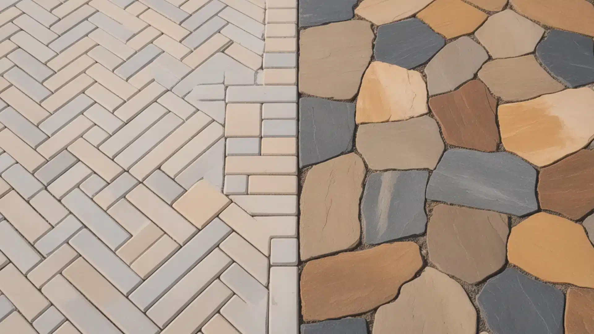
Planning an outdoor upgrade gets exciting fast, until the budget questions show up. When I started pricing out my patio, the first thing I searched was, “Is stamped concrete cheaper than pavers?” If you’re looking at driveways, walkways, or patios, you’re likely asking the same thing right now. The short answer is yes: stamped concrete usually costs less up front, but the full picture goes deeper than the initial price per square foot. I’ll walk you through installation costs, labor differences, maintenance expenses, durability, climate performance, and long-term value. By the time you finish reading, you’ll have a clear understanding of what each option truly costs and which one fits your budget, climate, and long-term plans Is Stamped Concrete Cheaper Than Pavers? When it comes to upfront cost, yes, stamped concrete is usually cheaper than pavers, especially for larger outdoor surfaces like patios and walkways. Most stamped concrete installations range from roughly $8 to $28 per square foot, depending on design complexity and coloring. Pavers, on the other hand, typically cost $20 to $40 per square foot or more because each piece must be laid, leveled, and fitted individually, which increases both material and labor costs. However, initial pricing isn’t the whole story. While stamped concrete saves you money up front, pavers often offer better long-term durability and easier, lower-cost repairs. Because individual pavers can be replaced if damaged, they may save you money over the long term. Choosing the right option depends on your budget, climate, maintenance preferences, and how long you expect the surface to last. Installation Cost Breakdown: Where Your Money Goes Understanding installation differences explains why stamped concrete and pavers have noticeable price gaps beyond the cost of materials alone. Material Costs Material costs start with the surface itself. Stamped concrete uses poured concrete, color hardeners, release agents, and stamping tools to create patterns. The materials are delivered in bulk and installed as one continuous slab. Pavers, on the other hand, require individual units, joint sand, edge restraints, and often a thicker gravel base. Because each paver is manufactured separately and transported in pallets, material costs increase. The added base layers also contribute to higher overall expenses compared to a single concrete slab. Labor Costs Labor plays a major role in the overall price difference. Stamped concrete is poured, leveled, colored, and stamped in a coordinated process that happens within a short time frame. Once the slab is finished, curing begins. Pavers require individual placement, alignment, spacing, leveling, and compacting. Each piece must be adjusted to maintain pattern consistency and structural stability. This careful placement takes significantly more time. Because installation requires precision and extended labor hours, paver projects typically cost more in workforce expenses. Base Preparation Base preparation is one of the biggest hidden cost factors. Stamped concrete requires soil compaction and a stable base before pouring a single slab on top. While proper compaction is critical, the structure remains one solid piece. Pavers require multiple base layers, including compacted gravel and a bedding sand layer to support flexibility and drainage. This layered foundation improves long-term durability and reduces cracking from ground movement. However, the additional materials and labor required for proper layering increase installation costs compared to stamped concrete. Stamped Concrete vs Pavers: Pros and Cons Before choosing between stamped concrete and pavers, it helps to compare their strengths and weaknesses side by side. This makes the trade-offs much clearer. Feature Stamped Concrete Pavers Upfront Cost Lower upfront cost Higher upfront cost Installation Speed Faster installation Longer installation time Design Options Many decorative patterns Wide variety of shapes and styles Durability Can crack over time Extremely durable and flexible Repairs Repairs are more visible Easy to replace single pieces Climate Performance May struggle in freeze-thaw cycles Handles freeze-thaw cycles well Maintenance Needs resealing every 2–3 years Occasional sand replenishment is needed Surface Safety Can be slippery when wet Better grip with joint texture Resale Value Moderate property value boost Adds stronger resale value Stamped concrete works well if you want decorative appeal at a lower cost. Pavers require more upfront investment but often offer greater durability and easier long-term maintenance. Long-Term Value: Which Saves More Money? The initial price is only one part of the story. Let’s examine the total cost over the years to determine which option truly saves you money. 1. Maintenance Costs Over Time Stamped concrete needs resealing every 2–3 years to prevent fading and damage, at a cost of about $1–$2 per square foot. Over 20 years, maintenance can reach roughly $3,000–$5,000. Pavers are simpler to maintain; you may only refill the joints with sand and clean them, with sealing optional. Long-term costs are usually $1,000–$2,000 lower than concrete. Repairs are also easier, since single pavers can be replaced cheaply, whereas repairing cracked concrete is harder and more expensive. 2. Lifespan and Long-Term Value Lifespan is where the real value difference appears. Stamped concrete generally lasts between 15 and 25 years when properly maintained. Pavers typically last 30 to 50 years, or even longer, because their modular design better handles ground movement. When you spread total costs over the full lifespan, the yearly cost difference becomes much smaller. Although pavers cost more initially, their extended durability often improves long-term value and reduces the need for full replacement. 3. Return on Investment Both options add curb appeal, but pavers typically add more property value. Pavers return 60-80% of their cost at resale, while stamped concrete returns 50-65%. Buyers see pavers as a premium feature that won’t need replacing soon. Here’s the cost per year for a 400 sq ft patio over 20 years: Stamped Concrete: Initial cost $6,000 + Maintenance $4,000 = $10,000 total ($500/year) Pavers: Initial cost $10,000 + Maintenance $1,500 = $11,500 total ($575/year) The difference is only $75 per year. Since pavers last 10-20 years longer, your cost per year drops even more over time. Durability in Different Climates Climate plays a major role in how stamped concrete and pavers perform over time, especially when weather extremes and ground movement are involved. Warm climates: Stamped concrete performs well because temperature shifts are minimal and slab stress is lower. Freeze-thaw regions: Pavers perform better since their flexible structure adjusts to soil expansion and contraction. Heavy vehicle traffic: Pavers distribute weight more evenly, reducing stress cracks under driveways. Pool areas: Pavers stay cooler under sunlight and provide better slip resistance around water. Ground movement affects solid slabs more severely than modular paver systems, especially in shifting soil conditions. Design Differences Between Stamped Concrete & Pavers Both options offer design flexibility, but they create very different visual effects and overall impressions in outdoor spaces. Stamped Concrete Design Features Stamped concrete focuses on creating a continuous decorative surface that mimics higher-end materials at a lower cost. Custom-stamped patterns replicate stone, brick, tile, or wood textures with consistent surface detailing. Seamless look creates a smooth, uninterrupted finish across patios and driveways. Mimics natural materials without individual piece installation or joint spacing. Continuous surface appearance offers clean lines and modern simplicity. Stamped concrete provides strong decorative value while keeping installation costs more affordable. Paver Design Features and Premium Appearance Pavers create a modular, textured surface that often feels more dimensional and upscale in finished outdoor spaces. Modular patterns allow creative layouts using various shapes and arrangement styles. Wide color variety offers deeper tone options and blended finishes. More dimensional texture adds shadow lines and natural variation. Premium visual perception often increases curb appeal and resale attraction. Pavers typically deliver a higher-end appearance that improves long-term property value. When to Choose Stamped Concrete or Pavers Choosing between stamped concrete and pavers really depends on your priorities. Stamped concrete makes more sense if you need a lower upfront cost, live in a warm climate, or want faster installation. It works especially well for large patios where keeping expenses under control matters. The seamless design also appeals to homeowners who prefer a smooth, continuous look. Pavers are worth the extra cost if you want maximum lifespan and stronger long-term durability. They perform better in freeze-thaw regions, handle heavy loads like driveways, and allow easier repairs by replacing single pieces. If resale value and long-term performance matter most, pavers often provide better overall value. Final Thoughts After comparing the upfront costs and long-term value, I’ve realized that when people ask, is stamped concrete cheaper than pavers, the honest answer depends on what matters most to you. Stamped concrete usually wins if you’re working with a tight budget and want a decorative surface right away. You can often save 10–15% on installation, which can amount to hundreds or even thousands of dollars on larger projects. But if you can handle the higher initial investment, pavers often make more sense long term. They last longer, make repairs easier, and reduce the risk of costly crack repairs later. Think about your climate, your budget, and how long you plan to stay in your home before deciding. Planning a project soon? Drop your question in the comments, share this guide with someone renovating, or save it to compare costs when you’re ready.
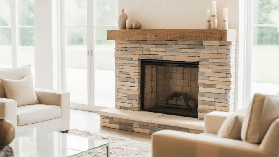
When I first thought about updating my fireplace, the biggest question on my mind was simple: how much would it actually cost? I quickly learned that fireplace remodel costs can vary a lot. Some homeowners spend just a few hundred dollars on paint and small upgrades, while others invest thousands for a full redesign with stone, inserts, or a new mantel. I’ll walk through real fireplace remodel cost ranges, what affects the price, and what homeowners usually wish they knew before starting. I’ll also share budgeting tips, common hidden costs, and smart ways to save money so you can plan your remodel with confidence. Fireplace Remodel Cost at a Glance Understanding general price ranges helps you set realistic expectations before meeting contractors or shopping for materials. These typical costs reflect common remodel paths homeowners choose today. Cosmetic update: $200 – $650 Fireplace refacing: $600 – $4,500 Full remodel: $2,000 – $8,000+ New fireplace build: $7,000 – $10,000+ These ranges vary based on material quality, fireplace size, labor rates, and structural changes. Defining your project scope early keeps your budget controlled and prevents unnecessary upgrades later. Real Homeowner Fireplace Remodel Costs and Experiences In a Reddit discussion, a homeowner asked contractors how much it would cost to raise an old fireplace into a modern stone design. Several replies suggested the project could cost anywhere from about “$30,000 to $50,000 or more”, depending on materials like granite and the weight the floor must support. Some users warned that heavy stone might require additional beams or structural work, which could quickly increase the total cost. The conversation showed how fast a simple visual upgrade can turn into a large construction project. Reading this made me realize that the cost of every fireplace remodel depends heavily on hidden structural needs. I think homeowners should always get inspections first and set aside extra budget before starting any fireplace upgrade. Fireplace Remodel Cost Breakdown Understand exactly where your fireplace remodel budget goes, including materials, inserts, mantels, and labor, so you can plan costs clearly and avoid unexpected expenses. 1. Refacing Costs Refacing focuses on updating the outer surface of your fireplace without rebuilding the internal structure. This usually includes installing tile, stone veneer, brick panels, or modern surround materials to refresh the appearance. I’ve noticed many homeowners choose this option when the fireplace works fine but looks outdated. The final cost depends on material choice, design complexity, and fireplace size. Custom patterns, premium stone, or intricate layouts push pricing toward the higher end of that range. 2. Fireplace Insert Costs If your fireplace does not heat efficiently, adding a new insert can significantly improve performance. Inserts come in gas, electric, or wood-burning models, and each option affects total cost differently. The unit itself generally costs between $500 and $2,000. However, that number rarely reflects the final bill. Installation, gas line connections, venting modifications, and possible electrical upgrades increase the total. I’ve seen homeowners underestimate these add-ons, so planning for both equipment and professional installation is important. 3. Mantel Installation Costs Updating the mantel can completely change how your fireplace looks without altering the firebox. Mantels range from simple pre-made wood shelves to large custom-built stone or reclaimed wood designs. Basic options may cost a few hundred dollars, while custom builds can reach several thousand. Installation typically ranges from $500 to $5,000, depending on material weight, design complexity, and finishing details. Decorative molding, floating supports, and integrated lighting can also raise costs beyond the base price. 4. Labor Costs and Professional Services Labor often represents a significant portion of your total remodeling budget. Even small projects may require skilled professionals to ensure safety and code compliance. Masonry work for brick or stone, gas line installation for inserts, and electrical upgrades for lighting or electric fireplaces all require licensed trades. The more complex the project, the higher the labor cost. Structural reinforcement or demolition work can increase labor hours substantially, which directly affects your final total investment. Hidden Fireplace Remodel Costs Most Homeowners Miss Before starting your fireplace remodel, it’s smart to know that the listed price is not always the final price. Many homeowners run into extra costs once the work begins. Permit fees: Many cities require a permit before you change a fireplace, especially if gas lines, vents, or structure are involved. Fees are usually small, but skipping this step can lead to fines later. Chimney repairs: Once work begins, contractors sometimes find cracks, blockages, or liner damage inside the chimney. Fixing these problems can add unexpected costs to the project. Structural reinforcement: If the wall or floor cannot safely hold heavy stone, brick, or a new insert, extra support may be needed. This hidden work increases labor and material costs. Venting upgrades: New gas or wood inserts often require updated venting systems to ensure safe airflow. Adding or replacing vents can raise the total remodel price. Hearth code compliance: Local safety rules may require a larger hearth, heat-safe materials, or extra spacing. Meeting these rules protects your home but may add to your budget. Knowing about these hidden expenses ahead of time helps you plan a safer budget and avoid stressful surprises during the remodel. Is Remodeling a Fireplace Worth the Investment? When I looked into remodeling my fireplace, I kept asking myself if the cost would truly pay off. In many cases, it does. Small updates like paint, tile, or a new mantel can dramatically improve the look of your living space without requiring a huge budget. Larger renovations, such as adding an insert or upgrading materials, can increase heating efficiency and reduce energy waste. If you plan to sell, many homeowners recover between 50% and 90% of their investment, depending on market conditions and build quality. Even if you are staying put, a refreshed fireplace often becomes the visual centerpiece of the room, adding warmth, comfort, and long-term enjoyment to your home. Final Thoughts After researching fireplace remodel costs and seeing what real homeowners spend, I’ve learned there isn’t one single price that fits every project. A small refresh can be very affordable, while a full remodel with new materials or inserts can cost much more. The key is to know your goal first: if you want a simple visual upgrade or a complete fireplace transformation. If you plan carefully, compare quotes, and focus on the upgrades that matter most, you can achieve beautiful results without overspending. If you’re thinking about remodeling your fireplace soon, start by setting your budget and save this post today so your project stays smooth and stress-free.

A plaster fireplace can change the whole feel of your living room. I’ve seen how a smooth, clean surround instantly makes a space look more modern and calm. But before you commit, you probably want to know more than just how it looks. You might be wondering how it compares to stucco, how much it costs, and whether it can handle heat safely. This guide covers the key differences between plaster and stucco, typical pricing, safety details, and long-term maintenance tips. You’ll also see modern, minimalist design ideas to help you decide what best fits your home. By the end, you’ll know if plaster is the right choice for your fireplace project. Understanding Plaster Fireplaces Plaster fireplaces are made from a mixture of lime, cement, sand, and sometimes gypsum, depending on the type of plaster used. Lime-based plaster is especially popular because it’s breathable, durable, and develops a soft, natural finish over time. The application process involves layering plaster over a prepared surface, often cement board or masonry. Each layer is carefully smoothed or textured by hand, which gives the fireplace its custom look. Skilled application is key to preventing cracks and ensuring a clean result. Plaster works beautifully in modern homes because it creates a seamless, built-in appearance. Common finishes include ultra-smooth surfaces, light texture, limewash for subtle movement, and polished Venetian plaster for added depth and richness. Plaster Fireplaces vs Stucco: What’s the Difference? Plaster and stucco may look similar at first glance, but they differ in composition, texture, durability, cost, and ideal use. Understanding these differences helps you choose the right finish for your fireplace project. 1. Material Composition Plaster typically contains lime, sand, and sometimes gypsum or cement. Lime-based plaster is breathable and ideal for interior applications, especially fireplaces where a refined finish matters. Stucco is usually made from cement, sand, lime, and water. It’s designed for durability and is commonly used on exterior walls. While stucco can be used indoors, it’s generally better suited for outdoor environments because of its heavier composition and weather resistance. 2. Appearance and Texture Plaster offers a smooth, seamless finish that works beautifully in modern interiors. It can be polished to a sleek surface or lightly textured for subtle movement. The overall look feels clean and integrated into the wall. Stucco has a rougher, more textured appearance. It often features visible grit and a heavier pattern. While this works well for Mediterranean or rustic styles, it doesn’t create the same minimalist look that plaster fireplaces provide. 3. Durability and Maintenance Plaster fireplaces are durable when properly installed, but they can develop hairline cracks if applied incorrectly. Lime-based plaster remains breathable, which helps reduce moisture issues indoors. Small cracks are usually repairable with professional touch-ups. Stucco is thicker and more impact-resistant, especially outdoors. However, repairing indoor stucco can be more noticeable due to its texture. For long-term indoor performance, plaster typically offers better aesthetic longevity with proper installation. 4. Cost Comparison Plaster installation usually costs more because it requires skilled labor and careful hand application. Pricing depends on finish type, with Venetian or specialty finishes increasing the total cost. Stucco tends to be slightly less expensive per square foot, particularly for larger surface areas. However, detailed indoor stucco work may still require professional labor. Maintenance costs for plaster are typically lower indoors, especially when properly sealed and maintained. 5. Best Use Cases Plaster is better for a seamless, modern, built-in look in indoor fireplaces. It works especially well in minimalist, organic, and contemporary homes where clean lines matter. Stucco is better suited for exterior fireplaces or homes with rustic, Mediterranean, or textured design styles. If weather resistance is the main priority, stucco performs more reliably outdoors than traditional interior plaster finishes. Plaster gives you a sleek, modern look but needs more upkeep. Stucco handles heat better and lasts longer, especially for wood-burning or outdoor fireplaces. Pros and Cons of Plaster Fireplaces Before choosing plaster fireplaces for your home, it helps to see both the benefits and drawbacks clearly. This quick comparison makes your decision easier and more practical. Pros Cons Seamless, smooth appearance Can crack if poorly installed Customizable finish and texture Higher labor cost Clean, modern look Requires skilled application Ideal for indoor use Repairs may need a professional Understanding these advantages and limitations helps you decide if plaster fireplaces truly fit your budget, style, and long-term expectations. Why Plaster Fireplaces are Popular in Modern Homes Plaster fireplaces have become a favorite in modern homes because they offer a clean, simple look that feels calm and intentional. The smooth surface creates a seamless, built-in appearance that blends naturally into the wall instead of looking bulky or separate. This minimalist appeal works especially well in open-concept spaces where visual clutter needs to stay low. Another reason they’re popular is their flexibility with color. Plaster finishes adapt beautifully to soft whites, warm beiges, greige tones, and earthy shades. That neutral adaptability makes styling easier over time. If your home leans toward modern, organic, contemporary, or even transitional styles, plaster fireplaces provide a balanced backdrop that feels current without looking trendy or overdone. Modern Plaster Fireplace Design Ideas If you’re looking for ideas you can actually picture in your home, this section will help. I’ll walk you through popular plaster fireplace styles, where they work best, and why they’re popular for love them. 1. Smooth Minimal Plaster Fireplace A smooth, minimal plaster fireplace has clean lines and a flat, seamless surface. It often runs from floor to ceiling with no heavy trim or detail. This style shines in minimalist settings, modern Scandinavian spaces, or simple, open-concept spaces. People pick this because choose it because it appears calm and uncluttered. It also pairs easily with wood floors, neutral walls, and simple furniture without competing for attention. Pair it with a floating wooden mantel, or leave it without a mantel for maximum impact. 2. Venetian Plaster Concrete Look This finish mimics the look of soft concrete with subtle depth and movement. Venetian plaster is layered and polished to create a smooth surface with slight variation in tone. It fits well in modern, industrial, or contemporary homes. Many opt for this when choosing this look because it creates a current and refined look without using real concrete. It adds character while still keeping the space clean and controlled. Choose gray or taupe tones for the most authentic concrete effect, and make sure your installer polishes the final layer for that signature smooth sheen. 3. Curved or Arched Fireplace A curved or arched plaster fireplace instantly softens the room. Instead of sharp corners, you get rounded edges and gentle lines. This style works beautifully in Mediterranean, organic, or modern homes that lean toward natural shapes. Plaster makes curves easier to achieve compared to stone or tile. This appeals to those who love this option because it brings an inviting feel and adds subtle architectural interest. Work with your installer to create soft curves rather than tight arches; gentler shapes feel more modern and less traditional 4. Fluted Plaster Fireplace Trend Fluted plaster fireplaces feature vertical grooves carved into the surface. These lines create shadow and depth while keeping the overall design simple. This trend complements contemporary rooms in modern and transitional spaces that need texture without heavy detail. Many people choose fluted plaster because it appears custom and high-end. It adds movement to the wall without overpowering the room. Fluting typically runs 2–4 inches wide and extends from floor to ceiling for the strongest effect. 5. Textured Matte Finish A textured matte plaster fireplace has a soft, hand-applied feel. The surface may show slight trowel marks or gentle variation. This style fits rustic, farmhouse, or relaxed modern interiors. It’s popular because it is often chosen for its warm, natural feel compared to glossy finishes. The matte surface also hides small imperfections better than polished options, making it practical for busy homes. Ask your installer to leave slight trowel marks visible rather than sanding them completely smooth; this adds authentic handcrafted character without looking messy 6. Dark or Black Plaster Fireplace A dark or black plaster fireplace makes a bold focal point. The deep tone highlights the shape of the surround and frames the fire beautifully. This look suits modern, moody, or high contrast rooms. Many people choose dark plaster to anchor a bright space. It adds depth, making light walls, wood accents, and metal details stand out more clearly. Balance the dark surround with lighter furniture and walls to prevent the room from feeling too heavy or closed in. How Much Does a Plaster Fireplace Cost? From what I’ve seen working with plaster fireplace projects, the price can vary quite a bit. It really comes down to the size of the fireplace, the design, and the type of finish you want. For a basic project where someone is simply adding a plaster surround to an existing firebox, I usually see costs in the $500 to $1,500 range. That typically covers the materials and some straightforward labor without any major structural work. Once you start building a custom hearth or adjusting the fireplace structure, the price usually climbs. In my experience, most of those projects fall in the $2,000 to $5,000 range, especially if the homeowner wants specialty finishes like limewash, textured plaster, or Venetian plaster. Those finishes take more time and skill, which adds to the labor cost. The price can go even higher when a design includes curves, detailed edges, or built-in shelving around the fireplace. I’ve noticed that labor often becomes the biggest part of the budget. Plaster work has to be done carefully to avoid cracking and to create that smooth, seamless look people love. One thing I always suggest is getting a few quotes from experienced plaster installers before starting. I’ve learned that small details, like prep work, framing adjustments, or finish coats, can change the final price more than most people expect. Planning for those details early helps keep the budget realistic. Is Plaster Safe and Heat Resistant? Yes, plaster is safe for fireplace surrounds when installed correctly. It’s non-combustible, so it won’t catch fire or release toxic fumes when exposed to heat. That said, plaster has moderate heat resistance. It handles the warmth from gas and electric fireplaces just fine. But with wood-burning fireplaces that generate intense, direct heat, you need to be more careful. The main issue isn’t the plaster itself burning. It’s cracking. When the substrate beneath (such as drywall or cement board) expands and contracts due to heat, the plaster can develop hairline cracks over time. To avoid this, ensure there’s adequate clearance between the plaster and the firebox. Most codes require at least 6 inches of space. Using cement board as your base also helps since it handles heat better than standard drywall. Common Plaster Fireplace Problems and How to Fix Them Plaster fireplaces look great, but can develop issues if not installed or maintained properly. Here’s what to watch for, how to prevent problems, and how to keep your fireplace in good shape. Issue/Task How to Handle It Hairline Cracks Use cement board base; apply thin coats; keep 6-inch clearance from firebox Soot Stains Seal after install; wipe soot immediately with a damp cloth Poor Substrate Prep Install corner beads; tape seams; prime surface before plastering Moisture Issues Seal properly; avoid outdoor use without protection; fix leaks fast Cleaning Wipe with a soft, damp cloth and mild soap weekly or as needed Sealing Apply breathable sealer every 2–3 years; let dry 24 hours Crack Repair Fill with plaster compound; smooth, sand, and touch up the sealer immediately Annual Inspection Check for cracks, stains, and moisture yearly; reseal as needed Regular maintenance and quick fixes keep your plaster fireplace looking clean and prevent minor issues from becoming costly repairs down the road. Wrapping Up I’ve walked you through everything from plaster versus stucco to costs, safety, and design styles. Now you know that a plaster fireplace fits naturally in with gas or electric setups, costs around $10–$15 per square foot, and requires proper sealing to avoid cracks and stains. The smooth finish gives you a clean, modern look, but it requires more upkeep than textured stucco. If you’re ready to commit, start with good substrate prep and seal it right after installation. That’ll save you headaches down the line. Planning a plaster fireplace project? Tell me your biggest question in the comments, and I’ll help you figure it out.

I’ll never forget the first time I stumbled upon an Art Nouveau building in Brussels. The flowing curves, the vine-like ironwork, the way every detail seemed to dance, it was like the building was alive. That moment sparked my fascination with Art Nouveau architecture, and I’ve been finding these magical structures ever since. If you’ve ever wondered about those whimsical buildings with curved lines and nature-inspired decorations, you’re in the right place. I’ll walk you through everything you need to know about Art Nouveau, from its revolutionary characteristics to the most perfect examples you can visit today. Let’s look into this beautiful world together! Understanding Art Nouveau Art Nouveau was a design movement that flourished roughly between 1890 and 1910. The name means “New Art,” reflecting the desire of architects and designers to move away from older historical styles and create something modern, expressive, and original. It developed during a period of rapid industrial growth. As cities became more mechanical and standardized, designers aimed to reintroduce beauty through flowing lines, natural forms, and visible craftsmanship. Unlike Art Deco, which highlights bold geometry and machine-inspired design, Art Nouveau architecture emphasizes organic curves, floral motifs, and a strong sense of artistic unity throughout the entire structure. Key Characteristics That Define Art Nouveau Style Art Nouveau stands out for its flowing beauty, natural inspiration, and artistic details that change ordinary buildings into expressive works of art. Nature-Inspired Forms: Vines, flowers, leaves, insect motifs, and flowing plant shapes are woven into both structure and decoration. Whiplash Curves: Long, sweeping, asymmetrical lines create a sense of movement and rhythmic flow. Organic Asymmetry: Layouts and façades avoid rigid symmetry, embracing fluid, natural composition. Innovative Materials: Iron, glass, and ceramic tiles add flexibility, lightness, and decorative richness. Ornate Craftsmanship: Mosaics, stained glass, sculpted faces, and intricate handcrafted details enrich surfaces. Gesamtkunstwerk Vision: Architecture, interiors, and furnishings unite into one cohesive artistic expression. These defining features make art nouveau instantly recognizable, blending structure and decoration into a cohesive celebration of nature and creativity. Art Nouveau Architecture Around the World This movement spread across Europe and beyond, leaving beautiful buildings that still inspire travelers, architects, and design lovers today. 1. Hotel Tassel: Brussels, Belgium A project byVictor Horta, this townhouse is widely considered the first true masterpiece of the movement. Its open interior plan replaces traditional rooms with flowing spaces connected by light-filled corridors and decorative iron details. The famous staircase features whiplash railings and mosaic floors that blend structure, ornament, and nature-inspired design into one unified artistic experience. 2. Castel Beranger: Paris, France Developed by Hector Guimard, this apartment building introduced bold new visuals to the streets of Paris. Its façade combines stone, brick, and ironwork in dramatic curves that break away from strict classical symmetry. Organic balconies, sculpted doorways, and intricate decorative details make the building feel expressive, modern, and visually alive throughout every floor. 3. Paris Metro Entrances: Paris, France Also created by Hector Guimard, these entrances changed everyday subway access into sculptural examples of public art. Their green cast-iron frames curve upward like plant stems, forming protective canopies over stairways below. Beautiful lettering, glass panels, and flowing lines make these entrances some of the most recognizable public designs in Paris today. 4. Casa Batlló: Barcelona, Spain The work of Antoni Gaudí, this house changed the style into a bold, imaginative masterpiece. Its façade ripples like water, featuring balconies shaped like masks and columns resembling bones. Inside, curved walls, stained glass, and marine-inspired details create a luminous, dreamlike space filled with color, movement, and artistic energy throughout. 5. Casa Milà (La Pedrera): Barcelona, Spain Another extraordinary work by Antoni Gaudí, this building raises the movement into bold sculptural territory. The flowing stone façade undulates like ocean waves, completely avoiding straight lines and rigid angles. Above, surreal chimneys and ventilation towers stand like abstract guardians against Barcelona’s skyline, creating a dramatic, unforgettable silhouette visible from blocks away. 6. Palau de la Musica Catalana: Barcelona, Spain Crafted by Lluís Domènech i Montaner, this concert hall celebrates the style through its use of light and decoration. Its exterior blends mosaics, arches, and sculptural elements inspired by music and Catalan culture. Inside, a stained-glass skylight floods the hall with color, creating a vibrant and uplifting performance space loved by musicians worldwide. 7. Secession Building: Vienna, Austria Planned by Joseph Maria Olbrich, this landmark represents Austria’s distinctive interpretation of the movement. Its clean white cubic form contrasts strikingly with the ornate golden dome woven from laurel leaves. The overall design symbolizes artistic freedom, progressive ideals, and a confident departure from traditional academic conventions that dominated European cities at the time. 8. Majolikahaus: Vienna, Austria A project by Otto Wagner, this apartment building highlights the style through vibrant surface decoration. Its façade is clad in ceramic tiles painted with bold floral patterns and flowing stems. By combining modern construction methods with refined ornamentation, the design beautifully balances practicality, innovation, and artistic polish across every level of the structure. 9. Hotel Solvay: Brussels, Belgium Another masterpiece by Victor Horta, this mansion showcases the refined and luxurious expression of the movement. Every interior detail, from sweeping staircases to carefully crafted light fixtures, was custom-designed to maintain balance. Rich materials, curved woodwork, and iron accents create a beautiful, unified, and immersive artistic environment throughout the entire residence. 10. Old England Building: Brussels, Belgium Built by Paul Saintenoy, this building expresses industrial grace within the style. Its exposed iron framework supports expansive glass panels, allowing generous natural light to flood the interior. Ornate balconies and finely crafted metal details soften the structural grid, blending engineering strength with graceful artistic refinement and visual warmth. 11. Wainwright Building: St. Louis, USA Designed by Louis Sullivan, this pioneering skyscraper combines early modern verticality with refined ornamentation. Strong vertical lines highlight its impressive height, while intricate terracotta patterns soften the façade’s rigidity. The structure proves that artistic detailing could coexist with innovative steel-frame construction technology and modern engineering ambition in American cities. 12. Glasgow School of Art: Glasgow, Scotland Built by Charles Rennie Mackintosh, this school thoughtfully merges structural clarity with bold decorative experimentation. Strong vertical masses balance refined ironwork and subtle curved detailing across the façade. Inside, carefully designed studios feature custom furniture and intentional lighting, reflecting a cohesive artistic vision that unites function, craftsmanship, and creative expression. 13. Casa Amatller: Barcelona, Spain The work of Josep Puig i Cadafalch, this building gracefully blends Gothic Revival influences with expressive decoration. Its stepped façade and richly ornamented balconies create a bold and memorable street presence. Intricate carvings, patterned ceramic tiles, and symbolic motifs celebrate fine craftsmanship while telling a vivid story across the entire front face. 14. Villa Majorelle; Nancy, France Architected by Henri Sauvage, this villa reflects a refined French interpretation of the movement. Graceful iron balconies curve outward like blooming stems, reinforcing the botanical inspiration throughout the exterior. Inside, flowing wooden details and softly colored stained glass create a warm, intimate atmosphere that feels unified, artistic, and inviting to visitors. 15. Casa Campanini: Milan, Italy A project by Alfredo Campanini, this Milanese landmark displays sculptural beauty. The grand entrance is framed by dramatic carved female figures that command attention. Flowing iron gates, intricate relief panels, and richly layered detailing combine to create a façade that feels theatrical, expressive, and truly unforgettable for anyone passing by. These buildings show how the movement spread across Europe and even the United States, with each city adding its own creative touch. Interior Design in Art Nouveau Buildings When I look at these structures, I always notice that the beauty doesn’t stop at the front door. The interiors were just as important as the exterior. In fact, many architects believed a building should feel like a single, cohesive work of art, from the walls to the smallest door handle. Custom Furniture and Stained Glass Furniture was never random or mass-produced in these buildings. Designers created custom pieces that matched the flowing lines and natural themes. Architects like Victor Horta designed chairs and cabinets with curved wood and floral carvings. Stained glass windows filtered colorful light, often featuring vines, flowers, or insects, making interiors feel warm, artistic, and alive. Curved Staircases and Organic Railings Staircases became sculptural centerpieces inside Art Nouveau homes. Instead of straight lines, they curved gently upward as plant stems. In homes such as Hôtel Tassel, iron railings twist into beautiful, whiplash shapes. The craftsmanship is subtle yet strong, turning a simple staircase into a dramatic artistic feature within the home’s design. Wallpaper and Lighting Design Architects carefully selected wallpaper, tiles, and lighting to match the entire design. Floral and organic patterns echoed the curves found in doors and windows. Designers like Antoni Gaudí used decorative glass and creative light fixtures shaped like flowers. Every surface worked in harmony, creating a unified environment of structure and decoration. Immersive Artistic Atmosphere These interiors felt immersive and complete. Walls, ceilings, and railings flowed together without harsh angles. Natural colors like green, gold, and brown enhanced the organic mood. This “total work of art” approach ensured every detail belonged. The result was a peaceful yet expressive space that still feels magical and inspiring today. Why Art Nouveau Still Inspires Designers Today I truly believe this style still inspires designers because it feels classic and deeply human. Its organic curves and plant-like forms connect buildings to nature in a way that feels calming and intentional. Today, many architects are returning to nature-based and sustainable design, and Art Nouveau already embraced that philosophy over a century ago. I also see its influence in boutique hotels and creative renovations, where designers want spaces to feel artistic and immersive rather than plain or industrial. On social media, these flowing balconies and floral details instantly stand out. To me, Art Nouveau proves that thoughtful craftsmanship and natural beauty will always remain relevant. Art Nouveau vs. Art Deco: What’s the Difference? Many people confuse these two styles, but their design philosophies, shapes, and historical contexts are actually very different. Feature Art Nouveau Art Deco Time Period 1890–1910 1920s–1930s Design Inspiration Nature, plants, flowers, insects Machines, industry, technology Line Style Flowing, curved “whiplash” lines Sharp, straight, geometric lines Overall Look Soft, organic, decorative Bold, sleek, symmetrical Materials Iron, glass, ceramic tiles Chrome, steel, glass, marble Ornamentation Floral motifs and handcrafted details Sunbursts, zigzags, streamlined patterns Famous Architect Antoni Gaudí William Van Alen Iconic Example Casa Batlló Chrysler Building Understanding these differences helps you quickly recognize whether a building celebrates natural curves or modern geometric precision. Final Thoughts After finding the world of Art Nouveau architecture together, I hope you feel inspired to seek out these incredible buildings yourself. What started as a revolutionary movement over a century ago left us with some of the most beautiful structures ever created. These buildings remind us that beauty matters, that nature can inspire our urban spaces, and that true artistry knows no boundaries. Next time you travel to Brussels, Paris, Barcelona, or any European city, keep your eyes open; you might just find your own Art Nouveau treasure. And when you do, drop a comment and share your favorite find, I’d love to hear which hidden gem captured your heart!