

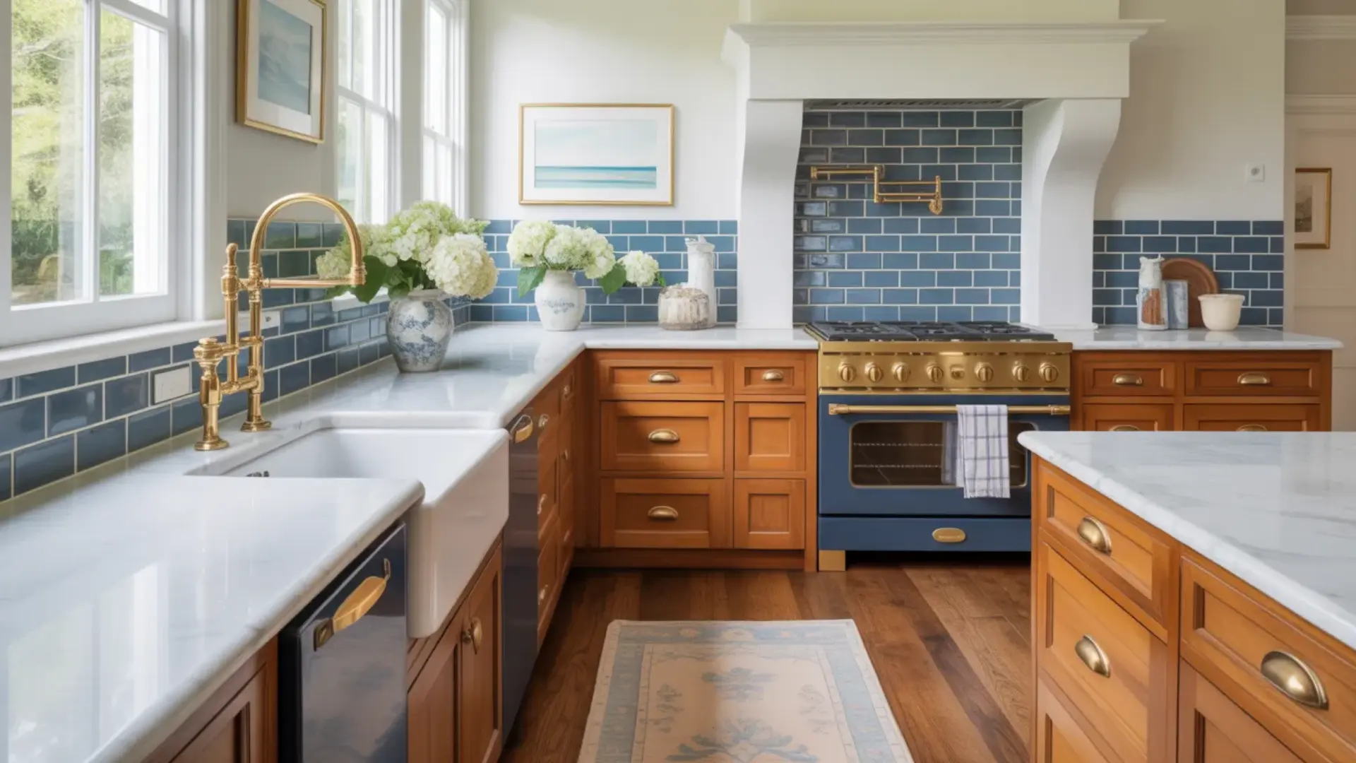
Oak kitchen cabinets were everywhere in the 80s and 90s, and honestly, I get why people fell in love with them. But that warm, honey-orange tone? It can make a kitchen feel really dated really fast. The good news is, you don’t need to rip everything out and start over. I’ve put together this guide to show you exactly how to make oak kitchen cabinets look modern without blowing your budget. I’ll cover everything from hardware swaps and lighting tricks to backsplash ideas and two-tone cabinet combinations. Let’s give your kitchen the refresh it deserves. Why Oak Cabinets Look Outdated Oak cabinets often look outdated because of their strong orange or yellow undertones, especially the popular honey oak finish from the 1990s. Over time, that warm tone can make a kitchen feel dark, heavy, or overly traditional. The visible wood grain can also feel busy compared to today’s smoother, cleaner cabinet styles. But here’s the good news: the problem usually isn’t the cabinets themselves. Oak is a durable, high-quality wood that can last for decades. In most cases, the color and surrounding design elements are what feel dated. Instead of replacing them, you can update the finish, hardware, lighting, or backsplash. A smart, budget-friendly refresh can completely transform the space without a full renovation. How to Make Oak Kitchen Cabinets Look Modern: 15 Proven Ways Oak cabinets are solid, durable, and built to last, but their dated look doesn’t have to be permanent. Here are 15 proven ways to modernise them. 1. Paint Them a Neutral, Modern Color Painting is the single most impactful way to modernise oak cabinets. Neutral shades like white, soft gray, navy, and sage green instantly eliminate the dated look while giving your kitchen a clean, contemporary feel. For a perfectly smooth finish, use a grain filler before painting to minimise oak’s natural wood grain texture. Not ready to paint? Swapping hardware and updating lighting can still make a significant difference without touching the cabinets themselves. 2. Restain Instead of Painting If you love the warmth of wood but want a fresher look, restaining is the answer. Contemporary stains in lighter whitewash tones or rich, darker finishes like espresso and walnut replace the telltale orange hue that makes honey oak feel so dated. The process strips back the old finish and applies a new one, completely transforming the cabinet colour while keeping the natural wood feel intact and the grain beautifully visible. 3. Swap Out the Hardware Never underestimate how much cabinet hardware affects the overall look of a kitchen. Replacing old brass or chrome handles with matte black, brushed nickel, or warm brass hardware is one of the quickest and most affordable upgrades you can make. It takes a few hours, requires no professional help, and the difference is immediately visible. Modern hardware gives oak cabinets a sharp, intentional look that feels completely current. 4. Add Glass Inserts to Cabinet Doors Replacing solid cabinet door panels with glass inserts instantly adds depth, lightness, and a modern open feel to any kitchen. Clear glass works best for displaying styled dishware or glassware; frosted glass is a better option if you prefer to conceal the contents while still letting light through. Either way, glass inserts break up the heaviness of solid oak doors and give the kitchen a more elevated, contemporary character. 5. Replace Some Upper Cabinets with Open Shelving Swapping a few upper cabinet units for open shelves creates an airy, contemporary look that feels instantly more modern. Style the shelves with a curated mix of everyday items, stacked white plates, glassware, small plants, and a few decorative objects, keeping it intentional rather than cluttered. Open shelving also makes smaller kitchens feel larger and more connected, which is one of the reasons it has remained one of the most popular modern kitchen trends. 6. Mix Oak Lowers with Painted Uppers The two-tone cabinet trend is one of the most effective ways to modernise oak without a full renovation. Keep the oak lower cabinets as they are and paint the upper cabinets in a fresh, contrasting colour. White uppers with oak lowers are the most classic and widely used combination, clean, balanced, and visually grounding. Soft sage green or navy uppers also work beautifully, adding personality while letting the natural wood warmth below anchor the space. 7. Update the Countertops Countertops frame the cabinets and have an enormous impact on how modern or dated the entire kitchen feels. White or light grey quartz immediately brightens the space and reduces the visual heaviness of oak’s warm tones. Dark concrete or charcoal countertops create a bold contrast that feels sleek and contemporary. Butcher block is a warmer, more natural option that complements oak beautifully while still feeling intentional, updated, and very much on-trend in modern kitchen design. 8. Install Modern Lighting Lighting can completely change how oak cabinets read in a kitchen. LED under-cabinet strip lighting adds a clean, modern glow that highlights the countertops and reduces shadows, making the whole kitchen feel brighter and more polished. Sleek pendant lights hung over an island or breakfast bar add a strong design statement overhead. Choose fixtures in matte black or brushed brass to tie the lighting in with updated hardware and create a cohesive, modern kitchen look throughout. 9. Change the Backsplash The backsplash sits directly behind and above the cabinets, making it one of the most visually connected surfaces in the kitchen. Large-format tiles in light grey, white, or cool-toned shades visually counterbalance the warmth of oak and significantly reduce its orange undertone. Sleek subway tiles in a vertical stack or herringbone pattern feel contemporary and clean. If you want to make a bolder statement, a patterned or textured tile adds personality while still pulling the kitchen into a more modern design direction. 10. Add a Kitchen Island or Peninsula If your kitchen layout allows it, adding an island or peninsula is one of the best ways to modernize the whole space. A painted island in a contrasting color like navy, black, or sage green instantly creates a two-tone look that feels very current. It also adds counter space, storage, and a natural focal point that draws the eye away from dated oak cabinetry. 11. Decorate with Modern Accessories and Styling Sometimes the fastest way to modernize a kitchen is simply changing what sits on the surfaces. Swapping out old decorative items for clean, intentional accessories can completely shift the feel of the space without any renovation at all. Think matte ceramic canisters, wooden cutting boards, and a simple herb pot. Less is more, aim for three to five purposeful items rather than a crowded, mismatched countertop. 12. Add Crown Molding or Updated Trim Crown molding is a small finishing detail that has a surprisingly strong effect on how polished and modern a kitchen looks. Adding clean, simple molding to the top of oak cabinets closes the gap between the cabinet and the ceiling, giving the kitchen a more built-in, intentional appearance. Choose a slim, minimal profile rather than an ornate style; simplicity is what keeps it feeling modern rather than traditional. Paint the molding to match the cabinets or the ceiling for a seamless, streamlined finish. 13. Add a Statement Range Hood A range hood is one of the most prominent features in any kitchen, and upgrading it can shift the entire room’s style. Most dated kitchens have a basic builder-grade hood that blends into the background. Replacing it with a stainless chimney, matte black metal, or a custom shiplap hood makes the kitchen feel far more designed and intentional, without touching a single cabinet. 14. Update the Flooring The floor is the largest surface in your kitchen, and outdated flooring can undermine even the most well-executed cabinet refresh. If you still have old vinyl, worn hardwood, or dated ceramic tile, updating it makes a massive difference. Large-format porcelain tile, luxury vinyl plank, or white oak hardwood all pair beautifully with oak cabinets. Best of all, peel-and-stick LVP and floating floor systems make this a very doable DIY weekend project without tearing everything out. 15. Incorporate Plants and Greenery Adding plants to your kitchen is one of the easiest and most affordable ways to modernize the space. Greenery softens the warm orange tones of oak cabinets and adds a fresh, organic element that feels very current in modern kitchen design. A trailing pothos on top of upper cabinets, a herb garden on the windowsill, or a snake plant in the corner can instantly make the whole kitchen feel alive and curated. Oak kitchen cabinets have more potential than most people give them credit for. Try even two or three of these updates, and the transformation will genuinely surprise you. Tips for Getting a Smooth Finish When Painting Oak Cabinets Want your oak cabinets to look modern and flawless? Proper prep and careful painting are key. Follow these steps for a smooth, professional finish. Remove Doors and Hardware: Remove all cabinet doors, drawers, and hardware. Label each piece for easy reassembly. Clean Thoroughly: Degrease surfaces with a strong cleaner to remove oils, dirt, and residue. Sand the Surface: Lightly sand with medium-grit sandpaper to remove the factory finish and improve primer adhesion. Apply Grain Filler: Fill oak’s deep pores with a quality grain filler; let it dry completely, then sand smooth. Prime the Cabinets: Use a high-bond or stain-blocking primer to prevent tannin bleed and ensure paint sticks. Sand Between Coats: Lightly sand after primer and between paint layers for an ultra-smooth surface. Apply Thin Paint Coats: Use multiple thin coats of high-quality paint rather than one thick layer for a flawless finish. Take your time with each step, and your oak cabinets will achieve a smooth, modern, and professional-looking finish that completely transforms your kitchen’s style. Final Thoughts Updating your oak kitchen cabinets doesn’t have to feel overwhelming or expensive. Knowing how to make oak kitchen cabinets look modern is all about small, smart changes that make a huge difference, whether that’s a fresh coat of paint, new matte black hardware, or a sleek backsplash that pulls everything together. The key is to pick the updates that work for your budget and your style, then take them one step at a time. I truly believe that with the right approach, oak cabinets can look just as fresh and modern as anything you’d find in a brand-new kitchen. Which of these tips are you trying first? Drop it in the comments below, I’d love to hear about your kitchen transformation!

Just last week, my family and I were discussing our morning bathroom chaos, everyone rushing, waiting for hot water, and foggy mirrors. That’s when it became clear how smart technology can completely change the bathroom experience. If you’re tired of outdated fixtures and want your bathroom to work smarter, not harder, you’re in the right place. These are the latest smart bathroom innovations that combine convenience, luxury, and energy savings. You’ll see intelligent toilets, voice-activated showers, smart mirrors, and water-saving fixtures that are changing how bathrooms work. If you’re planning a complete remodel or simple upgrades, these technologies can turn your bathroom into a modern space that saves time, money, and makes every day easier. Why Smart Bathrooms are Worth Your Attention Smart bathrooms aren’t just fancy gadgets anymore; they’re becoming essential parts of modern homes. More families are choosing smart devices because they make daily life easier and more comfortable. Imagine a toilet that cleans itself, a shower that remembers your perfect temperature, or a mirror that checks the weather while you brush your teeth. These features bring real convenience to your morning routine. Smart bathrooms also help you save money by using less water and energy, which is better for the environment and your wallet. Plus, they include safety features like automatic lighting and temperature controls to protect your family. Whether you want luxury, savings, or simply a better bathroom experience, smart technology delivers all three in ways that genuinely improve your everyday life. Designing a Smart Bathroom: Combining Tech and Style Creating a smart bathroom means blending cutting-edge technology with a beautiful design that matches your personal style. Here are some innovative updates that can change your bathroom into a modern, efficient space: 1. Smart Mirror with Touchscreen and Lighting Smart mirrors automatically adjust brightness based on time of day, giving you perfect lighting for grooming. The touchscreen displays weather, news, and your daily schedule while you get ready. Some models also play videos or music. These mirrors combine practical lighting with helpful technology, making your morning routine smoother. They’re like having a personal assistant right on your bathroom wall every day. 2. Voice-Activated Smart Shower Control your shower completely hands-free using simple voice commands like “start shower” or “make it warmer.” Set your perfect water temperature and pressure, then save it as a preset. You can even play music through the built-in speakers. No more cold water shocks or fumbling with knobs while half-asleep. Just speak, and your shower creates a personalized bathing experience instantly every single time. 3. Heated Floors Say goodbye to cold bathroom floors on winter mornings. Smart heated floors warm up automatically before you wake up using a phone-controlled thermostat. Schedule different temperatures for different times to save energy while staying comfortable. The gentle warmth spreads evenly across the entire floor, making early morning bathroom visits actually pleasant. 4. Smart Toilet with Bidet Functionality Modern smart toilets include heated seats, built-in bidets with adjustable pressure, and automatic self-cleaning systems. Many models have nightlights, automatic lids that open when you approach, and air dryers. Though they’re an investment, these high-tech toilets provide incredible comfort, better hygiene, and water savings. They make traditional toilets feel ancient and completely transform your bathroom experience. 5. Touchless Faucets Wave your hand under the spout, and water flows at your preset temperature without touching anything. Touchless faucets use motion sensors to keep germs away and prevent cross-contamination when hands are dirty. Water stops flowing when you move away, helping conserve resources significantly. These sleek, stylish faucets make your bathroom more hygienic, environmentally friendly, and modern-looking. 6. Smart Lighting with Color Control Use your phone or voice to adjust bathroom brightness from bright white for mornings to soft, warm tones for relaxing baths. Smart bulbs offer millions of color options for any mood. Set schedules so lights automatically brighten gradually in the morning or dim at night. They reduce energy costs and last longer than regular bulbs. Change your bathroom’s atmosphere instantly while saving money and creating perfect lighting. 7. Smart Water Leak Detector Protect your bathroom from costly water damage with smart leak detectors that monitor pipes, toilets, and sinks 24/7. These small devices send instant alerts to your phone when they detect moisture or leaks, even tiny drips you might miss. They’re affordable, easy to install under sinks or near toilets, and can save thousands in potential repair costs while giving you complete peace of mind. 8. Wi-Fi Enabled Bathroom Scale Step on, and this scale automatically sends weight, body fat percentage, muscle mass, and health metrics to your smartphone. Track fitness progress over time with easy charts and graphs. It syncs with popular fitness apps and automatically recognizes different family members. It’s like having a personal health monitor that provides valuable insights to help you reach your wellness goals effortlessly every day. 9. Smart Towel Warmer Wrap yourself in perfectly warm towels after every shower by controlling your towel warmer from your phone or voice assistant. Schedule it to turn on before your morning shower so towels are ready when you need them. They help towels dry faster, preventing musty smells and bacterial growth. Energy-efficient settings ensure you’re not wasting electricity. It’s an affordable luxury that makes your daily routine feel like a spa experience. 10. Bluetooth Bathroom Speaker Enjoy music, podcasts, or audiobooks while showering with waterproof Bluetooth speakers designed for bathrooms. They connect wirelessly to your phone and deliver clear sound even with water running. Mount them conveniently on walls or shower heads. Starting your day with energizing music or unwinding with calming sounds makes bathroom time more enjoyable and entertaining for everyone in your family. 11. Smart Bath Mat This mat measures your weight and body composition the moment you step on it after showering. Data syncs automatically to your phone, tracking health changes over time without requiring separate weigh-ins. It looks like a regular bath mat, but it provides valuable health information effortlessly. Convenient monitoring fits naturally into your daily routine without extra steps or requiring you to remember to weigh yourself. 12. Automatic Light Sensors Motion-sensor lights illuminate automatically when you enter and turn off when you leave, so you never fumble for switches in the darkness. They’re perfect for nighttime bathroom visits, providing just enough light without shocking your eyes. Many systems adjust brightness based on time, brighter during the day, dimmer at night. This saves energy since lights never stay on accidentally. 13.Smart Ventilation System Control your bathroom fan remotely through your phone to maintain perfect humidity and prevent mold growth. Smart ventilation automatically turns on when it detects excess moisture from showers, then shuts off once humidity returns to normal. Set a schedule for regular air circulation, or activate it remotely before arriving home. Some include air quality sensors that monitor temperature and odors. Proper ventilation protects your bathroom from damage while keeping the air fresh and healthy. 14. Smart Soap and Lotion Dispensers Never run out of soap unexpectedly with automatic dispensers that track usage and alert you when refills are needed. These touchless dispensers release the perfect amount of soap or lotion with a simple hand wave, reducing waste and mess. Many connect to your phone for usage tracking and can be programmed for different dispense amounts. They’re hygienic, convenient, and help you monitor your household supplies efficiently while keeping countertops clean and organized. 15. Smart Shower Head with Water Filtration Enjoy cleaner, healthier water with intelligent shower heads that filter out chlorine, heavy metals, and impurities while you bathe. These devices monitor filter life and send replacement reminders to your phone automatically. Some models adjust spray patterns based on water pressure and can pause flow while you lather up. They improve skin and hair health while conserving water, combining wellness benefits with smart technology perfectly Smart Bathroom Upgrades for Every Budget Smart bathroom upgrades don’t have to cost a fortune. You can start small or go all in. It really depends on what you want and how long you plan to stay in your home. No matter your budget, you can improve comfort, save water, and lower energy use over time. Budget Level & Price Range Installation Long-Term Value Budget-Friendly ($50–$300) Most items are simple plug-and-play. You can install smart showerheads, LED mirrors, or motion lights with basic tools. A good entry into smart tech. You may see small water and energy savings. Easy to replace later. Mid-Range ($300–$1,500) Some items are DIY, but smart toilets or fans may need a plumber or electrician. Adds comfort and practical home value. Many upgrades last 5–10 years. High-End ($1,500–$10,000+) Usually needs professional installation for plumbing and electrical systems. Long lifespan and strong resale value with higher energy efficiency. When I look at it this way, it’s clear you don’t need the biggest budget to start. Even small upgrades can make your daily routine feel more comfortable and efficient. Final Understanding After looking at these smart bathroom innovations, I think upgrading your bathroom isn’t only about luxury. It’s about making daily life easier and more comfortable. From voice-activated showers and smart toilets to heated floors and intelligent mirrors, I’ve seen how these technologies can change your morning routine and help save energy. Whether you’re working with a tight budget or planning a full luxury upgrade, I believe there’s a smart option that can fit your space. Bathroom technology keeps improving, and I expect even better ideas in the coming years. I’d love to hear your thoughts. Comment below and tell me which smart feature you’re most excited to try first.

Setting a table might seem simple, but doing it the right way can make any meal feel special, whether it’s a regular Tuesday dinner or a big holiday feast. I used to just toss plates and forks on the table without much thought, until I realized how much a properly set table changes the whole vibe of a meal. It shows care, and honestly, it just looks really good. I’ll walk you through everything you need to know about how to set a table properly. From a basic everyday setup to a full formal dinner arrangement, I’ve got you covered. I’ll also share some easy tips and tricks so you’ll never feel confused about where things go again. Why Table Setting Matters More Than You Think? Have you ever sat down at a beautifully set table and instantly felt like the meal was going to be something special? That’s not an accident. A properly set table does so much more than just hold your food; it makes guests feel welcome, keeps the meal organized, and sets the tone for the whole occasion. Knowing where bread plates and wine glasses go improves the dining experience by reducing confusion during multi-course meals. Once you learn the basics, setting a table properly becomes second nature. How to Set a Table Properly for Different Occasions Different occasions call for slightly different table setups. Here are simple ways I adjust table settings for holidays, brunch, and family meals. 1. The Basic Table Setting For Everyday Meals This is your go-to setup for casual family dinners, weeknight meals, or any time you don’t need anything fancy. You only need a few items, and placement is straightforward. What You Need Placemat Dinner Plate Fork Knife Spoon Water Glass Napkin Step-by-Step Basic Table Placement Setting a table properly becomes simple when you follow a few basic steps. Here’s the easiest way I arrange a basic table setting. Lay the Placemat: Place the placemat centered directly in front of each seat. This gives every diner their own defined space at the table. Place the Dinner Plate: Set the dinner plate right in the center of the placemat. This is the anchor of the entire place setting, so everything else will be arranged around it. Put the Fork to the Left & Knife to the Right: Place the dinner fork directly to the left of the plate and the dinner knife to the right of the plate. The fork and knife should sit parallel to the plate, with the tines pointing upward. Keep it close to the plate but not touching it. Set the Spoon to the Right of the Knife: Place the spoon just to the right of the knife, with the bowl of the spoon facing upward. Like the fork and knife, the bottom of the spoon should be aligned about one inch from the table edge. Fold and Place the Napkin: Fold the napkin neatly and place it either on top of the dinner plate or to the left of the fork. For a simple family meal, a basic fold works perfectly fine. Step back and check the full setting. Ensure the bottoms of the plate, fork, knife, and spoon are aligned in a straight line about 1 inch from the table edge. Small adjustments greatly enhance the table’s polished look. Quick Rule: Forks always go LEFT. Knives and spoons always go RIGHT. Knife blade always faces the plate. 2. How to Set a Formal Dinner Table ( 3 Course Meal) A formal table setting is what you’d see at weddings, holiday feasts, fine dining restaurants, and elegant dinner parties. It looks impressive, but once you break it down step by step, it’s very manageable. What You Need for a Formal Setting Category Items Needed Plates Charger, dinner plate, salad plate, bread & butter plate Forks Salad fork, dinner fork (fish fork if serving fish) Knives Dinner knife, salad knife, butter knife Spoons Soup spoon, dessert spoon Glasses Water glass, white wine glass, red wine glass Extras Cloth napkin, napkin ring, dessert fork Step-by-Step Formal Table Setting A formal table setting may look complicated at first, but once I follow a few simple steps, the arrangement becomes clear and organized. Start with the base: Begin by spreading a solid-colored, well-ironed tablecloth evenly over the table. Then place the charger in the center, in front of each seat, set the dinner plate on top of it, and stack the salad plate on top. Arrange the Flatware: Place the forks to the left of the plate, salad fork on the outside, dinner fork closest to the plate. On the right, position the dinner knife first (blade facing inward), then the salad knife, and finally the soup spoon at the far right. Set the Dessert Utensils and Bread Plate: Lay the dessert spoon and fork horizontally above the dinner plate, spoon on top facing left, fork below it facing right. Place the bread plate above and to the left of the forks, with the butter knife resting across it. Place the Glassware and Napkin: Arrange the glassware in the upper right corner, water glass closest to the plate, then white wine glass, then red wine glass. Finally, fold the cloth napkin neatly and place it on top of the charger or to the left of the forks. Place utensils in the order they will be used, starting from the outside and moving inward toward the plate. So if you’re having soup first, then salad, then the main course, your soup spoon sits outermost on the right, salad fork outermost on the left, and dinner fork and knife closest to the plate. 3. Holiday or Thanksgiving Table Setting Holiday or Thanksgiving table settings are meant to feel warm, inviting, and a little more elegant than everyday meals. What You Need Tablecloth (white, cream, or seasonal color) Charger plates Dinner plate, salad plate Forks, knives, spoons Cloth napkins and napkin rings Centerpiece (candle holders, bud vases, or fresh flowers) Step-by-Step Holiday Table Setting I usually start with a solid-colored, well-pressed tablecloth in white, cream, or a seasonal shade to create a clean base. Then I add matching cloth napkins, often with napkin rings for a polished look. Lay the Tablecloth: Spread a solid-colored, well-ironed tablecloth evenly over the table, making sure it hangs equally on all sides for a neat, elegant look. Set the Charger and Plates: Place the charger in the center in front of each seat, set the dinner plate on top, and stack the salad plate above it. Arrange the Flatware: Follow the formal setting, salad fork outermost on the left, dinner fork next, then dinner knife (blade inward), and soup spoon on the right. Add Cloth Napkins: Fold the cloth napkins neatly, slip them into napkin rings, and place them on the charger plate or to the left of the forks. Place the Centerpiece: Set candle holders, small bud vases, or fresh flowers in the center of the table to add a festive touch without crowding the setting. Check the Spacing: Make sure there is at least 30 centimeters between each place setting so every guest has a comfortable room to eat and move freely. Tip: You don’t need to buy new décor every season. Candle holders, bud vases, and tealight holders can be reused year-round, just swap the flowers or colors to match the occasion. 4. Breakfast or Brunch Table Setting Breakfast and brunch settings are all about keeping things simple, relaxed, and easy to put together, no fancy pieces or formal arrangements needed here. What You Need Item Placement Placemat Centered in front of the seat Dinner or side plate Center of the placemat Fork Left of the plate Knife Right of plate (blade inward) Teaspoon Right of the knife Coffee cup & saucer Right side, above the spoon Juice glass Above the knife Napkin Left of the fork or on the plate Step-by-Step Breakfast Table Setting Setting a breakfast table is quick and straightforward, just a few simple steps, and your morning table will look neat, welcoming, and ready to go. Lay the Placemat and Plate: Place the placemat centered in front of each seat and set the breakfast or side plate right in the middle of it as the base of the setting. Set the Fork, Knife, and Teaspoon: Place the fork to the left of the plate, the knife to the right with the blade facing inward, and the teaspoon just to the right of the knife. Add the Coffee Cup and Juice Glass: Set the coffee cup and saucer on the right side above the teaspoon, and place the juice glass just above the knife for easy reach. Place the Napkin: Fold the napkin and place it to the left of the fork or on the plate to keep the setting neat and ready for the morning meal. Once you follow this simple layout, setting the table in the morning becomes quick, effortless, and stress-free. 5. Table Setting for Kids or Family Meals For everyday family dinners with kids, I like to keep the table setting simple and practical. There’s no need for extra pieces or formal arrangements. What You Need Plastic or melamine plate Fork Knife Spoon Cup or glass Napkin Step-by-Step Kids Table Setting Setting a breakfast table is quick and straightforward, just a few simple steps, and your morning table will look neat, welcoming, and ready to go. Lay the Placemat and Plate: Place the placemat centered in front of each seat and set the breakfast or side plate right in the middle of it as the base of the setting. Set the Fork, Knife, and Teaspoon: Place the fork to the left of the plate, the knife to the right with the blade facing inward, and the teaspoon just to the right of the knife. Add the Coffee Cup and Juice Glass: Set the coffee cup and saucer on the right side above the teaspoon, and place the juice glass just above the knife for easy reach. Place the Napkin: Fold the napkin and place it to the left of the fork or on the plate to keep the setting neat and ready for the morning meal. Once you follow this simple layout, setting the table in the morning becomes quick, effortless, and stress-free. Common Table Setting Mistakes (And How to Fix Them) Even people who’ve been setting tables for years make these errors. Here’s what to watch out for: Knife Blade Facing Outward: Always turn the knife blade inward toward the plate; it’s basic etiquette and a safety habit every host should follow. Wrong Glass Placement: Glasses go in the upper right corner, above the knife. Use the “D” trick to remember that your right hand means drink, so the glass is on the right. Ignoring the Outside-In Rule: Arrange utensils in the order they’ll be used, with the first farthest from the plate and the last closest. Overcrowding the Table: Leave at least one inch from the table edge for all items and keep about 30 centimeters between each place setting so every diner has a comfortable, clutter-free space. Using Wrinkled Tablecloths: Always iron the tablecloth beforehand, ensuring it’s solid-colored, well-pressed, and hangs evenly for a polished look. Avoiding these common table setting mistakes keeps your table neat, comfortable, and welcoming, helping every meal feel more organized and enjoyable. FinalThoughts Now you know how to set a table properly, which is not as complicated as it looks. Once you learn the basic rules, forks go on the left and knives on the right, with the blades facing inward, and utensils are always arranged from the outside in. Everything starts to click. I hope this guide helps you feel more confident, if you’re laying out plates for a quiet family dinner or hosting a fancy gathering. Ready to put it all into action? Try setting your table tonight using one of the styles above and see how great it looks! And if you found this guide helpful, share it with a friend who could use a little table-setting confidence, too.

A fireplace should make a living room feel warm and inviting. But more oftenthan not, it ends up making everything feel off, the sofa lands in a weird spot, the TV competes for attention, and the whole roomjust feels like a puzzle with missing pieces, even when trying different fireplace accent wall ideas. I’ve looked at countless before-and-after awkward living room layouts with fireplace fixes, and the good news is that most of these rooms are very fixable. You don’t need to renovate or buy all new furniture. This blog covers real layout problems, corner fireplaces, off-center placements, narrow rooms, and the actual fixes that worked. From TV placement to rug sizing, there’s a lot to get into. Let’s start with why fireplaces cause so many layout headaches in the first place. Why Fireplaces Create Awkward Living Room Layouts? Fireplaces are beautiful, but they’re also one of the hardest design elements to work around. Most rooms weren’t built with both a fireplace and modern furniture placement in mind. Off-center fireplaces throw off the whole wall. One side feels heavy, the other feels empty. Corner fireplaces are even trickier; they pull the eye in a direction that furniture just doesn’t naturally follow. Then there’s the TV problem. Two focal points in one room create a constant tug-of-war for attention. Narrow walls make it worse by limiting options. And if traffic flow isn’t carefully planned, even a good layout can feel cramped and cut off. Before and After Awkward Living Room Layout With Fireplace Most awkward fireplace rooms share the same core problems, and solutions like modern fireplace built-ins often help fix layout balance and storage at the same time. 1. Corner Fireplace Layout Fix A corner fireplace sounds like a great idea until the furniture goes in. Getting the seating, the TV, and the fireplace to all work together in one corner-focused room is genuinely tricky. Before: The sofa was pushed flat against the wall, the TV was crammed into the corner, and there was no real spot to sit and talk comfortably. The room felt disconnected. After: An angled sectional faced the fireplace directly. The TV moved to the adjacent wall. A rug anchored the whole seating area, and the furniture floated away from the walls. Why it works: The layout creates a clear focal zone, improves sight lines to both the fireplace and TV, and balances the visual weight across the room. 2. Fireplace and TV on Different Walls Two focal points on opposite walls might be the most common complaint about fireplaces out there. The room ends up serving neither well, and the seating always feels like a compromise. Before: Seating faced only one focal point, so it was constantly turning to see the other. One side of the room felt like a dead zone with no real purpose. After: A swivel mount TV brought flexibility without a full renovation. L-shaped seating naturally covered both focal points, and the conversation area finally felt intentional rather than accidental. Why it works: Flexible seating and a movable screen remove the either-or problem. The room serves two functions without feeling pulled in two directions. 3. Narrow Living Room With Fireplace Long, narrow rooms are hard enough on their own. Add a fireplace into the mix, and the layout options start to feel very limited, very fast. Before: Furniture lined every wall like a waiting room. The room felt long, flat, and impossible to make cozy, a classic bowling alley layout with no clear center. After: The sofa floated away from the wall with a console table placed behind it. A defined walkway was kept clear on one side. Two smaller chairs replaced a bulky sectional, opening up the floor. Why it works: Floating furniture breaks the tunnel effect. Smaller pieces give the room breathing room without sacrificing seating. 4. Off-Center Fireplace Fix An off-center fireplace throws off the whole room without being obvious. It just feels wrong, and it takes a minute to figure out why. Before: The fireplace sat off to one side, making the wall feel lopsided. One side looked heavy and busy while the other felt bare and unfinished. After: Built-ins or open shelving were added on the empty side to balance the visual weight. Art was placed strategically. Furniture was offset intentionally rather than forced into a symmetrical position. Why it works: Accepting the asymmetry and designing around it, rather than fighting it, makes the room feel considered instead of accidental. 5. The “Fireplace in the Middle of a Long Wall” Fix A centered fireplace sounds balanced, but it often splits the room into two disconnected halves with no clear gathering point. Before: The fireplace sat centered on the long wall, the TV was squeezed into a random corner, and the sofa floated too far back. The room felt stretched with no real anchor. After: The TV mounted above the fireplace or on a side panel. The sofa pulled closer to tighten the seating zone. Two chairs opposite formed a U-shape, and a large rug grounded the entire conversation area. Why it works: The visual length of the room shortens, and one clear gathering space replaces two awkward halves. 6. The “Fireplace Between Two Doorways” Layout A fireplace flanked by two openings leaves almost no solid wall to work with, which makes the whole room feel like a pass-through. Before: The fireplace sat between two doorways with no solid wall for the sofa. Traffic constantly cut through the seating area, making the room feel restless and unsettled. After: The sofa floated in the center, facing the fireplace. A console table behind it defined the walkway. Accent chairs are angled near the fireplace with a clear 36-inch path kept behind the seating. Why it works: Designing around the traffic flow instead of fighting it keeps the room functional without sacrificing comfort. 7. The “Tiny Living Room With Corner Fireplace” Reset Small rooms with corner fireplaces are easy to over-furnish. One piece too many, and the whole space feels impossible to move through. Before: A bulky sectional was crammed into the corner, the coffee table blocked the walkway, and the TV dominated the room. Everything competed for the same limited floor space. After: A smaller sofa replaced the sectional opposite the fireplace. Two slim armchairs took up less visual weight. A round coffee table improved flow, and the TV was mounted on a swivel bracket for flexibility. Why it works: Choosing the right scale opens the room without removing anything essential. 8. The “Open Concept With Fireplace Off to the Side” Solution In open concept spaces, a fireplace that sits off to the side can feel like it belongs to a different room entirely. Before: The fireplace wasn’t aligned with the kitchen or dining area. Seating faced the TV only, and the living space felt disconnected from the rest of the home, with no defined zone. After: The sofa angled slightly toward the fireplace. A secondary chair faced the kitchen to balance the visual. An area rug clearly defined the living area, and the fireplace served as a visual anchor. Why it works: The rug and angled seating create a defined zone inside the open space, making the fireplace feel like it belongs. 9. The “Two Focal Points Fighting Each Other” Fix When a large fireplace and a big TV sit on opposite walls, the seating ends up serving neither, and the room never quite settles. Before: Seating split awkwardly between the fireplace and TV on opposite walls. Constant head-turning made the space uncomfortable, and the coffee table was not centered on either of the focal points. After: A sectional positioned to see both the fireplace and TV. The TV moved adjacent to the fireplace or onto a swivel mount. The coffee table centered on the seating group rather than the walls. Why it works: Seating becomes the priority, and both focal points support it rather than compete with each other. Step-by-Step Formula to Fix Your Own Awkward Living Room Layout Fixing an awkward fireplace layout doesn’t require starting from scratch. Follow these five steps in order, and the room will start to make sense. Step 1: Measure the Room: Measure every wall, window, doorway, and open walkway before moving anything. Write the numbers down so you can plan with confidence. When you know your exact dimensions, you avoid crowding the space with furniture that feels too large. Step 2: Pick One Focal Point: Decide if the fireplace or the TV will lead the room. When both compete, the layout feels unsettled. Choosing one main focal point helps you arrange seating with purpose and keeps the entire room visually calm. Step 3: Place the Largest Piece First: Start with your sofa or sectional since it anchors the space. Position it to clearly face your chosen focal point. Avoid automatically pushing it against a wall unless the room size truly requires it. Step 4: Define the Seating Zone: Add chairs and a coffee table to form a clear conversation area. Keep at least 36 inches open for walkways so people can move comfortably. This keeps your layout functional without feeling cramped or blocked. Step 5: Balance and Test: Sit in each seat and check what you see. Walk through every path in the room. If something feels tight or off balance, adjust the placement slightly until the space feels comfortable and easy to move through. The whole process gets easier once there’s a clear starting point. Most awkward fireplace rooms just need a logical order, not a full renovation. The 2/3 Rule for Living Room Layout Most rooms that feel “off” aren’t missing furniture; they’re missing proportion. The 2/3 rule is one of the simplest ways to fix that without hiring a designer. The idea is straightforward. The sofa should take up roughly two-thirds of the focal wall it sits against. Not the whole wall, not half, about two-thirds. That one guideline alone prevents the most common sizing mistakes. Art follows the same logic. Whatever hangs above the sofa should span about two-thirds of the sofa’s width. Too wide and it overwhelms. Too narrow and it looks lost. Applied consistently, this rule creates visual balance that feels natural without looking calculated. The room just feels right, and that’s exactly the point. Mistakes to Avoid as A Beginner Small layout mistakes can make even a well-furnished room feel wrong. Here are the most common ones to watch out for. Mistake Why It’s a Problem Furniture against all walls Creates a hollow, disconnected center with no defined gathering zone Ignoring scale Oversized or undersized pieces throw off the entire room’s proportion TV is mounted too high Forces neck strain and pulls the eye away from the natural sightline Blocking the fireplace Cuts off the room’s main focal point and disrupts traffic flow Rug too small Makes the seating area look unanchored, and the room feel unfinished Getting these details right costs nothing; it just takes a second look before finalizing any layout decision. Budget Fixes If You Can’t Renovate Not every awkward fireplace layout needs a contractor. These small, low-cost fixes can change how the whole room feels. Symmetry tricks: Add matching lamps, plants, or shelves on either side of the fireplace to create visual balance without moving walls. Console table divider: Place a slim console behind the sofa to define the seating zone and separate it from the rest of the room. Mirrors to shift focus: A well-placed mirror can redirect attention, add light, and make an off-center fireplace feel more intentional. Built-in illusion: Floating shelves flanking the fireplace mimic the look of built-ins at a fraction of the cost. Most awkward fireplace rooms just need a few intentional additions. A small change in the right spot goes a long way. Key Takeaway Fireplace layouts have stumped some of the most beautifully furnished rooms I’ve seen. The space looks great on paper, but the moment furniture goes in, something feels off. I’ve been there, and so have most people searching for before-and-after awkward living room layout with fireplace solutions. The good news? You don’t need a designer or a renovation budget. In most cases, a floating sofa, a better rug, and one clear focal point are enough to turn the whole room around. Start small. Pick one fix from this guide and try it this weekend. Even moving the sofa a few feet can completely change how a room feels. Drop a comment below and share what’s not working. Let’s figure it out together.
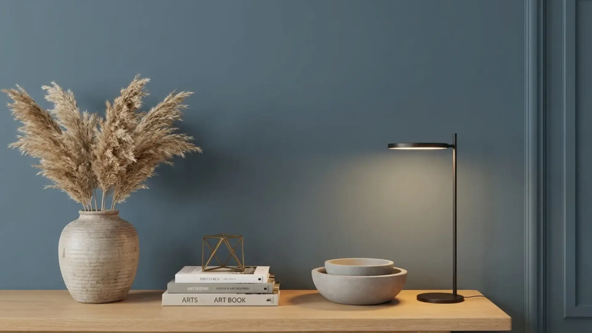
Color Name Sherwin-Williams Smoky Blue SW 7604 Brand Sherwin-Williams LRV 15, dark (reflects very little light) Undertones Cool gray, with subtle teal in bright south-facing light Best For Accent walls, kitchen cabinets, bedrooms with natural light, south- and east-facing rooms Avoid In Small, north-facing rooms with no natural light; spaces that already feel dark or enclosed What Sherwin-Williams Smoky Blue SW 7604 Actually Looks Like in a Real Room Sherwin-Williams Smoky Blue SW 7604 is a deep blue-gray that reads muted and sophisticated — not bold, not cold, and nowhere near a true navy. The gray undertones are what give it that distinctive smoky character: they pull it back from the edge of being too sharp or too saturated, making it livable in a way that a pure blue never quite is. If you’ve been staring at the chip in the store and wondering whether it’s too much, the honest answer is: it depends entirely on your room’s light, not on the color itself. I’ve used this color in a handful of client projects over the years, accent walls, kitchen cabinetry, built-in shelving, and the one thing I tell everyone before they commit is that LRV 15 means it’s working against the light, not with it. It absorbs most of what hits it. In the right room, that creates exactly the depth and calm you’re looking for. In the wrong room, it can feel like the walls closed in overnight. Here’s what you need to know before you open that can. Smoky Blue SW 7604 Undertones Explained The primary undertone is gray — a cool, slate-leaning gray that softens the blue rather than neutralizing it. This is what separates Smoky Blue from a standard dark blue: the gray is always present, doing the work of keeping the color from feeling aggressive or jarring against white trim. What surprises some people is the secondary note that surfaces in certain light conditions: a faint teal or green hint that shows up in south-facing rooms with strong midday sun. It’s subtle, but it’s there. If your room gets a lot of direct light, test the sample at noon before you decide. How those undertones behave is almost entirely dictated by which direction your windows face: North-facing rooms: The gray undertones become dominant. The color reads cooler and heavier, closer to a blue-gray slate. You’ll feel the LRV more strongly here — rooms that already lack warmth can start to feel dim. South-facing rooms: This is where Smoky Blue performs best. The warmth in the light enriches the blue and brings out a hint of depth and richness that makes the color feel intentional rather than heavy. East-facing rooms: Morning light is soft and diffused, which keeps the color calm and balanced throughout the early hours. By afternoon, it settles to a quieter, more neutral blue-gray. West-facing rooms: Late afternoon sun shifts the color warmer and more atmospheric — the most dramatic version of this paint, in a good way. Before committing to any of these applications, test large peel-and-stick samples on multiple walls and check them at 7am, noon, and 7 pm. The color shifts more than you’d expect. Color Specs: RGB 89 / 110 / 121 | HEX #596E79 | LRV 15 How Light Affects Sherwin-Williams Smoky Blue An LRV of 15 puts Smoky Blue near the darker end of the usable color spectrum, not a near-black, but not forgiving either. In rooms with ample natural light, especially south-facing spaces, it reads rich and grounded. In rooms without it, that same depth can tip into something that feels oppressive by 4 pm. The finish you choose also changes how the color reads. Higher-sheen finishes reflect more light back into the room, which makes the color appear marginally brighter and slightly more saturated. Flat and matte finishes absorb even more light, delivering the softest, most velvety version of the color, but giving up some of that reflected depth. For most wall applications in rooms with decent natural light, eggshell is the right call: a little durability, a little sheen, without killing the color’s quieter qualities. Choosing the Right Finish for Smoky Blue The finish decision for SW 7604 isn’t complicated, but it matters more than it does with lighter colors because you’re starting from a lower LRV baseline. Matte or flat: Best on walls in low-traffic bedrooms or dining rooms where you want maximum softness. Hides surface imperfections well, but not cleanable. Eggshell: The standard for living rooms, hallways, and bedrooms. A practical balance of durability and a subtle sheen that doesn’t fight the color. Satin: Ideal for kitchens, bathrooms, and high-traffic areas. Easier to wipe down. Adds a slight luminosity that works especially well on cabinetry. Semi-gloss: Reserve this for trim, doors, and cabinet faces. It creates a crisp, polished contrast when the walls are matte or eggshell. If you’re using Smoky Blue on kitchen cabinets — which is one of its strongest applications — go satin or semi-gloss. The sheen holds up to daily cleaning and keeps the color from going flat under cabinet lighting. Where to Use Sherwin-Williams Smoky Blue SW 7604 Because of its muted gray undertones, Smoky Blue is more versatile than its depth suggests. It works across several applications, though each one has conditions worth knowing before you commit. 1. Kitchen Cabinets This is where I’ve seen Smoky Blue do its best work. On lower cabinets paired with white or cream uppers, the color creates that high-low contrast that feels intentional and modern without being trendy. Brushed gold or unlacquered brass hardware reads exceptionally well against it; the warm metal pulls out the blue’s depth and prevents the whole thing from feeling cold. White quartz or marble countertops complete the pairing without competing. If you’re painting a full kitchen in Smoky Blue, all uppers and lowers, make sure you have strong under-cabinet lighting. LRV 15 will make the interior of those cabinets very dark. 2. Bedrooms In bedrooms, the gray undertones carry the emotional weight; this color genuinely reads calm and restful rather than moody or dramatic, provided the room has some natural light. I usually suggest it first as an accent wall behind the bed rather than all four walls, which lets you test the depth in your specific light conditions before committing to a full room. Pair it with linen or cream bedding, warm wood furniture, and layered lighting at the nightstand level. The warmth of wood against the cool blue is the pairing that makes this work; without it, the room can start to feel clinical. 3. Living Rooms Smoky Blue on a living room accent wall, particularly behind a sofa or a fireplace, is one of its most effective uses. The color adds depth and character to a space without demanding that the entire room be restyled around it. Built-in shelving in Smoky Blue is another strong option: it makes the objects on the shelves pop and creates a backdrop that feels considered rather than accidental. Light sofas in cream, beige, or warm gray balance the cool tone. Add a textured rug and brass or aged-bronze metal accents, and the room finds its equilibrium quickly. 4. Exterior On exterior siding, Smoky Blue reads stately and grounded; it has more visual weight than coastal blues but less severity than navy. White trim sharpens it considerably; black shutters push it into a more contemporary look. It works particularly well with homes that have natural stone or brick elements, where the gray undertone ties into the existing material palette. For front doors, it makes a quieter but more distinctive statement than the trendy blacks and navies that have become common. Make sure you’re using SW’s exterior formula; the color can read slightly lighter outdoors under open sky than it does on an interior chip. Sherwin-Williams Smoky Blue Coordinating Colors Because Smoky Blue has cool gray undertones, it pairs best with colors that bring warmth or softness — not more cool tones. The risk is creating a palette that reads entirely cold, which is what happens when you pair it with crisp whites that lean cool or with other blue-grays. The coordinating colors below are chosen specifically to prevent that. Coordinating Color Undertone Why It Works with Smoky Blue Best Use Alabaster SW 7008 Warm creamy white Softens Smoky Blue’s cool undertones without harsh contrast. The classic pairing. Trim, ceilings, upper cabinets Extra White SW 7006 Crisp clean white Creates high contrast that makes Smoky Blue pop. Best in rooms with strong natural light. Trim, doors, window frames Urbane Bronze SW 7048 Deep warm charcoal Adds depth for a modern, moody look. Grounds the palette with earthy warmth. Doors, accent trim, exteriors Sea Salt SW 6204 Soft aqua-gray Shares Smoky Blue’s cool family but is significantly lighter. Creates a coastal palette without a color clash. Adjacent walls, bathrooms Shoji White SW 7042 Warm greige-white Neutral enough to work in any adjacent space. Blends smoothly with Smoky Blue’s muted base. Bedrooms, large wall areas The consistent thread across all of these pairings is warmth. Alabaster and Shoji White bring warm undertones that counterbalance the cool gray in Smoky Blue, while Urbane Bronze anchors the palette with earthiness. Avoid pairing Smoky Blue with cool whites like Chantilly Lace or Bright White, they’ll pull the whole palette cold. Sherwin-Williams Smoky Blue vs. Similar Colors Several blue-grays in the same family can look almost identical on a chip but read very differently on the wall. Here’s how Smoky Blue stacks up against the four comparisons that come up most often. Smoky Blue vs. Naval SW 6244 Naval is a true, saturated navy with very little gray mixed in. It reads bold and declarative in most lighting conditions. Smoky Blue, with its stronger gray undertones, feels calmer and more muted; there’s a smokiness to it that Naval doesn’t have. If you want a statement navy, use Naval. If you want depth that doesn’t dominate the room, Smoky Blue is the better choice. They’re not interchangeable. Smoky Blue vs. Gale Force SW 7605 Gale Force sits directly below Smoky Blue on the same color strip and is the darker of the two. It has more intensity and reads heavier in rooms with limited natural light. Smoky Blue is the more approachable option; it gives you depth without the heaviness that Gale Force can carry in dimmer spaces. Smoky Blue vs. Riverway SW 6222 These two are close siblings, with nearly identical LRVs. The meaningful difference is in which direction the undertone leans: Riverway carries more gray and can read almost entirely gray-blue in bright light, while Smoky Blue holds its blue identity more clearly. If you want something that reads bluer, go with Smoky Blue. If you want the gray to do more of the work, Riverway is the pick. When Not to Use Sherwin-Williams Smoky Blue This is the section most paint reviews skip, and it’s the one most worth reading. Small, north-facing rooms with no natural light: an LRV of 15 in a room that already struggles for light will make the space feel significantly smaller and darker than it actually is. This isn’t a color to use in a windowless powder room or a narrow hallway that faces north. Rooms that already have cool-leaning finishes: If your floors are gray, your countertops are white-gray, and your furniture leans cool, adding a blue-gray wall creates a palette where nothing is warm enough to create contrast. The result feels flat and slightly clinical. If you’re hoping it reads like a lighter blue in real life, what you see on the chip is darker than what you imagine, not lighter. At LRV 15, the wall version will be noticeably deeper than any physical or digital sample suggests. If you’re on the fence, test first, don’t assume it’ll lighten up on the wall. Low-ceilinged spaces without layered lighting: The color visually pulls the ceiling and walls closer together. If your ceiling is already at 8 feet and you have only one overhead fixture, this combination can feel more enclosed than cozy. Design Styles That Work with Smoky Blue SW 7604 The blue-gray balance in Smoky Blue makes it adaptable across a range of design vocabularies. Here’s where it genuinely fits — and what makes each pairing work: Coastal: Paired with crisp whites, natural rattan, wicker, and light linen, Smoky Blue reads fresh and breezy without being clichéd. The gray undertone keeps it from going too bright or too “beach house.” Modern Farmhouse: Against shiplap walls, warm wood beams, and unlacquered brass fixtures, the color adds depth while keeping the warmth that defines the style. The key is making sure the warm elements outweigh the cool ones in the room. Contemporary: Clean lines and minimal décor let Smoky Blue function as a refined neutral backdrop. It adds enough color to feel considered without being decorative in a way that dates the space. Traditional: With brass hardware, rich wood furniture, and classic white trim, this color reads timeless — closer to a classic library or study blue than anything trend-dependent. Moody Modern: Matte black fixtures, dark-toned furniture, and Smoky Blue walls or cabinetry create a palette that reads bold but controlled. The gray prevents it from tipping into maximalism. Frequently Asked Questions Does Smoky Blue work in small spaces? Yes, but use it with balance. In a small space, Smoky Blue can feel cozy and rich instead of cramped when paired with lighter trim, mirrors, and simple decor. Keep large furniture pieces light or warm-toned so the room still feels open and comfortable. Can I paint the ceiling Smoky Blue? Yes, Smoky Blue can look beautiful on a ceiling if you want a cozy, wrapped-in feel. It works best in bedrooms, offices, or powder rooms. For a softer look, keep the walls light. For drama, use it on both walls and the ceiling. What curtain colors go with Smoky Blue? Cream, oatmeal, warm white, soft gray, and muted beige curtains pair well with Smoky Blue. These shades keep the room calm without fighting the wall color. If you want more contrast, try rust, camel, or patterned curtains with small blue-gray details. Is Smoky Blue good for resale? Smoky Blue can be good for resale when used thoughtfully. It feels classic and refined, especially on cabinets, built-ins, or a single accent wall. For broad buyer appeal, pair it with neutral walls, clean trim, and simple finishes instead of heavy, dark decor. Should I use primer with Smoky Blue? Primer is a smart choice, especially if you are painting over bright, dark, glossy, or uneven walls. It helps Smoky Blue look smoother and more accurate. A tinted primer may also reduce the number of coats needed for a rich, even finish. What flooring looks best with Smoky Blue? Smoky Blue pairs well with oak, walnut, warm-toned wood, light tile, and neutral carpet. Warm floors help soften the cool blue-gray tone. Very cool gray flooring can still work, but the space may need brass, cream, or wood accents for balance. Can Smoky Blue work with black accents? Yes, black accents can make Smoky Blue feel sharp and modern. Use black in small amounts through lighting, picture frames, cabinet pulls, or furniture legs. Too much black can make the room feel heavy, so balance it with warm whites and natural textures. How many coats does Smoky Blue need? Most projects need two coats of Smoky Blue for full, even coverage. If the surface is very light, very dark, glossy, or patched, primer may be needed first. Always let each coat dry properly so the final color looks smooth and consistent. Final Verdict Here’s what I’d tell you if you were standing at the paint counter right now: Sherwin-Williams Smoky Blue is an excellent color in the right room, specifically, a room with meaningful natural light, warm wood or cream elements to balance its cool undertones, and a clear application (accent wall, cabinet color, or all four walls in a well-lit south-facing space). If your room ticks those boxes, the LRV 15 depth will read exactly the way you’re hoping: rich, grounded, and sophisticated. If it doesn’t, particularly if you’re dealing with a north-facing or low-light space, order a Samplize sample and check it at multiple times of day before you open a can. That one step has saved more clients from expensive repaints than any other advice I give. Sources: Sherwin-Williams official color page, SW 7604 Smoky Blue. LRV value verified against official Sherwin-Williams product specifications.
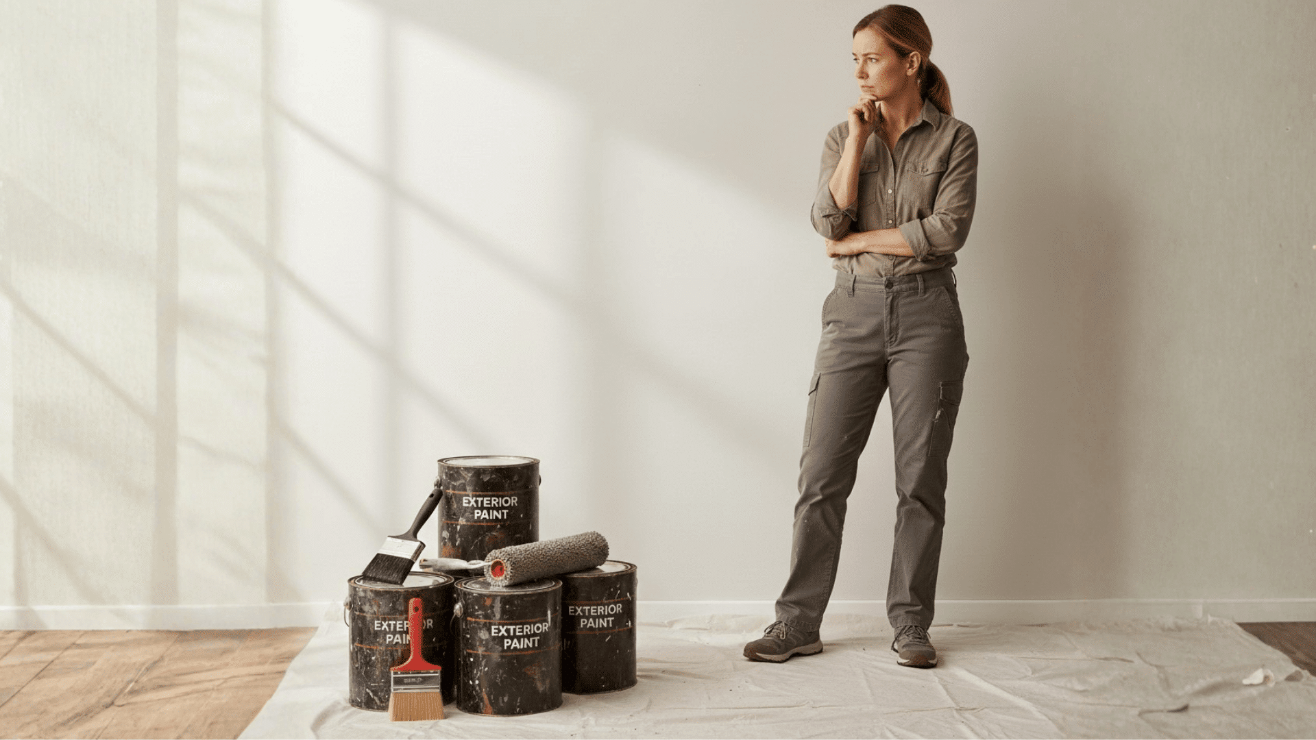
Staring at a leftover can in your garage and thinking about using it inside? If you’re asking, “can I use exterior paint inside my home”? I’ve had that same thought when trying to save time and money on a project. The short answer is yes, but it’s not always the smartest move. I’ll walk you through the real differences between interior and exterior paint, when it might make sense to use it indoors, and the risks you need to consider first. You’ll also learn about fumes, durability, cost, and safer alternatives. By the end, you’ll know exactly what works for your space and what’s better left outside. Can You Use Exterior Paint Indoors? Yes, you can use exterior paint indoors, but you need to be cautious. Exterior paint is designed to handle rain, sunlight, and temperature changes, which makes it tougher than most interior paints. In certain situations, such as damp basements, garages, or utility rooms, it may be acceptable because of its added durability and mildew resistance. However, it’s usually not recommended for main living areas. Exterior paint often contains higher levels of VOCs and stronger chemicals that release heavy fumes indoors. It also takes longer to dry and cure properly. For bedrooms, living rooms, and other comfort-focused spaces, interior paint is generally the safer and more practical choice. Benefits and Drawbacks of Using Exterior Paint Indoors Before deciding, it helps to clearly compare the advantages and disadvantages of using exterior paint inside your home. Benefits Drawbacks Extra durability for wear and tear Strong fumes and higher VOC levels Good scratch resistance in busy areas The off-gassing period may affect air quality Strong moisture resistance for bathrooms, basements, and laundry rooms Longer drying and curing time UV protection for rooms with heavy sunlight Higher cost per gallon Performs well in utility or non-living spaces Thicker texture, less refined interior finish Understanding both sides helps you decide if the added durability is worth the trade-offs for your specific indoor space. What’s the Difference Between Exterior and Interior Paint? Exterior and interior paints are formulated for completely different environments, affecting their ingredients, durability, finish, and overall performance inside your home. 1. Formula and Ingredients Exterior paint contains higher levels of VOCs and stronger chemical additives because it must survive sun exposure, rain, humidity, and temperature swings. It often includes mildew-resistant agents to prevent mold growth in damp outdoor conditions. Flexible resins are added so the paint can expand and contract without cracking. Interior paint, however, focuses on lower odor, smoother application, and safer air quality for enclosed living spaces. 2. Durability Differences Exterior paint is engineered to handle harsh weather, UV rays, and constant environmental stress. It resists fading, cracking, and moisture damage outdoors. Interior paint, while still durable, is formulated differently. It’s built to withstand scrubbing, everyday scuffs, and household cleaning rather than extreme climate exposure. For indoor walls that need frequent washing, interior paint often performs better over time. 3. Finish and Texture Exterior paint is typically thicker and heavier because it needs to form a protective barrier against the weather. This thicker consistency can leave a slightly rougher texture indoors. Interior paint is smoother and designed to create clean, even finishes across drywall. Sheen also behaves differently indoors; exterior paint may not produce the same refined look or consistent light reflection as interior formulas. Is Exterior Paint Safe to Use Indoors? Exterior paint is formulated for outdoor conditions, so it may contain chemicals that are not ideal for indoor spaces. The fumes from exterior paint can be much stronger than those from interior paint, posing health risks if the area is not properly ventilated. These paints often contain higher levels of volatile organic compounds (VOCs), which can irritate your eyes, throat, and lungs. Additionally, exterior paint generally requires longer drying times, which could be inconvenient indoors. While exterior paint offers durability and moisture resistance, it’s important to consider the safety risks. If you choose to use it indoors, make sure to work in a well-ventilated area, use proper protective gear, and allow extra drying time for best results. Better Alternatives to Exterior Paint for Indoor Use If durability or moisture resistance is your concern, several interior paint options perform better indoors, with fewer strong fumes or safety risks. Option Why It’s Better Indoors Best For High-Durability Interior Paint Designed for scrubbing and daily wear Hallways, kids’ rooms, living areas Bathroom & Kitchen-Specific Paint Mold- and moisture-resistant formula Bathrooms, kitchens, laundry rooms Low-VOC or Zero-VOC Paint Safer indoor air quality with minimal fumes Bedrooms, nurseries, enclosed spaces These alternatives provide strength and safety, making them smarter choices for comfortable, long-term indoor living. When Does It Make Sense to Use Exterior Paint Indoors? In some limited situations, exterior paint can make practical sense indoors, especially in spaces where durability matters more than comfort. Garages Utility rooms Workshops Concrete basement walls These areas often face moisture, temperature changes, and heavy wear. In such cases, exterior paint’s toughness and mildew resistance can be useful. Still, proper ventilation and safety precautions are essential before using it inside. Cost Comparison: Exterior vs. Interior Paint Indoors Understanding the cost difference helps you decide which paint type fits your budget and project needs. Paint Type Average Price per Gallon Coverage Typical Use Interior Paint $25 – $60 350–400 sq ft Walls, ceilings, and indoor trim Exterior Paint $40 – $80 300–400 sq ft Outdoor siding, fences, exterior trim Exterior paint usually costs more because it contains additives designed to resist weather, moisture, and UV exposure outdoors. For indoor projects, interior paint is usually more affordable and designed specifically for indoor air quality and surface durability. Conclusion Now you have a clear understanding of when exterior paint can work indoors and when it’s better to avoid it. I’ve covered durability, moisture resistance, fumes, drying time, cost, and safer alternatives designed specifically for indoor spaces. While exterior paint may seem convenient, it isn’t always the healthiest or most practical choice for your home. You deserve a finish that looks good, performs well, and keeps your indoor air safe. Before you open that leftover can, take a moment to think about ventilation, room use, and long-term comfort. If you’ve tried using exterior paint indoors, share what happened. Your experience could help someone else make a smarter decision.
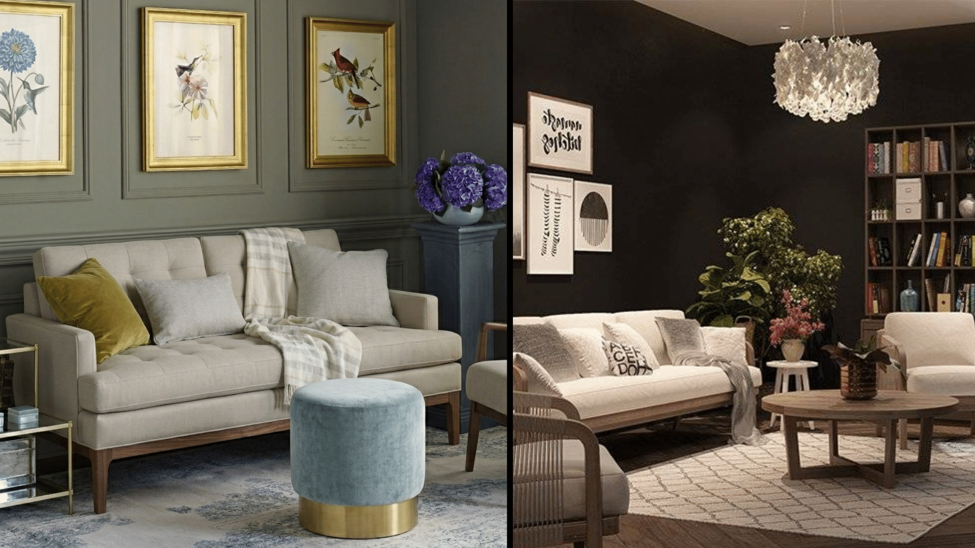
When people start comparing paint finishes, one question comes up again and again: matte vs. flat paint. As a color consultant, I help clients choose paint colors and finishes that work for their homes. Over the years, I’ve seen how small differences in sheen can affect both the look of a room and how well the paint holds up. Flat and matte finishes both create that soft, low-sheen look many homeowners like. At first glance, they can seem almost identical. But once you understand how they perform on real walls, the differences start to matter. Let’s break it down in a simple way so you can choose the right finish with confidence. Flat Paint: What You Should Know Before Choosing It Flat paint creates a soft, non-reflective surface that works especially well when you want walls to look smooth and subtle. With almost no sheen, it absorbs light instead of bouncing it back, which helps hide dents, patches, and uneven texture. This makes it a practical choice for ceilings and low-traffic rooms where durability is less of a concern. However, the same matte finish that hides flaws can also make cleaning difficult. Scrubbing often leaves shiny spots or discoloration. It is generally more affordable than higher-sheen options, but it does not hold up well in busy areas. Choosing flat paint works best when appearance matters more than washability or heavy wear resistance. Matte Paint: What You Should Know Before Choosing It Matte paint offers a balance between appearance and durability, making it a practical option for many interior spaces. It has a low sheen that keeps walls looking soft and modern, while still reflecting a small amount of light for added depth. Unlike flat paint, matte can handle gentle cleaning without leaving shiny marks, which makes it more suitable for bedrooms, living rooms, and other moderate-traffic areas. It still does a good job of hiding minor imperfections, though not quite as well as flat finishes. Matte paint typically costs a bit more per gallon, and durability can vary by brand. Overall, it provides a refined look with improved everyday performance compared to flat paint. Best Use Cases for Flat vs. Matte Paint Choosing between flat and matte isn’t about which looks better; it’s about matching the paint to how the space gets used. Here’s where each finish shines and where it struggles. 1. Ceilings Matte paint can work on ceilings in very modern homes where you want a touch more depth, but it costs more with no real benefits. Lighting matters too; flat absorbs light better in bright rooms. Professional painters almost always use flat paint on ceilings because it hides imperfections very well. There’s no reason to worry about cleaning up there. The lack of sheen also prevents distracting light reflections from windows or fixtures. 2. Low-Traffic Areas Matte paint also works here if you prefer slightly easier cleaning, but flat is usually the budget-friendly winner. Both finishes let your wall color shine without distracting from the shine. Flat paint works beautifully in adult bedrooms, formal dining rooms, and guest rooms because these spaces don’t get touched much. You won’t deal with scuffs or dirty handprints, so durability isn’t a concern. The smooth, stylish look makes rooms feel calm and sophisticated. 3. High-Traffic Areas Matte paint is the smarter choice for hallways, busy living rooms, and dining spaces where people constantly pass through. It handles light bumps, occasional cleaning, and everyday wear much better than a flat. Flat paint will show scuffs and marks that are hard to remove in these areas. Matte still gives you that low-sheen look, but with the toughness you need. It’s worth spending a bit extra to avoid repainting within a year. 4. Homes With Kids or Pets Matte paint usually performs better because it survives sticky fingers, paw prints, and the occasional crayon mark. Premium matte paints with stain-resistant formulas are absolutely worth the investment; they wipe clean without burnishing or damage. Flat paint will frustrate you quickly in active households. While matte costs more upfront, it saves you time, stress, and repainting costs down the road. Choose a washable matte for peace of mind. Matte vs Flat Paint: Side-by-Side Comparison Sometimes you need to see the differences laid out clearly to make the right call. Here’s everything that matters when choosing between matte and flat: Feature Flat Paint Matte Paint Sheen Percentage 0–5% 3–10% Light Reflection Absorbs almost all light Reflects a small amount of light Durability Low. Marks easily. Moderate. Handles daily wear better Cleanability Hard to clean Can be gently wiped Touch-Up Blends very well Good but slightly visible Cost Per Gallon $25–$45 $35–$60 Best Use Ceilings, low-traffic rooms Bedrooms, living rooms Longevity Shorter lifespan Lasts longer Use this chart as your quick-reference guide: match your space’s traffic level and cleaning needs to the right finish. Common Mistakes to Avoid Avoiding these mistakes isn’t just about aesthetics: it’s about protecting your investment and ensuring a finish that lasts: Using flat paint in high-traffic areas leads to scuffs and stains that are nearly impossible to wipe clean. Applying a matte finish to damaged drywall highlights every imperfection rather than concealing them. Skipping paint samples before committing can result in costly color mismatches once the paint dries. Ignoring sheen levels in specific rooms, such as bathrooms or kitchens, can cause premature peeling and moisture damage. Overlooking primer before painting over dark or damaged walls leads to uneven, patchy final results. Take the time to plan, test, and choose wisely, because the right preparation today saves you from expensive corrections tomorrow. What Do Professional Painters Recommend? In my work as a color consultant, I often speak with professional painters before starting a project. Most contractors give the same advice: use flat paint on ceilings. It hides drywall seams, roller marks, and small imperfections better than other finishes. It also absorbs light, which prevents glare from windows or ceiling fixtures. For walls, many painters I work with now recommend matte paint as the standard interior finish. It keeps the soft, low-sheen look homeowners like while offering better durability for daily living. Over the years, I’ve seen fewer professionals use flat paint on walls because clients want surfaces they can clean. Major brands such as Benjamin Moore and Sherwin-Williams now support this shift with improved matte formulas. Community Discussion: What Will Work For Your Home? Before you make your final decision, it’s worth hearing from people who’ve actually lived with these finishes. I found an incredibly helpful Reddit post where homeowners shared their real experiences with matte versus flat paint, the good, the bad, and for the “I wish I’d known that sooner” moments. Some painters explained that flat usually works best on ceilings because it hides roller marks and uneven drywall. Others said matte can look almost the same, depending on the brand, but may show a slight sheen in certain light. A few warned that not all “matte” labels mean the same thing across companies. Reading through those comments gave me practical insight you won’t see on a paint can. It might do the same for you before you buy. Final Recommendation After years of helping clients choose paint finishes, I’ve learned that the right choice depends on how a room is used. When clients ask about ceilings, I usually recommend flat paint because it hides small drywall flaws and reduces light reflection. For interior walls, I often suggest matte paint since it keeps the soft look people like while holding up better to daily wear. If a room sees regular activity, matte paint is usually the safer option because it handles light cleaning and minor scuffs more easily. Once homeowners understand how each finish performs, the decision becomes much clearer. My advice is simple: match the finish to your lifestyle, and your walls will stay looking fresh for much longer.
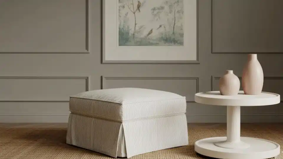
When I first started looking for a rich gray paint that felt warm but still classic, Rockport Gray by Benjamin Moore quickly showed up everywhere. It’s one of those colors that designers keep recommending because it adds depth without feeling too dark or cold. Here, I’ll walk you through everything you need to know about Rockport Gray Benjamin Moore. I’ll explain its undertones, best rooms to use it in, colors that match it, comparisons with other popular grays, and where you can buy it. By the end, you’ll know if this timeless gray is right for your home. Understanding Rockport Gray HC-105 by Benjamin Moore Rockport Gray (HC-105) is a rich, medium-depth gray from the Historic Color Collection, known for adding depth while still feeling warm and inviting. With a Light Reflectance Value (LRV) of about 35, it sits in the mid-tone range, meaning it won’t look too pale or overly dark in most rooms. Designers often call it a warm gray because of its subtle brown and soft violet undertones, which help it feel balanced instead of cold. Rockport Gray works well in many interior spaces, such as living rooms, cabinets, and accent walls, and it can also be used on exteriors when paired with lighter trim for contrast and a classic, classic look. Rockport Gray Undertones Explained If you’re trying to understand how Rockport Gray really looks on the wall, the secret is in its undertones. Here’s a simple breakdown to help you picture it better: Main base color: Medium gray that feels rich but not too dark Warm hint: Soft brown undertone that keeps it from looking cold Subtle extra tone: Very light violet touch that adds depth In bright sunlight, Can look warmer and slightly lighter In low light or cloudy rooms, May appear deeper and a bit cooler South-facing rooms: Usually show its warm, cozy side North-facing rooms: Can make the color look darker and more muted Overall, these subtle undertones make Benjamin Moore Rockport Gray feel balanced, cozy, and easy to use in many rooms. Where Does Rockport Gray Work Best? If you’re wondering where this color really shines, I’ve seen Benjamin Moore Rockport Gray work beautifully in many parts of a home. Here’s a simple room-by-room guide: 1. Living Rooms I love using Benjamin Moore’s Rockport Gray in living rooms because it adds depth while still feeling warm and welcoming. It’s darker than light grays, so the space feels cozy rather than washed out. This color works especially well with white trim, wood floors, and soft neutral furniture. If the room gets good natural light, the gray feels balanced and calm. Add warm lamps and textured fabrics to keep the space comfortable and inviting. 2. Bedrooms Rockport Gray is a great choice for bedrooms if you want a calm, slightly dramatic look without going too dark. I find it helps the room feel peaceful and restful, which is perfect for sleep spaces. Pair it with soft bedding, warm whites, and natural wood tones for a relaxed style. In brighter bedrooms, it feels warm and soothing, while in dim lighting, it creates a cozy, cocoon-like mood that many people really enjoy. 3. Kitchen Cabinets On kitchen cabinets, Rockport Gray can look rich, stylish, and timeless. I often suggest it when someone wants a darker neutral that still feels warm and friendly. It pairs beautifully with white or marble countertops, subway tile backsplashes, and brass or black hardware. Because it’s a mid-to-deep gray, it hides small marks better than lighter colors, too. 4. Exterior Siding Rockport Gray can also look beautiful on home exteriors when you want a classic, slightly bold neutral. I usually recommend pairing it with crisp white trim, stone details, or warm-wood doors to balance it. Because it’s deeper than many exterior grays, it gives the house strong curb appeal and a timeless feel. Always test it outside first, since sunlight can make it appear lighter during the day and much deeper in shade. Where to Buy Rockport Gray by Benjamin Moore If you’re ready to try Rockport Gray, here’s a quick guide to the easiest places to find it and what each option is best for. Where to Buy What You’ll Get Best For Official Benjamin Moore retailers Exact HC-105 color mixing, full paint lines, and finish advice Safest option for final purchase Local independent paint stores Same Benjamin Moore paints, staff guidance, and possible ordering Quick local pickup and expert help Online paint sample shops Small sample pots or peel-and-stick swatches delivered home Testing the color before buying gallons Large home improvement partners (select locations) Limited Benjamin Moore selections depending on the store Checking availability nearby I always suggest testing a sample first so you can be sure the color looks right in your own lighting before buying the full paint. Best Coordinating Colors for Rockport Gray Choosing the right coordinating colors can truly elevate Rockport Gray and help it feel balanced and intentional in your space. The shades you pair with it will influence whether the room feels warm, modern, cozy, or dramatic. 1. Best Whites to Pair With Rockport Gray Rockport Gray looks stunning with soft, warm whites that keep the space bright without creating harsh contrast. Shades like White Dove (OC-17) and Simply White (OC-117) work beautifully for trim and ceilings. If you want a cozy feel, choose a creamy white; for a cleaner, more modern look, go with a brighter neutral white. The right white will prevent the gray from feeling heavy and keep the room fresh and balanced. 2. Accent Colors for Contrast Rockport Gray serves as a sophisticated anchor, effortlessly balancing depth and neutrality. To elevate the space, pair it with Hale Navy (HC-154) or Wrought Iron (2124-10) for a dramatic, high-contrast look on cabinetry or interior doors. For a warmer touch, consider dusty blue, soft sage, or even a muted blush to add personality without overwhelming the space. Brass or matte black hardware also complements its depth. Keep accent tones intentional, so Rockport Gray remains the anchor of the design. 3. Complementary Neutrals For a layered and cohesive look, combine Rockport Gray with greige, taupe, or soft beige tones. Shades like Revere Pewter (HC-172),Edgecomb Gray (HC-173), or a warm putty-neutral blend seamlessly fit into open layouts. These colors allow smooth transitions between rooms while maintaining subtle contrast. Warmer neutrals emphasize Rockport Gray’s inviting side, while cooler grays create a more modern, streamlined aesthetic. Rockport Gray vs. Popular Benjamin MooreGrays If you’re picking a gray paint, it really helps to compare a few popular options side by side. I like doing this because small differences in depth and undertones can totally change how a room feels. Comparison Rockport Gray Other Color Best For Revere Pewter Deeper, richer, and warmer. Adds noticeable depth and feels cozy on walls or cabinetry. Revere Pewter is lighter, softer, and more airy. It keeps spaces bright and works well as a whole-house neutral. Choose Revere Pewter for open, light-filled spaces. Choose Rockport Gray when you want more warmth and presence. Chelsea Gray Balanced mid-tone gray with warmth. Offers depth without feeling overly dark or dramatic. Chelsea Gray is darker and moodier, leaning toward a charcoal look. Makes a bold statement. Use Rockport Gray in everyday living areas. Choose Chelsea Gray for accent walls or dramatic spaces. Kendall Charcoal Lighter and warmer, making it easier to use throughout most homes. Kendall Charcoal is much darker and creates a strong, modern, moody feel. Pick Rockport Gray for kitchens and living rooms. Use Kendall Charcoal in large, bright rooms that can handle deep color. Overall, Rockport Gray sits comfortably in the middle, offering warmth and depth without the heaviness of darker charcoals or the lightness of softer grays. How to Test Rockport Gray the Right Way Before picking Rockport Gray from Benjamin Moore, I always test it in the actual room because paint can look very different on the wall than in photos or stores. First, try the Paint Swatch Method by painting a large square on your wall so you can see the real depth and undertones next to your floors and furniture. If you want a mess-free option, use Peel-and-Stick Samples and move them around the room during the day to compare lighting and décor. Finally, View It at Different Times of Day by checking the color in morning sun, afternoon light, and evening lamps. This simple process helps you avoid surprises and choose the shade with confidence. Final Coat After researching and seeing Rockport Gray in real homes, I’ve found it’s a strong choice if you want a gray that feels warm, elegant, and a little dramatic without going too dark. It works especially well in living spaces, cabinets, and feature walls where you want depth and character. Still, like any paint color, lighting makes a big difference, so I always suggest testing a sample before committing to a full room. If you’re thinking about using Rockport Gray by Benjamin Moore, start by grabbing a sample and checking it in your space during both the day and the night. And if you want, bookmark this post or share it with someone planning a repaint so you can come back to it when choosing your final color.
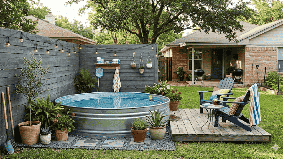
Last summer, I wanted a pool in my backyard, but I didn’t want to spend thousands of dollars. That’s when I came acrossthe diy stock tank pool idea. It’s affordable, simple, and perfect for small spaces. I was surprised at how easy it was to build with the right tools and clear steps. Here, I’ll walk you through everything you need to know. I’ll cover the full materials list, step-by-step setup, pump installation, water maintenance, common mistakes to avoid, helpful installation tips, and a realistic cost breakdown. If you’ve been thinking about adding a small backyard plunge pool without hiring contractors, this will help you build it yourself with confidence. Overview of Stock Tank Pool A DIY stock tank pool is basically a big metal tank that you turn into a small backyard pool. It’s super popular in the USA because it’s cheap, easy to set up, and perfect for small spaces. Unlike traditional above-ground pools, you don’t need a lot of tools, time, or a big budget, and it looks really cute in your yard. Most people use round tanks that are 6, 8, or 10 feet wide, which is big enough for a few friends or kids to splash around. These pools are great for renters, families with small yards, or anyone who wants a quick, fun way to cool off in the summer without spending thousands of dollars on a full-size pool. How to Build a DIY Stock Tank Pool: Step-by-Step Guide Before you start building your DIY stock tank pool, it’s a good idea to gather all the materials you’ll need. I’ve found that having everything ready makes the process easier and faster, and you won’t have to stop mid-project to run to the store. Tools and Materials Needed Pool Pump Pool Plunger Valve Assembly Replacement Part Kit 2¾-Inch Hole Saw Chlorine Dispenser Chlorine Tablets Clear Balance Tablets Pool Test Strips Rechargeable Pool Vacuum Replacement Pool Filters Pool Filter Cartridge Cleaning Tool Total Estimated Cost: $400–$650, depending on what materials you already have and whether you use mulch or stone for landscaping. Step 1: Level the Ground Place the tank on a level surface. Use 4 bags of leveling sand under an 8-foot tank; smaller tanks require less. Leveling ensures the tank is stable and prevents stress on the metal and pump. Take time to level properly, as an uneven base can lead to leaks, tilting, or other problems during use. Step 2: Finish Landscaping Around the Tank Add landscaping around the tank for a clean, safe setup. Mulch works as a temporary solution, while stone is better for drainage and staying clean. Stone also helps prevent dirt and debris from entering the pool. Landscaping creates a neat area around the tank and protects the surrounding ground from water splashes. Step 3: Build the Inlet Nozzle and Outlet Strainer The outlet strainer pulls water into the pump, and the inlet nozzle pushes filtered water back into the tank. The outlet strainer is not included with the pump and must be assembled using parts from the Intex replacement kit. Proper assembly ensures efficient water circulation and prevents damage to the pump or tank. Step 4: Drill the Holes Use a 2¾-inch hole saw to drill two holes, approximately 1 foot from either side of the tank seam and centered vertically. Avoid drilling too low, or the plunger valves won’t fit. After drilling, file the edges smooth to prevent scratches on the fittings. The side placement of the inlet and outlet doesn’t affect performance. Step 5: Install the Fittings Install the inlet nozzle and outlet strainer, placing the rubber gasket on the inside of the tank. Tighten both fittings securely. Silicone or caulk is not required. Checking for leaks after installation ensures the pool is watertight and ready for pump connection. Step 6: Connect the Pump Attach hoses to the plunger valves. Place the black cap only on the outlet strainer, leaving the inlet nozzle open. The black cap controls airflow during startup. Proper connection of hoses and valves ensures the pump circulates water efficiently and prevents air from getting trapped. Step 7: Fill the Pool and Prime the Pump Fill the tank until water is above the inlet and outlet openings. Unlock the plunger valves and open all pump valves. Turn on the pump and bleed trapped air from the hoses and filter. Once water flows smoothly, tighten all connections and fill the tank completely. This primes the pump and prepares the pool for chemical treatment. Step 8: Balance Pool Chemicals Add a 3-inch chlorine tablet and set the dispenser to four tabs to shock the pool. Run the pump for 24 hours. Reduce to one tab after the first day and run the pump 2–4 hours daily. Test water daily with test strips, adjust pH or alkalinity as needed, and replace chlorine tablets when they are depleted to maintain clean, safe water. For a detailed breakdown, refer to the YouTube video below. How to Keep Your DIY Stock Tank Pool Clean Maintaining a stock tank pool is simple when a few key steps are followed. First, run the pump daily to keep the water moving and prevent algae from forming. Use a floating chlorine dispenser to slowly release chlorine, keeping the water safe for swimming. Test the water at least once a week with pool test strips to check pH and alkalinity, and adjust using a pH or alkalinity balancer if needed. Keep the tank edges dry and inspect fittings regularly to prevent rust or leaks. Remove leaves and debris from the water as they appear. During winter or long periods of non-use, it’s best to drain the tank, clean it, and cover it to protect the metal and prevent water buildup. Following these steps ensures the pool stays clean, safe, and ready for use all season. Common Problems and How to Avoid Them Even though a stock tank pool is simple to set up, a few common problems can pop up if not addressed early. Being aware of these issues can save time, money, and frustration. Leaks: Allow the sealant or fittings to fully set, then check connections daily before filling the pool. Rust at the Bottom: Place the tank on stone or leveling sand instead of bare ground, and keep the edges dry to prevent corrosion. Unlevel Base: Make sure the ground is completely level to avoid stress on the tank and pump. Green Water Issues: Run the pump regularly, use chlorine, and test pH/alkalinity to keep water clear. By following these simple tips, the pool will stay safe, clean, and enjoyable throughout the season. Final Thoughts Building my own diy stock tank pool was one of the most satisfying backyard projects I’ve done. It didn’t require special skills, just patience and careful setup. Once everything was installed and the pump was running smoothly, it felt amazing to relax in a pool I built myself. The key is taking your time with leveling, sealing, and choosing the right pump. When you do it right, maintenance becomes simple and stress-free. If you’ve been waiting for the perfect time to upgrade your backyard, this might be it. Start gathering your materials, plan your space, and begin your DIY stock tank pool project this week. And let me know how it turned out in the comments below.
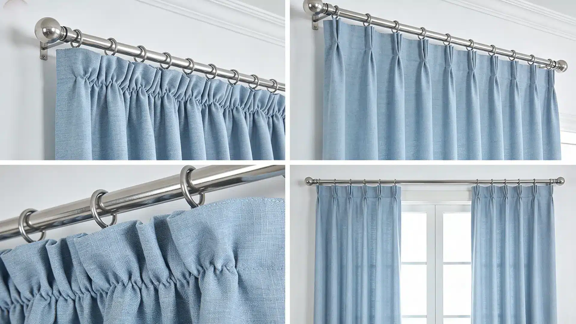
After years of sewing, I can tell you that few things are as rewarding as hanging curtains you made yourself. I still remember my first pair, slightly uneven hems and all, but they were mine, and I was hooked. Over the years, I’ve sewn curtains for nearly every room in my home, experimenting with fabrics, styles, and techniques along the way. What started as a simple cost-saving idea turned into one of my favorite sewing projects. In this blog, I’m sharing everything I’ve learned on how to sew curtains, so you can skip the guesswork and go straight to the good part: creating beautiful, custom curtains that fit your space perfectly. Why Sewing Your Own Curtains Is Easier Than You Think? Many people assume sewing curtains requires advanced sewing skills. In reality, it’s one of the easiest projects you can start with. You don’t need complicated techniques or special training. If you can sew a straight line, you already have the main skill needed to make basic curtain panels. Curtains are also forgiving projects. Small mistakes are rarely noticeable once the panels are hanging on the rod. Another reason this project works well for beginners is the time commitment. Most simple curtain panels can be completed in just a few hours. Once you understand the basic process, you can sew curtains for any room using the same steps. With the right fabric and measurements, you can create panels that fit your windows exactly the way you want. Step-by-Step: How to Sew Basic Curtain Panels Sewing your own curtain panels is easier than it looks, and the results are always worth it. Follow these simple to know how to sew curtains, steps to get started: Tools and Fabric Essentials for Sewing Curtains Before you start sewing, it helps to see your tools and fabric options side by side. I like keeping this simple, so you can plan your budget and shop smart in the following: Item Type Why It Matters Estimated Cost Sewing machine or needle Tool Needed to stitch hems and headers $0–$200+ Polyester thread + 12/14 needle Tool Strong enough for medium to thick fabric $5–$12 Measuring tape + fabric scissors Tool Ensures accurate cuts and clean edges $10–$40 Cotton fabric Fabric Easy to sew and great for simple panels $8–$15/yard Blackout fabric Fabric Blocks light and adds privacy $10–$20/yard Drapery-weight fabric Fabric Heavier fabric for fuller, structured curtains $15–$40/yard These are the main items you’ll need to get started without overcomplicating things. Prices are estimates and may vary by brand, quality, and where you shop. Step 1: Measure Your Window and Prepare the Fabric Start by measuring from the curtain rod to where you want the curtain to end, then add 16 inches for the top fold and bottom hem. For width, measure your window and double it for a fuller look. Before you cut, trim off the selvages; those tightly woven edges can make your curtain hang unevenly. A little prep here saves a lot of trouble later. Step 2: Sew the Side Hems Fold the fabric 1 inch toward the wrong side, then press it flat. Then fold it one more inch and press again. Sew close to the inner fold, about 1/8 inch from the edge. If your fabric is thick, set your stitch length to around 3.0 for smoother sewing. Repeat the same steps on the other side. Pressing as you go keeps everything neat and straight. Step 3: Create the Bottom Hem Measure 3 inches up from the bottom edge and fold the fabric up. Press it flat, then fold up another 3 inches and press again. A deep hem like this adds weight to the curtain, helping it hang straight and look polished. Stitch along the folded edge just like the sides. If the fabric feels too bulky under the presser foot, level it before you stitch. Step 4: Sew the Top Header for Grommets Measure 5 inches down from the top edge and mark it with chalk. Fold the fabric toward the wrong side and press. Then fold down another 5 inches and press again. Stitch close to the folded edge to hold the header in place. This double fold creates a firm, sturdy top, giving your grommets something solid to grip onto without pulling or tearing over time. Step 5: Install the Grommets and Hang the Curtains Mark your grommet spots 2½ inches from the top and sides, spacing each one about 9 inches apart. Use the grommet template to trace each circle, then carefully cut out the holes. Push the bottom piece through from the right side of the fabric, then snap the top piece firmly into place. Once all grommets are set, slide the curtain onto the rod, and you’re done. For the more clear and more brief step, check out the video tutorial by Craftsy. Video Tutorials for Different Curtain Styles Learning curtain styles is so much easier when you can see every step in action that’s exactly what this section is for: a curated playlist of the best tutorials, organized by style and skill level, so you always know where to start. 1. Rod Pocket Curtains Rod pocket curtains are the perfect starting point for anyone new to sewing. You simply sew a folded channel at the top, slide the rod through, and you’re done, no grommets, no hooks, no extra tools needed. Difficulty level is beginner-friendly, and most panels take about 1 to 2 hours to complete. Watch this easy step-by-step tutorial to follow along at your own pace. 2. Back Tab Curtains Back tab curtains have a sleek, polished look because the rod stays completely hidden behind the fabric. The tabs are sewn onto the back of the panel, giving the front a smooth, uninterrupted finish perfect for a modern or minimalist space. It takes a little more precision than a rod pocket, but nothing difficult. 3. Tab Top Curtains Tab top curtains are casual, relaxed, and full of personality. The fabric loops sit right on top of the rod, making them easy to hang and simple to sew. They work beautifully in bedrooms, reading nooks, or any space where you want a laid-back, cozy feel. If you’re past the beginner stage and want something fun to make. 4. Pinch Pleat Curtains Pinch pleat curtains are the most formal and tailored style on this list, ideal for dining rooms, living rooms, or anywhere you want an elegant, structured look. They require more measuring and attention to detail, and pleater tape makes the whole process much easier by doing the spacing work for you. If you’re ready to level up, this tutorial is for you. Common Curtain Sewing Mistakes Every sewist makes mistakes, and what matters most is knowing exactly how to fix them and move forward with confidence: Uneven hems: Always press and pin your hem before sewing, and use a hem gauge for consistent folding every time. Crooked seams: Slow down at the machine, use your seam guide, and never skip the pinning step. Curtain too short: Always add extra length when cutting. You can hem up, but you can never hem down. Not enough fullness: Double your fabric width at minimum, triple it if you want a rich, gathered look. Fabric fraying: Finish all raw edges with a serger, zigzag stitch, or a simple fold-and-press before sewing. Take your time with each step, trust the process, and remember every mistake is just a lesson that makes your next pair of curtains even better. Final Thoughts If you’ve made it this far, you already have everything you need to get started. I have covered it all, from measuring your window and preparing your fabric to sewing clean hems, installing grommets, and choosing the right curtain style for your space. You’ve seen the most common mistakes and learned exactly how to fix them before they slow you down. After years of sewing curtains myself, I can tell you that the first pair you hang will feel like a genuine accomplishment, and it only gets easier from there. Pick your fabric, thread your machine, and trust the process. Your windows are waiting, and your best curtains are the ones you make yourself. Also, comment below on how your very first sewing experience went.
When I first set up my workshop, I was stuck using a wobbly folding table; it was a nightmare. Tools slid around; there was no solid surface to clamp anything, and storage was nonexistent. That’s when I learned how to build a workbench, and it completely transformed my workspace. The best part? You don’t need to be an expert or spend a fortune. I’ll walk you through step by step, covering everything from choosing the right wood, determining the ideal height and depth, to cutting, assembling, and finishing your bench. Let’s build something you’ll use for years What Size Should a Workbench Be? Choosing the right size is important when building a workbench. The standard height for most people is between 34 and 36 inches, which allows you to work comfortably without bending too much. If you are taller or shorter, you can adjust the height to fit you. The ideal depth is usually 24 to 30 inches, giving you enough space to work without overreaching. For length, common options are 4, 6, or 8 feet, depending on your available space. A 6-foot bench works well for most garages and home workshops. Always measure your space before cutting lumber. Step by Step: How to Build a Workbench Follow these six simple steps to build a solid workbench from scratch. Each step is beginner-friendly and requires only basic tools and standard lumber. Materials Required Before you start cutting wood, it’s important to gather the right tools and materials. Having everything ready will make the process smoother and help you avoid mistakes. Item Purpose Circular saw, or miter saw Cut the 2×4 lumber and plywood to the correct size. Drill/driver Drills pilot holes and drives screws during assembly. Measuring tape Ensures accurate measurements for proper fit. Carpenter’s square Helps keep corners at a precise 90-degree angle. 2×4 lumber (8–10 pieces, 8 ft) Used to build the legs and frame of the workbench. ¾-inch plywood (1 sheet, 4×8 ft) Creates the workbench top and lower shelf. 2½-inch wood screws Secure the main frame together. 1¼-inch wood screws Attach the plywood top and shelf. Wood glue Adds extra strength to the joints. This basic setup keeps the cost down while still giving you a strong, durable workbench that can handle most DIY and garage projects. Step1: Cut your lumber Measure twice, cut once, it’s the oldest rule in woodworking, and it’s true. Use a circular saw or chopsaw to trim your legs, top frame, lower frame, and stretchers to the correct lengths. Mark each piece clearly before cutting so nothing gets mixed up. Accurate cuts here make every step that follows much easier and save you from costly mistakes. Step 2: Build the base frame Start by assembling two rectangular end frames using 2x4s and screws. Each frame consists of two legs connected by a short top and bottom rail. These end frames form the sides of your bench and carry most of the weight. Pre-drill your holes before driving screws to prevent the wood from splitting and to get a tighter, cleaner joint every time. Step 3: Connect the frames Stand both end frames upright and join them with long side stretchers running front to back. Space your stretchers evenly near the top and bottom for maximum strength. This step gives your workbench its full length and locks the whole structure square and stable. Use a square to check your corners before fully tightening every screw. Step 4: Add the lower shelf Lay a sheet of plywood or a row of 2×4 decking flat across the bottom frame and screw it down firmly. Make sure the boards sit flush and tight with no gaps. This shelf does two important jobs; it adds rigidity to the entire structure and gives you a useful spot to store tools, bins, or supplies while you work. Step 5: Attach the tabletop Stack two sheets of 3/4″ plywood on top of the frame. Spread an even layer of wood glue between them, then drive screws up through the frame from below to lock everything in place. This double-layer method creates a thick, rock-solid work surface that handles heavy loads, hard impacts, and years of tough use without warping or flexing. Step 6: Sand and finish Run 80-grit sandpaper across the entire tabletop to smooth out any rough patches, splinters, or uneven edges. Wipe away the dust with a damp cloth, then let it dry completely. For a durable finish, apply one or two coats of polyurethane and let each coat dry completely. Prefer a raw look? Leave it unfinished; it still works great right out of the box. That’s all it takes, six steps and a few hours. Full Cut List Here’s every piece you’ll need to cut before assembly. Print this list and check off each piece as you go. Part Dimensions Qty Legs 2×4 @ 34″ 4 Top frame (long side) 2×4 @ 72″ 2 Top frame (short side) 2×4 @ 21″ 2 Bottom frame (long side) 2×4 @ 72″ 2 Bottom frame (short side) 2×4 @ 21″ 2 Side stretchers 2×4 @ 72″ 2 Tabletop (double layer) 3/4″ plywood @ 24″ x 72″ 2 Lower shelf 3/4″ plywood @ 21″ x 72″ 1 Adjust all dimensions to match your preferred bench height and length. Now that your lumber is cut and ready, let’s move on to assembly. Pro Tips for a Stronger Workbench If you want your bench to last for years, a few simple upgrades can make it stronger, safer, and more stable. Double-Layer Top: Adding a second layer of plywood makes the surface thicker and prevents sagging under heavy weight. Cross Bracing: Installing braces between the legs reduces side movement and keeps the bench steady. Wall Anchoring: Securing the bench to wall studs adds extra support and prevents tipping. Lag Bolts: Using lag bolts instead of basic screws improves joint strength and long-term durability. These small changes improve strength and stability, helping your workbench handle bigger projects with confidence. Optional Workbench Upgrades If you want to improve your setup, these simple upgrades can make your workbench more functional, organized, and easier to use every day. Upgrade What It Is Why It Helps Best For Mounted Power Strip A power outlet strip is attached to the side of your workbench. Easy access to power, fewer extension cords, cleaner workspace. Garage workstations and frequent power tool use Drawers or Cabinets Storage units installed under the workbench. Hides clutter, protects tools from dust, and keeps supplies organized. Organized workshops Folding Extension Wing A side panel that folds out for extra space and folds down when not needed. Adds more work area when required and saves space when folded. Small or compact garages These upgrades are optional, but they can transform a basic bench into a more efficient workspace built for long-term use. Beginner Mistakes to Avoid Building a workbench can be straightforward, but beginners often make avoidable errors. Recognizing common pitfalls early ensures a safer, sturdier, and more enjoyable workshop experience. Skipping Squaring Checks: Failing to check corners with a carpenter’s square can leave your frame uneven and unstable. Using Warped Lumber: Choosing bent or twisted boards can weaken the structure and cause it to wobble over time. Incorrect Screw Length: Using screws that are too short or too long can reduce joint strength or damage the wood. Not Leveling the Legs: Ignoring proper leveling can make your workbench rock and feel unsafe during use. Avoiding these mistakes guarantees a workbench that’s solid, level, and durable. With careful attention, your project will be efficient, reliable, and ready for years of use. Final Thoughts Learning how to build a workbench was one of the best things I ever did for my workshop. It gave me a solid foundation, literally, to tackle every project after it with more confidence and less frustration. If you went with a simple 2×4 build or a beefier garage bench with storage, you now have a space that’s truly yours. The whole process taught me that you don’t need fancy tools or expensive materials to make something that works great. All it takes is a good plan, some basic lumber, and a free afternoon. If you’re ready to get started, grab your cut list and head to the lumber yard. Your perfect workbench is closer than you think. Drop your questions in the comments, I’d love to help!
Keeping kids busy without spending a fortune is one of those things that always feels harder than it should, trust me on that. That is where DIY toys you can make at home come in handy. Most of what you need is already sitting in your recycling bin, junk drawer, or craft supply stash. These projects are screen-free, hands-on, and genuinely fun to put together. My go-to approach is grouping ideas by toy type, which is exactly how this list is laid out. The materials are simple, the steps are clear, and the results are worth every bit of effort you put in. Understanding DIY Toys DIY toys are homemade playthings built from everyday household materials rather than store-bought kits. Think cardboard boxes, empty plastic bottles, fabric scraps, paper rolls, and rubber bands, the kind of stuff that piles up in my house and usually ends up in the trash. The appeal, in my experience, is real: these toys cost almost nothing, keep kids away from screens, and build useful skills along the way. The best part, to my mind, is watching a child play with something made from a cereal box with the same excitement as a brand-new purchase. Safety matters here, especially for younger children. Always choose age-appropriate materials, skip small loose parts for toddlers, and use non-toxic supplies when possible. A little planning on your end goes a long way. DIY Toys From Cardboard and Recycled Materials Cardboard boxes, toilet paper rolls, plastic bottles, and coffee cans are some of the most versatile materials in any home. With a little tape and imagination, everyday packaging becomes something a child will actually want to play with. Here are eleven ideas to get started. 1. Cardboard Playhouse Turn a simple cardboard box into a cozy playhouse where your child can imagine, decorate, and create their own little world indoors. Materials: Large cardboard box, box cutter, strong packing tape, washable paint, thick markers, and extra cardboard strips for reinforcement. How to make it: Choose a sturdy box large enough for your child to sit inside comfortably, then tape the bottom flaps shut Mark a doorway on the front panel measuring 40 cm tall and 25 cm wide using a ruler and marker Cut carefully along the marked lines, leaving one side attached so the door can swing open Draw two square windows 15 cm × 15 cm on the side panels and cut them out to let light in Cut cardboard strips 5 cm wide and tape them firmly into each interior corner for added structural strength Let children paint the walls or add stickers, then allow at least 30 minutes drying time before play Important Safety Notes: Place the playhouse on a rug or foam mat for stability, tape sharp edges for safety, and encourage kids to decorate with curtains. 2. Cardboard Car or Truck Your child will love climbing into their own cardboard car and heading off on make-believe road trips around the living room. Materials: Large cardboard box (at least 60 cm × 40 cm × 40 cm), box cutter, strong tape, paper plate (25 cm diameter), dark permanent marker. How to make it: Remove top flaps completely to create an open seating space roughly 40 cm × 40 cm Cut a low doorway opening 30 cm tall × 25 cm wide along one side panel Trace and cut four matching cardboard circles, each 15 cm in diameter, for wheels Tape wheels securely onto both sides of the box at equal height, about 8 cm from the bottom edge Attach a 25 cm paper plate inside the front panel as a steering wheel, centered at the child’s arm height Draw headlights (10 cm circles), door lines, and window details using a dark permanent marker Important Safety Notes: Tape all cut edges before use, place on a flat non-slip surface, and check wheel attachments regularly during play. 3. Mini Cardboard Dollhouse This compact dollhouse gives your child a detailed space to arrange tiny rooms and act out their own small-scale stories. Materials: Thick cardboard base (50 cm × 40 cm), fabric scraps, non-toxic glue, scissors, ruler. How to make it: Cut away one large 50 cm × 40 cm side panel completely to create open front access to the rooms Measure and glue a vertical cardboard strip 40 cm tall by 4 cm wide down the center of the base Add a horizontal strip 50 cm long by 4 cm wide across the middle to divide the space into four rooms Secure all dividers firmly with extra glue along every join so the interior walls stay fully upright Cover each roughly 20 cm × 20 cm wall section with glued decorative scrapbook paper for a finished look Cut small furniture pieces, such as 5 cm tall chairs and 6 cm wide tables, from spare cardboard scraps Important Safety Notes: Use non-toxic glue only, allow full drying time before handling, and check all dividers are firmly secured before play begins. 4. Cardboard Marble Run Watch your child’s eyes light up as marbles zigzag down a track they helped design, learning cause and effect along the way. Materials: Large cardboard sheet (60 cm × 90 cm), paper towel rolls (each 28 cm long), hot glue, marbles (1.5 cm diameter). How to make it: Cut paper towel rolls lengthwise to create open channel pieces, each measuring 28 cm long for the track Arrange channels diagonally at a 30-degree angle across the board to form a zigzag path downward Glue each channel firmly onto the 60 cm × 90 cm cardboard backing with at least 3 cm of glue contact per side Leave 4–5 cm drop gaps between each channel section so the marble can fall through cleanly Test a 1.5 cm marble from the top, adjusting slope angles in 5-degree increments until movement is smooth Add extra glue under any loose sections and allow a full 20 minutes drying time before use Important Safety Notes: Keep marbles away from children under 3, supervise play at all times, and check all glued sections regularly for signs of loosening. 5. Cardboard Parking Garage Give your child’s toy car collection a proper home with a multi-level garage complete with ramps, floors, and numbered parking spots. Materials: Three flat cardboard boxes (each 50 cm × 35 cm × 8 cm), extra cardboard, tape, and marker. How to make it: Stack three flat 50 cm × 35 cm × 8 cm boxes evenly on top of each other to form the garage levels Cut ramp openings 15 cm wide by 12 cm tall on alternating sides to connect the upper and lower floors Insert angled cardboard ramps 30 cm long by 15 cm wide into each opening between levels Tape every ramp securely at both the top and bottom edges to prevent any shifting during active play Draw parking lines with each space 10 cm wide by 18 cm long, and add clear numbers on every floor Test by rolling toy cars up to 8 cm wide through the full structure before allowing children to play Important Safety Notes: Reinforce all ramp joints with extra tape, ensure the structure sits on a flat surface, and check stability before each play session. 6. Cardboard Rocket Ship Take your child on a trip to outer space without leaving the living room, using nothing more than a tall box and some paint. Materials: Tall cardboard box (at least 40 cm × 40 cm × 100 cm), extra cardboard, tape, and paint. How to make it: Stand the tall box upright to form a rocket body standing approximately 100 cm tall on a flat surface Roll a 50 cm × 50 cm cardboard sheet tightly into a cone shape and secure the seam firmly with tape Attach the cone to the top of the box using 10 cm strips of strong tape applied all the way around Cut four triangular fins 25 cm tall by 20 cm wide at the base, and attach them evenly around the bottom Reinforce every seam with 5 cm wide tape strips applied both inside and outside for maximum strength Paint the full rocket in chosen colors and allow at least 60 minutes of complete drying time before play Important Safety Notes: Ensure the cone is firmly attached before play, place it on a stable, flat surface, and thoroughly tape all sharp cut edges. 7. Cardboard Puppet Theater Set up a stage where your child can perform puppet shows for the whole family using a single large cardboard box. Materials: Large cardboard box (60 cm × 40 cm × 80 cm), fabric strips (each 40 cm long × 15 cm wide), tape, paint. How to make it: Stand the box upright at 80 cm tall with the open side facing outward toward the seated audience Cut a wide stage window 40 cm wide by 25 cm tall near the top of the front panel Tape 40 cm fabric strips inside along the top edge of the window opening to serve as stage curtains Cut a performer access doorway 35 cm tall by 25 cm wide at the back of the box for entry Decorate the entire front surface with paint, keeping the 40 cm × 25 cm stage window area completely clear Allow at least 45 minutes of full drying time before setting up for the first puppet performance Important Safety Notes: Tape all cut edges, ensure the box sits flat and stable on the floor, and check curtain attachments are secure before each show. 8. Plastic Bottle Sensory Shaker This calming sensory toy keeps young children engaged as they tilt and shake it to watch glitter swirl slowly inside. Materials: Clear plastic bottle (500 ml), clean water, glitter or small beads (3–5 mm), strong, waterproof glue, a tightly sealing cap, and a funnel. How to make it: Fill the 500 ml clear plastic bottle to the 250 ml mark with clean room-temperature water Add 2 tablespoons of glitter or small 3–5 mm beads carefully into the bottle using a funnel Leave a 3–4 cm air gap at the top of the bottle to allow movement and swirling inside Apply a 1 cm ring of waterproof glue inside the cap threads carefully before sealing it shut Twist the cap firmly until completely closed, and wipe away any glue that squeezes out around the rim Shake gently and check closely for any leaks for at least 10 minutes before handing it to a child Important Safety Notes: Glue the cap permanently shut, never leave a toddler unsupervised with the bottle, and inspect the seal regularly for signs of loosening. 9. Coffee Can Coin Bank Teach your child the value of saving with a personalized coin bank made from a recycled coffee can that you decorate together. Materials: Coffee can with lid (10 cm diameter × 14 cm tall), craft knife, decorative paper (cut to 44 cm × 14 cm to wrap the can), tape. How to make it: Clean and dry the 10 cm diameter by 14 cm tall coffee can thoroughly inside and out before starting Cut a coin slot 3 cm long by 0.5 cm wide, centered precisely in the middle of the plastic lid Smooth all rough edges around the slot by folding tape neatly over the entire cut opening Wrap the outer surface of the can with a 44 cm × 14 cm sheet of decorative paper for personalizing Secure the decorative paper tightly using clear tape along both the top and bottom edges of the can Snap the lid firmly closed and test the slot with a standard 2.5 cm diameter coin drop Important Safety Notes: Tape all cut edges on the lid slot, ensure the lid snaps fully closed every time, and keep away from children under 3 due to the choking risk from coins. 10. Egg Carton Caterpillar This cheerful caterpillar is made from an egg carton and a handful of craft supplies your child can paint and personalize freely. Materials: Standard 12-egg carton, non-toxic paint, googly eyes (1.5 cm diameter), pipe cleaners (30 cm long), and non-toxic glue. How to make it: Cut a single row of six connected cups from the egg carton, forming a strip roughly 30 cm long Paint each of the six cups a different bright color, then allow at least 30 minutes of full drying time Glue two 1.5 cm googly eyes firmly and flat onto the front cup of the caterpillar strip Poke two small holes 1 cm apart above the eyes using a pencil tip pressed through gently Insert a 30 cm pipe cleaner through both holes and bend each side into an antenna shape, 8 cm tall Draw small 1 cm patterns or dots along each cup segment using a marker for extra decoratio Important Safety Notes: Use non-toxic paint and glue only, allow full drying before handling, and check that googly eyes are firmly attached before giving to young children. 11. Toilet Paper Roll Binoculars Your child can take these homemade binoculars on indoor or outdoor adventures and decorate them however they choose. Materials: Two toilet paper rolls (each 11 cm long × 4 cm diameter), tape, non-toxic paint, yarn (60 cm length). How to make it: Align two 11 cm long toilet paper rolls evenly side by side, with both ends perfectly flush Tape the rolls tightly together along the full 11 cm touching seam using several overlapping strips Paint the outer surfaces of both rolls in chosen colors and allow at least 30 minutes of drying time Punch one small hole 1 cm from the outer edge on each roll for the carrying strap Thread a 60 cm length of yarn through both holes and tie a strong double knot at each end Adjust the yarn loop so the finished binoculars hang comfortably at the child’s chest height Important Safety Notes: Ensure yarn knots are tight and secure, check that paint is fully dry before wear, and use child-safe paint throughout. DIY Sensory and Toddler Toys Toddlers learn through touch, sound, and movement. The toys in this section support fine motor development, sensory processing, and early problem-solving without requiring much in the way of materials or prep time. 12. Hair Gel Sensory Bag This mess-free sensory bag lets your child press and move objects without getting their hands dirty, making it great for quiet, focused play. Materials: Large freezer bag (27 cm × 28 cm), clear hair gel (200 ml), small plastic items (2–5 cm), strong packing tape. How to make it: Open the 27 cm × 28 cm freezer bag and squeeze 200 ml of clear hair gel evenly inside Add 8–10 small plastic items, each 2–5 cm in size, spread evenly throughout the gel layer Press out all excess air from the bag before sealing the zipper completely and firmly shut Tape the full 27 cm zipper edge with a double layer of packing tape to prevent any opening Lay the sealed bag flat on a sturdy table and smooth it to an even 1 cm thickness throughout Tape all four outer edges with 3 cm wide tape strips before handing to a toddler for play Important Safety Notes: Tape all edges thoroughly to prevent gel leaks, supervise toddlers at all times, and check the seal is fully intact before each use. 13. Fabric Scrap Texture Board This simple texture board turns leftover fabric scraps into a rich sensory activity that keeps toddlers engaged through touch and feel. Materials: Thick cardboard base (40 cm × 40 cm), fabric scraps in varied textures, and non-toxic glue. How to make it: Cut a sturdy 40 cm × 40 cm cardboard square from thick cardboard to serve as the base board Select 9–12 fabric scraps with clearly different textures, such as rough, smooth, fluffy, and bumpy Cut every selected fabric piece into equal 10 cm × 10 cm squares to create a neat, uniform grid Spread non-toxic glue evenly across each 10 cm × 10 cm section of the cardboard surface carefully Press each fabric square firmly into its glued section, smoothing out any bubbles or lifted edges Allow the completed board a full 60 minutes of drying time before handing it to a child Important Safety Notes: Use only non-toxic glue, ensure all fabric edges are firmly glued down, and check for loose pieces before each use. 14. Rice Sensory Bin A sensory bin for rice gives your toddler a whole world of scooping, pouring, and digging, with hidden toys to find beneath the surface. Materials: Shallow plastic bin (50 cm × 35 cm × 10 cm deep), 1–2 kg uncooked rice, cups, spoons, small toys (at least 5 cm in size). How to make it: Pour 1–2 kg of uncooked rice evenly into the 50 cm × 35 cm bin to a depth of about 6 cm Bury 5–8 small toys, each at least 5 cm in size, lightly beneath the rice surface for discovering Add 2–3 scoops, cups, and small funnels to encourage scooping, filling, and pouring play Place the bin on a 60 cm × 60 cm mat beneath it to catch any rice that spills over the edges Show your toddler how to scoop and pour rice using the provided cups and funnels to get started Supervise closely throughout every sensory play session to ensure safe and engaged exploration Important Safety Notes: Keep rice bins out of reach of children under 18 months, supervise at all times, and store rice in a sealed container between uses. 15. Water Bead Bottle This sealed bottle filled with water beads makes a visually engaging toy that develops focus and visual tracking without any mess. Materials: Clear plastic bottle (750 ml), water beads (expand to 1–1.5 cm each), clean water, and waterproof glue. How to make it: Soak water beads in clean water for 4–6 hours until they have fully expanded to 1–1.5 cm each Fill the clear 750 ml bottle to the 500 ml mark with fresh, clean water before adding beads Add 20–25 fully expanded beads carefully through the bottle opening using a funnel for control Leave a 5 cm air space at the top of the bottle to allow the beads to move and float freely Apply a 1 cm ring of waterproof glue inside the cap, and seal the bottle tightly and completely Shake gently and inspect the cap seal closely for at least 10 minutes before toddler handling Important Safety Notes: Glue the cap permanently shut, never give to children under three due to bead choking risk, and inspect the seal regularly. 16. Rainbow Capillary Action Paper Towel Experiment This colorful experiment lets your child watch science happen in real time as colors travel up paper towels completely on their own. Materials: Paper towel sheet (full size, approximately 28 cm × 28 cm), washable markers, two clear cups (250 ml each), water. How to make it: Draw thick, 4 cm wide rainbow color stripes across both short ends of the full-size paper towel Fill two 250 ml cups to the 150 ml mark each with clean water before setting them in position Place the two filled cups 20 cm apart from each other on a flat and stable surface Fold the paper towel lengthwise to a 7 cm width and dip one colored end into each cup Ensure only the bottom 3 cm of each colored end is actually touching the water surface Watch the colors travel upward and meet in the center naturally over the next 20–40 minutes Important Safety Notes: Use only washable markers, place cups on a stable surface to avoid spills, and supervise young children around water at all times. 17. Crinkle Paper Toy Babies and toddlers are drawn to the satisfying crinkling sound this toy makes every time they squeeze or grab it during play. Materials: Two cotton fabric squares (20 cm × 20 cm each), one cellophane sheet (18 cm × 18 cm), ribbon pieces (each 10 cm long), needle, thread. How to make it: Cut two 20 cm × 20 cm cotton fabric squares of completely equal size for the outer layers Place an 18 cm × 18 cm cellophane sheet centered precisely between the two fabric layers Insert 4 ribbon loops, each 10 cm folded down to 5 cm, evenly along the edges before sewing Sew around all four edges with a 1 cm seam allowance, leaving a 5 cm opening on one side Turn the fabric carefully right side out through the 5 cm opening, pulling gently to avoid tearing Sew the 5 cm opening fully closed using small 3 mm hand stitches for a neat and secure finish Important Safety Notes: Check all stitching is secure before giving to a baby, ensure ribbon loops cannot be pulled off, and inspect the toy regularly for wear and loose seams. 18. Simple Treasure Basket A treasure basket gives babies a safe, open-ended way to handle different textures, weights, and shapes entirely at their own pace. Materials: Low wide basket (30 cm diameter × 10 cm tall), wooden spoons, fabric pieces, safe household objects (each at least 6 cm). How to make it: Choose a wide, shallow basket no taller than 10 cm with no sharp edges, splinters, or rough spots Gather 8–12 safe household objects, each at least 6 cm in size, with varied textures and weights Place all items loosely inside the 30 cm diameter basket with at least 3 cm spacing between them Remove any object smaller than 6 cm immediately, as it could pose a serious choking hazard Sit baby nearby within arm’s reach and allow completely free, open-ended exploration of the basket Rotate 3–4 objects every week to maintain the baby’s interest and introduce new textures regularly Important Safety Notes: Check every item for choking hazards before placing it in the basket, supervise babies at all times, and inspect all objects regularly for damage or sharp edges. 19. Paper Towel Roll Ball Drop A cardboard box and a few paper towel rolls become a drop-and-chase toy your toddler will return to again and again. Materials: Tall cardboard box (30 cm × 30 cm × 60 cm), paper towel rolls (each 28 cm long), tape, soft foam ball (6 cm diameter). How to make it: Stand the 60 cm tall cardboard box upright and secure it firmly against a wall before starting Cut an entry hole 8 cm × 8 cm near the top front panel, positioned 50 cm up from the floor Tape paper towel rolls diagonally inside at 35-degree angles to form a smooth zigzag path down Leave a 5 cm drop gap between the bottom of one roll and the top of the next roll below Cut an exit hole 8 cm × 8 cm near the bottom front panel, positioned 10 cm up from the floor Test the full path using a 6 cm foam ball, adjusting the roll angles until movement is completely smooth Important Safety Notes: Secure the box firmly against a wall to prevent tipping, tape all cut edges, and use only a soft foam ball during play. 20. Bottle Cap Matching Game This matching game uses recycled bottle caps to help your child practice letter recognition and memory skills at the same time. Materials: 20 matching bottle caps (3–4 cm diameter each), permanent marker. How to make it: Collect 10 pairs of matching bottle caps, with each cap measuring 3–4 cm in diameter Write identical letters inside each matching pair of caps clearly using a permanent marker Shuffle all 20 caps thoroughly and lay them face down in a grid on a flat surface Arrange the caps in a 4 × 5 grid pattern with 2 cm of even spacing between each cap Flip two caps per turn and look for a matching letter pair before turning the unmatched caps back over Keep all matched pairs set aside and continue playing until all 10 pairs have been found Important Safety Notes: Check all caps for sharp edges before play, keep small caps away from children under three, and store in a sealed container between sessions. 21. Shape Sorting Box This color-coded shape sorter helps your child match shapes and solve a simple, hands-on problem independently. Materials: Sturdy cardboard box (25 cm × 25 cm × 15 cm), extra cardboard, and non-toxic paint. How to make it: Cut five shapes into the 25 cm × 25 cm box lid: a 6 cm circle, a 6 cm square, a 7 cm base triangle, an 8 cm × 4 cm rectangle, and a 7 cm wide star Trace each matching shape onto spare cardboard and cut every piece out carefully along the outline Paint each shape and its corresponding hole the exact same color using non-toxic paint throughout Allow all painted pieces and the box lid at least 45 minutes of full drying time before use Demonstrate posting each shape through its correct 6–8 cm opening slowly and clearly for the child Reset all pieces and repeat the activity as your child builds confidence, matching each shape correctly Important Safety Notes: Use non-toxic paint, ensure cut shapes have no sharp edges, and check that pieces are too large to be swallowed before giving to young children. 22. DIY Puzzle From Cereal Box Turning an empty cereal box into a puzzle is one of the quickest ways to make a personalized activity your child will want to repeat. Materials: Empty cereal box (front panel approximately 20 cm × 30 cm), scissors, and marker. How to make it: Cut the 20 cm × 30 cm front panel cleanly and completely from the empty cereal box Draw 6–8 irregular puzzle-piece lines across the panel surface using a marker for cutting guides Cut carefully along each drawn line, separating all pieces into sections roughly 6–8 cm wide each Mix all the cut pieces thoroughly before handing them to your child to begin solving the puzzle Store all finished pieces neatly inside the original cereal box after every completed play session Gradually increase the puzzle to 12–15 pieces as your child’s cutting and fitting skills develop Important Safety Notes: Check all cut edges are smooth before play, supervise young children to prevent pieces from being put in their mouths, and store pieces safely to avoid loss. When you offer hands-on sensory play, you naturally build focus, coordination, and confidence. Try one simple setup this week, and you will notice how deeply your toddler engages. DIY STEM and Educational Toys Hands-on learning sticks better than any worksheet. The projects in this section introduce kids to force, balance, time, and motion through play that they actually want to do. No expensive kits needed. 23. Marshmallow Catapult This popsicle-stick catapult turns basic physics into a game your child will want to set up targets for and play over and over. Materials: 10 craft sticks (15 cm long each), rubber bands, plastic spoon (15 cm long), mini marshmallows (1.5 cm diameter). How to make it: Stack 8 craft sticks and secure both ends of the bundle tightly with rubber bands at each end Stand 2 craft sticks upright at one end of the stack and hold them together with a rubber band Slide the 8-stick bundle between the two upright sticks so it sits firmly 3 cm from the top Attach a 15 cm plastic spoon to the top of the upright sticks securely using 2 rubber bands Load a 1.5 cm mini marshmallow into the spoon bowl and press the spoon down 4–5 cm to prime Release the spoon quickly to launch the marshmallow forward a distance of up to 2–3 metres Important Safety Notes: Supervise all launching activity, aim only at soft targets, and keep rubber bands away from young children to prevent snapping injuries. 24. Paper Plate Clock This hands-on clock helps your child read time in a way that sticks far better than any worksheet or screen-based activity. Materials: Paper plate (23 cm diameter), cardboard, brass brad, marker. How to make it: Write numbers 1–12 evenly spaced around the plate edge, with each number standing 2 cm tall for easy reading Cut a long 10 cm minute hand and a shorter 7 cm hour hand from a piece of spare cardboard Color each hand a different shade so children can clearly distinguish between the minute and hour hands Punch a small 3 mm hole through the exact center point of the paper plate before assembly Insert a brass brad through both cardboard hands and the center hole, then secure it flat from behind Practice setting and reading real daily schedule times together each day to reinforce learning naturally Important Safety Notes: Press the brass brad flat on the back to avoid scratching, use child-safe markers, and supervise younger children during the making process. 25. DIY Balance Scale This simple scale helps your child compare weights using everyday household objects, making balance and measurement tangible and easy to grasp. Materials: Two paper cups (9 cm tall each), string (4 × 20 cm lengths), ruler (30 cm), pencil. How to make it: Punch two holes 1 cm from the top rim on opposite sides of each 9 cm paper cup Thread a 20 cm string through each pair of holes to form a sturdy handle loop Attach both cup handles to opposite ends of the 30 cm ruler, each sitting 2 cm from the end Balance the ruler carefully across a pencil positioned at the 15 cm center mark to create the pivot Place small objects like coins, buttons, or pebbles into each cup to compare their relative weights Observe which side dips lower as different objects are added to or removed from each cup Important Safety Notes: Use only lightweight objects, ensure all string knots are secure before use, and supervise children to prevent small objects from being put in their mouths. 26. DIY Magnetic Fishing Game This magnetic fishing game builds counting, color recognition, and patience all at once using nothing more than cardboard and a magnet. Materials: Thick cardboard, paper clips (3 cm each), string (50 cm), small magnet (2 cm), chopstick (25 cm long). How to make it: Cut 10 fish shapes from thick cardboard, each measuring approximately 8 cm long by 5 cm wide Decorate each fish with a number from 1–10 or a distinct bright color using markers for variety Tape a 3 cm paper clip firmly and flat onto the mouth area of every individual fish shape Tie a 50 cm length of string onto the 25 cm chopstick, knotted securely 3 cm from one end Attach a 2 cm magnet firmly to the free dangling end of the string using strong tape Lower the magnet to within 2 cm of each fish and watch the paper clip snap it upward Important Safety Notes: Keep small magnets away from children under five, check paper clip attachments before each game, and supervise play at all times. 27. Balloon Rocket This balloon rocket shoots across a taut string, giving your child a hands-on introduction to thrust and motion through exciting play. Materials: String (3–5 metres long), plastic straw (20 cm), balloon (30 cm when inflated), tape. How to make it: Thread the full 3–5 metre string through the 20 cm plastic straw completely before tying anything Stretch the string tightly between two fixed anchor points set 3–5 metres apart from each other Inflate the balloon to roughly 25–30 cm in length and pinch the open end firmly closed without tying Tape the inflated balloon firmly onto the straw using two separate 5 cm tape strips for security Hold the pinched balloon end completely closed and steady until you are fully ready to launch Release the end and watch the escaping air shoot the balloon across the entire 3–5 metre string Important Safety Notes: Tie string anchor points securely to fixed objects, keep the 3–5 metre launch path clear of faces, and supervise balloon inflation to prevent overinflating. 28. Spoon Catapult This craft stick catapult gives your child more launch power to test different objects and compare how far each one travels. Materials: 12 popsicle sticks (15 cm each), rubber bands, plastic spoon (18 cm). How to make it: Stack 10 popsicle sticks (15 cm each) in a flat bundle and secure both ends tightly with rubber bands Stand 2 sticks upright to form the fulcrum and bind them with a rubber band 3 cm from the top Slide the 10-stick bundle firmly between the two upright sticks, positioning it 4 cm from the top Lay one flat 15 cm stick horizontally across the center of the upright fulcrum to create the arm Attach the 18 cm plastic spoon securely to the longer end of the arm using a rubber band Press the spoon down 5 cm and release quickly to launch small objects up to 3 metres forward Important Safety Notes: Supervise all launching; aim only toward clear, open areas at least 3 metres wide; and keep rubber bands away from young children. 29. Paper Airplane Challenge This activity turns basic paper folding into a full experiment your child can run, measure, and repeat with different designs each time. Materials: 4 sheets of A4 paper (21 cm × 29.7 cm each), a tape measure (at least 5 metres), and small stickers for labeling. How to make it: Fold four clearly different airplane designs from four separate 21 cm × 29.7 cm A4 paper sheets Label each finished plane with a small numbered sticker from 1 through 4 for straightforward tracking Mark a consistent starting line on the floor using tape, positioned at least 2 metres from any wall Throw each plane forward from the same line using a steady and consistent force every single time Measure the exact distance each plane travels from the line using a tape measure of at least 5 metres Record all four distances carefully and compare which airplane design flew the furthest overal Important Safety Notes: Choose an open indoor or outdoor space at least 5 metres long, keep bystanders clear of the flight path, and fold back the sharp nose tips for younger children. 30. Paper Spinner This simple spinner shows your child how colors appear to merge together when they spin fast enough, a satisfying visual result every time. Materials: Stiff cardstock (10 cm × 10 cm), markers, toothpick (6.5 cm long). How to make it: Cut a neat 8 cm diameter hexagon shape from a sheet of stiff 10 cm × 10 cm cardstock Divide the surface into six equal 60-degree sections by drawing lines with a ruler and pencil Color alternating sections in two strongly contrasting colors, each section roughly 3 cm wide Push the 6.5 cm toothpick carefully and straight through the exact center point of the hexagon Leave 1.5 cm of the toothpick protruding below and 3 cm above the cardstock surface for balance Spin it quickly between your fingers and watch the two contrasting colors appear to blend together Important Safety Notes: Supervise toothpick use at all times, trim the sharp tip for children under five, and ensure the toothpick is centered before each spin. 31. Paper Chain Building Game This pattern-based building game challenges your child to follow sequences and think ahead as the chain grows longer with each loop. Materials: Colored paper strips (each 20 cm long × 2.5 cm wide), non-toxic glue. How to make it: Cut colored paper into uniform strips, each measuring exactly 20 cm long by 2.5 cm wide Write a simple repeating color sequence pattern onto a small 5 cm × 5 cm guide card for reference Form the first 20 cm strip into a loop by gluing the two ends together with a 1 cm overlap Thread the next 20 cm strip through the first completed loop before gluing its ends firmly together Continue adding one loop at a time, following the pattern card carefully with each new strip added Measure the finished chain once complete, aiming to reach at least 50 cm in total length Important Safety Notes: Use only non-toxic glue, keep it away from mouths, and ensure all strips are cut with smooth 90-degree edges before handling. 32. DIY Drum From Tin Cans This homemade drum gives your child a real instrument to tap and experiment with, producing different sounds depending on the can size and tension. Materials: Tin can (10 cm diameter × 12 cm tall), balloon (25 cm when inflated), thick rubber band (10 cm diameter), chopsticks (25 cm long each). How to make it: Clean the 10 cm × 12 cm tin can thoroughly and check the entire rim carefully for any sharp edges Cut the balloon neck off cleanly and stretch the remaining rubber piece over the full 10 cm opening Secure the stretched balloon tightly in place using a 10 cm diameter rubber band around the rim Press the surface gently to confirm it feels taut with only about 3–4 mm of flexible give remaining Wrap 2 cm of foam or fabric padding around each end of the two 25 cm chopsticks for softer tapping Tap the drum surface steadily with both padded chopsticks to produce clear and satisfying rhythmic sounds Important Safety Notes: Check the can rim carefully for sharp edges and tape any rough spots, ensure the rubber band holds the balloon firmly, and supervise chopstick use with younger children. These hands-on builds make learning feel active instead of forced or dull. Pick one project, test it together, and you will see how quickly curiosity grows through doing. DIY Pretend Play and Creative Toys Pretend play is how children make sense of the world around them. These projects give kids the props they need to act out stories, try on roles, and create their own games without any expensive accessories. 33. DIY Play Kitchen Food These cardboard food pieces give your child a full set of props for playing restaurant, chef, or grocery store right at home. Materials: Thick cardboard sheet (50 cm × 70 cm), non-toxic paint, dark marker. How to make it: Draw fruit shapes (8 cm wide), vegetables (10 cm tall), and bread slices (10 cm × 8 cm) onto the cardboard sheet Cut each food shape out carefully along its drawn outline using a pair of scissors with smooth edges Paint every piece in realistic food colors using non-toxic paint and allow a full 45 minutes to dry Add fine detail lines like seeds, crusts, and stripes using a dark marker with a 1–2 mm tip Check each piece thoroughly for any sharp or torn cardboard edges before handing them to a child Store all finished food pieces neatly inside a small basket or lidded box between each play session Important Safety Notes: Use only non-toxic paint, allow full drying before play, and check regularly for damaged or torn pieces that may have sharp cardboard edges. 34. Cardboard Cash Register This play cash register sets your child up to run their own pretend shop and practice number recognition through everyday play. Materials: Medium box (25 cm × 20 cm × 15 cm), small box (15 cm × 10 cm × 5 cm), marker, cardboard scraps. How to make it: Close and tape the 25 cm × 20 cm × 15 cm medium box on all sides to form a solid, stable base Attach the smaller 15 cm × 10 cm × 5 cm box on top of the base and secure it firmly with tape Draw a grid of number buttons, each 2 cm × 2 cm, arranged in a 3 × 4 layout across the front panel Cut a 15 cm × 3 cm rectangular slot near the bottom front edge of the box for the cash drawer Slide a shallow 15 cm × 10 cm cardboard tray into the slot opening to serve as the working drawer Add paper money cut to 10 cm × 5 cm and round cardboard coins 3 cm in diameter to complete the setup Important Safety Notes: Tape all box seams firmly, check for sharp cut edges on the 15 cm drawer slot, and keep small coin pieces out of reach of children under 3. 35. Doctor Kit From Household Items This homemade doctor kit gives your child everything needed to set up a pretend clinic and care for toys through role-play. Materials: Cardboard, pipe cleaners (30 cm long), craft stick (15 cm), gauze roll (5 cm wide). How to make it: Cut a round 8 cm diameter cardboard circle to serve as the stethoscope chest piece base Fold a 30 cm pipe cleaner in half and attach it to the chest piece to form the earpiece shape Paint one end of a 15 cm craft stick red to represent a simple pretend thermometer clearly Roll a 30 cm length of 5 cm wide gauze into a neat and soft bandage wrap for pretend injuries Rule five to six lines across 10 cm × 8 cm paper sheets to create a simple pretend prescription pad Place all finished tools together inside a small 20 cm × 15 cm bag or container for easy carrying Important Safety Notes: Fold all pipe cleaner ends flat to avoid scratching; use non-toxic paint on the craft stick; and keep small pieces away from children under 3. 36. DIY Sock Puppet A sock puppet comes together in minutes and gives children a character with a name and voice they will return to long after the first day. Materials: Clean adult sock (25–28 cm long), two googly eyes (2 cm diameter each), yarn (10 × 15 cm strands), and non-toxic glue. How to make it: Slide a clean 25–28 cm adult sock over one hand to check the fit and confirm the mouth position Lightly mark the eye positions with a pencil, placing them 5 cm back from the toe end of the sock Glue two 2 cm googly eyes firmly at the marked positions, sitting just above the knuckle line Cut a 3 cm × 1.5 cm felt tongue piece and attach it securely inside the folded mouth area Glue 10 strands of 15 cm yarn evenly along the top edge of the sock to create the puppet’s hair Allow at least 60 minutes of full drying time before handing the finished puppet to a child for play Important Safety Notes: Use strong, non-toxic glue; check that the googly eyes are firmly set before giving to young children; and ensure the yarn is securely attached, with no loose strands longer than 15 cm. 37. Superhero Masks These cardboard masks let your child step into their favorite character and head off on adventures around the house in full costume. Materials: Thick cardboard (25 cm × 15 cm), non-toxic paint, elastic string (35 cm long). How to make it: Draw a symmetrical mask shape 22 cm wide by 10 cm tall onto the 25 cm × 15 cm cardboard sheet Cut two oval eye holes, each 4 cm wide by 2.5 cm tall, spaced 7 cm apart at the center point Decorate the entire front surface of the mask using non-toxic paint in the child’s chosen colors Allow at least 45 minutes of complete drying time before moving on to any further assembly steps Punch 3 mm holes 1 cm from each outer edge of the finished 22 cm wide mask shape Thread a 35 cm elastic band through both holes and tie firm double knots at each end to secure Important Safety Notes: Ensure eye holes are large enough for clear vision, check that the 35 cm elastic is not too tight around the head, and use non-toxic paint throughout. 38. DIY Tool Belt This fabric tool belt lets your child strap on their cardboard tools and get to work fixing everything in sight with a real sense of purpose. Materials: Fabric strip (70 cm long × 8 cm wide), cardboard, non-toxic paint. How to make it: Cut a 70 cm × 8 cm fabric strip that fits comfortably around the child’s waist with room to tie Attach three small fabric pockets, each 10 cm × 8 cm, evenly spaced along the front of the strip Draw a hammer (20 cm), a wrench (18 cm), and a screwdriver (16 cm) onto thick cardboard sheets Cut each tool shape out carefully, following the drawn outlines as closely and neatly as possible Paint every tool in grey and brown tones using non-toxic paint, then allow 45 minutes to dry fully Tie the belt securely around the child’s waist with a 5 cm overlap at each end for a comfortable fit Important Safety Notes: Check that the belt tie is not too tight around the waist, use non-toxic paint on all cardboard tools, and ensure all pockets are sewn firmly before loading with tools. 39. Homemade Doll Bed This shoebox doll bed gives your child’s favorite toy a proper place to rest, complete with a hand-sewn pillow and a fabric blanket. Materials: Shoebox (30 cm × 15 cm × 10 cm), fabric pieces, cotton stuffing, cardboard (15 cm × 10 cm for headboard). How to make it: Line the interior of the 30 cm × 15 cm × 10 cm shoebox with a fabric sheet cut to fit and glued flat Cut a 15 cm × 10 cm cardboard piece to serve as a simple rectangular headboard for the bed Glue the headboard upright and firmly against the inside of one 15 cm end wall of the shoebox Sew a small pillow from two 10 cm × 8 cm fabric squares stitched together along three sides Fill the pillow lightly with cotton stuffing and stitch the remaining open 8 cm edge fully closed Place the finished pillow and a 20 cm × 15 cm fabric blanket neatly inside the completed bed Important Safety Notes: Use non-toxic glue for lining, ensure the headboard is firmly attached before play, and check all pillow stitching is secure before giving to a child. 40. Paper Fortune Teller This classic folded paper toy gives your child a fun way to play prediction games with friends or family using one square sheet. Materials: Square paper sheet (20 cm × 20 cm), marker. How to make it: Fold all four corners of the 20 cm × 20 cm square sheet inward to meet precisely at the center point Flip the paper over and fold the four new corners inward to the center point once more Fold the resulting 10 cm × 10 cm square in half to create a neat 5 cm × 10 cm rectangle shape Insert both thumbs and both forefingers into the four 5 cm × 5 cm inner pockets to operate it Write numbers 1–8 on the outer triangles and a different color on each of the inner visible triangles Add a short 2–3 word fortune beneath each of the eight inner flaps using a child-safe marker Important Safety Notes: Use child-safe markers only, ensure folds are crisp so the fortune teller holds its shape during use, and replace with a fresh 20 cm × 20 cm sheet when worn. 41. Origami Jumping Frog This origami frog takes one sheet of paper and a few precise folds to produce a toy that actually jumps when pressed from behind. Materials: One rectangular paper sheet (A4, 21 cm × 29.7 cm). How to make it: Fold the 21 cm × 29.7 cm sheet in half lengthwise to create a long 10.5 cm × 29.7 cm strip Fold the top two corners diagonally inward so they meet neatly at the center to form a triangle point Collapse the triangle folds inward to produce a compact 10.5 cm × 10.5 cm layered square shape Fold the bottom rectangular section of approximately 10.5 cm × 9 cm upward to begin forming the body Fold the resulting 5 cm bottom edge firmly back down to create the rear spring for jumping Press the 5 cm rear fold down quickly and release to make the frog leap 10–15 cm forward Important Safety Notes: Use paper with no sharp, torn edges, supervise younger children during folding steps, and replace the frog when it becomes too worn to jump cleanly. 42. Paper Pop It This paper pop-up gives your child a low-cost, reusable fidget activity they can carry anywhere and reset easily with a fresh sheet. Materials: Cardstock sheet (20 cm × 20 cm), marker. How to make it: Draw a 6 × 6 grid of circles, each 2.5 cm in diameter, across the full 20 cm × 20 cm cardstock sheet Leave 0.5 cm of even spacing between each circle as you draw the full grid across the surface Place a small 3 mm dot inside the very center of every individual circle across the entire grid Hand the sheet to the child and invite them to begin crossing out circles one at a time in any order Continue marking off circles until all 36 across the complete 6 × 6 grid have been crossed out Draw or print a fresh 20 cm × 20 cm sheet to reset the activity and start a new round of play Important Safety Notes: Use only non-toxic markers, replace worn sheets to keep cardstock edges smooth, and ensure all corners are trimmed to avoid sharp points before handing the cardstock to a child. 43. Paper Puppet This paper bag puppet sparks immediate creative play and gives your child a full cast of characters to build and perform with the same afternoon. Materials: Standard paper bag (18 cm × 10 cm × 6 cm), yarn (10 × 20 cm strands), non-toxic glue, marker. How to make it: Place the 18 cm × 10 cm paper bag flat with the sealed bottom flap positioned facing upward Draw eyes 2 cm wide, a nose 1 cm tall, and a mouth 4 cm wide onto the 10 cm × 6 cm top flap Glue 10 strands of 20 cm yarn evenly along the top sealed edge of the bag to create the hair Cut two 5 cm × 4 cm paper ear shapes and glue one firmly to each side of the bag Slide one hand inside the bag with your fingers reaching up into the 6 cm top sealed flap Move your fingers upward to open and close the 4 cm mouth flap naturally during your performance Important Safety Notes: Use non-toxic glue and markers, ensure all yarn strands are firmly attached with no loose ends longer than 20 cm, and check the bag opening is wide enough for your child’s hand. When you give children simple props, they create full worlds on their own. Choose one idea here, set it up, and watch stories unfold in ways you never expected. Quick Tips for Making DIY Toys A few simple habits make the building process smoother, safer, and more enjoyable for everyone involved. Keep these in mind before starting any project. Use age-safe, non-toxic materials and avoid small, loose parts for children under three Sand sharp cardboard edges and supervise all cutting, gluing, and hot glue gun steps Start with the simplest project in a category before moving to more complex builds Let kids help design and decorate, it increases how long they actually play with the toy Store finished toys in labeled bins and rotate them weekly to keep interest high Starting with one idea and seeing it through is better than planning ten projects at once and finishing none. Final Thoughts The best thing about these DIY toys you can make at home is that most of what you need is already within reach. A cardboard box, a pair of scissors, some tape, and a little time are enough to make something a child will actually use. From my experience watching kids play, a homemade toy often gets more attention than a store-bought one, partly because they helped make it, and partly because it feels like theirs in a way that bought toys rarely do. Start with one idea this week, something that fits what you already have at home. The process of building together is as valuable as the toy itself. Bookmark this list, come back to it when you need a new project, and keep the craft supplies within reach for when the mood strikes. Drop a comment below and share your ideas too!