


If you’re planning a cabin bathroom renovation or starting from scratch, you want ideas that actually translate to real spaces, not just pretty photos. This guide gives you specific, actionable cabin bathroom ideas organized around the elements that matter most: materials, fixtures, storage, layout, and finishing touches. When I think about a cabin bathroom, I imagine a space that feels warm, calm, and close to nature. A well-designed cabin bathroom is not just about function; it’s about creating a cozy retreat that fits the rustic joy of a log home. I’ve found that small details like natural wood, warm lighting, stone textures, and simple décor can completely change the feel of the space. Even a small cabin bathroom can feel inviting and stylish with the right ideas. Key Elements of a Cozy and Rustic Cabin Bathroom A cabin bathroom should feel warm, simple, and connected to nature. When I picture the perfect cabin bathroom, I think about natural materials, soft lighting, and textures that make the space feel calm and welcoming. Wood walls, stone accents, and earthy colors often play a big role in creating that rustic atmosphere. These elements help the bathroom blend naturally with the surrounding cabin environment. I also like adding small details that make the space feel comfortable and personal. Wooden vanities, vintage fixtures, woven baskets, and soft textiles can bring character while still keeping the design practical. Natural light from windows or warm lighting fixtures can further enhance the cozy feeling. When these features come together, a cabin bathroom becomes more than just a functional room; it becomes a peaceful and relaxing retreat. Balancing Rustic and Refined: A Quick Reference One of the most common pitfalls in cabin bathroom design is leaning too heavily on rustic materials, which can make the space feel dark or heavy. The fix is contrast. Every cabin bathroom I’ve worked on that succeeded had at least one element the lightened the room, whether that was white grout, bright textiles, or a light stone countertop against dark wood paneling. Rustic Element Pair It With Why It Works Dark wood paneling White or light stone counter, bright towels Breaks visual weight, keeps the room from feeling cave-like Rough stone shower walls Simple frameless glass partition Lets stone texture read clearly without closing the space Log or timber ceiling beams Light plaster walls, minimal overhead lighting Draws the eye upward without doubling the visual density Copper or oil-rubbed bronze fixtures Neutral linen textiles, matte surfaces Let’s metal details land as focal points, not clutter Reclaimed wood vanity Stone or ceramic sink, clean-lined mirror Grounds the rustic base with a refined surface Best Cabin Bathroom Ideas to Create a Rustic and Cozy Space The ideas below are organized so that structural decisions (walls, floors, fixtures) come first, followed by storage and finishing details – the order I’d recommend working through them if you’re planning a renovation. 1. Use Natural Wood Walls for a Classic Cabin Look Natural wood walls instantly create the warm and cozy feel most people want in a cabin bathroom. I often see pine, cedar, or reclaimed wood used to bring texture and character into the space. The natural grain of the wood adds depth while keeping the room connected to the outdoors. Wood walls also pair beautifully with stone floors, metal fixtures, or simple décor, helping the bathroom feel authentic, rustic, and welcoming. Space planning note: In bathrooms smaller than 50 square feet, limit wood paneling to one or two walls. Full wood coverage on all four walls in a small space traps light and makes the room feel smaller than it is. Use white or light stone on the remaining walls to compensate. 2. Install a Rustic Wooden Vanity A wooden vanity can become the centerpiece of a cabin bathroom. I like how a solid-wood vanity adds warmth and durability to the space while maintaining the rustic style. Reclaimed wood or distressed finishes work especially well because they add character and history to the design. When paired with a stone or ceramic sink, a rustic vanity creates a balanced look that feels both practical and stylish. Practical tip: Seal reclaimed wood vanities with a water-resistant polyurethane or oil-based finish before installation. Unsealed reclaimed wood in a humid bathroom warps within months. A satin finish keeps the rustic look while protecting the wood long-term. 3. Add Stone Accents for a Natural Feel Stone accents are a great way to add natural texture to a cabin bathroom. I’ve noticed that stone works beautifully on shower walls, backsplashes, or even around a bathtub area. The rugged surface adds depth, making the space feel grounded and organic. Combining stone with wood elements creates a balanced rustic design that feels warm, earthy, and connected to the surrounding landscape. River rock and granite are the most durable choices for wet areas. Sandstone and travertine look beautiful but require more sealing and maintenance in high-moisture environments worth knowing before you commit. 4. Choose a Freestanding Tub for a Relaxing Cabin Vibe A freestanding tub can make a cabin bathroom feel like a relaxing retreat. I love how these tubs create a spa-like atmosphere while keeping the design simple and elegant. Placing the tub near a window or wooden wall can make the space feel even more peaceful. The open design of a freestanding tub also makes the bathroom look larger and adds a touch of rustic luxury. Space planning note: A freestanding tub needs a minimum of 6 inches of clear floor space on each side and 12 inches at the foot for comfortable access and cleaning. In bathrooms under 60 square feet, a freestanding tub often crowds the space more than a drop-in alcove tub with a stone surround. 5. Try a Walk-In Shower with Natural Stone Tiles A walk-in shower with natural stone tiles can add both beauty and practicality to a cabin bathroom. I find that stone tiles add a rugged, earthy texture that complements rustic interiors. They also hold up well in humid environments, making them a durable option. A simple glass partition keeps the space open while allowing the stone textures to stand out as a key design feature. 6. Use Warm Lighting to Create a Cozy Atmosphere Lighting can completely change how a cabin bathroom feels. I prefer warm lighting because it highlights wood textures and creates a calm, inviting mood. Soft wall sconces, rustic lantern-style lights, or vintage fixtures can work beautifully in cabin spaces. Good lighting not only improves visibility but also helps the bathroom feel comfortable and relaxing, especially during quiet evenings in a cabin setting. For fixture materials, wrought iron, aged brass, and distressed wood all stay true to the cabin aesthetic. Aim for bulbs in the 2700K range. That’s the warmth level that makes wood grain glow rather than look flat. Pair task lighting at the vanity mirror with ambient wall sconces to avoid the flat, clinical look of single overhead lighting. 7. Add Reclaimed Wood Shelves for Storage Reclaimed wood shelves are both practical and stylish in a cabin bathroom. I like using them to store towels, candles, or small décor items while keeping the rustic look intact. The aged wood adds character and blends naturally with log walls or wooden vanities. Open shelves also help keep the room from feeling crowded, which is especially helpful in smaller cabin bathrooms. 8. Incorporate Black Metal Fixtures for Contrast Black metal fixtures can add a bold contrast to the warm tones of wood and stone. I often see black faucets, towel bars, and shower hardware used to give cabin bathrooms a modern rustic look. The dark finish stands out against lighter materials and adds a touch of sophistication. This simple design choice can make the bathroom feel more balanced and visually interesting. Matte black tends to read cleaner in rustic settings than polished black, which can look more contemporary. Oil-rubbed bronze is a strong alternative if you want warmth rather than stark contrast. It bridges the gap between the cool edge of black hardware and the warm tones of wood. 9. Add Rustic Wall Art for Cabin Character Rustic wall art can add personality and warmth to a cabin bathroom without taking up extra space. I like using nature-inspired artwork, vintage signs, or wooden wall décor to reflect the outdoor feel of a cabin. Simple framed prints of forests, mountains, or wildlife can enhance the rustic theme. These decorative pieces help make the bathroom feel more inviting while keeping the design consistent with the cozy cabin style. 10. Use Sliding Barn Doors for a Rustic Touch Sliding barn doors are a popular feature in many cabin bathrooms. I find them useful because they save space while adding a strong rustic character. The wooden door panels and metal tracks complement cabin-style interiors. Barn doors also work well in smaller layouts where a traditional swinging door might take up too much room. Space planning note: Barn doors require clear wall space equal to the door’s width on the slide-open side. Before committing, check that the adjacent wall has no switches, outlets, or built-ins that would block travel. Also, confirm your rough opening can support a header for the track hardware. 11. Add a Wooden Framed Mirror A wooden-framed mirror can enhance the rustic charm of a cabin bathroom. I like how a simple wood frame adds warmth while keeping the design natural and understated. The frame can match the vanity or wall panels to create a consistent look. Mirrors also reflect light, making the bathroom feel brighter and more open. In a bathroom with heavy wood walls, a large mirror (36 inches or wider) does more to open the space than a small one. The reflection doubles the visible light and creates a sense of depth that a small vanity mirror simply can’t achieve. 12. Install Open Shelving for a Practical Cabin Style Open shelving works well in cabin bathrooms because it keeps the space simple and functional. I like arranging towels, baskets, and small decorative pieces on wooden shelves for a relaxed, organized look. Open shelves also make everyday items easy to access while showcasing rustic textures like wood or metal brackets. The one downside of open shelving in a bathroom is dust and moisture. Keep open shelves for items you use regularly (towels, a few candles, a plant), and use closed storage for toiletries and products that don’t need to be on display. 13. Choose Earth-Tone Color Palettes Earth-tone colors help create a calm and natural atmosphere in a cabin bathroom. Shades like warm brown, soft beige, forest green, and muted gray work beautifully with wood and stone elements. I find that these colors make the space feel grounded and peaceful. They also allow natural materials and textures to stand out without overwhelming the design. If your cabin has dark log walls, lean toward lighter earth tones, warm whites, creamy beige, or soft sage, to prevent the room from going too dim. Darker tones like espresso and charcoal work well in cabins with generous natural light or large windows. 14. Add Plants for a Fresh Natural Look Plants can bring life and freshness to a cabin bathroom. I enjoy adding small potted plants or hanging greenery to make the space feel more connected to nature. Plants soften the rustic textures of wood and stone, enhancing the overall atmosphere. Even a simple plant on a shelf or windowsill can make the bathroom feel brighter and more inviting. Choose plants that genuinely tolerate low light and humidity rather than ones that look right aesthetically. Pothos, ferns, and snake plants all perform well in bathrooms. A beautiful plant that’s dead in two months does nothing for the room. 15. Use Pebble Stone Shower Floors Pebble stone shower floors can create a unique, natural look in a cabin bathroom. I like how the small stones add texture and a spa-like feeling underfoot. The uneven surface also helps with grip, making it a practical choice for wet areas. Combined with wood or stone walls, pebble flooring enhances the rustic, outdoor-inspired style. Pebble floors do require more grout than standard tile, which means more cleaning surface area. Use an epoxy grout in a tone close to the pebble color to minimize visual maintenance and reduce the chance of discoloration over time. 16. Create a Small Cabin Bathroom Layout Many cabins have limited space, so a smart layout is important. I focus on compact fixtures, simple storage solutions, and open designs to make the bathroom feel larger. Wall-mounted sinks, corner showers, and floating shelves can help save space. With thoughtful planning, even a small cabin bathroom can feel comfortable, organized, and stylish. Space planning specifics: In bathrooms under 40 square feet, a corner shower (minimum 32″×32″, preferred 36″×36″) frees up the center of the room for a freestanding vanity. A wall-hung toilet adds 6–8 inches of perceived floor space. Floating vanities at 32–34 inches in height (rather than the standard 30 inches) reduce back strain and make the floor appear larger. Keep the door swing inward only if the bathroom is over 50 square feet — below that, a pocket door or barn door is almost always a better choice. 17. Add Vintage or Antique Décor Vintage or antique décor can add personality and charm to a cabin bathroom. I like incorporating items like old wooden crates, vintage mirrors, or antique light fixtures. These details give the space character and create a sense of history. When mixed with natural materials, vintage elements help the bathroom feel unique and timeless. An antique dresser repurposed as a vanity is one of the strongest single moves you can make in a cabin bathroom. It reads instantly as genuine rather than styled, and offers storage that typical vanities don’t. The conversion requires a vessel sink or undermount bowl and plumbing modifications; budget accordingly. 18. Install Log or Timber Ceiling Beams Exposed log or timber ceiling beams can enhance the authentic cabin feel of the bathroom. I find that these structural details add depth and warmth to the space. Even in a modern cabin, wooden beams can bring a rustic touch that ties the room to the rest of the home. They also draw the eye upward, making the space feel more interesting. If your cabin doesn’t have structural beams, faux timber beams made from polyurethane are a practical alternative, as they are lightweight, moisture-resistant, and convincing at normal viewing distance. They attach with adhesive and hidden brackets without requiring structural support. 19. Use Woven Baskets for Storage Woven baskets are a simple yet effective storage solution in cabin bathrooms. I like using them to hold towels, toiletries, or extra supplies while maintaining the rustic style. Natural materials like wicker or rattan blend well with wood surfaces. Baskets also help keep the bathroom organized while adding texture and warmth. 20. Try a Copper Sink for Rustic Charm A copper sink can become a striking feature in a cabin bathroom. I appreciate how the warm metallic tone pairs beautifully with wood vanities and stone countertops. Over time, copper develops a natural patina that adds character. This makes the sink not only functional but also a unique design element in the space. Copper sinks require specific care: avoid abrasive cleaners and acidic products like lemon juice or vinegar, which strip the finish. Use a mild soap and occasional beeswax treatment to maintain the patina and prevent uneven discoloration. 21. Use Patterned Rustic Floor Tiles Patterned rustic floor tiles can add personality while maintaining the cabin aesthetic. I like tiles that mimic natural stone or feature subtle geometric patterns in earthy tones. These floors add visual interest without taking away from the rustic feel. Durable tile flooring is also easy to maintain, making it a practical option for bathrooms. 22. Install a Window to Bring in Natural Light Natural light can make a cabin bathroom feel more open and refreshing. I often recommend adding a window, especially near the bathtub or shower. Sunlight highlights the textures of wood and stone while reducing the need for artificial lighting during the day. A well-placed window can also offer beautiful outdoor views. Space planning note: For shower windows, use tempered glass and position the window above head height (60 inches from the floor minimum) or use frosted or ribbed glass for privacy. A window at eye level in a shower requires a waterproof surround on all adjacent surfaces, including the sill. 23. Add Cozy Textiles Like Towels and Rugs Soft textiles can make a cabin bathroom feel more comfortable and inviting. I like using plush towels, woven rugs, and natural fabrics to add warmth to the space. Neutral or earthy colors work best because they blend well with rustic materials. These cozy touches help balance the harder surfaces like wood, stone, and tile. Cabin Bathroom Ideas by Budget One of the most practical questions people ask when planning a cabin bathroom is how to prioritize spending. Not every idea in this list costs the same, and the impact doesn’t always scale with cost. Budget Range Best Investments Where to Save Under $500 New fixtures (faucet, towel bars, lighting), woven baskets, textiles, plants, and paint Skip tile changes; focus on what’s visible at eye level $500–$2,000 Reclaimed wood shelves, wooden-framed mirror, barn door, open shelving installation Use peel-and-stick stone veneer for an accent wall instead of real stone $2,000–$6,000 Vanity replacement, walk-in shower retile, new flooring, window addition Source reclaimed wood locally; antique stores often have better vanity bases than retail $6,000+ Full bathroom renovation: freestanding tub, stone tile, timber beams, copper sink, custom vanity Reuse existing plumbing rough-in locations wherever possible; moving drains adds high cost Common Mistakes to Avoid When Designing a Cabin Bathroom Designing a cabin bathroom can be exciting, but it’s easy to make choices that undermine the cozy, rustic feel you’re aiming for. I’ve noticed that many cabin bathrooms lose their charm when the design becomes too modern or cluttered. Using Too Many Modern Materials Sleek finishes like glossy tiles or bright chrome fixtures can clash with the rustic cabin style. The fix isn’t to avoid modern elements entirely; it’s to anchor them with natural material. A matte-black faucet on a reclaimed-wood vanity reads as modern rustic. The same faucet on a white laminate vanity reads as just modern. Overcrowding the Space with Decor Too many decorations can make a small cabin bathroom feel cluttered and cramped. A good edit rule: for every decorative object you add, ask whether you’d miss it if it weren’t there. If the answer is no, it doesn’t earn a spot. Ignoring Proper Lighting Poor lighting can make wood and stone features look dull instead of warm and inviting. The most common lighting mistake in cabin bathrooms is relying on a single overhead fixture. Add at least one secondary light source, a sconce flanking the mirror, or a small lamp on a shelf, to eliminate flat, shadowless light. Skipping Practical Storage Without enough storage, the bathroom can quickly become messy and less functional. In small cabin bathrooms specifically, the storage plan should come before the aesthetic plan. Know where every toiletry, towel, and cleaning product lives before you decide on finishes. Aesthetics built on a solid storage plan hold up; those layered over an insufficient one collapse the moment someone actually uses the room daily. Going All-Rustic without Any Contrast Dark wood on all four walls, a stone floor, and heavy timber beams with no lighter counterpoint create a space that feels oppressive rather than cozy. Every successful rustic cabin bathroom I’ve seen has at least one element, white grout, light stone, bright towels, doing the work of visual relief. Avoiding these mistakes can help keep your cabin bathroom balanced, cozy, and true to its rustic character. Final Thoughts Designing a cabin bathroom is really about creating a space that feels warm, simple, and connected to nature. I’ve noticed that the best cabin bathroom ideas mix natural materials, cozy lighting, and practical design. Even small touches like wood shelves, stone details, or warm colors can make the space feel much more inviting. The ideas in this post can help you create a bathroom that feels both comfortable and timeless. If there’s one thing I’d leave you with, it’s this: start with your layout and storage before you pick a single finish. The most beautiful cabin bathroom materials in the world won’t save a room that doesn’t work spatially. Get the bones right first, then build the warmth and character on top of them. If you’re planning a cabin upgrade, start with a few of these ideas and see how they change your space. And if you enjoyed this, save it for the future or share it with someone who is planning an upgrade.

There’s something about a kitchen that sits perfectly between warm and cool, neither too stark nor too cozy, that makes you stop and take notice. Greige kitchen cabinets hit that balance in a way few other colors do. They bring in the softness of beige without the dated feel, and the coolness of gray without the coldness. Lately, more homeowners and designers are reaching for this middle-ground neutral, and honestly, it’s easy to see why. If you’re planning a kitchen update or starting from scratch, this color direction might be exactly what your space needs. Let me walk you through some of my favorite ideas. What Are Greige Kitchen Cabinets? The word greige is simply a mashup of gray and beige, two neutrals that, when combined, produce something more interesting than either on its own. It’s a warm-leaning neutral that reads differently depending on the light, the materials around it, and the specific paint shade you choose. What makes it such a smart cabinet color is its flexibility: it works with warm wood tones, cool marble, modern black hardware, and everything in between. Unlike white, it doesn’t show every smudge, and unlike dark gray, it doesn’t make a kitchen feel heavy. For anyone looking for a neutral that does real work without demanding all the attention, greige is worth a serious look. Greige Kitchen Cabinet Ideas and Color Pairings Greige cabinets offer incredible versatility in kitchen design, ranging from light and airy to rich and dramatic. If you have a small galley or a large open-plan space, there’s a greige shade that will work for you. 1. Soft Greige Cabinets with White Marble Countertops This is one of those pairings I see and immediately understand why it works. Soft greige cabinets against white marble countertops keep the kitchen feeling bright without the clinical sharpness of an all-white space. The warm undertones in the greige pull out the cream veining in the marble, creating a look that feels curated without being overdone. If you want a kitchen that feels light, fresh, and subtly luxurious, this is the combination I’d point you toward without hesitation. 2. Two-Tone Kitchen with Greige Base Cabinets and White Upper Cabinets The two-tone kitchen trend has real staying power, and this version is one my eye keeps going back to. Greige base cabinets ground the lower half of the kitchen with warmth, while white uppers keep the walls feeling open and airy. The contrast is there, but it’s subtle, not jarring. It’s a particularly good move in kitchens that don’t get much natural light, since the white uppers help reflect the available light. The result feels intentional and well-balanced, like a decision a designer made rather than a default. 3. Greige Cabinets with Matte Black Hardware Matte black hardware against greige cabinets is a pairing that genuinely excites me; the crispness of it feels very current without trying too hard. The dark metal cuts through the softness of greige in a way I find completely intentional and satisfying, while the matte finish keeps everything from tipping into anything too polished. In my experience, it works best with flat-panel or shaker styles where hardware carries real visual weight. If you want modern without cold, this is my go-to direction. 4. Dark Greige Cabinets with Brass Hardware Something about this combination feels genuinely warm and considered. Dark greige cabinets, think a shade closer to warm taupe-gray, paired with brushed-brass hardware, create a kitchen that leans into richness without going too dark. The brass adds a golden warmth that brings out the beige side of the greige, making the whole space feel inviting and layered. It’s a more mature take on the greige cabinet trend, and one that ages really well as design tastes shift. 5. Greige Shaker Cabinets for a Transitional Kitchen Shaker cabinets in greige might be the most universally workable combination on this list, and that’s exactly what draws me to it. The simple recessed panel of a shaker door has just enough detail to feel classic, and greige keeps it from feeling like a period piece. It sits comfortably between traditional and modern, which is what transitional design is all about. If you’re not sure which design direction your home leans, greige shaker cabinets are the safest bet, and safe here doesn’t mean boring. 6. Greige Cabinets with Natural Wood Shelving Open wood shelving paired with greige cabinetry feels very right to me. The natural grain and warmth of wood softens the neutrality of greige and adds a layer of texture that painted surfaces alone can’t provide. This works especially well in kitchens where you want to bring in organic elements without committing to a full wood cabinet look. A few floating shelves in oak or walnut above greige lower cabinets create a grounded, natural feel that never looks overdone. 7. Modern Flat-Panel Greige Cabinets Flat-panel cabinets in greige are the kind of thing I find genuinely appealing for their restraint. There’s no ornament, no fuss; just clean lines and a color that’s interesting without being loud. Handleless or minimal-hardware flat-panel designs in greige suit contemporary kitchens really well, especially when paired with sleek countertop materials like quartz or concrete. The color does the work here, giving the kitchen personality while the cabinet form stays disciplined. It’s a look that feels purposefully minimal. 8. Greige Cabinets with White Subway Tile Backsplash Sometimes the classics work because they genuinely do. White subway tile behind greige cabinets is a pairing that holds up across kitchen sizes, styles, and budgets. The tile’s grid pattern adds just enough visual texture to keep the backsplash from disappearing into the wall, while the white keeps the overall feel clean and bright. What’s smart about this combination is its adaptability; change the grout color from white to charcoal, and the whole mood shifts while the core pairing stays the same. 9. Greige Kitchen Island with White Perimeter Cabinets Flipping the two-tone approach, greige on the island, white on the surrounding cabinets, is something I find particularly interesting from a design perspective. The greige island serves as a natural focal point without demanding a dramatic color contrast. It reads as grounded and intentional, anchoring the center of the kitchen while the white perimeter keeps everything feeling spacious. For larger kitchens, this approach adds visual structure and breaks up what could otherwise be a very flat, uniform space. 10. Light Greige Cabinets with Quartz Countertops Light greige paired with white or light grey quartz countertops is genuinely one of my favorite combinations for a bright, modern kitchen. The quartz brings a clean, low-maintenance quality that works hard in a real working kitchen, while the greige cabinets keep the space from feeling cold or sterile. I advise choosing a quartz with subtle veining; a little movement goes a long way in stopping this pairing from looking flat. Together, they create a kitchen that feels fresh, functional, and genuinely well put together. 11. Greige Cabinets with Warm Oak Flooring This combination just feels right to me on a gut level, warm neutrals layered with warm wood. Greige cabinets above oak or honey-toned wood flooring create a cohesive, grounded kitchen. The risk with greige is always that it can skew too cool and detached, but warm wood floors pull it firmly into comfortable, livable territory. The trick is keeping the greige on the warmer side of the spectrum so the two elements work together rather than pulling against each other. 12. Greige Cabinets with Glass-Front Upper Cabinets Glass-front uppers mixed with solid greige lowers is a detail my eye genuinely appreciates every time I see it done well. The glass panels break up what could be a heavy wall of cabinetry, inviting you to display glassware or carefully arranged items with real intention. It adds a layer of depth that solid doors can’t. The greige lowers provide a grounding base, making the glass feel like a considered design choice rather than just a practical one. 13. Greige Cabinets with Bold Stone Backsplash Using a dramatic stone backsplash, think leathered quartzite, book-matched marble, or a waterfall slab, behind greige cabinets is an approach I find genuinely exciting. The greige steps back and lets the stone be the statement, which takes real confidence in design terms. It works because greige is neutral enough not to compete with a busy stone surface, yet warm enough to complement it. The result is a kitchen with real visual impact concentrated in exactly the right place. 14. Greige Cabinets with Waterfall Kitchen Island A waterfall island, where the countertop material drops straight down to the floor on one or both sides, is a modern luxury detail that sits particularly well with greige cabinetry. What I find compelling about this combination is how the clean, sculptural quality of the waterfall contrasts with the softness of greige. The island becomes almost furniture-like, and the greige cabinet color gives it a warmth that colder cabinet colors wouldn’t. Together, they make a kitchen that feels both current and inviting. 15. Greige Cabinets with Gold Hardware Accents Gold hardware on greige cabinets is a pairing I have a real soft spot for and often recommend. Brushed gold or antique brass pulls bring out the warmer, beige side of greige in a way that feels genuinely considered rather than trendy, and, in my experience, that distinction matters when it comes to a decision you’ll live with for years. Softer than matte black and more traditional in feel, it’s the combination I’d point you toward first for a classic or transitional kitchen. 16. Rustic Greige Cabinets with Farmhouse Sink A farmhouse-style apron-front sink paired with greige cabinets in a matte or chalky finish is a combination that I genuinely enjoy for its grounded, unpretentious quality. The chunky porcelain sink brings in that classic farmhouse reference, while greige keeps the look from veering into overly rustic territory. It’s a pairing that feels lived-in and honest, without any of the forced “country kitchen” clichés that can make farmhouse design look costume-like. A simple shaker cabinet door works best here. 17. Greige Cabinets with Dark Countertops Pairing greige cabinets with dark countertops, black granite, dark soapstone, or charcoal quartz is a bolder move than most of the combinations on this list, and that’s exactly what makes it interesting to me. The contrast is strong, but the greige keeps it from feeling too dramatic. This works particularly well in kitchens with good natural light, where the dark countertop grounds the space rather than swallowing it. It’s a confident, graphic choice that rewards design decisiveness. 18. Greige Cabinets with Patterned Tile Flooring A graphic or patterned floor tile under greige cabinets is the kind of unexpected move that I think more kitchens should make. The neutral cabinet color is strong enough to carry the visual weight of a patterned floor without the two elements competing. Think encaustic cement tiles in black and white, or a Mediterranean-inspired geometric pattern. The greige holds everything together from above, serving as a visual anchor for a floor with personality and movement. 19. Greige Cabinets with Soft LED Under-Cabinet Lighting Under-cabinet lighting changes how greige reads in a kitchen more than almost any other single variable, and I find this genuinely fascinating. Warm LED strip lighting underneath upper cabinets casts a soft glow across the countertop and the cabinet face below, pulling out the warmer undertones in the greige and making the whole space feel more welcoming at night. It’s a practical choice that doubles as a design detail, and it’s one of the more underused tools in kitchen styling. When you look at all of these ideas together, the common thread is how well greige works as a foundation color, one that can shift to suit almost any design direction depending on the materials and details layered around it. Best Greige Paint Colors for Kitchen Cabinets With so many greige shades on the market, narrowing it down can feel overwhelming. These are the colors designers reach for most often, and why each one works: Paint Color Brand Undertone Best For Agreeable Gray Sherwin-Williams Warm beige Most kitchen styles Perfect Greige Sherwin-Williams True greige Balanced, neutral kitchens Accessible Beige Sherwin-Williams Warm, slightly yellow Kitchens with wood tones Revere Pewter Benjamin Moore Warm gray-green Traditional and transitional kitchens Edgecomb Gray Benjamin Moore Soft, cool-leaning Bright, well-lit kitchens Always test swatches in your actual kitchen light before committing; greige shifts more than most colors depending on which direction your windows face. What Countertops Go Best with Greige Cabinets? The countertop you choose has a bigger impact on the final look than most people expect. Here are the pairings that consistently work well with greige cabinets: White quartz: clean, reflective, and low maintenance; the most popular pairing for a reason Marble or marble-look quartz: adds movement and a premium feel without overpowering the cabinet color Black granite or dark quartz: creates a strong contrast for a bolder, more graphic kitchen look Butcher block: brings warmth and organic texture; works especially well with warmer greige shades Concrete countertops: suit minimalist or industrial kitchens where matte surfaces complement the greige’s subdued quality As a general rule, cooler greige shades pair best with white or light stone, while warmer greiges work better with wood, brass, or cream-toned materials. Greige vs. Gray vs. White Kitchen Cabinets Trying to decide between these three neutrals? Here’s a straightforward breakdown of how each one performs across the factors that actually matter in a kitchen: Factor Greige Gray White Warmth Warm-neutral Cool Neutral to cool Brightness Medium Medium-low Highest Shows dirt/smudges Low Low High Works with wood tones Excellent Poor-fair Good Small kitchen suitability Good Fair Best Hardware compatibility Brass, black, gold Black, chrome All finishes Risk of dating quickly Low Medium Low Overall versatility High Medium High For kitchens that need to feel current, comfortable, and easy to style across different materials, greige holds a clear advantage over both gray and white. Are Greige Kitchen Cabinets Still in Style? The short answer is yes, and the reason has more to do with the nature of the color than any particular trend cycle. Greige works because it’s a genuinely neutral, adaptable color rather than a fad. Designers still specify it regularly because it plays well with so many material combinations and doesn’t date the way trendier colors do. The current shift in kitchen design is toward warmer neutrals overall, which actually works in greige’s favor; it’s warmer than gray and more current than straight beige. The cabinets that tend to date quickly are those that lean too heavily on a single trend. Greige, done well, avoids that problem. Final Thoughts Greige earns its place in a kitchen not through drama but through dependability, and that’s exactly why I keep coming back to it when helping people make long-term decisions about their space. It works across styles, materials, and lighting conditions in a way that few other neutrals can match. My honest take is this: if you want a cabinet color that feels considered without being trendy, warm without being heavy, and neutral without being forgettable, greige is one of the most reliable calls you can make. Pick the ideas that fit your space, test your swatches in real light, and build from there. Which greige shade caught your eye? Share your thoughts below.
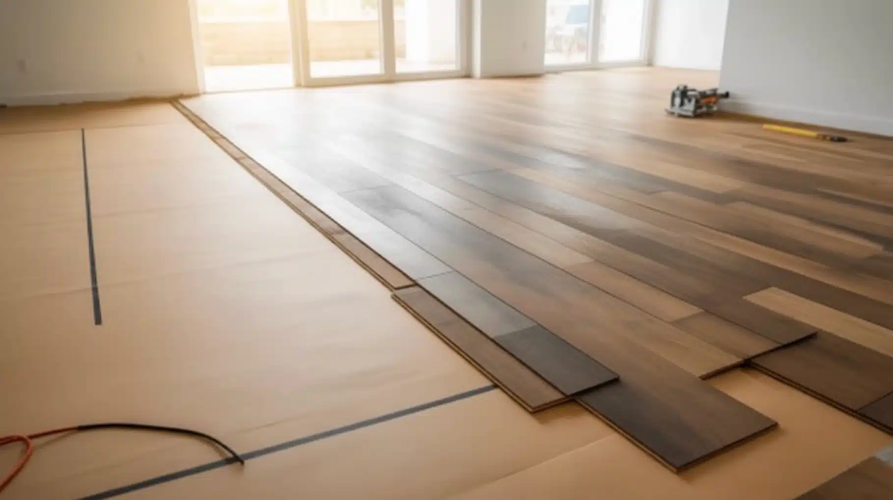
Choosing which direction to lay vinyl plank flooring seems simple until you start researching it. One source says follow the longest wall, another says follow the light, and a third says align with the joists. By the time I had read five articles, I had five conflicting opinions and a room full of unopened boxes. If that sounds familiar, I’ve been right where you are. The answer isn’t hidden in some expert formula. In my experience, it comes down to a few clear factors and making a call that fits your specific space. Let me help you by explaining everything you need to move forward with confidence. What Determines the Direction of Vinyl Plank Flooring? Before you lock in a direction, I find it genuinely useful to understand what’s actually driving the decision in the first place, because it’s less about rules and more about results. Here’s what determines which direction to lay vinyl plank flooring: Floating Floor Design: Plank direction is about visual outcomes, not structural rules, since vinyl isn’t nailed or glued down like hardwood. Room Shape Matters: Your room’s proportions determine which direction makes the space feel longer, wider, or more balanced. Natural Light Source: Running planks toward or across your light source can either highlight or soften the plank lines. Floor Joist Orientation: Joist direction rarely affects modern click-lock installs, but it’s still worth checking before you start. Entry Point Placement: Where someone first steps in sets the visual tone, making entry alignment a practical factor. Open Plan Continuity: One consistent direction across connected rooms creates flow and makes the whole space feel cohesive. Once you understand these factors, the decision starts to feel a lot less overwhelming, and in my experience, the right direction for your space becomes fairly clear on its own. The Main Rules for Which Direction to Lay Vinyl Plank Flooring Most flooring advice circles back to the same core principles. Understanding how each rule works and when it actually applies makes the decision far more straightforward. 1. Run Planks Parallel to the Longest Wall This is the most widely recommended starting point, and from my experience, it holds up in most situations. When planks run parallel to the longest wall, the eye follows them naturally from one end to the other. The space feels longer and more open without any structural changes. It works cleanly in living rooms, bedrooms, and any rectangular room with a clear dominant length, while also reducing cuts along the shorter walls. 2. Follow the Main Natural Light Source Some installers prioritize light direction over wall length, and there’s solid reasoning behind it. When planks run toward the main natural light source, light hits the floor surface more evenly across the full length. Seams catch less shadow, minor gaps become far less noticeable, and the floor reads as smoother overall. This matters most in rooms with large south- or west-facing windows where light is strong throughout the day. 3. Install Perpendicular to Floor Joists This rule most often applies to wood subfloor situations where stability is a genuine concern. Running planks perpendicular to floor joists adds rigidity and reduces the slight bounce older wood subfloors develop over time. On a concrete slab, joist direction is entirely irrelevant. For most modern click-lock products, this isn’t a make-or-break decision, but on an older wood subfloor with noticeable give, it’s worth checking before the first row goes down. 4. Run Lengthwise in Hallways Hallways follow a different logic from open rooms, and this direction choice is rarely worth debating. Running planks lengthwise naturally move the eye forward, making the space feel connected rather than broken up. Cross-installation creates short, choppy lines that make narrow spaces feel cramped. The hallway also reads as a natural extension of the adjoining room’s floor rather than a separate, disconnected zone, which is exactly what you want. 5. Keep Direction Consistent in Open Floor Plans In open floor plans where rooms connect without walls, a direction change mid-space creates a visual break that most people notice immediately. Maintaining a single, consistent direction across the entire area allows the floor to read as a single continuous surface. A transition strip can justify a change between doorway-separated rooms, but in fully open layouts, choosing direction based on the longest sight line across the whole space consistently produces the cleanest result. How Direction Changes the Way a Room Feels Most flooring guides focus on rules and skip the visual logic entirely. Plank direction controls where the eye travels, and that shapes how large or comfortable a room actually feels. Here’s a clear breakdown: Plank Direction Visual Effect Best Used When Parallel to the longest wall The room feels longer, the eye moves end to end Space feels short or lacks depth Across the longest wall The room feels wider, and space opens sideways Space feels narrow or cramped Toward the main window The eye moves toward the light, and the floor reads more smoothly. The room has a strong natural light source From the entry to the back wall Creates depth, space feels more generous The room is small or needs a sense of distance No extra material or cuts are needed to achieve any of these effects. The result comes entirely from which direction the lines run when someone stands at the doorway and looks in. Vinyl Plank Layout Patterns Worth Knowing Direction and pattern are distinct choices that both shape the final result. Getting the pattern right is just as important as deciding which way the planks run. 1. Standard Staggered Pattern The most common starting point for good reason, it mimics natural wood closely and works across nearly every room type, size, and style without looking out of place. Here’s what to know before committing: End joints are randomized, closely resembling real hardwood and avoiding rigid, repetitive lines Avoid the H-pattern and stair-step offsets, where joints in alternating rows align predictably Beginner-friendly and the most forgiving pattern for anyone installing vinyl plank for the first time Aside from avoiding those two specific joint patterns, this layout is difficult to get wrong and suits almost any space well. 2. Brick or Fixed Offset Pattern A fixed offset, typically one-third of a plank length, suits spaces where clean lines and deliberate symmetry matter more than a natural, organic floor appearance. Here’s the full picture: Creates a structured, uniform look with consistent and repeatable lines throughout the floor Works well in modern or contemporary interiors where geometry is part of the overall design Easier to plan than a randomized stagger, but less forgiving if plank lengths vary across the batch The fixed offset is a deliberate stylistic choice rather than a default. It pays off most in rooms where the floor is meant to feel intentional and structured. 3. Diagonal Layout Running planks at a 45-degree angle is one of the more practical ways to make a small or awkward room feel noticeably larger without any structural changes to the space. Here’s what sets it apart: Diagonal lines draw the eye outward, making tight or square rooms feel more open Requires significantly more cuts along every wall edge and increases material waste by 10–15% Intermediate skill level, manageable with patience, but not ideal as a first installation attempt The visual payoff is real in the right room, but the added cuts and waste make this a considered choice rather than a practical default for larger or straightforward spaces. What the Reddit Community Actually Says About Plank Direction After going through that Reddit discussion, I noticed something consistent. No one pushed a single hard rule. Instead, most advice focused on visual flow and how the floor feels once everything is installed. One user said following the longest line of sight from the main entrance made the space feel more natural. Another user said they changed direction between connected rooms and later regretted it because the break looked awkward. Many users preferred keeping one direction throughout an open floor plan, especially when rooms flow directly into each other. Several mentioned that changing direction without a wall or divider made the space feel chopped up. A few users also brought up natural light, saying they didn’t consider how sunlight would hit the seams until after installation. From what I gathered, the shared mindset was clear: continuity and light matter more than strict rules. How to Make the Final Call? Before the first plank goes down, a few quick checks at the entrance will give you a clear, confident direction for the entire floor. Here’s what you need to check: Main entrance first: stand there and look toward the longest sight line in the room Natural light source: identify where the strongest light comes from before committing to a direction Room connections: check whether adjacent rooms connect openly or are separated by a doorway Visual flow: ask which direction makes the space feel larger and more continuous Small square rooms: skip the analysis and choose whichever direction needs fewer cuts Starting position: begin in the left-hand corner with the tongue side facing the wall, working left to right Expansion gap: Leave a quarter-inch around the full perimeter to prevent buckling over time Taking two minutes to assess the room before the first plank goes down saves considerable frustration mid-installation. Get these basics right, and the rest of the process follows naturally. Final Thoughts Figuring out which direction to lay vinyl plank flooring comes down to reading the room rather than following a fixed rule. The longest wall is a reliable starting point in most spaces, but light, room shape, and open connections all shift that decision. My approach, and the one that worked best for me, is to stand in the doorway, look at the space honestly, and think about where I want the eye to go. The floor will be there for years, so a few minutes of thinking through direction before the first plank goes down is always worth it. Get the direction right, keep the pattern consistent, and the rest falls into place. Drop your question or experience in the comments below.
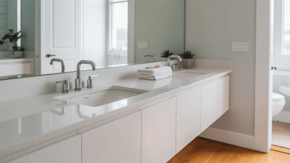
When I started looking into bathroom upgrades, I quickly realized that one of the easiest ways to refresh the space is by replacing the vanity. But the first question that came to my mind was simple: what is the real cost to replace a bathroom vanity? The price can vary a lot depending on the size of the vanity, the materials used, and whether you install it yourself or hire a professional. In some cases, it can cost just a few hundred dollars, while larger or custom vanities can cost several thousand. In this guide, I’ll walk you through the average costs, labor fees, material options, and extra expenses you should expect so you can plan your bathroom project with confidence. Average Cost to Replace a Bathroom Vanity The cost to replace a bathroom vanity usually ranges from $300 to $4,000, depending on the size of the vanity, the materials used, and whether you hire a professional installer. On average, most homeowners in the U.S. spend around $1,600 for a vanity and installation combined. A small prefabricated vanity with basic installation can cost as little as $300 to $900, while larger double-sink or custom-built vanities can cost $2,000 to $4,000 or more. Labor, plumbing adjustments, and countertop materials can also increase the total price. If you choose to install the vanity yourself and reuse existing plumbing, the total cost can be significantly lower. Signs It’s Time to Replace Your Bathroom Vanity Over time, a bathroom vanity can start to show wear and tear. If you notice certain problems, it may be a good sign that it’s time to replace it. Common signs include: Water damage or swelling: Cabinets may swell, warp, or peel after long exposure to moisture. Mold or mildew around the base: Moisture buildup can cause mold or mildew to grow near the bottom of the vanity. Cracked or damaged countertop: Chips or cracks in the countertop can make the vanity look worn and harder to clean. Outdated design: An old-style vanity can make the whole bathroom look dated. Limited storage space: Older vanities often have less storage and may not meet your current needs. One signal people often overlook: if the vanity cabinet doors no longer close flush or the drawer slides are broken, that’s a functional failure that affects daily use more than any cosmetic issue. A vanity that works poorly every single day justifies replacement even before it shows visible wear. If you notice several of these issues, replacing the vanity can improve both the appearance and functionality of your bathroom. Bathroom Vanity Replacement Cost Breakdown When I looked into replacing a bathroom vanity, I learned that the total price is made up of several costs. The vanity itself is usually the biggest expense, but labor and removal of the old unit can also add to the final bill. 1. Cost of the Vanity Unit The vanity unit is the cabinet, sink, and sometimes the countertop. Prices can vary a lot depending on the style and materials. Prefabricated vanity: $100 – $2,600 Custom vanity: $500 – $3,500+ A few things can change the price: Size: Larger vanities cost more. Materials: Solid wood and stone tops are more expensive than laminate. Storage features: Extra drawers or shelves can increase the price. Sink type: Double sinks or special sink designs usually cost more. Before buying a vanity unit, measure the exact rough-in width of the existing space, not just the old vanity’s face. Also, measure the door clearance. Barn doors and pocket doors have different swing requirements than hinged doors. A vanity that’s even 2 inches wider than your opening requires drywall work and potentially baseboard trimming, which adds $200–$500 to the project. Confirm the plumbing drain centerline location as well, since moving it adds $450–$800 in plumbing costs. 2. Labor Cost to Install a Bathroom Vanity If you hire a professional, you’ll also pay for installation. Labor costs depend on the complexity of the job. Professional installation: $200 – $1,000 Plumber hourly rate: $45 – $200 per hour Total labor for a full replacement: $665 – $3,300 If plumbing lines need to be moved or repaired, the labor cost can go up. Who should handle the install? For a straightforward like-for-like swap (same size, same plumbing locations), a skilled handyperson ($50–$80/hour) can often handle the job and costs less than a licensed plumber or contractor. If the project involves new plumbing, drain relocation, or moving supply lines, hire a licensed plumber. Unpermitted plumbing work can create problems when selling your home and may not be covered by homeowner’s insurance if something goes wrong. 3. Cost to Remove and Dispose of the Old Vanity Before the new vanity can be installed, the old one needs to be removed. Some contractors include this in their price, but sometimes it’s a separate cost. Typical removal and disposal cost comes to around $150 – $400. This usually covers disconnecting the plumbing, taking out the old vanity, and hauling it away. Cost by Bathroom Vanity Size The total cost to replace a bathroom vanity can also vary depending on the size. Typical installed price ranges are shown below: Vanity Type Typical Width Typical Cost Installed What’s Typically Included Small single vanity 18″–30″ $300 – $900 Prefab cabinet, integrated sink top, basic installation Mid-size vanity 31″–48″ $600 – $1,700 Cabinet, separate or integrated top, standard installation Double sink vanity 49″–72″ $700 – $2,600 Cabinet, two sinks, countertop; may need plumbing for a second drain Custom luxury vanity Any size, built to spec $2,000 – $5,000+ Custom cabinetry, premium countertop, full installation with plumbing These estimates include the vanity unit and basic installation, but the final price can be higher if you choose premium materials or need additional plumbing work. Cost of Different Vanity Materials The material you choose for your bathroom vanity can significantly affect the final price. Some materials are simple and budget-friendly, while others are stronger, more stylish, and more expensive. 1. Budget Materials Budget materials are great if you want a quick upgrade without spending too much money. They are common in prefabricated vanities and work well for smaller bathrooms or guest bathrooms. Common budget materials include: Laminate MDF (medium-density fiberboard) Cultured marble tops These materials are affordable and easy to find, but they may not last as long as higher-end options. Typical cost:$100 – $500 MDF durability: MDF vanities are the most budget-friendly but are the most vulnerable to water damage at the base and around the sink cutout. If you choose MDF, seal all exposed edges before installation and ensure the plumbing connections are watertight. A small, slow leak onto an MDF vanity base can cause swelling within weeks. 2. Mid-Range Materials Mid-range materials offer a good balance between price, durability, and appearance. Many homeowners choose these options because they look nicer than basic materials but still stay within a reasonable budget. Common mid-range materials include: Solid wood cabinets Ceramic sinks Quartz composite countertops These materials are stronger and usually last longer than budget options. Typical cost:$500 – $1,500 3. Luxury Materials Luxury materials are used in high-end bathrooms and custom vanities. They often have a premium look and can increase the value of your bathroom. Common luxury materials include: Granite countertops Marble tops Custom hardwood cabinetry These materials are durable and beautiful, but they also cost much more than basic options. Typical cost:$1,500 – $4,000+ Countertop Material Cost Comparison The countertop is often the biggest single cost variable in a vanity replacement. Here’s how common materials compare: Material Cost per Sq. Ft. Durability Best For Laminate / cultured marble $10–$40 Low–moderate; scratches easily Guest baths, budget renovations Ceramic / porcelain tile $7–$20 + $13–$28 labor Good; grout lines require maintenance Mid-range bathrooms, classic look Quartz composite $50–$200 Excellent; non-porous, moisture-resistant Primary baths, high-use vanities Granite $5–$100 (varies by slab) Very good; requires annual sealing Mid-to-high end bathrooms Marble $40–$150+ Moderate; etches with acidic products High-end primary baths; low-traffic use Concrete $75–$135 Good; heavy, requires strong cabinet support Industrial or custom aesthetic Quartz has overtaken granite as the most popular vanity countertop material among homeowners, largely because it’s non-porous, doesn’t require sealing, and resists the moisture and cleaning products that bathrooms are exposed to daily. Additional Costs That Can Increase the Price When replacing a bathroom vanity, the price is not always limited to the vanity and installation. In some cases, extra repairs or upgrades may be needed, which can increase the total project cost. Some of the most common additional expenses include: Plumbing repairs or upgrades: $450 – $1,800 Countertop replacement: $300 – $5,400 Faucet installation: $60 – $600 Flooring or wall repairs: $500 – $2,000 Electrical or lighting adjustments: $150 – $800 Permit requirement: Replacing a vanity in the same location with no plumbing changes typically does not require a permit. However, if you’re moving the drain, adding a second sink, or making any changes to supply lines, most jurisdictions require a plumbing permit ($50–$300). Working without a required permit can cause issues when selling your home and may void homeowner’s insurance coverage on related claims. When in doubt, call your local building department; it’s a quick call that can save significant headaches later. DIY vs Professional Vanity Replacement Cost Before deciding how to replace your vanity, it helps to compare the cost and benefits of doing the job yourself versus hiring a professional. The table below shows the main differences between the two options: Factor DIY Bathroom Vanity Replacement Hiring a Professional Average Cost $150 – $800 $400 – $1,700+ Labor Cost None (you do the work) $200 – $1,000 depending on the job Skill Level Needed Basic DIY and plumbing knowledge No skills needed from the homeowner Installation Time May take longer if you are learning Usually completed in a few hours Risk Level Higher risk of plumbing or installation mistakes Lower risk due to professional experience Best For Simple vanity swaps with existing plumbing Complex installs or plumbing changes Both options can work well, depending on your budget, skills, and the type of vanity replacement you plan. DIY time estimate: A first-time DIY vanity replacement on a simple like-for-like swap typically takes 4–8 hours. That includes shutting off the water, disconnecting the old plumbing, removing the vanity, setting and leveling the new one, reconnecting the drain and supply lines, and caulking. If you’ve never worked with P-traps or compression fittings, budget toward the higher end and watch a full installation video for your specific vanity type before you start. Shared Experiences on Vanity Replacement In a Reddit thread, a user asked how much professionals usually charge to remove and replace a single-sink bathroom vanity. The poster mentioned that a plumber would handle the pipe connections separately and estimated the work would take about 3 hours. One commenter replied that they were doing a similar job the next day and planned to charge about $300. Another user shared a higher quote, estimating around $900 for removing and reinstalling the vanity, reconnecting the water and drain lines, and painting the small bathroom. The $300–$900 range in that thread is consistent with what I’ve seen for straightforward single-sink replacements where plumbing stays in place. The moment you add plumbing work, wall repairs, or a larger vanity, quotes climb quickly. Always get at least three written quotes for any job over $500; the spread between contractors for identical work can be $300–$600, which is significant at this project scale. Tips to Save Money on Bathroom Vanity Replacement Replacing a bathroom vanity can get expensive, but there are a few simple ways to keep the cost lower. Small choices during the project can make a big difference in the final price. Choose prefabricated vanities: These are usually much cheaper than custom-built vanities and are widely available in stores. Reuse existing plumbing: Keeping the sink and pipes in the same place helps avoid costly plumbing changes. Keep the same vanity size: Installing a vanity with the same dimensions prevents extra work on walls, floors, or countertops. Install the vanity yourself: If the plumbing setup is simple, doing the installation on your own can save labor costs. Shop seasonal sales: Many home improvement stores offer discounts during holiday sales or clearance events. Buy the vanity cabinet and countertop separately: Many retailers bundle these together at a premium. Buying a solid wood cabinet from one source and a quartz top from a fabricator often costs 15–25% less than a pre-bundled unit of equivalent quality. This requires a bit more coordination, but the savings on a mid-range project can be $200–$400. Planning ahead and comparing options can help you upgrade your bathroom while staying within your budget. Does a New Bathroom Vanity Add Value to Your Home? If you’re replacing a vanity partly with resale in mind, it helps to understand the actual return. Industry data on bathroom remodels consistently shows that midrange updates (new vanity, updated fixtures, fresh tile) return roughly 65–75% of their cost at resale. That means a $1,500 vanity replacement might add $975–$1,125 in home value on a national average basis. A floating vanity with a quartz countertop is one of the specific upgrades most often cited by real estate professionals as contributing to buyer appeal. Modern vanities signal a well-maintained, updated bathroom, which reduces the buyer’s negotiating leverage on price. Key context on ROI: Minor cosmetic updates (new vanity, fixtures, lighting) tend to recoup the highest percentage of cost, often 70–85%, because the investment is smaller. Upscale custom vanities with premium stone recoup a lower percentage (50–60%) because the cost is high relative to what buyers are willing to pay. Double vanities are consistently cited by real estate professionals as a high-appeal feature in primary bathrooms, particularly for buyers with families or couples sharing a space. ROI varies significantly by local market. In high-demand areas, bathroom updates are more directly rewarded in the sale price. In slower markets, returns the more indirect, with improved days-on-market and reduced buyer concessions. Is Replacing a Bathroom Vanity Worth the Cost? Replacing a bathroom vanity is often worth the cost because it can quickly improve both the look and function of the space. A new vanity can provide better storage, a cleaner sink area, and a more comfortable layout for everyday use. It is also one of the easiest ways to modernize an outdated bathroom without doing a full remodel. Many homeowners choose this upgrade because it can make the bathroom feel fresh and more organized in just a few hours of work. In addition, a stylish, well-installed vanity can enhance the home’s overall appeal, potentially increasing resale value if you plan to sell in the future. From my own experience overseeing these projects, the satisfaction-to-cost ratio of a vanity replacement is genuinely high compared to most home upgrades. It’s visible every single day, it directly affects morning and evening routines, and a well-chosen vanity can even make a dated bathroom feel current. It’s one of the few upgrades where the functional improvement and the aesthetic improvement happen simultaneously, which is hard to match at this price point. Final Thoughts Replacing a bathroom vanity is one of the easiest ways I’ve found to upgrade a bathroom without doing a full remodel. The cost to replace a bathroom vanity can range from a few hundred dollars for a simple DIY swap to several thousand for a custom installation. The final price usually depends on the vanity size, materials, and whether plumbing changes are needed. Planning ahead and understanding the cost breakdown can help you avoid surprises and stay within budget. With the right choice, a new vanity can make your bathroom more functional, organized, and stylish. Ready to upgrade your bathroom? Start searching vanity options and estimate your project cost today, and share them in the comments below.
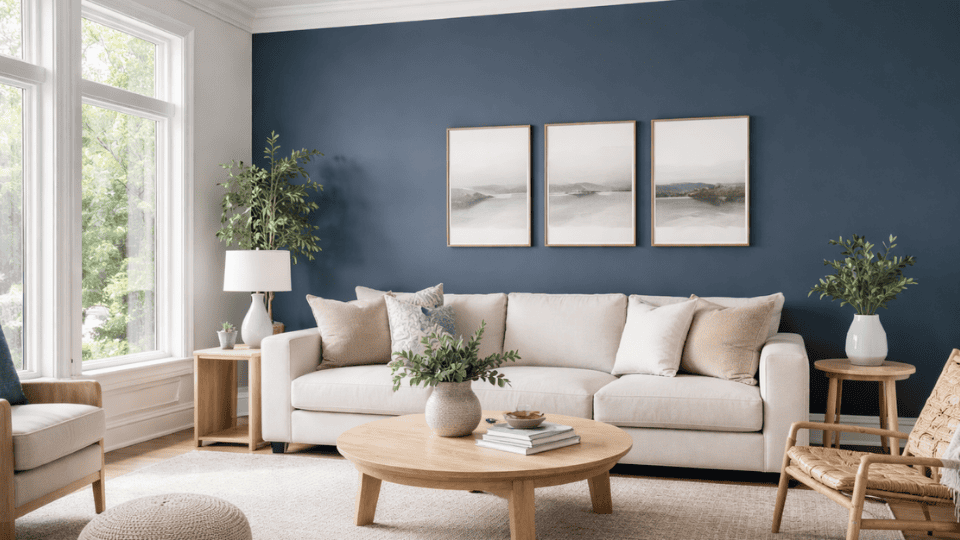
I’ve noticed that some paint colors look simple on a sample card but feel very different on a real wall. Sherwin-Williams Indigo Batik is one of those colors. It’s a deep blue that can look calm in one room and bold in another, depending on the light. In this guide, I’ll walk you through everything you need to know about this paint color. You’ll learn its color code, LRV, undertones, and where it works best in a home. I’ll also show you how lighting changes its look, which colors pair well with it, and how it compares to other popular navy paints. By the end, you’ll know if Indigo Batik is the right choice for your space. What Is Sherwin Williams Indigo Batik (SW 7602)? Sherwin-Williams Indigo Batik (SW 7602) is a deep blue paint color known for its rich and slightly muted look. It belongs to the blue color family and often reminds people of dark denim or classic navy. This shade has cool undertones with a soft gray base, which keeps it from looking too bright or overpowering. Indigo Batik has a Light Reflectance Value (LRV) of 8, meaning it absorbs most light and appears quite dark on walls. Because of this depth, it works well for strong contrast or a bold accent. Many people use this color on accent walls, cabinets, or doors to add a calm yet striking presence to a room. SW Indigo Batik (SW 7602) LRV: 8 (7.62%) Hex: #3E5063 RGB: 62 / 80 / 99 Color Family: Blue Sherwin-Williams describes it as: “A dark, saturated denim blue. This moody hue feels restful in dim bedrooms but comes to life in direct sunlight.” Why Does It Look Softer than Other Navies? Many navy paint colors can feel very strong or even heavy on a wall. This shade often feels a bit softer than many other navy tones. I’ve noticed that this happens because the color contains gentle gray notes mixed into the blue. Those gray hints calm the color and reduce the sharp brightness you sometimes see in darker blues. When you place it on a wall, the shade often feels more balanced and relaxed instead of bold and overpowering. This mix of blue and gray helps the color work well in many spaces, from bedrooms to living rooms. It gives you the depth of navy while still keeping the overall look comfortable and easy to live with. Important Undertone Note – Indigo Batik also carries a visible purple undertone in certain lighting conditions, particularly under warm artificial light in the evening. This is different from Naval (SW 6244), which reads as a more pure navy. If you’re sensitive to any hint of purple in your blue, test Indigo Batik carefully in evening light before committing. In well-lit rooms during the day, this undertone is subtle. Under incandescent or warm LED bulbs at night, it becomes more pronounced. LRV of Sherwin-Williams Indigo Batik The Light Reflectance Value helps you understand how light or dark a paint color will appear on your walls. This number shows how much light a color reflects or absorbs, which can change how a room feels. 1. What LRV Means LRV stands for Light Reflectance Value, which shows how much light a paint color reflects or absorbs. The scale runs from 0 to 100. Lower numbers indicate that the color absorbs more light, while higher numbers indicate that it reflects more light. When you check LRV, you get a better idea of how dark or light a paint color will appear on your walls. 2. Indigo Batik LRV Value Sherwin-Williams Indigo Batik has an LRV of 8, which places it in the dark color range. Because the number is low, the color absorbs most of the light instead of reflecting it. This is why Indigo Batik looks deep and rich on walls. The shade creates a bold presence and often appears stronger than medium blue. 3. What This Means for Your Room Because Indigo Batik has a low LRV, it works best in spaces that receive ample natural or artificial light. Bright rooms help the blue tones appear clearer and more balanced. In darker rooms, the shade may appear deeper and moodier. Many homeowners use it on accent walls, cabinets, or doors to add contrast and depth. LRV Reality Check At LRV 8, Indigo Batik is in the same darkness range as some black paints (which typically sit around LRV 3–6). In a room without strong natural light — a north-facing room, a windowless bathroom, or a basement — this color can read as near-black by evening. That’s not necessarily a bad thing, but it’s worth seeing in person before painting a full room. I always recommend testing this one on at least two walls, in both daylight and evening artificial light, before committing. How Lighting Affects Sherwin-Williams Indigo Batik Lighting plays a big role in how this paint color appears on your walls. The same shade can look brighter, deeper, or slightly different depending on the light source in the room. Natural Daylight In rooms with plenty of natural daylight, Sherwin-Williams Indigo Batik often shows its true blue character. The color appears clearer and a bit brighter compared to dim spaces. Sunlight helps reveal the rich, denim-like tone of the paint, making the blue feel fresh and balanced rather than overly dark or heavy. Warm Artificial Light Under warm indoor lighting, Indigo Batik can appear slightly different. The warmth of the bulbs may bring out subtle violet or purple hints within the blue base. This effect is usually gentle, but it can make the color feel softer and a little warmer during the evening or at night. Bulb Temperature Matters Significantly Here Warm bulbs (2700K–3000K) will pull the purple undertone forward noticeably in the evening. If you prefer Indigo Batik to stay firmly blue throughout the day, use daylight-balanced bulbs (4000K–5000K) for your artificial lighting. I’ve seen the same room look like rich denim navy in daylight and deep violet-blue at night, simply because of the incandescent fixtures. Neither is wrong, just know which you’re getting. Low Light Rooms In spaces that receive little natural or artificial light, Indigo Batik can appear deeper and more dramatic. Because the color already has a low LRV, it absorbs more light than it reflects. This can create a cozy, moody look, but in very dark rooms, the shade may look closer to navy or charcoal blue. Direction of Natural Light The direction your windows face changes how Indigo Batik reads throughout the day. North-facing rooms: Cool, blue-toned light throughout the day. Indigo Batik reads deeper and slightly cooler here, with less warmth in the blue. The purple undertone is less likely to appear, but the overall color reads darker and more muted. South-facing rooms: Warm, consistent light. This is where Indigo Batik performs best. The denim-blue quality comes through clearly, and the color feels bold rather than heavy. East-facing rooms: Warm golden light in the morning becomes neutral by noon. The color will look its most vibrant in the morning hours and gradually settle into a truer navy. West-facing rooms: Neutral to warm light in the afternoon. Late afternoon sun gives Indigo Batik a particularly rich, saturated quality. Best Places to Use Sherwin-Williams Indigo Batik Indigo Batik is a versatile dark blue, but it performs best in specific contexts. The notes below go beyond the general list to give you what I’ve actually observed in real spaces. Accent Walls Indigo Batik works well as an accent wall in living rooms, bedrooms, or dining areas. The deep blue color creates a strong contrast against light walls and neutral furniture. For accent walls, avoid the wall behind the sofa in a narrow room, as it will visually close the space. The most effective placement is a wall that faces you as you enter, or a fireplace wall where the depth adds drama without making the room feel compressed. Kitchen Cabinets Using Indigo Batik on kitchen cabinets can give your kitchen a bold but balanced look. It pairs nicely with white countertops, marble backsplashes, and brass or gold hardware. On lower cabinets paired with white uppers, Indigo Batik creates a two-tone kitchen that feels contemporary and grounded. Use satin or semi-gloss finish for durability and cleanability. Matte finish on kitchen cabinets wears through at hardware touchpoints within a year or two. Front Doors Indigo Batik is a strong choice for front doors because the deep blue shade stands out easily. It adds personality to your home’s exterior while still feeling classic. For front doors, use an exterior-grade paint in satin or semi-gloss. Indigo Batik on a door reads as a rich navy in most daylight conditions and pairs cleanly with white, black, or natural wood surrounds. Bedrooms Indigo Batik can create a calm, relaxing atmosphere. The deep blue tone helps make the space feel cozy, especially when paired with soft bedding and warm lighting. In bedrooms, this color works particularly well when you paint all four walls rather than just one. The enclosure effect of a dark color on all sides feels intentional and serene rather than claustrophobic, especially when ceilings stay white and trim stays crisp. Keep bedding and textiles in whites, creams, or warm oatmeal tones to prevent the room from going too dark. Built-ins and Furniture This color works well on built-in shelves, cabinets, and painted furniture. Indigo Batik helps these pieces stand out and adds depth without overwhelming the space. Bathrooms Indigo Batik works in bathrooms but requires careful handling of the LRV. In a bathroom with a window and white tile, the blue reads as moody and sophisticated. In a windowless powder bath, pair it with a highly reflective white tile, bright vanity lighting, and a large mirror to prevent the space from going oppressively dark. Use eggshell or satin finish for moisture resistance. Entryways and Hallways One of my favorite applications for this color. An entry hall painted Indigo Batik makes an immediate impression without the risk of feeling overwhelming, since people pass through rather than spend long periods there. Pair with bright overhead lighting and a light-toned floor to keep the energy from going heavy. Because of its depth and versatility, Indigo Batik works well in many spaces. Small accents or large surfaces can both benefit from this rich blue color. Indigo Batik vs Similar Blue Paint Colors The comparisons below include updated details on undertones and real-world differences that go beyond LRV numbers alone. Paint Color Brand LRV How It Compares to Indigo Batik Indigo Batik (SW 7602) Sherwin-Williams 8 A balanced navy with gray and subtle purple undertones sits between true navy and mid-toned blue. More of a denim blue than a pure navy. Hale Navy (HC-154) Benjamin Moore 8.4 Slightly lighter and more muted with gray undertones instead of purple. Hale Navy reads more traditionally navy; Indigo Batik reads richer and slightly brighter. Naval (SW 6244) Sherwin-Williams 4 Noticeably darker (LRV 4 vs. 8). Naval is a more saturated, truer navy. Indigo Batik reads lighter and more like denim blue beside it. Salty Dog (SW 9177) Sherwin-Williams 4 Much darker and more saturated than Indigo Batik. Salty Dog also leans toward teal-blue rather than the grayed navy of Indigo Batik. In the Navy (SW 9178) Sherwin-Williams 4 Significantly darker and more saturated. In the Navy is a stark, bright navy that makes a bolder statement. Indigo Batik is the softer, more layered option between the two. Indigo Batik vs. Naval: The Key Distinction Indigo Batik SW 7602 LRV: 8 Hex: #3E5063 Denim blue quality; more gray-green undertone visible Hovers between mid-tone blue and navy More forgiving in imperfect light Naval SW 6244 LRV: 4 Purer navy More saturated true navy; gray undertone dominates Deeper, bolder, more demanding of good light Can read near-black in dim conditions If you’re deciding between the two, Naval is the choice when you want the deepest, most saturated navy possible, and your room has strong natural light.Indigo Batik is the choice when you want a navy character with a bit more flexibility. It tolerates varied lighting conditions better and pairs more easily without demanding as much from the rest of the room. Trim Colors That Work With Indigo Batik Trim color plays a big role when you use this deep blue shade on your walls. Because the color is rich and dark, lighter trim colors help create contrast and balance. Many homeowners choose crisp whites to keep the room feeling bright and clean. Popular options include SW Pure White, SW Snowbound, and SW Alabaster. Pure White offers a fresh and clear contrast that highlights the blue walls. Snowbound has a soft, slightly cool tone that blends well with the paint’s undertones. Alabaster brings gentle warmth, which can soften the bold look of the blue and make the space feel more comfortable and inviting. Trim Recommendation by Priority My first choice is SW Pure White. It’s neutral enough not to clash with either the gray or the purple undertone in Indigo Batik. SW Extra White is a sharper, brighter option for a more high-contrast modern look. Avoid overly yellow or warm creamy whites like SW Greek Villa or SW Antique White. The contrast between the yellow undertone in those whites and the cool blue of Indigo Batik can read as muddy rather than intentional. For a more tonal, sophisticated look, SW Icicle (a cool blue-gray white at LRV 73) reads almost white next to the deep blue while sharing its cool undertone family. Pros and Cons of Sherwin-Williams Indigo Batik Before choosing Indigo Batik for your space, consider its main advantages and limitations. This quick table makes the decision easier. Pros Cons Rich and timeless blue – feels classic and works well across many interior styles Can look near-black in small or dimly lit rooms due to the LRV of 8 Pairs well with neutrals – whites, beige, soft grays, and natural wood finishes all complement it Lighting can change its look significantly – warm light pulls out violet hints that some find unexpected More forgiving than darker navies like Naval (LRV 4) – better in varied lighting conditions Requires 2–3 coats for full coverage over lighter walls – factor this into your painting budget Works on both interior and exterior surfaces with strong results on doors, shutters, and cabinets Purple undertone can surface in evening light or north-facing rooms – must be tested in your specific conditions Is SW Indigo Batik Good for Exterior Use? This deep blue shade can work well for exterior areas when you want a bold but classic look. The rich navy tone stands out nicely against light siding, brick, or other neutral exterior colors. Many homeowners use it on front doors, exterior shutters, garage doors, and small siding accents to create contrast without repainting the entire house. Because the color is dark and rich, it adds depth and character to exterior features. It also pairs well with white trim and natural stone. When used on exterior accents, this shade can give a home a polished and balanced look while keeping the overall design simple and timeless. Exterior Finish Note For exterior applications, use Sherwin-Williams Emerald Exterior or Duration Exterior in satin. Flat exterior finishes on dark colors show every water streak, dust mark, and handprint. Satin holds up better to weather and stays cleaner over time. On front doors specifically, semi-gloss gives the most durable finish and catches light in a way that makes the color read as richer and more polished. Tips for Testing Indigo Batik Before Painting Testing paint before committing to a full wall helps you see the true color. Indigo Batik can change slightly depending on lighting and nearby materials. Large Samples: Always paint a large sample area on your wall rather than relying on a small paint chip. Bigger samples help you see how Indigo Batik actually looks across a wider surface. Different Times: Check the painted sample during morning, afternoon, and evening hours. Natural daylight changes throughout the day, and Indigo Batik may appear brighter, softer, or deeper. Nearby Surfaces: Look at the sample next to trim, flooring, furniture, and décor. Surrounding colors can influence how Indigo Batik appears, sometimes making the blue look darker or cooler. Artificial Lighting: Turn on your room’s lights at night and observe the color carefully. Warm bulbs may soften the blue while cooler lighting can make the shade look sharper. Multiple Walls: Try the sample on more than one wall if possible. Light direction and window placement can change how Indigo Batik appears in different parts of the room. Taking time to test paint samples helps you avoid surprises later. It also ensures Indigo Batik looks balanced and comfortable in your room. Foam Board Testing Technique Rather than patching directly on the wall, paint a large piece of white foam board (at least 12″x18″) with two coats of Indigo Batik. You can move it around the room, hold it against the trim, test it in the corner versus against the window, all without committing. This technique is especially useful with a dark, opaque color like Indigo Batik, where the existing wall color underneath can subtly affect how a small patch reads. When Indigo Batik is Not the Right Call Based on what I’ve seen in real projects, there are a few specific situations where I’d steer someone away from this color despite its appeal. Rooms where you need maximum light: A home office where you’re doing detail work, a kitchen with no window, or a bathroom without adequate ventilation lighting. Dark paint in these spaces works against the practical demands of the room. Rooms with existing warm-toned wood paneling: The cool blue of Indigo Batik can fight with orange or red-toned wood rather than complement it. In those spaces, a warmer navy like Naval or Hale Navy handles the pairing better. If you’re genuinely purple-averse: Some people are very sensitive to purple undertones. If you strongly dislike any hint of purple and the room uses warm artificial lighting, Naval is a cleaner, more purely blue option. Wrap Up Sherwin-Williams Indigo Batik is a rich blue that can add depth and character to many spaces. I like how it feels bold without being too bright or overwhelming. The soft gray and violet hints make it more flexible than many other navy shades. If you’re thinking about using this color, take time to test it in your space. Light, furniture, and trim colors can change how it looks throughout the day. Once you see it in your own room, you’ll have a much better idea of whether it fits your style. If you’re planning a paint project soon, keep this color on your shortlist. Try a sample first and see how Indigo Batik works with your lighting and décor.
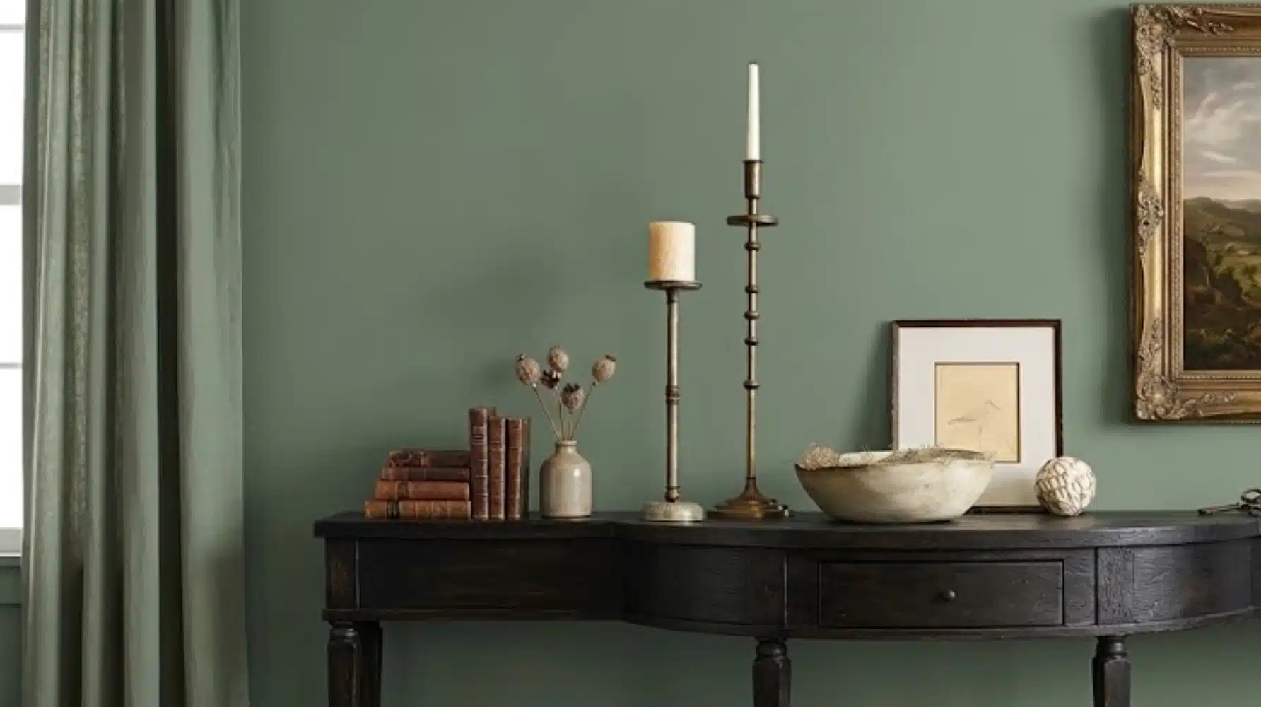
If you are considering Privilege Green SW 6193, you likely want to know how the color behaves in real life before committing to a full gallon. As a color consultant with over a decade of interior design experience, I have worked with dozens of green paint colors across hundreds of projects. Privilege Green is one of the few I recommend without hesitation, but only when the conditions are right. I have seen it go from gorgeous to flat when placed in the wrong lighting, which is exactly why I want to walk you through every variable before you open a can. In this guide, you will see how Privilege Green responds to light, where it performs best, and how you can pair it with other colors to create a balanced space. Getting to Know Privilege Green by Sherwin-Williams Privilege Green (SW 6193) sits in a nuanced middle ground, deeper than a classic sage, quieter than a forest green, and less blue-forward than many of its neighbors on the color strip. Its RGB breakdown (Red: 122, Green: 135, Blue: 117) confirms what you see in person: green dominates, but just barely, which is what gives it that refined, almost muted sophistication. The color looks different depending on your room, your lighting, and what is already on your floors and furniture. It does not demand attention, but it is never invisible either. If you have been cycling through greens that pull too olive or too teal, this is the color that tends to put an end to that search. It lands in a place that feels genuinely livable, grounded without feeling heavy, deep without feeling dramatic. Before buying a full gallon, having the exact specs in one place saves you from second-guessing at the paint counter: Detail Value Notes Color Code SW 6193 Sherwin-Williams reference LRV 22–23 Confirmed darker-range color; absorbs more light than it reflects HEX #7A8775 Digital reference RGB 122, 135, 117 Green-dominant, low saturation Coverage 350–400 sq ft per gallon Two coats recommended Dry Time 1 hour touch / 2 hours recoat Depends on conditions Interior Lines Emerald, Duration, SuperPaint, Cashmere Choose based on durability needs Exterior Lines Duration Exterior, Emerald Exterior Strong weather resistance Best Cross-Brand Match Benjamin Moore Cedar Path Very close RGB and LRV match for those not using SW The commonly cited figure of 26 is slightly off. Multiple authoritative color databases list Privilege Green’s LRV at approximately 22–23, placing it firmly in the darker category. In practical terms, that means it will make rooms feel more intimate and cozy, but it can also feel heavy in spaces with limited natural light. Plan accordingly. When in doubt about the product line, Emerald is worth the extra cost for high-traffic rooms; its coverage and washability make a visible difference over time. Privilege Green Undertones and Lighting Effects One of the most common mistakes I see clients make is assuming that a green this muted must be neutral. It is not. The gray undertone in Privilege Green is real, and in the wrong light it can push the color toward khaki or even a faint blue-gray. I had one client who nearly repainted her entire dining room because she had tested it only in midday light. She had not accounted for how dramatically it shifted under the warm, incandescent light of her fixtures at dinner. Testing across multiple light conditions is non-negotiable with this color. Lighting has a strong impact on how Privilege Green SW 6193 appears throughout the day. Its deep green base with soft gray undertones can shift subtly depending on natural and artificial light conditions. In Natural Light Natural light brings out the botanical richness in this shade, helping it feel layered and grounded rather than flat or dull. North-facing rooms: North light is cooler and slightly muted. In these spaces, Privilege Green may appear deeper and more shadowed. The gray undertone becomes more prominent, giving the color a calm, quiet, and slightly moody appearance. South-facing rooms: South-facing rooms receive warmer sunlight throughout the day. This draws out the green’s natural warmth, making the color feel more alive and lush. It reads as slightly more saturated in strong daylight. East-facing rooms: Morning light is cool and bright. Early in the day, Privilege Green can look fresher and more clearly green. As the light fades into the afternoon, it settles into a deeper, quieter tone. West-facing rooms: Afternoon and evening sunlight adds warmth. Privilege Green may take on a richer, more amber-like quality later in the day, creating a cozy, intimate atmosphere. In Artificial Light Artificial lighting changes how Privilege Green feels after sunset. Under warm bulbs, the green tones soften, and the gray undertone pulls forward slightly, giving the space a settled and sophisticated look. Cool LED or daylight bulbs can bring out more of the true green and reduce the muted quality, making the color feel crisper and more saturated. Using layered lighting, combining overhead fixtures with lamps, helps maintain balance and prevents the color from feeling too dark or too flat at night. Choosing the Right Finish The finish you select for Privilege Green SW 6193 can noticeably change how the color feels in your space. While the shade itself is deep and muted, the level of sheen affects depth, light reflection, and durability. Higher-sheen finishes reflect more light, which can subtly brighten Privilege Green. Flatter finishes absorb light and reinforce the color’s muted, grounded character. Matte finishes work well on walls, especially in living rooms and bedrooms, because they help hide minor surface imperfections and keep the moody quality intact. Eggshell offers a slight sheen and is a popular choice for main living areas due to its ease of cleaning. Satin finishes are ideal for kitchens, bathrooms, and high-traffic spaces where durability matters. Semi-gloss works best for trim, doors, and cabinets, providing durability and easy wipe-down maintenance. One detail worth noting: at an LRV of 22–23, Privilege Green already absorbs a significant amount of light. A flat or matte finish will deepen this further. If your room is on the darker side, choose eggshell at minimum to recover some brightness without losing the color’s grounded character. How Privilege Green Looks in Different Rooms This color shows up differently depending on the room, and that versatility is a big part of why it works across full homes rather than just one carefully styled space. 1. Living Rooms In open living areas, I often recommend this color when homeowners want a space that feels grounded but not overly dark. Privilege Green tends to look especially balanced when paired with warm wood flooring and lighter upholstery. The contrast helps the color feel rich without overpowering the room, and it allows natural textures like linen, oak, and woven materials to stand out. When the space has plenty of daylight, the green develops greater depth and character throughout the day, keeping the living room feeling layered and comfortable rather than flat. In one living room project I worked on, the homeowner had tried three different greens before landing on Privilege Green. The space had south-facing windows, warm white trim, and oak floors – a combination that let the color reach its full potential. She told me a few months later that guests consistently ask about the paint color, which tells me everything about how it performs when the conditions align. 2. Bedrooms In many bedroom projects, I see clients choose this shade when they want a calm environment without relying on very pale neutrals. Privilege Green creates a relaxed, settled feeling that works well with soft textiles and simple bedding. When combined with warm whites on trim and ceilings, the room keeps a light, balanced atmosphere while still feeling cozy. I often recommend adding natural textures such as linen curtains, wood nightstands, or woven rugs to enhance the grounded quality of the color. From a design psychology standpoint, deep muted greens like this one work in bedrooms partly because of their visual weight. They read as calm rather than stimulating, which supports winding down. I pair it consistently with warm-toned lighting (2700K–3000K bulbs) to prevent the gray undertone from taking over in the evening. 3. Kitchens On kitchen walls, Privilege Green is one of those colors I find genuinely exceptional. It creates a strong visual backdrop that feels grounded and fresh without competing with colorful ceramics, open shelving displays, or the natural tones of food styling. What I appreciate most is how well it holds its character alongside white or cream cabinetry, letting the walls do the work while everything else sits comfortably around it. If you’re pairing green walls with white upper cabinets, choosing a connecting trim color ensures the transition reads as intentional rather than abrupt throughout the space. Privilege Green also works surprisingly well on kitchen cabinets themselves, not just walls. I have used it as a lower cabinet color with white uppers in a two-tone kitchen, and the depth it adds at counter level grounds the entire space without making it feel enclosed. 4. Bathrooms I have also seen this color used beautifully on bathroom walls, and it’s one of those applications that genuinely impresses me every time. Privilege Green brings enough depth to make a small bathroom feel considered and intentional rather than plain or forgettable. It stands out naturally against white fixtures and tilework while blending warmly with wood vanities and warm metal accents. In many bathrooms, pairing these walls with brass or brushed gold fixtures creates a balanced, timeless look that adds real character without overwhelming the overall feel of the space. For smaller bathrooms with no window, I would hesitate. At LRV 22–23, Privilege Green can make an already dim space feel considerably heavier. My recommendation in those cases is to keep it on a single accent wall behind the vanity rather than wrapping the full room. 5. Cabinets and Interior Doors Privilege Green provides enough depth on cabinetry and interior doors to feel intentional rather than accidental. It performs well as a full kitchen cabinet color, bathroom vanity finish, or accent door shade in homes with warm wood flooring. The balanced undertone prevents it from appearing too gray or too saturated against lighter walls. Its medium saturation allows it to stand on its own while still coordinating easily with surrounding neutral palettes and architectural details. Exterior Applications Privilege Green is rated for exterior use (Interior/Exterior, Color Usage Code B), and it performs well in this context. On exteriors, it reads as a sophisticated, nature-forward shade that sits beautifully against natural stone, brick, and wood trim. I have recommended it for front doors, shutters, and full exterior walls on craftsman-style and cottage homes where the color’s botanical quality feels native to the architecture. Use Duration Exterior or Emerald Exterior for the paint line; both handle UV exposure without significant fading in medium-sunlight climates. Comparisons to Other Similar Sherwin-Williams Colors If you are deciding between similar Sherwin-Williams greens, these comparisons cut through the guesswork faster than holding swatches under a store light ever will: Shade Tone Best Use Warm/Cool LRV Notes Evergreen Fog (SW 9130) Soft gray-green Bedrooms, transitional spaces Cool-neutral 30 Lighter and more gray-forward than Privilege Green Pewter Green (SW 6208) Deep blue-green with gray Feature walls, moody interiors Cool 14 Darker and cooler with a stronger blue influence Retreat (SW 6207) Muted sage green Bedrooms, bathrooms Warm-neutral 28 Softer and slightly warmer than Privilege Green Ripe Olive (SW 6209) Deep olive with a yellow base Accent walls, exterior trim Warm 11 Much darker with a noticeable warm yellow undertone Jade Dragon (SW 9129) Cool botanical green Accent walls, offices Cool 30 Similar feel but reflects 7% more light; better for rooms with limited natural light Coastal Plain (SW 6192) Lighter muted green Open-plan spaces, bathrooms Neutral 37 14 LRV points lighter than Privilege Green; good alternative for dimmer rooms If you are still unsure, sample two or three of these directly on your wall, side by side, and test in your actual light to settle the comparison faster than any description. Benjamin Moore Equivalent and Cross-Brand Matching If you are working with Benjamin Moore or want a second-brand comparison before committing, the closest match to Privilege Green SW 6193 is Benjamin Moore Cedar Path. Their RGB values are nearly identical (BM Cedar Path: 117/134/110 vs. SW Privilege Green: 122/135/117), and both share an LRV right around 23. In side-by-side testing, Cedar Path reads very slightly cooler and marginally less saturated, but in practice, the difference is minor. If you are using a contractor who works primarily with one brand, this gives you the flexibility to stay true to the color. Top Coordinating Paint Colors to Consider Getting coordinating colors right matters as much as the wall color itself; these pairings work consistently across different room types and lighting conditions: Alabaster (SW 7008): Soft, creamy trim pairing that keeps the overall palette warm and cohesive without harsh contrast Pure White (SW 7005): Crisper, cleaner trim option for spaces where you want more definition between the wall and the woodwork Shoji White (SW 7042): A warm off-white that softens the transition between Privilege Green and lighter ceilings Urbane Bronze (SW 7048): Rich, earthy accent that sits naturally alongside the green’s botanical character without competing Naval (SW 6244): Deep navy that adds bold contrast; the warm undertone in both colors stops the pairing from feeling cold Accessible Beige (SW 7036): A warm greige that harmonizes well with the earthy undertones in Privilege Green; works particularly well on adjacent walls in open-plan spaces Tricorn Black (SW 6258): A strong contrast option for door frames or cabinetry hardware; adds dramatic definition without fighting the green When in doubt, start with trim and flooring; getting those two right makes every other coordinating decision noticeably easier. One of the best colors to coordinate with SW Privilege Green is Alabaster (SW 7008), which reads as genuinely warm and bridges the gap between the green and your ceiling without either fighting the other. Sampling Before You Commit Testing the color in your own space is the safest way to avoid surprises. Privilege Green can shift depending on lighting, surrounding finishes, and room size. Peel-and-stick samples from Samplize are a convenient way to preview the color without painting. Place them on at least two walls, preferably one that receives direct light and another that sits in shadow. Check the color at different times of day to see how it changes as lighting shifts. If you prefer traditional testing, purchase a sample can from Sherwin-Williams and paint a section about 2×2 feet on your wall. Allow the paint to dry completely before evaluating the color. Leave the sample up for at least 48 hours and compare it with your trim, flooring, and furniture before making a final decision. My professional practice is to also test the color against a white sheet of paper held next to the swatch. It sounds simple, but it immediately reveals whether the undertone pulls toward gray, blue, or stays true green, something very hard to see without a reference point. Try it before you commit. Final Thoughts After reviewing Privilege Green SW 6193 in different lighting conditions, finishes, and room settings, you now have a clearer picture of how this color behaves in real spaces. I have shared how its muted green base and soft gray undertones interact with natural light, how it works in living areas, bedrooms, kitchens, and bathrooms, and which coordinating colors support it best. When you understand these details, choosing paint becomes far less stressful. My advice is simple: test the color in your own lighting and observe it throughout the day before making your final decision. If you decide to try this shade, I would love to hear how it looks in your home, so feel free to share your experience or questions below.
I recently visited a friend’s home, and the first thing I noticed was the wall color. It felt calm, rich, and grounded. When I asked, she smiled and said it was SW Retreat (6207) by Sherwin-Williams. The color instantly made the space feel warm and settled without looking dark or heavy. You can spot this shade in living rooms, kitchen cabinets, bedrooms, and even on exteriors around your neighborhood. It stands out in a quiet way. If you look closely, you’ll notice how it shifts with light and pairs beautifully with wood, white trim, and brass. This color doesn’t shout for attention. Instead, it gently shapes the mood of a space and makes your home feel more relaxed and pulled together. Understanding: Color Data & Technical Details Before you choose a paint color, you need the facts. These details help you understand how it will truly look in your space. Here is a clear and simple breakdown of its full color profile: Detail Value Why It Matters Color Name Retreat Official name Color Number SW 6207 For ordering Color Family Green-Gray Reads as muted green with noticeable gray influence – not a pure green LRV ~21 Absorbs more light than it reflects; sits at the bottom edge of medium-depth range, close to dark territory RGB 122, 128, 118 Digital match HEX #7A8076 Web use Hue Angle 96° Low-saturation green, this is why it reads closer to neutral than saturated green in many lights Undertone Blue-gray Slight cooling effect Temperature Cool Balanced, not warm Two corrections worth flagging before you go any further: the LRV for SW Retreat is approximately 21, not “21” as a round number pulled from a chart. Multiple authoritative databases place it between 20.61 and 20.87. That matters because at LRV 21, this color sits at the very bottom edge of the medium-depth range, nearly crossing into dark territory. Plan your lighting accordingly. Additionally, the correct HEX code is #7A8076, and the confirmed RGB is 122/128/118, figures that are consistent with Sherwin-Williams’ own data and major color databases. These details may seem small, but they shape the final result. Once you understand the numbers and undertones, you can predict how it will behave. That clarity makes choosing it much easier and more confident. Visual and Practical Examples of SW Retreat Now let’s look at how it actually works in real spaces. Seeing it in action helps you decide if it fits your home and lighting. 1. SW Retreat on Kitchen Cabinets Looks rich and grounded on the kitchen cabinets. If you paint all cabinets this shade, your kitchen will feel bold yet calm, especially with good natural light. If you use it only on the island, it adds contrast without making the space feel heavy. Brass hardware adds warmth, while matte black gives a sharper look. It pairs beautifully with white quartz, marble, or light butcher block countertops. In practice, SW Retreat on full kitchen cabinetry works best in kitchens with substantial natural light or well-layered artificial lighting. I have seen it used on lower cabinets paired with white uppers in multiple projects, and that two-tone application consistently outperforms all-over coverage in kitchens under 150 square feet. It gives you the color’s depth and character without the weight that comes from surrounding yourself with it on all sides. 2. SW Retreat in Bedrooms In a bedroom, it creates a quiet and restful mood. The gray undertone keeps it from feeling too bright or overpowering. You’ll notice it feels cozy, especially in the evening light. Pair it with cream bedding, soft white sheets, and natural wood furniture for balance. Linen, cotton, and woven textures help soften the depth of the color and keep the room feeling relaxed. For bedrooms, I consistently recommend keeping bulb temperature between 2700K and 3000K. At LRV 21, Retreat already absorbs significant light, and a cool LED above 4000K will pull the blue-gray undertone forward to the point where the room can start to feel cold rather than calm. Warm bulbs keep the green front and center in the evenings, which is where this color performs best. 3. SW Retreat in Bathrooms Works beautifully in bathrooms with the right lighting. It pairs especially well with brass fixtures for warmth and contrast. Black hardware creates a clean and modern look. For tile, white subway tile keeps things fresh and balanced. Marble with light gray veining also works nicely. Make sure the space has enough light, since this shade can feel darker in small bathrooms. For bathrooms without a window, I would not recommend wrapping all four walls. An accent wall behind the vanity or a wainscoting application on the lower half of the room gives you the color’s depth and personality without the enclosed feeling that comes from using a dark LRV color in an already dim, enclosed space. 4. SW Retreat for Exterior Use They can look striking on exteriors, especially with natural stone or brick. It pairs well with light trim, such as Alabaster or Pure White, to create contrast. If your roof is dark gray or charcoal, this color blends nicely. Avoid pairing it with very warm red brick, since the undertones may clash. In bright sunlight, it appears greener, while shade brings out the gray. Colors at this LRV tend to read somewhat lighter on exterior surfaces than on interior walls, due to greater exposure to ambient light. So if you have sampled Retreat inside and found it a touch dark, the exterior application may actually suit you better. Use Duration Exterior or Emerald Exterior for maximum UV resistance and color stability over time. SW Retreat Compared to Similar Colors Choosing the right green means understanding subtle shifts in depth, warmth, and tone. Here’s how Retreat stacks up against its closest neighbors. 1. SW Retreat (SW 6207) vs. Evergreen Fog (SW 9130) Evergreen Fog carries about 10 more LRV points, making it noticeably lighter and airier. While Retreat reads as a grounded, medium sage. Evergreen Fog drifts toward a soft gray-green mist, ideal when you want depth without committing to a darker room. Retreat wins for cozy layered spaces; Evergreen Fog is better in low-light rooms needing lift. 2. SW Retreat (SW 6207) vs. Pewter Green (SW 6208) These two sit right next to each other on strip 217, but Pewter Green is a full shade darker with an LRV nearly half that of Retreat. Pewter Green is moody, metallic, and bold, best reserved for accent walls, cabinetry, or rooms intentionally designed around depth. Retreat is the safer everyday choice that still reads as a true green. 3. SW Retreat (SW 6207) vs. Succulent (SW 9650) Despite their visual similarity, Succulent carries a noticeably stronger, cooler green hue (hue angle 136°) compared to Retreat’s more muted, gray-leaning sage (hue angle 96°). Succulent from the Emerald Designer Edition has a more saturated personality and works best as a statement color. Retreat is the whole-home workhorse: versatile, restful, and easy to live with. 4. SW Retreat (SW 6207) vs. Acacia Haze (SW 9132) If Retreat feels a touch too deep for your space, Acacia Haze is the logical next step. It carries about 11 more LRV points, giving you a noticeably lighter sage-green that still shares Retreat’s organic, non-saturated quality. Where Retreat reads as a grounded, medium-depth green, Acacia Haze is airier and slightly more gray-forward. It is a strong alternative for north-facing rooms or spaces that cannot afford to lose more light. 5. SW Retreat (SW 6207) vs. Dried Thyme (SW 6186) Dried Thyme is the warmer, earthier sibling. It shares the same medium-depth family but pulls more yellow-olive in its undertone rather than Retreat’s cool blue-gray. If you have a space filled with warm wood tones and you find Retreat reading a touch cold, Dried Thyme bridges the gap. Choose Retreat when you want muted and relaxed; choose Dried Thyme when you want earthy and grounded. Comparison Table: Which Green Works for You? Choosing the right green-gray paint can make or break a room. Here’s how six of Sherwin-Williams’ most popular muted greens stack up across key factors from light reflectance to tone and ideal use cases. Color HEX LRV Tone Best For SW Retreat (SW 6207) #7A8076 ~21 Neutral-cool Whole-home use, cabinets, accent walls Evergreen Fog (SW 9130) #95978A 30 Warmer, lighter Low-light rooms, layered spaces Pewter Green (SW 6208) #5E6259 ~12 Darker, dusty Moody accents, statement cabinetry Succulent (SW 9650) #616C64 ~14 Cooler, bolder Statement rooms Acacia Haze (SW 9132) #8D9184 ~32 Lighter, sage North-facing rooms, low-light spaces Dried Thyme (SW 6186) #7A7A61 ~20 Warmer, earthier Spaces with warm wood, rustic interiors Retreat sits at the comfortable middle, not too light, not too dark, and neither aggressively cool nor warm. When balance matters most across an entire home, Retreat is your go-to. SW Retreat Uses and Pairing Ideas Is a natural team player; the materials, finishes, and colors you pair it with will either elevate its quiet sophistication or work against it: choose intentionally. Best Uses The right backdrop and surface choices unlock the full potential. Here’s where it performs best: Best White Trim: Alabaster adds warmth and softness, Greek Villa keeps it creamy and organic, Pure White sharpens contrast for a crisper, more modern edge; each shifts the mood meaningfully. Best Neutral Pairings: Warm beiges, soft taupes, and greige tones complement without competing, keeping the palette grounded, layered, and cohesive throughout the space. Flooring That Works: Light oak brightens the pairing, walnut adds rich contrast, and natural stone brings an earthy, tactile quality. Avoid cool gray or stark white floors, which flatten the tone. What to Avoid: Stark cool-white trim, high-gloss finishes, or overly saturated accent colors; these clash with muted, organic character and undermine its quiet depth. Nail these surface choices, and it transforms from a simple wall color into the foundation of a fully considered, cohesive interior. Best Pairing Ideas Beyond the surfaces, the finishing details of metals, fabrics, and textures make one feel truly styled. Here’s what works: Hardware & Metals: Brass introduces warmth and a touch of elegance, matte black creates bold modern contrast, and aged bronze adds an organic, lived-in richness that complements the green beautifully. Fabric & Soft Furnishings: Cream linen, raw cotton, and oatmeal-toned textiles feel natural alongside it, keeping the palette soft, breathable, and effortlessly layered. Wood & Natural Decor: Warm walnut furniture, light oak accents, and rattan or woven pieces echo the earthy undertones, grounding the space in organic, nature-inspired texture. Accent Colors That Work: Dusty terracotta, warm ivory, and deep navy make confident accent choices; each adds dimension without pulling focus from the wall color’s understated elegance. Accent Colors to Approach with Caution: Bright or saturated purples, vivid yellows, and high-contrast lime green all clash with the low-saturation, gray-leaning quality of Retreat. These pairings undermine the color’s calm rather than supporting it. A pairing I come back to consistently in client projects: Retreat walls, Alabaster trim, warm walnut furniture, and aged brass hardware. It is not a surprising combination, but there is a reason it appears in so many well-executed interiors. The warmth of the brass and wood offsets the color’s cool blue-gray undertone just enough to keep the space from reading cold, while the Alabaster trim holds everything together without going stark white. Pros and Cons of SW Retreat Brings quiet sophistication, but like any color, it thrives in the right conditions: here’s what to know before you commit. Pros Cons Sophisticated, muted look that feels curated Can feel dark and heavy in low-light rooms Pairs beautifully with wood, linen, and stone May read cooler or bluer than expected on walls Versatile enough to work across multiple rooms Not ideal for very small or north-facing dim spaces Works well on both interiors and exteriors Low saturation (4%) means it can read almost neutral under some artificial lights, losing its green quality entirely Tip: Sample in your actual lighting before committing. Its tone shifts noticeably between natural and artificial light, and the gap between morning and evening is wider than most people expect at this LRV. Get the most from this color by pairing it with warm wood tones and ample light, and it will reward you with effortless, enduring style. Who Should Choose or Skip the SW Retreat? Rewards the right space, knowing where it shines and where it struggles, saving you a costly repaint: here’s your quick guide. Choose if: You love muted, moody greens that feel collected rather than loud. This color is made for homeowners layering earthy wood tones, natural textiles, and warm finishes. Well-lit, open rooms allow its soft depth to breathe, making them a timeless, versatile anchor for a nature-inspired palette with real staying power. Skip if: Your room lacks natural light or leans into crisp, ultra-bright white interiors, the muted tone can easily read flat, cold, or uninspired. It’s also a poor fit for very small or north-facing rooms. If you want a vivid, saturated green with bold presence, a brighter, warmer shade will serve you far better. A note specifically for renters and apartment dwellers: Retreat’s LRV of 21 can make smaller rooms feel noticeably more enclosed. If your ceilings are under nine feet and your primary light source is overhead recessed lighting rather than windows, consider Acacia Haze (SW 9132) or Evergreen Fog (SW 9130) instead. You get the same color family without the weight penalty. Sampling SW Retreat: What to Do Before You Commit Given how dramatically SW Retreat can shift between lighting conditions, warmer and more clearly green in south-facing daylight, deeper and more gray-forward in north-facing or artificial light, I recommend a 48-hour minimum sampling period before purchasing a full gallon. Paint a 2×2 foot section on at least two walls: one that receives direct natural light and one that sits in shadow. Evaluate it at four distinct points: morning, midday, afternoon, and evening, with your artificial lights on. Peel-and-stick samples from Samplize are a fast and mess-free way to test the color without committing to a paint pot. They ship quickly and can be repositioned, which makes them useful for comparing Retreat against Acacia Haze or Dried Thyme side by side on the same wall. One practical technique I use with clients: hold a plain white sheet of paper next to your sample. It immediately reveals whether the gray undertone or the green is dominating in your specific light, something that is very difficult to see without a neutral reference point. If the sample reads mostly gray against the white paper, your room may not have enough warmth to let the green show through consistently. Final Thoughts I used SW Retreat in a client’s living room paired with warm oak shelving, cream linen curtains, and aged brass hardware. The space had good south-facing light and 9-foot ceilings, which gave the room the color it needed. What struck me when I returned for a follow-up visit a few months later was how the room felt at night: the warm bulbs kept the green honest, and the layered textiles softened any heaviness. It never overwhelmed and never faded. It just worked. That said, it shines brightest in well-lit rooms with natural materials. If that sounds like your space, sample it first and watch how it shifts from morning to evening light before committing. Tried SW Retreat or planning to? Drop your color choice and experience in the comments. I’d love to hear how it worked in your space.
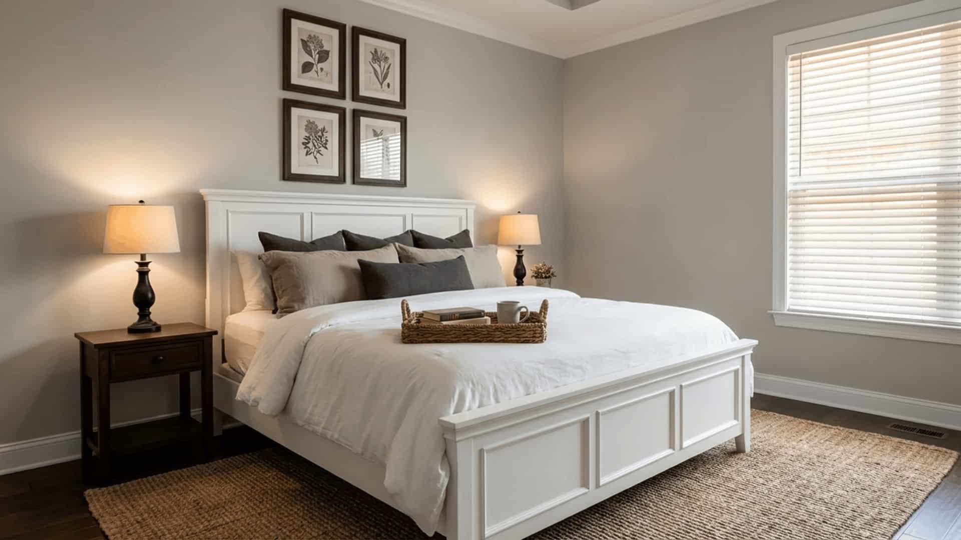
Standing in front of a wall of gray paint chips can feel strangely overwhelming. The differences look subtle in the store, yet once the paint hits your wall, everything changes. As a color consultant, I’ve watched this happen in homes countless times, and Repose Gray SW 7015 is one shade clients often ask about when they want a balanced neutral. You might be wondering how it really behaves in different rooms, how lighting shifts its undertones, and whether it will actually work with your flooring and trim. I’ll walk you through what I’ve seen in real homes over the years. You’ll learn how the color responds to light, where it works best, and which pairings help it feel intentional rather than accidental. Overview of Sherwin-Williams Repose Gray Sherwin-Williams Repose Gray (SW 7015) is a popular, versatile gray paint color with subtle warm undertones. It’s perfect for those looking for a soft, neutral backdrop in a variety of spaces. The color leans toward a light, almost greige shade, making it a perfect choice for both modern and traditional settings. Repose Gray is a great option for living rooms, kitchens, and bedrooms, as it pairs well with almost any other color, offering design flexibility. LRV: 58 Hex: #CCC9C0 RGB: 204 / 201 / 192 Collection: Sherwin-Williams Neutrals Finish options: Flat, Matte, Eggshell, Satin, Semi-Gloss, Gloss Repose Gray works wonderfully in spaces where you want a calm, inviting atmosphere without feeling too cold. Repose Gray Undertones and Lighting Behavior This is where Repose Gray gets genuinely interesting and where most people run into trouble. The color has a taupe base, which prevents it from reading cold or stark, but it also carries violet undertones that most people don’t notice until the paint is on the wall. In low light, north-facing rooms, or spaces with cool-toned artificial lighting, those violet undertones come forward noticeably. This is the most common surprise I see clients encounter with this color. Depending on the room, faint green, blue, or purple hints can come forward, making the color behave differently across spaces. In north-facing rooms, Repose Gray pulls cooler and darker, with blue and purple undertones becoming more noticeable throughout the day. In south-facing spaces, natural light brings out the warm taupe base, making it read as a soft, inviting greige for most of the day. In east-facing rooms, warm morning light softens the color early on, though it shifts to a cooler, grayer tone by afternoon. In west-facing rooms, late-afternoon golden light makes the taupe base glow, giving the color its warmest, most grounded appearance. Watch out for this: Warm or yellow-toned artificial lighting will draw out the taupe and make the room feel cozier. Cool recessed lighting or daylight-temperature LED bulbs flip the switch and amplify the violet undertone. If your home has cool-temperature recessed lighting throughout, test Repose Gray very carefully before committing. I’ve seen it read distinctly purple in spaces with 5000K overhead lighting. Before committing, test a large sample on the biggest wall and check it at different times of day. Flooring, trim, and surrounding colors all influence how Repose Gray reads in a specific space. Pairing SW Repose Gray with Pure White SW 7005 is one of the most reliable combinations for keeping the color looking clean and intentional. It works across room styles without feeling overdone. Undertone cheat sheet: If you place Repose Gray next to a warm yellow-white like SW Alabaster or SW Greek Villa, it can read slightly green in comparison. If you place it next to a cool, stark white, the violet undertone becomes more visible. Pure White SW 7005 sits in the middle. It’s the trim color I recommend most often with this wall color precisely because it doesn’t push either undertone. Which Paint Finish to Use for Repose Gray This is one of the most searched questions about this color and one that most paint reviews skip. Finish affects how Repose Gray reads on the wall and it affects durability. Room / Surface Recommended Finish Why Bedroom and living room walls Eggshell or matte Low sheen keeps the color soft; matte hides imperfections but marks easily Kitchen and bathroom walls Satin Wipeable, moisture-resistant; eggshell is acceptable in low-splash zones Cabinets and trim Satin or semi-gloss Durability for high-touch surfaces; semi-gloss makes cleaning easier Exterior siding Satin Holds up to weather while allowing the color’s warmth to read correctly Ceilings Flat Flat hides texture and prevents light reflection that would make the ceiling look gray One finish note worth knowing: flat and matte finishes on walls amplify the depth of Repose Gray’s undertones slightly. A satin finish on the same wall will read a touch lighter and less saturated. In darker rooms where you want the color to feel as warm as possible, satin is the better choice. Best Rooms for Repose Gray Repose Gray is one of those rare neutrals that adapts well across different spaces. Here is how it actually performs room by room. 1. Living Rooms Living rooms are where Repose Gray consistently performs best. The color holds up across different furniture styles, flooring types, and lighting conditions without demanding much from the rest of the room. It works with both cool and warm tones, making it easy to style around. In open-plan spaces with good natural light, it reads as a soft, inviting neutral that keeps the room feeling cohesive without looking flat. I used Repose Gray in an open-plan living and dining room with wide-plank white oak floors and warm brass fixtures. The south-facing windows kept the taupe base dominant all day, and the color looked intentional across both zones without any transition color needed. That versatility is genuinely hard to replicate with a more strongly directional color. 2. Bedrooms Repose Gray brings a calm, restful quality to bedrooms that heavier or cooler grays often miss. It does not feel clinical or cold, which matters in a space meant for winding down. Paired with soft white bedding and warm wood furniture, it creates a relaxed atmosphere without much effort. North-facing bedrooms may need warmer lighting to avoid feeling too cool in the evenings. North-facing bedroom caution: This is one room where I actively recommend testing before painting. In a north-facing bedroom with cool recessed lighting, Repose Gray can read distinctly lavender in the corners by evening. A warm sconce or bedside lamp mitigates this, but if you want to avoid it entirely, Agreeable Gray SW 7029 is a safer call in that specific scenario. 3. Kitchens Kitchens are a strong fit for Repose Gray, especially in spaces with white or light wood cabinetry. The color works as wall paint, staying out of the way while still adding depth. It pairs well with both warm and cool countertop materials. In well-lit kitchens, it reads clean and fresh. In darker kitchens, it can feel a little heavy, so testing a sample first is worth the effort. On cabinets specifically: Repose Gray has become one of the most popular cabinet colors of the past decade. It looks sharp paired with brass or matte black hardware and works with most countertop materials from white quartz to dark granite. Use satin or semi-gloss finish on cabinets for durability. Flat paint on kitchen cabinets wears through quickly and is difficult to clean. 4. Cabinets Repose Gray on cabinets has become increasingly popular, and it holds up well in that application. It works particularly well on kitchen or bathroom vanity cabinets paired with brass, matte black, or chrome hardware. The color gives cabinets a soft, updated look without going too bold. A satin or semi-gloss finish is recommended for durability and easy cleaning, especially in high-use areas like kitchens. One flag worth knowing: If your walls are also Repose Gray and you’re painting the cabinets the same color, you’ll need at least 15–20 LRV points between the wall color and the cabinet color for the cabinetry to read as distinct. Otherwise the room feels flat. Consider SW Eider White on the walls (LRV 73) if keeping Repose Gray on the cabinets. 5. Exterior Repose Gray works surprisingly well on exterior siding, particularly on craftsman, colonial, and modern farmhouse styles. It reads as a clean, understated gray from the outside without pulling too blue or too beige in direct sunlight. Pairing it with crisp white trim sharpens the contrast cleanly. Dark shutters in charcoal or black add definition, and natural stone or brick accents sit comfortably alongside them without clashing. One specific pairing I’ve used repeatedly on exteriors: Repose Gray siding, SW Dorian Gray on shutters and doors, SW Alabaster on trim. The three colors sit on the same warm-gray family but create enough tonal variation to read as intentional layering rather than a single flat gray. Particularly effective on homes surrounded by trees, where the warm base of Repose Gray neutralizes the green cast from foliage. 6. Bathrooms Repose Gray performs well in bathrooms but requires careful consideration. In a bathroom with a window and white tile, it reads as a sophisticated, calming neutral that pairs well with marble, quartz, and granite countertops. In a windowless powder bath, it can go heavy and purple-adjacent under warm artificial light. For bathroom applications, I recommend a satin finish for its moisture resistance and ease of cleaning. Pair with crisp white trim rather than a creamy or yellow-toned white. In a small space, the undertone clash between Repose Gray and a warm white becomes more visible than it does on a large living room wall. Small bathroom tip: In powder rooms or half baths under 40 square feet, Repose Gray can feel heavy if used on all four walls. Try it on three walls with the fourth in a lighter shade from the same color card, or simply use it on the vanity cabinet and paint the walls a lighter companion like SW City Loft (LRV 70). What Homeowners Say About Repose Gray In a recent r/HomeImprovement discussion titled “I’ve bought like..”, several users shared practical lessons from their own gray paint searches. u/sierra400 noted that Sherwin-Williams grays behave very differently depending on the room. u/TramStopDan pointed out that the existing wall color is reflected in the sample patches, distorting how a new shade appears. u/rynmcdm switched from buying samples to taping 12 paint chips together to better visualize the color. u/bigbadmax found that pairing gray with white trim made a noticeable difference. u/skimmer suggested identifying what feels wrong about each sample before moving on. u/SmithForLife went through 15 samples before finding the right one. Gray shifts more than expected, and testing in the actual space is the only step that consistently works. What these comments reflect, and what I’ve heard from my own clients, is that the paint store experience and the at-home experience diverge more with gray than with almost any other color family. The store lighting is typically fluorescent and consistent. Your home is not. That gap is why so many people end up with a shade that felt right in the store but surprises them on the wall. Repose Gray Coordinating Colors Choosing the right coordinating colors makes Repose Gray look intentional and pulled together. Since it carries taupe undertones with occasional green, blue, or purple shifts, it pairs best with shades that feel warm, clean, and grounded. Coordinating Color Undertone Why It Works with Repose Gray Best Ways to Use It Pure White SW 7005 Soft neutral white Creates clean contrast without pushing Repose Gray’s undertones in an unwanted direction Trim, ceilings, cabinets Alabaster SW 7008 Warm creamy white Strengthens the greige quality and keeps the overall space feeling warm and cohesive Trim, upper cabinets, ceilings Agreeable Gray SW 7029 Warm greige Sits just one step warmer, making it a natural transition color in open floor plans Adjacent walls, hallways Urbane Bronze SW 7048 Deep warm charcoal Adds depth and contrast for a modern, grounded look without clashing with the taupe base Doors, accent trim, exteriors Naval SW 6244 Deep navy blue Creates bold contrast against Repose Gray while playing off its cool undertones cleanly Accent walls, cabinetry, doors This mix of warm neutrals, soft whites, and broader accents helps Repose Gray look balanced and intentional across both modern and traditional spaces. A note on what to avoid: do not pair Repose Gray with whites that have strong yellow undertones (SW Greek Villa, SW Antique White, or similar). In a well-lit room, the yellow-white and the violet undertone in Repose Gray create a visual conflict that makes both colors look slightly off. This is not obvious on individual chips, but it shows up clearly once both are on full walls next to each other. I’ve had to repaint trim in a client’s home for exactly this reason. Repose Gray vs. Similar Colors Before choosing Repose Gray, it helps to compare it with other popular gray and greige shades. Small differences in undertones can completely change how a color feels on the wall. Repose Gray vs. Agreeable Gray SW 7029 Repose Gray SW 7015 LRV: 58 Undertone: Taupe + violet Reads more gray, holds up in mixed warm/cool spaces Agreeable Gray SW 7029 LRV: 60 Undertone: Beige + pink Reads more greige, softer in warm-dominant rooms Agreeable Gray sits one step warmer than Repose Gray. It leans more toward beige with pink and violet undertones, giving it a softer, cozier feel in most rooms. Repose Gray has stronger taupe and occasional cool undertones, making it feel more versatile across both warm and cool spaces. If the room has warm wood floors and furniture, Agreeable Gray feels more natural. If the space mixes cool and warm elements, Repose Gray holds up better. Repose Gray vs. Accessible Beige SW 7036 Repose Gray SW 7015 LRV: 58 True neutral gray-greige Works in warm and cool spaces Accessible Beige SW 7036 LRV: 58 Warm beige with orange/yellow Reads consistently warm regardless of light Accessible Beige is noticeably warmer than Repose Gray. It carries beige, orange, and yellow undertones that read consistently warm regardless of lighting conditions. Repose Gray is the cooler, more neutral option between the two. In rooms with warm flooring and furniture, Accessible Beige feels grounded and traditional. Repose Gray works better in spaces that need a true neutral without leaning too far into beige territory. Repose Gray vs. Modern Gray SW 7632 Repose Gray SW 7015 LRV: 58 True neutral gray-greige Works in warm and cool spaces Modern Gray SW 7632 LRV: 62 Warm greige with soft beige undertones Leans warmer than Repose Gray and can look slightly creamy in strong light Modern Gray sits slightly cooler and lighter than Repose Gray. It has a stronger gray base with less visible warmth, making it feel cleaner and more minimal in well-lit spaces. Repose Gray carries more depth and a warmer taupe quality than Modern Gray. In brighter rooms, Modern Gray can feel almost like a warm white. Repose Gray holds more character and reads as a true medium-light gray across a wider range of lighting conditions. Repose Gray vs. Mindful Gray SW 7016 Repose Gray SW 7015 LRV: 58 Lighter, warmer taupe base Versatile across lighting conditions Mindful Gray SW 7016 LRV: 48 One step darker, stronger gray More dramatic; test carefully for violet risk Mindful Gray is the next shade darker on the same Sherwin-Williams color card. It has a stronger gray base and is more likely to show violet undertones in lower-light rooms. It’s a good option if you want more presence and depth than Repose Gray offers, but it requires more careful testing before committing. The violet undertone risk is higher than with Repose Gray. Closest Benjamin Moore Match There is no true cross-brand match for Repose Gray. The closest Benjamin Moore equivalent is Collingwood (OC-28), which is slightly lighter. Color matching between brands is generally not recommended for light neutrals, as the undertones shift during mixing, and you can end up with an unexpected green cast on the wall. Tips Before Choosing Repose Gray Repose Gray rewards a little patience before committing. A few simple steps upfront save a lot of repainting later. Buy a sample first: The swatch at the store never tells the full story; a painted sample on your actual wall does. Test in your specific lighting: Check the sample in morning, afternoon, and evening light before making a final call. Live with it for 48 hours: The color looks different across days and under artificial lighting than it did on day one. Test next to your trim color: Place the sample directly beside your trim to catch any undertone conflicts before committing. Check against your flooring: warm wood or cool stone floors can bring out unexpected undertones in Repose Gray. Sample on the largest wall: Smaller walls can misrepresent how the color reads across a full room at scale. A little testing goes a long way with this color. Getting it right the first time is always easier than repainting. One technique I use with clients: Paint the sample on a large piece of white foam board rather than directly on the wall. That way you can move it around the room, hold it next to the trim, hold it next to the floor, and check it under your actual artificial lighting, all without committing to a patchy wall. It also lets you compare two or three colors side by side at the same time. When Repose Gray is Not the Right Call In my experience, there are specific situations where I steer clients away from this color despite its popularity. North-facing rooms with cool LED lighting: The violet undertone can read as purple-gray in this combination. Agreeable Gray or Accessible Beige will behave more predictably. Rooms with warm orange or red-toned wood floors: Repose Gray’s cool undertone can clash with Brazilian cherry or orange-stained oak. A warmer greige, like SW Accessible Beige or BM Revere Pewter, handles this pairing better. Spaces you want to feel bold or distinctive: Repose Gray is a background color. If you want a room with real personality, use it as a base and introduce a stronger accent color. Don’t expect Repose Gray alone to carry the room. The Bottom Line I’ve seen SW Repose Gray look a little different in almost every home I visit. When you put it on your walls, the undertones shift with the light, which can change the whole feel of a room. The finish you choose matters too. Even your trim color can either pull the look together or make the gray feel slightly off. As you read through the specs, room examples, lighting notes, and comparisons, you’ll start to see where it might work best for you. Still, I always tell people the same thing: nothing beats painting a real sample on your wall. Watch it through morning light, afternoon sun, and evening lamps. If you’ve used this color, share your experience below. Your tip might help someone else make a confident choice.

Creating a modern minimalist living room sounds easy, but most design guides I’ve come across don’t help much. They either get lost in abstract ideas or push expensive furniture without showing you how to actually use it. This guide does neither. Instead, you’ll get a clear picture of: What minimalism really means today A breakdown of several distinct concepts organized by visual strategy and function A simple step-by-step framework Practical choices for furniture, color, and layout that work in real homes Some hard-won lessons from spaces I’ve styled myself You don’t have to clear out your whole room. You just have to make better decisions, one at a time. That’s what turns your cluttered space into one that finally feels calm. What Makes a Living Room Modern Minimalist Today? A modern minimalist living room finds the balance between restraint and warmth. It removes what doesn’t need to be there, extra furniture, clashing patterns, and visible clutter, while keeping the space functional and comfortable to live in. Modern design features low-profile seating, open floor plans, and materials such as light wood, matte metal, and neutral fabrics. Minimalism then does the editing. Choose one impactful decorative piece instead of five small ones. Use hidden storage instead of cluttered open shelves. Empty space isn’t wasted; it allows the room to breathe. Minimalist rooms don’t follow rigid rules, but they do follow one consistent principle: every element earns its place. Books, plants, and personal items should be placed with intention, not habit. Modern minimalist design fosters calm through curated items, emphasizing quality and purpose over quantity and display. One thing I’ve noticed working with clients on minimalist spaces is that the hardest part isn’t removing things; rather, it’s resisting the urge to fill the space back up. A freshly edited room feels unfamiliar at first. Give it two weeks. The calm becomes the point. The Foundation: Color, Texture, & Light in a Minimalist Living Room Before you think about concepts or layouts, these three elements determine whether your minimalist room feels serene or sterile. Getting them right makes everything else easier. Color A neutral base (whites, warm creams, soft grays, and earthy beiges) is the most reliable starting point. These tones create a sense of spaciousness and let natural light do real work. That said, minimalism doesn’t require colorlessness. A single saturated accent, whether on a single wall, a single chair, or a large piece of art, adds identity without visual noise. The rule I use: one dominant neutral, one secondary tone, one intentional accent. Three colors, chosen before you shop for anything. Texture In a room with a limited palette, texture prevents flatness. Woven throws, matte plaster walls, a nubby area rug, rough-grain wood; these create depth through material rather than pattern or color. When I style a minimalist room that feels “too bare,” the fix is almost always texture, not more objects. Light Natural light is non-negotiable. Keep window treatments minimal or sheer to let light flood in. For artificial lighting, avoid overhead fixtures that wash everything flat. A single sculptural pendant over the seating area, plus one or two warm floor lamps, provides both function and atmosphere. Dimmable bulbs in the 2700K–3000K range keep the room feeling warm in the evening rather than clinical. Element What to Do What to Avoid Color 1 neutral base + 1 secondary tone + 1 accent More than 3 active colors; overly cool, stark white Texture Mix matte, woven, and natural grain finishes All-smooth surfaces; shiny lacquer throughout Light Sheer window treatments + warm pendant or floor lamp Heavy drapes that block light; cold overhead fluorescents Pattern One subtle geometric (rug or throw), if needed Multiple competing patterns; busy textiles Minimalist Living Room Furniture: What to Choose & Why Furniture selection is where most people make the costliest mistakes in a minimalist room, either buying too many pieces or choosing the wrong ones first. Here’s how to approach it. Start with The Sofa It’s the room’s largest piece and sets the scale for everything else. In a minimalist living room, a low-profile sofa with clean lines and simple upholstery (linen, boucle, or tight-weave cotton in a neutral) works in almost every layout. Avoid high backs, tufting, and ornate frames; these compete with the room rather than receding into it. Choose a Coffee Table that Earns Its Place A streamlined table with hidden storage, or a single sculptural piece in concrete, wood, or glass, gives the center of the room a focal point without clutter. Coffee tables should sit 14 to 16 inches high; use that as your proportional guide for surrounding furniture, too. Storage that Disappears Sideboards with doors, ottomans with lids, and floating shelves with minimal depth. These handle real-life storage needs without broadcasting them. Visible clutter is the fastest way to undermine a minimalist room, so plan for concealment before you plan for display. Accent Seating as Sculpture One well-chosen accent chair can do more for a minimalist room than a second sofa. A statement chair in a warm material or unexpected shape introduces visual interest while the rest of the room stays spare. I’ve found that one distinctive accent piece also gives the room a personality that pure neutrals alone can’t. A Simple Framework for a Minimalist Living Room Creating a minimalist living room does not require perfection. It requires order, clarity, and a few smart decisions made in the right sequence. Declutter by category. Gather books first, then cords, decor, and textiles. Finish one group before starting another to avoid shifting clutter around. Choose two or three colors before shopping. Pick one neutral base and one accent to keep the room visually consistent. Plan your layout with clear walking space. Keep 30 inches between pieces and 14 to 18 inches between the sofa and the table. Buy large furniture first. Seating, tables, storage, and lighting should come before decorative items. Add texture and one focal point. Before finishing, check that you have at least two different textures in the room (a rug, a throw, a woven cushion) and one clear focal point that draws the eye. Without these, the room feels sterile rather than serene. Build simple habits. Do a five-minute nightly reset and a weekly surface check to prevent clutter from returning. Minimalism stays simple when decisions are intentional. Follow the order, keep only what serves the space, and your living room will stay calm and functional. Core Modern Minimalist Living Room Concepts These foundational approaches define the space primarily through living room function, with distinct visual strategies that shape atmosphere and use. 1. Moody Living Room Dark rooms work when lighting does the heavy lifting. Swap overhead lights for floor lamps and warm pendants placed low; this creates a mood instead of killing it. Shadows shift naturally throughout the day, doing the decorating for you, which means you need far fewer objects to make the space feel considered. Add one light surface, like a cream rug or linen sofa, so the room doesn’t feel completely sealed in. Warm wood furniture keeps it from tipping into cold or gloomy. Make It Work: Place lamps low, overhead light flattens everything a dark room is trying to do One light-toned surface stops the room from feeling sealed shut Wood furniture is non-negotiable; metal alone reads too cold 2. Living Room Gallery Wall A gallery room works when art has a clear hierarchy over everything else. The moment furniture competes, the art loses, so every decision in the room should ask one question: Does this help the art or fight it? Keep seating low-profile and neutral, light it with a directional fixture rather than an ambient wash, and resist the urge to fill walls with multiple pieces. One large work creates presence the way five smaller ones arranged together never can, arrangements create noise, scale creates silence. Make It Work: Seating below the artwork’s midpoint, height competition kills hierarchy instantly One large piece beats five smaller ones every single time Directional picture lighting only, ambient wash flattens everything 3. Living Rooms Where the Floor Steals Attention When the floor is the feature, everything else exists to not compete with it. Keep furniture low-profile and sparse so the ground reads as one continuous, uninterrupted plane. The material does the work, whether that’s warm wood grain, cool stone, or patterned tile, the floor carries the visual weight that most rooms hand to walls or furniture. A bright light source reveals texture and lets shadows define the surface throughout the day, making the floor feel different at noon than at dusk. Make It Work: Furniture legs over solid bases, solid pieces block the floor’s continuity entirely Fewer rugs, not more, a rug competes with what you’re trying to show Overhead light positioned to cast shadows that reveal floor texture 4. Low Furniture Living Room Lowering everything creates the illusion of more ceiling without changing a single structural element. A low sofa, floor cushions, and a coffee table under knee height shift the entire sightline downward, making the vertical space above feel generous and open. The room breathes upward instead of feeling packed in. This works especially well in smaller rooms where height is the only dimension you haven’t fully used. Keep walls bare, with everything sitting low; any wall decor reads as floating and disconnected. Make It Work: Coffee table under 14 inches, anything higher breaks the horizontal emphasis Wall decor should be minimal or absent; height contrast looks unresolved Floor cushions alongside a low sofa add flexibility without adding bulk 5. One Material Living Room Building a room around a single material, wood, concrete, or plaster, sounds restrictive, but actually removes every decision that usually creates visual noise. Variation comes from texture, tone, and finish rather than contrast. The uniformity feels intentional, not monotonous, because light reveals the material differently across surfaces and throughout the day. The key is committing fully; one material used halfway reads as unfinished, not minimal. The room’s entire character comes from how well you understand the material you’ve chosen. Make It Work: Commit fully, mixing in a second material breaks the whole effect Texture variation within the same material stops it from feeling flat Light placement matters most here; shadows reveal what color cannot 6. Living Room with Home Office Two functions in one room work when each zone has a clear visual identity. Here, the living area anchors one end, the work zone the other, and the floor itself becomes the dividing line. A dedicated bookshelf behind the desk keeps work materials contained without needing a separate room. The living space stays dominant in scale and tone, so the room reads as a living room first. The key is that both zones feel deliberate rather than accidental, same room, two completely different purposes, zero visual confusion. Make It Work: Let floor space physically separate the zones; no rug is needed when the distance does the work Bookshelf stays in the work zone only; crossing it into the living area blurs everything Keep the living side lighter in tone; contrast reinforces the boundary naturally 7. Living Room with Dining Corner Tucking the dining table into a corner frees the entire center of the room without sacrificing function. Two walls act as a natural backdrop, doing the work of definition without extra furniture or decoration. The corner placement creates intimacy around the table that a centrally placed dining set never achieves; meals feel contained and deliberate rather than exposed. Keep the living area clearly dominant in scale so the dining corner reads as a considered addition, not a compromise forced by limited space. Make It Work: A pendant directly above the corner table separates it from the living zone visually Dining chairs that tuck fully under the table, bulk is the enemy of a small corner Two walls as a backdrop means you need nothing hanging in that zone 8. Living Rooms Designed Around Light Most rooms treat light as an afterthought. Building around it means every decision, layout, color, and furniture placement responds to how light actually moves through the space. Window treatments disappear or go sheer, reflective surfaces multiply brightness, and furniture never blocks a light path. The room changes character naturally from morning to evening without a single adjustment. Artificial lighting supplements rather than replaces, meaning fewer fixtures doing more considered work rather than overhead lights washing everything flat. Make It Work: Sheer or no window treatments, anything heavier fights the whole concept Reflective surfaces opposite windows double the natural light available One sculptural fixture only, this room doesn’t need much artificial help 9. Living Room with a Cozy Corner A cozy corner works because it gives the room an emotional center, not just a functional one. Cluster seating tightly in one zone and leave the rest of the room lightly furnished; the contrast between the dense corner and the open space around it makes both feel intentional. The corner should feel like a room within a room, warm and enclosed, while the surrounding emptiness gives it breathing room. Without that contrast, it’s just furniture pushed together. Make It Work: One rug defines the corner; outside it, the room stays sparse Focused lighting over the corner only, ambient light elsewhere kills the intimacy Soft textures concentrated here, harder surfaces everywhere else 10. Lighting as the Only Decor When a single fixture does what most people try to do with shelves and accessories, the room no longer needs decoration. A sculptural pendant or a considered floor lamp becomes the focal point, the personality, and the atmosphere all at once. The fixture earns the emptiness around it the same way a statement artwork does; everything else recedes because there’s nothing competing. This only works when the fixture is genuinely remarkable; an average light in an empty room just looks unfinished. Make It Work: One fixture, chosen last, needs to respond to the room, not the other way around Wall sconces count as decoration, and keep artificial light sources to a minimum The fixture should be visible from the entrance, and it needs to land immediately 11. Plants as Room Dividers Large plants create zones the way walls do, without closing the space off. A tall fiddle leaf fig or a cluster of varying heights between the living and dining area defines a boundary that feels organic rather than architectural. The room gains structure without losing openness; you understand where one zone ends, and another begins, without a single hard edge. Unlike furniture dividers, plants add volume at different heights simultaneously, which fills vertical space in a way nothing else in a minimal room does. Make It Work: Group plants at varying heights; a single height reads as a row, not a divider Position near natural light sources, a divider that dies defeats the purpose Large specimens only, small plants cluster without ever creating real mass Common Minimalist Living Room Mistakes & How to Fix Them Most people don’t fail at minimalism because they have too much stuff. They fail because they make one of these specific errors. Mistake 1: Removing everything and calling it done. A room stripped of all objects isn’t minimalist, it’s unfinished. Minimalism requires a few deliberate, well-placed pieces that justify their presence. Without them, the space reads as empty rather than intentional. Mistake 2: Buying minimal-looking furniture that isn’t functional. A beautiful low-slung sofa with no back support gets replaced within a year. Minimalist design has to live in the real world. Prioritize comfort and durability, then refine the aesthetic. Mistake 3: Ignoring storage. Hidden storage is what makes minimalism sustainable. Without it, everyday objects end up on surfaces, and the whole effect collapses. Build in more storage than you think you need before you worry about decor. Mistake 4: Too many textures in too many colors. Texture adds depth to a minimal room, but it only works when the colors stay cohesive. Five different textures in five different tones create noise, not calm. Mistake 5: Choosing the wrong scale. Undersized furniture in a large room looks out of place. Oversized pieces in a small room feel oppressive. In minimalist spaces, scale relationships are especially visible because there’s nothing else to distract from them. Final Thoughts Rooms you build on intentional choices hold up far better than ones you fill with impulse purchases. The framework I’ve laid out here breaks the cycle you’ve probably been stuck in: decorate, clutter, start over. In the rooms I’ve styled that held up best over time, the common thread wasn’t the most expensive pieces or the most dramatic gestures. It was restraint exercised consistently, with fewer things, each chosen slowly and deliberately. That patience is what makes a minimalist room feel earned rather than assembled. Keeping things simple takes far less energy than constantly fixing chaos. I’ve seen it firsthand, the work you put in up front pays off every single day after. Notice what stays peaceful in your space. Adjust what doesn’t. Let your room grow with your actual needs, not with trends. Drop a comment if something clicked.
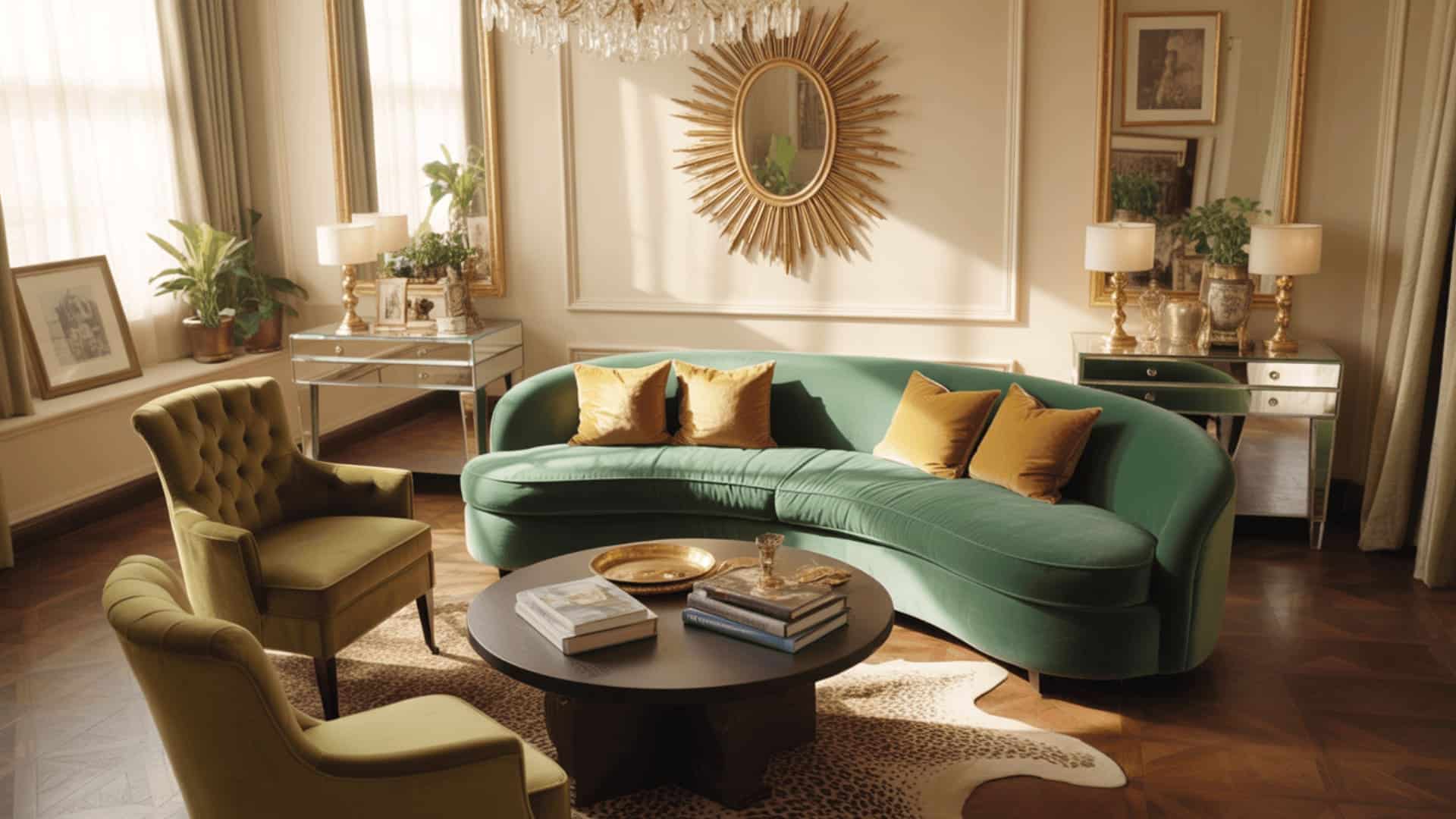
Some rooms instantly feel polished and glamorous the moment you step inside. That feeling often comes from a design approach called Hollywood Regency style. As an interior stylist with years of experience helping clients build cohesive, personality-driven spaces, I find Hollywood Regency endlessly fascinating to work with. It’s one of the few styles where restraint is not the point, theatricality is. I’ve styled several rooms in this idiom, and the reaction is almost always the same: people walk in and say it feels like a set. I’ll walk you through what defines this dramatic style, where it came from, and how you can bring it into your own home. You’ll also find practical tips for styling living rooms, bedrooms, and dining areas while keeping your space balanced and cohesive. Hollywood Regency Style Explained At its core, Hollywood Regency (also known as Regency Moderne) is the art of theatrical luxury. While other styles focus on how a room functions, this style focuses on how a room feels, specifically, how it feels under a spotlight. It is defined by a “more is more” philosophy, characterized by high-contrast visuals, such as crisp black-and-white floors paired with vivid emerald or gold. Reflective glamour is achieved through heavy reliance on mirrors, glass, and high-gloss lacquer to reflect light. Sensory textures matter deeply; if it’s not silky, velvety, or furry, it probably doesn’t belong. Scale and proportion play a crucial role, too, with low-slung furniture that makes ceilings look ten feet tall, creating an air of grandiosity that defines the entire space. One thing people often get wrong is conflating Hollywood Regency with Art Deco. While both share geometric precision and a love of metallic finishes, Art Deco tends toward sleekness and minimalism. Hollywood Regency is more ornamental, more eclectic, and openly maximalist. It borrows from Art Deco but layers in Chinoiserie, neoclassical symmetry, and a spirit of theatrical excess that Art Deco never fully embraced. The History Behind Hollywood Regency This style emerged during the Golden Age of Cinema (1920s–1950s), when movie stars like Joan Crawford and Carole Lombard sought homes that matched the opulence of their film sets. Dorothy Draper The “First Lady of Interior Design,” mastered bold patterns such as her “Brazilliance” leaf print and oversized checkerboard floors, demonstrating that contrasting patterns could achieve sophistication. Draper established the first interior design firm in the United States in 1923, and her work on The Greenbrier resort in West Virginia, which she transformed from a WWII Army hospital into a showcase of American glamour beginning in 1946, remains one of the most cited examples of Hollywood Regency at scale. William Haines A former silent film star pioneered low-profile furniture to maintain unobstructed sightlines during gatherings. Billy Baldwin A third figure often left out of these histories, sometimes called the dean of American decorators. Baldwin championed the idea that comfortable furniture was the ultimate luxury. He brought cotton fabrics, dark walls, pattern-on-pattern layering, and the armless slipper chair into the vocabulary — elements that would quietly shape what we now recognize as Hollywood Regency’s more livable side. David Hicks The English designer who brought the style into the 1960s and 70s with his bold geometric rugs and monochromatic rooms, giving it a sharper, more modern edge. Key Characteristics of Hollywood Regency Style This design style has a signature look that’s instantly recognizable, but knowing the rules also helps you know when to break them. In practice, I’ve found that the homes that pull this off best don’t use every characteristic at once. They anchor the room in one or two strong moves, say, a black-and-white floor and a velvet sofa, and let everything else follow quietly. 1. Bold Color Palettes The color approach is fearless and high-impact. Sharp black-and-white contrasts form the base, and rich jewel tones like emerald green, sapphire blue, and deep amethyst add drama. This contrast creates visual punch and keeps the eye moving around the room. It’s not about playing it safe; it’s about making each color choice count and letting different shades play off each other for maximum effect. Hot pink satin paired with emerald velvet, or turquoise drapes against lemon yellow upholstery. These are not accidental. The contrast creates visual tension, keeping the eye moving. The most effective Hollywood Regency rooms typically commit to one dominant jewel tone and use black, white, or gold as supporting players, rather than introducing three or four competing saturated colors at once. 2. Luxurious Materials Material choice defines the whole vibe. Plush velvet upholstery, smooth silk drapes, and glossy lacquered finishes dominate the space. Mirrored surfaces and glass accents reflect light, while brass and gold hardware add warmth and richness. These materials create layered textures that define the glamorous feel of the style. This mix of soft and shiny gives its signature opulent feel. In more contemporary takes on the style, Lucite furniture has become a staple. It carries the same sense of glamour and transparency without the weight. Faux fur throws and upholstered stools bring textural contrast. The goal with materials is layering: something shiny next to something plush next to something matte, so the room never reads as flat. 3. Furniture Shapes The furniture makes vibrant statements through shape alone. Curved sofas with dramatic silhouettes, deeply tufted chairs and headboards, and low-profile seating that feels modern yet plush. The armless slipper chair is a true Hollywood Regency staple. It reads as boudoir-inspired but works in almost any room. Haines’s “Bel Air” sofa, designed low to the floor so that guests appeared grander by comparison, is another classic reference point. Faux-bamboo accents on furniture frames, a nod to Chinoiserie, are equally characteristic and easier to source than people expect. Statement coffee tables, often with mirrored tops or sculptural bases, anchor the room. 4. Statement Decor Accessories take center stage. Sunburst mirrors create instant drama on walls, while crystal chandeliers add sparkle overhead. Animal prints like leopard or zebra bring pattern without fuss, and bamboo-style furniture nods to Chinoiserie influences. Oversized black-and-white photographic prints of classic film actresses were common in original Hollywood Regency interiors and are having a revival. Starburst motifs appear not just in mirrors but in ceiling flush mounts and sputnik-style pendant lights. When choosing animal prints, scale matters. A large-scale zebra print reads as confident, while a small repeat can feel timid and out of place in an otherwise bold room. It’s about choosing fewer pieces that make bigger impacts rather than cluttering surfaces with small, forgettable items. 5. Symmetry and Balance Hollywood Regency relies heavily on symmetrical arrangements to create visual harmony. Matching pairs of lamps, chairs, or side tables flank central focal points, such as sofas or beds. This deliberate balance creates a sense of formality and polish while anchoring bold design choices. The symmetry prevents dramatic elements from feeling chaotic, instead channeling energy into controlled, intentional glamour that feels both theatrical and refined. 6. Dramatic Lighting Lighting serves as jewelry for the room. Crystal chandeliers, oversized pendant lights, and sculptural table lamps with metallic finishes act as statement pieces beyond their functional purpose. Multiple light sources at varying heights create depth and ambiance. Dimmers allow flexibility between bright, energetic settings and moody, intimate atmospheres. Table lamps with unusual bases (sculptural animals, column forms, or oversized geometric shapes) are a Hollywood Regency signature. The goal is not simply to illuminate but to make every light fixture feel like a deliberate design object. Sputnik chandeliers, with their starburst arms, are the most direct contemporary interpretation of this approach. 7. Walls andSurfaces This is a characteristic top-ranking sources cover that is often underserved: plain white walls have no place in a true Hollywood Regency interior unless they are completely concealed by mirrors, frames, and artwork. Common approaches include lacquered walls in deep jewel tones, tropical or chinoiserie wallpapers, bold stripe patterns, and glossy checkered wainscoting. Full mirrored walls (not mosaic tiles) are also historically accurate, especially in dressing rooms and hallways. If budget is a constraint, a single mirrored wall behind key furniture achieves much of the same effect. How to Incorporate Hollywood Regency Style in Your Home When I bring this look into a client’s home, I always start one room at a time and resist the urge to do everything at once. The spaces that feel genuinely glamorous are almost always built in layers over time – a good piece of furniture first, then lighting, then accessories. Doing it all in a weekend tends to produce a room that looks costumed rather than designed. 1. Living Room Choose luxurious fabrics like velvet or silk for sofas and chairs to establish the foundation of glamour. Incorporate mirrored furniture or lacquered finishes on coffee tables and consoles to create a reflective shine. Add statement lighting like a vibrant crystal chandelier or large brass lamps with dramatic silhouettes. Layer in jewel-tone pillows and arrange furniture symmetrically around a central focal point to create balance and visual impact. A glossy black-and-white chequerboard floor is the single most impactful move in a Hollywood Regency living room. It sets the entire tone and makes everything placed on top of it read as intentional. If you rent or can’t change your flooring, a large geometric rug in black and white achieves a similar effect. Pair this with a low-profile velvet sofa in a single strong color (emerald, navy, or deep plum) and you’ve established the room’s core language. 2. Bedroom Use plush bedding with a mix of bold jewel tones and metallic gold or silver accents. Add large accent mirrors with ornate frames, and choose nightstands with chrome or mirrored finishes. Include vibrant velvet throw pillows in contrasting colors and incorporate Art Deco-inspired patterns on area rugs or accent wallpaper behind the headboard. Keep the palette high-contrast with deep colors against neutral backgrounds for drama. The divan, with its plush sides and asymmetric form, is the bedroom equivalent of the slipper chair: historically rooted in Hollywood Regency and still genuinely functional. A deeply tufted headboard in velvet or damask, ideally floor-to-ceiling in scale, is the fastest way to shift a bedroom into this register. Chinoiserie-patterned wallpaper on the wall behind the headboard adds depth without requiring a complete renovation. 3. Dining Room Use gold or silver-plated tableware and serving pieces to enhance the dining experience. Choose a statement dining table with a lacquered or mirrored finish as the room’s centerpiece. Hang a dramatic crystal chandelier directly above the table for ultimate glamour. Add upholstered dining chairs in velvet with tufted backs, and place a large sunburst mirror on the wall to reflect light and create depth. Skirted furniture, particularly in damask or brocade, is a detail that distinguishes a surface-level Regency dining room from a considered one. A lacquered bar cart in a jewel tone, stocked with crystal decanters and gold bar tools, is both functional and entirely in character. If the room has crown molding, painting it in a high-gloss white against a deeper wall color amplifies the drama considerably. Pros and Cons of Hollywood Regency Style Consider the advantages and challenges before adopting this bold interior style. This helps you decide if the look fits your space and budget. Pros Cons Creates a dramatic, luxurious ambiance that feels theatrical and polished Expensive materials like velvet, lacquer, and brass can significantly increase costs Combines modern and vintage elements for an eclectic, enduring look Can feel overwhelming in smaller spaces due to its bold, high-contrast nature Perfect for statement pieces and vibrant design lovers who embrace drama Requires careful balance to avoid a cluttered or over-the-top appearance Highly photogenic and Instagram-worthy for those who love visual impact Not ideal for minimalists or those preferring understated, neutral aesthetics Eclectic by nature, less restrictive than most styles, allowing genuine personalization across rooms Velvet, lacquer, and mirrored surfaces require regular upkeep to maintain their impact This bold décor style delivers undeniable glamour but demands thoughtful execution. If you love drama and have the budget, the rewards outweigh the challenges for creating unforgettable spaces. Who Should Choose Hollywood Regency? Hollywood Regency works best for people who love drama, glamour, and making vibrant design statements. If you’re drawn to high-contrast colors, luxe textures, and spaces that feel theatrical, this style fits your personality perfectly. It shines in apartments where vertical drama and mirrored surfaces make smaller spaces feel larger and more dynamic. Formal living rooms, dining rooms, and primary bedrooms also benefit from its polished, sophisticated vibe. That said, this design feels out of place in rustic or farmhouse-style homes. The glossy finishes and jewel tones clash with weathered wood and natural textures. If your space leans cozy and organic, this style might not be your best match. It also works surprisingly well in rental apartments. The style’s emphasis on furniture and accessories, rather than permanent architectural changes, means you can achieve significant impact without touching walls or floors. A velvet sofa, a pair of brass lamps, a sunburst mirror, and a geometric rug can transform a generic rental bedroom into something that reads as genuinely designed. Hollywood Regency in Modern Times Today, interior designers are giving this bold décor style a fresh update to fit comfortably in modern homes. Instead of filling every corner with vibrant décor, many designers focus on a few standout elements that bring glamour without overwhelming the space. This approach is often called minimal Regency glamour. You might see a velvet chair paired with a simple neutral sofa, or a single sunburst mirror used as the room’s focal point. The goal is to keep the drama but simplify the layout. Contemporary designers like Kelly Wearstler, Miles Redd, and Carlton Varney have been the most visible stewards of this style’s modern evolution. Wearstler in particular, whose work on the Viceroy Hotel in Miami is often cited, distills Hollywood Regency into something sharper and more graphic without losing its essential theatricality. Her approach is worth studying if you want to understand how to apply the style without it reading as period pastiche. Modern furniture brands also make this style easier to try. Budget-friendly options from retailers like IKEA-inspired collections sit alongside luxury lacquered consoles, brass lighting, and velvet seating from high-end brands. This mix allows homeowners to enjoy Regency-style interior flair on any budget. Hollywood Regency vs. Related Styles: How to Tell Them Apart This is a question that often comes up, and the top-ranking sources tend to address it only partially. Here is a direct comparison. Style Key Difference from Hollywood Regency Art Deco Sleeker, more geometric, and less eclectic. Art Deco started in Paris and skews minimalist relative to Regency’s maximalism. Glamour / Hollywood Glam Often used interchangeably, but “Hollywood Glam” tends to be used more loosely and without the historical specificity of Regency Moderne. Mid-Century Modern Overlapping era, but MCM prioritizes organic forms, natural materials, and functional restraint. No jewel tones or animal prints. Chinoiserie An influence within Hollywood Regency, not a synonym. Chinoiserie’s bamboo motifs and tropical prints are incorporated elements, not the whole style. WrappingUp Now you have a clearer understanding of how Hollywood Regency style works and why it continues to influence interiors today. This design approach centers on bold colors, luxurious materials, reflective surfaces, and statement pieces that create a polished and glamorous atmosphere. I always suggest starting with small details first. A mirrored tray, velvet pillow, or striking lamp can introduce Hollywood Regency style without overwhelming your space. Once those elements feel comfortable, you can gradually add larger pieces to complete the space. Interior design works best when it reflects your personality while still maintaining balance. If this guide helped you understand Hollywood Regency style, try adding one element to your home and see how it changes the room.