

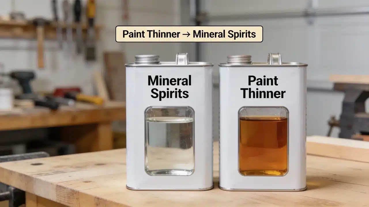
Mineral spirits are a refined petroleum distillate. Paint thinner is a broad term for several types of solvents. The two differ in odor, cost, and evaporation. Factor Mineral Spirits Paint Thinner Type Specific refined petroleum distillate Broad category; may contain mineral spirits, naphtha, or other solvents Odor Lower; odorless versions available Varies; some release stronger fumes Evaporation & Finish Slower evaporation; better control for smooth finishes Faster in some formulas; less consistent Cleaning Power Moderate Stronger in some formulas Cost Usually higher Usually lower Paint thinner and mineral spirits appear on shelf labels and project instructions as if they mean the same thing, but the two products behave differently in use. Product labels rarely describe the differences that show up during actual use. Solvent choice affects more than cleanup. The wrong product changes paint flow, drying behavior, and the final finish. After years of working with paint finishes on interior projects, the difference in odor, drying speed, and finish quality becomes apparent from the first coat. How Mineral Spirits and Paint Thinner Compare The differences between mineral spirits and paint thinner show up in composition, odor, drying time, solvent strength, and cost. 1. Composition and Refinement Mineral Spirits: A consistent refined petroleum distillate. The refining process removes most aromatic hydrocarbons, producing predictable performance across batches. Paint Thinner: Formulations vary because manufacturers combine different solvents based on cost. Two products with the same label can behave differently on the same job. 2. Odor and Indoor Use Mineral Spirits: Generally produce a milder odor. Odorless versions undergo additional processing to remove the strongest-smelling compounds, making them practical for enclosed spaces. Paint Thinner: Some formulas release stronger fumes. Both products require adequate ventilation regardless of which is used. 3. Drying Time and Evaporation Mineral Spirits: Evaporates more slowly, giving paint more time to level before drying. This reduces visible brush marks on furniture and detailed trim. Paint Thinner: Some formulas evaporate faster, which speeds up drying time on larger surface areas. Drying speed is less consistent across products. 4. Solvent Strength Mineral Spirits: Provides moderate solvency, covering most standard paint and cleanup tasks. The moderate strength also makes it safer for use on wood surfaces and with quality brushes. Paint Thinner: May have stronger cleaning ability depending on the specific solvents it contains. Strength varies by formula and brand. 5. Cost Comparison Mineral spirits typically cost more because of the additional refining required in production. Factor Mineral Spirits Paint Thinner Price per quart ~$8–10 ~$6–9 Price per gallon ~$18–20 ~$14–15 Reason More refined processing Less refined formulas Best Value Finish quality and control Budget-focused projects What are Mineral Spirits Used for? This product is best suited for tasks where low odor and better finish control are priorities. Thinning Oil-Based Paints: Mineral spirits improve flow for simple painting projects and give paint more time to level before drying. Cleaning Paint Brushes and Tools: For oil-based paint, mineral spirits clean effectively without being aggressive on the bristles. That gentler action preserves brush shape through repeated use. Preparing Surfaces Before Painting: Grease, wax residue, and oily film all affect how well a finish bonds. Wiping down with mineral spirits before painting removes those deposits. Furniture and Detailed Woodwork: A stronger product can damage the surfaces of fine wood furniture. Mineral spirits provide the solvent action needed for cleaning and prep work without that risk. What are Paint Thinners Used for? Paint thinner is suited for tasks where stronger solvent action or lower cost is the priority. Thinning Oil-Based Coatings: Paint thinner adjusts consistency for easier application when a product label specifies a particular solvent thinner. Cleaning Heavily Used Equipment: Brushes, rollers, and trays with thick dried deposits respond better to paint thinner than to mineral spirits. The stronger solvent action handles heavy buildup. Stronger Solvent-Based Cleanup: Some formulas include solvents beyond mineral spirits that dissolve residue a standard product cannot. Check the product label for the specific solvent content before use. Large Outdoor Painting Projects: The lower cost per volume makes paint thinner practical for frequent cleanup on exterior jobs. Ventilation is still required. Mineral Spirits vs Paint Thinner: Which One is Better? The right choice depends on the surface type, project scale, and the degree of finish control the job requires. Cleaning Paint Brushes: The lower-odor option is the better choice for cleaning oil-based paint brushes. They remove paint effectively without being harsh, which protects bristle quality over repeated use. Furniture Painting: It works better for furniture when finish quality is a priority. Slower evaporation gives the paint more time to level on the surface, reducing visible brush marks. Outdoor Painting: Paint thinner works for larger exterior cleanup jobs where cost matters. Confirm product compatibility before using it as a thinner on the job. Removing Dried Paint: Both products work on wet or fresh oil-based paint. Fully dried and cured paint requires a dedicated paint remover or mechanical removal; solvents alone will not break the bond. Which One Should You Choose Use this table to match the right product to the project need. Project Need Better Option Smooth furniture finish Mineral Spirits Indoor painting Mineral Spirits Cleaning quality brushes Mineral Spirits Lower-cost cleanup Paint Thinner Stronger solvent action Check product label Large outdoor projects Depends on project needs Mineral Spirits and Paint Thinner Safety Tips Both products are flammable solvents that require consistent, careful handling on every project. Work in a well-ventilated area to reduce exposure to fumes from either product. Wear gloves and eye protection when handling solvents during application or cleanup. Keep both products away from heat sources, open flames, and ignition sources. Store in tightly sealed original containers away from living areas and direct sunlight. Never pour used solvent down household drains. Follow local disposal regulations. What Not to Do When Using Paint Solvents Using mineral spirits or paint thinner with water-based latex paint is a common error. These solvents do not work with latex, which requires water for thinning and cleanup. Adding too much solvent at once reduces paint durability and affects adhesion to the surface. Not all products labeled paint thinner share the same formula or strength. Two cans with the same label can behave differently on the same job. Applying mineral spirits to a fully cured finish also falls short. Cured paint needs a dedicated remover, not a cleaning solvent. Frequently Asked Questions Is Odorless Mineral Spirits Safer than Paint Thinner? Odorless mineral spirits produce fewer noticeable fumes, but they are still solvents requiring ventilation, protective gear, and careful handling. Can Paint Thinner Damage Wood Surfaces? Some stronger paint thinner formulas may affect wood finishes. Always test on a hidden area before applying to finished surfaces. Does Mineral Spirits Leave Residue after Use? Mineral spirits usually evaporate cleanly, but residue can remain if the surface contains dissolved oils or impurities from the solvent. Can Mineral Spirits Be Used on Latex Paint? No, mineral spirits are not suitable for latex paint. Water-based paints require water for thinning and cleanup instead. How Long Does Mineral Spirits Take to Dry? Drying time varies with conditions, but mineral spirits typically evaporate more slowly than many paint thinners, allowing smoother paint leveling. Final Thought The decision between paint thinner and mineral spirits comes down to refinement, odor, and the project’s requirements. For interior finish work where odor and brush control matter, mineral spirits perform more reliably. Paint thinner is the practical choice for large-scale exterior cleanup where cost per volume outweighs the need for finish precision. The formula listed on the label determines what a product actually does, regardless of how it is shelved or priced. Both products are thin oil-based paints, but their formulas differ enough to change the final result. Test on a small surface before committing to a larger area. Share questions or project experiences in the comments below.

Choosing a light neutral paint color sounds simple until you see how much it changes once it reaches your walls. A shade that looks warm and balanced on a small paint card can appear cooler, flatter, or completely different depending on the room around it. Sherwin-Williams City Loft is a soft greige that sits between beige and gray, making it a versatile choice for modern interiors. Its appearance shifts with natural light, flooring, trim, and nearby finishes. In the morning, it may feel warm and beige, while evening lighting can bring out subtle pink or violet notes. What Color Is Sherwin-Williams City Loft? City Loft SW 7631 is a light, warm greige that sits closer to white than to true gray. It balances beige warmth with a soft gray base, which is part of why it reads as calm rather than flat. Designers reach for City Loft when a room needs warmth without committing to a strong color statement. Feature Details Paint Color City Loft Color Code SW 7631 Brand Sherwin Williams Color Family Greige Undertones Warm beige and red-pink, with a hint of violet LRV 70 Best Styles Modern, transitional, farmhouse, minimalist It works especially well in modern and transitional interiors that want a soft, quiet backdrop. What is the LRV of Sherwin-Williams City Loft? LRV, or Light Reflectance Value, measures how much light a color bounces back versus absorbs, on a scale from 0 to 100. Higher numbers mean lighter, more reflective colors. City Loft comes in at 70, which puts it firmly on the lighter side. That’s meaningfully deeper than a true white like Alabaster, which sits around 82, but noticeably lighter than mid-tone grays closer to 58. In practice, this means City Loft keeps a room feeling open and bright while still holding enough color to avoid looking stark. Where to Use Sherwin-Williams City Loft in Your Home Sherwin-Williams City Loft creates a soft, warm greige backdrop that feels calm without looking plain. Its subtle undertones work beautifully with natural textures, warm woods, and balanced finishes while adding depth to different lighting conditions. 1. Living Room City Loft is a great choice for living rooms where you want an airy, relaxed atmosphere. Its warm greige tone creates a comfortable foundation that works well with modern, transitional, and minimalist interiors. The color pairs naturally with wood furniture, linen fabrics, textured rugs, woven décor, and black accents that add contrast. In rooms with large windows, City Loft helps maintain a bright feel while adding more depth than a standard white. North-facing living rooms may bring out more of its gray undertones, while spaces with warmer sunlight usually highlight its beige warmth. 2. Bedroom City Loft creates a peaceful bedroom environment with its soft, muted appearance. It works well when you want a wall color that feels warmer than a traditional gray but lighter and calmer than a deeper beige. Pairing it with ivory bedding, beige textiles, warm wood furniture, and soft metallic finishes can create a cozy and balanced look. Since City Loft has a subtle warmth, it helps bedrooms feel settled and relaxing without making the space feel heavy or overly dark. 3. Kitchen Cabinet City Loft can give kitchen cabinets a sophisticated neutral finish without the stark look of pure white. Its warm greige tone works especially well in kitchens with natural materials and soft contrasts. It pairs beautifully with quartz countertops, marble or light stone backsplashes, brass or brushed nickel hardware, warm wood flooring, and cream-toned finishes. Since cabinet lighting can change the appearance of paint more noticeably than wall lighting, testing City Loft directly on your cabinets under your existing fixtures can help you see the true color before committing. 4. Bathroom City Loft brings a soft, spa-like feel to bathrooms by adding warmth while keeping the space clean and bright. It works well with white tile, natural stone surfaces, light wood vanities, and brushed metal fixtures. In bathrooms with limited natural light, City Loft can soften the room without making it feel too beige. Warm bulbs will enhance its cozy side, while cooler lighting may reveal more of its gray and violet undertones. 5. Exterior City Loft can create an elegant exterior when you want a light neutral with more warmth and depth than a plain white. Outdoor lighting affects paint colors differently than indoor lighting, so City Loft may appear lighter and slightly warmer on exterior walls. It pairs well with white trim, black-framed windows, natural stone, dark wood doors, and charcoal accents. Since sunlight, shade, and surrounding landscaping can influence how the color appears, testing City Loft on different sides of your home before painting the entire exterior is the best way to understand its final look. Colors That Go Well With Sherwin-Williams City Loft Sherwin-Williams City Loft works beautifully with a range of warm and cool neutrals because of its balanced greige base. Pairing it with the right colors can either enhance its cozy beige warmth or create a cleaner, more contrasting look. Soft whites, earthy greens, deeper charcoal tones, and natural wood f Paint Color Why It Works Sherwin-Williams Pure White Creates soft, gentle contrast Sherwin-Williams Alabaster Adds extra warmth Sherwin-Williams Extra White Gives a cleaner, crisper look Sherwin-Williams Urbane Bronze Adds depth and drama Sherwin-Williams Evergreen Fog Builds an earthy, layered palette For trim, Pure White and Extra White both offer clean contrast, while Alabaster softens the pairing if you want less separation between wall and trim. For accent walls, Urbane Bronze or Evergreen Fog give City Loft something to visually lean against. Sherwin-Williams City Loft vs Similar Paint Colors City Loft shares similarities with several popular light neutrals, but small differences in undertones, depth, and LRV can change how each shade feels in a room. Comparing City Loft with colors like Agreeable Gray, Repose Gray, Accessible Beige, and Pale Oak makes it easier to choose the right neutral for your lighting, finishes, and overall design style. City Loft vs Agreeable Gray Sherwin-Williams City Loft and Agreeable Gray are both popular neutral shades, but they create different moods in a space. City Loft is lighter and softer with warm beige, pink, and violet influences, while Agreeable Gray has a deeper greige appearance with more balanced taupe undertones. Comparing their brightness, undertones, and overall feel helps determine which color works better for your room. Feature City Loft Agreeable Gray Undertone Beige, red, pink, violet Taupe brown with a touch of violet Appearance Lighter, warmer greige Slightly deeper, more balanced greige LRV 70 60 Best For Soft, warm minimalist spaces Whole home neutral City Loft sits noticeably lighter on the LRV scale, and its undertones lean more toward pink beige than the brown taupe base in Agreeable Gray. City Loft vs Repose Gray Repose Gray reads cooler and more purely gray, with an LRV around 58. City Loft is both lighter and warmer, making it a better fit for rooms that want softness rather than a crisp, modern gray. Feature City Loft Repose Gray Undertone Warm beige with red, pink, and violet influence Warm gray with subtle beige undertones Appearance Soft, light greige Cleaner, cooler gray LRV 70 58 Overall Feel Warm, airy, and relaxed Balanced, modern, and understated Best For Bedrooms, minimalist spaces, bright interiors Whole home walls, modern and transitional rooms City Loft works better when you want a lighter and softer neutral, while Repose Gray suits spaces where you prefer a more traditional gray with less beige warmth. City Loft vs Accessible Beige Accessible Beige carries a stronger, more straightforward beige base with an LRV close to 58. City Loft is considerably lighter and carries more complexity in its undertones, thanks to that underlying violet note. Feature City Loft Accessible Beige Undertone Beige with red, pink, and violet notes Warm beige with gray influence Appearance Light, soft greige Deeper beige greige LRV 70 58 Overall Feel Fresh, subtle, and calming Warm, inviting, and grounded. Best For Bright interiors, soft neutral palettes Living rooms, traditional and transitional spaces City Loft is a better fit for spaces that need a lighter neutral, while Accessible Beige works well when you want more warmth and a stronger beige presence. City Loft vs Pale Oak Both colors share a soft, quiet neutral quality, but Pale Oak leans more consistently warm and beige-toned. City Loft’s violet undertone gives it a bit more range, since it can shift cooler under certain lighting in a way Pale Oak generally doesn’t. Feature City Loft Pale Oak Undertone Warm beige with red, pink, and violet influence Warm beige with subtle gray undertones Appearance Light greige with slight cooler shifts Soft, warm beige greige LRV 70 Around 69 Overall Feel Airy, modern, and adaptable Warm, elegant, and classic Best For Minimalist interiors, modern spaces Bedrooms, traditional and soft neutral rooms City Loft is ideal if you want a neutral that changes slightly with lighting, while Pale Oak offers a more consistently warm and beige appearance. Is Sherwin-Williams City Loft Right for Your Home? Choosing a paint color is rarely about finding a shade that looks perfect everywhere. It is about finding one that works with the way your home already feels, from the flooring under your feet to the light coming through your windows. Sherwin-Williams City Loft is a thoughtful choice for spaces that need a neutral backdrop with a little more personality than plain white. It allows furniture, textures, and architectural details to take the spotlight while adding warmth in the background. Before making the final decision, spend time with a sample in your own space and view it throughout the day. The right neutral should feel natural from morning coffee to evening relaxation. Share your experience with City Loft in the comments if you have used it in your home. Frequently Asked Questions Does City Loft look yellow? City Loft does not usually look yellow. It has a warm beige base with subtle pink and violet undertones, but lighting and nearby finishes can influence how warm it appears. What color makes a house look expensive? Elegant neutrals like soft whites, warm greiges, deep charcoal, and earthy tones often create a high-end look. The right choice depends on the home’s lighting, materials, and overall style. Is City Loft darker than Aesthetic White? No, City Loft and Aesthetic White are both light neutrals. Still, City Loft generally reads slightly deeper because of its stronger greige character compared to Aesthetic White’s softer off-white appearance. What is Sherwin-Williams’ recommended most popular white paint? Sherwin-Williams Alabaster SW 7008 is one of the brand’s most popular white paints. It is known for its warm, balanced appearance that works well in many interior styles. Which is better, Drift of Mist or City Loft? Both are soft neutral colors, but they create different moods. Drift of Mist feels lighter and more subtle, while City Loft offers more warmth and depth with its greige undertones.
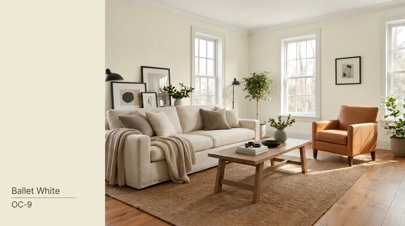
One of my clients once stood in her half-painted living room and asked me a question I hear all the time. “Why does this white look completely different than it did on the swatch?” That’s the thing about Benjamin Moore Ballet White OC-9. It’s a warm, muted off-white with more depth than a plain white. It has a soft, creamy base with a touch of beige. After ten years of color consulting, I’ve learned that the chip never tells the whole story. A color can look cream in the morning and lean gray by evening. It depends on your room’s light, your finishes, and the time of day. Natural light shifts constantly. So does artificial light, flooring, and even the stone on your countertop. What Color Is Benjamin Moore Ballet White? Ballet White is not a bright, crisp white. It falls between a warm off-white, cream, and light greige, offering enough depth to stand out without feeling heavy. Its soft beige, gray, and subtle green undertones shift with lighting, creating a warm and balanced look that works well in many interiors. Ballet White works beautifully in interiors that need a calm, welcoming backdrop and pairs well with natural materials, warm wood tones, soft neutrals, and layered textures. Color Detail Ballet White OC-9 Brand Benjamin Moore Collection Off White Collection Color family Warm off-white LRV 71.97 Main undertones Cream, beige, gray, and occasional muted green Best general use Walls, cabinets, trim, and exteriors Overall appearance Soft, warm, muted, and grounded Benjamin Moore includes Ballet White in its Off White Collection with an official LRV of 71.97. This high LRV allows it to reflect plenty of light while maintaining its cozy warmth. Pro Tips: Because lighting greatly affects how Ballet White appears, always test a sample on your walls before committing to the full space. Its final look depends on room direction, natural light, and surrounding colors. Where Does Benjamin Moore Ballet White Work Best? Benjamin Moore Ballet White is a versatile off-white that shines in the right spaces. Here’s where it works best and what to consider before using it. 1. Living Rooms and Open-Plan Spaces Ballet White connects adjoining rooms beautifully without looking stark, making it ideal for open floor plans and flowing spaces. Its warm undertones complement natural wood, stone, linen, leather, and neutral fabrics. Pair it with Benjamin Moore White Dove OC-17, Edgecomb Gray HC-173, or Saybrook Sage HC-114 for a balanced, timeless color palette. 2. Bedrooms In a bedroom, Ballet White creates a softer, more relaxing backdrop than a bright white, giving the space a warm and inviting feel. Its gentle beige-greige undertones promote a calm atmosphere without appearing dull or overly creamy. It pairs beautifully with ivory bedding, warm oak or walnut furniture, and muted green or dusty blue accents. For a cohesive Benjamin Moore palette, consider Saybrook Sage HC-114 for a soothing accent wall, or White Dove OC-17 for crisp trim and ceilings. 3. Kitchens and Kitchen Cabinets Ballet White behaves a bit differently on walls than on cabinetry. Cabinet sheen tends to make the color look lighter, since shinier finishes bounce more light back at your eyes. Always check it beside your backsplash tile, countertops, flooring, and appliances first. Kitchens mix many materials in one space, so testing against everything nearby saves you from a costly repaint later. One warning: cool white quartz or blue-white subway tile can make Ballet White appear dingy or yellow by comparison. 4. Bathrooms Bathrooms often have limited natural light and lots of reflective surfaces. Both factors affect how Ballet White actually reads once it’s on the wall, sometimes more than you’d expect. It works well with warm marble, limestone, travertine, brass, and brushed nickel fixtures. These materials share the same soft, warm undertone that Ballet White carries. Be careful pairing it with icy gray tile or stark blue-white fixtures, since the mix can clash and look off. Always sample the paint first, right in your own bathroom lighting, before committing to the full room. 5. Hallways and Low-Light Areas Ballet White can bring a soft, inviting warmth to a windowless space, making it feel more comfortable than cooler white paints. However, no paint color can create natural light where none exists. In hallways or rooms without windows, Ballet White may appear flatter or more beige because of limited illumination. Before deciding to switch paint colors, consider upgrading your artificial lighting instead. Brighter LED bulbs, additional fixtures, or a better color temperature can dramatically improve how the paint looks, helping the space feel brighter, more balanced, and visually appealing. 6. Trim, Doors, and Ceilings Ballet White works beautifully as a trim color when paired with darker warm neutrals, creating a soft, elegant contrast without feeling too stark. It also performs well as both a wall and trim color when used in different finishes, such as eggshell on the walls and semi-gloss on the trim, for a subtle tone-on-tone effect. However, avoid pairing Ballet White with another off-white that has very similar undertones. Without enough contrast, the combination can appear unintentional, making the overall design feel flat rather than polished and cohesive. Colors That Coordinate Well With Ballet White Benjamin Moore Ballet White pairs beautifully with warm neutrals, soft whites, and muted blues or greens. Crisp whites create contrast, while earthy tones and deeper shades add balance and depth. These combinations help highlight Ballet White’s creamy, timeless appearance in any interior style. Recommended Color Pairings: White Trim & Ceilings: White Dove OC-17, Simply White OC-117, Chantilly Lace OC-65 Warm Neutrals: Pashmina AF-100, Edgecomb Gray HC-173, Revere Pewter HC-172, Kendall Charcoal HC-166 Blue & Green Accents: Hale Navy HC-154, Boothbay Gray HC-165, Saybrook Sage HC-114, October Mist 1495 Paint Finishes that Complement BM Ballet White The right paint finish enhances Ballet White’s soft warmth while improving durability and ease of maintenance Surface Suggested finish Why it works Living and bedroom walls Matte or eggshell Soft appearance with manageable cleaning Kitchen and bathroom walls Eggshell or satin Better moisture and stain resistance Cabinets Satin or semi-gloss Durable and easier to wipe clean Trim and doors Satin or semi-gloss Adds definition and withstands handling Ceilings Flat Reduces glare and surface imperfections Exterior siding Low-lustre Offers durability without excessive shine Sheen changes how light bounces off a surface. The same color can look lighter in one finish and richer in another. Paint Colors that are Similar to Ballet White If Ballet White isn’t quite right, these shades share its soft, warm character with small shifts in tone. White Dove OC-17 White Dove is one of Benjamin Moore’s most popular soft whites. It reads brighter and crisper than Ballet White, with far less beige weight behind it. This makes it a strong pick if you want a clean, airy feel without going all the way to a stark white. Many painters choose White Dove for trim, ceilings, or whole-house schemes where a soft but bright backdrop is the goal. It stays warm enough to avoid feeling cold, but it won’t carry the same creamy depth as Ballet White. Feature Ballet White OC-9 White Dove OC-17 LRV 71.97 85.4 Undertone Warm greige, cream, faint green Soft, clean warmth Best For Balanced warmth, most rooms Brighter, crisper spaces Swiss Coffee OC-45 Swiss Coffee is a creamier, more traditional off-white. It carries more visible yellow warmth than Ballet White, giving it a cozier, old-world feel that many people associate with classic interiors. This color tends to lean warmer in every kind of light, including cooler north-facing rooms. If you love the idea of a true cream but find Ballet White too muted, Swiss Coffee may be the better fit. Feature Ballet White OC-9 Swiss Coffee OC-45 LRV 71.97 81.56 Undertone Warm greige, cream, faint green Warm, yellow-leaning cream Best For Balanced warmth, most rooms Traditional, cozy interiors Shoji White SW 7042 Shoji White is Sherwin-Williams’ closest match to Ballet White. It sits in the same warm greige family, but the undertone balance leans slightly cooler and more neutral overall. If you’re set on a Sherwin-Williams product but want something close to Ballet White’s character, Shoji White is worth sampling. Just remember that paint formulas across brands are never identical, even when the numbers look similar on paper. Feature Ballet White OC-9 Shoji White SW 7042 LRV 71.97 71 Undertone Warm greige, cream, faint green Warm greige, cooler balance Best For Balanced warmth, most rooms Sherwin-Williams equivalent When Ballet White May Not Be the Right Choice Ballet White isn’t for every home. It may not fit if you want a crisp, clean, gallery-like white instead of something softer and warmer. It also struggles when nearby permanent finishes carry strong blue, violet, or cool gray undertones, since Ballet White’s warmth can clash rather than blend in. Rooms that already lean warm, with golden light and wood tones, can start to feel too creamy once Ballet White joins the mix. Low-light spaces bring a similar risk. If you want something bright and true white, dim rooms can make this shade look duller than expected. Placed next to a true white, it can also read dingy by comparison. If you dislike beige, cream, or shifting undertones, this color will likely bother you over time. And if your trim sits too close to Ballet White, you’ll lose the contrast that makes trim details stand out. Is Benjamin Moore Ballet White a Good Choice? Ballet White suits homes that want a warm, substantial off-white rather than a crisp, cold one. It performs best with warm materials, transitional rooms, natural finishes, traditional interiors, and softly layered color palettes. Its final look depends heavily on your room’s undertones and lighting. That’s simply how this color works. The smartest move is to sample it at a large scale before making your final decision. Frequently Asked Questions What Are The Undertones In Benjamin Moore Ballet White? Benjamin Moore Ballet White has warm beige and greige undertones. It can appear creamy in warm light and slightly gray in cooler conditions. Is Benjamin Moore’s Ballet White Too Yellow? Ballet White is not overly yellow. Its balanced beige undertones create warmth without looking bright yellow, especially when paired with natural lighting. What Is The Difference Between Ballet White And Swiss Coffee? Ballet White is softer and more muted with greige undertones, while Swiss Coffee is warmer, creamier, and has stronger yellow-beige characteristics. What Makes Ballet White So Popular? Ballet White is popular because it offers a versatile neutral backdrop that works beautifully with modern, traditional, and transitional interiors while feeling warm and timeless. Does Ballet White Look Dingy? Ballet White usually does not look dingy. However, in low-light rooms or with cool finishes, its beige undertones may appear slightly muted.
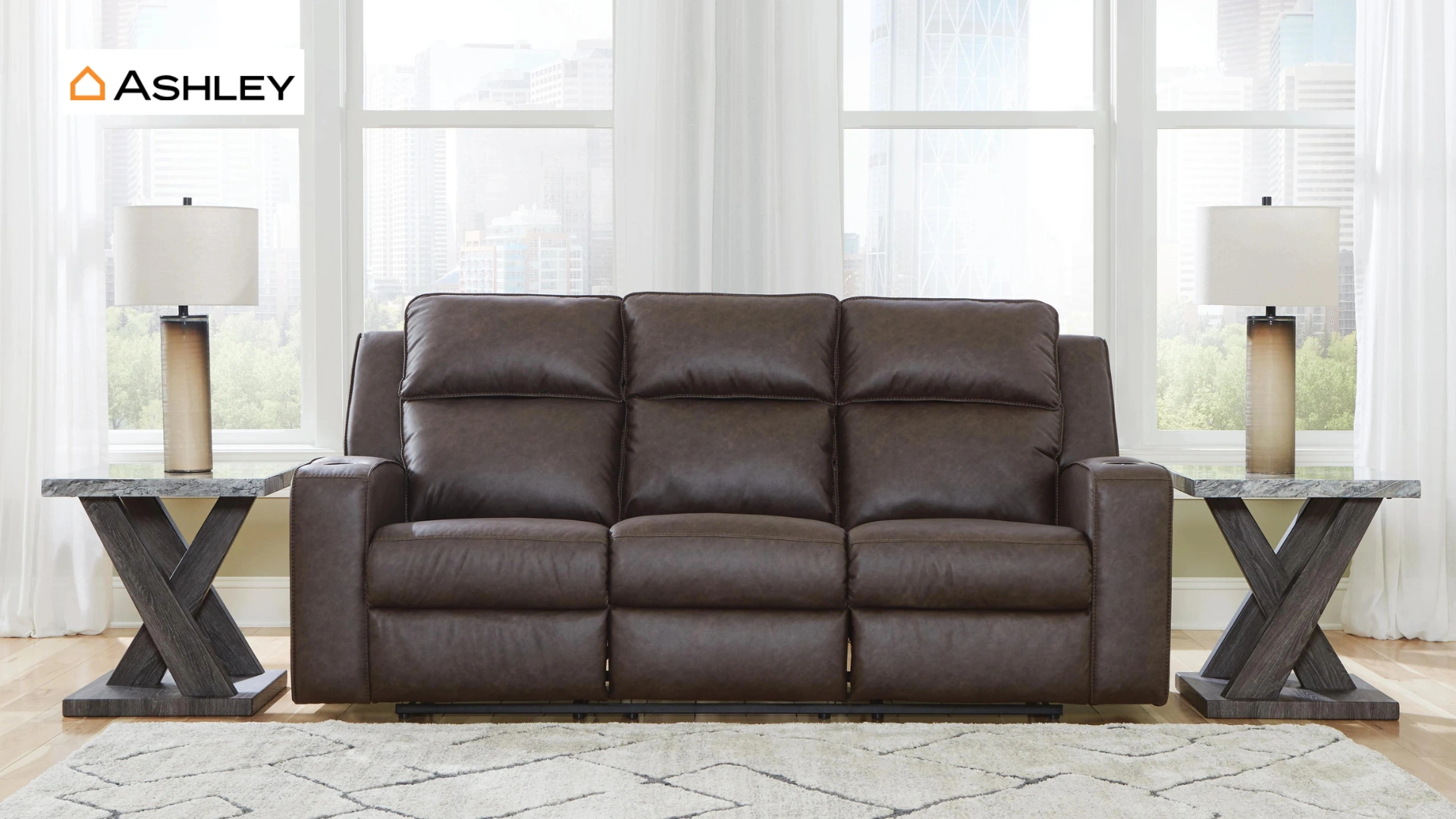
I learned the hard way that choosing furniture is not always as simple as picking the piece that looks best in a showroom. A sofa can feel perfect when you first sit on it, only to lose its shape after months of daily use. That experience led me to the question many shoppers consider before making a purchase, is Ashley Furniture good quality? Furniture quality is rarely a black-and-white decision. The right choice depends on the piece itself, the materials behind it, and the kind of everyday use it needs to handle. A solid dining table and a budget dresser may carry the Ashley name, but they can perform very differently over time. This blog looks beyond the showroom appeal to break down Ashley Furniture’s materials, construction, durability, and the pieces that offer the best value. It will help you understand where the brand performs well and where you may want to be more careful before buying. Is Ashley Furniture Good for Your Home? Ashley Furniture offers decent value if you are shopping on a budget or mid-range price point. It is not built to premium or heirloom standards, and it does not try to be. Some pieces hold up well for years with normal use. Others, especially heavily used sofas and recliners, show wear sooner than buyers expect. The smartest approach is to judge each product on its own. A dining table from one collection can outlast a sofa from another. Look at the specific model, not just the brand name. How Good is Ashley Furniture’s Overall Quality? Image Source: ashleyfurniture.com Quality at Ashley is not one fixed standard. It shifts based on materials, where a piece is made, and how it was built. Two sofas in the same store can perform very differently over time. Materials Used in Ashley Furniture Most Ashley pieces rely on engineered wood, made from particleboard or MDF covered with a wood veneer. Solid wood shows up in select collections, usually at a higher price point. Most Ashley pieces rely on engineered wood, made from particleboard or MDF covered with a wood veneer. Understanding what engineered hardwood is can help you compare its construction, durability, and performance against solid wood options. Solid wood shows up in select collections, usually at a higher price point. Upholstery ranges from polyester fabric to faux leather and genuine leather. Cushion foam density varies too, which affects how long a sofa keeps its shape. Engineered wood keeps prices low and stock full. It works fine for lighter use. It is more prone to moisture damage and chipped edges than solid hardwood. Ashley Furniture Construction Quality Frame strength depends on the model. Better pieces use corner blocking and reinforced joints. Cheaper lines may rely on staples and glue instead of screws. Before buying, check these details in person: Drawers that slide without sticking Joints that feel tight, not wobbly Reinforced corners on frames Clear weight limits listed on the tag Warranty terms in writing Assembly is required for many pieces, and reviewers often mention missing hardware or unclear instructions during delivery. Durability of Furniture Most owners report that Ashley furniture lasts about three to five years under daily use before showing real wear. High-traffic pieces wear out faster than furniture used only now and then. Several factors decide how long a piece will actually last: How often it gets used? Household size Pets and kids in the home Regular cleaning and care The specific materials chosen at checkout Choosing the right piece based on your lifestyle is key to getting better value from Ashley Furniture. Matching the furniture type and materials to your needs can make a noticeable difference in its overall lifespan. Knowing what the most durable furniture material is can also help you choose pieces that better match your expected usage and long-term needs. Choosing the right piece based on your lifestyle is key to getting better value from Ashley Furniture. Matching the furniture type and materials to your needs can make a noticeable difference in its overall lifespan. How Good Are Ashley Furniture Sofas? Image source: ashleyfurniture.com Sofas draw the most questions about Ashley furniture quality, since they see daily use and carry a bigger price tag. 1. Sofa Frame Quality Ashley sofas use a mix of engineered wood and hardwood frames. Corner blocking adds strength at stress points. A well-braced frame is the biggest factor in how long a sofa survives. 2. Cushion Comfort and Longevity Foam density makes or breaks comfort over time. Dense foam holds its shape longer than soft, low-cost foam. Fiber-filled cushions feel plush at first but often flatten faster. A sofa that feels great in the store may not feel the same after two years of daily sitting. Ask about foam density before you buy. 3. Upholstery Options Polyester fabric is common and budget-friendly, but it wears faster under heavy use. Performance fabrics resist stains and hold up better for families with kids or pets. Faux leather is affordable but can crack over time. Genuine leather costs more and lasts longer with proper care. Is Ashley Furniture Good for Bedroom Sets? Bedroom sets are one of Ashley’s strongest categories, mainly because matching collections make furnishing a full room simple. Pros Cons Matching pieces available across complete collections Some pieces use particleboard instead of solid wood More affordable than many custom bedroom sets Drawer hardware may loosen with regular use Wide range of styles and finishes to choose from Heavier pieces can be difficult to move frequently If you plan to stay in one home for years, a bedroom set from Ashley can be a fair trade. If you move often, lighter and more durable options may serve you better. Common Complaints About Ashley Furniture While many pieces perform well for different buyers, some recurring concerns are worth knowing before purchasing. 1. Cushion Sagging and Wear: Sofa cushions lose their shape fastest in homes with daily sitting or kids jumping on furniture. Lower foam density speeds this up. 2. Delivery and Assembly Issues: Customers often mention delayed shipments, missing hardware, and long waits for replacement parts. Checking your order the moment it arrives can save a headache later. 3. Finish and Material Concerns: Some buyers report peeling veneer, surface scratches, and loose hardware after a year or two of regular use. These issues tend to cluster in lower-priced lines rather than higher-tier collections. To be fair, plenty of customers also praise their sales experience and specific sofa or bedroom models. Results vary by product and by store. Which Ashley Furniture Products are Worth Buying? Image Source: ashleyfurniture.com Some Ashley Furniture products offer better value than others depending on how they are built and how often they will be used. Solid dining tables with sturdy leg construction, accent chairs and side tables meant for lighter use, higher-tier collections with denser foam and stronger frames, and performance fabric sofas are generally better choices for long-term value. However, pieces that experience heavy daily use require closer inspection. Sofas and sectionals used regularly, recliners with mechanical parts, entry-level bedroom sets, and furniture requiring extensive at-home assembly may need more careful consideration before buying. Taking a few extra minutes to check materials, construction, and comfort in-store can help you avoid problems later. How to Choose Good Quality Ashley Furniture? Before buying Ashley Furniture, check the materials listed on the product tag or online description to understand what you are paying for. Test cushions in person by sitting on them instead of judging only by appearance, and look for reviews that mention long-term use rather than just delivery experiences. Inspect important details like joints, corners, drawer slides, and overall construction quality. It is also worth comparing the warranty coverage carefully to see what is included. Most importantly, choose furniture based on your household’s needs and daily habits rather than looks alone. Ashley Furniture vs Other Furniture Brands Ashley sits in the middle of the budget furniture market. It costs more than IKEA but usually less than Living Spaces on similar pieces. Brand Sofa Price Bedroom Set Price Ashley Furniture $400 to $1,200 $1,000 to $3,000 IKEA $200 to $1,000 $500 to $1,500 Living Spaces $600 and up $1,500 to $3,000 IKEA, Ashley, and Living Spaces each target different price points and buying preferences, so the best choice depends on budget, material expectations, and how much assembly or customization buyers are comfortable with. IKEA is generally positioned as a more budget-friendly option, with many sofas, beds, and furniture sets available at lower price points. The trade-off is that some pieces use lighter materials, have fixed cushion designs, and require customer assembly. Ashley typically falls into the mid-range category, offering a wider selection of assembled furniture with delivery options. Many pieces feature hardwood components, removable cushions, and product-specific warranties, although materials and construction can vary across collections. Living Spaces often sits in a similar mid-range category, with pricing that can be higher on certain models. Some collections focus on upgraded materials and construction details, while others remain closer to standard furniture offerings. Rather than comparing brands only by price, consider factors such as expected usage, preferred materials, maintenance needs, delivery options, and how long you want the furniture to last. Each brand offers different choices depending on the balance between cost, convenience, and durability you are looking for. Is Ashley Furniture Worth Buying? Ashley Furniture can be a good choice for first-time homeowners furnishing a space on a budget, renters who may move again, or shoppers who want updated styles without paying premium prices. It also works well for buyers who are comfortable replacing furniture every few years rather than investing in pieces meant to last decades. However, shoppers who need heavy-duty furniture for daily family use or want handcrafted, solid wood pieces may find better options elsewhere. The right decision depends on your budget, lifestyle, expected usage, and how long you want the furniture to last. Frequently Asked Questions What is the quality level of Ashley Furniture? Ashley Furniture falls into the affordable to mid-range category. Its quality varies by product, with some collections offering better materials, while entry-level pieces focus more on price and style. Is Ashley Furniture made cheaply? Ashley Furniture uses a mix of materials, including engineered wood, veneers, and some solid wood components. While budget pieces may use lower-cost materials, higher-tier options offer better construction. Is Ashley Furniture better than La-Z-Boy? Ashley Furniture offers more variety and budget-friendly options, while La-Z-Boy is often known for stronger seating comfort and customization. The better choice depends on your priorities, budget, and furniture needs. What are the weaknesses of Ashley Furniture? Common concerns include inconsistent quality between collections, lower durability in some budget pieces, potential cushion wear, and customer service issues reported by some buyers after delivery or repairs. Who has better furniture, Ashley or Wayfair? Ashley Furniture provides more traditional furniture collections with physical stores for testing, while Wayfair offers a wider online selection. Quality depends on the specific product, materials, and manufacturer chosen from each brand.