


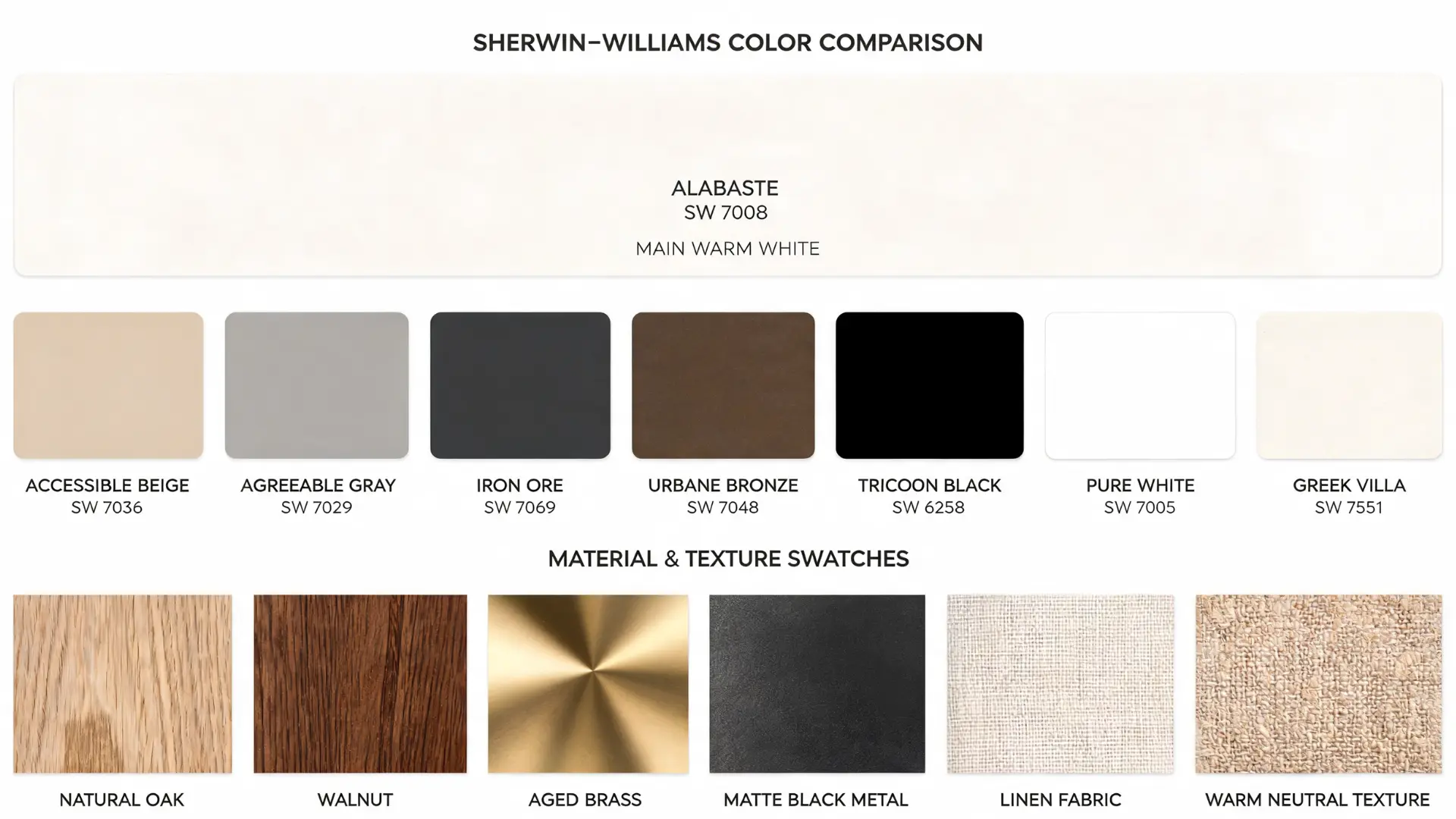
| Color Name | Alabaster SW 7008 |
| Brand | Sherwin-Williams |
| LRV | 82 |
| Hex | #EDEAE0 |
| RGB | 237 / 234 / 224 |
| Undertones | Warm beige, soft yellow, subtle gray |
| Best For | Walls, trim, cabinets, ceilings, built-ins, exteriors |
| Avoid In | Dark north-facing rooms, spaces with cool gray floors and icy white trim |
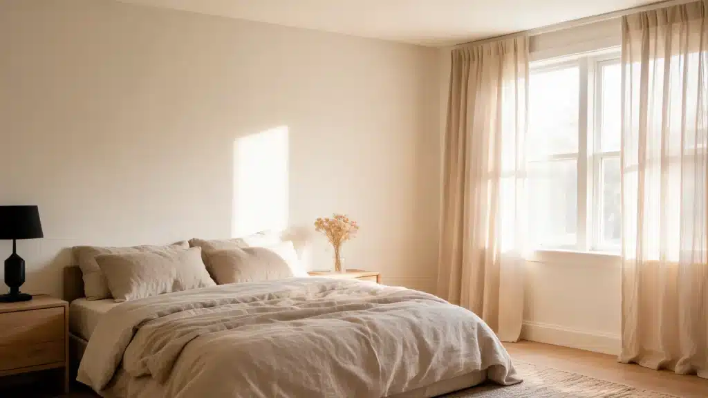
Alabaster SW 7008 looks like a soft, warm white in most rooms, but how it actually reads depends entirely on your light, trim, and flooring. In a south-facing living room with natural wood floors, it stays clean and balanced all day. In a north-facing room with cool gray tile, it can drift toward creamy or slightly flat by early afternoon.
That shift is the thing people miss when they pick it from a chip at the paint counter. The chip never shows you the 7 pm version, the north-light version, or the version standing next to your existing trim. That is what this review covers.
By the end, you will know its undertones, how light moves through it, which pairings keep it looking balanced, and the specific situations where it is the wrong choice.
Alabaster SW 7008 Undertones

Alabaster SW 7008 may look like a simple warm white at first, but its undertones are what decide how it feels in a room.
The soft beige and yellow notes give it warmth, but they can also shift depending on lighting, trim, flooring, and furniture.
- Warm Beige Undertone: Alabaster SW 7008 has a soft beige undertone that gives it a calm and relaxed look. This beige base keeps the color from feeling sharp or cold, making it a good option for rooms where you want a softer white on the walls.
- Soft Yellow Undertone: The soft yellow undertone adds warmth to Alabaster without making it look strongly yellow in most rooms. This warmth helps the color feel cozy and inviting, especially in living rooms, bedrooms, and spaces with natural wood or warm decor.
- Balanced Natural Light: In balanced natural light, Alabaster usually reads as a soft warm white rather than a yellow paint color. It can look clean and gentle during the day, especially in rooms with enough sunlight and neutral surrounding finishes.
- Warm Lighting Effect: Alabaster can look creamier or more yellow under very warm bulbs. Yellow-toned wood floors, cream furniture, and warm artificial lighting can bring out its undertones, so the color may feel richer in the evening than it does during the day.
- Cool Trim Contrast: Cool white trim can make Alabaster look warmer by comparison. If the trim is very bright or icy, the walls may appear more creamy or yellow, even if Alabaster looked balanced on its own.
- Best Fit: Alabaster works best for people who want a soft white with gentle warmth. It may feel too creamy if you want a crisp, bright white, but it can be a strong choice for a cozy and comfortable wall color.
These undertones are the reason Alabaster SW 7008 feels softer than many bright whites. Once you understand how beige, yellow, light, and trim affect it, it becomes easier to decide where this color will look warm and clean instead of too creamy.
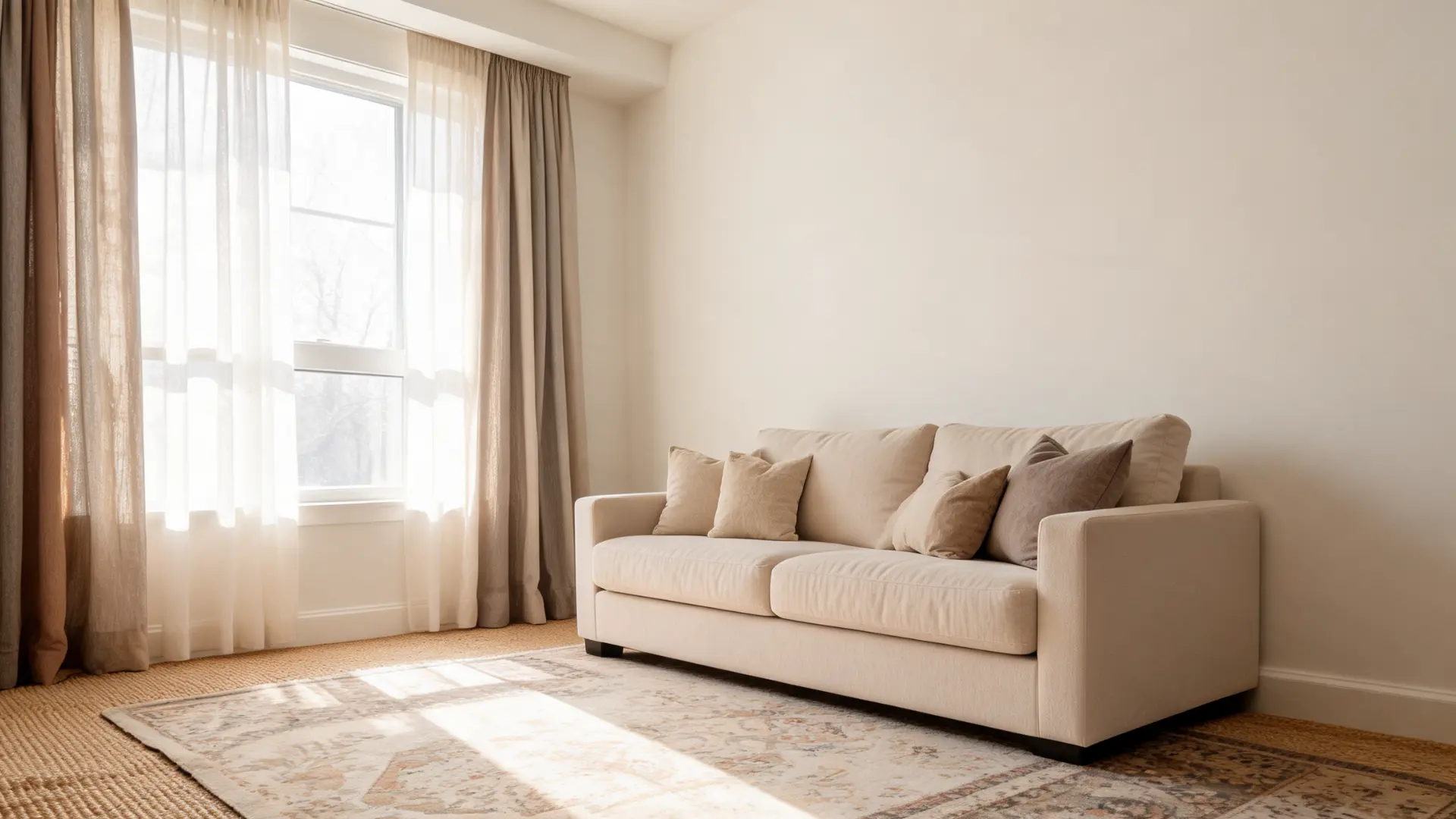
What To Pair With Alabaster Walls In A Living Room
Alabaster SW 7008 looks like a soft warm white that feels bright without looking cold. In darker rooms or near warm bulbs, it can look creamier.
It works best in living rooms with warm wood, neutral sofas, woven rugs, linen curtains, black accents, and natural textures.
1. Cream And White Sofas
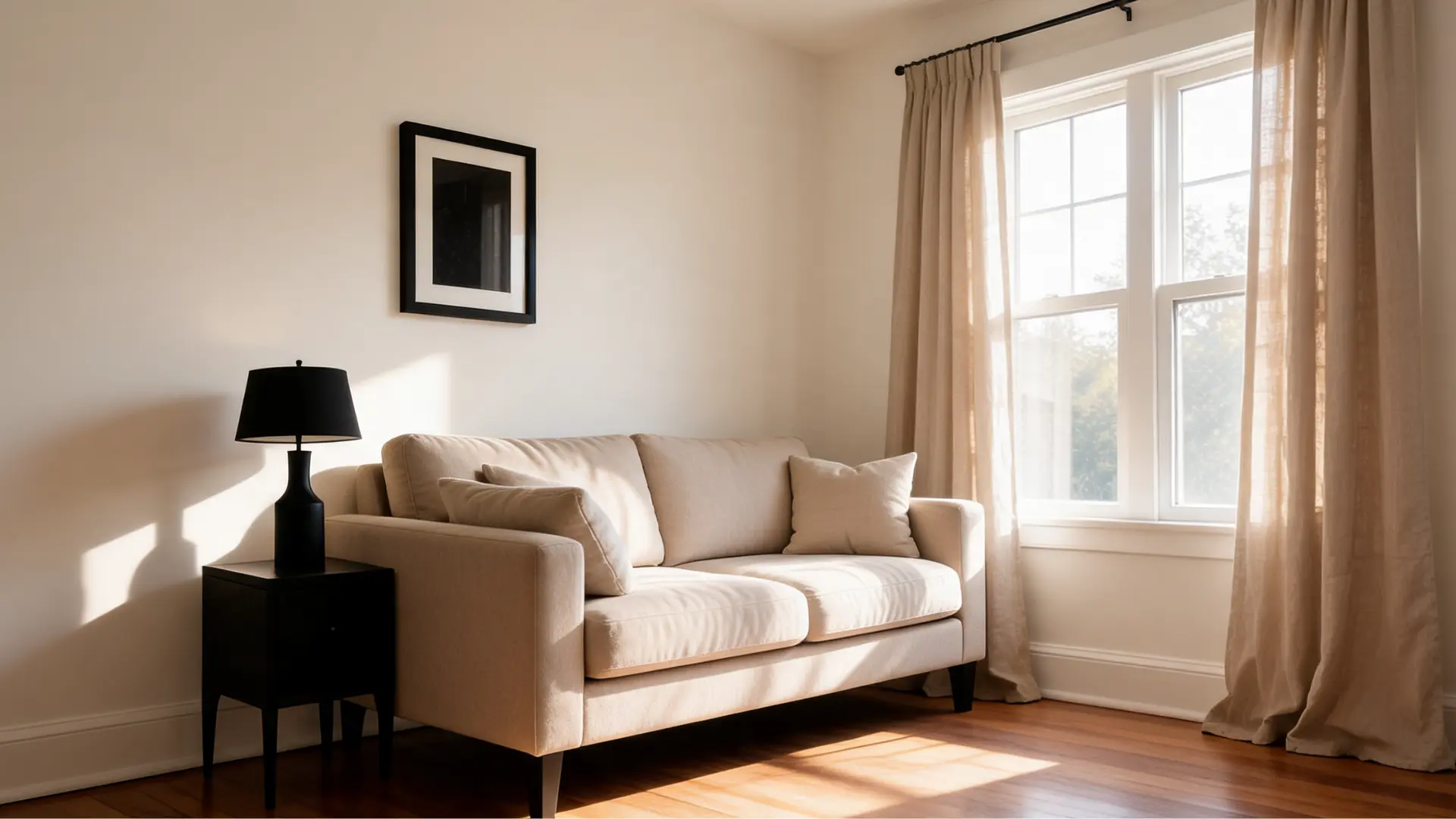
Cream and white sofas can work well with Alabaster walls when their undertones feel similar. A warm cream, ivory, or soft beige sofa usually creates a calm, blended look.
If the sofa is a cooler white, the walls may look more yellow beside it. Add texture through pillows, throws, or woven pieces so the space does not feel too plain or washed out.
2. Gray, Greige, And Taupe Furniture
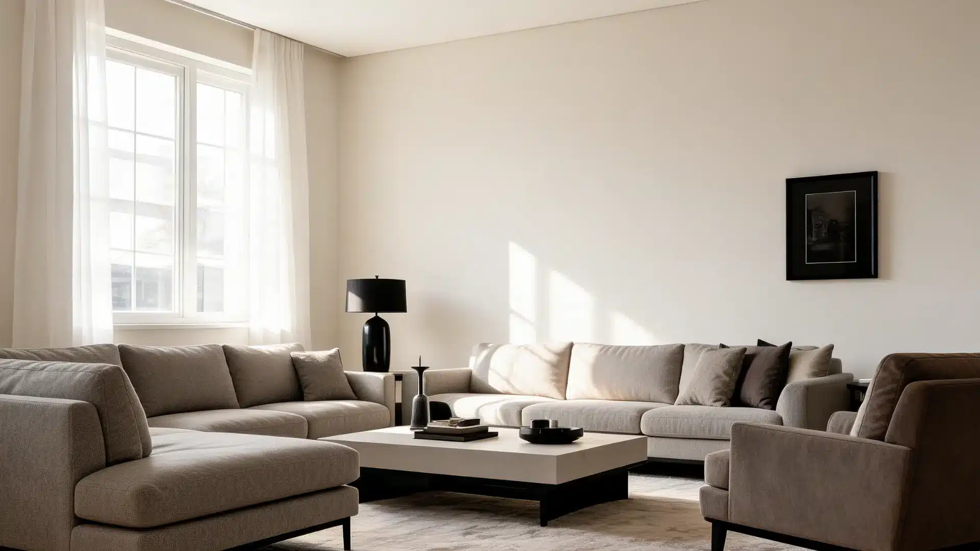
Warm gray, greige, and taupe furniture pairs better with Alabaster than cool blue-gray pieces. These softer neutrals work with the wall color instead of fighting it.
A greige sofa, taupe lounge chair, or warm gray sectional keeps the room feeling balanced and neutral without making the walls appear too creamy.
If you are considering Balanced Beige SW 7037 for an adjacent space, it coordinates naturally with Alabaster across open floor plans.
3. Brown Leather And Wood Furniture
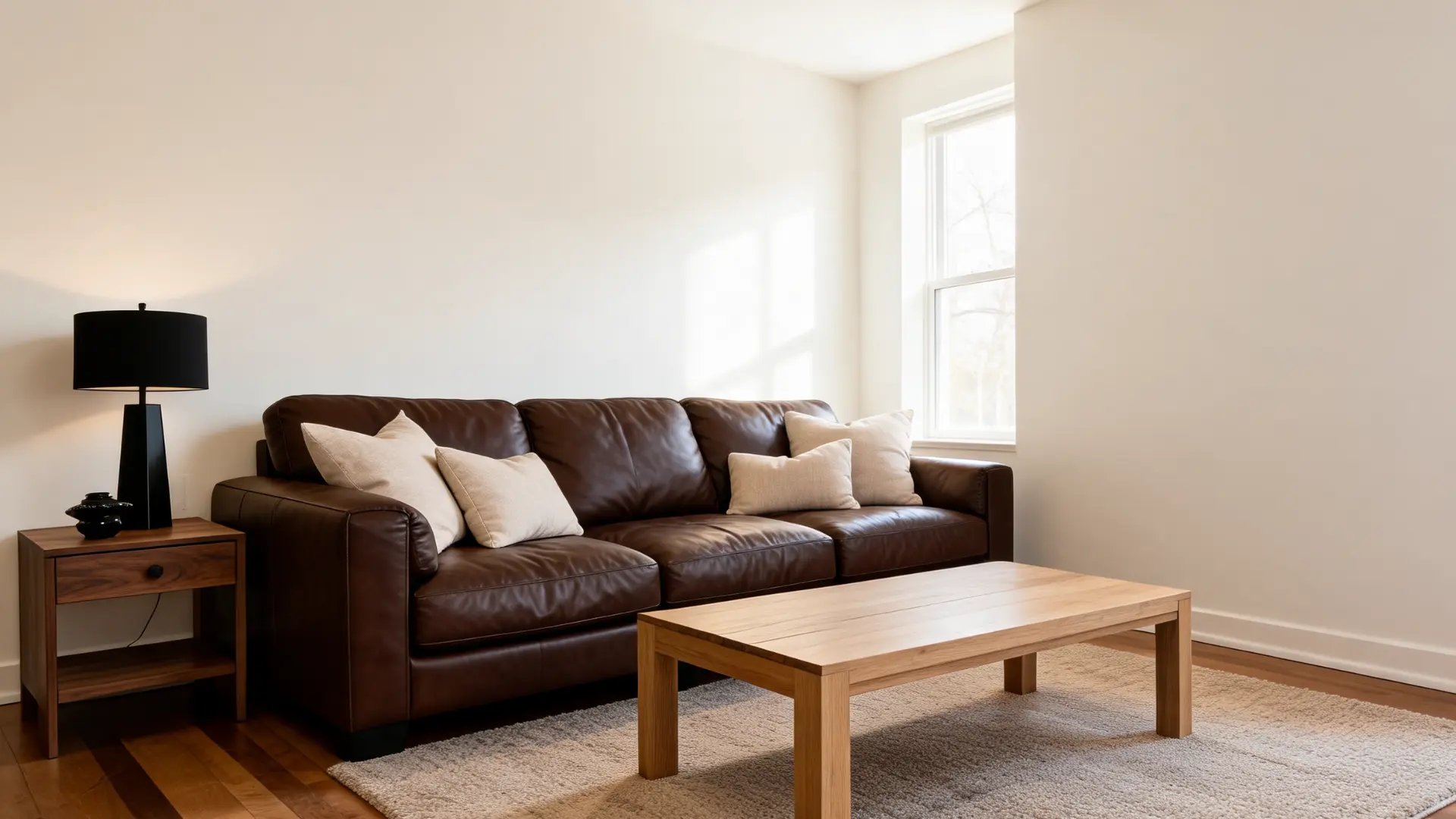
Brown leather furniture works well with Alabaster because the warm wall color softens its heavier look. Natural oak, medium-brown wood, walnut, and warm wood tones also pair well with this paint.
Yellow or orange-toned wood can make Alabaster look creamier, so those finishes need balance through rugs, black accents, or cooler neutral fabrics. This keeps the room warm without making it feel too yellow.
4. Rugs And Curtains
Rugs and curtains help decide whether Alabaster walls feel soft, layered, or too plain. Jute, wool, warm neutral rugs, vintage-style patterns, faded designs, and muted colors usually work well.
For curtains, linen, oatmeal, taupe, warm white, soft beige, and greige are strong choices. Very cool white curtains may make the wall color look more cream, especially in rooms with warm bulbs.
5. Black Accents And Contrast
Black accents help Alabaster walls feel more defined. Since Alabaster is soft and warm, a room can look flat if every piece is light and similar.
Black frames, lamps, curtain rods, side tables, fireplace details, and hardware add structure without overwhelming the space.
This contrast works especially well in living rooms with neutral sofas, warm wood floors, and simple decor.
What Color Trim Looks Best With Alabaster Walls
The trim color you choose with Alabaster walls can change the whole look of the room. Matching trim feels soft and seamless, while a cleaner white trim adds more definition.
The best choice depends on whether you want a calm blended look or a brighter contrast.
| Trim Color | Best For | Final Look |
|---|---|---|
| Alabaster SW 7008 | Matching Walls And Trim | Soft And Seamless |
| Pure White SW 7005 | Gentle Contrast | Clean But Not Harsh |
| Extra White SW 7006 | Stronger Contrast | Crisp And Bright |
| Snowbound SW 7004 | Soft Contrast | Slightly Cooler |
| Greek Villa SW 7551 | Warm Layered Look | Creamy And Warm |
Pure White SW 7005 is the safest choice for most homes because it provides just enough contrast to define the trim without making Alabaster walls look yellow by comparison. Extra White gives a sharper, more modern edge.
If you want a full monochromatic warm-white scheme with no visible breaks, matching the walls, trim, and ceiling in Alabaster is a legitimate strategy, but it requires changing the sheen to create separation: eggshell on walls, satin or semi-gloss on trim, and flat on the ceiling.
For anyone building out an adjacent space, the wall and trim pairing covers sheen and contrast combinations in more detail across different room conditions.
My Tip: I would use Alabaster on walls, trim, and ceilings when I want a soft, connected look instead of strong contrast. The trick is to change the sheen: eggshell on walls, satin or semi-gloss on trim, and flat on the ceiling. In darker rooms, a cleaner ceiling white may feel brighter.
How Lighting Can Make Alabaster SW 7008 Look Yellow Or Dingy
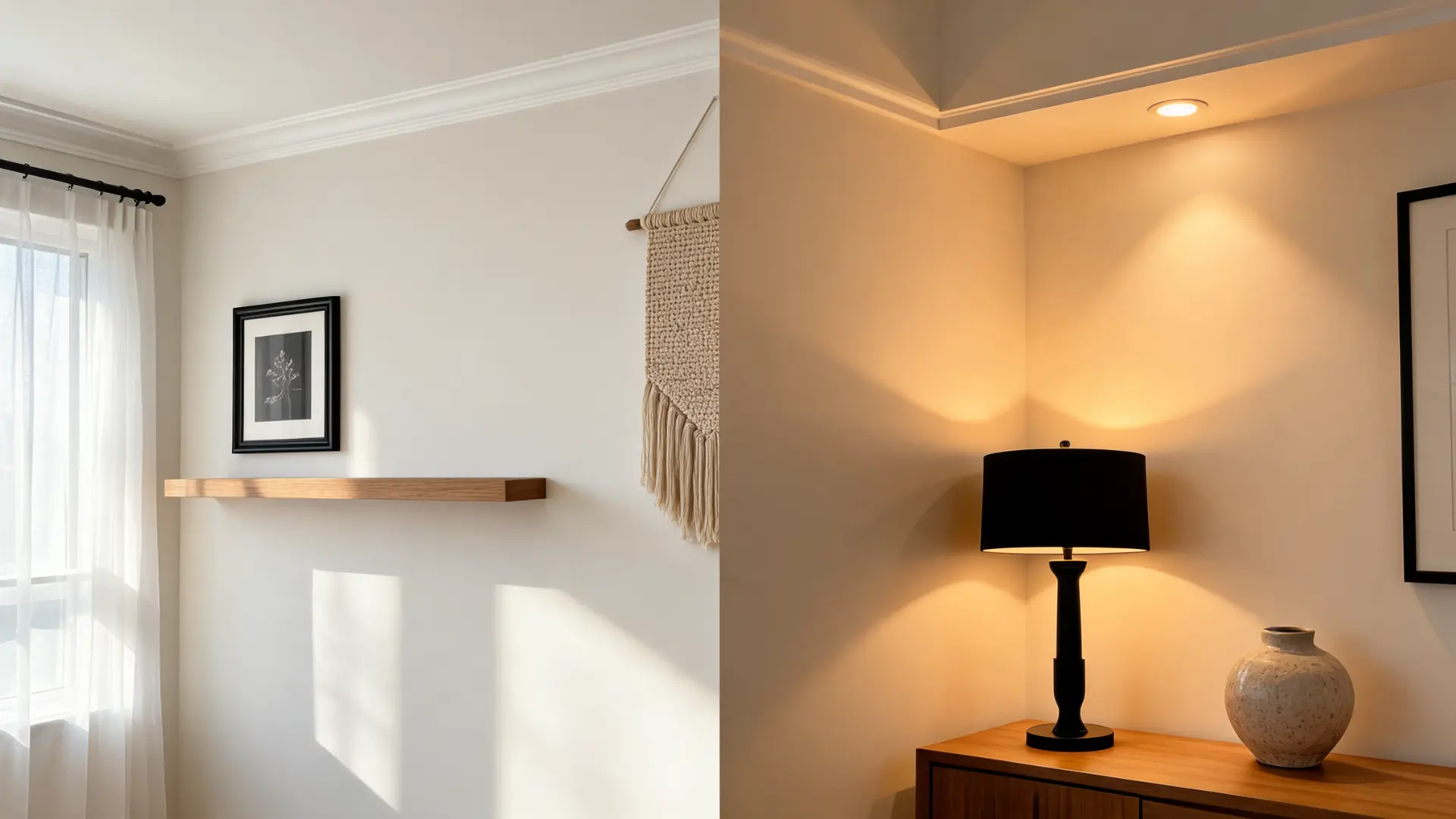
Lighting has a big effect on Alabaster SW 7008 because it is a warm white with soft beige and yellow undertones. The same color can look fresh in one room and creamier in another, depending on natural light, bulb temperature, flooring, trim, and furniture.
1. Natural Lighting
Natural light changes how Alabaster SW 7008 reads throughout the day. North-facing rooms can make it look more muted, beige, or creamy because the light is cooler.
South-facing rooms usually make it look brighter and more balanced. East-facing rooms can feel fresher in the morning, while west-facing rooms may bring out more warmth in the late afternoon.
2. Artificial Lighting
Artificial lighting can bring out the warmer side of Alabaster SW 7008, especially at night. Warm bulbs may make the color look more yellow or creamy in living rooms, bedrooms, and hallways.
Neutral bulbs usually keep it closer to a soft warm white. Since lighting changes after sunset, it is important to view Alabaster under the bulbs used daily.
3. Yellow And Dingy Look
Alabaster SW 7008 can look yellow near warm bulbs, yellow-toned floors, cream furniture, or cool white trim.
It can look dingy in dark rooms, shadowy corners, or spaces with cool gray finishes. The color usually looks fresher when the room has contrast, such as black accents, warm wood, textured rugs, darker decor, or clean trim.
Alabaster SW 7008 works best where you want warmth to feel intentional, not accidental. I would use it on living room walls, trim, doors, cabinets, built-ins, and even ceilings when the space has enough light and contrast. For exteriors, expect it to look brighter because outdoor light is stronger.
How Does Alabaster SW 7008 Compare And Pair With Other Colors?
Alabaster SW 7008 is easiest to choose when you compare it with nearby whites and the colors you plan to use around it.
The table below covers its best pairings, similar whites, and whether it is the right fit for your home.
| Need | Best Choice | Why It Works |
|---|---|---|
| Warm Neutrals | Accessible Beige SW 7036, Agreeable Gray SW 7029, Balanced Beige SW 7037, Tony Taupe SW 7038 | Supports Alabaster’s warmth |
| Dark Contrast | Iron Ore SW 7069, Urbane Bronze SW 7048, Tricorn Black SW 6258, Greenblack SW 6994 | Adds depth and definition |
| Natural Finishes | Natural Oak, White Oak, Walnut, Aged Brass, Matte Black, Oil-Rubbed Bronze | Keeps the look warm and balanced |
| Avoid Or Test First | Natural Oak, White Oak, Walnut, Aged Brass, Matte Black, Oil-Rubbed Bronze | Can make Alabaster look creamy |
| Cleaner White | Pure White SW 7005 | Better for crisp contrast |
| Softer Warm White | Greek Villa SW 7551 | Creamier and warmer |
| Best Room Fit | Warm, Layered Rooms | Works with wood, linen, and black accents |
The coordinating color situation is where Alabaster really earns its reputation. For a deeper look at which specific colors hold up next to it in different room types, the Alabaster coordinating colors page on this site goes room by room.
If you are comparing Alabaster against the grays, the Agreeable Gray vs Repose Gray comparison is also worth reading before you finalize a whole-home palette.
How To Test Alabaster SW 7008 Before Painting
Testing Alabaster SW 7008 in the actual room is the safest way to see how it will really look. Light, trim, flooring, furniture, and bulbs can all change the final result.
- Use A Large Sample: A small paint chip is not enough to judge Alabaster. Place a large sample on the wall so you can see its warmth, softness, and undertone more clearly.
- Test More Than One Wall: Put the sample on different walls in the same room. Each wall gets light differently, so Alabaster may look brighter on one wall and creamier on another.
- Check It All Day: Look at the sample in the morning, afternoon, evening, and at night. Living rooms especially need nighttime testing because lamps can make Alabaster look warmer.
- Place It Near Fixed Finishes: Test Alabaster beside trim, flooring, sofas, curtains, and rugs. These finishes affect whether the color looks soft, yellow, creamy, or balanced.
- Compare It With Cleaner Whites: Place Alabaster beside Pure White or Snowbound. This makes its warmth easier to see and helps you decide if it feels too creamy for the room.
Alabaster SW 7008 Review: Pros, Cons, And Real-Home Takeaways
Alabaster SW 7008 gets strong reviews because it feels soft, warm, and easy to use in many homes. Still, it is not the right white for every room.
This quick review table shows where it works well and where it may need more caution.
| Review Point | What It Means In A Real Home |
|---|---|
| Soft Warm White Look | Alabaster gives walls a warm white finish without feeling too stark or cold. |
| Good For Living Rooms | It works well in living rooms with warm wood, neutral furniture, black accents, and textured rugs. |
| Cozy Instead Of Crisp | It feels softer than a sharp white, so it is better for relaxed rooms than very crisp modern spaces. |
| Can Look Creamy | In darker rooms or near warm bulbs, Alabaster can look creamier than expected. |
| Can Pull Yellow | Yellow-toned floors, cream furniture, warm lighting, or cool white trim can bring out its yellow undertone. |
| Works On Trim And Cabinets | It can look good on trim, doors, cabinets, and built-ins when you want a connected warm white look. |
| Needs Testing First | The final look depends on light, flooring, trim, and furniture, so it should be tested in the actual room. |
Overall, Alabaster SW 7008 is best reviewed as a soft, cozy white rather than a crisp white. It works beautifully when the room supports warm undertones, but it can feel too creamy in dark or cool-toned spaces.
Common Mistakes To Avoid With Alabaster SW 7008
Alabaster SW 7008 is a soft warm white, so it needs the right light, trim, and surrounding finishes.
These common mistakes can make it look too yellow, too creamy, or dull instead of clean and balanced.
- Skipping The Sample Test: Alabaster can look different in every room. A paint chip or online photo will not show how it reacts to your natural light, flooring, trim, and furniture. Always check a large sample before painting the full space.
- Using Very Cool White Trim: Cool white trim can make Alabaster walls look warmer or more yellow by comparison. If the trim feels icy next to the wall color, the contrast may look harsh rather than clean.
- Ignoring Flooring Undertones: Wood, tile, or carpet can change how Alabaster reads. Yellow, orange, red, or cool gray flooring may pull out different undertones, making the walls look creamier or more muted than expected.
- Choosing Warm Bulbs Without Testing: Very warm bulbs can make Alabaster look more yellow at night. This matters in living rooms, bedrooms, and hallways where lamps are used often. Test the color with the lighting you use daily.
- Expecting A Crisp White Look: Alabaster is not a sharp white. It is soft, warm, and slightly creamy. If you want a bright gallery-white finish, Alabaster may feel too warm for your space.
- Forgetting To Add Contrast: A room can feel flat if the walls, sofa, curtains, rug, and trim are all soft warm tones. Add contrast through black accents, wood furniture, textured rugs, or darker decor to keep the space defined.
Frequently Asked Questions
What paint finish should I use for Alabaster SW 7008 walls?
Eggshell is the most practical choice for walls in living rooms, bedrooms, and hallways. It holds up to light cleaning while keeping the soft look intact. If you are curious about how eggshell compares to satin before deciding, the satin versus semi-gloss finish covers both in detail.
Does Alabaster SW 7008 look yellow on walls?
It can, under the right conditions. Very warm bulbs, yellow-toned wood floors, cream furniture, or cool white trim placed next to it all increase the chance it reads yellow rather than white. In balanced natural light with neutral surroundings, it usually stays within the soft warm white range.
Is Alabaster SW 7008 good for kitchen cabinets?
Yes. Its warmth reads well on cabinetry without going as yellow as a full cream. It works especially well in kitchens with warm wood counters, brass hardware, or natural stone. In very white modern kitchens with cool countertops, a cleaner white like Pure White may sit more naturally.
Does Alabaster SW 7008 work with dark furniture?
Yes. Dark wood, black metal, charcoal upholstery, and deep brown leather all provide the contrast Alabaster needs to read clearly as a white rather than a filler. Without some contrast in the room, the warmth can start to blur into the furniture rather than stand apart from it.
Is Alabaster SW 7008 good for open floor plans?
It can work well when connected spaces share similar warm or neutral finishes. The problem arises when one zone has cool gray tile or icy trim and Alabaster walls flow directly into that space. The undertone mismatch becomes visible and hard to ignore.
What flooring looks best with Alabaster SW 7008?
Natural oak, white oak, walnut, medium brown wood, and warm-toned tile all pair well. Very yellow, orange, or cool gray flooring shifts how the wall color reads and requires more testing before committing.
Is Alabaster SW 7008 a good exterior color?
It can work on exteriors, particularly on homes with warm wood trim, brick, or stone. Outdoor light is stronger than indoor light, so Alabaster typically reads cleaner and brighter outside than it does indoors. Test it in direct and shaded areas of the exterior before painting the whole house.
Final Takeaway
A soft white can change a room more than you might expect, and Alabaster SW 7008 is a good example of that.
I like how it brings warmth without making a space feel too dark or heavy. You just need to pay close attention to light, trim, furniture, flooring, and bulbs before painting.
Its beige and yellow undertones can feel cozy in the right room, but they can also look creamy if the space has low light or cool finishes.
Testing it first helps you avoid surprises and choose pairings that feel balanced. Try these tips in your room, then share what worked best for your space.


