


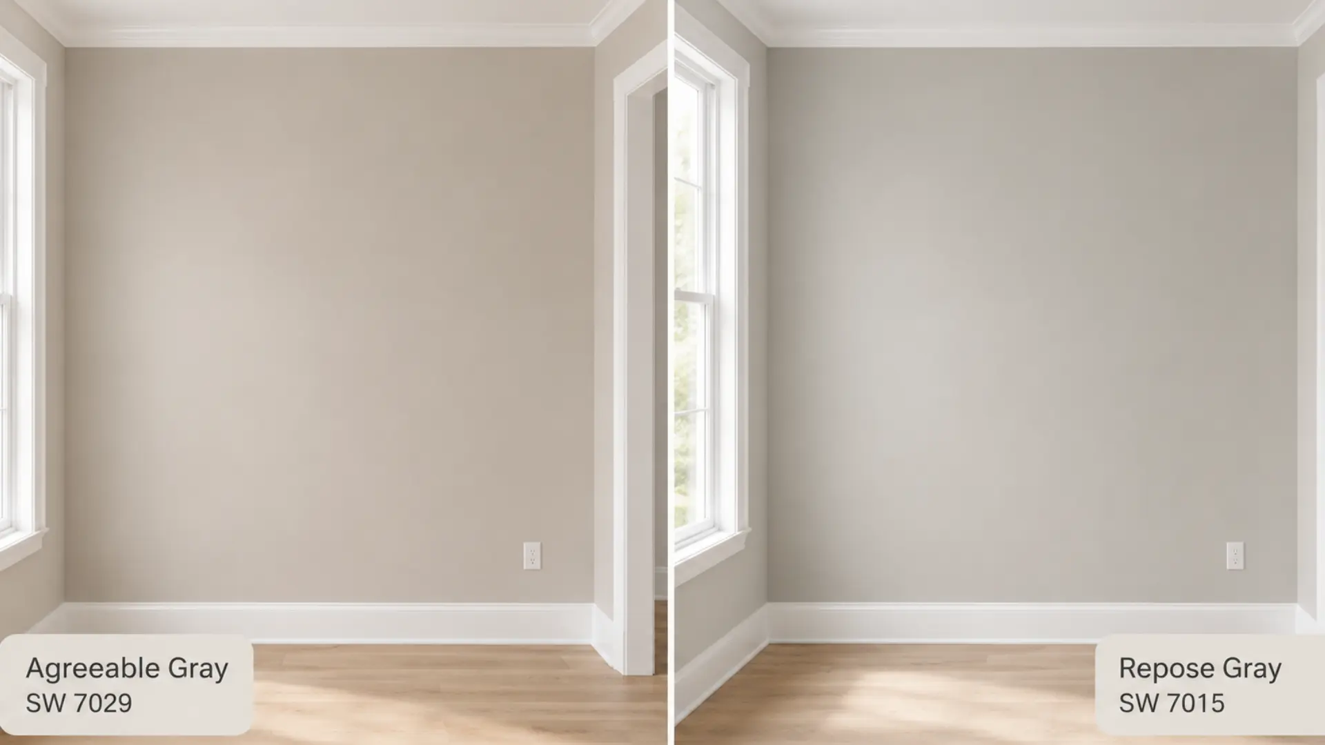
| Comparison | Agreeable Gray (SW 7029) vs Repose Gray (SW 7015) |
| Brand | Sherwin-Williams |
| Agreeable Gray LRV | 60, medium-light; reflects well in most conditions |
| Repose Gray LRV | 58, medium-light; marginally deeper |
| Agreeable Gray Undertones | Warm beige-greige with soft green-taupe influence |
| Repose Gray Undertones | Cool gray-greige with green and occasional violet |
| Best For | AG: living rooms, open plans, warm-finish spaces. RG: bedrooms, kitchens, modern interiors |
| Avoid In | AG: rooms with exclusively cool, gray-forward finishes. RG: north-facing rooms with cool lighting only |
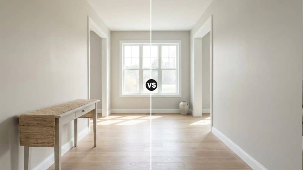
Agreeable Gray (SW 7029) and Repose Gray (SW 7015) are the two most compared paint colors in the Sherwin-Williams range, and the reason people keep getting stuck between them is that on a chip, they look almost identical.
On a wall in a real room, they create noticeably different atmospheres. One leans warm. One leans cool. And choosing the wrong one, given your lighting and finishes, is one of the more common and avoidable paint mistakes I see.
This guide covers how Agreeable Gray and Repose Gray actually differ in undertone, temperature, lighting behavior, and room suitability. I’ll give you a clear recommendation based on what’s in your space, not just what looks good in a photo.
What Is Agreeable Gray (SW 7029)?

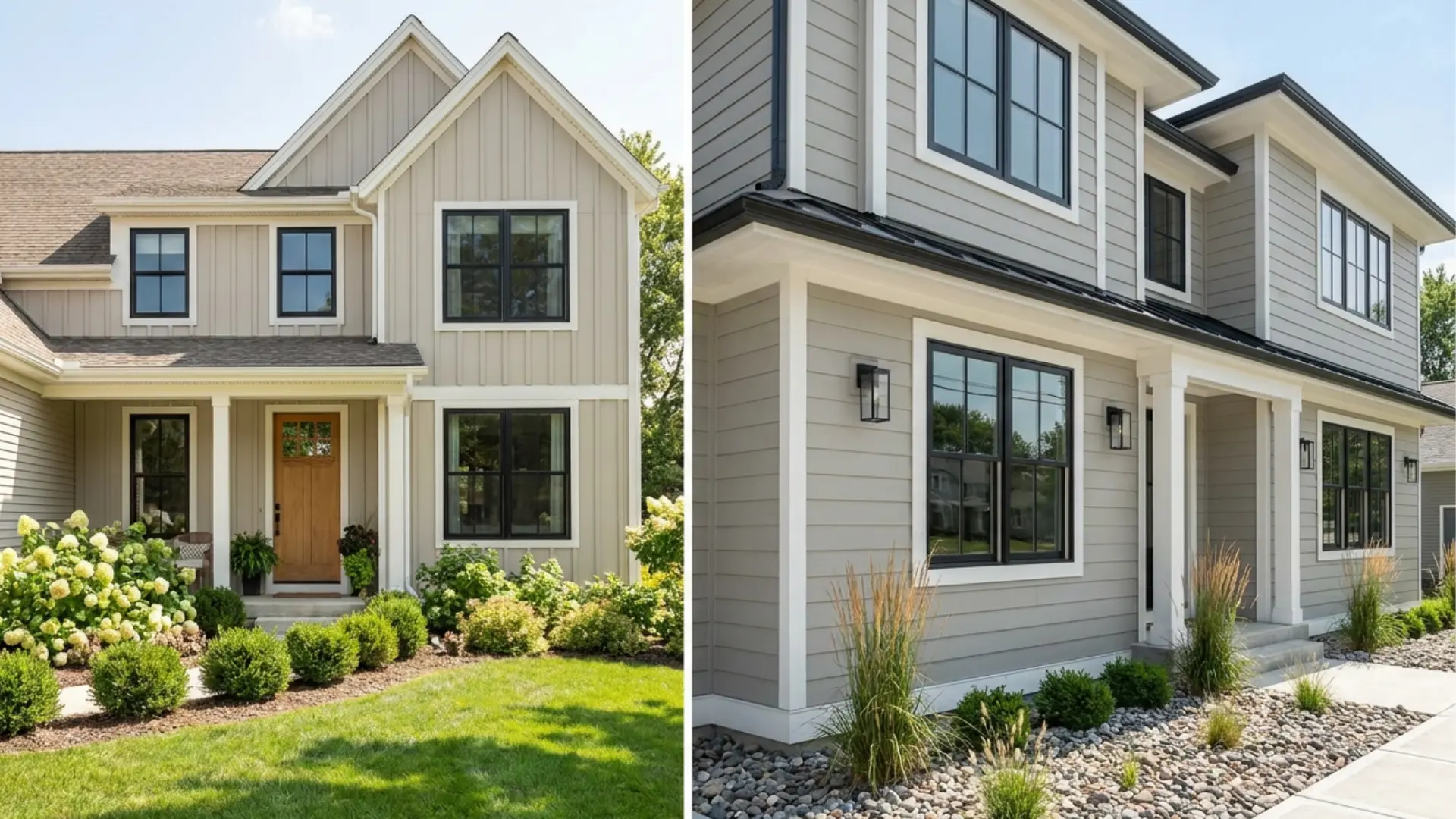
Sherwin-Williams Agreeable Gray (SW 7029) is a warm greige, equal parts gray and beige, with a soft green-taupe undertone that becomes more visible in north-facing light or under cool LEDs.
In south-facing rooms with direct sun, it reads as a beautiful, settled beige-gray. It holds its warm character more reliably across lighting conditions than almost any other neutral in the Sherwin-Williams range, which is the core reason it became the brand’s best-selling color overall.
LRV is 60, which places it in medium-light territory. It reflects enough light to work in smaller spaces without washing out in larger, bright rooms.
| Color Code | SW 7029 |
| Color Family | Warm greige |
| Hex | #D1CBC1 |
| LRV | 60 |
That warm, beige-forward quality is what makes Agreeable Gray so adaptable across different room types and mixed-finish spaces. If your home has warm wood floors, cream cabinetry, or a combination of traditional and contemporary furniture, it tends to pull everything together without looking like a calculated neutral.
| Note: Accessible Beige (SW 7036) is warmer and more beige than Agreeable Gray, making it a better fit for spaces with cream finishes and traditional wood tones. Agreeable Gray has a stronger gray influence, so it reads softer and more flexible across different room styles. If you want a neutral that leans more definitively toward beige, Accessible Beige is the pick. If you want a greige that adapts to both warm and cool finishes, Agreeable Gray is usually more versatile. |
What Is Repose Gray (SW 7015)?

Sherwin-Williams Repose Gray (SW 7015) sits one step cooler than Agreeable Gray. It reads as a true, sophisticated gray on a wall rather than a warm greige, but it still carries enough warmth in its undertone to stay inviting rather than cold.
It’s not a blue-gray or a silver-gray. It’s closer to what most people picture when they imagine a “perfect gray” that actually works in a home.
The LRV is 58, marginally lower than Agreeable Gray, which means it carries a touch more depth. In practice the difference is subtle, lighting will have a far greater effect on how light or dark either color reads than those two LRV points.
| Color Code | SW 7015 |
| Color Family | Gray-greige |
| Hex | #CCC8C1 |
| LRV | 58 |
Repose Gray is Sherwin-Williams’ most popular cool-leaning greige, which tells you something important: there is a large group of homeowners who want a neutral that feels clean and refined without tipping into warm beige territory. If that description fits your home, Repose Gray is worth testing seriously.
Agreeable Gray vs Repose Gray: The Key Differences
Both colors live in greige territory, but their undertones push them in different directions. Here is the full head-to-head.
| Feature | Agreeable Gray (SW 7029) | Repose Gray (SW 7015) |
|---|---|---|
| Undertones | Warm beige-greige with green-taupe influence | Gray-greige with green and occasional violet |
| Warmth | Warmer, cozier appearance | Slightly cooler, more neutral appearance |
| LRV | 60 — reflects slightly more light | 58 — marginally darker with more depth |
| Versatility | Works with warm and cool finishes alike | Best with cooler finishes and modern palettes |
| Trim Compatibility | Warm and crisp whites both work | Best with Pure White or Extra White |
| Cabinet Compatibility | White, cream, wood, greige cabinets | White, gray, and cooler-toned cabinetry |
| Best For | Living rooms, open plans, mixed-finish spaces | Bedrooms, kitchens, offices, modern interiors |
| Overall Feel | Warm, welcoming, approachable | Clean, refined, sophisticated |
The table confirms the pattern, but the most important detail is the undertone difference. Both colors have green undertones, but in Agreeable Gray that green is buffered by beige warmth, keeping it earthy and settled.
In Repose Gray the green is more exposed, which is what gives it a slightly cooler, more neutral quality. Knowing which undertone register fits your room is how you make this decision confidently.
Undertones Up Close
This is where most people get tripped up, and it’s the detail the paint chip never shows you clearly enough.
Agreeable Gray’s undertone is warm greige — beige-forward with a subtle green-taupe quality. In most rooms under most lighting, that green-taupe stays quiet and the beige warmth leads. In cool north-facing rooms or under cool artificial light, the green-taupe quality can become more visible, reading as slightly earthy. But even then, Agreeable Gray holds its warm character more reliably than Repose Gray does in the same conditions.
Repose Gray’s green undertone is less buffered. Without the beige layer that softens it in Agreeable Gray, the green in Repose Gray reads more cleanly as gray in most lighting conditions. That’s the source of its sophistication. It’s also the source of its most common complaint: in north-facing rooms with cool recessed lighting, Repose Gray can shift toward lavender in the corners by evening. A warm lamp mitigates this, but if you want to avoid the risk entirely in a north-facing room, Agreeable Gray is the safer call.
| Pro Tip: Before committing to either color, test a sample on two walls in your room — one with direct light and one without. Check the samples at 7am, noon, and 7pm. The shift you see in those three windows tells you more than any chip card or online photo ever will. |
How Lighting Affects Agreeable Gray vs Repose Gray
Lighting is not just a factor in how these colors look, it is the primary factor. The same paint can behave like two completely different colors depending on which direction your room faces and what bulbs are in your fixtures.
Natural Light by Room Orientation
In north-facing rooms, Agreeable Gray retains more warmth and reads as a settled, earthy greige. Repose Gray in the same room can look noticeably cooler and grayer, and may shift toward lavender in corners under low light by evening.
In south-facing rooms, both colors benefit from strong, warm sunlight. Agreeable Gray reads as a soft, comfortable beige-gray. Repose Gray remains more balanced and gray-forward rather than warming toward beige.
In east-facing rooms, morning sunlight brings out warmth in both shades. By afternoon they settle into a more neutral appearance, with Agreeable Gray holding its warmth slightly better as the light cools.
In west-facing rooms, the warm late-afternoon and evening light makes Agreeable Gray feel richer. Repose Gray takes on a warmer quality too, but stays closer to its core gray register rather than shifting fully toward greige.
Artificial Lighting
Under warm LED or incandescent bulbs, Agreeable Gray leans into its greige warmth. Repose Gray also warms up, but generally maintains a cleaner gray appearance rather than shifting toward beige.
Cooler LED lighting mutes both colors. Repose Gray reads noticeably cooler under these conditions, and Agreeable Gray loses some of its warmth without losing its structure entirely.
If your home uses predominantly cool recessed lighting, Agreeable Gray is the more forgiving choice between the two.
Room-by-Room: Where Each Color Works Best
Because lighting, flooring, trim, and furniture all interact differently room to room, the Agreeable Gray vs Repose Gray comparison genuinely produces different answers depending on the space. Here is where each color tends to land.
1. Living Room
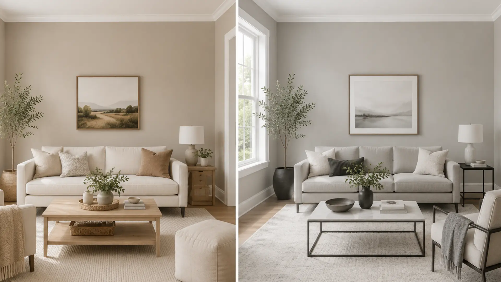
Agreeable Gray is the stronger choice for most living rooms. Its warm greige undertone creates an inviting backdrop for gathering spaces, and it adapts well to the mix of furniture, flooring, and textiles that most living rooms contain. In rooms with direct sunlight, it reads as soft and beige-forward without feeling heavy.
Repose Gray suits modern and transitional living rooms where a cleaner, more refined gray is the target. It works particularly well if your furniture and textiles lean cool, or if you have a lot of white trim and metal hardware creating a contemporary palette.
2. Bedroom
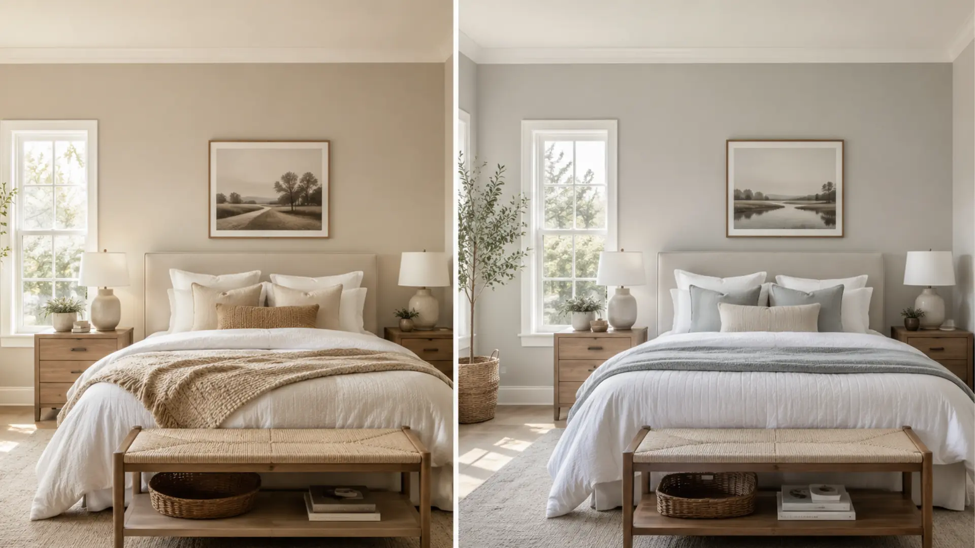
Repose Gray is the stronger bedroom choice for most people who want a calm, sleep-ready environment.
Its subtle coolness promotes a restful atmosphere, and in sun-filled bedrooms it can deliver a spa-like quality that Agreeable Gray’s warmer undertone doesn’t quite replicate. That said, if you are in a north-facing bedroom with cool recessed lighting, test Repose Gray carefully before committing — the lavender shift at night is real and not everyone finds it restful.
Agreeable Gray produces a cozier, more enveloping bedroom. It feels comfortable rather than clinical. For bedrooms used as both sleeping and reading spaces, or rooms with warm-toned wood furniture, Agreeable Gray often feels more settled.
3. Kitchen
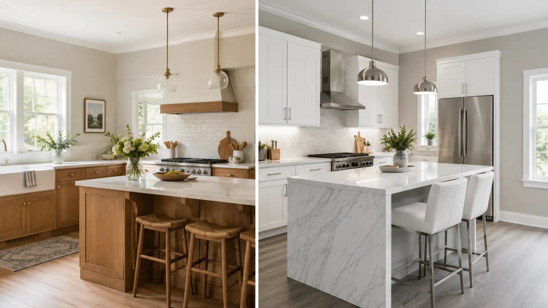
Repose Gray has become one of the most popular kitchen colors of the past decade, and it earns that.
Paired with white cabinetry, marble countertops, or stainless steel appliances, it creates a clean, polished look that complements crisp finishes without competing with them. It works equally well as wall paint in a bright kitchen or on the cabinets themselves as a sophisticated, muted gray.
Agreeable Gray is the better fit for kitchens with warm wood cabinetry, natural stone, or farmhouse-leaning design. Its higher LRV (60 vs 58) also helps smaller kitchens feel a little more open while keeping them warm rather than cold.
4. Bathroom
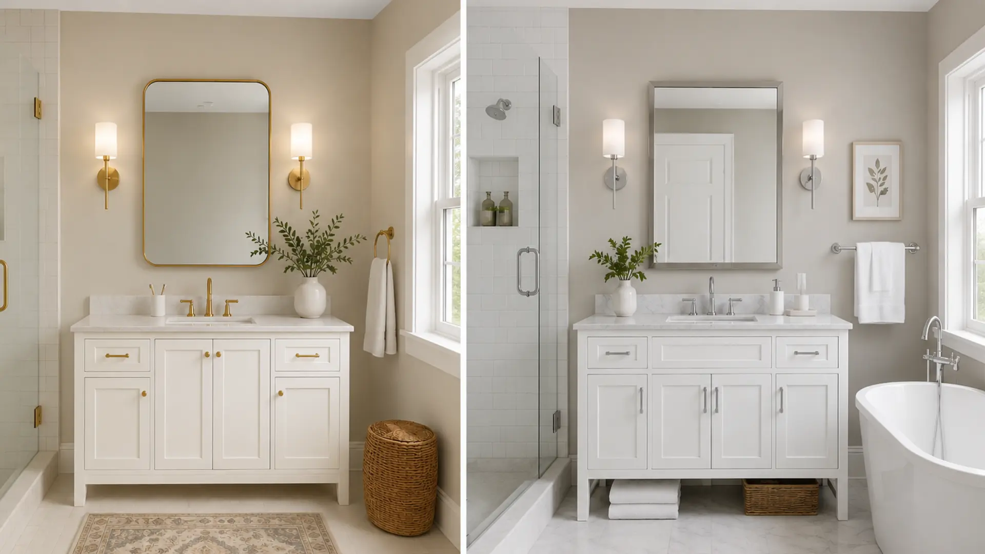
Repose Gray’s cooler undertones work well in bathrooms with white tile, chrome fixtures, and marble surfaces, reinforcing a clean, fresh aesthetic. In bathrooms with strong natural light, it reads genuinely spa-like.
Agreeable Gray handles bathrooms better when warm finishes are involved — brushed brass hardware, beige stone, or warm wood vanities. In low-light or windowless bathrooms, its warmth also makes the space feel less stark than Repose Gray does under the same conditions.
5. Dining Room
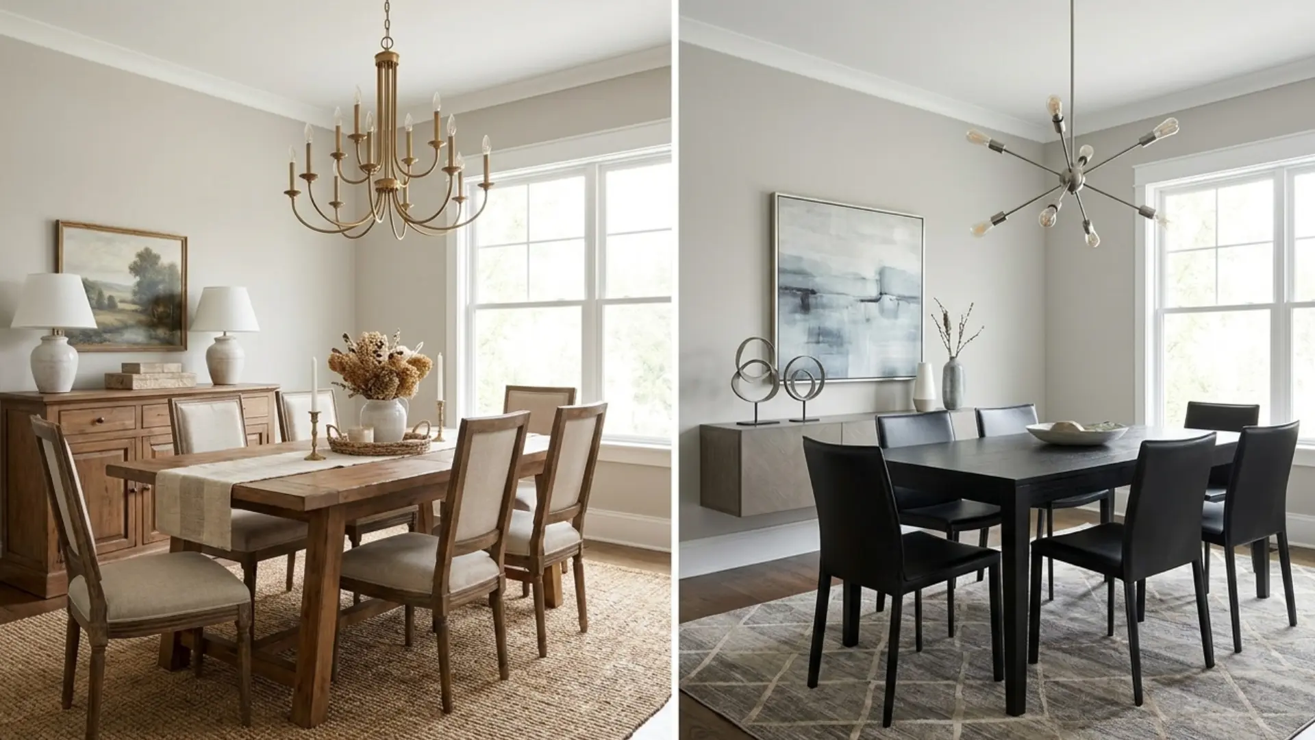
Agreeable Gray is generally preferred in dining rooms because its warmth makes the space feel inviting during meals without adding visual heaviness. The balanced greige undertone complements wood tables, upholstered chairs, and warm lighting comfortably.
Repose Gray suits formal dining rooms with cooler, more contemporary furnishings — think metal-base chairs, concrete or stone table tops, and pendant lighting in matte black or brushed nickel. Its cleaner gray register creates a more composed backdrop for that aesthetic.
6. Open Floor Plans
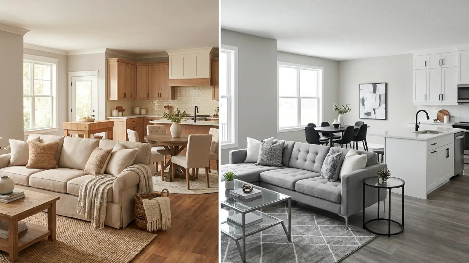
Agreeable Gray is usually the stronger choice for open-concept layouts, and the reason is practical: in open plans, one color has to work across different lighting conditions simultaneously.
Agreeable Gray’s balanced warmth holds better across the range of light from a bright kitchen facing one direction to a shadowed hallway facing another.
Repose Gray can absolutely work in open plans with cool, consistent finishes throughout, but it needs more care in mixed-light environments to stay cohesive.
7. Exterior
Both colors translate well to exteriors. In direct sunlight, Agreeable Gray reads warmer and slightly more beige. Repose Gray reads cleaner and more gray-forward. In winter or under overcast skies, Agreeable Gray holds its warmth better.
Repose Gray can read distinctly cooler in flat light, which works on contemporary homes but can feel cold on farmhouse or traditional styles.
For trim, Agreeable Gray pairs well with Alabaster coordinating colors like Shoji White and White Dove that share its warm base.
Repose Gray works best alongside Pure White (SW 7005), Extra White (SW 7006), or High Reflective White (SW 7757). For curb appeal, Agreeable Gray fits farmhouse, transitional, and traditional homes. Repose Gray excels on modern and contemporary exteriors.
Agreeable Gray vs Repose Gray With Different Flooring
Flooring interacts with wall color more than most people expect. The undertones in your floor can draw out or suppress the undertones in your paint. Here is how both colors perform with common flooring types.
| Flooring Type | Agreeable Gray | Repose Gray | Better Choice |
|---|---|---|---|
| Honey Oak | Excellent | Good | Agreeable Gray |
| Red Oak | Excellent | Fair | Agreeable Gray |
| White Oak | Excellent | Excellent | Tie |
| Gray Flooring | Good | Excellent | Repose Gray |
| Beige Tile | Excellent | Good | Agreeable Gray |
| Dark Hardwood | Excellent | Excellent | Tie |
The pattern is consistent: Agreeable Gray is the safer bet with warm-toned wood and beige tile floors. Repose Gray is better suited to cool gray flooring and modern hard-surface materials. White oak and dark hardwood give both colors room to work because those floors are neutral enough not to pull the undertones in either direction.
How These Two Compare to Other Sherwin-Williams Neutrals
If you’re still deciding, it helps to see where Agreeable Gray and Repose Gray sit within the broader range of popular Sherwin-Williams neutrals. Sometimes the right color isn’t one of the two you started with.
Colors Close to Agreeable Gray
| Color | Code | Hex | How It Differs from Agreeable Gray |
|---|---|---|---|
| Repose Gray | SW 7015 | #CCC8C1 | Cooler and more gray-forward, with less beige warmth |
| Accessible Beige | SW 7036 | #D1C7B8 | Warmer and more beige, better for cream finishes and warm wood |
| Worldly Gray | SW 7043 | #CFC6BA | Slightly deeper and warmer, stronger taupe influence |
| Alpaca SW 7022 | SW 7022 | #CCC5BD | Similar softness, but shows more violet or taupe under certain light |
| Gossamer Veil | SW 9165 | #D3CEC4 | Lighter and softer with a cleaner greige look and less warmth |
Colors Close to Repose Gray
| Color | Code | Hex | How It Differs from Repose Gray |
|---|---|---|---|
| Agreeable Gray | SW 7029 | #D1CBC1 | Warmer and more greige, softer and cozier feel |
| Mindful Gray | SW 7016 | #BCB7AD | Darker and moodier, more depth for cabinets or accent walls |
| Light French Gray | SW 0055 | #C2C0BB | Cooler and more traditional gray, less beige influence |
| Crushed Ice | SW 7647 | #D6D3CC | Lighter and brighter with a softer, more airy neutral look |
| Colonnade Gray | SW 7641 | #C6C0B6 | Warmer and slightly deeper, stronger beige-taupe undertone |
Both comparison tables reinforce the same point: Agreeable Gray is the most flexible greige in this range because it sits squarely between warm and cool without committing fully to either. Repose Gray is the best clean-gray option that still carries enough warmth to function in a home rather than feeling like an office wall.
When Not to Use These Colors
Every paint color has conditions where it works against you. These are the situations where I’d tell a client to reconsider before they open the can.
When to Avoid Agreeable Gray
Before choosing Agreeable Gray, check the room’s fixed finishes, lighting, and trim color. Its warm greige base can look wrong when every other surface leans cool or yellow.
- Avoid it in rooms with cool gray flooring, cabinetry, and textiles.
- Its beige warmth may look accidental against cool-toned finishes.
- Do not pair it with strongly yellow-white trim colors.
- Greek Villa can make Agreeable Gray read muddy.
- Compare it with Benjamin Moore Revere Pewter if testing greige options.
When to Avoid Repose Gray
Before choosing Repose Gray, test it in the exact room at different times of day. Its violet undertone can become more visible in cool light and shadowed corners.
- Avoid it in north-facing rooms with cool recessed LED lighting.
- It may shift lavender in corners by evening.
- Do not pair it with yellow-toned whites on trim.
- SW Greek Villa and SW Antique White can clash with it.
- Full-wall samples show the conflict better than small chips.
Common Mistakes When Choosing Between These Two Colors
Most of the regret I hear after paint decisions comes from one of four places.
Choosing from online photos or paint chips alone. Both colors can look identical on a chip and wildly different on a wall. The photo’s lighting, camera white balance, and room’s finishes all create a version of the color that may have nothing to do with how it behaves in your room.
Ignoring flooring undertones. Warm oak floors and cool gray floors create two completely different environments for these paint colors. Choosing the paint before accounting for what’s underfoot is the most common structural error in this decision.
Choosing the wrong trim. Repose Gray needs crisp, clean whites, Pure White or Extra White. Agreeable Gray is more forgiving and works with warmer whites like Alabaster or White Dove. Pair Repose Gray with a warm-yellow white and the mismatch becomes visible once both are on full walls.
Skipping actual samples. Order a peel-and-stick sample from Samplize, or brush a large patch on at least two walls, and check it at 7am, noon, and 7pm. The 30-minute investment before committing to gallons is always worth it.
Frequently Asked Questions
Which color is better for small rooms?
Agreeable Gray is usually better for small rooms because its LRV of 60 reflects slightly more light than Repose Gray. It also feels warmer, which can make tight spaces feel softer. Repose Gray can still work if the room has bright light and crisp finishes.
Can I use these colors on kitchen cabinets?
Yes, both can work on kitchen cabinets. Repose Gray gives cabinets a cleaner, more modern gray look, especially with white counters. Agreeable Gray feels warmer and softer, making it better with wood tones, cream finishes, or a more relaxed kitchen style.
Do these colors work with wood trim?
Agreeable Gray usually works better with wood trim because its warm greige base blends well with natural brown, oak, and walnut tones. Repose Gray may feel too cool beside orange or golden wood, but it can work with darker or cooler stained trim.
Which color looks better with white oak floors?
Both colors can look good with white oak floors. Agreeable Gray creates a warmer, more blended look, while Repose Gray gives stronger contrast and a cleaner style. Test both beside your exact flooring because white oak can lean warm, neutral, or slightly gray.
Are these colors good for rental properties?
Agreeable Gray is often safer for rentals because it works with more furniture styles, flooring tones, and lighting situations. Repose Gray can also work well, especially in modern rentals. For broad appeal, Agreeable Gray is usually the easier neutral to manage.
Which color hides wall imperfections better?
Repose Gray may hide minor wall imperfections slightly better because it has a little more depth. Agreeable Gray is lighter, so bumps or uneven drywall may show more in strong light. A matte or eggshell finish can also help reduce visible flaws.
Can these colors be used in basements?
Agreeable Gray is often the safer basement choice because it keeps more warmth in low natural light. Repose Gray can look flat or cool if the basement has limited windows. Use warm lighting and large samples before choosing either color below grade.
Which color is better for an accent wall?
Neither is a bold accent color, but Repose Gray works better if you want a subtle darker contrast. Agreeable Gray is better for a soft, tonal accent beside warm whites or beige neutrals. For stronger contrast, pair either with a deeper gray or taupe.
Final Verdict
Choosing between two close neutrals gets easier when you look beyond the paint chip. Agreeable Gray works best when you want warmth, flexibility, and a soft greige backdrop.
Repose Gray makes more sense when your space has cooler finishes, crisp whites, and a cleaner modern style.
You also saw how lighting, flooring, trim, cabinets, and room type can change the final look. That is why the best answer to Agreeable Gray vs Repose Gray depends on your actual home, not a photo online.
I’d test both colors on multiple walls before buying gallons. Try the sample test, then share which shade worked better in your space.


