

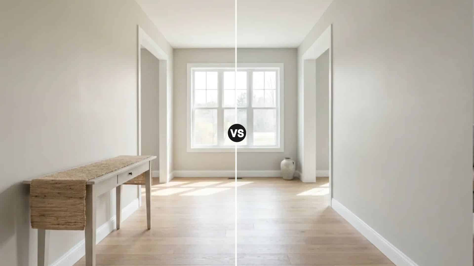
Comparison Agreeable Gray (SW 7029) vs Repose Gray (SW 7015) Brand Sherwin-Williams Agreeable Gray LRV 60, medium-light; reflects well in most conditions Repose Gray LRV 58, medium-light; marginally deeper Agreeable Gray Undertones Warm beige-greige with soft green-taupe influence Repose Gray Undertones Cool gray-greige with green and occasional violet Best For AG: living rooms, open plans, warm-finish spaces. RG: bedrooms, kitchens, modern interiors Avoid In AG: rooms with exclusively cool, gray-forward finishes. RG: north-facing rooms with cool lighting only Agreeable Gray (SW 7029) and Repose Gray (SW 7015) are the two most compared paint colors in the Sherwin-Williams range, and the reason people keep getting stuck between them is that on a chip, they look almost identical. On a wall in a real room, they create noticeably different atmospheres. One leans warm. One leans cool. And choosing the wrong one, given your lighting and finishes, is one of the more common and avoidable paint mistakes I see. This guide covers how Agreeable Gray and Repose Gray actually differ in undertone, temperature, lighting behavior, and room suitability. I’ll give you a clear recommendation based on what’s in your space, not just what looks good in a photo. What Is Agreeable Gray (SW 7029)? Sherwin-Williams Agreeable Gray (SW 7029) is a warm greige, equal parts gray and beige, with a soft green-taupe undertone that becomes more visible in north-facing light or under cool LEDs. In south-facing rooms with direct sun, it reads as a beautiful, settled beige-gray. It holds its warm character more reliably across lighting conditions than almost any other neutral in the Sherwin-Williams range, which is the core reason it became the brand’s best-selling color overall. LRV is 60, which places it in medium-light territory. It reflects enough light to work in smaller spaces without washing out in larger, bright rooms. Color Code SW 7029 Color Family Warm greige Hex #D1CBC1 LRV 60 That warm, beige-forward quality is what makes Agreeable Gray so adaptable across different room types and mixed-finish spaces. If your home has warm wood floors, cream cabinetry, or a combination of traditional and contemporary furniture, it tends to pull everything together without looking like a calculated neutral. Note: Accessible Beige (SW 7036) is warmer and more beige than Agreeable Gray, making it a better fit for spaces with cream finishes and traditional wood tones. Agreeable Gray has a stronger gray influence, so it reads softer and more flexible across different room styles. If you want a neutral that leans more definitively toward beige, Accessible Beige is the pick. If you want a greige that adapts to both warm and cool finishes, Agreeable Gray is usually more versatile. What Is Repose Gray (SW 7015)? Sherwin-Williams Repose Gray (SW 7015) sits one step cooler than Agreeable Gray. It reads as a true, sophisticated gray on a wall rather than a warm greige, but it still carries enough warmth in its undertone to stay inviting rather than cold. It’s not a blue-gray or a silver-gray. It’s closer to what most people picture when they imagine a “perfect gray” that actually works in a home. The LRV is 58, marginally lower than Agreeable Gray, which means it carries a touch more depth. In practice the difference is subtle, lighting will have a far greater effect on how light or dark either color reads than those two LRV points. Color Code SW 7015 Color Family Gray-greige Hex #CCC8C1 LRV 58 Repose Gray is Sherwin-Williams’ most popular cool-leaning greige, which tells you something important: there is a large group of homeowners who want a neutral that feels clean and refined without tipping into warm beige territory. If that description fits your home, Repose Gray is worth testing seriously. Agreeable Gray vs Repose Gray: The Key Differences Both colors live in greige territory, but their undertones push them in different directions. Here is the full head-to-head. Feature Agreeable Gray (SW 7029) Repose Gray (SW 7015) Undertones Warm beige-greige with green-taupe influence Gray-greige with green and occasional violet Warmth Warmer, cozier appearance Slightly cooler, more neutral appearance LRV 60 — reflects slightly more light 58 — marginally darker with more depth Versatility Works with warm and cool finishes alike Best with cooler finishes and modern palettes Trim Compatibility Warm and crisp whites both work Best with Pure White or Extra White Cabinet Compatibility White, cream, wood, greige cabinets White, gray, and cooler-toned cabinetry Best For Living rooms, open plans, mixed-finish spaces Bedrooms, kitchens, offices, modern interiors Overall Feel Warm, welcoming, approachable Clean, refined, sophisticated The table confirms the pattern, but the most important detail is the undertone difference. Both colors have green undertones, but in Agreeable Gray that green is buffered by beige warmth, keeping it earthy and settled. In Repose Gray the green is more exposed, which is what gives it a slightly cooler, more neutral quality. Knowing which undertone register fits your room is how you make this decision confidently. Undertones Up Close This is where most people get tripped up, and it’s the detail the paint chip never shows you clearly enough. Agreeable Gray’s undertone is warm greige — beige-forward with a subtle green-taupe quality. In most rooms under most lighting, that green-taupe stays quiet and the beige warmth leads. In cool north-facing rooms or under cool artificial light, the green-taupe quality can become more visible, reading as slightly earthy. But even then, Agreeable Gray holds its warm character more reliably than Repose Gray does in the same conditions. Repose Gray’s green undertone is less buffered. Without the beige layer that softens it in Agreeable Gray, the green in Repose Gray reads more cleanly as gray in most lighting conditions. That’s the source of its sophistication. It’s also the source of its most common complaint: in north-facing rooms with cool recessed lighting, Repose Gray can shift toward lavender in the corners by evening. A warm lamp mitigates this, but if you want to avoid the risk entirely in a north-facing room, Agreeable Gray is the safer call. Pro Tip: Before committing to either color, test a sample on two walls in your room — one with direct light and one without. Check the samples at 7am, noon, and 7pm. The shift you see in those three windows tells you more than any chip card or online photo ever will. How Lighting Affects Agreeable Gray vs Repose Gray Lighting is not just a factor in how these colors look, it is the primary factor. The same paint can behave like two completely different colors depending on which direction your room faces and what bulbs are in your fixtures. Natural Light by Room Orientation In north-facing rooms, Agreeable Gray retains more warmth and reads as a settled, earthy greige. Repose Gray in the same room can look noticeably cooler and grayer, and may shift toward lavender in corners under low light by evening. In south-facing rooms, both colors benefit from strong, warm sunlight. Agreeable Gray reads as a soft, comfortable beige-gray. Repose Gray remains more balanced and gray-forward rather than warming toward beige. In east-facing rooms, morning sunlight brings out warmth in both shades. By afternoon they settle into a more neutral appearance, with Agreeable Gray holding its warmth slightly better as the light cools. In west-facing rooms, the warm late-afternoon and evening light makes Agreeable Gray feel richer. Repose Gray takes on a warmer quality too, but stays closer to its core gray register rather than shifting fully toward greige. Artificial Lighting Under warm LED or incandescent bulbs, Agreeable Gray leans into its greige warmth. Repose Gray also warms up, but generally maintains a cleaner gray appearance rather than shifting toward beige. Cooler LED lighting mutes both colors. Repose Gray reads noticeably cooler under these conditions, and Agreeable Gray loses some of its warmth without losing its structure entirely. If your home uses predominantly cool recessed lighting, Agreeable Gray is the more forgiving choice between the two. Room-by-Room: Where Each Color Works Best Because lighting, flooring, trim, and furniture all interact differently room to room, the Agreeable Gray vs Repose Gray comparison genuinely produces different answers depending on the space. Here is where each color tends to land. 1. Living Room Agreeable Gray is the stronger choice for most living rooms. Its warm greige undertone creates an inviting backdrop for gathering spaces, and it adapts well to the mix of furniture, flooring, and textiles that most living rooms contain. In rooms with direct sunlight, it reads as soft and beige-forward without feeling heavy. Repose Gray suits modern and transitional living rooms where a cleaner, more refined gray is the target. It works particularly well if your furniture and textiles lean cool, or if you have a lot of white trim and metal hardware creating a contemporary palette. 2. Bedroom Repose Gray is the stronger bedroom choice for most people who want a calm, sleep-ready environment. Its subtle coolness promotes a restful atmosphere, and in sun-filled bedrooms it can deliver a spa-like quality that Agreeable Gray’s warmer undertone doesn’t quite replicate. That said, if you are in a north-facing bedroom with cool recessed lighting, test Repose Gray carefully before committing — the lavender shift at night is real and not everyone finds it restful. Agreeable Gray produces a cozier, more enveloping bedroom. It feels comfortable rather than clinical. For bedrooms used as both sleeping and reading spaces, or rooms with warm-toned wood furniture, Agreeable Gray often feels more settled. 3. Kitchen Repose Gray has become one of the most popular kitchen colors of the past decade, and it earns that. Paired with white cabinetry, marble countertops, or stainless steel appliances, it creates a clean, polished look that complements crisp finishes without competing with them. It works equally well as wall paint in a bright kitchen or on the cabinets themselves as a sophisticated, muted gray. Agreeable Gray is the better fit for kitchens with warm wood cabinetry, natural stone, or farmhouse-leaning design. Its higher LRV (60 vs 58) also helps smaller kitchens feel a little more open while keeping them warm rather than cold. 4. Bathroom Repose Gray’s cooler undertones work well in bathrooms with white tile, chrome fixtures, and marble surfaces, reinforcing a clean, fresh aesthetic. In bathrooms with strong natural light, it reads genuinely spa-like. Agreeable Gray handles bathrooms better when warm finishes are involved — brushed brass hardware, beige stone, or warm wood vanities. In low-light or windowless bathrooms, its warmth also makes the space feel less stark than Repose Gray does under the same conditions. 5. Dining Room Agreeable Gray is generally preferred in dining rooms because its warmth makes the space feel inviting during meals without adding visual heaviness. The balanced greige undertone complements wood tables, upholstered chairs, and warm lighting comfortably. Repose Gray suits formal dining rooms with cooler, more contemporary furnishings — think metal-base chairs, concrete or stone table tops, and pendant lighting in matte black or brushed nickel. Its cleaner gray register creates a more composed backdrop for that aesthetic. 6. Open Floor Plans Agreeable Gray is usually the stronger choice for open-concept layouts, and the reason is practical: in open plans, one color has to work across different lighting conditions simultaneously. Agreeable Gray’s balanced warmth holds better across the range of light from a bright kitchen facing one direction to a shadowed hallway facing another. Repose Gray can absolutely work in open plans with cool, consistent finishes throughout, but it needs more care in mixed-light environments to stay cohesive. 7. Exterior Both colors translate well to exteriors. In direct sunlight, Agreeable Gray reads warmer and slightly more beige. Repose Gray reads cleaner and more gray-forward. In winter or under overcast skies, Agreeable Gray holds its warmth better. Repose Gray can read distinctly cooler in flat light, which works on contemporary homes but can feel cold on farmhouse or traditional styles. For trim, Agreeable Gray pairs well with Alabaster coordinating colors like Shoji White and White Dove that share its warm base. Repose Gray works best alongside Pure White (SW 7005), Extra White (SW 7006), or High Reflective White (SW 7757). For curb appeal, Agreeable Gray fits farmhouse, transitional, and traditional homes. Repose Gray excels on modern and contemporary exteriors. Agreeable Gray vs Repose Gray With Different Flooring Flooring interacts with wall color more than most people expect. The undertones in your floor can draw out or suppress the undertones in your paint. Here is how both colors perform with common flooring types. Flooring Type Agreeable Gray Repose Gray Better Choice Honey Oak Excellent Good Agreeable Gray Red Oak Excellent Fair Agreeable Gray White Oak Excellent Excellent Tie Gray Flooring Good Excellent Repose Gray Beige Tile Excellent Good Agreeable Gray Dark Hardwood Excellent Excellent Tie The pattern is consistent: Agreeable Gray is the safer bet with warm-toned wood and beige tile floors. Repose Gray is better suited to cool gray flooring and modern hard-surface materials. White oak and dark hardwood give both colors room to work because those floors are neutral enough not to pull the undertones in either direction. How These Two Compare to Other Sherwin-Williams Neutrals If you’re still deciding, it helps to see where Agreeable Gray and Repose Gray sit within the broader range of popular Sherwin-Williams neutrals. Sometimes the right color isn’t one of the two you started with. Colors Close to Agreeable Gray Color Code Hex How It Differs from Agreeable Gray Repose Gray SW 7015 #CCC8C1 Cooler and more gray-forward, with less beige warmth Accessible Beige SW 7036 #D1C7B8 Warmer and more beige, better for cream finishes and warm wood Worldly Gray SW 7043 #CFC6BA Slightly deeper and warmer, stronger taupe influence Alpaca SW 7022 SW 7022 #CCC5BD Similar softness, but shows more violet or taupe under certain light Gossamer Veil SW 9165 #D3CEC4 Lighter and softer with a cleaner greige look and less warmth Colors Close to Repose Gray Color Code Hex How It Differs from Repose Gray Agreeable Gray SW 7029 #D1CBC1 Warmer and more greige, softer and cozier feel Mindful Gray SW 7016 #BCB7AD Darker and moodier, more depth for cabinets or accent walls Light French Gray SW 0055 #C2C0BB Cooler and more traditional gray, less beige influence Crushed Ice SW 7647 #D6D3CC Lighter and brighter with a softer, more airy neutral look Colonnade Gray SW 7641 #C6C0B6 Warmer and slightly deeper, stronger beige-taupe undertone Both comparison tables reinforce the same point: Agreeable Gray is the most flexible greige in this range because it sits squarely between warm and cool without committing fully to either. Repose Gray is the best clean-gray option that still carries enough warmth to function in a home rather than feeling like an office wall. When Not to Use These Colors Every paint color has conditions where it works against you. These are the situations where I’d tell a client to reconsider before they open the can. When to Avoid Agreeable Gray Before choosing Agreeable Gray, check the room’s fixed finishes, lighting, and trim color. Its warm greige base can look wrong when every other surface leans cool or yellow. Avoid it in rooms with cool gray flooring, cabinetry, and textiles. Its beige warmth may look accidental against cool-toned finishes. Do not pair it with strongly yellow-white trim colors. Greek Villa can make Agreeable Gray read muddy. Compare it with Benjamin Moore Revere Pewter if testing greige options. When to Avoid Repose Gray Before choosing Repose Gray, test it in the exact room at different times of day. Its violet undertone can become more visible in cool light and shadowed corners. Avoid it in north-facing rooms with cool recessed LED lighting. It may shift lavender in corners by evening. Do not pair it with yellow-toned whites on trim. SW Greek Villa and SW Antique White can clash with it. Full-wall samples show the conflict better than small chips. Common Mistakes When Choosing Between These Two Colors Most of the regret I hear after paint decisions comes from one of four places. Choosing from online photos or paint chips alone. Both colors can look identical on a chip and wildly different on a wall. The photo’s lighting, camera white balance, and room’s finishes all create a version of the color that may have nothing to do with how it behaves in your room. Ignoring flooring undertones. Warm oak floors and cool gray floors create two completely different environments for these paint colors. Choosing the paint before accounting for what’s underfoot is the most common structural error in this decision. Choosing the wrong trim. Repose Gray needs crisp, clean whites, Pure White or Extra White. Agreeable Gray is more forgiving and works with warmer whites like Alabaster or White Dove. Pair Repose Gray with a warm-yellow white and the mismatch becomes visible once both are on full walls. Skipping actual samples. Order a peel-and-stick sample from Samplize, or brush a large patch on at least two walls, and check it at 7am, noon, and 7pm. The 30-minute investment before committing to gallons is always worth it. Frequently Asked Questions Which color is better for small rooms? Agreeable Gray is usually better for small rooms because its LRV of 60 reflects slightly more light than Repose Gray. It also feels warmer, which can make tight spaces feel softer. Repose Gray can still work if the room has bright light and crisp finishes. Can I use these colors on kitchen cabinets? Yes, both can work on kitchen cabinets. Repose Gray gives cabinets a cleaner, more modern gray look, especially with white counters. Agreeable Gray feels warmer and softer, making it better with wood tones, cream finishes, or a more relaxed kitchen style. Do these colors work with wood trim? Agreeable Gray usually works better with wood trim because its warm greige base blends well with natural brown, oak, and walnut tones. Repose Gray may feel too cool beside orange or golden wood, but it can work with darker or cooler stained trim. Which color looks better with white oak floors? Both colors can look good with white oak floors. Agreeable Gray creates a warmer, more blended look, while Repose Gray gives stronger contrast and a cleaner style. Test both beside your exact flooring because white oak can lean warm, neutral, or slightly gray. Are these colors good for rental properties? Agreeable Gray is often safer for rentals because it works with more furniture styles, flooring tones, and lighting situations. Repose Gray can also work well, especially in modern rentals. For broad appeal, Agreeable Gray is usually the easier neutral to manage. Which color hides wall imperfections better? Repose Gray may hide minor wall imperfections slightly better because it has a little more depth. Agreeable Gray is lighter, so bumps or uneven drywall may show more in strong light. A matte or eggshell finish can also help reduce visible flaws. Can these colors be used in basements? Agreeable Gray is often the safer basement choice because it keeps more warmth in low natural light. Repose Gray can look flat or cool if the basement has limited windows. Use warm lighting and large samples before choosing either color below grade. Which color is better for an accent wall? Neither is a bold accent color, but Repose Gray works better if you want a subtle darker contrast. Agreeable Gray is better for a soft, tonal accent beside warm whites or beige neutrals. For stronger contrast, pair either with a deeper gray or taupe. Final Verdict Choosing between two close neutrals gets easier when you look beyond the paint chip. Agreeable Gray works best when you want warmth, flexibility, and a soft greige backdrop. Repose Gray makes more sense when your space has cooler finishes, crisp whites, and a cleaner modern style. You also saw how lighting, flooring, trim, cabinets, and room type can change the final look. That is why the best answer to Agreeable Gray vs Repose Gray depends on your actual home, not a photo online. I’d test both colors on multiple walls before buying gallons. Try the sample test, then share which shade worked better in your space.
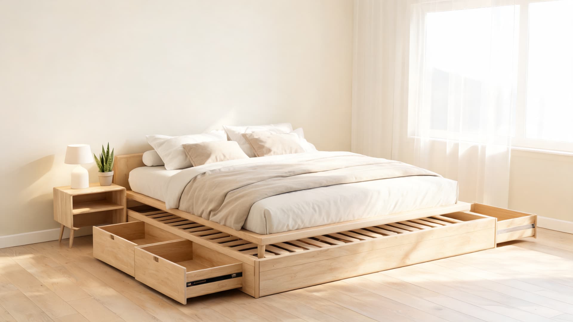
Some bed frames are easy to recognize but harder to define. You may have seen a low, clean frame with the mattress sitting directly on top and wondered how it differs from a panel bed, box spring, or regular frame, especially when comparing different types of bed frames. That confusion makes sense because platform beds are often described in terms of how they look rather than how they work. A platform bed is defined by its built-in support base. I’ll explain how that structure works, why it matters for mattress support, and how the design can affect height, storage, comfort, and room layout. You’ll also see how platform beds compare with panel beds and box springs, so you can understand the benefits and decide which setup fits your needs before buying. What Defines a Platform Bed? A platform bed is a bed frame with built-in mattress support. Instead of needing a separate box spring or foundation, the mattress rests directly on the bed’s base. That support may come from wooden slats, a solid deck, metal bars, steel mesh, plywood, or another reinforced surface. The main idea is simple: a platform bed combines the frame and mattress foundation into a single unit. Platform beds are often lower than traditional beds, but height is not what defines them. A platform bed can be wood, metal, upholstered, rustic, modern, simple, decorative, or designed with storage. What makes it a platform bed is the support system under the mattress. A platform bed is built to support the mattress directly. How a Platform Bed Frame Is Built Every platform bed frame has the same job: hold the mattress without a secondary foundation. But the parts doing that job vary considerably, and the quality of each one determines how well the bed holds up over years of daily use. 1. The Outer Frame This is the perimeter, the four sides that give the bed its shape and hold the rest of the structure in place. In solid hardwood frames, the outer frame is usually mortise-and-tenon or dowel-joined at the corners. In cheaper particleboard or MDF designs, the corners are bolted together with cam locks, which are fine for a few years but tend to loosen and wobble over time. 2. The Support Surface This is the part that replaces the box spring. It can be wooden slats, a solid plywood or MDF deck, metal bars, or steel mesh. Each behaves differently under load and affects how the mattress feels. A solid deck gives a firm, even surface, good for foam and latex. Slats add slight flex and better airflow. Metal grids are durable but only work well if the bars are close enough together (under 3 inches apart) to prevent foam from sagging through. 3. Slats and Slat Spacing Slat spacing is one of the most important specs on a platform bed and one of the most frequently glossed over in product listings. For memory foam and latex mattresses, slats need to be no more than 3 inches apart, ideally closer to 2 inches. Wider than that, the foam compresses into the gaps over time, creating pressure points and uneven wear. Innerspring mattresses are more tolerant of wider spacing, up to about 4 inches, because the coils distribute weight laterally. 4. The Center Rail and Center Legs In queen and king sizes, a frame without a center rail will eventually sag in the middle under mattress and body weight. The center rail, a longitudinal beam running head to foot, is what prevents this. Center legs underneath that rail carry the load down to the floor. On an inexpensive frame, the center legs are sometimes plastic or adjustable-height glides rather than actual structural legs. Those work, but solid wood or steel legs are more stable over time and don’t compress or shift when the mattress is loaded unevenly. 5. Storage Components Storage platform beds add drawers, cubbies, or a lift-up gas-piston mechanism under the mattress. The drawers are almost always side-opening and sized for folded bedding or clothing. Lift-up storage gives more volume but requires clearing the bed fully to access it, not ideal if you’re storing things you need regularly. The gas pistons on lift-up frames have a lifespan; on cheaper versions, they lose tension after a few years and no longer hold the mattress at height. 6. Frame Material Solid hardwood, oak, maple, walnut, or bamboo is the best long-term choice, especially if you compare the best furniture woods by strength, grain, and everyday durability. It doesn’t compress over time, holds fasteners without stripping, and can often be repaired rather than replaced. Solid pine is a step below hardwood in durability (Janka rating of around 870 lbf, compared with white oak at 1,360 lbf) but is widely used in mid-range frames and holds up well under normal loads. MDF and particleboard are the weakest options; they look fine when new but swell with humidity, strip easily at screw holes, and typically don’t survive a move intact. Metal frames made from welded steel are strong and light, but the quality varies significantly by gauge and weld quality. Pro Tip: Before buying any platform bed, ask the retailer for the slat spacing measurement and the center support configuration. These two specs, not the headboard style or the finish color, determine whether the frame will still perform well in five years. Platform Bed Base Types Compared The base type is the most consequential decision in a platform bed. Here’s how each option actually performs, beyond what the product descriptions say. Base Type Best For The Real Limitation Slatted (wood) Most modern mattresses; best airflow Slats must be ≤3 inches apart for foam; check before buying Solid deck (plywood/MDF) Firmest feel: foam and latex Traps heat and humidity under the mattress in summer Metal bar grid Durability; light weight Bar spacing varies wildly; confirm it’s under 3 inches Steel mesh Strength with some airflow Weld quality is the variable; hard to assess before delivery Storage (drawer or lift-up) Small rooms; extra organization Heavier, harder to move; lift pistons degrade over time Floating (wall-anchored) Visual impact; low-profile rooms Requires structural wall anchoring; no storage underneath The slatted base is the right default for most people, especially if the mattress is foam or hybrid. If you run warm or live somewhere humid, avoid solid decks entirely. If storage is the priority, the drawer option is the more practical choice over lift-up for everyday access. Platform Bed vs Traditional, Panel and Box Spring Bed The comparison that matters most is platform bed frame versus a traditional frame-and-box-spring setup, because that’s the real purchase decision most people are making. The differences affect more than just how the bed looks. Feature Platform Bed Traditional Frame + Box Spring Panel Bed Mattress support Built-in slats or deck Provided by the box spring Usually needs a box spring Box spring required? No Usually yes Usually yes Total setup cost Lower, one purchase Higher, frame + box spring Higher, frame + foundation Mattress feel Firm and direct More bounce from box spring flex Depends on foundation Best mattress type Foam, latex, hybrid Innerspring (designed for this pairing) Innerspring or hybrid Typical height Lower overall profile Taller, box spring adds 6–9 inches Taller, decorative frame design The practical takeaway: if you’re buying a foam or hybrid mattress, a platform bed is the simpler and cheaper path. If you already own a box spring and an innerspring mattress and they’re in good shape, replacing the whole setup with a platform bed may not deliver a meaningful improvement. The platform bed wins on cost and simplicity; the box spring wins on bounce and mattress compatibility for older innerspring designs. Where Platform Beds Make Sense and Don’t The benefits are real, but so are the limits. Here’s what to actually weigh before committing. Where a platform bed is the right call You’re buying a new foam, latex, or hybrid mattress and want to avoid paying separately for a foundation. You have a small bedroom and want to maximize visual space; lowering the bed makes the room feel less crowded, especially when paired with soft bedding and warm bedroom color ideas. You want under-bed storage without a bed skirt hiding an awkward gap. You’re assembling a bed solo and want fewer parts to deal with. Where a platform bed is the wrong call You or a partner has knee, hip, or back issues that make it difficult to get out of a low bed. Your current mattress warranty specifies a box spring or specific foundation type; using a platform bed without checking this can void coverage. You’re in a high-humidity climate, and considering a solid-deck base, trapped moisture under a foam mattress shortens its life and creates odor over time. You frequently rearrange rooms: solid-wood storage platform beds can weigh 150–200 pounds, making them genuinely difficult to move. Note: Before buying, check your mattress manufacturer’s warranty language. Many foam mattress brands require slat spacing under a specific measurement, usually 3 inches, and will deny warranty claims if the frame doesn’t meet that spec. The frame’s style is irrelevant; the slat spacing is what’s in the warranty document. Which Mattresses Work on a Platform Bed Frame Platform beds work well with most modern mattresses, but the base type and slat spacing determine whether they actually perform as advertised. Mattress Type Works on Platform Bed? What to Verify Memory foam Yes, preferred Slat spacing ≤3 inches; solid deck also fine Latex Yes, needs strong support Latex is heavy; verify center leg load rating Hybrid Yes Center support critical for queen and king sizes Innerspring Usually, check warranty Some brands require a box spring; check before buying Pillow-top Usually Adds height; confirm total bed height for room clearance Foam and latex are the clear winners here. They don’t need the spring flex of a box spring to feel comfortable; direct, firm support is actually what they’re designed for. Innerspring mattresses are the one category to double-check, because some older designs were engineered with the assumption that a box spring would absorb part of the impact load. Frequently Asked Questions Can a platform bed damage a mattress? A platform bed should not damage a mattress if the support surface matches the mattress requirements. The biggest risk comes from wide slat gaps, weak center support, or a base that does not meet the mattress warranty rules. Why do platform beds sit so low? Many platform beds sit low because they do not need a box spring underneath the mattress. That lower profile can make a bedroom feel more open, but it may not suit everyone, especially if getting in and out of bed is difficult. Do platform beds need ventilation? Yes, ventilation matters, especially for foam and latex mattresses. Slatted bases allow more airflow than solid decks. If the room is humid, a solid platform can trap moisture beneath the mattress, leading to odor or mildew issues. Are storage platform beds worth it? Storage platform beds are worth it when floor space is limited and you need hidden storage for bedding, clothes, or seasonal items. The tradeoff is weight, since storage frames are harder to move and assemble than simpler platform beds. Can you put any mattress on a platform bed? Not always. Many foam, latex, and hybrid mattresses work well on platform beds, but some innerspring mattresses may still need a box spring. Always check the mattress brand’s support guidelines before pairing it with a platform frame. Practical Takeaway A good bed frame supports your sleep, fits your room, and is easy to use daily. Choose a platform bed for built-in support, ideal for memory foam and small spaces. Pick a panel bed for a taller style, a decorative headboard, or if you have a compatible box spring. Use a box spring if your mattress recommends it, if you need extra height, or if you prefer a bouncier feel. For modern mattresses, a platform bed is simple and supportive; check slat spacing, airflow, height, support, and warranty before buying. Compare options and read related blogs for more tips.

Have you ever looked at an old brick home and noticed how perfectly everything lines up? That is often the pull of Georgian architecture. This classical building style is known for symmetry, proportion, brick or stone exteriors, sash windows, and a calm, formal look. Once you know the signs, it becomes much easier to recognize them in old houses, townhouses, terraces, civic buildings, and American colonial homes. I’ll explain where the style came from, what makes it different, how it shaped interiors and streets, and what details to look for when you see a Georgian building today. What Georgian Architecture Actually Is Georgian architecture is a building style defined by one thing above everything else: every element on the facade earns its place through proportion. If a window is the wrong size, it pulls the whole front out of balance. If the door is off-center by a foot, the entire elevation reads as wrong. That precision is not accidental. It is the core logic that ran through British construction from 1714 to 1830, and it is why Georgian buildings still hold up visually today. The style draws directly from ancient Greek and Roman design, filtered through Italian Renaissance principles and applied to brick-and-mortar construction across Britain, Ireland, and eventually the American colonies. Once you understand what Georgian architecture is built around, you start seeing its fingerprints everywhere: in terraced townhouses, civic halls, colonial plantation homes, and the Georgian Revival houses going up in new developments right now. Style Name Georgian Architecture Period 1714 to 1830 (reigns of Kings George I through IV) Origins Classical Greek and Roman design via the Italian Renaissance (Palladian influence) Defining Feature Symmetry and proportion: centered doors, evenly spaced sash windows, balanced facades Primary Materials Brick (towns), stone (grand houses), stucco (later Regency period) Found In Britain, Ireland, the American colonies, and Georgian Revival homes today What It Replaced Baroque excess and heavy ornament; folk-style colonial dwellings in America The table above gives you the factual skeleton. What the table cannot show is how these principles translate into specific decisions for a real building, from the spacing of windows to the height of ceilings to the placement of chimneys. That is what the rest of this article walks through. The History Behind Georgian Architecture The Georgian style developed during a period of growth, trade, and urban planning in 18th-century Britain. As towns expanded, builders used classical ideas to create homes and public buildings that felt refined, practical, and easy to organize. Key historical influences included: Britain’s growing wealth and demand for formal homes Planned streets, terraces, squares, and crescents Palladian design, with columns, pediments, and classical proportions The spread of British building traditions to Ireland and North America Later adaptations, including Regency, Federal, and Georgian Revival styles These influences made Georgian architecture more than a house style. It became a clear design language based on proportion, restraint, and practical planning. That is why many Georgian buildings still feel formal, calm, and easy to recognize today. The Five Core Principles of Georgian Architecture Every recognizable Georgian building follows the same five design principles. These are not decorative choices. They are structural logic that determines what gets built and where. 1. Symmetry The front door sits at the center. Windows are placed in matched pairs on either side, at consistent spacing across each floor. The roofline, chimneys, and any decorative details mirror each other left to right. This is the most immediately legible feature of Georgian architecture, and the easiest to check: stand in front of the building and draw an imaginary vertical line down the center. If both sides are true mirrors, you are almost certainly looking at a Georgian design. Inside, the same logic continues. A central entrance hall runs front to back, with rooms arranged in balanced positions on either side. The layout is not just aesthetic. It makes the house easy to navigate and gives every main room equal relationship to the central axis. 2. Proportion Proportion in Georgian design means that every element, window, door, room height, facade width, relates mathematically to every other element. A window is not placed based on how it looks in isolation. It is sized and positioned based on the total height and width of the wall it sits in. A door surround is not chosen for ornament alone. Its height, its frame width, and its relationship to the windows beside it all follow deliberate rules. This is the principle most responsible for why Georgian buildings look considered even when their detail is minimal. The math is doing the work that decoration is not. 3. Classical Influence Georgian buildings borrowed specific classical vocabulary from ancient Greece and Rome: columns or pilasters flanking a doorway, a pediment (the triangular element) above an entrance, a cornice line at the roofline, a fanlight above the front door. These were not decorative flourishes chosen at random. Each had a classical precedent and a defined position in the building’s hierarchy. The key distinction from earlier Baroque styles is restraint. Classical elements were used precisely and sparingly. A pediment on a doorway, yes. Pediments on every window as well? That would have been considered excessive. Georgian design favored control over display. 4. Light and Space Tall sash windows, often running to near ceiling height in formal rooms, served two functions: they brought daylight deep into the interior, and they reinforced the proportional rhythm of the facade from outside. High ceilings in principal rooms allowed those large windows without making the room feel compressed. The combination created interiors that read as spacious and well-lit by the standards of any era, not just the 18th century. In more modest Georgian homes, the same principles applied at smaller scale. The windows were still tall relative to the room. The ceilings were still higher than strictly necessary. Light and space were not luxuries reserved for grand houses. They were built into the design logic at every level of the market. 5. Restraint The fifth principle is what separates Georgian from Victorian. Where Victorian architecture added more molding, more color, and more carved detail, Georgian design held back. A Georgian cornice is present because it marks the transition between wall and roof. It is not carved into elaborate foliage. A Georgian door surround has a fanlight because the fanlight brings light into the hall. It is also encrusted with decorative metalwork. Late Georgian and Regency buildings pushed this boundary somewhat, adding ironwork balconies and stucco facades. But even in those cases, the underlying discipline of proportion kept the design from tipping into excess. Restraint was not austerity. It was the principle that decoration should serve the structure, not compete with it. Georgian Architecture Features: What to Look For Outside Knowing the principles is one thing. Spotting the specific features on an actual building is another. Here is what to look for on the exterior of a Georgian building, and what each feature tells you about the design logic behind it. Brick, Stone, and Stucco Facades Material choice in Georgian architecture followed clear conventions based on location and budget. Brick was the standard for urban townhouses and terrace housing because it was locally available, practical for repetitive construction, and produced even, flat facades that suited the Georgian preference for controlled surfaces. Stone appeared on grander country houses and public buildings where owners wanted a heavier, more permanent look. Stucco became increasingly common in the later Georgian and Regency periods, particularly on high-status terraces in London and other cities. It gave buildings a smooth, pale surface that read from a distance as more expensive than plain brick. The material changed; the proportional logic underneath did not. The Front Entrance The front door in a Georgian building is always a design statement, not just an opening. It sits in the exact center of the facade. It is framed by one or more of the following: columns or pilasters on either side, a pediment above, sidelights (narrow windows flanking the door), and a fanlight above. The fanlight is the most immediately recognizable feature: a semicircular or rectangular window set directly above the door, usually with decorative glazing bars in a fan or geometric pattern. The purpose of the fanlight was practical as well as decorative. The entrance hall of a Georgian townhouse was often narrow and received no direct window light. The fanlight solved that problem while simultaneously making the entrance look more formal and considered. If you spot a fanlight, you are almost certainly looking at a Georgian building or a Georgian Revival one. Rooflines and Chimneys Georgian roofs are typically hipped on all four sides, sloping to a ridge rather than ending in a gable at each end. This gives the building a neat, contained profile from any angle. On terraces and townhouses, a parapet wall often hid the roof entirely from street view, making the facade read as a clean horizontal line at the top. Chimneys were placed symmetrically. In a detached house, you will typically find them in matched pairs, positioned so they do not disturb the building’s left-right balance. Even practical infrastructure was subject to the same proportional discipline applied to windows and doors. Georgian Interiors: What Happens Inside Georgian exterior logic carries into the interior. A central hall organizes the layout, with main reception rooms balanced on either side and secondary or service areas toward the back or basement, keeping principal spaces formal and uncluttered. Rooms follow strict proportions: ceiling height matches floor area, and fireplaces align on central axes. Common features include crown molding, cornices, ceiling roses, paneled walls, and formal staircases. Wealthier homes added elaborate plasterwork; modest townhouses kept details simple. The core principles, proportion and clear axes, translate to contemporary spaces, ensuring rooms feel balanced regardless of style or period-appropriate decoration. The rules that underpin minimalist home decor share more with Georgian thinking than most people expect: both approaches rely on proportion and restraint rather than surface decoration to make a room work. Georgian Townhouses and Terraces The logic of Georgian exteriors carries into the interior. A central hall from the front door organizes the plan, with main reception rooms on either side and secondary rooms or service areas toward the back or basement. This keeps principal spaces uncluttered and formally arranged. Rooms follow proportional rules: lengths and widths feel balanced, ceiling height matches floor area, and fireplaces sit on central axes. Interiors often feature crown molding, cornices, ceiling roses above chandeliers, paneled walls in dining or entrance halls, and formal staircases near the entry. Wealthier homes could include elaborate plasterwork, while modest townhouses used simpler detailing, maintaining the same proportional and orderly logic throughout. In many surviving Georgian townhouses, the original basement layout is still legible even after 200 years of adaptation. The kitchen as a separate service space rather than a social room traces directly to this Georgian convention of keeping utilitarian functions off the principal floor. Georgian Architecture in Britain, Ireland, and America Georgian principles stayed consistent as the style crossed geographic boundaries, but materials, scale, and specific details adapted to local conditions. The table below maps the key differences. Region Georgian Architecture Features Britain Townhouses, terraces, squares, country houses, and civic buildings. Planned streets with balanced facades and formal urban layouts. Brick in cities, stone in the countryside. Ireland Brick-fronted townhouses and formal squares, particularly in Dublin. Tall sash windows, simple classical details, and repeating terrace forms. Dublin’s Georgian core is one of the best-preserved examples in Europe. American colonies Brick homes, plantation houses, churches, and public buildings. Georgian principles adapted to locally available timber and different climate conditions. Later evolved into the Federal style after independence. Georgian Revival (modern) Symmetry, sash-style windows, classical entrances, and brick or stone facades applied to modern construction. Uses contemporary layouts, insulation, and materials while maintaining the proportional logic of the original style. The American Federal style deserves a specific note because it is often confused with Georgian. Federal kept the symmetry and classical proportion but applied lighter, thinner details: narrower door surrounds, more delicate fanlight patterns, and ornamental motifs referencing the new nation rather than British classical tradition. Georgian feels heavier and more formal. Federal is the same logic made more precise and less monumental. How to Spot Georgian Architecture Today You do not need architectural training to identify a Georgian building. You need to look at the front in the right sequence. Start with the door: is it centered? Move to the windows: are they arranged in even rows on both sides? Check the roofline: is it neat and symmetrical, with chimneys placed in balanced positions? If the answer to all three is yes, and the building is brick or stone with restrained classical detail, Georgian architecture is a strong candidate. The features that most reliably confirm a Georgian identification are the fanlight above the door, the multi-paned sash windows, and the absence of heavy Victorian ornament. Georgian buildings are plain in a considered way. They are not trying to impress through decoration. They are trying to impress through order. Georgian Revival buildings built in the 20th and 21st centuries follow the same checklist. The giveaway is usually in the window glazing bars (modern double-glazed units sit slightly differently) and in the roofline details, but the proportional logic is the same. If understanding how historical styles shape contemporary design decisions interests you, the interior design style quiz at Minimal and Modern is a useful starting point for placing your own preferences in a broader context. Quick identification checklist: Centered front door with fanlight above. Sash windows in even rows, taller than wide. Brick, stone, or stucco exterior. Symmetrical facade. Hipped roof or parapet roofline. Chimneys in matched pairs. High ceilings and proportional rooms inside. Frequently Asked Questions About Georgian Architecture These are the questions that come up most often from people who have spotted a building they suspect is Georgian and want to understand what they are looking at. What are the key features of Georgian architecture? The key features are a centered front door with fanlight, evenly spaced sash windows, a symmetrical facade, brick or stone exterior, hipped or parapet roof, and proportional room layouts inside. Classical details such as columns, pilasters, and pediments appear at the entrance but are used with restraint rather than excess. What is the difference between Georgian and Victorian architecture? Georgian architecture is defined by restraint and symmetry: plain surfaces, proportional windows, minimal ornament. Victorian architecture added decorative complexity: carved stonework, asymmetric bay windows, polychrome brickwork, and far more surface detail. If a building looks busy, it is more likely Victorian. If it looks ordered and plain, it is more likely Georgian. What is a Georgian fanlight? A fanlight is the window set directly above a Georgian front door, typically semicircular in shape with radiating glazing bars. It brought daylight into the entrance hall when the door was closed and gave the entrance a more formal, considered appearance. It is one of the easiest Georgian features to spot from the street. Why do Georgian houses have such high ceilings? High ceilings in Georgian principal rooms were a deliberate proportional decision, not just a status signal. Taller walls allowed larger windows, which brought more daylight into formal spaces. The ceiling height also had to relate correctly to the floor area to satisfy Georgian proportional rules. A low ceiling in a large room would have read as incorrect. What is Georgian Revival architecture? Georgian Revival applies the proportional logic and exterior features of original Georgian buildings to modern construction. Symmetrical facades, sash-style windows, centered classical entrances, and brick or stone cladding are standard features. The underlying layouts and building systems are entirely contemporary. The revival approach has been popular in the UK and US since the late 20th century. What colors were used in Georgian interiors? Georgian interiors typically used muted, mid-toned colors: cream, pale blue, sage green, warm gray, ochre, and dusty pink. These worked with plasterwork, wood paneling, and period furniture without competing with the room’s proportional clarity. Deeper tones appeared in dining rooms and libraries in wealthier homes. Did Georgian homes have basements? Most Georgian townhouses had basements, particularly in cities. These lower levels housed kitchens, coal stores, and service rooms, keeping those functions separate from the formal living floors above. In many surviving Georgian terraces, the basement is still partially visible from the street through railings or light wells. How does Georgian architecture influence modern home design? Georgian influence shows up in symmetrical facades, centered front doors, sash-style windows, and proportional room layouts. The principles of balance and restraint also underpin approaches like mid-century modern design, which similarly prioritizes form and proportion over surface decoration. Both styles reward getting the fundamentals right rather than adding detail to compensate. Final Verdict: Is Georgian Architecture Worth Understanding for Your Own Home? Georgian architecture is not a historical curiosity. It is a set of design principles that remain some of the most reliable in residential construction: proportion first, symmetry as a structural tool, classical detail used precisely rather than liberally. If a room in your home feels off without you being able to identify why, the answer is almost always in the proportions: a ceiling that is too low for the floor area, windows that are too small for the wall they sit in, furniture at the wrong scale for the space. Georgian architecture made those decisions explicit and rule-governed. Understanding it makes it easier to see where modern rooms go wrong. Start with the room that bothers you most and measure the ceiling height against the longest wall. That ratio will tell you a lot.
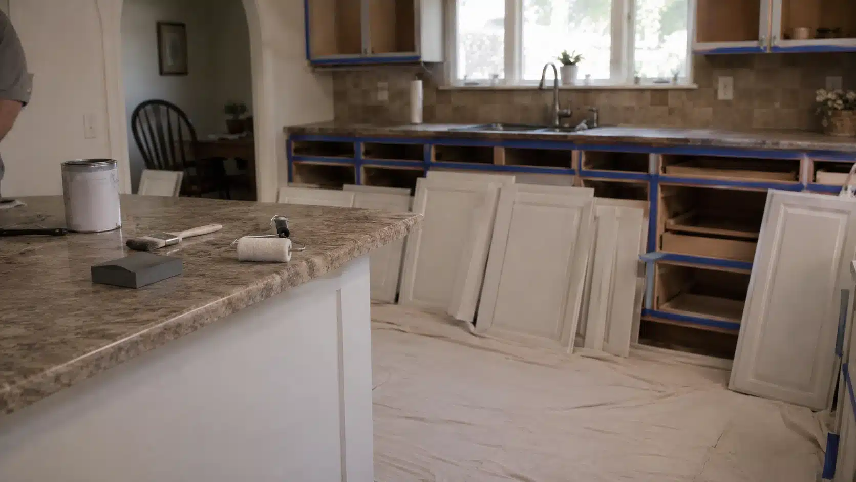
Painting kitchen cabinets sounds easy until the doors come off, the drawers are stacked in the garage, and you realize every little grease mark has been living rent-free on that surface for years. I have seen homeowners feel shocked by cabinet painting quotes, then feel even more shocked after trying to do the prep themselves. So if you are asking how much does it cost to paint kitchen cabinets, the honest answer is not just about paint. It is about time, prep, finish quality, cabinet condition, and how much of your kitchen you want painted. A small DIY project can stay under a few hundred dollars. A professional job can cost several thousand. Both can make sense, but only when you know what you are paying for. Let’s break down the real numbers in a clear way, without making your brain feel like a hardware store receipt. What You Want to Know Fast Answer Professional painting cost $2,000 to $6,500 for most kitchens DIY supply cost $200 to $600 Cost per door or drawer piece $70 to $185 depending on scope Cost per square foot $5.40 to $10.79 Time for DIY 30 to 60 hours Is it worth it vs replacing? Yes, if cabinet boxes are still solid How Much Does It Cost to Paint Kitchen Cabinets in 2026? The average cost to professionally paint kitchen cabinets is $2,000 to $6,500. DIY cabinet painting often costs about $200 to $600 in supplies, though your time can easily be the higher cost. A quick cabinet painting budget usually looks like this: Professional painting: $2,000 to $6,500 for an average kitchen DIY painting: $200 to $600 for paint, primer, tools, tape, and sanding supplies Per linear foot: about $30 to $70 for many professional jobs Per square foot: about $5.40 to $10.79 using current 2026 estimator data Per door or drawer piece: often about $125 to $185 for fine-finish spray work The reason prices swing so much is simple: cabinets are small but fussy. A painter is not just rolling paint on flat walls. They are removing doors, cleaning grease, sanding surfaces, priming, coating both sides, allowing time to dry, and reinstalling everything without turning your kitchen into a sticky puzzle. Professional Kitchen Cabinet Painting Cost vs DIY: Side by Side Professional Kitchen Cabinet Painting Cost: A professional job typically includes removing every door and drawer, labeling them, cleaning surfaces, sanding or deglossing, priming, spraying or brushing with cabinet-grade paint, drying time, and reinstalling. Many professionals also apply multiple finish coats. What is often not included: painting cabinet interiors, replacing hinges, hardware changes, or grain filling on older wood. Always ask. According to Angi’s 2026 data, smaller cabinet painting scopes may fall around $425 to $1,465, with an average near $940. Full-size kitchens with more prep, more doors, or higher-end finish work often land higher, closer to the $3,000 to $6,500 range shown in other cost guides. DIY Cabinet Painting Cost: DIY is cheaper in dollars and more expensive in weekends. A typical supply list includes degreaser, sandpaper or sanding blocks, tack cloth, painter’s tape, drop cloths, primer, cabinet-grade enamel or alkyd paint, quality brushes, a foam roller, and possibly an HVLP sprayer rental. That adds up to $200 to $600 depending on kitchen size and product quality. The hidden cost is time. Most DIY projects run 30 to 60 hours, and that does not count the days spent waiting for coats to dry. Option Typical Cost Time Professional painting $2,000 to $6,500 3 to 5 days DIY painting $200 to $600 30 to 60 hours Refinishing (professional) $1,500 to $4,500 2 to 4 days High-end spray-booth finish $6,500 to $10,000+ 5 to 7 days Painting covers the old surface with a new color. If you are leaning toward restoring the wood’s natural look instead, the cabinet refinishing process and costs are worth comparing before you commit to either route. Cost to Refinish Kitchen Cabinets vs Paint Them The cost to refinish kitchen cabinets is usually different from painting because refinishing often means sanding or stripping old stain, then applying new stain or a clear protective finish. It works best on solid wood cabinets that still look good underneath. Option Typical Cost Time Professional painting $2,000 to $6,500 3 to 5 days DIY painting $200 to $600 30 to 60 hours Cost to refinish kitchen cabinets $1,500 to $4,500 2 to 4 days High-end spray-booth finish $6,500 to $10,000+ 5 to 7 days Painting covers the old surface with a new color. Refinishing keeps more of the wood look. The cost to refinish kitchen cabinets often ranges from $1,500 to $4,500, while painting may land around $2,000 to $6,500 for many professional projects. What Drives the Price Up When Painting Kitchen Cabinets? Cabinet painting gets expensive when the job needs more handling, more prep, or a higher-end finish. Two kitchens can both have white cabinets, but the price can be totally different if one has clean flat doors and the other has greasy oak, dents, old hardware holes, and interiors included. 1. Cabinet Count and Door Style The more doors, drawers, panels, and trim pieces you have, the higher the price. Each piece must be removed, labeled, cleaned, sanded, primed, painted, dried, and reinstalled. Raised-panel doors, glass fronts, grooves, and detailed trim also take longer than flat slab doors. This is why cabinet count often matters more than kitchen size. A small kitchen with many drawers can cost more than a larger kitchen with fewer simple doors. 2. Prep Work, Repairs, and Grain Filling Prep is the part people dislike, but it is also the part that protects the finish. Grease must be cleaned off. Glossy surfaces need sanding or deglossing. Dents may need filler. Gaps may need caulk. Oak cabinets may need grain filling if you want a smoother finish. If prep is skipped, the paint may chip, peel, crack, or look rough. That cheap quote can become expensive if you need the work redone. 3. Paint Type and Finish Method Cabinet-grade paint costs more than basic wall paint because it needs to harden well and handle daily use. Many pros use enamel, alkyd, acrylic urethane, or stronger coating systems for better wear. Spraying can create a smoother finish, but it needs careful masking and controlled setup. Brush and roller work can still look good when done by a skilled painter using the right products. 4. Interiors, Hardware, and Add-Ons Painting the inside of cabinet boxes usually costs extra because it adds more cleaning, sanding, priming, and drying time. The same goes for replacing hinges, adding soft-close hardware, drilling new pull holes, and patching old ones. These extras can raise the final total more than homeowners expect. They are also easy to miss in a quick quote, so ask what is included before you compare prices. Painting vs Refinishing vs Refacing vs Replacing: Which Makes Sense? Painting is not the right move for every kitchen. If the cabinet boxes are swollen, peeling inside, moldy, or structurally soft, putting paint on top is not a fix. Option Average Cost Best When Not Best When Painting $2,000 to $6,500 pro Boxes are solid, you want a new color Boxes are damaged or heavily water-worn Cost to refinish kitchen cabinets $1,500 to $4,500 Real wood looks great, you want a natural finish You want to cover grain fully Refacing $5,000 to $13,000 Boxes are sound, doors look dated Layout no longer works Replacing $4,500 to $15,000+ Due to structural damage, the layout must change Budget is tight, boxes are sound Choose painting if the boxes are sound and you want a color change. Choose refinishing if the wood is beautiful and you want to keep it natural. Choose refacing if the layout works but the door style feels dated. Choose replacing only if the structure is compromised or the layout is genuinely not working. What Real Homeowners Are Saying About Cabinet Painting Costs People often underestimate how long DIY takes, and professional quotes vary widely because no two kitchens have the same scope. In a widely discussed Reddit thread, one homeowner was already 46 hours into prep and painting before even finishing. Quotes shared in the thread ranged from $1,000 for a small condo to $5,000 to $7,000 for a larger kitchen. One painter based in North Georgia charges around $2,500 and noted that people regularly turn down the quote as “too expensive,” not realizing what proper prep and materials actually cost. In New Jersey, someone else was quoted $16,000 from a premium company. In Massachusetts, one contractor shared that their going rate starts around $15,000 for spray-finish work. The lesson from all of it: scope matters. A $2,500 quote and a $6,500 quote are rarely for the same kitchen, finish method, or prep level. When you compare real stories, always check cabinet count, your city, whether interiors were included, and what kind of coating was used. That context is what makes a number make sense. Tips to Save Money on Cabinet Painting The safest way to save money is to reduce the scope, not weaken the prep. Skipping primer, sanding, or drying time may lower the bill today, but it can lead to chipping later. Keep the color close: Going from dark wood to bright white often needs more primer, more coats, and more labor than a softer color change. Skip the interiors: Painting inside cabinet boxes adds time and cost. If the interiors are clean, leave them alone. Reuse hardware: Keeping the same pulls and hinges avoids drilling new holes, filling old ones, and fixing alignment issues. Clear the kitchen first: Empty cabinets, clear counters, and move small appliances before painters arrive to save time. Ask for itemized quotes: Compare prep, primer, coats, paint type, finish method, cleanup, and warranty, not just the final number. Paint only sound cabinets: If boxes are swollen, peeling, or weak, painting may hide the problem for only a short time. Do not cut: cleaning, sanding, primer, or cure time. These are not optional steps. Every shortcut in prep shows up later as a chip, peel, or smear. A lower price is helpful only when the finish can still hold up. The professional kitchen cabinet painting cost should make sense on paper before anyone opens a paint can. Cabinet Painting Cost by Kitchen Size Cabinet count matters more than room size. A small kitchen packed with drawers can cost more than a larger open kitchen with fewer simple doors. Use this as a rough planning guide, and count your own cabinet pieces before calling for quotes. Kitchen Size Cabinet Count Guide Professional Cost DIY Supply Cost Small kitchen 10 to 15 doors and drawers $1,500 to $3,500 $200 to $400 Medium kitchen 20 to 30 doors and drawers $3,000 to $6,500 $350 to $600 Large kitchen with an island 35+ doors, drawers, pantry $6,000 to $10,000+ $600 to $1,000+ Count every door and drawer front before you call a contractor. That number tells more about your eventual quote than the room’s square footage ever will. If you are also weighing updates to the countertops at the same time, reviewing which countertop materials hold up in real kitchens can help you sequence and budget both projects together. Local labor markets can shift these numbers significantly, so always get quotes from at least two or three painters in your area. When Cabinet Painting Is Not Worth the Money Painting works best when the cabinet boxes are solid, and the main issue is color. If the cabinets are already damaged, paint may only hide the problem for a short time. Water damage: If cabinet boxes are swollen, soft, or warped, paint will not fix the structure. The damage can keep spreading under the new finish. Mold or moisture issues: If there is mold inside or behind the cabinets, fix the moisture problem first. Painting over it can trap the issue. Peeling laminate or thermofoil: If the outer layer is lifting, paint may not bond well. The finish can peel again even after prep. Weak cabinet frames: If doors do not close properly or the boxes feel loose, the problem is structural. Paint will not make the cabinets stronger. Bad kitchen layout: If storage, access, or daily use already feels frustrating, painting only changes the color. Refacing or replacing may be smarter. Before spending on paint, check the bones of the cabinets first. If the boxes are strong, painting can be a smart update. If the structure is failing, that money is better saved for refacing or replacing. What Budget Should You Set Before Saying Yes to a Cabinet Painting Quote? For most U.S. kitchens, a safe professional budget is $3,000 to $6,500. Smaller kitchens may come in under that, while larger kitchens with islands, cabinet interiors, oak grain, or spray finishes can run higher. If you plan to DIY, budget around $200 to $600 for supplies and plan for more time than you expect. Before you accept a quote, confirm it clearly lists the prep steps, paint products, number of coats, finish method, timeline, exclusions, and warranty. It should also cover door and drawer removal, cleaning, sanding or deglossing, primer, cabinet-grade paint, drying time, reinstallation, masking, and cleanup. Ask what costs extra, particularly cabinet interiors, grain filling, new hinges, soft-close hardware, new pull holes, water-damage repairs, and major color changes. My simple rule before approving any line item: count every door and drawer, check how much prep the surfaces actually need, and compare what each quote includes. That gives you a clearer answer than a random average when you are trying to figure out how much does it cost to paint kitchen cabinets in your specific kitchen. If you are budgeting other painting projects at the same time, the full breakdown of house painting costs covers what professional labor runs room by room. Frequently Asked Questions Will my kitchen be usable while cabinets are being painted? Your kitchen may be partly usable, but it will not feel normal. Doors and drawers are often removed, counters may be covered, and some areas may be masked off. Plan easy meals, protect pets from wet paint, and avoid heavy cooking until the finish cures. Do I need to move appliances before cabinet painting? Most painters do not need you to fully remove appliances unless cabinets are blocked or panels sit behind them. You may need to pull out small appliances, clear counters, and empty nearby cabinets. Ask the painter before moving heavy items like a refrigerator or range. What cabinet paint color is safest for resale? Soft white, warm white, light gray, greige, and muted neutral shades are usually safer for resale than bold colors. These tones work with many countertops and floors. Dark green, navy, or black can look great, but they may appeal to fewer buyers. Should I buy the paint myself to save money? Usually not. A professional painter often gets better product pricing and knows which cabinet coating works with your surface. If you buy the wrong paint, the job can fail sooner. Ask for the product name and do your research rather than trying to supply it yourself. How soon can I clean painted cabinets? Light use may be possible after a few days, but full curing can take much longer depending on the paint. Avoid scrubbing, harsh cleaners, steam, and heavy handling early on. Use a soft cloth and mild soap only after the painter confirms it is safe. Is cabinet painting worth it compared to replacing? Yes, when the cabinet boxes are structurally sound. Professional painting at $2,000 to $6,500 is a fraction of the $10,000 to $25,000 most homeowners spend on new cabinet installations. The key condition is that the boxes themselves need to be solid. Final Thoughts Cabinet painting is one of those projects that looks deceptively easy from the outside and gets very serious once the doors are off the hinges. How much does it cost to paint kitchen cabinets comes down less to how big your kitchen is and more to how many pieces need work, what condition the surfaces are in, what kind of finish you want, and whether a professional is doing the prep properly. DIY can absolutely work, especially for smaller kitchens with flat doors and a patient timeline. But knowing how much it costs to paint kitchen cabinets professionally means asking for itemized quotes, checking what is included, and not choosing the lowest price without understanding why it is low. If you have recently gotten a quote or finished a cabinet painting project, drop the cabinet count, your city, and what the job included in the comments. Real numbers from real kitchens help everyone figure out what is fair.
Color Name Natural Cream OC-14 (also: 1521 / Nature’s Essentials 1521) Brand Benjamin Moore Collection Off-White Collection LRV 64.78 — medium-light (not a white or off-white; a light greige) Undertones Warm beige-gray with a subtle green cast that shows in cool or low light Best For South- and west-facing rooms, living rooms, bedrooms, hallways, kitchens with warm finishes Avoid In Rooms dominated by cool gray tile, blue-gray counters, or icy white trim Benjamin Moore Natural Cream OC-14 is not a yellow cream, and it is not a gray. On the wall, it reads as a light greige, a warm, quiet neutral that sits between beige and gray without committing hard to either side. Its LRV of 64.78 puts it solidly in medium-light territory, which means it adds real color presence to a room while still reflecting a reasonable amount of light. If you walk in expecting something close to white, it will look darker than you anticipated. If you walk in expecting a traditional creamy yellow, it will look cooler and more grounded than you expect. That in-between quality is exactly what makes it useful. It has enough warmth to feel inviting, and enough gray-beige structure to look current rather than dated. The official collection is Benjamin Moore’s Off-White range, but at LRV 64.78, Natural Cream sits far enough from white that pairing decisions matter more here than with most off-whites. The sections below will walk you through exactly what this color does in different light, which rooms suit it, and what can go wrong when it is placed in the wrong conditions. Natural Cream Undertones: What the Chip Does Not Tell You The primary undertones in Natural Cream OC-14 are warm beige and muted gray. Those two sit in balance, which is what gives the color its greige character. But there is a third undertone that does not show up on most chips and only becomes visible in specific conditions: a soft green cast. It is not dominant. In warm, well-lit rooms you may never notice it. But in a north-facing room, on a gray winter day, or against cool-toned finishes, that green can pull forward and give the walls a slightly murky quality. This is the most important thing to know before committing to Natural Cream. The color does not lean yellow even in warm light, which many buyers see as a selling point after testing other greiges that turn amber. But the flip side is that its warmth relies on the room supporting it. Pull in blue-tinted trim, cool gray floors, or icy countertops, and Natural Cream loses its warmth fast and shows the green side instead. If you are still figuring out how undertones work throughout your space, choosing paint colors for your decor can help you build a more cohesive starting point. Avoid pairing it with Benjamin Moore Decorator’s White or any trim color with clear blue undertones. Those will make the wall color look grungy rather than soft. Warm whites like White Dove (OC-17), Chantilly Lace (OC-65), or Simply White (OC-117) are the right range for trim. If you want no contrast at all between walls and trim, Natural Cream can also be used on the trim itself. That green undertone is subtle on the chip — but light is what decides whether it shows up in your room. Here is exactly how that plays out. How Natural Cream Reads in Different Light Light changes this color significantly, and in some rooms, it changes it enough to make the difference between a color that works and one that does not. Natural light can make Natural Cream look warmer, cooler, brighter, or more muted depending on the direction your windows face. In sunny rooms, it often feels soft and warm. In cooler spaces, the gray side can become more noticeable. North-facing rooms: North-facing light is usually cooler and softer. Natural Cream may look more muted, grayer, or slightly green-gray in these rooms. It can still feel calm and elegant, but it often needs help from warm white trim, wood tones, layered fabrics, and soft lighting to keep the space from feeling flat. South-facing rooms: They receive warmer daylight for much of the day. This light brings out the beige warmth in Natural Cream and can make it feel softer, brighter, and more inviting. It is one of the easiest lighting conditions for this color because the warm light nicely balances its gray undertone. East-facing rooms: East-facing rooms get brighter morning light, so Natural Cream may feel fresher and warmer earlier in the day. As the light fades, the color can look more muted and gray. Warm lamps or soft white bulbs can help the room stay cozy later in the evening. West-facing rooms: West-facing rooms get stronger afternoon and evening light. During this time, Natural Cream can look warmer, creamier, and more relaxed. This makes it a strong choice for living rooms, dining rooms, and bedrooms where a soft evening glow feels comfortable. In Artificial Light Artificial lighting can significantly change the natural color after sunset. Warm white bulbs can bring out its beige side and make the room feel softer and more welcoming. Cool LED or daylight bulbs can make Natural Cream look grayer, flatter, or slightly green in some spaces. If you want the color to feel balanced, soft white lighting is usually the safer choice. Layered lighting also helps. Use ceiling lights, table lamps, floor lamps, or wall sconces together so the color looks even across the room. This keeps Natural Cream feeling warm, smooth, and natural from day to night. Beige vs Cream: Which Neutral Fits Your Space? Choosing between beige and cream can feel simple at first, but the difference becomes clear once the color goes on the wall. Beige has more depth and earthiness, while cream feels lighter, softer, and warmer. Feature Beige Cream Base Tone Brown, tan, or gray-based White with yellow or warm undertones Overall Look Grounded, warm, neutral Soft, light, cozy Best For Living rooms, bedrooms, hallways, open layouts Trim, walls, kitchens, bedrooms, soft neutral spaces Undertones Tan, gray, brown, sometimes green Yellow, ivory, warm white Room Feel Calm, settled, earthy Airy, gentle, warm Works Well With Wood tones, black accents, stone, taupe, warm whites Brass, soft whites, light wood, warm fabrics, muted colors Potential Risk Can look muddy or dated in poor lighting Can look too yellow if the undertone is strong Choose beige for a grounded neutral that adds depth and warmth to the room. It works well when the space has wood floors, stone, woven textures, or darker accents. Choose cream for a lighter, softer look that feels warm without adding too much color to the walls. For Benjamin Moore Natural Cream, the answer lies between the two. It has the warmth people like in cream, but the gray-beige base gives it more depth than a true creamy white. That makes it a good choice if you want softness without a strong yellow cast. Both beige and cream can look beautiful, but lighting, trim, and flooring decide the final result. Testing samples in the actual room helps you see which one feels balanced and natural. Coordinating Colors: Specific Paint Codes That Work Pairing decisions are where Natural Cream either pulls together or falls apart. Here are the specific codes that work, and the ones to avoid. Trim and ceilings: Benjamin Moore White Dove (OC-17) is the most reliable trim pairing — it is slightly warmer than a crisp white and creates a soft, cohesive transition without looking flat. Benjamin Moore Chantilly Lace (OC-65) works when you want more contrast and a slightly crisper edge. Benjamin Moore Simply White (OC-117) sits between the two and is a dependable all-purpose option. Avoid any trim color with blue or purple undertones; the contrast reads grungy against Natural Cream rather than clean. Accent and furniture colors: Natural Cream works with muted sage green tones, warm taupes, soft terra cotta, and earthy rust. It does not need strong color accents — a linen sofa, an oak table, and a brass lamp can be enough to finish the room. If you want a bolder accent, Benjamin Moore Newburyport Blue (HC-155) or a quiet forest green both work without fighting the wall color. Hardware and fixtures: Brushed brass, unlacquered brass, and warm bronze all suit Natural Cream well. Polished chrome and brushed nickel tend to pull out the cooler side of the undertone and can make the color look less warm than expected. Where Natural Cream Works Best Room by Room Some rooms set Natural Cream up to look its best. Others fight it. Here is the honest breakdown. 1. Living Room Living rooms are a strong match for Natural Cream because they typically have layered finishes, wood floors, upholstered furniture, and textiles, that reinforce the warmth in the wall color. Linen, leather, warm white curtains, and natural wood all work with it. The color gives the room a finished quality without drawing attention to itself, making it the right backdrop for a space where furnishings do the visual work. This is where Natural Cream earns its reputation as easy to live with. 2. Bedroom In a bedroom, Natural Cream creates a restful backdrop that stays warm enough to feel cozy at night without looking stark during the day. White bedding, taupe throws, wood nightstands, and muted green accents all pair well with it. The LRV of 64.78 means it reflects enough light to keep the room from feeling heavy, while still providing enough depth that the walls read as a real color rather than an almost-white. It suits both warm-wood and lighter-finish bedrooms well. 2. Kitchen Natural Cream works on kitchen walls and can also be used on cabinetry when the goal is a soft, warm finish that does not read as yellow. It suits white cabinets, warm wood cabinets, stone or quartz countertops in warm tones, and brass hardware well. Kitchens built around clean lines and restrained palettes, the kind covered in minimalist kitchen design, tend to be a particularly natural fit for this color on the walls. Where it struggles: kitchens with blue-gray tile backsplashes, icy white countertops, or very cool-toned cabinet colors. In those conditions, the green undertone becomes visible, and the overall look reads discordant rather than warm. 3. Bathroom Bathrooms require the most careful testing. Warm stone tile, soft white tile, beige floors, brushed brass, and wood vanities all work with Natural Cream. Cool gray tile or a predominantly chrome and gray bathroom will bring out the green undertone and make the color look muddier than intended. Bathrooms also tend to have less natural light than other rooms, which means the artificial lighting quality matters more here. Test under your actual bathroom lighting before buying gallons. 4. Hallways and Open Layouts Hallways and open-plan spaces need a neutral that reads consistently from one end of the home to the other, across changing light conditions. Natural Cream does this reasonably well because it is warm but not bold. It can run through entry halls, living rooms, dining rooms, and stairways without making a color statement. The key risk in open layouts is placing Natural Cream alongside cool-toned finishes in an adjacent space, the contrast will make the undertone shift more noticeable as you move through the home. 5. Exterior On exteriors, Natural Cream creates a soft, warm, and understated look that suits stone, brick, black shutters, warm wood doors, and creamy white trim. One important note: outdoor light is significantly stronger than interior light, and Natural Cream will appear lighter outside than it does inside. The LRV shifts perceptibly in full sun. Always test it on the actual exterior surface before painting a full elevation, and check it at different times of day since morning light and midday light read differently on an exterior. What Users Discuss About Benjamin Moore Natural Cream Redditusers discussing the room color options generally leaned toward Benjamin Moore Natural Cream as the safer and cozier choice for the space. Several commenters felt that Natural Cream would work especially well in a room with limited daylight because its warm undertones could keep the space feeling inviting rather than dark or moody. Others noted that darker green paint colors might feel overwhelming over time, particularly in a north-facing room. The original poster appreciated the feedback and mentioned wanting a comfortable atmosphere for relaxing with coffee and books during colder months. Overall, the discussion highlighted Natural Cream’s reputation as a warm, versatile neutral that can create a soft and welcoming look while remaining easier to live with long-term. Natural Cream vs. Similar Colors: The Comparisons That Matter These are the colors buyers consistently put Natural Cream next to when choosing. Here is the honest difference in each case. 1. Natural Cream vs. White Dove OC-17 White Dove is lighter (LRV around 83), softer, and functions as a warm white rather than a greige. Natural Cream has more visible body and reads as a wall color with real presence. Use White Dove when the goal is trim, cabinetry, or a very airy wall. Use Natural Cream when the walls need more depth and warmth than an off-white can provide. 2. Natural Cream vs. Edgecomb Gray HC-173 Edgecomb Gray has an LRV of 63, just slightly darker than Natural Cream at 64.78 — but it carries stronger green undertones and reads warmer on the wall. Natural Cream feels a little softer and creamier in comparison. The Benjamin Moore Moonshine review covers a similar greige territory if you want to see how another BM neutral at this depth reads in real rooms. If you want a greige that leans more definitively warm and earthy, Edgecomb Gray often wins. If you want slightly more lightness and a subtler undertone, Natural Cream is the better call. 3. Natural Cream vs. Pale Oak OC-20 Pale Oak is lighter (LRV 69) and carries taupe undertones rather than a beige-gray mix. It reads airier and slightly more delicate than Natural Cream. Pale Oak is the right call when the goal is a quiet, receding neutral. Natural Cream is the right call when the room needs more warmth and softness without going visibly beige. 4. Natural Cream vs. Swiss Coffee OC-45 Swiss Coffee is creamier and lighter, sitting closer to a soft off-white. Natural Cream has more gray-beige balance and reads more like a deliberate wall color with body. Swiss Coffee works when you want a very soft, slightly warm white. Natural Cream works when you want contrast between walls and trim, and want the walls to read as a distinct color rather than a near-white. These comparisons show that Natural Cream fills a specific gap — more depth than off-white, less warmth than a true beige, and a more current feel than many traditional cream colors. Whether that gap matches your room depends on what you are working with. How to Sample and Test Natural Cream OC-14 A poor sample test is the source of most of the disappointment that comes with this color. Here is how to do it properly. Buy the actual Benjamin Moore paint sample, not a printed swatch or a digital color chip. Paint at least two 12-inch by 12-inch samples on different walls in the same room. Walls receive different light at different times of day, and what looks warm on the south wall may look gray on the north wall. Let the paint dry completely before judging; wet paint is darker and masks the true undertone. Check the samples three times: morning light, midday, and evening with your artificial lights on. Hold your trim color and a piece of your flooring next to the sample. Those two elements, trim and floor, are where undertone clashes appear most clearly. The finish you choose also affects how the undertone reads: a lower sheen absorbs light and makes the color feel softer, while a shinier finish amplifies the surface and can pull the green forward. The differences between flat and satin paint finishes matter more with a complex neutral like this than with a plain white. For an easy, mess-free version of this process, Samplize peel-and-stick samples let you move a painted swatch from room to room without the prep and cleanup of a painted sample. They use real Benjamin Moore paint and give a more accurate read than any paper chip. Pros and Cons of Benjamin Moore Natural Cream OC-14 Pros Cons Warm without leaning yellow, which most greiges with warmth fail to manage Green undertone appears in cool or low-light conditions and against cold finishes More depth than off-whites like White Dove without the commitment of a full greige Will not read as a cream — buyers expecting ivory or rich cream will be surprised Works across living rooms, bedrooms, hallways, and open layouts consistently Needs warm finishes to support its warmth; cool-toned rooms fight it Pairs well with wood, stone, linen, brass, and natural textures Trim choice is critical — the wrong white makes the walls look dirty Shifts noticeably less toward purple or pink than most other greiges at this LRV Harder to assess accurately online — samples in real light are non-negotiable Use this table alongside your room’s specific light, trim, flooring, and finishes. Natural Cream earns its reputation in rooms that support its warmth. In rooms that work against it, the cons listed here are the ones you will feel most. Frequently Asked Questions Does Natural Cream work with black accents? Yes, Natural Cream works well with black accents. Black lighting, frames, hardware, or furniture can give the color more structure and contrast. The warmth in Natural Cream keeps the look from feeling too stark, especially when paired with wood, linen, or warm white details. Is Natural Cream good for a nursery? Natural Cream can work beautifully in a nursery because it feels soft, warm, and calm without being too sweet. It pairs well with light wood furniture, cream textiles, muted greens, soft blues, and warm neutrals. Test it first if the room has limited daylight. What curtains go with Natural Cream walls? Natural Cream pairs well with linen, oatmeal, ivory, taupe, muted sage, warm gray, or soft terracotta curtains. Choose natural fabrics if you want a relaxed look. Avoid icy white or blue-gray curtains because they may make the wall color look dull or slightly green. Can Natural Cream work with red brick? Yes, Natural Cream can work with red brick, especially if the brick has warm brown, rust, or clay tones. Its beige-gray base softens the brick without clashing. Add warm wood, brass, black accents, or cream trim to help the room feel connected. Is Natural Cream darker than Pale Oak? Natural Cream usually reads slightly deeper and warmer than Pale Oak. Pale Oak feels lighter, airier, and more taupe-based, while Natural Cream has more beige-gray body. If you want a wall color with a little more warmth and presence, Natural Cream may feel stronger. Does Natural Cream suit traditional homes? Yes, Natural Cream suits traditional homes because it works with wood trim, classic furniture, warm metals, and layered textiles. It feels refined without looking cold or too modern. It can also update older rooms while still respecting traditional details and warmer finishes. Can Natural Cream be used with navy accents? Yes, navy accents can look strong with Natural Cream. The wall color brings warmth, while navy adds depth and contrast. Use navy through pillows, rugs, cabinetry, art, or upholstery. A muted or slightly warm navy usually works better than a very bright blue. Final Verdict Natural Cream works best when you want a warm neutral that still feels calm and current. I like how it gives a room softness without making the walls look too yellow or too plain. You have seen how its greige base, LRV, lighting shifts, trim pairings, and sample testing all affect the final look. That matters because paint is not chosen in isolation. Floors, bulbs, furniture, and nearby whites can change everything. Benjamin Moore Natural Cream can be a beautiful choice when your space supports its warmth. Test it in real light, compare it with your finishes, and use the tips above before buying gallons. Share your room results in the comments or read a related paint review next.
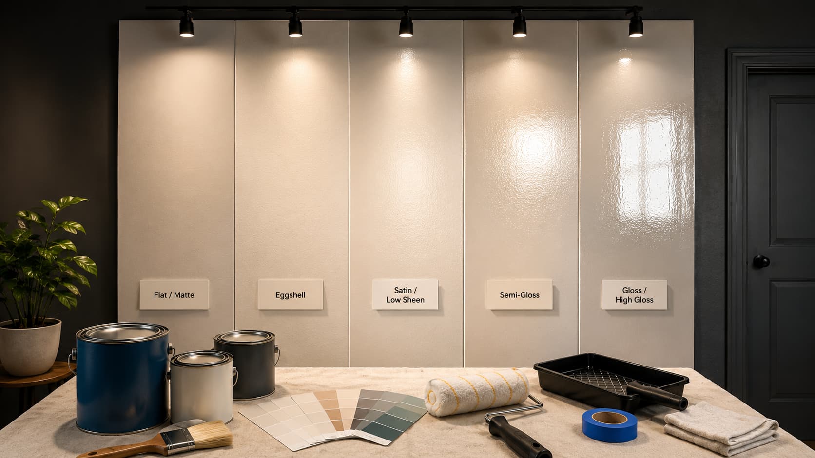
Choosing the right paint color is just one part of making a space look complete. Paint sheen is what gives walls, trim, and cabinets their personality, influencing how light reflects, how easy surfaces are to clean, and how long the finish lasts. Understanding paint sheens helps you decide which finish works best for each room, from bedrooms and living areas to kitchens, bathrooms, and exterior surfaces. Learning about the differences in sheen helps you choose finishes that make spaces feel comfortable, durable, and visually appealing without second-guessing your choice. What Paint Sheens Are? Paint sheen is the measure of how much light a dried paint surface reflects at you. Sheen is determined by the ratio of binder to pigment in the paint formula. More binder creates a denser, more reflective film. More pigment creates a porous surface that absorbs rather than reflects light. This ratio also affects durability; higher-sheen paints are harder, easier to wipe, and more resistant to moisture and scuffing. Lower-sheen paints are more forgiving of surface flaws but less resilient under daily use. That trade-off, surface forgiveness versus durability, is the real framework for choosing between finishes. It has nothing to do with personal taste and everything to do with the room you’re painting. Note: The same paint color can look different at different sheen levels. A higher-gloss finish reflects more light, making colors appear brighter and more saturated. A matte finish absorbs light, making colors feel deeper and slightly muted. Always test samples at your chosen sheen level before committing. Every Paint Sheen Type: Explained Simply Paint sheens become easier to choose when each finish is tied to real rooms, daily use, cleaning needs, and the kind of surface being painted. 1. Flat / Matte Flat and matte paints reflect almost no light, making them useful as they absorb light, so imperfections on walls appear less visible. They are ideal for ceilings with old seams or walls with repairs, as they hide flaws well. However, their porous surface makes them difficult to clean, as scrubbing can remove paint. Use flat and matte finishes primarily in adult bedrooms, on ceilings, and in low-traffic areas where walls aren’t frequently touched. Modern washable matte formulas from brands like Benjamin Moore (Aura Matte) have improved cleanability significantly, making them worth specifying if you want the flat look in a busier room. On textured walls, the gap between matte and flat paint behavior becomes more pronounced than the sheen scale suggests. 2. Eggshell Eggshell sits just above flat on the sheen scale, with enough glow to give walls a soft, clean look, not enough to create noticeable reflections. The name refers to the faint sheen on an actual eggshell, a useful visual reference: present but subtle. This is the finish I recommend for most living rooms, dining rooms, and adult bedrooms that require occasional light cleaning. It handles a damp cloth well without the scrub-sensitivity of flat paint, and it doesn’t pick up highlights from windows or lamps the way satin does. If you’re uncertain which finish to choose for a standard interior wall, eggshell is the safe, practical default. 3. Satin / Low Sheen Satin has a visible, pearl-like glow that reads as polished without crossing into obvious shine. It’s noticeably more durable than eggshell; the denser paint film resists moisture, holds up to repeated wiping, and maintains its surface longer in high-contact areas. This is the right finish for hallways, kids’ rooms, and any wall that gets regular hand contact. It also works well as a softer option for trim when semi-gloss feels too shiny for the aesthetic. One caveat: satin picks up application marks more readily than eggshell, so rolling technique matters. Uneven coverage and visible roller lines are clearly visible in angled light. Take your time with the application, satin on walls with regular moisture exposure rewards careful rolling far more than eggshell does. 4. Semi-Gloss Semi-gloss is a workhorse finish. It reflects significantly more light than satin, creates a tight, hard paint film, and wipes clean easily, including grease, moisture, and repeated fingerprint contact. That combination makes it the standard choice for trim, doors, window frames, cabinets, bathrooms, and kitchens. Because semi-gloss reflects light so effectively, it also shows every surface irregularity. Any wall patch, brush mark, or uneven roller stroke becomes visible at certain angles of light. Good prep, filling, sanding, and priming are not optional with this finish. On properly prepared surfaces, semi-gloss looks crisp and intentional. On unprepared walls, it looks worse than flat paint would have. 5. Gloss / High Gloss High-gloss is the hardest, most reflective finish available. The dried surface is essentially glass-like, which means it cleans with minimal effort, resists moisture and staining effectively, and creates bold visual contrast when used on doors, shutters, or cabinetry against matte walls. Use it only on smooth, well-prepared surfaces. High-gloss shows every flaw, every brushstroke, every small dent, every imperfect patch in sharp relief. Sanding the surface to a bare smoothness and applying a quality primer are the baseline prep requirements. In interiors, high-gloss walls read as extreme and can feel uncomfortable to live with. On exterior doors, trim, and furniture, it looks clean and purposeful. How Paint Sheen Behaves in Different Light Conditions Sheen doesn’t behave the same way in every room, and the direction of light is the variable that changes it most. In a north-facing room, natural light is cool and indirect. Higher-sheen finishes in north-facing spaces can look slightly gray or cold because the light they reflect lacks warmth. A satin or eggshell finish in these rooms reads truer to the color on the chip. Semi-gloss on walls in a north-facing room often looks streaky and cold. In a south-facing room, direct sun floods the space for most of the day. Lower-sheen finishes look their best here, rich, soft, and consistent. Higher-sheen finishes in south-facing rooms can feel overwhelming at midday when sunlight hits the wall directly and bounces back into the room. Artificial lighting has its own effect. Warm incandescent and warm LED bulbs soften the appearance of sheen; a satin wall reads closer to eggshell under warm light. Cool-white LEDs intensify sheen, making a satin finish look almost semi-gloss under bright overhead lighting. If you’re painting a room with cool-white downlights, step down one sheen level from what you’d normally choose. Pro Tip: Test your paint sample at the sheen you plan to use, on the actual wall, and observe it at three different times: morning light, midday, and after 7 pm with your lights on. Sheen’s behavior changes significantly across those three conditions. The 7 pm reading is often the most revealing. Choosing the Right Sheen for Different Rooms and Surfaces Each room requires a different paint sheen, so it should match traffic, moisture, light, and the frequency of surface touch or cleaning in daily use. 1. Bedrooms and Living Rooms Bedrooms and living rooms usually need a finish that feels easy on the eyes. Eggshell and satin work well because they give walls a soft look without too much shine. Eggshell hides small marks better, while satin adds a little more strength. These finishes suit spaces where comfort matters, but light cleaning is still needed. If color choice is still open, the paint colors that make bedrooms feel calm are worth pairing with an eggshell finish for the softest possible result. 2. Kitchens and Bathrooms Kitchens and bathrooms deal with moisture, splashes, grease, and regular wiping. Satin is a smart pick for walls because it cleans well without looking too glossy. Semi-gloss works better near trim, doors, or areas that get more moisture. These finishes help painted surfaces stay cleaner in rooms that work hard every day. Before finalizing wall and trim sheens, wall and trim color pairings can shift the decision about which finish works best in a room. 3. Hallways and Children’s Rooms Hallways and children’s rooms need paint that can handle fingerprints, scuffs, and frequent movement. Low-sheen paint or satin is usually the best choice because it gives enough durability while keeping shine under control. Flat paint may mark too easily here, and high gloss can make walls look too reflective. 4. Ceilings Ceilings usually look best with flat or matte paint. These finishes reduce glare from lights and windows, which keeps the ceiling looking smooth. Flat paint also hides small ceiling flaws better than shiny paint. Since ceilings are not touched often, cleanability is less important than a soft, even finish. 5. Trim, Doors, and Cabinets Trim, doors, and cabinets get touched more than walls, so they need stronger finishes. Semi-gloss is a reliable choice because it wipes clean and gives edges a neat look. High gloss works when the surface is very smooth and more shine is wanted. Good prep matters because shiny paint shows flaws. What Sheen for Exterior Paint? Here’s What Actually Works The right exterior sheen depends on the surface type, sunlight exposure, cleaning needs, and weather exposure. Use this table to match each outdoor area with a practical finish. Exterior Surface Best Sheen Why It Works Exterior siding Low sheen or satin Hides small flaws, reduces glare, and gives enough strength for outdoor use. Front doors Semi-gloss or gloss Handles touch, dirt, and fingerprints while giving a crisp, clean look. Trim and window frames Semi-gloss Helps edges stand out and adds protection against moisture and wear. Shutters Satin, semi-gloss, or gloss Works well for accents and makes cleaning easier. Porches and railings Satin or semi-gloss Handles touch, dirt, and weather better than flatter finishes. Garage doors Satin or semi-gloss Keeps the surface smooth while allowing easier washing when needed. Masonry or stucco Flat, low sheen, or satin Hides rough texture, cracks, and patch marks better than glossy paint. Outdoor furniture Semi-gloss or gloss Holds up to wiping and helps smooth painted pieces look cleaner. For most homes, keep large exterior walls softer and use more shine on touch points. This balance helps the paint look clean and last longer when exposed to the elements. Common Paint Sheen Mistakes to Avoid These are the errors worth knowing before you open the tin; each one is far easier to avoid than to fix after the paint dries. Using flat paint in bathrooms. Flat absorbs moisture, promotes mold behind the surface, and peels within a year of regular use. Satin or semi-gloss only in any room with regular steam or splashing. Applying high-gloss to unprepped walls. High-gloss reflects every dent, patch, and brush mark in sharp relief. Fill, sand, and prime thoroughly before any finish above satin. Painting cabinets in eggshell. Too soft for the contact cabinets to absorb daily, eggshell absorbs grease and stains, and fails to clean properly. Semi-gloss is the minimum for any painted cabinet surface. Using a single sheen throughout the entire house. High-traffic rooms wear out faster with a soft finish; low-traffic rooms look overworked with a hard one. Match sheen to traffic, moisture, and surface condition per room. Applying semi-gloss on rough or textured walls. Higher sheen amplifies surface texture; every bump and irregularity becomes the focal point rather than fading into the wall. Use flat or eggshell on textured surfaces. Skipping primer when switching sheen levels. Jumping from a lower sheen to a higher one without priming causes uneven adhesion, inconsistent reflectivity, and a patchy final surface. Prime first. Using interior paint on exterior surfaces. Interior formulas carry no UV resistance; they fade, chalk, and peel quickly outdoors. Always use exterior-grade paint on any outdoor surface, regardless of sheen. The most consequential mistake on that list is flat paint in a bathroom. It’s the one that creates real structural damage rather than just a cosmetic problem. Moisture works behind the paint film, and mold develops inside the wall cavity, not just on the surface. Frequently Asked Questions What paint sheen should I use for kitchen cabinet doors specifically? Semi-gloss at minimum. Cabinet doors take daily finger contact, grease, and repeated wiping; any finish softer than semi-gloss absorbs cooking residue, discolors, and stops cleaning properly within months. High-gloss is worth considering if the doors are very smooth and you want the extra durability. Does the sheen level change how long paint takes to cure? Yes. Higher-sheen paints contain more binder, which means the surface dries sooner but takes longer to cure and harden fully. Semi-gloss and gloss finishes typically need 2–4 weeks to reach full hardness. Avoid scrubbing or mounting hardware during that window, even if the paint feels dry to the touch. Can you mix sheens on adjacent walls in the same room? Technically, yes, but it rarely looks intentional. Adjacent walls with different sheens reflect light differently, which makes the same paint color appear as two slightly different colors depending on the angle. If you want contrast, use it between walls and trim, not between two walls of identical color. Which paint sheen holds up best on exterior siding? Satin or low-sheen. Large exterior field surfaces in high gloss reflect UV light aggressively, which accelerates paint degradation on wide, flat expanses. Satin provides enough durability to handle weather and washing without the UV drawback. Save semi-gloss and gloss for exterior trim, doors, and shutters where durability at contact points matters more than UV stability. Is a higher sheen always more durable indoors? More durable at the film level, yes, but not always the right durability for the surface. Semi-gloss on a heavily textured wall is technically hard but practically fails because every scrub catches the surface peaks and drags the finish away. Match the sheen’s durability to a surface smooth enough to handle it. On rough walls, a washable matte formula outperforms semi-gloss in real-world use. Final Verdict Choosing the right finish is really about matching paint to the way you live in each space. I would not pick sheen by shine alone. Think about traffic, moisture, wall flaws, cleaning, and light before you open the can. Soft finishes help walls look smooth, while stronger finishes protect doors, trim, cabinets, bathrooms, and outdoor surfaces. Paint sheens matter because they affect how color looks and how well the surface holds up over time. When you test samples, prep properly, and save your paint details, touch-ups become easier too. Try these tips on your next project, then share what worked best for you in the comments or read more paint care tips.
Garden landscaping looks simple in photos, but climate changes what works the moment you break ground. A dry Arizona yard, a soggy Pacific Northwest border, a humid Gulf Coast patio, a frost-heaved Midwest bed, and a mild coastal California edge all need different answers, different materials, different drainage strategies, and different plants. The ideas that hold up in one region fall apart in another, and that gap is almost never about budget. It is about reading the site before picking the style. My approach has always been site-first. I want to know where water collects, where frost sits the longest, what the ground feels like after rain, and how much maintenance the space can realistically absorb. That tells me which garden landscaping ideas belong there and which ones will need rescuing by June. The projects below are sorted by climate. Each one solves the most common failure mode in that region. Start with your climate, pick one project, and build from there. Cost Note: Figures in this article are estimates based on national averages. Actual costs vary significantly by region, contractor, materials, and project scope. Always get at least three quotes before committing to any project above $1,000. Start with the Site Before Choosing the Style Before settling on a garden style, spend time watching the space. Notice where the sun hits in the morning, where shade sits in the afternoon, and where water collects after rain. Check whether the yard slopes, whether wind dries out one corner, and whether the soil feels sandy, sticky, or compacted. Look at where the outdoor tap sits and how far the hose can reach. Also, be honest about how much maintenance you can manage after planting day. A style shapes the look, but the site decides what survives. One finished bed, path, or planting pocket almost always looks better than a large makeover that never gets completed. If you are also planning a seating structure to anchor the space, deck building costs are worth understanding before you commit to a layout. Why Climate Should Shape Your Garden Landscaping Plan Climate affects how a garden works, not just which plants belong in it. Climate Main design priority What usually goes wrong Dry Water control and shade Plants dry out, or the soil stays bare Rainy Drainage and raised roots Beds turn muddy, or plants rot Hot and humid Airflow and spacing Crowded plants get diseased Cold Winter structure The garden looks empty after summer Mild Editing and rhythm Too many plant choices create clutter I always think of climate as the first design rule. The same idea can succeed in one place and fail in another. A gravel bed in Arizona solves a water problem, while that same bed in a rainy yard may need a very different base and drainage plan. Garden Landscaping in Dry or Semi-Arid Regions Best for: Arizona, New Mexico, Nevada, Utah, Colorado, and dry inland California. Dry gardens need water management before anything else. Structure, shade, and smart plant zoning come first. Once those are in place, the garden starts to look finished. Plants and Aesthetic Direction for Dry Regions Plants to consider Aesthetic direction Lavender Silver foliage, soft scent, and a relaxed Mediterranean feel Russian sage Airy blue-purple color with a low-water, meadow-like look Agave Sculptural form that gives the bed a strong visual structure Desert marigold Bright seasonal color without heavy watering or constant care Apache plume Soft seed heads that add movement and desert texture Blue grama grass Fine texture that works well with gravel and stone Keep the palette edited. Silver, blue-grey, terracotta, gravel, and stone usually look stronger than too many colors fighting for attention. 1. Create a Hydrozoned Gravel Garden Bed A hydrozoned gravel bed works well in a sunny, exposed part of the yard where bare soil dries out fast. Choose one bed shape first. Use a curved shape for a softer desert look, or a straight edge for a modern feel. Group plants by water need, with thirstier plants closer to the drip line and tougher plants near the outer edge. Use cardboard under the gravel to reduce weeds, but cut open planting pockets so roots can settle into the soil. Keep gravel slightly away from plant crowns so moisture does not sit against the stems. Personalize it with: A Santa Fe-style pot A stone from an old garden project A color pulled from your house trim One sculptural plant from a past trip or yard 2. Add a Dry Creek Bed for Erosion Control and Shape A dry creek bed works best where water briefly rushes through the yard after heavy rain. It gives runoff a clear path, protects bare soil, and adds a natural line through the garden. Use larger stones at the edges and smaller river rock through the center. Best for: Slopes, side yards, and runoff lines after heavy rain. Main benefit: Controls erosion while adding movement and structure to the garden. Style fit: Works with desert, rustic, native, and Colorado-inspired gardens. Budget tip: Spend on edge stones because they hold the channel in place. 3. Build a Shade Island Around One Anchor Plant or Structure A shade island gives an exposed yard a cooler resting point without adding lawn. Start with one strong anchor, such as a drought-suited tree, large shrub, or pergola. Then surround it with gravel, decomposed granite, or low-water plants to make the area feel finished. Best for: Open yards that feel hot, flat, and exposed. Main benefit: Adds shade without expanding lawn or water demand. Style fit: Suits modern, native, and relaxed outdoor living spaces. Budget tip: Buy the anchor first, then fill around it simply. 4. Use Decomposed Granite Paths Between Planting Pockets Decomposed granite works well when a dry garden needs clear walking routes. It feels softer than concrete, suits informal layouts, and divides planting pockets without crowding the yard. Strong edging matters here, without it, the material drifts into beds within a season. If you want raised planting structure alongside the paths, building a simple planter box keeps the design looking deliberate rather than scattered. Best for: Side yards, front paths, and separated planting pockets. Main benefit: Provides access without sealing the ground like concrete does. Style fit: Works with desert, Mediterranean, rustic, and modern gardens. Budget tip: Invest in edging before upgrading the path material. Rainy or Damp Regions Best for: Pacific Northwest, wet coastal Northeast, and damp parts of the upper Midwest. Rainy gardens need water control before plant selection. The strongest ideas lift roots, slow runoff, and keep the ground usable through wet seasons. Plants and Aesthetic Direction for Rainy Regions Plants to consider Aesthetic direction Astilbe Soft flower plumes that brighten damp, shaded planting beds Japanese iris Elegant blooms that suit wet soil and cool palettes Ligularia Bold leaves that add drama to damp garden corners Ferns Layered green texture for woodland and shaded areas Sedges Grass-like movement that handles damp soil better than turf Creeping Jenny Low golden groundcover for softening wet bed edges Lean into layered greens, mossy tones, white flowers, pale pinks, stone, and timber. The garden can feel lush, but it still needs clear edges. 5. Build a Rain Garden in a Low Spot A rain garden turns a soggy patch into a planted bowl that catches runoff, slows it down, and helps it soak into the soil. Place it at least 10 feet from the house so water does not move toward the foundation. Shape the area as an oval, crescent, or kidney form so it looks intentional. The center should sit a few inches lower than the surrounding soil. Put moisture-loving plants in the lowest part and more flexible plants around the edge. Add stones where water enters to stop erosion. Personalize it with: A woodland-style plant palette A cottage garden colour mix Ferns inspired by a rainy walk or holiday A small stone feature from a previous garden job 6. Create Raised Planting Islands in Persistently Soggy Beds Raised planting islands help when the ground stays wet for too long after rain. Instead of forcing plants into saturated soil, build low mounds that lift the roots above the wettest layer. The garden gains shape, height, and better growing conditions without a full drainage overhaul. Best for: Heavy clay, wet borders, and flat, low-lying beds. Main benefit: Lifts plant roots above waterlogged soil and rot. Style fit: Suits cottage, woodland, and soft naturalistic gardens. Budget tip: Improve the soil on the mound before buying extra plants. 7. Add a Raised Timber Path Through Muddy Areas A raised timber path turns a wet, messy walking route into a useful garden feature. It keeps shoes cleaner, reduces soil compaction, and protects nearby planting edges. In damp gardens, timber often feels more natural than pavers and sits better over soft ground. Best for: Muddy side yards, woodland paths, and shaded routes. Main benefit: Keeps feet clean while reducing soil compaction damage. Style fit: Works with woodland, coastal, and natural garden styles. Budget tip: Choose thick timber over thin pavers in wet soil. 8. Turn a Damp Shaded Corner Into a Moss and Fern Feature A damp, shaded corner does not need to become a problem area. Treat it as a green texture feature instead. Ferns, mossy stones, sedges, and shade-tolerant groundcovers can make the space feel calm, intentional, and easier to maintain than a struggling flower bed. Best for: North-facing corners where flowering plants keep failing. Main benefit: Uses natural dampness instead of fighting the site. Style fit: Suits woodland, Japanese-inspired, and quiet green gardens. Budget tip: Use texture and stone instead of seasonal replanting. Hot and Humid Regions Best for: Florida, the Gulf Coast, the coastal Southeast, and humid parts of Texas. Hot, humid gardens grow fast. Without airflow and spacing, that growth can create disease and extra maintenance. Plants and Aesthetic Direction for Hot and Humid Regions Plants to consider Aesthetic direction Crinum lily Big leaves and flowers for a bold tropical feel Firebush Warm color that attracts pollinators and handles heat well Muhly grass Soft movement that balances heavy tropical foliage nearby Caladium Bright foliage for shade, pots, and humid corners Ginger lily Fragrant flowers with a lush, layered garden look Dwarf bougainvillea Strong color for containers, walls, and sunny edges Aim for tropical abundance with control. Use bold foliage, repeated shapes, and clean edges so the garden feels lush rather than chaotic. 9. Build an Airflow-Friendly Tropical Border An airflow-friendly tropical border gives you lush planting without creating a damp wall of crowded growth. Choose a fence line, patio edge, or side yard with decent air movement. Cut a clean front edge before planting. Use three layers: tall plants at the back, medium plants in repeated groups, and low plants along the front. Space everything by mature size, not nursery size. Mulch the bed, but keep mulch a few inches away from stems to reduce rot. Personalize it with: A plant color from a hotel garden you loved A bold leaf shape from a past client project A family courtyard memory A repeated red, white, or lime-green accent 10. Build a Container Cluster With Raised Drainage on a Humid Patio Container clusters are useful in humid climates because you control the soil, drainage, and spacing. Raise pots slightly so rainwater can drain rather than pool underneath. A few large containers usually look better than many small ones, especially when the pot material feels consistent. Best for: Paved patios, covered entries, and bare humid corners. Main benefit: Gives drainage control without planting in wet soil. Style fit: Suits tropical, modern, cottage, and coastal patios. Budget tip: Match pot finish, not every pot shape exactly. 11. Create a Wide Mulch Ring Under Trees Where Grass Fails Grass often struggles under mature trees in humid regions because shade, surface roots, and damp air work against it. A wide mulch ring solves the problem of repeated reseeding and makes the area look intentional. Add stepping stones or shade plants if the space needs more detail. Best for: Mature shade trees with thin, struggling turf below. Main benefit: Stops repeated reseeding and protects surface tree roots. Style fit: Works with tropical, relaxed, and naturalistic garden styles. Budget tip: Expand the ring slowly over two growing seasons. 12. Install a Hardscape Strip Near Downspouts and Rain-Splash Zones A hardscape strip is a small fix for places where rain hits the soil with force. Gravel, river stone, or pavers break the splash before it reaches walls, doors, or plant crowns. It keeps the area cleaner and helps reduce soil-borne disease around humid planting beds. Best for: Downspouts, thresholds, patio edges, and wall-side beds. Main benefit: Stops mud splash from hitting walls and plant crowns. Style fit: Suits clean, modern, tropical, and practical family gardens. Budget tip: Treat only true splash zones, not every bare patch. Cold or Snowy Regions Best for: Midwest, New England, northern mountain states, and the upper Great Plains. Cold gardens need structure that reads well through frost and snow, not just summer flowers. Plants and Aesthetic Direction for Cold Regions Plants to consider Aesthetic direction Siberian iris Upright leaves and spring flowers for cool-climate borders Black-eyed Susan Summer color and seed heads for late-season interest Karl Foerster grass Tall movement that keeps structure through winter weather Winterberry holly Red berries that stand out clearly against the snow Hellebore Early flowers that brighten shaded cold-region beds Snowdrop Small early blooms that signal the garden waking up A cold-region garden needs bones. Flowers help, but paths, edging, evergreens, bark, berries, and grasses carry the space in winter. 13. Build a Four-Season Foundation Bed A four-season foundation bed works best where you can see it from the street, front walk, or inside the house during winter. Cut a clear bed edge, improve the soil, and use stone, steel, or heavy timber edging that can withstand freeze-and-thaw. Plant evergreen anchors first because they hold the shape when everything else is dormant. Add hardy perennials in repeated groups. Choose plants with more than one season of interest, such as spring flowers, summer color, autumn seed heads, or winter berries. Mulch the bed to protect roots, but keep plants away from snow-dump zones. Personalize it with: Red berries near a window Grasses that move in snow Evergreens that remind you of an older family garden A stone edge inspired by a past front-yard job 14. Plant a Bulb-and-Perennial Layered Bed for Extended Season Color A bulb-and-perennial bed adds color to cold gardens without taking up more space. Spring bulbs bloom early, then perennial foliage rises and covers the fading leaves. This creates a smoother seasonal handoff and keeps the bed from looking empty between early spring and summer. Best for: Front beds, walkway borders, and foundation plantings. Main benefit: Adds early color before perennials fully wake up. Style fit: Works with cottage, traditional, and naturalistic gardens. Budget tip: Buy bulbs in bulk to reduce plant costs. 15. Use Gravel With Structural Edging for Freeze-Thaw Paths Cold-region paths need materials that can handle ground movement. Thin pavers may crack or shift after repeated freeze-thaw cycles, while gravel can move slightly without breaking. The key is strong edging, which keeps the path clean, contained, and easier to maintain. Best for: Informal side paths and access routes between beds. Main benefit: Handles ground movement better than thin concrete pavers. Style fit: Suits rustic, cottage, naturalistic, and classic gardens. Budget tip: Spend on edging before decorative gravel upgrades. 16. Create a Wind-Buffer Pocket to Protect an Exposed Bed A wind-buffer pocket helps protect plants in cold, exposed gardens. Use hardy shrubs, evergreens, or a short fence section on the windward side of the bed. Even a small buffer can reduce winter stress, slow drying winds, and make the area feel more sheltered. Best for: Windy corners, north-facing beds, and hillside gardens. Main benefit: Reduces winter wind stress and plant desiccation damage. Style fit: Works with four-season, traditional, and naturalistic gardens. Budget tip: One dense grouping can shelter a small area. Mild or Temperate Regions Best for: Southern coastal California, mild mid-Atlantic areas, and moderate parts of the Pacific Northwest. Mild climates offer more planting freedom, but that freedom can create unfocused gardens. Restraint, rhythm, and clear edges matter most here. Plants and Aesthetic Direction for Mild Regions Plants to consider Aesthetic direction Salvia Repeated color and pollinator-friendly movement through long seasons Gaura Airy flowers that soften structured beds and path edges Catmint Low, fragrant edging with a relaxed cottage-garden feel Dwarf pittosporum Evergreen structure that keeps mixed borders looking tidy Kangaroo paw Warm sculptural accents for sunny, mild-climate planting beds Society garlic Soft purple flowers with neat, grass-like foliage texture Choose two or three main colors and repeat plant shapes. A strong foreground, middle layer, and background layer will make the space easier to read. 17. Build a Layered Mixed Border With a Fixed Color Rhythm A layered mixed border works well along a fence, path, or long garden edge. Choose two or three main colors before shopping. This stops the border from becoming a random nursery haul. Set taller shrubs or upright plants at the back, medium plants in repeated drifts through the middle, and one low plant along the front edge. Leave space for mature size, even if the bed looks a little open at first. Mild-climate plants can fill out quickly. Personalize it with: A color rhythm from a previous garden A planting mix that reminds you of a favorite doorway A soft purple, silver, and cream palette A repeated flower color from a past job 18. Create an Edible Ornamental Border An edible ornamental border blends useful plants with a designed garden look. Herbs, compact vegetables, flowers, and fruiting shrubs sit together well when the layout feels repeated and tidy. Keep taller plants toward the back and use flowers or herbs to soften the front edge. For beginning builders who want to start with a defined planting structure, building outdoor furniture alongside raised garden frames in the same weekend makes the whole layout feel cohesive faster. Best for: Sunny, mild gardens with good soil and access. Main benefit: Combines harvest value with ornamental planting structure. Style fit: Suits cottage, Mediterranean, and casual modern gardens. Budget tip: Start with herbs because they are useful and decorative. 19. Add a Courtyard-Style Seating Pocket A courtyard-style seating pocket makes the garden usable rather than merely decorative. Mark a small floor area with gravel or pavers, add a bench or two chairs, and frame the space with planting. Even a compact pocket feels private when plants sit on two sides. Once the seating area is sorted, you can look at DIY outdoor sectional options to expand the space as the budget allows. Best for: Mild gardens with long outdoor living seasons. Main benefit: Turns the garden into a usable destination. Style fit: Suits Mediterranean, modern, cottage, and coastal gardens. Budget tip: Keep the floor small, finished, and easy to maintain. How to Keep Garden Landscaping Affordable Budgeting works better when it is tied to climate. The smartest spend is the one that prevents the most common failure in your region. Climate Spend on Save on Dry Drip irrigation, gravel, drought-suited plants Thirsty annuals and large lawn areas Rainy Drainage, raised soil, timber paths Plants that need dry soil Hot and humid Shade, spacing, mulch, drainage strips Dense planting that traps humidity Cold Frost-stable edging, hardy evergreens, and mulch Tender plants that die in winter Mild Edging, repeated plant groups, mature spacing Impulse plant buys The cheapest garden to run is one that suits its climate. Spending in the right place now saves money every season after. If you want to see how a well-planned outdoor structure anchors a garden layout, the DIY pergola build breaks down exactly where outdoor budgets go wrong at every stage. Common Garden Landscaping Mistakes to Avoid These mistakes make gardens fail early, cost more over time, and look worse even as the work increases. Mistake Why does it hurt the garden Copying a design from another climate Water, soil, frost, and humidity change what survives Shopping before planning Plant purchases turn into clutter Choosing the wrong surface Materials behave differently in heat, rain, frost, and humidity Planting too close Crowding causes weak growth, disease, and extra pruning Fighting the site The garden needs constant rescue Designing only for the peak season The space looks bare when flowers fade Every mistake on this list is easier to avoid before digging starts. A garden that suits its site improves faster and costs less. Frequently Asked Questions How do I make a small garden look properly landscaped? Use one clear bed shape, one path or edge, and a few repeated plant varieties. Small gardens lose focus when too many plants, pots, and materials compete. Every feature should have a job. What is the cheapest garden landscaping idea that still looks good? A defined planting bed with edging, mulch, and three or four repeated hardy plants is the lowest-cost option that still reads as intentional design. The edging does most of the visual work. Do straight or curved garden beds work better? Both can work. Straight beds suit modern homes, narrow spaces, and formal front gardens. Curved beds suit cottage gardens, irregular plots, and yards where the boundary already curves. How do I start landscaping without tearing up the whole garden? Begin with one visible edge, a front bed, fence line, or path border. Finish that area fully before starting another. A complete small project looks better than a half-finished large one. What garden landscaping ideas work in shady yards? Shade suits ferns, hostas, astilbe, and creeping Jenny. Layered groundcovers and mossy stones read well in low-light conditions. Work with what the site gives you rather than trying to force sun-lovers into deep shade. How often should I update my garden landscaping? Review the garden each season, but make big changes slowly. Replace plants that keep failing, widen paths that feel cramped, and edit crowded areas before adding more. Small updates typically work better than full redesigns. What garden landscaping ideas work for slopes? Dry creek beds, terraced beds, and ground-hugging native plants all handle slopes well. The goal is to slow water movement and anchor the soil before adding anything decorative. Final Takeaway Good garden landscaping starts with the place you already have. A dry yard needs different choices than a rainy, humid, snowy, or mild garden. I would rather build one climate-smart feature well than force a style that needs constant rescue. My best advice is to pick one visible area, solve the site problem first, then add beauty through plants, texture, and structure. When the garden landscape works with its climate, it becomes easier to maintain, more affordable, and much better to live with.