


| Color Name | Natural Cream OC-14 (also: 1521 / Nature’s Essentials 1521) |
| Brand | Benjamin Moore |
| Collection | Off-White Collection |
| LRV | 64.78 — medium-light (not a white or off-white; a light greige) |
| Undertones | Warm beige-gray with a subtle green cast that shows in cool or low light |
| Best For | South- and west-facing rooms, living rooms, bedrooms, hallways, kitchens with warm finishes |
| Avoid In | Rooms dominated by cool gray tile, blue-gray counters, or icy white trim |
Benjamin Moore Natural Cream OC-14 is not a yellow cream, and it is not a gray. On the wall, it reads as a light greige, a warm, quiet neutral that sits between beige and gray without committing hard to either side.
Its LRV of 64.78 puts it solidly in medium-light territory, which means it adds real color presence to a room while still reflecting a reasonable amount of light.
If you walk in expecting something close to white, it will look darker than you anticipated. If you walk in expecting a traditional creamy yellow, it will look cooler and more grounded than you expect.
That in-between quality is exactly what makes it useful. It has enough warmth to feel inviting, and enough gray-beige structure to look current rather than dated.
The official collection is Benjamin Moore’s Off-White range, but at LRV 64.78, Natural Cream sits far enough from white that pairing decisions matter more here than with most off-whites. The sections below will walk you through exactly what this color does in different light, which rooms suit it, and what can go wrong when it is placed in the wrong conditions.
Natural Cream Undertones: What the Chip Does Not Tell You
The primary undertones in Natural Cream OC-14 are warm beige and muted gray. Those two sit in balance, which is what gives the color its greige character. But there is a third undertone that does not show up on most chips and only becomes visible in specific conditions: a soft green cast. It is not dominant.
In warm, well-lit rooms you may never notice it. But in a north-facing room, on a gray winter day, or against cool-toned finishes, that green can pull forward and give the walls a slightly murky quality.
This is the most important thing to know before committing to Natural Cream. The color does not lean yellow even in warm light, which many buyers see as a selling point after testing other greiges that turn amber.
But the flip side is that its warmth relies on the room supporting it. Pull in blue-tinted trim, cool gray floors, or icy countertops, and Natural Cream loses its warmth fast and shows the green side instead. If you are still figuring out how undertones work throughout your space, choosing paint colors for your decor can help you build a more cohesive starting point.
Avoid pairing it with Benjamin Moore Decorator’s White or any trim color with clear blue undertones. Those will make the wall color look grungy rather than soft.
Warm whites like White Dove (OC-17), Chantilly Lace (OC-65), or Simply White (OC-117) are the right range for trim. If you want no contrast at all between walls and trim, Natural Cream can also be used on the trim itself.
That green undertone is subtle on the chip — but light is what decides whether it shows up in your room. Here is exactly how that plays out.
How Natural Cream Reads in Different Light
Light changes this color significantly, and in some rooms, it changes it enough to make the difference between a color that works and one that does not.
Natural light can make Natural Cream look warmer, cooler, brighter, or more muted depending on the direction your windows face. In sunny rooms, it often feels soft and warm. In cooler spaces, the gray side can become more noticeable.
North-facing rooms: North-facing light is usually cooler and softer. Natural Cream may look more muted, grayer, or slightly green-gray in these rooms. It can still feel calm and elegant, but it often needs help from warm white trim, wood tones, layered fabrics, and soft lighting to keep the space from feeling flat.
South-facing rooms: They receive warmer daylight for much of the day. This light brings out the beige warmth in Natural Cream and can make it feel softer, brighter, and more inviting. It is one of the easiest lighting conditions for this color because the warm light nicely balances its gray undertone.
East-facing rooms: East-facing rooms get brighter morning light, so Natural Cream may feel fresher and warmer earlier in the day. As the light fades, the color can look more muted and gray. Warm lamps or soft white bulbs can help the room stay cozy later in the evening.
West-facing rooms: West-facing rooms get stronger afternoon and evening light. During this time, Natural Cream can look warmer, creamier, and more relaxed. This makes it a strong choice for living rooms, dining rooms, and bedrooms where a soft evening glow feels comfortable.
In Artificial Light
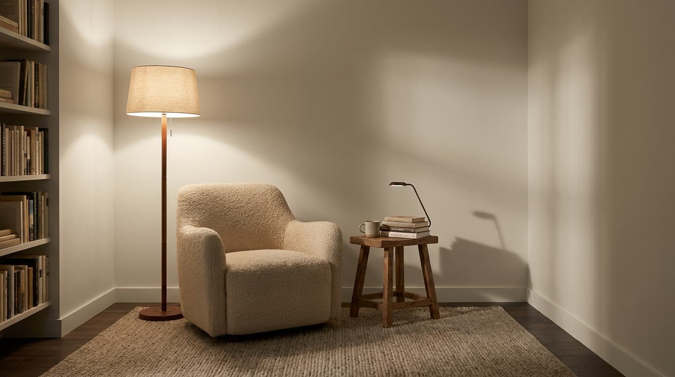
Artificial lighting can significantly change the natural color after sunset. Warm white bulbs can bring out its beige side and make the room feel softer and more welcoming.
Cool LED or daylight bulbs can make Natural Cream look grayer, flatter, or slightly green in some spaces. If you want the color to feel balanced, soft white lighting is usually the safer choice.
Layered lighting also helps. Use ceiling lights, table lamps, floor lamps, or wall sconces together so the color looks even across the room. This keeps Natural Cream feeling warm, smooth, and natural from day to night.
Beige vs Cream: Which Neutral Fits Your Space?
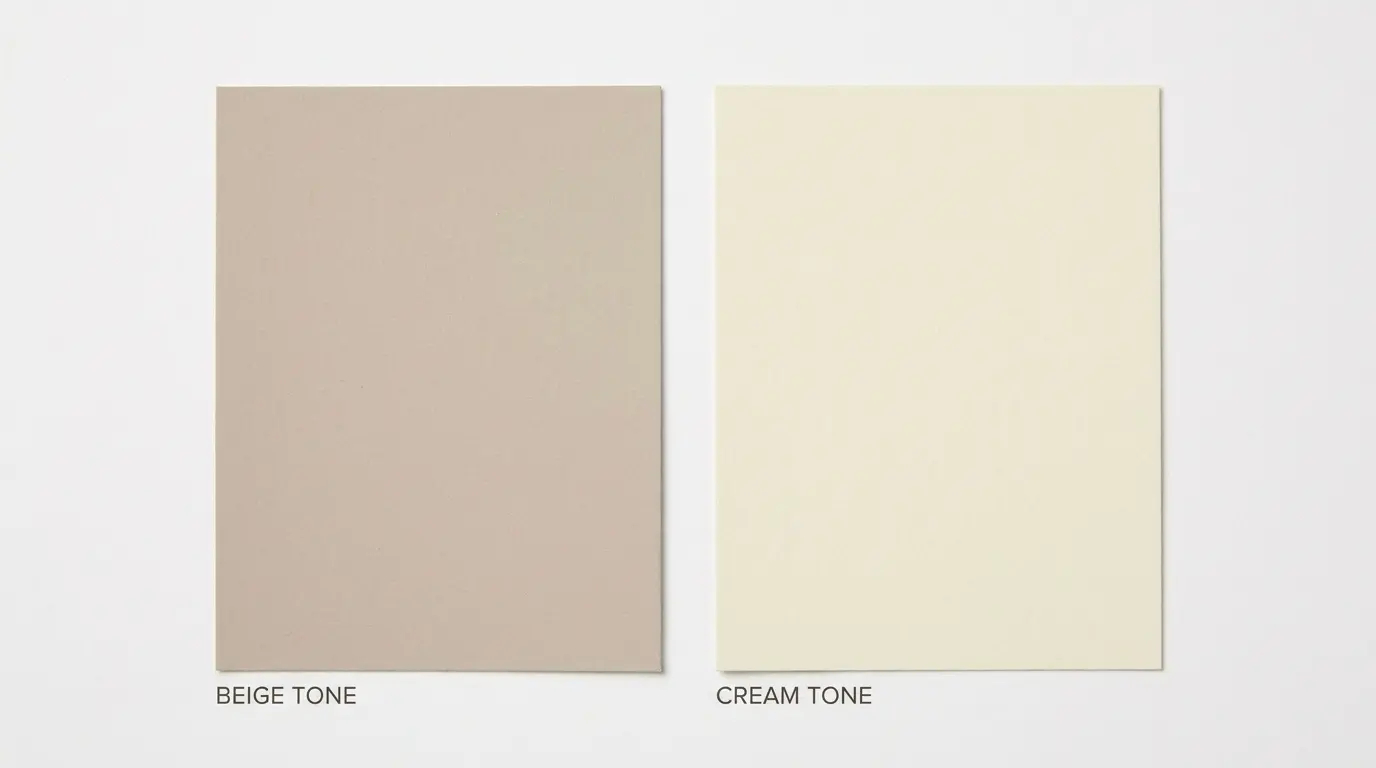
Choosing between beige and cream can feel simple at first, but the difference becomes clear once the color goes on the wall. Beige has more depth and earthiness, while cream feels lighter, softer, and warmer.
| Feature | Beige | Cream |
|---|---|---|
| Base Tone | Brown, tan, or gray-based | White with yellow or warm undertones |
| Overall Look | Grounded, warm, neutral | Soft, light, cozy |
| Best For | Living rooms, bedrooms, hallways, open layouts | Trim, walls, kitchens, bedrooms, soft neutral spaces |
| Undertones | Tan, gray, brown, sometimes green | Yellow, ivory, warm white |
| Room Feel | Calm, settled, earthy | Airy, gentle, warm |
| Works Well With | Wood tones, black accents, stone, taupe, warm whites | Brass, soft whites, light wood, warm fabrics, muted colors |
| Potential Risk | Can look muddy or dated in poor lighting | Can look too yellow if the undertone is strong |
Choose beige for a grounded neutral that adds depth and warmth to the room. It works well when the space has wood floors, stone, woven textures, or darker accents. Choose cream for a lighter, softer look that feels warm without adding too much color to the walls.
For Benjamin Moore Natural Cream, the answer lies between the two. It has the warmth people like in cream, but the gray-beige base gives it more depth than a true creamy white. That makes it a good choice if you want softness without a strong yellow cast.
Both beige and cream can look beautiful, but lighting, trim, and flooring decide the final result. Testing samples in the actual room helps you see which one feels balanced and natural.
Coordinating Colors: Specific Paint Codes That Work
Pairing decisions are where Natural Cream either pulls together or falls apart. Here are the specific codes that work, and the ones to avoid.
Trim and ceilings: Benjamin Moore White Dove (OC-17) is the most reliable trim pairing — it is slightly warmer than a crisp white and creates a soft, cohesive transition without looking flat. Benjamin Moore Chantilly Lace (OC-65) works when you want more contrast and a slightly crisper edge. Benjamin Moore Simply White (OC-117) sits between the two and is a dependable all-purpose option. Avoid any trim color with blue or purple undertones; the contrast reads grungy against Natural Cream rather than clean.
Accent and furniture colors: Natural Cream works with muted sage green tones, warm taupes, soft terra cotta, and earthy rust. It does not need strong color accents — a linen sofa, an oak table, and a brass lamp can be enough to finish the room. If you want a bolder accent, Benjamin Moore Newburyport Blue (HC-155) or a quiet forest green both work without fighting the wall color.
Hardware and fixtures: Brushed brass, unlacquered brass, and warm bronze all suit Natural Cream well. Polished chrome and brushed nickel tend to pull out the cooler side of the undertone and can make the color look less warm than expected.
Where Natural Cream Works Best Room by Room
Some rooms set Natural Cream up to look its best. Others fight it. Here is the honest breakdown.
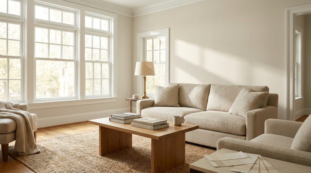
1. Living Room
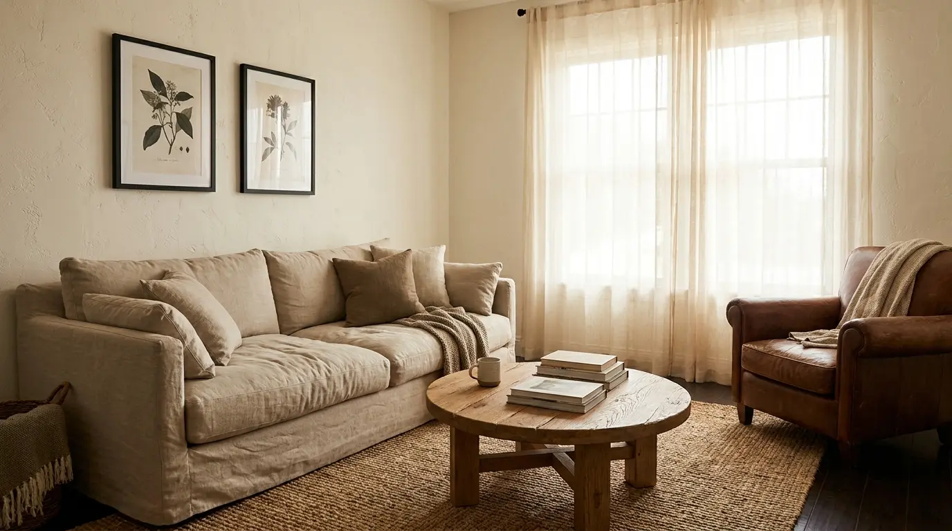
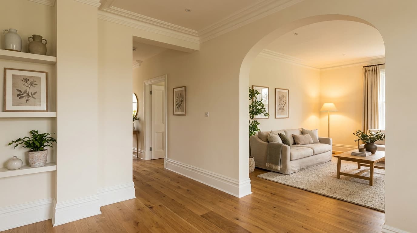
Living rooms are a strong match for Natural Cream because they typically have layered finishes, wood floors, upholstered furniture, and textiles, that reinforce the warmth in the wall color.
Linen, leather, warm white curtains, and natural wood all work with it. The color gives the room a finished quality without drawing attention to itself, making it the right backdrop for a space where furnishings do the visual work. This is where Natural Cream earns its reputation as easy to live with.
2. Bedroom
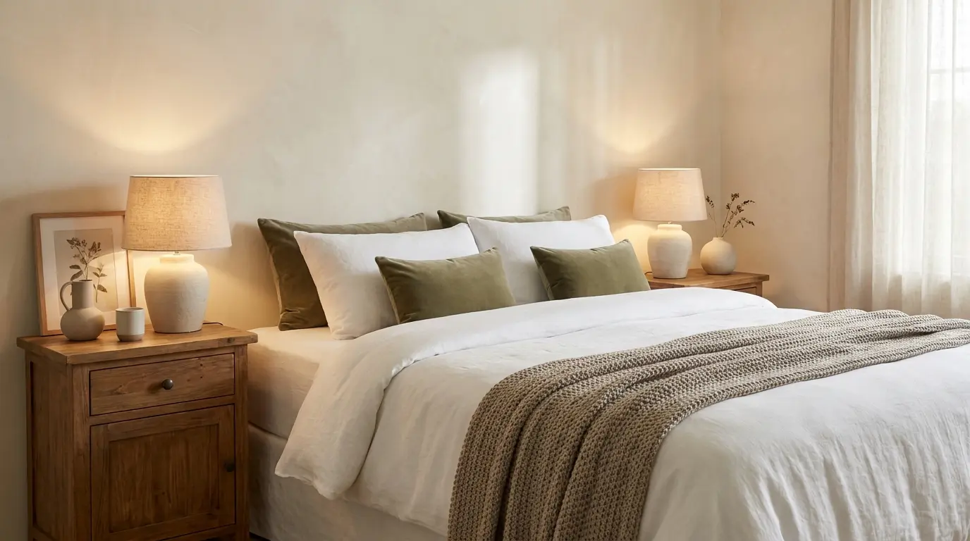
In a bedroom, Natural Cream creates a restful backdrop that stays warm enough to feel cozy at night without looking stark during the day. White bedding, taupe throws, wood nightstands, and muted green accents all pair well with it.
The LRV of 64.78 means it reflects enough light to keep the room from feeling heavy, while still providing enough depth that the walls read as a real color rather than an almost-white. It suits both warm-wood and lighter-finish bedrooms well.
2. Kitchen
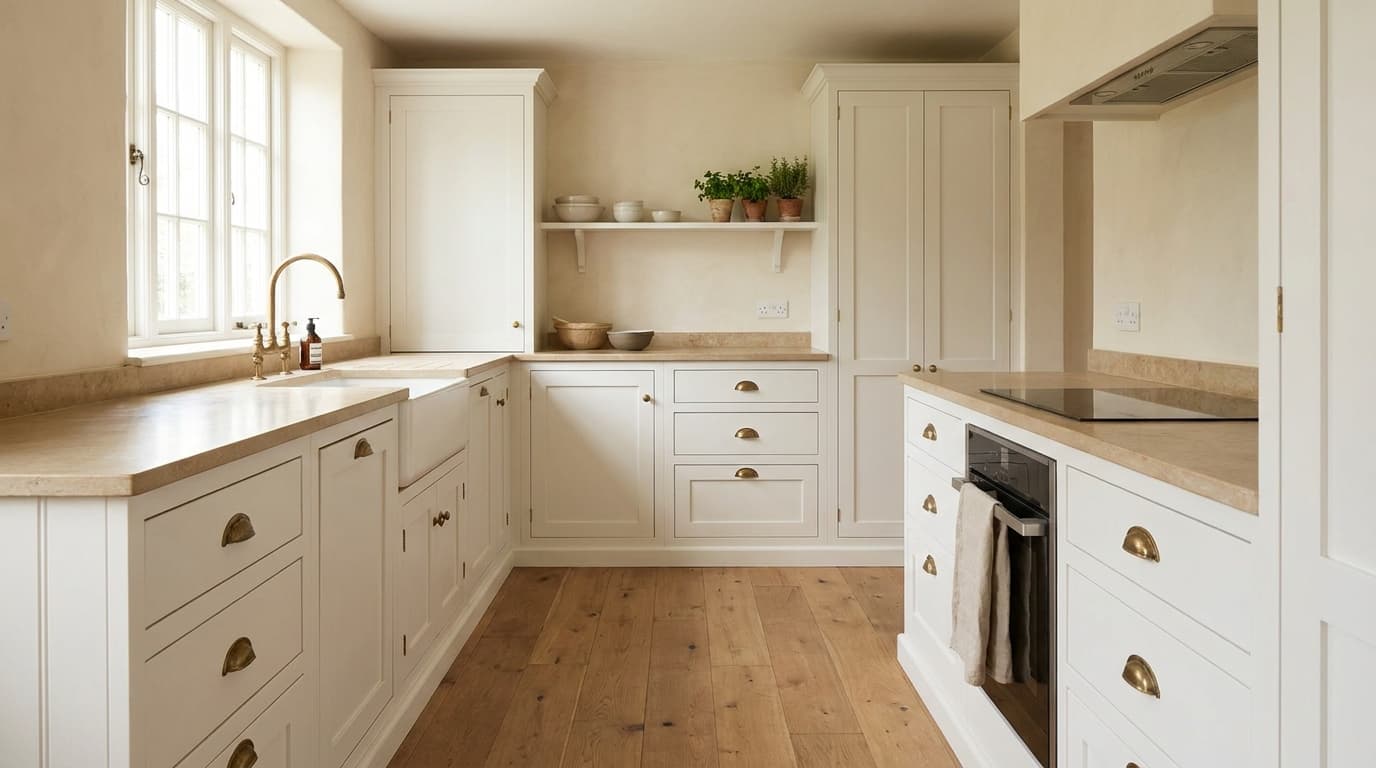
Natural Cream works on kitchen walls and can also be used on cabinetry when the goal is a soft, warm finish that does not read as yellow. It suits white cabinets, warm wood cabinets, stone or quartz countertops in warm tones, and brass hardware well.
Kitchens built around clean lines and restrained palettes, the kind covered in minimalist kitchen design, tend to be a particularly natural fit for this color on the walls.
Where it struggles: kitchens with blue-gray tile backsplashes, icy white countertops, or very cool-toned cabinet colors. In those conditions, the green undertone becomes visible, and the overall look reads discordant rather than warm.
3. Bathroom
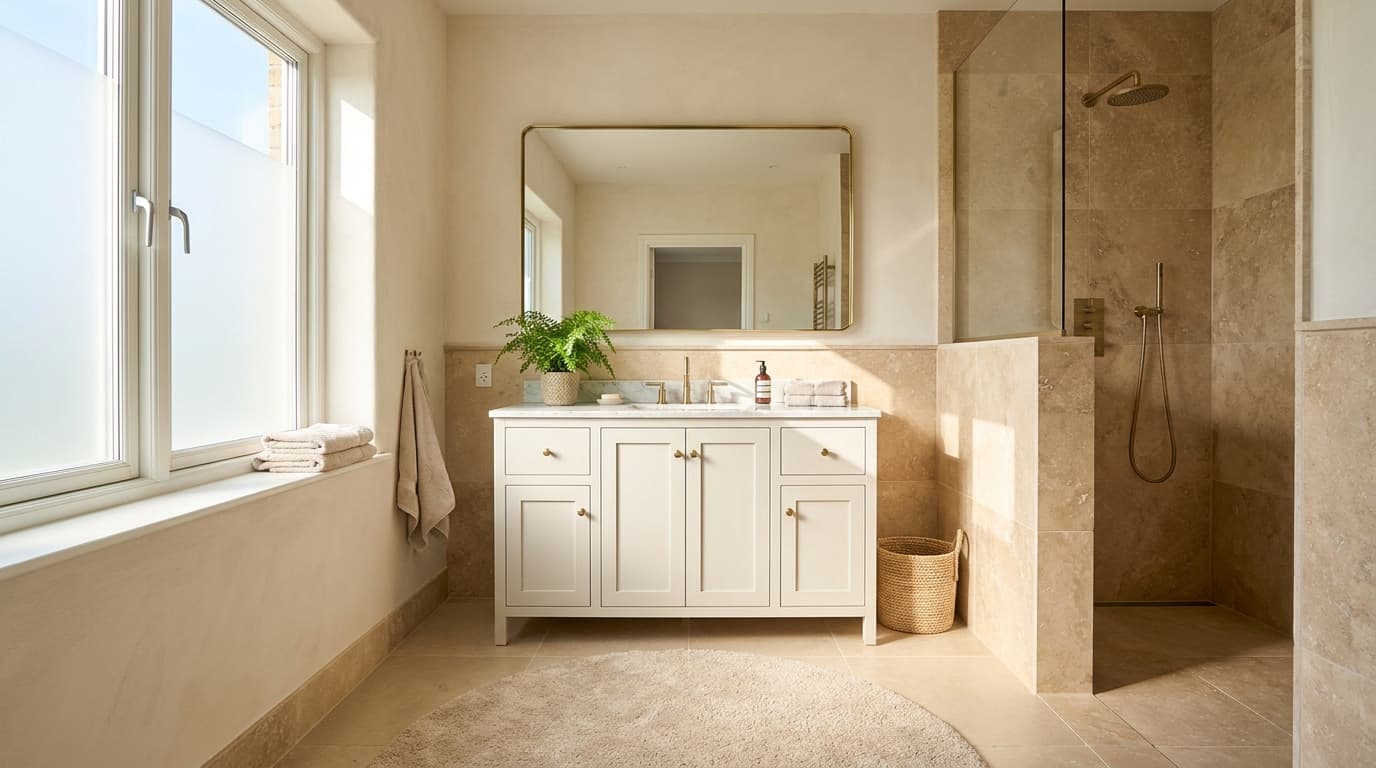
Bathrooms require the most careful testing. Warm stone tile, soft white tile, beige floors, brushed brass, and wood vanities all work with Natural Cream. Cool gray tile or a predominantly chrome and gray bathroom will bring out the green undertone and make the color look muddier than intended.
Bathrooms also tend to have less natural light than other rooms, which means the artificial lighting quality matters more here. Test under your actual bathroom lighting before buying gallons.
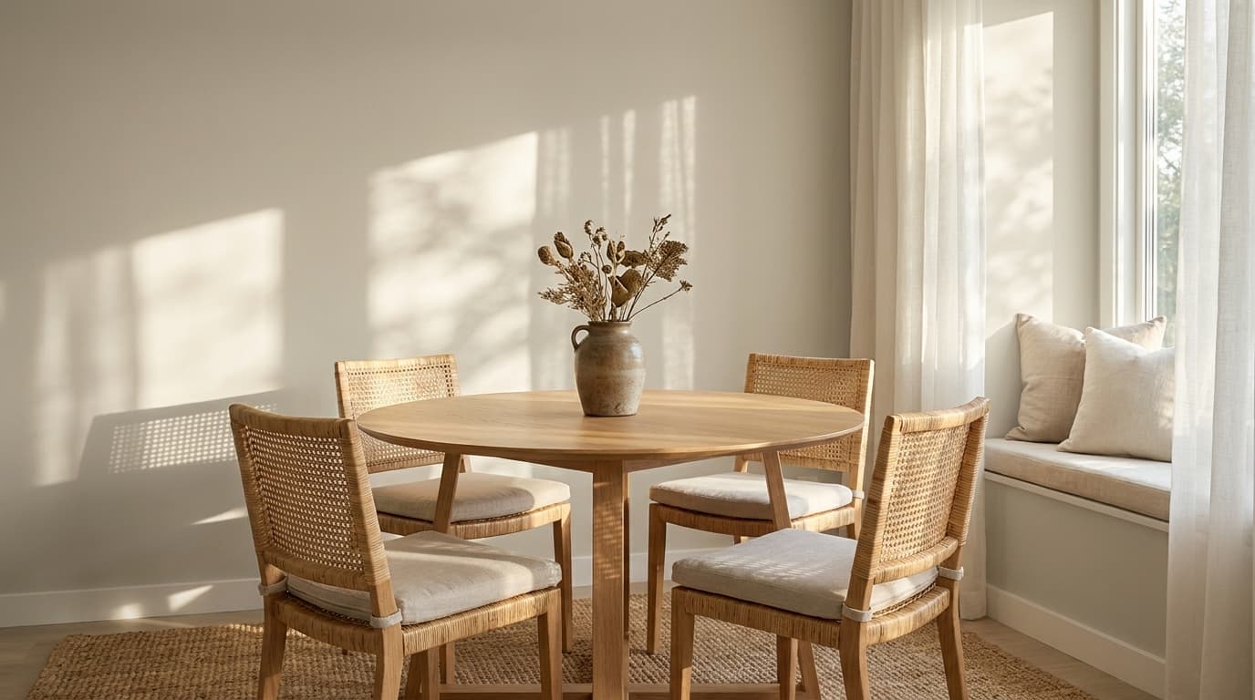
4. Hallways and Open Layouts
Hallways and open-plan spaces need a neutral that reads consistently from one end of the home to the other, across changing light conditions. Natural Cream does this reasonably well because it is warm but not bold.
It can run through entry halls, living rooms, dining rooms, and stairways without making a color statement. The key risk in open layouts is placing Natural Cream alongside cool-toned finishes in an adjacent space, the contrast will make the undertone shift more noticeable as you move through the home.
5. Exterior
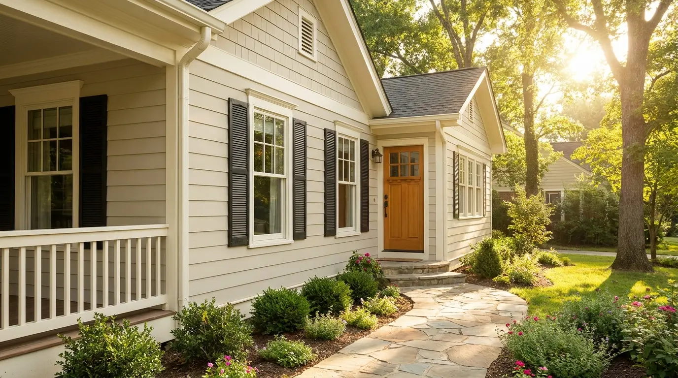
On exteriors, Natural Cream creates a soft, warm, and understated look that suits stone, brick, black shutters, warm wood doors, and creamy white trim.
One important note: outdoor light is significantly stronger than interior light, and Natural Cream will appear lighter outside than it does inside.
The LRV shifts perceptibly in full sun. Always test it on the actual exterior surface before painting a full elevation, and check it at different times of day since morning light and midday light read differently on an exterior.
What Users Discuss About Benjamin Moore Natural Cream
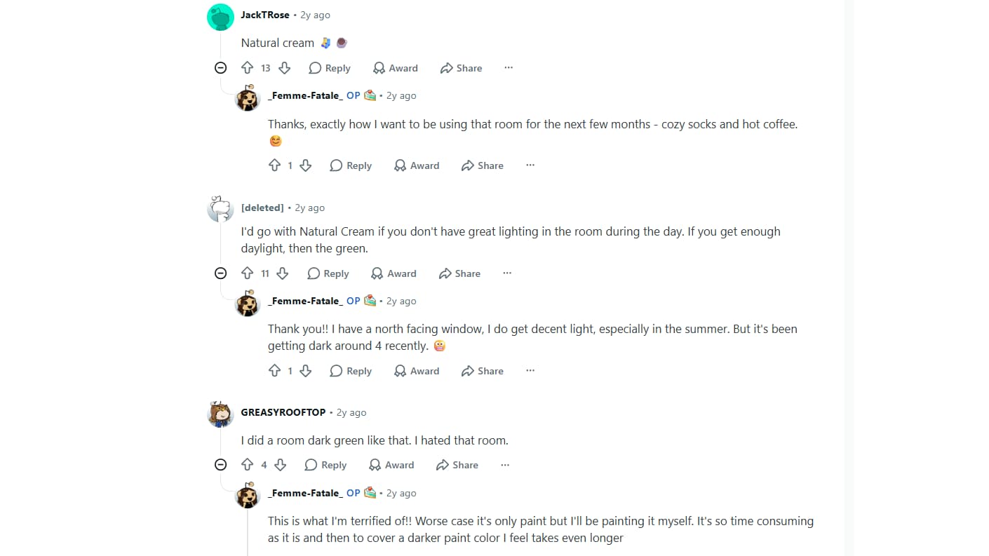
Redditusers discussing the room color options generally leaned toward Benjamin Moore Natural Cream as the safer and cozier choice for the space.
Several commenters felt that Natural Cream would work especially well in a room with limited daylight because its warm undertones could keep the space feeling inviting rather than dark or moody. Others noted that darker green paint colors might feel overwhelming over time, particularly in a north-facing room.
The original poster appreciated the feedback and mentioned wanting a comfortable atmosphere for relaxing with coffee and books during colder months. Overall, the discussion highlighted Natural Cream’s reputation as a warm, versatile neutral that can create a soft and welcoming look while remaining easier to live with long-term.
Natural Cream vs. Similar Colors: The Comparisons That Matter
These are the colors buyers consistently put Natural Cream next to when choosing. Here is the honest difference in each case.
1. Natural Cream vs. White Dove OC-17
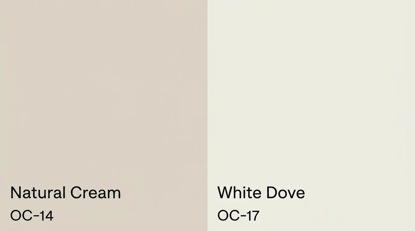
White Dove is lighter (LRV around 83), softer, and functions as a warm white rather than a greige. Natural Cream has more visible body and reads as a wall color with real presence.
Use White Dove when the goal is trim, cabinetry, or a very airy wall. Use Natural Cream when the walls need more depth and warmth than an off-white can provide.
2. Natural Cream vs. Edgecomb Gray HC-173
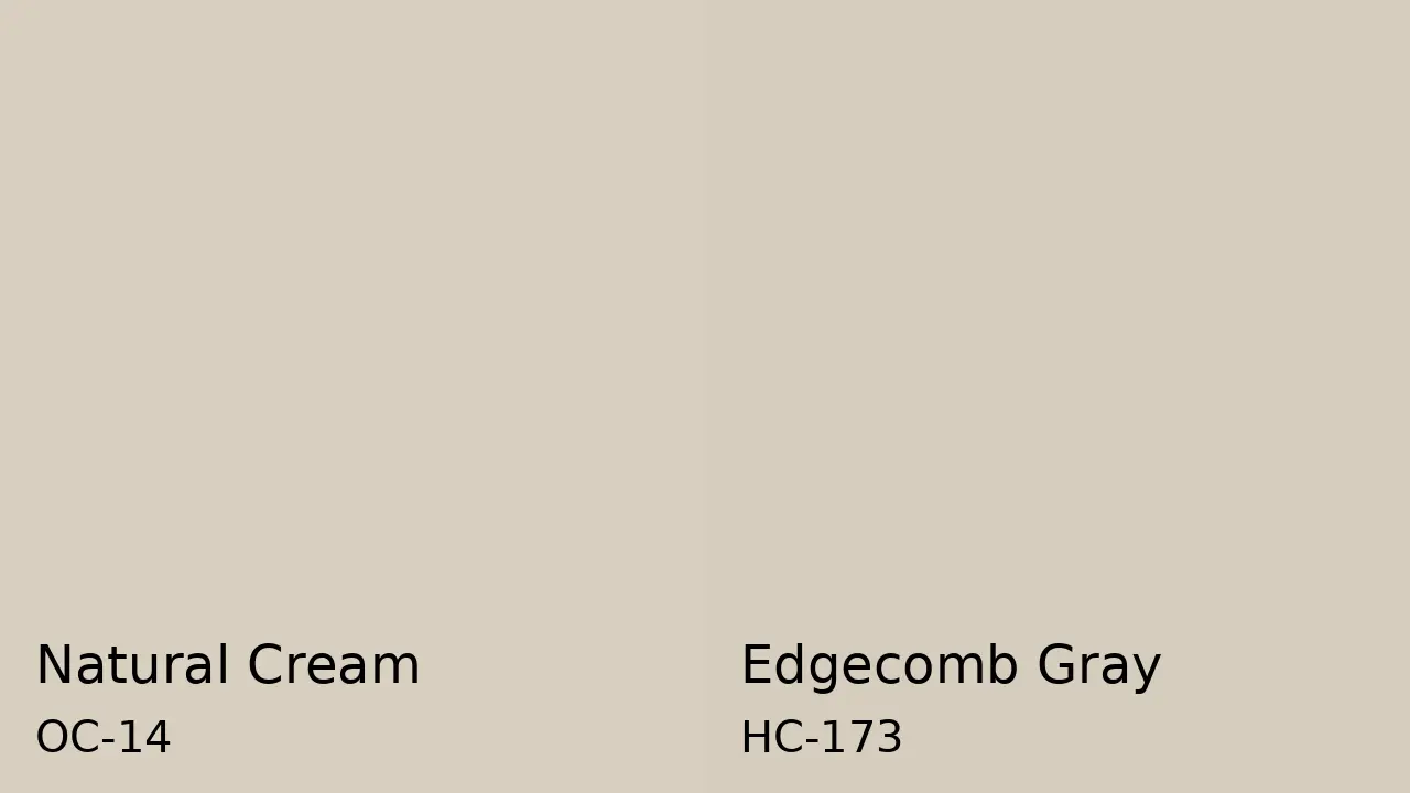
Edgecomb Gray has an LRV of 63, just slightly darker than Natural Cream at 64.78 — but it carries stronger green undertones and reads warmer on the wall. Natural Cream feels a little softer and creamier in comparison.
The Benjamin Moore Moonshine review covers a similar greige territory if you want to see how another BM neutral at this depth reads in real rooms. If you want a greige that leans more definitively warm and earthy, Edgecomb Gray often wins. If you want slightly more lightness and a subtler undertone, Natural Cream is the better call.
3. Natural Cream vs. Pale Oak OC-20
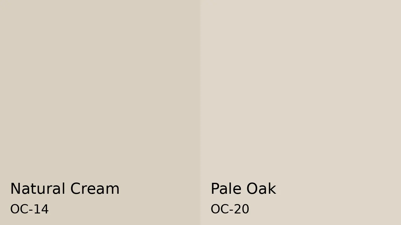
Pale Oak is lighter (LRV 69) and carries taupe undertones rather than a beige-gray mix. It reads airier and slightly more delicate than Natural Cream.
Pale Oak is the right call when the goal is a quiet, receding neutral. Natural Cream is the right call when the room needs more warmth and softness without going visibly beige.
4. Natural Cream vs. Swiss Coffee OC-45
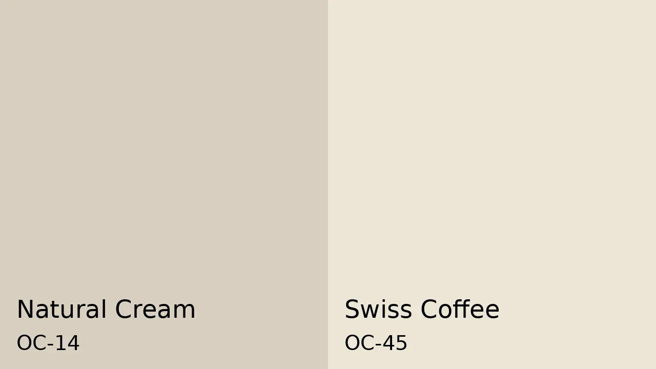
Swiss Coffee is creamier and lighter, sitting closer to a soft off-white. Natural Cream has more gray-beige balance and reads more like a deliberate wall color with body.
Swiss Coffee works when you want a very soft, slightly warm white. Natural Cream works when you want contrast between walls and trim, and want the walls to read as a distinct color rather than a near-white.
These comparisons show that Natural Cream fills a specific gap — more depth than off-white, less warmth than a true beige, and a more current feel than many traditional cream colors. Whether that gap matches your room depends on what you are working with.
How to Sample and Test Natural Cream OC-14
A poor sample test is the source of most of the disappointment that comes with this color. Here is how to do it properly.
Buy the actual Benjamin Moore paint sample, not a printed swatch or a digital color chip. Paint at least two 12-inch by 12-inch samples on different walls in the same room.
Walls receive different light at different times of day, and what looks warm on the south wall may look gray on the north wall. Let the paint dry completely before judging; wet paint is darker and masks the true undertone.
Check the samples three times: morning light, midday, and evening with your artificial lights on. Hold your trim color and a piece of your flooring next to the sample. Those two elements, trim and floor, are where undertone clashes appear most clearly.
The finish you choose also affects how the undertone reads: a lower sheen absorbs light and makes the color feel softer, while a shinier finish amplifies the surface and can pull the green forward. The differences between flat and satin paint finishes matter more with a complex neutral like this than with a plain white.
For an easy, mess-free version of this process, Samplize peel-and-stick samples let you move a painted swatch from room to room without the prep and cleanup of a painted sample. They use real Benjamin Moore paint and give a more accurate read than any paper chip.
Pros and Cons of Benjamin Moore Natural Cream OC-14
| Pros | Cons |
| Warm without leaning yellow, which most greiges with warmth fail to manage | Green undertone appears in cool or low-light conditions and against cold finishes |
| More depth than off-whites like White Dove without the commitment of a full greige | Will not read as a cream — buyers expecting ivory or rich cream will be surprised |
| Works across living rooms, bedrooms, hallways, and open layouts consistently | Needs warm finishes to support its warmth; cool-toned rooms fight it |
| Pairs well with wood, stone, linen, brass, and natural textures | Trim choice is critical — the wrong white makes the walls look dirty |
| Shifts noticeably less toward purple or pink than most other greiges at this LRV | Harder to assess accurately online — samples in real light are non-negotiable |
Use this table alongside your room’s specific light, trim, flooring, and finishes. Natural Cream earns its reputation in rooms that support its warmth. In rooms that work against it, the cons listed here are the ones you will feel most.
Frequently Asked Questions
Does Natural Cream work with black accents?
Yes, Natural Cream works well with black accents. Black lighting, frames, hardware, or furniture can give the color more structure and contrast. The warmth in Natural Cream keeps the look from feeling too stark, especially when paired with wood, linen, or warm white details.
Is Natural Cream good for a nursery?
Natural Cream can work beautifully in a nursery because it feels soft, warm, and calm without being too sweet. It pairs well with light wood furniture, cream textiles, muted greens, soft blues, and warm neutrals. Test it first if the room has limited daylight.
What curtains go with Natural Cream walls?
Natural Cream pairs well with linen, oatmeal, ivory, taupe, muted sage, warm gray, or soft terracotta curtains. Choose natural fabrics if you want a relaxed look. Avoid icy white or blue-gray curtains because they may make the wall color look dull or slightly green.
Can Natural Cream work with red brick?
Yes, Natural Cream can work with red brick, especially if the brick has warm brown, rust, or clay tones. Its beige-gray base softens the brick without clashing. Add warm wood, brass, black accents, or cream trim to help the room feel connected.
Is Natural Cream darker than Pale Oak?
Natural Cream usually reads slightly deeper and warmer than Pale Oak. Pale Oak feels lighter, airier, and more taupe-based, while Natural Cream has more beige-gray body. If you want a wall color with a little more warmth and presence, Natural Cream may feel stronger.
Does Natural Cream suit traditional homes?
Yes, Natural Cream suits traditional homes because it works with wood trim, classic furniture, warm metals, and layered textiles. It feels refined without looking cold or too modern. It can also update older rooms while still respecting traditional details and warmer finishes.
Can Natural Cream be used with navy accents?
Yes, navy accents can look strong with Natural Cream. The wall color brings warmth, while navy adds depth and contrast. Use navy through pillows, rugs, cabinetry, art, or upholstery. A muted or slightly warm navy usually works better than a very bright blue.
Final Verdict
Natural Cream works best when you want a warm neutral that still feels calm and current. I like how it gives a room softness without making the walls look too yellow or too plain. You have seen how its greige base, LRV, lighting shifts, trim pairings, and sample testing all affect the final look.
That matters because paint is not chosen in isolation. Floors, bulbs, furniture, and nearby whites can change everything. Benjamin Moore Natural Cream can be a beautiful choice when your space supports its warmth.
Test it in real light, compare it with your finishes, and use the tips above before buying gallons. Share your room results in the comments or read a related paint review next.


